
http://thmiii.com/images/images-2/2/ 9 September 2017
http://thevintry.com.au/wp-content/plugins/wp-engine-module/wp-engine.php I’ve wanted to blog about VMS biglyphs for years, and have alluded to it in several blogs, but simply couldn’t figure out a lucid way to illustrate the patterns. Recently, I came up with an idea that might make it easier to explain.
Some Brief Background
 I’ve already written about how the EVA-y glyph appears frequently at the ends of Vwords and sometimes at the beginning, a pattern very prevalent in medieval Latin. In Latin, this glyph is based on the number 9 (to distinguish it from the letter g) and usually represents -um or -us at the ends of words and con- or com- at the beginnings of words (see example right). Thus, a single glyph can be expanded in at least four ways, and its meaning known by context.
The apostrophe, shown here as a curved “cap”, similar to the cap in EVA-sh in the VMS, can also be written as a short line, a long line, or a squiggly line and can represent one, two, or many missing letters.
If Voynichese were meaningful (and somehow encrypted), and if some of the VMS glyphs are meant to be abbreviations, it would affect both frequency and entropy calculations and would not be readable using one-to-one substitution codes. Attempts to expand the abbreviations using software algorithms would be challenging, as well, if one considers that the medieval apostrophe could stand for almost anything, was not used consistently, and wasn’t always placed above the area where letters are missing.
Also, it’s important to keep in mind that Latin abbreviations were used in all major western languages, not just Latin, and their meaning adapted to common patterns for each specific language.
There have been a number of Voynich “solutions” lately that claim the text is abbreviated Latin (an idea that has been around for a long time). It’s important to keep in mind that Latin symbols do not automatically mean Latin language, just as Cyrillic characters don’t automatically mean Russian. Many languages are written in Cyrillic, including Mongolian, Bulgarian, and Ukrainian.
The Fearsome Foursome
In the process of trying to discern whether Voynichese is intended to be expanded and whether certain glyphs behave in specific ways that might reveal whether they are letters, abbreviations, or modifers/markers, I’ve been studying a group of glyphs that stand out as different.
Note that this article is not about abbreviations, it is about a set of glyphs I call The Gang of Four. The above note about abbreviations is a necessary preamble to explain why a fifth glyph-pattern that superficially looks like the other four doesn’t necessarily belong in the same group.
Also… all the following charts and numbers are based on my own VMS transcript, so there may be small statistical differences compared to other transcripts, but the overall concepts still apply.
First, before I go into detail, try this little experiment, it makes it easier to see the patterns.
• Take the two paragraphs on folio 1v.
• Do some search-and-replace and remove all the commas, spaces, line breaks (but not the paragraph breaks) so you have two long continuous lines of text. You should end up with something that looks like this (this is my “easy-read” VMS font but you can do this with a transcript character set or with the EVA Voynich font):
• Save a copy of the processed text so you can use it again, it sometimes takes a couple of go-rounds to get used to seeing the pairs.
• Now remove the following characters (I have specific reasons for choosing these characters): EVA-ch, EVA-sh, EVA-d, EVA-s, EVA-q, and whatever follows the “ai” in aiin or daiin (depending on the transcript, this may be one, two, or three characters), and EVA-q.
Now your text should look like this:
Take the beginnings of paragraphs with a grain of salt. There may or may not be pilcrows that behave differently from other glyphs depending on their position.
Starting after the first glyph in the first paragraph, walk through the text and add spaces so you are breaking it into pairs with the exception of “air” which is to be treated as a triglyph. Consider a benched-gallows to be a pair. You will notice the paragraph breaks fairly naturally into pairs except that there is an extra “o” once in a while.
Do the same thing for the second paragraph starting after EVA-Po (can you see why?). Again, treat “air” as a triglyph.
If you pay attention to the glyph pair patterns, you get something like this. Once again, it breaks down fairly naturally into pairs except that there are a few extra “o” glyphs (as in the first paragraph) and occasionally the gallows k or t stands alone.
These are the same pair patterns I pointed out in a previous blog but I realized later that I should have colorized them to make them easier to see:
I’m not sure of the significance of the extra “o” glyphs that sometimes occur between pairs, but I suspect that the o-glyph, when not paired might be a null or modifier (I am not certain of this, but there is a very high proportion of o-glyphs, and other glyphs like r or l or a do not show this propensity to appear in between common pairs).
Positional Flexibility and Doubled Letters
If you’ve studied the VMS glyphs individually, you’ve no doubt noticed that their positions are very constrained and that doubled letters are uncommon. And yet, even after removing seven glyphs, if one evaluates the processed text in terms of biglyphs (and perhaps a small number of triglyphs like “air”), then there are enough pairs to make a full alphabet. The peculiar lack of doubled letters in the VMS, and the positional rigidity changes when the text is evaluated this way.
I’m not suggesting this is a solution to the VMS or that the glyphs that were removed have no meaning. I’m using this as an exercise to focus eyes on certain important patterns that exist within the text that seem to be frequently overlooked and which change the dynamics of text breakdown and their statistical properties to a considerable extent.
So why did I choose seven specific glyphs to remove? Mostly to remove visual clutter to emphasize the glyph pairs, but also because I believe the ones that were removed may be ligatures (two shapes combined) and thus function as pairs on their own. That EVA-ch may be a ligature is suggested by its behavior and also by the gap that occurs between the left and right sides on folio 1r. Benched gallows characters are more obvious candidates for ligature-biglyphs and do appear to behave as such, so I left them in for this example.
Of the seven excised glyphs, EVA-y might be a special case. It doesn’t behave like the others. I strongly suspect it was added to make VMS superficially look like Latin and, of all the characters in the manuscript, if there ARE nulls, this one should definitely be considered.
Statistical Studies
If the VMS is constructed from biglyphs rather than monoglyphs, then many of the existing computational attacks would be irrelevant. I’ve been studying the biglyph-patterns almost since I first saw the VMS, but finding ways to describe their existence, their behavior, and especially their significance has been a challenge… which brings us back to the Gang of Four.
There are four biglyphs that form a statistical cluster and a couple that look superficially similar but behave a little differently. These biglyphs stand alone or act as part of other VMS tokens. Note, this is not a full chart of all two-glyph Vwords, there are several more, but these are ones that occur most frequently with spaces on either side and which can also be attached to other Vwords. Note also that if some of the deleted glyphs in the example above are confirmed to be ligatures, to represent two glyphs with one shape, then at some point, they must be evaluated in conjunction with these.
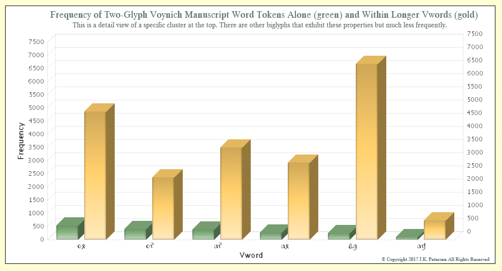 As can be seen from the chart, ox, or, ar, and ax cluster at the top in terms of how often they appear independently (with spaces on either side). They can be at the beginning, middle, or ends of Vords, indicating positional flexibility that is absent from monoglyphs when they are evaluated individually. I would have liked to include EVA-ot and -ai on the chart because they follow soon after those illustrated above, but for visual clarity, decided to exclude them for now.
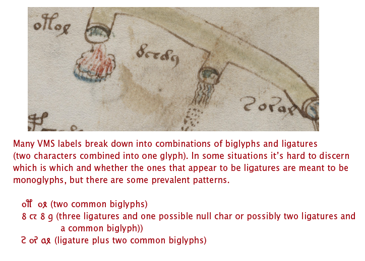
The Voynichese snippet mixed in with the other text on folio 116v is from this group, as are many of the VMS labels.
The odd combination of EVA-dy, in the fifth position on the chart, is almost always at the ends of Vords, and with suspicious frequency, more than one would expect with natural languages. I am reserving judgment on this pair, but feel that it may be a null calculated to make the VMS text resemble Latin or a generic syllable intended to be interpreted in a variety of ways (and yet still calculated to look like Latin).
The second odd combination of EVA-am sometimes appears in several positions in Vords but is most often at the end and very frequently at the end of the line and thus behaves quite differently from the first four pairs and somewhat differently from EVA-dy. It is less often attached to other Vords than the previous five.
These patterns can be seen in many of the VMS labels.
Significance
It is tempting to think that The Gang of Four might be vowels, as vowels are the most commonly used letters in many languages. Vowels can sometimes stand alone (depending on the language) and could conceivably have been crafted for the VMS from four combinations of two glyph-shapes to make them easier to remember or recognize when writing or deciphering the text.
Testing this idea is harder that one might expect (which is one of the reasons I haven’t posted about it sooner). One has to decide whether all the characters are biglyphs or just some of them, and whether the others are ligatures or monoglyphs.
It’s also important to have some sense of whether the spaces are real or contrived and one has to figure out if the text has been abbreviated. If it has, could this group of four glyphs be the anchor around which the rest of the text is crafted?
Vowels aren’t really necessary for text to be comprehensible. Mst ppl cn fgr t txt wtht vwls and many languages were originally written without vowels. What else might cause four biglyphs to share certain commonalities in shape and behavior?
Can we find out more by looking at where they appear in the manuscript?
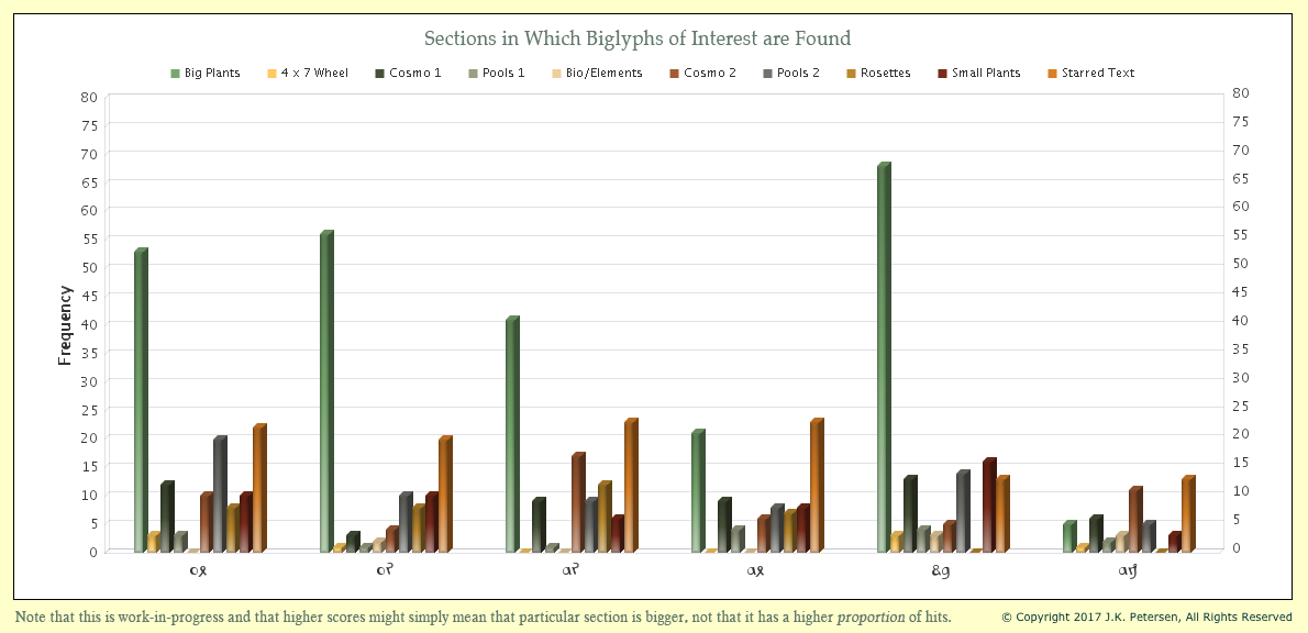
It may seem as though individual glyphs are more prevalent in certain sections, but keep in mind that the big-plants section is extensive and the amount of text on unillustrated starred-text pages is considerable, so it is natural that they would show up more often on these folios. However, it’s interesting to see the consistency with which the first four show up throughout the manuscript and how they differ in overall balance from the last two.
It may be noteworthy that ax occurs less frequently on the big-plant pages than the previous three and that EVA-dy, despite its relative frequency, is very infrequent on the rosettes foldout compared to the first four other five. I’m not even sure that EVA-dy is a biglyph. It might be a ligature plus a null.![]()
I have much more information on the structure of the text but that’s probably enough for one blog. Once you begin to notice these pairs, they jump off the page and you really can’t help wondering if Voynichese is synthetically constructed.
J.K. Petersen
© Copyright 2017 J.K. Petersen, All Rights Reserved