
isotretinoin no prescription needed 20mg 11 December 2017
Ivermectin buy cheap On November 25th, 2017, D. O’Donovan posted an image of a decorated plate next to the center motif of Voynich Manuscript folio 67r. There’s no commentary or date accompanying the plate, but I’m assuming it was intended as a comparison to the central motif in the VMS design, as the paired images are both rayed patterns and O’Donovan cropped the VMS image down to emphasize the central rays. A larger image of the dish was added later that day, and was posted again November 30th, 2017 on her continuation blog on cloudbands.
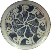 I’ve always been interested in antiques, so I recognized the plate pattern as one of the signature designs of Iznik ceramics, which reached its zenith in the late 16th century. The distinctive designs and quartz-enhanced materials are believed to be from a number of kilns in the Tabriz region. İznik (Nicaea) was a primary center for their production and distribution. Earlier designs (c. 1400s) include Iznik Miletus-ware (center detail shown left).
Is it possible that ceramic designs from the Iznik area are related to the central motif in VMS 67r?
There’s no question that they are visually similar, but the Iznik designs that are closest to the dish posted by O’Donovan were crafted about 100 to 170 years after the radio-carbon dating of the Voynich Manuscript. The 14th-century ceramic glazes and designs from this area are less similar to the VMS image than the later wares, but I thought Voynich researchers might appreciate some background information on Iznik designs so they can decide for themselves.
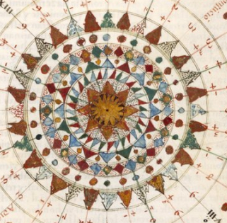
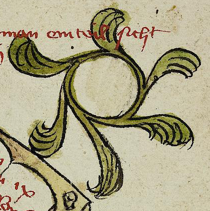
First, here is a wider shot of the VMS image. I’ve included the twelve moon-like circles because they may be contextually important to understanding the center (full Beinecke scan is here). The rayed motif in the center is the focus of the paired images on O’Donovan’s blog:
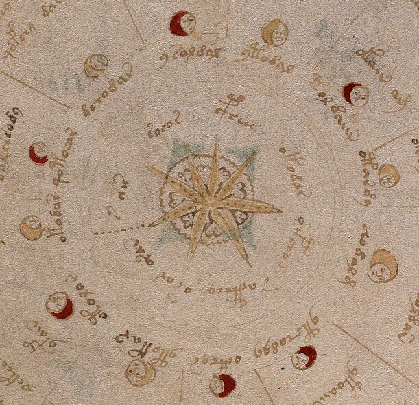
The VMS image consists of eight pointed rays painted brownish-amber, with a line of dots down the center of each ray. The four upper-left rays have six dots each, the others, seven dots each. Whether the numbers are significant is hard to tell. The lower rays are a bit bigger, so perhaps the extra dot is to fill the space.
To the left of the rays is a line of dots, possibly to demarcate the beginning and end of the accompanying letter-tokens. Behind the star- or starfish-like pattern is an unpainted almost circular band of scalloped bumps within which is a series of somewhat heart-shaped larger bumps. There are irregular clusters of dots in the inner bumps that make them stand out from the undotted texture behind them. The layering doesn’t make it clear whether the heart-shaped bumps are part of a larger design hidden by the rays or whether there are eight individual shapes between each ray.
 The important details to note are the fairly straight VMS rays, joined in the center (with dots running through the middle), that sit on top of the unpainted scallops.
Iznik-ware is similar, with rays and scallops, but the rays are behind the central “daisy” petals, and the difference might be important.
 Iznik designs are mostly floral. The “rays” poking out from behind the petals are often painted green and sometimes more explicitly curved. They are often drawn from the top, sometimes from the side.
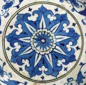
The image details on the right are both traditional Iznik from the late 16th century (courtesy of christies.com).
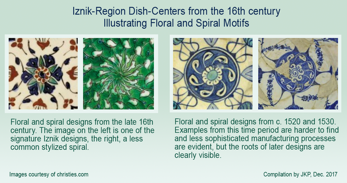
Iznik floral centers (below left) are typically divided into six or eight rays, but there are exceptions. Asters and Dianthus are especially popular, as their petal arrangements adapt naturally to rayed designs.
The red and blue pattern (below left) is similar to the VMS center motif. The green pattern second-left is less common and more stylized than most. It includes a slight twist suggestive of a spiral. Note that there are 13 rays, an uncommon number.
The two dishes below-right are from an earlier time period and very rare, c. 1530 with a daisy and spiral design, and c. 1520 (far right), with the same spiral but a more stylized center (7.5 sun-like curls and 10 rays). There are also sprays of flower spikes that extend the spiral motion. Note the flatter, more monochromatic glazing on the earlier examples:
The Whole Enchilada
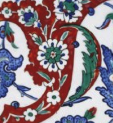
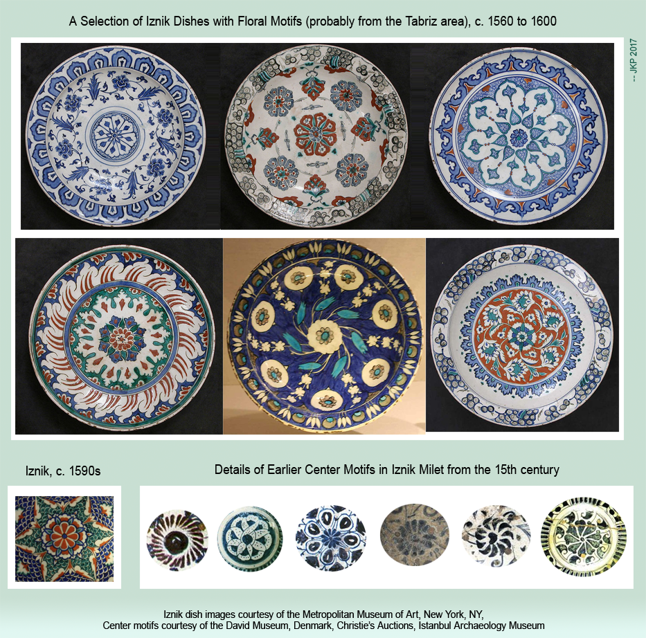
The following compilation shows the center motif in relation to the surrounding design. All are from the late 16th century (courtesy of the Metropolitan Museum of Art). One shows Asian influence in the outer ring in the flame- or cloud-like “petals”. Dragon-scale patterns were sometimes added for color and texture (bottom-left).
The details below the dishes (to the right) are very rare 15th-century examples. In the oldest ones, the flowers are often suggested rather than literal, with just a few petal-like brush strokes:
Could Iznik Traditions have Influenced the VMS?
Iznik and the VMS both include rays, but Iznik plates are historically based on floral patterns and the VMS design has pointed rays and lacks the daisy center (and is surrounded by moonlike shapes), so it’s hard to know whether it’s a similarity or a coincidence.
The Iznik center motifs that most closely resemble the VMS are too late to have influenced a 15th-century illustrator, and those that came earlier are a couple of evolutionary steps away from the later designs.
Are there centers that resemble the VMS more closely than designs on dishes? What do the moon shapes represent? Phases of the moon drawings are common in medieval manuscripts, but the VMS “moons” do not vary from full to crescent, and they alternate irregularly with single and double jumps and thus might not be moons at all.
The number of segments doesn’t necessarily reveal the meaning of associated symbols, but assuming the twelve-part division is meaningful, one possibility is that the VMS segments represent the relationship between the months of the year and the hours, as in the calendar-related computational manuscript attributed to Helperic, which is based in part on Bede’s De temporum ratione (St. John’s College MS. 17).
This manuscript includes a wheel divided into 12 spokes with an eight-pointed flower-like figure in the center (note the dots radiating between the spokes):
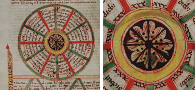
Reading the Latin, one can see that each segment, beginning at the top, is labeled in reference to a month: Primum mensem (1st month), Secondon mensem (2nd month), and then it switches to Roman numerals for the rest of the sequence.
Unfortunately, this wheel, while including an interesting center design, doesn’t shed much light on the rayed center in the VMS, or the moonlike shapes that surround it.
There is another wheel on the previous page that has a decorative center very similar to the one above except that the dark bands are replaced by triple branches and the surrounding red band is decorated with dots (the same design is used in the perpetual calendar on f34r):
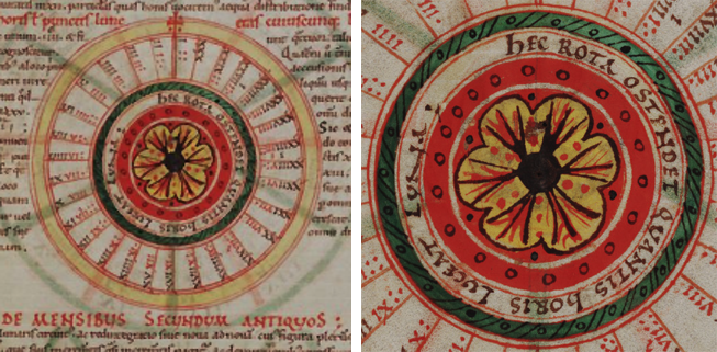
In this diagram, the Roman numerals in the 31 spokes are meant to represent the hours of moonlight.
Could inspiration have come from time-related or cosmology-related diagrams in manuscripts?
Another Possibility
 Volvelles are another source of very interesting center designs, and some of the more ornate ones from the 16th century are based on flower patterns. Volvelles also fit thematically with the VMS astrology/cosmology section. I can’t possibly fit all the wonderful examples of volvelles with decorative centers into this blog, but a quick search of Google images will give you an idea. You might especially enjoy the 13th-century volvelle by Benedictine monk Matthew Paris.
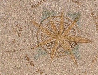
A related source of imagery is compass roses (right), but they tend to have single or layered star shapes and the cloud-like or petal-like background on the VMS star is not usually seen on compass roses and wind roses.
Maybe there’s another possibility…
This is just an idea, not necessarily the best one, but it might account for the moon-like shapes, the pattern, and the presence of the f67r text. Let’s take another look at the VMS drawing:
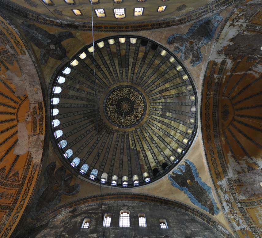
Dome in Hagia Sophia [Photo courtesy of Jorge Lascar, CC license].
Rayed patterns are found in domes all over the world and often there are additional petals or rays between the main ones. Here is a very small selection of dome designs:
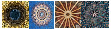
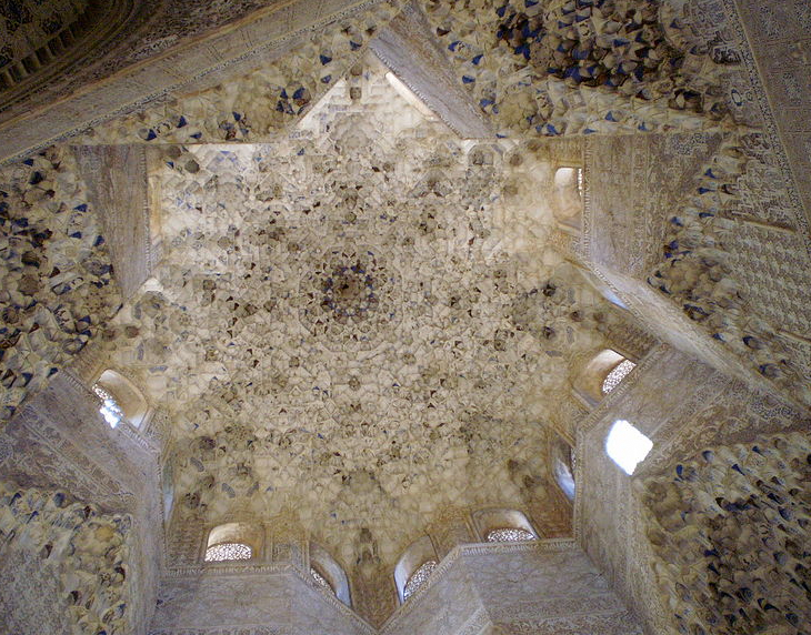
The deeply textured Alhambra star dome is reminiscent of the grotto-like textures throughout the VMS and the center could be interpreted as a drawing in a number of ways. [Photo courtesy of AnnekeBart, Wikimedia Commons.]
What about the moon shapes?
Domes are frequently decorated with important figures (religious, secular, mythical, magical)—the moons might be people, or perhaps coyly disguised drawings of arched windows that let in light irregularly, depending on the time of day and buildings nearby (or the presence or absence of doorways). When you stare at a dome from the ground, the upper semicircles are sometimes irregularly dark and light, and somewhat moon-shaped.
Since 2008, I’ve collected hundreds of pictures of domes to see if any of them match the VMS wheels or star patterns in the “cosmo” or general features in the “map” section. Despite a concerted effort, I didn’t find a match, but there are some interesting themes and commonalities (if you click on the links you will get targeted search results):
- Many church domes have arched windows, central rosettes, and panels of allegorical figures or celestial themes.
- Islamic mosques also have arched windows, delicate rosettes, and intricate compositions of text-as-image.
- There are Indian temples with breathtaking and very symbolic domes that are 3D layered and mathematical in their embodiment (something that might appeal to the creator of the VMS), and which sometimes have protrusions like the “container” shapes in the VMS central rosette. I recommend clicking this link to see the stunning carvings.
- Like the Indian temples, some of the Spanish domes have 3D grotto-like layers reminiscent of the multi-layered scale-textures in the VMS.
A Prevalent Theme in VMS Research
Even though medieval domes are full of rayed patterns, I didn’t feel satisfied that I had uncovered all the possibilities, so I turned to alchemical manuscripts and immediately found something more consistent with the shapes and themes on folio 67r, in combination with other drawings in the same section.
As a quick example (you can find many more on the Web), below is a pair of beakers with sun, moon, and star motifs, with the sun drawn in a dark/light fashion. Look at these together with the 67r two-image foldout and 68v (note also the tree on the craggy hilltop on the VMS 85–86 foldout):
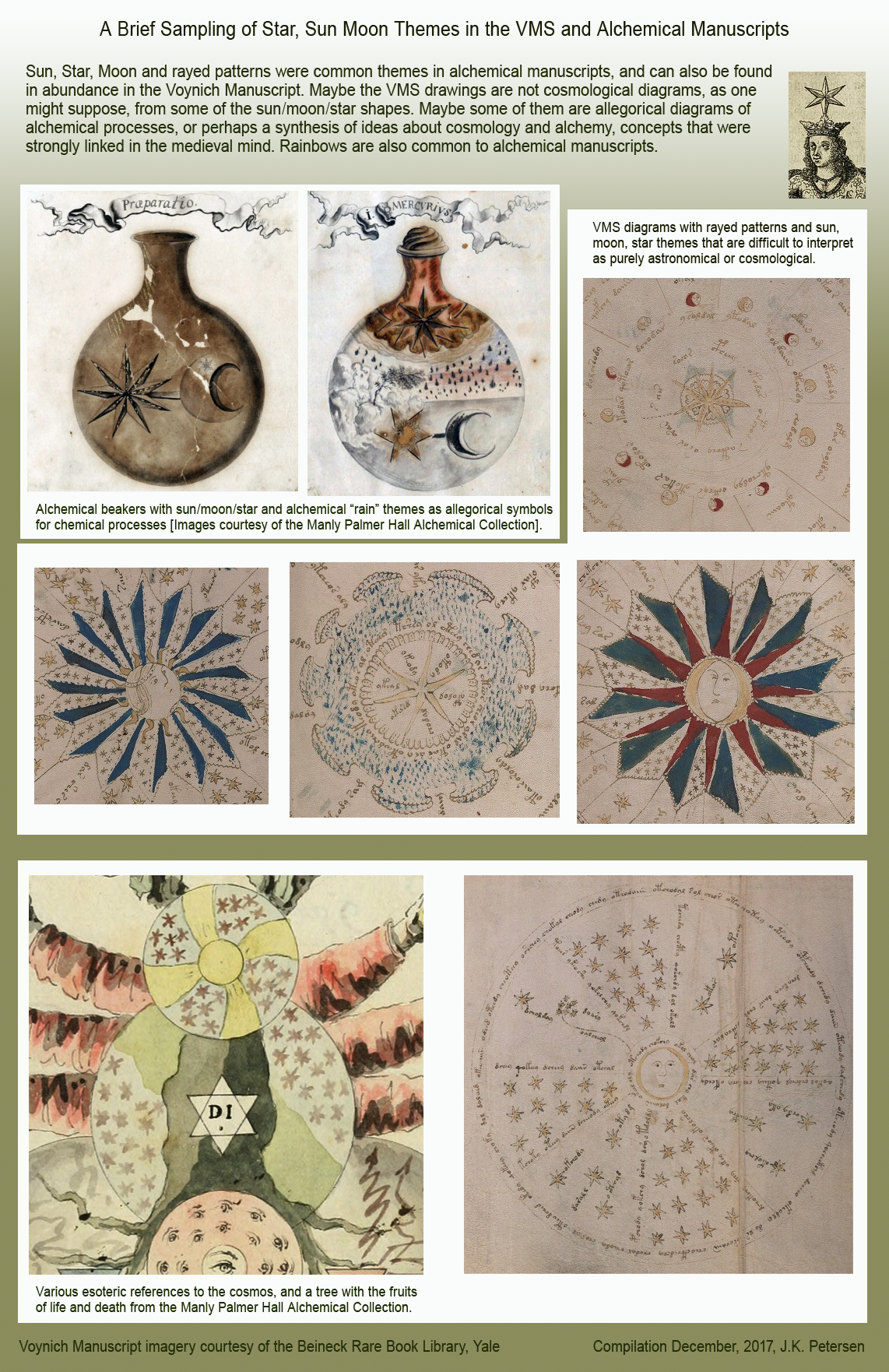
Stars feature prominently, as well. Another of the ideas put forward in alchemical manuscripts is the transformation of lunar nature into solar nature (representative of chemical changes). I haven’t posted all the relevant VMS illustrations here, it’s far too much for one blog, but these should be enough to highlight the commonalities.
Summing Up
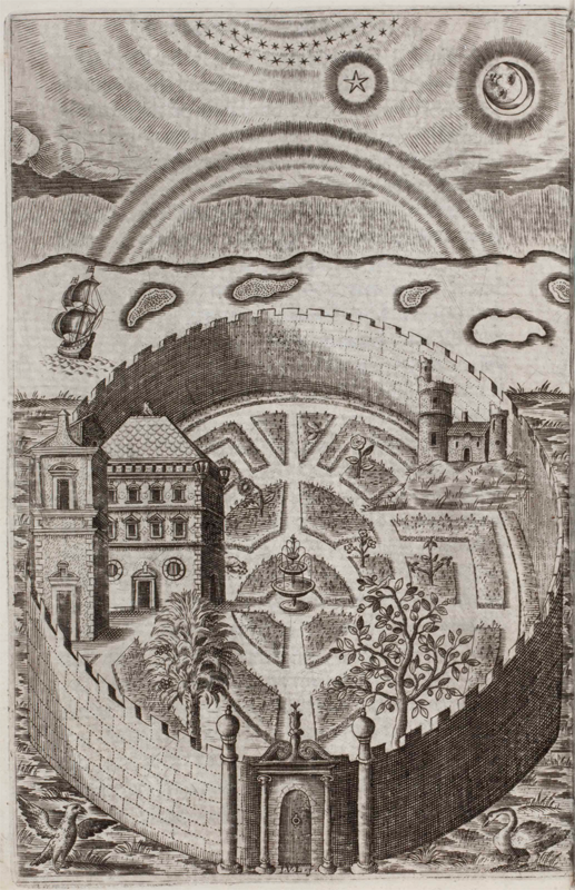
Henry Hawkins was a Renaissance-era Jesuit, as were Jacobi Synapius, Kircher, and many of Kircher’s circle of friends. Hawkins post-dates the VMS by two centuries, but there is an illustration in his book Partheneia Sacra: Or the Mysterious and Delicious Garden of the Sacred Parthenes (1633) that sums up many of the themes that are common to both alchemical manuscripts and the VMS. It includes a garden, birds, castles, cosmological symbols, rainbows, bodies of water, almost everything except naked nymphs:
 Alchemy has been mentioned hundreds of times in connection with the VMS. I’ve frequently looked at alchemical texts myself, but what brought me back to it in this specific instance was the way the rayed design in f67r was drawn and integrated with other moon/star themes.
 Even if there are alchemical references in the VMS, it doesn’t necessarily follow that the entire manuscript is focused on alchemical themes (some may be medical), but if I were to choose whether the center of folio 67r were inspired by the floral designs of the 16th century, or medieval alchemical drawings, I would choose the latter because the broader context of stars, moons, clouds, and other themes of an apparent celestial nature seems more in keeping with this quire as a whole, and because the pointed rays on 67r are more star-like than flower-like.
 In fact, the dots coming out of the left-hand ray could represent a comet or a stream of light. Comets were included in most astronomical texts and many of the astrological and alchemical texts of the Middle Ages, and were drawn in dozens of different ways, sometimes even as spirals (see left)… or perhaps the line of dots doubles as a marker (for the start of the text) and part of the illustration at the same time.
J.K. Petersen
© copyright 2017 J.K. Petersen, All Rights Reserved
-JKP-
Very kind of you to mention my work. Thank you.
You’ve made me realise that I’ve fallen into a habit of writing for my longer-term readers, who have followed my analysis of each section in turn (with various asides for historical notes, detailed exposition, comparative matter, comments on current ‘buzz’ topics and, of course, the occasional rant. 🙂
But I treated these diagrams fairly early on, and the allusion in my showing the Iznik was actually as cross reference – just to show how the ancient designs survived …
You have made me realise that I should include much more linking-back to my posts, and be more considerate of more recent arrivals; naturally you would not know that I treated the page before, and it is understandable that you didn’t want to have to write and ask me if your impression was correct. So that you have quite missed my point is entirely my fault.
Allow me to correct it now.
https://voynichimagery.com/2012/10/13/fol-67r-ii-moon-and-nymphaea/
Diane wrote: “But I treated these diagrams fairly early on, and the allusion in my showing the Iznik was actually as cross reference – just to show how the ancient designs survived …”
After reading your earlier blog (thank you for the link), I still feel that rayed designs based on stars and rayed designs based on flowers, while being very similar (sometimes even overlapping), may have different lines of transmission (Iznik, in particular, relies strongly on floral inspiration), but I agree that more explicit cross-references can help prevent misunderstandings.
Even the briefest caption (or a single link) lets people know whether an unannotated comparison is a summation, reprise, or extension of previous writings rather than a new stand-alone observation. That doesn’t mean the reader will click the link, of course (I have learned from experience that many don’t), but at least the opportunity is there.