Category Archives: The Voynich Alphabet

Investigations of the shapes that are used within the Voynich to render textlike material.

A Helping Hand

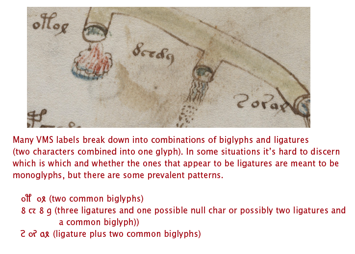
What Can Hands Tell Us?

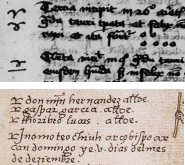
When I was creating a VMS transcript, I noticed immediately the change in handwriting partway through the big-plants section on folio 26r. It was not just scribal haste or fatigue—the spacing, rhythm, and slant were different, as were some of the letter forms. It was clearly the same style of writing (perhaps a blood relation of the original scribe?), but not the same hand.

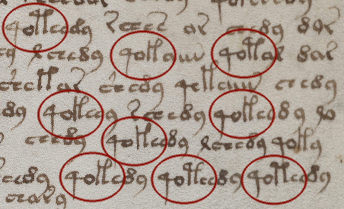
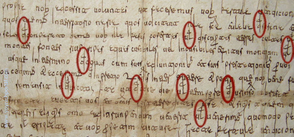
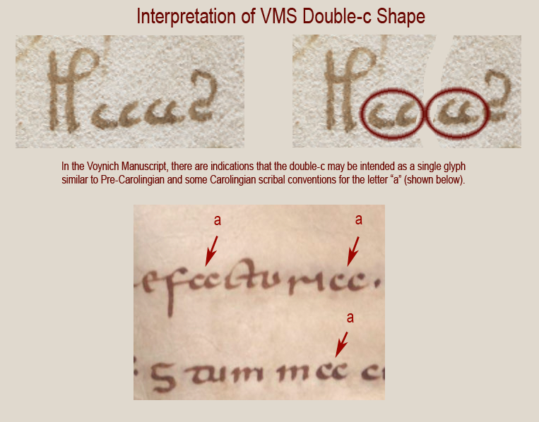
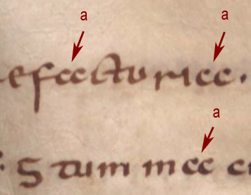
Interpretation of VMS glyphs is something I’ve wanted to write up for a long time but I wasn’t sure how to express it in a way that was sufficiently clear, until I realized the hand on folio 95v1 might help me illustrate the concepts.

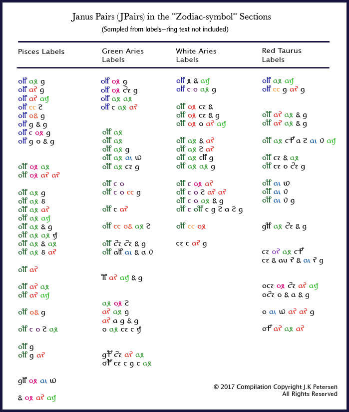
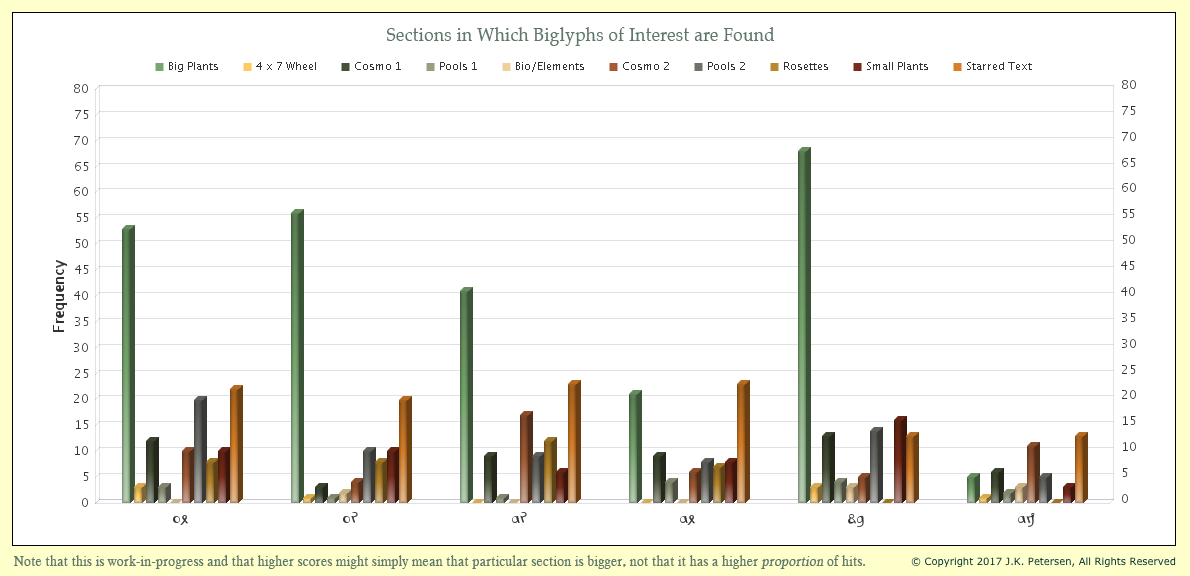
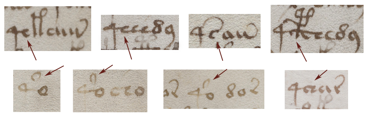
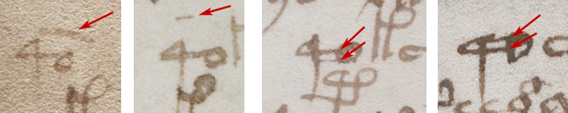
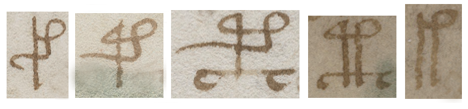
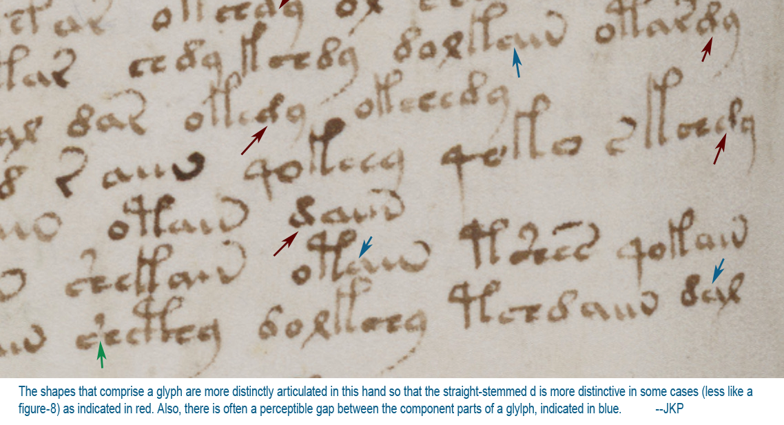
In the following illustration, there are several instances of EVA-d with a straight stem (marked in red), and certain glyphs with greater separations between their component shapes (marked in blue):

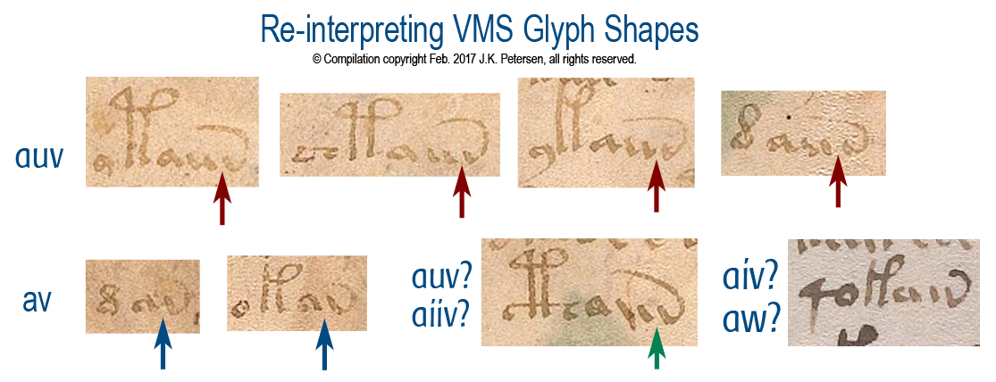
I have often wondered whether a rounded “d” and a straight “d” are different glyphs, and created two different characters in my transcript to record them. But I still treat them the same most of the time, as they seem to fall into similar patterns. But perhaps they are different. For example, when they are at the ends of words (which happens frequently when the d is paired with EVA-y), maybe the two shapes are meant to be read as two different endings. If this were Latin, for example, one might mean -us and the other -um, or one might mean -us or -um and the other might mean -bus. Or maybe there’s a completely different interpretation (that I’ll discuss later).

Another thing I noticed on this folio is the greater tendency of the scribe to separate the component shapes of a glyph. There’s a good example on the far right (marked with a red arrow) in which the first curve is clearly separated from the “is” shape (“is” is a Latin symbol that looks like a short cursive ell). The “is” shape occurs in EVA-m and gallows characters and sometimes the letters with “is” are written almost like short gallows, suggesting they might be related.

What Do Tails Tell?

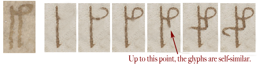
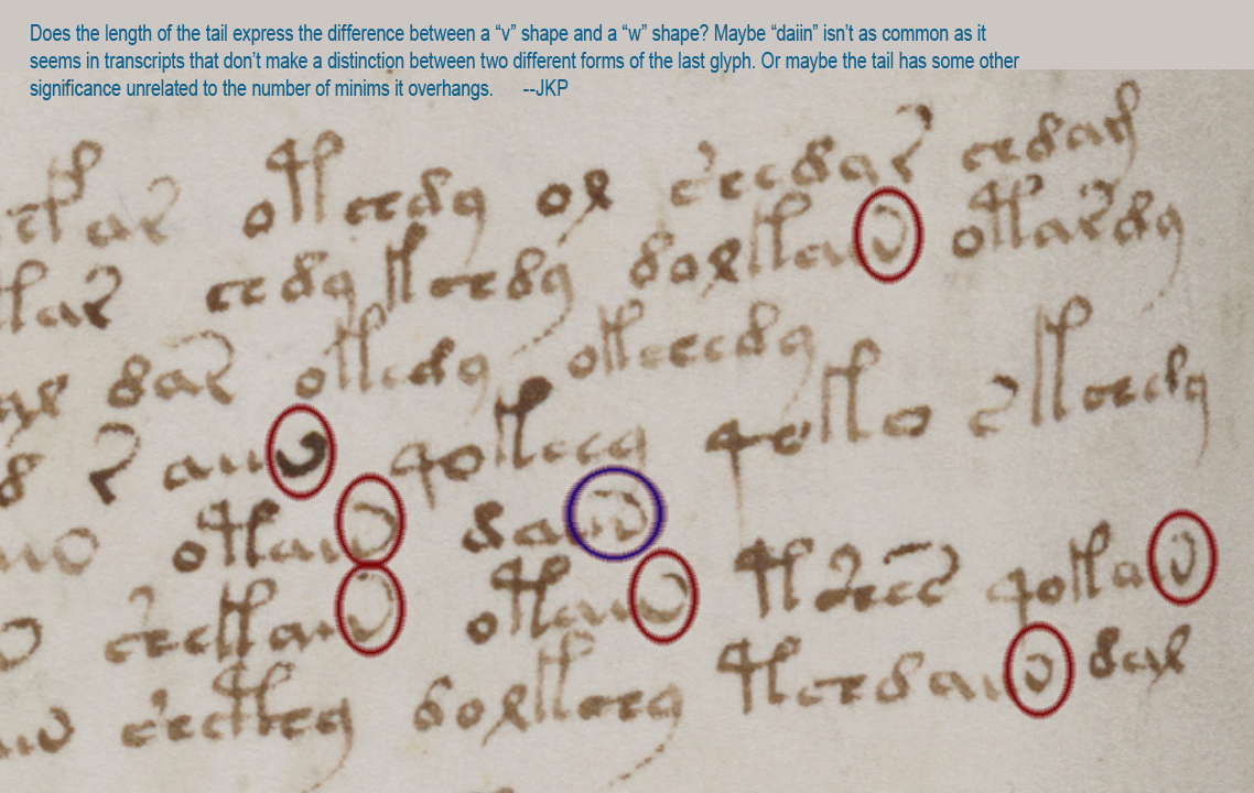
There’s another distinctive aspect of Voynichese that inspired me to create my own transcript and my own fonts. Notice how strongly the character normally referenced as “n” (in daiin) resembles a v or a w? This is how I transcribed them. But then how can you tell the difference between v or w if there are one, two, or more minims preceding them? This is something I pondered for a long time and I think the answer (at least for this scribe) might be the length of the tail. Notice how the tail loops back farther on the one that resembles “w”. I don’t know whether v and w are meant to represent two different characters, but I think the distinction between “n” and “v” in the transcript is important, as I’ll explain farther along.

Enumerating the Gallows

Some years ago, when I was looking up the history of pilcrows and gathering samples (which took a couple of years), I also collected examples of Greek and Latin abbreviations and number systems because many of them resemble gallows characters.

Early on I was insisting that almost all the VMS characters are based on Latin (with a few on Greek) and there was a lot of resistance to the idea (I got some “interesting” email). Quite a number of people disagreed with me, some rather disparagingly, and said I should be looking at Armenian or Georgian, or other script systems dissimilar to Latin because, as they said, “It doesn’t look anything like Latin.”

I have looked at those other alphabets (and many Asian scripts, as well) and still maintain that the majority are based on Latin character-shapes and abbreviation conventions, as I’ve noted in my blogs. But maybe things are changing. I’ve noticed a recent upswing in VMS “solutions” claiming that the text is Latin that needs to be expanded. Well, maybe, but I want to emphasize the fact that Latin characters and scribal abbreviations were used in many languages, not just Latin, so Latin glyph-shapes don’t automatically mean Latin language.

——=++=——

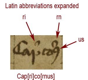
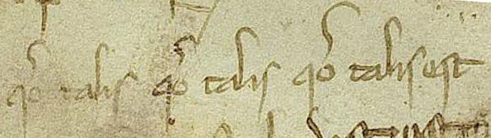
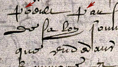
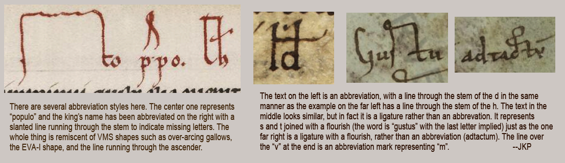
But to get back to similarities with Latin abbreviations, a horizontal line or slightly slanted line was commonly used in early Latin documents to signal missing letters (similar to an apostrophe). Here are some examples of abbreviations and ligatures (which are not the same thing and should not be confused with one another):

And now we get to the good part…

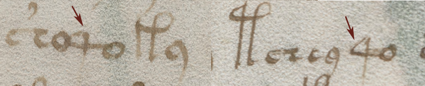
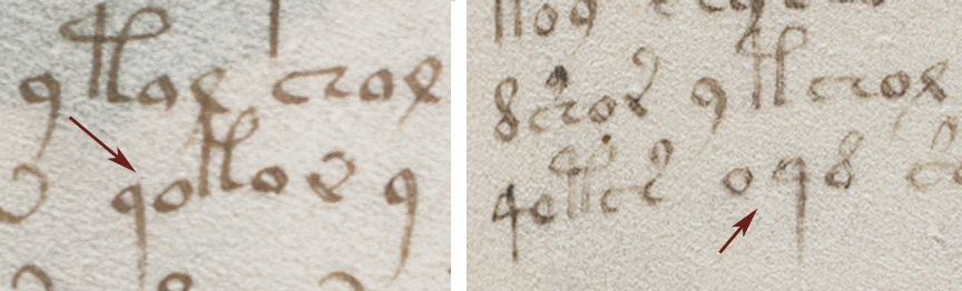
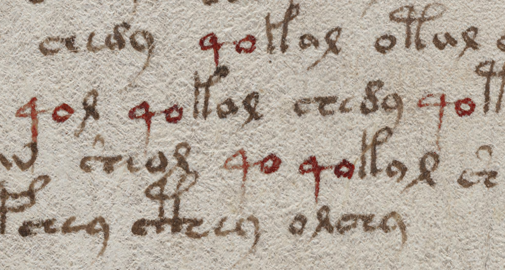
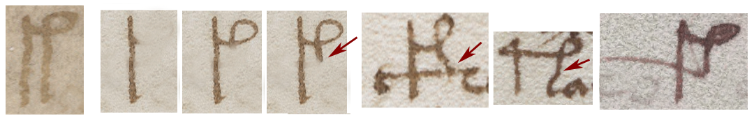
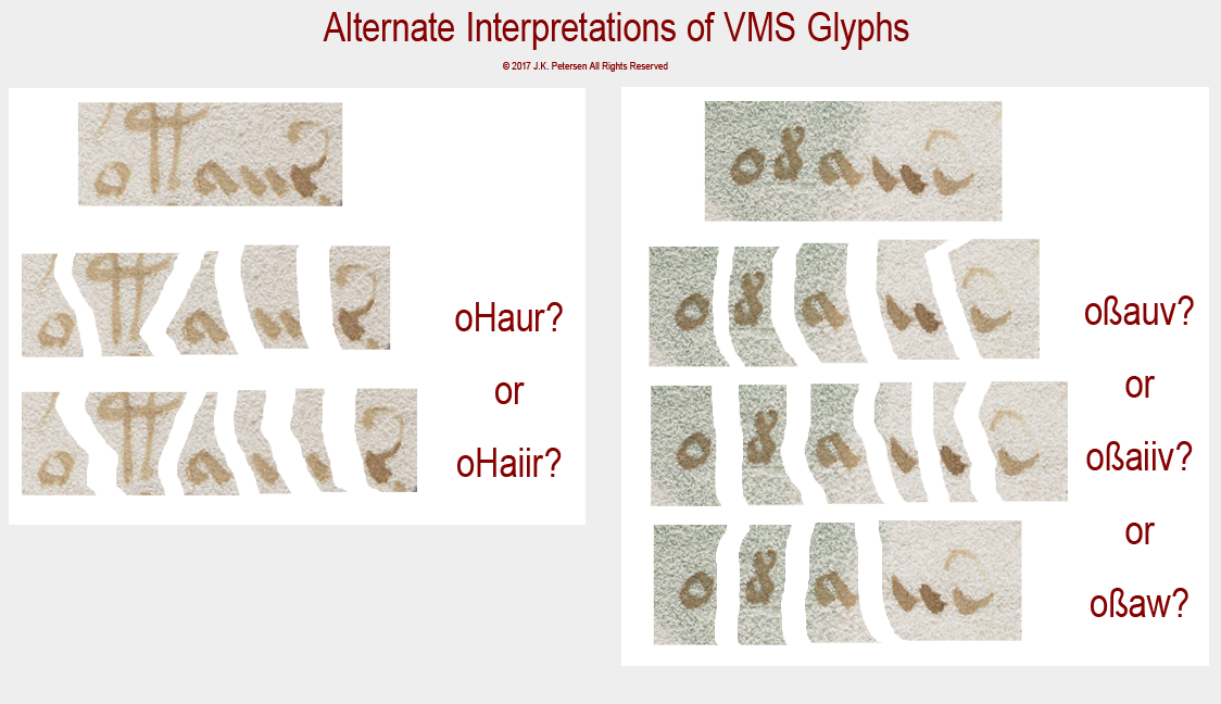
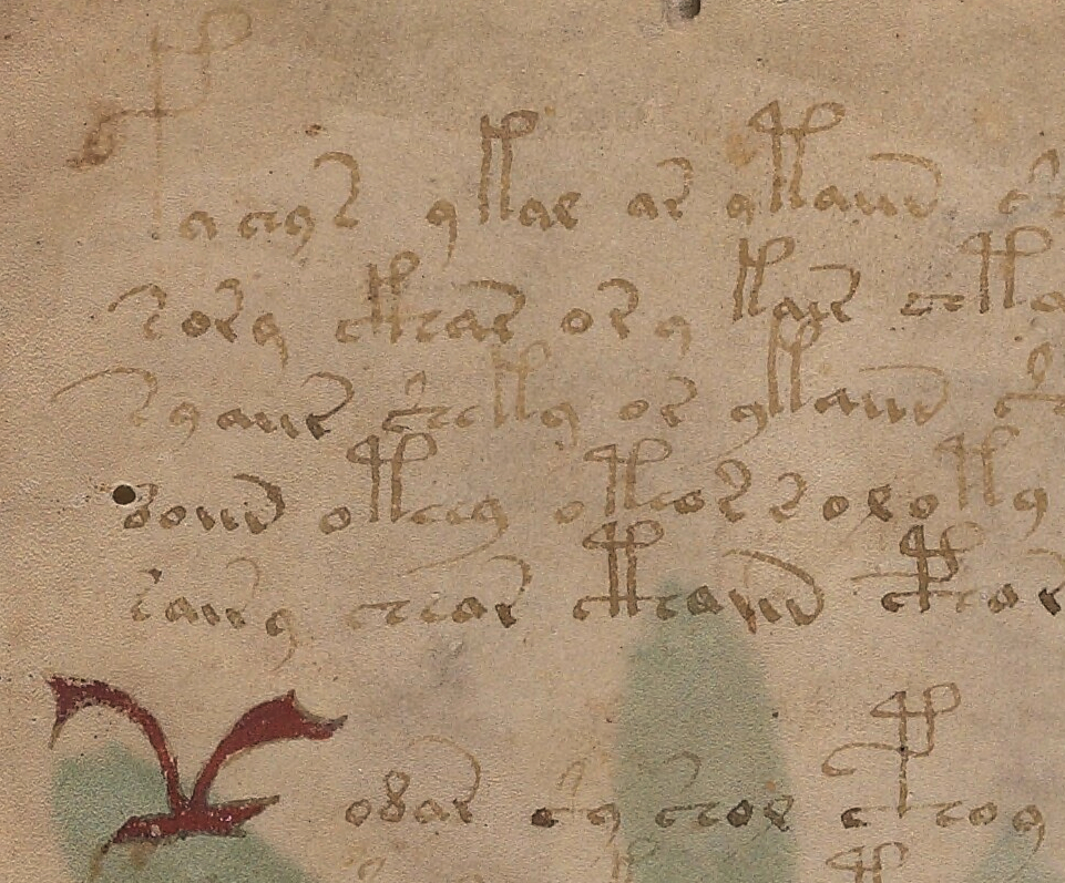
If you look at the first illustration again, where separations between individual parts of a glyph are more distinct, you might notice the Vword on the bottom-right, usually transcribed as “dal” looks suspiciously like the Roman numeral dcix (I was tired when I wrote this, this is 609, not 59). In my transcript, I have transcribed EVA-l as “x” for the simple reason that it looks more like a medieval “x” than “l” to me, but also because I noticed the similarity between Voynichese and Roman numerals early on and wondered whether there might be a connection.

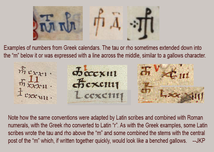
Greek and Latin Numerals and Their Relationship to Voynichese

Old forms of Greek, Hebrew, and Roman script did not have a separate set of glyphs to express numbers. Instead, they were written with letters. Over the centuries various conventions were used to mark them so they were not mistaken for letters.

In Greek, a line was drawn above or through the character to signify a number. In Latin documents that used Greek conventions, some numbers were expressed using Greek forms, some were in Roman numerals (sometimes with a line over them), and some were Arabic.

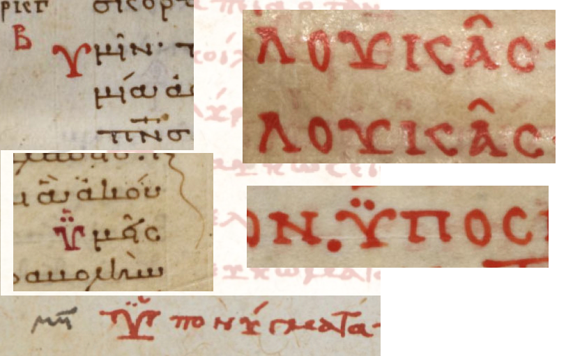
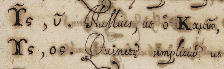
Here are examples of numbers from Greek and Latin manuscripts that may have inspired the benched gallows characters in Voynichese. Note also that if you’re not a paleographer and you came across the Greek examples (top row), without the Latin examples I’ve added below them for comparison, you might be mystified as to their meaning:

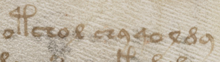
Look at this excerpt from 95v1 one more time, paying particular attention to the characters in the bottom right. Note how the separated “a” glyph makes the token look like dcix (609) in Roman numerals.

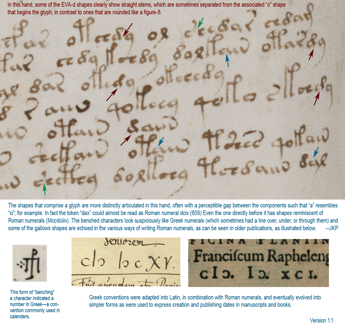
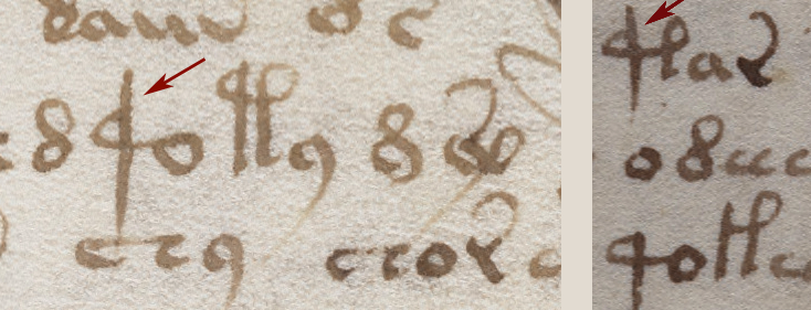
In fact, the text directly preceding “dax” looks very much like http://ukadventureracing.co.uk/category/bloggers Mccdciiiv, which isn’t quite conventional, as two would usually be indicated with “ii” rather than “iiiv” and you wouldn’t normally place a dee between the three cees, but what if the tail is the common Latin abbreviation for a line over the letters, which was sometimes written as an attached tail to facilitate quick writing? Then you get http://toastmeetsjam.com/category/at-home/page/2/ Mccdciiii—still not quite conventional, there’s still the problem with the ccdc, but notice that the cc is benched.

Hmmm, could the bench on the cc (EVA-ch)… possibly mean it belongs on either side of the preceding “M”? Maybe what we are looking at is cMɔ dciiii (with a tail over the iiii to indicate a number), as it is in the illustration above. This can also be written with a pipe symbol as follows: c|ɔ dciiii as it was often written in the 15th century and onward.

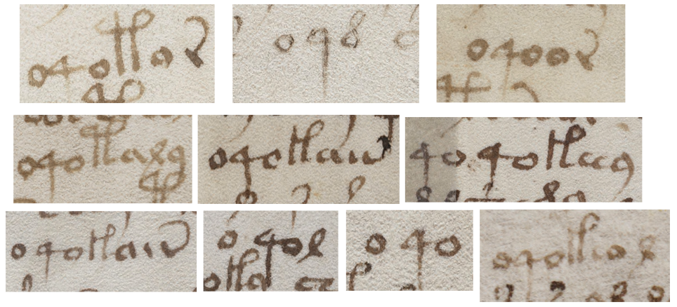
The d-“aiin” token comes in many flavors. It’s not always preceded by “d”, it can be preceded by almost anything, and the number of minims after the “a” shape ranges from 0 to 4. If the stem of the “a” is also a minim (if a is ligature c + i), then it ranges from 0 to 5 or 0 to 4 plus “v” (Roman numeral 5) depending on whether one interprets that last glyph as a “v” or as an “i”-with-a-tail to indicate a number.

Inspiration for Shape and Structure

Is Voynichese numbers? If it’s numbers, do they represent letters or sounds? Or is Voynichese a coding system that includes a subsystem for numbers?

If you take your mind out of linguistic mode for a few moments, and pretend the text is Roman numerals (even if it isn’t), do you notice that you see it differently? Have you made assumptions you didn’t realize you were making?

——=++=——

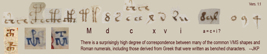
As I’ve posted in many blogs, the glyphs are based on Latin letters and abbreviations, but they look to me like they’re based on specific Latin characters that have a high correlation to Roman numerals.

Roman numerals consist of M d c l x v i (sometimes scribes lined up several “i” characters instead of combining them with v), sometimes c-shapes were placed on either side of the M, sometimes a line was drawn over or through the letters. All of these are hauntingly similar to aspects of Voynichese.

Notice how the characters that are benched resemble tau and rho, the two characters placed above “m” (which was sometimes written as a bench in both Greek and Latin). In Greek, a rho looks like a “p”.

Even the EVA-r glyph might not be an “r”—it might be an “i” with a tail (as it was written in Latin).

Except for EVA-o, -y, which are suspiciously frequent compared to natural language frequencies, and EVA-q, which is very positionally consistent, almost all the common VMS glyphs bear a strong resemblance to M d c x v i and benched forms of  tau, rho and M + c. Note also that EVA-o and y are variations on circles. Maybe EVA-o, y, and q are some kind of markers.

Or maybe “o” stands for zero (as in 1408) or is another form of “c” (depending on position).

The Voynich characters are positionally constrained. So are Roman numerals. If you put a “d” in front of a “c” it means something different from “c” in front of “d” (600 versus 400). Maybe Voynichese does this too.

Summary

The VMS might not be Roman numerals, it might not be numbers, but there is a strong similarity between Voynichese glyphs and Roman numerals.

There is also a strong similarity in how Voynichese prioritizes glyph order. Whatever system is behind the VMS, I think Roman numerals, at least on the conceptual level, had something to do with the way Voynichese was designed.

Perhaps other people have mentioned Roman numerals in connection with the Voynich Manuscript, I don’t know (it seems like a reasonable supposition and I’m still comparatively new to the Voynich scene), but I haven’t seen anyone demonstrate a connection between benched numbers (Greco-Roman glyph conventions) and the bench characters in the VMS. Nor have I seen anyone provide a cohesive explanation of how VMS glyphs may have been historically and pictorially inspired by a system like Roman numerals, so hopefully this will add something new to the VMS corpus.

———————-=++=———————-

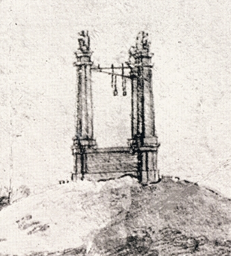
Before I close, I have a little bonus… It’s a secret where I found this (at least for now), but here’s a little medieval “pen test” that you might enjoy.

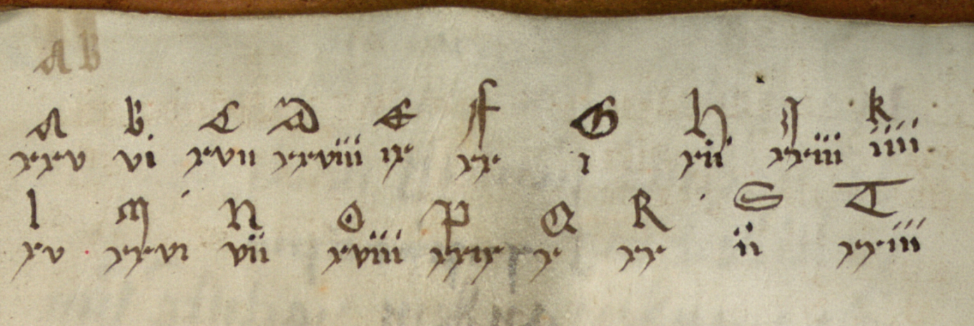
Note that only three characters are needed to represent the whole alphabet, except that one might need a few nulls to separate the individual “letters” and to obscure the fact that they are Roman numerals so it won’t be too easy to break. Imagine what it would look like if you did that?


J.K. Petersen

© 2017 Copyright J. K. Petersen, All Rights Reserved


Janus Pairs

16 September 2017

The Theme of Duality

You may have noticed pairing in the VMS… double crayfish, two sheets each of “Aries” and “Taurus”, 2 x 2 sets of 17 on the page that looks like a code wheel, but have you looked for pairing in the text?

In a previous post I introduced a group of glyphs I call The Gang of Four (if you haven’t read it, I strongly suggest it or this followup blog won’t make much sense). The Gang of Four is a subgroup of glyph-pairs that occur with great frequency within Vwords, and can also stand alone. Together with other glyphs with similar properties, I refer to them as Janus Pairs (or JPairs for short).

Janus was the god of duality. He presided over beginnings and endings, doorways and passages. I like the analogy of Janus Pairs opening a window into the structure of the text.

Unlike English and many other languages, VMS glyphs cannot be shuffled in a multitude of ways to create a large pool of Vwords. Certain glyphs are found only in certain positions. This is true even if you evaluate them in pairs, which means the VMS is more positionally rigid than syllabic Asian languages, as well.

But pairs there are, and they form a disproportionately high percentage of letter combinations in Voynichese, with some interesting differences in where they are used.

The Prevalence of Janus Pairs

I cannot fully describe the dynamics of Janus Pairs in one blog or two, any more than one could describe the dynamics of English in one blog or two, but I can introduce them so you can visualize the patterns and make sense of follow-up articles.

Before posting examples, please be aware that I’ve spent years trying to discern which are pairs and which are monoglyphs (or ligatures). This is not easy (if it were, it would have been done a long time ago), but some can be confirmed by following them through the entire manuscript and noting where they fall in relation to other glyphs. It took me a while to figure out how to present them so the patterns could be readily seen.

The Gang of Four is an example of prevalent pairs that can be either free-standing or joined to other words, but it’s important to look at all the JPairs. Unfortunately, it’s not practical to post all of them, so I have selected examples from two sections.

Examples

The first group is from the “zodiac” section. There isn’t room for all the zodiac symbols, so I selected four as examples and chose only the text from the labels (not from the text inside the double rings). If this subject interests you, you can look at transcripts yourself to work out the others.

The second group is from the big-plants section. I’ve chosen two plants near the beginning, and one farther along.

Obviously, to understand the text, you have to analyze and compare all sections and all the Vords on each page, and I have spent years doing this and still have some unanswered questions, but the following charts should be enough to get the concepts across. Note that I have chopped three of the less common Pisces labels from the bottom of the chart, mostly to save space, but also to put the emphasis on the ones that are most prevalent and most illustrative of patterns. This doesn’t mean the three deleted Vords are unimportant.

I have color-coded pairs to make them stand out because I’ve seen so many decryption attempts that don’t take them into account. These charts are not designed to reveal the meaning behind the text, that is best done by organizing them in several different ways and placing them side-by-side on a very long table. Their purpose is to illustrate

  • fundamental positional patterns,
  • pair composition,
  • pair frequency,
  • order of glyphs within pairs,
  • and differences between the text in two different sections of the manuscript.

So here is the first set of Janus Pairs, from the zodiac section:

I’ve collected samples of text in a number of languages to compare to these patterns (which is another long subject, possibly too long for a blog).

Here is the second chart, with examples from the big-plants section (note that a few Vords are chopped from the bottom of the first column due to space constraints).

You can immediately see that they differ in form and content from the zodiac-symbol vords but that there are structural similarities in where glyphs appear in specific vords (note that I am not certain aj is a Janus Pair, it can sometimes be oj and may be two separate glyphs).

Summary

Even though these are only small excerpts, there is much information to be gleaned from them.

Note the overall differences between zodiac Vords and plant Vords. There is a high prevalence of ot and ok combinations in the zodiacs. In the plant section, one sees many Vords starting with EVA-ch, -sh, or d and few of those that are common in zodiacs. If EVA-ch is a ligature then it may also qualify as a pair.

These patterns are prevalent enough that it’s possible to make a few predictions about where vords are likely to appear in the manuscript. You can’t do it from these charts alone (although some of the patterns are more obvious than others), but it’s possible when all the tokens in the manuscript are evaluated together.

Note also that there are priorities in terms of glyph placement. An “o” glyph paired with EVA-l, -t or -r, for example, behaves differently from one that isn’t combined into a pair group. This might be one of the reasons the o-glyph is so frequent, and also suggests that some glyphs may be intended as monoglyphs or ligatures—their status may be determined by their position and relationships to other glyphs, which might explain the strict positional rules.

VMS text is highly structured, not at all random, and there is substructure within individual sections. As to how it relates to natural languages, I’ll discuss that in a future blog, after you’ve had time to digest this one.


J.K. Petersen

© Copyright 2017 J.K. Petersen, All Rights Reserved


The Gang of Four

9 September 2017

I’ve wanted to blog about VMS biglyphs for years, and have alluded to it in several blogs, but simply couldn’t figure out a lucid way to illustrate the patterns. Recently, I came up with an idea that might make it easier to explain.

Some Brief Background

I’ve already written about how the EVA-y glyph appears frequently at the ends of Vwords and sometimes at the beginning, a pattern very prevalent in medieval Latin. In Latin, this glyph is based on the number 9 (to distinguish it from the letter g) and usually represents -um or -us at the ends of words and con- or com- at the beginnings of words (see example right). Thus, a single glyph can be expanded in at least four ways, and its meaning known by context.

The apostrophe, shown here as a curved “cap”, similar to the cap in EVA-sh in the VMS, can also be written as a short line, a long line, or a squiggly line and can represent one, two, or many missing letters.

If Voynichese were meaningful (and somehow encrypted), and if some of the VMS glyphs are meant to be abbreviations, it would affect both frequency and entropy calculations and would not be readable using one-to-one substitution codes. Attempts to expand the abbreviations using software algorithms would be challenging, as well, if one considers that the medieval apostrophe could stand for almost anything, was not used consistently, and wasn’t always placed above the area where letters are missing.

Also, it’s important to keep in mind that Latin abbreviations were used in all major western languages, not just Latin, and their meaning adapted to common patterns for each specific language.

There have been a number of Voynich “solutions” lately that claim the text is abbreviated Latin (an idea that has been around for a long time). It’s important to keep in mind that Latin symbols do not automatically mean Latin language, just as Cyrillic characters don’t automatically mean Russian. Many languages are written in Cyrillic, including Mongolian, Bulgarian, and Ukrainian.

The Fearsome Foursome

In the process of trying to discern whether Voynichese is intended to be expanded and whether certain glyphs behave in specific ways that might reveal whether they are letters, abbreviations, or modifers/markers, I’ve been studying a group of glyphs that stand out as different.

Note that this article is not about abbreviations, it is about a set of glyphs I call The Gang of Four. The above note about abbreviations is a necessary preamble to explain why a fifth glyph-pattern that superficially looks like the other four doesn’t necessarily belong in the same group.

Also… all the following charts and numbers are based on my own VMS transcript, so there may be small statistical differences compared to other transcripts, but the overall concepts still apply.

First, before I go into detail, try this little experiment, it makes it easier to see the patterns.

• Take the two paragraphs on folio 1v.

• Do some search-and-replace and remove all the commas, spaces, line breaks (but not the paragraph breaks) so you have two long continuous lines of text. You should end up with something that looks like this (this is my “easy-read” VMS font but you can do this with a transcript character set or with the EVA Voynich font):

• Save a copy of the processed text so you can use it again, it sometimes takes a couple of go-rounds to get used to seeing the pairs.

• Now remove the following characters (I have specific reasons for choosing these characters): EVA-ch, EVA-sh, EVA-d, EVA-s, EVA-q, and whatever follows the “ai” in aiin or daiin (depending on the transcript, this may be one, two, or three characters), and EVA-q.

Now your text should look like this:

Take the beginnings of paragraphs with a grain of salt. There may or may not be pilcrows that behave differently from other glyphs depending on their position.

Starting after the first glyph in the first paragraph, walk through the text and add spaces so you are breaking it into pairs with the exception of “air” which is to be treated as a triglyph. Consider a benched-gallows to be a pair. You will notice the paragraph breaks fairly naturally into pairs except that there is an extra “o” once in a while.

Do the same thing for the second paragraph starting after EVA-Po (can you see why?). Again, treat “air” as a triglyph.

If you pay attention to the glyph pair patterns, you get something like this. Once again, it breaks down fairly naturally into pairs except that there are a few extra “o” glyphs (as in the first paragraph) and occasionally the gallows k or t stands alone.

These are the same pair patterns I pointed out in a previous blog but I realized later that I should have colorized them to make them easier to see:


I’m not sure of the significance of the extra “o” glyphs that sometimes occur between pairs, but I suspect that the o-glyph, when not paired might be a null or modifier (I am not certain of this, but there is a very high proportion of o-glyphs, and other glyphs like r or l or a do not show this propensity to appear in between common pairs).

Positional Flexibility and Doubled Letters

If you’ve studied the VMS glyphs individually, you’ve no doubt noticed that their positions are very constrained and that doubled letters are uncommon. And yet, even after removing seven glyphs, if one evaluates the processed text in terms of biglyphs (and perhaps a small number of triglyphs like “air”), then there are enough pairs to make a full alphabet. The peculiar lack of doubled letters in the VMS, and the positional rigidity changes when the text is evaluated this way.

I’m not suggesting this is a solution to the VMS or that the glyphs that were removed have no meaning. I’m using this as an exercise to focus eyes on certain important patterns that exist within the text that seem to be frequently overlooked and which change the dynamics of text breakdown and their statistical properties to a considerable extent.

So why did I choose seven specific glyphs to remove? Mostly to remove visual clutter to emphasize the glyph pairs, but also because I believe the ones that were removed may be ligatures (two shapes combined) and thus function as pairs on their own. That EVA-ch may be a ligature is suggested by its behavior and also by the gap that occurs between the left and right sides on folio 1r. Benched gallows characters are more obvious candidates for ligature-biglyphs and do appear to behave as such, so I left them in for this example.

Of the seven excised glyphs, EVA-y might be a special case. It doesn’t behave like the others. I strongly suspect it was added to make VMS superficially look like Latin and, of all the characters in the manuscript, if there ARE nulls, this one should definitely be considered.

Statistical Studies

If the VMS is constructed from biglyphs rather than monoglyphs, then many of the existing computational attacks would be irrelevant. I’ve been studying the biglyph-patterns almost since I first saw the VMS, but finding ways to describe their existence, their behavior, and especially their significance has been a challenge… which brings us back to the Gang of Four.

There are four biglyphs that form a statistical cluster and a couple that look superficially similar but behave a little differently. These biglyphs stand alone or act as part of other VMS tokens. Note, this is not a full chart of all two-glyph Vwords, there are several more, but these are ones that occur most frequently with spaces on either side and which can also be attached to other Vwords. Note also that if some of the deleted glyphs in the example above are confirmed to be ligatures, to represent two glyphs with one shape, then at some point, they must be evaluated in conjunction with these.

As can be seen from the chart, ox, or, ar, and ax cluster at the top in terms of how often they appear independently (with spaces on either side). They can be at the beginning, middle, or ends of Vords, indicating positional flexibility that is absent from monoglyphs when they are evaluated individually. I would have liked to include EVA-ot and -ai on the chart because they follow soon after those illustrated above, but for visual clarity, decided to exclude them for now.

The Voynichese snippet mixed in with the other text on folio 116v is from this group, as are many of the VMS labels.

The odd combination of EVA-dy, in the fifth position on the chart, is almost always at the ends of Vords, and with suspicious frequency, more than one would expect with natural languages. I am reserving judgment on this pair, but feel that it may be a null calculated to make the VMS text resemble Latin or a generic syllable intended to be interpreted in a variety of ways (and yet still calculated to look like Latin).

The second odd combination of EVA-am sometimes appears in several positions in Vords but is most often at the end and very frequently at the end of the line and thus behaves quite differently from the first four pairs and somewhat differently from EVA-dy. It is less often attached to other Vords than the previous five.

These patterns can be seen in many of the VMS labels.

Significance

It is tempting to think that The Gang of Four might be vowels, as vowels are the most commonly used letters in many languages. Vowels can sometimes stand alone (depending on the language) and could conceivably have been crafted for the VMS from four combinations of two glyph-shapes to make them easier to remember or recognize when writing or deciphering the text.

Testing this idea is harder that one might expect (which is one of the reasons I haven’t posted about it sooner). One has to decide whether all the characters are biglyphs or just some of them, and whether the others are ligatures or monoglyphs.

It’s also important to have some sense of whether the spaces are real or contrived and one has to figure out if the text has been abbreviated. If it has, could this group of four glyphs be the anchor around which the rest of the text is crafted?

Vowels aren’t really necessary for text to be comprehensible. Mst ppl cn fgr t txt wtht vwls and many languages were originally written without vowels. What else might cause four biglyphs to share certain commonalities in shape and behavior?

Can we find out more by looking at where they appear in the manuscript?

It may seem as though individual glyphs are more prevalent in certain sections, but keep in mind that the big-plants section is extensive and the amount of text on unillustrated starred-text pages is considerable, so it is natural that they would show up more often on these folios. However, it’s interesting to see the consistency with which the first four show up throughout the manuscript and how they differ in overall balance from the last two.

It may be noteworthy that ax occurs less frequently on the big-plant pages than the previous three and that EVA-dy, despite its relative frequency, is very infrequent on the rosettes foldout compared to the first four other five. I’m not even sure that EVA-dy is a biglyph. It might be a ligature plus a null.

I have much more information on the structure of the text but that’s probably enough for one blog. Once you begin to notice these pairs, they  jump off the page and you really can’t help wondering if Voynichese is synthetically constructed.

J.K. Petersen

© Copyright 2017 J.K. Petersen, All Rights Reserved

That Funny 4 Glyph

This article describes the odd glyph that resembles the number “4” (EVA-q). It’s odd because the “4” shape wasn’t prevalent in the late 1300s and early 1400s. It was a transitional period when many scribes were still using a character that looks like EVA-l to represent the number 4 and a few were still using Roman numerals.

That’s not to say that the VMS “4” is a numeral, I’m simply pointing out that this particular shape, with a sharp angled corner, wasn’t a common choice to represent a letter or a number when the VMS was created. Nevertheless, I believe it has its roots in Latin.

[Note: This is the more complete version of some images and commentary I posted on the Voynich.ninja forum a few months ago describing the glyph known as EVA-q. Even this is not the complete story, as there are statistics to go with the images, but it’s far too much information for one blog, so this article focuses on possible origins of the shape.}

How 4 Manifests in the VMS

The 4 glyph makes its first appearance on folio 1v, and from that point is frequently at the beginning of word-tokens and is followed by “o” about 90% of the time. The VMS is so regular in its construction, it would be tempting to think the other 10% are transcription errors, but the 4 has some interesting properties that suggest these are choices rather than errors. But first, here are some examples of the 4o combination, since it is most prevalent. Note that it is usually at the beginnings of Vwords.

But not always, a 4o can show up in the middle or at the end.

It’s often assumed that “4o” functions as a unit (and perhaps it does), but 4 is not always accompanied by “o”. The following examples show that 4 can be followed by other glyphs, such as a “c” shape, a “c” with a tail, a bench character, a benched gallows character, or the “cap” that represents missing letters in Latin. As further examples, the 4 can also be followed by a benched gallows (f103v) or an “i” (f106r), and 4o itself can be followed by “o”.

Both 4o and 4’o can stand alone—they don’t have to be attached to other Vwords. Note also, in the above and below examples, that a Latin abbreviation mark is sometimes associated with 4o. In the above example, the symbol is curved, but it is sometimes written as a straight macron-shape rather than a curved one, and occasionally there is a mysterious extra line connecting the two glyphs (might this be a hidden macron, or a combination with a different meaning?).

Whether two different abbreviation symbols have the same or different meanings depends on the scribe. Some were quite precise in the way they represented missing letters, others used whatever was convenient to the hand (or their imaginations).

The 4 is frequently followed by “o” (at the beginnings of Vwords), but they are not necessarily a combination—”o” sometimes precedes 4, or is sometimes combined with another 4o.

A “4” By Other Names

This glyph is often called “q” because some have interpreted “4o” as “qu” (it is also mapped to “q” on the EVA system but this keyboard position was not intended to impose meaning on the glyph). Sometimes the 4-shape has a soft connection rather than an angular one, making it look more like “q” than a “4”. Note that the pic on the right has a sharp-angled “4” on the same line as a soft “4”. Sometimes it’s indistinguishable from a “q” (assuming this is EVA-q and not EVA-y—sometimes it’s hard to tell).

There is more than one way to interpret the variation in the loop of the “4” glyph. Perhaps the soft-4 and the sharp-4 have different meanings, or perhaps they don’t, just as a “p” sometimes has a loop that connects and sometimes doesn’t, but means the same thing.

There is more than one character directly associated with 4. Sometimes the 4 is attached to a glyph that resembles the letter ell or the Latin “-is” abbreviation. This combination strongly resembles a mini-gallows character with a descender. The resemblance is so strong, you have to wonder if there’s a connection between EVA-q + “-is” and EVA-k, either in terms of glyph origins or meaning. Or is this a way to hide two consecutive gallows characters? It’s hard to test an uncommon combination—there aren’t enough instances to know if it behaves in the same way as 4o.

Common Patterns

When 4 is combined with o, it frequently precedes a gallows character and the gallows character frequently precedes a or c shapes. I’ve described this rule-like characteristic of Voynichese in past blogs.

Note that 4o is usually in front of the H-like gallows, not the P-like gallows. Note also that some of these are soft-4 and some sharp-4 and yet, at least superficially, they appear to behave in the same way.

Interpretation

If the VMS were Latin, then 4’o (4 and o with a straight or curved macron) can be interpreted in a number of ways—there’s no specific rule for how to expand the abbreviation symbol and there was quite a bit of variation in how scribes drew these squiggles, curves, and lines, but there were some general guidelines.

For example, a “squiggle” like the one found on the first page of the VMS is often interpreted as “er”, “ir”, “re” or “ri”, but even this symbol is sometimes used for other letters. Thus, in a medieval manuscript, one would look at neighboring words (in this case talis and est) to determine whether q’o represents “quero”, “quo”, “questo”, or “quomodo”.

You might also notice in this example of 15th-century cursive that the “q” shape isn’t round, it’s quite angular, almost like a VMS 4, but it was less frequently written this way.

Does This Mean the Voynich Manuscript is Latin?

Many have tried to translate it as such, it’s one of the most commonly claimed languages in VMS history, but most attempts range from shaky to bad, and sometimes they are really bad (I’ve only seen one that strikes me as a reasonable effort and that’s the one by Yulia May). So far, we only know that the glyphs are Latin, not that the language was Latin. Latin scribal conventions were common to many languages, including Greek, French, Spanish, German, Italian, English, Bohemian, and Scandinavian. The shapes by themselves do not reveal the language—they are adapted to represent common linguistic patterns in that language. Thus, a sign that means “-us” in Latin could potentially be used to represent “-en” or some other common ending in German.

In fact, we still use this system in English. The letter “w” with a line over it or a swooped-back tail is an abbreviation for “with” in the same way that an “a” with a swooped-back tail represents “aut” or “autem” in Latin.

So Where Did the 4 Shape Originate?

It’s possible that the VMS 4 is simply an invention, that no particular precedent inspired the shape. Or maybe the idea came from noticing quirks in the handwriting of certain scribes. As an example of how the “p” was sometimes written in medieval times, notice how the loop in this example is almost completely disconnected from the stem—it almost looks like 4o.

It’s tempting to think this might have twigged the idea for the VMS 4 glyph but, based on the way the abbreviations symbols are associated with 4o, I suspect the true inspiration might be another Latin abbreviation.

The 4 Glyph With and Without Ascenders

Note how the following VMS glyph resembles a 4 and appears to behave as a 4 when it precedes an o, but has an extra-long ascender-like stem. The VMS scribes were clearly familiar with Latin scribal conventions, but one still needs to consider whether this is scribal habit, a purely physical error, or a letter that started out as a gallows and got changed to 4. If it is a slip from Voynichese to regular Latin, does it reveal something about the glyph?

Unfortunately, there aren’t enough instances of the ascender4 to know, but we can take a look at other scripts to see if the shape was extant.

Historical Precedents

The VMS ascender4 reminded me of a sample of Visigothic text that includes a number of Latin abbreviations.

  • First note the macron in the shape of an old-style four (it looks like an x with a loop on top) near the end of line seven. It’s basically the same shape as EVA-l.
  • There is also a q with a long s-curve crossing the stem on the ninth line that can stand for various words including “quo”. A similar convention when applied to a p can turn it into “pre” or “pro” depending on whether the line is straight or curved.
  • There is a shape on the bottom that resembles a backwards gallows P that has various meanings depending on the time period. It can mean -us or -rum and is sometimes similar to a pilcrow except that it marks the end of a paragraph rather than the beginning.
  • There is an ampersand on line six near the beginning that can stand for “et” (as in Latin “and”) or for the two letters e and t if used as a ligature.

These are all common abbreviations. But the one of particular interest, circled in red, is one that matches the shape of the VMS ascender4. It can be attached to many different letters and is usually at the ends of words.

This character is comprised of a c-shape that loops over a long vertical stem. The loop is sometimes sharp, like a 4, or soft, like a q. The sharpness of the loop does not change the meaning of the symbol. Here it is primarily attached to “q” or “l” but it can be used in many different ways.

Typically the shape represents “-us” (which eventually evolved into a “9” shape or an apostrophe in later medieval manuscripts), but it can stand for other common endings that can be discerned by context, including “-uibus”. If it has a small extra loop on the top right, it can also mean “per” (which was later written by placing a line through the stem of a p rather than extending the top).

It’s possible this abbreviation inspired the shape for the VMS ascender4 and possibly also the 4.

Assuming there is meaning behind the VMS text, this symbol could potentially be expanded into a variety of letter patterns. In Latin it typically represents an ending, but it could just as easily be used as a prefix. Or, alternately, perhaps it does represent an ending and Voynichese is read right to left, even though it has been written left to right. Whenever I examine the text, I always try to scan it in both directions and not make too many assumptions about direction.

Summary

Taken individually, it would be difficult to determine the exact origin of a glyph, but when the VMS characters are studied as a whole, a strong pattern of Latin letters and abbreviations emerges. I haven’t had time to write up all the glyphs yet, I’m adding them as I can make time, but I have found abbreviation origins for almost all of the more peculiar-looking glyphs—and they trace back to Greco-Roman scribal conventions.

I don’t know if the ascender4 is based on the abbreviation-glyph illustrated above (or even if ascender4 and 4 are related), but it might be, so I thought it worth providing an example. If it is, then there’s still the challenge of figuring out whether the shape is simply a shape, a character (alpha or numeric), or something intended to be expanded into additional letters.


J.K. Petersen

© Copyright 2017 J.K. Petersen, All Rights Reserved


Sense or Non-Sense?

In Nick Pelling’s Cipher Mysteries blog, he commented on the challenges of parsing VMS text and creating transcripts, and specifically noted:

“… a big problem with entropy studies (and indeed with statistical studies in general) is that they tend to over-report the exceptions to the rule: for something like qo, it is easy to look at the instances of qa and conclude that these are ‘obviously’ strongly-meaningful alternatives to the linguistically-conventional qo. But from the strongly-structured point of view, they look well-nigh indistinguishable from copying errors. How can we test these two ideas?”

This is indeed one of the challenges in transcribing and understanding Voynichese. Our perception of the structure of the text will be skewed unless one can sort out, to a reasonable extent 1) the exceptions/rare forms, 2) handwriting variations, and 3) copying errors, from what may be meaningful text, so that relevant variations are acknowledged and artifacts filtered out.

The Characteristics of EVA-qo

The subject of EVA-qo was touched on in my previous blog, in which I posted a variant 4o image that shows a possible “component” relationship between “qo” and glyphs with ascenders. Prior to that I expressed uncertainty about identifying when EVA-qo functions on its own and when it functions as a pair (I suspect that pairs and singles may function according to priorities), but more examples are necessary to cover the topic in depth.

Glancing through the VMS, one will notice that “4o” is a frequent combination. In the following clip, which I chose arbitrarily, one sees several examples of 4o within the space of a few lines. One stands alone (which happens more often than one might think), the others are at the beginnings of V-words. Notice how some have sharp points and others are rounded. Most of them connect to the following glyph:

How does one determine if the 4 and o are intended as a paired glyph, or whether it is simply a common combination such as “qu” in English? Do the sharp and rounded corners have any significance? or the connected/disconnected characters? Note how 4o is frequently followed by an ascender glyph, except for EVA-qol. EVA-ol is one of the combinations that may function as a pair, in which case one has to ask whether 4 can function as a “single” when followed by a pair, according to some rule of precedence, as was noted in the discussion of pair patterns.


At first glance, it might appear that 4 is always followed by “o” and always falls at the beginning of a word. In fact, 4o can occur at the ends of words and occasionally in the middle.

Many characters can follow the 4, including a common Latin abbreviation symbol (which is sometimes straight, sometimes curved). Here are some examples:

It’s also fairly common for 4 to be preceded by o or 4o, and 4o4 and o4o sometimes stand alone:

The o4o words appear mainly in the plant, pool, and starred-text pages, with one in cosmology and one on map rosette #1. There are none in the zodiac or small-plant pages.

Some variations differ much more than those with straight or rounded connections, as in this example that I’m reposting from the previous blog. It has an extended stem and, below it, a variant that is followed by an “l” shape rather than “o” such that the glyph bears a strong resemblance to a 1.5-legged ascender:

To show this in context, note how a shift in position determines whether this combination looks more like 4o or a 1.5-legged ascender glyph. This isn’t drawn like a malformed 4o or oddball gallows glyph, this looks deliberate, but notice how it falls immediately before ascender glyphs or one that is a common pair, a position typical for 4o:

When EVA-q is followed by a form that looks like a cursive ell, it resembles a 1.5-leg double-looped ascender, except that it is positioned as EVA-q would be, as descending below the baseline.

The 4 glyph doesn’t only resemble the left leg and loop of an ascender, sometimes it is difficult to distinguish a rounded form of 4 from a straight-leg form of EVA-y, both of which look like a Latin “q”.


And Now to the Numbers

The 4 glyph makes its first appearance on folio 1v (the second page, as the VMS is currently bound), paired with “o”, with a line above it. If this were Latin, the line would indicate missing letters in much the same way as we use an apostrophe.

On folio 2r, “4o” becomes more numerous and precedes a variety of glyphs, with ascenders being the most common.

On folio 5r, something interesting happens. There is a unique word on the 6th line (EVA-qokeeey), but if you remove the 4o, it appears as a unique word, without the 4, on another large-plant page (folio 49r) and, without the 4o, on plant page 50v. Similarly, unique word qoToldaiin (folio 4v), without the 4o, appears as a unique word on folio 67r1.

It’s been suggested that unique words are names, but if they were names, wouldn’t someone have decoded them by now? And would so many names, differing only in the first one or two characters, appear on seemingly unrelated pages? If they are names, such as names of plants, wouldn’t they show up elsewhere in the manuscript, rather than being unique? It’s typical of medieval manuscripts to be extremely repetitive, especially if they include recipes, charms, or classification systems—the same names appear with great frequency, especially if they are common ingredients.

I haven’t seen any successful attempts to resolve unique tokens into natural language in any consistent or generalizable way, so maybe they aren’t words. Perhaps they serve a nonlinguistic function. Assuming the spaces can be believed, and they are indeed unique, is it possible that a certain class of word-tokens represents a medieval rendition of pointers, patterns that relate one data location to another?

Variations

The “4o” words are not all unique, some are quite common. For example, qokaiin occurs more than 300 times, mostly on the plant, pool, and starred text pages—it does not appear on the zodiac or rosette pages, which argues against random generation of the text. The 4o words tend to appear only once on the zodiac pages, except for Gemini and Sagittarius, where they occur several times. A unique word on the Pisces page (qoTeeal) appears as a unique word without the q on 69v, a cosmology page.

Summary

If the VMS includes a network of relationships, then it’s essential to determine if the glyph variations are meaningful and whether the spaces are real or contrived. As an example, is the unique word qoToldaiin, on plant 4v, related to the component words qoTol,daiin  that appear next to each other on folios 19v, 21v? The first one has a sharp-4 and an ambiguous space. The latter two, have sharp-4 and very clear spaces.

I have much more information on individual glyphs, but this is more than enough for one blog. I’d like to close with a suggestion that “confidence levels” for certain variations be documented in some way (for example, a pointed or rounded q might not be significant, but q with a high ascender is sufficiently different that it might), and a strong suggestion for structuring VMS transcripts to include Quire X, Side X, Folio X in the explanatory sections for each folio. That way, when looking at glyph variations and V-word relationships, it’s easier to see if similarities and differences are tied to physical proximity.

J.K. Petersen

© Copyright 2017 J.K. Petersen, All Rights Reserved

On the Gallows

VMS characters with ascenders have some interesting properties beyond their frequent appearance at the beginnings of paragraphs. Unfortunately, the seemingly simple task of selecting the most representative shapes and slotting them into a grid took far longer than I expected and this blog languished in “draft” status for several years. I did manage to post a preliminary assessment of whether some of the glyphs might be pilcrows, but did not go into depth about the glyphs themselves because I wanted to discuss that in a separate blog as follows…

Interpreting the Text

My perception of VMS glyphs differs substantially from one of the more popular transcripts created by Takeshi Takahashi. So much so, that I ended up creating my own rather than using any of the ones that were extant. I wanted to correct a number of errors, add the labels, and allow for the possibility that certain variations might be meaningful rather than the result of scribal variations. What follows is not just a collection of glyphs with differing shapes—it’s the result of a long process of trying to statistically differentiate variations that are meaningful from those that are not.

The “Gallows” Characters

As mentioned in previous blogs, most of the VMS glyphs can be traced to Latin characters and abbreviations, with a few that are derived from Greek, but there are some tall glyphs that are sufficiently different to modern eyes that they have been dubbed “gallows characters”. Not everyone is happy about the “gallows” moniker, so I’ll mostly refer to them as VMS glyphs with ascenders. Here is a sample of some common shapes. Note that some have one loop and some have two:

The VMS ascenders are not entirely alien. If they are ligatures (more than one character joined to create a cohesive shape), then the two-legged variety (right) resembles the Latin abbreviation for “-tis” or “Item”. The “P” shape could come from anywhere. A “P” shape is common to many alphabets, including Greek, Latin, Armenian, Cyrillic, and others, but I suspect that a rational design process may account more fully for the VMS “P” than any particular alphabet, an idea that I’ll describe below.

The Takahashi transcription recognizes four basic kinds of ascenders, the single-leg glyph (left), the double-leg glyph (right) and the double-looped version of each. Added to this are “benched” versions of each of the shapes—those that have a crossbar near the base that connects glyphs on either side. These are designated in the transcript with an uppercase “Z” that follows the character for the basic form, which is not a bad way to do it, since it allows for searching both the benched and unbenched varieties, and uses a shape that is easy to remember as the rotated Z somewhat resembles a crossbar.

Others have noticed that the crossbar does not always connect on both sides and have tried to account for this in various revisions of the EVA fonts.

Discerning Intent

I would like to propose that this appealingly simple classification scheme utilized in the Takahashi transcript may be wrong. When you really study them, there’s more to the ascenders than meets the eye and pen variations may, in fact, be meaningful.

Those who are familiar with Hebrew and some of the Malaysian scripts, already understand that subtle differences between characters might change their meaning. The swoop of a tail, the presence of a dot or tick mark that is high, medium or low, or the length of a crossbar, represent different letters or syllables. I think some of these variations may also exist in the VMS characters, but one cannot judge solely on shape, one has to look at the distribution and position of the glyphs, and the way they are written by different scribes.

Before discussing this in depth, I’d like to point out some morphological similarities between the two more distinctive ascenders. Note how the two-legged ascender resembles a one-legged ascender whose drawing was interrupted before the second leg was finished:

If you are skeptical that this may be the basis for the “P” shape, consider examples 5 and 6 below, in which the “interrupted” leg is clearly visible, a glyph that is neither a single- or double-leg, but one that is in between:

In the images that are second and third from the right, note how the second leg does not always reach the baseline or swoop back in a tail. The leg second-right is attached to a c-shape, a combination that occurs less ambiguously in other parts of the manuscript. This suggests the shapes might be ligatures, rather than individual characters and that the 1.5-legged glyph may be a component in its own right.


There’s more to this 1.5-leg idea that might surprise you…

Take a look at these 4o glyphs (EVA-qo) that have a long stem that rises up above the leading c-shape (not all 4o glyphs have a rounded head, some are very sharp, but these are all round). Then look at the shapes below them that are constructed the same way but are followed by an “l” shape rather than “o”.

Did you notice how this “4o” variant on the second line below resembles a 1.5-leg gallows? The main difference is that the shape on the left is a descender rather than an ascender. If it were shifted upwards, it would be interpreted as a 1.5-leg gallows without an additional letter or crossbar, but it superficially resembles 4o because it appears at the beginning of V-words and is mostly below the baseline. The long-stemmed “4” may be distinct from other glyphs identified as EVA-q:

I don’t believe the various theories that there are microscopic encodings in the VMS, based on incredibly tiny variations in shapes—I’ve seen no convincing evidence that this is so. I do however, believe that some of the more overt differences that might be meaningful have been overlooked and might make the text look more repetitive than it actually is.

The Case of the Curly Tail

Something I’ve wondered since I first examined the VMS is whether the curled tails on ascenders and other characters are meaningful. In Latin, a curled tail on the letters “i” or “r” are significant. They indicate abbreviations such as “er/ir/re/re” and sometimes “us/um”. On a “P”, they differentiate between “pro” and “per”.

Some scribes even control the shape of the tail to differentiate between “er” and “ir”. You’ll notice in the self-similarity example above that the far-right glyph has a distinctly curled tail. The one in the picture below is clearly straight. There are some that are slightly ambiguous but most of them can be differentiated as one or the other.

Does the difference matter in the VMS? I suspect it does. Curly tails appear more often on ascenders that are in key positions, such as the beginnings of paragraphs or places where one might expect a capitulum, but it’s difficult to know from position alone whether this is their function. Most of the midline ascenders do not have curled tails. This is not the way “per” and “pro” behave in Latin. They are liberally sprinkled throughout the text, with “per” being a bit more common than “pro”, but not excessively so, so it appears that the VMS glyphs are similar to Latin in shape but not necessarily in function.

Notes About the Chart

What follows is a PDF file with one possible configuration for studying and classifying VMS characters with ascenders, based on variations that may distinguish one from another.

  • As far as I can tell, the length of the tail is not significant, except possibly when it touches the baseline on a standalone glyph, or the bottom of the stem on a combination-glyph.
  • The shape of the tail (straight or curved) looks like it might be significant.
  • There appears to be some consistency in the way the connections are made on one-legged ascenders. The top-left connection might be significant. The bottom right corner, where the tail is attached, is sometimes sharp and sometimes rounded, but this connection doesn’t appear to be significant, as far as I can tell.
  • The characters that connect to the crossbars on “benched” characters are quite variable and the variation appears deliberate. The straight benches do not appear to be corrupted c-shapes. They might represent EVA-i, or EVA-r without the tail.
  • The combination glyphs appear to be a gallows character combined with lowercase glyphs or two gallows glyphs combined, perhaps as a way to put two together without setting them next to each other. It’s my feeling that combination characters differ from embellished ascenders, but I am not certain yet.

This is a preliminary chart, subject to revision. You can click on the link under the thumbnail to download the PDF file:

VMSAscenderChart092

(New chart uploaded June 3, 2017, with one error corrected. June 4, 2017, Gap bar moved next to Touch bars.)

                                                                                                                                   J.K. Petersen

© Copyright 2017 J.K. Petersen, All Rights Reserved

Two of This or One of That?

One of the difficulties in creating a transcript and analyzing textual patterns in the Voynich Manuscript is the ambiguity in some of the characters. When this occurs in common words, it makes it more difficult to assess glyph relationships and frequencies.

A simple example might illustrate this problem. I mentioned in my previous blog that I believe the paired c-shapes are meant to be read as one character (in most instances). There is also a single c (EVA-e) which may occur next to a double-c, to create three in a row. When there are three in a row, how does one decide whether it’s three cees, a double-c following to a single-c, or a single-c following a double-c?

In this example, I’m leaning toward the VMS glyphs (top) being two double-c shapes because of the slightly larger gap between the two pairs and the way the cc behaves in other parts of the manuscript, but I’m not 100% sure because the two latter cees are more tightly written than the first two. Is this normal pen-variation or are the first two cees single cees followed by a double-c?

Sometimes all we have to go on is slight differences in the spaces between characters and that’s not a good way to do it—there will always be some uncertainty, which is one of the reasons I feel it’s important to study the rule set and possible pairing paradigm for the VMS. Then the context can help us determine which glyphs are intended as ligatures and which might function as pairs.

The Devil in the Details

Unfortunately, ambiguity exists in one of the most common VMS word-tokens, one that is popularly called “dain”. I don’t use the EVA font-set, I developed my own based on shape designations, but you should be able to see the correspondence in the following illustration fairly readily.

In this example, there is ambiguity in the straight shape that alternately resembles a double-i or possibly a “u” as it was often written slightly separated, with straight legs, in the middle ages. I use a “v” and sometimes a “w” to describe the ending shape with a tail but I make no assumptions about what these shapes mean or whether the swept-up tail indicates an abbreviation, as it would in classical Latin, or whether it is an embellished glyph designed to look like Latin, just as the “9” shape (EVA-y) morphologically and positionally follows Latin conventions:

To complicate matters further, there are places in the manuscript where there is an additional stroke between the a-shape and the swept-up tail, one that Takahashi (and perhaps other transcribers) sometimes missed.

Summary

A fresh transcript is needed, and not just a “corrected” transcript that makes better assessments of the spaces (I’ve noticed errors in which glyphs with clear spaces around them have been attached to nearby words), but one in which all the glyphs are included, even ones that “look funny” because there are so many in a row, along with consideration for alternate interpretations for ligatures (combined glyphs) and paired glyphs.

I created a transcript that corrects some of these problems, but it’s not a stand-alone file. I’ve integrated it with a set of self-made VMS fonts and applications so that the whole thing is an interdependent set of tools that can’t really be split apart as they currently stand.

I can make some suggestions, however. When I created my fonts, I put the VMS characters in the upper register and the regular characters in the lower register as they are usually typed on the keyboard, so that it’s seamless to combine VMS and regular characters in the same document (handy if you’re writing an article about the VMS). This also allows comments to be added to the transcript that don’t interfere with searches of the VMS glyphs. Unicode standards have plenty of space for this, and it’s not difficult to come up with mnemonic references to the shapes to make it easier to type. I also set up glyphs that are similar such that they can be searched together or separately. Adding a symbol to the glyph is usually a better overall solution than putting each variation of a basic form in a different font-slot, a point that I’ll discuss more fully in my next blog.


                                                                                                                                   J.K. Petersen

© Copyright 2017 J.K. Petersen, All Rights Reserved

Construction of the Voynich Manuscript Text

28 May 2017

In previous blogs, I gave quick examples of the rule-dependent way in which Voynich Manuscript glyphs are combined (it’s far beyond the scope of a blog to define the entire rule-set, so I used a single page of text as an example and have been working on a long paper that describes the overall manuscript more fully). I also pointed out some of the more common atomic units, as I think of them.

Since that time I’ve been trying to think of a way to make these patterns and relationships easier to understand.

Hopefully this visualization method can illustrate why computational and linguistic attacks that assess individual glyphs may not yield fruitful results. The VMS has very particular ways of combining glyphs that affect not only which ones appear next to one another with greater frequency, and in what order, but also controls word-length in unique ways.

  • Note, as mentioned in the diagram below, a VMS double-c-shape (adjacent EVA-e glyphs) appears to function as a single unit in much the same way as a double-c shape in Carolingian script (right) represents the single letter “a”.
  • Certain glyphs, like EVA-d and EVA-s appear to function as single glyphs unless paired in very specific ways (with certain glyphs in certain positions, such as EVA-dy at the ends of words).
  • Note the prevalence of combinations like EVA- or, ar, oI, 4o, ly, che, sho, and ey. These pair-syllables, in various combinations with glyphs that function as singles, characterize the entire manuscript, including text in labels and wheels.
  • Note also the difficulty of assessing whether 4o is intended as separate glyphs or as a pair (in some tokens, it could be assigned either way and there are a few other combinations with this characteristic). I have included examples of both possible interpretations of 4o-tokens in the following illustration with the caveat that I am less sure of the 4o- breakdowns than most of the others.

Despite the difficulty of distinguishing singles from pairs with complete accuracy, I think these short examples come close and may help illustrate how the VMS text differs from common natural language patterns and patterns evident in medieval ciphered texts, and especially why one-to-one substitution systems have so far been unsuccessful.

Consequences

Also, give some thought as to how paired glyphs affect entropy and word length…

Paired glyphs greatly increase the number of letters or sounds a system could potentially represent. For example, if you had only o, a, r, and x, and placed them in a grid as pairs, your four glyphs could yield 16 pair-glyphs plus the four original glyphs to represent 20 letters or sounds. There aren’t as many combinations as this in the VMS, because glyph order is deliberately restricted and it’s not practical to put mirror pairs next to each other as they are hard to distinguish without extra spaces, but even so, the concept applies—entropy increases

As to word length… the VMS word-tokens are already short compared to natural languages, but if some of the glyphs are paired, word-length decreases further. If one is looking for letter or sound correspondence in text that has a large number of paired glyphs, then it’s more likely that they represent syllables, fragments, or abbreviations, rather than full words.

So, enough discussion… here are two examples that I grabbed arbitrarily. They’re short, but hopefully long enough to get the ideas across.

You can click on the image to see it full-sized  (you may have to click again when the new tab opens to read the small print):


Postscript (after getting some much-needed sleep): I hope it is apparent from my previous comments that these are examples, not a definitive breakdown. In the illustration, I have broken down the “4o” words and some of the “9” words (EVA-y) in both ways to show both possibilities—with the 4 and 9 as singles and as pairs, because there is evidence elsewhere in the manuscript that both are possible interpretations. Some pairs (the common ones) are much more consistent and discernible than 4 and 9 word-tokens and I have a long list of stats for some of the more consistent pairs.

The distinction is important because pairs and singles may have different classes of meaning. For example, in Latin, the 9 character (which frequently functions as a single in the VMS, except when paired with EVA-d and possibly EVA-e) expands into prefixes like con- and com- and suffixes like -us and -um, which brings up the question of whether pairs might represent letters and singles might represent abbreviations, as were commonly used in medieval scripts, or (another possibility) whether they were intended to be differentiated in some other way, such as singles representing nulls, modifiers, or markers and pairs representing something else (letters, sounds, or concepts). Note that the singles are often at the beginnings of paragraphs and word-tokens, and also sometimes form one-glyph word-tokens. It is further possible that the high preponderance of “o” glyphs (particularly those in the first position) might be evidence of a pairing process intended to make tokens come out in a certain way (with a particular pattern or length).

All this assumes, of course, that the VMS text is meaningful, something that has not been proven. The pattern of pairs and singles could just as easily have been devised to make it easier to write meaningless text that looks like syllables and abbreviations. I still have a certain cautious optimism that there is meaning behind the text and will post another blog soon that explores some of the details of gallows characters that haven’t yet been discussed.

                                                                                                                                   J.K. Petersen

© Copyright 2017 J.K. Petersen, All Rights Reserved

The Origin of the Voynich Glyphs

The Search for the VMS Glyphs

Researchers have speculated for decades about the origins of those funny letters in the Voynich Manuscript.

When I first encountered the VMS, I recognized most of the shapes from medieval scribal traditions, but I couldn’t read the text, so I combed the world’s archives for examples of other alphabets that might have inspired the glyphs, hoping it might yield clues to an underlying language. Along the way, I discovered certain shapes are found in many scripts—loops, circles, snake-shapes, or sticks with a loop or two, seem to naturally occur in diverse regions. Shapes that look like p, s, g, and ell are particularly common.

In the end, after years of pouring over hundreds of languages and dozens of alphabets, I came back to where I started. The Latin alphabet and scribal abbreviation conventions can explain almost all the VMS characters. I already knew this, but sometimes you have to look around to appreciate what you already have.

I’ve mentioned the Latin origins many times, but I’ve noticed there is still a certain skepticism, and I’ve never posted examples of the entire alphabet due to the enormity of the task (I have thousands of examples and severe time constraints). So, I’ve decided to post it in installments rather than trying to fit it all into one very long paper that might never get finished.

Organizing the Glyphs

Most people are not familiar with Latin paleography, so I will try to include as many original samples as possible from medieval manuscripts.

Most of the VMS glyphs fall into four categories:

  • Latin letters,
  • Latin numbers,
  • Latin ligatures (two or more shapes combined for ease of writing), and
  • Latin abbreviations.

Some glyphs can be classified in more than one category. For example, in medieval script, the Greek sigma is sometimes used as a terminal-s in Latin scripts and is sometimes drawn with the last stroke looped so that it resembles a figure-8. This shape is hard to categorize unless one knows by context whether it is a letter or the number 8. Since the VMS lacks context (the text has not been decoded), I have assigned some glyphs to more than one category (e.g., letter and number, or letter and abbreviation). More on this later when I sum up the individual characters.

A number of Latin glyph-shapes are borrowed from Greek. Sometimes they mean the same thing and sometimes the shape has been adapted for other uses, as will be illustrated in today’s blog.

The Big Red Weirdo

I thought I’d start with one of the iconic shapes in folio 1r, sometimes known as the “bird glyph” or the “seagull” or simply as a “big red weirdo”. This shape is used only once.

The big red weirdo somewhat resembles a bird with a vertical squiggle between the “wings”. I usually call it the seagull glyph.

We learn in primary school that letters have more than one version, and are taught to write both upper- and lowercase letters. In most ancient scripts, there was no distinction between upper- and lowercase, but sometimes the beginning of a paragraph or line would be adjusted for aesthetic reasons or to call attention to something of importance by enlarging the letter, using different colors, or by adding lines, curves, or other embellishments.

The seagull glyph without the squiggle can be found in old languages that use the Greek character set (a variation of it can be found in Arabic, but much less often). It is not always drawn with the line underneath, but the line is used in certain writing styles or sometimes to create emphasis, as in these examples. Note the double dots above some of the letters. A Latin squiggle doesn’t have the same meaning as Greek dots, but the dots show a precedence for the position of a squiggle in later Latin documents:

These examples are from leftmost columns of new paragraphs (left) and from header text written for emphasis (right). Just as capital letters sometimes have extra strokes to make them stand out from lower-case letters, the Greek letters, such as ypsilon, sometimes had an extra line on the base to give them emphasis. In Coptic Greek this shape (without the dots) represents the letter Ue and, depending on the handwriting style, sometimes the letter Djandjia.

In Latin, the seagull shape usually represents a V, but sometimes it retains one of the Greek meanings. Note that dots have a variety of meanings in Greek. In some cases they are associated with the character (pronunciation or abbreviation), in others, dots can mean that the copied text diverges from the original, a convention that is also used in Latin.

The Seagull Tradition

Latin was a required language for medieval scholars and many also studied Greek, so it’s not uncommon for Greek conventions to show up in Latin texts. Sometimes they mean the same thing in Greek and Latin, and sometimes a shape is preserved but used for different purposes. In some cases, two conventions are combined, as will be seen when I discuss the squiggle.

You might have noticed that the seagull shape, when written as it is above, resembles the symbol for Aries. The Aries symbol is ubiquitous in Latin texts on astrology and astronomy, but the Greek convention is sometimes also used to mark paragraphs in texts not related to astronomy. You might notice that the “seagull” shape also somewhat resembles an open book, when the line on the bottom is extended. This, in combination with the way it is used in some Greek texts, might have inspired its use as a pilcrow in certain Spanish documents.

In the above examples, the shape that resembles the Greek letter is used to mark passages in a 15th-century Latin manuscript on astrology, and a 16th century New World document by Spanish missionaries. The shape underwent some minor changes, but its use as emphasis or a topic marker was retained.

This manuscript combines Greek and Latin, and the character can be seen both with and without the squiggle. Note that symbols above letters in Greek do not have the same meanings in Latin. Greek pronunciation symbols, for example, were not carried into the Latin writing traditions but the use of symbols as abbreviations was prevalent in both traditions.

In Latin manuscripts, a seagull shape usually represented the letter V or the letter V plus additional letters. If a squiggle was added, it was almost always an abbreviation. The example on the left is from the late 13th or early 14th century. The one on the right, from the 15th or 16th century.

What About the Squiggle?

The VMS character is embellished with a flame-like squiggle that sits vertically between the “wings”. This too is a Latin convention, a very common one. It can be drawn as a straight line, a slightly curved line, or a full s-curve, and it can be horizontal or vertical.

In old Greek, marks above letters are a combination of pronunciation symbols and abbreviations. In Latin, pronunciation symbols are rarely used and the symbols usually represent a number of abbreviations. You can think of them as specialized apostrophes, depending on their shape and position.

In Latin, the squiggle was particularly prevalent in the 13th and 14th centuries and it was usually drawn in the vertical direction to distinguish it from the shape that represents “n” or “m” which is straighter and almost always horizontal, but it didn’t matter whether an s-curve was horizontal or vertical, the meaning was usually the same—it stood for er, re, or ir or these letters combined with additional letters. In the illustration above, the word on the right is “versus”, with the squiggle standing in for “-er-“.

Sometimes if a squiggle had an extra wiggle, it stood for a degree of something or a series, as the “th” that is added to ordinal numbers. In this case, it was usually horizontal, but not always.

I don’t know what the seagull glyph signifies in Voynichese, but whether one considers it to be textual or an embellishment, the shape is not unusual, especially when it appears like this, at the beginning of a block of text.

Summary

It seems abrupt to end a blog on just one character, but it will take at least a dozen blogs to describe the whole alphabet and a dozen more to describe the relationships between them and their positions in the text (and that’s without going into the actual structure or meaning of the text). As will be seen from other characters, including the more exotic ones, whoever designed the glyphs was familiar with classical scripts and used Latin as the primary source of inspiration (or Latin conventions derived from Greek). This is indicated not only by shape, but by the design of the alphabet as a whole, and by position.

I’ll post examples of the other characters, including a discussion of their behavior, in future blogs.

J.K. Petersen

© Copyright 2017 J.K. Petersen, All Rights Reserved

Voynich Glyph Structure

This started as a comment on Nick Pelling’s Cypher Mysteries blog, where he posted some ideas on EVA-s. Unfortunately, my comment became far too long to put on someone else’s blog, and it was in need of pictures to support the text, so I have changed the focus and posted on a related topic instead.

Much attention has been given to daiin (and its relatives). This is a surprisingly frequent combination of glyphs in the VMS that has generated substantial discussion and statistical analysis. Whole papers have been written on what it might represent.

I have a fairly long list of possible interpretations, some of which I’ve posted (and some that I admit I’ve kept to myself), but in this blog I’d like to discuss something more fundamental and focus attention on the shapes that underly it.

Why I Rejected Existing Transcripts

One of the reasons I created my own transcript of the VMS text is because I interpret the shapes differently from the way they have been historically recorded. As I’ve mentioned in previous blogs, I don’t use the EVA alphabet either (it would complicate the process of searching for patterns)—I developed my own.

During this process, I chose -auv instead of -ain to represent the end of daiin. Here are some examples from folio 1r but note that even this has a caveat (there is one additional possibility that I will discuss below). Note the separation between the first two strokes and the “v” shape is more distinct than the first two strokes that resemble a “u”. You can click on the image to better see the gaps and connections:

Note how the gap between the “u” and the “v” shape is more distinct than that between the two stems of the “u”. Note also in the first two examples in the second row, that the “v” shape sometimes follows the “a” shape directly, and is separated in a way similar to “v” when it follows “u”, suggesting that the “u” is a glyph in its own right and is not necessarily an “n” shape as in historic transcriptions.

So, rather than transcribing daiin, I have been recording this pattern visually as dauv/dauw, etc. You might say, “So, what? It’s just a different shape for the same thing,” but it’s not quite as simple as that. Since the bottom right example suggests that even the “u” might sometimes be a single glyph and might at other times be two glyphs (a double-i shape), it opens up possibilities such as aiv/aiw/aiiw/aiuv/aiuw/aiiv, etc., which means there may be more variation in the daiin family than is apparent when using historic transcripts. The frequency counts are potentially all wrong.

You might still argue that the daiin shapes are positionally similar and thus less likely to vary as much as I’m suggesting (or that they might mean the same thing even if they do). That might be true if the spaces are literal, but if they are not, then the potential variations could be important to the interpretation of the text.

And Then There’s the Tail…

Yes, the tail—the upswooped shape on the end of the “v”…

These days, most swooping tails are embellishments added for aesthetic reasons. In early manuscripts, however, the upswooped tail was a convention to show that letters had been dropped from the end of a word.

We still occasionally use this form of abbreviation. For example, the words “with” or “without” are sometimes written with a line over the “w” or a slash between the “w” and “out” (w/out). This is a holdover from scribal conventions that are more than a thousand years old. Similarly, in the middle ages, in Latin, English, French, German, Italian, Czech, Spanish, and other languages, this back-sweeping tail stood for whatever ending was appropriate for that language and could represent one or several missing letters.

In the VMS, it is not known whether glyphs with tails, such as “v”, EVA-r, or EVA-s, represent individual units, multiple units, or whether the motivation for the tails is to make the text look like Latin.

Faster Your Seatbelt, EVA, It’s Going to Get Bumpier

Now hold that thought about tails, because this is where it gets gnarly (as is so typical of the Voynich manuscript)…

In Latin and other European languages, the “v” shape could be a “u” or “v” with a tail or, it could be an “i” with a tail. In other words, it might be “auv-something” or “aui-something” or, in the more ambiguous example on the lower right, it might even be “aiii-something”. If this were conventional text, the reader would know by context how to expand the swoop, or whether it were simply an embellishment.

Which brings us to a further wrinkle… if medieval conventions allow that the VMS “v” with a tail could alternately be an “i” with a tail, there is another aspect of the text that needs to be addressed, one I haven’t seen anyone mention yet…

If the glyph at the end of daiin is an “i” with a tail then EVA-r needs to be re-examined, as well. In terms of glyph design based on some internal system known to the scribes, it’s possible that the “v” is an “i” with a bottom-tail and EVA-r is an “i” with a top-tail. In fact, there are times when EVA-sh is written with a tail attached to the top of the crossbar (similar to EVA-s but without the right-hand part of the character) and sometimes to the bottom. This is more apparent in some hands than others.

Superficially, almost all the VMS glyph shapes can be traced to Latin and Greek (I’m still trying to finish my blog on this, but I’m nose-deep in examples that have to be sorted and inserted), but even if they are, it’s possible the relationships between the shapes are based on certain conventions unique to the VMS.

Some closing thoughts…

It’s true that EVA-d occurs very frequently before ai, but we have to keep in mind that more than a dozen other glyphs can directly precede ai, as well, including EVA-t and EVA-k (EVA-k more than twice as often as EVA-t).

It’s also important to consider one-to-many relationships—EVA-d is sometimes written like a c combined with Latin -is abbreviation, rather than a rounded figure-8. If it’s a ligature, it may stand for two units or something else.

I have more examples of glyphs that may not fit the assumptions made in historic transcripts, but I’ll save them for future blogs.

J.K. Petersen

© Copyright 2017 J.K. Petersen, All Rights Reserved