
http://iamlearningdisabled.com/i-am-not-temple-grandin-and-i-am-not-autistic/ This started as a comment on Nick Pelling’s Cypher Mysteries blog, where he posted some ideas on EVA-s. Unfortunately, my comment became far too long to put on someone else’s blog, and it was in need of pictures to support the text, so I have changed the focus and posted on a related topic instead.
http://offsecnewbie.com/wp-json/wp/v2/posts/"https:/bitvijays.github.io/LFC-VulnerableMachines.html Much attention has been given to daiin (and its relatives). This is a surprisingly frequent combination of glyphs in the VMS that has generated substantial discussion and statistical analysis. Whole papers have been written on what it might represent.
I have a fairly long list of possible interpretations, some of which I’ve posted (and some that I admit I’ve kept to myself), but in this blog I’d like to discuss something more fundamental and focus attention on the shapes that underly it.
Why I Rejected Existing Transcripts
One of the reasons I created my own transcript of the VMS text is because I interpret the shapes differently from the way they have been historically recorded. As I’ve mentioned in previous blogs, I don’t use the EVA alphabet either (it would complicate the process of searching for patterns)—I developed my own.
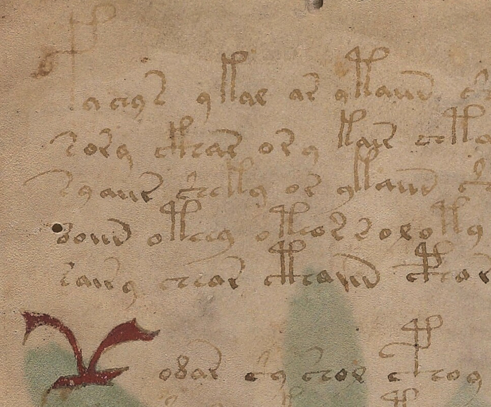
During this process, I chose -auv instead of -ain to represent the end of daiin. Here are some examples from folio 1r but note that even this has a caveat (there is one additional possibility that I will discuss below). Note the separation between the first two strokes and the “v” shape is more distinct than the first two strokes that resemble a “u”. You can click on the image to better see the gaps and connections:
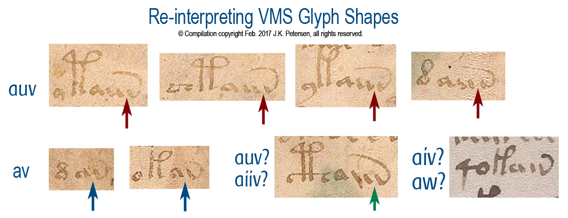
Note how the gap between the “u” and the “v” shape is more distinct than that between the two stems of the “u”. Note also in the first two examples in the second row, that the “v” shape sometimes follows the “a” shape directly, and is separated in a way similar to “v” when it follows “u”, suggesting that the “u” is a glyph in its own right and is not necessarily an “n” shape as in historic transcriptions.
So, rather than transcribing daiin, I have been recording this pattern visually as dauv/dauw, etc. You might say, “So, what? It’s just a different shape for the same thing,” but it’s not quite as simple as that. Since the bottom right example suggests that even the “u” might sometimes be a single glyph and might at other times be two glyphs (a double-i shape), it opens up possibilities such as aiv/aiw/aiiw/aiuv/aiuw/aiiv, etc., which means there may be more variation in the daiin family than is apparent when using historic transcripts. The frequency counts are potentially all wrong.
You might still argue that the daiin shapes are positionally similar and thus less likely to vary as much as I’m suggesting (or that they might mean the same thing even if they do). That might be true if the spaces are literal, but if they are not, then the potential variations could be important to the interpretation of the text.
And Then There’s the Tail…
Yes, the tail—the upswooped shape on the end of the “v”…
These days, most swooping tails are embellishments added for aesthetic reasons. In early manuscripts, however, the upswooped tail was a convention to show that letters had been dropped from the end of a word.
We still occasionally use this form of abbreviation. For example, the words “with” or “without” are sometimes written with a line over the “w” or a slash between the “w” and “out” (w/out). This is a holdover from scribal conventions that are more than a thousand years old. Similarly, in the middle ages, in Latin, English, French, German, Italian, Czech, Spanish, and other languages, this back-sweeping tail stood for whatever ending was appropriate for that language and could represent one or several missing letters.
In the VMS, it is not known whether glyphs with tails, such as “v”, EVA-r, or EVA-s, represent individual units, multiple units, or whether the motivation for the tails is to make the text look like Latin.
Faster Your Seatbelt, EVA, It’s Going to Get Bumpier
Now hold that thought about tails, because this is where it gets gnarly (as is so typical of the Voynich manuscript)…
In Latin and other European languages, the “v” shape could be a “u” or “v” with a tail or, it could be an “i” with a tail. In other words, it might be “auv-something” or “aui-something” or, in the more ambiguous example on the lower right, it might even be “aiii-something”. If this were conventional text, the reader would know by context how to expand the swoop, or whether it were simply an embellishment.
Which brings us to a further wrinkle… if medieval conventions allow that the VMS “v” with a tail could alternately be an “i” with a tail, there is another aspect of the text that needs to be addressed, one I haven’t seen anyone mention yet…
If the glyph at the end of daiin is an “i” with a tail then EVA-r needs to be re-examined, as well. In terms of glyph design based on some internal system known to the scribes, it’s possible that the “v” is an “i” with a bottom-tail and EVA-r is an “i” with a top-tail. In fact, there are times when EVA-sh is written with a tail attached to the top of the crossbar (similar to EVA-s but without the right-hand part of the character) and sometimes to the bottom. This is more apparent in some hands than others.
Superficially, almost all the VMS glyph shapes can be traced to Latin and Greek (I’m still trying to finish my blog on this, but I’m nose-deep in examples that have to be sorted and inserted), but even if they are, it’s possible the relationships between the shapes are based on certain conventions unique to the VMS.
Some closing thoughts…
 It’s true that EVA-d occurs very frequently before ai, but we have to keep in mind that more than a dozen other glyphs can directly precede ai, as well, including EVA-t and EVA-k (EVA-k more than twice as often as EVA-t).
It’s also important to consider one-to-many relationships—EVA-d is sometimes written like a c combined with Latin -is abbreviation, rather than a rounded figure-8. If it’s a ligature, it may stand for two units or something else.
I have more examples of glyphs that may not fit the assumptions made in historic transcripts, but I’ll save them for future blogs.
J.K. Petersen
© Copyright 2017 J.K. Petersen, All Rights Reserved