
Are There Pilcrows in the Voynich Manuscript?
substantively 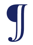 In the last article, I diverged from the Voynich theme to illustrate a brief history of the symbol we know as the pilcrow. I realized the article would be too long if I tried to tackle both the history of the pilcrow and its relevance to the VMS in one go, so this is a continuation of the previous blog.
buy modafinil canada online What does a typographical symbol have to do with the Voynich Manuscript? Maybe nothing. The VMS has enough space on most pages to visually separate the paragraphs, and yet there’s something odd about the behavior of the tall glyphs, popularly called “gallows characters”, a clue that might be important in interpreting the text.
The Duplicitous Gallows
 The first time I looked at the Voynich manuscript, I noticed a tall shape that looks like a Greek pi with a loop (or two loops) and one that looks like a P were often at the beginning of paragraphs. Sometimes they are embellished with extra loops that appear to be more decorative than meaningful (although that is not known for certain).
At the time, I knew very little about medieval scripts, nothing at all about capitula (although I was familiar with pilcrows from word-processing programs) and I further didn’t know that capitula could occur in the middle of a line, as well as at the beginning of paragraphs.
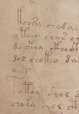
What I did know was that the VMS had been called a “cipher” manuscript and I noticed immediately that the gallows characters at the beginnings of sections would sometimes alternate (see Folio 3r as an example), so I entertained the notion that different gallows chars signaled a different encryption method, or perhaps a paragraph that required a different decryption key. It hadn’t occurred to me yet that the explanation might be simpler.
After paging through several of the VMS scans, it became apparent that gallows characters weren’t always at the beginning of paragraphs and didn’t all behave as pilcrows—some of them were midline and too close together to reasonably expect them to signify a new section.
This pattern prompted me to do some research on paragraph markers and I discovered capitula (section markers often used to separate units smaller than a paragraph) and noted that the C-shape in old manuscripts served two functions—it could represent a capital C or it could represent the capitulum symbol, depending on context.
Could some of the VMS glyphs have more than one purpose?
This example from folio 58r illustrates how gallows characters are frequently included within the main text, often close together, which provides an argument against them being section markers, but what if the gallows serve two purposes, as with medieval capitula, which can stand as section markers but also represent the letter C? Notice also how frequently EVA-k and EVA-t are followed by the glyphs that look like “ar” or “al” (more often than would be expected in natural languages and something I touched on briefly in another article). Is it possible that even the midline gallows is a marker rather than a letter?
Could the gallows characters be pilcrows or capitula in some situations and letter glyphs in others? If so, a computational attack would have to adjust for this possibility when estimating letter frequencies.
Maybe the glyphs aren’t doing double duty. Maybe they only represent section markers, proper names, or something else in the text that needs to stand out, but if that’s the case then there’s a problem… if the midline gallows are capitula or markers, it reduces the number of VMS glyphs that potentially correspond to an alphabet. The VMS character set is already rather restricted and reducing it further would make it even less like a natural language.
Counting the Pees and Ques Tees
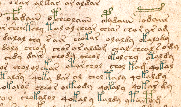
In the EVA font, a character set that helps you write Voynich glyphs, the EVA-k and EVA-t stand for the pi-like gallows with one loop or two. Similarly, EVA-f and EVA-p represent the P-like gallows with one loop or two. There are also some glyphs that combine the gallows with the bench char and are numerous enough to be significant, but it’s a more complex subject, so I considered both benched and unbenched at the beginning of sections as gallows for the purpose of this tally.
I counted only the text groupings that could be identified as discrete sections, what we would call paragraphs. Most of them are fairly clear—either there is space between them or the last line is shorter and a new group begins. Here are the tallies for the first section from folio 1r to 57r, which consists entirely of plant drawings except for the first page.
Out of 219 paragraphs, two were preceded by the red “weirdo” characters that resemble seagulls on the first folio. There were 206 groups preceded by gallows characters, most of them without bench chars, but a few had a full or partial bench character attached. A very small number were preceded by a gallows character with a leading “o”. Including the very small number with a leading “o”, 94% of paragraphs began with a gallows character.
The gallows were distributed as follows:
- EVA-p 85 (double loop P-shape)
- EVA-t 66 (double loop pi-shape)
- EVA-k 40 (single-loop pi-shape)
- EVA-f 15 (single-loop P-shape)
Gallows with two loops thus occur more frequently than those with single loops at the beginnings of paragraphs, with the most visually ornate of the four being the most numerous (whether by coincidence or design is not known).
Of the 11 glyphs that were not red seagull-shapes or preceded by gallows, all were secondary paragraphs (not the first one on the page) and were distributed as follows:
- EVA-q 6 (all were followed by the “o”)
- EVA-y 2
- EVA-ch 2 (both were bench chars with caps)
- EVA-s 1
Whether the lack of a gallows character at the beginning of some paragraphs was intentional or accidental is difficult to know without further interpretation or decryption of the text. Most of the exceptions were “4o” combinations that almost invariably fall at the beginnings of word-tokens throughout the manuscript.
A simple count cannot reveal whether a gallows at the beginning of a section is a paragraph marker, especially when there are four different symbols used for this purpose, all of which also show up in the main text. It does seem unusual, however, to have only four letters of an alphabet at the beginnings of paragraphs for such an extended number of pages. Even in medieval books of lists, calenders, and indexes, there is more variation than this when the length of the document exceeds 50 or 100 pages.
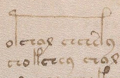
On folio 58r, the first full page of text after the plant section, the pattern of leading gallows characters continues, as does that of gallows characters occurring midline.
Perplexing Paragraphs
 In many respects both styles of gallows characters (the ones with two legs and the P), resemble pilcrows. Look again at the marker on the right from a manuscript written in medieval Lombardy—it’s two slashes with a horizontal bar. It’s a bit like EVA-k or -t and the regular pilcrow that resembles a P or backwards-P could be represented by EVA-P. Maybe the VMS gallows characters are a hierarchy of pilcrows, like the red and blue capitula where one is used for greater emphasis than the other. If one were a pilcrow and the other a capitulum, you would expect the “capitulum” to show up more often and perhaps even double for a letter, as it did in most medieval western languages.
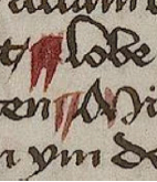
 But what about the strange behavior of gallows glyphs where they stretch over several characters? Is each leg standing in for the same character so it doesn’t have to be written twice? Is it an embellishment? Is it a different letter-glyph, one that’s only occasionally needed? Capitula never stretch over letters like that, do they?
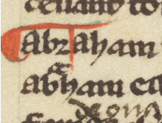 I didn’t think so until recently, and then I found the capitulum illustrated on the right. The manuscript had many traditional capitula and a few like this, where the stem came down several letters later. I don’t know if it’s because the scribe didn’t leave enough room for the stem and compensated by adding it farther on or if it was to give the capitulum greater emphasis. Perhaps it was an embellishment, but whatever its significance, apparently capitula can stretch over several letters.
Summary
Could the gallows characters be capitula, name or title markers, letter-glyphs or possibly both? At least some of the glyphs behave like capitula or pilcrows. Assuming that a natural language were behind the VMS, it seems unlikely that so many sections would start with the same two (or four) characters unless their function went beyond an alphabetic character. Maybe they aren’t letters at all. Maybe some or all of them are intended to provide emphasis, serve as modifiers, or as some kind of semantic break between words and perhaps that’s why they’re never placed two in a row.
J.K. Petersen
© Copyright 2016 J.K. Petersen, All Rights Reserved