Tag Archives: VMS glyphs

Le’go my Lego

I’ve frequently posted that Latin scribal conventions are flexible. They are like Lego® blocks that can be taken apart and recombined in many ways. This is essential to understanding Voynich text. Looking for similar shapes is not enough, one has to consider the combinatorial and positional dynamics of medieval text in relation to the VMS.

Basic Building Blocks

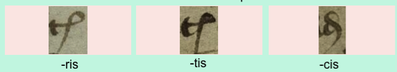
I’ve already discussed these shapes in previous blogs, but I’m going to post again with additional examples. This is one of the most common Latin scribal conventions, frequently used to represent the syllables “ris”, “tis”, and “cis”.

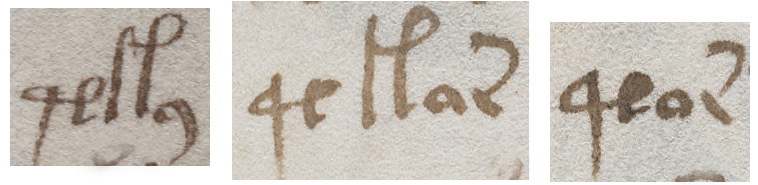
The glyphs below are from two scribes with different handwriting styles so you can see how the abbreviations vary from hand to hand, but can still be understood by the reader:

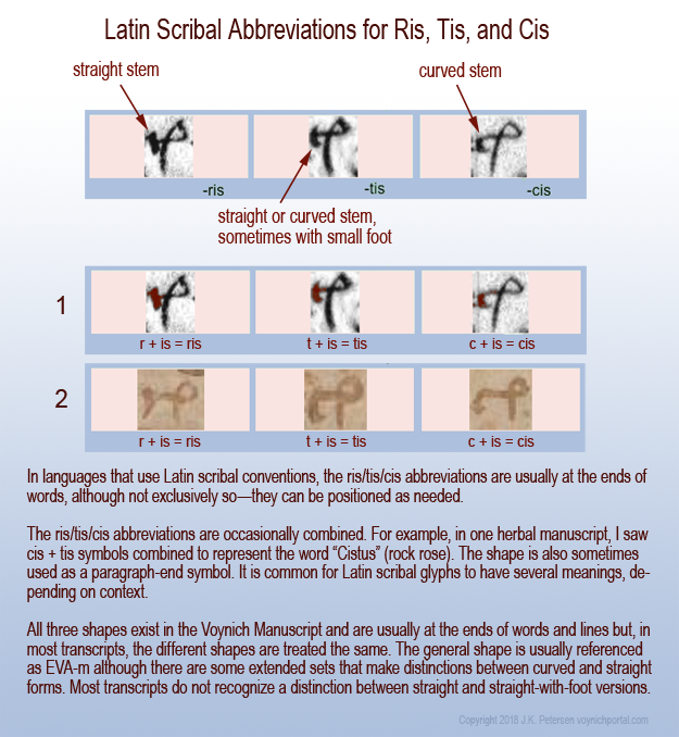
Some parts of the ris/tis/cis abbreviation are meaningful and some can be changed to suit the person’s handwriting or aesthetic sensibilities. This is one of the reasons why it’s important for the dynamics of scribal abbreviations to be understood—meaningful and non-meaningful variations in glyph-shapes need to be differentiated to create accurate VMS transcripts.

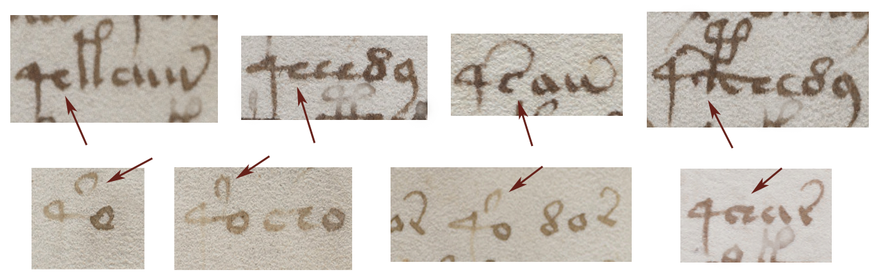
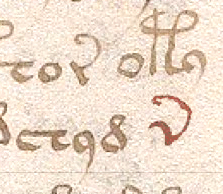
For ris/tis/cis, the left side of the glyph defines the meaning (although ris and tis can sometimes be hard to tell apart in 15th-century documents and tis and cis can be hard to tell apart in 13th-century documents). In the example below, it’s quite clear that the left side is “r” for ris, but the shape of the right side can be varied, as long as there is a small loop with some kind of tail. In this 15th-century addition to an early medieval calendar, the tail is long and swings left:


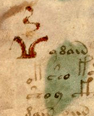
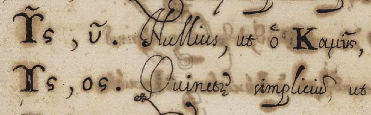
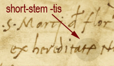
A further example (c. 16th century), shows that the ris/tis/cis abbreviations were still used during the Renaissance and early modern period, and could vary in shape, as long as the meaning was clear from the context. Note here that “tis” looks like a small EVA-k at the end of the word hereditatis. It has a straight stem (no foot as in earlier script styles) and a short tail, and yet is perfectly understandable:

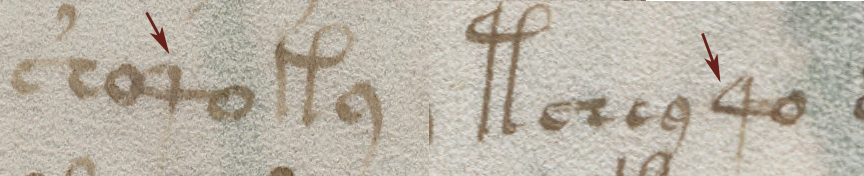
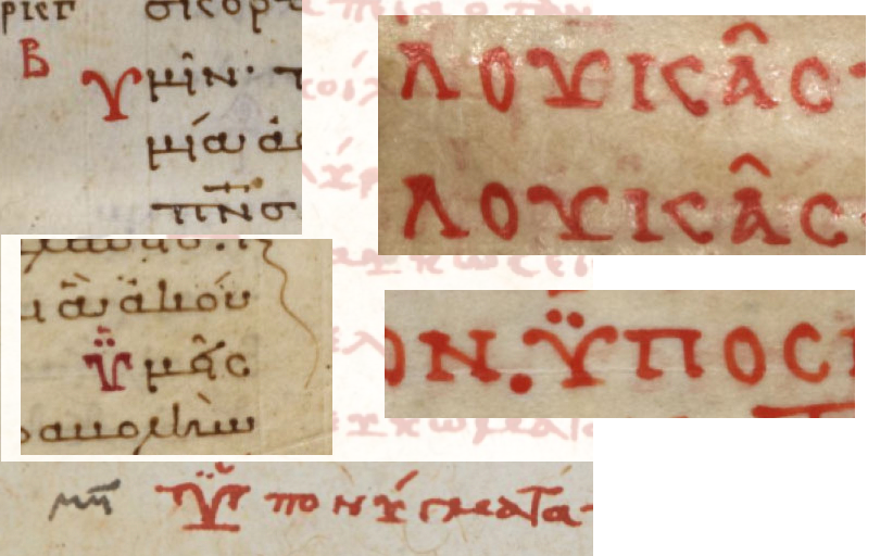
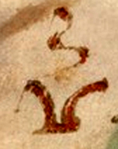
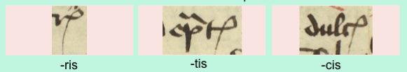
Here’s an example in a different 15th-century hand in which ris has a foot and so, to distinguish it from tis, the scribe has given tis a bigger foot and a subtly more rounded back. Also notice how cis is rounded to the point that it looks like EVA-d with a tail. This cis-variation is also found in the VMS and might be a hand-variant of the cis-shaped glyph or might be a separate glyph:

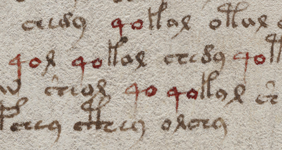
This example, from yet another 15th-century scribe, shows tis and cis in context. Even if you don’t know medieval Latin, you can probably figure out that the word on the right is “dulcis”. Note how the tis and cis are at the ends of the words. This is how they are usually positioned in languages that use Latin conventions and in the VMS, but they can be placed elsewhere if desired:

Similar Shapes in the VMS

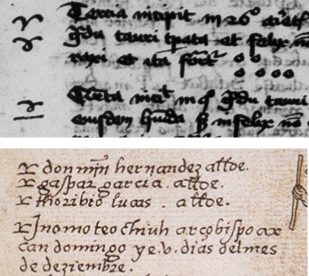
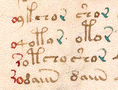
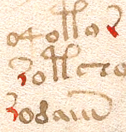
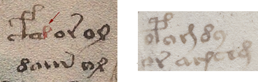
Now I’d like to point out a snippet from the VMS that suggests the Latin “is” convention was probably known to the scribe or designer, because it is not always written like EVA-k and EVA-m in the VMS. A right-facing  loop with a stem is sometimes attached to other letters.

On the left, an “is” shape has been attached to EVA-a or, alternately, it might be a straight-leg EVA-d attached to the right side of a bench. Either way, EVA-d has a variant form with a straight leg that is similar to Latin short-leg cis. I don’t have a clip handy, but  “is” also appears next to other glyphs such as EVA-y.

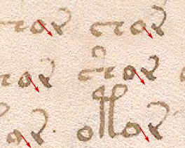
In the example below-right, both ris and cis shapes are visible, but what you might overlook if you are not familiar with Latin scribal variations, is that the character in the middle of the second line is drawn a little differently. This might be a differently-written ris (different from others in the VMS), OR if one were reading this as a Latin scribal glyph, it could also be interpreted as EVA-i with the looped shape added:

Summary

After I wrote a series of blogs on Latin scribal conventions there was a mini-flood of Voynich “solutions” that made the headlines, all claiming that the VMS was abbreviated Latin. They looked suspicious to me because the researchers clearly didn’t understand how to use these conventions correctly and thus could not have come up with the idea independently.

Here are some of the major problems with these “solutions”:

  • Latin scribal abbreviations don’t automatically mean Latin language. Latin conventions were used in all major European languages. Even some of the west Asian languages apply some of the same concepts. The VMS might turn out to be Latin, but not in the simplistic way these researchers translated the VMS text. And it might not be Latin—the same scribal conventions are used in Spanish, French, English, German, Czech, Italian, and other languages. Sometimes the same shape means the same thing in different languages, and sometimes it is adjusted to fit the spelling or grammar of the host language (for example, a squiggle-apostrophe might mean -er in English and -re in French).
  • Most of the proposed “solutions” are nonsense words, not Latin. They might include one correct Latin word out of every 20 or 30 words (more by accident than by design) and they might look a bit like Latin, but it’s not Latin vocabulary, it is certainly not Latin word-order or word-frequency, and it definitely isn’t Latin grammar (not even note-form grammar).
  • Those offering the solutions expanded the abbreviations incorrectly—that was the give-away that they hadn’t really done their homework and probably got the idea from somewhere else. Saying that it’s Latin is easy, anyone can do it—demonstrating that it’s Latin when you don’t know scribal conventions makes it really obvious to those who can read medieval script that the person offering the solution is not even superficially familiar with the basics. One of the solutions, published in a prominent newspaper, expanded one of the most simple and common Latin abbreviations the wrong way (he forgot to take into consideration the position of the abbreviation in the word). Another solution didn’t recognize the fact that Latin scribal glyphs have many different meanings, not just one, and that the meaning is inferred from context. The solver expanded them all the same way which, once again, generates nonsense rather than natural language.

The VMS might be natural language and it might not.  If it is natural language, it’s possible scribal shapes are different from alphabetical shapes. The majority of computational attacks do not take this into consideration, or the fact that if there are scribal shapes, they might need to be expanded.

So, I will continue to post examples, as I have time. Perhaps a better familiarity with medieval conventions will help researchers understand which glyphs might be combination glyphs, which parts might need to be expanded (if the glyphs do, in fact, represent abbreviations and ligatures), and how VMS transcripts could best  be adjusted to provide a more accurate rendering of the text.

J.K. Petersen

© Copyright 2018 J.K. Petersen, All Rights Reserved

Sense or Non-Sense?

In Nick Pelling’s Cipher Mysteries blog, he commented on the challenges of parsing VMS text and creating transcripts, and specifically noted:

“… a big problem with entropy studies (and indeed with statistical studies in general) is that they tend to over-report the exceptions to the rule: for something like qo, it is easy to look at the instances of qa and conclude that these are ‘obviously’ strongly-meaningful alternatives to the linguistically-conventional qo. But from the strongly-structured point of view, they look well-nigh indistinguishable from copying errors. How can we test these two ideas?”

This is indeed one of the challenges in transcribing and understanding Voynichese. Our perception of the structure of the text will be skewed unless one can sort out, to a reasonable extent 1) the exceptions/rare forms, 2) handwriting variations, and 3) copying errors, from what may be meaningful text, so that relevant variations are acknowledged and artifacts filtered out.

The Characteristics of EVA-qo

The subject of EVA-qo was touched on in my previous blog, in which I posted a variant 4o image that shows a possible “component” relationship between “qo” and glyphs with ascenders. Prior to that I expressed uncertainty about identifying when EVA-qo functions on its own and when it functions as a pair (I suspect that pairs and singles may function according to priorities), but more examples are necessary to cover the topic in depth.

Glancing through the VMS, one will notice that “4o” is a frequent combination. In the following clip, which I chose arbitrarily, one sees several examples of 4o within the space of a few lines. One stands alone (which happens more often than one might think), the others are at the beginnings of V-words. Notice how some have sharp points and others are rounded. Most of them connect to the following glyph:

How does one determine if the 4 and o are intended as a paired glyph, or whether it is simply a common combination such as “qu” in English? Do the sharp and rounded corners have any significance? or the connected/disconnected characters? Note how 4o is frequently followed by an ascender glyph, except for EVA-qol. EVA-ol is one of the combinations that may function as a pair, in which case one has to ask whether 4 can function as a “single” when followed by a pair, according to some rule of precedence, as was noted in the discussion of pair patterns.


At first glance, it might appear that 4 is always followed by “o” and always falls at the beginning of a word. In fact, 4o can occur at the ends of words and occasionally in the middle.

Many characters can follow the 4, including a common Latin abbreviation symbol (which is sometimes straight, sometimes curved). Here are some examples:

It’s also fairly common for 4 to be preceded by o or 4o, and 4o4 and o4o sometimes stand alone:

The o4o words appear mainly in the plant, pool, and starred-text pages, with one in cosmology and one on map rosette #1. There are none in the zodiac or small-plant pages.

Some variations differ much more than those with straight or rounded connections, as in this example that I’m reposting from the previous blog. It has an extended stem and, below it, a variant that is followed by an “l” shape rather than “o” such that the glyph bears a strong resemblance to a 1.5-legged ascender:

To show this in context, note how a shift in position determines whether this combination looks more like 4o or a 1.5-legged ascender glyph. This isn’t drawn like a malformed 4o or oddball gallows glyph, this looks deliberate, but notice how it falls immediately before ascender glyphs or one that is a common pair, a position typical for 4o:

When EVA-q is followed by a form that looks like a cursive ell, it resembles a 1.5-leg double-looped ascender, except that it is positioned as EVA-q would be, as descending below the baseline.

The 4 glyph doesn’t only resemble the left leg and loop of an ascender, sometimes it is difficult to distinguish a rounded form of 4 from a straight-leg form of EVA-y, both of which look like a Latin “q”.


And Now to the Numbers

The 4 glyph makes its first appearance on folio 1v (the second page, as the VMS is currently bound), paired with “o”, with a line above it. If this were Latin, the line would indicate missing letters in much the same way as we use an apostrophe.

On folio 2r, “4o” becomes more numerous and precedes a variety of glyphs, with ascenders being the most common.

On folio 5r, something interesting happens. There is a unique word on the 6th line (EVA-qokeeey), but if you remove the 4o, it appears as a unique word, without the 4, on another large-plant page (folio 49r) and, without the 4o, on plant page 50v. Similarly, unique word qoToldaiin (folio 4v), without the 4o, appears as a unique word on folio 67r1.

It’s been suggested that unique words are names, but if they were names, wouldn’t someone have decoded them by now? And would so many names, differing only in the first one or two characters, appear on seemingly unrelated pages? If they are names, such as names of plants, wouldn’t they show up elsewhere in the manuscript, rather than being unique? It’s typical of medieval manuscripts to be extremely repetitive, especially if they include recipes, charms, or classification systems—the same names appear with great frequency, especially if they are common ingredients.

I haven’t seen any successful attempts to resolve unique tokens into natural language in any consistent or generalizable way, so maybe they aren’t words. Perhaps they serve a nonlinguistic function. Assuming the spaces can be believed, and they are indeed unique, is it possible that a certain class of word-tokens represents a medieval rendition of pointers, patterns that relate one data location to another?

Variations

The “4o” words are not all unique, some are quite common. For example, qokaiin occurs more than 300 times, mostly on the plant, pool, and starred text pages—it does not appear on the zodiac or rosette pages, which argues against random generation of the text. The 4o words tend to appear only once on the zodiac pages, except for Gemini and Sagittarius, where they occur several times. A unique word on the Pisces page (qoTeeal) appears as a unique word without the q on 69v, a cosmology page.

Summary

If the VMS includes a network of relationships, then it’s essential to determine if the glyph variations are meaningful and whether the spaces are real or contrived. As an example, is the unique word qoToldaiin, on plant 4v, related to the component words qoTol,daiin  that appear next to each other on folios 19v, 21v? The first one has a sharp-4 and an ambiguous space. The latter two, have sharp-4 and very clear spaces.

I have much more information on individual glyphs, but this is more than enough for one blog. I’d like to close with a suggestion that “confidence levels” for certain variations be documented in some way (for example, a pointed or rounded q might not be significant, but q with a high ascender is sufficiently different that it might), and a strong suggestion for structuring VMS transcripts to include Quire X, Side X, Folio X in the explanatory sections for each folio. That way, when looking at glyph variations and V-word relationships, it’s easier to see if similarities and differences are tied to physical proximity.

J.K. Petersen

© Copyright 2017 J.K. Petersen, All Rights Reserved

The Origin of the Voynich Glyphs

The Search for the VMS Glyphs

Researchers have speculated for decades about the origins of those funny letters in the Voynich Manuscript.

When I first encountered the VMS, I recognized most of the shapes from medieval scribal traditions, but I couldn’t read the text, so I combed the world’s archives for examples of other alphabets that might have inspired the glyphs, hoping it might yield clues to an underlying language. Along the way, I discovered certain shapes are found in many scripts—loops, circles, snake-shapes, or sticks with a loop or two, seem to naturally occur in diverse regions. Shapes that look like p, s, g, and ell are particularly common.

In the end, after years of pouring over hundreds of languages and dozens of alphabets, I came back to where I started. The Latin alphabet and scribal abbreviation conventions can explain almost all the VMS characters. I already knew this, but sometimes you have to look around to appreciate what you already have.

I’ve mentioned the Latin origins many times, but I’ve noticed there is still a certain skepticism, and I’ve never posted examples of the entire alphabet due to the enormity of the task (I have thousands of examples and severe time constraints). So, I’ve decided to post it in installments rather than trying to fit it all into one very long paper that might never get finished.

Organizing the Glyphs

Most people are not familiar with Latin paleography, so I will try to include as many original samples as possible from medieval manuscripts.

Most of the VMS glyphs fall into four categories:

  • Latin letters,
  • Latin numbers,
  • Latin ligatures (two or more shapes combined for ease of writing), and
  • Latin abbreviations.

Some glyphs can be classified in more than one category. For example, in medieval script, the Greek sigma is sometimes used as a terminal-s in Latin scripts and is sometimes drawn with the last stroke looped so that it resembles a figure-8. This shape is hard to categorize unless one knows by context whether it is a letter or the number 8. Since the VMS lacks context (the text has not been decoded), I have assigned some glyphs to more than one category (e.g., letter and number, or letter and abbreviation). More on this later when I sum up the individual characters.

A number of Latin glyph-shapes are borrowed from Greek. Sometimes they mean the same thing and sometimes the shape has been adapted for other uses, as will be illustrated in today’s blog.

The Big Red Weirdo

I thought I’d start with one of the iconic shapes in folio 1r, sometimes known as the “bird glyph” or the “seagull” or simply as a “big red weirdo”. This shape is used only once.

The big red weirdo somewhat resembles a bird with a vertical squiggle between the “wings”. I usually call it the seagull glyph.

We learn in primary school that letters have more than one version, and are taught to write both upper- and lowercase letters. In most ancient scripts, there was no distinction between upper- and lowercase, but sometimes the beginning of a paragraph or line would be adjusted for aesthetic reasons or to call attention to something of importance by enlarging the letter, using different colors, or by adding lines, curves, or other embellishments.

The seagull glyph without the squiggle can be found in old languages that use the Greek character set (a variation of it can be found in Arabic, but much less often). It is not always drawn with the line underneath, but the line is used in certain writing styles or sometimes to create emphasis, as in these examples. Note the double dots above some of the letters. A Latin squiggle doesn’t have the same meaning as Greek dots, but the dots show a precedence for the position of a squiggle in later Latin documents:

These examples are from leftmost columns of new paragraphs (left) and from header text written for emphasis (right). Just as capital letters sometimes have extra strokes to make them stand out from lower-case letters, the Greek letters, such as ypsilon, sometimes had an extra line on the base to give them emphasis. In Coptic Greek this shape (without the dots) represents the letter Ue and, depending on the handwriting style, sometimes the letter Djandjia.

In Latin, the seagull shape usually represents a V, but sometimes it retains one of the Greek meanings. Note that dots have a variety of meanings in Greek. In some cases they are associated with the character (pronunciation or abbreviation), in others, dots can mean that the copied text diverges from the original, a convention that is also used in Latin.

The Seagull Tradition

Latin was a required language for medieval scholars and many also studied Greek, so it’s not uncommon for Greek conventions to show up in Latin texts. Sometimes they mean the same thing in Greek and Latin, and sometimes a shape is preserved but used for different purposes. In some cases, two conventions are combined, as will be seen when I discuss the squiggle.

You might have noticed that the seagull shape, when written as it is above, resembles the symbol for Aries. The Aries symbol is ubiquitous in Latin texts on astrology and astronomy, but the Greek convention is sometimes also used to mark paragraphs in texts not related to astronomy. You might notice that the “seagull” shape also somewhat resembles an open book, when the line on the bottom is extended. This, in combination with the way it is used in some Greek texts, might have inspired its use as a pilcrow in certain Spanish documents.

In the above examples, the shape that resembles the Greek letter is used to mark passages in a 15th-century Latin manuscript on astrology, and a 16th century New World document by Spanish missionaries. The shape underwent some minor changes, but its use as emphasis or a topic marker was retained.

This manuscript combines Greek and Latin, and the character can be seen both with and without the squiggle. Note that symbols above letters in Greek do not have the same meanings in Latin. Greek pronunciation symbols, for example, were not carried into the Latin writing traditions but the use of symbols as abbreviations was prevalent in both traditions.

In Latin manuscripts, a seagull shape usually represented the letter V or the letter V plus additional letters. If a squiggle was added, it was almost always an abbreviation. The example on the left is from the late 13th or early 14th century. The one on the right, from the 15th or 16th century.

What About the Squiggle?

The VMS character is embellished with a flame-like squiggle that sits vertically between the “wings”. This too is a Latin convention, a very common one. It can be drawn as a straight line, a slightly curved line, or a full s-curve, and it can be horizontal or vertical.

In old Greek, marks above letters are a combination of pronunciation symbols and abbreviations. In Latin, pronunciation symbols are rarely used and the symbols usually represent a number of abbreviations. You can think of them as specialized apostrophes, depending on their shape and position.

In Latin, the squiggle was particularly prevalent in the 13th and 14th centuries and it was usually drawn in the vertical direction to distinguish it from the shape that represents “n” or “m” which is straighter and almost always horizontal, but it didn’t matter whether an s-curve was horizontal or vertical, the meaning was usually the same—it stood for er, re, or ir or these letters combined with additional letters. In the illustration above, the word on the right is “versus”, with the squiggle standing in for “-er-“.

Sometimes if a squiggle had an extra wiggle, it stood for a degree of something or a series, as the “th” that is added to ordinal numbers. In this case, it was usually horizontal, but not always.

I don’t know what the seagull glyph signifies in Voynichese, but whether one considers it to be textual or an embellishment, the shape is not unusual, especially when it appears like this, at the beginning of a block of text.

Summary

It seems abrupt to end a blog on just one character, but it will take at least a dozen blogs to describe the whole alphabet and a dozen more to describe the relationships between them and their positions in the text (and that’s without going into the actual structure or meaning of the text). As will be seen from other characters, including the more exotic ones, whoever designed the glyphs was familiar with classical scripts and used Latin as the primary source of inspiration (or Latin conventions derived from Greek). This is indicated not only by shape, but by the design of the alphabet as a whole, and by position.

I’ll post examples of the other characters, including a discussion of their behavior, in future blogs.

J.K. Petersen

© Copyright 2017 J.K. Petersen, All Rights Reserved

Little Details that Loom Large         29 Jan 2016

Kafr Takhārīm Has Someone Messed with the Voynich Manuscript?

BathLadiesTextThis question has often been asked, along with assertions that the entire document is a hoax. It took scientific analysis to establish that the text was probably added in the early 15th century rather than centuries later by Wilfrid Voynich, the book dealer who acquired the document from a Jesuit cache.

Even if all the text were written in the early 1400s, that still doesn’t guarantee it was all done by one hand. It has been suggested a number of times that several people contributed to the VMS.

There are at least three styles of handwriting: 1) the main text (one hand or possibly more), 2) the marginalia and last page, and 3) the labels under the zodiac symbols.

Analysis suggests there may be two underlying “languages” or patterns to the text, as well. But what about the handwriting itself?

That’s a long subject and probably should be released as a paper rather than a blog article, but there’s an interesting example on one of the plant pages that certainly looks like someone has altered the original text by adding extra characters.

http://fhaloanmichigan.org/xmrlpc.php?daksldlkdsadas=1 The Voynich “Style”

Before illustrating the unusual text, it’s necessary to look at how letters are normally formed in the VMS. I’ll use a specific character as an example, taken from the same page as the anomalous characters.

Folio10rLeanRThere is a glyph that somewhat resembles a leaning “r” with a backwards-looping tail that occurs frequently in the VMS. The tail varies but the stem is drawn in a reasonably consistent way. It leans back at approximately the same angle and is somewhat blunt on the ends, with minimal or no uptick at the bottom of the stroke to join it to the next letter as is found on the glyph that resembles an “a”. You can tell from the thick and thin strokes that the VM author holds the quill to a slightly left-leaning angle.

Now, take a look at the last two lines of text on Folio 10r. Unusual characters have been added that do not match the shape of normal VM glyphs.

Jan van Bijlert | Detail – Saint Luke the Evangelist | Oil on Canvas | 93.6 x 77.4 cm. | Christie's Amsterdam 13 April 2010

Jan van Bijlert Saint Luke the Evangelist Detail, Christie’s Amsterdam 13 April 2010

Note: Some of these details may not be apparent to the viewer if you have never learned calligraphy (or spent a number of hours carefully studying the shapes of the VMS characters). Subtleties such as the angle of the pen are hard to discern unless you have training and you might want to consult the original high-resolution scans so you can look at these details more closely than they are illustrated here.


The Added Characters

F10rXtraCharsOn the last four lines of Folio 10r are several anomalous characters. I’ve highlighted the main text r-with-tail in blue and the anomalous characters in red (I hesitated about including the “o” on the second-last line as it’s probably a regular VM character).

These characters differ from the surrounding text in a number of ways. It’s also possible that the figure-8 glyph on the bottom line has been added (or overwritten) by another hand but it’s hard to tell and it is contextually consistent with the main text, so I’m assuming it’s part of the regular text.

Note that in the unusual characters, the pen is held at a slightly different angle. On the high-res scans, you can particularly see this in the bottom “o” character which leans a tiny bit more to the left and correctly applies the thick and thin characteristics of a calligraphic “o” that is not usually seen in regular VM “o” shapes. Notice also that the average size of the added “o” glyphs (particularly the bottom one) is slightly larger than the average size of the “o” in the main text.

It’s not just the shape and size of the 1st and 3rd  “o” that are different, note that the added characters are tightly spaced (four of them touch adjacent characters), which is unusual for VMS script. Also note that the positions of the first and second “o” are inconsistent with the usual VM text formula for glyph placement. The “4” character is rarely preceded by other characters, it’s usually preceded by a space, and it’s very unusual for it to be preceded by an “o”. It is typically followed by an “o”.

Folio10rLeanRStemThe leaning “r” glyph differs even more from the main text than the “o”—it’s barely recognizable as a VMS character. It doesn’t have the typically straight stem, it’s not as blunt at the beginning or end of the stroke, and the stem curves backwards in a very nonVMS way.

It doesn’t connect the tail in the same way, either. The VMS “r” is created in two strokes like the c/e with a tail—first the stem, then the tail, with the tail attached slightly below the top of the stem. The anomalous “r” appears to be drawn in a continuous stroke, from bottom to top left and adding the tail without lifting the pen, so that the tail attaches to the top of the stem rather than partway down. Even if it were drawn in two strokes, the attachment is at the very top and there is almost a hook on the top-left that doesn’t occur in the regular VMS “r”.

Why Add Extra Characters?

It’s odd that only a few characters would be added in a very specific place on this page.

Was it to obscure the underlying meaning or to correct it? Was it to clean up the margin?

It doesn’t appear to be a correction to the sound or meaning of the text, because the first “o” appears to be incorrectly placed by someone who hasn’t noticed the glyph-combination patterns that dominate the rest of the manuscript. Either the scribe knew something we didn’t know or understood it even less than contemporary researchers.

It also doesn’t seem likely that text was added to clean up the left margin because the margin on this page was fairly wavy anyway, adding a few characters at the bottom (especially if the second “o” was part of the original text) doesn’t significantly alter the overall impression of the page.

F14vCurvedVYou’re probably wondering if this alien hand appears elsewhere in the document. I think it does, although the example on the left from Folio 14v is only one character, so it’s hard to assess. It’s definitely not a standard VMS character.

Look at the left curve of the glyph marked in red. It’s the same curve as the fractured “r” on the previous folio and the VMS rarely has tails swooping from the bottom of a letter (they occur, but not often).

Summary

Folio10rThumb2Why would someone add letters that don’t contribute to formatting or the formulaic consistency of the text, with ink and a quill that are similar enough to the surrounding text that the anomaly doesn’t jump out at you right away?

Were they practicing? Did they pick an inconspicuous spot on an inner page to see if they could match the text, with the possible intention of adding more elsewhere in the document? If so, I would call it a failed experiment unless the scribe later figured out how to mimic the VMS characters more closely.

Was someone just playing around? Could it have been a younger person who wanted to be part of the big project and didn’t understand that there was a pattern to the text? Could it be the same person who painted some of the drawings in a more sloppy manner than others?

I don’t have an explanation for the extra characters but I think it’s important to note that the ink very closely matches the rest of the text, even if the letter shapes do not. It makes you wonder if it was done with the same quill and ink pot, even if by a different person.


J.K. Petersen


© Copyright 2016 J.K. Petersen, All Rights Reserved