Tag Archives: Voynich manuscript provenance

Misrepresentation…

Guatemala  9 April 2019         

It was just pointed out to me by a Voynich researcher that Diane O’Donovan is writing about me on her blog. I took a look and was actually quite surprised that the information I posted in my columns blog was so badly misconstrued.

But before we get to that, let’s put this rumor to rest. Maybe someone was joking (if so, no hard feelings), but this was posted as an aside on O’Donovan’s blog…

(Some have suggested tongue-in-cheek that JKP is a pseudonym adopted by Rene Zandbergen who holds very similar views and is one of the very few who really has been constantly involved for ‘many years’ – but it’s just jeu d’esprit. I’m sure JKP is quite real).

                                                       D.N. O’Donovan, 9 April 2019

Yes, I am. And to anyone who may think the rumor is true, I’m not using a pseudonym—I blog with my real name. I’m assuming René Zandbergen is European. I am North American. There’s a rather long swim between us and we don’t know each other personally.

Also, as far as I know, Zandbergen has been involved with the VMS quite a bit longer than I have. I first learned of the manuscript through Edith Sherwood’s site sometime in late 2006 or early 2007. A Google search for Da Vinci brought me to her blog and then, in 2007, I noticed she had a lot of plant IDs, as well.

I’m very interested in plants, I love puzzles, I’m fascinated by history.

That’s how I got hooked on the VMS. I wanted to solve it and it’s a perfect fit with my interests. I never planned to blog about it (my friends talked me into starting a blog, they kept insisting I had something to offer) and I’m still not sure a blog was a good idea (it takes time away from research) but in the process of blogging and joining the Voynich forum, I have met some beautiful minds, so it’s probably worth the sacrifice of time.

Now, to other matters…

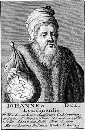
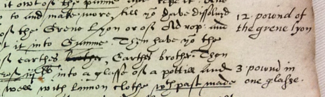
You know what. I was going to quote some of the “twists” on O’Donovan’s site and respond to them point-by-point, but I have changed my mind. There are too many. It would take too long. Plus, she chose to nullify the fact that Jacobi de Tepenecz was educated in Jesuit schools, administrated a Jesuit college, died in the hands of Jesuits, and left his estate to the Jesuits by declaring that he, “does not seem to have been an ordained member of any Jesuit community”.

If it walks like a duck and talks like a duck, then I don’t think it needs to be http://e17arttrail.co.uk/index.php?page=101 ordained as a duck to be included in general statements about the Jesuit community. My blog was not about Jacobi, it was about the column text.

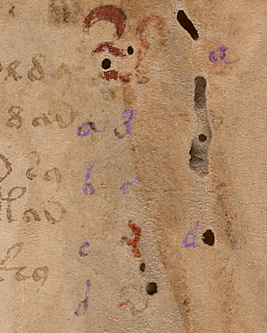
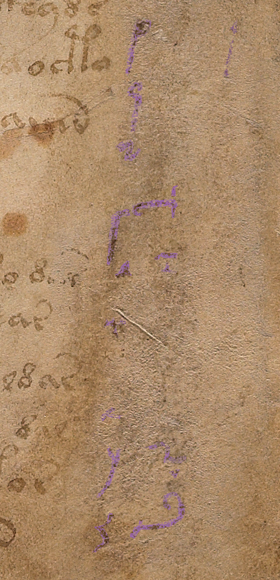
De Tepenecz Signature

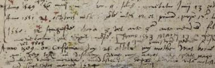
I’m also not sure why she posted a recreation of Jacobi de Tepenecz’s signature in connection with her comments about my study of the column text. It’s different handwriting. It should be in a separate section, not conflated with my column-text blog.

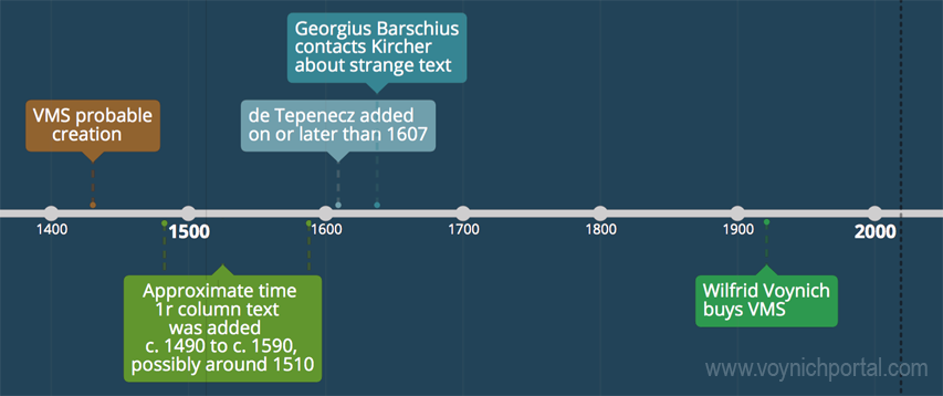
I didn’t discuss the signature because there might be a time gap between the writing of the column text and the addition of the signature at the bottom of folio 1r. We don’t know yet. I don’t have enough information on the signature to blog about it, and I think it’s premature to imply an association between them.

In my opinion there’s not enough research yet to draw any conclusions about Jacobi’s signature. In the scant examples that people have kindly posted on the Web (and which were probably difficult to find), the legal signature doesn’t match the other signatures and the other signatures almost look like two different hands, as though they were greatly separated in time, or perhaps because his name was added by someone else’s hand?

If you are interested in VMS provenance related to Jacobi de Tepenecz, Anton has been posting some very good research on the Wroblicionim annotations on some of Jacobi’s books on the Voynich.ninja forum. This enlightening detective work is slowly but surely helping to round out the picture.

Suffice it to say that in my previous blog, I presented needle-in-a-haystack work-in-progress to help fill out some of the missing corners of Voynich history, and presented it as simply as possible, and was not trying to change or misrepresent the manuscript’s provenance, as O’Donovan has implied.

J.K. Petersen

© copyright 2019 J.K. Petersen, All Rights Reserved.


Probing the Provenance

7 April 2019          

There’s a substantial gap in our knowledge of the VMS, from the time it was created (c. early 1400s) until the time it came into the hands of the Jesuits (c. mid-1600s), possibly through the court of Rudolph II. More than two centuries are shrouded in mystery.

Part of my palaeographic research has included the faint text on the right-hand side of folio 1r because I was hoping it might reveal something about this hidden history, to fill in some of the missing provenance.

column text top

The column text on the right side of folio 1r has been partly obliterated and is very faint.

There appear to be four columns. The first two columns look like the same handwriting, with the alphabet shifted. The alphabet in the first column is complete, except that it’s impossible to make out the style of the r or the t. With very careful scrutiny, the other letters can be discerned.

The third column is slightly different. The loops are slightly rounder and it doesn’t appear to include as many letters as the first two columns. The fourth column is very faint and has fewer letters still. There also appears to be erased writing under the column letters (earlier attempts? or something else?). The spacing and style of the “red weirdos” doesn’t seem to have anything in common with the column text, so it’s probably written by another hand, perhaps earlier?

After extensive study of the letterforms, and intensive searches for similar handwriting, some of which I posted in previous blogs, I had enough information to try to reconstruct the handwriting of the person who wrote the column text. This research stretched over many years and included letterforms, spacing, final-ess styles, abbreviation styles, and time periods in which the text might have been added.

To make it easier to visualize how the scribe might have written whole sentences, I have created a font based on the style in the left-most column. It took a great deal of time and patience to try to achieve accurate reproduction of this script style. A couple of letters simply cannot be seen, but over time I became more familiar with this style of writing and how specific letters were usually written.

Scribal Specifics

pic of lower column text f1r

Fortunately, there is a certain consistency to the way the shapes are written (not all writers do this).

  • The ascenders and especially the descenders are long, and some of the ascenders have an unusually long and rounded curve on the top (e.g., f, h, and s). This long curve is not common and appears to be specific to this scribe.
  • Letters with stems have a squeezed oval loop (b, d, p, and q); those without are more round (c and o).
  • An important clue to help identify the time period is the short left stem on the letter “h”—it doesn’t quite reach the baseline. The letter “h” was written this way during a fairly specific time period.
  • Another important clue is the style of the “g”. This was not an unusual style, but it was less common than the double-chambered “g” or one that is more angular.

Years ago, when I began this line of research, I was hoping to confirm John Dee as the foliator and/or writer of the column text. Unfortunately, after heroic efforts, I have some doubt that John Dee was the author of the column text or the folio numbers. His handwriting is close to both, but I have samples that are arguably closer. Examples of the column text can be seen in previously published charts and I have gathered more text and number samples since my early research was published that indicate a number of people had handwriting very similar to one another and to the VMS.

The Column Alphabet

Here is the basic alphabet (note that the column “e” is a variant that is less common and usually only shows up once in a while. I’ve seen it a few times but no scribe uses it habitually, so I have included the “base e” here and the variant column-“e” in the block of text below).

  • The shapes for u and v were used interchangeably by most scribes and the one in the VMS is hard to discern, but it looks like it might have a pointed bottom as we now associate with “v”.
  • I am not sure how long the descender is on the “x”, the x is barely discernible, but scribes who wrote in this style usually lengthened the stroke on the lower-left as follows. However, this specific scribe may NOT have added the small hook on the bottom left. It may have had a very severe tail, like the one on the y:

Constructing a Block of Text

To make it easier to imagine the handwriting of the column-text writer, I have created a block of text in Latin (I wasn’t worried about whether it was correct Latin or even medieval Latin, I just copied and pasted something more interesting than Ipsum Lorem).

Caveats

Be aware that reconstructing a block of text from an alphabet involves some educated guesses:

  • There are no upper-case letters, so the ones I included are based on writing samples that are very close to the column text, samples that took me years to locate.
  • The extent to which the writer used abbreviations is not known, so most of the following is not abbreviated except for the extremely common -us/-um abbreviation symbol that is included at the bottom of the alphabet on 1r.
  • The scale of the letter “o” is difficult to discern. I have made it a normal size in this sample BUT some scribes during this time period wrote the “o” smaller than other letters.
  • During the century or so that this style of writing was popular, some writers used long-ess as final-ess as well. Others used a snake-style final-ess, and some used both somewhat indiscriminantly. It’s impossible to know whether the column-text writer used a different shape for final-ess, so I have included both for purposes of illustration.
  • Whether the writer left out the serifs in the column alphabet because they were unnecessary, or because this is part of the writer’s style cannot be known from such a small sample, but the impression I get is that the scribe probably used serifs sparingly or not at all.

Here is the result of adapting the column text to a font that can be typed on a computer:

pic of recontruction of VMS f1r column text

Keep in mind that real handwriting is typically more varied in slant, spacing, and letterforms than a computer font. I have varied the letters slightly, but I didn’t want to stray too far from the original letters or make too many guesses, so it will be up to the reader to imagine what this would look like as handwritten text. Hopefully the reconstruction will help in that regard.

Pinpointing the Date

Preliminary date ranges were suggested in the charts I posted in previous blogs, but I didn’t feel I had enough samples to narrow it down. I’ve collected about 100 more samples since then (ones that are specifically similar to the column text) and I still don’t feel I have enough but I’m more confident now than I was a couple of years ago. Here’s a rough timeline that might help illuminate some of the dark corners of the Voynich Manuscript’s early provenance:

timeline of column text

Samples that are especially close to this script tend to be from the early 1500s, but this style was in use for about a century, so it might be premature to narrow it down any more than indicated by this date range. I will continue to seek out additional information and will post updates. I also have a great deal of information on other VMS text that I will post as I have time.

J.K. Petersen

© Copyright 2019 J.K. Petersen, All Rights Reserved

Reconsidering the Columns

The Mystery of the Columns

i-initialn May 2016, I posted a follow-up blog about the faint letters visible on the right-hand side of folio 1r and speculated that it might be a failed attempt at decoding the manuscript. That was a guess based on seeing the Latin alphabet in the first column paired with Voynich shapes in the second, and the fact that it was later erased. Two more columns are also faintly visible, but there’s not enough detail to discuss them in depth.

In my previous blogs, I was reluctant to guess the date of the columnar writing because only a few letters are clearly visible, but I went out on a limb and estimated that it might be late-16th- or possibly 17th-century script, based on the small round shapes, the long unlooped ascenders, the slant, and the overall look and feel. I wasn’t completely sure, however, because important clues about how the writer connected the letters and spaced the lines aren’t available.

As soon as I posted the May 2016 blog, I started this blog, to describe the writing further, but was pulled away by other interests and responsibilities. The column text is a sideline for me, but studying it might reveal a few details about the VMS’s provenance, so I come back to it from time-to-time.

Who Added the Columns to the Voynich Manuscript?

My paleographic collection includes thousands of writing samples, but most are focused on Carolingian or Gothic time-frames and the VMS columnar writing is different. It looks more recent than other parts of the VMS, and more like a casual or correspondence hand than a scribal book hand, and most of it has been erased. Nevertheless, there is enough to sample some of the letters.

Voyf1rColumns1To recap: on folio 1r, the first column (to the right of the main text) is moderately clear. An alphabet has been written from top to bottom in a tidy script with small, relatively smooth curves and unlooped ascenders/descenders. I have colorized the letters to make them easier to see.

The second column starts with the VMS figure-8 glyph, followed by a small c-shape, and then some shapes that resemble the “red weirdo” at the top of the columns. I’ve colorized the “weirdos” red to distinguish them from the regular Latin alphabet in Column 1 and the VMS characters above them. Columns 3 and 4 are almost completely erased and crowded by wormholes, and column 4 appears incomplete (it’s even possible that columns 3 and 4 are one column worked in around the holes), so this blog focuses on the letters in column 1.

A Brief Background on Writing Styles

Voyf1rColumns3From a paleographical point of view, the style of writing in Column 1 is quite distinct from the angular looped ascenders and proportions of 15th-century Gothic scripts. Gothic book and cursive hands (and those that closely resemble them, like Anglicana) were predominant in the Holy Roman Empire in the 15th century and were in use all the way north to Scotland and Sweden and south to the area around Naples, partly through the influence of Benedictine and Franciscan monasteries, and partly due to commercial scriptoria that offered handwriting lessons.

Gothic cursive styles were less common in the central Italian states and western reaches of Portugal and Spain, but were used in Flanders, eastern France, and Bohemia.

Gothic handwriting is relevant to Beinecke 408 because the labels on the zodiacs, and the marginalia on the last page and a few of the other pages, are in Gothic cursive hands. The latter appears to be in an older transitional style, between a Gothic book hand and Gothic cursive (I have a detailed paper on this that I will upload in a future blog).

The folio page numbers also appear to be different from both the main text and the last-page marginalia, and it has been suggested that John Dee may have added the numbers. I have not read the prior research on Dee and the folio numbers because I wanted to determine for myself whether there is a match so I could independently corroborate or refute existing opinions and will post my observations on a separate blog. For this blog, I thought it might be interesting to ask the question…

Did John Dee Write the Marginal Columns?

johndeeportraitJohn Dee was a pious family man with a thirst for learning. His broad interests included mathematics, medicine, astrology, and many other subjects. He avidly collected books, dreamed of establishing a national library, and was eager to communicate with angels in the hope of uncovering universal truths.

Dee is often described as an alchemist but he did not engage in alchemical experiments to any great degree, except in a secondary role if they were related to angelic communication. He was interested enough, however, to read about alchemy, to have some lab materials, and to leave marginal notes in this handwritten manuscript that may have been from his library:

johndeenotes

Dee’s margin note about “the grene lyon” (the green lion) is a reference to one of the ingredients of alchemical distillation processes. Interestingly, something I noticed as I looked at page after page of Dee’s writing, is that he appears to have picked up scribal ideas for ligatures and flourishes from some of the texts that he read or copied. I noticed the scribe on the left used a ligature for “th” and, in some places, a flourished “e” that are not found in Dee’s marginal notes for this page, but which show up in Dee’s later notes in adapted form.

johndeediarysnippet

In note form, Dee’s hand can be scrawly and difficult but is elegant and comprehensible when applied to finished charts and formal correspondence. Dee could draw reasonably well, valued good handwriting, and is said to have encouraged his sons to write well so as to make a good impression. (Image detail of Dee’s autobiographical notes courtesy of the Royal College of Physicians exhibit.)

In his search for knowledge, Dee ardently tried to communicate with angels and kept profuse notes of these sessions. He made efforts, sometimes on a daily basis, to contact these heavenly messengers. As a consequence, his notes, diary, and correspondence provide enough samples to get a good sense of his handwriting.

Evolution of Handwriting

By the 17th century, handwriting in academic circles had evolved from the upright, heavy, angular Gothic styles of the 15th century to a lighter, quicker, more slanted script. Compared to early 15th-century scripts, Dee’s 16th-century lower-case letters are small and rounded, the space moderately wide between letters, and the ascenders and descenders long and not always looped, more similar to the example on the right.

gothicitalicexample

On the left is a typical example of mid-15th century Gothic script from a commercial scriptorium that taught handwriting. By the 16th century, paper was more widely available, making it easier to engage in correspondence and quicker, lighter hands became prevalent in academic circles, as in the French example on the right. Dee’s hand also reflects this change in style and bears similarities to the hands of a number of scholars and nobles in France, distant parts of the Holy Roman Empire, and what is now northern Italy.

With regard to the VMS, Dee’s script is distinctively different from the Gothic cursive on folio 116v and a few other folios, so I think we can rule out Dee as the author of the last page and the zodiac wheels marginalia. It also doesn’t seem likely that he was one of the primary scribes for the VMS—the slant and spacing don’t match, the time-frame is wrong, and he handles the pen differently from the main text (more about that and the folio numbers in separate blogs).

Overall Impression

As I collected samples of Dee’s handwriting, it struck me that it was similar to Marcus Marci’s correspondence about the VMS, penned by a scribe on Marci’s behalf several decades later. I haven’t seen this similarity mentioned anywhere else in connection with Voynich studies, so I sampled one of Marci’s letters, as well, based on the image at http://www.voynich.nu. As far as I am aware, the identity of Marci’s scribe has never been determined.

Most of Dee’s available notes were written between 1550 and 1600, almost a century earlier than Marci’s letter, and yet you will see the similarities in style in the image below. The only significant differences are the following:

  • Dee sometimes wrote “e” with an ascending tail rather than a loop,
  • Dee’s “g” descender is shorter (although not always), and
  • the starting leg of the “h” is frequently truncated so it doesn’t reach the baseline—in combination with the flourished “e”, this is a distinctive marker in Dee’s handwriting but the pattern can be found in a few others, including that of Isabella d’Este who was raised in Ferrara, far from Dee’s London, England.

voy-f1rcolumnsmall

It was necessary to hunt through several hundred documents to find a few hands that closely resembled the style of writing on folio 1r and this is still a work in progress. It may require hundreds more to get a sense of when and where the columnar letters were written. As it is, Dee’s handwriting is somewhat close, and he sometimes wrote the “e” with a hook as in the columnar text, but the slant and pressure dynamics differ, so it’s not an exact match (click to see a larger version).

The hand of Isabella d’Esté (far right) is surprisingly similar to Dee’s (with the exception of the “g”), which demonstrates not only that geographically distant writers can end up with similar letter forms, but that it’s unwise to jump to conclusions when finding something that “almost” looks the same…. there might be others that match even more closely that may lie undiscovered.

Summary

When I first saw Dee’s handwriting, I noticed similarities between it and the VMS columnar text, but after sampling the handwriting of other writers, it appears that this style of script was widespread geographically even if it was not entirely common (I encountered many other styles in the search for this handful of samples).

My gut feeling, until more data is available, is that the columnar text was probably added sometime between the late 15th century and the mid-16th century. This is very tentative, as there is so little to go on, and certainly will be revised if additional examples that match more closely are found.

J.K. Petersen

© Copyright 2016 J.K. Petersen, All Rights Reserved