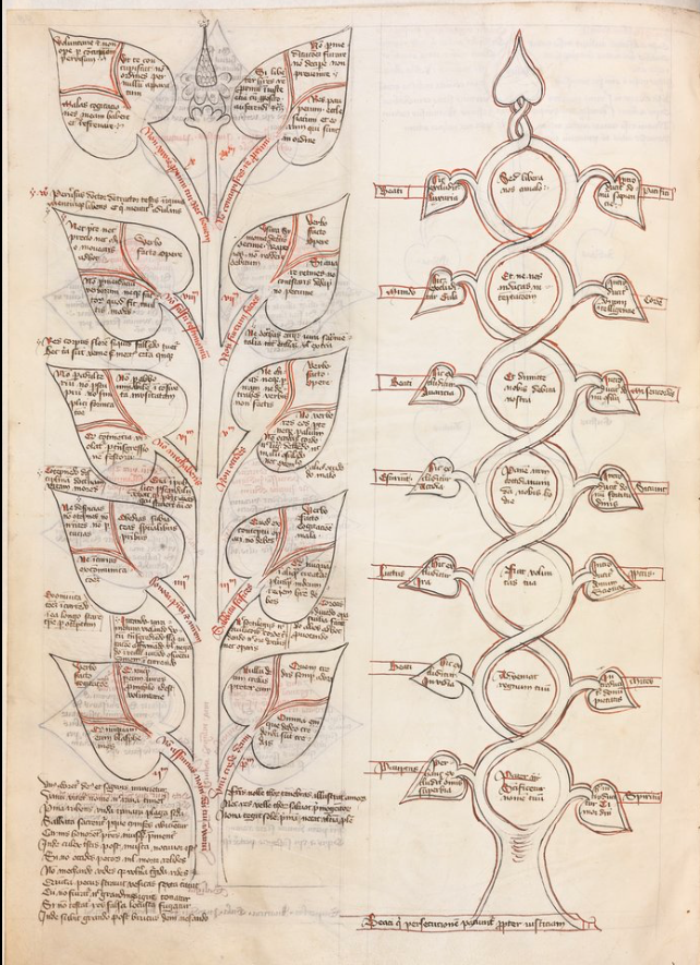
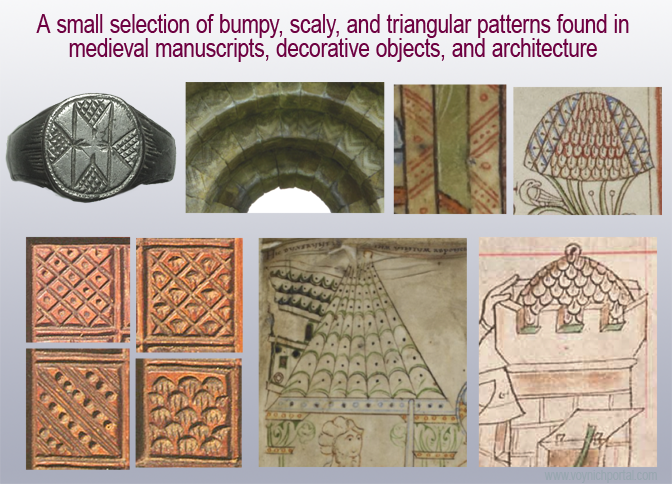
In April 2019, I posted a blog about double-cee shapes in the VMS text. This convention of combining two cees to create a different letter has a very long history but is not the custom in modern scripts. In medieval scripts, the tightly-coupled double-cee has a different meaning from two cee shapes slightly separated. Most of the time, the tightly-coupled cee represents a vowel. To identify which vowel, you have to look at position, as well. But first let’s look at the origins of some of these shapes…
Ancient Origins
To understand double-c and the Nota symbol, you need some familiarity with Greek and how it influenced Latin scribal conventions.
The Greek alphabet is found in handwritten Latin manuscripts up to about the 16th century, and was sometimes used in annotations in early medieval texts.
Here are a couple of examples from Latin manuscripts:
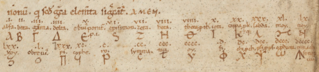
The Greek alphabet in a Latin manuscript from Southern Italy. [Source, Genève Cod. lat. 357]
Example of the Greek alphabet in a c. 1190s Latin text from southwest Germany. Note the shapes for nu (sometimes called “noy”) and omega as these were also used by Latin scribes. [Source: HHB Cod. Sal IX,39. A similar notation is in Einsiedeln Codex 29(878)]
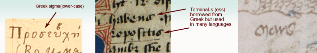
Some of the Greek shapes and scribal conventions were adapted by Latin scribes. For example, certain ligatures and letter-shapes such as the N in Nota were common. The lowercase form of sigma (sometimes called symma or summa) and variants similar to sigma evolved into a broadly used form of final-ess that has some relevance to the VMS.
Final-Ess
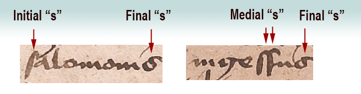
Medieval scribes used initial, medial, and final forms for certain letters. Some used the same initial and medial forms, but reserved other shapes for the final form. These distinctions still exist in Middle Eastern scripts, but have disappeared from most western alphabets:
Here long-ess is used for initial and medial forms, whereas the shape loosely resembling Greek sigma is reserved for ess in the final position.
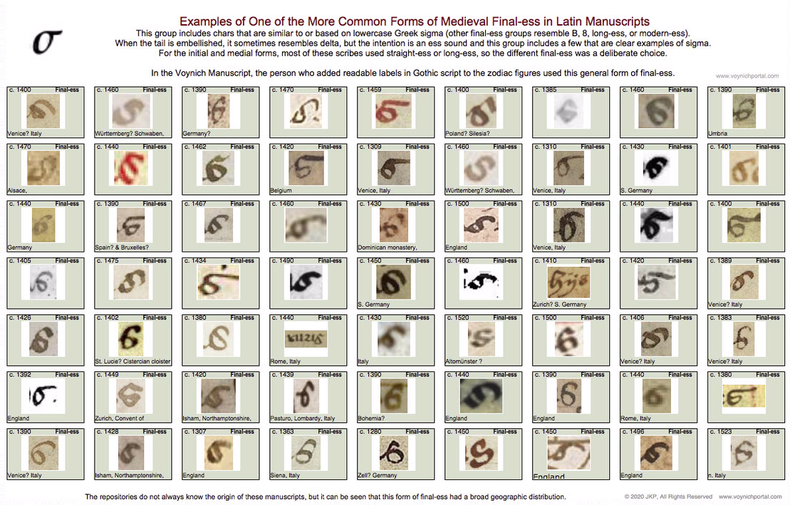
Not all scribes used the same shape for final-ess. There are several basic groups (long-ess/straight-ess, B-shape, 8-shape, sigma, and modern-ess). I will post examples of each in a future blog because the 8-shape relates to f116v.
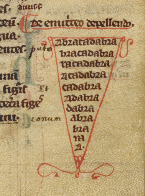
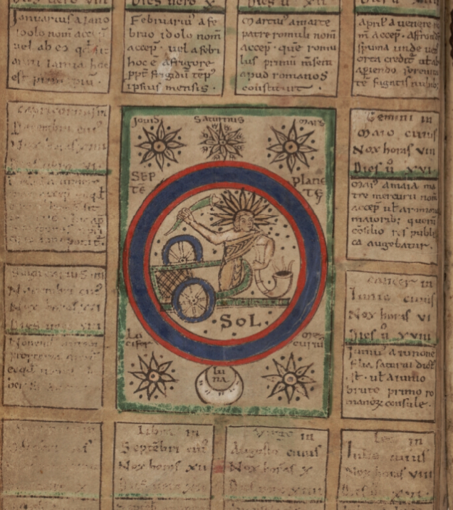
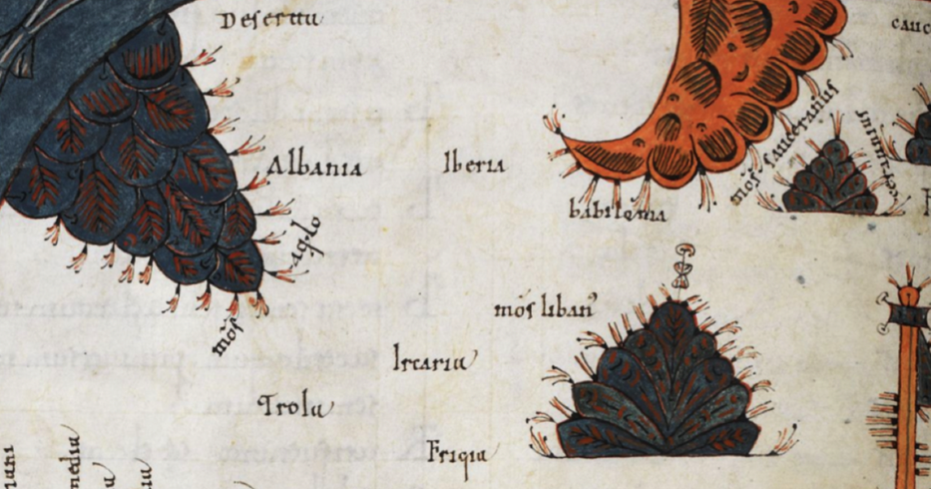
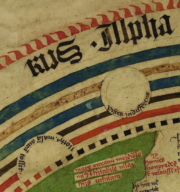
The following set represents one of the common groups of final-ess relevant to Voynich studies because the month labels added to the VMS “zodiac figures” use this general form:
Here are examples of the sigma shape from a Greek manuscript, a Latin manuscript, and the “Mars” (March) label under the fish in the VMS:
The general style of final-ess that resembles Greek sigma, which shown in the chart above, can be seen in the labels added to the VMS “zodiac figures” drawings.
Latin Vowels (and the occasional consonant) Written with Double-Cee
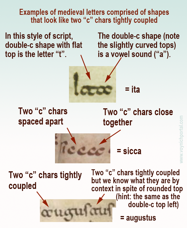
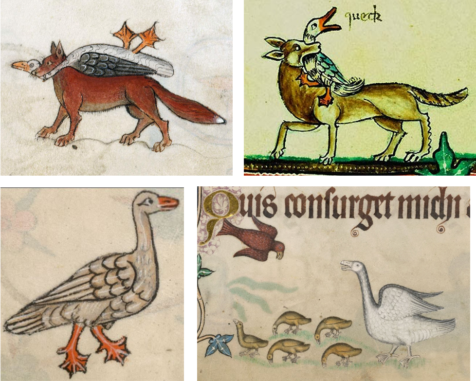
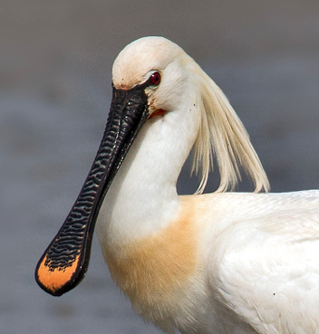
Another letter with Greek shape-mates (although not always the same meaning) is the double-cee. This is a loose term describing a group of symbols in Latin manuscripts. Why is it a loose term? Because some scribes wrote a tightly coupled “oc” rather than “cc”, but most of the time you’ll see “cc”.
In the early medieval period, there was very little distinction between a “t” and a “c” and they can be hard to tell apart. But, it depends on which script you are reading. Sometimes the “t” is distinguished from “c” by being doubled, so it looks like “cc”. The letter “a” was sometimes written this way as well, which can be even more confusing to those who haven’t learned medieval languages because you can only figure it out by reading the whole sentence.
Here are some examples that explain how to distinguish double-t, double-c and two cees in a row, but note that some are ambiguous unless you can see the words before and after:
Note especially the second example (sicca) which includes both c + c and a tightly-coupled double-cee representing the letter “a”.
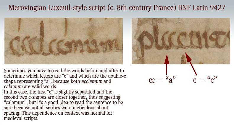
Additional picture added 8 March 2020 to illustrate that the double-c form of “a” was not limited to southern Italy or Dalmatia. This Merovingian example is from eastern France, probably from the Abbey of Luxeuil.
These loosely and tightly coupled cee shapes are also present in the Voynich Manuscript, but transcripts generally ignore the distinction (see my previous blog) and it is not yet known if it is a meaningful distinction. Now let’s look at another letter with similar characteristics…
Double-cee as “oo” “wa” or “u”
The medieval concept of “u” was not the same as we know it. In English, we make a distinction between “u” and “v” sounds and shapes. In medieval Latin, the “u” and “v” shapes were interchangeable in most languages using Latin characters and the sound was closer to a breathy w’ than an English “u” (and was not like our “v”). It was sometimes written as a superscripted double-cee shape next to the letter “q”.
Remember that Latin characters were used to write many languages, so it’s unwise to generalize too much, and difficult to describe a sound in any given language from 600 years ago. It’s better to think of the double-cee shape as a vowel (except when it was “t”) rather than as a specific letter.
Double-cee can represent “a” but it can also represent “u” (in the same manuscript), as well as indicating an ordinal, which means it is sometimes closer to a symbol than a specific letter. Once you understand the context, you can work out which letter it represents. In medieval script, context was king and many symbols had dual or triple meanings.
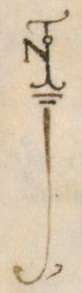
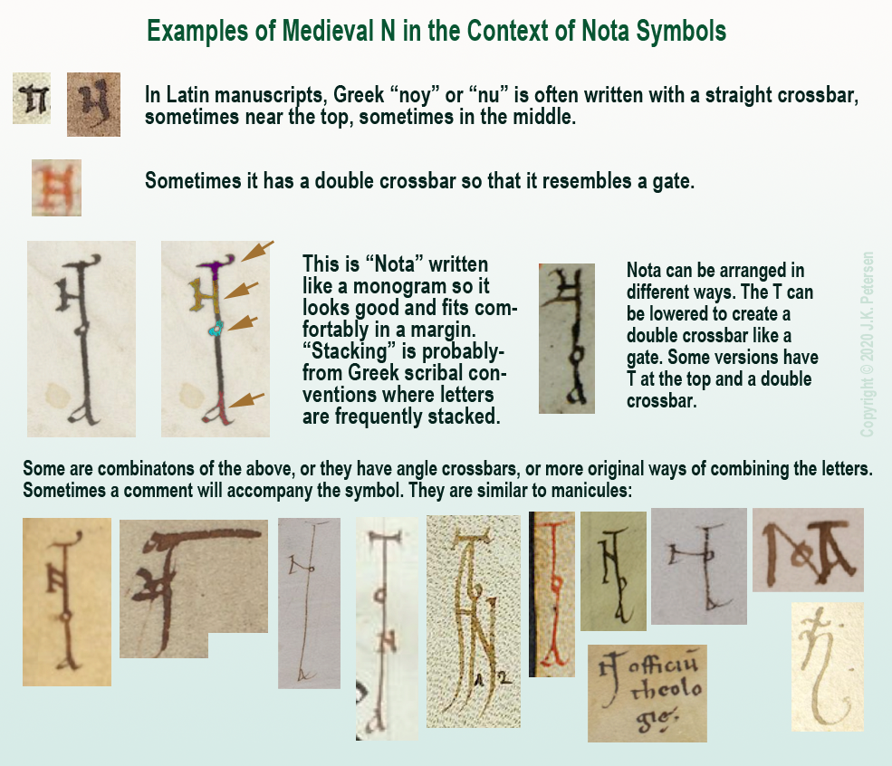
Greek Nu or “Noy”
Another Latin letter that is similar to Greek is the letter N.
We know it with an angular crossbar, as in the example to the right, but it was sometimes written with a straight crossbar (see below). In modern English, this form looks more like H than N. Sometimes the crossbar was at the top of the ascenders (somewhat like VMS EVA-k). Other times the crossbar was in the middle (similar to English H).
The crossbar could be single, or double, like a gate. Here are examples using a popular medieval symbol for pointing out interesting passages, the NOTA symbol. It was frequently stacked or intertwined like a monogram. Usually all four letters are present, although occasionally it is abbreviated NT:
Clearly there was some creative freedom to arrange the letters and yet the meaning is quite clear. The N will sometimes be combined with a B to create Nota Bene (note well).
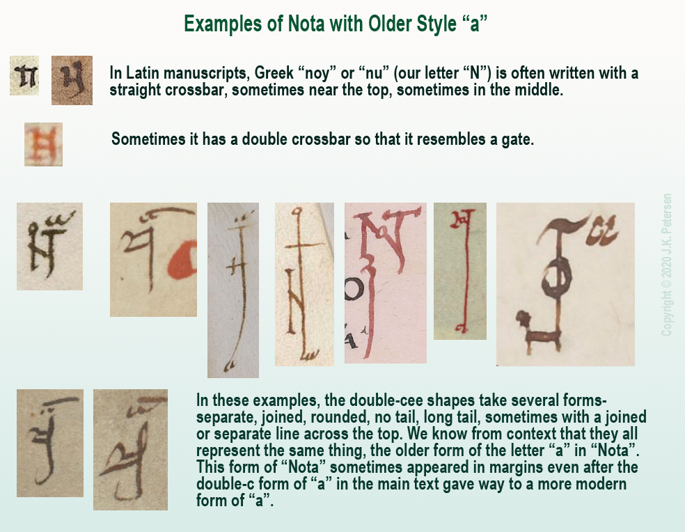
Nota with Double-C
There is another form of Nota that uses more traditional forms.
Remember the “a” written as double-c mentioned above? Sometimes NOTA was written with the earlier form of “a” rather than the late-medieval “a”, as in these examples:
A Less Obvious Example
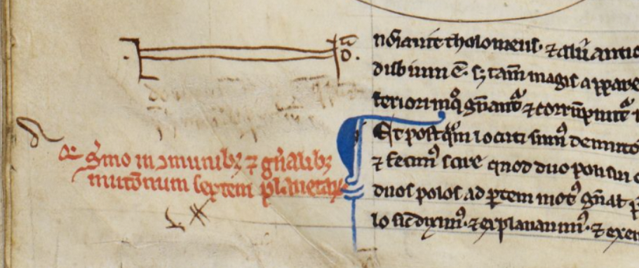
That should be enough background to help the reader interpret the more stylized symbol found in a 13th/14th-century scientific compilation.
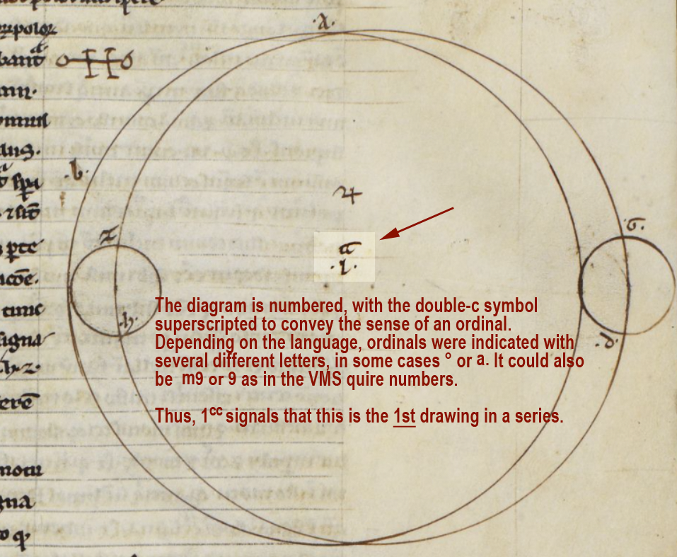
BL Harley MS 1 includes treatises on astronomy/astrology and mathematics, and the first section is attributed to Abu Ishaq al-Bitruji al-Ishbili. In it there is a series of geometric drawings, and below the third second drawing we find a symbol in the left margin…
It is essentially the same as the old-style double-c “a” Nota symbols in the above examples, except the gate-style N has been stretched more than usual to encompass the comment directly below (which has since been erased). On the right side of the “gate” there is a tick for the T, an “o” and, above it, the double-cee symbol representing “a”.
More Uses for Double-Cee
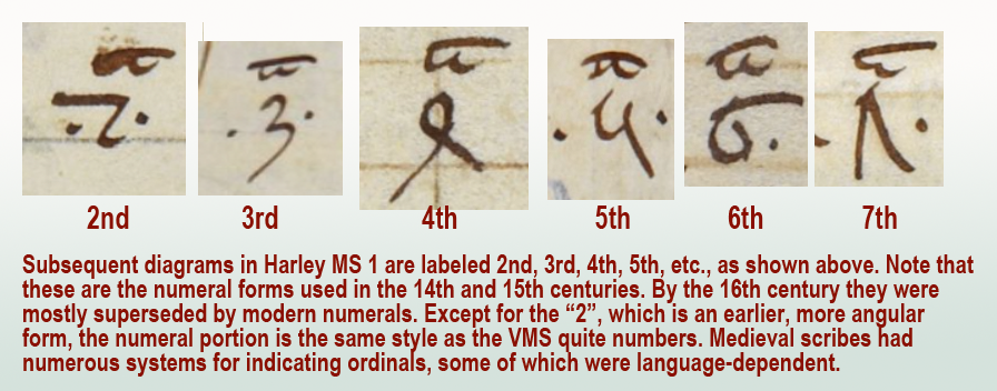
In Harley MS 1, the symbol that resembles double-c is used in other ways, as well. It can be found in each of the geometric diagrams.
Here the double-cee symbol superscripted next to the number 1 introduces this as a series of drawings. You can think of it as an ordinal symbol and this diagram as the http://telegraphharp.com/fw.php 1st:
As would be expected, the diagrams that follow are numbered in sequence as follows:
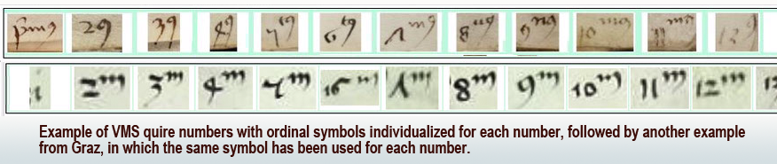
In a series of ordinals, sometimes the same symbol is used for all of them. Other times, the ordinals are individualized for each number, as in English (1st, 2nd, 3rd, etc.).
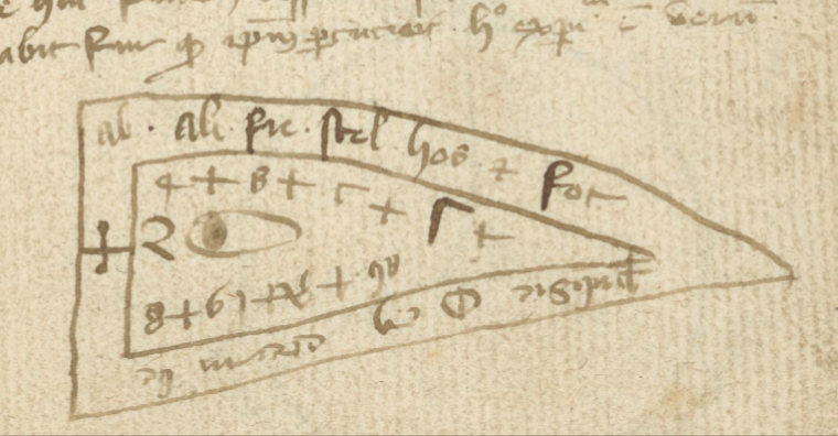
Here is an example showing the individualized ordinals of the VMS quire numbers compared to a set that uses only “m”:
Other common ordinal symbols are ° and superscripted-a.
This aspect of the VMS is, in a sense, a gift. If this ordinal system can be identified in other manuscripts, it might provide some clues to the early life of the VMS. Unfortunately, quire numbers are very difficult to find. I’ve been searching since 2008 and only have a handful of examples. They are usually trimmed off or bound inside the signatures where they can’t be seen. When I have time, I’ll post the ones I have so far.
Summary
The double-cee shape was disappearing by the 14th century and by the 15th century, the Nota symbol was often replaced by a manicule. By the 16th century, final-ess was beginning to disappear, as well, which means Greek influences were gradually replaced by early modern forms.
Even so, it helps to know these earlier conventions because there are aspects of the VMS that hint at some of these characteristics. Plus there are glyphs in the main text that may have been influenced by early-medieval conventions.
Also… there is a possibility that the separate cee shapes and tightly-coupled cee shapes in the VMS are not the same, which might partly explain why there are sometimes four in a row. If cee-gap-cee and double-cee are different, it might add some variety to the oddly monotonic script.
Medieval charms are like puzzles—ancient traditions, archaic names, corrupted words, blended languages, and numerous abbreviations. To decompose or interpret them, one has to learn about historic religious practices, both eastern and western, and to study hundreds of charms so that the general patterns become more evident.
I’ve posted several blogs on charms, talismans, and amulets. It was the word oladabas on the second line and the repetition of six, morix, marix on the third line of VMS 116v that started me on this journey. These patterns reminded me of magic words (like Abracadabra) and patterns of sound-repetition that have long been associated with ancient magical rites.
The earlier blogs are here:
Repeated sound sequences and ancient words like Abracadabra (July 2013)
When I looked into this subject in more depth, I discovered that various versions of Aladabra, Abraca, Abracula, Abracadabra, ala drabra, et al, are closely related, and shortenings of the name in a repetitive line or diagram are not just to save space but to “reduce” the power of illness or malign spirits. Sometimes these are intended to be chanted aloud. Other times they are written on small squares or strips and worn on various parts of the body, or buried in the ground.
Abracadabra is possibly of Semitic origin and is mentioned in Serenus Sammonicus’s Liber Medicinalis as an incantation for fever as “chartae quod dicitur abracadabra”.
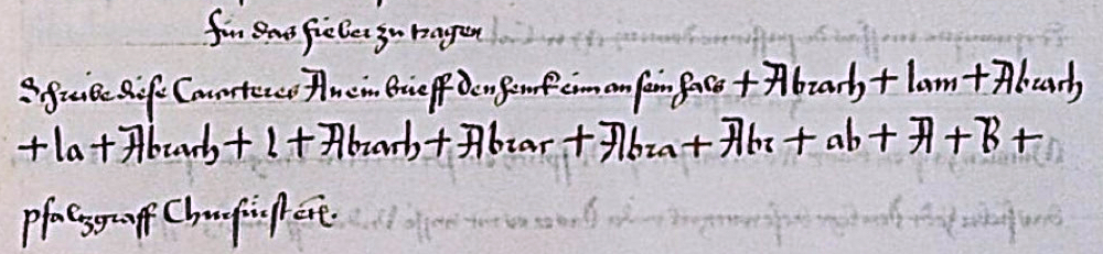
The charm words were not always written within shields or triangles, often they are within circles or pentagrams. Sometimes they are written in more prosaic style… let’s look again at an example I posted in 2016—a charm for fever:
Abrach, Abrach, Abrach, Abrach, Abrar, Abra, Abr, ab, A, B
And is interspersed with the shorter sequence from the end:
lam la l
Note how this differs from the shield charms (and from many of the more prosaic charms). This intertwining of the beginning and end is not common. Usually the ending is simply dropped to gradually reduce the word down to one or two characters, but the way the parts are interspersed in this example might be relevant to the VMS, as will be discussed farther down.
But first, a little more background. To fully appreciate charms, it helps to know a few abbreviations…
What is “aaa”?
Courtesy of St. John’s Orthodox Church
If you saw “aaa” in a manuscript or engraved on a talisman, you might scratch your head, but the history of charms reveals the meaning of this cryptic abbreviation.
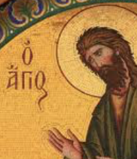
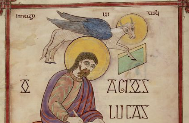
When I came across the incantation “Agios Agios Agios” in a medieval manuscript, I recognized it because it is commonly written on Greek icons with images of saints, Jesus, and God (like the Arabs, the Greeks frequently exploited the calligraphic characteristics of letter shapes and intertwined them like monograms). On the right is a typical icon labeled O Agios. Agios means “otherly” and is often translated as reverend, holy, or sacred. It is written and abbreviated in numerous ways.
Agios was also Latinized in the Middle Ages. There are several examples in the Lindisfarne Gospels. I include one here:
O Agios Lucas, St. Luke [circa early 700s, century, British Library, MS Cotton Nero D IV]
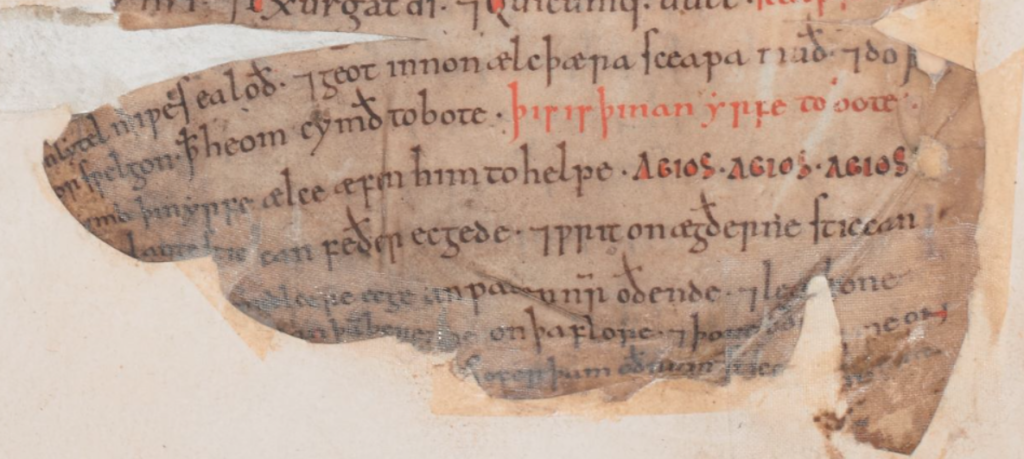
Another example of Agios, in the context of charms, is in an Old English manuscript from the 11th century. The reader is instructed to sing Agios Agios Agios to the cattle each evening (ælce æfen) as a form of protection and aid (him to helpe):
Agios charm to be sung each evening to protect cattle [British Library, Cotton Vitellius E XVIII, f15v]
Agios is sometimes abbreviated as Ai, and the abbreviation aaa is also a shortened version of Agios, Agios, Agios. But Agios, Agios, Agios (used in priestly invocations) is itself an abbreviation. It comes from an old hymn in Greek:
Ágios ó theòs, ‘ágios ìskhuròs, ‘Ágios àthánatos èléeson èmâs…
This hymn is known as the Trisagion (thrice Agion) and is sung in liturgies and processions. If a person is familiar with the hymn, then they would recognize Agios, Agios, Agios in the context of a charm without having to see the full text of the hymn. It seems likely that it is a direct reference to the hymn because the cattle charm instructs the user to sing the charm words.
Thus, extreme abbreviation to single letters or double letters was not uncommon.
Other Mystery Abbreviations
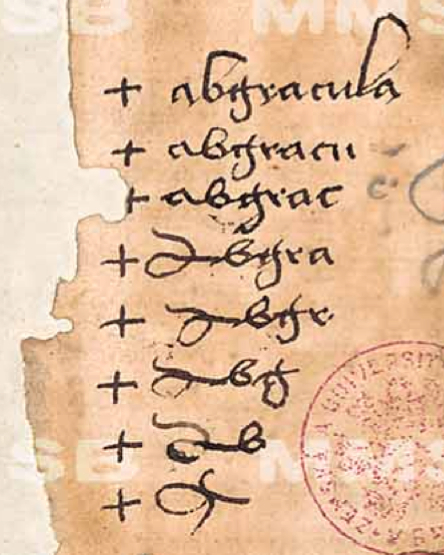
In previous blogs, I posted examples of Abracula/Abgracula (right), a word gradually reduced to a talismanic shape (sometimes as a shield diagram), and frequently combined with crosses. Since posting this in 2013, I have also seen the word shortened to “Abrac” and “Arac” in textual charms.
In addition to shortened words, medieval charms often include repetitious sounds, in addition to Hebrew and Latin,”power syllables”, names of angels, and other components.
The following shield charm begins with “ab” in the upper left, followed by what appear to be mostly abbreviations in the outer band. The inner band also begins with “ab” if you flip it around, followed by numbers and a mixture of Greek and Latin letters. I was wondering why shield charms were common in Latin manuscripts and I’m not sure of the specific reason, but in Hebrew and Arabic exemplars, triangles are very common, so perhaps this is an adaptation of the triangle:
I noticed “ab” was frequently at the beginning of charm words and thought it might trace back to the biblical Abraham, but there’s another possibility… perhaps “ab-” is popular in charm words because it roughly represents the first two letters of the alphabet (Greek, Hebrew, Arabic, Latin).
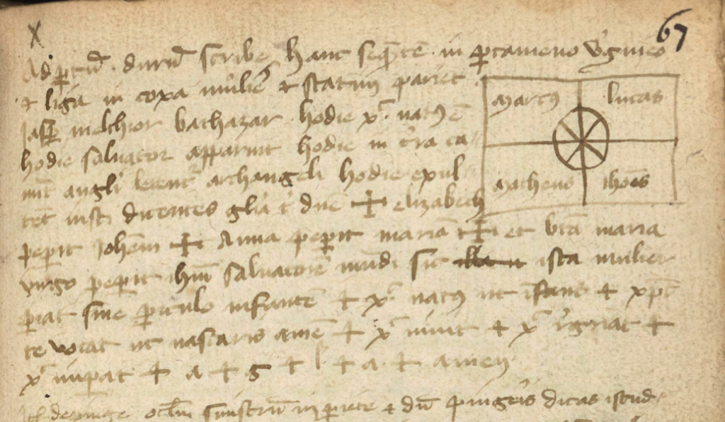
Below is another example from the same manuscript. In the top right are the names of the evangelists within quandrants, with a crossed circle in the center. On the third line are the names iasp[er] (a reference to Casper) melthior and bathazar (probably Balthazar), the three wise men, followed by invocations to archangels, followed by crosses and more names, including the following interesting passage:
+ elizabeth peperit Ioh[ann]em + Anna peperit Maria[m] + bra’ maria virgo peperit ihu’ (Jesus) Salvatore’ mu[n]di…
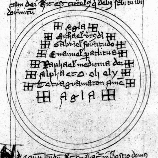
The names of women and their offspring are included in a number of childbearing charms and, if you scan down to the last line, you will see + a + g + l + a + amen, which is a clue that “agla” like “aaa” (Trisagion) is probably an acronym.
And so it is. It comes from the Hebrew אגלא for “Attah Gibbor Le’olam Adonai”. Adonai is one of the names of God, frequently included in charms with Eloyim and Sabaoth. This invocation acknowledges his might and power.
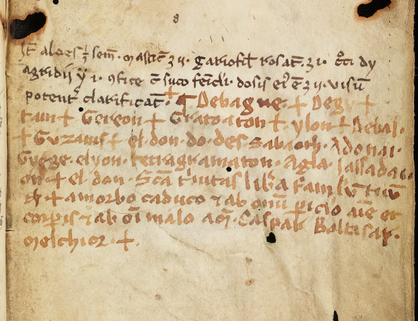
The following charm, added at the end of Arau MS Wett 4, also includes Adonai, Sabaoth, Grege, elyon, and tetragamaton (which also has Hebrew origins). At the end, are Baltasar and Melchior, as in the previous example and, as is common, several crosses (which in some cases indicates a genuflection):
Charm at the end of Ms Wett 4, folio 112r. This manuscript is from the second half of the 13th century, but these added notes might be from sometime in the 14th century, based on the handwriting. The second part may have been added at a different time, but it’s essentially the same style of handwriting (possibly the same writer), using a different writing implement and bottle of ink.
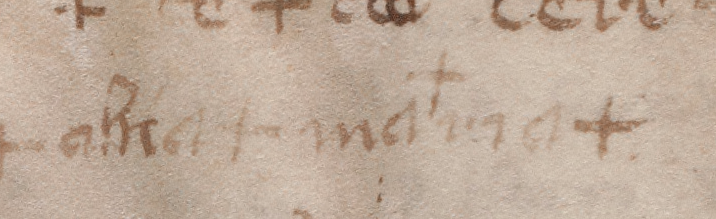
Near the end of the sixth line is the now-familiar agla.
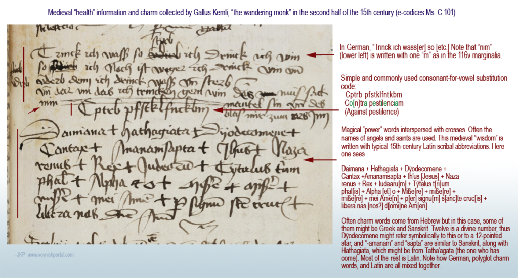
Here’s a pestilence charm with a similar format and a brief partial-substitution cipher that I posted in June 2018:
15th century charm for warding off the pestilence (black plague). [Source e-codices Ms c 101]
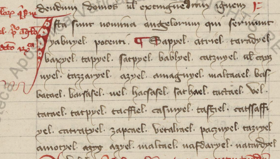
Names of angels are also very common in charms and general books of magic. Here is an example with names of angels (and other sacred personages).:
Long lists of the names of angels are common in medieval books of magic. Notice how many have “el” or “ael” endings as is also true of archangels Michael and Gabriel. [Source: Vatican Lat. 1300]
Specific angels were said to be associated with each hour of the day or night, with the archangel Michael presiding over the first hour of the day (the time when many rites were instructed to begin).
Sound Repetitions
I mentioned Agios as a repeated invocation, but there are also many vaguely Hebrew or Latin-sounding phrases that don’t appear to mean anything or which are simply repeats of names. Often the cluster of syllables is identical or self-similar.
For example Hatim, Hatim, Hatim (also written hatyn, and probably representing a name), kadosh, kadosh, kadosh (the Hebrew word for sacred) and eye, eye, eye can be found in medieval conjurations for Thursday (as described in the Heptameron and by Lauron de Lawrence, 1915) . The odd-looking eye, eye, eye found in BSB Clm 809, is an abbreviation for eschereie, eschereie, eschereie.
What might be even more interesting to Voynich researchers is sequences that are self-similar…
In a childbirth charm in MS Sloane 3160, the text following christus regnat is erex + arex + rymex. Looking more closely, if the wordplay is based on “regnat” or “rex” then eREX aREX RymEX might be the basis for the pattern.
Sometimes the short Latin-like words refer to longer statements, just as aaa refers to agios in its longer form as agios + agios + agios or as a hymn. For example, the following statement:
In nomine patris max, in nomine filii max, in nomine spiritus sancti prax.
will sometimes be abbreviated in charms as max + max + prax.
Another sound sequence found in charms is habay + habar + hebar, with habar being the Hebrew word for incantation. Note how each word varies by only one letter.
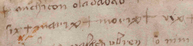
In VMS 116v, on line three, we see siX + mariX + moriX + viX + so IX is common to all four and this being the VMS, I can’t help wondering if “ix” was chosen because it also doubles as the number 9. There are some oddities of spacing… the ix in each case appears to be written in the same handwriting and the “a” is the same as others on the page, but the backleaning i character (resembling EVA-i) in “vix” is quite perplexing. Was it intentional? Or a slip into thinking in Voynichese? Or is it a later addition in another hand?
Spelling was quite variable in the Middle Ages, so I looked up “morax” as a substitute for “morix” and discovered that morax or more commonly marax is a demon, one of the fallen angels—a spirit that could be summoned by Solomon, appearing as a bull. Marax governs astronomy, herbs, and precious stones. He can be invoked at any time except twilight.
This information comes from De Laurence’s 1916 Lesser Key of Solomon, which is translated from manuscripts in the British Museum. BNF Italian 1524 is another version that includes this diagram with AGLA in the top left, and a magic square in the bottom right together with other talismanic symbols:
An earlier manuscript said to have inspired this is the Livre des Esperitz (Book of Spirits, Trinity O.8.29), a French grimoire with influences dating back at least to the 13th century (Boudet, Médiévales). The French version calls this demon “Machin”. Other variations include Mathim or Bathym. Ancient sources mention Tamiel or Temel for a demon with the same characteristics.
These fallen angels were said by some to be fallen stars. Others saw them as personifications of human failings.
Some of John Dee’s writings are referenced in an 18th-century hand-written version of the Book of Spirits that is now in the Penn State Library (Ars Artium, Ms Codex 1677). The book includes a reference to the papers of Alchemist Richard Napier and a statement on a flyleaf that “I” (the scribe) copied the book from an old manuscript written upon parchment (British Royal Commission).
The Royal Commission also mentions a book on Kabbalah “bought at Naples from the Jesuits” Colledge, &c.” and a book on alchemy that “the Government seized upon the Convent and sold their Library.” Another writer, possibly C. Rainsford, further mentions that Sepher Rasiel came into his hands from the Naples Jesuits (1874), which provides some interesting connections between the Jesuits and occult books.
But to get back to our demon…it appears that the name morax/marax, when associated with fallen angels, originated sometime in the late middle ages or Renaissance, and we cannot be sure that marix or morix in the VMS is a spelling variation, but the similarity is provocative.
Now let’s look at another way to generate charm words…
Magic Squares
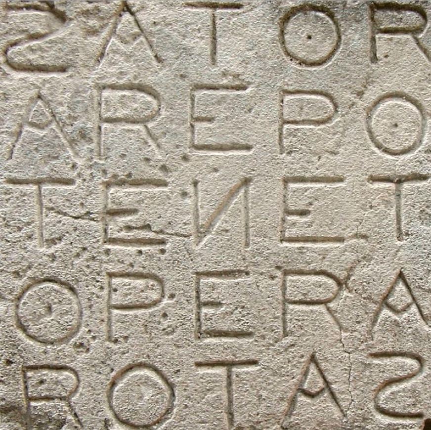
When I see self-similar patterns, I wonder if there is some formulaic way in which they are generated, other than simply having a couple of letters in common, as might be the case with palindromic magic squares. I saw one pattern that included the phrase ARAPS IASPER SCRIPT, which immediately reminded me of the famous SATOR/ROTAS square.
SATOR/ROTAS palindromic square [courtesy of M Disdero via Wikipedia, photo taken at Oppede, Luberon, France]
Many people are familiar with this square. It comes from ancient times and is frequently in books of magic, as with the Trinity example above.
Sometimes the square is omitted to show just the letters, as in the following incantation to influence friends in The Clavicle of Solomon, MS Sloane 3847. Note also the names of the three wise men, which were in MS Wett 4 pictured earlier, a variety of biblical names, and the four evangelists:
S. Sator, arepo, tenet, opera, rotas, Ioth, heth, he, vau, y. hac, Ia, Ia, Ia, papes, Ioazar, anarenetõ nomina sancta ad implete votum Amen. Baltazar, Iapher, Melchior, Abraham, Isaac, et Jacob, Sydrac, Misaac et Obednego, Marcus, Matheus, Lucas, Johannes, Ioron, Sizon, Tiris anfraton, adestote omnes in adiutorium ut a quacunque creatura voluere possim graciam impetrare.
Have you ever played with the letters in the SATOR/ROTAS square to create other words? For example, I noticed that PATER NOSTER (Our Father) can be constructed, and Pater Noster is also common in charms.
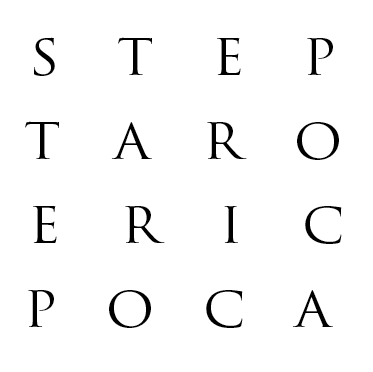
This made me wonder if charm sequences similar to ARAPS IASPER SCRIPT (ones whose origins are harder to identify) were loosely based on the SATOR idea. For example, something like this (I created this in a couple of minutes, so it’s not elegant, but it’s good enough to get the idea across).
Letters in this palindromic square can be picked out to generate the words ARAPS IASPER SCRIPT. To the medieval mind, perhaps they carry some of the “power” that comes from a palindromic square. Sound-similarity occurs almost by default when the character set is small.
Thus, I became suspicious that magic squares might have been used to generate a subset of charm words that are harder to fathom, and then I found this…
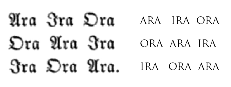
Abracula appears abbreviated as Abrac in Abrac Abeor Abere in Peter of Abano’s Heptameron. And it is apparently also the basis of “Ara”, an abbreviation used in a magic square with the following components:
Note the similarity of Ara and Ora to “aror” on folio 116v of the VMS. The preponderance of “a” and “o” (and the proximity of an “r” shape) is also a characteristic of the VMS main text.
If a string of something that looks like nonsense syllables were derived from other words in the same charm, then self-similarity across several lines would be significant. Even though the sequence SIX MARIX MORIX VIX isn’t sound-similar to the rest of 116v, it is similar to words in charms.
Practical Magic
The following example incorporates sacred names and abbreviations (typically Agla, Amara, Tanta, and others) within a circular frame surrounded by boxed crosses:
Sacred abbreviations and names surrounded by boxed crosses, all within a circle. The circle was not just decorative—often it was intended to be drawn on the ground, with the practitioner stepping within the circle and onlookers (if there are any) either waiting outside the circle or standing within, as well. The format varied with the tradition and the purpose of the charm. [15th century, BSB Clm 849]
If it is included, the name of God is often written first. Sometimes it is written several different ways. Other times the name of God is expressly omitted or only partially written, as certain cultures have prohibitions about writing the name of God.
AGLA is not specifically a name of God, but like max + max + prax represents a shortened phrase that includes the name Adonay, a reference to God that is very often in charms. Other common names in charms are Eloym and Sabaoth.
If you see C + M + B or G + M + B, there is a good chance it stands for Caspar Melchior Balthasar. M + G + E would be Michael, Emanual, Raphael and M + M + L + I is Mathew, Mark, Luke and Iohn (John). Names are sometimes written out in full or partly abbreviated. If there is limited space, the archangels are often chosen over other angel names. Sometimes many angel names are included.
Variations on words for friendship or love were also common in charms to win someone’s affections (or to get a girl to lift up her skirts).
As mentioned above, this shield-shaped charm symbol has numerous abbreviations and, as examples have shown, it was very common for charms and remedies to include Greek and Hebrew letters.
Unfortunately, when words or phrases are distilled down to one or two letters, it becomes harder to interpret them unless you can find a similar charm with the words written out. In this case, it’s possible the “ab” on the top-left is abracula or abracadabra as these words appear often in charms (especially shield charms):
This shield shape is populated with crosses and numerous abbreviations. It’s possible the “ab” stands for abracula, but sometimes an entire common phrase will be distilled down to a few letters for each word (note that there is “and” symbol before the last word on the top side) so it’s also possible this is a religious or magical invocation (a full phrase or sentence). [Wellcome MS Misc Alchem XII]
Magical diagrams in an Arabic manuscript, with symbols common to middle-eastern talismans and incantations [Baldah Al-Jinn]
Western charms have much in common with ancient Mediterranean, Arabic, and Indic charms, many of which have been transmitted through manuscripts created by Jewish and Greek scribes. Invocations to God from the Qur’an are sometimes included in divinatory diagrams.
Pentagrams, circles, shields, triangles, stars of David, and other geometric shapes are commonly found in both eastern and western manuscripts. Also common to eastern manuscripts is a double rectangle, with the second rectangle offset, with eight loops at the point, a symbol for Earth. Western manuscripts also include these shapes, but tend to favor circles, shields, stars, and rectangles. Sometimes the strange shapes that accompany divinatory frames are corruptions of Arabic letters and western-Arabic numerals.
Figures composed of spidery lines ending in circles are common in books of Kabbalah, and often the names of angels are expressed this way, as well. Some of the western alchemy and astrology symbols have these characteristics, as well. Shapes that resemble EVA-t are natural variations of these kinds of patterns.
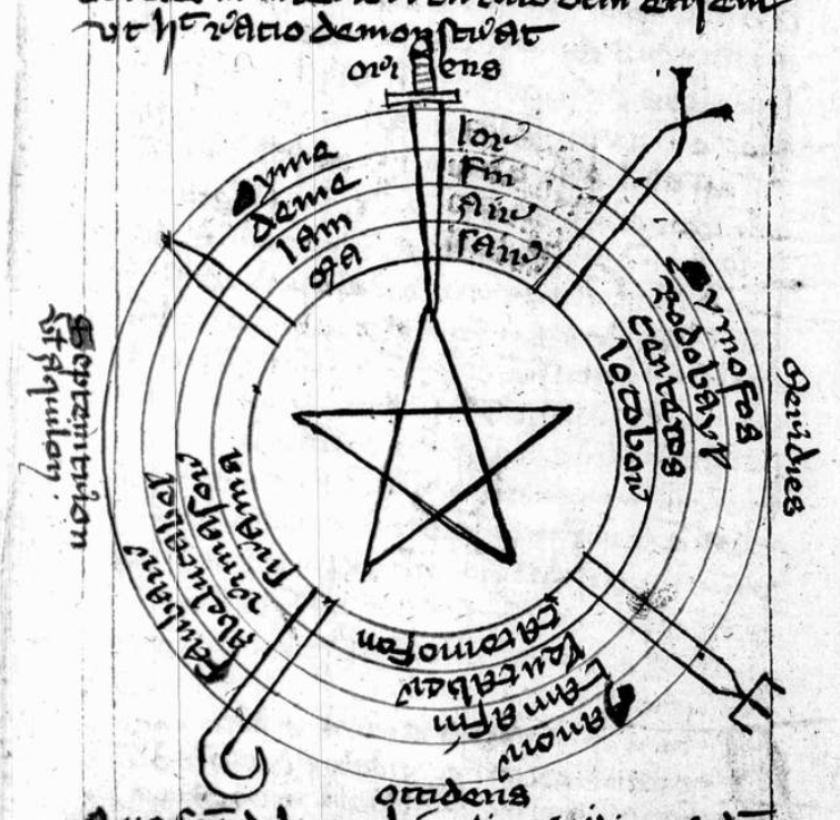
Sword and Soil
In medieval books of magic, drawing a circle in the dirt with a sword or stick is a frequent instruction, and incantations may be chanted from the edge or inner portion of the circle, depending on the specific kind of charm. The user is frequently directed to face east. If animals are used in the ceremony, they are usually sacrificed (and sometimes buried in a specific spot) or let free with the understanding that bad spirits will depart with the animal. The unfortunate Hoopoe, a beautiful bird that is fast declining, was a favorite sacrificial victim.
Often a young virgin boy was used to read the signs in water, oil, or other somewhat reflective surfaces. It was assumed that someone with enough youth and innocence would tell the truth. Often the boy was asked to reveal who had perpetrated a crime and people were gullible enough to accept the boy’s interpretation and to punish the “guilty”.
This may seem irrational and superstitious, but even respected 16th-century scholars like John Dee believed it was possible to “channel” information from other realms via a scrying mirror and a medium (in this case, Edward Kelley, who was neither young nor virginal).
This example from a 15th-century manuscript (Clm 849) is circular, with a central star, five divisions, and a sword at the apex representing east (east was commonly shown as “up” in medieval maps and many magical diagrams). This is the general form of diagrams that were inscribed on the ground, sometimes with a real sword.
It was rare for books with diagrams like this to survive as they were actively sought out and destroyed by authorities. Sometimes just owning one of these books could get you imprisoned:
Instead of a figure, sometimes the words or letters for alpha and omega are written in the inner circle. In BL Sloane 3648, the central circle includes pentagrams with ADONAI written in each outer triangle and alpha and omega split across them on either side:
As mentioned earlier, charm words are often in groups of three with sound similarity. Sometimes the words are identical, as in Amen, Amen, Amen, or Fiat, Fiat, Fiat.
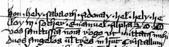
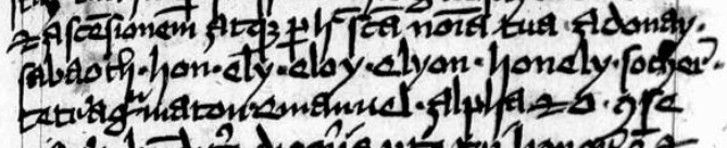
Sometimes they vary only slightly. Frequently the second and third words are only one or two letters different from the one that came before, as in Adra Adrata Adratta, or Adra Adrata Adracta, or one I see quite frequently, Hel, Hely Heloy (sometimes written Hely, Heloy, Heloe, Heloen or Helion, Heloi, Hel), or the variant shown here as Ely Eloy Elyon:
Holy names such as Sabaoth, Adonay, and Emanuel, and repetitious chants such as Hel, Hely, Heloy or Ely, Eloy, Elyon, are commonly found in books of divination, and in charms and remedies written in margins and flyleaves of manuscripts. [Source: BSB Clm 849, c. earlier in the 15th century]
I want to emphasize this because self-similar patterns are quite frequent in the main text of the Voynich Manuscript and I don’t think auto-copying is the only possible explanation. Before I post examples, I want to cover one more thing in folio 116v…
Names in Charms
In classical charms, a reference or invocation to Pagan heroes or gods was common. After Christianity became prevalent, the format remained essentially the same, but Hebrew and Christian names for God, angels, and the virgin Mary were often substituted, or shared space with older names whose origins were no longer known.
The second line of 116v has a word that might be “cere” which might be a Pagan reference to Ceres the goddess of crops and fertility, but there’s not enough information to know.
The next line includes the word maria with crosses on either side (which I mentioned in 2013 might be the sign for genuflection), and there is one that looks like it was inserted as an afterthought between the a and the r. This is quite possibly an invocation to the virgin Mary:
The word before “maria” is harder to discern. It looks like ahia, but the “i” is oddly written and the last stroke of the h is oddly abrupt and slightly truncated. It’s almost like an h badly melded with a k. It’s not quite a “b” (there is no bottom cross-stroke).
But let’s investigate the plausibility of ahia. This could be a reference to the prophet Ahia in the Biblical Book of Kings, who is best known for his prophesy that Jeroboam would be king. If the text on 116v is a medical charm, then Ahijah/Ahia/Ahiya would be an appropriate name, as Ahia the Shilonite was called upon in the Bible to be an intermediary between mortals and God in much the same way as Mary is asked to intercede on behalf of mortals in distress.
How Does This Relate to the VMS?
Patterns of repetition, in which subsequent tokens are only slightly different from preceding ones, are very prevalent in the VMS, but most of them are sequences of two (these can be found throughout the manuscript).
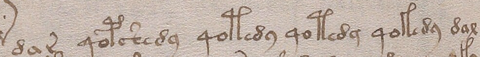
There are also dual and triple repeats with no apparent changes:
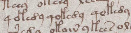
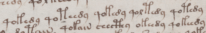
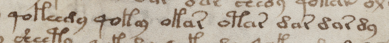
Are there sequences of three where the variation is limited to one character each time? A further example from folio 79r comes close, except that the third repetition has two changes, thus qolkeey qolkeedy qokedy:
This example, from the following folio might appear to be a sequence of five (with only one change in each), except that the differences in EVA-t and EVA-k create two changes rather than one:
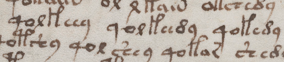
Here’s a similar sequence with dar and dax at beginning and end and four very similar tokens in between:
There’s no rule in charms that limits changes to only one letter, but when studying an unknown text like the VMS, if you give yourself too many degrees of freedom, you may be biasing your results. It’s usually better to examine simple changes first and, depending on what they reveal, go from there.
What we frequently find in the VMS is sequences where two glyphs change from one to the next. What is especially interesting about these sequences is that the characters that create two changes rather than one are often EVA-t and EVA-k.
The word oladaba8 on 116v is similar to some of the variants on abracadabra. Here is a full phrase found in Grimoires:
ala drabra ladr[a] dabra rabra afra braraagla et alpha omega
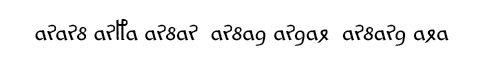
Now if we take the first part (before the readable part that says “agla et alpha omega”) and reverse it (something that was frequently done with magical words), we get
ararb arfa arbar arbad ardal arbard ala
If we substitute VMS characters with similar shapes, we get something close to Voynichese:
It’s not legal Voynichese (it’s too repetitive, there are other ways it could be substituted, and it breaks a couple of rules), but it shows some provocative similarities between Voynichese and charm sequences that are difficult to find between Voynichese and natural languages.
A French book of medicine from the early 19th century mentions both abracadabra and its reverse arbadacarba. In turn, if you break up arbadacarba into ar sa da 8ar sa (or something along those lines), the similarities to VMS components are more evident.
Remember the reduction charms I mentioned at the beginning? Where a charm word is broken down into smaller and smaller bits? Here is another interesting sequence in the VMS:
No, it’s not exactly the same in terms of which letters are dropped, but the way it diminishes is more similar to charm reductions than it is to the way sentences are usually constructed. Reduction-style charm sequences don’t follow hard-and-fast rules, just general guidelines (note that these patterns are more prevalent in some sections of the VMS than others).
Summary
There are not enough VMS glyphs with talismanic shapes to prove a connection to books of kabbalah or western magic. There’s only one (EVA-t) that is not easily found in the Greco-Roman scribal repertoire. My research tells me that most VMS glyph-shapes are the same shapes as Latin letters, numbers, and abbreviations (with a few that resemble Greek).
Also… to suggest that the VMS is full of enciphered charm words would be to ignore line-complexity, and the great variety of sequences that comprise the text. It’s possible that VMS patterns are generated in another way and similarity to charms is coincidental.
But there are portions that resemble charms in terms of pattern, repetition, and successive lengths of tokens, so perhaps some parts of the manuscript were inspired by incantations or charms. The only way to find out is to study them to see where and how often they occur.
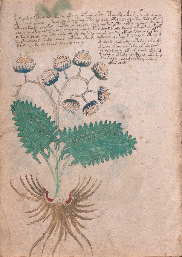
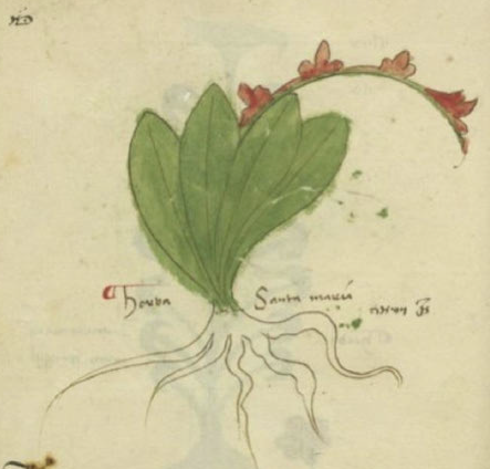
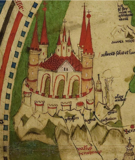
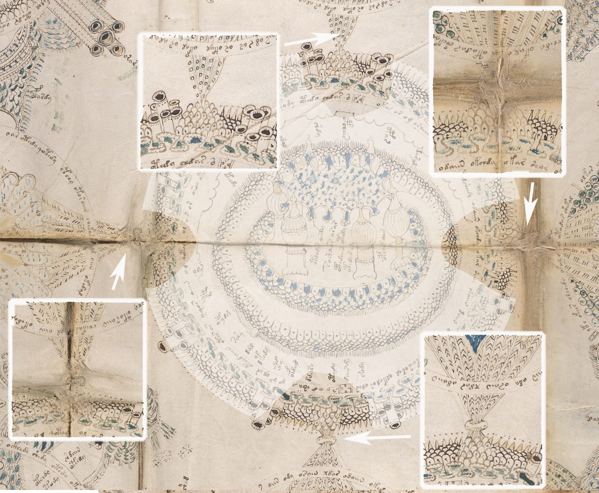
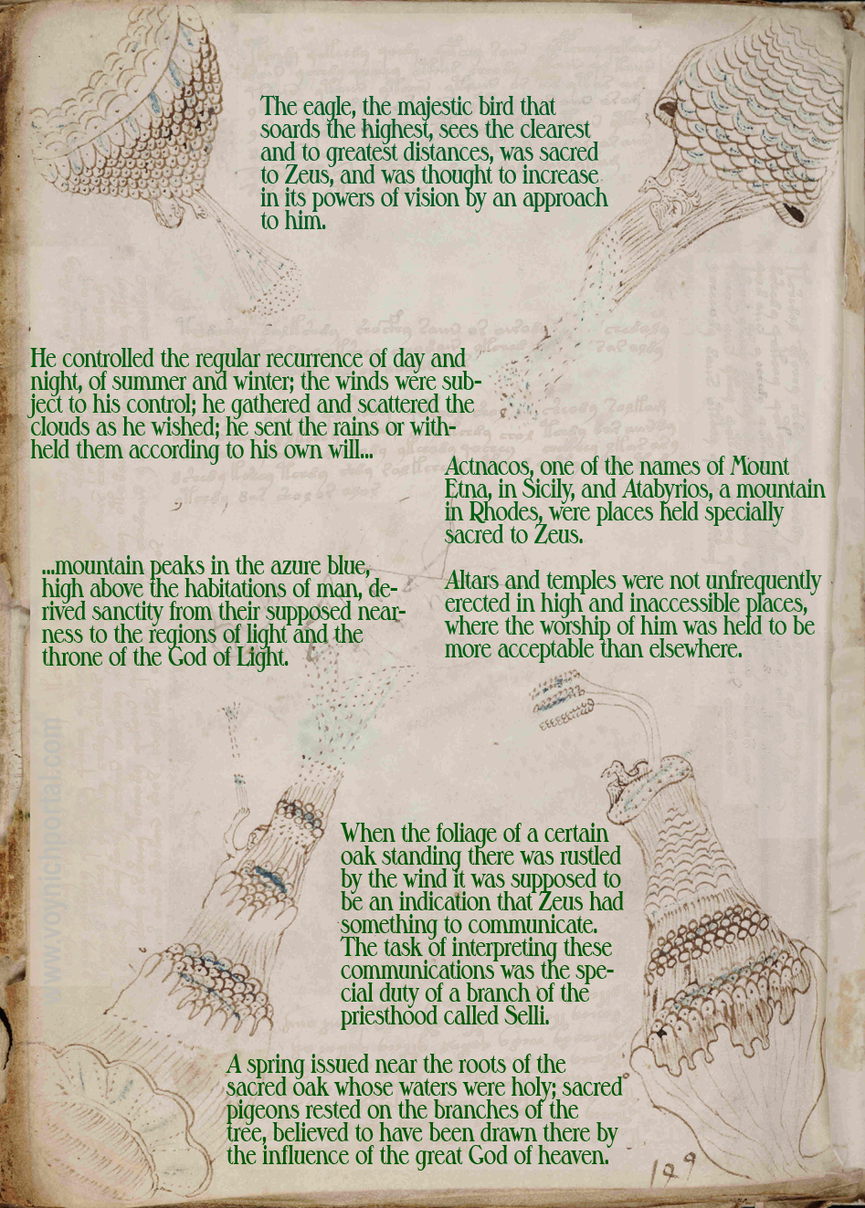
This is one of the VMS plant IDs I left blank in 2013 because I simply couldn’t find an explanation for the root shape. The plant has always looked to me like Tanacetum (or maybe Achillea), but I wanted to figure out the root before posting and was never completely sure if it was an angel, a bird, or something else. Now I realize it might not matter… there might be enough references in the style of the flower to help us understand the meaning behind it.
But first, let’s look at the VMS drawing…
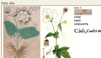
Plant 46v
Plant 46v is drawn toward the left of the page, as though space were left for more text that was never added. The text itself is a bit unusual. There is a right-side column that extends downwards and almost runs into the plant rather than following the shape of the plant. It looks like the text may have been added in two passes, a chunk on the left and a narrowing chunk on the right.
The drawing is fairly large and clipped at the bottom. The size of the flowerheads appears to be exaggerated (perhaps to show the details?). The stalk curls in a way that is not common to very many species—it might be mnemonic or stylized. A few of the individual stalks end abruptly, without flowers, an intriguing detail that might be important.
Coloration
The painting is rough, but the choice of colors indicates some thought. The stalk has clear green on the bottom, shading to a pale grayish-brown on the upper stalk, with blue on the individual flower stalks, and a darker blue for the calyx. The root is a medium brown with a light section where it connects to the stalk, and two red patches on either side.
The leaves are somewhat fernlike, with slight tails, and carefully drawn individual leaf serrations. The leaf stalks are concentrated at the base. On the leaves themselves, almost hidden by paint, are some lines that might represent hairs, veins, or ridges.
In fact, the whole drawing seems somewhat stylized (not just the root, but also the flower stalk and, to some extent, the leaves). To me, the root looks like an angel or maybe a bird and other researchers have suggested it might be a bird. What is provocative about it is the round circle in the “neck” and the red lining on the “shoulders”. These are not accidental details. The round part almost looks like an attachment point, as one might see in a tool or a piece of folding portable furniture.
When I look at the drawing from a distance, it reminds me of Tanacetum or Achillea. Both are in the aster family and have button-like flowers and serrated somewhat frondy leaves. The flower-heads and the serrated leaves in the VMS drawing seem consistent with these plants, but a Voynich researcher had another idea that I think has merit…
Prior IDs
I don’t agree with Edith Sherwood’s 2015 ID. She suggested Geum urbanum (wood avens), which is a plant in the rose family, but the flowers of G. urbanum are not the same shape as the VMS drawing. They have five petals that splay out (see below-right), and the flowerheads are more discrete, and they do not tend to cluster on the same stalk. The palmate leaves don’t match the VMS drawing very well either. She has an earlier ID (2008) suggesting a different plant (Inula conyza), which fits the drawing better, so I’m not sure why she changed the ID.
I think the button-like flowers in the VMS drawing look more like asters than roses, and the VMS leaves are clearly not palmate (there are other VMS drawings that have well-defined palmate leaves, so clearly the illustrator knew how to draw palmate leaves).
Other IDs
On the Voynich.ninja forum, Ellie Velinska mentioned costmary (Tanacetum balsamita). I like this ID. Costmary has finely serrated leaves and button-like flowers. I think Velinska mentioned a bird in the root, but I had been thinking it might be an angel. Either way, it looks more mnemonic than natural.
In Renaissance-era herbals I have noticed that costmary is sometimes listed under the older name of Chrysanthemum balsamita. Costmary is the Bible-leaf plant (the fragrant leaves are dried and used as bookmarks), and the French name for costmary is Herbe Sainte-Marie (referring sometimes to Mary Magdalene, other times to Mary, mother of Jesus). It was used medicinally in the Middle Ages, and also as a flavoring (hence the alternate name ale-cost).
Velinska’s ID of costmary fits well in almost every way. I wanted to endorse it, but there is one troubling detail…
Costmary is an eastern plant. It is common in Asia but was not introduced to Europe until about the 16th century. It did exist in a few places in the Caucasus, but may not have been abundant, as there were other more common species of Tanacetum that grew in this region, and plants are always competing for habitat. So I tried to find costmary in medieval herbals to see if I could support Velinska’s idea, but found it difficult to find any examples. Those that most resemble it are probably sage, but for the record, here is what I found…
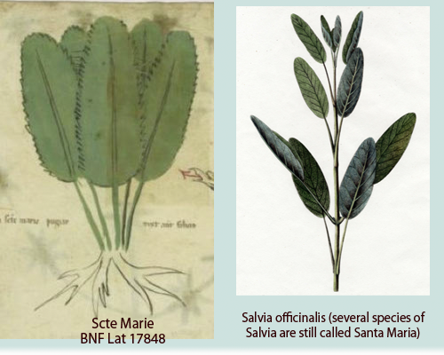
Tracking Down St. Mary
There are many plants called Sancte Maria/Santa Maria (including Dysphania ambrosioides, Solomon’s seal, and some species of Thymus) and the Linnaean system didn’t exist yet to help distinguish them. Most of the medieval drawinngs labeled Santa Maria show forget-me-nots or Solomon’s seal, or do not include flowers (which usually means the flowers are not a prevalent or useful part of the plant).
In medieval herbals, drawings labeled Santa Maria tend to depict leafy plants (which, unfortunately, are very numerous and hard to distinguish from each other), but it’s possible some of them are sage (Salvia), which is often drawn without flowers and called Santa Maria.
It’s possible this leafy plant, which is labeled Sancte Maria, is one of the common species of sage. The flowers were generally not included in the drawings, which makes it difficult to make a definitive identification, especially when there were several different plants with this name, but if it is sage, then the dog-muzzle style flowers would not be a good match for a VMS costmary ID.
There are numerous plants in medieval herbals with flowers that are similar to the VMS 46v. Feverfew, chamomile, and Tanacetum vulgare are common, but they are usually labeled in a way that they can be recognized and I have not found one that can be unambiguously pinpointed as Tanacetum balsamita.
A New Drawing of Santa Maria
Santa Maria, BNF Lat 17848, c. 1440s
Then, while looking through my copious files on medieval plants, I noticed that around the middle of the 15th century, a new drawing labeled Santa Maria shows up in a number of herbals. I couldn’t find it in the older references. Could this be costmary?
Unfortunately, the drawing doesn’t look like costmary, which is an aster. The mystery plant has a single long stalk with flame-like flowers (other versions of the drawing also have orange or red flame-like flowers). It looks more like Gladiolus or Salvia than costmary, so if it is costmary, it’s quite a bad drawing, even compared to other medieval drawings, and since most of the herbals have reasonably accurate drawings of tansy and feverfew (which are similar to costmary). I’m inclined to think the drawing on the right is not costmary, but maybe one of the red salvias.
Other Possibilities
The Tanacetum plants, in general, are a good match for VMS 46v. Many of them have frond-like sawtooth leaves and button-like flowers and, as mentioned, similar plants like tansy and feverfew are commonly found in medieval herbals. For the VMS plant, I was leaning more toward tansy than feverfew, but there are some varieties of feverfew that have shorter-than-usual petals and button-like centers, so it cannot be entirely eliminated.
I’m tempted to include Arabis collina on the list of possibilities. The leaves are a good match and the flower-stalk curls, but unfortunately, the flowers are wrong:
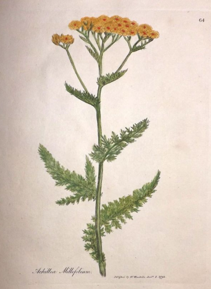
There is another species to consider. Achillea (also known as yarrow) has clusters of button-like flowers and finely serrated or frond-like leaves (depending on the species). It is widely distributed across Asia and Europe, and has much in common with the VMS drawing.
Achillea comes in several colors, including pink and red, but most varieties are yellow or creamy white. On some species, the flowers are like tansy, other times they are like chamomile. The leaves are sometimes feathery, sometimes more solid, and there are even woolly varieties. This plant is often included in medieval herbals under the name Millefolium:
Cotula is another possibiity. It has button flowers (there are quite a lot of asters with button flowers, sometimes called “rayless asters”), but the leaves are typically slender and smooth-margined, so the leaves are not a good match. Acamptopappus species also have button flowers, but it’s a desert plant (and American in origin), and the leaves are quite slender and small.
So I am still uncertain about the identity of 46v, if examined from a naturalistic point of view, and even thought costmary might not have been known in Europe in the early 15th century, it’s still one of my favorite IDs because the idea of an angel in the root would fit well with the name. A bird would too, if we are thinking in terms of Mary’s ascension and bird-drawings of the Holy Spirit.
But what about the curled stalk?
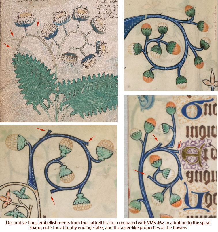
This is a question I’ve been wrestling with for some time, and another reason it has taken so long to post this blog. Is the curled stalk a characteristic of the plant, or is it a decorative embellishment?
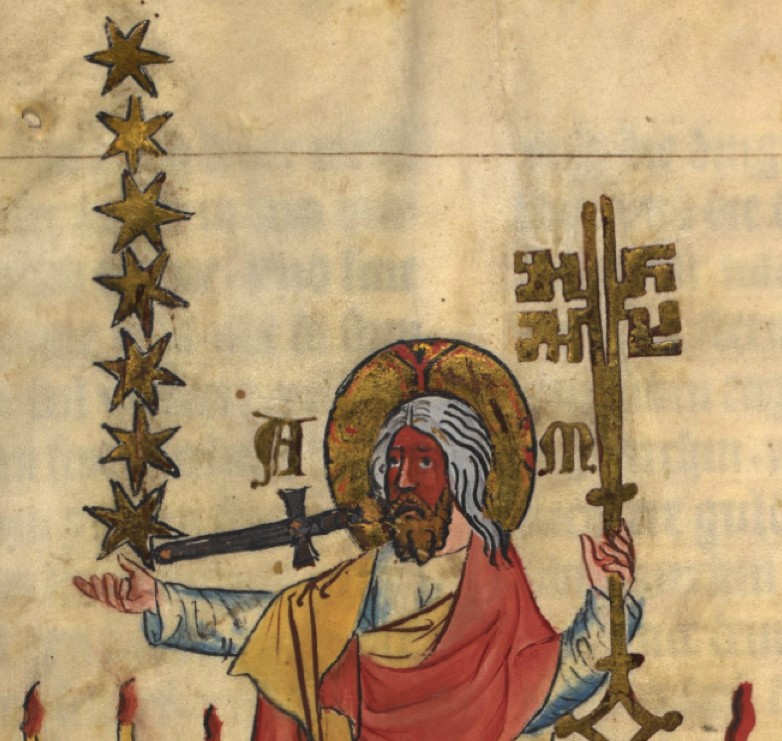
There are plants with curled stalks (Arabis, Heliotrope and many others), but they don’t usually have rayless flowers, and the stalk on the right of the VMS drawing has exactly seven flowers (a number important to medieval society).
I’m leaning toward 46v being a stylized drawing, especially when I see decorative floral elements in manuscripts such as the ones below (I have flipped them so they face the same way as the VMS flower). In terms of iconography, take note of the clipped stalks:
Top-left, VMS 46v. Top-right and bottom, decorative aster-like floral motifs from the Gorleston Psalter.
A Connection to Medieval Cosmology?
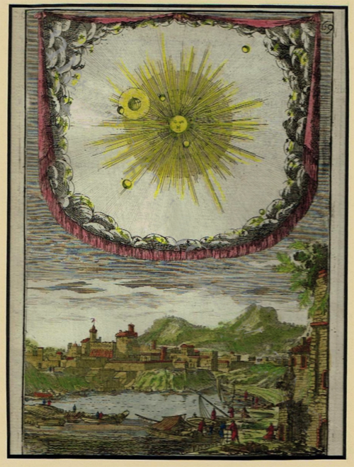
I kept wondering why the VMS illustrator spun the flower stalk in a loop and put seven flowers on the right stalk and one on the left. I knew it was common for medieval and post-medieval emblems to include seven stars representing the “seven planets”. In medieval cosmology, the earth was the center of the universe, orbited by seven “stars”.
Does the flower on the left represent the earth, and the seven flowerheads on the right the seven “stars” (or “planets” as they were conceived at the time), which were defined as Moon, Mercury, Lucifer/Veneris, Sun, Mars, Jupiter, and Saturn?
The seven “planets” from a medieval point of view as depicted in Liber Floridus as Sun, Moon, Mercury, Lucifer (Veneris), Mars, Jupiter, and Saturn. These were all considered to be revolving around the Earth.
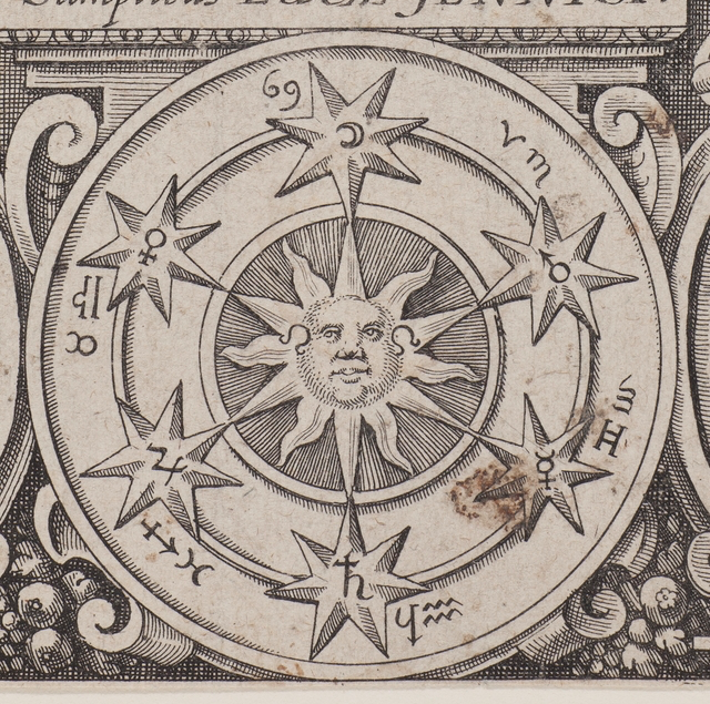
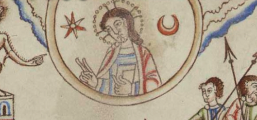
Here is a later example from Anatomia Auri (early 17th century) that I wanted to include because it combines medicine, astrology, cosmology, and alchemy. This astrological diagram focuses on Leo as the sun sign (notice the sign for Leo in the center by each of the sun’s cheeks) and, like earlier medieval drawings, shows the six other “planets” together with the sun:
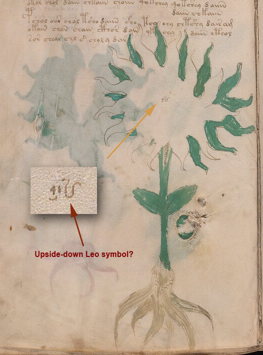
Why did I pick this one from the early 17th century rather than one from the 15th century? Because the Leo sign by the sun’s cheeks reminded me of this diagram on VMS 28v, which was discussed extensively by K. Gheuens and others on the Voynich.ninja forum due to the emblematic shape and the mysterious figures in the center.
I think the writing in the center could be interpreted in several different ways, possibly the way Gheuens suggested, but one of the ideas that crossed my mind was that the portion on the right might be an upside-down Leo symbol, similar to those on the cheeks of the sun-sign in the diagram above.
But getting back to Plant 46v, is it possible the flowers represent the earth on the left and seven “planets” on the right in the medieval earth-centric universe? Or is it something else?
In Kabbalah, the number one is the source, origin; seven is family, harmony, which might fit with an angel-root, but less so with a bird.
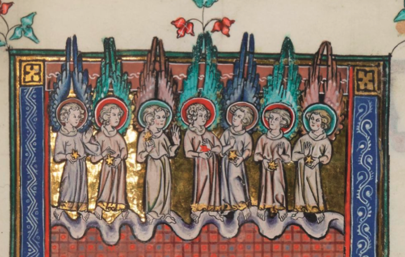
If the root is an angel, then perhaps the flowers on the right represent the angels of the seven churches, which are depicted here with each one holding a star:
The angels of the seven churches, standing on a cloudband, each one holding a star. Sometimes a key of Solomon is drawn along with the seven angels, and the stars are sometimes likened to the seven medieval “planets”. [Source: BNF Français 13096]
Sometimes the seven stars of the seven churches are shown on one side, with the key of Solomon on the other:
The key of Solomon, with Latinized initials for Alpha and Omega? on either side of the nimbed God. The seven stars represent the seven churches and may also refer to the seven “planets”. [Source: BL Add 15243]
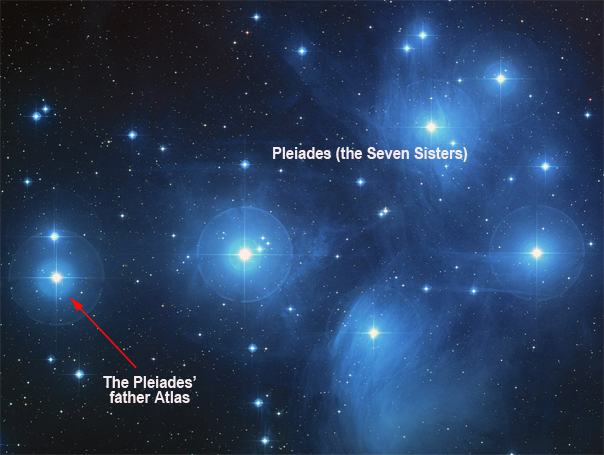
Unfortunately, it’s hard to narrow down a specific analogy because symbols of 1 + 7 are rather common. It might be a mnemonic for stars, such as the Pleiades (the seven sisters) and their father Atlas. The Pleiades are roughly arranged in an arc, with their father to one side:
Or there might be a religious analogy…
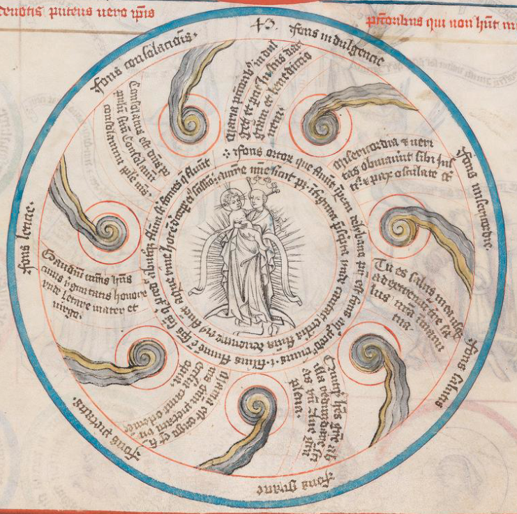
There is an image of the Virgin and child in the Pauper’s Bible that places the Virgin in the center of spiraling rings of water (the fountain or “font” analogy was adapted from water imagery in Pagan times).
You might wonder what this enigmatic drawing means (especially when one sees spiral images and a lot of water in the VMS, as well). It’s a mnemonic, in the Llullian tradition, representing a prayer that was widely included in Books of Hours. The fountains spiraling between Mary and the outer edge are invocations to the Virgin, representing her as the “fount” of mercy, grace, consolation, indulgence, etc.:
A mnemonic for a prayer common in Books of Hours that includes an invocation to the Virgin Mary [Source: Pauper’s Bible, BSB Clm 8201 1414/1415].
Thus, we see a focal point (Virgin and child) with seven comet-like “fonts” (funds, or fountains) in a spiral. It doesn’t look like the VMS plant, but the themes and elements are similar.
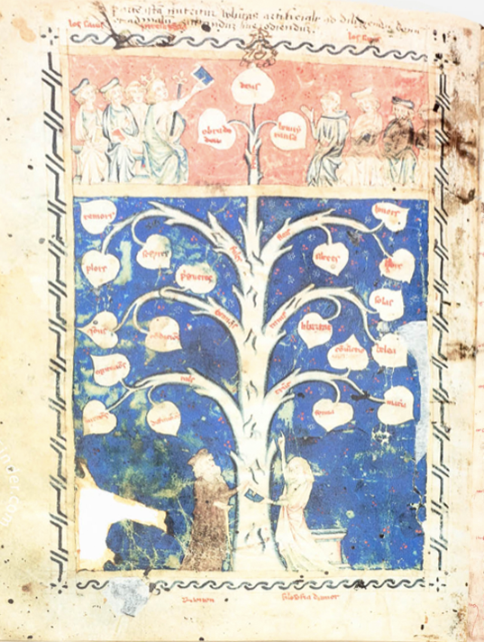
The Pauper’s Bible also has a large number of candlestick-like plant images, similar to those I mentioned in a previous post about The Desert of Religion and similar to those by Ramon Llull, as in this one enumerating key points of the philosophy of love:
Tree of the Philosophy of Love, Ramon Lull, c. 13th century [This version from the Biblioteca Diocesana de Mallorca]
Here are similar plant forms in the Pauper’s Bible that are used to express religious categorizations, concepts, and sometimes mnemonics:
Some of the VMS plants also have candelabra-like qualities, but they do not have labels on the leaves, so it’s difficult to know if they have a similar purpose.
In alchemical diagrams, an assumed relationship between astrology, the seven “planets”, plants, and candlesticks (a metaphor variously used for religion, heat, or light) and chemical processes (especially those of distillation) are frequently diagramed in a highly symbolic way, as in this example from Anatomia Auri:
Summary
I think two things are especially important to consider about VMS Plant 46v…
The first is the apparently symbolic root, and the spiraling, broken-off flower stalks. They are more decorative or mnemonic than naturalistic. Viny plants are common in the borders of medieval manuscripts, but my research so far indicates this style (with the spiral stalks with a few broken off) was especially prevalent in English/Northern French manuscripts of the 13th to 15th centuries. But unlike the VMS drawing, the manuscript flower stalks were mostly decorations and a single plant did not usually occupy a full page.
The second is to note that the drawing in the Pauper’s Bible is specifically mnemonic, in a way that was probably inspired by the works of Ramon Llull or one of his followers. It is designed to inform and to remind.
It’s easy to consider the root as symbolic, but perhaps the VMS flower is symbolic as well. Maybe the text that accompanies this specific drawing is not about plants. Maybe it is a description of a constellation (like Pleiades). Maybe the root is an eagle and the drawing is about alchemy. Or maybe Plant 46v represents a prayer and there is an angel in the root.
J.K. Petersen
Postscript: After posting a blog, I always notice a few hours later that I’ve forgotten something I intended to include.
This time, I left out the explanation for the oddities at the base of the plant stalk if the plant combines symbols from Christianity and alchemy. The eagle is a prevalent theme in alchemical diagrams and birds frequently represent ascension and the holy spirit in Christian imagery. So…
If 46v represents alchemical or Christian themes (or both), then the red shoulder and the odd round circle at the base of the stalk might be the blood of Christ (wine is a fermented product) and the “host” (the body of Christ as per Catholic tradition). In addition to possibly representing the “host”, the “o” might also double for the hole driven through Christ’s feet and hands at the crucifixion. I have sometimes seen this represented in medieval drawings as a simple “o”-shape.
Or perhaps it’s a symbolic representation of the philosopher’s stone (which was sometimes drawn in the claw of the alchemical eagle) or the pelican piercing its breast to feed its young (one of the common alchemical distillation jars was called a pelican jar due to the curved shape of the glass pipes that fed back into the main jar). In medieval illustrations, the pelican never looked like a real pelican, it was always drawn like a songbird or a small crane.
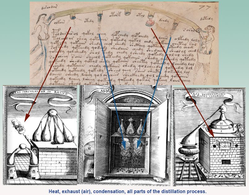
There are frequent comments that folio 77r represents medieval elements in the cosmological sense, but as you can see from my recent blog, I’m somewhat skeptical. There are five openings and two of the outflows are almost the same. Plus, they could be phlegm/bile/blood or various kinds of weather (hail, wind, rain, snow). But, even those ideas didn’t completely satisfy me, so I kept trying to think of others and here is an additional possibility….
A Different Interpretation
I’ve blogged about VMS folio 77r a few times and if you read the more recent ones, you may have noticed that I have never been completely convinced that these pipes were meant to be earth, water, air, and fire. Maybe they represent various outflows of alchemical heating and condensing processes:
In other words, instead of earth, water, air, and fire (except in the metaphorical sense in which most alchemical processes were expressed at the time), this might be heat, exhaust, and either two instances of condensation, or possibly one instance of boiling and the other of condensation, since two of the VMS outflows are very similar but not exactly the same.
Many alchemical images have been related to the VMS in one way or another over the decades. Not surprisingly, since many alchemical manuscripts are enigmatic and highly symbolic.
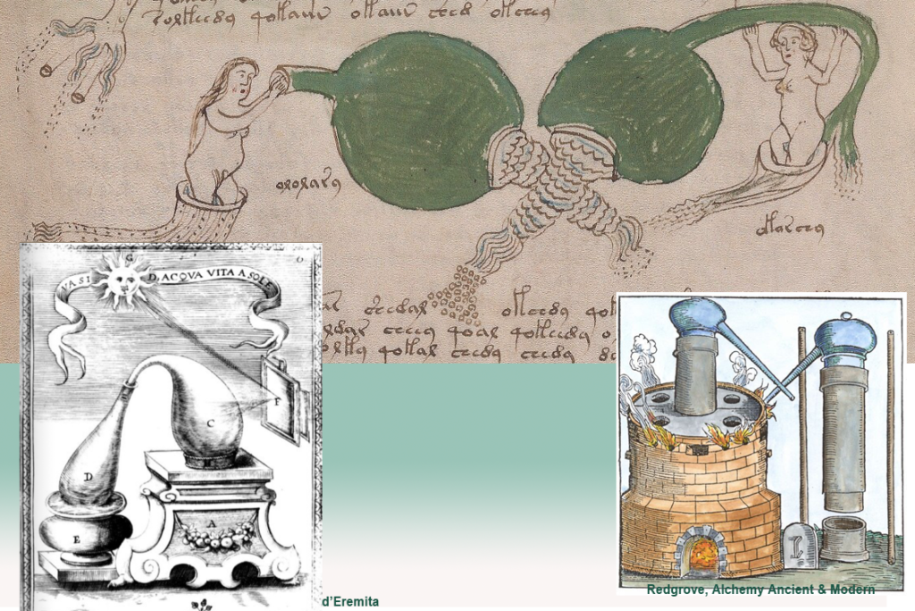
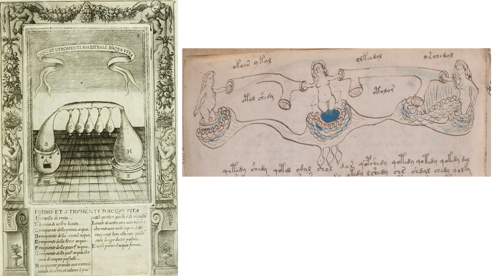
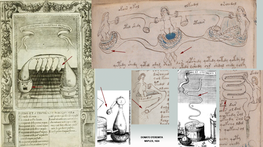
I’ve blogged a few distillation images myself, and the two big bladder-like things have always reminded me of distillation vessels, but I couldn’t decide exactly what they might be. It was bi3mw’spost #70 on the Alchemical Symbolism thread that motivated me to go back through my notes and think about it again. Now I think these bladders might represent the sublimation process:
Similarly, the bladder-like shapes at the top of f77v have always reminded me of the she-wolf’s teats in the story of Romulus and Remus, or the chest-of-plenty on Diana of Ephesus (which I have posted in the past), but now I think there might be another explanation:
Maybe the row of teats is a row of distillation vessels and the rounded forms left and right are heating vats.
Various alchemical vessels that have shapes similar to the VMS. The one on the bottom right is similar to another snaky distillation apparatus pointed out by bi3mw on the Voynich.ninja forum.
The pipes that connect them are spiritually guided by nymphs (all of alchemy was considered to be under spiritual guidance, hence the heavy use of religious motifs in alchemical drawings). Both magic and alchemy were suspect professions, associated with black arts, so the more religious symbology that was used, the more it legitimized these occupations.
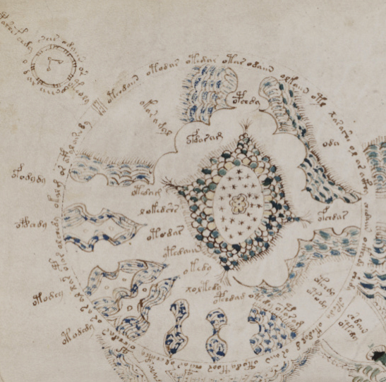
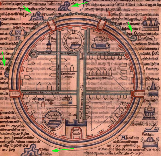
The VMS Rosettes Folio Reprised
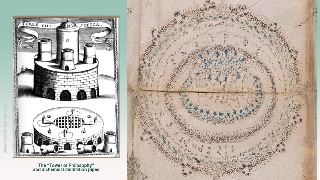
On a subject some researchers might not believe is related to distillation processes, I’ve also blogged numerous interpretations for the VMS “map” and I’ve only written up about 20% of the ideas I’ve been working on for years. One that has been lying on the backburner is that the central rosette might be the Tower of Philosophy, related to medieval alchemy. I haven’t posted it mainly because I wasn’t sure, but putting together the distillation process represented by the 77r pipes AND some of the features of the rosettes folio, I feel more confident about this idea than I did before.
I don’t know if anyone has specifically related the central rosette on the VMS “map” folio to the alchemical furnaces of the Tower of Philosophy. Most of the time people mention locations in the middle east (especially Baghdad) or north Africa and some people consider the folio to be a form of portolan.
To me, the central rosette always looked like a sacred place (probably because of the stars and arches and the central position), but I did not specifically associate it with the sacred mountain of the alchemists until today because many places were considered sacred in the middle ages. I think it might represent both sacred mountain and the alchemists’ furnace combined into one drawing. As I have mentioned in previous blogs… the meeting place between terrestrial and cosmological realms.
Here are two examples side-by-side so you can see the similarities. Note that the tower is round, with arches, like the arches in the center of the VMS rosette with the container-like towers. It has an almost onion-dome top and at the base of the image, there are more “towers” that look like pipes:
Left: Donato d’Eremita di Rocca alchemical furnace/tower of philosophy, Naples 1624 with many structural forms similar to central rosette on “map” folio of Voynich Manuscript, Beinecke 408, Yale.
Here is a link to an earlier (15th-century) image of an alchemy furnace with tower-like parts:
Robert Fludd’s images are often posted on the Voynich.ninja forum due to their structural and textural similarities to some of the VMS drawings. They are more sophisticated, and they were created much later than the VMS, but it’s my belief that his ideas were not entirely original, that they derive from older models and thus might have some relevance.
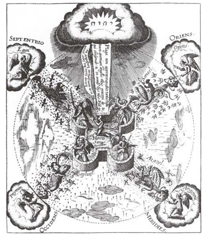
Here is an example that is similar in shape and direction to the general outlay of the rosettes folio. It represents a cosmic battle with demons and archangels attacking and defending the alchemist in the center. Notice the “spewy” things, all drawn in similar ways, but each taking a slightly different form (think of hordes of locusts or bees or frogs as are often mentioned in biblical literature):
I’ve blogged at length about the “spewy” things in the rosettes folder, never quite knowing what they were, but only that they looked like connections between the inner and outer circles. Maybe, as in Fludd’s engraving, they are pestilences, or a metaphorical reference to the battle between good and evil (with archangels and demons taking sides).
In this Rosicrucian image with alchemical references, notice the tent at the top of the sacred hill (sacred hills are a holdover from Paganism) and the alchemists’ cave below it. The VMS rosettes folio is full of these kinds of structures, almost too many to list in one blog, and MarcoP pointed out that Ellie Velinska had suggested tents for some of the shapes on the rosettes folio. When I took another look, I realized some of the small details that originally made no sense to me might be interpreted as tent flaps. Here is an image of a sacred hill atop an alchemists’ cave (such underground laboratories did actually exist, one was unearthed under a chapel complete with shards of numerous vessels):
Speculum Sophicum Rhodostauroticum, thought to be by Daniel Mögling
The Many Plant Folios
Distillation has a direct relationship to plants and plants like Centaurea (which I think is depicted fairly accurately on folio 2r) were of specific interest to distillers of alcoholic products, both recreational and medicinal. Tinctures of alcohol not only helped preserve the plants, but they provided concentrated formulas that were sometimes more effective than herbal “simples” (basic plant parts that had not been processed by distillation).
Jakob de Tepenecz, one of the probable owners of the VMS, became quite wealthy from sales of his distilled products. So much so, he could afford to lend money to the emperor himself.
I don’t know if the various sections of the VMS are like separate booklets that have been bound together, or if they were meant to relate to each other, but IF there’s an over-riding theme, then plants would fit right in.
Astrology
Alchemy has also been related to astrology and kabbalah. Besides the three “teats” (see f77v), this hybrid creature has a star on its crown rather than the usual Christian cross. There are also stars-on-sticks radiating from the center. The image further includes references to celestial beings and signs of the zodiac:
A combination of alchemical, kabbalistic, spiritual, and astrological symbols. Note the three “teats” teats and the star at the top of the crown that are reminiscent of VMS imagery. [Source: Michelspacher, 1615]
Notice also, in the above image, the inverted T-in-O, a cosmological variant of the T-in-O that is so common in map-related writings.
So maybe the VMS is alchemical after all. After investigating it for a while, I was leaning away from this idea, but a few things clicked when bi3mw revived the ninja thread, so I decided to take another look.
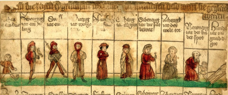
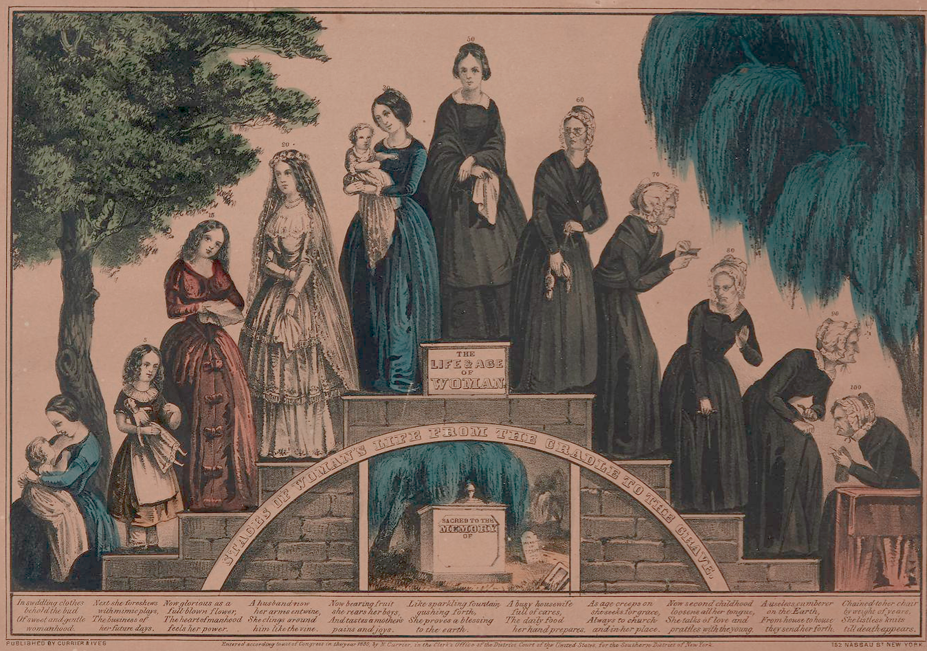
In 2016, I posted several blogs suggesting the imagery around the VMS zodiac figures might be cycles of life. In medieval times they called this the Ages of Man but since the nymphs are mostly women and some of the VMS cycles are specific to women’s physiology, I thought “stages of life” might be more appropriate.
I have less doubt about this interpretation than many aspects of the VMS, but I didn’t hear much support for the idea. The nymphs have variously been interpreted as star charts, parts of a calendar, and numerous other ideas (I have other ideas too, but the one I prefer for this specific wheel is stages of life). I intended to follow up the blog with more examples years ago, and this blog has been sitting in draft form since June, but other lines of research always intrude on continuing a series so, belatedly, here it is…
Ages of Man
Before we look at Ages of Man, keep in mind that classical Ages of Man (as described by Ovid and Hesiod) focused more on the evolution of mankind from gods, titans, heroes, to iron-age man, and less on the evolution of modern humans.
In the Middle Ages, dependence on classical beliefs began to wane. The concept of the Ages of Man still retained some classical ideas, but focused more and more on the individual’s journey through time. The stages of wo-man lagged behind the stages of man, but were gradually acknowledged in the Renaissance and early modern periods.
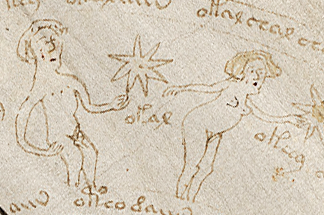
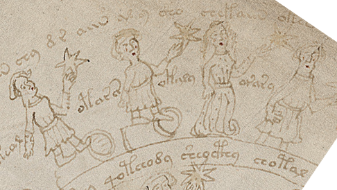
Unwinding the Zodiac-Figure Nymph-Wheels
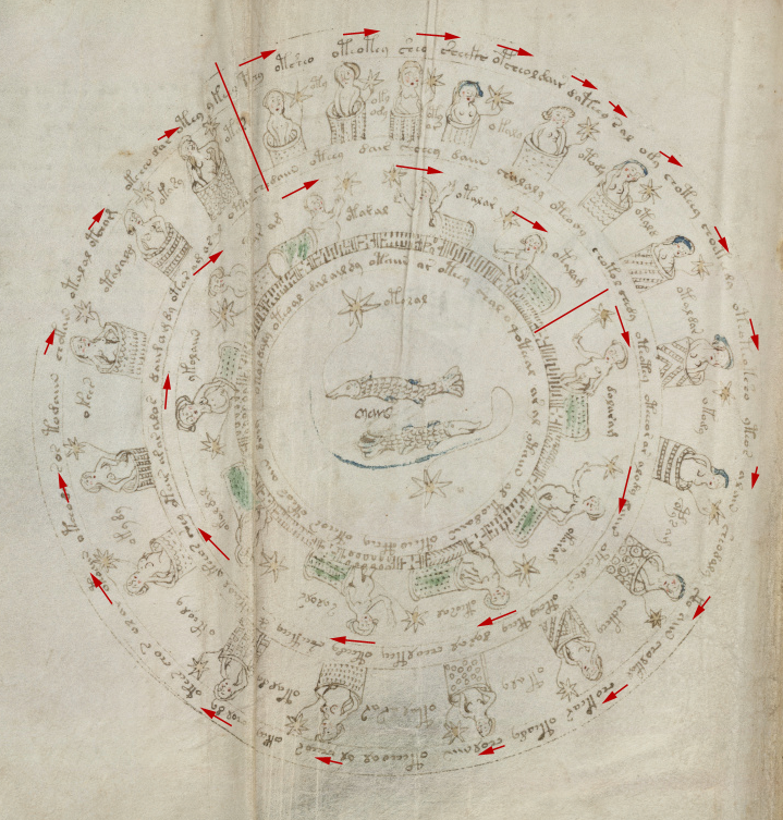
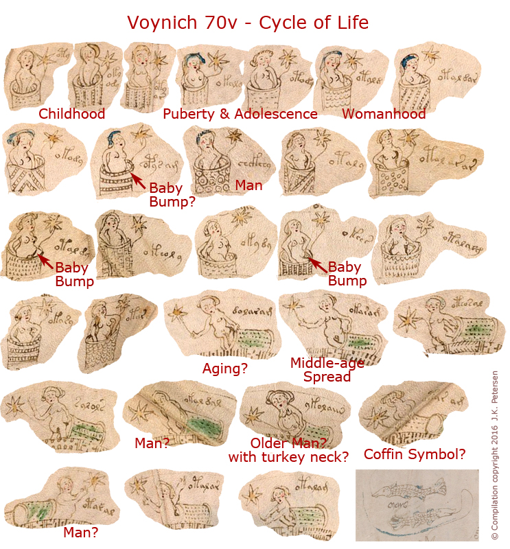
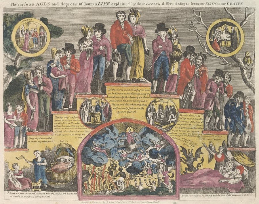
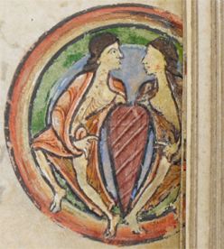
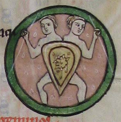
Below is an overview of the folio, and following that, the unwound series of nymphs I posted in April 2016 (the figures surrounding the f70v fish).
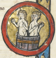
Note: In this overview, I am not entirely certain if the tipped-over barrels in the center ring, which I think of as coffins, are being entered (as the last stage of life), or exited (as the soul ascends to the after-world), so the arrows in the inner ring might have a different start-point than indicated here, but either way, the basic idea is the same, the outer wheel is maturation and middle age, the inner wheel is older age with a sugar-coated version of death or possibly one of ascension:
In 2016, I suggested this was a life cycle from pre-adolescence to old age.
Note how the nymphs in the outer ring go from skinny unpregnant pre-adolescence through child-bearing years and middle age, to tipped-over baskets that resemble caskets. The age progression and tipped-over posture gave me a hint of their possible meaning:
I believe this is a cradle-to-grave sequence, but did such a concept exist in medieval society?
Yes, very much so, and it was drawn in a variety of ways. Here are some examples…
Cradle-to-Grave Sequences
This stages-of-life diagram is a simple timeline. Note how the first figure is young, the second-to-last is hunched, and the last figure tips over.
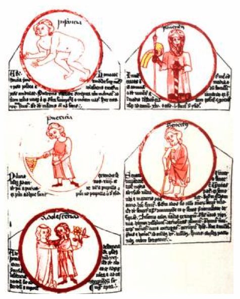
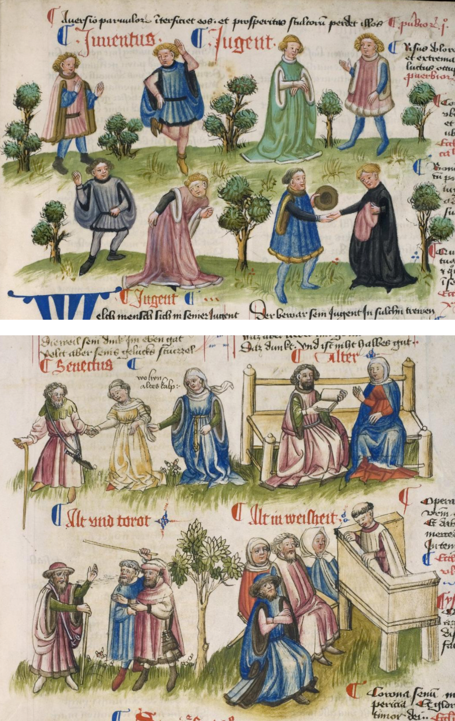
In classical and medieval times, the ages of life were usually described in six to eleven stages…
Plato described nine stages. Isidore of Seville (6th century) lists six: infantia, pueritia, adolescentia, juventus, gravitas, and senectus.
Shakespeare eloquently counts seven:
All the world’s a stage, And all the men and women merely players, They have their exits and entrances, And one man in his time plays many parts, His acts being seven ages…
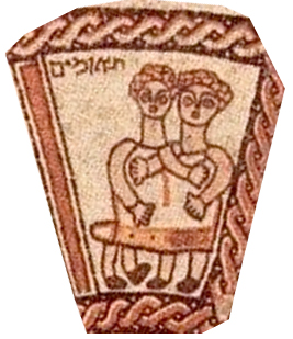
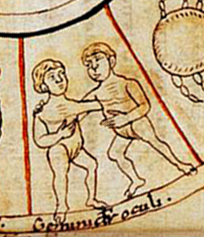
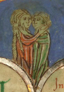
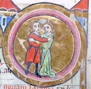
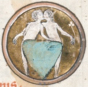
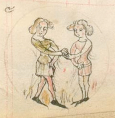
Sometimes there were fewer stages. The following 13th- or 14th-century example (sorry, I couldn’t find a shelfmark) roughly follows Isidore’s classification (relative to the VMS, note the Gemini-like amorous couple in the adolescence circle):
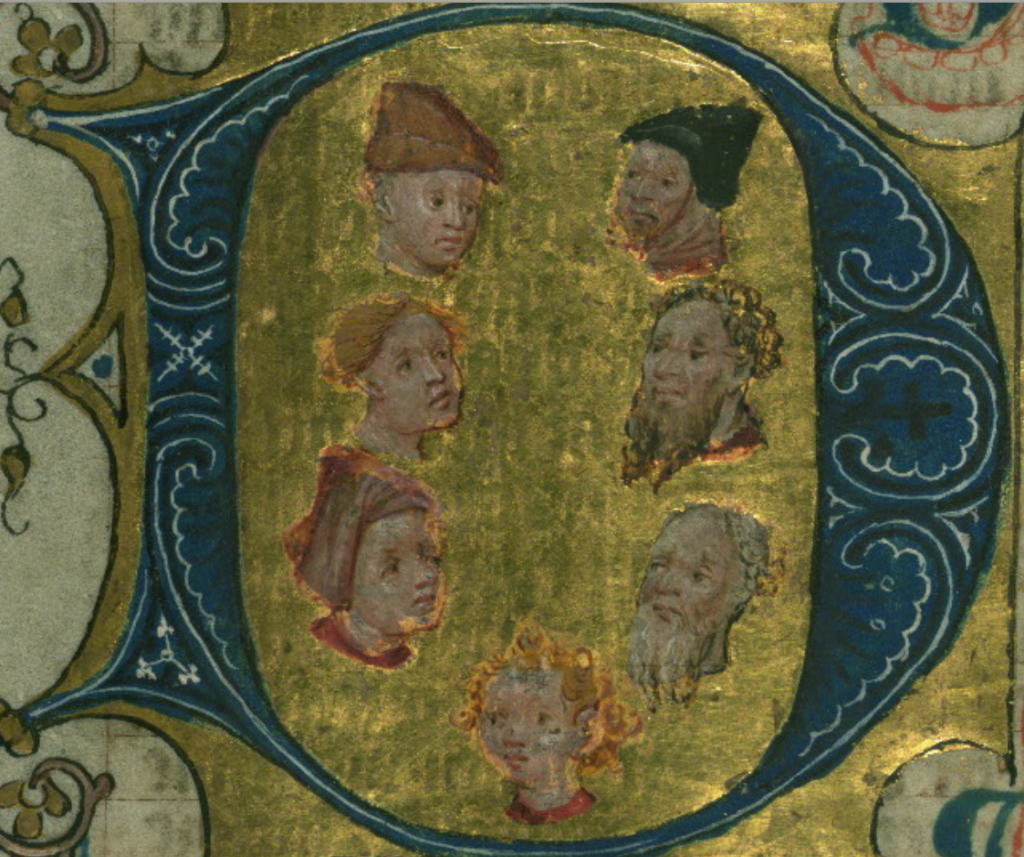
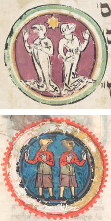
Postscript 21 March 2020: This illustrator managed to include seven ages of man within the tiny space of a historiated initial, beginning at the bottom and going clockwise:
The seven ages of man contained within a historiated initial. [Source: Digital Walters W.171, c. 1402]
Sometimes the cycle was depicted like a generational photo, rather than as a chart. Here are two examples depicting seven stages:
From infancy to old age in seven stages, from De proprietatibus rerum, Published after Jan. 1486 in the same style as a French copy from 1485 [courtesy of the U.S. Library of Congress]
In other words, there were no set rules on how to organize the drawing, or how many stages to include. As long as the idea of cradle-to-grave was present, the illustrator could draw the passage of life in many ways.
Postscript 28 March 2020: I wanted to add this depiction of the Stages of Life because it’s a bit unusual. Most illustrators tried to compact the stages into one image. In this case, the stages were spread over two different folios several pages apart, with commentary in between (Cod. pal. germ. 471):
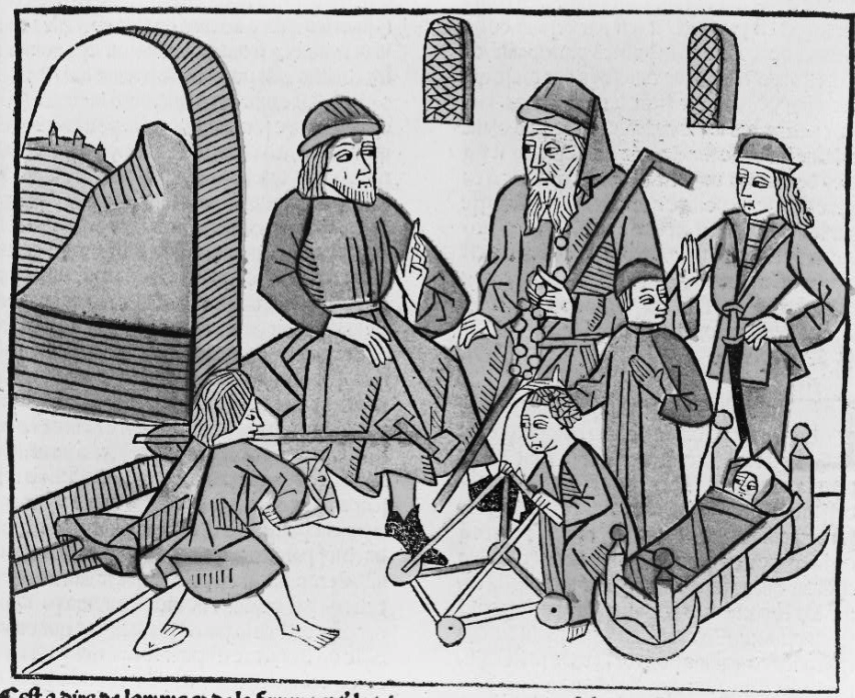
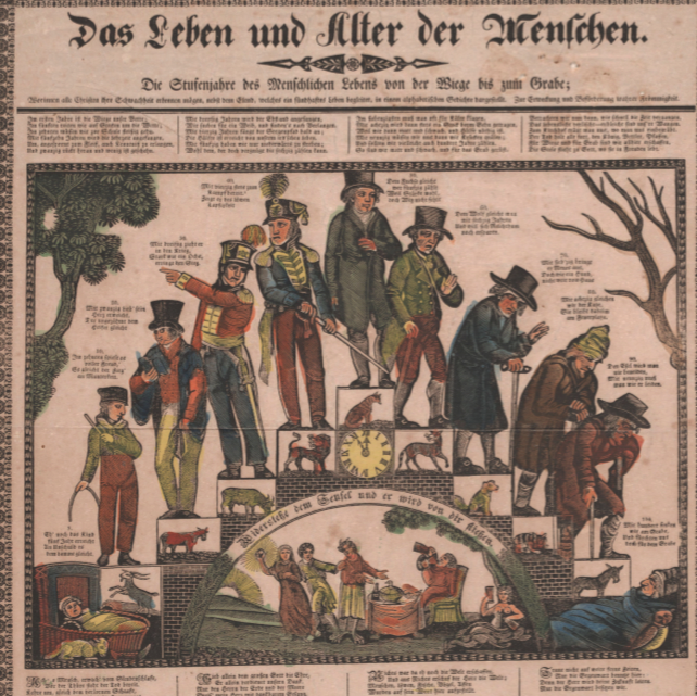
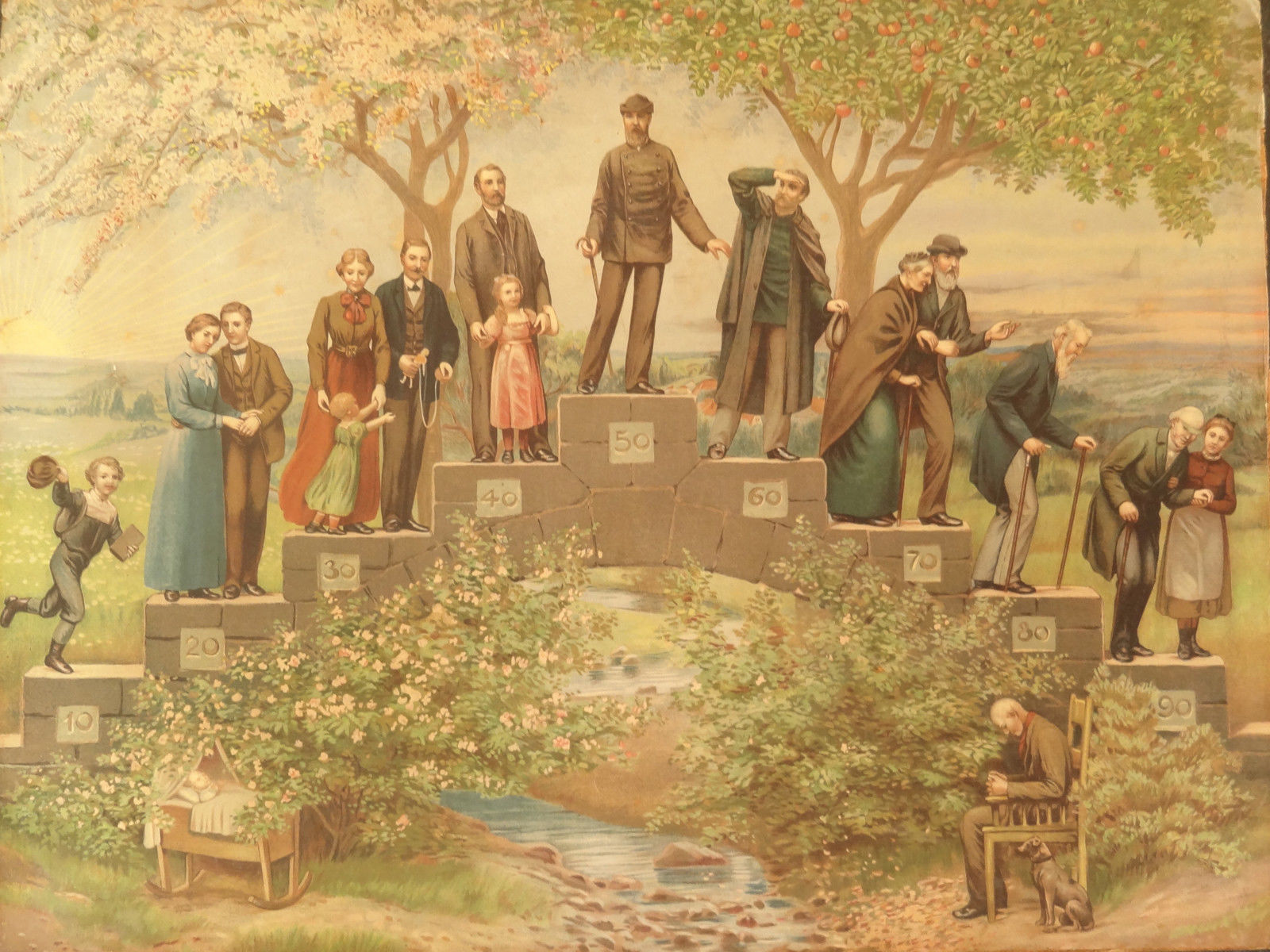
Ages Depicted Staircase-Style
Staircase drawings were especially popular in the 16th and 17th centuries and these later examples are of interest because the ages relate to animals through verse, and four of the animals are common to zodiac sequences (ram, bull, lion, goat). This is not a direct reference to astrology, it’s probably biblical, but it is interesting because depictions in other styles sometimes include astrological references (discussed further below).
Here’s the background on some of the stages-of-life animal drawings… There are biblical interpretations about the life of man being increased from 30 to between 70 and 100 years by adding in the ages of animals who begged to live shorter lifespans to ease their lives of burden.
The idea of animals relating to the ages of man is reflected in a classical Greek poem by Babrius:
Horse, bull, and dog appear freezing before the house of man. He opens the door, receives them kindly and offers them food; the horse gets barley, the bull legumens, and the dog food from the table. The animals filled with gratitude towards the man give up part of their years in return for his hospitality. First the horse repays with his years, that is why man is insolent in his youth; then the bull, therefore the middle-aged man has to work hard; last comes the dog with his years…
—L. Landau, The Journal of English and Germanic Philology, 1920
Here is one of the later staircase-style cradle-to-grave illustrations. I include it because it shows how stages were increased over the smaller set from classical times:
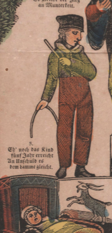
The above drawing illustrates eleven stages with animals inset in the steps. The cradle and grave are on the ground, perhaps expressing the idea of “dust to dust”:
The verse for the child and the man of 30 are as follows:
Eh’ noch das kind fünf Jahr erreicht, Un Unschuld es dem ramme gleicht. (Before the child reaches five, it is innocent/unknowledgable about the ram.)
Mit dreißig zieht er in den Krieg, Stark wie ein Ochs, erringt den Sieg. (At thirty, he goes to war, strong like an ox, achieving the victory.)
Post-medieval cradle-to-grave illustrations often include biblical references in both the illustrations and the text, and the overall CtoG theme was included in hymns and prayers.
The Feminine Angle
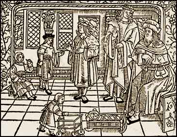
Medieval depictions of the stages of life usually emphasize men, but a lightly modified version for women was created for commercial sale in later years.
This is a simplified version, without animals or verses, with a greater emphasis on marriage and children, as published in the early 19th century for women:
There were also versions with both men and women that might be more similar to the VMS. This one includes includes 17 figures (and a dog) and 11 stages:
Cradle to Grave. Based on Fridolin Leiber by Gustave May, Frankfurt, Germany, late 1800s.
Here is a similar theme from romance to old age, played out by flamboyant characters:
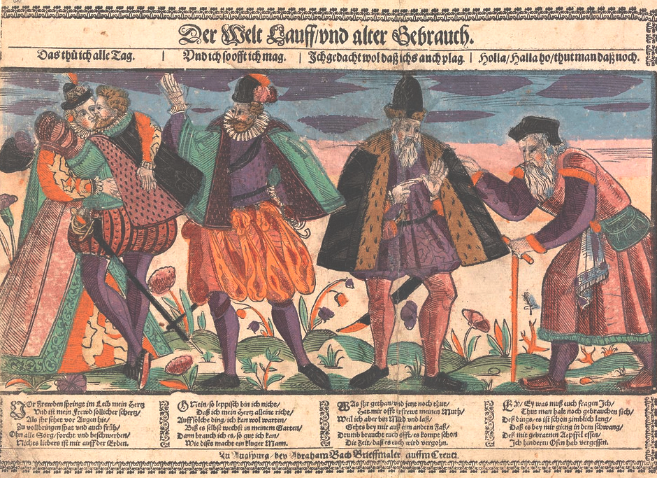
The Life Ages of Man, Abraham Bach the Edler, c. 1651 [courtesy of Wikimedia Commons]
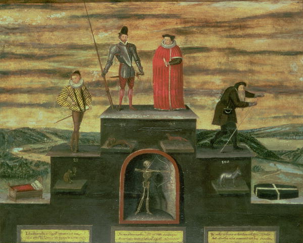
The following example is more sparse than some, only six stages (or five, depending on how one interprets the top step with two figures), but includes animals, and emphasizes the cradle-to-grave aspect with a cradle and casket at either end:
Stylistically, these don’t have the same look or feel as the VMS nymphs, but in terms of content, there are other formats with larger numbers of figures. This one is populated by 24 figures on the ground and steps, plus about 24 more in the round frames, along with some overseers (including an angel and a demon). In other words, more than the VMS:
Stages of life from birth to the grave, with heaven and hell inset in the center, John Pitts, London 1811.
So those are some timeline, generational, and staircase formats, but there are also some based around wheels.
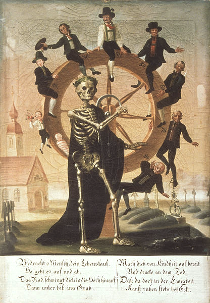
Co-opting the Wheel of Fortune Theme
Some stages-of-man illustrations borrowed from the “wheel of fortune” concept that was popular in the Middle Ages, with slight modifications in the characters. Note that this differs from most of the Wheel of Fortune drawings in that Fortuna is not present (there is a skeleton instead), there is no king at the top, and the emphasis is on maturing and aging rather than on one’s material standing, with a young boy on the left and a mostly prone figure on the bottom-right (and graves in the background):
The Wheel of Life in 10 steps with skeleton turning the wheel (c. 1800) [courtesy of http://www.kulturramtirol.at/ ]
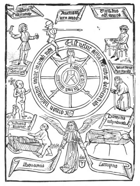
In this Schwabian manuscript, blindfolded Fortuna is turning the wheel, but the main theme is clearly not a wheel of fortune. It represents cradle-to-grave with labels similar to those used by Isidore of Seville. An angel waits in the casket below:
Cradle-to-grave sequence in wheel-of-fortune style with seven classical stages [BSB Cgm 312, c. 1450]
The idea is also reflected in sculpture, as in this example from the tomb of Peter 1st in Alcobaça, who died later in the 14th century. Unfortunately, it is horribly defaced, but in the inner ring, you can see the Fortuna theme, and in the outer ring are the stages of life. You can make out a mother and infant in the lower left, and if you follow the figures clockwise through their life cycle, you eventually reach the prone figure under the lid of a casket at the bottom:
Mother and infant on the left in the outer ring, with stages of life running clockwise around until it reaches the crypt in the bottom-center. [Source: Alcobaça tomb of Peter 1 by ho visto nina volare, Wikipedia]
Here is a late-15th century blockprint of the stages of life as a wheel. Except for the wheel, it is similar to some of the staircase drawings:
The Wheel of Life might be the same idea as the VMS, but it doesn’t feel the same in terms of drawing style and so far there’s very little connection with zodiac figures. Are there stages-of-life drawings with astrological connections?
Connections to Astrology and Astronomy—Wheels with “Stars”
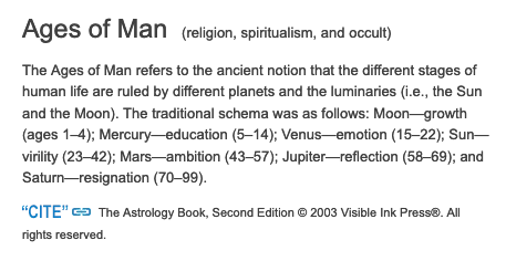
There is a variation on the Wheel of Fortune that has a stronger relationship to astrological/astronomical concepts than the previous examples. In this woodcut, Fortuna is replaced by an angel, the earth is in the center, and the seven stars or “planets”, as they called them (including the sun and moon), orbit around it.
Late 15th-century woodcut of cosmological themes (the seven “planets”) based on the general idea of a wheel of fortune or wheel of life.
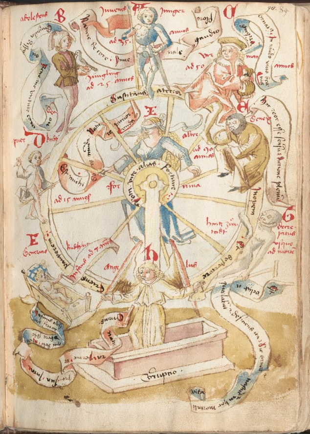
The following example from the Psalter of Robert de Lisle, originated in England in the early 1300s. This is often called The Ages of Man but you might notice small differences between these early depictions and the way they drew the Ages of Man in the 15th and 16th centuries.
The general format is circular, with a figure in the center, and there is an infant in the first circle (7 o’clock) and a prone figure near the end (4 o’clock). In this way it is similar to the sculpture of Peter 1. The actual lifespan is shown in eight stages, plus a circle for the eulogy, and a sarcophagus for a total of ten. The labels mention infancy, youth, aging, and death, as was common for classical stages:
The Ages of Man, showing stages of life in a circle around a central figure. [Howard Psalter and De Lisle Psalter, British Library Arundel 83, Creative Commons 1.0 – Public Domain]
Medieval Classification of Stages
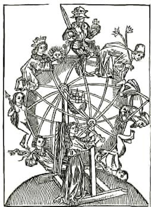
The stages in the following illustration from De Lisle Psalter are sandwiched together with Bible stories. Following the Tree of Life (the Jesse Tree) is a wheel with 12 stages of life, written as abbreviations for birth (Nasce[n]s), infancy (Infans), childhood (Puer.), adolescence (Adolesce[n]s), etc., counter-clockwise around the circle until one reaches death. In the corners are symbols for the four evangelists. The central figure is usually Jesus or God (in older manuscripts, the central figure is sometimes a personified sun):
12 Stages of Life from birth to death in the De Lysle Psalter, Arundel MS 82 (c. 1339) arranged in a wheel around a central figure of the deity nimbed. Symbols for Mathew, John, Luke, and Mark are in the corners.
Could images like this, arranged in a circle, have inspired the VMS creator to combine zodiac figures with the stages of life? The VMS is rife with illustrations that hint at concepts that have been combined, but they are not quite overt enough to be sure.
The Zodiac and Ages of Man
The idea of associating the stages of man with zodiac figures (thus creating 12 stages) may have come to us through Hebrew sources (e.g, the Midrash Tanhuman referenced by Landau, 1920).
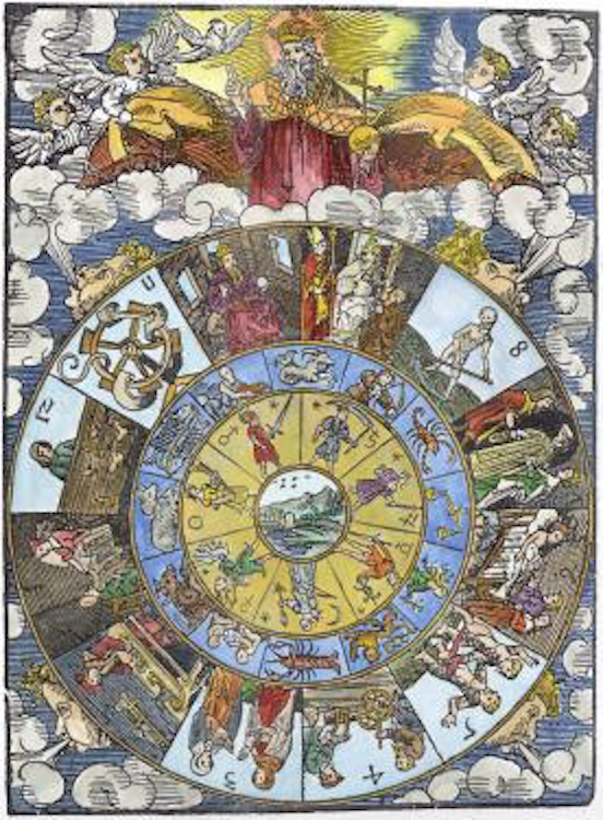
Astrological mansions (affairs of man) are combined with zodiac symbols in the following example by Erhard Schön. They are expressed as figures within three concentric circles. The inner circle includes the seven “planets” that are present in many medieval cosmological drawings, surrounded by twelve zodiac figures, further surrounded by twelve mansions in the outer circle. Since this diagram was created by a card-maker (1515), it is not surprising that some of the outer figures are also found in Tarot cards.
The subject matter is slightly different from the VMS—it generally focuses on affairs of men, and all the zodiac figures are in one diagram, but the general format (zodiac figures combined with other figures in concentric wheels), is more like the VMS than many of the previous examples. Note how the the numbers run counterclockwise:
Natal horoscope by Erhard Schoen, early 16th century.
If you are curious about what the mansions represent, look at the seventh house (on the right, next to the skeleton) and you will see the marriage ceremony. The skeleton itself refers to death, wills, and testaments. The tenth house represents kings, generals, and other leaders. The eleventh house is not as easy to discern in this image, but it represents friendship and fidelity.
Astrological References from Eastern Europe
In Bulgaria, there are frescoes that combine several ideas, including night and day, the seasons, the stages of life, and zodiac figures.
For example, the wheel in the Church of the Nativity in Arbanasi is one of the closest parallels I’ve found so far to the stages of life wheel in the VMS. It has concentric circles of figures, a number of which are unclothed. The zodiac figures are traditional, however, are all included in one wheel, and are not of the same iconographic subset as the VMS zodiac figures, but it’s still worth keeping this fresco in mind (the labels in the green band are the months of the year). Unfortunately, the images are copyrighted so you will have to click the link.
Eastern Wheels
(Image courtesy of Wikipedia)
The wheel of life or Wheel of Becoming (called bhavacakra भवचक्र) is a prevalent theme in buddhist art, but it follows a different scheme from western manuscripts, emphasizing the idea of karma and rebirth and planes of existence, along with the different realms (animal, human, etc.). They don’t usually include zodiac figures in the same way as some of the western manuscripts and Bulgarian frescoes.
When zodiac figures are included in Wheels of Becoming, they are typically in the eastern style, composed entirely of animals and are usually symbolic of various emotions or states of being.
Many of these Buddhist wheels are later than the 16th century.
I believe the VMS wheel expresses a cradle-to-grave theme rather than eastern concepts of reincarnation.
Textual Versions of Stages of Life
Many manuscripts that include herbs, information on bathing, or astrological information are not illustrated. The same is true for Stages of Life.
L. Landau (1920) mentions a rhyming poem about the stages of life that I think is important for textual reasons related to the VMS. It is not medieval, it was written in Venice in 1554, but it stands out as an example of how languages and scripts can be jumbled together in less obvious ways, something that could easily have happened in the 14th or 15th centuries, as well.
Bodley Can. Or. 12, Neubauer 1217 (fol. 211b–213) is a slightly bewildering combination of German/Yiddish and Judeo-Italian that was not penned in Latin script—it was written using Hebrew letter-shapes even though it is not in Hebrew:
Bodleian Library, Can. Or. 12 (Neubauer 1217), folio 213, Judeo German/Italian (in alternate verses) written with Hebrew letters, probably intended for oral recitation.
Does the Stages-of-Life concept apply to other VMS wheels?
As mentioned in previous blogs, I believe that several of the other wheels have similar themes, but that they focus and enlarge on more specific stages, such as menstrual cycles and childbearing cycles.
For example, in the 2016 blog, I posted an unspun cycle from 70v (green Aries, which is on the same foldout as Pisces) that focuses on female nymphs and their journey through womanhood. I believe it begins with a pre-adolescent maturing into a woman and acquiring a large [probably pregnant] belly (and possibly stretch marks).
Notice the fancy veil on the sixth nymph. I’ve noticed a fancier veil on other nymphs in contexts where it might represent marriage (I’m not completely certain of this because diadems were often used in preference to veils, but it depended on the region and time period):
When I was researching medieval wedding customs I read that some couples lived together and didn’t get married until the woman became pregnant. The logic was that the husband-to-be wanted to be sure his fiancée could produce children. This was not the custom everywhere, there was a gradual shift from Pagan to Christian traditions that differed from region to region, but living together before marriage was not as uncommon or as counter-culture in the 15th century as I originally assumed.
It’s possible the lines on the belly of the nymphs in this sequence represent stretch marks. I say this based on looking at patterns in all the folios but I am not entirely sure this is the correct interpretation. I do think it’s worth considering, however, because the lines are never on the pre-adolescent girls or male nymphs. They are usually on the ones with big bellies or the thinner ones that follow soon after the big bellies. As far as I can tell, this sequence represents two pregnancies, perhaps to show that it happens more than once in a woman’s life.
I found it particularly interesting that the bellies in all the green Aries nymphs are prominently displayed so you can see if they are thin or large, except the last one…
Since the sequence starts with a pre-adolescent girl (I suspect the genitals are displayed above the edge of the barrel to make it clear it’s not a boy), I’m wondering if maybe the last nymph, with the hidden belly, represents menopause, the point at which there are no more buns in the oven.
Related Wheel-Themes
The nymphs around affectionate-Gemini relate to these themes, as well. At 2 o’clock, there is a lustful male (I’m pretty sure his flag is raised) with his eye on the nymph in front of him.
There are several other males surrounding Gemini, some of them clothed (it’s a bit of a leap, but I am reminded of love triangles, which were popular in medieval literature, stories such as Tristan and Isolde, the forerunner to the story of Guinevere):
I wanted to go into more detail about these other cycles, but it’s far too much information for one blog, so I’ll leave it for now and will fill in the rest as I have time.
Summary
It should be clear from the above examples, that there was no specific format for cradle-to-grave illustrations. They can be timelines, staircases, wheels, or anything else that gets the idea across. The number of figures isn’t rigid either. What is common to all of them is the progression from youth to old age, and old age is frequently represented by semi-prone or prone figures and may include various styles of crypts or coffins.
I see 70v Pisces nymphs as a cradle-to-grave theme and green Aries, Gemini, and some of the others, as subsets of the cradle-to-grave idea (an expansion of the middle years, with the focus on romance and child-bearing). It’s appropriate that the Pisces and Aries nymphs would be side-by-side, and perhaps intentional that the pregnancy cycle is on Aries, the symbol we most associate with spring.
“When the platypus was first discovered by Europeans in the late 1700s, a pelt and sketch were sent back to the United Kingdom by Captain John Hunter, the second Governor of New South Wales. The British scientists were at first convinced that the odd collection of physical attributes must have been a hoax. George Shaw, who produced the first description of the animal in the Naturalist’s Miscellany in 1799 stated that it was impossible not to entertain doubts as to its genuine nature, and Robert Knox believed it may have been produced by some Asian taxidermist. It was thought that somebody had sewn a duck’s beak onto the body of a beaver-like animal. Shaw even took a pair of scissors to the dried skin to check for stitches.” —quoted by McGill University from English Wikipedia
The Luttrell Hybrid… Bird or Mammal or Both?
The platypus is only found in a narrow coastal strip along eastern Australia. It wasn’t known in Europe any earlier than the late 17th or 18th century. Or was it?
This drawing is in the 14th-century Luttrell Psalter. Obviously, it’s a hybrid with a boar on the right and something else on the left. The left side doesn’t look like a duck, however, despite the blue color that is reminiscent of a mallard (blue is used for a lot of un-blue things in the Luttrell Psalter).
Strangely-drawn animals are not unusual for the Middle Ages. Many Crocodiles and tigers would be completely unrecognizable if they weren’t labeled.
But the creature on the left seems rather carefully drawn, and there’s no difficulty in recognizing the boar. Note that the critter with the flat bill doesn’t have duck feet. It has furry legs and claws.
But let’s take a look at a mallard duck, a familiar bird throughout the northern hemisphere:
[source: Bengt Nyman, Wikipedia]
The mallard differs from the drawing in several respects. The nostrils are close to the head, and the bill tapers to a point with a dark spur. The feathers pull away from the beak, they do not flap over it. The eye does not have a conspicuous ring like the Luttrell drawing. So, except for the colors, it’s not very similar. And, of course, it has duck feet, not fur and claws.
There are numerous drawings of ducks and geese in medieval manuscripts that are similar in time and style to the Luttrell Psalter, and they tend to be fairly naturalistic. Here is a fox and goose, and two more drawings of a duck and geese by different artists in the Luttrell Psalter. Top-right is a fox and duck from the Gorleston Psalter. They are very recognizable and noticeably different from the drawing that resembles a platypus:
Clearly, medieval illustrators drew geese a lot better than they drew crocodiles.
Other Possibilities
[source: Andreas Trepte, Wikipedia]
But maybe it’s a different bird from a duck or goose.
Another possibility is the Eurasian spoonbill. It has a spatulate bill… but the nostrils are near the head and the bill is much longer than the Luttrell creature. It doesn’t have a conspicuous eye-ring either. Also, the Luttrell drawing isn’t fully spoon-shaped—it’s closer to the spade-like platypus bill. And the spoonbill doesn’t have fur and claws.
Another possibility is the Talpanas or “mole duck”. This bird has a flat bill with nostrils slightly farther from the head than most. Here is a recreation of this fascinating bird:
This might seem like a plausible candidate, but the bird is native to the island of Kauai, and died out a long time ago. The chance of it making a migratory trip to the Eurasian continent were nil even before it went extinct, as this was a flightless bird. Unfortunately, when islands are colonized by new species (including humans), flightless birds are often the first to be eaten.
Like other birds, the Talpanas doesn’t have furry hocks. The furry, clawed platypus still seems like a better match.
What About a Platypus?
In contrast to ducks and geese, the platypus, a furry creature that lays eggs, has a broad bill, with nostrils near the end, and when the eyes are open, you can see a distinct ring of raised skin around the eye, with light-colored fur under and sometimes around the eye The fur pulls back from the bill, like the feathers on the mallard (and not like the Luttrell drawing), but if you look closely, you’ll see a few tufts sticking out to the side (easier to see on the right side in the picture). The platypus has distinctive claws.
[source: TwoWings, Wikipedia]
Or how about the echidna? It is cousin to the platypus and has a leathery snout (although not very wide), with nostrils near the end. When it is a baby, it sometimes has a light eye-ring or ridge. It’s not as similar as a platypus, but it does have distinctive claws. The echidna’s bill gets longer in proportion to its body as it grows, however, so it looks less like the Luttrell drawing as it matures.
This vaguely echidna-like drawing from the Hague KA 16 is actually a drawing of an oyster.
The echidna is more widely distributed than the platypus, and some species extend beyond Australia, so the odds of an echidna being seen in Europe are better than the platypus, but it still seems very unlikely that a baby echidna would be known in northern Europe before the 17th century.
If you stop here, some people might conclude that the drawing in the Luttrell Psalter is more like a platypus than echidna or bird. If they feel certain that it’s a platypus and it’s pointed out to them that the platypus wasn’t known in the west until recently, they might suggest that the Luttrell Psalter is a modern hoax (I’m not saying everyone would do this, but modern hoax theories are popular, so there are bound to be a few people who would make this suggestion).
Symbolic Interpretations
There are other possibilities. Marginal drawings sometimes illustrate fables, other times they represent theatrical characters, so the enigmatic creature might be more imaginative than real. There’s no guarantee there’s a counterpart in the real world, but since many masks were based on real animals, it remains an open question.
Medieval musician and dancers wearing animal masks, Bodleian Library MS Bodl 264.
If the mystery flat-billed animal were an 18th-century drawing, people would probably assume it was a platypus and not think any further. When you find something that seems to match, It’s easier to sit back in triumph than to question or discard your own discoveries.
On the surface, the platypus seems like a good candidate for the Luttrell drawing, probably better than a duck, but a lot of confirmatory evidence would be necessary before making a determination because the ID doesn’t fit what we know (so far) about medieval history.
Research isn’t just about finding things, it’s also about confirming them. That might take more time, but the journey is worth it.
I forgot to include this illustration when I posted the above blog on December 1. Tucked away in a margin on f69v of the Luttrell Psalter, there is a small drawing of our erstwhile “platypus” looking skyward from a hybrid body.
The eye is a little more naturalistic than the larger version, and the color is different, a simple buffy-orange (that was probably closer to red when originally applied), but the shape of the bill is mostly the same as the larger drawing, very flat and spatulate, with nostrils away from the head and a ridge down the center.
In a previous blog, I noted some of the ways that “mounds” on the VMS rosettes folio might be interpreted. It was barely an introduction, so this is a continuation, with “mounds” discussed in the context of medieval mappae mundi.
The blog format is too constrained to cover all the mappae mundi, so I’ve selected these as the main examples:
Sawley (England, c. 1110), Corpus Christi College
Ebstorf (Germany? 13th c), original destroyed, facsimile in Ebstorf cloister
Hereford (England, late 13th c), Hereford Cathedral
Paris, Bibliothèque Sainte-Geneviève 782 (late 13th c)
Walsperger (Constance, 1448)
Others are identified as they appear.
Basic Format
Western mappa mundae usually place Jerusalem at or near the center, emphasizing its historical and spiritual importance, as in this passage in Ezekial:
Thus saith the Lord God, This is Jerusalem, I have set it in the midst of the nations and countries, that are round about her.
Ezekial 5:5
In the example maps, each depiction of Jerusalem is different, as follows:
Ebstorf: Rectangular aerial view of walls, quite detailed, showing towers, bricks/stones, and battlements, with an image of Christ in the center. The palette is bright and varied.
Hereford: Circular aerial view, with crenelations and 4 plus 4 structures facing the center, in varying shades of brown ink.
S-G 782: A frontal image of a building with towers, crenelations, a saddleback portal, and two crosses, embellished with turquoise. The Sawley mappa is similar except that Jerusalem is slightly off-center from the Cyclades, and it has a dome instead of a saddleback portal entrance.
Walsperger: A more naturalistic view of a walled city with two tall round, layered towers. The palette is green, red, and a pale brownish amber—similar to the VMS except there’s no blue.
Each one is different because the architecture is stylized or entirely fictional. Jerusalem is identified chiefly by the label and its position on the map.
General Shape
Mappae perimeters are usually shaped like a race-track, almond, or circle, ringed by a body of water. This shape may reflect the idea of the map as a “mirror” of the world (the mirror thus reflecting an image given by God). Note that medieval lawbooks, and the scrying glass of John Dee, were also referenced as “mirrors”. They were seen as a vehicle to channel messages from a higher power.
The Sawley map (c. 1110) is oriented with east at the top and the Cyclades in the center (with Jerusalem nearby). Angels preside in each corner. Mountain ranges are lines of small bumps. Specific mountains, like Mount Atlas (bottom-right), are taller mounds:
On some maps, the surrounding waters are embellished with fish, boats, monsters, named or unnamed islands, or people.
Sometimes, God or Jesus is shown at the top or incorporated into the content as head, hands, and feet at the outer edges:
The organization of the towns and landmarks is based partly on biblical events after the flood:
These are the families of the sons of Noah, after their generations among their people: and out of these were the nations divided in the earth after the flood.
Genesis 10
All ethnic groups were said to be descended from Noah’s sons, Shem, Ham, and Japheth, and the earth was basically “assigned” to their descendants.
By the Middle Ages, mapmakers had a greater awareness of the extents of human populations, the arctic, antarctic, and the east, so they added them to the biblical interpretation while still retaining the basic ideas. Some of these maps were stylized into a T-in-O shape (or a four-part shape similar to a T-in-O).
Thus, we have Asia being roughly half the world, with the rest divided between Europe and Africa (and sometimes the Antipodes are shown as a small section by Africa).
East is Up
In the older mappae mundi, east is usually oriented toward the top. By the 15th century, some maps had south at the top. South was the direction taken by most Europeans for pilgrimmages to Jerusalem, Ethopia, and to reach many of the African and Indian trade routes, so it may have been natural to think of this direction as “up”.
By the end of the 15th century, magnetic compasses were more common and our concept of “up” changed from south to north.
We cannot be sure that the T-in-O on the VMS “map” folio is meant as an orientation symbol (or that the VMS rosettes are strictly geographical) but if it were, it would roughly correspond to compass points as follows:
This would put east at the top in relation to the binding, as would be common for the early 15th century.
More Examples
The 11th century Saint-Sever mappa mundi is race-track-shaped, with east at the top. The Mediterranean divides north and south, and the river systems and Black Sea generally separate Europe from Asia. It’s not quite a T-in-O, but it’s easy to see how the idea of T-in-O evolved.
Note how the Saint-Sever mountain ranges are drawn as lines of triangular bumps, and the tall mountain in the upper-left quadrant looks like a pile of scaly bumps, as in the Sawley map shown earlier. To the right is the Red Sea:
The Royal Higden map (Royal MS 14 C IX, c. 1350), is the same race-track shape, but the drawing surface is rotated 90°, so that Asia is a larger proportion of the total. Jerusalem is a little above center and Noah’s arc to the left:
Mountains are drawn as circles with a bit of green paint in the middle. This top-view theme of mountains as circles is also quite common. Sometimes the rivers flow from their centers, sometimes from the edges.
Often the tower of Babel is included as a tall, narrow, tiered structure, but it is not always large or prominent on the map. The Higden map has an especially fancy drawing of Babylon and Babel:
We often hear about “the seven hills of Rome” but this idea is not usually reflected in medieval mappae mundi. Rome is a fancy building, and the alps are nearby, but the seven hills are not explicitly drawn:
More literal expressions of the seven hills are sometimes found in illuminated manuscripts. These lofty tors reminded me of some of the escarpments in the VMS “map”, but they do not have pathways connecting them:
Mons atlas (a mountain created when Atlas was turned to stone by Perseus) is frequently included on mappae mundi. On the Higden map, it is prominently featured at the bottom with a textured mound rather than a simple circle. This region, next to Morocco, is now known as the Atlas range (note also the highly stylized islands off the coast of Africa):
Mappae mundi are often crowned with images of Paradise, or of Paradise lost (Adam and Eve after their expulsion from the Garden).
Adam and Eve and the serpent are featured prominently at the top of the map in the Beatus of Liébana map (right), and the NAL 2290 Beatus (early 13c).
The NAL 2290 map is round, with a lively procession of castles and critters in the outer ring of water:
Once again, the mountains are drawn as piles of textured bumps.
The Garden of Eden
In the Middle Ages, Eden or “Paradise” was not always represented by Adam and Eve. Sometimes it was a fancy dwelling with four rivers emanating from its edges, including the Tigris and the Euphrates. It was generally believed that Paradise, the cradle of humanity, was near Mesopotamia, in Armenia.
The Walsperger map illustrates Paradise as an elaborate walled castle with four rivers flowing from its perimeter, two which we recognize as the Tigris and Euphrates.
On the Sawley map (right), Paradise is sketched very simply at the top, somewhat organically enclosed by a “moat” connected to the great waters that ring the perimeter. There are two central circles with lines that probably represent the four rivers in a more abstract way than the Walsperger map.
Other frequent landmarks include Paris, Rome, Galicia, Bethlehem, the mouth of the Nile River (and other important rivers), the sea of Galilee, Black sea, Caspian sea, and the Red Sea (which is often painted red), along with various mountain ranges.
Thus, the maps were not strictly geographical, they combined history, landmarks, the origins and spread of humanity, and sometimes animals common to a particular region. Fictitious races of distorted humans are sometimes included, as well, with imagery that later showed up in manuscripts describing the travels of “John de Mandeville”.
Hints of Itinerary Maps
In Liber Floridus (c. 1113), the map is essentially a T-in-O configuration, but it is arranged a little differently from single-page mappae mundi, with water surrounding an entire quadrant. South is somewhat at the top, but only for parts of the map. Eastern Europe, Italy, Germany, France, and Galicia jostle each other around the edge, and Scandinavia is smaller than Saxony. Rome is emphasized in the upper-right. The orientations shifts slightly depending on where you are on the map:
The emphasis on Rome is two-fold. Not only was it the seat of power for much of Christendom, but it was the destination for many clerics to plead their requests or grievances directly to the pope—in other words, they needed to know how to get there.
River Systems
You’ve probably noticed that river deltas are prominently featured in most of these maps. Paradise, Egypt, Europe, the Black Sea, the Rhine, everywhere you look, there are fanlike fingers representing river systems. This is not surprising since water sustains us, feeds our crops, and provides important transportation routes. The way rivers are represented is much the same in maps from Europe and the Arabic world:
On the VMS foldout, Rotum7 has always struck me as similar to an alluvial fan, so much so I have difficulty thinking of alternative explanations. There are mounds in the center, possibly representing mountains as a source of the water. River basins throughout the world have the same basic fan shape.
But… the streaming shapes in Rotum7 are adjacent to the pathway with the Ghibelline merlons. How are we to interpret that?
If this rotum is a river delta, and the merlons represent northern Italy, it’s tempting to interpret it as the Po or Arno river basin. If east is up, then rivers that drain toward the west seem more likely, but I would still caution against taking the T-in-O too literally. If this were a strip map, the orientation could change en route:
I have rotated Rotum7 clockwise so the “labels” are easier to see. Most of the tokens start with o-Ascender, as do those in the “star charts” and “zodiac” sections. For comparison, here is a closeup of Arabic labels at each river mouth, sharing space with coastline symbols:
There might be other explanations for Rotum7. Maybe it’s not a drawing of river systems. It could be argued that the image is inverse, with the streams unpainted and the parts in between being something other than water. Perhaps this is smoke or vapor emanating from a thermal crater, rather than a river basin. Thermal baths or steam vents are found in thousands of locations throughout the world including places where there were swallowtail merlons.
Details, Details…
Petrus Vesconti of Genoa produced a number of maps in Venice in the 1320s. His circular mappa mundi has a more practical feel to it than many of the medieval mappa mundi. Vesconti included the rhumb lines common to seafaring charts and the mountains are more naturalistic:
The Paris and Upsala maps of Jerusalem include mounds with more stylized textures than those of Vesconti. Each of the three mounds in the Upsala map has a different pattern, but all mean the same thing… mountains.
The Matthew Paris map of Jerusalem clearly shows some of the common features: mountains, city walls, major landmarks, and the mouths of springs:
In Liber Floridus, the alps are drawn as a pile of scaly bumps with scepter-like embellishments:
Note how the labels for Burgundia and Aquitanoa have been split into syllables between the major river systems. Is it possible some of the VMS labels have been divided up in the same way so that several are needed to make up one word?
Clearly the use of small heaps of textured bumps to represent mountains is common to medieval maps in several styles. The main difference between the heaps in the VMS and those in other maps are the “spewy” things coming out of them. Are there any medieval maps that are similar?
Mountains with Extra Protruberances
The Beatus of Liebana map exists in a number of versions and was drawn with a variety of textured mounds, as in the Las Huelgas Apocalypse from Spain c. 1220 (Morgan Library):
But it doesn’t have any tufts or spewy things. Neither does this late-medieval copy of an early medieval Arabic map from the Book of Curiosities (Bodley Arab.c.90):
However, other copies of the Beatus map were drawn with feathery “tufts” along the edges, such as the 10th century Escalada Beatus of Valcavado, thought to be from Tábara, Spain:
Morgan Library & Museum, MS M.644, approximately 10th century
In the clearly derivative Beatus below, we see the same features: a mountain in Albania with tufts, (mons aquilo, possibly Mt. Korab?), smaller mountains to the right with feathery tree-like tufts on the earlier Beatus, and individual grainlike tufts on the later one.
To the right and down is a mountain that has both tufts and a poof at the summit. It is labelled mons libanus, the old name for a high peak northwest of Damascus, near the coast:
The area around Damascus was volcanically active until the Holocene period and there is an extensive lava field southeast of Damascus, so perhaps the poof refers to volcanic craters.
The VMS also has some tufty looking protrusions on Rotum7 along the edges of the scaly bumps and at the tops of the “mounds”? Might these represent trees in a very abstract way as in the Beatus maps? Might some of the longer ones represent vents as discussed in the previous blog?
Venetian Mappae Mundi
The Giovanni Leardo map of c. 1452/53 is oriented with east and the “earthly paradise” at the top. A calendar fills the outer edge.
The mountains are colored green and pink to help distinguish them from overlapping features, but don’t vary much in texture:
The buildings have a cookie-cutter quality, similar to the mountains, with the more important ones marked with taller or more numerous towers. Jerusalem and Babylon are given special prominence and the Red Sea is bright red:
The Carta Marina, published in Venice a century after the Leardo map (1539), is a very detailed map of Scandinavia and Iceland. Volcanoes are shown as mounds but it’s interesting that fires are raging at the base rather than spewing from the tops as is common on many maps. There is also an interesting twist on rivers, which emerge from pipe-like structures that resemble reservoirs rather than natural springs—a pipelike theme somewhat reminiscent of the VMS:
Two centuries after the VMS, not much had changed in terms of representing mountains. In this 1650 map of Ephraim’s inheritance by Thomas Fuller, we see textured bumps, with higher bumps for taller or more important peaks:
As in the VMS, sometimes the peaks are topped with fortresses:
Most buildings in medieval maps were fictional. They rarely resembled actual structures.
For a unique synthesis of map and myth, take an hour to peruse the drawings of Opicinus de Canistris, who created a series of maps around the 1340s (Vat.Lat.6435). A supporter of the Guelphs (who, in turn, supported the pope in Rome), the biblical elements are very apparent, but his integration of figure and form have a deft puzzle-like quality that is unlike other maps created in the middle ages and which vaguely reminds me of some of the pond-and-river images in the VMS:
Cultural Differences
Arabic maps often share similarities in the ways mountains or rivers are drawn, the 12th century world map by Al-Idrisi is essentially the same as western maps, but there are also some notable differences in maps created by specific map-makers. For example, this 13th-century Zakariya Ibn Muhammad world map, labeled in Arabic, uses scaly textures to represent lakes, rivers, and oceans, and mountains are not included:
Zakariya Ibn Muhammad al Qazwini world map from The Wonders of Creation (of which there are quite a few copies) [Source: U.S. National Library of Medicine]
Borders
I wanted to make a quick note about borders before summing up. The edges of most mappae mundi are unremarkable, sometimes ringed only by a roughly drawn circle or double line. But some have more elaborate borders.
Here is a circular world map (Kitāb al-masālik wa-al-mamālik), in which the outer ring of water is contained within a lace-like pattern of donuts and loops that resembles tatting:
The Walsperger map has a flame-like border of triangular ticks:
… somewhat similar to the ticks in the VMS:
It’s not exactly the same—the VMS triangles emerge from a scaly base and the flaglike ticks are disengaged from the triangles—but it caught my attention because the Walsperger map includes other relevant details, like placeholders for zodiac symbols and text written within the perimeters of circles.
Highly schematized mandala-like maps with elaborate edges are also found in Indian maps in the 18th and 19th-centuries:
The Emerging Renaissance
The c. 1450 “Fra Mauro” mappa mundi illustrates an increasing trend toward realism as the Renaissance took hold in Europe. Paradise has been conspicuously removed from the top, within the map, as was traditional, and placed outside the perimeter, in a corner. It is contained within a circular enclosure, has a daunting pointy fence, and craggy terrain outside the perimeter (does that sound like the VMS?).
As with its predecessors, there are four rivers running from the edge:
Here is another version with the same basic features:
If it is a Map, Where Does the VMS Fit?
If we assume for the moment that the rosettes foldout is a map, could it be interpreted as a mappa mundi? The perimeter is not round or oval and each rotum is quite large and distinct, larger than one would expect for a world map, but it might be a good exercise to see if it works.
Perhaps, like so many medieval maps, the central rosette is Jerusalem:
This is believable, as Jerusalem is frequently drawn as a circular enclosure with numerous towers. Sometimes stars are included. The enclosure is often a wall of stones or bricks.
Following this line of thought, and depending on the orientation, the bottom-left rosette with rivers or vapors running out of it, or the more symbolic one in the top-middle might be interpreted as Paradise.
Years ago, I thought the Tower in the Hole might be Pisa or, if the map represents Naples, one of the structures coming out of the ancient tunnels that still exist underneath the city. But another possibility is the tower of Babylon, which is almost always included in mappae mundi.
If east is at the top, as per the small T-in-O, then the rotum middle-right could be an aerial view of the lighthouse of Alexandria (see the previous blog for a detailed look at Rotum6):
What about the Swallowtails?
But then it gets complicated… if east is at the top, that would place the Ghibelline merlons in the west (at the bottom) relative to Jerusalem, suggesting that the map as a whole represents the Mediterranean region, rather than the whole world. This, in itself isn’t a problem, but then how does one account for all the other rota?
That Nagging Feeling That it Doesn’t Add Up
The problem is, it doesn’t feel right. On a subjective level, it’s like trying to push square pegs into round holes. Some parts of the VMS “map” can be compared to mappae mundi, such as the way the textured details are drawn. In other ways, it feels more like a strip map (from the beginning, I’ve felt it was more suggestive of a journey than of a world map).
It feels even less like a portolan. In general, portolans were more practical than mappae mundi, and more geographically literal than either mappae mundi or strip maps. They were more likely to include detailed coastlines, navigational lines (wind-rose or “rhumb” lines), and a variety of mariners’ symbols.
Here’s an early and fairly simple version of a portolan with reference lines and numerous harbor markings along the coast of Alexandria:
Portolan detail of the Mediterranean coast, c. 1325 to c. 1350 (prob. Italian origin). Library of Congress. Full version can be seen here: https://www.loc.gov/resource/g5672m.ct000821
The children of seafaring merchants were expected to learn math and to know it well, including fractions, distance computation, percentages, area computations, “meet-in-the-middle” problems, differences in speed related to the number of sails, and much more (for examples and a fun read, see Dotson’s Merchant Culture in Fourteenth Century Venice).
With this emphasis on analytical skills, one can expect portlans to be more detailed and accurate than charts based on biblical stories that are intended for general education.
Only a few of the elements of early portolan maps are found in the VMS and they are not synthesized in the same way but, before rejecting them entirely, I think it’s worth illustrating at least one of the later-medieval portolans because they started adapting ideas from mappae mundi.
Evolution of Portolans
By the 15th century, portolans were more detailed and colorful, and included some of the elements more common to mappae mundi: scales and textured mounds for mountains, river deltas colored blue, and more elaborate architectural drawings for cities (both real and mythical). But they continued to include practical elements such as rhumb lines and numerous port symbols, as in this chart by Spanish cartographer Gabriel de Vallsecha:
A walled city with numerous towers represents Babylonia in this detail of a Mediterranean portolan by Gabriel de Vallsecha, 1447 [BnF CPL GE C-4607]
Ironically, at the same time that portolans were becoming more expressive, mappa mundae were becoming more naturalistic and accurate than traditional T-in-O maps.
Evolution in World Maps
The 15th-century world map of Pirrus de Noha is clearly more geographical than Biblical. The coastlines, mountain ranges and river systems are recognizable without labels. North is at the top, and the eastern portion stretches past the Caucasus, a region only vaguely charted on earlier maps:
The date of the Pirrus de Noha map is unknown, but it is bound in a manuscript dated 1414. It is thought to be a synthesis of information from Ptolemaic and nautical sources.
In the Pirrus map, the focus is on land masses, so the harbor markers and rhumb lines common to portolans are not present, but the VMS “map” shows no signs of being geographical like the Pirrus map—I included it mainly for contrast to the VMS, and to show some details of mountains and river systems, which are similar to most maps of the time:
Thus, semi-geographical maps, and the 1439 portolan below, represent mountains as rows of triangles or scales, with taller heaps for individual peaks:
Portolan chart with navigation lines, land forms, sovereigns, major ports and cities, and scaly mountains and mounds, and a few animals, as well. [attributed to Gabriel de Vallsecha, 1439, Palma, image courtesy of Maritime Museum, Barcelona]
It should be clear by now that the VMS is arranged differently from most medieval maps. It’s not overtly similar to mappae mundi or portolans, but there are other kinds of maps that were used regularly in the Middle Ages that might qualify.
Is the VMS like itinerary maps?
Itinerary maps are lists of major landmarks and destinations along the way. Sometimes distance is noted in units of time rather than units of measure. Some itineraries are so detailed, they are like short books, with descriptions of places to sleep or to visit within a local community, others are brief lists of town names in the order in which they were to be visited.
Many are not illustrated, so I took a small section of the 16th-century itinerary of Bartolomeo Fontana (U Penn Codex 451) and mapped the destinations as an example:
This is a fairly short trip compared to some of them, and yet it is eight destinations. If the VMS is an itinerary map and IF it is drawn in two planes, then the number of destinations is very small.
Before we look at strip maps, I’d like to mention a map that doesn’t fit the common categories. It includes elements of both geography and itinerary maps, but leans toward geographical.
A Spartan Format
When I first found this c. 1425 map, the folio was zoomed out and I saw only a grid with some red dots. The preceding folios were star charts, so I assumed the red dots were stars, as well. When I zoomed in, I realized it was a semi-geographical map listing locations from Germany to the Levant and Greece in the southeast, and to Spain in the southwest.
I’ve transliterated and translated some of the better-known locations to make it easier to read. It’s interesting to note the changes in some of the names. For example, Herbipolis is today’s Würzburg. It also provides some insight into the towns that were significant to whoever created the map.
The top of the page is roughly west rather than north and it’s not strictly geographical, even though it’s placed on a grid. These “wandering” compass points are common to itinerary maps and strip maps since the orientation of the folio can be inferred from the names. To give a general idea of the orientation, I added a compass.
Oddly, Nuremberg is shown west of Cologne and, even more surprising, Rome is off the bottom of this clip, southeast of Florence. Most of the other towns are more-or-less in the right orientation to one another:
Detail of a map from a medieval astronomy manuscript. The points show towns in France, Germany, Bohemia, Italy (along with Sicily, Sardinia, and Mallorca), Tunisia and, at the bottom of the folio… the Levant, and Greece. [BAV Pal.lat.1368, c. 1425]
Below Sicily and Rome, there is a gap. At the bottom is a muddled collection of points vaguely describing Greece, Egypt, the Levant, and “Babilonia Nova” (New Babylon). If you’re wondering where New Babylon is, it’s near the mouth of the Nile (old Babylon was southwest of Baghdad; on medieval mappa mundi, it was usually close to Jerusalem at the center).
On the left are some faint marks that look like roads or coastlines, perhaps the first attempt to create a more conventional map. Whether the final map that we see was considered finished (or “good enough”) we’ll probably never know, but it demonstrates that not all maps followed traditional styles.
Itinerary Maps that Focus on Visuals
Illustrated maps are usually more interesting than written instructions, and there was a significant one passed down to us by Giraldus de Barri (Giraldus Cambrensis), a cleric of Welsh-Norman ancestry. He created or commissioned a map c. 1200 that is sandwiched between his two books on Ireland.
The map seems strange at first. The land masses are blobby, and the top is approximately southeast. Hibernia (Ireland) is at the bottom, but appears too far north of England. Germany and France have been collapsed to a fraction of their size, and the proximity of Iceland to Scandinavia is more sociopolitical than longitudinal.
Right away one can sense similarities to the itinerary map above in terms of geographical compromises. In fact, the orientation of the map shifts as one follows the various routes from Ireland to Rome:
Strip Maps
A strip map falls somewhere between a geographical map and a written itinerary, but is even more schematic than the example posted above. One could call it a Point-A-to-Point-B-to-Point-C map.
A journey from north to south might be expressed in the shape of a snake or a circle so that it fits conveniently on a page. Sometimes the routes are even drawn as strips, like this map describing the road from Hereford to Leicester:
The most charming and interesting strip maps are probably those of Matthew Paris (mid-13th c). They include some of the mythic and geographical quirks of mappa mundi, some of the instructional features of itinerary maps, with added storytelling elements about the journey and what might be seen along the way.
They are, in some ways, the medieval version of a pop-up book. Here, a little flap opens up to show Rome:
A building is topped by a stork, another visited by a turtle. Note how the page is organized into vertical panels like the Leicester map:
A 13th-century Matthew Paris road map arranged in strips, highlights major architectural landmarks and interesting animals and plants along the way. [Royal MS 14 C VII, British Library]
Assuming it’s a Map, Where Does the VMS Fit?
To me, the VMS feels much more like a strip map than a portolan or mappa mundi… but only part of it (the outer corners).
The possible nautical symbol in the upper-right corner isn’t enough to confirm it as a portolan. The stars in the upper-right, the T-in-O shape, and the symbol that resembles a sextant (bottom left), might exist for instructional purposes (imagine a father with child at his side pointing out the identity and purpose of individual features).
I’ve tried resolving the features to the bay of Baia and Nisida, the home of many craters, steam vents, and baths of the Pozzuoli complex, and it works quite well, but there’s still the question of the Ghibelline merlons.
A Less Literal Interpretation
In the previous blog, I suggested the map could be interpreted as a synthesis of two planes, an earthly plane and a spiritual/celestial plane, with medieval notions of the elements incorporated into the four corners of the earthly plane:
The pathways connecting the corner rota, and the geographical details along the paths, remind me of strip maps. The other portions remind me of medieval abstractions of the celestial sphere. If this is the correct interpretation, then the likelihood of a strip map diminishes, due to the paucity of “stops”
Patterns Among Rota
The central rotum has always looked to me like a spiritual center, which could be a temple or church (Jerusalem, Rome, a pagan temple, or basically any local spiritual hub), or a representation of “Sol”, Apollo or God. It could even represent heaven, or a return to Paradise, as the ultimate destination on the road of life.
If the “pipes” emanating from Rotum1 are like chimney pipes, channeling heat from a fire, and if Rotum1 represents an earthly location in tandem with the element fire, then maybe the “pipes” around the central rotum also represent heat/light/fire, as is common in medieval cosmological drawings.
The four middle rota, connected to the center, seem more abstract than the corner rota, with radiating lines that were often used to represent celestial objects or events in didactic medieval illustrations of the cosmos. This form of abstraction continued into the Renaissance, but was increasingly accompanied by naturalistic drawings:
A 16th-century interpretation of the fiery ascension of Elijah. Note the abstraction of the chariot wheels, rotum-like with radiating lines. [Image courtesy of The Tretiakov Gallery, Moscow]
Here’s an 18th-century interpretation of the idea of an earthly plane below and a celestial plane above:
Note how the heavens are drawn within the frame of a hanging tapestry, as though enclosed within walls, with stone-like cloud textures around the edge (not dissimilar to the more abstract rota in the VMS).
The earthly plane is drawn like a late-medieval-style map (modern maps are more symbolic)—quite literal and terrain-oriented. The center of the celestial realm above emanates rays.
Even though this engraving came later than the VMS and is a different drawing style, the basic themes are surprisingly similar. Heaven and earth, two different planes, and even though the earthly sphere shows naturalistic terrain and may represent a real location, the intent is not to illustrate a physical journey, but to provide a mental map of where the world fits.
Summary
I want to believe that the VMS “map” represents real places, that it is a strip map representing a journey. I invested years searching for matching locations (and found a few that might be relevant that I haven’t even had time to blog about yet), but the more I study medieval culture, the more I suspect I might be wrong… the corner rosettes map so easily to the four elements, it’s possible that is all they are intended to be, without any particular dependence on real locations.
Even if the drawings are real locations, they don’t necessarily have to be geographically related—the idea that they connect on the lower level (under the mid-folio rota) through pathways is speculation, in which case it isn’t really a map in the geographical sense, it might be more of a teaching map to explain medieval cosmology, with a few well-known or generic locations delightfully illustrated in the corners.
If I find out otherwise, I’ll post about it. I have mountains of information about possible geographical interpretations burning a hole in my hard drive and it would be a shame for them to go to waste. If the VMS turns out to be information deliberately obscured, maybe there’s still hope of decoding the text and understanding the “map” on its own terms.
In a recent blog, I described a few interpretations of Rotum 1 (top-left) on the VMS “map” folio. One possibility is an aerial view of a volcano. But Rotum 1 isn’t the only shape that might be interpreted as a volcano. There are other mountain-like structures on the same folio, if one views them from the side instead of the top.
The “map” folio has a wealth of textural structures, too many to describe in a dozen blogs. So this blog will focus on the patterned triangular shapes attached to the sides of the circular rota.
Rotum 3 (top-right) and Rotum 9 (bottom-right) are somewhat different, but the mountain shapes have some commonalities. Both of them are textured, with circles and blue paint in the pattern, both appear to have holes at the top, and both point toward the center of the folio.
Sometimes bumps are intended to describe rough terrain, rocks, or mountainous regions, as this example from Losbuch (15th c):
But the VMS structures are on the outsides of the circles, are more triangular, and appear to have openings at the ends with something coming out of them:
For years I have thought of these as “spewy things”. But if they were, I wasn’t sure whether to interpret them as horizontal outflows (e.g., exit spouts or natural springs), or as vertical steam vents, geysers, volcanoes, or something else.
It even occurred to me that some of them might be steaming compost piles, which might fit one possible interpretation of Rotum 9 as an irrigated garden:
Lumpy, steaming pile of manure [photo courtesy of Mark Duxberry, Youtube]
Details of the Emanations
It’s interesting that the protrusions have different patterns, and different “somethings” spewing from the openings. Here’s a close-up of whatever is emanating from the tops:
The one on the left is somewhat watery and free-form, the other somewhat circular, like the splash from dropping a rock in a pond.
The patterns on both bumps are made of circles and lines, but the one on the left is somewhat scaly and lumpy. The one on the right, more linear and smooth on the edges, with alternating small and large dots. Both have alternating sections colored in blue.
Are the textural differences decorative or meaningful? Are there clues on the page to help us work it out?
There are four shorter spewy things between the central rotum and those on each side. They have a simpler scale pattern, but does that mean they are different structures?
I have enlarged and rotated the insets so it’s easier to compare them:
They all connect to the outer rota in essentially the same way. At four points, there emerges a pile of scaly textures with something spewing out. They are not as large as those on Rota 3 and 9 and they are more similar to one another. But the emanations from each has a different pattern. From the top going clockwise, there are
alternating circles and lines, with a touch of blue paint between the rows of circles,
alternating bands, some with very light lines with a touch of pale amber, the others with short lines in the perpendicular direction, parallel tick marks in groups of three,
blank bands alternating with wider bands filled with chevron-style vee shapes, no paint, and
alternating bands of angled tick marks, each band angled in the other direction, somewhat chevron-like if seen from farther back, no paint.
Triangle, chevron, and scale patterns are common to many cultures and go back a long way. They are found in manuscript art, jewelry, and architectural embellishments:
This example from the Beehive tomb in Praesos is more than 2,000 years old:
An Uncertain Context
To me, the central rotum suggests an inverted dome, the kind that is embellished with stars, so I wondered if this rosette might have spiritual significance. The double-scalloped band near the perimeter seems to reinforce this possibility, but since the identity of the central structures is not yet certain, it’s hard to know whether the spewy things are imaginary or real.
I’m also not quite sure how to interpret the pipes. I’ve always wanted to associate them with aqueducts, chimneys, or steam vents, but it’s tempting to think of them as sighting tubes (I’m a gadget freak, so I’m always imagining scientific instruments).
Sighting tubes were in regular use in the Middle Ages, but it would be unusual for there to be so many of them. They’re not all drawn the same, some have smooth sides, with dots around the ends, and come in different lengths; others are the same length, and have a pattern of dots along the length of the tube. Unlike the vent-like structures, they do not spew or connect the rota, and they don’t quite look like chimney pipes. These will have to wait for a separate blog.
I spent quite a bit of time in the early days trying to reconcile the “rosettes” folio with Jerusalem, but every time I tried, the topological features didn’t quite fit. I wasn’t able to reconcile them with mythical New Jerusalem either.
I wondered if it might be a mnemonic map of myths.
Myths, Mountains, and Spewy Things
The interesting structures below are in the Psychro cave in eastern Crete. It has been a sacred cave since ancient times and is associated with the birthplace of Zeus. Some of the textures on the nymph pages remind me of grottoes and caves.
The myth of baby Zeus might fit some of the features…
To save him from being eaten by his father, Zeus was hidden away in a cave and raised by his nursemaid Rhea, goddess of mountain tops and forests.
The cave had bees emanating from it that supplied baby Zeus with honey. Sometimes fire was said to emanate from the cave. Could some of the structures with openings be cave entrances? Might some of the spewings be sacred bees or flames?
The interior of this cave has several textural patterns:
Photo courtesy of Ingo Wölbern, Wikipedia
Stalagmites don’t spew, but stalactites drip moisture and chemical residues, and are often associated with watery discharges. Could the VMS textures be inspired by cave formations?
The tops of mountains were often seen as sacred places, and sometimes modified to create temples. This is a Minoan artifact with VMS-like scaly structures representing a mountain:
What if the textured bumps are geological rather than ornamental or mythical…
Natural Structures that Spew
There are volcanic structures that spew gases and mud, and the patterns on the sides can be quite varied. Geologically active areas exist in many regions, including Romania, Yellowstone park, Azerbaijan, China, Sicily, Naples, and some of the spa regions in central and eastern Europe. Even Antarctica has towering gas vents sheathed with ice.
Here are some mud volcanoes. Note the varied textures:
Some mud volcanoes splash, as powerful gas blurps out the mud. Others ooze and slowly drip down the sides. The texture changes as the material dries, and is partly molded by local weather conditions. Could the lumps on Rotum 3 and 9 represent different kinds of mud volcanoes, or two different stages in their formation?
Mud vents would fit well with the bathy themes in the VMS. In Naples and the Aeolian Islands near Sicily, people bathe in mud pools. Cleopatra is said to have enjoyed the mud baths in southeastern Turkey:
Could They be Vapor Without the Mud?
Fumaroles, which emit clouds of gases, vary considerably in shape and texture, as in these Google Image examples:
A fun fact about fumaroles is that they sometimes blow smoke rings.
I thought the circular formation above the bump on Rotum 9 might be a stylized splash, as in the mudbath image posted earlier, or a loud sound, but perhaps it’s the birth of a smoke ring.
I can’t post this Rights-Managed image, but here is a link, so you can see an example:
There are many fumaroles in Iceland, Yellowstone and Lassen parks, El Tatio, Dominica, Naples, and Sicily. These photos illustrate how varied they can be:
Relationships to Other Folios
I like to look at things in context and the VMS is more than a map-like foldout. There are textures in the bathy and cosmological sections similar to those on the rosettes folio.
Could there be a relationship between the structures in the VMS “map” and other textural folios like 86v, or do the bumpy textures on 86v represent something completely different?
Is 86v a Different Kind of Information?
There are textural groups in each of the four corners of 86v, and emanations as well. But it is much simpler, overall, than the rosettes folio, and there are humans and birds on the left and right sides.
The structures at the top might be weather-related or celestial (assuming this folio has a “top” and a “bottom”). Those at the bottom resemble stylized mountains or island tors. They are quite dynamically slanted toward the center, slightly off-kilter. One of the humans appears to be hiding. The VMS rosettes folio has an explanatory, practical feel to it. This one has a more narrative feel.
If it is narrative, can we guess what it is?
I have a lot of ideas about this, but I’ll choose three as examples…
Here’s one possible interpretation, according to an ancient myth:
But there are other possibilities, like this one:
Excerpts from The Gods and Religions of Ancient and Modern Times by Bennett
Or perhaps something like this:
The last one is based on the book of Revelation. It describes the cataclysm that occurs when the Sixth Seal is opened.
Apocalyptic scenes of the Sixth Seal, like the one below from Getty Ludwig III 1 (c. 1255), traditionally show the sun and the moon and sometimes a cloud-like division between heaven and earth. The heavenly bodies drop stars like figs (note the star shapes and snowball shapes). The people hide in the mountains (often there are two mountains resembling giant termite mounds, one or both with a tree):
This more traditional image is stylistically different from the VMS, but ignoring the style, the enigmatic 86v has some of the same narrative flavor as other medieval illustrations.
As a side note, the theme of sun and moon within a defining cloudlike band is very ancient, as in this pre-Hellenic Minoan artifact illustrating rites in a sacred grove (notice also the many textures):
The same sun/moon/cloud-band motif can be seen in the 12th century Eadwine Psalter (which I’ve discussed on the Voynich.ninja forum):
The Eadwine Psalter has some elements similar to 86v, including emanations from the heavens, and trees, birds, and hilltops:
Note how each wall has a different pattern, even though they are essentially the same kinds of walls. Is this what is happening in the VMS, or are the textures meant to convey differences?
In the VMS, I get the feeling that the varying textures in the big bumps on the “map” folio and those on 86v represent different (or somewhat different) things. The patterns in the emanations from the smaller bumps however (the ones in the insets), might be purely decorative.
Summary
One blog can’t even begin to introduce the subject of the VMS textures—this only scratches the surface. The important thing to remember is there are many ways to interpret the same drawing, and it’s not enough to look at one folio, others should be considered as well..
Postscript 6 March 2019: I mentioned termite mounds in my article, but forgot to include the picture and search link.
Termite mounds are quite sophisticated and diverse in size and texture and some of them resemble the ventlike shapes in the VMS. Some even have regular patterns of holes around the sides. They don’t “spew” from their tops, but if the VMS mounds are meant to be horizontal rather than vertical, then the entrance and exit of insects, like termites, ants or wasps, might be represented by a variety of textures pouring out from a hole.
Termite mound in Namibia [Photo by Olga Ernst, Wikipedia]
Today’s blog isn’t directly related to the Voynich manuscript, but may be of interest to paleographers and medieval bibliographers in general.
Connecting the Scribes
While scanning through Vatican Ross.708, I noticed the script was similar to another manuscript I had previously seen. The writing is Gothic cursive which, in itself, is not unusual. This style of script was common in the 15th century throughout northern Europe, Bohemia, Lombardy, parts of northeastern Spain and, to some extent, the area around Naples and Salerno.
In fact, it never ceases to amaze me that a specific style of writing could be so widely distributed in the days before television and public schools began to standardize culture and teachings, especially when travel was so treacherous—turbulent seas and precipitous mountain passes were significant obstacles. If you were fortunate enough to have a horse or mule, there were places you had to dismount because the trail was too narrow for both horse and rider or, if the path wound along mountain cliffs, there was a real possibility the animal would slip and plummet, and it was better not to be astride when that happened.
This book has been sewn into a swaddling girdle to protect the manuscript on journeys. The knot could be used to tie it to belt or saddle. [Image courtesy of the Yale Beinecke Library.]
Considering the distances, and the difficulties of finding food and shelter on journeys of hundreds or thousands of miles, it’s incredible that writing styles could be so similar… and yet they were. I don’t know if anyone has given an adequate explanation for this phenomenon, but it’s evident that scribes moved around and that manuscripts were carried for great distances. Book boxes, satchels, and girdles (like the one on the right) were designed to protect books while en route.
The Romans brought coins and a new culture to England in the early years and, by the eleventh century, partly due to the Crusades, manuscripts from major trading posts in the Mediterranean were showing up fairly regularly in England, a round trip of about seven thousand miles.
Handwriting as a Research Tool
A rare self-portrait of Rufilis, the rubricator and his paints, from Bodmer Ms 127.
Handwriting is an important tool for identification. Along with other clues, it can help date a manuscript, and sometimes even pinpoint a specific origin or author. For the most part, the names of medieval scribes have been lost, although there was a greater tendency to name and date them in the middle east than in Europe. This is partly because many European manuscripts were created in monasteries and humility was considered a virtue (although some monks couldn’t resist the urge to encode their names within the text or their images within the illuminations). In other cases, even if the name was known, the person who penned it may have been lost to the annals of history due to an untimely death from war, disease, or famine. In times of war, sometimes entire villages were burned, including the records.
I mentioned in a previous blog on VMS folio 1r, that the handwriting of John Dee and Isabella d’Este show surprising similarities, considering one was educated near London and the other in Ferrara several decades earlier. You can see samples here. This is strong evidence that handwriting can be similar even if it originates in different areas at different times. It doesn’t happen often, however. After searching thousands of manuscripts, I have collected a very large number of samples, and rarely see temporally separated hands that are this similar. Because there are general patterns of change over time, handwriting can help us learn about a manuscript even if we are not completely sure of its origin.
Looking for Commonalities
To determine a common origin (or a common scribe who worked at different locations), one has to study the ink and pigments, the writing medium (parchment or paper), the angle of the writing, the angle of the pen, the slant, and the spacing between letters and lines. Even details, such as the way the pages are trimmed or bound, the worm holes, the stains, and the stitching, can provide clues.
If two different manuscripts show significant similarity, but end up in different repositories, the handwriting can help determine if they were written by the same scribe or the same scribal tradition. The origins of many manuscripts are not known and the community at large might be able to help with some of the unanswered questions now that e-facsimiles are becoming available.
The Doppelganger to Vatican Ross.708
The manuscript whose handwriting closely resembles Vatican Ross.708 (recently uploaded from microfilm to DigiVatLib in Italy), is Codex Sang. 726, which is on the Stiftsbibliothek site in St. Gallen, Switzerland. The distance between Rome and Switzerland on modern roads is almost 600 miles—a three-month journey in medieval times, much of it through steep mountain passes.
The handwriting is not a perfect match, but many of the letter forms, and even whole words, are almost indistinguishable, and the slant and line spacing are a good match as well (something that often differs dramatically even if the letter-forms are similar).
Here are some samples (click to see it full-sized). The brown ink is Codex Sang. 726 (“Scribe 1”), the black photostat is Ross.708.
Samples for comparison between Codex Sang. 726 in Switzerland, and Vatican Ross.708 in Rome.
The main differences are
the “g” (Scribe 1 characteristically loops the tail up, Scribe 2 points it down to the left),
the “u” (Scribe 1 writes it with an undercurl, Scribe 2 with an overloop),
the “w” (Scribe 1 writes it like two v-shapes joined, while Scribe 2 tightens up the first “v”), and
a tendency on the part of Scribe 2 to sometimes not completely close the loop on the “e” or connect the stem on the “r”.
After collecting hundreds of samples of Gothic cursive, I’ve noticed it’s rare to find two scripts that are this similar unless they are by the same hand. Maybe they learned from the same tutor. Maybe they were blood relatives (sons often learned to write from their fathers).
Both manuscripts are in Middle German. Vatican Ross.708 (digitized from microfilm) is a popular story of travels attributed to John Mandeville and Codex Sang. 726 is about Schwabian history and law, so they are quite different in subject matter.
I can’t tell if Ross.708 was written on paper or parchment, but there are some vague horizontal striations in the muddy section about an inch in from the right on the bottom of page 2 that might suggest paper but it’s not clear enough to be sure. Note the Ex Libris mark on the same page for Bibliotheca Rossiana indicating that it probably originated from the de Rossi collection before it passed into the hands of the Society of Jesuits and the Vatican.
Sang. 726 is believed to be from S.W. Germany. It is listed as a late 14th or early 15th century document but I suspect it’s 15th century, probably closer to mid-15th century. It doesn’t use a single-loop “d” or double-story “a” as was more common in the 14th century, and it was written on paper rather than parchment, which also suggests 15th rather than 14th century (laminated paper was available around the eastern Mediterranean in earlier times, but laid and the later calendered papers, as were typically used in Central Europe, came later). Paper was available in France and Germany in the early-to-mid 14th century, but did not come into common use for manuscripts of this kind until about a century later.
Summary
So does any of this relate to the Voynich manuscript? Well, yes. As I’ve mentioned in previous blogs, most of the writing on the last page of the VMS is Gothic cursive script, which adds another piece of evidence to the estimated 15th-century origin of the manuscript and which relates to some of the research I’ve been doing on the text (to be posted later).
Also, Ross.708 (which was brought to our attention on the Voynich forum by René Zandbergen), includes a number of alphabets that might be of interest to Voynich researchers.
Whether these Mandevillian alphabets are actual or mythical is debatable, since Mandeville’s supposed travels have never been substantiated, and they scarcely resemble real eastern alphabets (note that each Mandeville story is accompanied by different illustrations), but they have some interesting shapes, some of which can be traced to other traditions, and might provide some food for thought.
Cesare da Cesto copy of a painting by Leonardo da Vinci showing Leda, Zeus in the guise of a swan, and the two eggs that hatched from their union—one with the sisters, the other with the brothers, Castor and Pollux.
The constellation Gemini is traditionally represented by male twins who were born to the legendary Leda, daughter of King Thestius.
The god Zeus desired Leda, but she was married to the Spartan King, so he came to her in the form of a swan that was fleeing an attacking eagle, thus contriving to fall into her protective arms with the intent to seduce her. In the process he impregnated her and she bore two sets of twins.
In one version, the male twins Castor and Pollux were fraternal twins, one born of King Tyndareus, the other of Zeus. In another version, two eggs result from the illicit union—one hatches into Castor and Pollux, the other into their sisters.
The twins were close, as many twins are, so when Castor was killed, his brother Pollux was devastated and begged Zeus to reunite them. To soothe the twin’s grief and perhaps to atone for his adulterous sin, Zeus turned them into the constellation Gemini, so they could be together forever.
Based on this legend, Greco-Roman images of Gemini typically show male twins closely associated, side-by-side.
The VMS Interpretation of Gemini
In contrast, the Voynich Manuscript Gemini shows a man and a woman clasping hands crossways (a posture that was noted by a number of Voynich researchers) in the center of a figural wheel.
Let’s look more closely at the details…
The man wears a traditional belted pleated tunic, boots, and the larger floppier medieval version of a beret. The tunic and hat are painted green.
The woman is decked out in a flowing blue robe with wide sleeves with a scalloped edge (probably trimmed with ruffles or lace). An undergarment or shirt can be seen poking out past the outer sleeves. She has long hair and a blue band across her forehead. It’s interesting that the illustrator included this level of detail in the boots and sleeves considering this drawing is very small.
I wondered whether the VMS image were unusual or whether Gemini traditions changed during the middle ages, so I looked through hundreds of zodiac cycles to study the pattern of evolution.
Traditional Depictions
In ancient and early medieval zodiacs, male twins are usually shown side-by-side with their arms around each other’s backs as in this Mithraic Gemini (right) from the 2nd century CE (now in the Modena Museum). From about the 9th century, the twins are sometimes shown standing side-by-side holding weapons, musical instruments, or symbolic items. Ancient Geminis were usually nude or wearing scanty togas. The ones in Jewish synagogues were usually clothed.
In Persia, we see a variety of cultural influences.
Some followed the Greco-Roman style of side-by-side twins and some depicted the twins with one body and two heads as in this 11th century “zodiac man” Gemini on the left. The Codex Vindobonensis (Austria? c. 13th C) has a similar image but the twins wear Phrygian caps rather than crowns. It would be easy to assume the two-headed Gemini was based on Janus, the ancient god who symbolized the beginning and the end and was often shown with two heads, but it doesn’t fit well with the legend of Castor and Pollux or the culture that created this variation, so it’s possible it’s based on something else…
The two-headed Gemini is mostly seen in Hebrew manuscripts or those written by Jews in other languages, so it may have descended from the mosaics in the Jewish synagogues. In the Beit Alpha mosaic (6th C), for example, Gemini is two figures clothed in one garment. Even though each twin has two legs and two arms, it’s an image that could easily be interpreted as conjoined twins because we can’t see what’s going on under the shared clothing.
Gemini in the Middle Years
In other cultures, the Greco-Roman tradition of nude male twins (sometimes with and sometimes without genitalia) and, in some cases, a nude male Virgo, continued for a few more centuries. The 11th-century image on the left is a Frankish zodiac that retains Roman influence.
So when did the creators of manuscripts decide to go their own way and clothe the twins?
One of the earlier examples of the break with tradition is Vatican Reg. Lat. 123, created at the St. Maria Rivipulli monastery c. 1056. The influence is clearly Greco-Roman, but Virgo and Gemini are fully clothed (right), thus imposing Christian modesty on legendary Pagan characters. Note that they also separated the twins with a wider space. The addition of clothing was picked up by some of the English and Frankish illuminators at around the same time, as in Arundel 60 and Royal 13 A XI, but some continued to depict the characters nude.
Some illuminators compromised by drawing mostly naked twins in scanty breech cloths (e.g., Egerton 1139, c. 1130s CE) or, in later years, by hiding them behind a bush (the green kind).
Hunterian Psalter, England c. 1170, British Library
In the Hunterian Psalter (left), the twins are fully clothed but display a further innovation… they share a common shield—an iconic representation of their commitment to stick together to defend one another as brothers. This detail is important because the shield becomes widely adopted later, first in England, then in other areas. Note also that the clothing is becoming more local than Roman.
One of the transitional zodiacs is the Stammheim Missal (Getty Ms 64, c. 1170s) which includes a mixture of Greco-Roman and biblical elements. Virgo is female, as in Jewish and Christian zodiacs, Sagittarius is a satyr with an animal head (Jewish), and Capricorn is a Roman-style sea-goat. I thought Gemini might be male-female, but on looking at a higher-resolution image, it appears that both are male.
Gemini Gender Reassigment
One of the more significant changes in Gemini is the introduction of male-female twins, and one of the earliest unambiguous examples is the c. 1300s Claricia Psalter (right). Why alter a tradition that had remained virtually unbroken for more than 1,000 years? Maybe the female twin was introduced because this psalter was created by nuns—most scriptoria were staffed by males.
Hildegard von Bingen’s drawing of Gemini (c. 1200) might be male-female, but it’s hard to tell. There are definite differences between the twins, but the drawing is small and somewhat ambiguous. I suspect it’s male-male.
The Shared Shield
Coming back to the shield, the Henry of Blois psalter is an Anglo-Norman manuscript created in England in the late 12th or early 13th century that includes two seminude twins, probably both male, leaning toward each other over a shield-like central embellishment. Its identity as a shield is less definite than later manuscripts. If you separate out the blue background and orange cloaks, it’s unusually narrow, more like a decorative element than a shield, but it may have been perceived as a shield because shields became popular from this point on.
The introduction of the shield allowed the nude tradition to continue without offending people of more modest sensibilities, as in the Hours of the Virgin (right), which interestingly shows conjoined twins (as does Trinity B-11-7 from c. 1400). Morgan Ms M.153 and Ms M.283 (France) follow the same illustrative tradition. Note that the twins are still typically male. You may also have noticed from the examples (and as mentioned in the previous blog on Libra) that medieval zodiacs are frequently enclosed within circles.
Diverging from Tradition
The Shaftesbury Psalter (England, c. 1237) is similar to the previous three in many ways, but introduces a new motif for the twins. They’re not standing or holding weapons, they’re not hiding behind cloaks or shields. Instead they are clasping each other by the shoulders and floating together in a boat with a nordic-style figure-head. The sign for Capricorn is also unique from other zodiacs. It is bright blue, has been liberated from his fish-tail, and is marching and blowing a horn, a theme possibly inspired by marginal drawings in manuscripts that don’t include zodiacs.
The Male-Female Theme Goes Mainstream
By the mid-to-late 13th century, male-female pairs show up independently of the Claricia Psalter. The Amiens Cathedral, near the north coast of France, has a stone-carved Gemini of a man and woman holding hands and gazing at each other with warm affection, exemplifying the break from Roman tradition. Closer to the source of the Claricia Psalter (and perhaps influenced by it) is Morgan Ms M.280 (right) with male and female clasping one another.
What is not known about these early examples of male-female Geminis is whether illustrators had lost the connection to the legend of Castor and Pollux or if this was a deliberate choice to create their own zodiac traditions at a time when the idea of “courtly love” (medieval chivalry) was gaining popularity.
In Royal 2 B II, a French Psalter, the figures aren’t just sharing a filial hug, they are kissing one another, in a manuscript created for a nun. After the mid-13th century, many manuscripts include a shield (usually with male twins) or male-female twins clasping one another or holding hands.
Hebrew Traditions
The Michael Mahzor (right), a Hebrew document from the mid-13th century, has a unique interpretation of the twins. They are drawn with animal heads and face away from one another, with no physical contact. Virgo is also drawn with an animal head, possibly due to the prohibition against graven images.
The Schocken Italian Mahzor,Add 22413 mahzor (c. 1322, lower right), and Oxford Mahzor (1342) similarly have animal heads, but the figures face one another.
The Add. 26896 mahzor (c. 1310s) harks back to older versions with conjoined twins but with animal heads (rather than human heads wearing crowns, as in the Persian Gemini previously shown).
The Dresden Mazhor from 1290 contrasts with the previous examples by having male and female figures with human heads facing one another.
Innovations in the 13th Century
The twins-in-a-boat was an early 13th-century English creation. Half a century later, in Switzerland, there was another creative variation in which the twins (who may be male and female) are shown in a bathtub (or a wine-stomping barrel). The other zodiac signs in the Swiss manuscript follow traditional patterns for the region, so it’s not clear why the bathtub was added. The bathtub shows up again about a decade later in a manuscript from Liège that follows some of the conventions of central Europe.
England diverged from tradition again in the early 1300s by drawing the Gemini twins and Virgo as merpersons. Around the same time, a manuscript from Bologna included two sets of twins (possibly because Leda’s swan eggs produced twin boys and twin girls).
Persian Manuscripts
Persian astronomical/astrological manuscripts before the 11th century typically didn’t include a full zodiac but, by the mid-1300s (right), we see male twins with a conjoined fish tail facing one another, holding a head on a staff. Later manuscripts from the 15th century had male conjoined twins sitting crosslegged in eastern-style dress. Clearly the VMS Gemini is not based on this model.
The Exception Becomes the Norm
By the 14th century, male-female zodiacs were common in the Anglo-Frankish and Germanic regions (which included most of the Holy Roman Empire, including northern Italy down to Rome and Venice).
Not all illustrators made the switch, however. In Tractatus de sphaera (c. 1327), the traditional nude male twins and Virgo with wings are seen.
A Catalan breviary differs from most zodiacs by illustrating Gemini as a pair of male warriors going at each other in a very unbrotherly way.
Zeroing in on the VMS
By the mid-1300s, Gemini twins start to more closely resemble the VMS Gemini.
There were still many Geminis with shields in France and England, and zodiacs from Genoa (c. 1365) and Padua (c. 1378) that include a traditional pair of nude males, but Germanic manuscripts (especially Swiss, German, and a few of the Czech zodiacs), and a few of the English and French manuscripts, illustrate the idea of “courtly/chivalric love” and are possible precedents. Getty Ms 34 (1395) takes it one step further and has the twins in an unusually tight hug.
Small Stylistic Changes in the 15th Century
Around 1418 there was a re-emergence of nude male twins in both France and Germany, but rather than drawing them like Roman warriors or gods, they look more like young men and boys. A manuscript from Germany takes a different approach and casts the twins as Adam and Eve holding branches against their groins.
The poses change as well. Rather than clasping one hand or hugging each other’s backs, the figures are commonly clasping arms at the elbow or stretching their arms so their hands are on each other’s ribs. To date, I have not found one in which the arms reach across each other as in the VMS.
By the 1440s, modesty again takes hold in parts of France, and the twins hide behind bushes. In one case conjoined twins hide their shared groin behind an oversized fig leaf (BNF Latin 924) and then the trend swings again toward depicting the twins as completely nude (and not hiding behind anything). In this way the French manuscripts generally differ from the VMS, which shows the twins modestly clothed with high necklines.
While central and northern Europe were developing their own styles, the illuminators in southern Italy retained many of the Roman traditions into the 15th century, including togas, two-legged Taurus, and Virgo with wings (e.g., Codex Bodmer 7 from Naples). A 15th-century zodiac by Cristoforo de Predis of Milan follows the central-European models except that the nude male twins stand back-to-back.
Summary
The early 15th-century image on the right is not specifically from a zodiac cycle, but I’m posting it because it includes a clasping couple with text around the circle, reminiscent of the VMS, and helps to remind us that the VMS illustrator may have consulted non-zodiacal sources, as well.
It can be seen from the examples that the VMS Gemini bears little resemblance to the Persian, traditional Jewish, or southern Italian zodiacs, and only slightly resembles those from France and Spain. Like Sagittarius with a crossbow, the lizard/dragon Scorpio, and Libra without a figure, the ones that most nearly resemble the VMS in terms of subject matter, pose, and painting style, are the zodiac Geminis from Germanic Europe (the Holy Roman Empire).