Description
In the center of the Voynich manuscript is a set of wheels spanning a number of pages (some of them foldouts) that resemble zodiacs except that they have no obvious references to Medieval astronomy or astrology other than the figures in the center.
There are two inks on the page and the script in the darker ink under each zodiac symbol is in a different handwriting from the regular Voynich script. I refer to this as Third Script* for the sake of discussion and I have written a paper on Third Script that I will upload when I have time. For now, let’s look at the labels under each zodiac symbol. They give us information about the Third Script writer, and perhaps clues to where the VM originated or travelled prior to its acquisition by Wilfred Voynich.
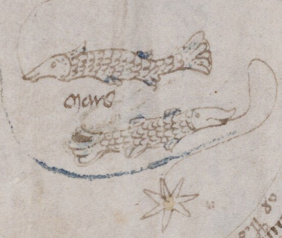
Pisces the Fish
Piscium, Pisces, Mars, March

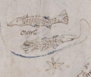
Pisces the Fish is the first zodiac symbol represented in the VM. We don’t know if the illustrator intended to begin with March or if January and February have been lost. Another possibility is that not all the months were relevant.
The fish illustration is not original in concept.
Note that the fin arrangement (two groups both top and bottom) is similar to Pisces in the du Berry Book of Hours, and that the fish have long snouts. Both include curved embellishments (which represent cords or garlands in some depictions of Pisces) leading out of the mouths of the fish. These details are not common to all depictions of Pisces at the time, but they were not unusual either.
The zodiac fish carved into the L’Église St. Nicholas in Civray depict Pisces in a manner similar to the du Barry fish, two fish with two sets of fins top and bottom, the bottom fish upside down, and a curved garland linking their mouths. The VM illustrator drew both fish facing the same direction, akin to the fish in the Codex Schürstab (Nürnberg) and in the 15th century Book of Hours thought to be from Nantes, France (below right).
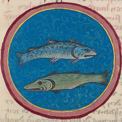
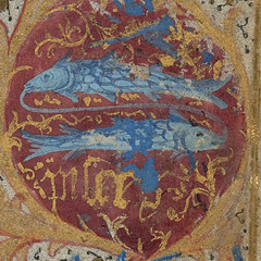
Upright fish like the VM Pisces can be found in the Codex Schürstab and the Book of Hours thought to be from Nantes, France. both are from approximately the same time period as the VM. The one on the right features a similar curved line connecting the fish by the mouth. The fin arrangement is slightly different in the VM but the overall arrangement is the same. In turn, the French Book of Hours painting of Pisces harks back to even earlier depictions of fish connected by a cord from the region that is now Germany and Switzerland.
The text between the fish, which may have been added by a hand other than the VM author, and which looks similar to the text on the last VM page, says Mars (French for March). The stem of the “a” is a bit disconnected, but if you look at the other labels, you will see that the writer frequently writes the “a” this way.
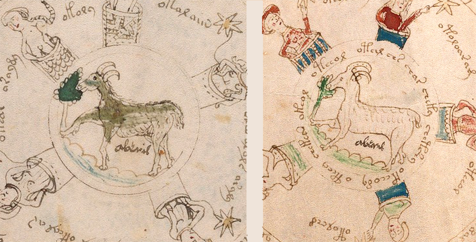
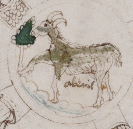
Aries the Ram
Arietis, Aries, Aberil, April
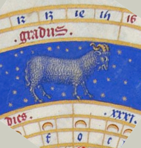

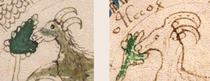
The VM ram isn’t a copy of the du Barry ram, but neither does it differ significantly (if you accept that the VM illustrator was not a skilled artist) The du Barry ram’s coat and horns are longer and curlier but the hooves are very similar. The VM ram’s neck is thinner and the illustrator has put a green tree in the background similar to Aries the Ram stepping out in the Codex Schürstab.
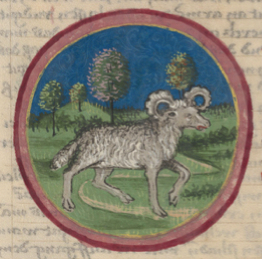
Underneath the VM ram, in a loose script that is similar to the script in the other zodiac pictures, is written aberil. Avril and abril represent April in French and Spanish respectively.
I suspect that the zodiac labels were written by somebody trying to decode the manuscript, and since zodiac symbols are familiar to many people, even today, it’s a logical place to start. I don’t think there are any secret codes written in Third Script (like “Leonardo” spelled backwards). I think these are what they appear to be, labels to help sort things out.
The ram is repeated on the next page and the whole page painted a little differently and this too has been labeled in a darker ink with aberil representing April.
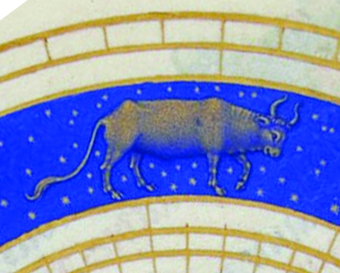
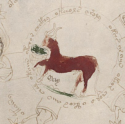
Taurus the Bull
Taurus, May

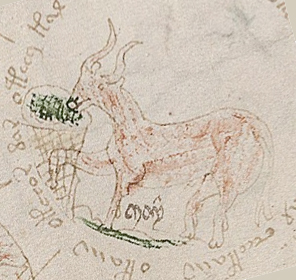
The bull representing Taurus is essentially the same as the du Berry bull except that it’s facing the other direction, has a thinner neck and, like Aries, is nibbling on something green. Under the bull’s belly is written may. In French, Spanish, Italian, and German, May is currently written with an “i” rather than a “y”. Also, oddly, there appears to be a symbol over the y resembling a caret. Like Aries, the VM author has created two copies of Taurus, with the animal essentially the same as the previous one, except that the brick red paint is smoother and more heavily applied. There’s a little more room for a longer tail on the second drawing and the anatomically male bull is more clearly outlined. In the second drawing it’s a bit easier to see that the bull is eating (or drinking) from what may be a bucket and one can also see, from looking at both the rams and bulls, that the Voynich illustrator has’t quite figured out how to draw hind legs. They mimic front legs rather than orienting the joints in the other direction. The bull from the Codex Schürstab (below right) has more anatomically functional legs.

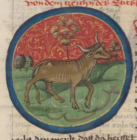
There are many clues that suggest the illustrator was cleaning up small details in the second bull. The information surrounding the duplicate Aries and Taurus pages are different, however.
Note that there is no mark above the “y” in the second drawing of Taurus. The Third Script writer may not have intended the mark on the first one.
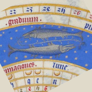
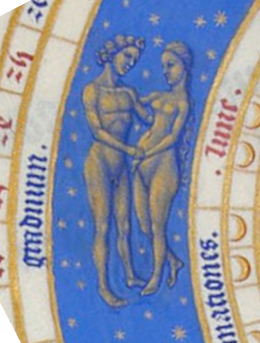
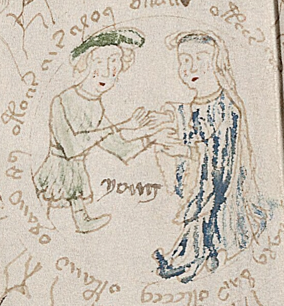
Gemini the Twins
Graduum, Gemini, Iune, Juni, June, Yuny/Yony
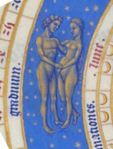
Something to note about the VM Gemini twins is that they are fraternal male and female. Not all zodiacs were depicted in this way—many show the twins as the same sex (see the Codex Schurstab twins on the right). The du Barry zodiac also depicts male and female twins. Interestingly, the du Barry twins are naked, similar to Adam and Eve before The Fall, yet the VM twins, in a manuscript overflowing with naked characters, are clothed and the twin on the right is drawn almost the same as the female figure in the VM Virgo.
Between the twins, in Third Script, is written yuny or yony (the second “y” is slightly smudged, but these are calligraphic “y”characters consistent with other y letters written in Third Script). In many areas of northern Europe. a “j” is pronounced like a “y”. For example, in Danish, June is spelled “juni” but pronounced “yooni” like a y. The Third Script writer may have been transcribing the sound of a word rather than the technical spelling. Given that borders were constantly changing, and nobility and their retinues were constantly on the move, this was not unusual.
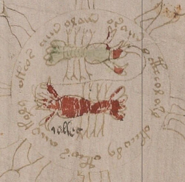
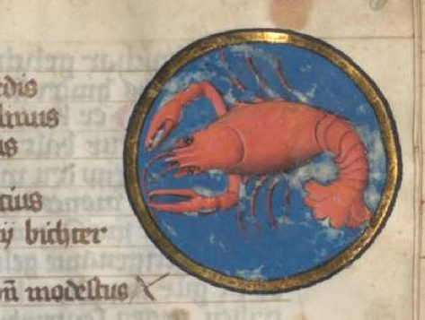
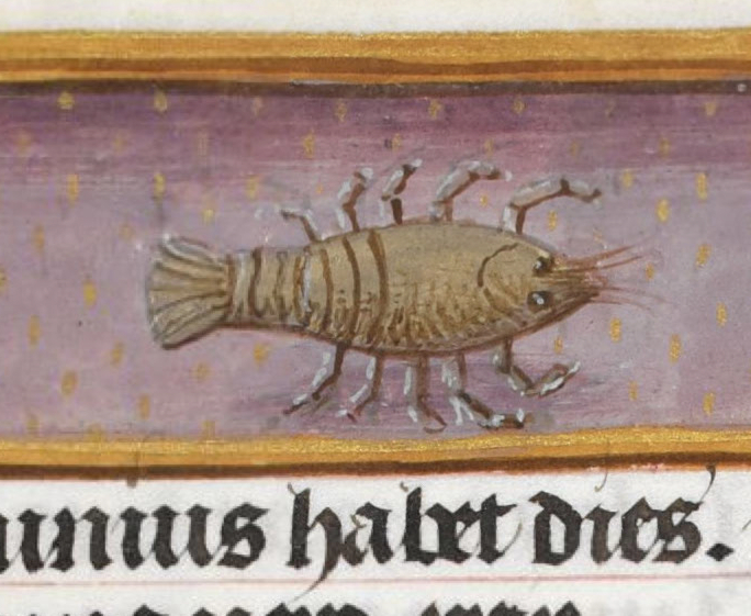
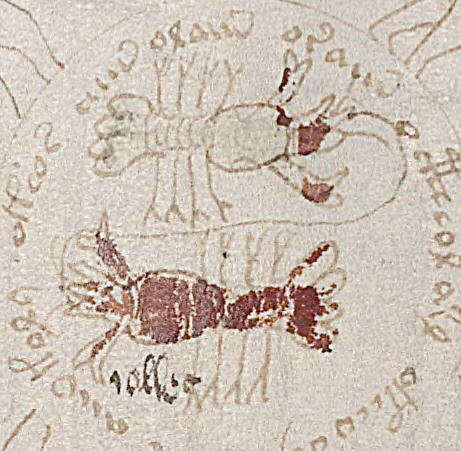
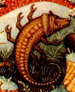
Cancer the Crab
Cancri, Cancer, July, Juli, Iollio
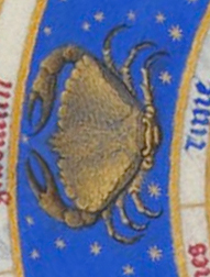
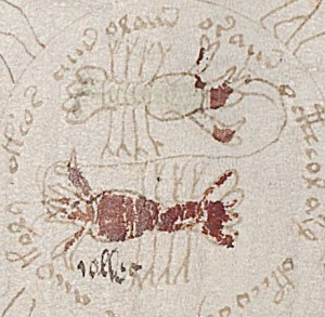
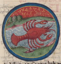
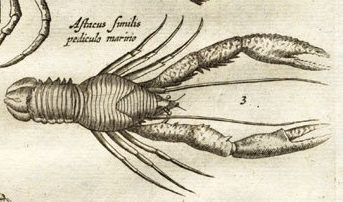
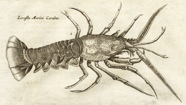
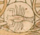
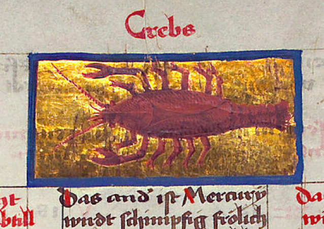
If it appears, from the other zodiac symbols, that the VM illustrator might be copying The Book of Hours, Cancer the crab makes it clear that the VM may be similar in some respects to the du Barry manuscript, but is not copying slavishly (if at all) from The Book of Hours. The du Barry illuminations show cancer as a crab. Many zodiacs at the time, however, depicted cancer as a crayfish or lobster (perhaps the crayfish were drawn by illustrators who lived near lakes rather than oceans) and the VM illustrator’s crab not only follows the crayfish rather than crab style, but it is duplicated in the same manner as the pisces fish (the du Barry crab sits alone). The crayfish/lobster version of the crab is illustrated in the Codex Schürstab (right).
In second script, under the crabs is written iullio or iollio. One of the other zodiacs has a letter one would expect to be “u” but which looks like an “o” so perhaps the scribe writes a u like an o or is transcribing a local dialect. The letter “i” followed by a vowel was often used to represent the “j” sound at the time. When spoken out loud, iullio would sound like julio (yoo-lee-oh) which is a cross between the Scandinavian juli (yoo-lee) and Spanish julio (hoo-lee-oh)—both words for July. It comes even closer to the Italian word for July, which is iuglio (yoo-lee-oh) or, in Catalan, juliol. These are the modern words for July, but they are all in the same basic sound family and close enough to fit the VM label.
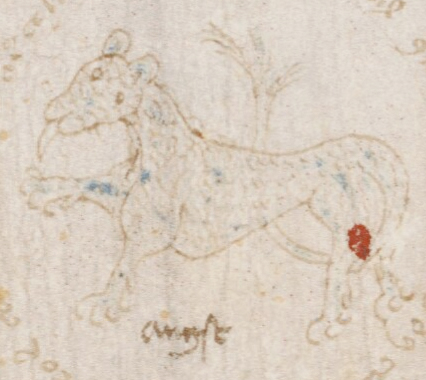
Leo the Lion
Leonis, Leo, August, Augst
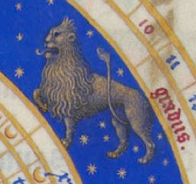
There’s quite a bit of similarity between the du Barry Leo and the VM Leo, other than the thinner. In fact, the VM illustrator might have intended a female lion (without a shaggy mane), or perhaps thinner necks is simply the VM illustrator’s way of drawing necks (a number of other animals have thin necks, including Taurus the bull) just as the hind legs of hoofed animals aren’t quite right. Note the lifted right-front leg, extended tongue, and tail curling up between the hind legs are similar to the duBarry lion.
In contrast to many zodiac wheels, the VM illustrator appears to have a genuine interest in plants, and included a tree behind the lion. This clue suggests the VM author and illustrator might be the same person since whoever created VM 408 was interested enough in plants to spend months or perhaps years studying and documenting them. Or, if it were a different person, the VM author might have directed the illustrator to include plants. I think the first is more likely, but it’s an open question and there are a few zodiacs by other illustrators that include plants. For example, the Codex Schürstab Leo doesn’t closely resemble the VM Leo, but it includes trees in the background.
As an aside, note that the Voynich illustrator rarely depicts anything as fierce. The du Barry fish have the predatory expression and teeth of aggressive fish like barracudas, and the lion has a ferocious look as well, but the VM fish are rather cheerful looking and the VM lion’s expression is quite neutral.
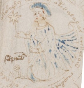
Virgo the Virgin
Virgo, Virginis, Septembris, September, Septembre
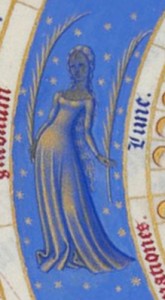
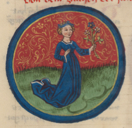
The du Barry Virgo (left) is rather demure and alluring, with a sassy pose, long wavy hair down to her knees, and a low neckline. She holds what appears to be long elegant feathers, or perhaps fronds.
The VM Virgo is more modest, dressed in a higher neckline, short hair, or hair hidden by her cap. Like many of the other VM zodiac symbols, the composition includes a plant to the lady’s bottom left. The long folds of fabric and cap are painted blue. The star-line held in her hand perhaps symbolizes her status as a zodiac symbol. The Schürstab Virgo is also dressed in blue, with head ornamentation, and a small bouquet of flowers. In this case, the VM Virgo is closer in style to the Schurstab rendition than du Barry.
To the left of the Voynich Virgo, in Third Script, is written septembre in the style of Greek miniscules, which often use a short dash above the lowercase letters to represent an unwritten letter from common letter combinations such as “em” “per” “tem” and “er”. These conventions were adapted in days when parchment was precious, expensive, and small. It also helped relieve tedium and writer’s cramp for scribes. The Codex Shürstab and Codex Manesse use these dashes to represent abbreviations, as well, so it wasn’t a practice restricted to Greek literature—parchment and time were precious everywhere.
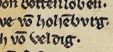
In this example, from the 14th century Codex Manesse, the dash above the “o” represents the letter “n” (or “m”, depending on context) so the text on the middle line reads “von hohenburg” (or, in other circumstances it can represent “vom (von dem)”. The Third Script writer used this form of abbreviation when labeling the VM zodiac drawings.
Together, the style of writing of the Third Script author, which is more calligraphic than the Voynich Manuscript (the thick and thin dynamic of the quill is more effectively used), and the abbreviations characteristic of miniscules, suggest that the Third Script writer may have had experience in creating manuscripts, or had studied miniscule-style literary works. When interpreting the label next to Virgo (and the other zodiac labels), keep in mind that the 15th century letter S looked more like our modern-day f than the snaky S we use today, depending on its position in the word. For example, in the du Barry book, “septembris” is written with a final “s” that curves, but an initial “s” that resembles a modern-day, lowercase “f”.
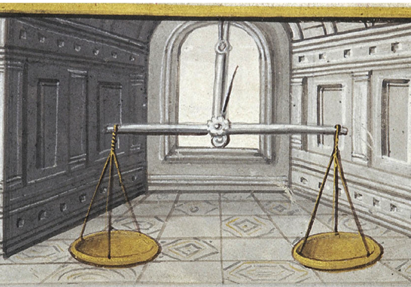
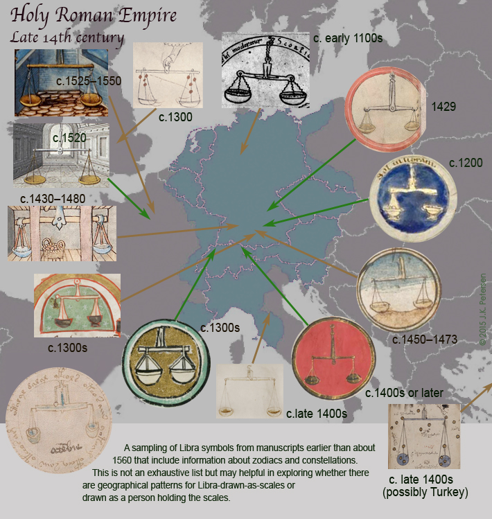
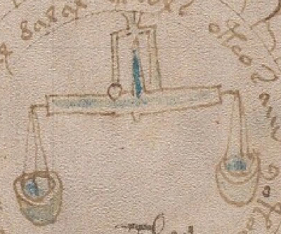
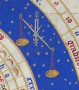
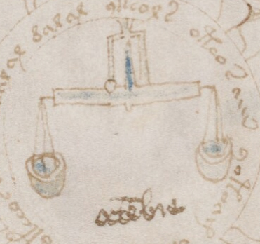
Libra the Scales
Libre, Libra, October, Octobris, Octembre
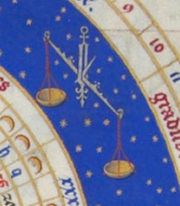
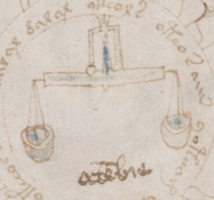
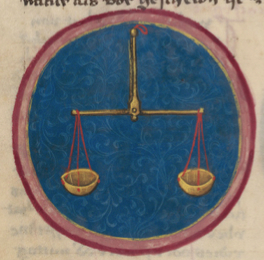
The du Barry scales are shown with one end higher than the other (so the tip in the center is at an angle) to fit within the narrow ring full of stars and stil remain upright. Since the VM scale is in the center of the wheel, it’s possible to show it straight on (and easier to draw), with the cups level and the gauge in the center upright. Essentially it’s the same kind of mechanical scale, just a little less embellished than the du Barry example. The way it is drawn is similar to the Schürstab Libra (below, left), with a straight-on view, slightly deeper cups, and supporting cords without a twist in the upper portion. The main difference is that the VM illustrator has turned the fulcrum to one side to show the pointed gauge (painted in blue) that shows the level/angle of the scale.
Beneath the VM scale is written octembre in miniscule abbreviation style.
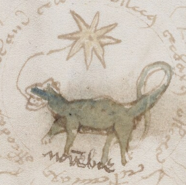
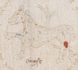
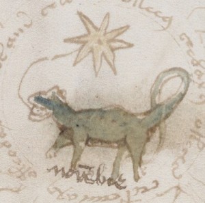
Scorpio the Scorpion
Scorpronis, Scorpio, November, Novembris, Novembre
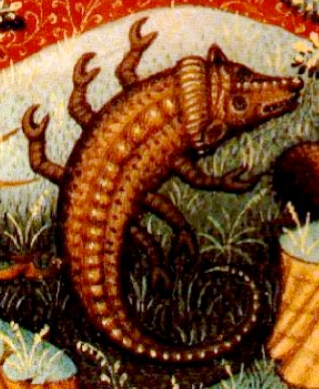
The du Barry Scorpio (below left) bears a strong resemblance to a real scorpion. The VM scorpion looks more like a lizard, but I don’t think there is any intent to obscure the scorpion’s identity. Many zodiacs of the time have scorpions that resemble lizards, perhaps because the illustrators had never seen a scorpion and were going by spoken descriptions.
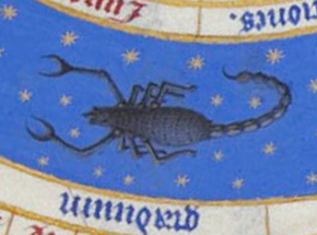
The fairly naturalistic scorpion on the left is from the du Barry book of hours, the one on the right is from a mid-15th century book of hours known as the Falstof Master. Except for the legs, the Falstof Scorpio looks more like a mammal crossed with a reptile than a crustacean. The scorpion carved into the L’Église St. Nicholas in Civray looks like a fat lizard with a pair of front claws. Scorpio on the Benedictine Abbey Church of Sante-Marie-Madeleine resembles a goat with extra legs. The Schürstab Scorpio resembles a somewhat more crustaceous version of the “weasel-Scorpio”. Many northerners have never seen scorpions, which might account for the anatomical anomalies.
Beneath the VM Scorpio, in Third Script, is the label novembre, using miniscule abbreviation.
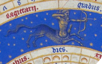
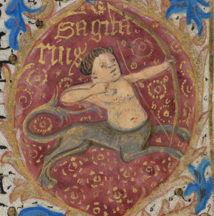
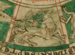
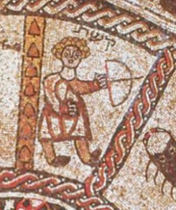
Sagittarius the Archer
Sagittarius, Sagitarii, December, Decembre

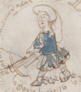
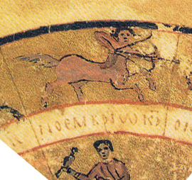
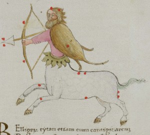
Sagittarius is a particularly interesting VM illustration because it goes against the more common conventions. Sagittarius is usually depicted as a centaur—part man, part horse (or goat, since some have cloven hooves). The VM archer has legs. Also, it is typical for medieval and Renaissance Sagittariuses to have traditional bows rather than the crossbow in the Voynich Manuscript. The few examples of Sagittarius that can be found with legs tend to be from northern rather than southern Europe.
Here is an example of a Sagittarius with legs from a 15th century Nürnberg manuscript—Codex Schürstab. Other than the head dress, his clothing similar to the VM archer. To the right is a more conventional Sagittarius, depicted as part man, part cloven-hoofed animal.
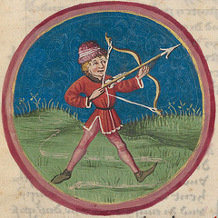

Even northern documents tend to show Sagittarius with an animal body. The very dynamic Sagitarrius with horse’s hooves shown below left is from Walters MS W.17, a scientific manuscript from about the 10th century. While the uncommon examples of Sagittarius with legs tend to come from northern Europe, there are exceptions. A particularly notable one is the 5th century Beit Alpha synagogue zodiac (below right) in Israel.
Why is Sagittarius shown with an animal body, even in earlier centuries as in this 8th century Geographia of Ptolemy (below left)? Because the arrangement of the lower stars traditionally assigned to the constellation Sagittarius are widely spread, suggesting the lower part of an animal, as illustrated in this 15th century drawing from the Genus Arati (Naples, Italy, below right). The red dots are the stars that make up the constellation.
Capricon the Goat and Aquarius the Water Bearer are missing from the VM set, and both Aries and Taurus appear twice, suggesting either that the series was left unfinished or that the other zodiac symbols were not directly relevant to the information surrounding the center symbols.
The VM zodiac months may have been specifically chosen to represent the timing of certain events or, I suppose, drawn as a ruse to throw off a viewer from the textual content (which might have nothing to do with zodiacs), but I don’t think the pictures are a ruse. The content in the surrounding wheels shows cycles of life, and people in the Middle Ages (and many people even now) believed that cycles were influenced by the constellations and would ask astrologers to suggest good days for major events, such as marriages or journeys.
Summary
The Voynich author was surely exposed to medieval literature or the Voynich Manuscript probably wouldn’t have followed many of the conventions evident in the document, but it doesn’t appear that the zodiac symbols are copied straight from one source (unless that source has been lost). Inspiration seems to have come from a variety of sources, perhaps from carvings or documents in a monasterial or royal library. Many kings prided themselves on their collections of oddities, manuscripts, and other treasures available only to those of wealth and stature and the VM illustrator may have had access.
The zodiac labels are mostly, but not entirely written in French. I’ve drawn up a chart to make it easier to see the names for people who are not familiar with reading calligraphy or older style writing. As noted on the chart, an “e” with a slash consistently represents “em” as in miniscule abbreviation style, and the old-style “s” is represented by a shape that looks like a lowercase “f”.
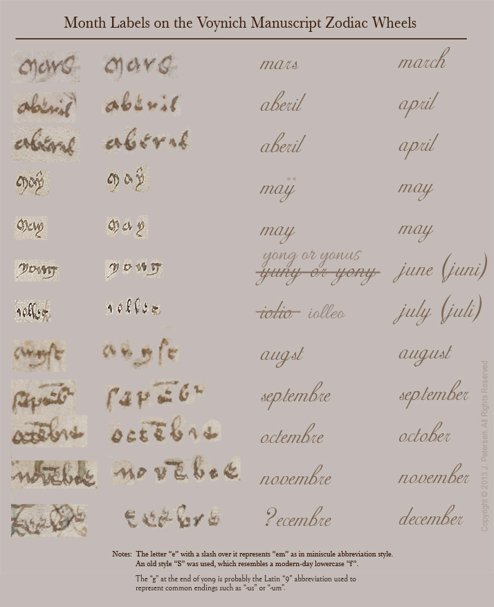
Interpretation of month names on zodiac-figures in Voynich manuscript
The fact that some of the labels are not pure French as we know it is not unusual. Language changes, people of the Middle Ages did not have radio or television to “cinch down” a language and keep it consistent. Reading and writing were not widely taught as they are now. Also, among literate circles (usually clerics and nobility), there was a great deal of travel and many battles—the constant struggle to acquire and hold on to wealth and power kept people on the move. The king of Spain or Naples could also be the king of Jerusalem, even though these regions are geographically distant (especially in the days before cars and trains). Cross-pollination of languages in wealthy circles was probably common. It happens even today.
When I was traveling in Europe, I met a jovial fellow who managed one of the Swiss youth hostels. He could understand half a dozen languages through contact with a constant stream of travellers but he admitted he had lost most of his mother tongue and I noticed, when conversing with him, that he spoke a polyglot that could only be understood by those who knew a mixture of German, French, Italian, and English.
I get the sense that the Third Script writer (possibly someone who never met or knew the identity of the VM author) may also have been a polyglot or lived in one of those regions where the borders changed and languages blended. It’s likely that the writer lived sometime in the 15th to 17th centuries, based on the style of writing, and there is a document in almost the same style written in the mid-1400s that suggests the Third Script writer may even have been a contemporary or near-contemporary of the VM illustrator.
What if the text underlying the Voynich Manuscript were also polyglot? A mixed language would be more difficult to decode.
[Image sources: Codex Schürstab (ca. 1472) courtesy of the Zentralbibliothek, Zürich. The Nantes? Book of Hours courtesy of the Bibliothèque de Genève. Tetrabiblos of Ptolemaios from the Geographia of Ptolemy, courtesy of the Vatican Library.]
J.K. Petersen
* Note that I renamed the Zodiac scripts as “Third Script” to disinguish the handwriting from the “Second Script” on the last page of the Voynich a year or so ago after analyzing them in more detail. I believe there are probably (at least) three hands represented in the Voynich, the main script, last-page script, and Zodiac labels (I haven’t yet posted my notes on the page numbers). One of my blog entries includes a chart showing their distinct characteristics.

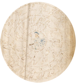 The Voynich Manuscript has a series of wheels with zodiac symbols in the center, but the images around the symbols have no apparent relationship to constellations, seasons, or months of the year. Instead they are mostly populated by naked nymphs in gaily decorated baskets or loges, each with a star.
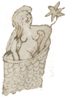 In some cases, the maidens look somewhat generic, in others they look like they might represent real people, and there are different characteristics to the imagery in different wheels. In some wheels the figures are fully clothed and more heavily painted.
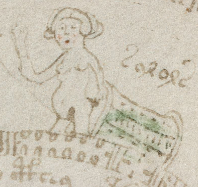 In the chart below, I’ve extracted each nymph while retaining their order to make it easier to see this pattern. There are three figures that look like children, followed by one that looks like a teen with longer hair. More mature women follow until there’s one with its stomach above the edge of the basket to expose what looks like a baby bump. Continue on for three more baskets and then there’s another exposed stomach showing what looks like another baby bump (before birth control, it was not uncommon for women to have a dozen pregnancies).
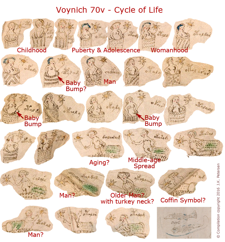 This is, of course, a tentative interpretation. I don’t know what the labels say and I don’t know if I began reading the figures at the right spot, but there does appear to be an aging sequence.
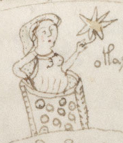 On the same folio is a wheel with a ram in the center and a smaller number of nymphs in the surrounding wheel.
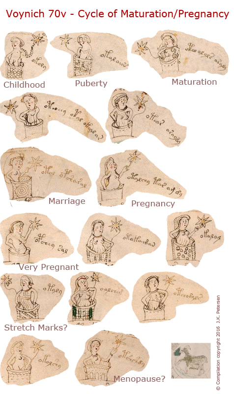 The stomachs and sometimes the groin area are visible in most of the drawings, but the last one covers up the stomach. Could this be menopause, when a woman is no longer ovulating or becoming pregnant?
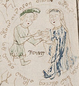
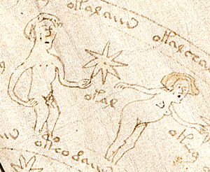 I’m not going to upload all the wheels, it’s too much information for one blog, but you can look at the originals, and you will see another wheel that looks like a cycle of menstruation and one that appears to be a cycle or commentary on relations between the sexes (right), with a man whose genitals are clearly included and a nymph who is leaning down more than the others in a provocative pose. I can’t quite figure out what’s going on with his genitals, they’re not drawn as clearly as one in the biological section, but it might be an animation with two positions (flaccid and erect). Since most of the men are modestly depicted, this more explicit image is making a point about the meaning of the drawings.
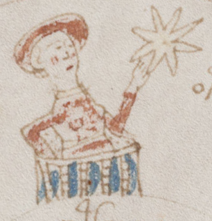 Not all the wheels appear to be cycles. The colored wheels give a different impression. They feel more like political commentary or perhaps genealogical images. The wheel around the symbol for Cancer is more similar to the life cycle wheels and has a large number of figures, quite a few of whom are male, but the pattern and their significance is not clear.