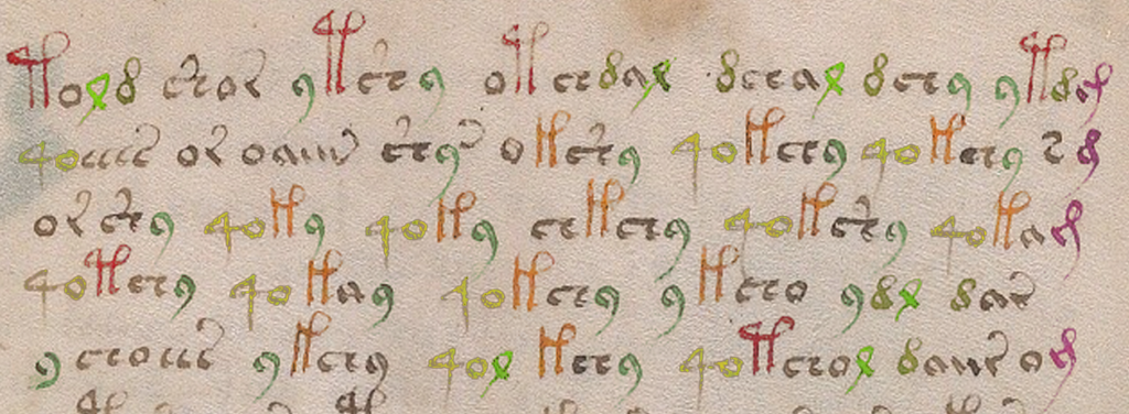
 here’s a glyph in the Voynich Manuscript
 EVA font-set that is mapped to the “j” key, because it resembles a j to contemporary eyes (note, it turns out this is mapped to “m” in EVA).
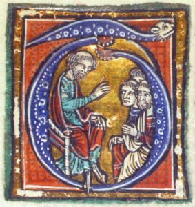
In the 15th century, however, the letter j barely existed. Many European languages used a soft “j” (similar to a “y” as in “you”) and it was written as an “i” preceding another vowel, as in IOANNES (Johannes) and IVLIVS (Julius).
The “j” wasn’t even part of the alphabet—it evolved gradually from an embellished capital “i” that was used for names.
 To the medieval eye, the “j” shape was not a letter, it was a Latin abbreviation written as a ligature (two shapes combined together for comfortable writing—something I’ve mentioned in previous blogs about the Voynich glyphs). Here’s an example of -ris, from a 14th-century manuscript, decomposed into its parts.

The letter “r”on the left is combined with the shape on the right, a common Latin abbreviation for “-is” to create the suffix “-ris”.
Depending on the shape of the first stroke, this can stand for “-ris”, “-tis”, or “-cis” and, in some contexts it was also used for the suffix “-rum”, instead of the more common 4-shaped “-rum”.
Origins of VMS Glyph Shapes
The Voynich Manuscript borrows many conventions from Latin, so it’s reasonable to assume that the inspiration for the EVA-j glyph-shape was probably the Latin -ris. It’s also interesting to note that in Latin, -ris occurs more frequently than -cis, and this is also true in the VMS. Whether this has anything to do with the meaning of the glyph or whether it is a case of misdirection (mimicry of Latin shapes without intending the same meaning) is not known but it’s noteworthy that -ris can occur at the end of a word almost anywhere in a Latin sentence, whereas it tends to occur at or near the ends of lines in the Voynich manuscript. The shape is the same; the positional patterns are different.
It’s also noteworthy that almost any letter can occur before -ris/-tis/-cis in Latin, whereas in the Voynich Manuscript it is usually preceded by the EVA-a glyph, as in the following examples:
 But EVA-j is not limited to following the a-glyph. It doesn’t happen often, but it can follow other shapes:
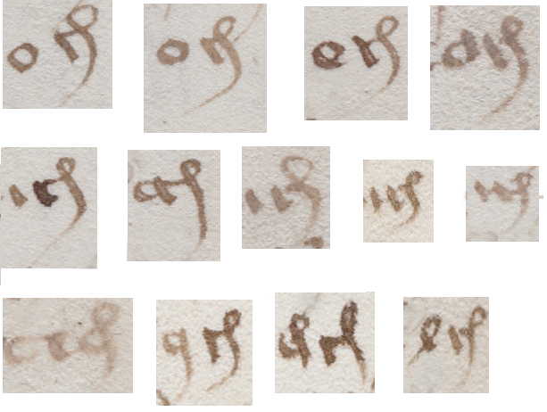
The aj combination is the most frequent, but many other glyphs can precede the EVA-j shape, some of which are unclear as to whether they are “o”, “a”, or something else.
It’s difficult to tell which VMS glyphs are 1) combined shapes meant to be read as one glyph, or 2) combined shapes intended as multiple-glyph ligatures, but there’s some evidence that the Latin -is shape (the righthand side of the -ris) might be a separate glyph in the Voynich manuscript. There are instances where the -is loop is completely disconnected from the previous stroke and some where it is preceded by other glyphs besides the “r”, thus suggesting it may be able to stand alone:
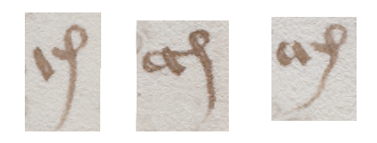
In these examples, the -is glyph is separated from the previous glyph and is preceded by something other than the “r” shape, thus suggesting it may be a separate glyph and possibly used as a ligature.
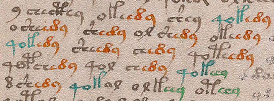
In Latin, it’s uncommon for the -ris shape to appear anywhere other than the end of a word and even more unusual for two of them to occur in sequence unless they happen to be variations (e.g., -ris followed by -tis). Midword positions are infrequent in the VMS, as well, but they do occur:
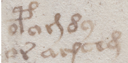
In the VMS, “aj” is usually found at the ends of words, usually at the ends of lines, but it is sometimes written midword, as in these examples.
Many transcriptions of the VMS text do not recognize the distinction between the straight “aj” and the curved “aj” (which is part of the reason I created my own transcription), but it might be important to acknowledge the difference partly because they are separate suffixes in Latin, but also because they appear to be clearly distinguished from one another in adjacent examples in the same VMS word-tokens. For example, here we see the -ris shape both preceding and following the -cis shape:

In the first example, there are two -ris shapes and one that may be either -cis with a short stem or a different character entirely. The second and third examples are less ambiguous, however. In both, the -cis glyph precedes the -ris glyph and it appears that the distinction is deliberate, as was the custom in medieval Latin.
Summary
If we assume that the looped part of the aj glyph is the right-hand side of a ligature, and could potentially be combined with other glyphs, then we have to look for other instances of its use.
As I illustrated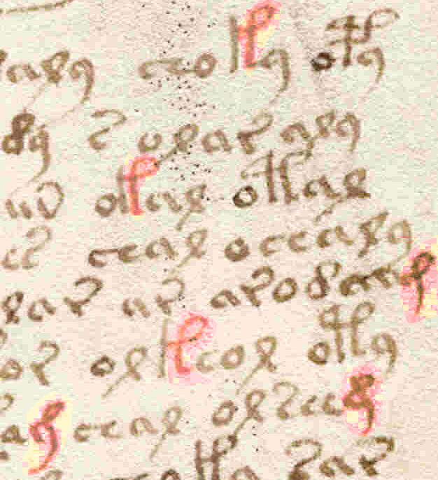 back in January (and mentioned in even earlier blogs), the gallows character on the right may be composed of two parts, as well. Even if it is, what the glyph means is anyone’s guess. This shape has different interpretations in different languages—it can be “Il” in French, “lis” in Latin, “Item” in German, and sometimes even a very abbreviated “peri” in Greek. It’s also possible that it’s a capitulum, modifier, or marker, and the similarity to the looped shape in “aj” is coincidental.
Note that the gallows glyph also has certain positional peculiarities that differ from “aj”. It’s frequently preceded by “o” rather than “a”, it’s not usually found at the ends of words or the ends of lines, and might be a counterpart to the gallows glyph with two loops.
 One other detail worth noting is that some of the EVA-d characters have a straight rather than looping stem. Is it possible this shape is a short-stemmed -cis or “j” rather than a “d”? In some places the distinction between them is more dramatic than in this example but are they different enough to be considered different glyphs?
Questions like this can’t be answered by shape alone. Position and frequency have to be considered, as well, to see if they behave differently. I’ve done this kind of analysis on some of the other morphologically similar glyphs, but I haven’t had time to evaluate the short-stemmed -cis to see if it’s different from EVA-d.
J.K. Petersen
© Copyright 2016 J.K. Petersen, All Rights Reserved

