Monthly Archives: June 2017

The Site of the Cross

26 June 2017

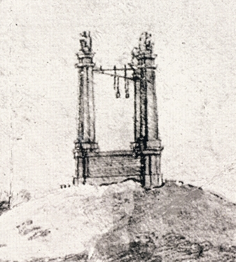
On December 14, 2016, Searcher, on the Voynich.ninja forum, suggested that the cross-shaped item in the hand of a nymph on folio 79v might be a cross-staff. This was an intriguing idea, especially considering the way in which the instrument is held and the fact that there is another nymph holding something that looks like calipers, so I looked up some of the history of cross-staffs to see if there might be support for the idea.

The cross-staff is an ancient instrument which may trace back as far as the Chaldeans, who are also connected to early forms of astrology. In the Renaissance, it was used in navigation, but its original purpose was to study and measure distances related to the sun and stars. The staff provided a way to guide the eye and was the forerunner to instruments such as the quadrant and sextant.

Basics
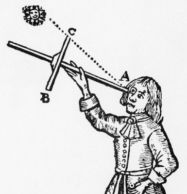
In its simplest form, the cross-staff consists of a rod with a smaller crossbar mounted at 90 degrees to the longer bar. The smaller bar is known as a “vane” or “transom”.

A cross-staff was held to the eye so the person using it could site along a line to the sun and compare this with the distance to the horizon. The vane was adjusted back and forth until both could be brought into view at the same time. Refinements included various means to move the crossbar, and markings on the instrument, in degrees and minutes, to help determine distance. Sometimes multiple vanes were added, but the basic instrument needed only one.

The cross-staff was sometimes known as Jacob’s staff. This may be based on the ladder Jacob envisioned stretching in a line from Earth to heaven. It has also been suggested that the name comes from one of the medieval names for the constellation we know as Orion, which has a short “belt” of stars resembling the vane on a cross-staff.

In French, it was called arbalete, rayon astronomique, and baton de Jacob, or arbalestrille for the marine version (the fore-staff). In Portguese, balestilha. In Latin, radius astronomicus, and in German, Jacobs-Stab or Stab und Kreuz, or just Kreuz.
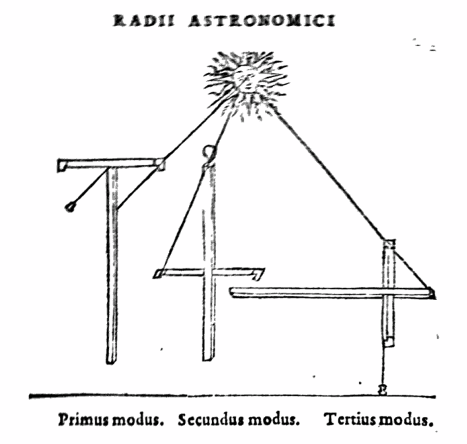
Three modes for using the cross-staff for siting and measuring are illustrated in Gemmae Frisii de radio astronomico et geometrico liber (Frisius, et al, Cavellat, 1557).

The earliest reference to the cross-staff, so far identified, is from 11th-century China. In Europe, the earliest references to modern use of the instrument are from Provençe in the 14th century. Of particular interest is a reference by Gersonides, a Jewish scholar who believed in astrology, who describes the instrument and attributes its uses not only to measuring distances between celestial bodies, but also their diameters.
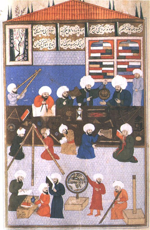
In this image, Moslem astronomers discuss the use of the astrolabe (upper right) and another uses a double sighting rod (left) while an early form of quadrant sits next to him on the table. The Q’uran (written in the 7th century) includes a passage about Allah/God having set out the stars to help navigation at night, thus inspiring an interest in the practical application of astronomy. [Image courtesy of the University of North Florida]

By the 19th century, a modified cross-staff with a round or square head, and sometimes a quadrant of slits, was used in surveying, in combination with a rod or chain and a number of staves. It was useful for measuring fields, platting lands, and certain forms of cartography.

The Cross-Staff for Navigation

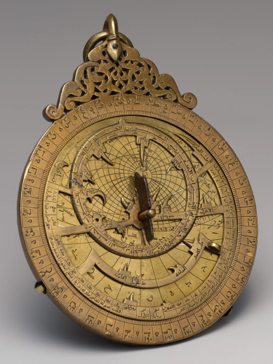
Yemeni Astrolabe, 1291 [Courtesy of the Metropolitan Museum of Art: Edward C. Moore Collection]

Of particular interest to Voynich researchers is the history of the cross-staff for navigation on water. In marine navigation, it was known as a fore-staff, so-called because the person using it faced the direction being observed, in contrast with the back-staff which was used with one’s back turned. Adjustments had to be made for how high the person was above the water.

It may seem surprising, but historians claim that the cross-staff was not used for marine navigation until fairly late in the middle ages.

In the Mariner’s Museum, they have this to say about the history of the cross-staff:

“…sailors did not use it until the early 1500s; the first recorded date was 1514. As with other early navigation instruments, the first use for the Cross-Staff was in astrology, in measuring the altitude of stars to help forecast the future.”

William Wales notes, in 1744, that John Werner, of Nuremburg, recommended the use of the cross-staff as a marine instrument for determining longitude, by observing the distance between the moon and stars, in a book printed in 1514 (W. Wales, 1777), which is likely the same reference noted by the Mariner’s Museum.

In Motorboating (July, 1947), there is a practical description of the difficulties of using an instrument like a cross-staff on the sea:

“The pitching, rolling deck of a ship prevented general adaptation of the astrolabe. The cross-staff required the observer not only to sight directly on the blazing sun but also to look at two things simultaneously: the sun and the horizon. In the middle and high latitudes this latter job was not too difficult. In the low latitudes traversed by so many ships of the early days, it was nearly a physical impossibility to sight on a noon-day sun nearly overhead and a horizon dead ahead. These disadvantages led John Davis to invent, in 1590, his Back-Staff or Sea-Quadrant.”

Andrew MacKay, in 1793, sheds further light on why the cross-staff was not the instrument of choice for determining distance on water in the early days:

“The method of reckoning the latitude in degrees and minutes being introduced, instruments for observing altitudes were divided accordingly.– The Astrolabe, (a circular ring, having a moveable index and fights,) was applied to observe altitudes at sea. It was, however, supplanted by the Cross Staff, and that again by the Quadrants of Davis and Hadley, in succession.”

Thus, he suggests that use of the astrolabe preceded the cross-staff for marine purposes, with the quadrant eventually succeeding it.
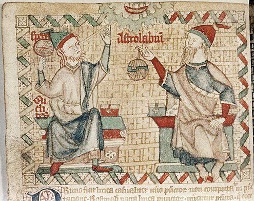
On the left is a sighting rod (without crossbar), to the right, an astrolabe, constructed of overlapping, rotating rings—an instrument commonly used in navigation. Note the cloud band and the pattern in the background. [British Library, Bodley Digby 46, late 1300s]

Interpretation

If the object in the hand of the nymph on folio 79v is a cross-staff, then it’s unlikely that it’s intended as a marine navigation instrument—the astrolabe and other means were more commonly used for this purpose before the 16th century. In the early 15th century, the cross-staff was primarily used for land navigation, architectural measurement, and astrology.
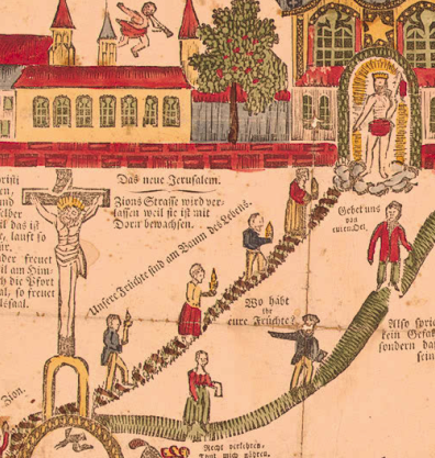
Unfortunately, the other images on the page, below the cross-wielding nymph, add little to our understanding of the cross-shaped object unless, perhaps, the Jacob’s Ladder story is being used in a metaphorical way and the presence of a nebuly-like “umbrella” over the nymph and her crow’s-next viewpoint are pointing to a path to heaven, a concept particularly prevalent in Christian iconography, but common to many cultures.

Or perhaps it’s the astrological significance of the cross-staff that is alluded to in the Voynich manuscript. If the various nymphs are personifications of constellations, as suggested by Koen Gheuens, it would not be out of place to find a cross-staff aimed at the stars or a possible connection with Jacob’s rod, which was traditionally associated with Orion’s belt.


J.K. Petersen

Copyright © 2017, All Rights Reserved

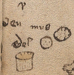
Ven Mus Mel

I’ve already written about the text next to the “aching tummy” figure at the base of folio 66r in a couple of blogs but perhaps it’s time to post some of the background information that influenced my ideas about what it might say.

Ven Muß Mel

I should start by saying, I’m pretty sure there is a letter “m” in “mel” that has been overwritten with a couple of heavier strokes so that the changed letter almost resembles a “g”. Since the interpretation of “mel” and “gel” are very different, this blog will concentrate on the original word “mel” and leave “gel” for a separate blog.

Note that it was very common for a single “s” to be written as “ß” in the middle ages, if it was at the end of a word. It was not always intended as a ligature for double ess.

I’ve already described some possible interpretations for individual parts of this phrase. To recap, in Anglo-Saxon “ven/wen” refers to a swelling or tumor, which may or may not apply to how it is used here, but should be considered as a possibility because the mysterious letter above it resembles an Anglo-Saxon letter form.

In German, muß typically means must/should but can also be “mouse” in Nordic areas. The word “mel” sometimes means honey (more often spelled melle, but sometimes also mell or mel), a very common ingredient in medieval remedies. Mel can also mean flour, and it too is a common ingredient.

All these interpretations have been mentioned in my previous blogs, but I thought I would take a moment to fill in some of the background information that influenced my perception of the text.

This is just one possibility, but if we consider “muß mel” as belonging together, we get a phrase (or compound word) that can be traced back to the middle ages.

Müsmehl is ground grain that was distinguished from bread flower by its color and texture. It was known as musmel/müsmel in the middle ages, and corresponds to later spellings of müsmehl and Muasmähl (note that corn meal was sometimes substituted for the original grains after the conquest of the Americas). This ground grain was used for porridge and a granola-like mixture, similar to the grains in muesli/müsli (note the similarity in the words).

Historical Confirmation of Terminology

In the Hermann Miles Chronik notation for anno 1529, there is a list of prices for basic foodstuffs. It tells mentions a quarter of “korn” (grain) and a “fierlig” of müsmel at 18 d.

Schillings, florins, and ducats were common currencies at the time, but I’m not sure what the currency unit “d” represents. Fiertel is a quarter, but fierlig appears to be a larger quantity, given that a fierlig of müsmel was almost four times costlier than a pound of “flaisch” (meat). Note that the definition of a “pound” varied from region to region.

In Württembergische Geschichtsquellen, published in 1905 in Swabia, the distinction between “schön mel” and “müsmel” is noted. In English, schön mel generally refers to fine flour—flour for breads and pastries.

Thus, the term is documented in print at least by the 16th century and may have existed in oral history for some time prior.

Summary

I’ve already mentioned that the handwriting on 66r next to the prone figure appears to be the same hand that wrote the marginalia on 116v. What is particularly interesting about the term “musmel/ mus mel” is that it was not widespread. In this form, it was mainly used in an area that is geographically consistent with some of the idiosyncracies in the spelling/grammar of the marginalia on the last page. For example, in Schwabia and the Alsace, “p” was often substituted for “b” (which would support an interpretation of “pox” as goat) and “a” for “e”, and letters were frequently dropped from words—characteristics one sees in the Hermann Miles Chronik and that are expressed or hinted at on 116v.

Although I have spent several years trying to systematically track down the homeland of the marginalia writer, and have a great deal of paleographic data, I haven’t yet committed to a specific region. Gothic cursive was written everywhere from Scotland to Naples, and France to Bohemia in the 15th century, and the marginalia writer’s hand (which is a mixture of cursive and book forms) does not give away a specific location. However, the combination of the handwriting style and the spelling and grammar suggests that the marginalia author may have learned to write Latin letter forms in the Alsace or Swabia.

If the marginalia on 66r is intended to be “muß mel” in the sense of ground grains/flour, and if the scribe is the same person who penned 116v, then it strengthens the evidence for the Voynich manuscript having passed through the hands of someone familiar with linguistic conventions of a fairly specific region.


J.K. Petersen

© Copyright 2017 J.K. Petersen, All Rights Reserved

Postscript October 2018: At first I thought that the handwriting on 116v and 17r and 66r were all in the same handwriting. They are a similar style. But after more study and collecting many more thousands of medieval handwriting samples, I am no longer sure. I still believe 116v and 17r are in the same handwriting, but I now have doubts about the short note on 66v for a number of reasons.

A Small Piece of the Puzzle

“Despite his best efforts, Voynich never sold the manuscript. It spent 30 years in a bank vault after the bookseller died in 1930. In 1961, rare-book dealer Hans Peter (“H.P.”) Kraus bought it from Anne Nill, Voynich’s former secretary and confidant, for $24,500 plus half the proceeds of any future sale. Unable to sell the manuscript, Kraus donated it to the Beinecke Library in 1969.”

–Mike Cummings, YaleNews, April 24, 2017

The American history of the Voynich Manuscript is reasonably well documented. From articles like the one cited above, we learn that Hans Peter Kraus, a Viennese bookseller, owned the manuscript from 1961 until 1969.

Early Years

Ellis Island immigrant station courtesy of the U.S. Library of Congress.

Kraus was a Buchenwald survivor who, after a stay in Sweden, traveled to the U.S. in 1939, leaving behind tens of thousands of precious manuscripts from his antiquarian business in Austria.

He had a particular interest in manuscripts produced before the year 1500 and one can only wonder at what gems he was forced to abandon. After arriving in New York, Kraus rebuilt his business and his reputation as a keen-eyed collector and trader of books and acquired the Voynich Manuscript for a sum equal to the price of a new house and car.

While it was in his possession, Kraus made efforts to learn more about the Voynich Manuscript, traveling to Europe and visiting the Vatican Library in 1962, as documented on www.voynich.nu, If he could confirm that the author was Roger Bacon, it would not only establish the antiquity of the volume, but would give it the celebrity appeal that could garner a good price.

It is said Kraus made efforts to sell the VMS, but less is known about this aspect of the VMS’s history than others, since many antiquarian communications are by word of mouth. Dealers, especially those dealing in rare and collectible objects, often have a number of elite clients who receive news of new acquisitions before they are offered to the public.

Kraus didn’t rely entirely on walk-in business or word-of-mouth. He was also an effective print promoter. I happened across an auction catalog that makes a brief mention of the VMS in 1966, when it was still being called the Roger Bacon Cipher Manuscript. Here is a summary of the auction listing (the reference to the VMS has been bolded):

Lot Number: 178           Title: Miniatura

…H.P Kraus (New York) Fifty mediaeval and Renaissance manuscripts. catal. ii, pp.XII, 114 Thirty-five manuscripts. Including the St. Blasien Psalter, the Llangattock Hours, the Gotha Missal, the Roger Bacon (Voynich) Cipher Ms., catal. 100, pp. 90.24 x 12. Manuscripts + books, catal. 115, 1966. pp. 196….

It has been erroneously posted on the Web that this was a listing for the VMS to be auctioned off but that it didn’t sell. I think this is a misreading of the auction listing.

The publication mentioned in the auction is not the manuscript itself, but a catalog called Thirty-Five Manuscripts, Including the St. Blasien Psalter, the Llangattock Hours, the Gotha Missal, the Roger Bacon (Voynich) Cipher Ms. It was published by Kraus to promote the sale of some of his more prominent items, including the Voynich Manuscript, which was described at the time as being about 700 years old. Kraus produced at least half a dozen significant catalogs between 1956 and 1978 (and apparently many more that are lesser known, totaling more than 200).

Summary

I have not seen the catalog, it is difficult to find, but it is a cloth-bound hardback with 87 pages and 41+ illustrations, published in January 1962, and is said to be well annotated. I would be curious to know how Kraus described the VMS. A quick search of the Web revealed only a few copies of Thirty-Five Manuscripts available for purchase or viewing. Here are some examples:

  • A copy in the holdings of the U.S. Library of Congress. Unfortunately, whoever borrowed it in Jan. 2016 neglected to return it, as it is listed as overdue.
  • Abebooks lists three copies, one of which is a repeat of the copy on Amazon, and one which has library markings (should we be suspicious of its origin? ).
  • A used copy on Amazon.com for $195.
  • A copy available, by request, to view in the reading room of the National Library of Australia.

Even with this kind of promotion, apparently no one was interested in the odd little volume, as it was donated, unsold, to the Yale library in 1969. Whether the lack of a sale was because potential buyers doubted the authenticity of the manuscript, or its speculative provenance, or whether it was because the asked-for price was more than they cared to risk is unknown, but interest in this unique work has not declined in the intervening years. It still whispers to the curious among us about secrets as yet to be discovered.

J.K. Petersen

© Copyright 2017 J.K. Petersen, All Rights Reserved

Sense or Non-Sense?

In Nick Pelling’s Cipher Mysteries blog, he commented on the challenges of parsing VMS text and creating transcripts, and specifically noted:

“… a big problem with entropy studies (and indeed with statistical studies in general) is that they tend to over-report the exceptions to the rule: for something like qo, it is easy to look at the instances of qa and conclude that these are ‘obviously’ strongly-meaningful alternatives to the linguistically-conventional qo. But from the strongly-structured point of view, they look well-nigh indistinguishable from copying errors. How can we test these two ideas?”

This is indeed one of the challenges in transcribing and understanding Voynichese. Our perception of the structure of the text will be skewed unless one can sort out, to a reasonable extent 1) the exceptions/rare forms, 2) handwriting variations, and 3) copying errors, from what may be meaningful text, so that relevant variations are acknowledged and artifacts filtered out.

The Characteristics of EVA-qo

The subject of EVA-qo was touched on in my previous blog, in which I posted a variant 4o image that shows a possible “component” relationship between “qo” and glyphs with ascenders. Prior to that I expressed uncertainty about identifying when EVA-qo functions on its own and when it functions as a pair (I suspect that pairs and singles may function according to priorities), but more examples are necessary to cover the topic in depth.

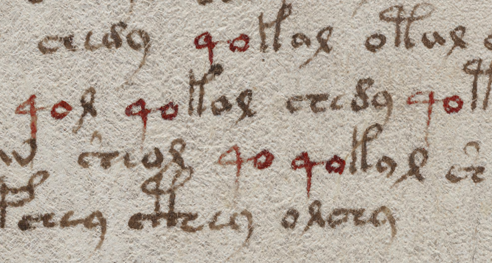
Glancing through the VMS, one will notice that “4o” is a frequent combination. In the following clip, which I chose arbitrarily, one sees several examples of 4o within the space of a few lines. One stands alone (which happens more often than one might think), the others are at the beginnings of V-words. Notice how some have sharp points and others are rounded. Most of them connect to the following glyph:

How does one determine if the 4 and o are intended as a paired glyph, or whether it is simply a common combination such as “qu” in English? Do the sharp and rounded corners have any significance? or the connected/disconnected characters? Note how 4o is frequently followed by an ascender glyph, except for EVA-qol. EVA-ol is one of the combinations that may function as a pair, in which case one has to ask whether 4 can function as a “single” when followed by a pair, according to some rule of precedence, as was noted in the discussion of pair patterns.


At first glance, it might appear that 4 is always followed by “o” and always falls at the beginning of a word. In fact, 4o can occur at the ends of words and occasionally in the middle.

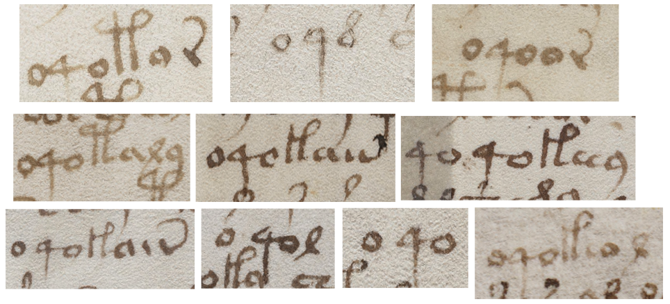
Many characters can follow the 4, including a common Latin abbreviation symbol (which is sometimes straight, sometimes curved). Here are some examples:

It’s also fairly common for 4 to be preceded by o or 4o, and 4o4 and o4o sometimes stand alone:

The o4o words appear mainly in the plant, pool, and starred-text pages, with one in cosmology and one on map rosette #1. There are none in the zodiac or small-plant pages.

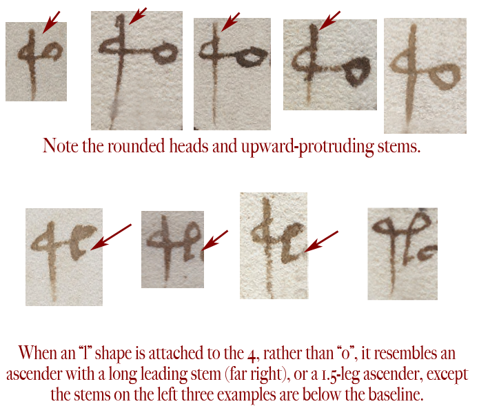
Some variations differ much more than those with straight or rounded connections, as in this example that I’m reposting from the previous blog. It has an extended stem and, below it, a variant that is followed by an “l” shape rather than “o” such that the glyph bears a strong resemblance to a 1.5-legged ascender:

To show this in context, note how a shift in position determines whether this combination looks more like 4o or a 1.5-legged ascender glyph. This isn’t drawn like a malformed 4o or oddball gallows glyph, this looks deliberate, but notice how it falls immediately before ascender glyphs or one that is a common pair, a position typical for 4o:

When EVA-q is followed by a form that looks like a cursive ell, it resembles a 1.5-leg double-looped ascender, except that it is positioned as EVA-q would be, as descending below the baseline.

The 4 glyph doesn’t only resemble the left leg and loop of an ascender, sometimes it is difficult to distinguish a rounded form of 4 from a straight-leg form of EVA-y, both of which look like a Latin “q”.


And Now to the Numbers

The 4 glyph makes its first appearance on folio 1v (the second page, as the VMS is currently bound), paired with “o”, with a line above it. If this were Latin, the line would indicate missing letters in much the same way as we use an apostrophe.

On folio 2r, “4o” becomes more numerous and precedes a variety of glyphs, with ascenders being the most common.

On folio 5r, something interesting happens. There is a unique word on the 6th line (EVA-qokeeey), but if you remove the 4o, it appears as a unique word, without the 4, on another large-plant page (folio 49r) and, without the 4o, on plant page 50v. Similarly, unique word qoToldaiin (folio 4v), without the 4o, appears as a unique word on folio 67r1.

It’s been suggested that unique words are names, but if they were names, wouldn’t someone have decoded them by now? And would so many names, differing only in the first one or two characters, appear on seemingly unrelated pages? If they are names, such as names of plants, wouldn’t they show up elsewhere in the manuscript, rather than being unique? It’s typical of medieval manuscripts to be extremely repetitive, especially if they include recipes, charms, or classification systems—the same names appear with great frequency, especially if they are common ingredients.

I haven’t seen any successful attempts to resolve unique tokens into natural language in any consistent or generalizable way, so maybe they aren’t words. Perhaps they serve a nonlinguistic function. Assuming the spaces can be believed, and they are indeed unique, is it possible that a certain class of word-tokens represents a medieval rendition of pointers, patterns that relate one data location to another?

Variations

The “4o” words are not all unique, some are quite common. For example, qokaiin occurs more than 300 times, mostly on the plant, pool, and starred text pages—it does not appear on the zodiac or rosette pages, which argues against random generation of the text. The 4o words tend to appear only once on the zodiac pages, except for Gemini and Sagittarius, where they occur several times. A unique word on the Pisces page (qoTeeal) appears as a unique word without the q on 69v, a cosmology page.

Summary

If the VMS includes a network of relationships, then it’s essential to determine if the glyph variations are meaningful and whether the spaces are real or contrived. As an example, is the unique word qoToldaiin, on plant 4v, related to the component words qoTol,daiin  that appear next to each other on folios 19v, 21v? The first one has a sharp-4 and an ambiguous space. The latter two, have sharp-4 and very clear spaces.

I have much more information on individual glyphs, but this is more than enough for one blog. I’d like to close with a suggestion that “confidence levels” for certain variations be documented in some way (for example, a pointed or rounded q might not be significant, but q with a high ascender is sufficiently different that it might), and a strong suggestion for structuring VMS transcripts to include Quire X, Side X, Folio X in the explanatory sections for each folio. That way, when looking at glyph variations and V-word relationships, it’s easier to see if similarities and differences are tied to physical proximity.

J.K. Petersen

© Copyright 2017 J.K. Petersen, All Rights Reserved

On the Gallows

VMS characters with ascenders have some interesting properties beyond their frequent appearance at the beginnings of paragraphs. Unfortunately, the seemingly simple task of selecting the most representative shapes and slotting them into a grid took far longer than I expected and this blog languished in “draft” status for several years. I did manage to post a preliminary assessment of whether some of the glyphs might be pilcrows, but did not go into depth about the glyphs themselves because I wanted to discuss that in a separate blog as follows…

Interpreting the Text

My perception of VMS glyphs differs substantially from one of the more popular transcripts created by Takeshi Takahashi. So much so, that I ended up creating my own rather than using any of the ones that were extant. I wanted to correct a number of errors, add the labels, and allow for the possibility that certain variations might be meaningful rather than the result of scribal variations. What follows is not just a collection of glyphs with differing shapes—it’s the result of a long process of trying to statistically differentiate variations that are meaningful from those that are not.

The “Gallows” Characters

As mentioned in previous blogs, most of the VMS glyphs can be traced to Latin characters and abbreviations, with a few that are derived from Greek, but there are some tall glyphs that are sufficiently different to modern eyes that they have been dubbed “gallows characters”. Not everyone is happy about the “gallows” moniker, so I’ll mostly refer to them as VMS glyphs with ascenders. Here is a sample of some common shapes. Note that some have one loop and some have two:

The VMS ascenders are not entirely alien. If they are ligatures (more than one character joined to create a cohesive shape), then the two-legged variety (right) resembles the Latin abbreviation for “-tis” or “Item”. The “P” shape could come from anywhere. A “P” shape is common to many alphabets, including Greek, Latin, Armenian, Cyrillic, and others, but I suspect that a rational design process may account more fully for the VMS “P” than any particular alphabet, an idea that I’ll describe below.

The Takahashi transcription recognizes four basic kinds of ascenders, the single-leg glyph (left), the double-leg glyph (right) and the double-looped version of each. Added to this are “benched” versions of each of the shapes—those that have a crossbar near the base that connects glyphs on either side. These are designated in the transcript with an uppercase “Z” that follows the character for the basic form, which is not a bad way to do it, since it allows for searching both the benched and unbenched varieties, and uses a shape that is easy to remember as the rotated Z somewhat resembles a crossbar.

Others have noticed that the crossbar does not always connect on both sides and have tried to account for this in various revisions of the EVA fonts.

Discerning Intent

I would like to propose that this appealingly simple classification scheme utilized in the Takahashi transcript may be wrong. When you really study them, there’s more to the ascenders than meets the eye and pen variations may, in fact, be meaningful.

Those who are familiar with Hebrew and some of the Malaysian scripts, already understand that subtle differences between characters might change their meaning. The swoop of a tail, the presence of a dot or tick mark that is high, medium or low, or the length of a crossbar, represent different letters or syllables. I think some of these variations may also exist in the VMS characters, but one cannot judge solely on shape, one has to look at the distribution and position of the glyphs, and the way they are written by different scribes.

Before discussing this in depth, I’d like to point out some morphological similarities between the two more distinctive ascenders. Note how the two-legged ascender resembles a one-legged ascender whose drawing was interrupted before the second leg was finished:

If you are skeptical that this may be the basis for the “P” shape, consider examples 5 and 6 below, in which the “interrupted” leg is clearly visible, a glyph that is neither a single- or double-leg, but one that is in between:

In the images that are second and third from the right, note how the second leg does not always reach the baseline or swoop back in a tail. The leg second-right is attached to a c-shape, a combination that occurs less ambiguously in other parts of the manuscript. This suggests the shapes might be ligatures, rather than individual characters and that the 1.5-legged glyph may be a component in its own right.


There’s more to this 1.5-leg idea that might surprise you…

Take a look at these 4o glyphs (EVA-qo) that have a long stem that rises up above the leading c-shape (not all 4o glyphs have a rounded head, some are very sharp, but these are all round). Then look at the shapes below them that are constructed the same way but are followed by an “l” shape rather than “o”.

Did you notice how this “4o” variant on the second line below resembles a 1.5-leg gallows? The main difference is that the shape on the left is a descender rather than an ascender. If it were shifted upwards, it would be interpreted as a 1.5-leg gallows without an additional letter or crossbar, but it superficially resembles 4o because it appears at the beginning of V-words and is mostly below the baseline. The long-stemmed “4” may be distinct from other glyphs identified as EVA-q:

I don’t believe the various theories that there are microscopic encodings in the VMS, based on incredibly tiny variations in shapes—I’ve seen no convincing evidence that this is so. I do however, believe that some of the more overt differences that might be meaningful have been overlooked and might make the text look more repetitive than it actually is.

The Case of the Curly Tail

Something I’ve wondered since I first examined the VMS is whether the curled tails on ascenders and other characters are meaningful. In Latin, a curled tail on the letters “i” or “r” are significant. They indicate abbreviations such as “er/ir/re/re” and sometimes “us/um”. On a “P”, they differentiate between “pro” and “per”.

Some scribes even control the shape of the tail to differentiate between “er” and “ir”. You’ll notice in the self-similarity example above that the far-right glyph has a distinctly curled tail. The one in the picture below is clearly straight. There are some that are slightly ambiguous but most of them can be differentiated as one or the other.

Does the difference matter in the VMS? I suspect it does. Curly tails appear more often on ascenders that are in key positions, such as the beginnings of paragraphs or places where one might expect a capitulum, but it’s difficult to know from position alone whether this is their function. Most of the midline ascenders do not have curled tails. This is not the way “per” and “pro” behave in Latin. They are liberally sprinkled throughout the text, with “per” being a bit more common than “pro”, but not excessively so, so it appears that the VMS glyphs are similar to Latin in shape but not necessarily in function.

Notes About the Chart

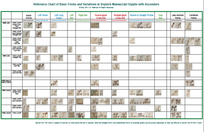
What follows is a PDF file with one possible configuration for studying and classifying VMS characters with ascenders, based on variations that may distinguish one from another.

  • As far as I can tell, the length of the tail is not significant, except possibly when it touches the baseline on a standalone glyph, or the bottom of the stem on a combination-glyph.
  • The shape of the tail (straight or curved) looks like it might be significant.
  • There appears to be some consistency in the way the connections are made on one-legged ascenders. The top-left connection might be significant. The bottom right corner, where the tail is attached, is sometimes sharp and sometimes rounded, but this connection doesn’t appear to be significant, as far as I can tell.
  • The characters that connect to the crossbars on “benched” characters are quite variable and the variation appears deliberate. The straight benches do not appear to be corrupted c-shapes. They might represent EVA-i, or EVA-r without the tail.
  • The combination glyphs appear to be a gallows character combined with lowercase glyphs or two gallows glyphs combined, perhaps as a way to put two together without setting them next to each other. It’s my feeling that combination characters differ from embellished ascenders, but I am not certain yet.

This is a preliminary chart, subject to revision. You can click on the link under the thumbnail to download the PDF file:

VMSAscenderChart092

(New chart uploaded June 3, 2017, with one error corrected. June 4, 2017, Gap bar moved next to Touch bars.)

                                                                                                                                   J.K. Petersen

© Copyright 2017 J.K. Petersen, All Rights Reserved