Monthly Archives: July 2017

Auction of Libri Manuscripts

There are some interesting entries in the Catalogue of the extraordinary collection of splendid manuscripts: chiefly upon vellum, in various languages of Europe & the East published by Davy in 1859.

It is an auction catalog compiled by or for M. Guglielmo Libri, who was parting with his enviable library through S. Leigh Sotheby & John Wilkinson, apparently due to ill health. His shelves contained many texts on philosophy and science in Latin, Greek, Hebrew, Aramaic, and other languages, as well as books of music and maps. The collection is notable for having a significant number of very old manuscripts (early medieval, Merovingian, and Carolingian).

Herbal Traditions

The following entry is for an herbal manuscript on vellum:

482 HERBARIO, CON FIGURE  4to SÆC. XV. ON PAPER (80 leaves)

Each leaf contains a rude drawing in colours of the Plant described in the opposite page. The work, which seems totally unknown, commences “Dacer el qualle te scrive li vertu de alchune herbe in lo so principio mette in parte de le vertu et proprieta de lartemissio, &c.” For the history of botany this manuscript is invaluable. Ancient manuscript Herbarj in Italian, with drawings, are extremely scarce; one only is mentioned by Marsand, and not a single one is to be found in the immenso Catalogue of the Medicean Library by Baudini.

The “Dacer el qualle…” introduction looks like Catalan to me but I am not familiar with all the dialects in that region. The bibliographic entry, as a whole, provides a peephole into what was known about herbal manuscripts (or, at least, what was known or claimed by this collector in the mid-19th century).

Embellished Characters

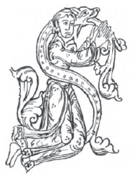
Something else of interest among his books is an example of littera elongata (similar to the VMS letters with ascenders). Legal documents often include embellished letters, but they are less common in manuscripts like this, a 12th-century book on astrolabe astronomy, with numerous tables written in Roman numerals. Note, in addition to the elongated characters, there is also a figure-8-style flourished character on the right:

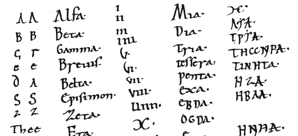
I mentioned a while back on the Voynich.ninja forum, in connection with the 4 x 17 sequence in the VMS, that the Greek letter delta was sometimes written as a triangle without the baseline (similar to the letter alpha) and noticed there was an example of this variation in Libri’s copy of Pancrati Maryris Officium et Passio (catalog #760), which has text related to numbers added to a fore-leaf written in a pre-Gothic script (possibly close to the time of the creation of the manuscript, which is from the 10th century):

Costumes and Human Figures

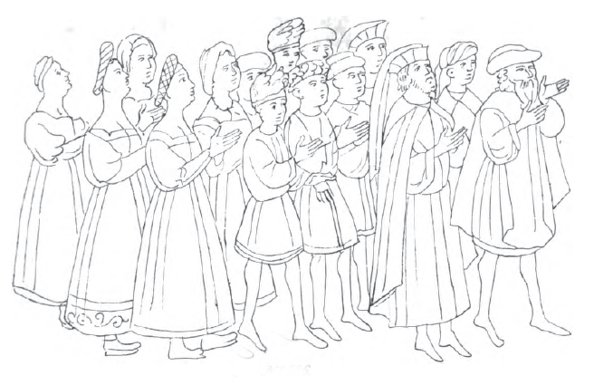
The facsimile below is from one of the drawings in Libri’s 15th-century copy of the Hagada Schel Pesach. It provides an unusual glimpse of people in a medieval Hebrew manuscript.

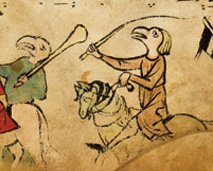
There were prohibitions against illustrating humans, so one usually finds decorative embellishments, bodies with blank faces, or human-animal hybrids, rather than people (see example on the right from the Israel Museum).

In contrast, Libri’s copy is illustrated with naturalistic people (in the Spanish style, according to the auction listing):

The garments and the poses are of interest, and also the way the faces are drawn (particularly the women on the left), as they are somewhat reminiscent of the VMS nymphs, with their rounded facial features and indistinctly drawn jawlines.

Auction catalogs do not always make interesting reading material, but this one is an exception, not only for the quality of the collection, as a whole, but because there are facsimiles of some of the illustrations at the end, and longer descriptions than usual. If you are interested in perusing it, there is a copy here.

J.K. Petersen

© Copyright 2017 J.K. Petersen, All Rights Reserved

Mi Casa No Es Siempre Su Casa

In a previous blog I wrote about the VMS cycles of life, the circles of nymphs that surround the zodiac symbols. This blog discusses why there are two zodiac symbols missing, why some of them are paired, and why some of the nymphs are clothed, something I was trying to work out when I wrote the original blog in April 2016.

Mi Casa

The Spaniards are legendary for their hospitality. Mi Casa Es Su Casa is a common expression and I certainly received cheerful greetings everywhere I traveled in Mexico some years ago, even though I was a foreigner who knew nothing of the language. The locals immediately started teaching me Spanish and never frowned or rolled their eyes if I used the wrong word or pronounced it badly. Instead, they cheered my efforts and clapped me on the back for even the smallest effort.

In astrology, things are a little different. My house isn’t necessarily your house. The stars are in different positions every time a child is born, and their relative positions are said to reflect one’s destiny.

Most people are familiar with the zodiac, the twelve symbols that make up a cycle of constellations, but ask them about astrological houses and the majority have no idea what you are talking about.

In a nutshell, in medieval astrology, the heavens were divided into twelve parts, working from east to west and the houses are organized into groups of three, each group having its own general character (masculine, feminine, choleric, melancholic, etc.).

The Twelve Houses

The twelve houses are not the same as the twelve zodiac symbols—even though they are related. In astrological forecasting (horoscopes), the influence of the constellations and planets on a person’s life is based their positions at a specific time and place and this will depend on where they appear in relation to each other in various houses. In other words, a planet can show up in more than one house or not at all, and each planet, in turn, was said to govern specific zodiac symbols. It’s more about influence and the precise position of a constellation in the sky than sequence. A constellation can cross the boundary from one house to the next and thus be attributed to two houses.

The following simulations show the sky above Rome, Italy, courtesy of Fourmilab.ch. I thought this might make it easier to illustrate how the constellations move through successive houses. The red line is the ecliptic, which makes it easier to find the familiar zodiac constellations:
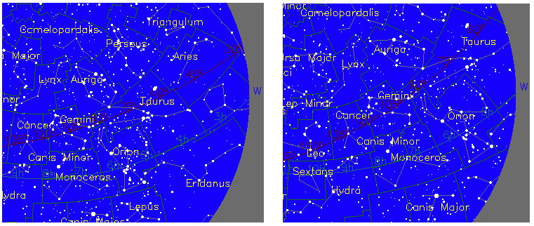
Note how Aries, Taurus, Gemini, and Cancer are related to one another in a curve from top right to middle left. In the second illustration, two hours later, Aries has moved outside our viewport, Taurus has moved close to where Aries was before, but Gemini and Cancer are still somewhat in the middle, a little farther apart (you have to remember that the Earth is round and our drawing is flat). Now imagine a grid with the twelve houses superimposed on this view of the sky and you can imagine how some of the constellations may have crossed a house boundary, some might be in the same house, and some might be in transition from one to the next. Thus, the position of the constellations in the houses is not as rigidly geometric as a zodiac wheel might imply.

Medieval Houses in Brief

The houses are somewhat hierarchical and express cycles of human life. Astrologers have given specific significance to each house and those designations have evolved over the centuries, but here is how they were understood in the 11th to 15th centuries:

  • The first house governs one’s life, soul, and general physical form.
  • The second house relates to one’s household, property, business dealings, and relationships.
  • The third house is kinship. It refers to one’s siblings, neighbors, communication, and local travels.
  • The fourth house relates to one ancestors, assets, house and land, and local community.
  • The fifth house is pregnancy and procreation, children and events in which people come together to celebrate and enjoy one another’s company. In modern astrology, it also relates more broadly to enjoyment and recreation.
  • The sixth house refers to illness, calamity, and loss of property in the earlier manuscripts, and to living property, including servants, herd animals, and contractors in later manuscripts. In modern astrology, it relates to nurturance, health and well-being.
  • The seventh house relates to marriage, matters of intimate relationships, partnerships, quarrels, lawsuits, agreements, and disputes.
  • The eighth house relates to death and murder in earlier manuscripts, and to one’s estate, wills, inheritance, dowries, and other aspects of property in later manuscripts.
  • The ninth house relates to journeys and long voyages, and also to philosophy, visions, and matters of religion.
  • The tenth house relates to authority, including sultans, kings, dukes, judges, and generals, as well as one’s image and status in society. In modern astrology, it relates to status, career, and ambition.
  • The eleventh house is friendship, trust, praise, and fidelity.
  • The twelfth house relates to sorrow, enemies, debts, imprisonment, curses, secrets, and mischief. In modern astrology, it relates to clandestine activities, mysteries, privacy, and secrecy.

Medieval Horoscopes
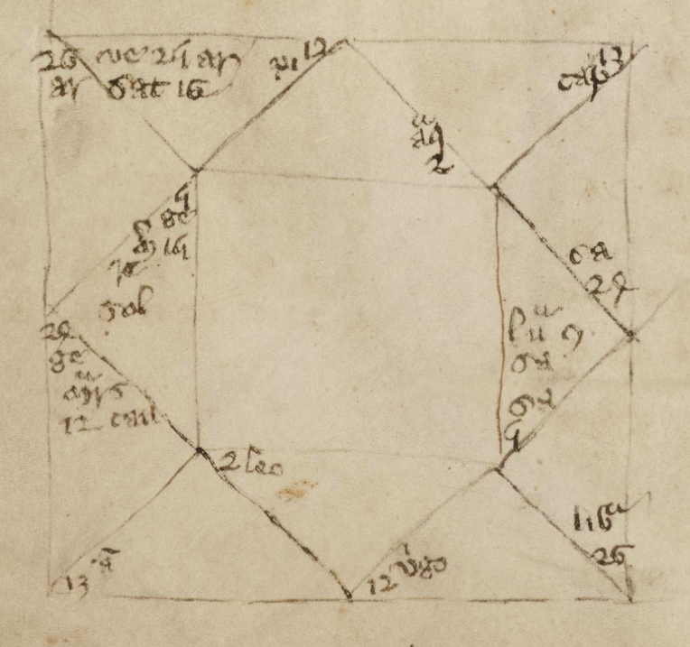
In the middle ages, the twelve houses were typically represented as twelve geometric divisions within a square. This form was still in use in the 17th century but was gradually superseded by the wheel-and-spokes style of chart.  [Cambridge MS Peterhouse 75.I]

When casting a chart, the houses are typically represented as spokes on a wheel or as geometric divisions within a square (right).

The positions of the planets are then added to each segment based on the time and location of the chart (volvelles were used to help calculate the positions), along with any constellations that have influence over that segment at the time. Specific planets and constellations do not always show up in every house or with equal frequency.

Astrology was a lucrative business. Manuscripts were hard to come by and those who owned books on astronomy that included charts for computing star positions could sell their skills to the nobility.

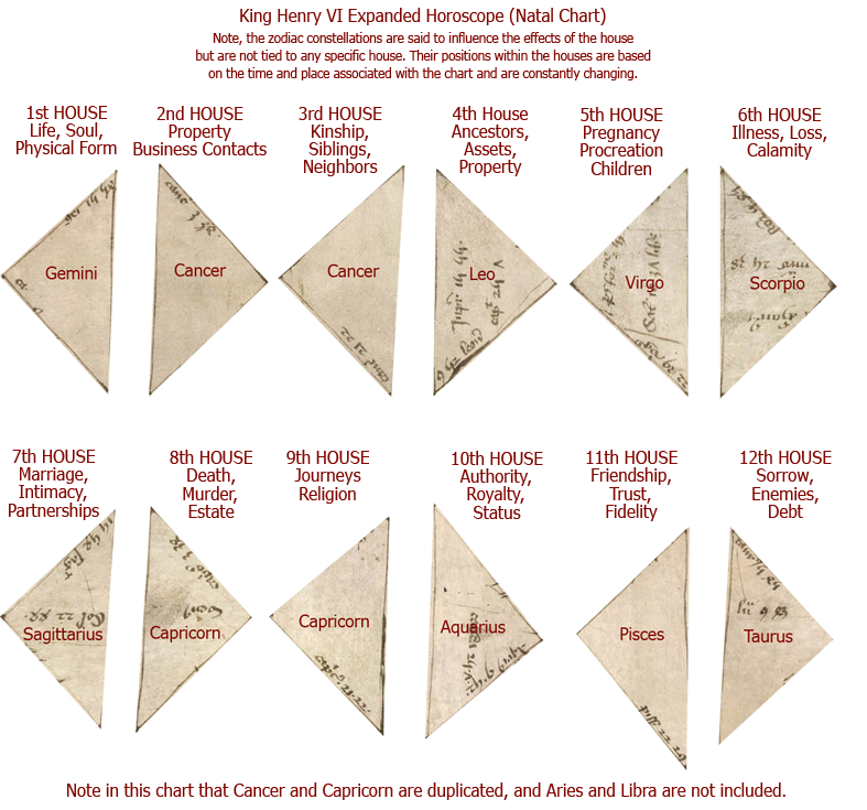
In a natal chart cast for King Henry VI in the 15th century (shown below), the sequence begins with Gemini in the first house, and Cancer in the 2nd and 3rd. Sagittarius is noted in the 7th house and Capricorn in both the 8th and the 9th, followed by Aquarius and Pisces in the 10th and 11th.

In other words, in a medieval chart, the sequence doesn’t necessarily start with Aries, as is typical of zodiac cycles, doesn’t necessarily include all the constellations, and sometimes repeats a constellation if the sign is in transition from one house to the next.

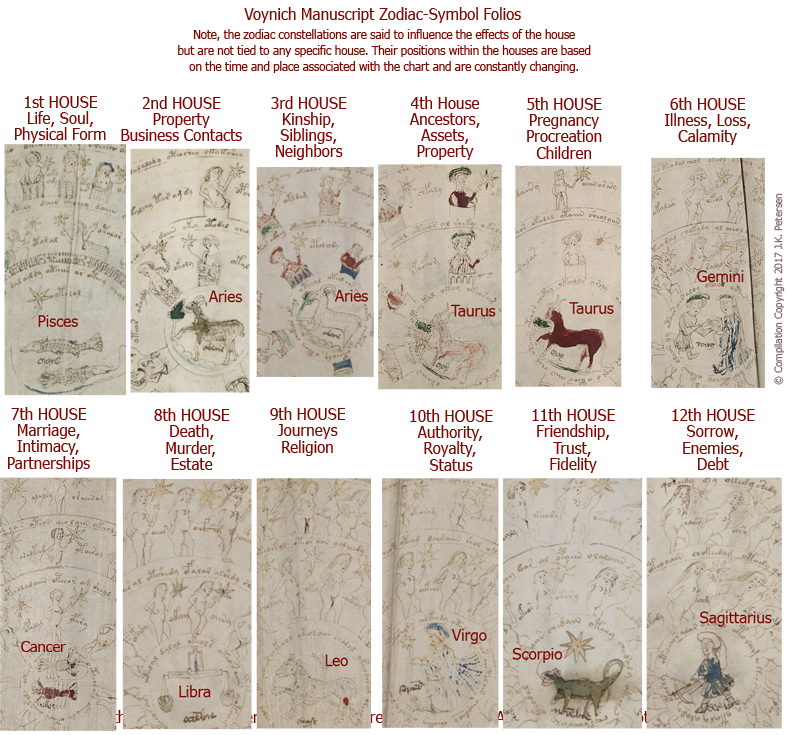
This method of plotting the positions of planets and stars might explain the peculiar arrangement of the VMS zodiac sequence. Imagine if you expanded out the twelve houses into twelve separate drawings rather than trying to fit them all into one grid.

To put it more simply, the VMS zodiac sequence might not represent a zodiac cycle, it might be an illustration of twelve houses and the sign that has the most influence within that house at the time and location for which the chart was cast.
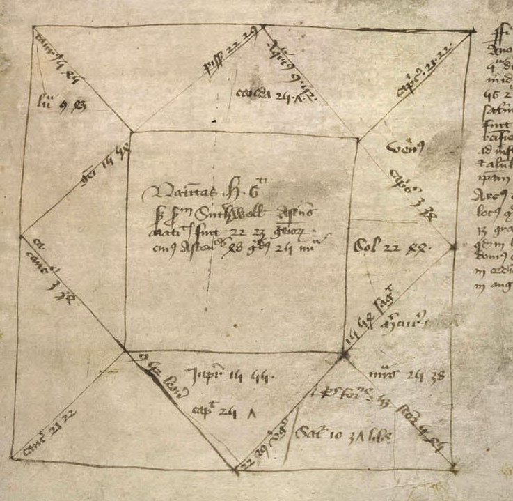
Medieval horoscopes are usually organized into geometric triangles within and surrounding a square. The name, date and time of birth (or of a specific event) are inserted into the central square. The houses usually begin in the triangle on the middle-left and follow twelve divisions counter-clockwise around the central square. This chart was drawn up for the birth of Henry VI (1421) in Cambridge, England. [Image credit: British Library, Eggerton 889]

Assigning Cycles to Houses

If the VMS zodiac folios represent an expanded natal (or other special-event) chart, it should be possible to identify the twelve houses by their subject matter.

The order of the houses doesn’t really matter. In less elaborate charts, they are identified by number, or simply by their position within a square as shown above. In the VMS, if the twelve wheels, taken together, represent a horoscope, it is a clever way to combine the meanings of the houses along with whichever constellation was visible in that house at that particular time—a two-in-one solution to schematic representation that makes it mnemonically easier to understand the houses.

Relating VMS Wheels to Traditional Houses

It’s not difficult to find commonalities between the VMS zodiac wheels and traditional descriptions of the astrological houses, but do they relate well if taken in sequence?

  1. First House—One’s life and physical form. The first VMS wheel appears to be a cycle of life, from birth to death as discussed here, so it matches quite well to the first house.
  2. Second House—Household and property. The second VMS wheel looks like  a cycle of pregnancy to me, from childhood through puberty, to pregnancy and post-partum, which doesn’t seem to fit the second house’s relation to material goods and property.
  3. Third House—Kinship. The third VMS wheel has always looked like a medieval family tree to me, and the traditional third house relates to kinship and relations, so maybe this one matches.
  4. Fourth House—Ancestors and assets. Once again we have something that resembles a family tree and shows fancy clothing (material goods and assets). This relates well to the theme of ancestors and assets.
  5. Fifth House—Pregnancy and Procreation. I would have expected the second VMS wheel to be here, the one that looks like puberty > pregnancy > post-partum. The sixth VMS wheel would also be appropriate in this slot, as it has men and women together with the man’s genitals clearly drawn. Perhaps the fifth VMS fits, as it shows what appears to be a cycle of menstruation followed by a fat stomach (pregnancy?) followed by a more slender waistline, and there are men in this wheel, but I’m not completely sure.
  6. Sixth House—Illness and Calamity. The sixth VMS wheel has a high proportion of men and relates to romance and sex in both the inner circle (with the courting Gemini figures) and the images that surround it, so I can’t see any relationship here between the VMS figures and illness or calamity. The sixth wheel would fit better in the fifth house.
  7. Seventh House—Marriage. It’s difficult to see what is going on in this wheel because many of the figures are male but some of the male-like figures appear to have breasts added in darker ink in a  style that is slightly different from the other female nymphs. It’s also difficult to know if this represents marriage when sex has already been shown in a couple of the previous wheels and there doesn’t appear to be as much sex going on here (some of my friends would probably joke that that is typical of marriage).
  8. Eighth House—Death and Murder. Death and murder is not a topic we frequently see in the VMS. Most of the nymphs are going about their business quite happily and the animals have paws instead of claws and never show any teeth, not even the one that vaguely resembles a lion. So, I’m not sure how to interpret the eighth VMS wheel other than to note that many of the nymphs appear pregnant.
  9. Ninth House—Journeys. What can I say, more nymphs, some of them heavily pregnant. It was mostly the men who went on long journeys… sailors, crusaders, soldiers, explorers, merchants, so it’s hard to know if this wheel relates at all to the ninth house.
  10. Tenth House—Authority. This is another wheel in which many of the figures look like they are male and where some of them look like they’ve had breasts added. A few have fancy head-dresses. It doesn’t overtly seem to represent authority unless it means medieval authority of men over women.
  11. Eleventh House—Friendship. The eleventh VMS wheel is a mixture of male and female nymphs (once again, some seem to have had breasts added) and there are four figures across the top with long hair, two with fancy headdresses. I can’t tell if this represents friendship. There’s nothing overtly indicating friendship other than the nymph top-right and the one middle-left (inner ring) who are touching the the nymphs beside them and this isn’t enough to know for sure.
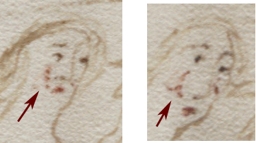
  12. Twelfth House—Sorrow and enemies. Are these nymphs more sorrowful than others? Look at their mouths. Also, note that there are nymphs across the top of this one in the same manner as the previous wheel. If wheels 11 and 12 represent the yin and yang of friendship/trust and sorrow/enemies, they might conceivably be drawn in similar ways. Note how the nymph directly above the crossbowman has a line of red dots on her cheek, rather than the usual blotch of  blush. One can sometimes find dots on the other nymphs, but not usually in a vertical line. I’m not sure if this is a sneaky way to represent tears or just an anomaly, so I’ll leave it to the reader to decide.

Implications

Many of the VMS wheels can be related to medieval astrological houses, and several appear to be in the right sequence, but is the similarity strong enough to support the idea? Let’s go back to the horoscope and see if there’s anything that can help confirm or deny this impression…

Looking at Henry VI’s chart, shown above, we see Gemini listed in the first house, Cancer in the second and third, “Leon9” (Leo), in the fourth, and so on, with Pissz (Pisces) in the 11th, and “Taur9” (Taurus) in the twelfth.

Thus, in King Henry’s chart, Gemini is first, Cancer and Capricorn are each represented twice and Aries and Libra are missing. Why is this? Because a natal chart is drawn up for a specific time and place. It doesn’t have to start with Aries, it starts with the person’s “birth sign” or ascending constellation. At the same time, some of the constellations may be transitioning from one house to the next, and others may not be expressly visible.

This is very similar to the way the VMS zodiac symbols are represented. The cycle begins with Pisces, not with Aries, and Aries and Taurus are shown twice, while Capricorn and Aquarius are not shown at all.

If the VMS zodiac-symbol sequence is a natal horoscope (or one for a specific event, like the investiture of a king), whose is it? Does it relate to the creator of the VMS or perhaps to a patron, or to one of the prominent individuals of the time? Or is it a teaching tool, to give an example of how a prognostication chart might be organized? Is it perhaps an example of “judicial astrology” in which a legal judgment for some infraction is said to be written in the stars?

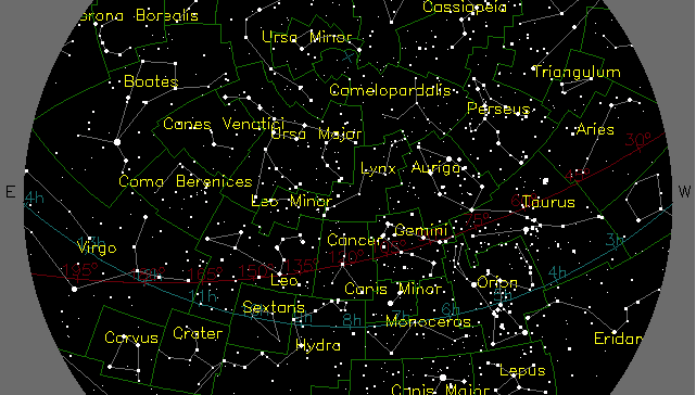
Here is a simulation of the sky above Rome, Italy, at midnight on January 1st, 1408. Aries, Taurus, Gemini, Cancer, Leo, and Virgo are clearly visible and the others are outside our current point of view:
If we want to see how the sky might have appeared after Pisces came into view (for the same location) we have to look later in the year—around the end of November or beginning of December:
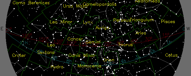
This, of course, will change as you go farther north or south (and east or west). For example, if you go south to Cairo, Egypt, and look up at the same time and date as the previous example, Pisces will not yet be visible.

Summary

I’ve said this in the past, but wasn’t sure how to explain it in a blog before now, but I think the VMS sequence may be a horoscope, rather than a zodiac cycle or calendar. Many aspects that seem strange in the context of a zodiac cycle are not, if the entire sequence is viewed as the chart for a specific event. It would also be a credit to the VMS creator, if he or she found a unique way to pictorially combine the concepts of astrological houses with an “expanded” prognostication chart.

As a bonus, if the VMS zodiac series is a horoscope for a specific event (rather than a teaching example using arbitrary zodiacs) then, with a bit of computing power, it may be possible to calculate the specific times and places during which Pisces was rising, Aries and Taurus were on the boundary between houses, and Capricorn and Aquarius were not visible enough to be included.


Postscript [3 hours later]: I don’t know if I was clear enough about how I think the VMS wheels might relate to medieval horoscopes, such as the one cast for Henry VI, so I have expanded each of the sections of the Henry VI chart and added the influences of the houses, so they can be compared more easily to the VMS wheels. With the exception of the Gemini nymphs (which seems better matched to House 7 than House 6) and the 8th House (Death, Murder, Estate), the correspondence between the houses and the VMS figures is not too bad. You can click on the images to see them larger:


J.K. Petersen

© Copyright 2017 J.K. Petersen, All Rights Reserved.      Citations: J.K. Petersen, 12 July 2017, voynichportal.com
Nosing Around Again

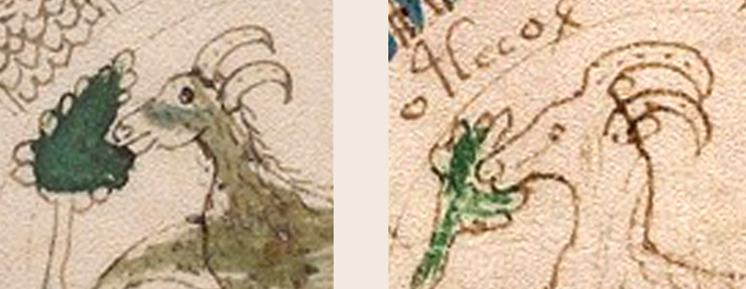
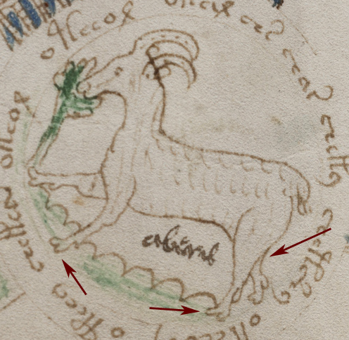
In March 2016, I posted details of the noses of the green and white rams in the Voynich Manuscript, to point out that they were drawn by different people (I am quite sure of this). The first is a more confident hand with a better sense of anatomy, the second is drawn with less dexterity and the person who drew it was less aware of the structure of the bones underneath the form.

GreenWhiteAries2

There are other parts of the manuscript with slight differences in drawing styles, and there appear to be at least two painters and at least two scribes, so perhaps it’s not surprising that there might be more than one illustrator as well.

Quite unexpectedly, when looking at commonalities between some of the drawings in a Welsh book of law, and the Picatrix, I came across something in one of the illustrated versions of the Sachsenspiegel (The Saxon Mirror, a book of Saxon law) that reminded me of the VMS. It took me by surprise because the two different drawing styles are evident in rams and goats and makes one wonder whether the VMS rams might represent goats (we only assume from their position relative to the other roundels that they are probably rams, the drawings are not expert enough to know for sure).

Two Pairs of Noses

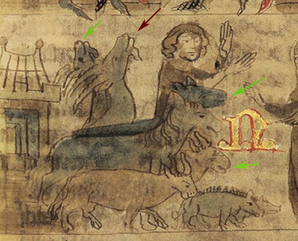
The Sachsenspiegel illustration includes human figures, a building, and various herd animals in pairs. If you look closely at the two goats with their heads raised, you will notice the one in front has a nose and neck that is more deftly and confidently drawn (marked with a red arrow). Note how the upper lip is more clearly modeled with a better sense of line and the underlying anatomy. In contrast, the other animals have rounded indistinct features with a much weaker sense of the structure under the skin. I instantly had the feeling of a teacher/apprentice or parent/child relationship. The teacher (or team leader) draws in some of the key points, to give an idea of what is desired and where things go, and the apprentice fills in the rest.

Could the Sachsenspiegel have been drawn by the same illustrators who created the VMS?

The more accomplished hand in the VMS is similar to the drawing style of the more accomplished hand in the Sachsenspiegel and the less accomplished is quite similar, as well, but it seems unlikely that they had any involvement in the VMS. Both the more and less accomplished hands in the Sachsenspiegel show stylistic differences from the two hands in the VMS. Note especially that the hind legs of the animals in the Sachsenspiegel point in the anatomically correct direction and the hooves look more or less like hooves.

In contrast, in the VMS, the hind legs of most of the animals are anatomically strange, with the middle joint almost nonexistent. The VMS hooves are also unusually round and include prominent dewlaps. These characteristics, especially the missing joint, are very difficult to find in other medieval drawings and are not characteristic of either hand in the Sachsenspiegel.

So, the drawing styles in the Sachsenspiegel and the VMS do not match, but perhaps they are similar in the sense of a mentor-student relationship.

If I had to guess, I would say that the more skilled illustrator drew many of the human figures and perhaps some of the buildings in the Sachsenspiegel—in other words, a substantial portion of the drawings. In the VMS, I get the opposite feeling… that most of it was drawn by the less expert illustrator, with only a few possible additions by someone with more skill (and perhaps some later additions by a third person with even less skill).

Summary

I keep hoping I’ll find other drawings by whoever drew the VMS, but haven’t been lucky so far, but maybe the Sachsenspiegel goats can explain the dots on the horns of the VMS animals.

In the Sachsenspiegel, the goats have bumps on the horns like the Ibex, a form of mountain goat. On the VMS, there is a series of dots that might indicate the more shallow ridges on the horns of most other species of goats and rams.

I’m not 100% certain the VMS white and green rams are actually sheep/rams, I never have been. I’ve always wondered why there are two, which is not typical of a zodiac sequence. It occurred to me that the white one might be Capricorn and the green one Aries, for example, but their position in sequence with the others seems to argue against this. I do have one idea as to why they might be out of sequence, however, which I’ll blog about as soon as I have time.

J.K. Petersen

© Copyright 2017 J.K. Petersen, All Rights Reserved

Medieval Fashion VMS Style

7 July 2017         

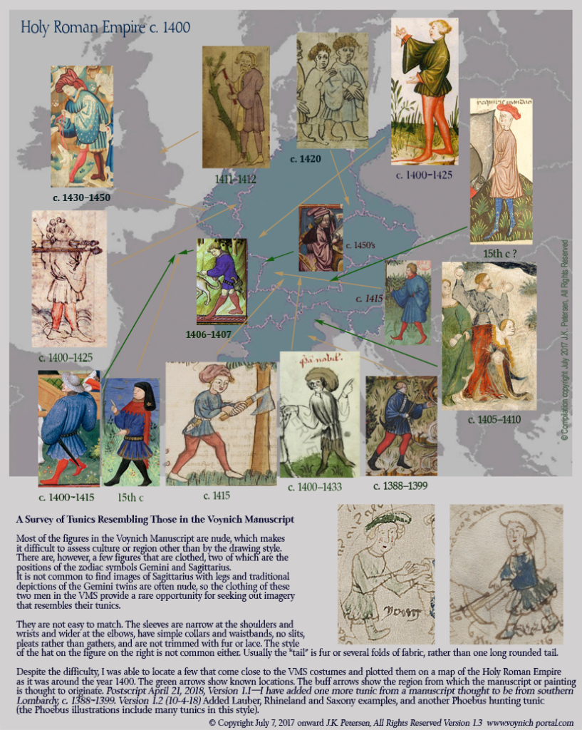
As a follow-up to a previous blog, I have added tunic images to a map of the Holy Roman Empire as it was about 1400. They are not perfect matches to the tunics in the Voynich Manuscript, but they are close, and it gives a visual sense of how this kind of clothing was depicted in manuscripts and paintings, and where this style of dress may have been worn.

pics of Gemini male and Sagittarius tunic styles

Hunting for Hats

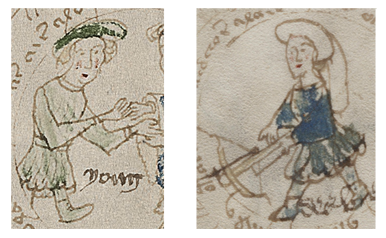
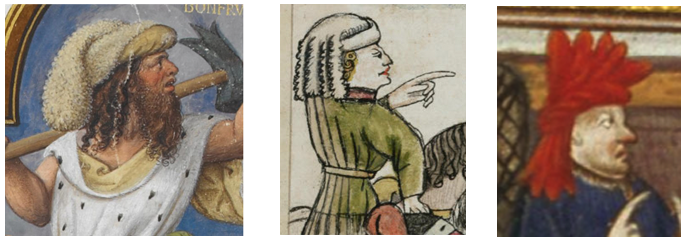
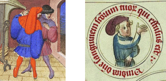
Locating tunics similar to those in the VMS was a challenge, and finding hats similar to the one on the crossbowman just as hard. Those with a rounded turban-like base with a portion that hangs to the back usually have tails made of fox fur or sheepskin or several tails or folds of fabric. Some are too short, others are squared off at the bottom.

pics of medieval chaperone-style hats

[Image credits: left BL 1231 f2r, middle Codex Sang 602, right Houghton Typ 127]

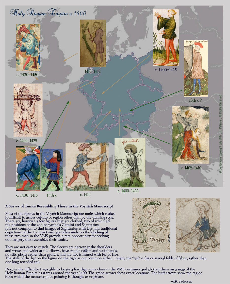
A long round tail like the one in the VMS is less common, but I was able to find one (below left). Note that the tunic is a little more fancy than the VMS, with much wider sleeves and a cape the covers the shoulders. There are a number of similar hats in Vatican Pal Lat 871 and the one shown right notably wears a simple tunic with a plain band at the collar and waist. Note also that it is enclosed in a circle of text:

pic of medieval "sock" hats in French and German manuscripts

[Image credits: left Morgan M.453, right Vatican Pal Lat 871]


pic of tunics in medieval book of law

These images [added July 11, 2017] are from a Swedish book of law. They illustrate tunics that are more elaborate than the VMS, with fancy collars and sleeves as were worn by the upper nobility. The tails on the hats are not as long as those of the VMS, but they are of interest because they are the correct general style, and resemble those in Pal Lat 871. [Image credit: Eriksson’s Landslag Cod. Ups. B.68]

I have only located one image so far that matches well to the VMS tunic that also shows a man with short legs and a similar hat, in Vatican Pal Lat 1806 (included at the bottom of the following map). The origin of this manuscript is thought to be Augsburg, Germany. It includes quite a few images of tunics similar to those in the VMS.

And now to the map (you can click on the image to see it larger):

Summary

In searching for these pleated tunics, I looked all over the world but was not able to find any that were closer than the ones illustrated above in the more distant countries. Not only were the clothing styles different, but the drawing styles, as well. I also rejected tunics that were a combination of vest and tunic as separate pieces of clothing and those with split sleeves.

We cannot know how accurate the VMS illustrator drew the clothing, but it’s noteworthy that the VMS Gemini twin shows the laces on the boots, a detail that is absent from most other drawings. The illustrator made an effort to record details despite the small size of the VMS, which is why it seemed worth the effort to look for costumes of a similar style.

                                                                                                                   J.K. Petersen 

© Copyright 2017 J.K. Petersen, All Rights Reserved  


Postscript April 21, 2018: I have added one more tunic to the map originally posted July 7, 2017.

Postscript Oct. 4, 2018: I have many more tunic images, but some of them are the same style, from the same areas as already marked on the map. However, I was able to squeeze in four additional tunics, so this is Version 1.2 (note that some of these tunics are from manuscripts that have numerous images of this style of tunic but only one example was chosen). Version 1.3 is a minor update (a date disappeared so I added it back in, and tapestry arrow was adjusted):

pic of Voynich Manuscript Tunic Styles on map of the Holy Roman Empire

Postscript 7 July 2019: After I wrote this blog, and posted the map (2017), I was kindly informed that the Victoria & Albert Museum has revised the date of the Devonshire hunting tapestries downward to 1425–1430 (see tunic top-left).

The Mystery of the Short-Legged Knight

The Ghâyat al-Hakîm fi’l-sihr (the “Picatrix”) is an occult manuscript brought to my attention on the Voynich.ninja forum and in a comment by K. Gheuens. I had noted some similarities between the VMS dragon-critter and some of the VMS men, with illustrations I saw in an Icelandic text. The Picatrix includes some provocative drawings of figures proportioned like the VMS archer.

The Picatrix

The Picatrix brings together older writings on proto-science, prayers, magic, and astrology.

It was written in Arabic around the 10th century and was translated into Spanish in the mid-13th century and, afterward, from Spanish into Latin (Benedek Lang, 2010). It is mentioned in two of the volumes by 16th-century polymath Johannes Heidenberg, commonly known as Trithemius, who is famous for his contributions to the history of cryptography. The Arabic Picatrix was apparently not known in the west until about 1920 (W. Hartner, Isis, V. 56, 1965).

The Picatrix (Biblioteka Jagiellonska MS 793) includes many interesting details. The origin of this version is debated, and the text breaks off abruptly in the second of four parts, but it is thought to have been created by a Polish scribe in Italy, or possibly in the region around Kraków. Its creation date is estimated to be in the mid-15th century, with a binding date around 1460 (B. Lang, Unlocked Books, 2010). Lang describes it as the only illustrated copy. Fortunately, the illustrations continue beyond the disrupted text.

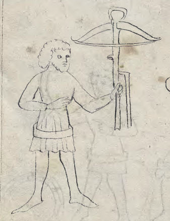
For Voynich researchers, there are a number of interesting details. As examples, in the astrology section, there are two long-triggered crossbows held by figures with legs, as well as a number of figures holding ball-like forms. There are many wearing plain-necked tunics similar to the VMS archer’s, except that the sleeves are not as wide at the elbows.

Of particular interest is a panel of figures in a style that differs from the rest of the manuscript. K. Gheuens commented on the drawings when discussing proportions of the nymphs in October 2016.
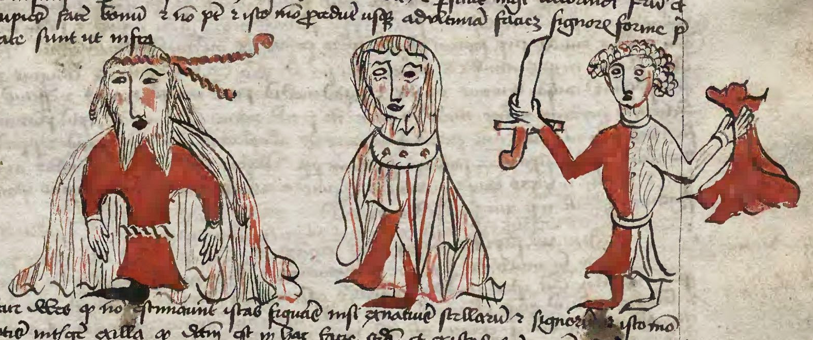
For those who haven’t seen them, here are the figures, which strike me as very King Arthurish. There is a figure with an extravagant cape and a forked beard, in the middle a female, and possibly a knight on the right, oddly holding his sword by the blade. They are distinctly long in the waist and short in the legs, like the VMS archer:

I have a particular interest in these figures because I noticed a similarity between them and those in another manuscript, one that was created in Wales. The history of the Picatrix manuscripts does not include any mention of Wales, and a search of the Web did not yield any comments connecting the Picatrix figures and those in this Welsh manuscript, so this may be the first time the connection has been noted.

Leges Hywel Dda

The Leges Hywel Dda is a book of Welsh law. John Dee wrote comments on the version that is now Leges Walliae, Oxford, Merton College MS 323. The copy that includes the illustrations that follow is the Leges Hywel Dda, available from the National Library of Wales.

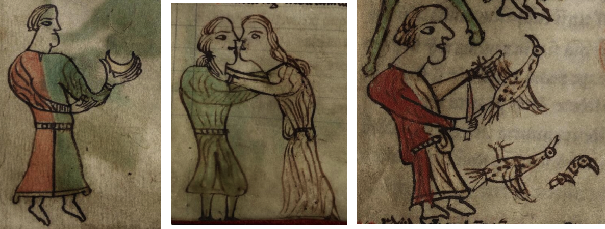
The figures in the Picatrix and the Leges Hywel Dda are clearly not drawn by the same person and it’s not common for a book on the occult to share similarities with a book of law, but there are details that suggest that one illustrator may have seen the works of the other, or that the illustrators might have some kinship in terms of blood, culture, or education.

First, a note about the differences… the Picatrix drawings are scratchy, with tentative strokes, stubby chins, and bodies all facing front, the Hywel Dda are drawn with a cleaner line, faces turned sideways, distinct necks and chins, but…

note the similarity in dress and proportions of the figure on the right. He is wearing a red and white tunic and is holding his sword or long knife by the blade in the Picatrix and almost by the blade in the Hywel Dda. The figure on the right in the Hywel Dda Picatrix appears to have been explicitly drawn with legs that are shorter than the figures on the left.

Other similarities include the wide, very rounded shoulders, the lack of ears, and the concave flare of the tunic from waist to hem. In both the tunic billows out above the waist, although in one it hangs over the edge of the belt. In both cases, the man with the blade is standing on the following text, with his foot touching the letters:

The National Library of Wales has this to say about its early provenance of the Leges Hywel Dda:

“It is known that, by the beginning of the 14th century, the manuscript was at St Augustine’s Abbey, Canterbury. The evidence for this comes from one of two pastedowns preserved at the end of the volume. These are all that remain of the original ‘old oak boards binding’ seen by J. Gwenogvryn Evans at the end of the 19th century, when it was still at Peniarth, Merionethshire. One of these bears the press-mark of the library of St Augustine’s Abbey, Canterbury, and the name of the donor, now partly illegible but interpretable as that of William Byholte (fl. 1292-1318), prior of the abbey. It is also thought that this was the copy of the Welsh laws consulted by John Peckham, archbishop of Canterbury, 1279-94, when he sent his letter to Prince Llywelyn ap Gruffudd in 1282, denouncing the prince’s morals and those of the Welsh, and in which he makes two references to the Laws of Hywel Dda.”

Thus, we find that this edition of the Leges Hywel Dda predates the illustrated edition of the Picatrix by at least 150 years, which brings up some questions:

  • Did the illustrator of the unusual panel of illustrations in the Picatrix see this specific copy of the Leges Hywel Dda? It seems unlikely that a book of Welsh law would go far beyond the boundaries of Wales, but the scholars themselves were quite nomadic, often studying at several universities, and taking patronage and appointments in a variety of courts, some quite distant from their homelands. It’s also noteworthy that the illustrated copy is in Latin, not Welsh, a language known by most scholars of the time. There is also a half century, from c. 1500 to c. 1550 in which the whereabouts of the Leges Hywel Dda is not known, or
  • Is there an earlier exemplar that includes a figure with short legs, dressed in a bicolor tunic, clutching a knife or sword in a less-than-optimum way?

Searching for the Short-Legged Knight

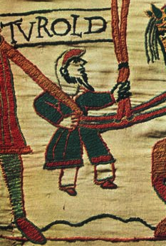
The character of Turold in the Bayeux Tapestry might serve as an exemplar for a short-statured character. He is often called a dwarf, but Turold, while small, is of relatively normal proportions compared to the VMS archer and the Leges Hywel Dda figure. Turold’s clothing isn’t similar either. He wears long wide pants and a cowl and has a distinctively long goatee.

I think we can rule out Turold as the inspiration for the short-legged figures.

The character of Lancelot, from the Arthurian Legends, is often shown in red and white garb, but I’ve never seen him with unusually short legs.

Hunting for an exemplar can be a time-consuming and exasperating task. Sometimes one has to move on and hope that one finds clues along the way, or that someone else comes across a possible precedence.

Summary

I don’t have any explanations for the short-legged character, other than a few rough ideas, but since he sometimes appears in combination with long-legged figures, the proportions appear deliberate in at least some manuscripts. I can’t help wondering if he is based on a legendary character.

I was intrigued by details in drawings that might indicate a connection between a central European book of magic and a Welsh book of law.

One thing I’d like to mention in closing is that the figure clutching the blade of the long knife in the Picatrix struck me as odd in the same way as the VMS crayfish with legs coming out of its tail—an anatomical oddity I’ve never seen in another lobster/crayfish drawing. One can’t directly equate an incautious knight with a leg-challenged crustacean, but it’s a reminder that some people have a slightly different perception of the world and perhaps the VMS illustrator was one of them.


Postscript (5 hours later):

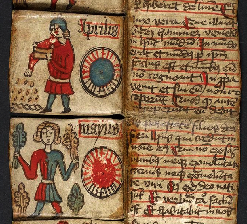
I neglected to include this in my original post. It’s a Danish almanac, written in Latin, from the early 16th century. The lower figure in particular is similar in pose and features  to the Picatrix illustrations (in the sense of having round shoulders, a front-on viewpoint, two-toned tunic, and short legs), but more similar to the Welsh manuscript in the sense of having fewer, more assured strokes of the pen. The figure in the all-red tunic it is not quite as clearly short-legged—note how the head is smaller in proportion to the body than the other—but still leans toward having shorter legs. There are several centuries separating these from the Welsh law book, so it’s difficult to know if there is any connection, but the images relate well to the subject of costumes and body proportions:


J.K. Petersen

© Copyright 2017 J.K. Petersen, All Rights Reserved

The Camel’s Hump

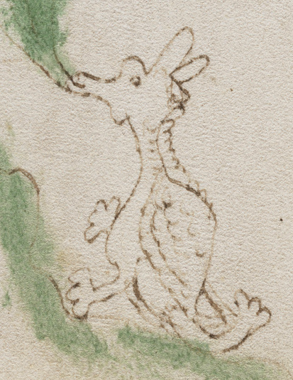
It’s difficult to make sense of the little critter by the plant on folio 25v. It has elements of a camel, a giraffe, and the dragons that inhabit the pages of medieval manuscripts. What is it and what is it doing? It looks like it’s nibbling on the leaf but it’s also been suggested that it might be smelling the leaf.

Nothing about it is entirely clear. Is that a mane on its neck? Is the arm-like appendage on the back a tail? Are the odd extra lines near the tail an attempt at drawing wings? Is the texture on the back a shell? a hump? or simply a different texture?

The entire drawing has a tentative not-sure-how-to-draw-it feeling.

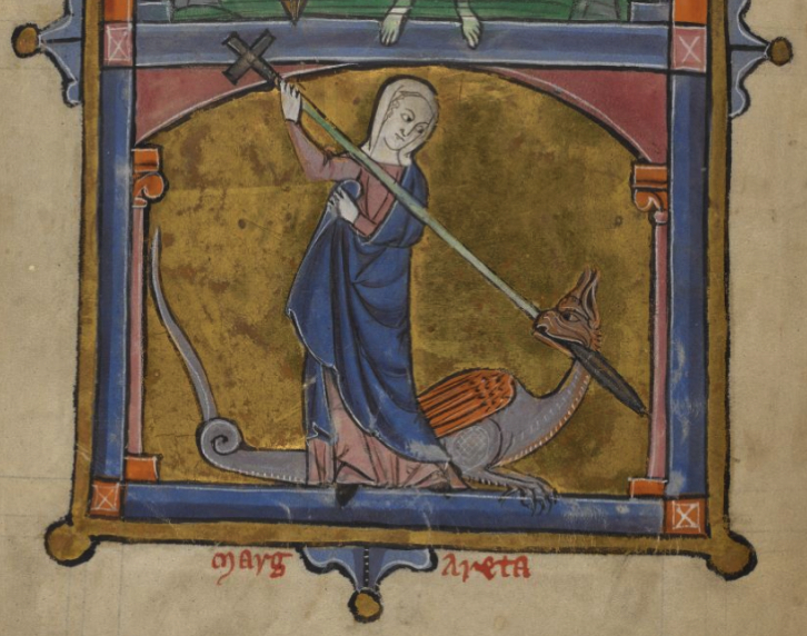
If the hump is intended to be a shell, then perhaps the critter is a tarask, a mythical creature tamed by St. Margaret. Or maybe it’s a generic dragon, or some roughly-drawn animal with a linguistic connection to the plant.

The Tarask tamed by St. Margaret has been drawn in many forms, from a six-legged turtle-monster to a two-legged basilisk-like dragon. [BL Additional 21926]

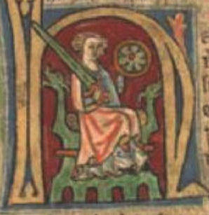
I considered many explanations for the hump but it never occurred to me, until I saw this image on the right, that the differently textured back might be a cushion, like those on dragon thrones, chairs used by nobility that were embellished with sculpted lions or dragons. The cushions were made of natural materials: leathers, furs, sometimes sheepskin pelts, bumpy like the critter’s back. I don’t think this is the most likely explanation for a critter on a plant page, but I don’t like to rule out possibilities for questions that haven’t yet been answered.

The tail of the critter is odd too, it’s almost like an extra leg or arm, with finger- or paw-like appendages that aren’t quite as flower-like as most dragons with “flower tails”. They are rounder and less defined. The manuscript with the dragon throne has a number of two-legged creatures, and flower embellishments that have this rounded aspect (which may be coincidental, but I decided to include them for those who are interested):

Whatever the creature is, it’s not hard to find various dragon-like critters that are similar, with ears, two legs, and something like a tail, but is it possible to connect them to a manuscript that is similar to the VMS in other ways?

The Short-Legged Men

The proportions of the figures in Pal. Germ 794 (second left) are common to many manuscripts. Those in the Ebersberg manuscript (left) are a little longer in the legs than usual. The shortened legs and larger heads of the VMS figures shown on the right are somewhat uncommon. Note the similarity in the woodsman’s hat and tunic to that of the VMS archer.

I’m sure I’m not the only one who has noticed that some of the male figures in the VMS have short legs in proportion to their bodies. This is especially apparent in the images of Gemini and Sagittarius and is not a common way to draw them. When I searched for medieval drawings of short-legged men, I found a number of examples, but they were definitely in the minority. The VMS females also have fairly large heads, but their legs aren’t shortened quite as much as the men.

Perhaps the men are drawn this way because the space within the circles is constrained, which makes it difficult to fit the legs, but that wouldn’t explain why the heads are quite large. If the VMS illustrator was male, was he drawing men in proportions similar to his own?

What about the figures in the manuscript with the dragon throne shown above?

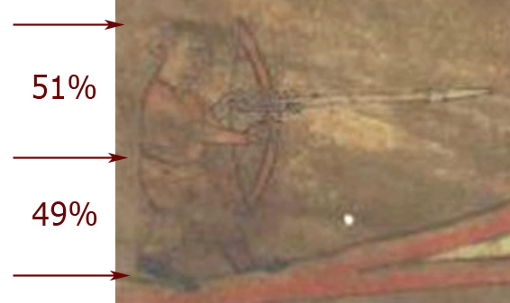
There aren’t many human figures who are standing—the imagery is mainly dragons, embellishments, and seated figures—but there is an archer whose proportions are similar to those of the VMS men.

Those Oddball Grain-Trees

On folio 86v there is an image of a bird, perched on the ground or in a nest at the top of a tor with three odd tree-like structures bending over it like grain blowing in the wind.  Medieval trees were drawn in strange and imaginative ways, but it’s hard to find parallels to tree-like plants that look like grain. Even so, this one caught my eye in the manuscript with the dragon-throne. It’s not a direct parallel, but it did include some similar elements. There are birds and, to the right, three botanical embellishments that have the proportions of trees, with narrow leaves that suggest something smaller.

Summary

Most of the examples above (except for St. Margaret and the panel of proportions) are from a 14th-century Icelandic miscellany written in old Norwegian (AM 226). The content and the images are not directly comparable to the VMS, but in overall tone and style, there is something about them that makes one want to look twice. The shapes of the dragons, the rounded, simple flower-tail embellishments, the proportions of the archer, and the marginal drawing with the birds are not uncommon or hard to find when taken individually, but it’s difficult to find all these elements together in one volume.

Whether it shares a cultural kinship with the VMS or it’s a coincidence, I don’t know, but I thought it interesting enough to note.


                                                                                                                                   J.K. Petersen

© Copyright 2017 J.K. Petersen, All Rights Reserved