Monthly Archives: November 2017

And the Clouds Parted

I’ve been collecting images of cloudbands for a number of years, but not as a concerted effort. If I come across something that looks interesting, I add it to the collection, but I don’t have many, less than 50, and I’ve scarcely looked at them, as most of my time is spent researching plants and text. A few days ago, I glanced through them and noticed one wasn’t a cloudband at all, but could easily be mistaken for one.

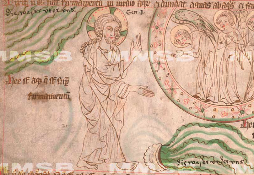
At first glance, this drawing from České republiky XXIII.C.124 (left) looks like there is some kind of liquid flowing from a bowl on the ground, and the undulating lines on the top left resemble a rudimentary cloudband of the kind more common to older manuscripts, before they took on their characteristic infurled shape:
Many medieval manuscripts are fragments, some are unfinished, and some include very terse and difficult-to-understand labels that don’t reveal much about the illustrations, so it can be easy to misinterpret them—one often has to find several versions from the same tradition to understand the imagery.

But this one is a little more clear, and upon reading the text, it turns out that God is parting the waters and that cloud-like shape in the sky isn’t a cloud at all. As the Bible says, “God made the expanse, and separated the waters which were below the expanse from the waters which were above the expanse…”

So both streams of undulating green are waters “below the expanse” and “above the expanse” and there are no clouds in this panel. If there were no text, how might a copyist with a wider palette of colors interpret the shape? There are many thousands of examples of imagery and text going through mutations as they pass from one hand to the next, and many examples of imagery being misinterpreted because modern viewers are unaware of old traditions.

Take the example of early Christian imagery. If you showed these pictures to a modern viewer, many would identify the figure as Jesus when, in fact, it is John the Baptist:
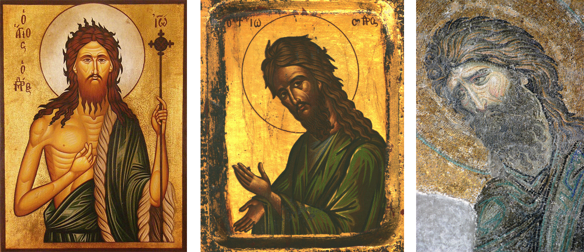
I have also seen images that have been mistaken for Jesus and Mary which are ancient personifications of the sun and moon, with the circle around the figure’s head being assumed to be a halo rather than the sun symbol.

More Undulating Shapes

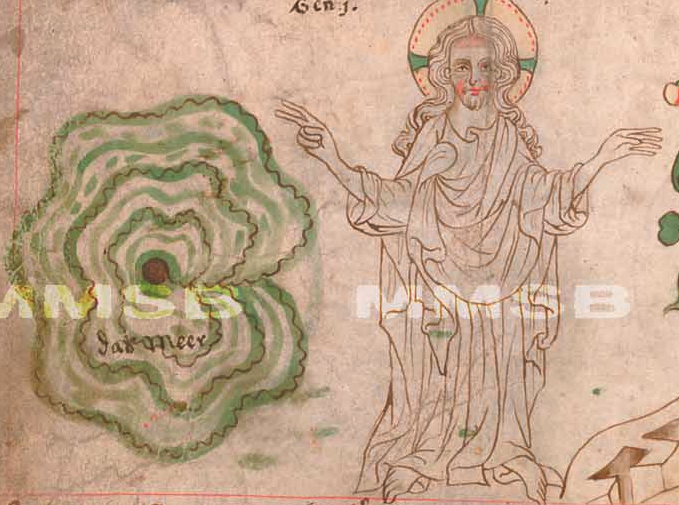
Coming back to the original manuscript, there are some other interesting illustrations. Often there are odd, round formless wiggly shapes in medieval manuscripts that are hard to interpret. For example, if this were drawn without an image of God next to it, it might be hard to recognize it as a picture of “the waters” being gathered into one place:
In the following panel, there is something vaguely cloud-bandish lined with stars. To the sides, are personifications of the dark and the light (the moon and the sun). In this case, the scalloped lines and stars represent “the expanse of the heavens” to separate the night from the day:
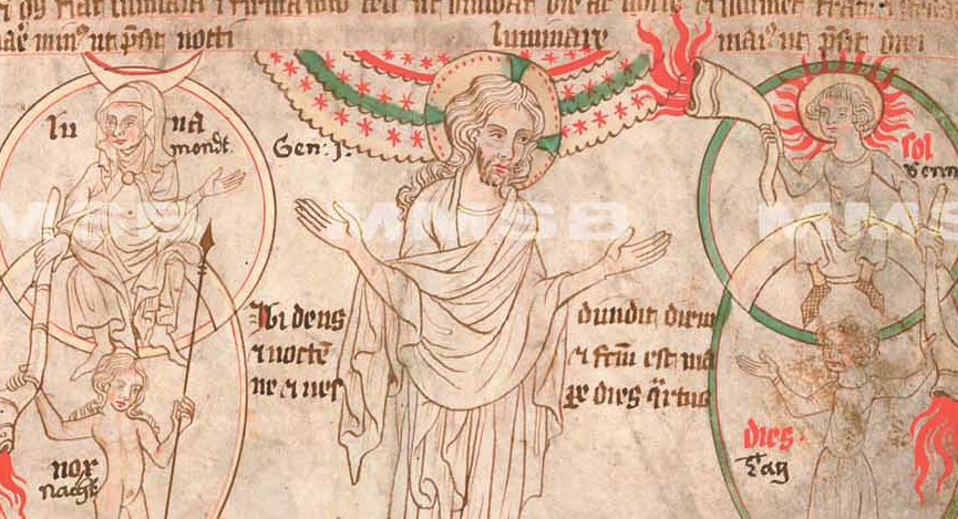
You’ll notice there are flame-like lines emanating from a number of horns. I believe these are meant to represent light (which in medieval times was usually provided by torches and oil lamps).

The next panel has undulating green lines to separate land from water. It depicts birds above and “swarms”of living creatures and great sea monsters below, with the lines painted right over the aquatic creatures (this was a very common way to draw water in the Middle Ages):
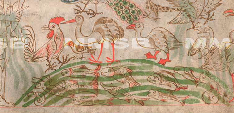
The palette in these illustrations caught my attention because it is very similar to the VMS. The brown is probably gall ink, and most of the water is a common shade of green. Blue is used more sparingly for highlights. The main difference is the shade of red, which is quite unusual, almost a fluorescent color. Older manuscripts with this palette tended to use orange rather than red, especially those copied in the Roman style. Later ones tended toward a true red, so perhaps this is a blend of orange and red pigments with egg binder that brightens up the color (I don’t know if this manuscript has been chemically analyzed, so this is pure guesswork).

Next, after the terrestrial creatures are created, we see an interesting scene with a water theme common to older biblical illustrations, but less common in later centuries. Around a drawing of newly created man are four women, naked from the waist up, holding jugs of flowing liquid. If you follow the biblical narrative, you might expect mists steaming up from the earth rather than water flowing downward, but this is inspired by a later passage in which a river flows out of Eden to water the garden, from which it divides to become four rivers.
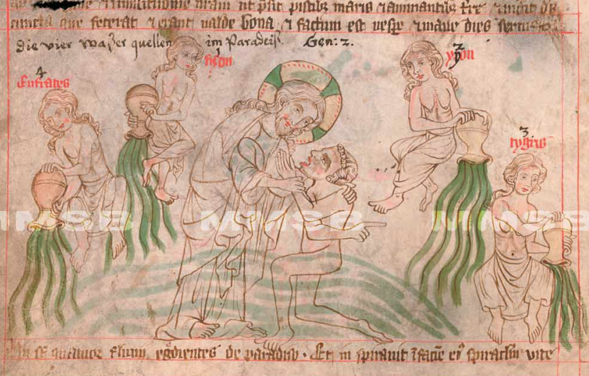
The composition borrows from traditional pagan styles, with nymphs dispensing the water, as was widely believed before Christianity, and are echoed in Homer’s Odyssey, in which the four fountains on the island of Ogygia, home of the nymph Calypso (daughter of Atlas) were described as, “…fountains four in a row… flowing with bright water hard by one another, turned one this way, one that.”

We know these represent the sources of four rivers because they are explicitly labeled Eufrates (Euphrates), fizon (Pishon), ygon (Gyon/Gihon), and tygris (Tigris) after the four rivers mentioned in Genesis. The Tigris and Euphrates flow through the Fertile Crescent, also known as “the cradle of civilization”, an apt reference to the Garden of Eden. Historians are not certain which rivers represent the Pishon or Gihon (there are many theories) or whether they still exist.

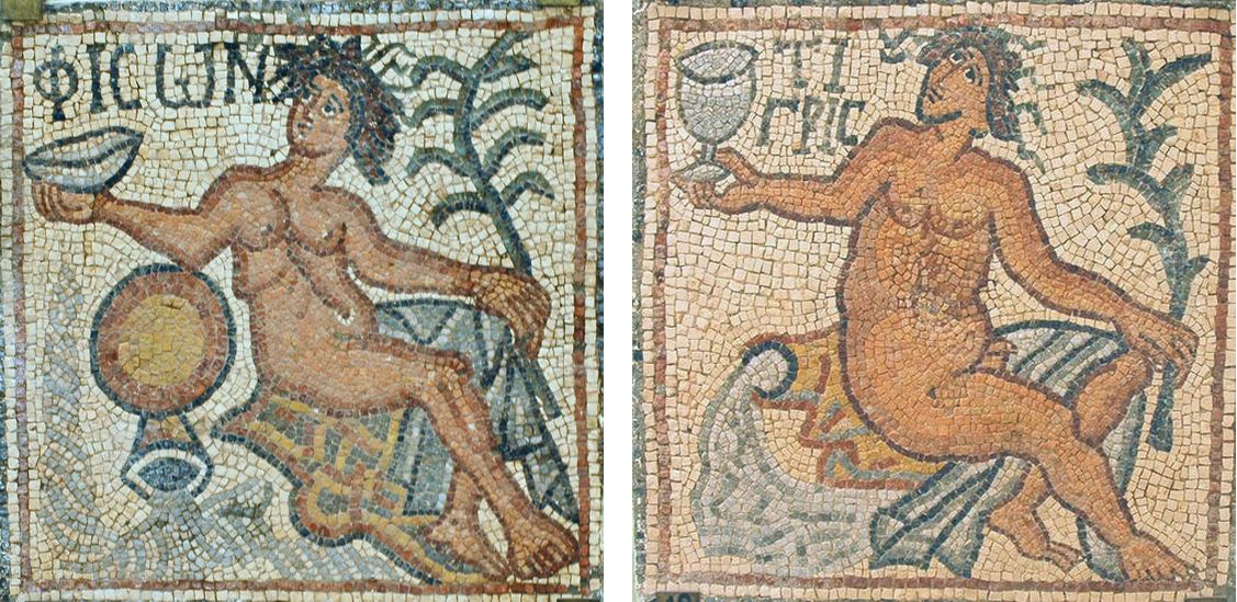
This 6th-century Libyan mosaic of the Pishon river is thematically similar to the illustration above, with a nymph at the head of the stream and an inverted jug dispensing the water. The same mosaic depicts other rivers of paradise, including the Tigris (shown right). For Voynich researchers following the “crown grotto” thread on voynich.ninja, note that the course of the Pishon (perhaps coincidentally) is drawn in spirals like a curl of hair:
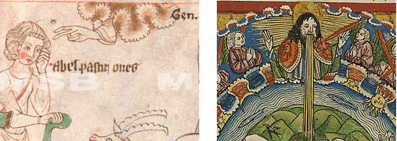
A few panels later, after Adam and Eve bear sons, we see a more classic depiction of a deeply infurled cloudband. On the left, the hand of God is reaching out to Abel. This style was still in vogue when the printing press was invented two centuries later and was used in woodblock prints (right).
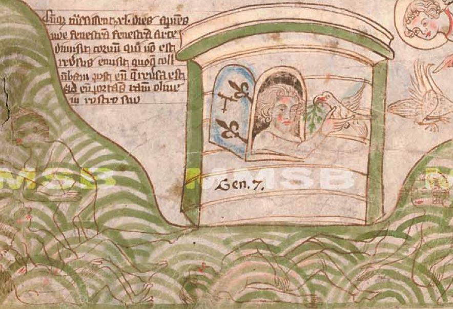
In the story of Noah’s ark, we see water depicted in a different way, as overlapping concentric curves, probably to emphasize the waves and vastness of The Flood. Under the waves are the outlines of the drowned:
In a subsequent panel illustrating the construction of the tower of Babel, which was ambitiously designed to reach into heaven, God comes down and and thwarts the effort by dividing the languages of the workers so they can no longer easily cooperate. There are three cloudbands, one unpainted, one blue, the other a double band painted green, each with a hand and a staff to harass the workers. The differences between them appear quite deliberate so it might be intended to illustrate different points in time or the activities of God’s helpers:
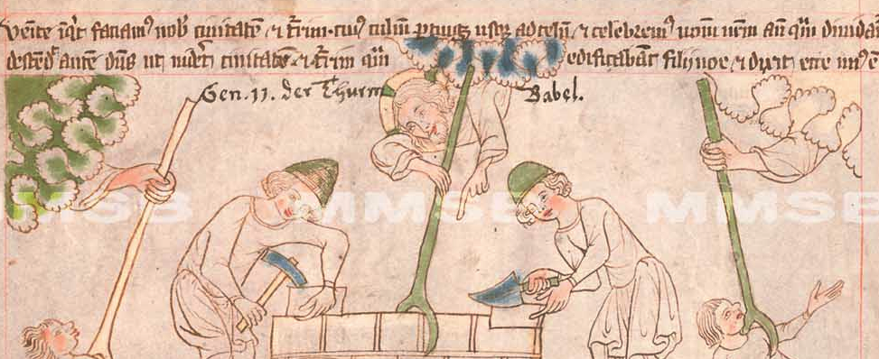
Thus, humanity is scattered across the earth and many panels of war and mayhem follow.

As far as celestial imagery goes, the illustrator hasn’t run out of ideas yet.

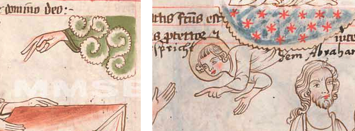
Further on, we see new forms of heavenly bands in the panels where God promises to shield and reward Abraham and Abraham, in turn, beseeches God for a son. In the first, a figure is poking out from a cloud-shape created with spiral forms reminiscent of the curlicues the Persians inherited from Chinese art. In the second, a finely scalloped edge encloses red stars against a blue background. This is not just a decorative element, but part of the story—Abraham is tasked with counting the stars and if he can, his descendants will number the same:
Most of the subsequent drawings of water and cloudbands follow the same basic styles as illustrated above, but there are other illustrative conventions of interest in this manuscript…

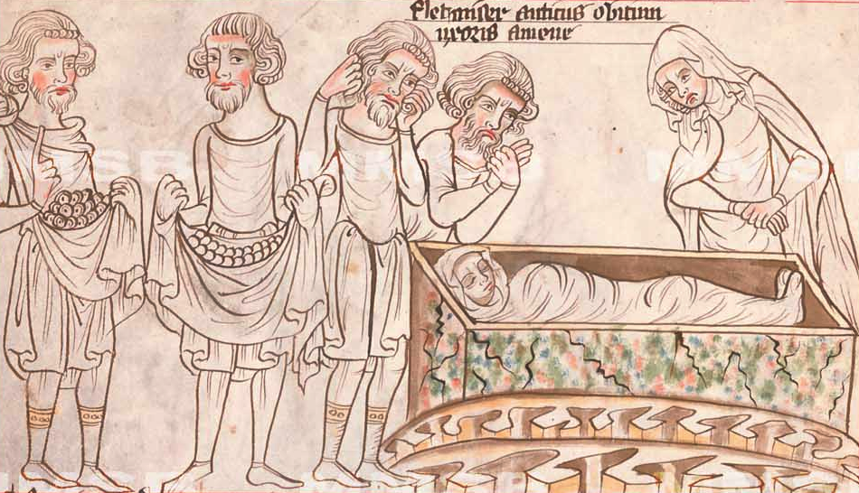
In the following panel, there are overlapping round shapes in the folds of the men’s tunics. This is a common way to depict coins in various forms of manuscripts, including chronicles, Bibles, and books of law. Abraham has asked Ephron to sell him a piece of a field and caves to bury his dead, so the coins represent shekels, and Sarah is shrouded in a box to the right, awaiting completion of the transaction so she can be buried. Note the jagged scallops under the box. When drawn and colored this way, they usually represent chasms, ditches, and holes in the ground.

Sorting Myth from Reality

Sometimes there’s no way to know if an image is literal or allegorical unless you know the story behind it.

In the following drawing, a woman with face and hair similar to the river-nymphs holds a jug upside down, with liquid streaming from it. In the previous pictures, the stream represented a river and the women were mythical nymphs that protected and dispensed the water. In this drawing, however, the interpretation is more literal. The camels were led to a well in the city of Nahor where women drew water in the evenings. The damsel is not a nymph, but a woman named Rebekah. The main difference between her and the drawings of the nymphs is that she is fully clothed:
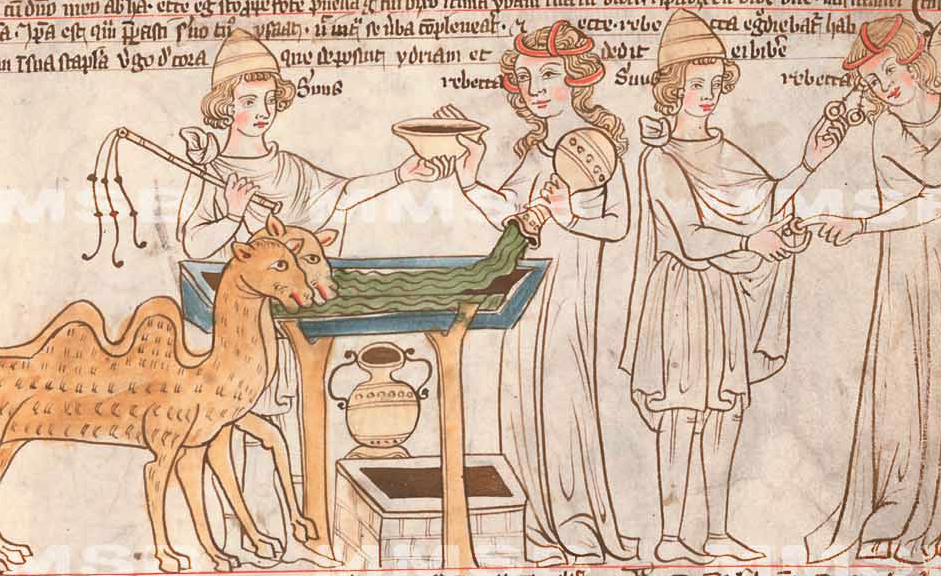
Rebekah shows a kindness by offering water to the traveler and his camels. The two figures to the right are the same people after the camels have been watered, which might be confusing because it’s in the same panel and could be mistaken for two other people at the well.

The “panel” to the right illustrates the emissary giving Rebekah a ring—it could be a nose ring, finger ring, or earring (historians and theologicans aren’t sure which kind of ring is meant), along with two bracelets of gold—a rather excessive payment for a few gallons of water, but it was more of a bribe and expression of intent, since he was tasked with finding and bringing back a bride. [As an aside, it’s hard to believe Rebekah, who was from a well-to-do family, would be drawing water (normally a servant would do it), but since divine intervention is at work here, we’ll let it pass.]

Summary

Many of the shapes in this manuscript would be difficult to interpret if it didn’t have a well-known backstory, so it’s refreshing to find such a variety of water and cloud/celestial imagery in a text that’s easy to read. Earlier medieval texts were sometimes abbreviated almost as much as the later ones, but the handwriting in the earlier periods was generally more clear than Gothic styles that came later.

Note that many themes of water, rivers, ponds, drowning animals, and rings are also found in the VMS. These are elements common to many legends, both biblical and otherwise.
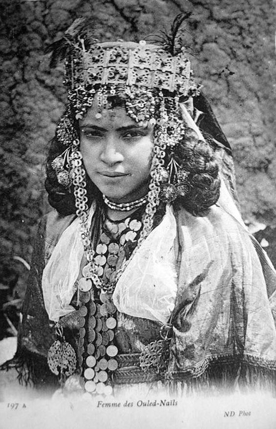
One of the things the drawing of Rebekah brought to mind that I find interesting about ancient cultures, is that women paraded the family’s wealth. They walked around wearing a significant portion of family gold and jewels, dangling from their waists, ears, foreheads, arms, and ankles. If you tried to do that in New York or London or any major city today, you’re asking to be dismembered.

This custom, in turn, reminded me of the mysterious ring-like shapes in the VMS. Usually rings in manuscripts represent marriage or sometimes mirrors. In some cases they represent coronation. But perhaps there’s a further possibility, that of representing a transaction, or intent to bargain, with the ring as a down payment until the final terms are settled.

J.K. Petersen

© 2017 J.K. Petersen, All Rights Reserved

The Catch to the Crossbow

7 November 2017

I’ve written several posts on the VMS bowman and didn’t think there was more to say about his bow, but after looking at hundreds of crossbows, I feel more strongly than ever that the origin of the Sagittarius bow might remain a mystery until the text is deciphered.

It’s difficult to find crossbows that originated before 1500. They’re made of natural materials that wear out or easily perish in fires. There are a few rare examples that are claimed to be from the late 15th century, but even those dates are speculative—a home-crafted bow from the 16th century can look very much like a typical 14th-century bow.

Crossbow artisans kept their trade secrets close to the vest, so most of what we know about crossbows was passed down by scribes and illustrators. Fortunately, a few descriptions are relatively detailed. Most of them, however, are not, including the drawing of a crossbow in the Voynich Manuscript.

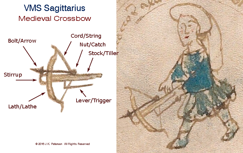
To recap, here is a picture the VMS crossbow that was previously posted to point out its main features. The shape of the stock-end is speculative, since it’s hidden by his hand.

pic of details of Voynich Manuscript Sagittarius crossbow

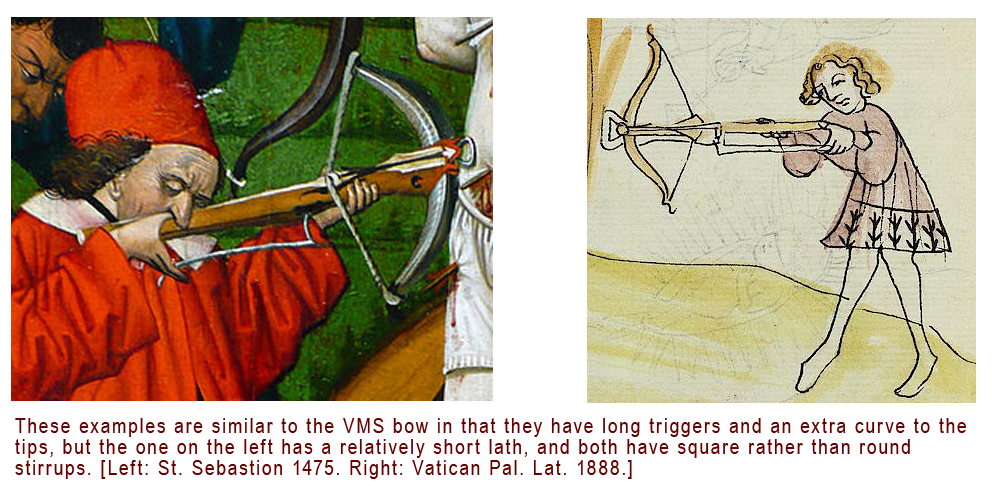
In terms of locating the origin or time-period of the bow, there are four features of particular interest:

  • the rounded stirrup,
  • the long trigger,
  • the extra curve at the tips of the lath (also called a prod), and
  • the position of the nut or tumbler, also known as the catch (in a small, rough drawing it’s impossible to determine the style of catch).

Details of Interest

Lugs and Lath Tips

Most stocks in the Middle Ages were straight or narrowed. After the Renaissance, some evolved into gun-stocks like those on a rifle. Later bows were fitted with lugs for attaching a crank (these are usually positioned a couple of inches behind the nut), a feature that was less common in the 15th century, but quite prevalent by the 17th century.

pic explaining lugs on old crossbows

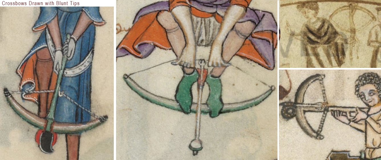
The VMS drawing is not detailed enough to show the style of cord, whether there were lugs, or how the stirrup was bound to the lath. It is interesting, however, that so much care and attention was given to the graceful curving tips at the end of the lath, a feature that was not common to crossbows (longbows didn’t always have long tips either). Medieval laths were usually wood, or composite materials such as wood and bone, with blunt tips, as in these examples:

pic of medieval crossbows with blunt tips

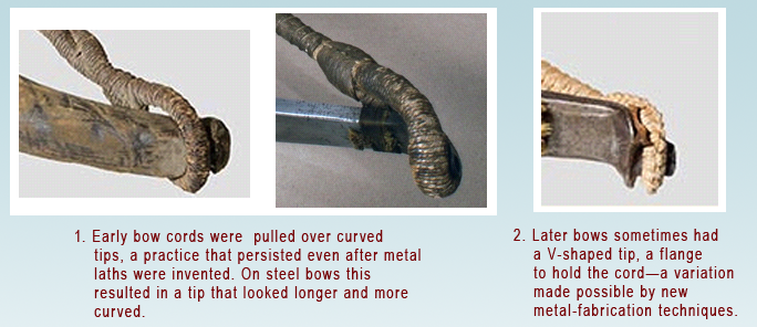
Sometimes when the cord is quite thick it gives the appearance of longer tips (as in the center image that follows), but the VMS drawing doesn’t look like an extended cord—it looks like the tips of the lath extend beyond the wound cord.

examples of wound crossbow cords

So what could account for the relatively sharp lath-tips in the VMS crossbow?

Could the illustrator have combined features of the longbow and crossbow? Or might the lath have been made of steel (as in the two images to the right above), a material that was gradually introduced in the 12th century, but did not become widespread until the late 15th or early 16th century? Steel prods were narrower than composite, sometimes with longer tips.

Or maybe the answer is more complicated… the lath in the following picture looks like it could be composite materials (it is moderately thick), but the tips are quite narrow and very hooked, as though they were reinforced and extended by metal caps. I’m not aware of any historic prods with caps, and the glue would have to be very strong to hold against the pull of a loaded cord, so I looked for another explanation. Perhaps the bow in the picture was wrapped in a material like snakeskin, with the tips left unwrapped… but that still doesn’t account for the extra curve in the tips—these kinds of curves are not easily incorporated into wood or composite bows, and the tips become fragile if sharply tapered—a broken tip could lead to death on the battlefield or the loss of a week’s food on a hunting trip.

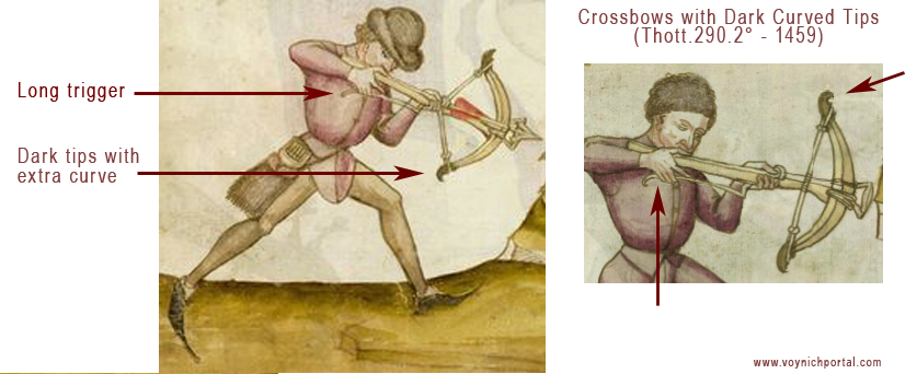
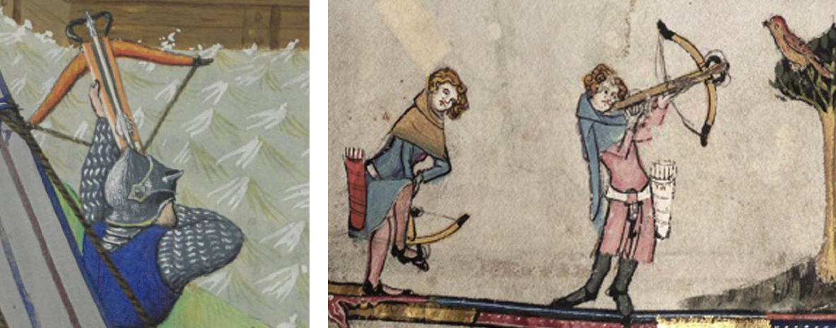
If the tips were “caps” rather than a protruding unwrapped part, these drawings from 1459 (Thott.290.2º) might illustrate a part of crossbow history that isn’t well documented. Either way, even if the curve is not literal, but simply an artistic embellishment, drawings like the VMS, with an extra curl in the tips, are definitely in the minority. I found very few compared to bows with blunt tips or only a slight curve. Here are some drawn with an extra curve:

pics of medieval crossbows with long curved tipsexamples of medieval crossbows with long triggers

Note how the laths in the Thott illustration above have darkened tips.

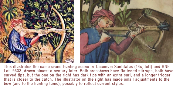
The following examples are the same crane-hunting scene from the Tacuinum Santitatus tradition, drawn by different illustrators almost a century apart. Except for drawing style, the later version is a fairly faithful reproduction of the storyline, but notice how the illustrator took time to change some of the details, like the sleeves of the tunic, and the color and shape of the crossbow tips:

crossbows in Tacuinum Sanitatus

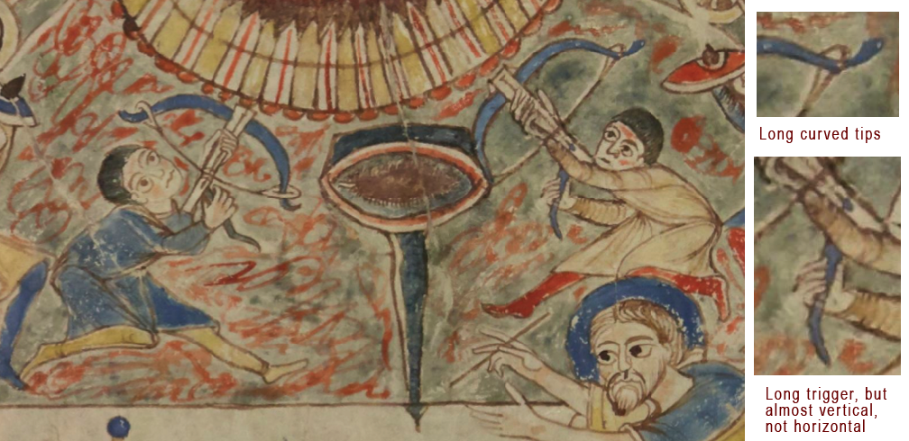
The earliest example I could find of a relatively clear crossbow with slender long tips was in an ecclesiastical manuscript from the 11th century (BNF Latin 12302), probably from France. It doesn’t have a stirrup, however, and the trigger is almost vertical, in contrast to the mostly horizontal triggers of later crossbows:

crossbows in early medieval manuscript

I did locate a photo of a long-triggered steel bow from Portugal with slender tips curved a little more than average, from the late 1500s, but the stock extends a couple of inches beyond the lath, and there was no stirrup attached.

Coloration in Drawings of Medieval Crossbows

By the 15th century crossbow laths with dark tips are not uncommon. Here are examples of a battle bow from BNF Français 9342 and a hunting bow from Bodley 264, with darker tips. In these drawings, it looks like the bow might be wrapped (possibly with snakeskin) and the tips left unwrapped, as opposed to the tips being capped:

medieval crossbow laths in manuscript art

The VMS drawing doesn’t have dark tips but it does have a rounded stirrup, like the bow on the right.

Stirrups

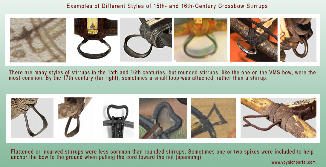
The rounded stirrup, the style in the VMS drawing, appears to be more common than squared-off stirrups:

examples of different styles of crossbow stirrups

When comparing the VMS bow to historic crossbows, keep in mind that they were functional items, subject to wear-and-tear, and the stirrup bindings and cords were replaced as they wore out. Thus, the stirrup itself may also have been replaced, especially if the original was lost due to disintegrated bindings, which were usually leather or cord. The nut would sometimes also break and be replaced with a slightly different style.

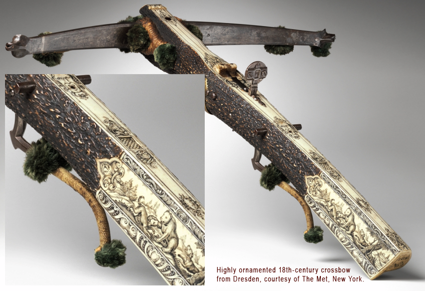
By the late 16th and 17th centuries, many crossbows, especially those for the nobility, showed significant artistry, with ivory, bone, laminate, and incised decorations along the full length of the stock. In the 17th century, pompoms (rounded tassels) were added to some of the laths. This remarkable bow from Dresden, Germany, has elaborately carved bear-hunting scenes, a tooled lath tip, and pom-poms. It dates to about the late 17th century or early 18th century (it has similar characteristics to a 1663 bow in The Met collection).

The VMS drawing shows no signs of decoration (possibly because it is so small), but judging by other medieval drawings, embellishments were less common in the 15th century than later.

And now to the important part… a little detail that is scarcely a blot on the drawing of the VMS stock.

Nuts

The catch to this whole VMS crossbow identification effort, is, well… the catch, the nut, the little protruding knob that secures the power of the spanned cord, like a capacitor, until the bowman releases its energy.

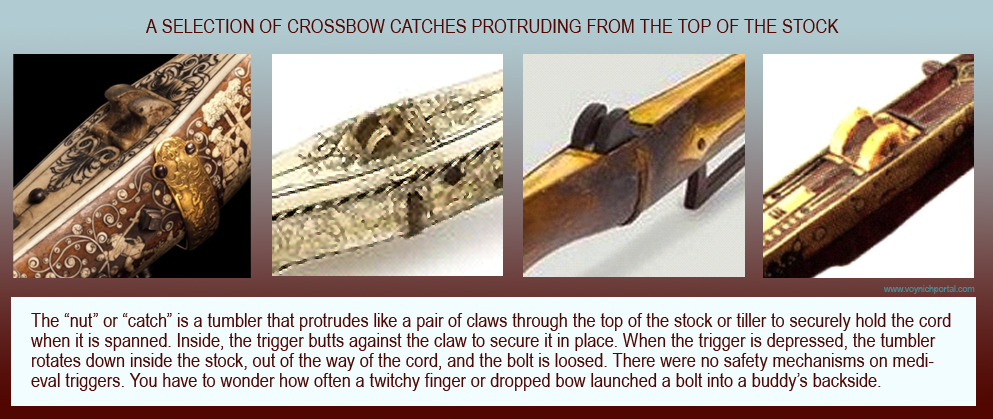
The catch is approximately a third of the way down the stock from the stirrup, depending on the length and style of bow. The trigger “catches” on the underside of the nut so that pulling the trigger moves it just enough for the catch to rotate freely and ZING! the cord is freed and ejects the bolt. Here are some examples of the nut/catch. Notice it is clawlike, to grip the cord securely:

examples of crossbow nut mechanisms

Catches are pretty much alike… or so it seems if you look only at the shape and ignore the mechanics. There’s quite a bit of variation in the distance of the catch from the trigger, and how they connect inside the stock, but there are some things that are necessary for the trigger to work… And this is the important detail that throws all VMS identification efforts out the window… the VMS catch is like the legs on the lobster’s tail in the zodiac roundels, or like the joints in the back legs of the ruminants—it’s in the wrong place.

I looked at the catches of almost 200 historic crossbows, and all of them were located above or slightly ahead of where the trigger attaches to the stock (usually about 1/2″ to 2″, up to a maximum of about 3″). If you look at the VMS drawing again, you’ll see that the catch is about 2″ behind the trigger. This never happens, as far as I can determine. The portion of the trigger inside the stock rotates in a specific way when you squeeze it and the nut has to sit at the right junction to efficiently respond to this movement.

Summary

hunting scene with crossbow and VMS Sagittarius style of tunicI would love to say I found bows that closely resemble the VMS bow, and I did have some success, but if this important detail of the crossbow-catch is wrong, maybe others are too.

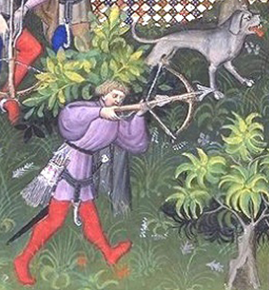
Maybe the tips are artistic, maybe the trigger is lengthened to make it look like it’s touching his hand, not because it’s long, maybe the attachment point of the trigger was moved up to show that it is long… It’s possible the position of the catch is the only thing that’s off, but there’s no way to be sure. We have to look to other factors, like the style of the bowman’s tunic (which is echoed quite well in the hunting scenes of Gaston Phoebus, right) and aspects of the manuscript that seem mostly but not-quite-right.

So, I’ve put crossbow identification on the table for now, but I’ll keep my eyes open for other imagery that might help us understand this roundel, and if I find some, I’ll post it.

J.K. Petersen

© 2017 J.K. Petersen, All Rights Reserved
Latin’s “Om-age” to Indic Numerals

5 November 2017

Most people don’t think of Indic and Latin scripts as similar, but the links between east and west are old and deep and medieval Latin script is not the same as modern Latin.

When I first discovered VMS glyphs, I scoured foreign alphabets for the origins of some of the less familiar characters. I already knew the Latin alphabet, some of the runic scripts, the Cyrillic and Hebrew alphabets, the rudiments of Korean, a little bit of Russian and Japanese (and a tiny bit of Chinese), some Coptic Greek, a few Greek numeral systems, and a smattering of Malaysian alphabets, but no matter how hard I searched, none of them, except Latin (combined with a small percentage of Greek), seemed to match a high proportion of the VMS glyphs.

I also searched plant-related words in Baltic and Turkic languages. Unfortunately, I haven’t had time to study Finnish, Czech, or Silesian, but they’re on my list.

Just to be sure I hadn’t missed anything, I explored several other alphabets from languages I thought had potential, including Georgian, Armenian, Amharic/Ge’ez, Syrian, and Sanskrit/Gujarati/Nagari (the word Devanagari did not exist in the middle ages) and… once again was led back to Latin, but with a better understanding of how Latin, Greek, and Indic script were more similar in the Middle Ages than they are now.

Western Presence in Eastern Lands

In ancient times, the Greeks and Romans occupied Pakistan and made forays into northern India. Alexander the Great, the Kushana peoples, and the Persians all left their mark, and absorbed certain aspects of Indic culture. There were numerous Indic coins that included Greek letters and numbers long after Greek occupation had subsided.

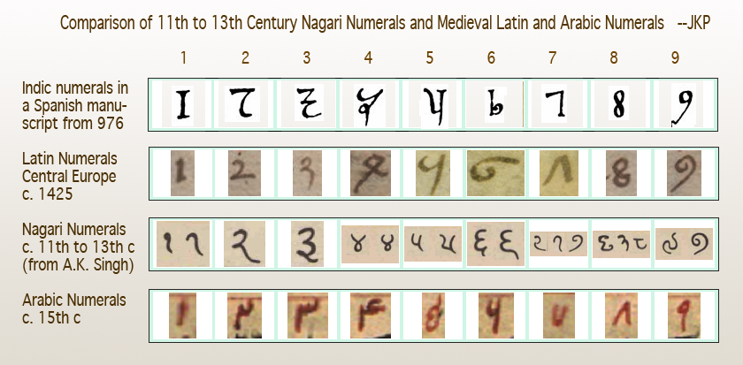
I couldn’t help noticing that “Arabic” numerals, as they were used by Latin scribes in the 14th and 15th centuries, resemble Indic numerals more than Arabic, and I subsequently saw the credit line in Latin, in the Codex Vigilanus (Spain, 976), attributing the number system to the Indians.

The earliest-known Indian numerals in a European manuscript are in the Codex Vigilanus (976 CE). It’s possible the manuscript reached the Spaniards through Arabic traders, thus leading to the “Arabic” moniker.

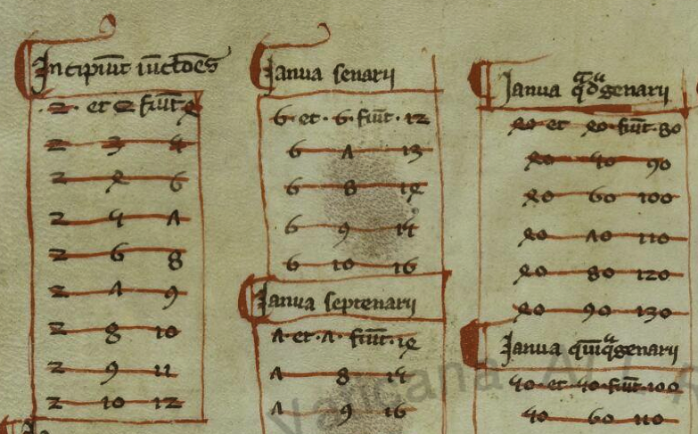
Leonardo of Pisa, now known as Fibonacci, appears to have independently discovered the Indic number system that was documented in Spain two centuries earlier. While traveling in Bugia, North Africa, with his father, he observed the notation system and calculations used by Muslim traders. When he returned to Pisa, he wrote Liber abbaci “Book of Calculation”, which included the Indic numerals. There are no copies of the original, completed in 1202, but a number of copies of Fibonacci’s enlarged 1228 edition survive.

The following is from a copy of Fibonacci’s book, believed to be from the late 13th century (BAV Pal. Lat. 1343). Like the Spanish manuscript, it introduced the numeral system that became popular until the 15th century, when slightly rotated glyphs for 4 and 7 and a more curled 5 evolved into our modern system:

Despite widespread acclaim for Fibonacci’s 13th-century manuscript on computation, change occurred slowly, and Roman numerals did not significantly give way until the 15th century when more flexible calculations were needed for scientific studies.


Latin Conventions in Medieval Scripts

Researchers often miss similarities between VMS glyphs and Latin because medieval scribes used many ligatures and abbreviations that are not taught in modern Latin. These were as integral as the letters themselves, and it’s hard to find late-medieval manuscripts without them.

Before describing similarities between Latin and Indic scripts, it’s important to understand how Latin is more than just an alphabet. You’ll note in the examples that follow that several of these scribal conventions are apparent in Voynichese.

Example #1

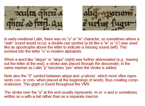
The first sample (BNF Lat 731) is lightly abbreviated. It uses some of the more common Latin conventions, including quibus, per, et, tails on the ends of words that loop back over the previous letters to indicate missing letters (it’s like an attached apostrophe), and caps over other letters to serve much the same purpose when the missing letters are closer to the middle of the word than the end.

Notice that loop-back tails and caps are common in the VMS, and that the abbreviation symbol that resembles a “2” or back-leaning “r” is, as well.

Example #2

The second example (BSB CLM 29505) also uses very common conventions, but not identical to the previous example. Scribes were free to pick and choose what was convenient because they were interpreted by context.

In this example, we see the common symbol for “Item” (at the beginnings of lines)—it resembles EVA-k; the macron or “cap” that indicates missing letters; the swooped-back tail at the ends of words (also missing letters); g° to stand for degree (grado/grade); a squiggly line over the “e”, which usually indicates a missing “r” or “er” “ir” or “re” (again, depending on context). Note that this is similar to the squiggle on the red weirdo on VMS 1r.

The loop on “item” is also used at the ends of words to represent “is” with the Latin suffixes -ris/-cis/-tis being drawn like EVA-m.

Notice also the tail on the “r” on the last line. This tail wasn’t always added to “r”, sometimes it was added to “i”, so one has to read for context to know which letter was intended. Take note that the shape of the tail sometimes indicates specifically which letters are missing (I’ll come back to that later), but not all scribes distinguished the missing letters by shape.

Thus, there are four scribal conventions in this small sample that are found as VMS glyphs:

Example #3

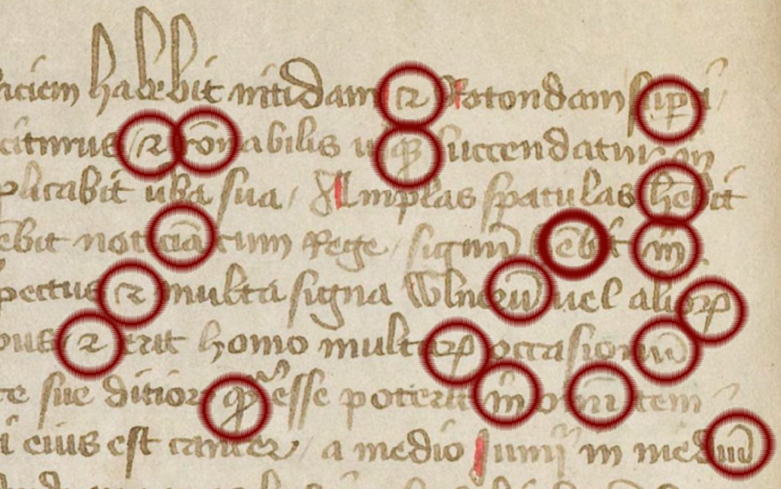
The third example (Ms San 827) makes slightly more frequent use of abbreviations, but they are still very common ones and easily readable.

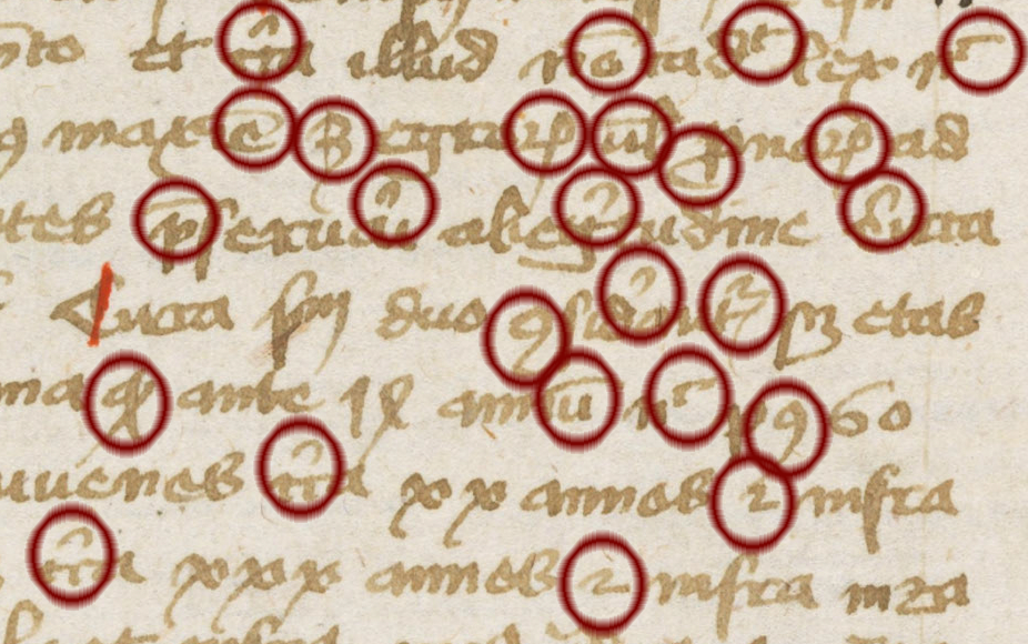
In sample #3, note the lines and caps over the letters to indicate missing letters, the curled tail on the “p” to stand for “pro”, the symbol that resembles a “2” which sometimes means “et” (and) but often means -ur or tur.

On the fourth and fifth lines, you will see the “9” symbol at the beginning of one word and the end of another. At the beginning, in this example, it stands for “con-“. At the end it is usually “-us” or “-um”. This is one of the most common glyph-shapes in the VMS and, as in Latin, it is usually at the end, but sometimes at the beginning:

Example #4

The above examples are all from the 15th century, but conventions were similar in the 11th to 14th centuries, leading up to the creation of the VMS. The following earlier text (OBV SG 21), uses all of the same concepts and most of the same conventions:

Thus, with four brief samples, and the numerals that evolved from Greek that were mentioned in a previous blog, we can account for the majority of glyphs in the VMS.

The problem is not in relating the VMS glyph-shapes to Latin letters, ligatures, and abbreviations—the similarities are numerous and obvious—the difficulty is in determining their meaning because VMS tokens do not, in general, behave like Latin or the majority of natural languages in terms of the variability of the words or the characters within the words. Here are some important differences:

  • In Latin scripts used for a variety of languages, abbreviation symbols can be associated with many different letters. In the VMS we see caps only on EVA-sh and occasionally EVA-q.
  • In Latin, the swept-back tail is found on almost any character where letters have been omitted near the end of a word. In the VMS, it is specific to EVA-e, EVA-r, and the last glyph in “daiin”.
  • The “9” symbol is shaped and positioned the same in both Latin and Voynichese, but in Voynichese it’s much too frequent to mean the same thing as it means in Latin (or other common languages).

So the shapes are similar to Latin, but the extreme repetition and positional rigidity are not.

After the 15th century, abbreviations and ligatures fell out of use, as Latin scholarship was replaced by local languages, and the newly invented printing press and typewriter introduced mechanical limitations that made it difficult to mimic these scribal traditions.

Ties with the Eastern World

So what does all this have to do with the Indian scripts mentioned at the beginning?

Dozens of languages have been mentioned in connection with the VMS, but claiming it’s a specific language is easy. I saw one person claim five different languages in the same week, and another claimed three more in the course of three months. Proving that it’s a specific language is the real challenge, and so far no one has provided a convincing translation of even one paragraph.

I think I know why so many different languages have been proposed for the VMS. It’s partly because expanding or anagraming text expressly turns it into readable text or, if Voynichese is based on natural language, it may be partly because words related to disciplines like science are often loanwords and thus similar in many languages. But this bewildering array of suggested languages might not be entirely imaginary… certain languages did, in fact, have more in common with one another in the Middle Ages than they do now.

As an example, Indo-Iranian writing styles are more similar to medieval Latin than east-Asian character-based scripts like Chinese—both come from proto-Indo-European roots.

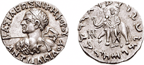
The Indo-Greeks and others who subsequently ruled Pakistan kept some of their native customs and adapted others from local culture. They blended pagan gods with Buddhist beliefs and minted bilingual Indo-Greek coins, as in the following example from c. 100 BCE:

[Image courtesy of the Classical Numismatic Group, Inc.]

The Kushana, nomadic peoples from central Asia, at one time ruled a large region that included Afghanistan, parts of Pakistan, and northern India, and almost shared a border with the Romans during Trajan’s and Hadrian’s rules (a coin mould featuring Emperor Hadrian was found in excavations of c. 2 CE artifacts in Rairh, near New Delhi). The Kushana were Indo-Europeans who actively traded with both Rome and China.

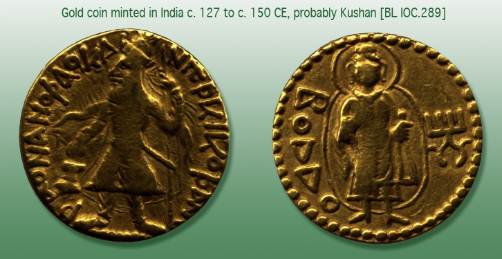
This gold coin, probably of Kushan origin, is a testament to multicultural interaction. It was minted in India, inscribed with Greek letters with the ruler on one side and “Boddo” (Buddha) on the other, and was unearthed in Afghanistan. Sometimes Zeus was substituted for Buddha on this style of coin.

[Image courtesy of the British Museum.]

Commonalities with Indo-Iranian Scripts

Please note that I have used Gujarati as an example of glyph similarities, even though it is more recent than Nagari, because it does not have the line across the top (thus making it easier for westerners to read). It is very similar to other Indic scripts if you ignore the top-line and look specifically at the shapes underneath. The following observations apply to a group of related Indic scripts descended from Sanskrit, not specifically to Gujarati.

I’ll start with some of the simpler and more familiar shapes, followed by glyphs with ascenders (gallows characters), because the majority of VMS glyphs are Latin. Only a few that are rarely used (or which show up only once) are distinctly eastern and will be described later.


Glyphs with Tails

Voynichese has a number of glyphs with tails, a ubiquitous convention in medieval Latin. Adding a tail to a glyph wasn’t just an embellishment, it was a way to indicate missing letters. In the VMS, the r, c, and minim shapes at the end of the word “daiin” all have distinctive tails. Certain Indic glyphs also have tails, and the shape or length of the tail can change the sound or meaning of a letter.

Here are some interesting patterns in Latin and certain Indic scripts, that may have some relevance to the VMS:

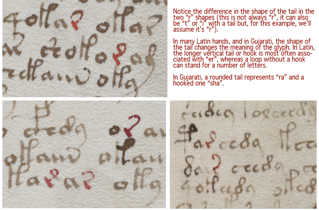
  • EVA-r. In Latin, when a tail is added to “r”, it can mean “rus, but it often means “re”, “er”, “ra”, “ar”, “ir”, or “ri”. In other words, a vowel is inherently indicated by a tail added to a consonant, as in some of the abugida languages. Similarly, in the later 13th- and 14th-century Nagari scripts, and in Gujarati, you will see an “r” shape with a curved tail to represent “r” or “ar” or “ra”. There are several places in the VMS where two forms of tails are apparent in the same block of text. In Voynichese, Latin, and Gujarati, the curved tail is more frequent than the extended-loop tail. If Voynichese is anything like Latin, Gujarati, or some of the Malaysian scripts, and not just a smokescreen to make the text look like Latin, then extending the tail and changing its shape changes the meaning of the glyph:
  • EVA-s. In many older Latin scripts, the “t” was written like a “c”, rather than with a straight stem. It can be a struggle to tell them apart. Adding a tail to this c-like tee stood for “te” or “ta” or most combinations of “t” plus a vowel (it can also mean “ter” or “tus”). In Gujarati, the symbol for “ta” is a c with a tail (note that both “r” and “c” shapes with tails are found in the VMS) and some are ambiguous, with a slight hook on the foot, perhaps denoting a third character. In Greek, a c-shape was used as an abbreviation for “kai” (and). Once again, if you look at it from a Latin point of view, the c-shape can also be “e” (many early medieval e-shapes didn’t have a crossbar or hook), and adding the tail turns it into “eius” or “et” for “and” (in fact, if you extend the tail a little more, it becomes an ampersand). Thus, we have a glyph with many meanings. C-tail can be the abbreviation for te, ta, or ter, or for et, eius, or er. In the VMS, as in Latin, this tailed shape, which sometimes resembles c-tail, sometimes e-tail, and sometimes t-tail, is found both individually and within other words.
  • EVA-d. If you look at variations of the thorn character, which is usually associated with northern European scripts, you’ll see some of them are written like a curvy “d” or a Greek sigma with a small bar through the ascender. It may be coincidental, but the Gujarati shape for “tha” is a curvy “d” shape. There’s no line through the stem, but many Latin scribes wrote it that way, and there is a strong association between “d” and “th” sounds in various Indo-European languages. If you round the top loop a little farther, as some scribes did with Latin “d”, thorn, and Greek sigma, it resembles a figure-8. This is why many researchers read the figure-8 on folio 116v as an “s” or “d”, but perhaps “th” should also be considered.

There are analogs to VMS shapes in both medieval Latin and some of the Indic scripts. The “a” and “o” shapes need no explanation—they are distinctly Latin, and “o” is common to many languages.

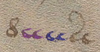
The simple “c” shape doesn’t tell us much either, because it is found in most alphabets, but two c-shapes tightly joined were used in early-medieval Latin to express “a”, “t”, and sometimes “u”. The double-c is also found in the VMS (right)—a distinction that might be meaningful but is not recognized in most VMS transcripts. In fact, in the Takahashi transcript, which is probably the most widely used, the extra c-shapes are sometimes omitted.

But tails are meaningful in both Latin and Indic languages, and ligatures common to both. Sometimes the tail changes the letter, sometimes it extends a sound, and sometimes it specifies which vowel is used. Note that Nagari and Gujarati are syllabic languages which might not seem to have much in common with Latin, but medieval Latin script has its share of implied vowels.

A sidenote on abugida scripts… Gujarati is a syllabic language, but not entirely an abugida script (neither is Hebrew). Both Hebrew and Gujarati include a shape for alpha, so it is explicit rather than implied (it’s possible that in ancient languages alpha was more of a glottal stop than a vowel), but most of the time the most common vowel (alpha) is rolled in with the consonant, as it is in a number of Asian and African languages.

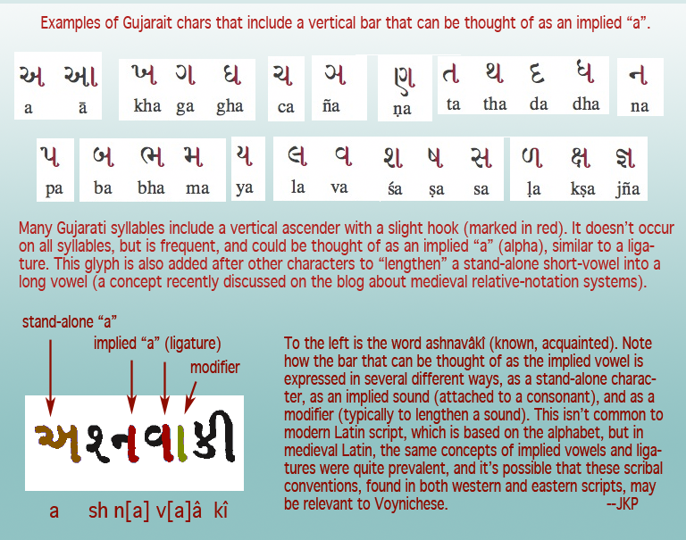
In Gujarati, several of the syllables are written as though they were ligatures, with a vertical stem on the right  (as in sa, pa, na, and numerous other glyphs). This is technically part of the syllable but can also be thought of as the implied vowel. This vertical line has an additional function—it can be added to the preceding vowel or syllable to lengthen it into a long vowel, as in the following example:

Note how the vertical bar changes a short-a to long-a, a symbolic concept that was mentioned in the previous relative notation blog. A similar convention exists in Modi, another Indic script that is first recorded in the late 14th century.

Some of the commonalities between Latin and Indic scripts disappeared when Latin abbreviations were dropped and Latin was reduced to a simple alphabet.

Summary

I have much more information on this subject and was going to try to cover the Voynchese ascenders and some of the rare characters in the same blog  because they also have their roots in scribal conventions, but this is becoming too long, so I will continue with the less common characters in a future installment.

… to be continued…

J.K. Petersen


© Copyright 2017 J.K. Petersen, All Rights Reserved