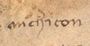
There’s a controversial word on the last page of the Voynich manuscript that is often read as “anchiton” or “michiton”. I’ve written about it before and so have many others, and yet the question hasn’t been settled despite decades of study. I’m hoping some paleographic insights might help.
The troublesome word is on folio 116v (near the beginning of the second line). The individual letters that form “chiton” or “chi ton” are not controversial—they are pretty clear and fairly conventional. Most people agree on them. The only unusual thing I noticed is the extra-long leading serif on the letter “i”. This is a less common way to write “i”:
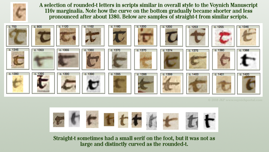
The extra curve on the “t” is not unusual if the writer learned to write the more traditional round-stemmed “t”. The rounded “t” (written like a “c”) was popular for many centuries, from the early medieval age into the 15th century. Here are some samples of rounded “t” and straight-stemmed “t” in scripts with some overall similarity to the marginalia writing style:
In the 20 scripts with the greatest overall similarity to the marginalia, both rounded and straight t are represented, but most of them tend to be like the VMS t, in-between the two extremes:
So, putting aside “chiton” for the moment, let’s take a close look at the first letter, or two letters, since it’s not clear whether it’s one or two:
I can understand why anchiton/michiton is contentious. The first couple of letters can be read as ni, an, or mi, depending on the handwriting. Even “mehiton” (vaguely Semitic if it is a hard-h as in mechiton) might be reasonable if the other letters “e” were similar to the character preceding “h”, but they are not. It looks like “ch”.
The problem is further complicated by the less-than-professional-level script—the slants are all over the place, the loops are connected in different ways, and the letterforms are moderately inconsistent.
Nevertheless, I have some observations…
Note that the ending leg of “an” or “m” is not drawn like “i”. This writer has a tendency to draw “i” with a long leading serif, a straight stem, and no ending serif. The last minim on “an” is not drawn this way, so I am inclined to rule out “mi” or “ni” as a reading for this word. That leaves “m” or “an” (or perhaps a very unusual ligature “am”).
What about “an”? Here’s the full passage again, so you can look at all the instances of “a” and “n”:
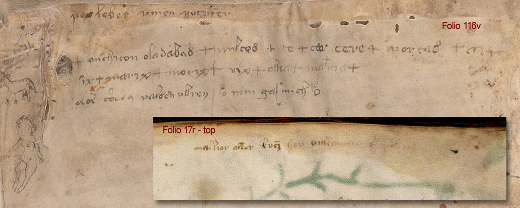 Note the following characteristics of the handwriting…
- The letter “a” is mostly tall, with a point at the top of a straight stem, but not always.
- Ascending loops are usually sharp and at a certain angle, but not always.
- The figure-8 letter (which is usually interpreted “d” or “s”) usually has a larger bottom loop, but not always.
- The “n” is usually small and rounded, but not always.
So how do we know whether it’s “an” and both letters diverge slightly (the curve is squished on the “a” and the loops are sharper on “n”), or a loop-m that diverges even more?
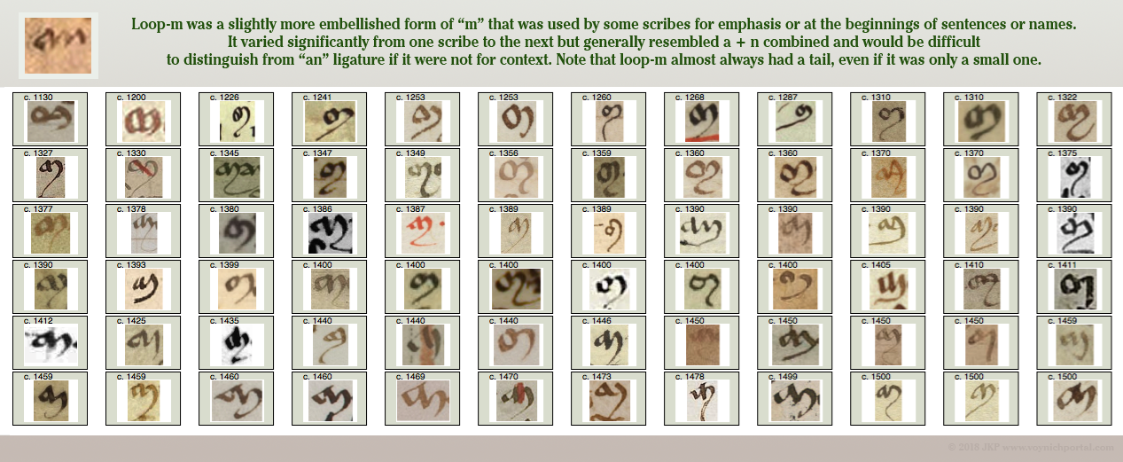
Examples of Loop-M
Here are examples of “loop-m”, a particular style of medieval “m” that looks like a ligature-“an” to modern eyes. These are all chosen from unambiguous sources where it can be verified that the shape represents “m”. Loop-m was used more conservatively than regular–m. Some scribes only used it for names or for emphasis:
Did you notice that almost all the samples differ from the VMS in one important detail? Loop-m in medieval manuscripts always has a tail. Always… well, almost always. There are very few exceptions, and even the exceptions tend to have a short tail or a down-pointing end-stroke rather than a serif, in comparison to how the scribe wrote regular “m”.
Summary
I stated years ago that I was leaning toward “an” rather than “mi” and it has taken many years to find enough time to explain why. And yet, even though I lean toward “anchiton”, I’m not certain of either reading…
- If this is “michiton” then the “i” is written differently from all the other “i” characters on the folio, and the “m” is an unconventional loop-m with no hint of a tail.
- If this is “anchiton” then the “a” is a bit squished, and the “n” is more angular than other “n” characters on the folio.
In fact, I’m not even sure this is one word. It could be “an chiton” or “an chi ton”, which looks suspiciously like an awkward Greek transliteration. It could be coincidence, but if you search the Greek words chυτά/Χυτά or chυτό/Χυτό, and filter for the metallic ones, you will see some very ornate Voynich-like Greek and Russian oil lamps and incense burners:
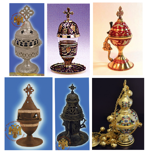 Images courtesy of Nioras.com and Holy Archangel Liturgical Supply
Medieval versions were probably less ornate than those pictured above (although some of the medieval Jewish spice jars were very ornate), but the tradition of metal censers for funerals, healing rites, and sometimes exorcisms, goes back a long way and the word chytoú for “cast” goes back to biblical times.
If the text on 116v is a healing charm or medicinal remedy (not saying it is, but it’s a reasonable possibility), then a cast/molded burner (chytó, chytón χυτό) for incense (or even as source of flame for other purposes) would not be out of place.
J.K. Petersen
© Copyright 2018 J.K. Petersen, All Rights Reserved

