Monthly Archives: March 2020

The Portal Gate

25 March 2020

In medieval times, people walked. Many cities were completely walled and you entered by the portal gate. Some cities had only one entrance. Some had three or four. If there was only one, it was important to know where it was or you could approach from the wrong side and spend hours or days backtracking along treachorous mountainous paths or deep forest.

To make it easier to recognize the gate from a distance, certain “signal” styles were adapted by builders and architects, many of which were specific to their region. It was common to build a tower, or a pair of towers, over the main portal. The extra height let the watchmen see who was coming, and visitors knew where to approach.
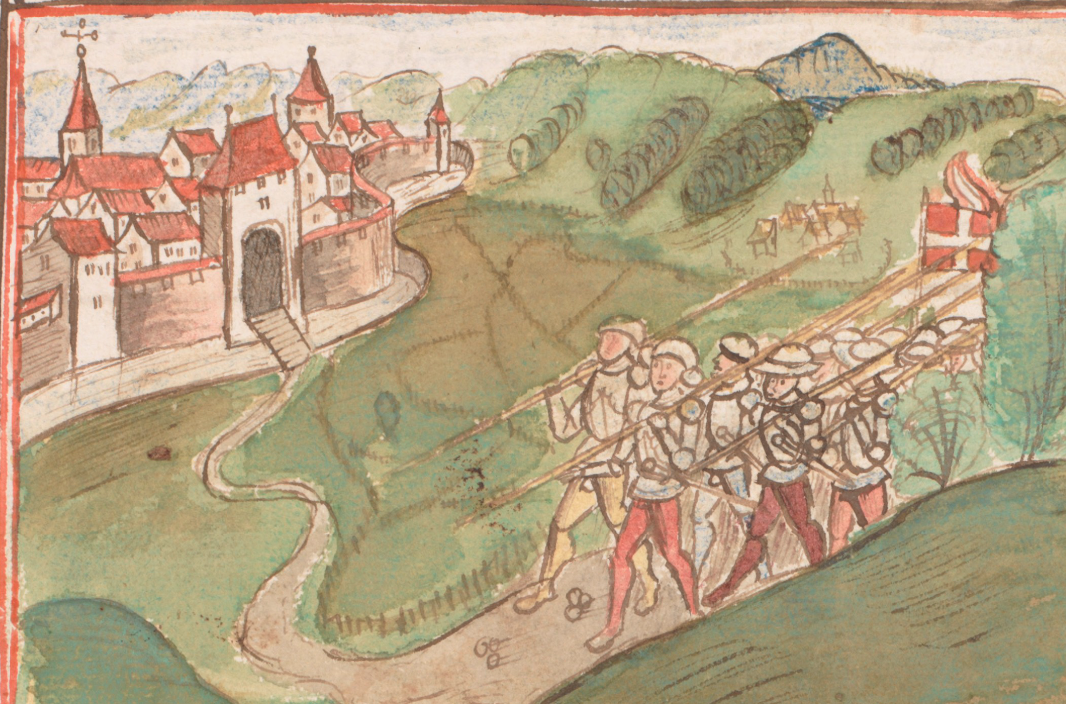
Example of travelers approaching the main entrance to a walled medieval city by spotting the distinctive portal gate.
Medieval portal entrances were designed with distinctive features and usually stood higher than the walls so watchmen could scan incoming traffic from a suitable height, and travelers could find the right entrance to walled cities. [Source: Eidgenössische Chronik, Cod. ZF 18, c. 1520s]

Portal-Tower Architecture

Most towers were built with brick and mud or stone according to local engineering and cultural traditions. Some had flat platforms, others had roofs.

The Canaanite Gate in Tel Dan is several thousand years old and currently under restoration (the doorway has not been fully excavated). It features a heavy wall and a single portal in the central recessed portion of a thick wall. The portal is within a broad arch that predates Roman arches by about 1,500 years. There may have been a higher central tower above the doorway at the time of original construction:
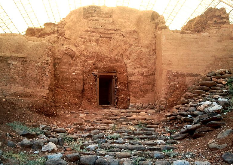
The ancient city gate called the Canaanite Gate or Abraham's Gate
The mud-brick Canaanite Gate in Tel Dan was built almost 4,000 years ago and features a thick wall, a higher portion above the portal (perhaps the remains of a tower), and an arched door-support. [Source: Hanay, Wikimedia]

This basic format, a strong wall, a central portal, and a raised platform or tower over the doorway was common to many countries.

There are a number of ancient gates in Bosra, in southwest Syria. They typically have arched doorways, but high towers above the gate are not usual.

The Gates of Istanbul are massive, with mostly-square towers, and very old. Some have been bricked up or restored over the years. This is the Belgrade Gate which still includes parts of the original wall:
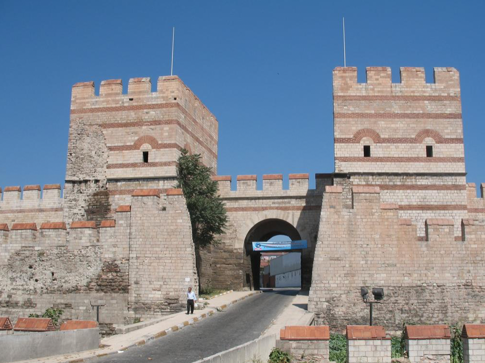
Portions of the wall ran along the water and a chain was stretched over the canal to prevent undesired entry by boats.

Here are two examples of medieval tower portals from Cairo, Egypt. The well-fortified north-facing portal (left) has a platform and crenellations. The south portal (right) has elaborately carved minaret towers and stone roofs with sculptural finials:
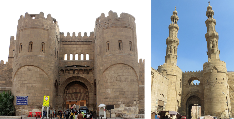
The north and south gates of the old city of Cairo, Egypt.
The north-facing portal and south portal to the city of Cairo were built in two different styles in the 11th and 12th centuries. [Sources: Sailko and JMCC1, Wikipedia]

The bastion style on the left was a common style. It was designed for visibility and also for protection. It enabled guards to drop arrows, rocks, and burning oil onto anyone trying to storm the gate. This form of tower is often depicted in manuscript illuminations.

The Porta Soprana of Genoa, built in the 11th 12th century, is similar to the north-facing portal in Cairo, although not quite as massive. Between the two round towers, and on the top, are Ghibelline merlons, but it’s difficult to determine exactly when they were added. It is possible, in this case, that they are original, since this is one of the pockets where there were Ghibelline supporters, but since the portals were intended, in part, to assert the independence of Genoa, it’s questionable whether they would include a symbol specifically supporting the Holy Roman Empire:
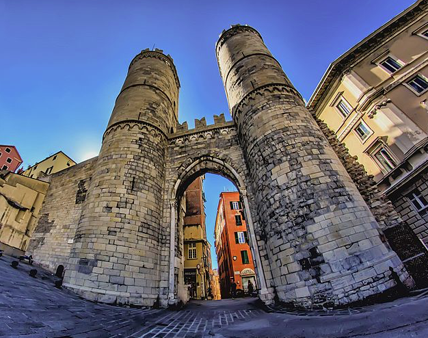
The Porta Soprana portal in Genoa, built in the 12th century. [Source: Maurizio Beatrici, Wikimedia, 2016]

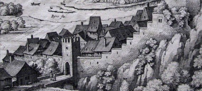
The little town of Münchenstein, on the northern Swiss border, had quite a simple portal with a square tower and crenellations:
The Augustus Arch, portal to Rimini, is very ancient and classical in design with an unusually large opening that probably never had a gate. The Ghibelline merlons were added in the 11th 10th century when the Ghibelline family took control of the city:
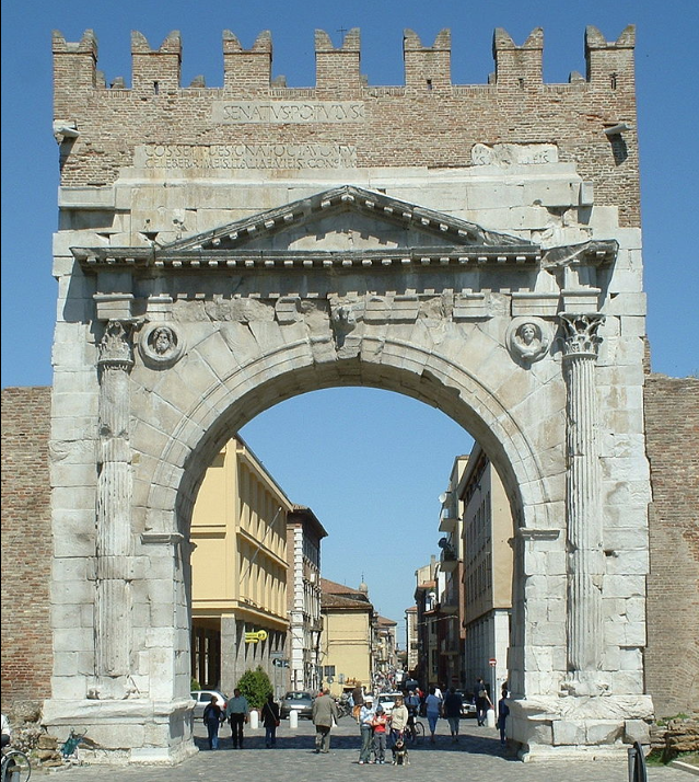
The Augustus Arch was originally built in the 1st century BCE and dedicated to Caeser Augustus by the Roman Senate. In the 11th 10th century, the Ghibelline merlons were added by the Ghibelline family. [Photo: Tobabi1, Wikipedia]

Gable Roofs

Sometimes towers had roofs similar to those on houses. A common style was the gable roof, seen in areas where ceramic or wooden roofs were added:
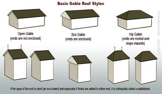
Examples of basic gable roof styles for buildings and towers
One of the roof styles used for medieval portal towers is the gable roof. In certain regions, the two ends of the roof-span sometimes included globe finials or flag finials.
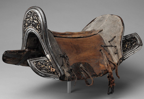
Antique saddle with raised pommel and cantle [Source: The Met]

The span of a gable can vary. If it is a short-spanned gable with finials or raised peaks at either end, it is sometimes called a “saddleback” because of the resemblance to saddles with raised pommels and cantles (right).

Saddlebacks were common in Bohemia/Bavaria, Alsace, and parts of eastern France in the Middle Ages.

Historic Portals

The Butcher’s Tower (below) is a hip-style gable with inward-sloping sides and roofing materials on all four sides.

This picturesque watchtower was built in the 14th century, and stands above an entrance gate in a long wall.
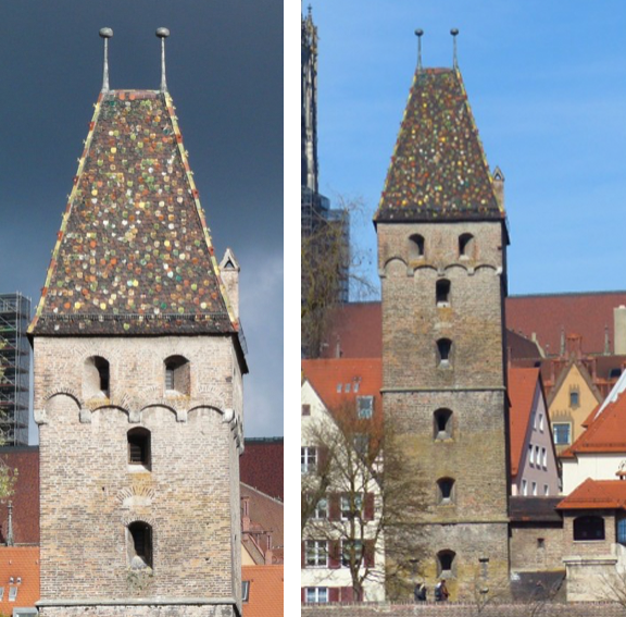
Hip Gable "saddleback" roof on the Butcher's Tower, 1349, Ulm, Germany
Hip-gable style of “saddleback” roof with globe finials. The Butcher’s Tower, 1349, Ulm, Germany.

A similar style of portal can be seen in the Berner Chronik (Burgerbibliothek Mss.h.h.I.1), created between 1478 and 1483. It has a hip-gable saddleback roof with finials:
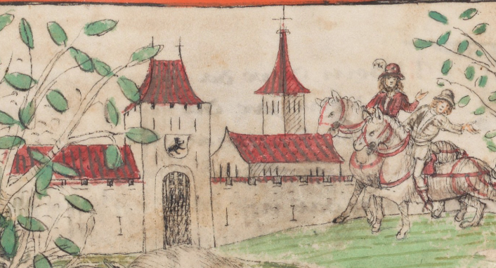
Example of a saddleback portal tower with finials in the Berner Chronik, created c. 1480.

The main difference between this and the Butcher’s Tower is that the Berner Chronik portal has a crenellated level where the stone ends and the roof begins. In some cases, towers started out unroofed and roofs were added later. In other cases, there is a crenellated balcony at the apex of the stone that was part of the design.

In this illustration, there are two entrance portals built along the water for accessibility by boat and for extra security. Both portal towers have saddleback roofs with globe finials, but the tower on the left has a viewing window and the one on the right has a covered walkway leading to the opening:
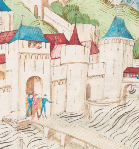
Examples of two forms of saddleback portal towers in the 15th-century Berner Chronik, c. 1480.
Two portal towers leading to the city, entered by crossing bridges, one plain, the other covered. Both have hip-gable roofs with finials. The arch-shaped extensions are similar to those on the Butcher’s Tower. [Source: Amtliche Berner chronik, Mss.h.h.I.1, c. 1480]

Postscript 29 March 2020: I forgot to add the following drawing when I posted this blog, but it’s worth including because it’s part of an extensive collection of town maps from the mid-15th century. The drawings of Guillaume Revel are generally more accurate than castle drawings in storytelling manuscripts because part of his purpose was to document ducal holdings.

Revel drew the town of Feurs around 1450. There are four saddleback portals, each with flag finials and, unlike most castle drawings, he included details of the archways and balcony just below the rooftops, a style that was fairly common in this area but not always elsewhere. Between the portals are semicircular wall towers with simple battlements:
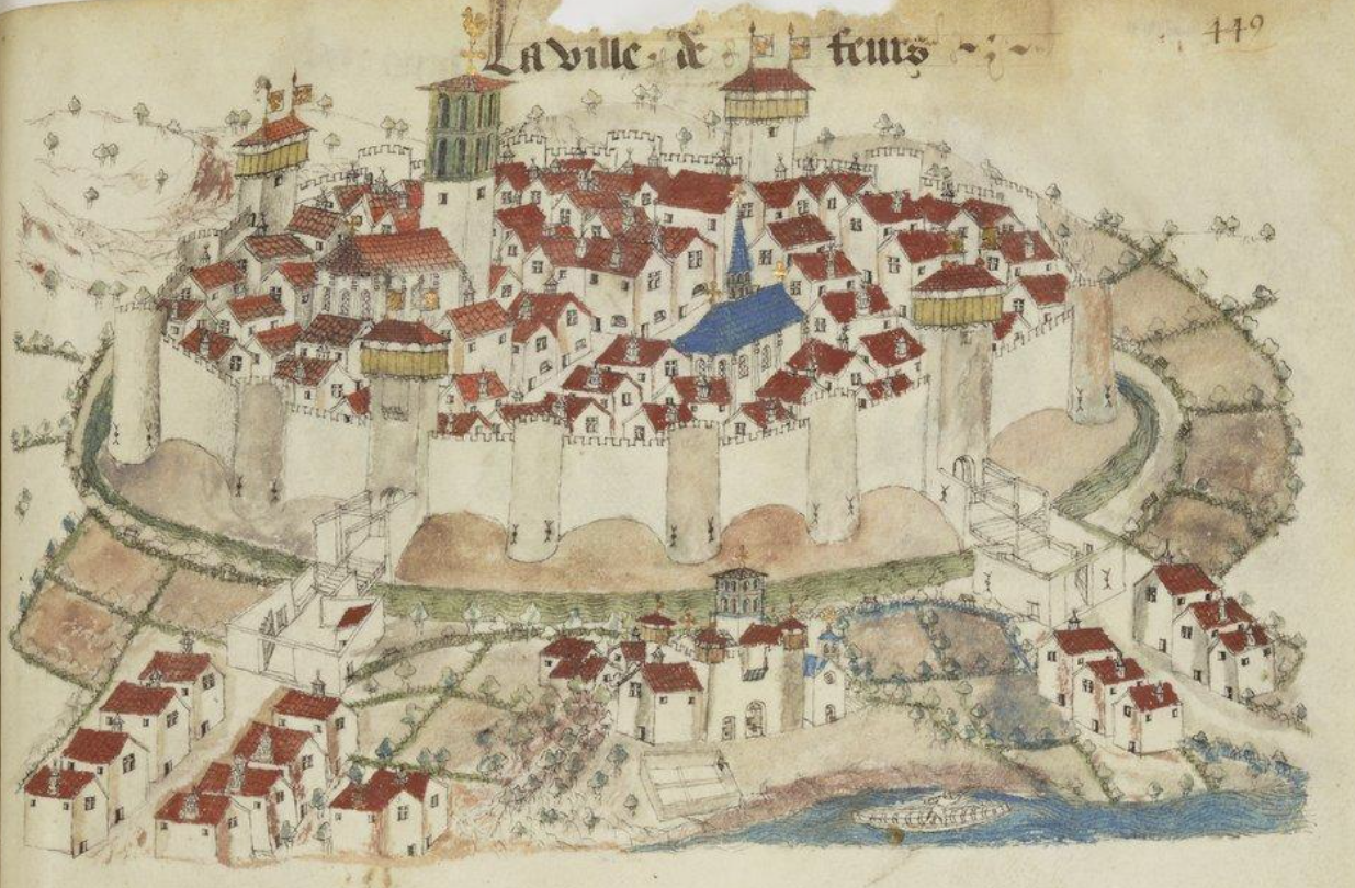
The town of Feurs, France, documented in the 1450s by Guillaume Revel.
The walled town of Feurs in the 15th century is drawn here with four saddleback portal gates with flag finials. This detailed drawing was created as part of an armorial record by Guillaume Revel [source: BNF Français 22297]

The following examples of German towers include 1) double towers, one with a hip-gable saddleback on the left and a cone-shaped tower on the right, 2) a single tower with a saddleback roof and globe finials, and 3) a finial-topped cone tower surrounded by a balcony with battlements:
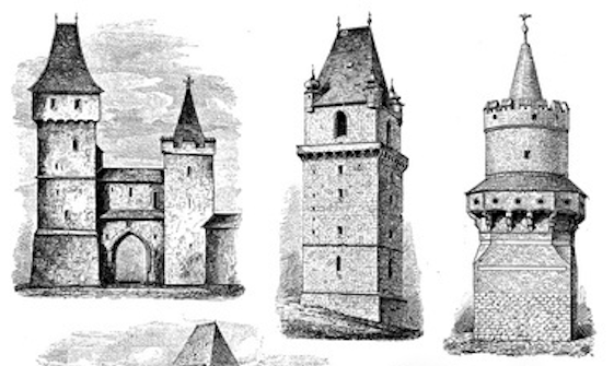
Examples of medieval portal tower styles.

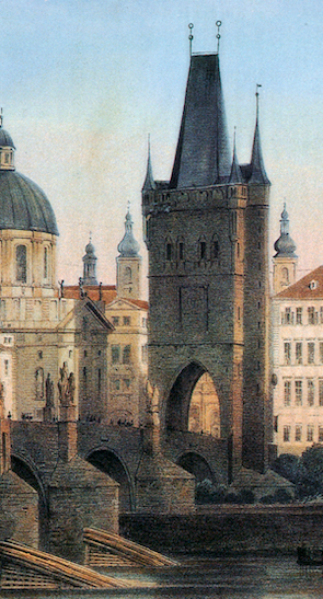
The Prague “Powder Tower” is situated on one of the main city portals on the Charles Bridge. During the reign of Emperor Rudolph II, it housed some of the alchemists

It has a hip gable with globe finials and turrets in the corners, similar to the tower in the center diagram above, but the Powder Tower was not built until 1475 and I couldn’t find any clear pictures of the original tower it replaced.

Towers similar to the Powder Tower served as portals to the cities of Batteheim and Ensißhein.

Sometimes local architecture was used to illustrate events in far-off places. For example, Vatican Pal. Lat. 871, includes a biblical story of Ezechiel that obviously didn’t take place in central Europe, and yet the illustrator drew local architecture, including a pair of flag finials facing outward:
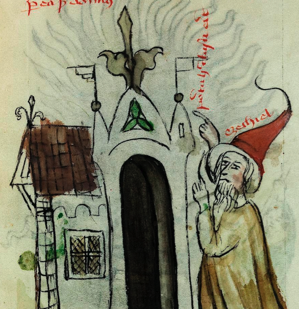
Manuscript Vatican Pal. lat. 871 illustration of a portal gate with flag finials.

On a side note… outside Ensißhein a meteorite boomed out of the sky and landed in a field November 1492. A number of woodcuts and drawings commemorating the event show a saddleback portal gate (a 15th-century drawing of Belgrade includes similar-looking portals):
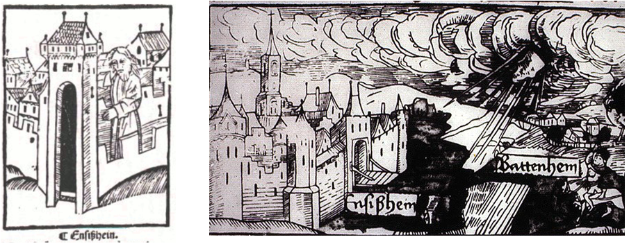
Ensißhein (now Ensisheim) was immortalized in story and images in 1492 when it was struck by a meteorite. Citizens quickly started hacking off pieces, but an official intervened and preserved it for future generations.

Albrecht Dürer created elaborate allegorical engravings of the meteorite event replete with sun, moon, stars, cloudbands, angels, and people cowering in fear. Here are two examples:
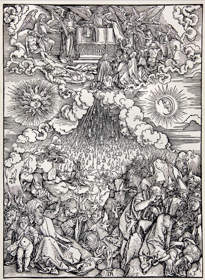
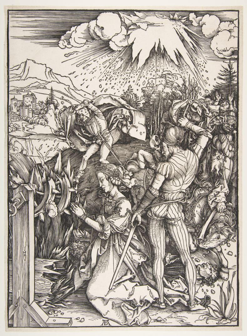
Ensißhein meteorite event allegorically interpreted by Albrecht Durer
Albrecht Durer engraving of a meteorite event near Enseßheim that occurred in 1492.

Ensisheim is in eastern France, near the Swiss and German borders and I was intrigued by a more humble drawing of the meteorite event. People are pointing, birds are knocked out of their flight by the boom from the “thunderstone”, and animals scurry for their dens:
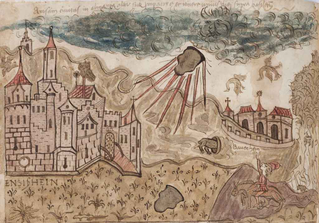
Meteorite falling to earth at Ansißhein in eastern France in 1492.
Meteorite blasting out of the sky with a loud boom, causing chaos November 1492 in the environs of the city of Ensißhein. [Courtesy of the Vatican Observatory Foundation, BAV Chigi G.11.36]

This illustration reminded me of the full-page drawing in the VMS that has multiple textures and emanations seemingly shaking the foundations of the earth. There is a person hiding or peeking out from behind a tor, a bird flapping by a cloudlike formation in the upper-right and another with wings raised as if to fly sits on the tor below.

I’ve already blogged about possible interpretations of this folio, and the Ensißhein meteorite event is probably too late to have influenced the VMS, but the fact that the folio has a narrative feel, like the Ensesheim drawings, makes me wonder if it chronicles a natural or mythical cataclysm:
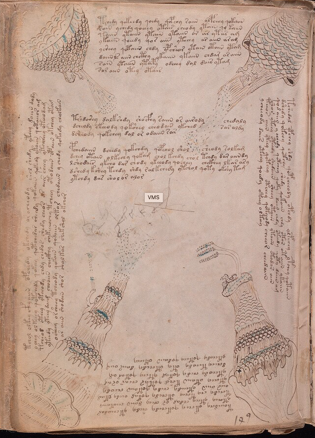
Voynich Manuscript folio 86v image of birds, cloudlike formations and tall tors
Beinecke 408, the Voynich Manuscript, folio 86v, courtesy of the Beinecke Rare Book & Manuscripts Library at Yale.

Another meteorite hit the earth near Basel, Switzerland, in the 16th century but I wasn’t able to find any illustrations of similar events before the Ensisheim meteorite. There are some earlier drawings of “comets”, however, and since the word “comet” was used rather imprecisely at the time, maybe some of these sitings were meteorites.

U. dall’Olmo, in the Journal for the History of Astronomy, 1978, Vol. 9 searched medieval records for celestial events and describes a spectacular meteor shower in southern Italy in 1387 that was said to light up the sky. Three decades later, a meteor appeared after sunset and split into three while traveling west to east. If the VMS drawing has anything to do with meteor events, maybe it chronicles something earlier than the thunderstone of Ensesheim.

More on Portal Gates
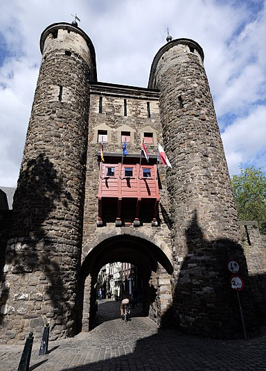
Helpoort entrance portal by Ben Bender, Wikimedia Commons
Helpoort portal, photo by Ben Bender, Wikimedia Commons

Getting back to portal gate designs… the Helpoort gate in the Netherlands is a 13th-century entrance portal with an arched entrance, two round towers, and an asymmetric cone-shaped roof. I don’t know how old the finials are (they tend to wear and be replaced) but globe and flag finials were common in the middle ages.

In the 17th century, Reims was drawn with two saddleback portal gates flanked by a pair of round towers with cone roofs. A series of round towers, some roofed, some not, are spaced at intervals along the city wall.

When Adam and Eve are driven from Paradise in this manuscript from Switzerland, we see them exiting through the portal gate roofed with a hip gable and two flag finials:
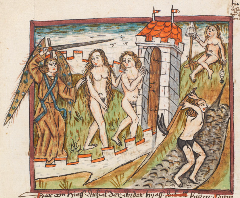
Manuscript illumination, Adam & Eve driven from Paradise through a saddleback portal tower with flag finials.
Adam and Eve driven from the walled garden of Paradise through a traditional portal gate with a hip gable roof with a pair of flag finials. [Source: Bern, Burgerbibliothek Cod. A 45, c. 1480]

Roofs in the VMS “Rosettes” Folio

There are a number of corner towers and portal towers on the VMS “map” folio. The drawings are very tiny but still recognizable. The roofs are consistent with the styles of the towers and with each other.

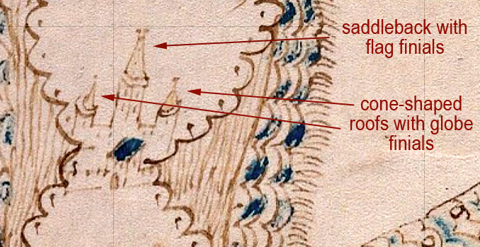
On the lower side of the top-right rosette, there is a simple square tower facing the rosette, but the tall tower is probably also a portal tower that faces the pathway on the other side (imagine standing on the rosette and looking toward the “path” as though you are seeing it from the back). The central tower roof is a gable with flag finials facing outwards, a typical saddleback, flanked by cone roofs with globe finials (I think the finial on the right is probably a smudged globe finial, but it may possibly be a flag finial):
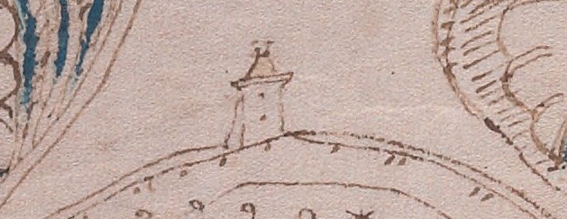
On a circular wall within the rosette, possibly at the top of a steep area, there is another saddleback tower apparently attached to the wall, but it doesn’t appear to have a portal opening. It may be a watchtower rather than an entry point.

This one has a hip gable and a pair of finials that are so small, it’s difficult to tell if they are flag or globe finials. If it’s a watchtower rather than an entrance tower, they are probably globe finials.

I think it’s very unlikely that the drawing below represents a lighthouse. Lighthouses were generally round and even if they were square near the bottom, as in some of the most ancient, the top was usually round so the signal fires could be seen from multiple angles. All through history, the majority of lighthouses were round or rounded (octagonal) at the top. Even the tower of Hercules transitions from square to octagonal to rounded as one reaches the top.

I have never seen a historic lighthouse with a saddleback roof and, in general, lighthouses were not attached to walls at the tops of hills. More often they were on prominences jutting out into the water closer at sea level, or they were on small islands or rock formations in or near the harbor. This looks like a typical wall-tower:
On the same wall, on either side of this tower, there are additional towers that appear to have cone roofs and finials. Moving to the left side of the rosette, facing another “pathway”, there is a wall castle or city with Ghibelline merlons, two unroofed towers, and a tall, narrow hip gable with finials:
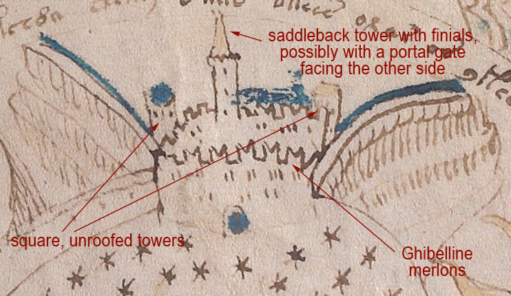
Voynich Manuscript "map" folio showing saddleback towers and Ghibelline merlons, possibly on a steep hill.

Note also that the Ghibelline merlons are not on every side. The merlons on the left are the more common square merlons.

Pointed merlons are found in many areas of southern Spain, and if they are placed in pairs, they superficially resemble Ghibelline merlons, but they are not the same. The merlons on the VMS are straight on the outside and angled on the inside and join without reaching the base. The merlons in Spain are angled on two sides to create a different shape. There are some swallowtail merlons in Spain, but I haven’t found any that existed before the latter part of the 15th century.

Beyond this compound, to the left, there appears to be a walled pathway with buildings and towers at intervals. On the outsides of the walls are what appear to be steep escarpments, very similar in shape to certain geological formations and also similar to the escarpments created by mining operations. The buildings on the left look like houses and possibly a tower with finials. On the right is a platform tower with crenellations, possibly roofed. In the center is a faint tower with a cone roof that looks like it might have been partially erased:
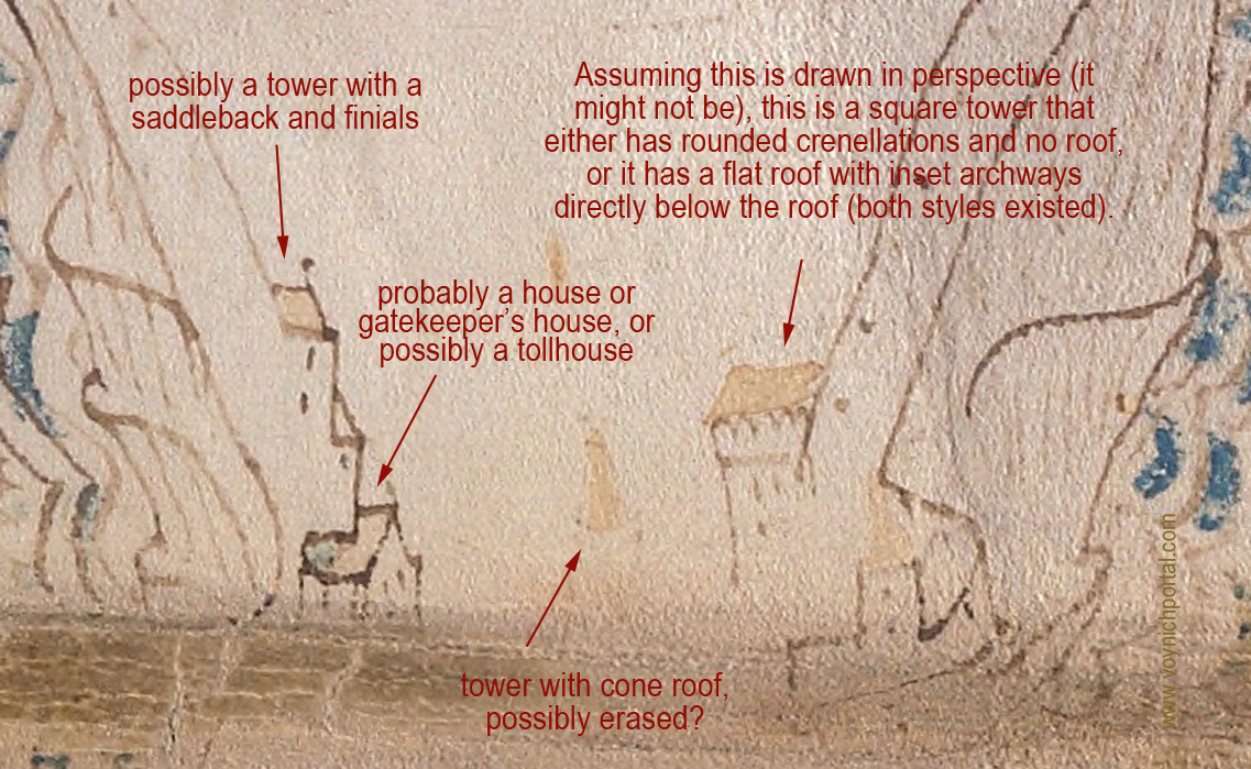
Towers built into the walls above escarpments on the Voynich Manuscript "map" folio

Mining was quite extensive in the Middle Ages. Silver, gold, and other metals, along with desirable stones such as gemstones, granite, and marble, were so heavily mined that entire mountains were sometimes reduced to foothills. During the process, narrow terraces were often formed. This makes it difficult to know whether the lines that look like escarpments in the VMS are natural or manmade.

The next section in the top-left is quite detailed and it’s difficult to interpret the structures that appear to be inset into apparent hollows in the pathway:
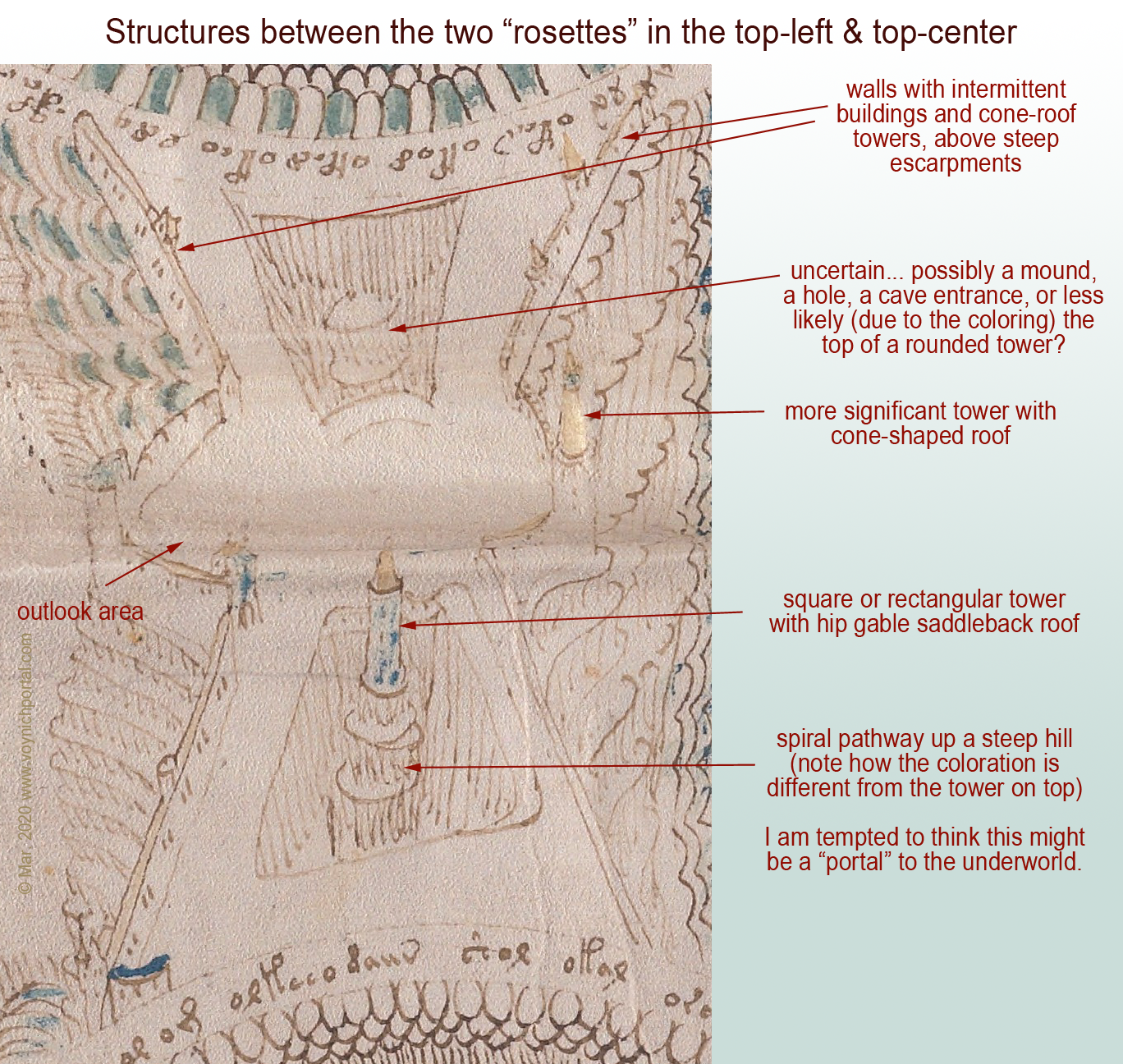
VMS "map" folio tower in a hole and other architectural structures such as towers and buildings
Beinecke 408 Voynich Manuscript folio 86r foldout [Beinecke Rare Books & Manuscripts, Yale University]

The blue tower appears to be sitting on a steep tor with a spiral pathway to the top, and is colored to distinguish it from the structures under and around it. For this reason, I am reluctant to call the bumpy thing in the upper hole a building, as it is the same colors and textures as the “dirt” around the lower tower. My best guess at the moment is that the upper “hole” might be a cave entrance or a cutaway in a cliff as was sometimes created in the middle ages, with arched lookout points along the way.

Walls with Buildings

Walls with attached buildings were quite common in the Middle Ages. The way the path widens out where it appears to be steep is fairly common, as well, providing intermittent stopping places and viewpoints.

Tollhouses were installed at regular intervals on major rivers and paths, so the presence of a house attached to the wall might indicate a checkpoint or tollhouse.

At the bottom of the folio, we see a long wall of Ghibelline merlons, but no towers:
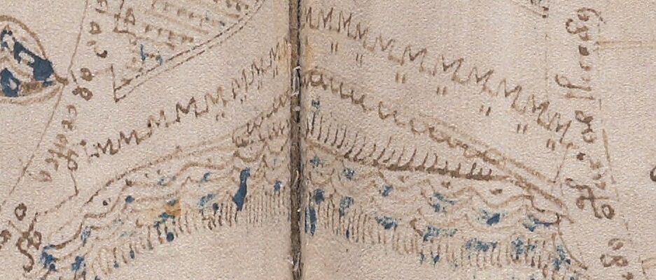
Long line of Ghibelline merlons at the base of the Voynich Manuscript "rosettes" folio.

This drawing of a wall in Constantinople, published 1580, has numerous attached towers, but they are shown with flat, unroofed, crenellated tops:
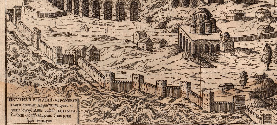
Old paintings of Florence, Italy, have towers similar to those in the illustration of Constantinople, with the exception of one portal tower that includes a low-profile hip-gable roof.

This image of Nuremberg published in 1493 includes numerous cone- and gable-style roofs, several with globe and flag finials:
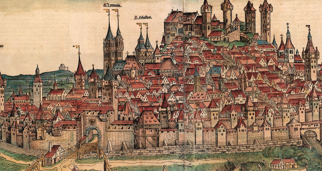
Detail of the city of Nuremberg with a variety of roof styles and flag finials.

Burgdorf was drawn very similar to Nuremburg, with a variety of gable- and cone-style roofs. Note the tall tower with the saddleback roof is plainly visible even though trees obscure the gate. The buildings on the hill have flag finials (perhaps more than actually existed at the time but which were not uncommon in Switzerland and can also be found in Thun, south of Bern):
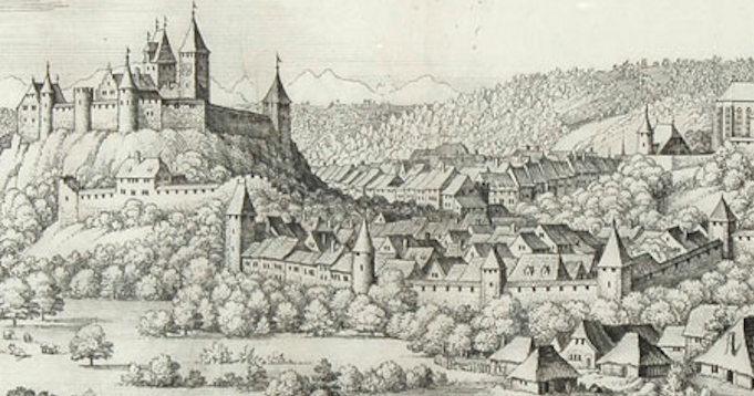
Medieval Burgdorf city walls and portal tower.

The way the portal-style towers and gates are positioned in the VMS, at significant junctions between landmarks and pathways, makes sense in the context of the Middle Ages, a time when there were many walled cities.

Real or Mythical?

But are they real or mythical? Should they be interpreted as actual places?

The “tower in the hole” has always made me wonder if the illustrator were suggesting a link to the underworld. Oceanus was said to swirl around the earth in nine rings (there are nine circular “rosettes”), which hints at the possibility of myth. When Psyche planned to throw herself off a tower after Aphrodite gave her an impossible task, it was the tower that told Psyche how to get to the underworld and back without losing her life. Is the tower-in-a-hole a conduit between this world and the one below?

Summary
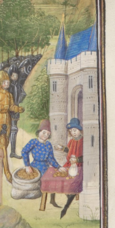
Saddleback portal with two round towers with cone roofs.

As can be seen by some of the examples in this and other blogs, illustrations of far-off places or mythical events were sometimes drawn with local architecture. The illustrators guessed, or simply drew what they knew. This means that the saddleback portals and Ghibelline merlons might not be literal, they could be symbolic, or simply familiar and thus easy to use.

Regardless of why they were chosen, the consistency among them suggests awareness of architectural styles that were common in the region stretching from Bohemia in the east and the Alsace and eastern France in the west, and from Bavaria in the north and Lombardy and the republic of Genoa in the south. If the “rosettes” folio is a map, it might represent this region and it might not, but even if it doesn’t, the illustrator chose elements that betray a specific familiarity with the southern portion of the Holy Roman Empire.

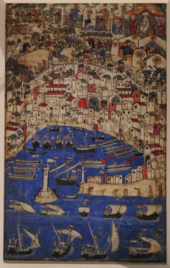
You might notice that the picture to the right has a saddelback portal flanked by two round towers with cone-shaped roofs, similar to the first VMS castle illustrated above. It could easily be a coincidence, but for the record, the image is from a chronicle of the crusades penned in the 1460s (Bibliothèque de Genève Ms. fr. 85).

J.K. Petersen

© Copyright 25 March 2020 J.K. Petersen, All Rights Reserved

Family Affairs

24 March 2020

I’ve mentioned a few times that maybe the Voynich Manuscript was a family project. This seems possible because medieval fathers sometimes created books of wisdom to hand down to their sons. One medieval family codex might be of particular interest to Voynich researchers because of visual similarities to the rosettes folio.

A Book Disembodied

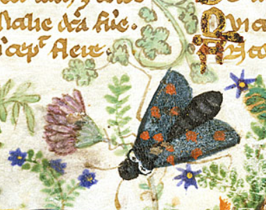
Detail of moth and flowers in the Cocharelli Codex.

The Cocharelli family previously of Provençe and Acre settled in Genoa and created a beautiful 14th-century codex for their children. Parts of it are based on stories told by the compiler’s grandfather. It was produced around the 1320s or 1330s, but has a murky history. At some point it was cut into pieces.

S. Nicolini (University of Bologna) reports that the cuttings appeared inside a 15th-century missal in the 19th century and were sold as part of an anonymous book collection.

Clippings have turned up in several different countries: England, Germany, Italy, and the United States. Some of the content is allegorical, being a treatise on the vices, but there are also historical events, and the folios are enlivened by naturalistic images of flora and fauna that would appeal to any age group. The drawings are surprisingly detailed considering the small size of the codex (approx. 160 x 99mm):

Moths and wasp or fly decorating the base of the folio of the Cocharelli Codex Prologue.
Naturalistic images of moths and insect embellish the base of the Prologue [BL Egerton MS 3127]

I have collected links to the fragments so they can be accessed from one place:

  • BL Additional 27695 – 15 fragments, including prologue, heaven and hell, vices of Envy, Avarice, and Gluttony, Adam and Eve, and notably the sack of Tripoli and death of Philip IV of France
  • BL Additional 28841 – exotic animals, marine life, insects, rodents, along with verse about the history of Sicily
  • BL Egerton 3127 – 4 fragments (2 leaves) of history and natural history
  • BL Egerton 3781 – 2 fragments of a courtly garden scene
  • Museum of Art Cleveland, Ms. n. 1953.152 – leaf of Accidia and her court
  • Museo del Bargello, Ms. inv. 2065 – Siege of Acre
  • Fragment sold as part of Eine Wiener Sammlung, Berlin (12 May 1930)

The illuminators are currently identified as the Master of the Cocharelli Codex (active in Genoa, c. 1330) and the Monk of Hyères (disputed). The sequence of the illustrations is considered by researchers to be different from the original order.

Multicultural Influences

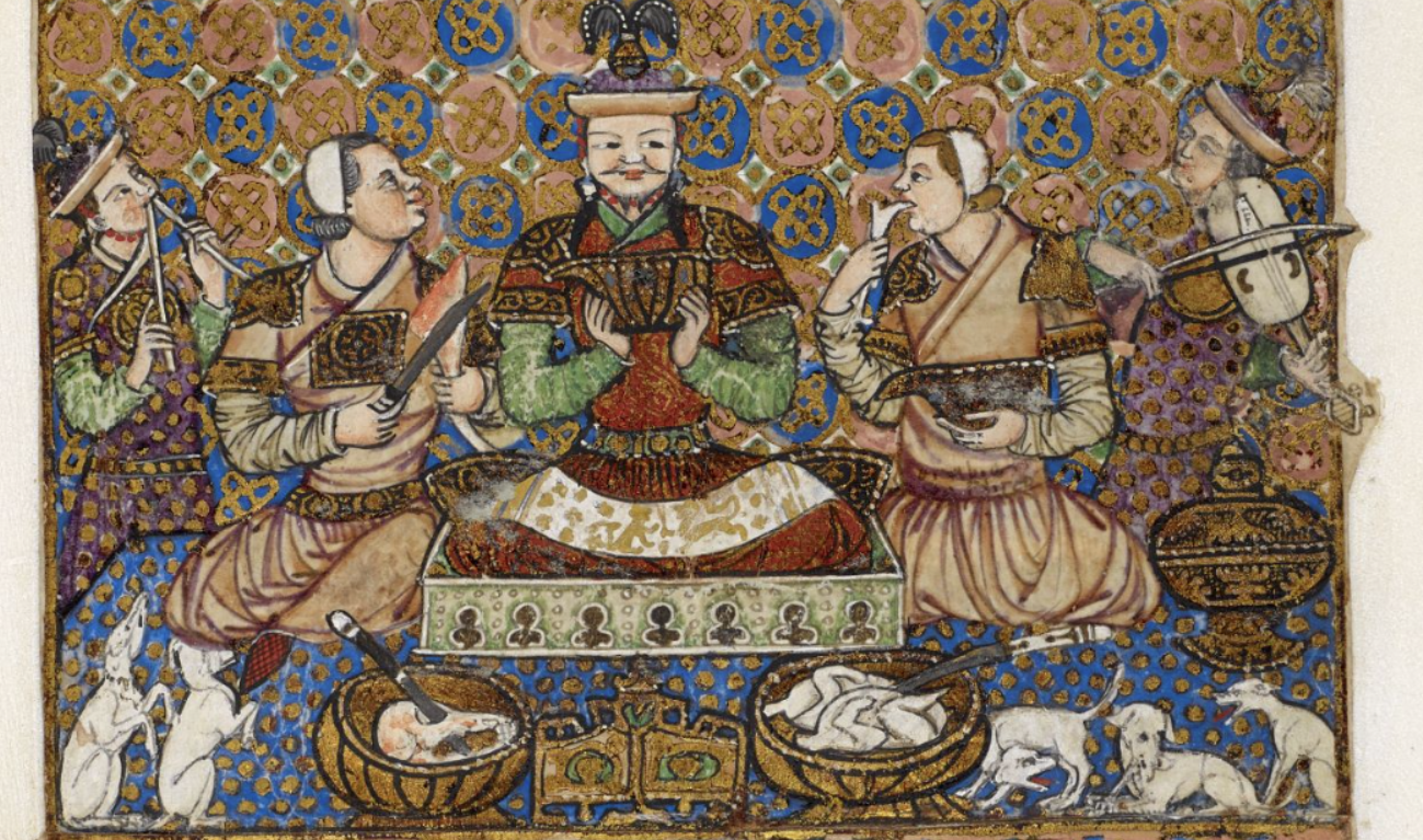
Parts of the manuscript are in a more eastern style and there are several black people in African dress in the main illustrations and in the borders, as well as a person in the center of a feast who looks Asian:

Feast in Cocharelli codex ina more eastern style, Additional MS 27695

It makes you wonder if the grandfather who related these stories was a seafarer who traveled widely. There are documents that support the presence of Pellegrino Cocharelli at some of the locations mentioned in the codex (C. Concina, 2016).

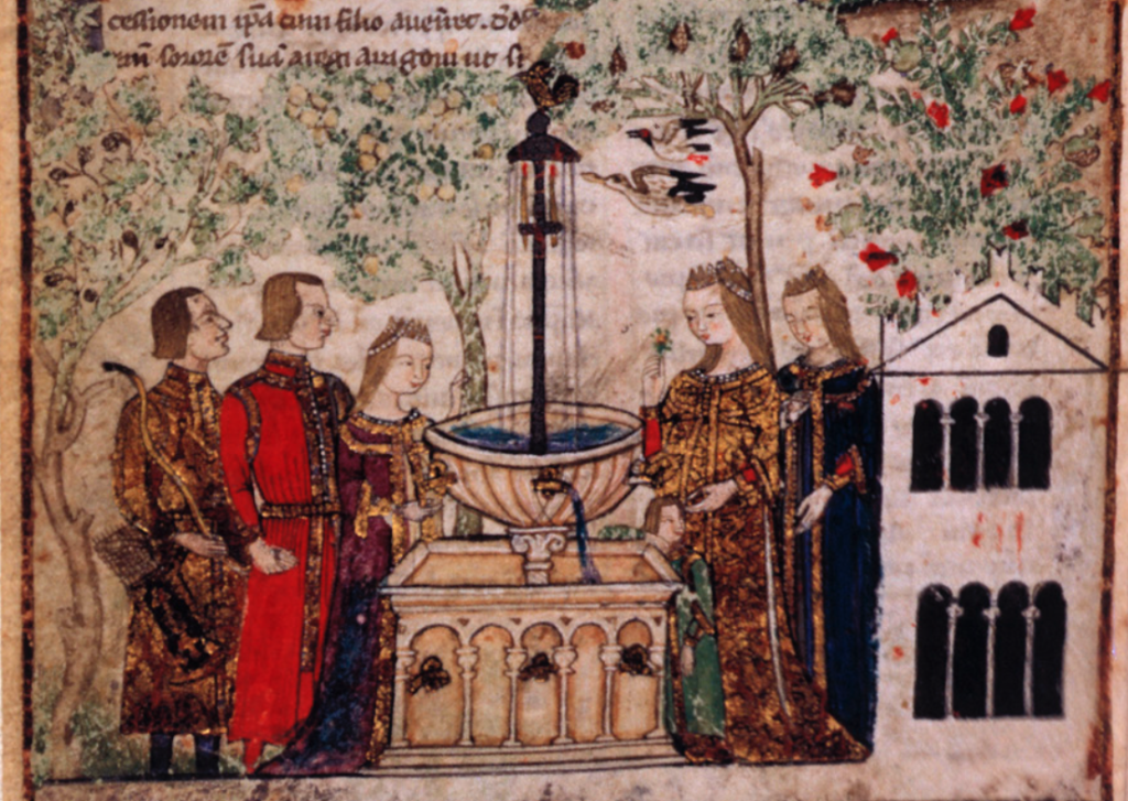
One of the Egerton 3781 fragments includes this image of a garden fountain, and if you look closely, you will notice to the right, there is a building with arches and Ghibelline merlons. Genoa was well within the purview of the Holy Roman Empire in the early 14th century (the HRE included Rome and much of Burgundy/Provençe at the time):

Cocharelli Family Codex courtly scene around a garden fountain.

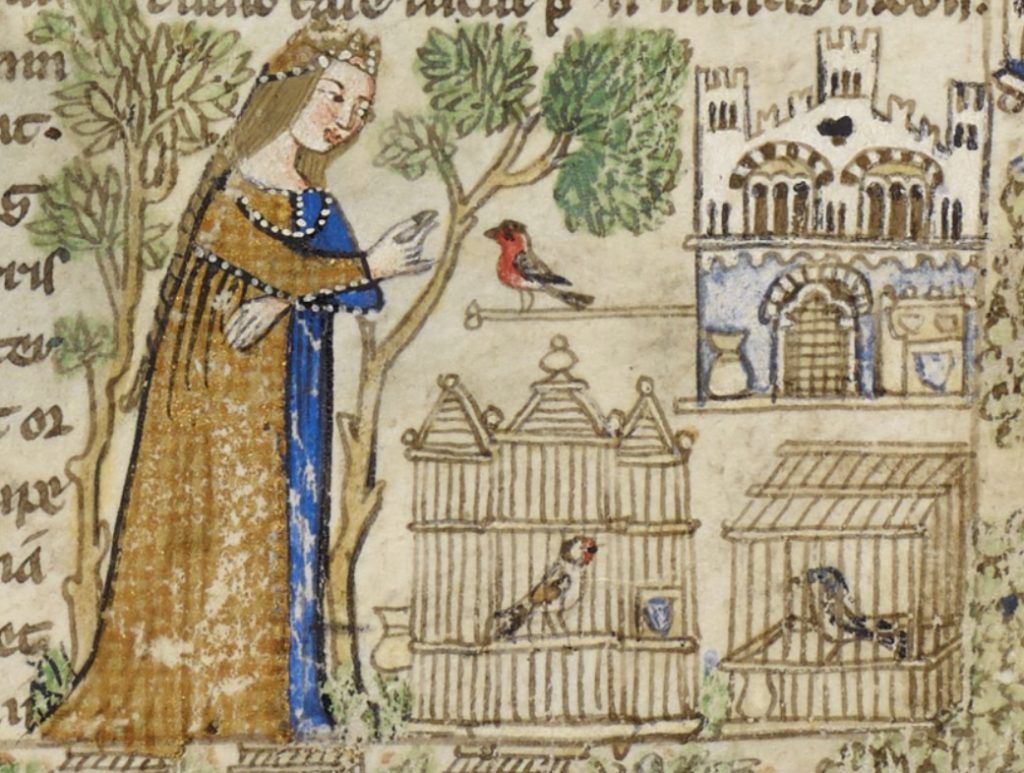
In this illustration on the page with text about the vice of Luxuria (lust), we see a maiden feeding a bird next to an architectural birdhouse that has Ghibelline merlons between the three towers:

Ghibelline merlons were one way in which Italians, especially those in an east/west belt where Italy spread out into the wider geographical region of Lombardy and Bohemia, signaled their allegiance to the HRE (in opposition to the pope). This political implication continued until about the mid-15th century after which the merlons gradually became more decorative than political (and thereafter spread to other areas).

In the following battle scene from BL Additional 27695, there are square battlements on all the walls and towers except for the central tower, which has swallowtail Ghibelline merlons at the top. Since this represents the sack of Tripoli (Lebanon), it seems probable that the Ghibelline merlons are symbolic rather than literal, but installations of the Knights Templar sometimes had Ghibelline merlons, so perhaps they existed to a limited extent outside of northern Italy before the late 15th century.

In the waters of this elaborate illumination, there are four galleys from Genoa, in addition to others from Pisa and the Veneto:

In the 13th and 14th centuries, there were considerable tensions between the papacy and various kings and emperors in the late Middle Ages. Philip IV of France (1268–1314) aggressively challenged the power of the pope and the increasingly powerful Knights Templar. He gave important positions to his family members and even attempted to install a relative as Holy Roman Emperor to enlarge the kingdom of France.

The Cocharelli family recorded the arrest and torture of the Templars by Philip IV for a variety of charges, such as heresy, black magic, and financial corruption. In 1310 and 1314, King Philip had many of them burned at the stake. But his dreams of a large consolidated empire withered a few months later when he suffered a stroke while hunting in northern France. He died soon after.

Swallowtail Merlons in the Voynich Manuscript

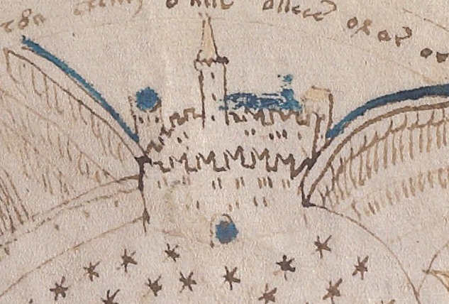
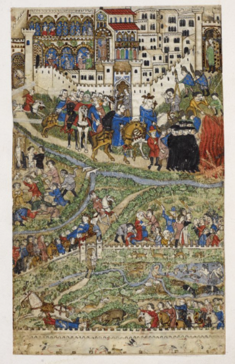
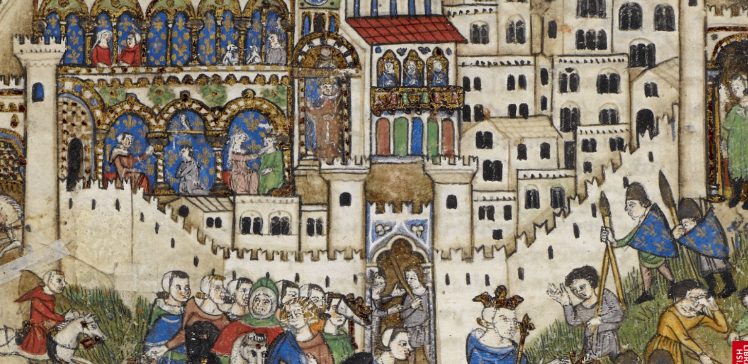
In the Cocharelli illustration below, the roundup of the Templars is shown in the top half of the folio. The walled city has Ghibelline merlons on the front of the complex, but not the back. This is similar to the small drawing of a walled city or castle in the upper right section of the VMS rosettes folio.

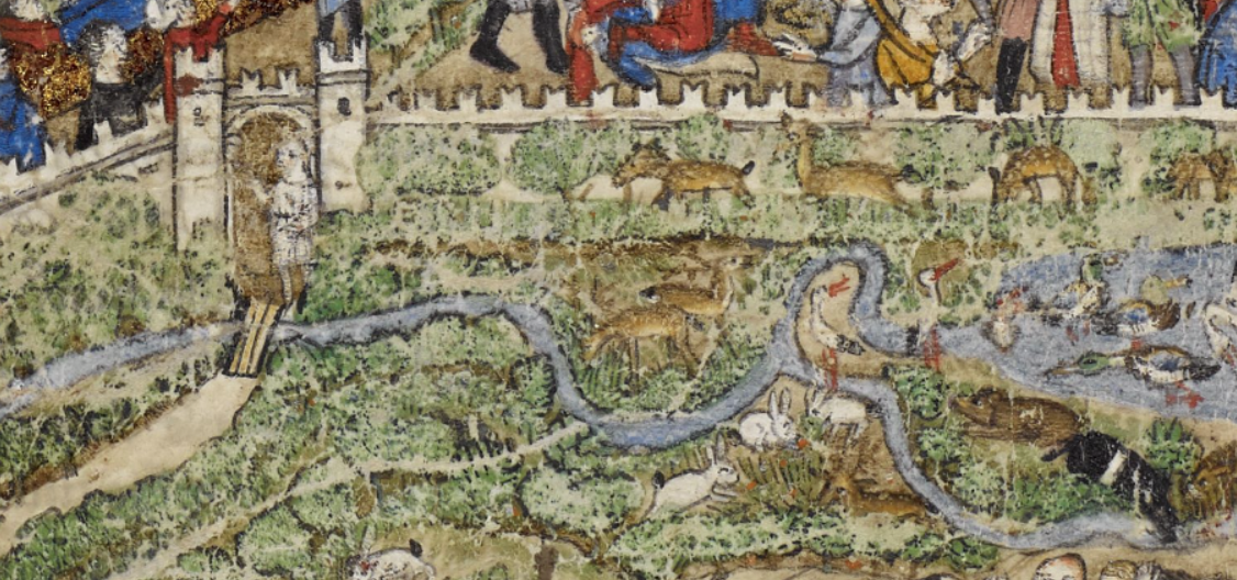
The walled garden at the bottom of the Cocharelli folio, depicting game animals and the death of Philip IV, is completely surrounded by a long wall with Ghibelline merlons. In the VMS, there is also a long wall on one of the sections connecting two rosettes, but I wouldn’t describe this as a garden wall, it looks more like a long city or castle wall:

Since the events surrounding King Pillip in the Cocharelli codex took place in France, it is not likely that the merlons in these illustrations are literal, but since Philip IV was ardently against the power of the papacy and open to allegiances with the HRE, and the illustrators were Italian, it may have been their way of diagraming his political leanings:

Execution of the Templars and Death of Philip IV of France
Storybook style illustration recording the rounding up and persecution of the Knights Templar by Philip IV of France at the top, and the subsequent death of King Philip from a stroke while he was hunting in northern France. [Source: BL Additional MS 27695 folio 6v]
Detail of the walled city and roundup of the Knights Templar. Note the Ghibelline merlons are mostly at the front.
Closeup of the walled garden stocked with game, representing the death of Philip IV from a stroke that occurred during a hunt in northern France in 1314 not long after he had dispensed with the Templars.

The VMS is also known for its elaborate containers in the small-plants section and the container-like “towers” on the rosettes folio. There are also some interesting containers on Cocharelli folio f7v in a fragment that has been completely cut away from the text:

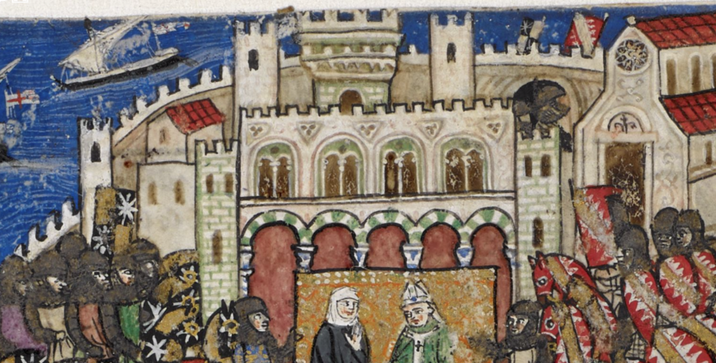
In contrast, the illustration of the Siege of Acre (Museo del Bargello), in which the Crusaders lost Acre, a city on the Levantine coast, Ghibelline merlons are not included except on a single portal in the lower center part of the city:

(Note, there is some dispute about this being Acre. Some scholars say Genoa, but the textual evidence seems to lean toward Acre.)

In a discussion of the possible ordering of the original Cocharelli codex folios, Concina mentions some of the political turmoil associated with the Guelfs and the Ghibellines:

In the summer of 1308 Opizzino Spinola of Lucoli proclaimed himself the only captain of Genoa by deposing and imprisoning Bernabò Doria, who was his co-ruler in the traditional diarchy established for the government of the city. Following this coup d’état, many leaders of the Ghibelline families of the Doria (including Corrado and his son Pietro) and Spinola of San Luca, as well as of the Guelf families of the Grimaldi and Fieschi, were forced to flee the city. In June 1309 those families exiled set aside their old differences and joined forces to defeat Opizzino and his army at Sestri Ponente, forcing him to take shelter in the castle of Gavi. On the same day, the Guelf and Ghibelline exiles entered Genoa, apparently without great losses….

In addition, if we consider historical references, we can glimpse a family [the Cocharellis] gravitating towards the Ghibelline party, the Doria and the Aragoneses.

—Chiara Concina (University of Verona)

Summary

As mentioned previously, the Ghibelline merlons in these drawings may be symbolic rather than literal. It’s hard to find evidence of this style of merlon outside of northern Italy/Lombardy/Bohemia before the latter 15th century and the Cocharelli drawings are from the 14th century when their geographical distribution was quite limited. But, considering that Philip IV of France was one of the more ardent opponents of the pope and friendlier than some French monarchs to the Holy Roman Empire (he was hoping to expand into that region as well, via family alliances), the Ghibelline merlon reflects his political leanings via a symbol that was familiar to Italian artists.

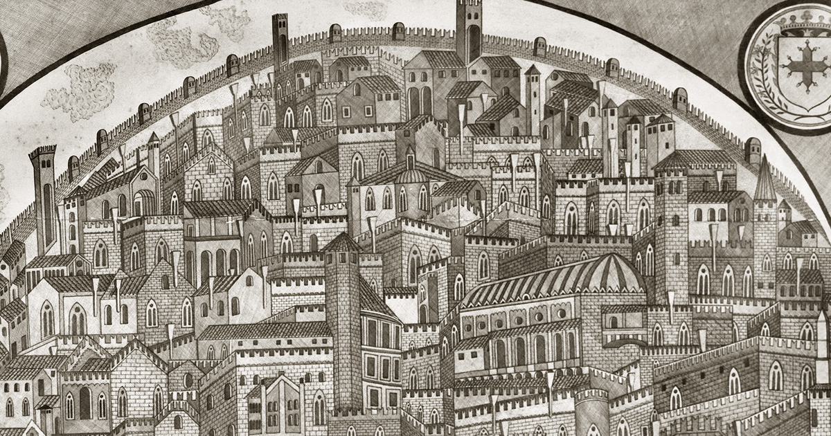
Here is a drawing of Padua, with a long wall and numerous towers topped by Ghibelline merlons, by Felice Celeste Zanchi c. 1300:

Padua with Ghibelline merlons, c. 1300 by Felice Zanchi.

But are they real or symbolic? A 15th century drawing of Padua shows square merlons, so perhaps Zanchi added some from his imagination.

At times there is only a glimpse of the merlons, as in this illustration in BNF Latin 9333 (c. 1410s):

Sometimes the merlons are more clearly indicated, as in this earlier example of Tacuinum Sanitatis (Casanatense, 14th century):

So what about the merlons in the VMS rosettes folio. Are they literal or symbolic?

It is interesting that the walled city or castle at the top of the VMS folio was drawn with more Ghibelline merlons on the front than there on the back (similar to the Cocharelli depiction).

Is this how compounds were usually built? Or do the drawings in the two different codices have a common inspiration? Is the VMS merlon sending a political message? Is it a reference to a specific event? Or is it an actual place, a landmark to help a traveler find his way?

J.K. Petersen

© Copyright March 2020 J.K. Petersen, All Rights Reserved
Palaeography – Double-c Revisited

1 March 2020

In April 2019, I posted a blog about double-cee shapes in the VMS text. This convention of combining two cees to create a different letter has a very long history but is not the custom in modern scripts. In medieval scripts, the tightly-coupled double-cee has a different meaning from two cee shapes slightly separated. Most of the time, the tightly-coupled cee represents a vowel. To identify which vowel, you have to look at position, as well. But first let’s look at the origins of some of these shapes…

Ancient Origins

To understand double-c and the Nota symbol, you need some familiarity with Greek and how it influenced Latin scribal conventions.

The Greek alphabet is found in handwritten Latin manuscripts up to about the 16th century, and was sometimes used in annotations in early medieval texts.

Here are a couple of examples from Latin manuscripts:

The Greek alphabet in a Latin manuscript from Southern Italy. [Source, Genève Cod. lat. 357]
Example of the Greek alphabet in a c. 1190s Latin text from southwest Germany. Note the shapes for nu (sometimes called “noy”) and omega as these were also used by Latin scribes. [Source: HHB Cod. Sal IX,39. A similar notation is in Einsiedeln Codex 29(878)]

Some of the Greek shapes and scribal conventions were adapted by Latin scribes. For example, certain ligatures and letter-shapes such as the N in Nota were common. The lowercase form of sigma (sometimes called symma or summa) and variants similar to sigma evolved into a broadly used form of final-ess that has some relevance to the VMS.

Final-Ess

Medieval scribes used initial, medial, and final forms for certain letters. Some used the same initial and medial forms, but reserved other shapes for the final form. These distinctions still exist in Middle Eastern scripts, but have disappeared from most western alphabets:

Here long-ess is used for initial and medial forms, whereas the shape loosely resembling Greek sigma is reserved for ess in the final position.

Not all scribes used the same shape for final-ess. There are several basic groups (long-ess/straight-ess, B-shape, 8-shape, sigma, and modern-ess). I will post examples of each in a future blog because the 8-shape relates to f116v.

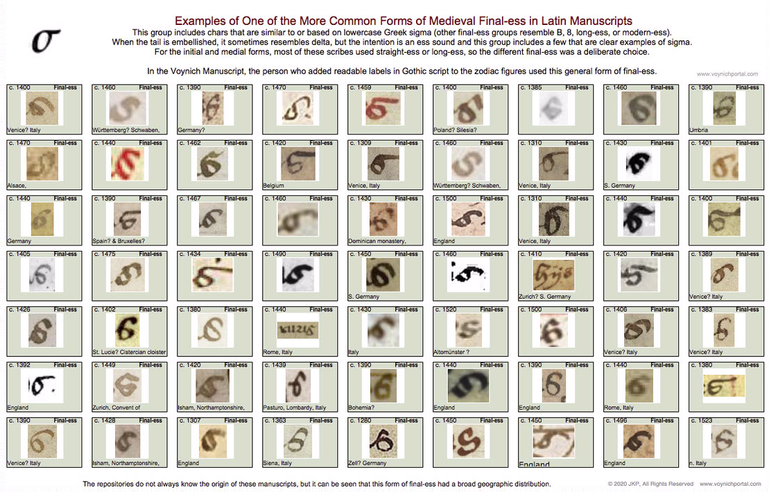
The following set represents one of the common groups of final-ess relevant to Voynich studies because the month labels added to the VMS “zodiac figures” use this general form:

Table of medieval final-ess characters that are similar to or include a shape based on Greek sigma.

Here are examples of the sigma shape from a Greek manuscript, a Latin manuscript, and the “Mars” (March) label under the fish in the VMS:

The general style of final-ess that resembles Greek sigma, which shown in the chart above, can be seen in the labels added to the VMS “zodiac figures” drawings.

Latin Vowels (and the occasional consonant) Written with Double-Cee

Another letter with Greek shape-mates (although not always the same meaning) is the double-cee. This is a loose term describing a group of symbols in Latin manuscripts. Why is it a loose term? Because some scribes wrote a tightly coupled “oc” rather than “cc”, but most of the time you’ll see “cc”.

In the early medieval period, there was very little distinction between a “t” and a “c” and they can be hard to tell apart. But, it depends on which script you are reading. Sometimes the “t” is distinguished from “c” by being doubled, so it looks like “cc”. The letter “a” was sometimes written this way as well, which can be even more confusing to those who haven’t learned medieval languages because you can only figure it out by reading the whole sentence.

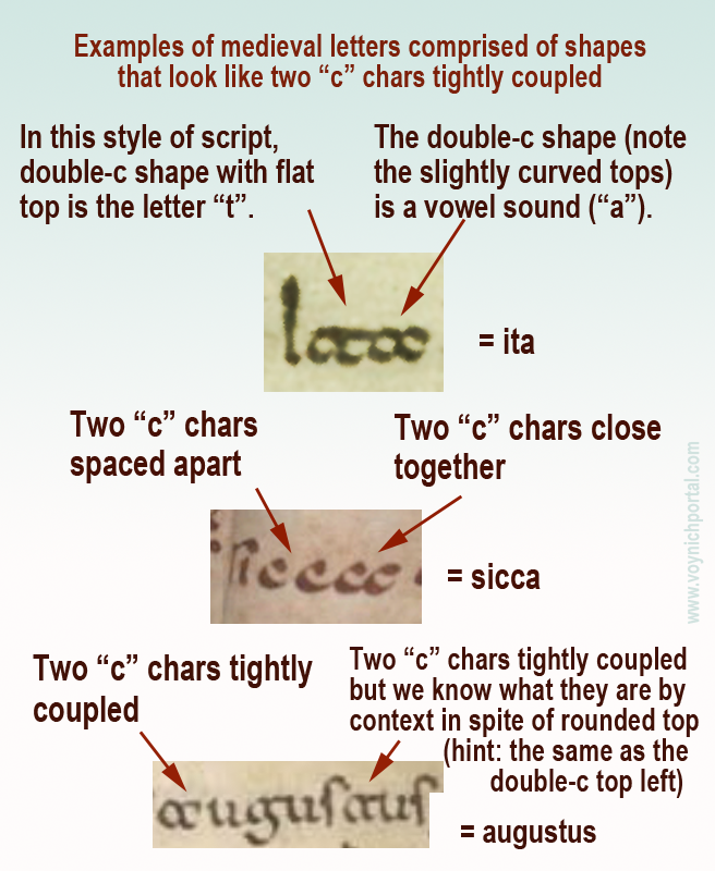
Here are some examples that explain how to distinguish double-t, double-c and two cees in a row, but note that some are ambiguous unless you can see the words before and after:

Examples of various medieval letters that resemble two "c" characters.

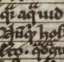
Note especially the second example (sicca) which includes both c + c and a tightly-coupled double-cee representing the letter “a”.

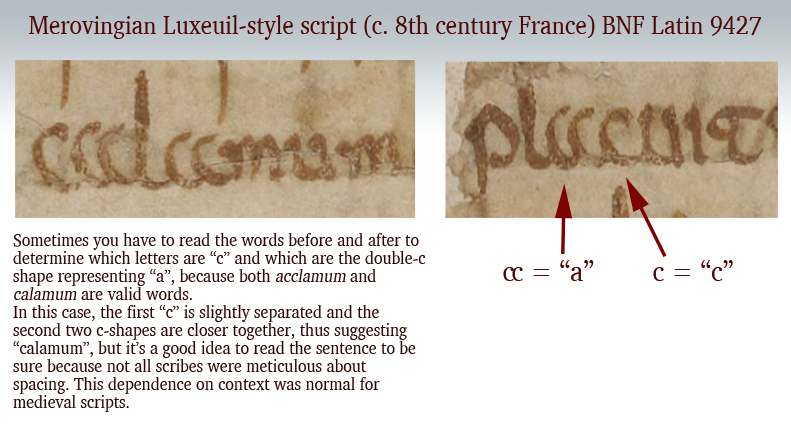
Palaeographic example of the double-c form of "a" in an early medieval manuscript from France.
Additional picture added 8 March 2020 to illustrate that the double-c form of “a” was not limited to southern Italy or Dalmatia. This Merovingian example is from eastern France, probably from the Abbey of Luxeuil.

These loosely and tightly coupled cee shapes are also present in the Voynich Manuscript, but transcripts generally ignore the distinction (see my previous blog) and it is not yet known if it is a meaningful distinction. Now let’s look at another letter with similar characteristics…

Double-cee as “oo” “wa” or “u”

The medieval concept of “u” was not the same as we know it. In English, we make a distinction between “u” and “v” sounds and shapes. In medieval Latin, the “u” and “v” shapes were interchangeable in most languages using Latin characters and the sound was closer to a breathy w’ than an English “u” (and was not like our “v”). It was sometimes written as a superscripted double-cee shape next to the letter “q”.

Remember that Latin characters were used to write many languages, so it’s unwise to generalize too much, and difficult to describe a sound in any given language from 600 years ago. It’s better to think of the double-cee shape as a vowel (except when it was “t”) rather than as a specific letter.

Double-cee can represent “a” but it can also represent “u” (in the same manuscript), as well as indicating an ordinal, which means it is sometimes closer to a symbol than a specific letter. Once you understand the context, you can work out which letter it represents. In medieval script, context was king and many symbols had dual or triple meanings.

Greek Nu or “Noy”

Another Latin letter that is similar to Greek is the letter N.

We know it with an angular crossbar, as in the example to the right, but it was sometimes written with a straight crossbar (see below). In modern English, this form looks more like H than N. Sometimes the crossbar was at the top of the ascenders (somewhat like VMS EVA-k). Other times the crossbar was in the middle (similar to English H).

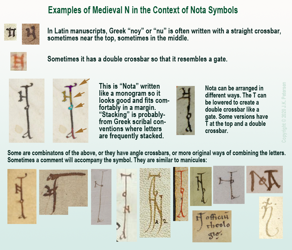
The crossbar could be single, or double, like a gate. Here are examples using a popular medieval symbol for pointing out interesting passages, the NOTA symbol. It was frequently stacked or intertwined like a monogram. Usually all four letters are present, although occasionally it is abbreviated NT:

Examples of medieval letter N in the context of monogram-like NOTA symbols.

Clearly there was some creative freedom to arrange the letters and yet the meaning is quite clear. The N will sometimes be combined with a B to create Nota Bene (note well).

Nota with Double-C

There is another form of Nota that uses more traditional forms.

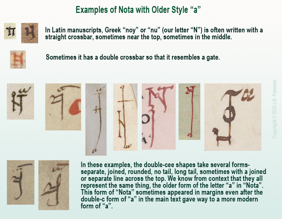
Remember the “a” written as double-c mentioned above? Sometimes NOTA was written with the earlier form of “a” rather than the late-medieval “a”, as in these examples:

Examples of Nota with older style of "a" written like a double-cee.

A Less Obvious Example

That should be enough background to help the reader interpret the more stylized symbol found in a 13th/14th-century scientific compilation.

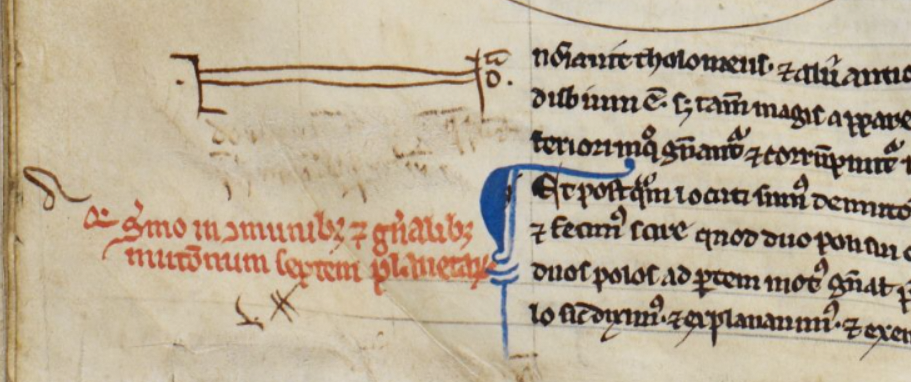
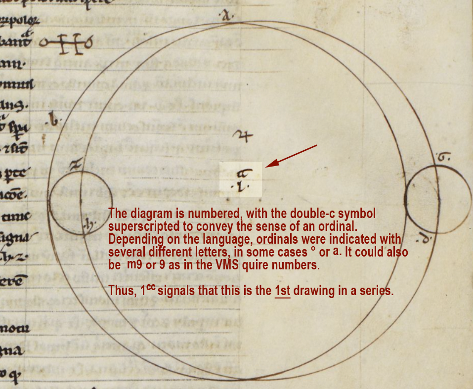
BL Harley MS 1 includes treatises on astronomy/astrology and mathematics, and the first section is attributed to Abu Ishaq al-Bitruji al-Ishbili. In it there is a series of geometric drawings, and below the third second drawing we find a symbol in the left margin…

It is essentially the same as the old-style double-c “a” Nota symbols in the above examples, except the gate-style N has been stretched more than usual to encompass the comment directly below (which has since been erased). On the right side of the “gate” there is a tick for the T, an “o” and, above it, the double-cee symbol representing “a”.

Example of Nota symbol with old-style "a" stretched horizontally in the margin of BL Harley MS 1.

More Uses for Double-Cee

In Harley MS 1, the symbol that resembles double-c is used in other ways, as well. It can be found in each of the geometric diagrams.

Here the double-cee symbol superscripted next to the number 1 introduces this as a series of drawings. You can think of it as an ordinal symbol and this diagram as the 1st:

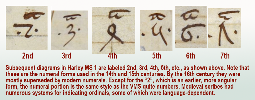
As would be expected, the diagrams that follow are numbered in sequence as follows:

Examples of subsequent ordinal numbers used to label a series of geometric diagrams in a 13th/14th century manuscript.

In a series of ordinals, sometimes the same symbol is used for all of them. Other times, the ordinals are individualized for each number, as in English (1st, 2nd, 3rd, etc.).

Here is an example showing the individualized ordinals of the VMS quire numbers compared to a set that uses only “m”:

Examples of Voynich Manuscript quire numbers with individualized ordinal symbols compared to a system with only one ordinal symbol.

Other common ordinal symbols are ° and superscripted-a.

This aspect of the VMS is, in a sense, a gift. If this ordinal system can be identified in other manuscripts, it might provide some clues to the early life of the VMS. Unfortunately, quire numbers are very difficult to find. I’ve been searching since 2008 and only have a handful of examples. They are usually trimmed off or bound inside the signatures where they can’t be seen. When I have time, I’ll post the ones I have so far.

Summary

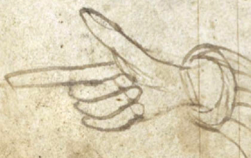
The double-cee shape was disappearing by the 14th century and by the 15th century, the Nota symbol was often replaced by a manicule. By the 16th century, final-ess was beginning to disappear, as well, which means Greek influences were gradually replaced by early modern forms.

Even so, it helps to know these earlier conventions because there are aspects of the VMS that hint at some of these characteristics. Plus there are glyphs in the main text that may have been influenced by early-medieval conventions.

Also… there is a possibility that the separate cee shapes and tightly-coupled cee shapes in the VMS are not the same, which might partly explain why there are sometimes four in a row. If cee-gap-cee and double-cee are different, it might add some variety to the oddly monotonic script.

J.K. Petersen

© Copyright March 2020, J.K. Petersen, All Rights Reserved