Category Archives: Paleography

An Enciphered Herbal

22 September 2020

A few years ago I noticed something was going on with the plant names in Codex LJS 419, but I was busy with other research, so I bookmarked it for future reference. In March 2020, with most of the world in quarantine, I finally had a few minutes to leaf through the scans and realized, when I saw the peony plant, that the labels had been lightly enciphered.

A Plant Book that Spanned a Century

According to the U. Penn Schoenberg Collection Subject Details, the LJS 419 Erbario was begun in the first half of the 15th century with a number of later additions. The drawings are quite good for 15th century. Some are stylized, but most are recognizable.

UPenn Schoenberg Collection LJS 419 is a bit of a pastiche. The drawings are in at least three different styles, and the ones on the recto (the original drawings) are frequently smaller than the ones they face.

There are labels by most of the drawings, and text under some of the images in handwriting that was common to the 16th century. Thus, the text may have been added as much as a century after the drawings.

I noticed that some of the labels are incorrect. The plant below is clearly not Calendula, a plant that has had the same name for centuries. It is recognizable as Senecio, probably Senecio vulgaris:
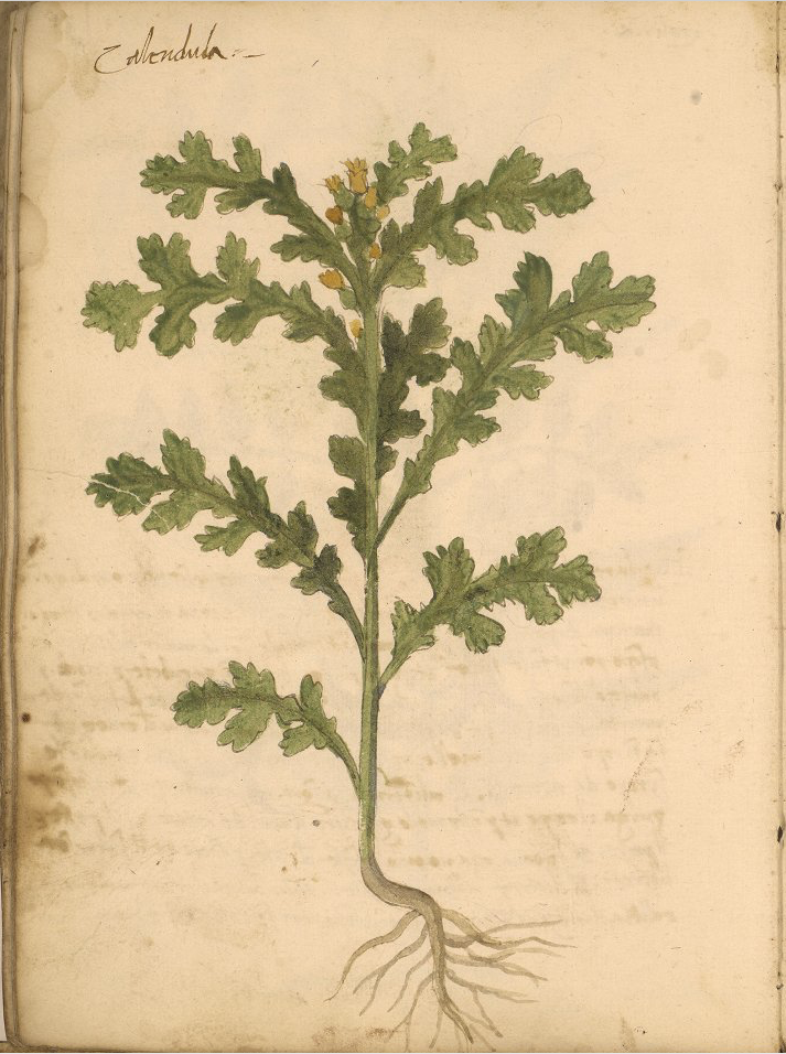
LJS 419 drawing incorrectly labeled as Calendula.

The labels for Pulmonaria (65v) and Salvia (65r) don’t match the plant drawings either, but if you swap the labels, then they match (a detail that the Shoenberg commentator didn’t note in the annotations for each plant).

Most of the labels appear to be correct, however, and they are interesting because some of them are in cipher…

The Garbled Plant Labels

Some of the plant names are readable. Others are oddly spelled and overwritten, like this one:
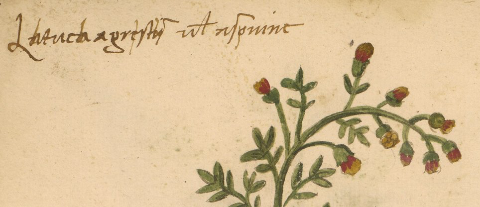
LJS 419 Latucha changed plant label

The word “Latuca” is somewhat mangled. Adding a stem to each “a” makes it Lbtucb. The next word, “agrestis” has a stem through the “e” to make it “f”, and the “i” is “l”.

I wasn’t sure what was happening until I saw an odd label next to a plant that was easy to identify. That’s when I realized this was a simple cipher with some of the vowels changed.

Here is the label. It reads pepnla:
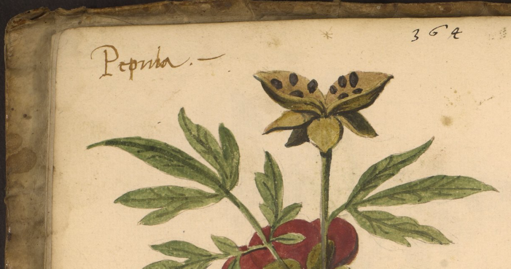
I could see this was a Peony plant not a “Pepnla” plant which, in turn, made it clear that this was a partial substitution cipher. It is sometimes called the monk’s cipher and I can see why. I have often seen it in manuscripts with ecclesiastical content, like sermons.

Notice how the “o” is “p” (I saw the same substitution in some of the earlier plant labels), and the “i” is changed to “l” (ell). That was the clue. It’s a common and simple vowel-substitution cipher that is quite easy to read once you get used to the fact that consonants are used for vowels:

  • The “o” is changed to “p” because it is a vowel and “p” is the closest consonant following “o”.
  • The “i” has been changed to “l” because it is the closest consonant following “i”. They didn’t have “j” in the Middle Ages (what looks like “j” was usually an embellished “i”) and many languages did not have “k”, so “l” (ell) would be the closest consonant following “i”.

I’m not sure why they left the first “e” and last “a” as vowels rather than substituting all the vowels. Either it was an oversight, or perhaps they thought Pepnla was enough to obscure the name.

Here’s another example that reveals the order in which things were done for this label but apparently not for all the labels:

Underneath, it looks like Spftlnb, which is a little more difficult to read without decoding it first because it is both abbreviated and enciphered. Someone wrote over it with darker ink, to create S~pe’tina, which is an abbreviation for Serpentina. It uses the same system as the others, of selecting the next-closest consonant to replace the vowel.

Note how the “u” letters in the next two words were written as “x”, which is to be expected for a consonant following “u”. Many languages did not have the letter “w”, and “u” and “v” were roughly equivalent, so “x” is a natural substitute.

Sometimes plaintext is written over the ciphertext. Sometimes it’s the other way around. Perhaps there were three hands involved, one turning it into ciphertext, someone else converting it back.

Now that it was clear that a consistent system was used, it became straightforward to decipher the last word cpstb which was not overwritten. This can be deciphered as “costa”. Costa is a medicinal plant that was common in medieval herbals.

A plant drawing that clearly depicts Asphodel also has an altered label. It looks like this:

Here the ciphered text is Afpdklk, and we can see that the “o” was written as “p” (consistent with the previous examples). The two “i” characters in Afodili (one of the common spellings at the time) were written as “k”.

So the writer apparently did know the letter “k” (“k” was not used in every language but sometimes it was used in loanwords). The phrase following the name “herba di Sbtxrnp” is only partly enciphered. It decrypts to herba di Saturna.

The next label reads Bftpnlchb, which decrypts to Betonicha, another very common plant in medieval herbals:

The next one might have been harder to read without the picture, since it is both abbreviated and enciphered, but it includes a good drawing of the plant:

The word was overwritten as Tprmftlla, which decodes to Torme’tila, with the macron standing for the missing “n” in Tormentila.

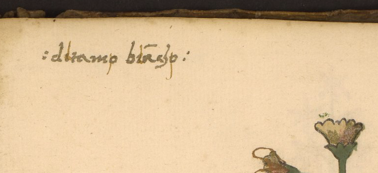
The next one reads dltamp bla’chp, so the “a” was left in its normal state. The plaintext is ditamo biancho. Note the humanist-style “h”, which has a short stem that doesn’t quite reach the baseline. This, in addition to the overall style, is one of the palaeographic clues that the labels were probably added in the later 15th century or, more likely, the 16th century:
Male and Female Plants

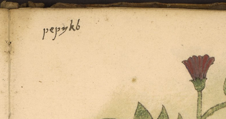
The following label puzzled me for a moment. Since pepnkb isn’t a plant name, it has to be the enciphered word peonia. But it doesn’t look as much like a peony as the other drawing already mentioned. It is more upright, and drawn without the seeds. Then I remembered that some medieval manuscripts included both “male” and “female” (mascula, femina) versions of peony, just as they did for Mandrake and a few other plants. Since there is a very recognizable peony drawing on the verso, I’m guessing that it represents the female and the recto represents the male plant:
The next label reads Mprssus dkbbpli, which translates to Morssus diaboli (devil’s bite), a common name for several species of Scabious.

But the drawing is not a Scabious plant. Scabious has pufflike flowers, not bell-shaped flowers. The flower in the drawing is like Campanula, but the hairy stalk and parsley-like leaves are not, so it is probably Pulsatilla, the Pasque flower, rather than Scabious. Most Pulsatilla flowers do not dangle as much as this, they tend to spread their petals, like anemones, but they do sometimes hang, depending on the species. Taken together with the flower shape, leaves, and fibrous base, it’s probably Pulsatilla:

The next label is lxnbrkb, which is described as follows in the Schoenberg annotations for this manuscript:

66: ‘Lenbrkb’ – a puzzle, though the same word is used for a different plant on 71r

It’s really not that puzzling. This decrypts quite easily as “lunaria” by using vowel-for-consonant substitution:
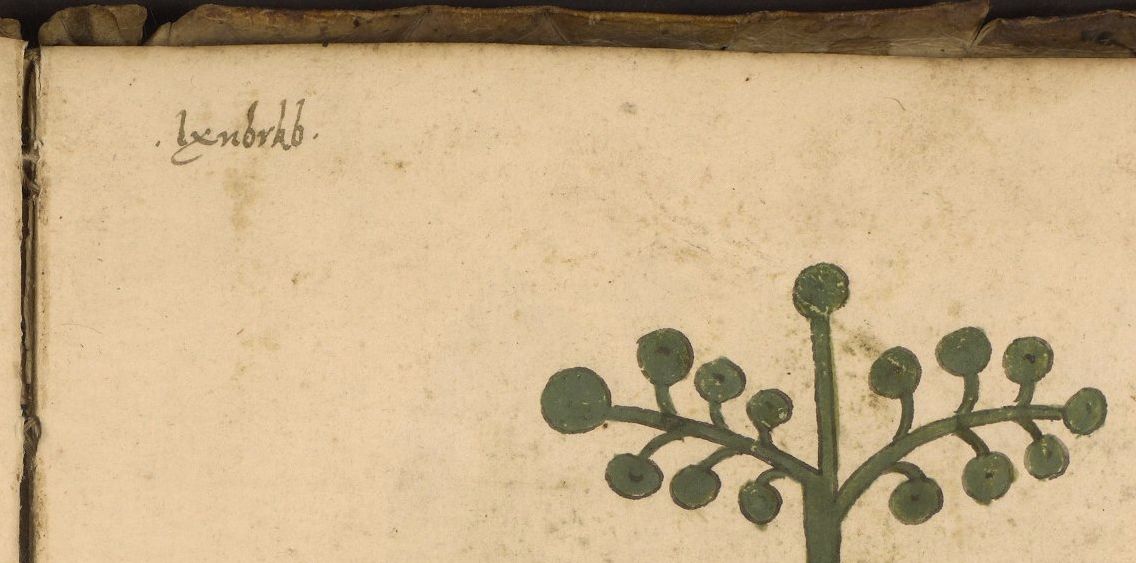
Lunaria, enciphered plant label in LJS 419.

Compared to ciphers of today, or even of 200 years ago, this is easy to read. You don’t even have to make a chart, you just have to learn the letter that follows each vowel and you can read it as though it were normal text.

Other Interesting Details

A few of the drawings are unpainted and include color annotations, a detail that may also exist in the Voynich Mansucript:
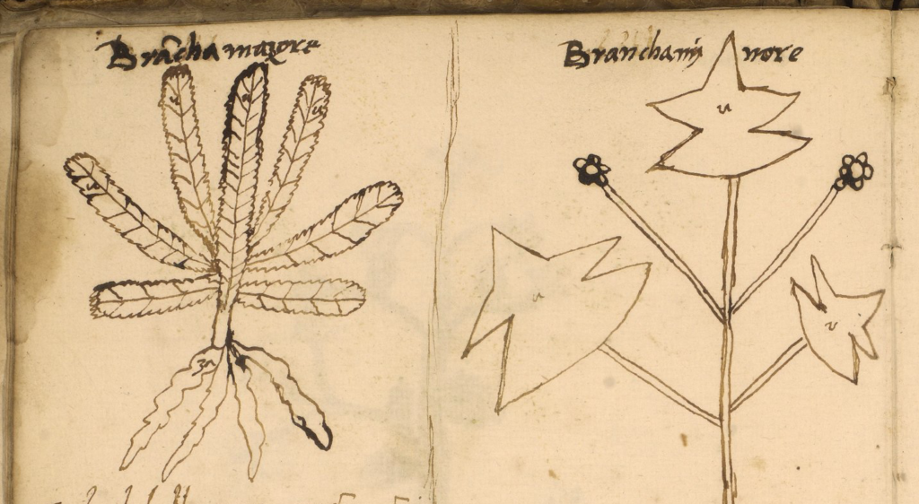
LJS 419 unpainted plant drawings with color annotations

Why someone chose such light encipherment for plant names (and only enciphered a few of them) is difficult to understand. Maybe they did it for fun. Maybe they were planning something similar for the rest of the text but never completed the task. What it tells us, however, is that even in the 16th century, these very simple ciphers were still in use, and if you combine them with abbreviations, they can sometimes be a bit more challenging to figure out if there are no drawings to make the meaning clear.

Summary

I had planned to post this blog in April, but simply forgot about it. Then today, I saw the paper of Alisa Gladyseva on Researchgate.net where she describes the peony name in this manuscript as an example of a “corrupted” plant name.

I was quite stunned that someone who writes a paper on the history of cryptography and who claims to have decoded the VMS did not recognize the monk’s cipher (which is simple and only involves partial substitution of vowels) and so I decided to post this blog so the VMS community can compare her interpretation with what is really happening in LJS 419. Here is what Gladyseva wrote in her paper:

Obviously, some names of 13 plants [in MS Aldini 211] seem to be corruptions of known names e.g. ‘Antolla’ for ‘Anthyllis’, ‘Ariola’ for ‘Oriola’. 23 plant names are strongly corrupted for e.g. ‘Metries’ for ‘Myrtus’, ‘Rigogola’ for ‘Galega’….

Manuscript Number is ‘ljs419’ Italy, of XV century is a typical of the medieval Apuleius herbal. But it has corrupted botanical names of plant on 71r folia. As well as the name of plant ‘Pepeko’ 24r, that is probably is one of the species of peony in real. | P E O N I O |. In reason, on the next folia there is another kind of peony: 24v: ‘Peonia’. –Gladyseva, Jan 2020

So, Gladyseva includes a paragraph on corrupted plant names and then cites LJS 419 as an example of corrupted plant names, but it is not! It is an example of a common and very simple medieval substitution cipher, as can be seen by the decryption examples I posted above.

Gladyseva has been claiming for some time that she has deciphered the VMS, but never shows any concrete examples of her method. How could a researcher who claims to have deciphered the Voynich Manuscript in a paper that describes the history of cryptography have missed something so simple and obvious as the monk’s cipher?

I think it’s time for her to reveal her method so the rest of the research community can see if there is sufficient evidence to support her claims.

J.K. Petersen

© Copyright September 2020, J.K. Petersen, All Rights Reserved

Palaeography – Double-c Revisited

1 March 2020

In April 2019, I posted a blog about double-cee shapes in the VMS text. This convention of combining two cees to create a different letter has a very long history but is not the custom in modern scripts. In medieval scripts, the tightly-coupled double-cee has a different meaning from two cee shapes slightly separated. Most of the time, the tightly-coupled cee represents a vowel. To identify which vowel, you have to look at position, as well. But first let’s look at the origins of some of these shapes…

Ancient Origins

To understand double-c and the Nota symbol, you need some familiarity with Greek and how it influenced Latin scribal conventions.

The Greek alphabet is found in handwritten Latin manuscripts up to about the 16th century, and was sometimes used in annotations in early medieval texts.

Here are a couple of examples from Latin manuscripts:

The Greek alphabet in a Latin manuscript from Southern Italy. [Source, Genève Cod. lat. 357]
Example of the Greek alphabet in a c. 1190s Latin text from southwest Germany. Note the shapes for nu (sometimes called “noy”) and omega as these were also used by Latin scribes. [Source: HHB Cod. Sal IX,39. A similar notation is in Einsiedeln Codex 29(878)]

Some of the Greek shapes and scribal conventions were adapted by Latin scribes. For example, certain ligatures and letter-shapes such as the N in Nota were common. The lowercase form of sigma (sometimes called symma or summa) and variants similar to sigma evolved into a broadly used form of final-ess that has some relevance to the VMS.

Final-Ess

Medieval scribes used initial, medial, and final forms for certain letters. Some used the same initial and medial forms, but reserved other shapes for the final form. These distinctions still exist in Middle Eastern scripts, but have disappeared from most western alphabets:

Here long-ess is used for initial and medial forms, whereas the shape loosely resembling Greek sigma is reserved for ess in the final position.

Not all scribes used the same shape for final-ess. There are several basic groups (long-ess/straight-ess, B-shape, 8-shape, sigma, and modern-ess). I will post examples of each in a future blog because the 8-shape relates to f116v.

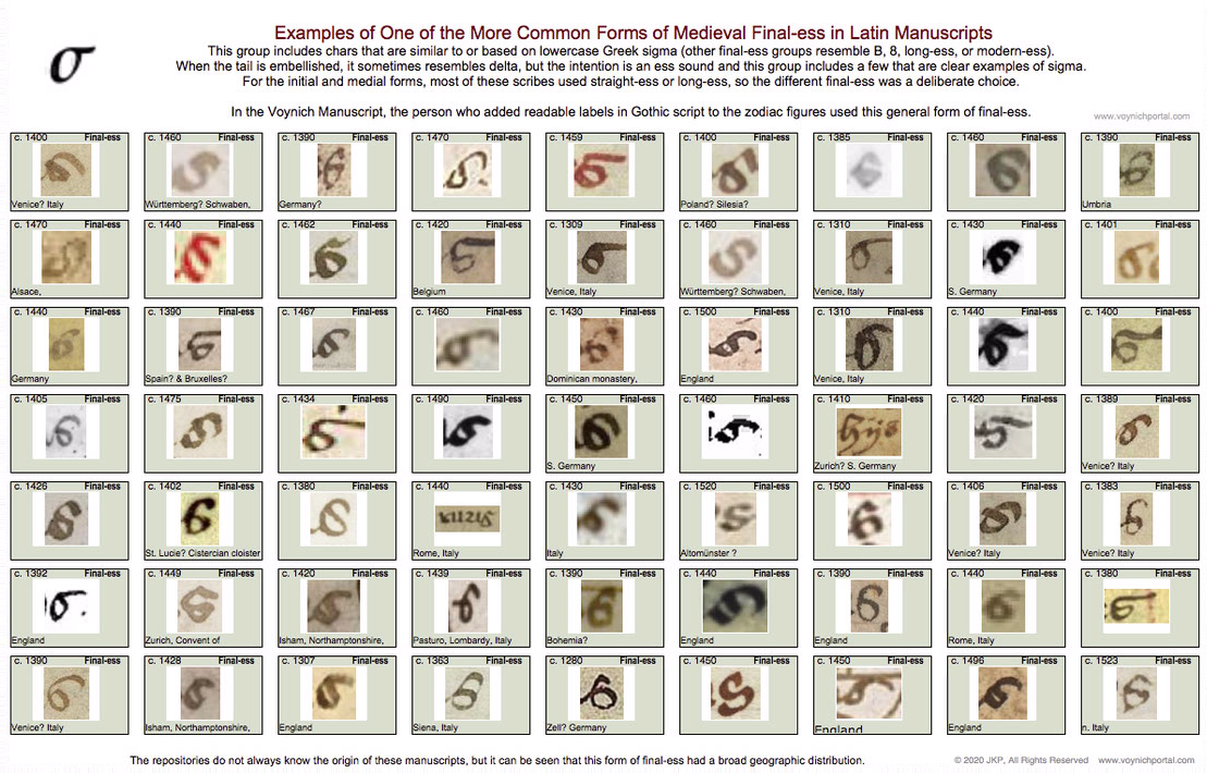
The following set represents one of the common groups of final-ess relevant to Voynich studies because the month labels added to the VMS “zodiac figures” use this general form:

Table of medieval final-ess characters that are similar to or include a shape based on Greek sigma.

Here are examples of the sigma shape from a Greek manuscript, a Latin manuscript, and the “Mars” (March) label under the fish in the VMS:

The general style of final-ess that resembles Greek sigma, which shown in the chart above, can be seen in the labels added to the VMS “zodiac figures” drawings.

Latin Vowels (and the occasional consonant) Written with Double-Cee

Another letter with Greek shape-mates (although not always the same meaning) is the double-cee. This is a loose term describing a group of symbols in Latin manuscripts. Why is it a loose term? Because some scribes wrote a tightly coupled “oc” rather than “cc”, but most of the time you’ll see “cc”.

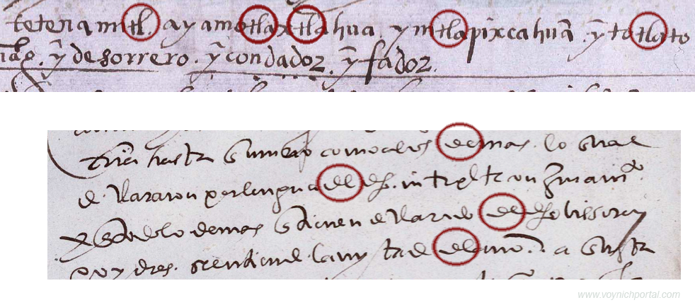
In the early medieval period, there was very little distinction between a “t” and a “c” and they can be hard to tell apart. But, it depends on which script you are reading. Sometimes the “t” is distinguished from “c” by being doubled, so it looks like “cc”. The letter “a” was sometimes written this way as well, which can be even more confusing to those who haven’t learned medieval languages because you can only figure it out by reading the whole sentence.

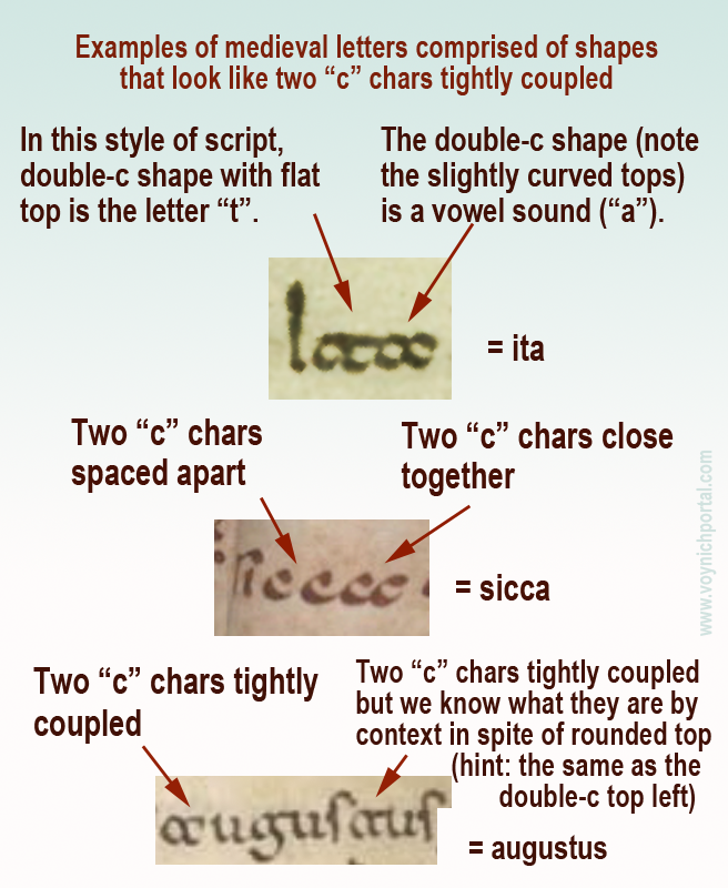
Here are some examples that explain how to distinguish double-t, double-c and two cees in a row, but note that some are ambiguous unless you can see the words before and after:

Examples of various medieval letters that resemble two "c" characters.

Note especially the second example (sicca) which includes both c + c and a tightly-coupled double-cee representing the letter “a”.

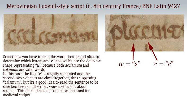
Palaeographic example of the double-c form of "a" in an early medieval manuscript from France.
Additional picture added 8 March 2020 to illustrate that the double-c form of “a” was not limited to southern Italy or Dalmatia. This Merovingian example is from eastern France, probably from the Abbey of Luxeuil.

These loosely and tightly coupled cee shapes are also present in the Voynich Manuscript, but transcripts generally ignore the distinction (see my previous blog) and it is not yet known if it is a meaningful distinction. Now let’s look at another letter with similar characteristics…

Double-cee as “oo” “wa” or “u”

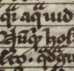
The medieval concept of “u” was not the same as we know it. In English, we make a distinction between “u” and “v” sounds and shapes. In medieval Latin, the “u” and “v” shapes were interchangeable in most languages using Latin characters and the sound was closer to a breathy w’ than an English “u” (and was not like our “v”). It was sometimes written as a superscripted double-cee shape next to the letter “q”.

Remember that Latin characters were used to write many languages, so it’s unwise to generalize too much, and difficult to describe a sound in any given language from 600 years ago. It’s better to think of the double-cee shape as a vowel (except when it was “t”) rather than as a specific letter.

Double-cee can represent “a” but it can also represent “u” (in the same manuscript), as well as indicating an ordinal, which means it is sometimes closer to a symbol than a specific letter. Once you understand the context, you can work out which letter it represents. In medieval script, context was king and many symbols had dual or triple meanings.

Greek Nu or “Noy”

Another Latin letter that is similar to Greek is the letter N.

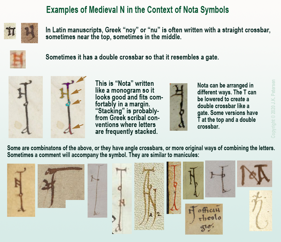
We know it with an angular crossbar, as in the example to the right, but it was sometimes written with a straight crossbar (see below). In modern English, this form looks more like H than N. Sometimes the crossbar was at the top of the ascenders (somewhat like VMS EVA-k). Other times the crossbar was in the middle (similar to English H).

The crossbar could be single, or double, like a gate. Here are examples using a popular medieval symbol for pointing out interesting passages, the NOTA symbol. It was frequently stacked or intertwined like a monogram. Usually all four letters are present, although occasionally it is abbreviated NT:

Examples of medieval letter N in the context of monogram-like NOTA symbols.

Clearly there was some creative freedom to arrange the letters and yet the meaning is quite clear. The N will sometimes be combined with a B to create Nota Bene (note well).

Nota with Double-C

There is another form of Nota that uses more traditional forms.

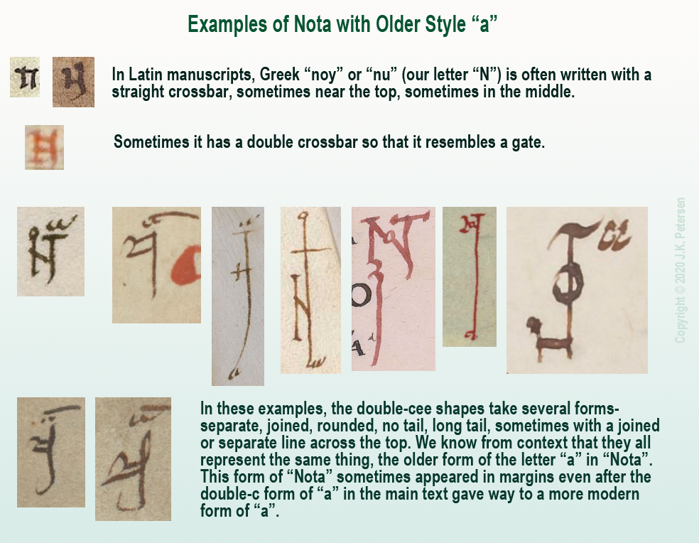
Remember the “a” written as double-c mentioned above? Sometimes NOTA was written with the earlier form of “a” rather than the late-medieval “a”, as in these examples:

Examples of Nota with older style of "a" written like a double-cee.

A Less Obvious Example

That should be enough background to help the reader interpret the more stylized symbol found in a 13th/14th-century scientific compilation.

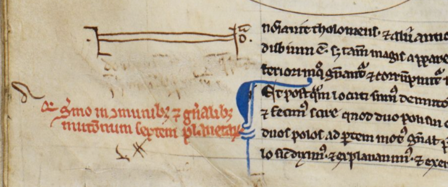
BL Harley MS 1 includes treatises on astronomy/astrology and mathematics, and the first section is attributed to Abu Ishaq al-Bitruji al-Ishbili. In it there is a series of geometric drawings, and below the third second drawing we find a symbol in the left margin…

It is essentially the same as the old-style double-c “a” Nota symbols in the above examples, except the gate-style N has been stretched more than usual to encompass the comment directly below (which has since been erased). On the right side of the “gate” there is a tick for the T, an “o” and, above it, the double-cee symbol representing “a”.

Example of Nota symbol with old-style "a" stretched horizontally in the margin of BL Harley MS 1.

More Uses for Double-Cee

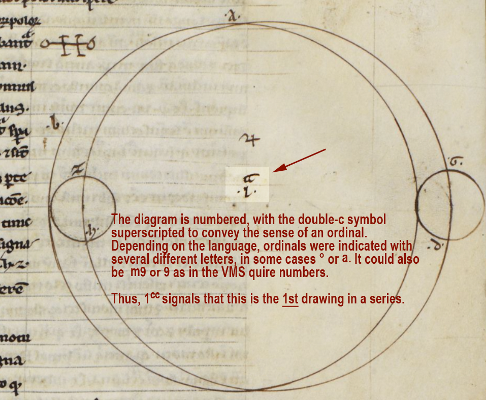
In Harley MS 1, the symbol that resembles double-c is used in other ways, as well. It can be found in each of the geometric diagrams.

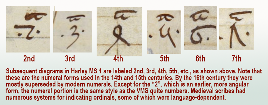
Here the double-cee symbol superscripted next to the number 1 introduces this as a series of drawings. You can think of it as an ordinal symbol and this diagram as the 1st:

As would be expected, the diagrams that follow are numbered in sequence as follows:

Examples of subsequent ordinal numbers used to label a series of geometric diagrams in a 13th/14th century manuscript.

In a series of ordinals, sometimes the same symbol is used for all of them. Other times, the ordinals are individualized for each number, as in English (1st, 2nd, 3rd, etc.).

Here is an example showing the individualized ordinals of the VMS quire numbers compared to a set that uses only “m”:

Examples of Voynich Manuscript quire numbers with individualized ordinal symbols compared to a system with only one ordinal symbol.

Other common ordinal symbols are ° and superscripted-a.

This aspect of the VMS is, in a sense, a gift. If this ordinal system can be identified in other manuscripts, it might provide some clues to the early life of the VMS. Unfortunately, quire numbers are very difficult to find. I’ve been searching since 2008 and only have a handful of examples. They are usually trimmed off or bound inside the signatures where they can’t be seen. When I have time, I’ll post the ones I have so far.

Summary

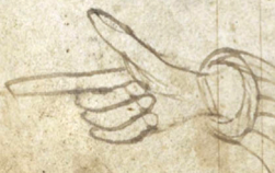
The double-cee shape was disappearing by the 14th century and by the 15th century, the Nota symbol was often replaced by a manicule. By the 16th century, final-ess was beginning to disappear, as well, which means Greek influences were gradually replaced by early modern forms.

Even so, it helps to know these earlier conventions because there are aspects of the VMS that hint at some of these characteristics. Plus there are glyphs in the main text that may have been influenced by early-medieval conventions.

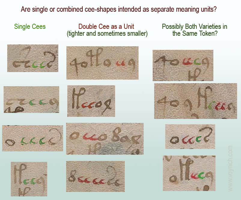
Also… there is a possibility that the separate cee shapes and tightly-coupled cee shapes in the VMS are not the same, which might partly explain why there are sometimes four in a row. If cee-gap-cee and double-cee are different, it might add some variety to the oddly monotonic script.

J.K. Petersen

© Copyright March 2020, J.K. Petersen, All Rights Reserved

Cheshire Reprised

16 May 2019         

A week ago I posted commentary on Gerard Cheshire’s “proto-Italic ” and “proto-Romance” solution for the VMS. At the time, his most recent paper was pay-to-view, so I had to restrict my comments to the previous open-access paper. Now the most recent version is open-access. Unfortunately, not much has changed from the previous version. You can see his April 2019 proto-Romance theory here.

What exactly do the terms “proto-Romance” and “proto-Italic” mean?

Proto-Romance

If you search for “proto-Romance”, you will find many references to “vulgar Latin” (also called colloquial Latin)—variations of Latin spoken by the common people (most of whom were illiterate) during the classical period of the Roman Empire.

The “classical period” of the Greeks and Romans spanned approximately 14 centuries up to about 6th century C.E. when the Roman Empire was no longer dominant. As Rome lost its grip, vernacular languages and local versions of Latin had the opportunity to evolve into modern languages such as Italian/Sardinian, Spanish, Portuguese, French (with Gaulish influence), and Romanian.

Extinct Languages and Undocumented Scripts

The prefix “proto-” comes from Greek πρωτο-. This refers to the first, or to something that comes before. So proto-Romance means before the Romance languages had fully emerged (from vulgar Latin), and proto-Italian script means an alphabet that was used before the script that became standard for writing medieval Italian. Medieval Italian script is essentially the same alphabet we use now except that the letterforms are more calligraphic than modern computer users are accustomed to seeing.

This brings us back to Cheshire, who is claiming that Voynichese is an extinct proto-Romance language in an undocumented proto-Italian script… something that existed about 1,000 years before the creation of the VMS.

How is that possible when the radiocarbon-dating and many of the iconographical and palaeological features of the VMS point to the early 15th century?

Cheshire’s Interpretation of Medieval Characters

Cheshire’s descriptions of individual glyphs, and his interpretations of the annotations on folio 116v, suggest that he is not familiar with medieval scripts.

It also seems that he hasn’t studied the frequency or distribution of the Voynich glyphs in the larger body of the main text, because he associates common letters and letter combinations with glyphs that are rare, or that have unusual positional characteristics. This point is so important, it bears repeating… Cheshire assigned substitution values for common letters to rare VMS glyphs, or glyphs that have positional characteristics that are not consistent with Romance languages.

Is it possible he never tested his system to see if it would generalize to larger chunks of text? Did he prematurely assume he had solved it?

Let’s look at some examples…

Cheshire’s Analysis and Transliteration of Voynich Glyphs

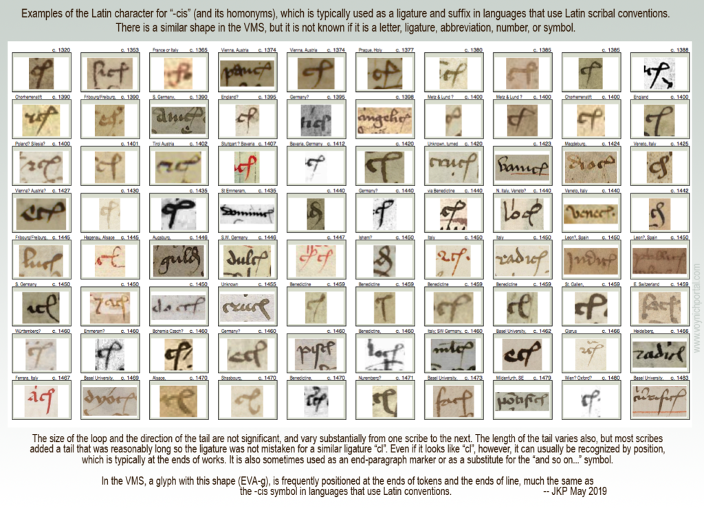
In his first example, Cheshire takes a glyph-shape that is known to palaeographers as the Latin “-cis” abbreviation (the letter c plus a loop that usually represents “is” and its homonyms). This shape is both a ligature and an abbreviation in languages that use Latin scribal conventions. It has not yet been determined what it means in the VMS, but its positional characteristics are similar to texts that use the Latin alphabet.

VMS researchers know this shape as EVA-g.

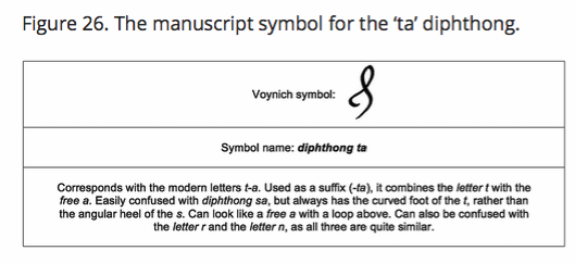
Cheshire transliterates it as a “ta” diphthong. It’s not a diphthong. A diphthong is a combination of two vowel sounds and “t” is clearly not a vowel. The terminology is wrong.

He then gives an explanation of the shape that doesn’t mesh with medieval interpretations of letter shapes. This is figure 26 from his paper (Source: tandfonline):

To say that this can be confused with the letter r and the letter n makes no sense to anyone accustomed to reading medieval manuscripts. It looks nothing like r or n. If Cheshire means it can be confused with his transliterated r or n, he should clarify and provide examples.

To get a sense of how this character was used in the medieval period, I have created a chart with examples of the “-cis” ligature/abbreviation that was common to languages that used Latin scribal conventions. I have sorted them by date.

This is not to imply that the Latin meaning and the VMS meaning are the same. The VMS designer may only have borrowed the shape, but it is important to note that the position of this glyph in the VMS is very similar to how it is positioned in Latin languages:

More important than the mistakes in reading medieval characters and linguistic terminology is that Cheshire did not address the basic statistics of VMS text and the fact that this glyph occurs primarily at the ends of words and sometimes the ends of lines. Thus, transliterating EVA-g as “ta” is highly questionable.

Perhaps Cheshire can justify this mismatch between letter frequency and position by saying that separate glyphs also exist for “t” and “a”, but when you put the various transliterations together, one finds that the character distribution of Romance-language glyphs and Cheshire transliterations are significantly out-of-synch.

For example, as in his previous paper, he chose one of the rarest glyphs in the VMS repertoire (EVA-x) to represent the letter “v”. In classical Latin and Romance languages, the letters “u” and “v” are essentially synonymous and very frequent. In this brief excerpt in modern characters, from Pliny the Younger, note how often u/v occurs:

Pic of letter frequency of U/V in classic Latin text by Pliny the Younger

If Voynichese were a proto-Romance language (some form of classical vulgar Latin), and EVA-x were transliterated to U/V and also F/PH, as per Cheshire’s system, one would expect to see this character more than 40,000 times in 200+ pages. Instead, this character occurs less than 50 times. That alone should create doubt in people’s minds about Cheshire’s “solution”.

So what has Cheshire done? He has assigned a different letter to represent “u”, but we know that in classical Latin, Etruscan, and Old Italic, “v” and “u” did not represent different letters even if both shapes were used (which they usually weren’t).

Even in the Middle Ages, when there were different shapes for “u” and “v”, most scribes used them interchangeably. In other words, “verba” might be written with the “v” shape in one phrase and with a “u” shape (uerba) in the next, just as “s” was written with several different shapes (without indicating any difference in sound).

This is the 23-character Latin alphabet in use around the time vulgar Latin was evolving into Romance languages:

Example of Roman alphabet

Perhaps Cheshire didn’t know that they were interchangeable shapes rather than two different letters when he created his transcription system. But if he did know, if he actually believes that “u” and “v” were distinct letters in proto-Romance languages, he will have to provide evidence, because historians, palaeographers, and linguists are going to be skeptical.

Beginning-Paragraph Glyphs

Voynich scholars have noticed there are disproportionate numbers of EVA-p/r and EVA-t/k characters at the beginnings of paragraphs. There is a possibility that some are pilcrows, or serve some other special function when found in this position.

Cheshire doesn’t appear to have noticed this unusual distribution (at least he doesn’t comment on this important dynamic in his paper) and translates the leading glyph in the same ways as the others. In his system, a very large number of paragraphs inexplicably begin with the letter “P”.

Some of his translations cannot be verified. For example, he used a drawing on f75r to demonstrate a single transliterated word “palina” on f79v. There’s no apparent relationship between them (other than what he contends), so how does an independent party determine if the translation is correct?

Tenuous Assertions

On f70r, he uses a circular argument to explain the transliteration of “opat” (which he says is “abbot”). He says the use of “opat” indicates “that proto-Romance reached as far as eastern Europe” because “opát survives to mean abbot in Polish, Czech and Slovak”.

We don’t need a dubious transliteration to tell us that proto-Romance languages reached eastern Europe. The existence of Romania demonstrates this rather well—it borders the Ukraine, and used to encompass parts of Bohemia. Bohemia included Hungary, Czech, and parts of eastern Germany, so transmission of vulgar Latin to Polish through Czech was a natural process.

Palaeographical Interpretations

There are problems with the way Cheshire describes the text on folio 116v. He refers to the script as “conventional Italics”. It is, in fact, a fairly conventional Gothic script, not “conventional Italics”.

Then he makes a strange statement that the second line on 116v is hybrid writing, that it is Voynichese symbols mixed with “prototype Italic symbols, as if the calligrapher had been experimenting with a crossover writing system”. It’s hard to respond to that because his statement is based on misreading the letters. Here is the text he referenced in his paper:

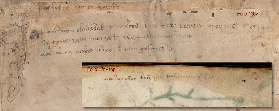
anchiton mehiton VMS 116v

Cheshire interprets this as “mériton o’pasaban + mapeós”

He misread a normal Gothic h as the letter “r” and a normal Gothic “l” as the letter “P”. In Gothic scripts, the figure-8 character is variously used to represent “s”, “d”, and the number 8, so it’s very familiar to medieval eyes, but he doesn’t seem to know that and interpreted it as a Voynich character that he transliterated to “n”.

If his reading of the letters is wrong, then his transliteration is going to be wrong, as well.

Zodiac Gemini Figures

Cheshire mentions the Gemini zodiac figures (the male/female pair), and states: “Both figures are wearing typical aristocratic attire from the mid 15th century Mediterranean.”

It takes research to determine the location and time period for specific clothing styles—it’s not something people just automatically know. Since Cheshire didn’t credit a source for this reference, I will. It’s possible he got the information from K. Gheuen’s blog.. Even if he didn’t, Gheuen’s blog is worth reading.

Flora and Fauna

I’m not going to deal with Cheshire’s fish identification. It’s just as dubious as the Janick and Tucker alligator gar. There are fish that are more similar to the VMS Pisces than Cheshire’s sea bass, and pointing out the fact that sea bass has “scales” is like pointing out that a bird has wings.

I was hopeful that Cheshire’s latest paper would be an improvement over his previous efforts, but I was disappointed.

Summary

It’s possible there is a Romance language buried somewhere in the cryptic VMS text (it was, after all, discovered in Italy, and the binding is probably Italian), but that is not what Cheshire is suggesting. He’s saying it’s an extinct proto-Romance language, without providing a credible explanation of how this information could have been transmitted a thousand years into the future.

There is a relentless publicity campaign going on right now to catapult Cheshire into the limelight. I’m not going to repeat the claims in the news release (they’re pretty outrageous), but even Superman would blush at the accolades being heaped on this unverified theory.

When I checked Cheshire’s doctoral research, I discovered it was in belief systems. Somehow that seems fitting.

J.K. Petersen

© Copyright 2019 J.K. Petersen, All Rights Reserved
Postscript 16 May 2019: The University of Bristol has retracted the Cheshire news release. You can see the retraction here for as long as they decide to make it available.

Maximizing the Minims

19 April 2019

There are two pattern groups in the VMS that could be related, maybe. They have traits in common that might help us understand Voynichese.

I’ve blogged about double-cee shapes (EVA-ee), but felt it would be too long if I included relationships between cee patterns and the more familiar aiin patterns, so I’ll continue the discussion here…

The Double-Cee Question

As I’ve posted before, there are many places in the VMS where cee shapes (EVA-e) look like they might be joined. There are even places where double-cee and single-cee are adjacent:

Examples of cee shapes in Voynich Manuscript text

I strongly suspect that double-cee (the one that is tightly coupled) is intended as one meaning-block.

  • In Visigothic manuscripts, the letter “t” was often written as a double-cee shape.
  • In early and mid-medieval manuscripts, a double-cee stood for “a”
  • In early and mid-medieval manuscripts, a superscripted double-cee stood for what we would call “u” (it was often next to a “q” character).

Thus, many scribes perceived tightly coupled cees as a unit.

Of course, nothing is easy with the VMS. Here is an example of overlapping cee-shapes next to ones that are separate. Do we interpret them as different or the same?

Note also how the bench joins with the row of connected cees, which brings us to the next point…

Is The VMS Deliberately Deceptive?

It’s very difficult to tell if the VMS is designed to deceive. Patterns like the following are hard to interpret.

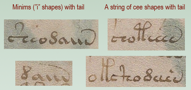
Are the tails on these glyphs added to hide the length of a sequence? Or are they genuinely different glyphs?

In the same vein, are EVA-ch and EVA-sh cee-shapes in disguise? Could the cap on EVA-sh be yet another cee?

Here’s an example where two cee-shapes are topped with a macron-like cap (a shape that is usually associated with the benched char):

EVA-ee with cap

For that matter, is the 9-shape a hidden cee?

I don’t know for sure, but based on the behavior of the glyphs (in terms of position and proximity), I get the feeling (so far) that EVA-ch and EVA-sh might be related to cee-shapes, even if they mean something different (they frequently occur together), while EVA-y dances to a different drummer.

Positionality

Cee shapes frequently cluster in the middles of tokens, just as minim patterns are frequently at the ends, but are they somehow related? They are the only two groups of glyphs that repeat many times in a row.

These examples from f4v and f7v are provocative because they suggest that cee shapes and minims might be related. Rather than being word-medial, the cees on the right are word-final and have long tails from the bottom rather than the top:

Now, let’s examine the -aiin patterns…

Aiin not Daiin, and maybe not even Aiin

I think it was a big mistake for early researchers to cinch the idea of “daiin” in people’s minds. The aiin sequences are frequently (yes, frequently) preceded by glyphs other than EVA-d.

Stephen Bax wrote a paper in 2012 (revised Nov. 2013), in which he summarized one of the most common ideas for interpreting the glyph sequence called “daiin” (e.g., that it might mean “and”). Here is a quote and a link to the PDF file:

It is argued from this analysis that the element transcribed as ‘daiin’, the most frequently occurring item in the manuscript as a whole, is in fact a discourse marker separating out sense units, functioning like a comma or the word ‘and’, and analogous to the use of crosses in folio 116v.

Stephen Bax

The Voynich manuscript—informal observations on some linguistic patterns.

And here are some of my observations…

First, let’s start with the crosses on folio 116v. There is a strong precedence in medieval manuscripts for including the plus sign in charms and medical remedies in places where the reader or speaker (or healer) genuflects. The plus sign is sometimes also used like “and”, just as we use it now (nothing new about that). However, I doubt that the plus- or cross-symbol on 116v is related to “daiin”.

Now back to the paper…

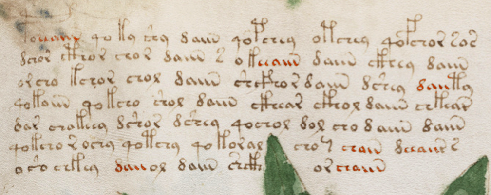
On page 3, Bax noted instances of word-final daiin, but he examined them out of context. He recorded instances of aiin that are preceded by EVA-d and basically ignored the other glyphs that precede -aiin in the same sample (as well as daii- that occurs at the beginning). I have marked the patterns that were not mentioned in red:

Studying the “daiin” pattern this way is like examining -tally patterns in English while ignoring related patterns like -ly, -lly, -ally, -aly, and -dly. He also failed to account for the fact that aiin is not a homogenous glyph pattern. It includes an/ain/aiin/aiiin and even sometimes iiin.

He further makes no mention of the tail patterns. If the length of the tail is meaningful then, like so many before him, Bax might have overestimated the frequency of daiin.

Tail Coverage

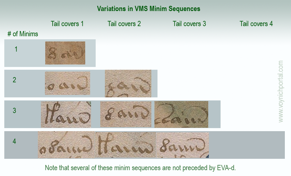
Most transcripts treat the many versions of daiin as if they are the same. They count only the number of minims (and they don’t always get that right). But there is another dynamic that gets little attention, and that is the length of the tails.

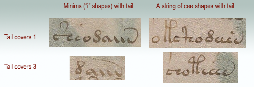
Tail coverage varies. Thus, a glyph with three minims might have three different versions of tail coverage and perhaps three different meanings:

VMS tails in minim sequences

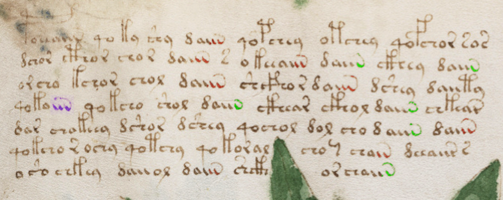
Here is the text sample color-coded for different tail patterns, with green for one and red for two:

About half the instances of “daiin” look like dauv and the others look like daiw, if you pay attention to the length of the tail. They are not necessarily the same. If you include aiin sequences not preceded by EVA-d, it varies even more. Normally I wouldn’t consider tail length to be important. In Latin, the length of tails (a form of apostrophe or ligature) is pretty arbitrary. Some scribes lengthened the tail if more letters were left out, but this was not the norm. In the VMS, when you create a transcript and examine every token, tail-length feels deliberate.

Nick Pelling pointed out to me in a blog comment that there are dots at the ends of tails. I’m not sure I had noticed that (he’s right, there are). I had noticed the varying tail lengths. After Pelling called my attention to the dots it occurred to me that maybe the dots were to help the scribe accurately craft the length of the tail.

Tail lengths might turn out to be trivial rather than meaningful, but it’s still important to document their patterns as part of the research process. If they are significant, then vanilla-flavored “daiin” is not nearly as frequent as claimed.

Forget about the “d”…

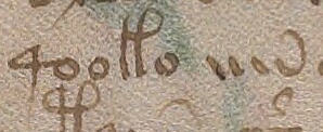
Minim sequences don’t require EVA-d and don’t always need EVA-a. Here’s a minim sequence that stands alone (four minims with one covered, or perhaps three minims and another glyph entirely):

I think future research would be more fruitful if transcripts and descriptions of the text were more aligned with reality. Calling them minim sequences carries fewer assumptions than “daiin”.

Interpreting Minims

I’m not sure minim sequences are intended as separate characters. Just as some of the cee shapes look like they belong together as a block, the iii sequences do so as well. There are numerous instances where they resemble uiv rather than iiv.

In this example from folio 8r, a curved macron has been placed over two minims in aiiin (I prefer to call the shapes aiiiv rather than aiiin, but I’ll respect the existing EVA system for now). It is almost as though the scribe were explicitly associating two minims:

Maybe the cap is a macron in the Latin sense (apostrophe for missing glyphs), or maybe it’s a way to say, this is a “u” shape, don’t confuse it with “ii”. Note that there is a slight gap between the first “u” shape and the second (or between the “u” shape and the “iv” shape):

In this example from f8v, the first two minims resemble a “u” shape and are distinctly separated from the final glyph (which resembles “v” or “i-tail”, and yet there is a 3-coverage tail):

As for the length of the tail, in Latin it usually doesn’t matter, but there were a few scribes who pointed the tail at the particular spot where letters were missing (the tail is an apostrophe attached to the end so the scribe doesn’t have to lift the quill). What it means in the VMS is still a mystery.

Maybe progress in understanding the VMS is slow because many transcripts don’t include these details.

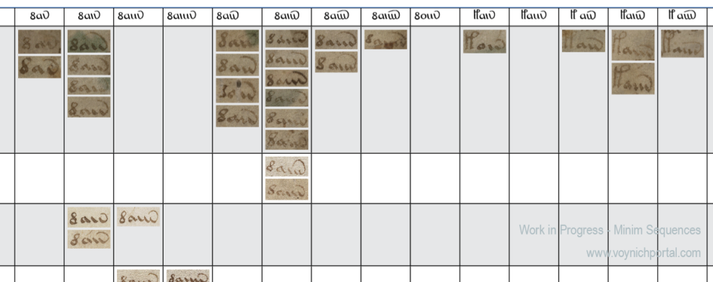
I have an enormous chart that documents these patterns, but it’s not yet finished and ready to interpret. This is only the merest snippet—part of the top-left corner:

Snippet from very large Minim-Sequence Chart


Minims and Cee Shapes

This is getting long, so I’ll end with one last question (possibly an important one). Is there some connection between minims and cee shapes?

Minims are more frequently at the ends of tokens (but not always). Cee shapes more often in the middle. Both tend to cluster. Both have tails of varying lengths.

It’s fairly obvious that they both repeat, but I don’t know if anyone has offered a practical explanation (other than the possibility of Roman numerals). Here are examples that illustrate the similarities:

And here is an example that is particularly enigmatic. Is it EVA-ochaien or EVA-ocheiien or ochaiin or something else? Did the scribe slip and draw one of the minims as a cee-shape, or is this a uniquely structured token?

J.K. Petersen

© Copyright 2019 J.K. Petersen, All Rights Reserved


Misrepresentation…

 9 April 2019         

It was just pointed out to me by a Voynich researcher that Diane O’Donovan is writing about me on her blog. I took a look and was actually quite surprised that the information I posted in my columns blog was so badly misconstrued.

But before we get to that, let’s put this rumor to rest. Maybe someone was joking (if so, no hard feelings), but this was posted as an aside on O’Donovan’s blog…

(Some have suggested tongue-in-cheek that JKP is a pseudonym adopted by Rene Zandbergen who holds very similar views and is one of the very few who really has been constantly involved for ‘many years’ – but it’s just jeu d’esprit. I’m sure JKP is quite real).

                                                       D.N. O’Donovan, 9 April 2019

Yes, I am. And to anyone who may think the rumor is true, I’m not using a pseudonym—I blog with my real name. I’m assuming René Zandbergen is European. I am North American. There’s a rather long swim between us and we don’t know each other personally.

Also, as far as I know, Zandbergen has been involved with the VMS quite a bit longer than I have. I first learned of the manuscript through Edith Sherwood’s site sometime in late 2006 or early 2007. A Google search for Da Vinci brought me to her blog and then, in 2007, I noticed she had a lot of plant IDs, as well.

I’m very interested in plants, I love puzzles, I’m fascinated by history.

That’s how I got hooked on the VMS. I wanted to solve it and it’s a perfect fit with my interests. I never planned to blog about it (my friends talked me into starting a blog, they kept insisting I had something to offer) and I’m still not sure a blog was a good idea (it takes time away from research) but in the process of blogging and joining the Voynich forum, I have met some beautiful minds, so it’s probably worth the sacrifice of time.

Now, to other matters…

You know what. I was going to quote some of the “twists” on O’Donovan’s site and respond to them point-by-point, but I have changed my mind. There are too many. It would take too long. Plus, she chose to nullify the fact that Jacobi de Tepenecz was educated in Jesuit schools, administrated a Jesuit college, died in the hands of Jesuits, and left his estate to the Jesuits by declaring that he, “does not seem to have been an ordained member of any Jesuit community”.

If it walks like a duck and talks like a duck, then I don’t think it needs to be ordained as a duck to be included in general statements about the Jesuit community. My blog was not about Jacobi, it was about the column text.

De Tepenecz Signature

I’m also not sure why she posted a recreation of Jacobi de Tepenecz’s signature in connection with her comments about my study of the column text. It’s different handwriting. It should be in a separate section, not conflated with my column-text blog.

I didn’t discuss the signature because there might be a time gap between the writing of the column text and the addition of the signature at the bottom of folio 1r. We don’t know yet. I don’t have enough information on the signature to blog about it, and I think it’s premature to imply an association between them.

In my opinion there’s not enough research yet to draw any conclusions about Jacobi’s signature. In the scant examples that people have kindly posted on the Web (and which were probably difficult to find), the legal signature doesn’t match the other signatures and the other signatures almost look like two different hands, as though they were greatly separated in time, or perhaps because his name was added by someone else’s hand?

If you are interested in VMS provenance related to Jacobi de Tepenecz, Anton has been posting some very good research on the Wroblicionim annotations on some of Jacobi’s books on the Voynich.ninja forum. This enlightening detective work is slowly but surely helping to round out the picture.

Suffice it to say that in my previous blog, I presented needle-in-a-haystack work-in-progress to help fill out some of the missing corners of Voynich history, and presented it as simply as possible, and was not trying to change or misrepresent the manuscript’s provenance, as O’Donovan has implied.

J.K. Petersen

© copyright 2019 J.K. Petersen, All Rights Reserved.


The Ligature Legacy

“…some symbols in the Voynich Codex show similarities to letters found in sixteenth century codices from New Spain (Tucker and Talbert 2013; Comegys 2013) particularly the Codex Osuna (Valderrama 1600; Chávez Orozco 1947).”  —Janick and Tucker, Aug. 2018

The authors are talking about shapes that roughly resemble EVA-k and EVA-t. The following statement is much more surprising:

“We thus conclude that the author of the Voynich Codex made up his syllabary/alphabet, and the letters were borrowed from contemporary post-Conquest MesoAmerican manuscripts such as the Codex Osuma.”

In scholarly circles, “conclude” is a strong word—a word that needs to be backed up with solid evidence. Unfortunately, I find this conclusion highly questionable. The examples the authors use in their arguments are conventions that originated in Old World Latin scripts long before the 16th century. How can one use Old World scribal conventions to argue for a New World conclusion?

Is There a Preponderance of Evidence to Support the Conclusion?

Perhaps the authors felt that if the glyph shapes are taken together with botanical and biological identifications, there is enough evidence to support a New World origin, but the botanical and biological identifications of Tucker, Talbert, Janick, and Flaherty are highly questionable, as well. If you haven’t been following this discussion, then at least scan-read the previous blogs:

Even though the VMS 93r “sunflower” has a number of possible identifications (both New and Old World), Janick bases broad conclusions on this unproven ID as though it were fact:

“Simply put, there is no way a manuscript written on vellum that contains a sunflower and an armadillo could have been written before 1492,” —quoted on Purdue The Exponent news site, 10 Sep. 2018

There isn’t any proof of the identity of the “armadillo” either. It looks more like an Old World pangolin than a New World armadillo, but even this identification can be contested.

What I see in the papers and book by these authors is a collection of inadequately researched suppositions combined in a circular argument to support a New World theory. They pick out a few similarities and ignore the larger body of contrary evidence. They identify two completely different fish as the same fish. One of the plants they identified doesn’t even grow in MesoAmerica. They ignore numerous significant details like the cloudband under the “armadillo”. They ignore alternate IDs for the sunflower.

Unfortunately, the authors’ identification of Voynich-like glyphs suffers the same lack of critical evaluation as the plant and animal IDs, so let’s take a closer look at those.

The VMS-like Letters in the Codex Osuna

Here are examples of the Voynich-like glyphs cited by Janick and Tucker (and by Tucker and Talbert in a previous publication) in the Codex Osuna.

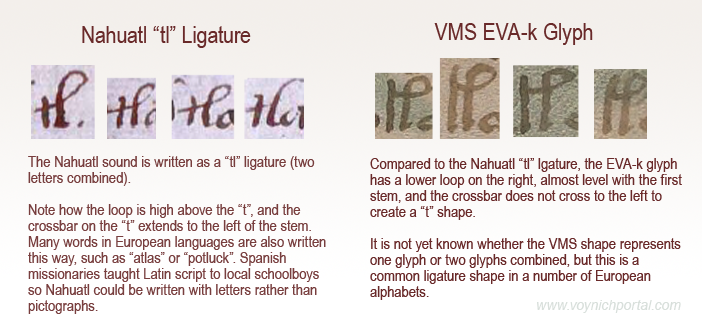
EVA-k is at the top, and EVA-t is at the bottom. Note that the handwriting is different:

Before you say, “Oh, those are similar”, make sure you read the rest of this blog. Bats and owls might look similar to a visitor from another planet, but one is a mammal, the other is a bird, and they are not closely related.

Visual Similarity is Not Enough (especially when they’re not actually that similar)

Something important Janick and Tucker did not mention is that the letters that appear to resemble EVA-k and EVA-t exist in two different scripts in two different languages. Failing to mention this distinction obscures the origin of these shapes, so I will fill in the missing pieces:

  • The EVA-k shape is in the sections written in Nahuatl.
  • The EVA-t shape is in the sections written in Spanish.

There are simple reasons for this, but they are important ones because there is no specific relationship between the Spanish and Nahuatl shapes. The similarities are coincidental, but some background might be necessary to make this clear…

Nahuatl Version of EVA-k

If you’ve heard the Bushmen click language, you know it can be very difficult to express this with Latin letters.

Similarly, there is a sound in Nahuatl that is hard to write. It’s made with the tongue against the back of the teeth, so the Spanish missionaries chose to represent the sound as the letters t + l and they wrote it as a ligature tl, with the crossbar of the “t” connecting to the loop of the “l”.

This ligature is not specific to Nahuatl or to the New World. It exists in Old World words like “atlas”, “battle”, “gatling”, etc. Note that the crossbar in the first letter “t” always extends some distance to the left of the stem, which is different from the way EVA-k is written:

It’s possible EVA-k is a ligature (two shapes combined) but if it is, then it follows age-old scribal conventions that are not specific to the New World (or to Nahuatl script). It doesn’t seem likely that VMS EVA-k was copied directly from Nahuatl if one goes by shape alone. It is more similar to some of the European ligatures and abbreviations such as “Il” (French) or “Item” (Italian, German, Latin) than the ligature on the left.

What About EVA-t?

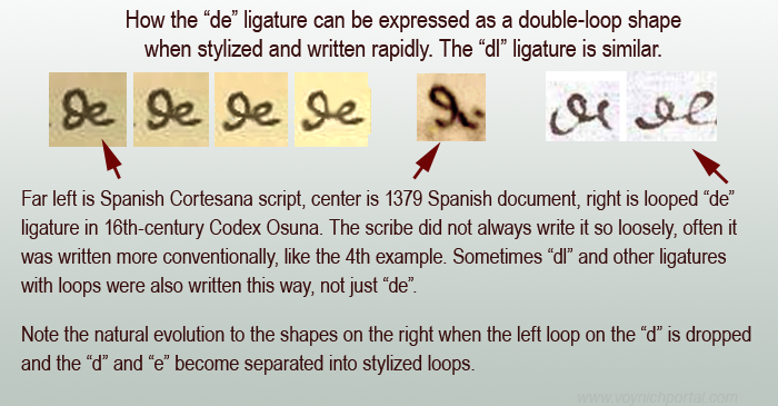
Another common ligature in Old World languages that used Latin characters was the d” + “e” and since the letter “d” was written a dozen different ways, the “de” ligature is quite variable. A similar ligature combines “d” and “l” as in words like “headless”. Sometimes they are hard to tell apart from each other and from ligatures like “il”, but the concept is the same—two letters are combined so they can be written faster or in less space.

Here are examples of how “de” and related ligatures were sometimes written in Spanish scripts from the 14th to 16th centuries. The two on the right are from the Codex Osuna. The faster and loopier the writing, the more it resembles EVA-t (sort of):

The examples on the right illustrate how loose a ligature could be and how combinations like “de” or “dl” or “Il” or “Ie” need to be seen in context to be distinguished from one another, especially if it is an open-loop “d” followed by a very round “e” or “l”.

It has been suggested by Janick and Tucker that the glyphs above-right inspired EVA-t in the VMS, but this seems unlikely. EVA-t has long straight stems:

It’s possible the VMS char is a ligature, but even if it was inspired by “de” (I highly doubt that “de” was the inspiration but let’s pretend for a moment that it was), this ligature was common in many Old World languages.

The authors of Unraveling the Voynich Codex didn’t mention that the two shapes that resemble VMS glyphs are taken from two different sets of scripts (one in Nahuatl, the other in Spanish) and, more importantly, that these shapes were part of the normal scribal repertoire of Old World Europe and thus might have been seen by the creator of the Voynich Manuscript long before the conquest of MesoAmerica.

Summary

The authors didn’t provide any solid evidence that the inspiration for these shapes was specifically New World sources. In fact, the position of EVA-k and EVA-t within VMS tokens doesn’t match well to Nahuatl letter order, either, which further weakens the authors’ interpretation of the VMS script as a Nahuatl substitution code.

I’m not entirely opposed to New World interpretations. I think the VMS is probably Old World, but I will listen to New World arguments, as long as they are good ones. Unfortunately, many New World theories are marred by faulty logic and hasty conclusions.

J.K. Petersen

© 2018 J.K. Petersen, All Rights Reserved
 

Tricky Text

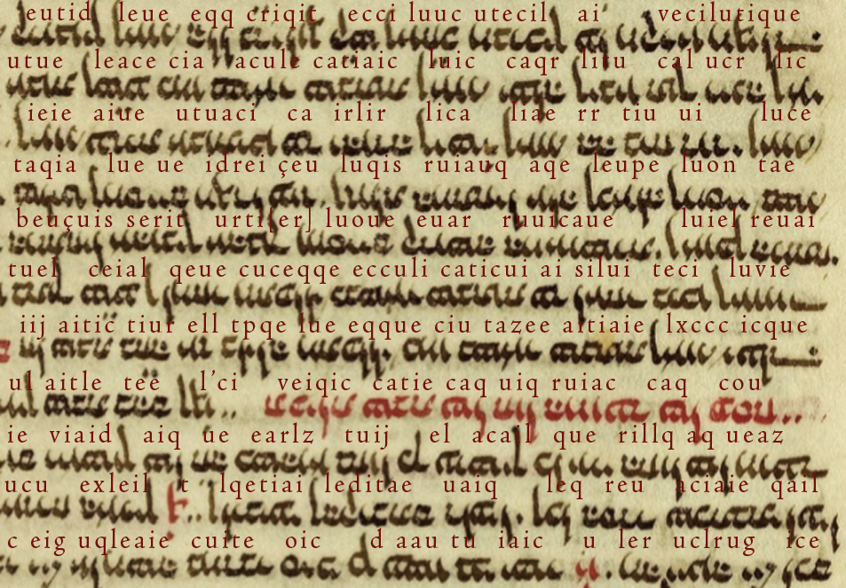
Here’s a chunk of cryptic text that looks like Latin at first glance, early Latin, in a 13th-century script. To read it, you need to remember a few things about old-style script…

In the early medieval period, they wrote letters differently…

  • “a” was written like two cees joined—”cc”,
  • “t” was small and round like a “c”,
  • “e” was sometimes written without a crossbar, and sometimes with a longer embellished crossbar,
  • the stem of the “i” sometimes had a slight curve, similar to the rounded “t”,
  • a common style of “r” had a long foot on the bottom (it almost looks like a square cee), and
  • roman numerals with several ones in a row or words with two “i” chars at the end, usually added a descending tail to the last one so it looks like a “j”.

I won’t keep you in suspense any longer. Here’s the cryptic text with a rough transliteration:

The transliteration doesn’t have to be perfect to demonstrate that there’s something a bit weird about this text.

What language is it? It looks vaguely like early medieval Latin, but the common words aren’t there, and it’s somewhat more repetitive than one would expect.

Is it another language expressed with Latin characters?

I’ll let you think about it before I provide further information.

J.K. Petersen

© Copyright 2018 J.K. Petersen, All Rights Reserved
I C U

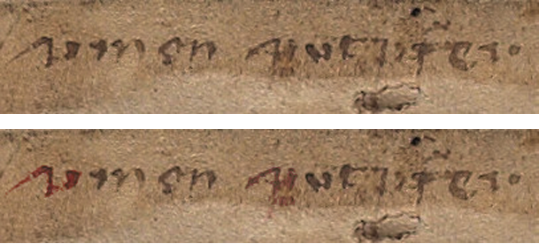
In his most recent CipherMysteries blog, Nick Pelling zeroed in on a shape on the top line of f116v in the Voynich Manuscript. The letter in question (there are plenty of questions) has been interpreted in more ways than I realized. Pelling has suggested that it might be, “…a rare way of writing a Gothic ‘s’ shape”. I have to admit, “s” never occurred to me when I examined the letter. Not even once.

Here is a snippet that includes the mystery letter (focus on the first character). Underneath, I include a color-enhanced version to make it clear which shape(s) we are talking about and what I see when I look at it.

Pelling says he proposed in 2009 that it might be read as “simon sint (something)”. I found this  puzzling. No matter how I look at it, or split up the pen strokes, I don’t see a medieval “s” at the beginning (I’ll post examples of Gothic “s” further on):

To clarify my thoughts on this…

First, I do not see the first letter in the first word and the first letter in the second word as necessarily being the same. To me, the second one might have a faint descender and a horizontal line just to the right of the descender (under the smudgy part). It’s more squished than the first one (in the horizontal direction). It might be the same letter and it might not. The serifs at the beginnings of words often look similar on different letters.

I couldn’t see any descenders in the multispectral scans, but whether a descender shows depends partly on resolution and partly on which spectra are chosen. The first letter doesn’t appear to have a descender, however. The one on “put?fer” might. The letter on the right word looks vaguely like a “p” but I’m not sure, so most of my comments will be about the first word and the mystery letter on the left.

Sorting out the Letters in the First Word

I usually refer to the first word as “umen” or “umon”, but ONLY for communication, not because I’m committed to any particular interpretation. I have a list of possibilities and I don’t assume it’s a word—it could be a string of characters (e.g., vmçn), or an abbreviation.

The “e/o” letter is indistinct. It could be “o”, “c”, “ç”, or “e” (or something else). When I enlarge it, looks like there might be a couple of pen skips, so it’s possible it is an incomplete “o” (right). Letters 2 and 4 look like “m” and “n”, but I’m not sure about “m” because the humps are different from all the other “m” letters on the folio. Could it be “in”?

Scribal Habits

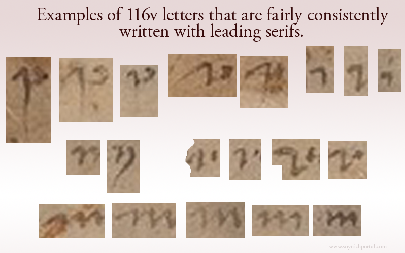
Before going into detail about the mystery letter, I’d like to point out that whoever wrote this (assuming a specific individual authored most of it) habitually used leading serifs, some of them quite long. It’s possible the writer learned both bookhand (the more formal handwriting) and cursive hand (for rapid writing). There are many hybrid hands with elements of both (see previous blog about the letter “g” which has a bookhand tail and low end-serif).

Here are examples of letters with leading serifs. The serif on the letter “i” is longer than average for scripts of this style:

Now here comes the surprise…

I couldn’t figure out why Pelling kept referring to the first letter as “^”. I assumed he was trying to be neutral about the letter’s identity by choosing a symbol instead of a letter, which is actually a good idea. It was several hours before it hit me that maybe he was interpreting only the serif as a letter. My reaction was, “Whoaaaaaaa!!”

It’s been a week of surprises palaeography-wise. I did not fully appreciate, until the last few days, how differently each researcher sees these characters.

Here are my feelings about it…

The serif at the beginning of the shape on the right is not a letter. If it were, the only typical letter it might be in Gothic script would be an undotted “i” with a very long serif.

An extra-long serif is not  unusual at the beginning of a word, but it still doesn’t look very much like “i”, in my opinion, it looks nothing like “s” either. Also, if the “^” shape were a letter, then what is the blob attached by a stroke on the bottom? The right stroke is not written like the other “i” shapes. NONE of the other “i” letters on the folio has a crooked stem or connects to the previous letter along the bottom. I think this is one letter, not two—one letter with a long serif.

So what letter is it?

You may have noticed that the longest serif of all is on our mystery letter, but is it unusually long? That depends on the identity of the letter. A long leading serif is unusual on the letter “i” but completely normal on “u” and “v” shapes.

Before I post the v/u examples, I’d like to clarify the medieval letter “s” to explain why I don’t think the beginning of the word is “s” (not even a rare one)…

Examples of Medieval “s”

Based on direct observation and sampling thousands of medieval manuscripts, I have identified seven primary forms of “s” in scripts of the same basic style as 116v:

  • straight “s”
  • long “s” (essentially a straight “s” plus a descender)
  • final-“s” sigma (inherited from Greek)
  • final-“s” B shape (similar to modern ß but usually representing one “s”)
  • final-“s” snake shape (like our modern “s”—not common in most countries, although Spanish manuscripts often have this form of “s”)
  • figure-8 “s” (a true figure-8, not one that is deliberately skewed like a cursive “d” or accidentally similar to “8”—this was not common in cursive hands, but is sometimes found in book hands)
  • esszett (commonly expressed on computers as ß, this character had slightly different meanings in different languages but was frequent in central European manuscripts)

The straight-s (which modern eyes can easily mistake for “f”) was more popular in the early medieval period. The stem does not go below the baseline. The long-s has the same hook shape as straight-s plus a descender.

In the early medieval manuscripts, the straight-s was sometimes the only form of “s” used (which means it could be in any position in the word). In other manuscripts, a different “s” (final-s) was used at the ends of words. By the late medieval period, most scribes used a different “s” at the ends of words and some used multiple forms of “s”, as the example below-right:

The straight-s was gradually replaced by long-s. Straight-s is not very common in scripts that are similar to the 116v text, most of them use long-s.

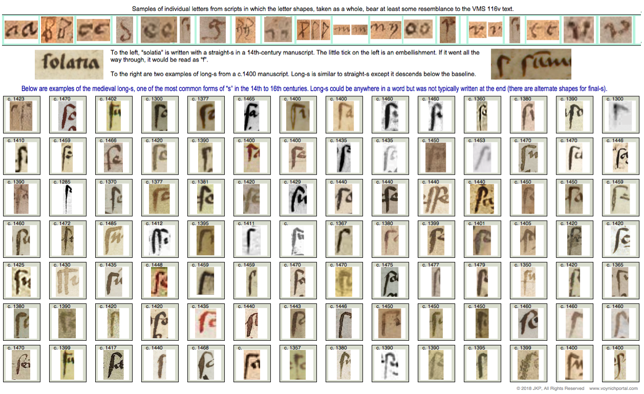
Sometimes scribes added loops or flourishes, but the general form was the same. This chart illustrates that the VMS long-s is quite ordinary:

I’m not aware of any “s” shapes that resemble the first letter or even the first two penstrokes of “umen” but the above forms match well with the first letter of “six”, the last letter of “gas/gaf” and the last letters of “oladabas/oladabad”, “imiltos/multos/miltos” and portad/portas”, so the 116v script is reasonably conventional.

Summary

I don’t have a definitive ID for the mystery letter. It looks like the top of an open-p with a long leading serif, but I can’t see a descender (at least not on the first one) or any rubouts under the letter.

It comes closer to a flat-bottomed “v” than the remaining letters of the alphabet but I haven’t found a close match (the flat-bottomed variant is not as common as those with pointed bottoms). The vee on the right is a little too flat—it has lost the “v” shape.

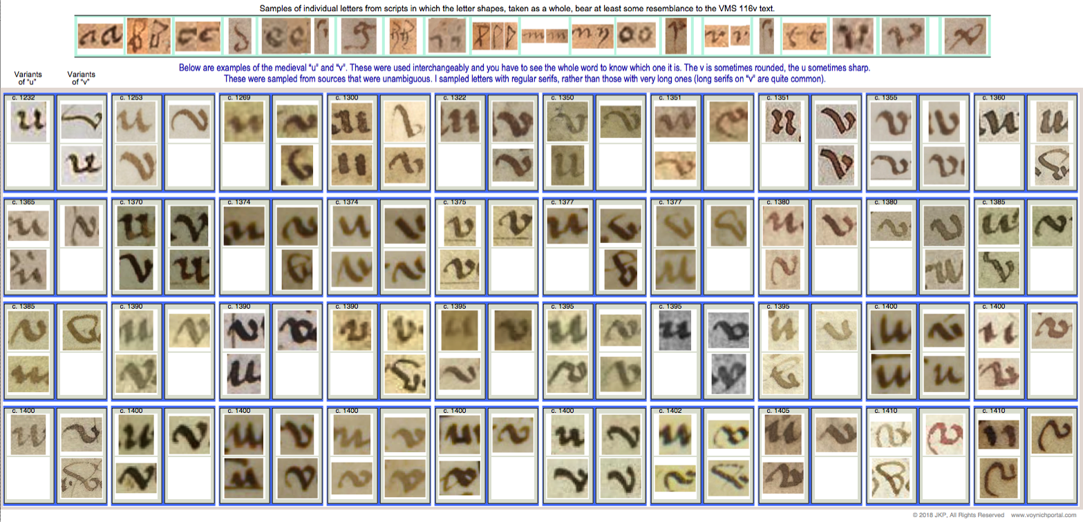
Here is a chart of v/u letters common throughout the medieval period. There are a some flat-bottomed versions circa 1355, 1395, 1400, 1402, and 1410, so it’s possible this style was more prevalent after the mid-14th century, but I haven’t had time to confirm if this is true:

Coming back to the second letter… if this shape is “in” instead of “m”, it might be read as “vinen”, which has meanings in several languages (come, they come, the wine, the vines).

If the last word is “putrifer” then “vinen putrifer” (the grapes ferment/the wine ferments) would be hard to ignore as a possible interpretation. In certain germanic dialects, the “n” at the end of “vinen” is like adding the article “the”.

But what if it’s an “o”? Then it might be vinon or uinon which is harder to pin down than vinen. Vinon is a place in France, but a place name doesn’t seem like the best fit with the other words on the line.

Is anything gained by studying unknown letters?

Even if we can’t make out the letter, the serif on the mystery shape has a calligraphic “brush stroke” feel to it, as does the tail and dipped oval of the letter “g” on the last line. And yet, it’s not professional calligraphy. Maybe these clues hint at other skills…

Was it someone who could draw or who used a brush for some other craft? Medieval artists and illuminators were sometimes illiterate or semi-literate. Perhaps the writer contributed the nose on Aries, painted some of the plants, or inked the secondary breasts on the nymphs. The style of writing is 15th century and might even be earlier in the century if the “a” in 17r “mallier” is a double-story “a”.

I’ve never assumed the writer had any involvement in the creation of the VMS—notes on back pages were often added decades later—but the possibility is there… and that makes it more interesting.

J.K. Petersen

© Copyright 2018 J.K. Petersen, All Rights Reserved
Gee, I Never Would Have Guessed!

The VMS marginalia on folio 116v has a number of unclear letters and others that are reasonably clear. Fortunately, a few of them are repeated so we can see variations of the same letter, such as “h”, “i”, “m” and others. For the last decade I have been seeking matches to the marginalia in medieval manuscripts and incunabula, hoping to find the scribe (obviously not a professional scribe, but maybe there’s something out there). I don’t have a match yet, but I have some interesting paleographic data.

It surprised me to discover that one of the letters that I considered clear and readable has been challenged. It has been suggested that the letter following “nim” in “so nim — mich” is “ez” rather than “g”.

I take exception to this. I also do not consider the “plummeting rock” shape after the word “mich” to be the letter “o”, as discussed in my previous blogs.

Here is the phrase in question:

Note that the tall letter with a hook is a medieval “long s”. It’s only an “f” if there’s a crossbar. I read this as “so nim gas/gaf mich” followed by a small drawing.

I can’t tell if the third word is “gas” or “gaf” (both were used in the Middle Ages). There’s an abrasion on the parchment, so it’s hard to tell if it’s “s” or “f” but the letter in question is not the last one, it’s the first one. Another Voynich researcher stated on Nick Pelling’s CipherMysteries blog that the word that looks like “gas” or “gaf” is actually “ez as”. I don’t agree.

Here is a color-enhanced version of how I see it:

It’s a typical “g”, common for the time. The scribe does not write “e” like this and “z” is not typically written like the part on the right side of this letter in medieval scripts, not even as an “ez” ligature. I believe the first letter in the word is one letter and it is “g”. Especially note the serif (the tick on the right).

In medieval scripts that overall resemble the VMS marginalia, the letter “z” usually looks like the shapes in the chart below:

Are there other possibilities?

For the record, the “g” shape is not a medieval “9” abbreviation either. The medieval “9” abbreviation at the beginnings and ends of words was popular for centuries. The “9” abbreviation looks and is positioned pretty much as you see it in the VMS (so I included the VMS “9” glyph along with the other samples in the chart below with the date c.1425 for reference).

Here is how the “9” glyph looks in the VMS. Note that it is positioned the same way as in manuscripts that use Latin scribal conventions, mostly at the ends, but also commonly at the beginnings of words. I’ve written about this many times, but here is a visual refresher:

Sometimes the “9” char was drawn simply, sometimes ornate, but it always signified the same thing in medieval manuscripts… an abbreviation (usually con-/com- or -us/-um).

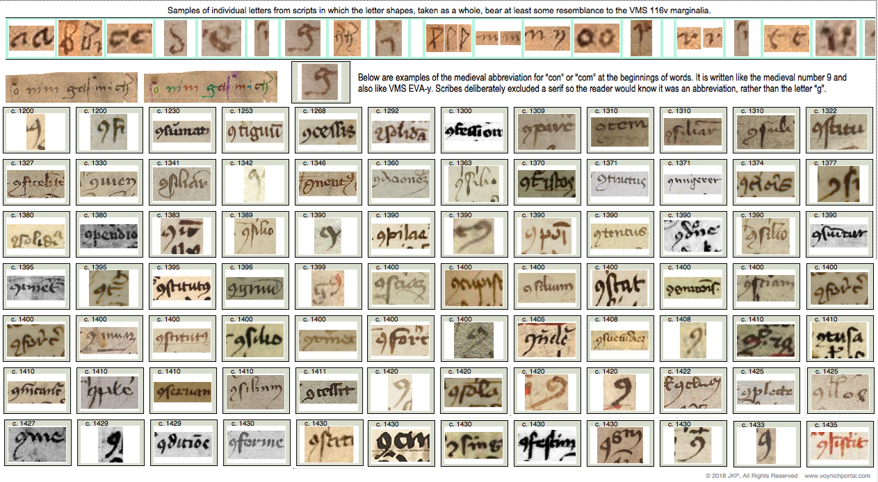
Here are examples of how the con-/com- abbreviation looks at the beginnings of words (it was essentially the same shape at the ends of words). Note that a serif is expressly not included to help differentiate it from the letter “g”:

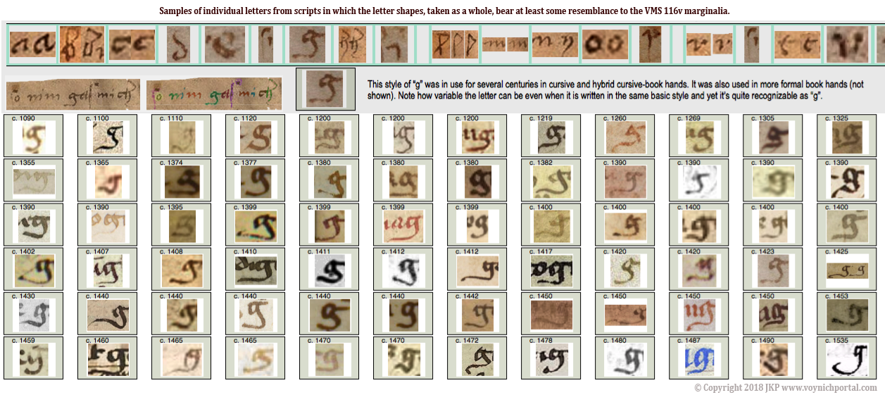
So, the marginalia “g” does not resemble a “z” or an “ez” ligature and it does not resemble a “9” abbreviation. It does, however, fit comfortably with common forms of medieval “g”, as in these examples:

Summary

There are many shapes in the marginalia that I can’t make out. Some letters have abrasions, some are indistinctly written, some are partly filled in or rubbed out. But I don’t think there’s much ambiguity about the “g”. There’s nothing unusual about the shape or its position in the word.

If someone has a different interpretation for this letter, they can post their paleographic evidence. Personally, I think it’s one of the less controversial letters on the page.

J.K. Petersen

© Copyright 2018 J.K. Petersen, All Rights Reserved

Anchiton, Michiton, or An Chiton?

There’s a controversial word on the last page of the Voynich manuscript that is often read as “anchiton” or “michiton”. I’ve written about it before and so have many others, and yet the question hasn’t been settled despite decades of study. I’m hoping some paleographic insights might help.
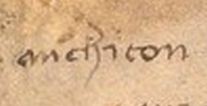
The troublesome word is on folio 116v (near the beginning of the second line). The individual letters that form “chiton” or “chi ton” are not controversial—they are pretty clear and fairly conventional. Most people agree on them. The only unusual thing I noticed is the extra-long leading serif on the letter “i”. This is a less common way to write “i”:
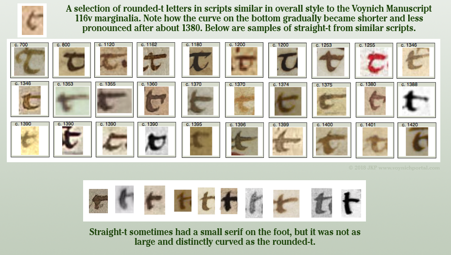
The extra curve on the “t” is not unusual if the writer learned to write the more traditional round-stemmed “t”. The rounded “t” (written like a “c”) was popular for many centuries, from the early medieval age into the 15th century. Here are some samples of rounded “t” and straight-stemmed “t”  in scripts with some overall similarity to the marginalia writing style:

In the 20 scripts with the greatest overall similarity to the marginalia, both rounded and straight t are represented, but most of them tend to be like the VMS t, in-between the two extremes:

So, putting aside “chiton” for the moment, let’s take a close look at the first letter, or two letters, since it’s not clear whether it’s one or two:

I can understand why anchiton/michiton is contentious. The first couple of letters can be read as ni, an, or mi, depending on the handwriting. Even “mehiton” (vaguely Semitic if it is a hard-h as in mechiton) might be reasonable if the other letters “e” were similar to the character preceding “h”, but they are not. It looks like “ch”.

The problem is further complicated by the less-than-professional-level script—the slants are all over the place, the loops are connected in different ways, and the letterforms are moderately inconsistent.

Nevertheless, I have some observations…

Note that the ending leg of “an” or “m” is not drawn like “i”. This writer has a tendency to draw “i” with a long leading serif, a straight stem, and no ending serif. The last minim on “an” is not drawn this way, so I am inclined to rule out “mi” or “ni” as a reading for this word. That leaves “m” or “an” (or perhaps a very unusual ligature “am”).

What about “an”? Here’s the full passage again, so you can look at all the instances of “a” and “n”:

Note the following characteristics of the handwriting…

  • The letter “a” is mostly tall, with a point at the top of a straight stem, but not always.
  • Ascending loops are usually sharp and at a certain angle, but not always.
  • The figure-8 letter (which is usually interpreted “d” or “s”) usually has a larger bottom loop, but not always.
  • The “n” is usually small and rounded, but not always.

So how do we know whether it’s “an” and both letters diverge slightly (the curve is squished on the “a” and the loops are sharper on “n”), or a loop-m that diverges even more?

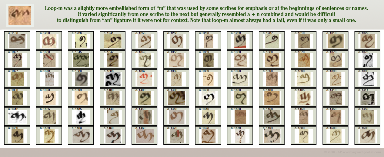
Examples of Loop-M

Here are examples of “loop-m”, a particular style of medieval “m” that looks like a ligature-“an” to modern eyes. These are all chosen from unambiguous sources where it can be verified that the shape represents “m”. Loop-m was used more conservatively than regular–m. Some scribes only used it for names or for emphasis:

Did you notice that almost all the samples differ from the VMS in one important detail? Loop-m in medieval manuscripts always has a tail. Always… well, almost always. There are very few exceptions, and even the exceptions tend to have a short tail or a down-pointing end-stroke rather than a serif, in comparison to how the scribe wrote regular “m”.

Summary

I stated years ago that I was leaning toward “an” rather than “mi” and it has taken many years to find enough time to explain why. And yet, even though I lean toward “anchiton”, I’m not certain of either reading…

  • If this is “michiton” then the “i” is written differently from all the other “i” characters on the folio, and the “m” is an unconventional loop-m with no hint of a tail.
  • If this is “anchiton” then the “a” is a bit squished, and the “n” is more angular than other “n” characters on the folio.

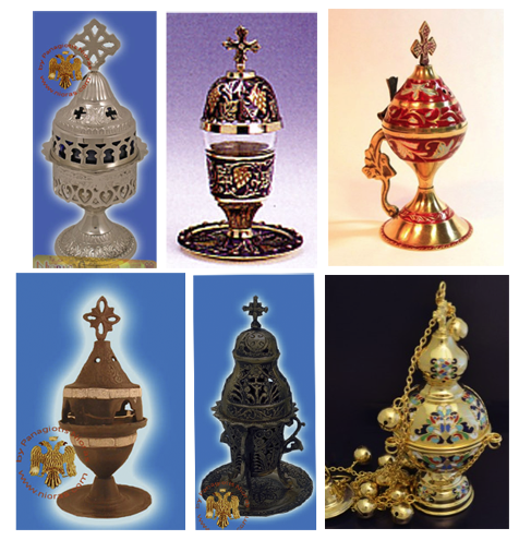
In fact, I’m not even sure this is one word. It could be “an chiton” or “an chi ton”, which looks suspiciously like an awkward Greek transliteration. It could be coincidence, but if you search the Greek words chυτά/Χυτά or chυτό/Χυτό, and filter for the metallic ones, you will see some very ornate Voynich-like Greek and Russian oil lamps and incense burners:

Images courtesy of Nioras.com and Holy Archangel Liturgical Supply

Medieval versions were probably less ornate than those pictured above (although some of the medieval Jewish spice jars were very ornate), but the tradition of metal censers for funerals, healing rites, and sometimes exorcisms, goes back a long way and the word chytoú for “cast” goes back to biblical times.

If the text on 116v is a healing charm or medicinal remedy (not saying it is, but it’s a reasonable possibility), then a cast/molded burner (chytó, chytón χυτό) for incense (or even as  source of flame for other purposes) would not be out of place.

J.K. Petersen

© Copyright 2018 J.K. Petersen, All Rights Reserved