Category Archives: The Voynich Provenance

Who Copied the Voynich Manuscript?

28 April 2021

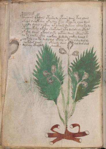
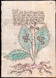
More than five years, ago Fabrizio Salani purchased a drawing at a second-hand market in Italy that resembles a copy of a VMS plant, folio 14v. Rene Zandbergen provided a link to the drawing on the voynich.ninja forum. Unfortunately, the link is no longer active, but Salani later posted an interesting video about his discovery on youtube that is still available.

Deja Vu

When I saw the drawing, I immediately noticed something familiar, something I had noticed while cruising through plant drawings, but I couldn’t remember where I had seen it. From that moment on, I was intrigued by the possibility of finding the illustrator and, after an extensive survey of medieval, Renaissance, and modern plant books, I located examples that have the same idiosyncrasies as the drawing purchased by Salani.

The Long Road Forward

The only reason it was possible to find the Salani illustrator is because he substituted his own style of root for the VMS root. The VMS drawing (right) has a crab-like root, painted a dark brick-red). The Salani root is more naturalistic. He also added an extra leaf which has some distinctive properties.

At the time we were alerted to the Salani drawing, I posted a few examples of roots on the voynich.ninja forum (02/12/16). I knew they were not the same illustrator, but I had a feeling they they might be approximately the same time period. I did not restrict my search to this period of history, however, but several years of research brought me back to it, time and time again, and it turned out to be the right ballpark.

The Salani drawing is not a slavish copy of the VMS plant, but it’s faithful enough that it cannot be a coincidence. Assuming the Salani illustrator copied the VMS (or copied a copy of the VMS) and not the other way around (which seems unlikely), he apparently did not think a 100% faithful copy was needed for whatever purpose he made the copy.

Voynichese Characters

The VMS glyphs are not copied with complete accuracy either. They are mostly right, and even the way they cross the leaf has been honored, but there are some small discrepancies.

Guessing at the purpose of the copy is difficult, but my research on printing history revealed that Renaissance entrepreneurs scrambled to gather up manuscripts that they could turn into printed books. Perhaps there was a period in the life of the VMS when someone thought it might be worthy of print reproduction. If so, this may have occurred during the “dark” portion of the VMS provenance.

Another possibility is that the copy represents one of the events documented in letters about the VMS between the Jesuits who had it in their possession before Wilfrid Voynich acquired it. There is mention of a copy (the current owner apparently didn’t want to give up the whole manuscript). I will discuss this in future posts because this is only valid if the active life of the illustrator synchs up with the dates of the letters.

Summary

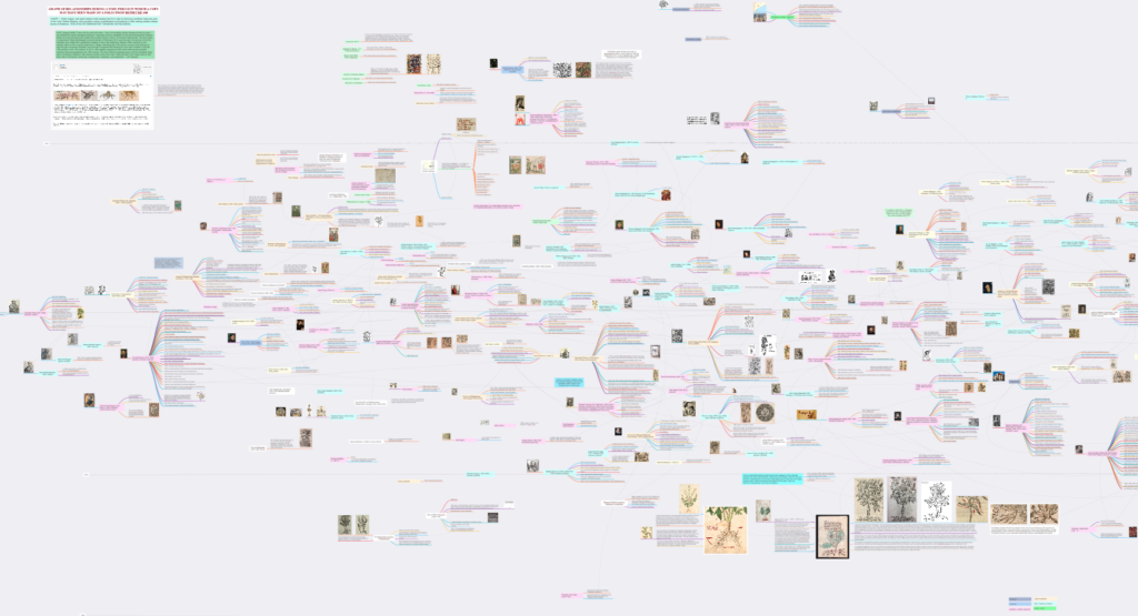
I will share more about this intriguing discovery in future blogs, but for now, here is a small portion of a chart I created as I was searching for the illustrator and, more importantly searching for corroborating evidence to pinpoint the dates during which he was active and who he associated with at the time.

Chart Documenting Illustrator for Fabrizio Salani drawing
J.K. Petersen chart documenting connections to the illustrator who apparently created the Fabrizio Salani drawing

I will post close-ups at a future date (this is a teaser since it’s not possible to explain the whole chart without close-ups that show the connections).

J.K. Petersen

© Copyright April 2021 J.K. Petersen, All Rights Reserved

Probing the Provenance

7 April 2019          

There’s a substantial gap in our knowledge of the VMS, from the time it was created (c. early 1400s) until the time it came into the hands of the Jesuits (c. mid-1600s), possibly through the court of Rudolph II. More than two centuries are shrouded in mystery.

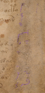
Part of my palaeographic research has included the faint text on the right-hand side of folio 1r because I was hoping it might reveal something about this hidden history, to fill in some of the missing provenance.

column text top

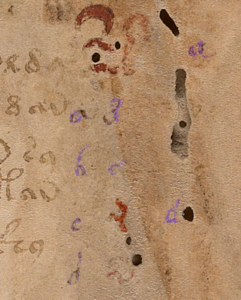
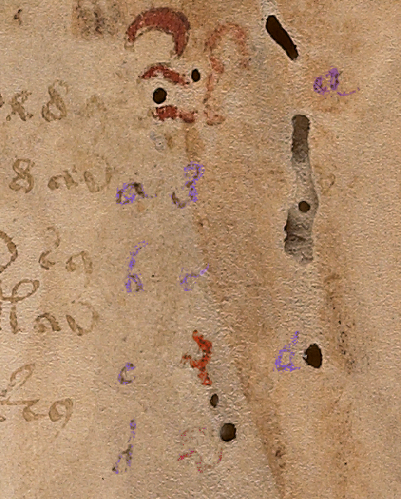
The column text on the right side of folio 1r has been partly obliterated and is very faint.

There appear to be four columns. The first two columns look like the same handwriting, with the alphabet shifted. The alphabet in the first column is complete, except that it’s impossible to make out the style of the r or the t. With very careful scrutiny, the other letters can be discerned.

The third column is slightly different. The loops are slightly rounder and it doesn’t appear to include as many letters as the first two columns. The fourth column is very faint and has fewer letters still. There also appears to be erased writing under the column letters (earlier attempts? or something else?). The spacing and style of the “red weirdos” doesn’t seem to have anything in common with the column text, so it’s probably written by another hand, perhaps earlier?

After extensive study of the letterforms, and intensive searches for similar handwriting, some of which I posted in previous blogs, I had enough information to try to reconstruct the handwriting of the person who wrote the column text. This research stretched over many years and included letterforms, spacing, final-ess styles, abbreviation styles, and time periods in which the text might have been added.

To make it easier to visualize how the scribe might have written whole sentences, I have created a font based on the style in the left-most column. It took a great deal of time and patience to try to achieve accurate reproduction of this script style. A couple of letters simply cannot be seen, but over time I became more familiar with this style of writing and how specific letters were usually written.

Scribal Specifics

pic of lower column text f1r

Fortunately, there is a certain consistency to the way the shapes are written (not all writers do this).

  • The ascenders and especially the descenders are long, and some of the ascenders have an unusually long and rounded curve on the top (e.g., f, h, and s). This long curve is not common and appears to be specific to this scribe.
  • Letters with stems have a squeezed oval loop (b, d, p, and q); those without are more round (c and o).
  • An important clue to help identify the time period is the short left stem on the letter “h”—it doesn’t quite reach the baseline. The letter “h” was written this way during a fairly specific time period.
  • Another important clue is the style of the “g”. This was not an unusual style, but it was less common than the double-chambered “g” or one that is more angular.

Years ago, when I began this line of research, I was hoping to confirm John Dee as the foliator and/or writer of the column text. Unfortunately, after heroic efforts, I have some doubt that John Dee was the author of the column text or the folio numbers. His handwriting is close to both, but I have samples that are arguably closer. Examples of the column text can be seen in previously published charts and I have gathered more text and number samples since my early research was published that indicate a number of people had handwriting very similar to one another and to the VMS.

The Column Alphabet

Here is the basic alphabet (note that the column “e” is a variant that is less common and usually only shows up once in a while. I’ve seen it a few times but no scribe uses it habitually, so I have included the “base e” here and the variant column-“e” in the block of text below).

  • The shapes for u and v were used interchangeably by most scribes and the one in the VMS is hard to discern, but it looks like it might have a pointed bottom as we now associate with “v”.
  • I am not sure how long the descender is on the “x”, the x is barely discernible, but scribes who wrote in this style usually lengthened the stroke on the lower-left as follows. However, this specific scribe may NOT have added the small hook on the bottom left. It may have had a very severe tail, like the one on the y:

Constructing a Block of Text

To make it easier to imagine the handwriting of the column-text writer, I have created a block of text in Latin (I wasn’t worried about whether it was correct Latin or even medieval Latin, I just copied and pasted something more interesting than Ipsum Lorem).

Caveats

Be aware that reconstructing a block of text from an alphabet involves some educated guesses:

  • There are no upper-case letters, so the ones I included are based on writing samples that are very close to the column text, samples that took me years to locate.
  • The extent to which the writer used abbreviations is not known, so most of the following is not abbreviated except for the extremely common -us/-um abbreviation symbol that is included at the bottom of the alphabet on 1r.
  • The scale of the letter “o” is difficult to discern. I have made it a normal size in this sample BUT some scribes during this time period wrote the “o” smaller than other letters.
  • During the century or so that this style of writing was popular, some writers used long-ess as final-ess as well. Others used a snake-style final-ess, and some used both somewhat indiscriminantly. It’s impossible to know whether the column-text writer used a different shape for final-ess, so I have included both for purposes of illustration.
  • Whether the writer left out the serifs in the column alphabet because they were unnecessary, or because this is part of the writer’s style cannot be known from such a small sample, but the impression I get is that the scribe probably used serifs sparingly or not at all.

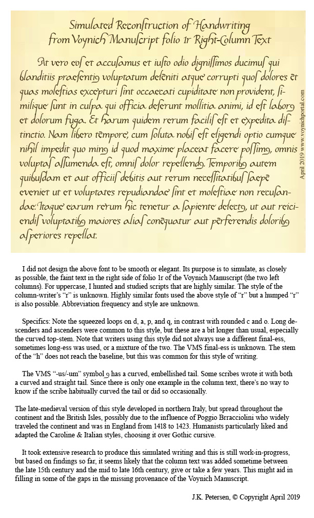
Here is the result of adapting the column text to a font that can be typed on a computer:

pic of recontruction of VMS f1r column text

Keep in mind that real handwriting is typically more varied in slant, spacing, and letterforms than a computer font. I have varied the letters slightly, but I didn’t want to stray too far from the original letters or make too many guesses, so it will be up to the reader to imagine what this would look like as handwritten text. Hopefully the reconstruction will help in that regard.

Pinpointing the Date

Preliminary date ranges were suggested in the charts I posted in previous blogs, but I didn’t feel I had enough samples to narrow it down. I’ve collected about 100 more samples since then (ones that are specifically similar to the column text) and I still don’t feel I have enough but I’m more confident now than I was a couple of years ago. Here’s a rough timeline that might help illuminate some of the dark corners of the Voynich Manuscript’s early provenance:

timeline of column text

Samples that are especially close to this script tend to be from the early 1500s, but this style was in use for about a century, so it might be premature to narrow it down any more than indicated by this date range. I will continue to seek out additional information and will post updates. I also have a great deal of information on other VMS text that I will post as I have time.

J.K. Petersen

© Copyright 2019 J.K. Petersen, All Rights Reserved

Brotherhood and Books

It’s almost impossible to search through medieval manuscripts without seeing the Ex Libris of the Society of Jesus (the Jesuits) on the fly leaves of books. The Jesuits also feature prominently in the provenance of the Voynich Manuscript, as there was correspondence among them about a mysterious unreadable book, and it was Jesuits who purportedly sold the manuscript to Wilfrid Voynich.
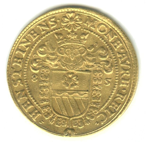
A commemorative gold piece featuring the five-petaled rose and diagonal bars of Wilhelm of Rosenberg was minted to honor his investiture as a member of the Order of the Golden Fleece in 1585. [Photo by Matthias Kauerhase in the Národní museum, Prague.]

The “Societas Jesu” (Society of Jesus) was officially established in the mid-16th century through a commendation by Pope Paul III. After a limit on membership was lifted, in 1550, Jesuits rapidly spread across the globe.

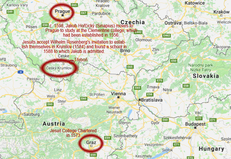
One of the first missions of the Society of Jesus was to establish schools. The Jesuit college at St. Clement’s in Prague became a university in 1562. In 1566, the college in Moravia did so, as well. In 1572, a college was founded in Brno. A year later, with support from archduke Charles, a college was chartered in Graz and attained university status in 1586.

Jesuit Missions and Jakub Horčický

Not to be outdone by Prague to the north and Graz to the south, Wilhelm of Rosenberg (Rožmberk), the nobleman who ruled Krumlov, invited Jesuits to establish themselves in his realm, in 1584, as part of the counter-reformation.

As a result, in 1588, the Jesuits founded the Krumlov school that admitted the young Jakub Horčický, as a poor student with scholastic potential who later became Emperor Rudolf II’s physician and herbalist (and whose name appears on the first page of the Voynich manuscript).
Despite their relatively small numbers, the Jesuits emerged as a unifying force among scholars in the 16th century and provided a regular communications conduit between Rome, Bohemia, and other outlying missions. Their students were not all Jesuits (although a number of them joined the order later in life)—scholarships were given primarily on the basis of need and academic potential, not on the basis of religion.

Georg Baresch (Jiří Bareš), attended the Jesuit college of Prague in the late 1500s and probably knew, or knew of, fellow Bohemian Jakub Horčický, who arrived in Prague in 1598 to study logic and sciences at about the same time Baresch was working toward his baccalaureate. There were about 800 students by this time at the Clementinum (Berenger, Simpson, 2014).

The Jesuits were probably a tight-knit group, being in the minority in Protestant Bohemia, with less than 300 officially recognized in the early 1600s.

The Jesuit Passion for Books

Libraries were an important aspect of Jesuit schools, and donations were sought to populate the shelves. The Clementinum library became the third largest of all the Jesuit libraries:

In 1562, the Clementinum college became a university and inherited a number of manuscripts that had come to St. Clement’s from the Celestine monastery of Oybin (about 150 km north of Prague). Jakub Horčický moved to Prague to study at the Clementinum in 1598. The University of Prague library, which originated sometime around 1366, had its holdings turned over to the Jesuits and incorporated into the Clementinum library in 1622. [Image courtesy of Bruno Delzant, Wikipedia]

By the mid-1700s nobleman are known to have bequeathed entire libraries to the Jesuits, and by the time the Jesuit holdings of Krumlov, a relatively small town, were transferred to Prague, in the late 1700s, there were enough books to fill 44 cases [encyklopedie.ckrumlov.cz]. Unfortunately, details of the collegiate library in the 1500s are scanty, so it’s difficult to know whether the Voynich Manuscript might have passed through Jesuit hands in Krumlov.

VMS correspondence is not explicit enough to tell us if the Voynich Manuscript was in Jacobi Horčický’s/Sinapius’s hands around the time that Rudolf died, but I’ve often wondered if Sinapius, or one of his Jesuit colleagues (many of whom were interested in herbs), brought the manuscript to Prague rather than the oft-cited John Dee or Edward Kelley (or someone else who purportedly sold it to the emperor).

If we go back a few years, there are a number of possibilities…

Champion of Catholicism in the 16th Century
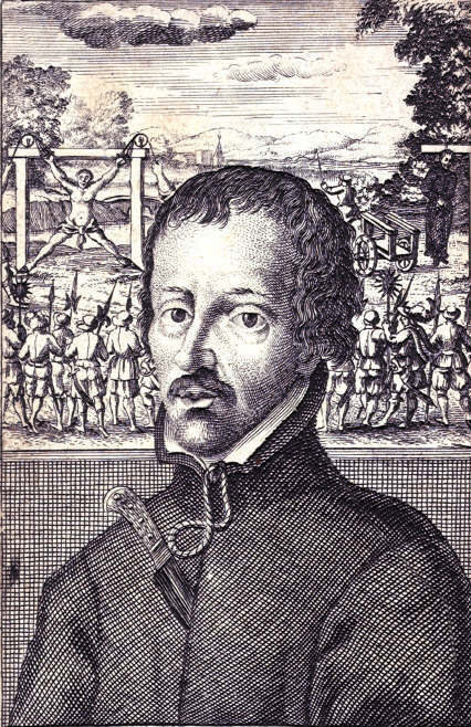
British Library: print of Edmund Campion, published in 1631.

Edmund Campion (1540–1581) was the son of a London bookseller, and deacon of the Anglican church. His eloquence impressed everyone, and he became a patron of Lord Dudley, with the opportunity of living a pleasant life, but Campion was uneasy in his conscience, a Catholic at heart, and left England for Ireland. Suspected of being a papist, he fled Ireland and his belongings were apparently confiscated. He made it to France and continued by foot to Rome, and became a Jesuit in 1573.

Thereafter, he traveled through Moravia, was ordained as a priest and became a professor at the Jesuit college in Prague.

As the son of a bookseller, it’s possible Campion had an eye for books. His parents hoped he would apprentice as a merchant, perhaps to help in his father’s business, but the boy was more interested in matters of the soul. Nevertheless, given the Jesuit passion for learning, it’s possible Campion picked up books along the way. If he did, some may have ended up in his father’s shop or in the hands of his Jesuit colleagues and friends.

Campion’s comfortable life as a college professor ended when tensions rose between Protestants and Catholics and he was summoned to Rome. From there, he was sent on an evangelistic mission to England, traveling in the guise of a jewel merchant, in 1580.

He was soon captured and given a stern admonition, and then released and treated as a gentleman, but Campion was resolute—he refused to be won over, and continued his campaign of conversion with unflinching ardor. After writing and distributing materials denouncing the Queen’s religion, in 1580, he became a hunted man and was captured for sedition, imprisoned in the tower of London, tortured, found guilty of treason, and executed, in 1581.

More Connections…

Campion’s father, the bookseller (and perhaps Campion himself), would surely have been known to John Dee. Dee was born in 1527, not far from London, when the elder Campion was probably in his teens or twenties, and Dee ardently collected books wherever he could find them and probably made many trips to Paternoster Row, where Campion’s bookstore was surrounded by other booksellers and publishers.
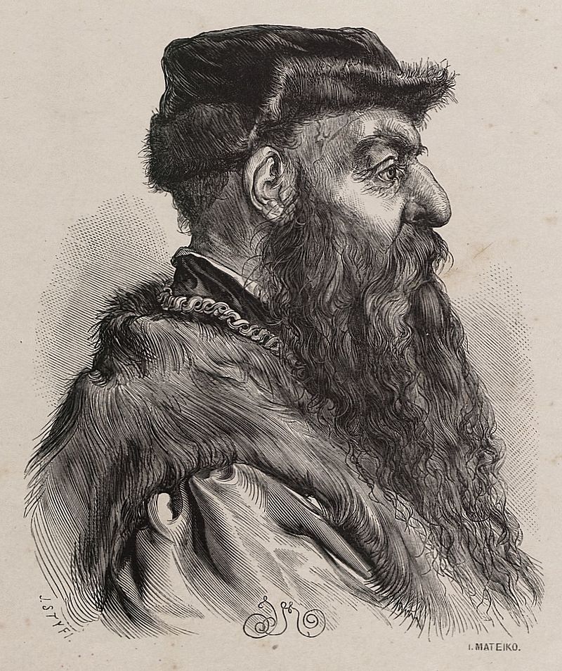
Olbracht Łaski, Prince Albert Lasky, who hosted Dee and Kelley before they moved to Prague. [Image courtesy of Jan Matejko, Wikipedia]

Philip Sydney, an English poet and diplomat, accompanied Prince Albertus Laski (Olbracht Łaski/Albert Lasky) on some of his sojourns around London and may have helped promote the meeting between Lasky and John Dee. Dee was formally introduced to Lasky in the chambers of Campion’s former patron Robert Dudley, the Earl of Leicester, in May 1583. Sydney had also known Edmund Campion at Oxford, and met with him in Prague.

Three months after meeting Lasky, Dee packed up his family and moved, with Edward Kelley and Kelley’s wife, to Krakow and, about a year later, to Prague, the capital of the Holy Roman Empire.

Dee apparently did not impress Emperor Rudolf II and failed to secure patronage as a court mathematician. Eventually, Count Rožmberk provided him a place to stay in Třeboň, where he lived from 1586 to 1589. Třeboň is less than 50 kilometers northeast of Český Krumlov (see map above), so there’s a possibility Dee visited the Rosenberg residence in Krumlov, and perhaps saw the Jesuit library. He may even have crossed paths with the young Jakub Horčický who was four years older than Dee’s son Arthur.

Dee was more interested in collecting books than selling them and his diaries don’t mention anything we can definitely link to the VMS. The various mystery texts connected to Dee have been identified by historians as the Book of Soyga and various notes authored by Dee and Kelley related to the angelic language eventually called Enochian.

In contrast to Dee, Kelley would probably sell a book in a heartbeat if he could talk it up and get a good sum for it, so it’s possible Kelley or Dee conveyed the VMS to the emperor, as has been suggested, but the possibility that the Voynich Manuscript reached Prague through the Jesuits  (or by other means), rather than directly through Dee or Kelley, should also be considered.

Jakub Horčický, tended botanical gardens and trained under an apothecary and distiller, and thus had a personal interest in both plants and alchemical processes. In mid-life he reaped a financial windfall from sales of his elixir and might have acquired a book of plants independently of the emperor. As a successful herbalist, distiller, and entrepreneur (so successful he ended up lending money to Rudolf II) perhaps Jacobi de Tepenecz was entitled to put his name on the VMS, and the “600 ducats” recorded in the letter from Marci was paid for something else.

The New Regime

It’s not unreasonable to think that Jakub may have snitched Rudolf’s book when Rudolf died, but it’s also possible Horčický was legally entitled to the Voynich Manuscript. If so, the secrecy surrounding the mysterious book in Jesuit correspondence might have less to do with it being contraband, than its appearance as a book of the occult (“black arts” were banned at the time), or possibly its immodest contents (by 16th-century standards). There are many possible reasons Horčický’s name was on the manuscript and was later expunged.

Before trying to decide whether John Dee sold the VMS to the emperor, let’s re-examine the handwriting in the VMS.

The Role of Paleography in Unraveling History

It has been said, as per expert opinion, that the VMS foliation is in Dee’s handwriting. I had to do a search, just now, to see who stated this, and found the name of A.G. Watson mentioned on the Voynich.nu site and thereafter found Kennedy and Churchill’s book, The Voynich Manuscript, in which I noted the following (courtesy of Google books):

“Most importantly, as Professor Watson wrote in 1986 to Yale University, ‘the foliation in the Voynich manuscript is Dee’s…even allowing for the notorious difficulty in deciding that figures are or are not in one hand, I am sure as I can be’. He refers to comparisons made with two Dee documents in the Bodleian Library’s Ashmole Collection…” (Kennedy & Churchill, 2006)

I am somewhat in sympathy with Professor Watson’s opinion, the handwriting is very similar to Dee’s handwriting, even given that Dee had three hands: a scrawly note hand, a script hand, and a calligraphic hand. Even though Dee’s handwriting is variable, there is still a reasonable amount of consistency in how he wrote numbers (with the calligraphic hand having slightly more serifs).

However, unlike Professor Watson, I cannot say that I am “sure as I can be” because I have found examples of numbers in other manuscripts, from other regions, that are arguably as similar or more similar to the VMS foliation than Dee’s.

It wasn’t easy to come to this conclusion. I had to collect almost 400 samples of late Medieval and Renaissance numbers to locate about a dozen that were similar to the VMS foliation. In particular, the way the 3, 5, 7, and 9 are written in the VMS are specific to this scribe and difficult to find elsewhere as a group.

Note that the number system used for the foliation is of a later date than that of the quire numbers:
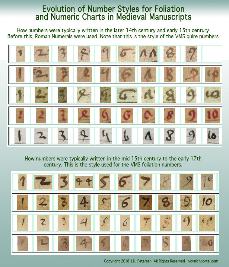
Comparing VMS Numbers to Those on Medieval Manuscripts

I consciously searched for samples that were similar to the VMS, and developed a mathematical scale for comparing the shapes more objectively so they could be searched and sorted by computer.

This is work-in-progress, but I am uploading a sample of what I have so far so the reader can decide whether the foliation can definitely be traced to John Dee (note that folio 12 is missing from the VMS, so the number has to be estimated by looking at others).

When sorted for the closest matches, two samples in Dee’s hand appeared in the top twelve. To convey a sense of how differently numbers could be written at the time, I have also included examples that scored in the middle, from 81 to 88.

I will discuss the results in more depth, with details about origin, date, and content, in a future blog. In the meantime, I’ll let you guess which ones are in John Dee’s handwriting (click to see full-sized):
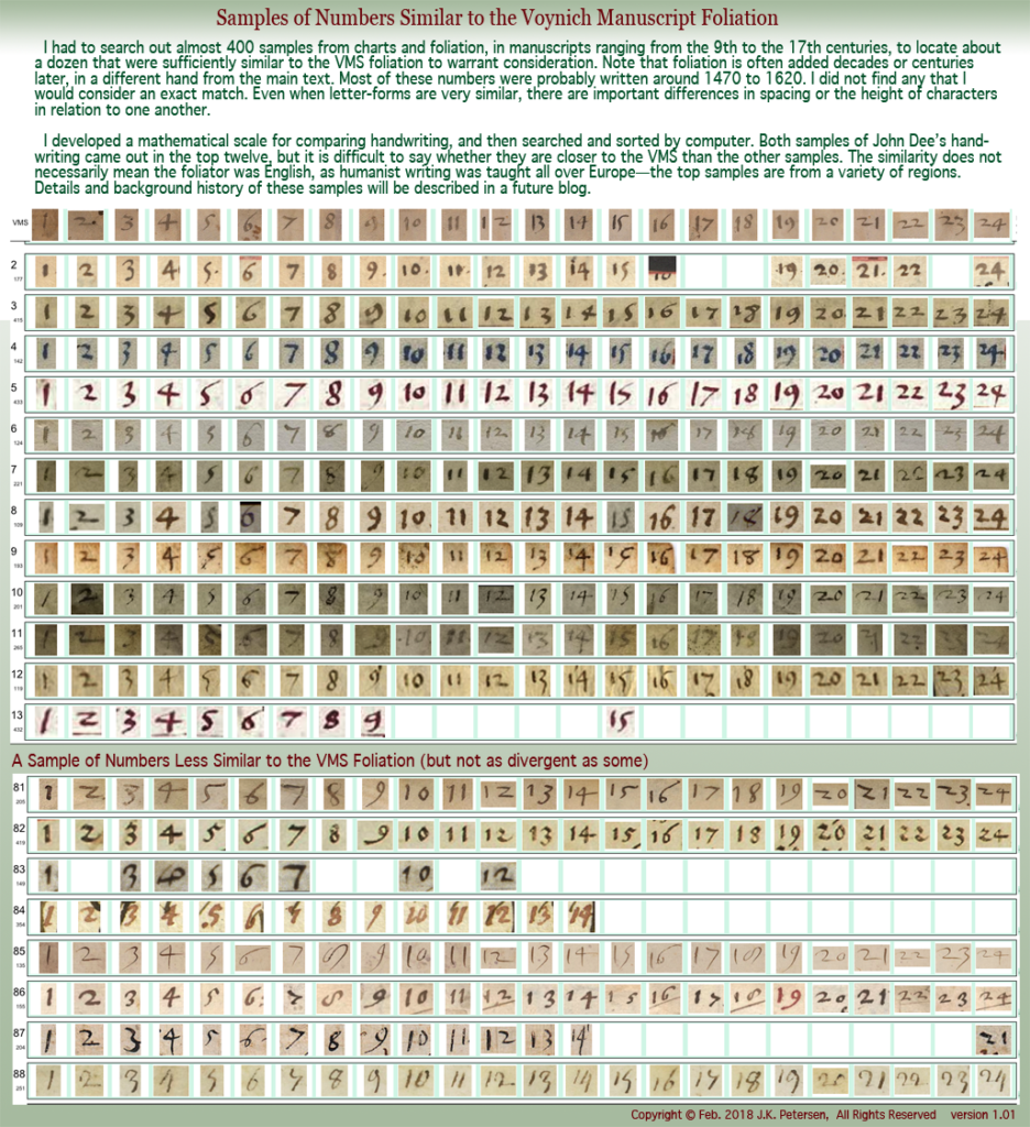
From a total of nearly 400 samples gleaned from a variety of manuscripts dating from the 9th to 16th centuries, only about a dozen were significantly similar to the handwriting of the Voynich Manuscript folio numbers. Samples were taken from foliation and from number charts within the manuscripts themselves.

Summary

By itself, this chart does not disprove the possibility that the VMS was sold to Rudolf II by Dee and/or Kelley, but it does cast doubt on the assertion that it was John Dee who foliated the manuscript, as there are other hands that are similar and none appears to be a perfect match.

If Dee is eventually ruled out as foliator, then a Jesuit connection to the VMS, perhaps Jakub Horčický himself, might be more important to the manuscript’s provenance than previously thought.

J.K. Petersen

Copyright © 2018, J.K. Petersen, All Rights Reserved
 

Does Size Matter?

9 September 2017

Dimensional Comparison

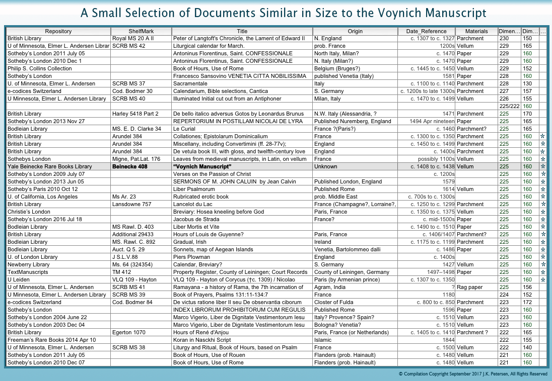
René Zandbergen posted an interesting diagram a year ago on the Voynichninja forum that illustrates the Voynich Manuscript dimensions as they compare to other documents. The VMS is listed as 225mm x 160mm (note that there are also larger foldouts), and is quite small compared to some of the other volumes. It’s a size that suggests portability.

I haven’t been keeping track of the dimensions of manuscripts to any great extent, I only record about 5% of those I come across, but I do sometimes note them down and, over time, have accumulated dimensions on about 50 manuscripts that are in the same general ballpark as the VMS.

Sleuthing Out Similar Sizes

Out of the reasonably close matches, there are 19 20 with the same dimensions as the VMS, variously produced on parchment, vellum, and paper. Materials and dimensions are not always listed, but a glance at the date can give a rough idea of what the writing medium might be (and if the scans are good enough you can usually tell from the digital images).

Very few of the documents fall within the same time-frame as the VMS. Those that do, tend to be reference manuscripts that are carried and consulted, such as breviaries/books of hours.

For those who are interested, here is a sample of the documents so far that are similar to the dimensions of the VMS, with information on repositories and shelf marks, and the approximate place of origin and date. The ones that come closest to the VMS are marked with asterisks:

Since this was not a systematic search for manuscripts with certain dimensions, merely a survey of some of the information I have in my files, one should not try to generalize too much from the results. Many of the manuscripts are from France, England, Germany, and Italy, but that might simply mean that Spanish or Arabic manuscripts did not include dimensions (or were not similar in size) or that the information was in a language, like Indian or Thai, that I couldn’t read. Nevertheless, it may be of interest and may yield interesting results as more data is added over time.

J.K. Petersen

© Copyright 2017, J.K. Petersen, All Rights Reserved

A Small Piece of the Puzzle

“Despite his best efforts, Voynich never sold the manuscript. It spent 30 years in a bank vault after the bookseller died in 1930. In 1961, rare-book dealer Hans Peter (“H.P.”) Kraus bought it from Anne Nill, Voynich’s former secretary and confidant, for $24,500 plus half the proceeds of any future sale. Unable to sell the manuscript, Kraus donated it to the Beinecke Library in 1969.”

–Mike Cummings, YaleNews, April 24, 2017

The American history of the Voynich Manuscript is reasonably well documented. From articles like the one cited above, we learn that Hans Peter Kraus, a Viennese bookseller, owned the manuscript from 1961 until 1969.

Early Years

Ellis Island immigrant station courtesy of the U.S. Library of Congress.

Kraus was a Buchenwald survivor who, after a stay in Sweden, traveled to the U.S. in 1939, leaving behind tens of thousands of precious manuscripts from his antiquarian business in Austria.

He had a particular interest in manuscripts produced before the year 1500 and one can only wonder at what gems he was forced to abandon. After arriving in New York, Kraus rebuilt his business and his reputation as a keen-eyed collector and trader of books and acquired the Voynich Manuscript for a sum equal to the price of a new house and car.

While it was in his possession, Kraus made efforts to learn more about the Voynich Manuscript, traveling to Europe and visiting the Vatican Library in 1962, as documented on www.voynich.nu, If he could confirm that the author was Roger Bacon, it would not only establish the antiquity of the volume, but would give it the celebrity appeal that could garner a good price.

It is said Kraus made efforts to sell the VMS, but less is known about this aspect of the VMS’s history than others, since many antiquarian communications are by word of mouth. Dealers, especially those dealing in rare and collectible objects, often have a number of elite clients who receive news of new acquisitions before they are offered to the public.

Kraus didn’t rely entirely on walk-in business or word-of-mouth. He was also an effective print promoter. I happened across an auction catalog that makes a brief mention of the VMS in 1966, when it was still being called the Roger Bacon Cipher Manuscript. Here is a summary of the auction listing (the reference to the VMS has been bolded):

Lot Number: 178           Title: Miniatura

…H.P Kraus (New York) Fifty mediaeval and Renaissance manuscripts. catal. ii, pp.XII, 114 Thirty-five manuscripts. Including the St. Blasien Psalter, the Llangattock Hours, the Gotha Missal, the Roger Bacon (Voynich) Cipher Ms., catal. 100, pp. 90.24 x 12. Manuscripts + books, catal. 115, 1966. pp. 196….

It has been erroneously posted on the Web that this was a listing for the VMS to be auctioned off but that it didn’t sell. I think this is a misreading of the auction listing.

The publication mentioned in the auction is not the manuscript itself, but a catalog called Thirty-Five Manuscripts, Including the St. Blasien Psalter, the Llangattock Hours, the Gotha Missal, the Roger Bacon (Voynich) Cipher Ms. It was published by Kraus to promote the sale of some of his more prominent items, including the Voynich Manuscript, which was described at the time as being about 700 years old. Kraus produced at least half a dozen significant catalogs between 1956 and 1978 (and apparently many more that are lesser known, totaling more than 200).

Summary

I have not seen the catalog, it is difficult to find, but it is a cloth-bound hardback with 87 pages and 41+ illustrations, published in January 1962, and is said to be well annotated. I would be curious to know how Kraus described the VMS. A quick search of the Web revealed only a few copies of Thirty-Five Manuscripts available for purchase or viewing. Here are some examples:

  • A copy in the holdings of the U.S. Library of Congress. Unfortunately, whoever borrowed it in Jan. 2016 neglected to return it, as it is listed as overdue.
  • Abebooks lists three copies, one of which is a repeat of the copy on Amazon, and one which has library markings (should we be suspicious of its origin? ).
  • A used copy on Amazon.com for $195.
  • A copy available, by request, to view in the reading room of the National Library of Australia.

Even with this kind of promotion, apparently no one was interested in the odd little volume, as it was donated, unsold, to the Yale library in 1969. Whether the lack of a sale was because potential buyers doubted the authenticity of the manuscript, or its speculative provenance, or whether it was because the asked-for price was more than they cared to risk is unknown, but interest in this unique work has not declined in the intervening years. It still whispers to the curious among us about secrets as yet to be discovered.

J.K. Petersen

© Copyright 2017 J.K. Petersen, All Rights Reserved
Cultural Pollination

In the days before overpopulation and “private property” made it difficult to travel without getting permission or a passport, humans were nomadic. They followed the seasons and, when they had “used up” the resources in a particular spot, they moved to another one, eventually colonizing the whole planet, including places where the snow never melts. As resources dwindled, they changed from colonizers to conquerors, often displacing or assimilating earlier cultures.

From Watering Holes to Warfare

The Mongols have long been known for their great equestrian skills, and for their ability to travel long distances through harsh climates. In the 13th century they were ambitious invaders, making repeated efforts to conquer China, parts of Russia, and even eastern Europe—their campaigns ranged over thousands of miles. In so doing, they came in contact with diverse cultures, sometimes absorbing their ideas, other times influencing or extinguishing them.

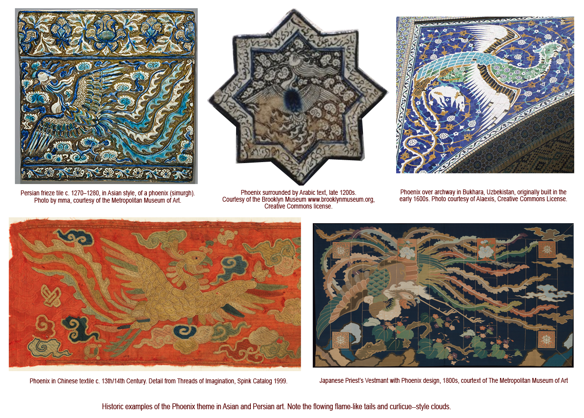
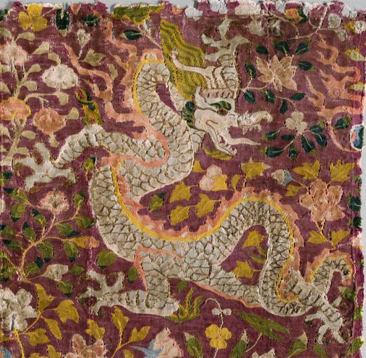
Some theorists say the Asian style of dragon that is especially prevalent in China, and to a lesser extent in Persia, was influenced by Mongolian art. I don’t have time to research this, it seems to me that 13th-century Mongolian art has a different look and different themes, and that a phoenix with flowing lines existed in early Japanese art and is found in Uzbekistan mosaic art, so perhaps it was indirect rather than direct influence that brought the extravagant flames and curlicue clouds to Persia in the middle ages. There were surely multiple lines of transmission, Mongol caravans with foreign goods, and new trade routes opened by Mongol incursions, but land-roving nomads were not the only visitors—seafaring traders were constantly moving goods between east and west and ship technology was constantly improving. Whatever the source, the ties with Asia are readily apparent in 13th-century Persian art.

Click to see a larger version.


This fabulous textile art, created around the 11th or 12th century in east-central Asia, is thought to have been crafted by the Turkic Uyghur people, and might represent another route of transmission for east-to-west dragon imagery:

Note: Uyghur dragon textile was added a few hours after the blog was published. Note the tail snaking through the legs, a motif often seen in Mediterranean and western European drawings of lions. [Photo courtesy of the Metropolitan Museum of Art.]

With reference to the Persian Ilkhanid Period (1256–1353):

“In [book] illustration, new ideas and motifs were introduced into the repertoire of the Muslim artist, including an altered and more Chinese depiction of pictorial space, as well as motifs such as lotuses and peonies, cloud bands, and dragons and phoenixes.” –Suzan Yalman, The Metropolitan Museum of Art

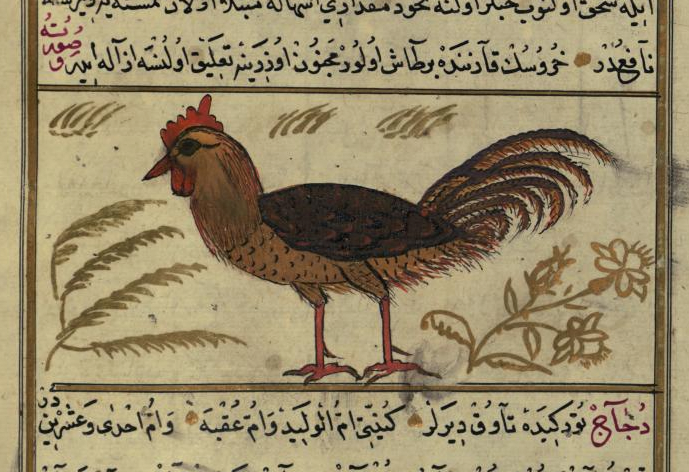
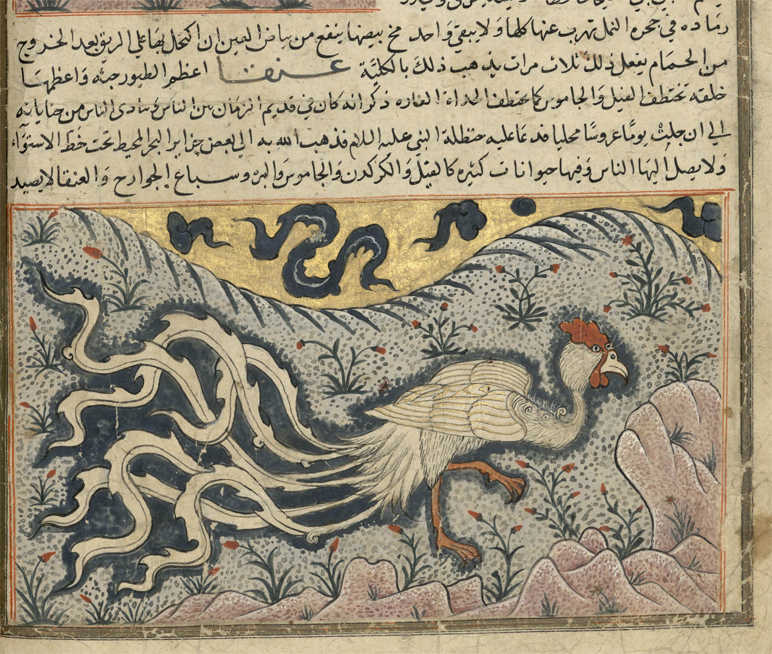
[Cockerel images added April 8, 2017] These examples from a group of Arabic manuscripts that were inspired by Al-Qazwini’s 13th-century bestiary, illustrate interesting differences in style:

Al-Qazwini’s bestiary, created around the mid-13th century, was reproduced in different versions. The top example of a cock from Walters MS 659 (1500s) is a traditional depiction, with no exaggeration in the landscape or details, the bottom one, from Bibliotèque Bordeau MS 1130, clearly shows eastern influence in the curlicue clouds, undulating landscape, and extravagant flame-like tail-feathers. The cock has almost been transformed into a phoenix.

Within the next few centuries, the eastern influence becomes even more apparent…

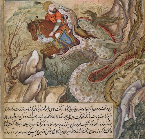
The British Library holds an illustrated Arabic romance of the adventures of the Persian King Darab, originally composed in the 12th century by Muhammad ibn Hasan Abu Tahir Tarsusi. The library’s copy dates to between c. 1580 to c. 1585, so it’s not as old as the phoenix tiles, but it shows a similar adaptation of eastern style in dragon art.

In this dramatic scene, Bahman and his horse are swallowed whole:

The nose looks like a camel, and it’s clearly a malevolent beast, but the tendrils on the lower jaw, the whiskers, eye-stripe, and mane are in the flamelike undulating style that is common to Chinese dragons.

[I had an example of an Asian-style dragon from western Europe that I found about three months ago but, unfortunately, despite a concerted hunt through my files, I can’t find it. If I do, I will upload it here.]

Summary

This is, in a sense, a follow-up to the post on the jongleurs, where the French illustrator used a different style to express itinerant performers (who may have been of eastern origin), but I also have a personal interest in Asian art and looked up some more specific examples that relate to cultural transmission to see when these particular styles were introduced to the Arabic world. Persia has had political ties with China at least since the 6th century (royalty intermarried), so there may be other examples, but unfortunately I can’t pursue all of them.

The images are interesting in their own right, so I decided to post them for Voynich researchers who may be curious about cultural influences between east and west.

J.K. Petersen

© Copyright 2017 J.K. Petersen, All Rights Reserved

VMS F1r Column Text, updated chart

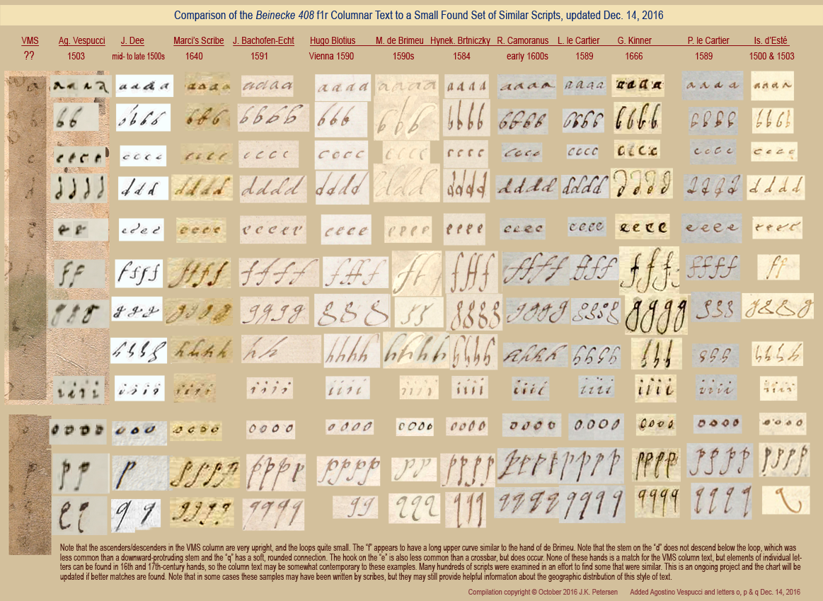
On October 24, 2016, I posted a blog about the partly erased vertical alphabet in the right column of folio 1r.  Over the next month, I added o, p, and q and one more sample of handwriting. The text is probably marginalia, it doesn’t appear to match any of the other text in the manuscript, but it may reveal a few things about the manuscript’s provenance if a match can be found.

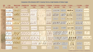
I’m enclosing the revised chart illustrating similar hands as an addendum to the previous post, which you can read here. You can click on the revised image to see it full-sized:

J.K. Petersen

© Copyright 2016 & 2017 J.K. Petersen, All Rights Reserved

Scribal Relationships

Today’s blog isn’t directly related to the Voynich manuscript, but may be of interest to paleographers and medieval bibliographers in general.

Connecting the Scribes

While scanning through Vatican Ross.708, I noticed the script was similar to another manuscript I had previously seen. The writing is Gothic cursive which, in itself, is not unusual. This style of script was common in the 15th century throughout northern Europe, Bohemia, Lombardy, parts of northeastern Spain and, to some extent, the area around Naples and Salerno.

In fact, it never ceases to amaze me that a specific style of writing could be so widely distributed in the days before television and public schools began to standardize culture and teachings, especially when travel was so treacherous—turbulent seas and precipitous mountain passes were significant obstacles. If you were fortunate enough to have a horse or mule, there were places you had to dismount because the trail was too narrow for both horse and rider or, if the path wound along mountain cliffs, there was a real possibility the animal would slip and plummet, and it was better not to be astride when that happened.

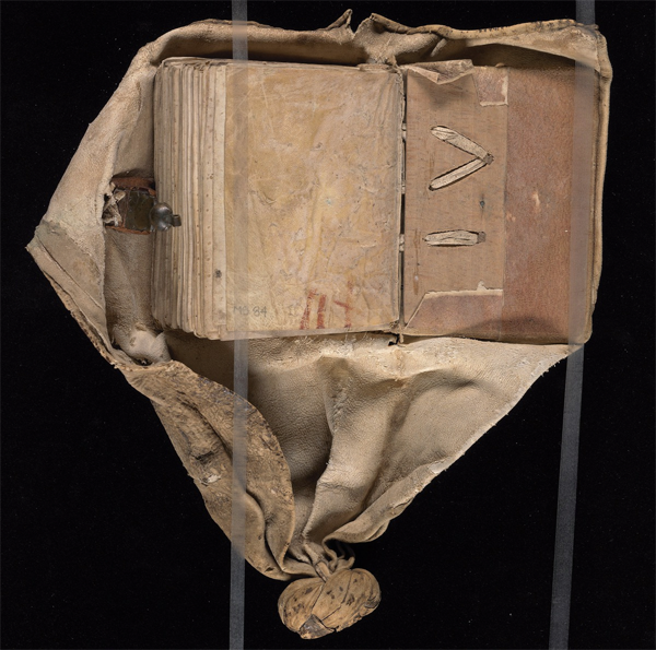
This book has been sewn into a swaddling girdle to protect the manuscript on journeys. The knot could be used to tie it to belt or saddle. [Image courtesy of the Yale Beinecke Library.]

Considering the distances, and the difficulties of finding food and shelter on journeys of hundreds or thousands of miles, it’s incredible that writing styles could be so similar… and yet they were. I don’t know if anyone has given an adequate explanation for this phenomenon, but it’s evident that scribes moved around and that manuscripts were carried for great distances. Book boxes, satchels, and girdles (like the one on the right) were designed to protect books while en route.

The Romans brought coins and a new culture to England in the early years and, by the eleventh century, partly due to the Crusades, manuscripts from major trading posts in the Mediterranean were showing up fairly regularly in England, a round trip of about seven thousand miles.

Handwriting as a Research Tool

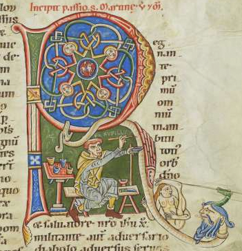
A rare self-portrait of Rufilis, the rubricator and his paints, from Bodmer Ms 127.

Handwriting is an important tool for identification. Along with other clues, it can help date a manuscript, and sometimes even pinpoint a specific origin or author. For the most part, the names of medieval scribes have been lost, although there was a greater tendency to name and date them in the middle east than in Europe. This is partly because many European manuscripts were created in monasteries and humility was considered a virtue (although some monks couldn’t resist the urge to encode their names within the text or their images within the illuminations). In other cases, even if the name was known, the person who penned it may have been lost to the annals of history due to an untimely death from war, disease, or famine. In times of war, sometimes entire villages were burned, including the records.

I mentioned in a previous blog on VMS folio 1r, that the handwriting of John Dee and Isabella d’Este show surprising similarities, considering one was educated near London and the other in Ferrara several decades earlier. You can see samples here. This is strong evidence that handwriting can be similar even if it originates in different areas at different times. It doesn’t happen often, however. After searching thousands of manuscripts, I have collected a very large number of samples, and rarely see temporally separated hands that are this similar. Because there are general patterns of change over time, handwriting can help us learn about a manuscript even if we are not completely sure of its origin.

Looking for Commonalities

To determine a common origin (or a common scribe who worked at different locations), one has to study the ink and pigments, the writing medium (parchment or paper), the angle of the writing, the angle of the pen, the slant, and the spacing between letters and lines. Even details, such as the way the pages are trimmed or bound, the worm holes, the stains, and the stitching, can provide clues.

If two different manuscripts show significant similarity, but end up in different repositories, the handwriting can help determine if they were written by the same scribe or the same scribal tradition. The origins of many manuscripts are not known and the community at large might be able to help with some of the unanswered questions now that e-facsimiles are becoming available.

The Doppelganger to Vatican Ross.708

The manuscript whose handwriting closely resembles Vatican Ross.708 (recently uploaded from microfilm to DigiVatLib in Italy), is Codex Sang. 726, which is on the Stiftsbibliothek site in St. Gallen, Switzerland. The distance between Rome and Switzerland on modern roads is almost 600 miles—a three-month journey in medieval times, much of it through steep mountain passes.

The handwriting is not a perfect match, but many of the letter forms, and even whole words, are almost indistinguishable, and the slant and line spacing are a good match as well (something that often differs dramatically even if the letter-forms are similar).

Here are some samples (click to see it full-sized). The brown ink is Codex Sang. 726 (“Scribe 1”), the black photostat is Ross.708.

Gothic cursive text samples from Codex sang. 726 and Ross.708

Samples for comparison between Codex Sang. 726 in Switzerland, and Vatican Ross.708 in Rome.

The main differences are

  • the “g” (Scribe 1 characteristically loops the tail up, Scribe 2 points it down to the left),
  • the “u” (Scribe 1 writes it with an undercurl, Scribe 2 with an overloop),
  • the “w” (Scribe 1 writes it like two v-shapes joined, while Scribe 2 tightens up the first “v”), and
  • a tendency on the part of Scribe 2 to sometimes not completely close the loop on the “e” or connect the stem on the “r”.

After collecting hundreds of samples of Gothic cursive, I’ve noticed it’s rare to find two scripts that are this similar unless they are by the same hand. Maybe they learned from the same tutor. Maybe they were blood relatives (sons often learned to write from their fathers).

Both manuscripts are in Middle German. Vatican Ross.708 (digitized from microfilm) is a popular story of travels attributed to John Mandeville and Codex Sang. 726 is about Schwabian history and law, so they are quite different in subject matter.

I can’t tell if Ross.708 was written on paper or parchment, but there are some vague horizontal striations in the muddy section about an inch in from the right on the bottom of page 2 that might suggest paper but it’s not clear enough to be sure. Note the Ex Libris mark on the same page for Bibliotheca Rossiana indicating that it probably originated from the de Rossi collection before it passed into the hands of the Society of Jesuits and the Vatican.

Sang. 726 is believed to be from S.W. Germany. It is listed as a late 14th or early 15th century document but I suspect it’s 15th century, probably closer to mid-15th century. It doesn’t use a single-loop “d” or double-story “a” as was more common in the 14th century, and it was written on paper rather than parchment, which also suggests 15th rather than 14th century (laminated paper was available around the eastern Mediterranean in earlier times, but laid and the later calendered papers, as were typically used in Central Europe, came later). Paper was available in France and Germany in the early-to-mid 14th century, but did not come into common use for manuscripts of this kind until about a century later.

Summary

So does any of this relate to the Voynich manuscript? Well, yes. As I’ve mentioned in previous blogs, most of the writing on the last page of the VMS is Gothic cursive script, which adds another piece of evidence to the estimated 15th-century origin of the manuscript and which relates to some of the research I’ve been doing on the text (to be posted later).

Also, Ross.708 (which was brought to our attention on the Voynich forum by René Zandbergen), includes a number of alphabets that might be of interest to Voynich researchers.

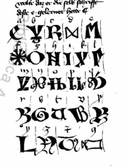
Whether these Mandevillian alphabets are actual or mythical is debatable, since Mandeville’s supposed travels have never been substantiated, and they scarcely resemble real eastern alphabets (note that each Mandeville story is accompanied by different illustrations), but they have some interesting shapes, some of which can be traced to other traditions, and might provide some food for thought.

J.K. Petersen

© Copyright 2017 J.K. Petersen, All Rights Reserved
Reconsidering the Columns

The Mystery of the Columns

i-initialn May 2016, I posted a follow-up blog about the faint letters visible on the right-hand side of folio 1r and speculated that it might be a failed attempt at decoding the manuscript. That was a guess based on seeing the Latin alphabet in the first column paired with Voynich shapes in the second, and the fact that it was later erased. Two more columns are also faintly visible, but there’s not enough detail to discuss them in depth.

In my previous blogs, I was reluctant to guess the date of the columnar writing because only a few letters are clearly visible, but I went out on a limb and estimated that it might be late-16th- or possibly 17th-century script, based on the small round shapes, the long unlooped ascenders, the slant, and the overall look and feel. I wasn’t completely sure, however, because important clues about how the writer connected the letters and spaced the lines aren’t available.

As soon as I posted the May 2016 blog, I started this blog, to describe the writing further, but was pulled away by other interests and responsibilities. The column text is a sideline for me, but studying it might reveal a few details about the VMS’s provenance, so I come back to it from time-to-time.

Who Added the Columns to the Voynich Manuscript?

My paleographic collection includes thousands of writing samples, but most are focused on Carolingian or Gothic time-frames and the VMS columnar writing is different. It looks more recent than other parts of the VMS, and more like a casual or correspondence hand than a scribal book hand, and most of it has been erased. Nevertheless, there is enough to sample some of the letters.

Voyf1rColumns1To recap: on folio 1r, the first column (to the right of the main text) is moderately clear. An alphabet has been written from top to bottom in a tidy script with small, relatively smooth curves and unlooped ascenders/descenders. I have colorized the letters to make them easier to see.

The second column starts with the VMS figure-8 glyph, followed by a small c-shape, and then some shapes that resemble the “red weirdo” at the top of the columns. I’ve colorized the “weirdos” red to distinguish them from the regular Latin alphabet in Column 1 and the VMS characters above them. Columns 3 and 4 are almost completely erased and crowded by wormholes, and column 4 appears incomplete (it’s even possible that columns 3 and 4 are one column worked in around the holes), so this blog focuses on the letters in column 1.

A Brief Background on Writing Styles

Voyf1rColumns3From a paleographical point of view, the style of writing in Column 1 is quite distinct from the angular looped ascenders and proportions of 15th-century Gothic scripts. Gothic book and cursive hands (and those that closely resemble them, like Anglicana) were predominant in the Holy Roman Empire in the 15th century and were in use all the way north to Scotland and Sweden and south to the area around Naples, partly through the influence of Benedictine and Franciscan monasteries, and partly due to commercial scriptoria that offered handwriting lessons.

Gothic cursive styles were less common in the central Italian states and western reaches of Portugal and Spain, but were used in Flanders, eastern France, and Bohemia.

Gothic handwriting is relevant to Beinecke 408 because the labels on the zodiacs, and the marginalia on the last page and a few of the other pages, are in Gothic cursive hands. The latter appears to be in an older transitional style, between a Gothic book hand and Gothic cursive (I have a detailed paper on this that I will upload in a future blog).

The folio page numbers also appear to be different from both the main text and the last-page marginalia, and it has been suggested that John Dee may have added the numbers. I have not read the prior research on Dee and the folio numbers because I wanted to determine for myself whether there is a match so I could independently corroborate or refute existing opinions and will post my observations on a separate blog. For this blog, I thought it might be interesting to ask the question…

Did John Dee Write the Marginal Columns?

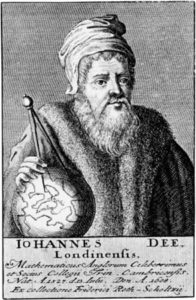
johndeeportraitJohn Dee was a pious family man with a thirst for learning. His broad interests included mathematics, medicine, astrology, and many other subjects. He avidly collected books, dreamed of establishing a national library, and was eager to communicate with angels in the hope of uncovering universal truths.

Dee is often described as an alchemist but he did not engage in alchemical experiments to any great degree, except in a secondary role if they were related to angelic communication. He was interested enough, however, to read about alchemy, to have some lab materials, and to leave marginal notes in this handwritten manuscript that may have been from his library:

johndeenotes

Dee’s margin note about “the grene lyon” (the green lion) is a reference to one of the ingredients of alchemical distillation processes. Interestingly, something I noticed as I looked at page after page of Dee’s writing, is that he appears to have picked up scribal ideas for ligatures and flourishes from some of the texts that he read or copied. I noticed the scribe on the left used a ligature for “th” and, in some places, a flourished “e” that are not found in Dee’s marginal notes for this page, but which show up in Dee’s later notes in adapted form.

johndeediarysnippet

In note form, Dee’s hand can be scrawly and difficult but is elegant and comprehensible when applied to finished charts and formal correspondence. Dee could draw reasonably well, valued good handwriting, and is said to have encouraged his sons to write well so as to make a good impression. (Image detail of Dee’s autobiographical notes courtesy of the Royal College of Physicians exhibit.)

In his search for knowledge, Dee ardently tried to communicate with angels and kept profuse notes of these sessions. He made efforts, sometimes on a daily basis, to contact these heavenly messengers. As a consequence, his notes, diary, and correspondence provide enough samples to get a good sense of his handwriting.

Evolution of Handwriting

By the 17th century, handwriting in academic circles had evolved from the upright, heavy, angular Gothic styles of the 15th century to a lighter, quicker, more slanted script. Compared to early 15th-century scripts, Dee’s 16th-century lower-case letters are small and rounded, the space moderately wide between letters, and the ascenders and descenders long and not always looped, more similar to the example on the right.
gothicitalicexample

On the left is a typical example of mid-15th century Gothic script from a commercial scriptorium that taught handwriting. By the 16th century, paper was more widely available, making it easier to engage in correspondence and quicker, lighter hands became prevalent in academic circles, as in the French example on the right. Dee’s hand also reflects this change in style and bears similarities to the hands of a number of scholars and nobles in France, distant parts of the Holy Roman Empire, and what is now northern Italy.

With regard to the VMS, Dee’s script is distinctively different from the Gothic cursive on folio 116v and a few other folios, so I think we can rule out Dee as the author of the last page and the zodiac wheels marginalia. It also doesn’t seem likely that he was one of the primary scribes for the VMS—the slant and spacing don’t match, the time-frame is wrong, and he handles the pen differently from the main text (more about that and the folio numbers in separate blogs).

Overall Impression

As I collected samples of Dee’s handwriting, it struck me that it was similar to Marcus Marci’s correspondence about the VMS, penned by a scribe on Marci’s behalf several decades later. I haven’t seen this similarity mentioned anywhere else in connection with Voynich studies, so I sampled one of Marci’s letters, as well, based on the image at http://www.voynich.nu. As far as I am aware, the identity of Marci’s scribe has never been determined.

Most of Dee’s available notes were written between 1550 and 1600, almost a century earlier than Marci’s letter, and yet you will see the similarities in style in the image below. The only significant differences are the following:

  • Dee sometimes wrote “e” with an ascending tail rather than a loop,
  • Dee’s “g” descender is shorter (although not always), and
  • the starting leg of the “h” is frequently truncated so it doesn’t reach the baseline—in combination with the flourished “e”, this is a distinctive marker in Dee’s handwriting but the pattern can be found in a few others, including that of Isabella d’Este who was raised in Ferrara, far from Dee’s London, England.

voy-f1rcolumnsmall

It was necessary to hunt through several hundred documents to find a few hands that closely resembled the style of writing on folio 1r and this is still a work in progress. It may require hundreds more to get a sense of when and where the columnar letters were written. As it is, Dee’s handwriting is somewhat close, and he sometimes wrote the “e” with a hook as in the columnar text, but the slant and pressure dynamics differ, so it’s not an exact match (click to see a larger version).

The hand of Isabella d’Esté (far right) is surprisingly similar to Dee’s (with the exception of the “g”), which demonstrates not only that geographically distant writers can end up with similar letter forms, but that it’s unwise to jump to conclusions when finding something that “almost” looks the same…. there might be others that match even more closely that may lie undiscovered.

Summary

When I first saw Dee’s handwriting, I noticed similarities between it and the VMS columnar text, but after sampling the handwriting of other writers, it appears that this style of script was widespread geographically even if it was not entirely common (I encountered many other styles in the search for this handful of samples).

My gut feeling, until more data is available, is that the columnar text was probably added sometime between the late 15th century and the mid-16th century. This is very tentative, as there is so little to go on, and certainly will be revised if additional examples that match more closely are found.

J.K. Petersen

© Copyright 2016 J.K. Petersen, All Rights Reserved