Category Archives: The Voynich Small Plants

Hidden in Plain Sight

24 October 2020

Mandrake is one of the best-known plants in medieval herbals. The root is roughly humanoid, and medieval entrepreneurs sometimes carved it to make it more overtly human. Folklore said it was dangerous to dig up the root. The plant would shriek and hearing it could kill you, so harvesters were counseled to use a dog on a leash to dig it up.

The Mandrake in Medieval Herbals

Many medieval herbals included the mandrake, from countries like Italy, France, England, Germany, Greece, the Middle East, and others.

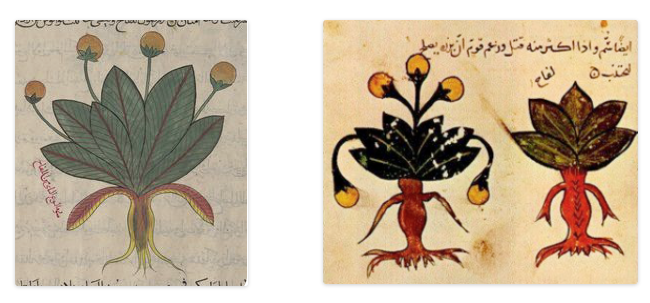
Sometimes only one plant is shown, sometimes two versions: “masculine” and “feminine”, as in these Arabic manuscripts:
The male/female dichotomy goes back to the Dioscorides. In this early copy, the faces are not explicitly drawn, but the roots are distinctly humanoid. A dog is not included in the image, but is mentioned in the text:
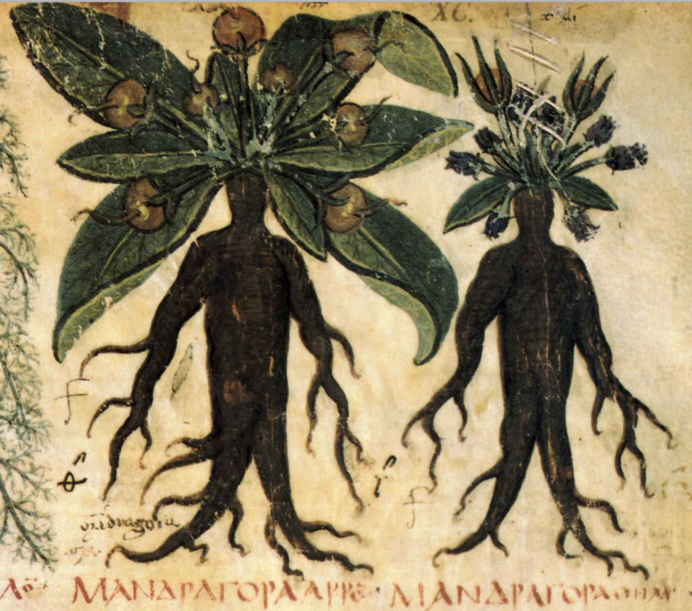
Dioscorides male and female mandrake plants
Male and female Mandrake in the 7th-century Naples Dioscorides [MS Suppl. gr. 28]

The humanoid root appears in early copies of Pseudo-Apuleis with a dog, but still does not have a humanoid face:
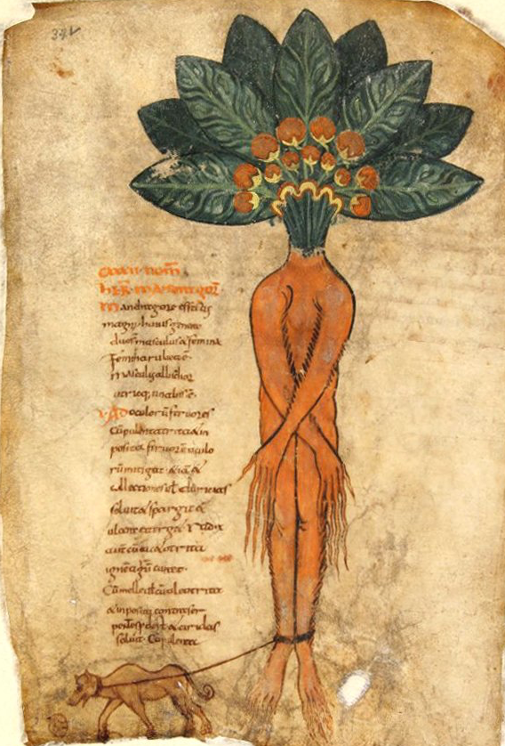
Mandrake with a humanoid body, but no facial features. [Pseudo-Apuleius, Kassel Mandragora, c. 9c]

The anthropomorphic Mandrake was especially popular in the 12th to 15th centuries. This one, from 12th-century England, includes the dog pulling out the plant while two figures approach with hooks or spears:
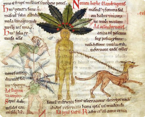
BL Harley 5294 humanoid mandrake drawing with dog
A dog pulls the mandrake from the ground and two humans approach it from the left: [Source: BL Harley Ms 5294]

This 13th century example is the same basic theme, with the dog, and figures with spears, but the narrative is broken up into a series of panels:
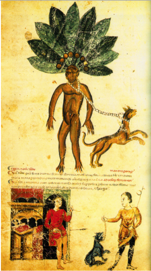
Codex Vindobonensis 93 mandrake plant with dog
The mandrake was supposed to be excavated with the help of a dog so the human was not harmed by the mandrake’s shrieks. [Codex Vindobinensis 93, 13 century, Wash. University]

On the facing folio, the dog has done its job and two figures poke the root with hooked spears, but it is different from most depictions of mandrake in that a second figure is under the feet of the standing mandrake. The shadow under the character on the left is very doglike.
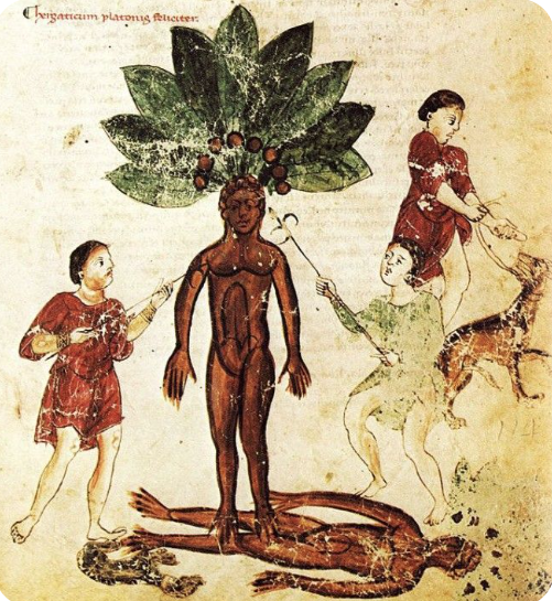
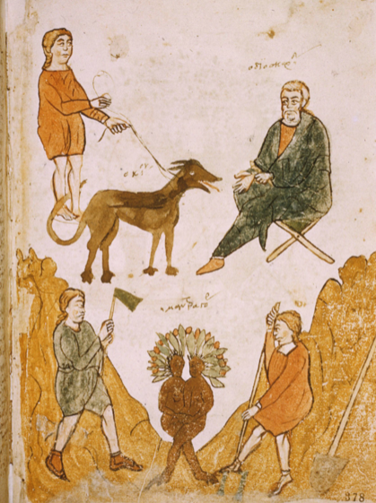
This version is the same general idea, but the spears are replaced by more familiar tools, and the male and female versions are shown as conjoined twins:
Bologna mandrake drawing
Male and female forms of mandrake cojoined, with the dog pictured above. [Biblioteca Bologna, Gr. 3632]

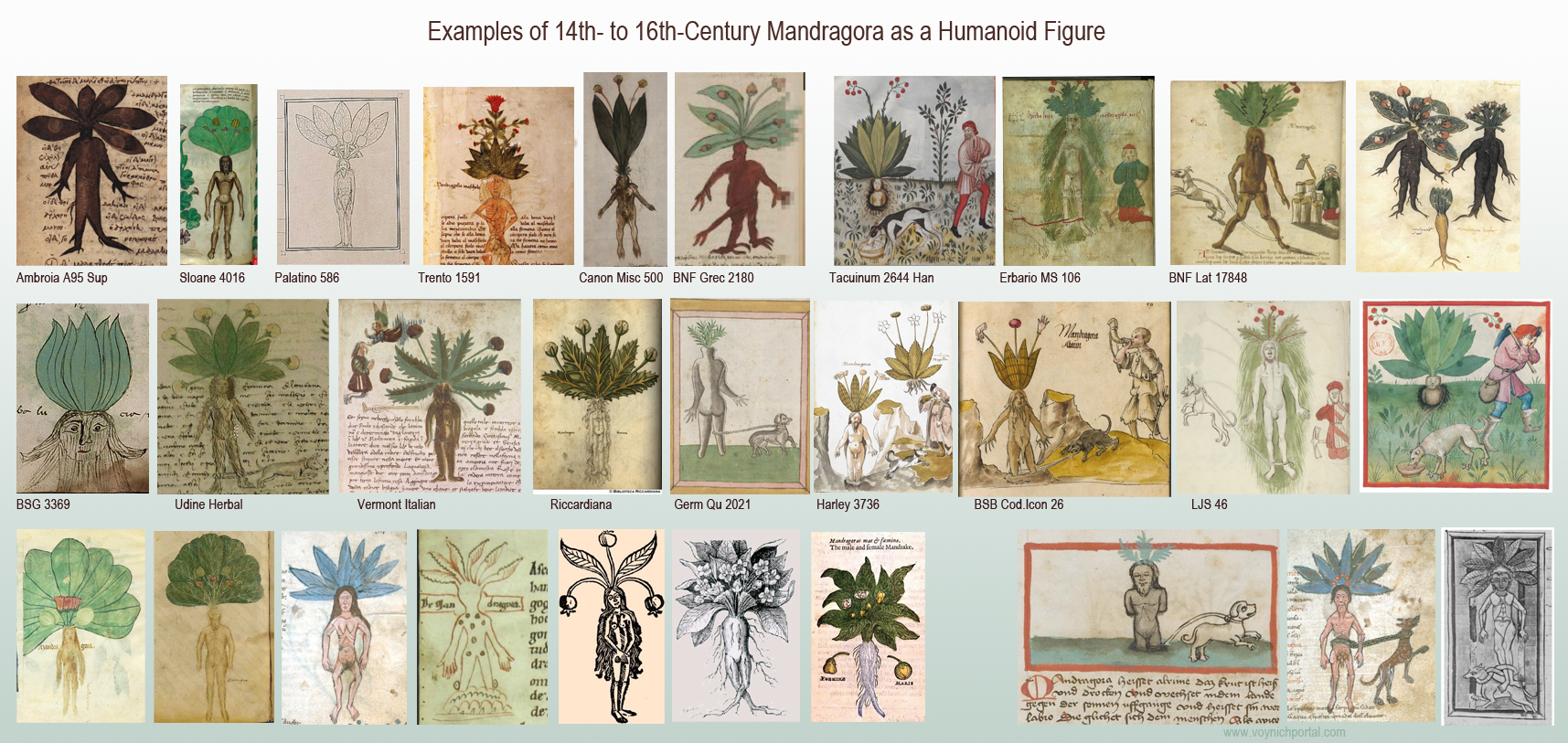
The dog is not always included. Here are a number of examples that emphasize the humanoid form both sans and with the dog:
sample of medieval mandrake (Mandragora) drawings

Most mandrake drawings include berries. Some have smooth leaf margins, others are serrate. In real life, the margins are ruffled and irregularly serrate.

In the 16th century, the humanoid form was gradually superseded by naturalistic representations.

Is Mandrake in the VMS?

The Voynich Manuscript has a large number of plants in the “big plant drawings” section, and yet there’s nothing that overtly resembles Mandrake. Some have suggested that f33r might be mandrake, but I think there are better identifications for 33r.

A better possibility is f25v, but the root is not humanoid, the leaves are not ruffled or serrate, and they have been carefully drawn with parallel veins, more similar to Plantago or Dracaena. The little dragon is not typical for mandrake plants and I have a few things to say about the critter in another blog.

The VMS is incomplete, so if Mandrake was included, maybe it was separated from other folios. Or… perhaps it is in the section with the small plant drawings…

Artfully Subtle

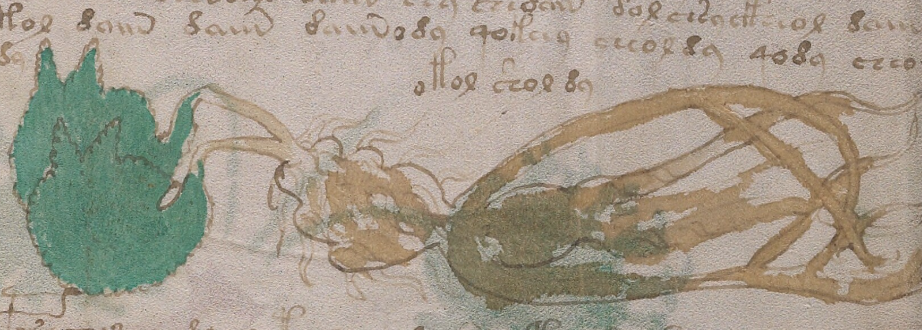
I’ve been intending for years to write about the small-plants section, but it’s a large number of plants, my notes have turned into a dauntingly huge pile, and it’s hard to find time to write it up properly. But I’m beginning to think I should mention this particular plant because I’ve believed for a long time that it is mandrake, and that it is partly mnemonic:
Voynich Manuscript small humanoid plant maybe mandrake
Is this a sideways, mnemonic version of Mandragora? [Yale Rare Books and Manuscripts Library, Beinecke 408, f89r]

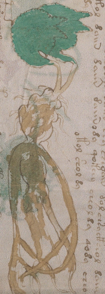
If you turn your head sideways, you can see the human figure, or rather a fairly naturalistic root with humanoid overtones. The head has little rootlets that look like hair, the shoulders have long root-like arms. There’s a rounded body and rootlike legs. To the left, coming out of the head, are two leaves with serrated margins. I believe the leaves are shaped to represent the heads of dogs, with ears facing right and the muzzle vaguely suggested.
VMS small plant maybe mandrake

Why two dog heads? Maybe the intention was to imply male and female plants without being too obvious about it.

Mandrake is toxic. Maybe the prone posture represents something that can make you ill.

If this is Mandrake, it gives us insight into the drawing style and thought processes of the VMS designer. The important elements are there, but nothing is completely traditional or overt. The figure is sideways, thus making it less noticeably humanoid. The dogs are not drawn separately, but included as a mnemonic in the leaves. It’s subtle, whimsical, clever, and irresistibly cheeky.

J.K. Petersen

© Copyright October 2020 J.K. Petersen, All Rights Reserved

Through a Glass Lightly

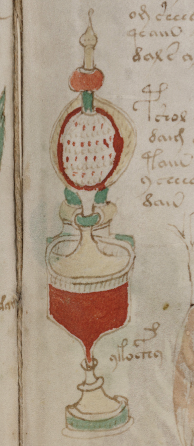
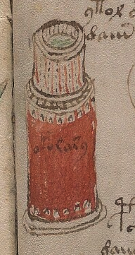
The container on f89r of the Voynich manuscript has always struck me as an attempt to draw transparency. The bulbous part near the top (below the finial), and the narrow stem, seem to be encased in an outer layer. It would be difficult to create patterns like this out of crystalline stone, but fused glasses sometimes look like this.

I don’t want to get too tied to the idea of glass, but if it is glass, could such a container be fabricated in the 15th century?

f89r container

Antique Glass

I’m familiar with Murano glass and Bohemian glass in general, I have antique glass in my personal collection. I saw some exquisite etched glass while traveling through Hungary. Italian glass is well-known and has been actively traded through Venice for hundreds of years, but was glass technology sufficiently advanced in the 15th century to create vessels as fabulous as the one in the VMS?

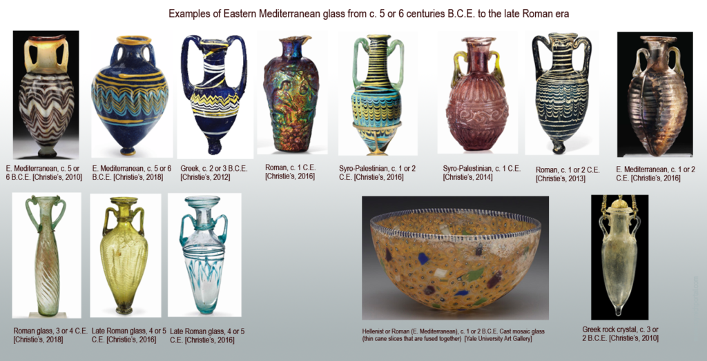
I don’t have enough free time to research and answer this intriguing question, but I gathered a few pictures of amphoriska that demonstrate that glass-making in Greece, the Levant, and the Roman Empire, were quite sophisticated in earlier times. Most of the following artifacts were created 2,600 to 1,500 years ago.

We can see from the examples, that glassmakers knew how to create translucent, feathered glass in multiple colors approximately 2,500 years ago, and that iridescence and the use of sliced canes (the ancient equivalent of millefiori) had also been achieved by the Roman era. Molded and patterned surface textures (both added and intrinsic) were also part of the glassmaker’s repertoire (click to see larger):

The detail in these little amphorae is extraordinary, considering they were only about 3″ high. Note that the detail in the carved rock crystal (bottom-right) was also remarkable—equal to that of many blown-glass vessels.

Signed pieces from the early Roman era also demonstrate a high level of skill in creating molded pieces, some of which compare favorably to glass housewares from the 1940s.


Layered Glass

But what about cased glass, one of the techniques that might result in a container similar to the VMS drawing? Cased glass is glass that is fused so one color shows through another (e.g., transparent glass over colored glass) and is sometimes cut to further reveal the underlying layer. It’s more difficult than fusing multiple colors within the same layer.

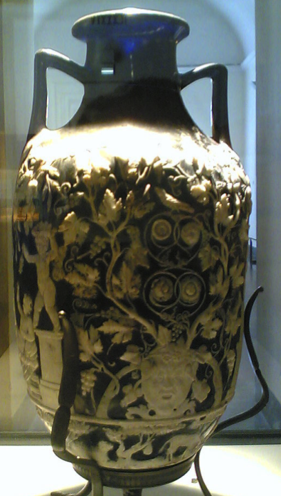
Blue Vase, Pompeii
The Blue Vase with cameo technique from Pompeii, Photo courtesy of m.violante, Wikipedia

Bohemian glass from the last couple of centuries is well-known for this technique (Egermann and Moser pioneered some of the modern methods). Beads made from slices of caned glass (sometimes called “eye” glass) go back to the ancients but I was not able to find ancient artifacts that had a layer of translucent glass fused on top of colored glass in a curved vessel.

The closest I was able to find was “cameo glass” like the magnificent Blue Vase from Pompeii (right), held in the Naples museum (a museum that was “on strike” when I attempted to visit it years ago), but it does not have the same effect as cased glass in which translucent over colored is used instead of the other way around. Still, it does demonstrate the great level of sophistication achieved in ancient times. Some of these techniques disappeared for a few centuries during the Middle Ages.

Medieval Glass

Progress does not occur in a straight line and knowledge is sometimes lost. Millions died in famines, plagues, and wars, and their skills and trade secrets died with them. The techniques illustrated by the ancient amphoras can all be found in Europe in the 16th century, and a century later many new techniques were developed to reproduce ancient styles. But how much was known in the 15th and 14th centuries?

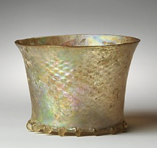
c. 1300 patterned glass courtesy of The Met

It was quite common for medieval glassmakers to add blobs of transparent or translucent glass as decorative additions. Engraved glass was not uncommon either. Glass enameling and a medieval form of “carnival” glass existed by the 15th century. Metal and glass were frequently combined, but it’s a struggle to find vessels in which a layer of translucent glass was fused on top of a colored layer.

If the VMS container is glass (or possibly glass with a metal base), it might not be cased glass. It might be translucent glass with an embedded pattern of colored glasses. The pattern does not look feathered, and appears too even and regular to be caned glass, so it is not an example of the most common styles, but if the vessel is partly imaginary, or a design for something that was not practical to fabricate, then the imagination of the illustrator may have embellished it.

Maybe it’s not glass at all. Maybe it’s one vessel behind another, or two different ideas for the same vessel. Or maybe it’s like a Russian doll, one vessel inside another, but drawn to show both.

I’m hoping that it’s at least partly glass, I like glass, but I’d better not hold my breath. VMS research has a way of stretching out longer than one expects.

J.K. Petersen

© Copyright 2019 J.K. Petersen, All Rights Reserved
Postscript Feb 22, 2019:

I didn’t post this image in the above article because it’s a rights-managed Getty image, and blog readers often don’t click on external links, but I wish I had because it illustrates similarities to the VMS containers that are strongly associated with the 15th century.

It’s a goblet made in Murano with a finial similar to the VMS container (which could be glass or metal). This kind of finial is not difficult to make in glass and is also common to Egyptian glass, so it’s not the primary reason I chose this example. What I suggest you pay attention to is the regular pattern of raised, applied enamel dots, a style and fabrication technique that was not typical of ancient glass:

https://www.gettyimages.com/detail/photo/light-blue-goblet-decorated-with-polychrome-high-res-stock-photography/159620064

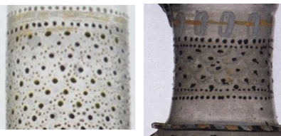
Now hold that dot style in your mind and imagine it applied to a raised, translucent pattern, as in these Murano vessels (in the Museo del Vetro). Clear glass was a significant innovation of the early 1400s and from that point on was often combined with colored elements:

Scale motifs are found in almost all cultures, they are not exclusive to glass or to Murano, so I try not to get too excited when I see them, but every time I come across them, I am reminded of the many scaly patterns in various sections of the VMS.

Postscript Feb. 24, 2019:

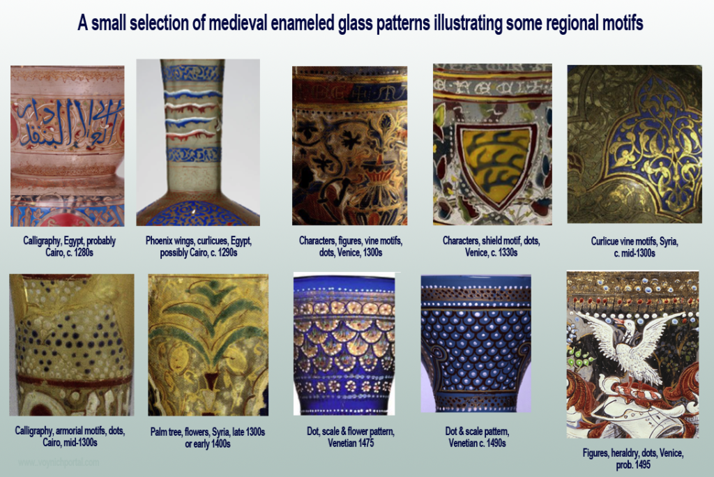
I thought it might be helpful to include a few examples that illustrate regional differences in enameled glass motifs from about the late 1200s to the late 1400s:

13th to 15 century enameled glass patterns

Six of One, Half Dozen of the Other

In a recent Cipher Mysteries blog, Nick Pelling wrote: “I believe that most Voynich researchers would agree that – very unusually – a single plant seems to appear in three separate places in the manuscript: f17v, f96v, and f99r. “

Although I’m a fan of Nick’s blog, I don’t agree! My immediate reaction was, “No way!”

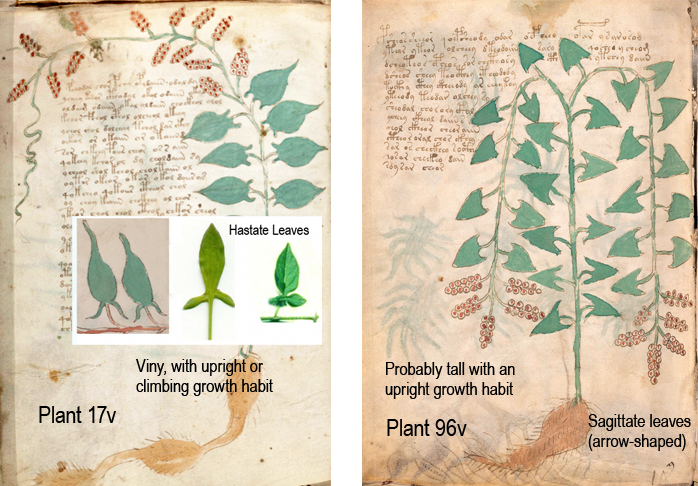
  • Plant 17v has hastate leaves and more upright growth habit (possibly an upright plant or climbing vine).
  • Plant 96v has sagittate leaves and is probably tall (and might be a climbing variety and might not).
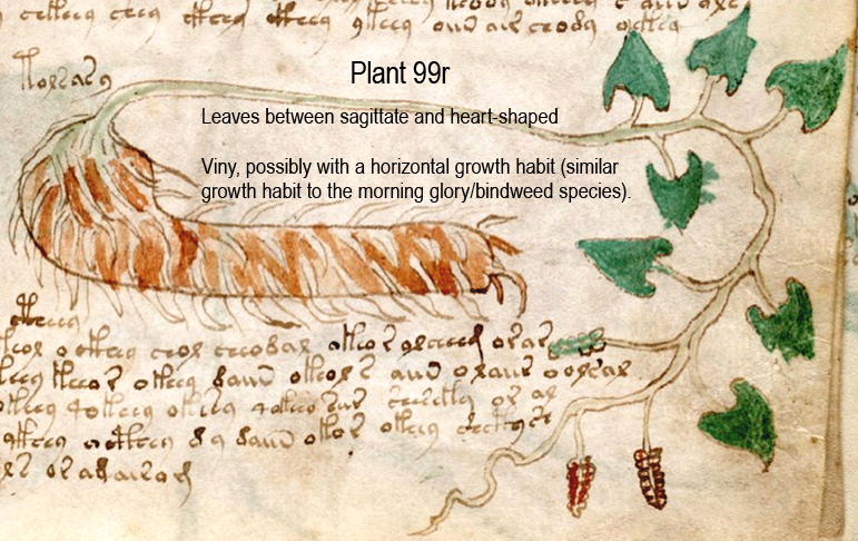
  • Plant 99r has heart-shaped leaves and a viny habit (possibly a semi-climbing vine that grows more horizontally than the first plant) and a differently shaped root from the first two.

This cannot be dismissed as mere differences in drawing style. Some details are defining, others are embellishments… to a botanist, these specific details are identification keys and I’m quite sure the VMS illustrator cared about the difference because the leaf margins and veins of many of the plants are carefully drawn to make the same kinds of distinctions. The various plant drawings are also specific as to whether they are solitary, viny, or clumpy. Whoever drew them knew a few things about plants.

Comparing the Three Plant Drawings

I spent months studying the VMS drawing style and how certain specific parts of the plants were differentiated before trying to identify them. Whoever drew them, especially the more naturalistic ones, cared about anatomical features. From a botanical viewpoint, these drawings represent three different leaf types and three different growth habits.

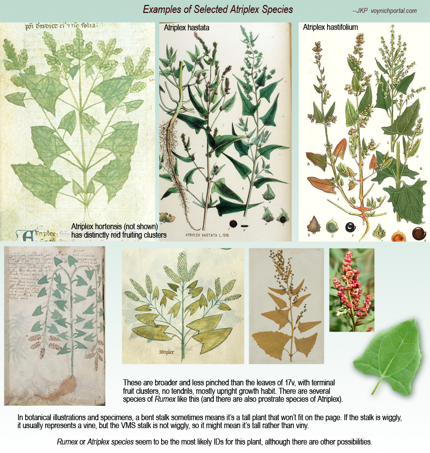
Note the way 96v is bent—it’s almost folded in half. In botanical drawings (and dried specimens), if the plant is too big to fit on the page, the illustrator will bend them to show that the plant has a long stalk. It doesn’t always mean it’s a vine, it sometimes means it’s a tall plant. Note that 96v does not have any tendrils and the stalk is not wiggly like the other two:

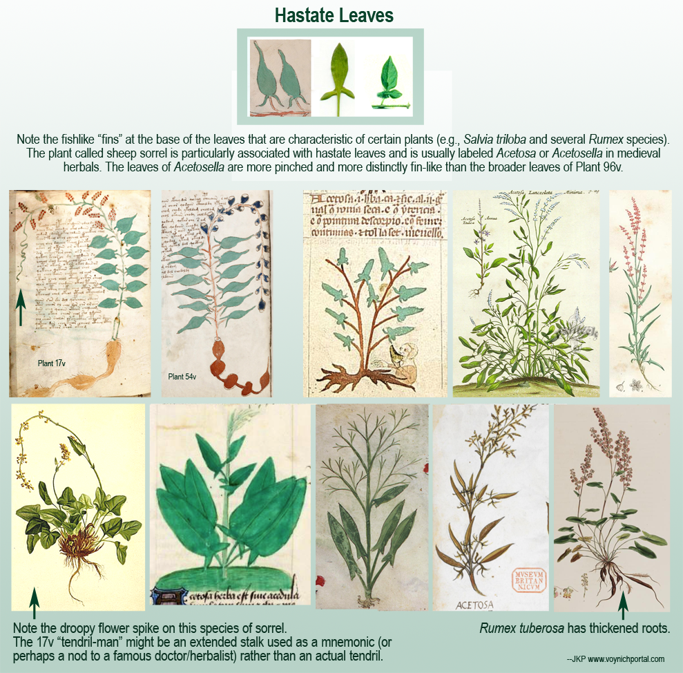
Plant 17v and 96v are superficially similar, but the plant on the left has hastate leaves, the one on the right has broader, more sagittate (arrow-shaped leaves). These distinctions are important for identification. They might be the same plant family (possibly Rumex), but it’s unlikely that they are the same species.

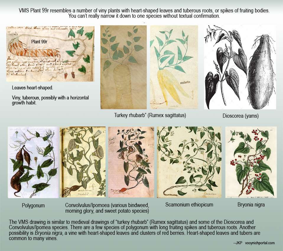
Plant 99r has heart-shaped leaves, a shape that is very common to tuberous vines. There are quite a few plants that could be represented by this drawing (see examples below), a number of which are in medieval manuscripts.

The first two examples might be from the same plant family, but probably not the same plant species. The first might be a viny plant, and the third is probably a viny plant. The second is more likely an upright plant. The first might not even be a vine—the “tendril” might not be a tendril—it might be the stalk that is extended to create a face as a mnemonic or tribute.

Visual Examples

The following chart includes botanical drawings with hastate leaves:

Now note that Plant 96v is different from 17v and 54v. It has broader, less “pinched” leaves, more sagittate than hastate (it’s probably a species of Rumex or Atriplex, although Smilax and a few other species could also be considered):

Plant 99r is different again. It is distinctly viny with heart-shaped leaves (possibly a viny Rumex, Polygonum, Bryonia, Dioscorea, or Convolvulus):

To Sum Up

I assembled these charts very quickly—grabbing examples that were on hand, due to time constraints—it’s really more of a comment response than a blog, but hopefully it’s enough to illustrate important differences that exist between the three VMS plant drawings.

There are instances of drawings in the big-plants section being duplicated in the small-plants section (I have compiled a list of them), but I think these three specific drawings are probably different species and hopefully the examples illustrate why.

J.K. Petersen

Copyright © 2018 J.K. Petersen, All Rights Reserved
Aegis and Bacon

In 1267, Roger Bacon sent his Opus Maius and a number of related treatises to Pope Clement IV. The works comprised a brave and impassioned plea for scientific inquiry into all aspects of life (including the occult arts and arts practiced by folk outside of scholarly circles). Friar Bacon hoped that the support of the pope could raise the Catholic faith above its traditional limitations, but Clement IV died in 1268 and may not have read Bacon’s writings. In 1277, Bacon was condemned and subsequently imprisoned for his outspoken and unconventional views, and lived only a short time after being released in 1292.

Bacon loved science and one of the subjects dear to his heart was optics. This may be of interest to researchers studying containers in the Voynich Manuscript because some have said that c. 1404 to c. 1438 is too early for any of the containers to be reading tubes or telescopes, but this statement by John Henry Bridges in 1900 suggests the technology may have been available long before the VMS:

Of the magnifying powers of convex lenses Bacon had a clear comprehension. He imagined, and was within measurable distance of effecting, the combination of lenses which was to bring far things near, but which was not to be realized till the time of Galileo…. in his Optics Bacon shows that he was acquainted with the properties of parabolic concave mirrors, and of their power of causing parallel rays to converge after reflection to a focus. in this respect he was in advance of his principal teachers in Optic, Euclid, Ptolemy, and Alhazen.

Bacon was familiar with parabolic concave mirrors, had a specific interest in lenses (and may have had some in his possession), and was far ahead of his time in believing that radiant energy could pass through space and air independently of the eye (in contrast to those who asserted that sight was based on the eye producing light rays).

Commentators say that Bacon derived much of his knowledge from Alhazen’s Thesaurus Opticae, but understood it from a fresh perspective in which he questioned traditional assumptions and pursued the ideas as practical embodiments.

Bacon may have been very close to inventing telescopes and microscopes before his tragic incarceration in the late 1270s, and others must have been inspired by him or had similar ideas, because wearable eyeglasses appear to have been in use by 1270, as attested in German Minnesänger ballads, mentioned by C. Barck in 1907 and located by Villiers and Pike in the German Handbook of Inventions by Busch (1795):

Brille besteht aus zwei geschliffenen durch eine Einfassung mit einander verbundenen Gläsern, durch welche die Gegenstände den Augen deutlicher erscheinen. [Eyeglasses are made from two ground/polished glasses, which are connected to one another through a mount/rim, through which the eyes will more clearly see objects.]

The Busch passage illustrated in German script by Villiers and Pike states that Roger Bacon believed that eyeglasses were known in Germany by 1270, quotes the above passages, and writes that they say expressly that old people used them [eyeglasses] to read.

The invention of eyeglasses has sometimes been credited to Salvino d’Armati, in 1284, but in the absence of a supposed epitaph on his tombstone, no evidence supports this claim, and the Minnesänger reference predates it by 14 years.

Friar Alessandro della Spina is said to have created eyeglasses late in the 13th century based on ideas obtained from an unnamed craftsman, possibly by a Pisa artisan. In the archives of 1313, the apparent year of Alessandro’s death, is written:

Brother Alessandro della Spina, a modest and good man, learned to make all industrial products of which he saw or heard. Spectacles, which were made first by some one else, who did not want to communicate anything about them, were then made by him, and were distributed with a cheerful and benevolent heart. [C. Barck, 1907]

Bacon mentions reading lenses (ground-crystal lenses placed directly on parchment to magnify the area beneath it). These lenses were more convenient than using a glass globe of water as a magnifier, an idea that had been around since the time of Seneca (c. 30 CE).

Reading tubes (short sighting tubes with lenses added) probably also preceded wearable glasses. It was a logical evolution, as lensless sighting tubes existed in early Greco-Roman times.

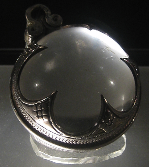
Visby lens [Photo credit: mararie, Wikipedia]

Early lenses were not always vision aids—some were decorative, and some were used to concentrate sunlight to illuminate a dark corner or start a flame, but their magnification abilities did not go unnoticed, and lens development was not confined to the south—crystal lenses were made in Scandinavia, as well. Lathe-turned lenses of a quality and shape that was remarkable for the early medieval period (and which were close to optimum for magnification) have been found in Viking graves on the island of Gottland (Sweden).

Summary

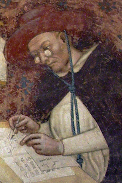
Fresco painting of Dominican Cardinal Hughes de St. Cher wearing glasses. [Risorto Celebrano, on Wikipedia].

The earliest eyeglasses have disappeared, but spectacles were painted on the nose of a Dominican cardinal (right) in 1352 by Tommaso da Modena, in a seminary attached to the Basilica San Nicolo in Treviso (north of Venice). The location is not accidental—Murano became a major supplier of glass lenses for spectacles (explicitly described in 1300 as “vetri da occhi”), a material that gradually displaced rock crystal.

Vincent Ilardi, in his book on historic eyeglasses and telescopes (2007), describes documents in which the firm of Francesco di Marco Datino of Prato and Florence purchased  eyeglasses from Venice, in July 1400. He also references a pair of spectacles that was donated by Francesco Datini to Franciscan friar Bonifazio Ruspi (originally of Florence but, at that time, in Corsica).

Documents relating to purchases by the Sforzas and duke of Milan confirm the use of spectacles in Florence which, by the mid-15th century were available in a variety of styles and magnifications.

Thus, we can see that reading lenses and spectacles (and probably also reading tubes) preceded the VMS by at least 115 years and their possible inclusion in the manuscript is not inconsistent with early 15th-century technology.

J.K. Petersen

Copyright © 2018, All Rights Reserved

Pigments and Painters

How Many Scribes?

Some time ago, Currier proposed that more than one hand penned the Voynich Manuscript and labeled the pages as to which hand scribed it. I haven’t looked at these designations because I wanted to decide for myself whether more than one hand was present.

After creating my own transcript of the VMS text, and looking at every word in the document, I’m convinced there was more than one scribe and perhaps more than two. The hand at the beginning is a little rounder, the one that follows a little smaller, slightly less round, and shows signs of maybe being a quicker hand. I have more to say about this later, but it brings up questions about whether the VMS was 1) a cooperative project or 2) a situation where someone picked up the work where someone else left off. It is evident that the same systems of composing the glyphs were known by both scribes—there is a high level of consistency between the construction of the VMS word-tokens on the various pages—so perhaps the two main scribes were contemporaries.

How Many Painters?

It’s more difficult to assess whether those who added the text also created the drawings or added the paint, but it is possible to assess the styles to see if they were painted by different hands.

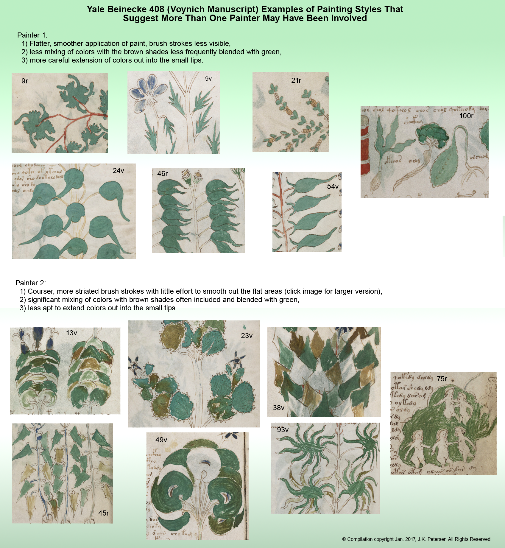
After looking through all of the VMS illustrations, I’m reasonably sure there was more than one person painting the drawings. The easiest way to explain my observations is with visual examples. This is not a comprehensive overview of the drawings (it deals only with the paint), and it doesn’t include examples that might have been painted by a third hand (if such a hand exists), but it’s enough to give a sense of why I believe there was more than one painter.

Some pages are hard to assess. They don’t have enough paint to reveal the style and those with blue pigment are problematic because the blue appears to have been more difficult to mix and apply, making it harder to distinguish any difference in styles, but those with a preponderance of greens and browns, which blended more readily, give some clues as to painting styles.

It’s a large image—you may have to click on it (and click again when it opens) to see the details, such as the brush strokes, and the tips of the leaves:

Summary

If the only difference between the two sets of samples were the care and attention with which the paint was applied, it would be hard to know if this were two painters, or one painter having good days and bad days, but the different way the brushstrokes are blended or not blended, the greater propensity for color mixing, and the different color “sensibility” (use of brown for accent and variety) increase the likelihood that more than one person painted the images.

J.K. Petersen

© Copyright 2016 J.K. Petersen, All Rights Reserved
Voynich Text Underpinnings

6 May 2017

A discussion about the Voynich Manuscript zodiac pages (with examples by Marco Ponzi) came up today on the Voynich.ninja forum and I wanted to post something I’ve been sitting on for a while that relates to the structure of the VMS text.

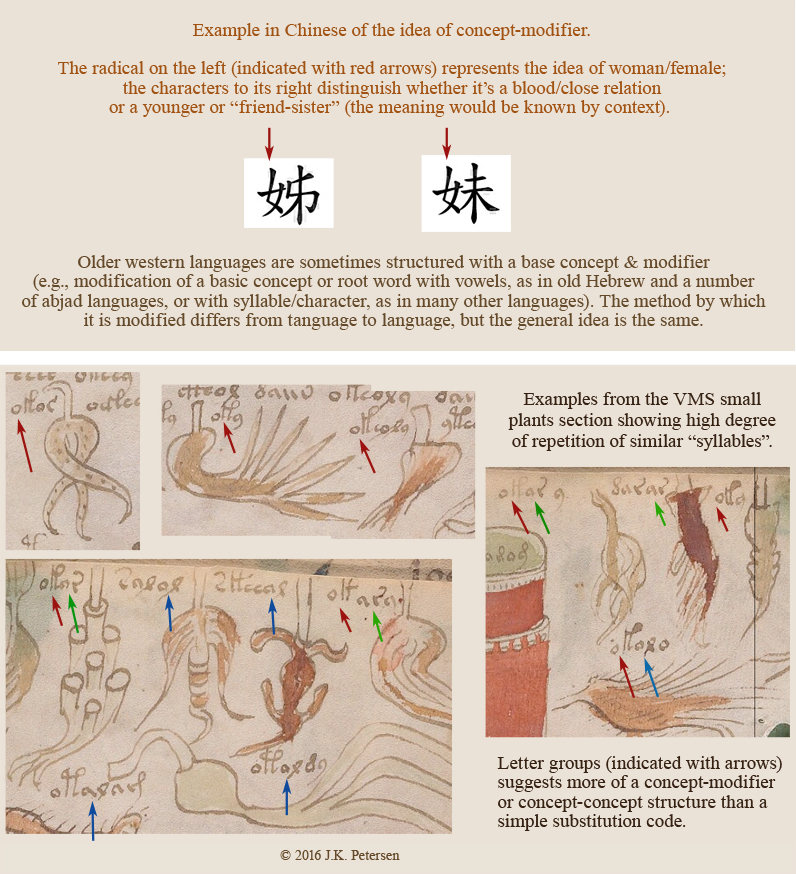
I’ve selected some of the imagery from one of the small-plant pages and included an example from Chinese. This does not mean the underlying language is Chinese but that the structure of the VMS text is similar to quite a number of languages that have a syllabic structure that is based on concept-modifier or concept-concept in various combinations of simple building blocks. I think this structure argues against a basic substitution code but might enlighten how the manuscript is encoded.

MVSConceptStructure

If you look at various sections of the manuscript, you will see the same patterns. The VMS is written mostly in Latin characters and numerals (with some original shapes included), but the conceptual foundation (that of basic building blocks combined in similar ways for similar items), exhibits some of the structural characteristics of syllabic languages (or of a constructed/synthetic language).

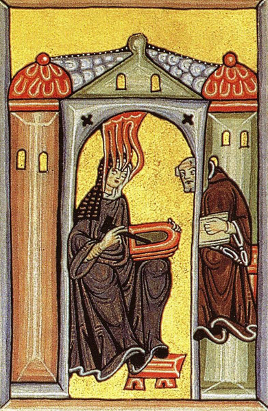
vonBingenScriptConstructed languages were not a novel idea in the middle ages. Magical languages have a long history, as do kabbalistic symbols as a means of communication. There are some interesting arguments that much of the Bible is allegorical and that there are numbers embedded in the text that provide secret information to those who are schooled in the hidden arts. Hildegard von Bingen created a cipher and partly constructed language in the 12th century.

In the 17th century, John Dee had a strong interest in ciphers, symbols, and magical languages and expended considerable energy on recording them, and Athanasius Kircher developed a universal script in the hopes that communication could reach a wider audience.

But coming back to the Voynich Manuscript…

The VMS has many properties that suggest a constructed language or perhaps one that is a hybrid of natural and constructed language. I’ve remarked before on its singularly regimented style and seeming rigidity and its similarity to syllabic languages (anyone who has practiced their ba, be, bo, bu, and ma, me, mo, mu while studying Asian languages knows what I’m talking about).

The likelihood that the labels are names or regular nouns (as opposed to combinations of noun-concepts) seems low, given that no one has managed to decode them in a way that relates to the labels as a whole or illuminates any of the rest of the text. Anagramming the characters to come up with a handful of labels that look like words isn’t sufficiently convincing either. It seems more likely that the labels represent attributes or information about the items’ composition or use than the names of the items.

Will this unlock the information on the pages without illustrations?

The structure of the “labels” is similar to that of the main text, which also appears to be made up of simple building blocks and includes a high degree of repetition, but there are some additional dynamics in the longer passages that go beyond the kind of glyph-combinations that are in the labels. The very fact that many lines end with the same characters, characters that rarely appear midline, suggests an added level of complexity. Nevertheless, a better understanding of the labels might help unlock the rest.

J.K. Petersen

© Copyright 2016 J.K. Petersen, All Rights Reserved