Category Archives: The Voynich Collective Plants

Investigations of the smaller plant images collectively grouped.

Torre Filosofica

6 February 2020

There are frequent comments that folio 77r represents medieval elements in the cosmological sense, but as you can see from my recent blog, I’m somewhat skeptical. There are five openings and two of the outflows are almost the same. Plus, they could be phlegm/bile/blood or various kinds of weather (hail, wind, rain, snow). But, even those ideas didn’t completely satisfy me, so I kept trying to think of others and here is an additional possibility….

A Different Interpretation

I’ve blogged about VMS folio 77r a few times and if you read the more recent ones, you may have noticed that I have never been completely convinced that these pipes were meant to be earth, water, air, and fire. Maybe they represent various outflows of alchemical heating and condensing processes:
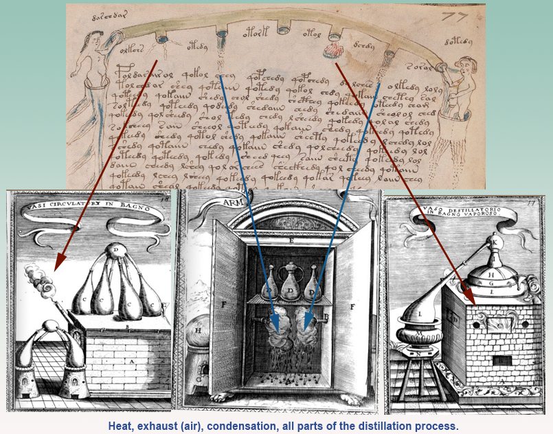
Voynich Manuscript volio 77r "elements" pipes related to alchemical furnaces

In other words, instead of earth, water, air, and fire (except in the metaphorical sense in which most alchemical processes were expressed at the time), this might be heat, exhaust, and either two instances of condensation, or possibly one instance of boiling and the other of condensation, since two of the VMS outflows are very similar but not exactly the same.

Many alchemical images have been related to the VMS in one way or another over the decades. Not surprisingly, since many alchemical manuscripts are enigmatic and highly symbolic.

I’ve blogged a few distillation images myself, and the two big bladder-like things have always reminded me of distillation vessels, but I couldn’t decide exactly what they might be. It was bi3mw’s post #70 on the Alchemical Symbolism thread that motivated me to go back through my notes and think about it again. Now I think these bladders might represent the sublimation process:
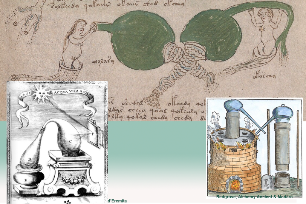
Similarly, the bladder-like shapes at the top of f77v have always reminded me of the she-wolf’s teats in the story of Romulus and Remus, or the chest-of-plenty on Diana of Ephesus (which I have posted in the past), but now I think there might be another explanation:
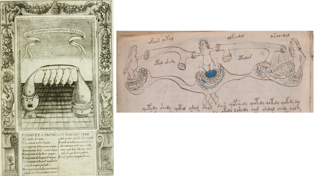
Maybe the row of teats is a row of distillation vessels and the rounded forms left and right are heating vats.
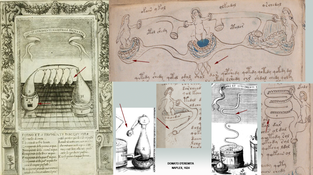
Various alchemical vessels that have shapes similar to the VMS. The one on the bottom right is similar to another snaky distillation apparatus pointed out by bi3mw on the Voynich.ninja forum.

The pipes that connect them are spiritually guided by nymphs (all of alchemy was considered to be under spiritual guidance, hence the heavy use of religious motifs in alchemical drawings). Both magic and alchemy were suspect professions, associated with black arts, so the more religious symbology that was used, the more it legitimized these occupations.

The VMS Rosettes Folio Reprised

On a subject some researchers might not believe is related to distillation processes, I’ve also blogged numerous interpretations for the VMS “map” and I’ve only written up about 20% of the ideas I’ve been working on for years. One that has been lying on the backburner is that the central rosette might be the Tower of Philosophy, related to medieval alchemy. I haven’t posted it mainly because I wasn’t sure, but putting together the distillation process represented by the 77r pipes AND some of the features of the rosettes folio, I feel more confident about this idea than I did before.

I don’t know if anyone has specifically related the central rosette on the VMS “map” folio to the alchemical furnaces of the Tower of Philosophy. Most of the time people mention locations in the middle east (especially Baghdad) or north Africa and some people consider the folio to be a form of portolan.

To me, the central rosette always looked like a sacred place (probably because of the stars and arches and the central position), but I did not specifically associate it with the sacred mountain of the alchemists until today because many places were considered sacred in the middle ages. I think it might represent both sacred mountain and the alchemists’ furnace combined into one drawing. As I have mentioned in previous blogs… the meeting place between terrestrial and cosmological realms.

Here are two examples side-by-side so you can see the similarities. Note that the tower is round, with arches, like the arches in the center of the VMS rosette with the container-like towers. It has an almost onion-dome top and at the base of the image, there are more “towers” that look like pipes:
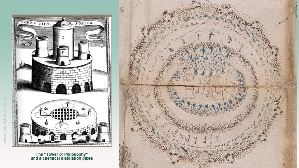
Left: Donato d’Eremita di Rocca alchemical furnace/tower of philosophy, Naples 1624 with many structural forms similar to central rosette on “map” folio of Voynich Manuscript, Beinecke 408, Yale.

Here is a link to an earlier (15th-century) image of an alchemy furnace with tower-like parts:

https://www.gettyimages.com/detail/news-photo/an-alchemy-furnace-miniature-from-alchemical-discourse-news-photo/142084494

Robert Fludd’s images are often posted on the Voynich.ninja forum due to their structural and textural similarities to some of the VMS drawings. They are more sophisticated, and they were created much later than the VMS, but it’s my belief that his ideas were not entirely original, that they derive from older models and thus might have some relevance.

Here is an example that is similar in shape and direction to the general outlay of the rosettes folio. It represents a cosmic battle with demons and archangels attacking and defending the alchemist in the center. Notice the “spewy” things, all drawn in similar ways, but each taking a slightly different form (think of hordes of locusts or bees or frogs as are often mentioned in biblical literature):
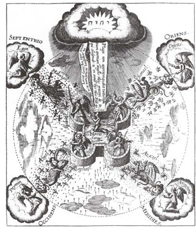
Archaengels fighting off demons and plagues, with the alchemist in the center. Robert Fludd.

I’ve blogged at length about the “spewy” things in the rosettes folder, never quite knowing what they were, but only that they looked like connections between the inner and outer circles. Maybe, as in Fludd’s engraving, they are pestilences, or a metaphorical reference to the battle between good and evil (with archangels and demons taking sides).

In this Rosicrucian image with alchemical references, notice the tent at the top of the sacred hill (sacred hills are a holdover from Paganism) and the alchemists’ cave below it. The VMS rosettes folio is full of these kinds of structures, almost too many to list in one blog, and MarcoP pointed out that Ellie Velinska had suggested tents for some of the shapes on the rosettes folio. When I took another look, I realized some of the small details that originally made no sense to me might be interpreted as tent flaps. Here is an image of a sacred hill atop an alchemists’ cave (such underground laboratories did actually exist, one was unearthed under a chapel complete with shards of numerous vessels):
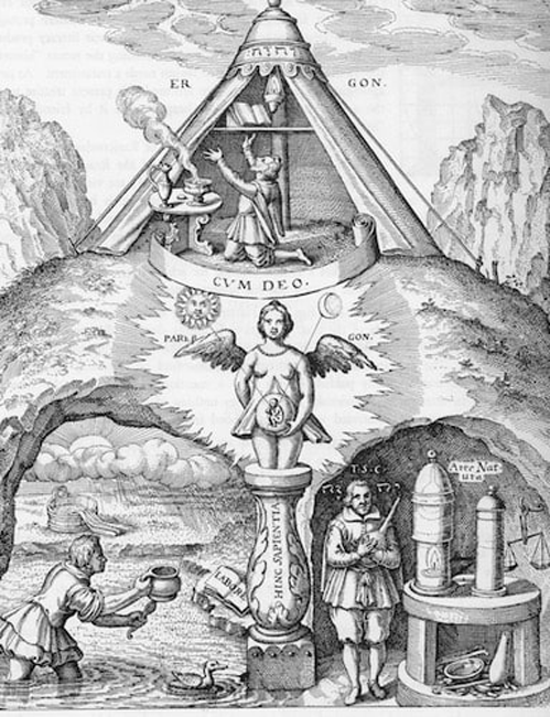
Alchemical symbolism, tent on sacred mountain, secret societies.
Speculum Sophicum Rhodostauroticum, thought to be by Daniel Mögling

The Many Plant Folios

Distillation has a direct relationship to plants and plants like Centaurea (which I think is depicted fairly accurately on folio 2r) were of specific interest to distillers of alcoholic products, both recreational and medicinal. Tinctures of alcohol not only helped preserve the plants, but they provided concentrated formulas that were sometimes more effective than herbal “simples” (basic plant parts that had not been processed by distillation).

Jakob de Tepenecz, one of the probable owners of the VMS, became quite wealthy from sales of his distilled products. So much so, he could afford to lend money to the emperor himself.

I don’t know if the various sections of the VMS are like separate booklets that have been bound together, or if they were meant to relate to each other, but IF there’s an over-riding theme, then plants would fit right in.

Astrology

Alchemy has also been related to astrology and kabbalah. Besides the three “teats” (see f77v), this hybrid creature has a star on its crown rather than the usual Christian cross. There are also stars-on-sticks radiating from the center. The image further includes references to celestial beings and signs of the zodiac:
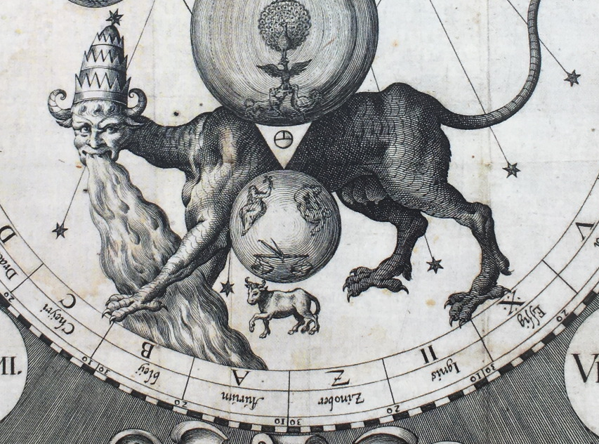
A combination of alchemical, kabbalistic, spiritual, and astrological symbols. Note the three “teats” teats and the star at the top of the crown that are reminiscent of VMS imagery. [Source: Michelspacher, 1615]

Notice also, in the above image, the inverted T-in-O, a cosmological variant of the T-in-O that is so common in map-related writings.

So maybe the VMS is alchemical after all. After investigating it for a while, I was leaning away from this idea, but a few things clicked when bi3mw revived the ninja thread, so I decided to take another look.

J.K. Petersen

© Copyright Feb. 2020 J.K. Petersen, All Rights Reserved

Six of One, Half Dozen of the Other

In a recent Cipher Mysteries blog, Nick Pelling wrote: “I believe that most Voynich researchers would agree that – very unusually – a single plant seems to appear in three separate places in the manuscript: f17v, f96v, and f99r. “

Although I’m a fan of Nick’s blog, I don’t agree! My immediate reaction was, “No way!”

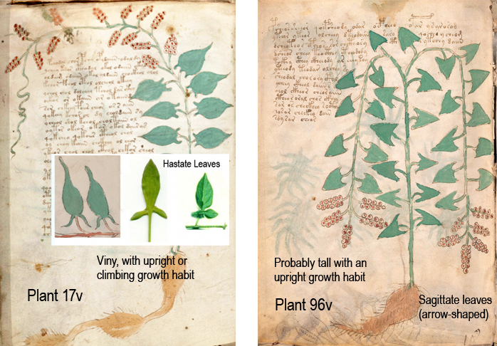
  • Plant 17v has hastate leaves and more upright growth habit (possibly an upright plant or climbing vine).
  • Plant 96v has sagittate leaves and is probably tall (and might be a climbing variety and might not).
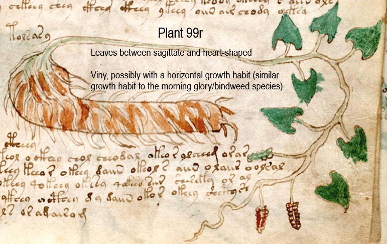
  • Plant 99r has heart-shaped leaves and a viny habit (possibly a semi-climbing vine that grows more horizontally than the first plant) and a differently shaped root from the first two.

This cannot be dismissed as mere differences in drawing style. Some details are defining, others are embellishments… to a botanist, these specific details are identification keys and I’m quite sure the VMS illustrator cared about the difference because the leaf margins and veins of many of the plants are carefully drawn to make the same kinds of distinctions. The various plant drawings are also specific as to whether they are solitary, viny, or clumpy. Whoever drew them knew a few things about plants.

Comparing the Three Plant Drawings

I spent months studying the VMS drawing style and how certain specific parts of the plants were differentiated before trying to identify them. Whoever drew them, especially the more naturalistic ones, cared about anatomical features. From a botanical viewpoint, these drawings represent three different leaf types and three different growth habits.

Note the way 96v is bent—it’s almost folded in half. In botanical drawings (and dried specimens), if the plant is too big to fit on the page, the illustrator will bend them to show that the plant has a long stalk. It doesn’t always mean it’s a vine, it sometimes means it’s a tall plant. Note that 96v does not have any tendrils and the stalk is not wiggly like the other two:

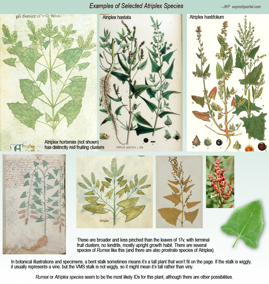
Plant 17v and 96v are superficially similar, but the plant on the left has hastate leaves, the one on the right has broader, more sagittate (arrow-shaped leaves). These distinctions are important for identification. They might be the same plant family (possibly Rumex), but it’s unlikely that they are the same species.

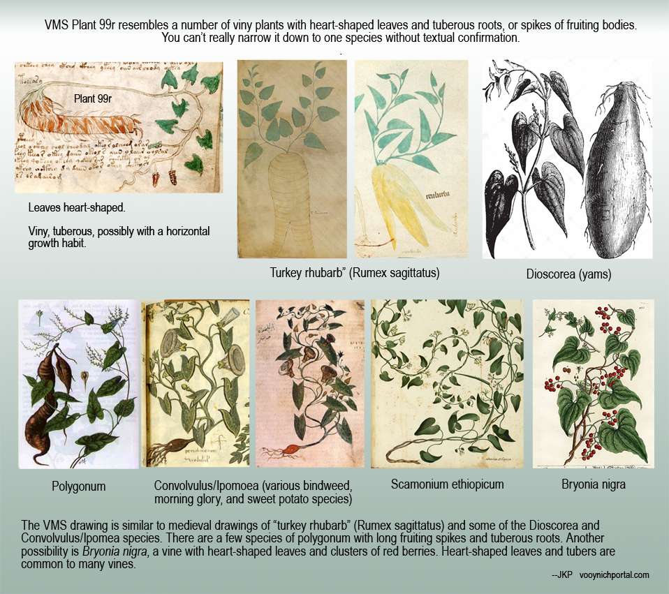
Plant 99r has heart-shaped leaves, a shape that is very common to tuberous vines. There are quite a few plants that could be represented by this drawing (see examples below), a number of which are in medieval manuscripts.

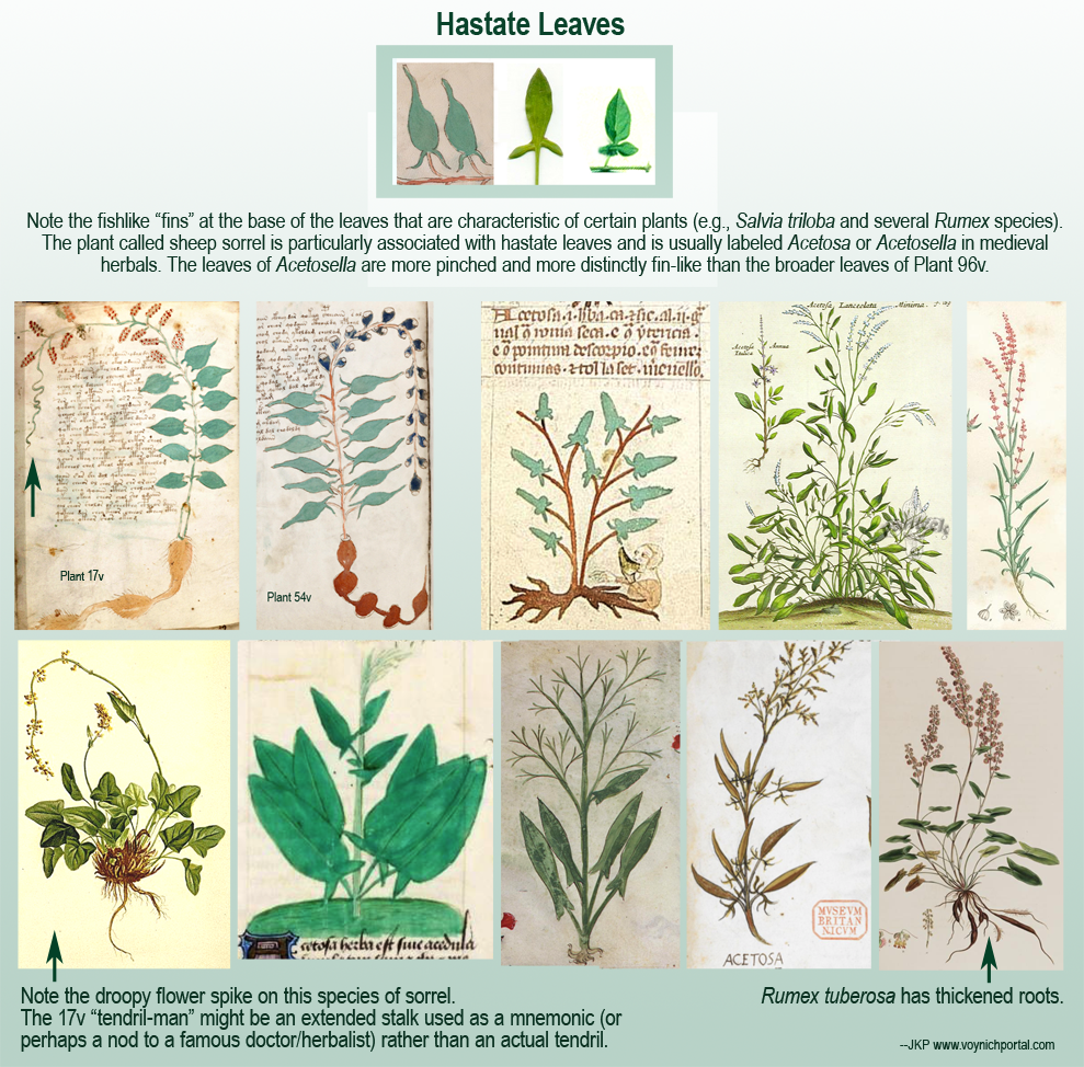
The first two examples might be from the same plant family, but probably not the same plant species. The first might be a viny plant, and the third is probably a viny plant. The second is more likely an upright plant. The first might not even be a vine—the “tendril” might not be a tendril—it might be the stalk that is extended to create a face as a mnemonic or tribute.

Visual Examples

The following chart includes botanical drawings with hastate leaves:

Now note that Plant 96v is different from 17v and 54v. It has broader, less “pinched” leaves, more sagittate than hastate (it’s probably a species of Rumex or Atriplex, although Smilax and a few other species could also be considered):

Plant 99r is different again. It is distinctly viny with heart-shaped leaves (possibly a viny Rumex, Polygonum, Bryonia, Dioscorea, or Convolvulus):

To Sum Up

I assembled these charts very quickly—grabbing examples that were on hand, due to time constraints—it’s really more of a comment response than a blog, but hopefully it’s enough to illustrate important differences that exist between the three VMS plant drawings.

There are instances of drawings in the big-plants section being duplicated in the small-plants section (I have compiled a list of them), but I think these three specific drawings are probably different species and hopefully the examples illustrate why.

J.K. Petersen

Copyright © 2018 J.K. Petersen, All Rights Reserved
The Blue Cube

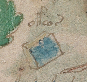
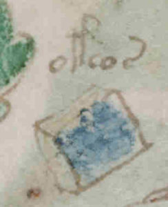
Voynich researchers have been discussing the “blue cube” on the small plants page in the Voynich forum and there are various ideas about why this anomalous object is in a section dedicated to plants and objects that look like containers.

It’s painted blue and pale yellow and is roughly book-shaped.

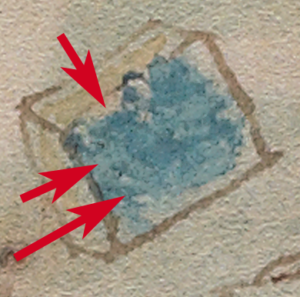
I wanted to know what was under the paint, so I tried to remove the paint without disturbing the faint brownish lines underneath. This is difficult because brown also includes a certain amount of blue which tends to disappear when the overpainted blue is lightened.

I didn’t expect to find anything under the blue paint. I assumed those faint traces of brownish color were just lines but was very surprised when shapes emerged that resemble writing.

Is There Writing Out of the Blue?

There may be two, perhaps even three lines of text and I don’t know if they’ll be sufficiently visible in a blog pic. The first one (the top line) I can’t be sure. There’s a shape that resembles an “M” or possibly “a M” but it might be irregularities in the parchment where the paint tends to pool.

bluecube bluecube2


The second line is less ambiguous. It looks like Voynich characters. I can almost discern an EVA-ell, then something faint that’s hard to see, perhaps another EVA-ell or EVA-r or maybe it’s a space. The following glyph looks like a figure-8, then there’s a space, then a messy shape that looks a bit like a c-shape with a blotchy descender that probably isn’t a descender at all. It looks to me like a darker paint-brush stroke.

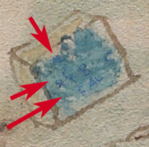
What’s even more surprising is that there seems to be another line at the bottom in another hand. It’s not small and neat like Voynichese, and it doesn’t look like Voynich characters. It’s reminiscent of the large straight angular block letter scribbles that are drawn by children, somewhat like the scribbles on a few of the VMS pages. It looks like it might be “S A L” which is “salt” in some languages, and which might apply to a cube in a page of plants. Salt was a preservative, an ingredient in medicinal recipes, and was, of course, used in food.

If you’re wondering if I projected an expectation of the word “salt” on the shapes, I think that’s unlikely. I shook my head when I first saw it. I thought the cube might represent some resin or mineral more commonly associated with various herbal compendiums and would not expect salt to be drawn this way.

I’m not claiming the cube is salt or even that this interpretation of the shapes is correct. Why would someone represent it as a cube and paint it blue? Why would the sides be yellow with an added line that makes it look like two blocks laminated together? Salt crystals are whitish, irregular and very small. They’re grainy like sand. Rock salt looks more cubical than modern table salt but it doesn’t look like this.

Summary

bluecube4So… I’m not absolutely sure it says SAL—maybe it’s “S AL” or a parchment wiggle followed by “AL” or pressure marks from a knife as are found in a few places in the manuscript. You can click on the thumbnail right to see the larger version).

I’m not sure of any of the text—but there’s something under the paint that appears darker and more systematic than irregularities in the vellum that I have tentatively marked with dots in the bottom image.

bluecube3

In medieval manuscript preparation, it was common to write a color name on an object that was later to be painted. Finding text isn’t unusual in itself, but this text doesn’t show any obvious signs of indicating color.

The only glyph that is reasonably clear (on the unmarked image) is the EVA-ell, and we have to remember that all of this is very small—the marks might be artifacts created by the texture of the vellum.

Once again, you’ll have to decide for yourself if there’s writing under the paint and what it might mean.


J.K. Petersen

© Copyright 2016 J.K. Petersen, All Rights Reserved