31 July 2020
In page layout, text is frequently organized in columns. If the left side is even and the right side is ragged, it is “left-justified”. If it is even on both sides, it is “justified” or “double-justified”.
In contemporary page layout, lines can be padded with software algorithms that add extra space between each character to fill the columns. In the Middle Ages, padding was at the discretion of scribes, and there were numerous strategies.
Strategies for Padding
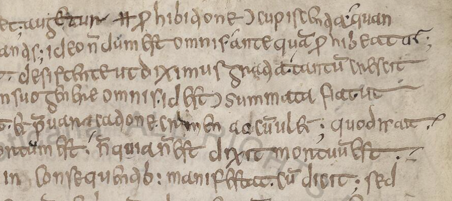
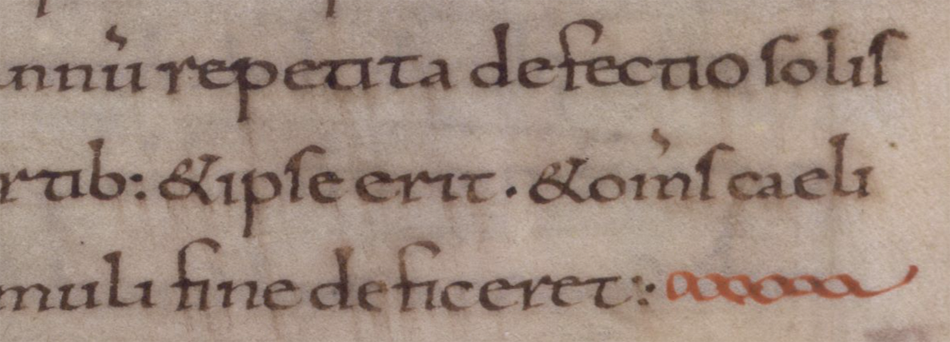
In early medieval texts and some of the Hebrew texts, the right margin is sometimes padded by stretching out the last character:
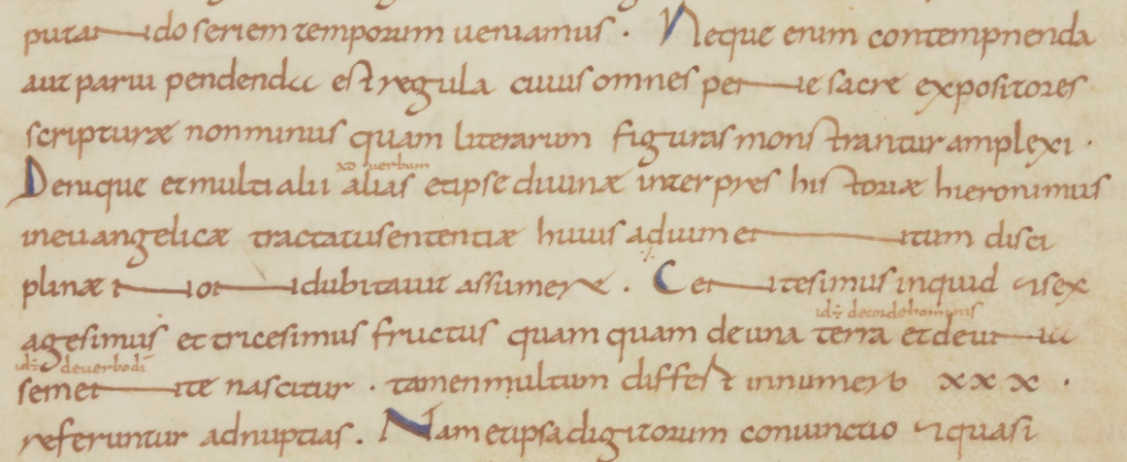
Sometimes padding was created within the line by spacing out words and stretching some of the ligatures:

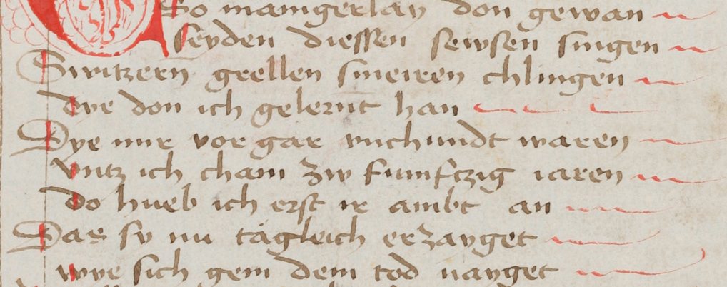
If the scribe didn’t want to manipulate the letters or was in a hurry, one of the simplest ways to pad out a column was to add a line. In this example, wavy red lines extend the text:
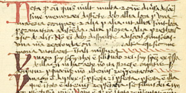
The padding Morgan B.25 is equally simple but rises higher from the baseline:
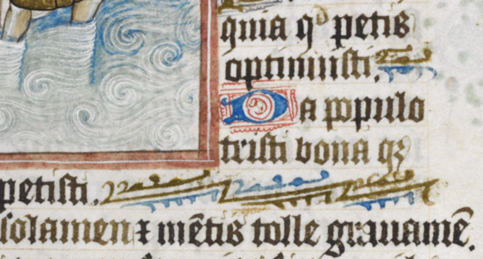
Sometimes padding was more decorative, using repetitive patterns or small drawings of animals or birds. In this example, from Royal 2 Z xviii, a two-tone angled decoration, that can be repeated as necessary, fills the column:
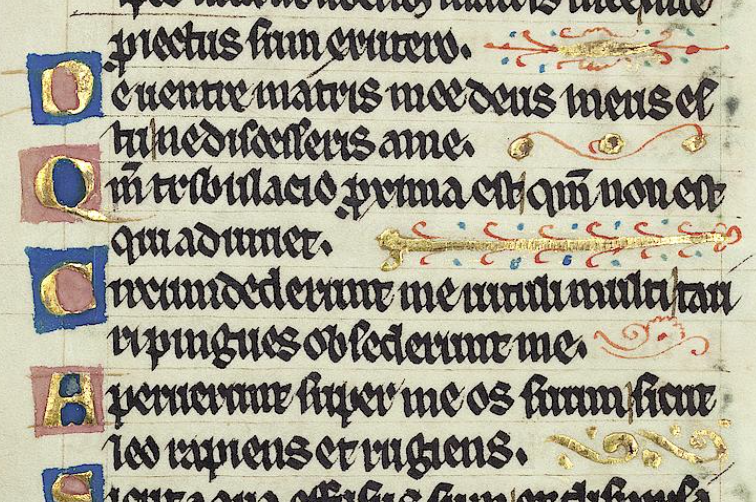
A similar format was used to pad the right-hand side in Pal.lat.26 except that the designs are more varied:
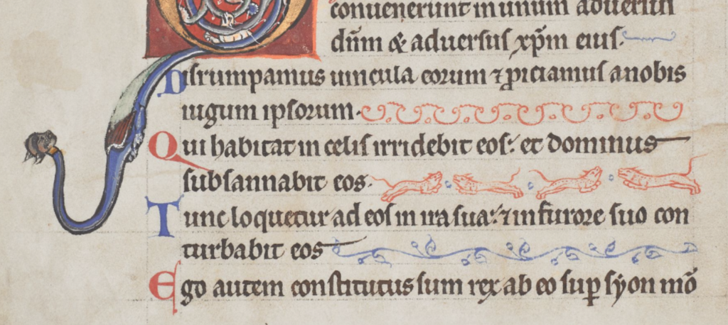
Decorative padding was a creative opportunity. Some rubricators or illustrators drew plants, animals, and many kinds of birds. Arundel 157 has page after page of charming examples, each one a little different:
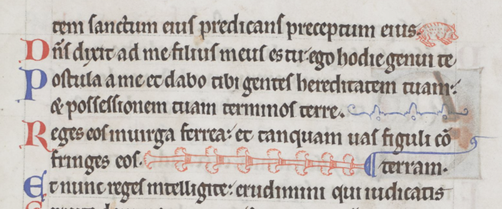
Sometimes a simple repetitive pattern was used, with space between each iteration:
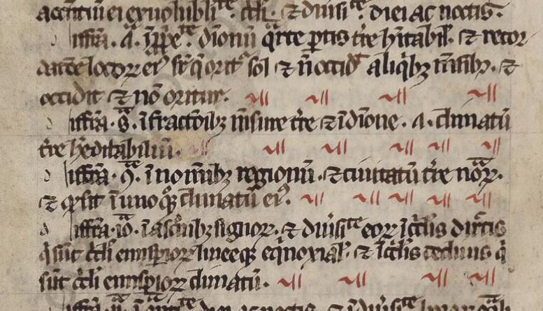
Sometimes the repeating pattern was shaped like a letter:
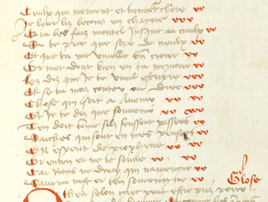
When the letters were close together, they became visually similar to a decorative pattern. This simple letter-like padding from the early medieval period was still used in the 15th century:
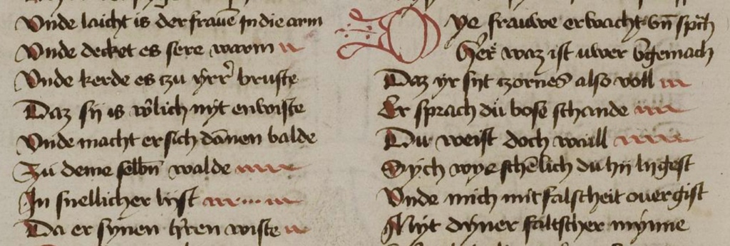

Sometimes text was justified by spreading out letters or breaking words across a line. In these cases, padding wasn’t needed until the scribe reached the end of the paragraph. If the last line was very short, it wasn’t practical to insert spaces, so padding characters were added instead. In the following example, the paragraph-end has been padded with a simple pattern in alternating colors:
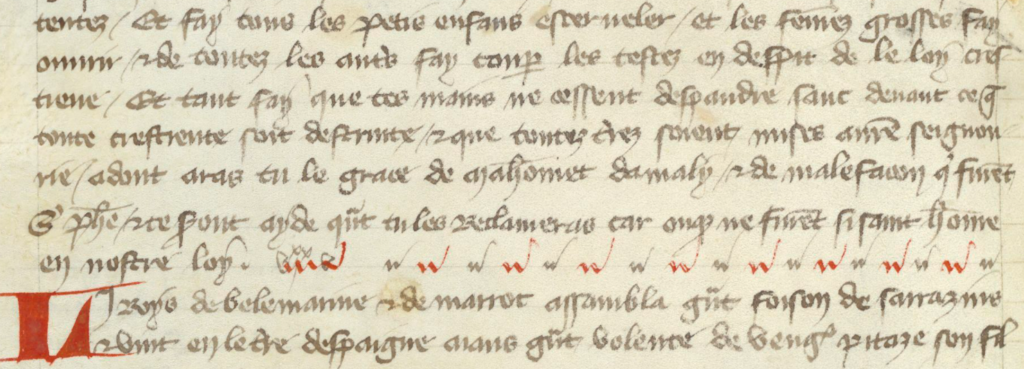
In this example, a more decorative line was added to fill out the last line:
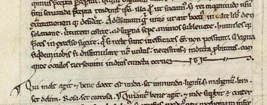
Sometimes the last line would be padded with a stretched-out version of the word “AMEN”.
Sometimes larger spaces were added near the end of the line with the last letter capitalized, to create visual balance with the style at the beginning of the line:
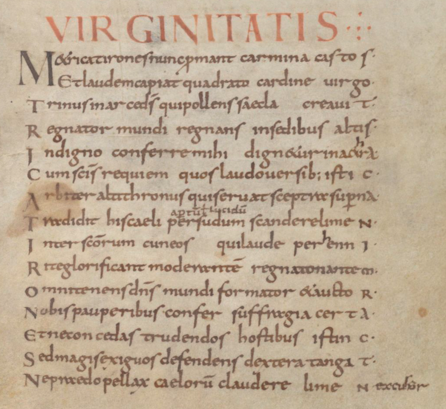
In the same manuscript, padding has been inserted between sections of text within the line:
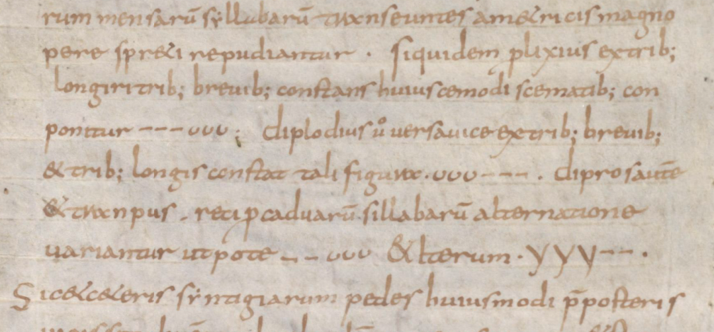
In another manuscript, instead of inserting decorative characters between the words, the letters are stretched:

What about the VMS?
Medieval padding caught my attention because it sometimes beings with a shape like “a” and ends with a shape like “v”. Note how closely this pattern resembles aiv av aiiv av aiiv:
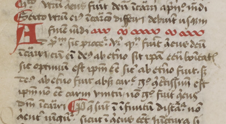
In general, padding was added at the ends of lines, but the earlier examples illustrate that there were midline padding strategies as well.
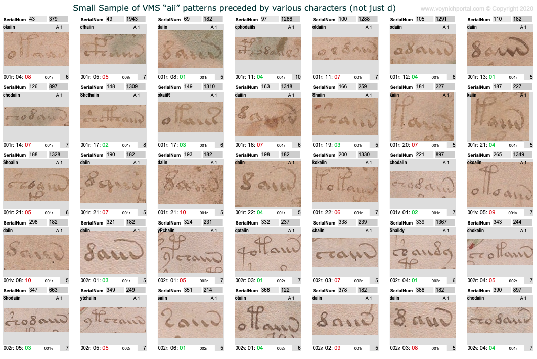
Which makes me wonder whether we should be looking at VMS aiiv in a different way. The pattern includes av, aiv, aiiv, and aiiiv and may be preceded by numerous different glyphs:
The oiv patterns are similar. They are usually at the ends of tokens and are preceded by a variety of glyphs:
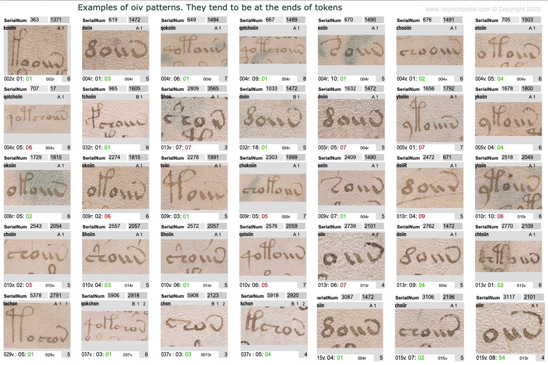
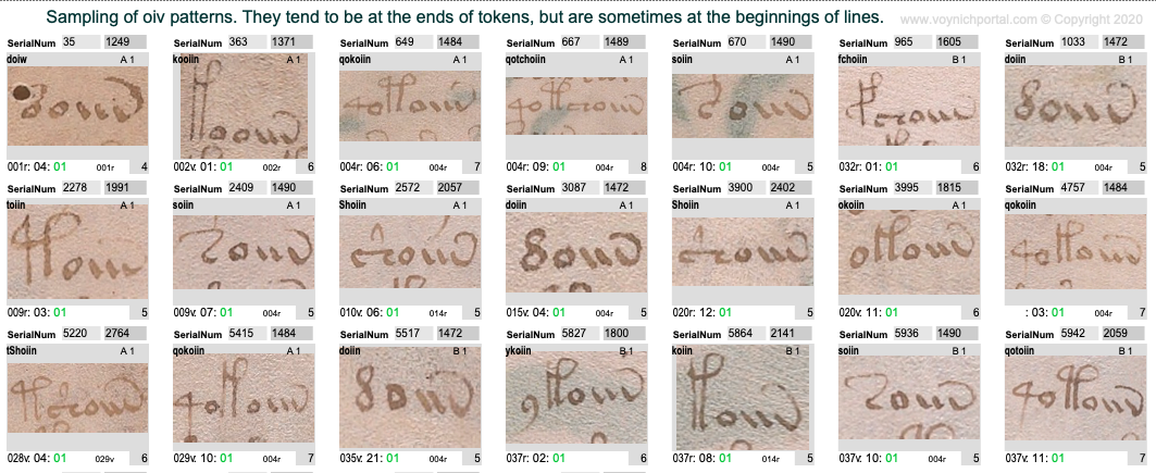
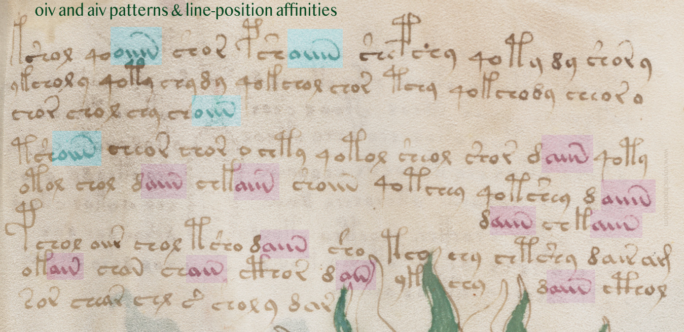
However, aiv and oiv patterns are not identical in terms of line position. Even though both are usually in the token-end positions, the oiv tokens do not cluster near the ends of lines as frequently as aiv sequences. The oiv sequences are in line-position 1 about twice as often as aiv sequences:
Here is an example of these tendencies in VMS folio 28v:
Implications for the Voynich Manuscript
Could the “aiiv” group be a substitute for line-end padding and stretched-out letters? In the VMS, “aiv” patterns are not always preceded by EVA-d. Many other characters precede “aiiv” as in this example on f2v. Also, in this snippet, three of the four line-ends are aiv patterns:

In general, aiv patterns tend to be in the latter half of a line more than the first half, even in text that has not been double-justified.

However, this is a slight overall trend. There are sections in which the proportions are even, as in this snippet:
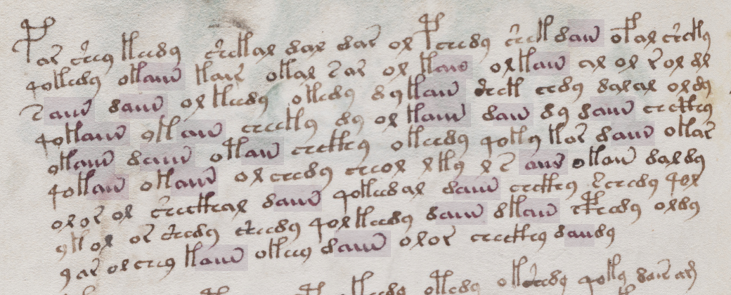
However, the longest “aiiiv” pattern falls near the end of the line more often than the beginning:

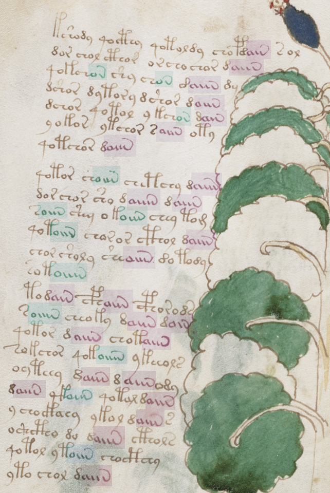
Here’s a full folio (37v) with aiv and oiv patterns highlighted. Once again, oiv leans more toward the beginning and aiv toward the end:
Summary
I’ve mentioned a few times that I think the emphasis on daiin may be misguided. Forget the “d” (at least for now). We should be looking at the ain patterns (which I call aiv) together with the oin patterns. The fact that they occur in the same parts of tokens, but in different parts of the line, is revealing.
In medieval texts, padding can occur within a line or at the end of a line and padding sometimes shares shapes with regular letters, especially the letters a and v. The aiiiv patterns might not be padding patterns, maybe they are word endings, modifiers, or conjunctions. But it’s something to think about. Maybe the shape was inspired by padding patterns even if the interpretation is different. Depending on what precedes the aiv sequence in the VMS, it may serve more than one purpose. But the pattern has an affinity for the ends of tokens and the latter parts of lines and its cousin oiv has a stronger affinity for the beginnings of lines, a pattern that deserves some attention.
J.K. Petersen
© Copyright July 2020, J.K. Petersen, All Rights Reserved
