Medieval alphabets, numbers, and abbreviations are often the same shape. For example, the glyph identified in the VMS as EVA-l (ell) was used as both a number and as a scribal abbreviation. In the previous blog, I described the “is” glyph, which is used to create syllables such as ris, tis, or cis. This time I’ll illustrate the flexibility of the EVA-l shape.
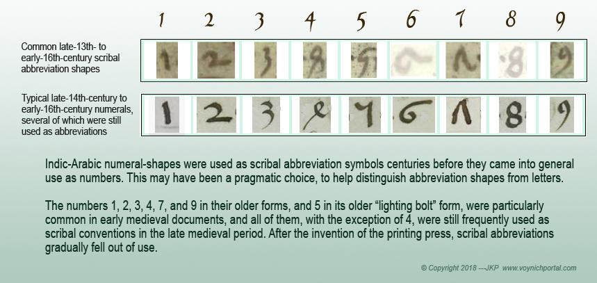
Something I noticed, when reading early medieval texts, is that many basic abbreviation symbols were based on Indic-Arabic numbers, long before these shapes came into general use. I’m assuming this was to help distinguish abbreviations from regular letters.
Thus, the number 1 (the old style with a slight wiggle), and the lightning-bolt style of 5 were used for er/ir/re/ri and other sound-alikes that usually include “r”. Number 2 represented ur/tur, number 3 (often written like a zee) was at the ends of words to stand for rem or us/um. Number 4 (as shown above) was a general-purpose abbreviation, 7 became et, and the number 9 was commonly used at the beginnings of words for con/cum, and at the ends for us/um. These conventions continued from the early medieval period until the 16th century. The only significant change was that the number 4 gradually fell out of use by the 15th century.
The 4 had lapsed as an abbreviation by the time the Voynich Manuscript was created, but it had become common to use it as a numeral.
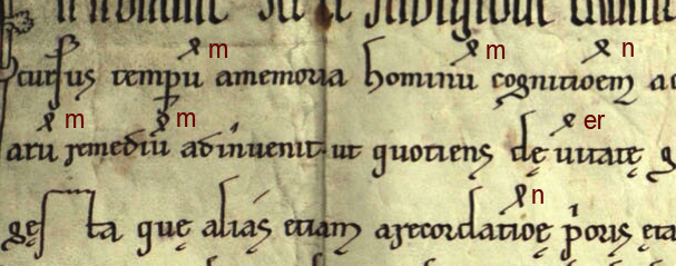
This clip from a legal charter illustrates the flexible nature of 4. It represents whatever letters are missing, similar to a short macron or curved macron in late medieval texts. It usually stood for one- or two-letter omissions (a bar was more commonly used if several letters were missing). Here it variously stands for m, n, and er:

Examples of the flexible nature of the “4” abbreviation standing in for several different letters or more than one letter. [Image credit: Stiftsarchiv Reichersberg German legal document from 1231]
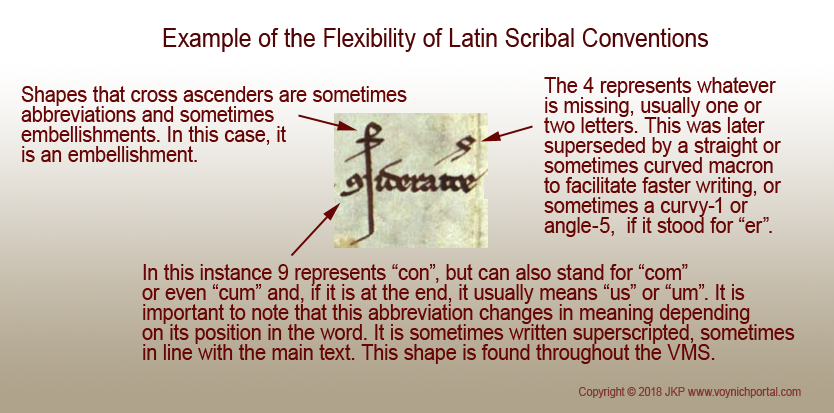
Paper began to replace parchment in the 14th century, and was less expensive, so some of the superscripted abbreviations, like 9, were lowered to the main text (some scribes wrote it both ways). The 4 continued to be superscripted until it became more strongly associated with numbers rather than with abbreviations:
I think it’s important to understand how scribes made the distinction between letters, abbreviations, and embellishments if one is to analyze anything written in the medieval period.
I still encounter considerable skepticism about the VMS glyph-shapes being inspired by Latin. They are not as unusual as many people have suggested.
You can search all over the world for that elusive “alphabet” without finding it. In fact, I did exactly that. Even though I recognized these shapes as Latin, I wanted to be sure I had not overlooked anything and spent two years learning dozens of foreign alphabets (Armenian, Syriac, Gujarati, Georgian, Sanskrit, Hebrew, Greek, etc., in addition to the ones I already knew… Korean, Japanese, Russian and a tiny bit of Chinese), well enough to read simple words… and then came back to where I started—almost all the VMS glyphs are normal Latin scribal repertoire, and the few that are questionable are similar to Greek conventions or could reasonably be constructed from Latin scribal building blocks put together in a slightly unconventional and yet acceptable way.
Understanding scribal conventions might help sort out which variations in VMS shapes are meaningful and which are not. For example, in Latin, you can draw the tail on EVA-m in any direction without changing the meaning, but if you change the left-hand side, it becomes another syllable. In Latin, the 9 shape can be drawn any way you want, as long as it is vaguely 9-shaped, but if you move it from the end of the word to the beginning, you change the meaning. VMS glyphs might follow similar concepts even if different meanings have been assigned.
Summary
If some of the VMS glyphs are abbreviations, it creates one-to many relationships of varying lengths. If this were a substitution code, this, in itself, would not be unduly difficult for cryptanalysts to unravel, but in medieval times there was another twist—scribal abbreviations commonly represented not only several letters, but often different letters in each word. In this way, scribal abbreviations diverge from typical one-to-many/many-to-one diplomatic ciphers, in that the interpretation of a specific shape can change from one word to the next.
In Latin, and possibly also in the VMS, two words can look the same, but mean something different.
J.K. Petersen
Copyright © 2018 J.K. Petersen, All Rights Reserved


Hello, J. K.,
I am a regular reader on your blog. Voynich’s manuscript is of great interest to me, but I am not a specialist in areas that would help to read it. But at least I think I am a good observer (part of my profession). About a year ago, I decided to put some of my review on another occasion in one of Nick Pelling’s blog topics. Now, reading your article, I would like to know if my observations would be useful in connection with this topic or the whole task at all. I’m sending you a link: https://drive.google.com/file/d/1iep91aVSdk9nBtG8flfeoLetBGvDRXMF/view?usp=sharing
With respect to your opinion and many congratulations,
Milen Chakarov