24 March 2019
In a previous blog, I noted some of the ways that “mounds” on the VMS rosettes folio might be interpreted. It was barely an introduction, so this is a continuation, with “mounds” discussed in the context of medieval mappae mundi.
The blog format is too constrained to cover all the mappae mundi, so I’ve selected these as the main examples:
- Sawley (England, c. 1110), Corpus Christi College
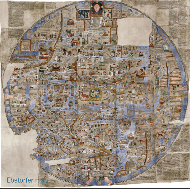
- Ebstorf (Germany? 13th c), original destroyed, facsimile in Ebstorf cloister
- Hereford (England, late 13th c), Hereford Cathedral
- Paris, Bibliothèque Sainte-Geneviève 782 (late 13th c)
- Walsperger (Constance, 1448)
Others are identified as they appear.
Basic Format
Western mappa mundae usually place Jerusalem at or near the center, emphasizing its historical and spiritual importance, as in this passage in Ezekial:
Thus saith the Lord God, This is Jerusalem, I have set it in the midst of the nations and countries, that are round about her.
Ezekial 5:5
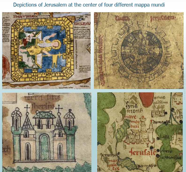
In the example maps, each depiction of Jerusalem is different, as follows:
- Ebstorf: Rectangular aerial view of walls, quite detailed, showing towers, bricks/stones, and battlements, with an image of Christ in the center. The palette is bright and varied.
- Hereford: Circular aerial view, with crenelations and 4 plus 4 structures facing the center, in varying shades of brown ink.
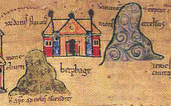
- S-G 782: A frontal image of a building with towers, crenelations, a saddleback portal, and two crosses, embellished with turquoise. The Sawley mappa is similar except that Jerusalem is slightly off-center from the Cyclades, and it has a dome instead of a saddleback portal entrance.
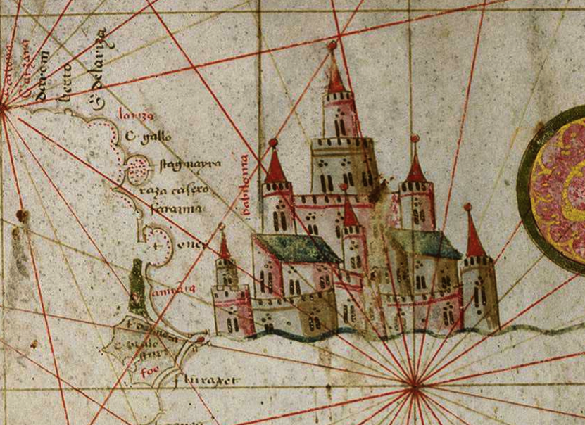
- Walsperger: A more naturalistic view of a walled city with two tall round, layered towers. The palette is green, red, and a pale brownish amber—similar to the VMS except there’s no blue.
Each one is different because the architecture is stylized or entirely fictional. Jerusalem is identified chiefly by the label and its position on the map.
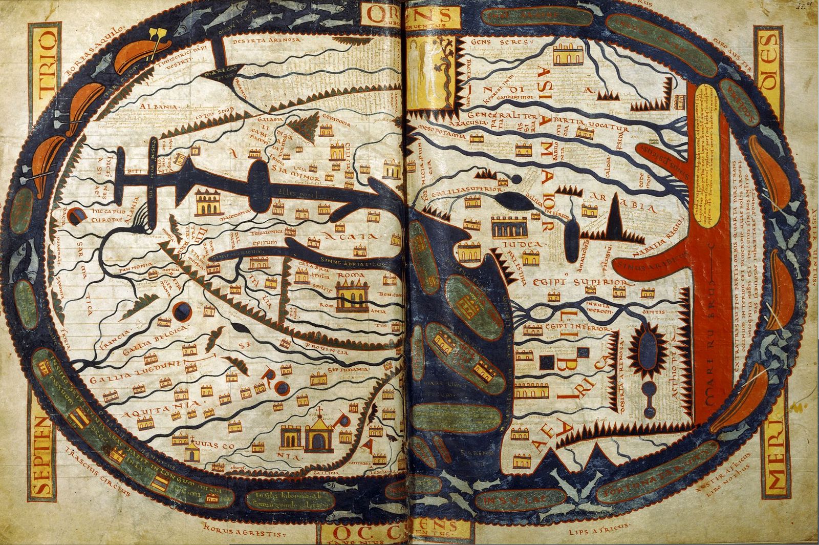
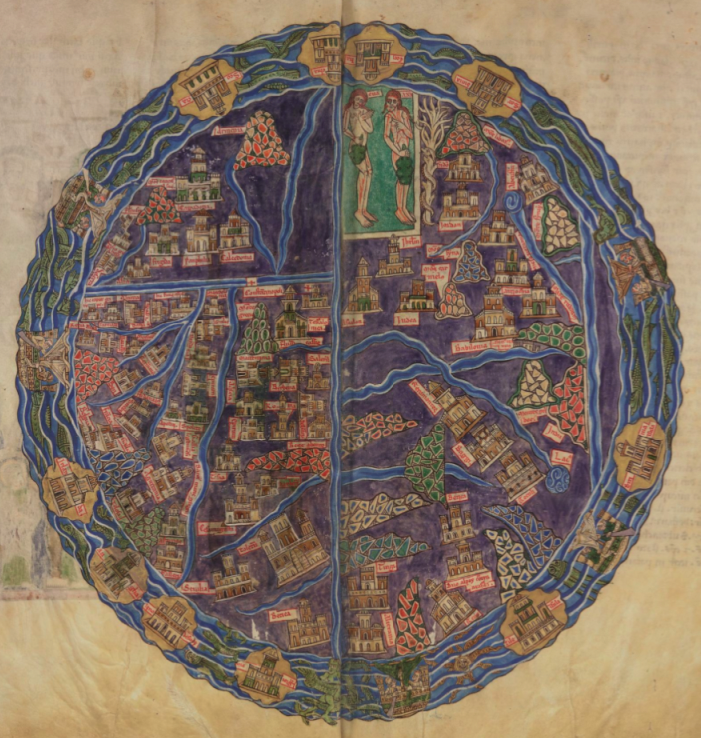
General Shape
Mappae perimeters are usually shaped like a race-track, almond, or circle, ringed by a body of water. This shape may reflect the idea of the map as a “mirror” of the world (the mirror thus reflecting an image given by God). Note that medieval lawbooks, and the scrying glass of John Dee, were also referenced as “mirrors”. They were seen as a vehicle to channel messages from a higher power.
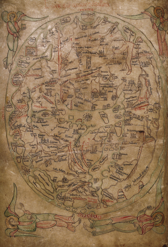
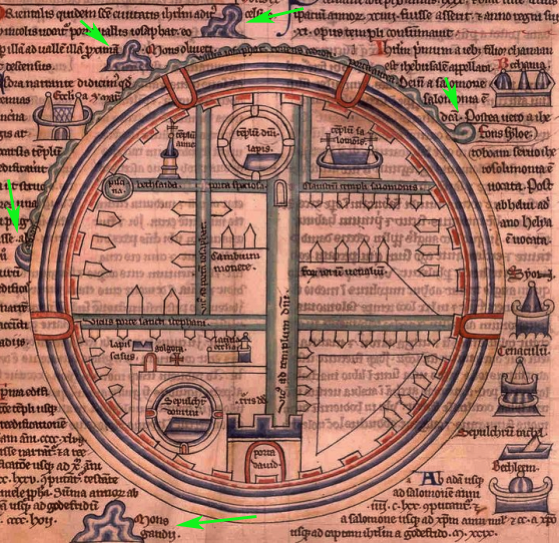
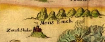
The Sawley map (c. 1110) is oriented with east at the top and the Cyclades in the center (with Jerusalem nearby). Angels preside in each corner. Mountain ranges are lines of small bumps. Specific mountains, like Mount Atlas (bottom-right), are taller mounds:
On some maps, the surrounding waters are embellished with fish, boats, monsters, named or unnamed islands, or people.
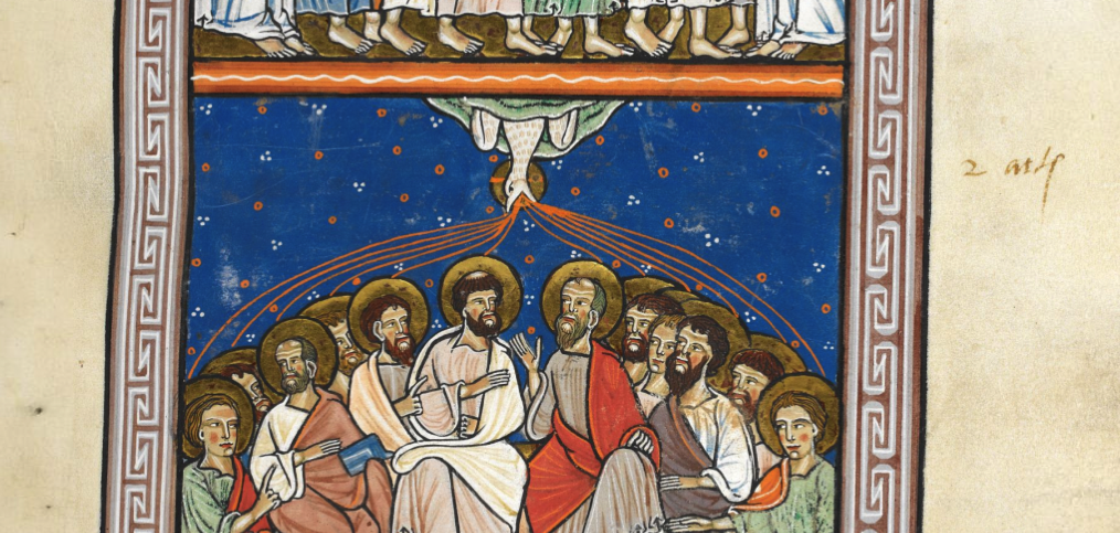
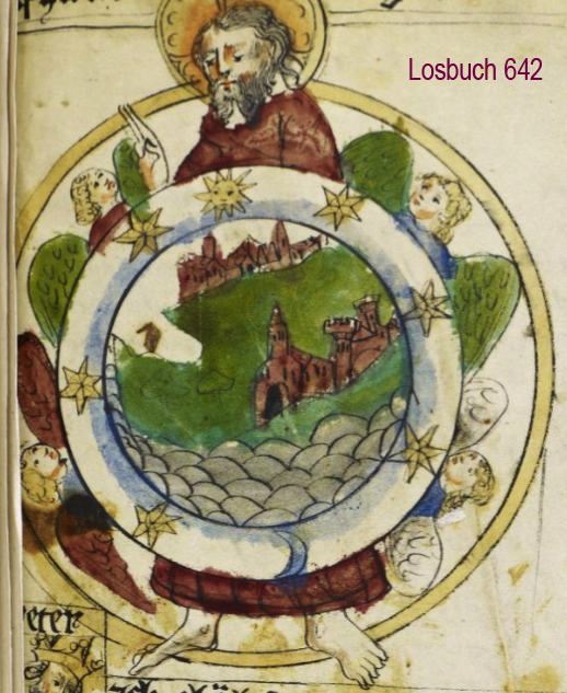
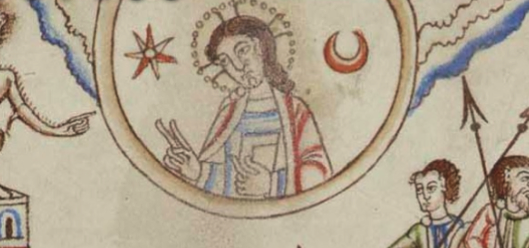
Sometimes, God or Jesus is shown at the top or incorporated into the content as head, hands, and feet at the outer edges:
The organization of the towns and landmarks is based partly on biblical events after the flood:
These are the families of the sons of Noah, after their generations among their people: and out of these were the nations divided in the earth after the flood.
Genesis 10
All ethnic groups were said to be descended from Noah’s sons, Shem, Ham, and Japheth, and the earth was basically “assigned” to their descendants.
By the Middle Ages, mapmakers had a greater awareness of the extents of human populations, the arctic, antarctic, and the east, so they added them to the biblical interpretation while still retaining the basic ideas. Some of these maps were stylized into a T-in-O shape (or a four-part shape similar to a T-in-O).
Thus, we have Asia being roughly half the world, with the rest divided between Europe and Africa (and sometimes the Antipodes are shown as a small section by Africa).
East is Up
In the older mappae mundi, east is usually oriented toward the top. By the 15th century, some maps had south at the top. South was the direction taken by most Europeans for pilgrimmages to Jerusalem, Ethopia, and to reach many of the African and Indian trade routes, so it may have been natural to think of this direction as “up”.
By the end of the 15th century, magnetic compasses were more common and our concept of “up” changed from south to north.
We cannot be sure that the T-in-O on the VMS “map” folio is meant as an orientation symbol (or that the VMS rosettes are strictly geographical) but if it were, it would roughly correspond to compass points as follows:
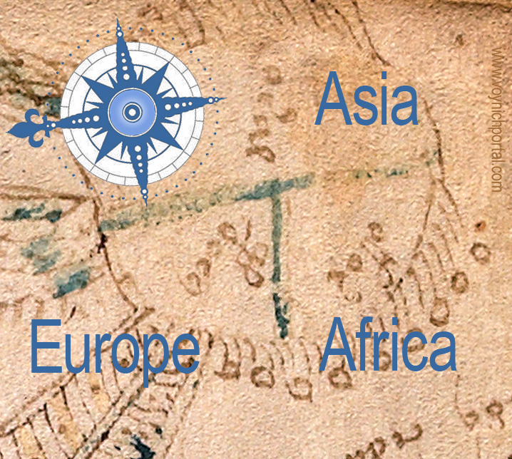
This would put east at the top in relation to the binding, as would be common for the early 15th century.
More Examples
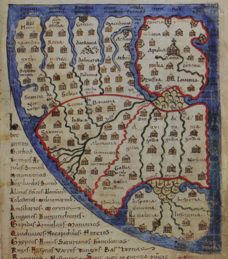
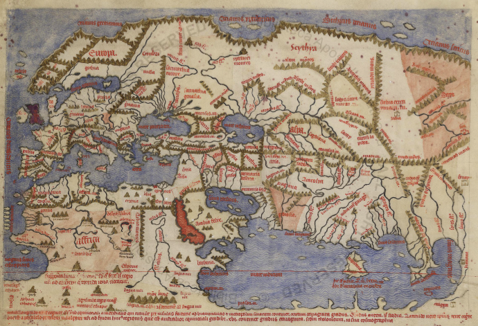
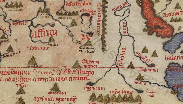
The 11th century Saint-Sever mappa mundi is race-track-shaped, with east at the top. The Mediterranean divides north and south, and the river systems and Black Sea generally separate Europe from Asia. It’s not quite a T-in-O, but it’s easy to see how the idea of T-in-O evolved.
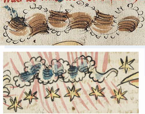
Note how the Saint-Sever mountain ranges are drawn as lines of triangular bumps, and the tall mountain in the upper-left quadrant looks like a pile of scaly bumps, as in the Sawley map shown earlier. To the right is the Red Sea:
The Royal Higden map (Royal MS 14 C IX, c. 1350), is the same race-track shape, but the drawing surface is rotated 90°, so that Asia is a larger proportion of the total. Jerusalem is a little above center and Noah’s arc to the left:
Mountains are drawn as circles with a bit of green paint in the middle. This top-view theme of mountains as circles is also quite common. Sometimes the rivers flow from their centers, sometimes from the edges.
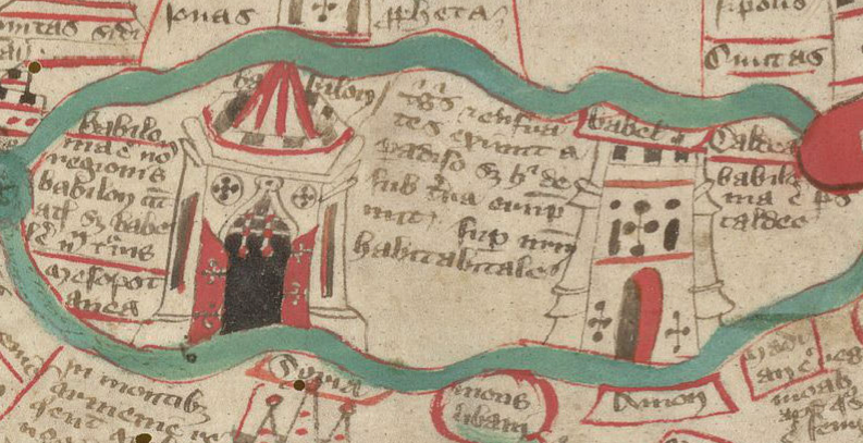
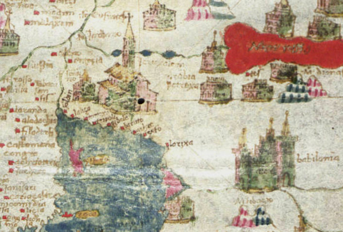
Often the tower of Babel is included as a tall, narrow, tiered structure, but it is not always large or prominent on the map. The Higden map has an especially fancy drawing of Babylon and Babel:
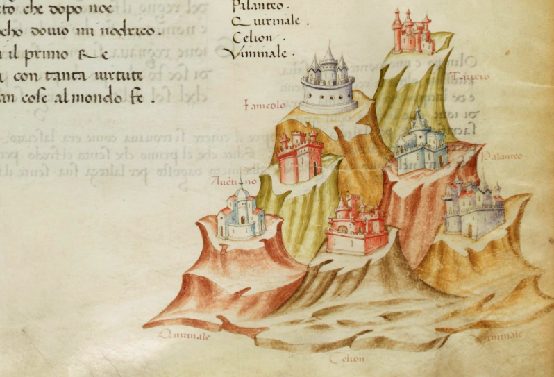
We often hear about “the seven hills of Rome” but this idea is not usually reflected in medieval mappae mundi. Rome is a fancy building, and the alps are nearby, but the seven hills are not explicitly drawn:
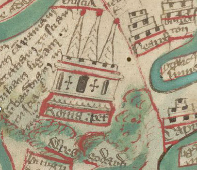
More literal expressions of the seven hills are sometimes found in illuminated manuscripts. These lofty tors reminded me of some of the escarpments in the VMS “map”, but they do not have pathways connecting them:
Mons atlas (a mountain created when Atlas was turned to stone by Perseus) is frequently included on mappae mundi. On the Higden map, it is prominently featured at the bottom with a textured mound rather than a simple circle. This region, next to Morocco, is now known as the Atlas range (note also the highly stylized islands off the coast of Africa):
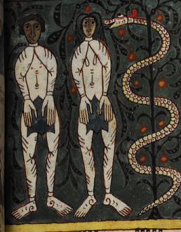
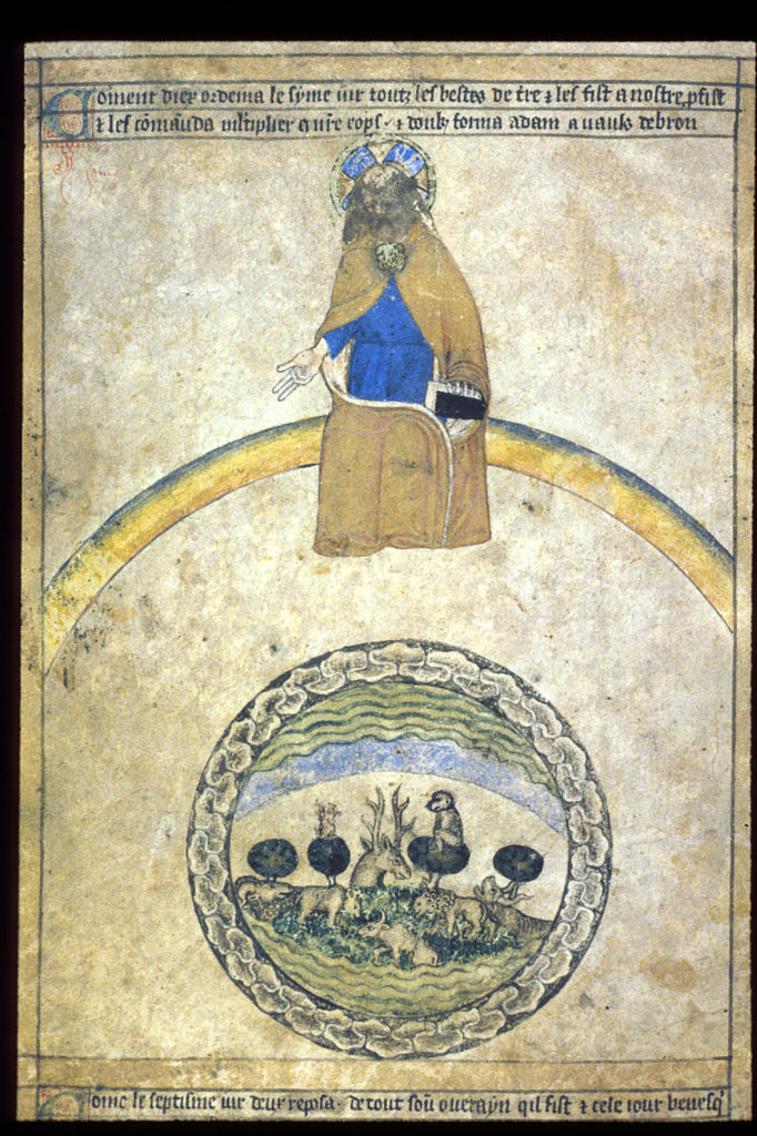
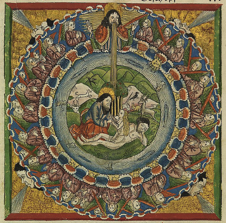
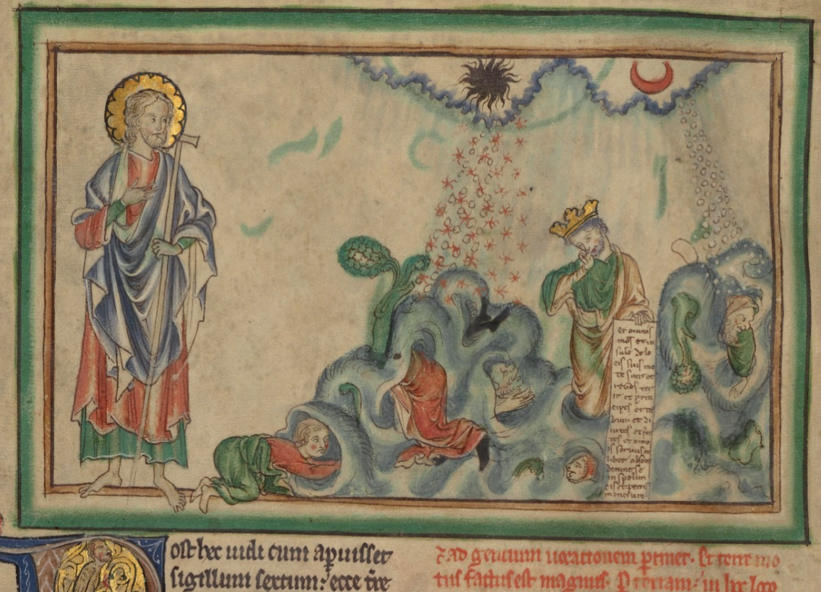
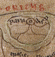
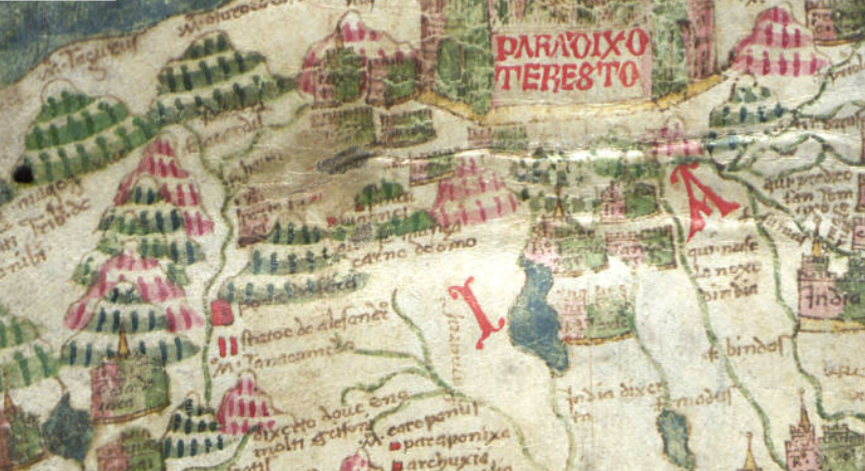
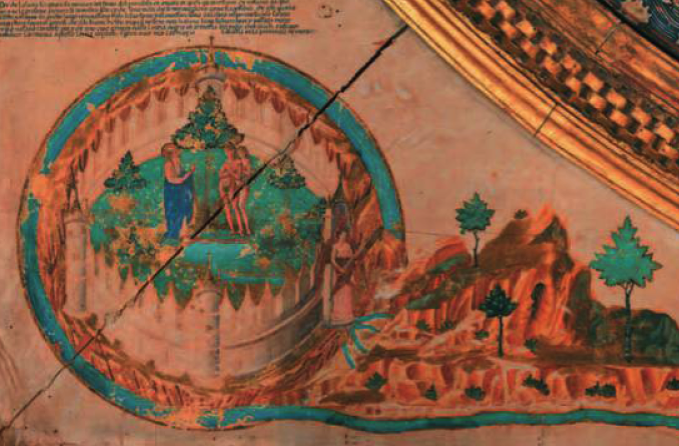
Mappae mundi are often crowned with images of Paradise, or of Paradise lost (Adam and Eve after their expulsion from the Garden).
Adam and Eve and the serpent are featured prominently at the top of the map in the Beatus of Liébana map (right), and the NAL 2290 Beatus (early 13c).
The NAL 2290 map is round, with a lively procession of castles and critters in the outer ring of water:
Once again, the mountains are drawn as piles of textured bumps.
The Garden of Eden
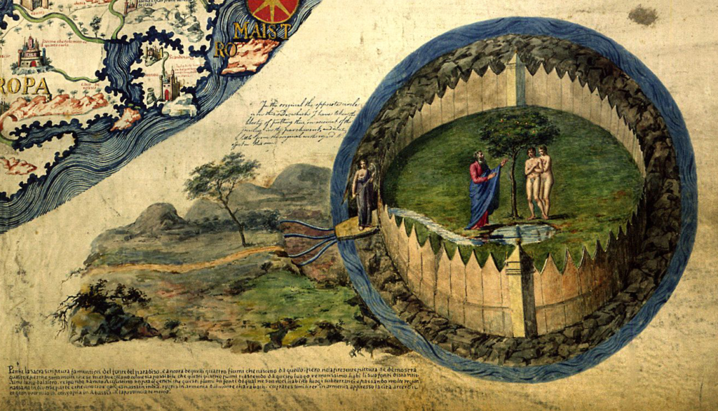
In the Middle Ages, Eden or “Paradise” was not always represented by Adam and Eve. Sometimes it was a fancy dwelling with four rivers emanating from its edges, including the Tigris and the Euphrates. It was generally believed that Paradise, the cradle of humanity, was near Mesopotamia, in Armenia.
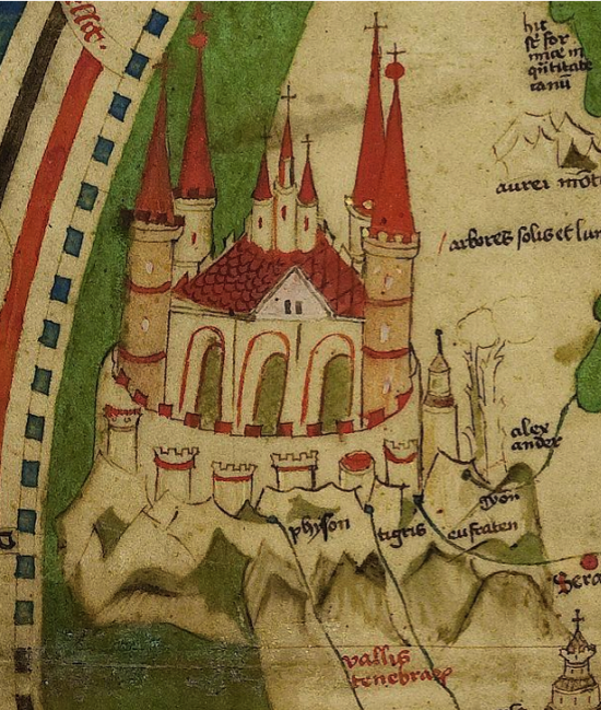
On the Sawley map (right), Paradise is sketched very simply at the top, somewhat organically enclosed by a “moat” connected to the great waters that ring the perimeter. There are two central circles with lines that probably represent the four rivers in a more abstract way than the Walsperger map.
Other frequent landmarks include Paris, Rome, Galicia, Bethlehem, the mouth of the Nile River (and other important rivers), the sea of Galilee, Black sea, Caspian sea, and the Red Sea (which is often painted red), along with various mountain ranges.
Thus, the maps were not strictly geographical, they combined history, landmarks, the origins and spread of humanity, and sometimes animals common to a particular region. Fictitious races of distorted humans are sometimes included, as well, with imagery that later showed up in manuscripts describing the travels of “John de Mandeville”.
Hints of Itinerary Maps
In Liber Floridus (c. 1113), the map is essentially a T-in-O configuration, but it is arranged a little differently from single-page mappae mundi, with water surrounding an entire quadrant. South is somewhat at the top, but only for parts of the map. Eastern Europe, Italy, Germany, France, and Galicia jostle each other around the edge, and Scandinavia is smaller than Saxony. Rome is emphasized in the upper-right. The orientations shifts slightly depending on where you are on the map:
The emphasis on Rome is two-fold. Not only was it the seat of power for much of Christendom, but it was the destination for many clerics to plead their requests or grievances directly to the pope—in other words, they needed to know how to get there.
River Systems
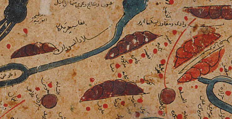
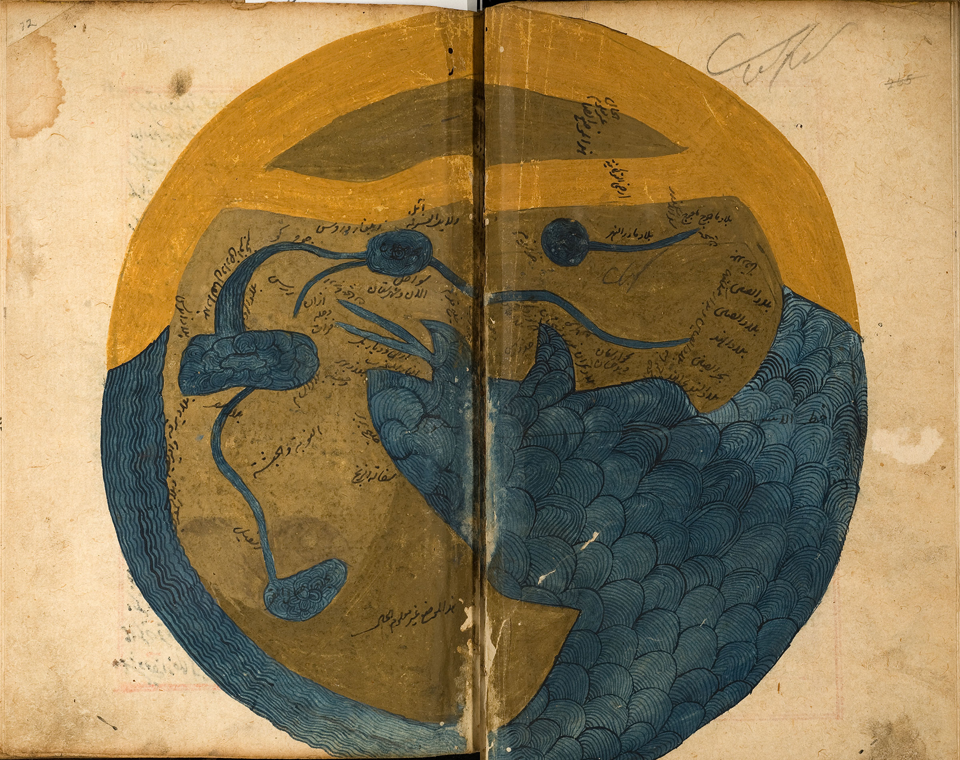
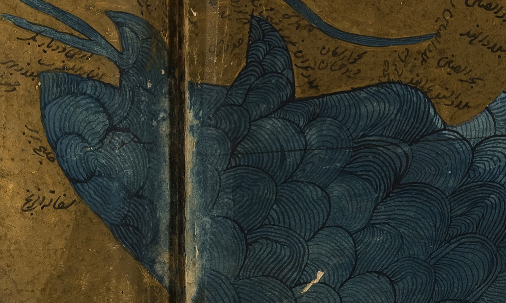
You’ve probably noticed that river deltas are prominently featured in most of these maps. Paradise, Egypt, Europe, the Black Sea, the Rhine, everywhere you look, there are fanlike fingers representing river systems. This is not surprising since water sustains us, feeds our crops, and provides important transportation routes. The way rivers are represented is much the same in maps from Europe and the Arabic world:
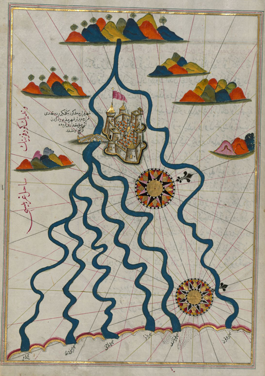
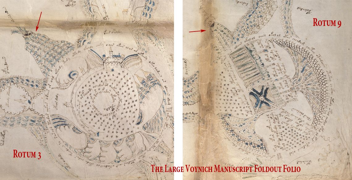
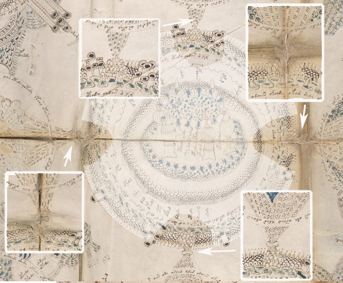
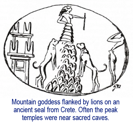
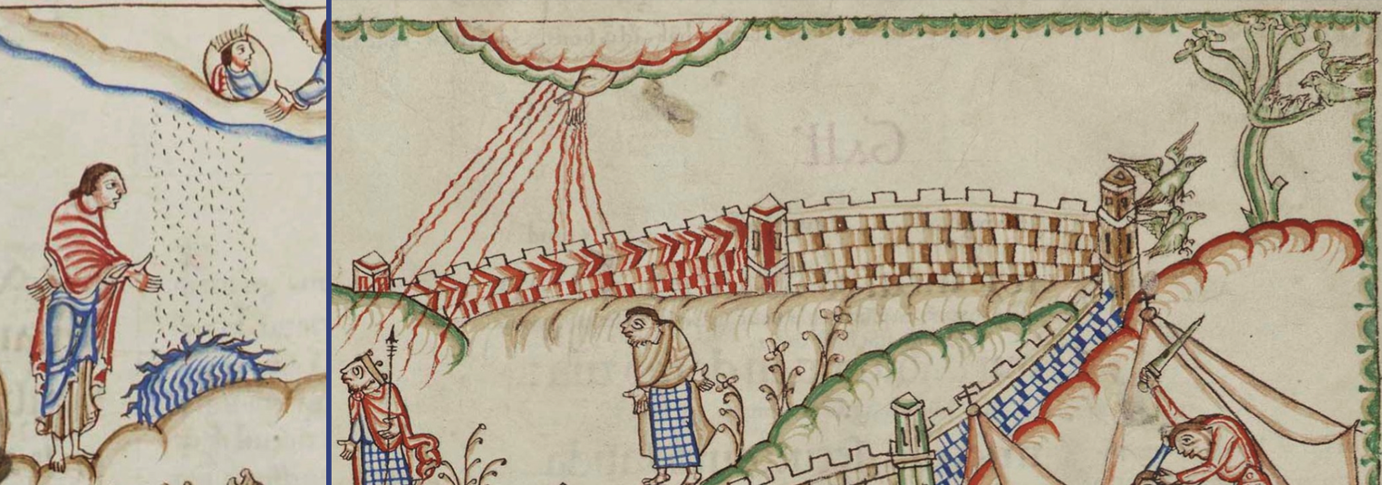
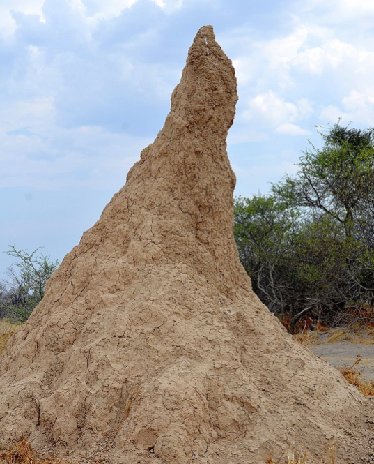
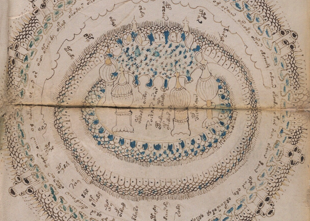
On the VMS foldout, Rotum7 has always struck me as similar to an alluvial fan, so much so I have difficulty thinking of alternative explanations. There are mounds in the center, possibly representing mountains as a source of the water. River basins throughout the world have the same basic fan shape.
But… the streaming shapes in Rotum7 are adjacent to the pathway with the Ghibelline merlons. How are we to interpret that?
If this rotum is a river delta, and the merlons represent northern Italy, it’s tempting to interpret it as the Po or Arno river basin. If east is up, then rivers that drain toward the west seem more likely, but I would still caution against taking the T-in-O too literally. If this were a strip map, the orientation could change en route:
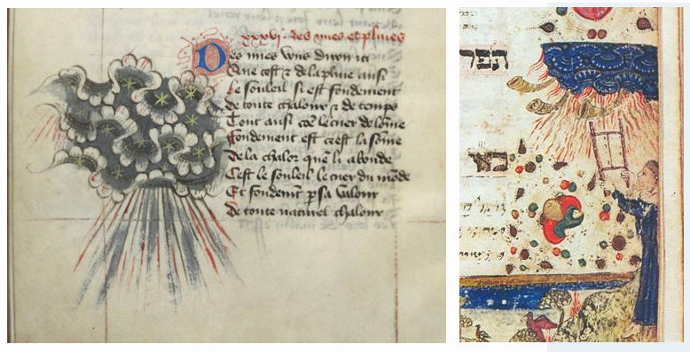
I have rotated Rotum7 clockwise so the “labels” are easier to see. Most of the tokens start with o-Ascender, as do those in the “star charts” and “zodiac” sections. For comparison, here is a closeup of Arabic labels at each river mouth, sharing space with coastline symbols:
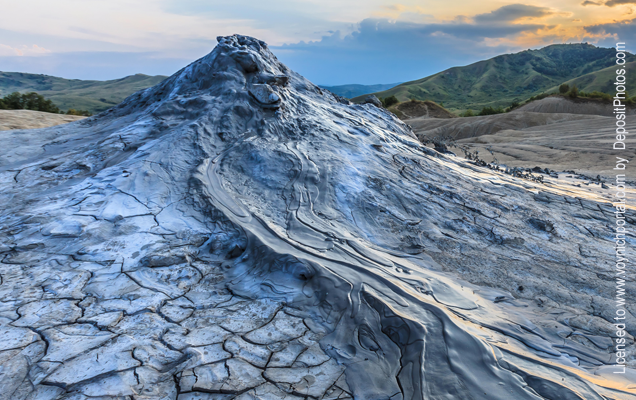
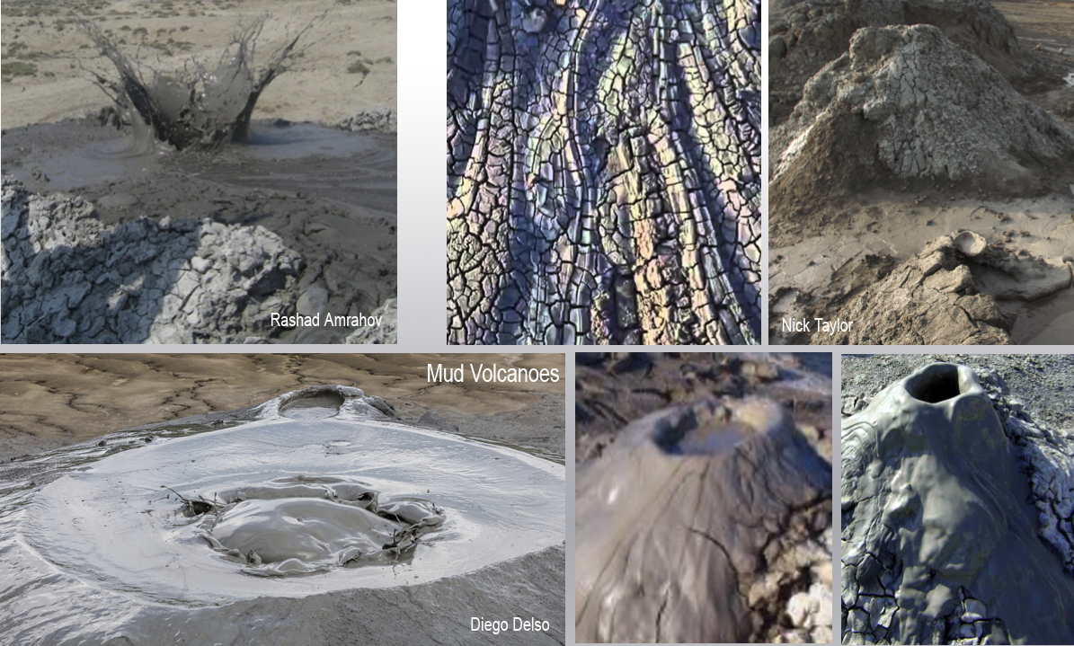
There might be other explanations for Rotum7. Maybe it’s not a drawing of river systems. It could be argued that the image is inverse, with the streams unpainted and the parts in between being something other than water. Perhaps this is smoke or vapor emanating from a thermal crater, rather than a river basin. Thermal baths or steam vents are found in thousands of locations throughout the world including places where there were swallowtail merlons.
Details, Details…
Petrus Vesconti of Genoa produced a number of maps in Venice in the 1320s. His circular mappa mundi has a more practical feel to it than many of the medieval mappa mundi. Vesconti included the rhumb lines common to seafaring charts and the mountains are more naturalistic:
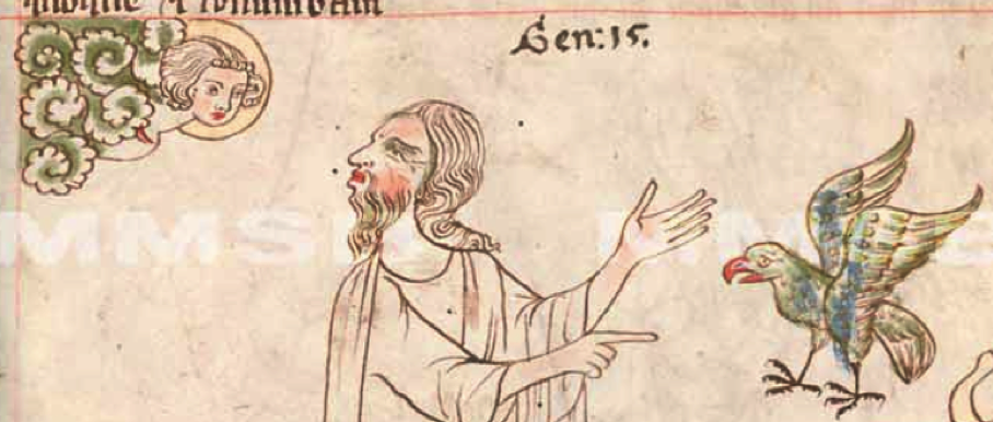
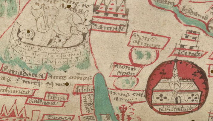
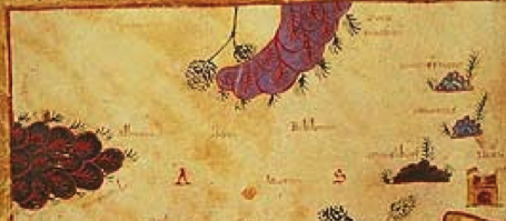
The Paris and Upsala maps of Jerusalem include mounds with more stylized textures than those of Vesconti. Each of the three mounds in the Upsala map has a different pattern, but all mean the same thing… mountains.
The Matthew Paris map of Jerusalem clearly shows some of the common features: mountains, city walls, major landmarks, and the mouths of springs:
In Liber Floridus, the alps are drawn as a pile of scaly bumps with scepter-like embellishments:
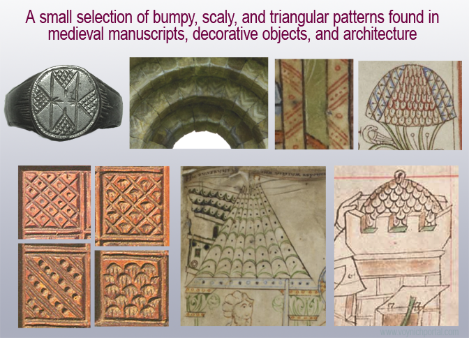
Clearly the use of small heaps of textured bumps to represent mountains is common to medieval maps in several styles. The main difference between the heaps in the VMS and those in other maps are the “spewy” things coming out of them. Are there any medieval maps that are similar?
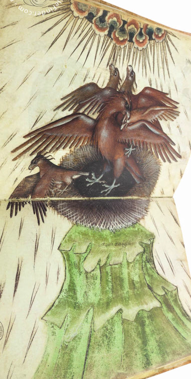
Mountains with Extra Protruberances
The Beatus of Liebana map exists in a number of versions and was drawn with a variety of textured mounds, as in the Las Huelgas Apocalypse from Spain c. 1220 (Morgan Library):
But it doesn’t have any tufts or spewy things. Neither does this late-medieval copy of an early medieval Arabic map from the Book of Curiosities (Bodley Arab.c.90):
However, other copies of the Beatus map were drawn with feathery “tufts” along the edges, such as the 10th century Escalada Beatus of Valcavado, thought to be from Tábara, Spain:
In the clearly derivative Beatus below, we see the same features: a mountain in Albania with tufts, (mons aquilo, possibly Mt. Korab?), smaller mountains to the right with feathery tree-like tufts on the earlier Beatus, and individual grainlike tufts on the later one.
To the right and down is a mountain that has both tufts and a poof at the summit. It is labelled mons libanus, the old name for a high peak northwest of Damascus, near the coast:
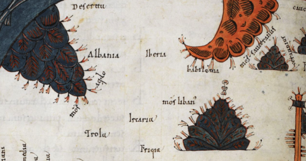
The area around Damascus was volcanically active until the Holocene period and there is an extensive lava field southeast of Damascus, so perhaps the poof refers to volcanic craters.
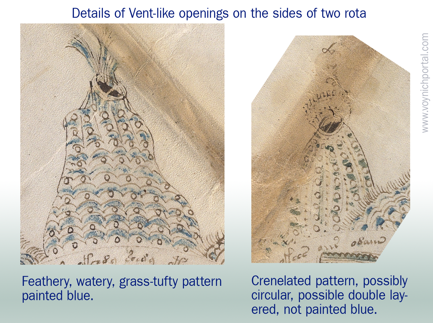
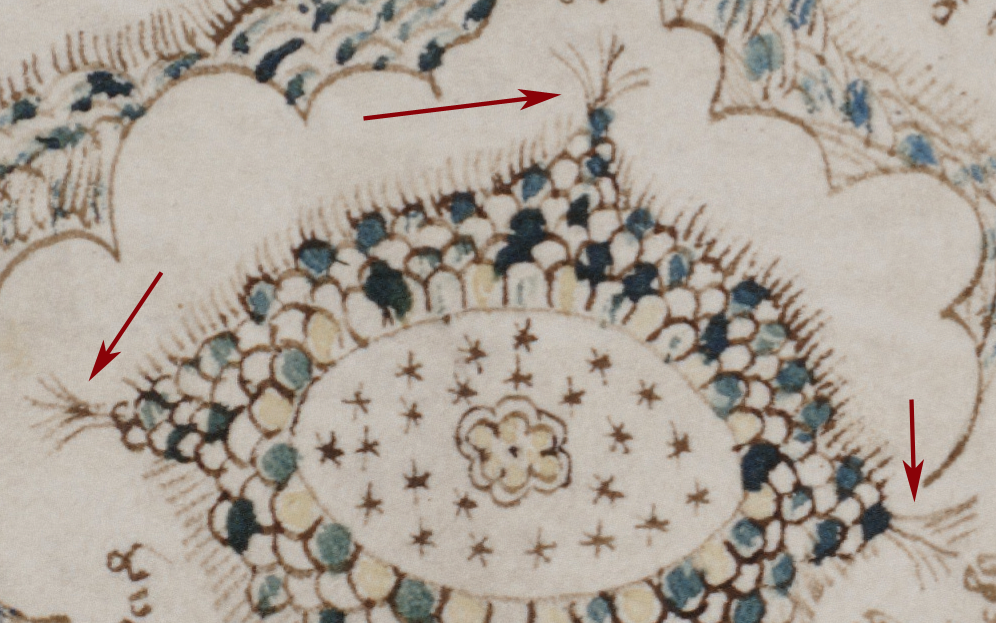
The VMS also has some tufty looking protrusions on Rotum7 along the edges of the scaly bumps and at the tops of the “mounds”? Might these represent trees in a very abstract way as in the Beatus maps? Might some of the longer ones represent vents as discussed in the previous blog?
Venetian Mappae Mundi
The Giovanni Leardo map of c. 1452/53 is oriented with east and the “earthly paradise” at the top. A calendar fills the outer edge.
The mountains are colored green and pink to help distinguish them from overlapping features, but don’t vary much in texture:
The buildings have a cookie-cutter quality, similar to the mountains, with the more important ones marked with taller or more numerous towers. Jerusalem and Babylon are given special prominence and the Red Sea is bright red:
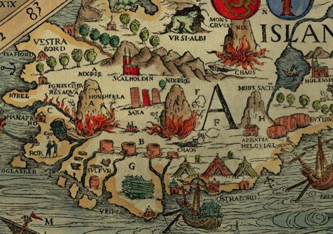
The Carta Marina, published in Venice a century after the Leardo map (1539), is a very detailed map of Scandinavia and Iceland. Volcanoes are shown as mounds but it’s interesting that fires are raging at the base rather than spewing from the tops as is common on many maps. There is also an interesting twist on rivers, which emerge from pipe-like structures that resemble reservoirs rather than natural springs—a pipelike theme somewhat reminiscent of the VMS:
Two centuries after the VMS, not much had changed in terms of representing mountains. In this 1650 map of Ephraim’s inheritance by Thomas Fuller, we see textured bumps, with higher bumps for taller or more important peaks:
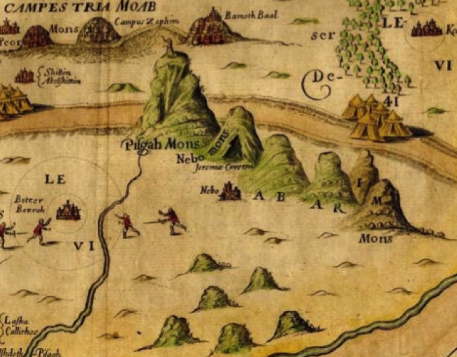
As in the VMS, sometimes the peaks are topped with fortresses:
Most buildings in medieval maps were fictional. They rarely resembled actual structures.
For a unique synthesis of map and myth, take an hour to peruse the drawings of Opicinus de Canistris, who created a series of maps around the 1340s (Vat.Lat.6435). A supporter of the Guelphs (who, in turn, supported the pope in Rome), the biblical elements are very apparent, but his integration of figure and form have a deft puzzle-like quality that is unlike other maps created in the middle ages and which vaguely reminds me of some of the pond-and-river images in the VMS:
Cultural Differences
Arabic maps often share similarities in the ways mountains or rivers are drawn, the 12th century world map by Al-Idrisi is essentially the same as western maps, but there are also some notable differences in maps created by specific map-makers. For example, this 13th-century Zakariya Ibn Muhammad world map, labeled in Arabic, uses scaly textures to represent lakes, rivers, and oceans, and mountains are not included:
Borders
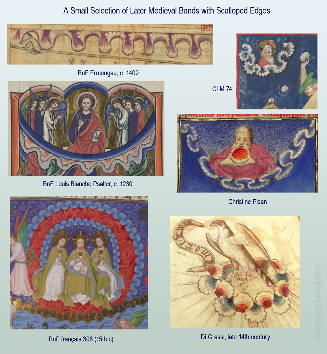
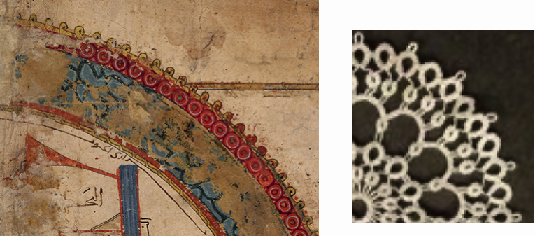
I wanted to make a quick note about borders before summing up. The edges of most mappae mundi are unremarkable, sometimes ringed only by a roughly drawn circle or double line. But some have more elaborate borders.
Here is a circular world map (Kitāb al-masālik wa-al-mamālik), in which the outer ring of water is contained within a lace-like pattern of donuts and loops that resembles tatting:
The Walsperger map has a flame-like border of triangular ticks:
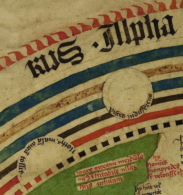
… somewhat similar to the ticks in the VMS:
It’s not exactly the same—the VMS triangles emerge from a scaly base and the flaglike ticks are disengaged from the triangles—but it caught my attention because the Walsperger map includes other relevant details, like placeholders for zodiac symbols and text written within the perimeters of circles.
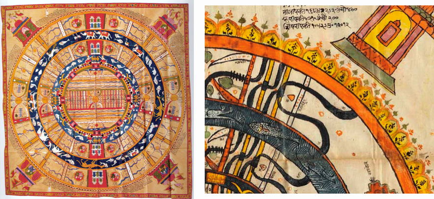
Highly schematized mandala-like maps with elaborate edges are also found in Indian maps in the 18th and 19th-centuries:
The Emerging Renaissance
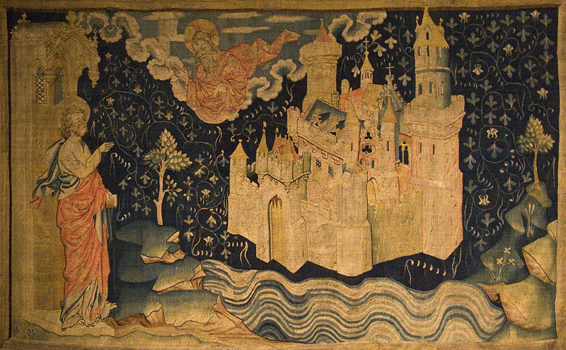
The c. 1450 “Fra Mauro” mappa mundi illustrates an increasing trend toward realism as the Renaissance took hold in Europe. Paradise has been conspicuously removed from the top, within the map, as was traditional, and placed outside the perimeter, in a corner. It is contained within a circular enclosure, has a daunting pointy fence, and craggy terrain outside the perimeter (does that sound like the VMS?).
As with its predecessors, there are four rivers running from the edge:
Here is another version with the same basic features:
If it is a Map, Where Does the VMS Fit?
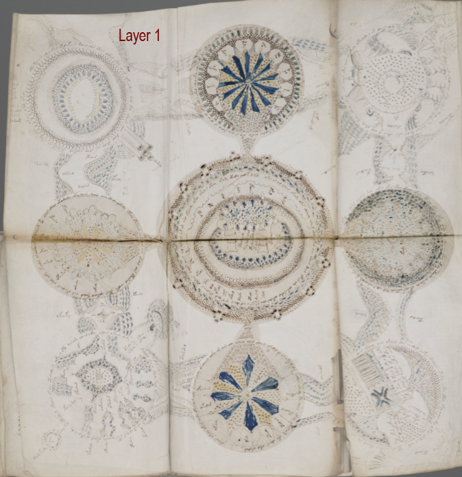
If we assume for the moment that the rosettes foldout is a map, could it be interpreted as a mappa mundi? The perimeter is not round or oval and each rotum is quite large and distinct, larger than one would expect for a world map, but it might be a good exercise to see if it works.
Perhaps, like so many medieval maps, the central rosette is Jerusalem:
This is believable, as Jerusalem is frequently drawn as a circular enclosure with numerous towers. Sometimes stars are included. The enclosure is often a wall of stones or bricks.
Following this line of thought, and depending on the orientation, the bottom-left rosette with rivers or vapors running out of it, or the more symbolic one in the top-middle might be interpreted as Paradise.
Years ago, I thought the Tower in the Hole might be Pisa or, if the map represents Naples, one of the structures coming out of the ancient tunnels that still exist underneath the city. But another possibility is the tower of Babylon, which is almost always included in mappae mundi.
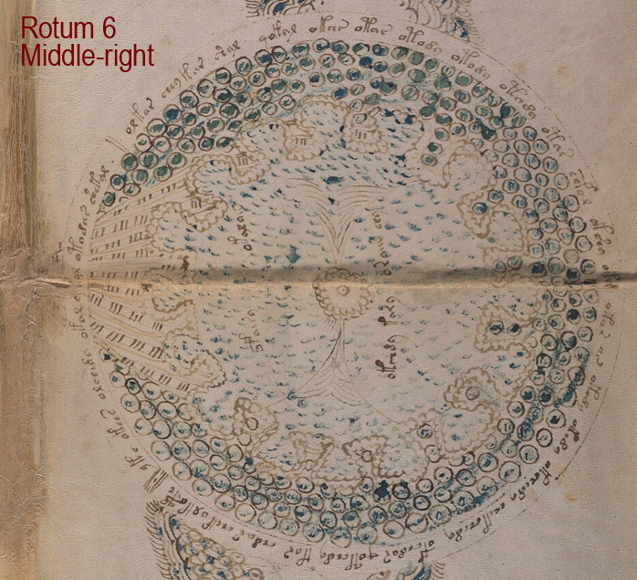
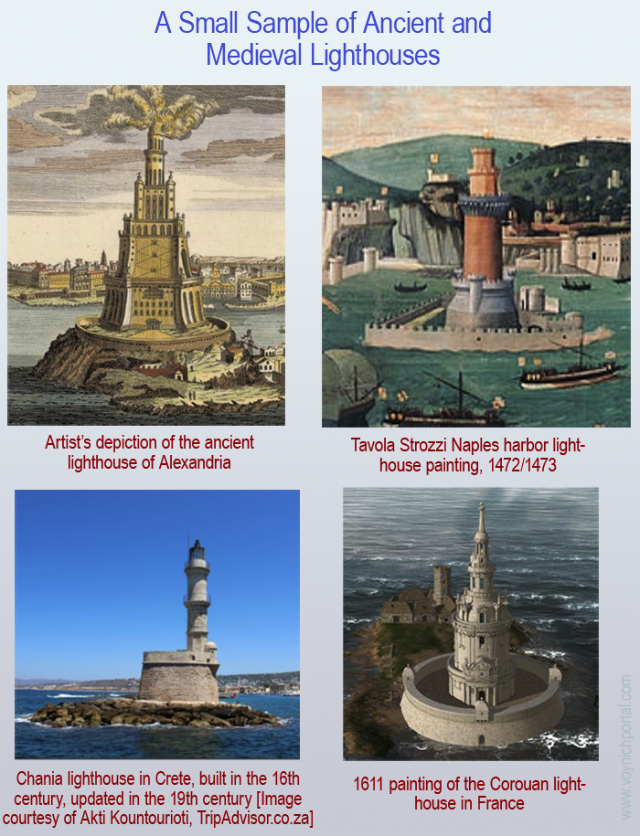
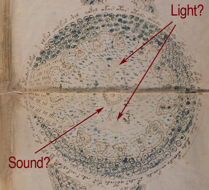
If east is at the top, as per the small T-in-O, then the rotum middle-right could be an aerial view of the lighthouse of Alexandria (see the previous blog for a detailed look at Rotum6):
What about the Swallowtails?
But then it gets complicated… if east is at the top, that would place the Ghibelline merlons in the west (at the bottom) relative to Jerusalem, suggesting that the map as a whole represents the Mediterranean region, rather than the whole world. This, in itself isn’t a problem, but then how does one account for all the other rota?
That Nagging Feeling That it Doesn’t Add Up
The problem is, it doesn’t feel right. On a subjective level, it’s like trying to push square pegs into round holes. Some parts of the VMS “map” can be compared to mappae mundi, such as the way the textured details are drawn. In other ways, it feels more like a strip map (from the beginning, I’ve felt it was more suggestive of a journey than of a world map).
It feels even less like a portolan. In general, portolans were more practical than mappae mundi, and more geographically literal than either mappae mundi or strip maps. They were more likely to include detailed coastlines, navigational lines (wind-rose or “rhumb” lines), and a variety of mariners’ symbols.
Here’s an early and fairly simple version of a portolan with reference lines and numerous harbor markings along the coast of Alexandria:
The children of seafaring merchants were expected to learn math and to know it well, including fractions, distance computation, percentages, area computations, “meet-in-the-middle” problems, differences in speed related to the number of sails, and much more (for examples and a fun read, see Dotson’s Merchant Culture in Fourteenth Century Venice).
With this emphasis on analytical skills, one can expect portlans to be more detailed and accurate than charts based on biblical stories that are intended for general education.
Only a few of the elements of early portolan maps are found in the VMS and they are not synthesized in the same way but, before rejecting them entirely, I think it’s worth illustrating at least one of the later-medieval portolans because they started adapting ideas from mappae mundi.
Evolution of Portolans
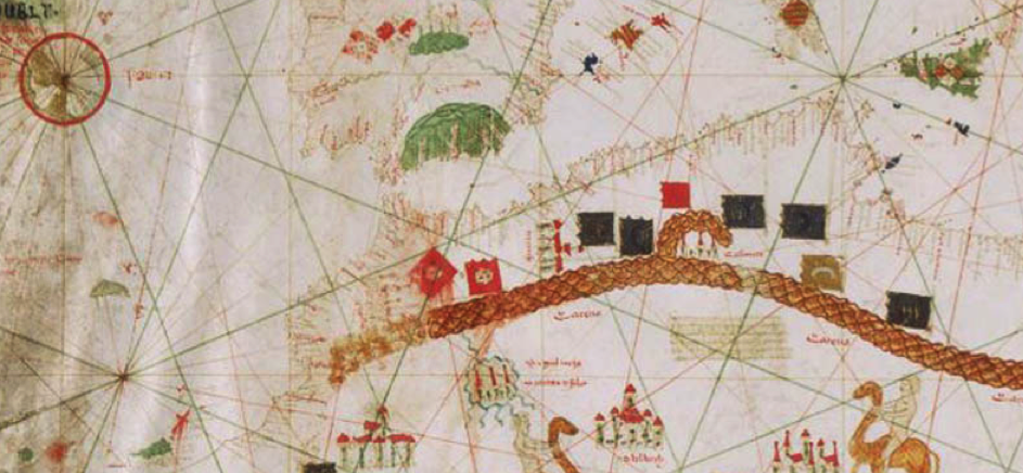
By the 15th century, portolans were more detailed and colorful, and included some of the elements more common to mappae mundi: scales and textured mounds for mountains, river deltas colored blue, and more elaborate architectural drawings for cities (both real and mythical). But they continued to include practical elements such as rhumb lines and numerous port symbols, as in this chart by Spanish cartographer Gabriel de Vallsecha:
Ironically, at the same time that portolans were becoming more expressive, mappa mundae were becoming more naturalistic and accurate than traditional T-in-O maps.
Evolution in World Maps
The 15th-century world map of Pirrus de Noha is clearly more geographical than Biblical. The coastlines, mountain ranges and river systems are recognizable without labels. North is at the top, and the eastern portion stretches past the Caucasus, a region only vaguely charted on earlier maps:
In the Pirrus map, the focus is on land masses, so the harbor markers and rhumb lines common to portolans are not present, but the VMS “map” shows no signs of being geographical like the Pirrus map—I included it mainly for contrast to the VMS, and to show some details of mountains and river systems, which are similar to most maps of the time:
Thus, semi-geographical maps, and the 1439 portolan below, represent mountains as rows of triangles or scales, with taller heaps for individual peaks:
It should be clear by now that the VMS is arranged differently from most medieval maps. It’s not overtly similar to mappae mundi or portolans, but there are other kinds of maps that were used regularly in the Middle Ages that might qualify.
Is the VMS like itinerary maps?
Itinerary maps are lists of major landmarks and destinations along the way. Sometimes distance is noted in units of time rather than units of measure. Some itineraries are so detailed, they are like short books, with descriptions of places to sleep or to visit within a local community, others are brief lists of town names in the order in which they were to be visited.
Many are not illustrated, so I took a small section of the 16th-century itinerary of Bartolomeo Fontana (U Penn Codex 451) and mapped the destinations as an example:
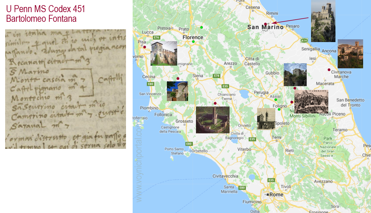
This is a fairly short trip compared to some of them, and yet it is eight destinations. If the VMS is an itinerary map and IF it is drawn in two planes, then the number of destinations is very small.
Before we look at strip maps, I’d like to mention a map that doesn’t fit the common categories. It includes elements of both geography and itinerary maps, but leans toward geographical.
A Spartan Format
When I first found this c. 1425 map, the folio was zoomed out and I saw only a grid with some red dots. The preceding folios were star charts, so I assumed the red dots were stars, as well. When I zoomed in, I realized it was a semi-geographical map listing locations from Germany to the Levant and Greece in the southeast, and to Spain in the southwest.
I’ve transliterated and translated some of the better-known locations to make it easier to read. It’s interesting to note the changes in some of the names. For example, Herbipolis is today’s Würzburg. It also provides some insight into the towns that were significant to whoever created the map.
The top of the page is roughly west rather than north and it’s not strictly geographical, even though it’s placed on a grid. These “wandering” compass points are common to itinerary maps and strip maps since the orientation of the folio can be inferred from the names. To give a general idea of the orientation, I added a compass.
Oddly, Nuremberg is shown west of Cologne and, even more surprising, Rome is off the bottom of this clip, southeast of Florence. Most of the other towns are more-or-less in the right orientation to one another:
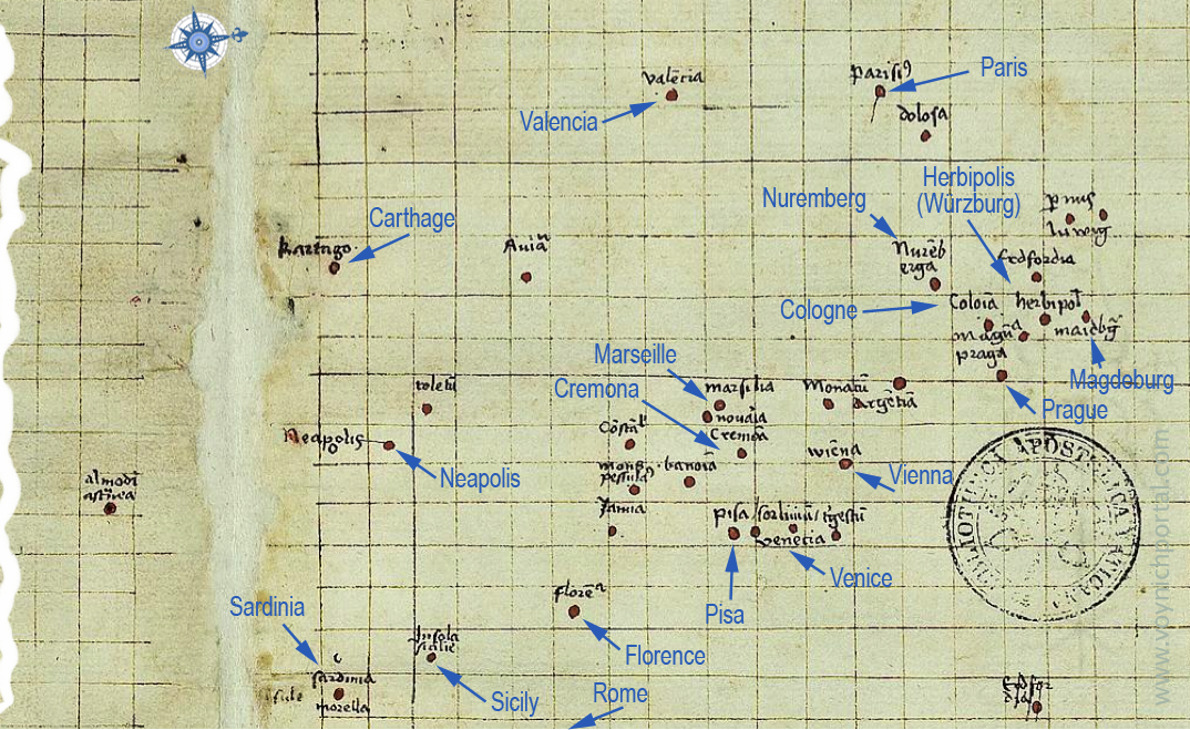
Below Sicily and Rome, there is a gap. At the bottom is a muddled collection of points vaguely describing Greece, Egypt, the Levant, and “Babilonia Nova” (New Babylon). If you’re wondering where New Babylon is, it’s near the mouth of the Nile (old Babylon was southwest of Baghdad; on medieval mappa mundi, it was usually close to Jerusalem at the center).
On the left are some faint marks that look like roads or coastlines, perhaps the first attempt to create a more conventional map. Whether the final map that we see was considered finished (or “good enough”) we’ll probably never know, but it demonstrates that not all maps followed traditional styles.
Itinerary Maps that Focus on Visuals
Illustrated maps are usually more interesting than written instructions, and there was a significant one passed down to us by Giraldus de Barri (Giraldus Cambrensis), a cleric of Welsh-Norman ancestry. He created or commissioned a map c. 1200 that is sandwiched between his two books on Ireland.
The map seems strange at first. The land masses are blobby, and the top is approximately southeast. Hibernia (Ireland) is at the bottom, but appears too far north of England. Germany and France have been collapsed to a fraction of their size, and the proximity of Iceland to Scandinavia is more sociopolitical than longitudinal.
Right away one can sense similarities to the itinerary map above in terms of geographical compromises. In fact, the orientation of the map shifts as one follows the various routes from Ireland to Rome:
Strip Maps
A strip map falls somewhere between a geographical map and a written itinerary, but is even more schematic than the example posted above. One could call it a Point-A-to-Point-B-to-Point-C map.
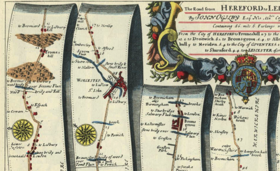
A journey from north to south might be expressed in the shape of a snake or a circle so that it fits conveniently on a page. Sometimes the routes are even drawn as strips, like this map describing the road from Hereford to Leicester:
The most charming and interesting strip maps are probably those of Matthew Paris (mid-13th c). They include some of the mythic and geographical quirks of mappa mundi, some of the instructional features of itinerary maps, with added storytelling elements about the journey and what might be seen along the way.
They are, in some ways, the medieval version of a pop-up book. Here, a little flap opens up to show Rome:
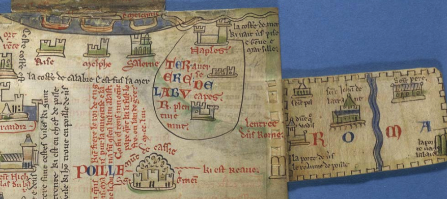
A building is topped by a stork, another visited by a turtle. Note how the page is organized into vertical panels like the Leicester map:
Assuming it’s a Map, Where Does the VMS Fit?
To me, the VMS feels much more like a strip map than a portolan or mappa mundi… but only part of it (the outer corners).
The possible nautical symbol in the upper-right corner isn’t enough to confirm it as a portolan. The stars in the upper-right, the T-in-O shape, and the symbol that resembles a sextant (bottom left), might exist for instructional purposes (imagine a father with child at his side pointing out the identity and purpose of individual features).
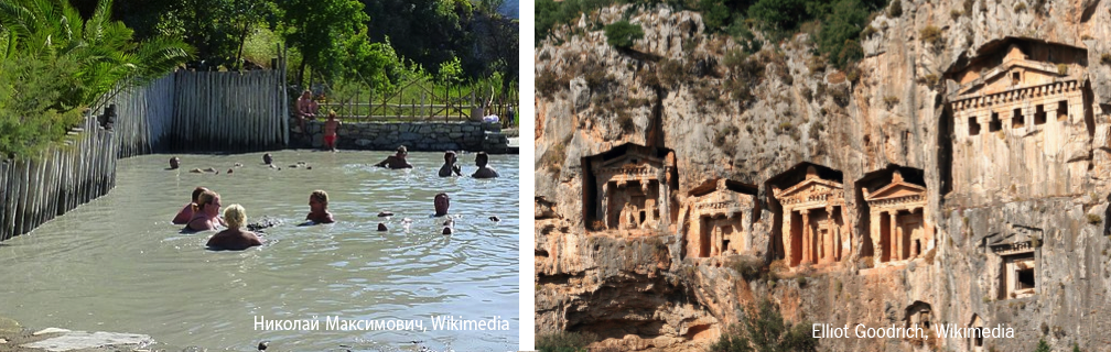
I’ve tried resolving the features to the bay of Baia and Nisida, the home of many craters, steam vents, and baths of the Pozzuoli complex, and it works quite well, but there’s still the question of the Ghibelline merlons.
A Less Literal Interpretation
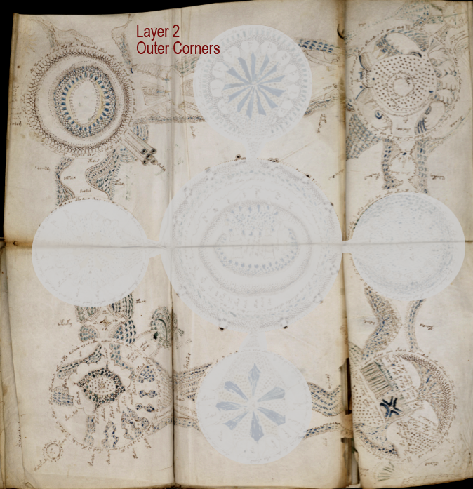
In the previous blog, I suggested the map could be interpreted as a synthesis of two planes, an earthly plane and a spiritual/celestial plane, with medieval notions of the elements incorporated into the four corners of the earthly plane:
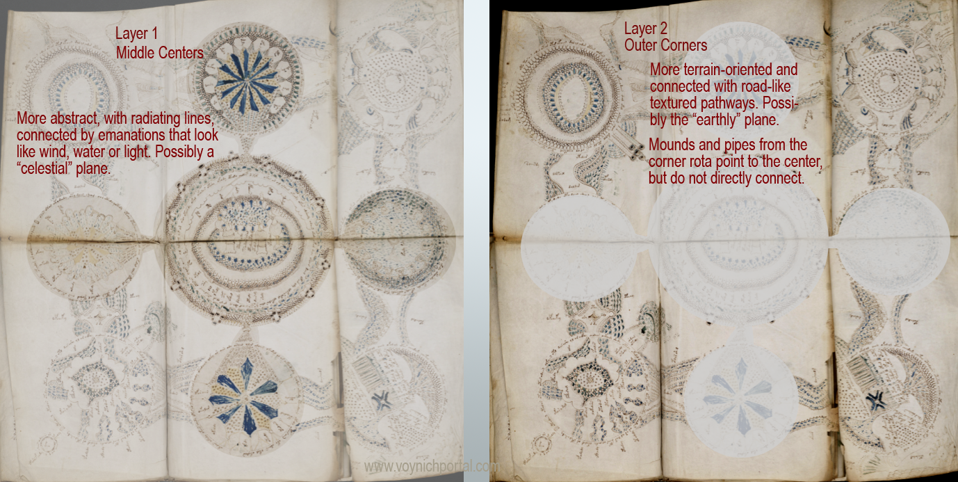
The pathways connecting the corner rota, and the geographical details along the paths, remind me of strip maps. The other portions remind me of medieval abstractions of the celestial sphere. If this is the correct interpretation, then the likelihood of a strip map diminishes, due to the paucity of “stops”
Patterns Among Rota
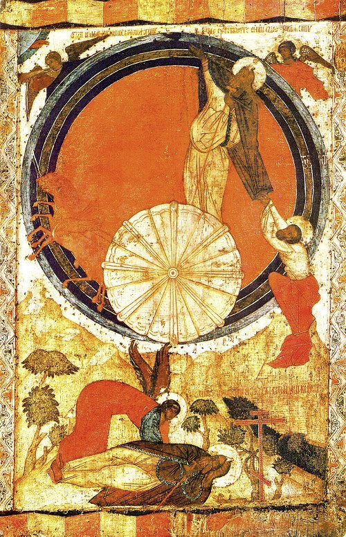
The central rotum has always looked to me like a spiritual center, which could be a temple or church (Jerusalem, Rome, a pagan temple, or basically any local spiritual hub), or a representation of “Sol”, Apollo or God. It could even represent heaven, or a return to Paradise, as the ultimate destination on the road of life.
If the “pipes” emanating from Rotum1 are like chimney pipes, channeling heat from a fire, and if Rotum1 represents an earthly location in tandem with the element fire, then maybe the “pipes” around the central rotum also represent heat/light/fire, as is common in medieval cosmological drawings.
The four middle rota, connected to the center, seem more abstract than the corner rota, with radiating lines that were often used to represent celestial objects or events in didactic medieval illustrations of the cosmos. This form of abstraction continued into the Renaissance, but was increasingly accompanied by naturalistic drawings:
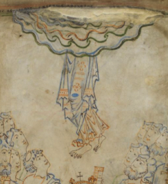
Here’s an 18th-century interpretation of the idea of an earthly plane below and a celestial plane above:
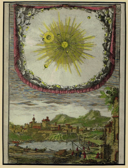
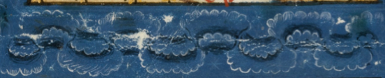
Note how the heavens are drawn within the frame of a hanging tapestry, as though enclosed within walls, with stone-like cloud textures around the edge (not dissimilar to the more abstract rota in the VMS).
The earthly plane is drawn like a late-medieval-style map (modern maps are more symbolic)—quite literal and terrain-oriented. The center of the celestial realm above emanates rays.
Even though this engraving came later than the VMS and is a different drawing style, the basic themes are surprisingly similar. Heaven and earth, two different planes, and even though the earthly sphere shows naturalistic terrain and may represent a real location, the intent is not to illustrate a physical journey, but to provide a mental map of where the world fits.
Summary
I want to believe that the VMS “map” represents real places, that it is a strip map representing a journey. I invested years searching for matching locations (and found a few that might be relevant that I haven’t even had time to blog about yet), but the more I study medieval culture, the more I suspect I might be wrong… the corner rosettes map so easily to the four elements, it’s possible that is all they are intended to be, without any particular dependence on real locations.
Even if the drawings are real locations, they don’t necessarily have to be geographically related—the idea that they connect on the lower level (under the mid-folio rota) through pathways is speculation, in which case it isn’t really a map in the geographical sense, it might be more of a teaching map to explain medieval cosmology, with a few well-known or generic locations delightfully illustrated in the corners.
If I find out otherwise, I’ll post about it. I have mountains of information about possible geographical interpretations burning a hole in my hard drive and it would be a shame for them to go to waste. If the VMS turns out to be information deliberately obscured, maybe there’s still hope of decoding the text and understanding the “map” on its own terms.
J.K. Petersen
©Copyright 2019 J.K. Petersen, All Rights Reserved