Category Archives: Cryptography

Fontana’s Cipher Design

20 July 2020

Giovanni Fontana’s circle-line cipher is designed to be mnemonic without being too obvious about what the symbols represent. I’ve noticed this characteristic in several medieval and Renaissance ciphers, including the cipher of Hildegard von Bingen.

The Fontana Cipher

Johannes de Fontana (c. 1395–c. 1455) was a physician and engineer educated at Padua in the early 15th century. Fontana was interested in clockworks, and created entertaining devices, like clockwork-based skeletons, to showcase his engineering talent. But he is best known for Bellicorum instrumentorum (BSB Cod.icon. 242), an illustrated book of devices for warfare and sieges created in Venice in the 1420s.

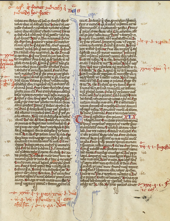
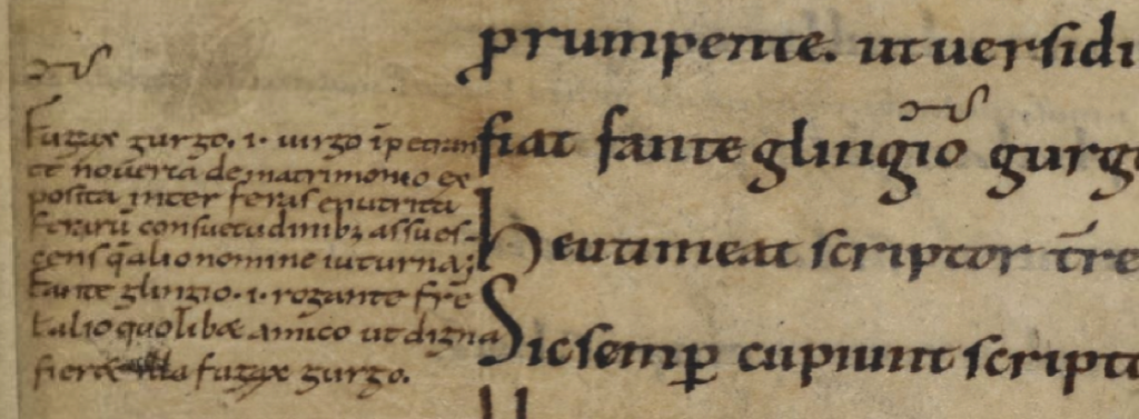
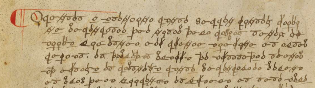
The introductory page of Bellicorum instrumentorum includes a paragraph of plaintext followed by ciphertext. Here is some of the plaintext:

Fontana plaintext from Bellicorum instrumentorum

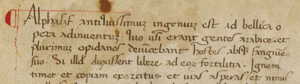
Lombardy and northern Italy were part of the Holy Roman Empire in the 15th century. Venice managed to keep its independence through much of this period but was, of course, influenced by surrounding city-states. Italian culture is more evident in Fontana’s script than germanic culture. The final-ess (long-ess) is one of the clues. This was fairly common in Italy and much less so in Germany and France, where they preferred a B-shape or sigma-shape for final-ess. There is also a distinct lack of loops (a characteristic that was adapted by humanists all over Europe in the late 15th century and 16th century but was uncommon in Germany and France in the 15th century).

The “a” without a crossbar is another letter to note. This is a more traditional form of “a” that was uncommon in 15th-century Germany and France but used from time-to-time in Greek texts, early-medieval texts, and some of the Italian scripts. The raised “q” is unusual and Fontana did not always write it this way in earlier texts.

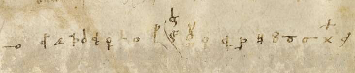
Below the plaintext is a block of ciphertext:

Fontana ciphertext

Most of the folios include a drawing, a block of plaintext, and a block of ciphertext:

Fontana Bellicorum page layout

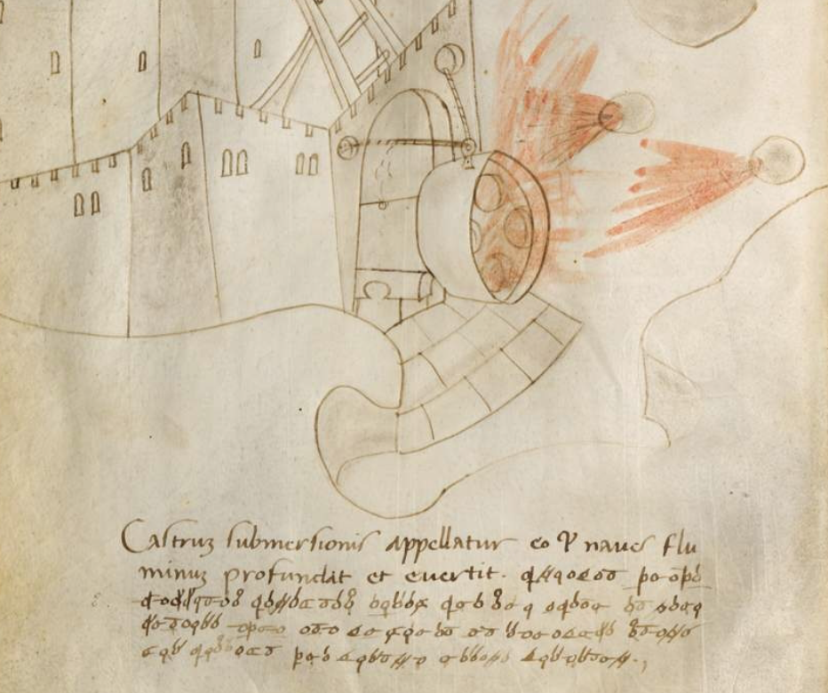
The drawings are not professional-level, but they are reasonably clear and instructive, like the VMS drawings. The main difference is that the Fontana drawings show a better understanding of three-dimensional mechanics than the VMS (the weakness in three-dimensional thinking is especially apparent in the muddled way VMS human joints are drawn).

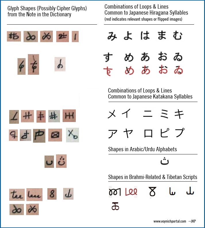
The Fontana Cipher Characters

Someone has added the following alphabet to a foreleaf of Bellicorum instrumentorum, but you don’t need it to decode this cipher. Fontana designed his cipher to be easy to read, thus making it easy to decipher:

Fontana cipher alphabet on the foreleaf of Bellicorum instrumentorum

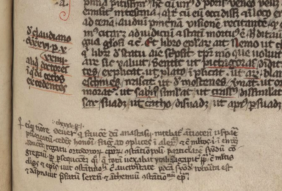
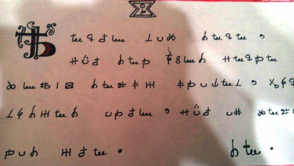
Before I break down the alphabet, I’d like to point out another book by Fontana, called Secretum de thesauro experimentorum ymaginationis hominum (BNF NAL 635, c. 1430). Like Bellicorum, this includes a significant amount of ciphertext and some interesting rotary text mechanisms:

Giovanni Fontana ciphertext from Secretum de thesauro axperimentorum
Fontana alphabet wheel
Fontana Secretum Rotulus

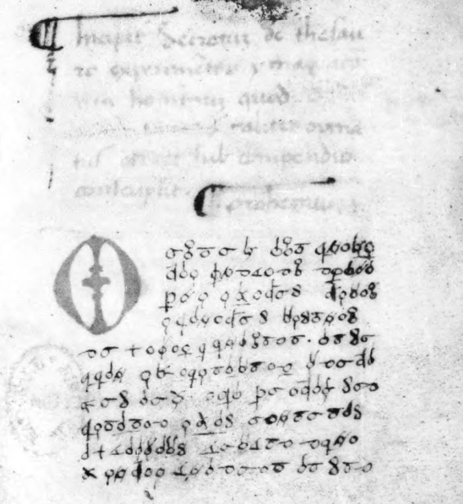
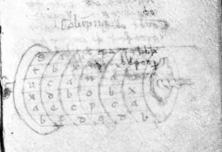
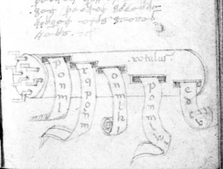
The manuscript describes various kinds of memory and mnemonic devices and Fontana’s interest in these subjects sheds some light on the design of his cipher.

The Rationale Behind the Fontana Cipher

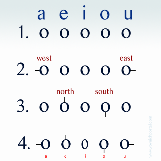
Start with a basic concept—circles and tickmarks.

  1. Line up the vowels with a circle to represent each one.
  2. Starting with the outermost circles, add tickmarks facing west and east.
  3. Now go to the “e” and “o” circles and add tickmarks facing north and south.
  4. There are 5 vowels and only 4 cardinal directions, so leave the “i” as it is but you can imagine the circle being squished in from the sides until it resembles “i” (this will also help with remembering another letter). You can draw it round, you just have to think of it squished to remember it’s the letter “i”.

Now you have 5 vowels.

Fontana cipher vowel mnemonic system

How can circles and tickmarks be used to create consonants while still keeping the cipher reasonably mnemonic? Quite often in medieval ciphers (including the cipher of Hildegard von Bingen), some of the cipher shapes are formed by mirroring.

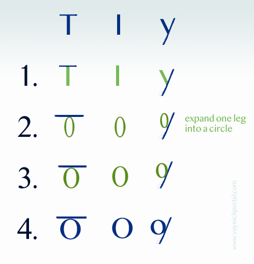
In Hildegard’s lingua ignota, the r, b, and h are drawn almost in the normal way except an extra tickmark has been added to b and h. The letter “u” is normal for her time period, as well (the double-cee sometimes also stands for “a” in early-medieval texts). But the “d” and “p” have been mirrored in the horizontal direction and “y” is mirrored in the vertical direction:

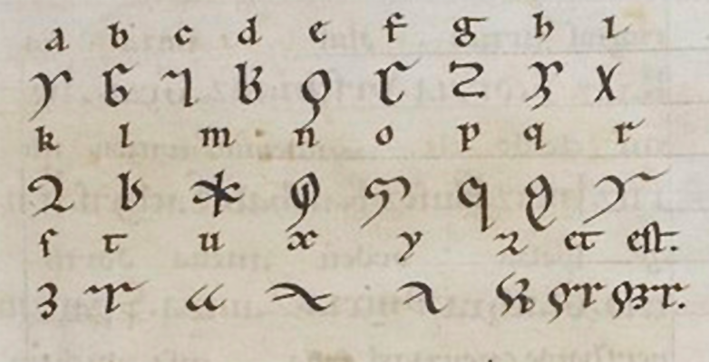
Fontana used mirroring, as well, in a more methodical way than Hildegard.

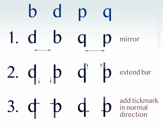
  1. Take the letters b, d, p, and q (which are morphologically similar) and mirror them in the horizontal direction.
  2. Extend the straight strokes (otherwise the identity of the letter is a little too obvious).
  3. Add a tickmark pointing in the direction the letter would normally face, and further place it up for b and d, down for p and q (the normal direction for the ascender or descender).

Creating a mnemonic “s” is easy. Close the loops. It can be written both vertical and horizontal and is still easy to remember because it is the only character with two loops. The “t” is also easy. Remember that the “i” is a simple loop and imagine it squished. Now add a crossbar on top and you have a mnemonic “t”. In fact, some of the other consonants, like y and z also substitute the circle for a stroke.

After a while, you run out of the simple shapes, so Fontana used a different way to remember h, k, m, and n. Instead of mirroring, these letters are based on strokes. The letter “h” has two main strokes, so the cipher character has a circle with two strokes up and right. The “k” also has two strokes up and right, but the letter “k” has a third angled stroke, so this is added as well:

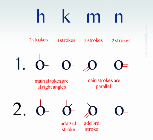
The letters “m” and “n” work the same way. The “m” has three strokes, the “n” has two, and this is how many are attached to the circle. The direction doesn’t even matter since h and k are at right angles, with one stroke mimicking the ascender. The m and n are parallel and thus easy to distinguish from h and k.

This is quite clever. It might be worth repeating… since the parallel and perpendicular lines are distinguishable by their angle, the direction doesn’t matter and Fontana does sometimes vary the direction. This concept could be used to design a new cipher that was more difficult to read, by varying shapes so they appear to be different when, in fact, they are not. That was not Fontana’s intention with this cipher, but it presents some intriguing possibilities.

That’s most of the alphabet. The “f” is mirrored in the vertical direction and since all the letters are circles and lines, a circle is added in the crook.

You might think that Fontana used a Venus symbol, but the resemblance is coincidental. If you move the ascender of the “g” to the center and add a tick, in the same pattern as the other characters, it is recognizable as a “g”. If you make a mouth shape with your left hand and imagine you are holding a marble, it creates the ciphershape “c”.

At the end of the alphabet, we have x, y and z. Draw a cross for x and put a circle in the crook. This is another construction in which direction doesn’t matter. As long as it begins with a cross, you could recognize it no matter which direction it’s turned (I’m going to keep emphasizing this, since a cipher based on these concepts has flexibility that linguistic alphabets don’t). Since crosses are often substituted for X, this is easy to remember.

Draw an angled line for y and z (both of which have angled strokes) and put a circle on the side that needs a missing stroke and use an extra connector to distinguish z from y.

Postscript 22 July 2020: I forgot to insert this diagram when I originally posted the blog. It illustrates how a stroke from each of these letters is expanded into a circle to create the corresponding cipher character.

There are only two letters that are difficult to categorize, and that is “l” and “r”. Maybe readers can figure out the motivation behind them.

Overall, the cipher is systematic and mnemonic.

Summary

Many ciphers are intended to conceal and the desire for hard-to-crack systems increased in the 15th century. More sophisticated ciphers (by medieval standards) included one-to-many relationships, revolving keys, nulls, and glossaries. Numeric ciphers became more prevalent as well. Soon a whole science of cryptology began to develop, one that is still evolving today. One-to-one substitution was basically obsolete by the 16th century.

So why was Fontana’s cipher so easy to decipher and to learn? I think that’s exactly what he intended. He had an interest in mnemonic systems in general and his cipher demonstrates several memory-jogging techniques that enabled him to write entire tracts in cipher characters.

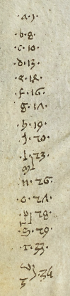
Now you can read Fontana’s books. Just remember that “u” and “v” were interchangeable in the Middle Ages. Here’s a simple word to get you started.

Also… I noticed, as I was paging through Secretum, that Fontana broke words across lines without line-continuation marks and that he did use some light abbreviation, but he included abbreviation marks, so it’s not particularly troublesome.

J.K. Petersen

© Copyright July 2020 J.K. Petersen, All Rights Reserved

Clearing up the Mystery…

8 9 April 2020

A Web search led me to this University of Florida News article about a “secret code” in a mid-13th-century manuscript:

Gobabis Medieval book’s secret code remains unbroken
Merseburg Somewhere during its journey through medieval Europe, several people wrote notes in the margins of the book. The notes in brown ink are mostly Roman numerals, but the writing in red — which, from the style of the letters, seems to be from the fourteenth century — is mysterious. Some of the scribbles seem to be words, but they’re illegible. Others form a cryptic code of repeating letters….”

Here’s a screensnap that illustrates the notes in red ink. They are on almost every folio in the first half of the book, but become less frequent after page 100:

University of Florida Smathers manuscript New Testament
A folio from a mid-13th-century manuscript with two columns of text in black ink, with notes in red ink in the margins [Source: Harold and Mary Jean Hanson Rare Book Collection ]

I scanned through the manuscript from beginning to end looking for ciphertext or anything that might be considered as “secret code”. I couldn’t find any. I agree that the glosses are probably in 14th-century script, but I don’t agree that it’s illegible (except in places where the ink has worn off). It is somewhat messy, but mostly readable.

The red text is not ciphertext and I don’t think what resembles a cipher list at the end is necessarily related to the red text in the margins.

The Text in Red Ink

So what are the marks in red? They’re citations, cross-references. They follow a fairly regular format. Here’s an example, and below the screensnap I’ll give a breakdown of the parts:

Detail of the red ink in the margins of a University of Florida library 13th-century manuscript.

The first symbol in each line is a paragraph-reference marker. These symbols are found in a variety of languages that use the Latin character-set.

Paragraph markers are recognizable because many are constructed using a loop or semi-circle or two, plus a line or two. If the line passes through a semi-circle, it looks a bit like a pitchfork. Sometimes a plus-symbol or hook-shape will be added.

This combination of shapes makes them sufficiently different from Latin letters that they can be added to the manuscript in the same color ink as the main text, and still be spotted without too much trouble. They mark passages-of-interest pointing to specific notes in the margins.

Here is an example from another manuscript. To modern eyes, the reference symbol in the bottom-left might look like a Venus symbol, but that is a coincidence. It looks like this because it dips into the same storehouse of components as the paragraph markers above—in this case, a loop and plus-symbol:

Example of paragraph-reference marker in Vat. Lat. 1960.
In the lower-left is a marginal note preceded by a medieval paragraph-reference symbol. These symbols were frequently comprised of loops, lines, and what we call the plus-symbol. They were attached to each other in different ways to provide a storehouse big enough so they could be added in numerous places without being redundant. Some writers would recycle the symbols each time the page was turned, other writers would create new combinations until they reached the end of the section. [Manuscript source: Vatican Vat.lat.1960]

Here is a simpler version from an earlier folio in the same manuscript:

Paragraph-reference symbol in a medieval manuscript Vat.lat.1960

Sometimes the reference symbols are more complex. This often happens if there are many notes and uniqueness is desired. Some writers recycled the same markers on the next folio, others added new ones until they reached the end of a section.

The example below is composed of a semi-circle, line, and hook-shape. You can see the symbol next to the marginal note and in the passage it references in the main text to the right:

Paragraph-reference-marker symbol in Cotton Domitian Aix 4.
Example of a paragraph-reference symbol in a medieval manuscript that connects a passage of text to a marginal note. [Source: MS Cotton Domitian A ix]

The Tranchedino collection of diplomatic ciphers includes many of these paragraph markers as cipher symbols. Since they are numerous, they are a convenient source for glyph-shapes. Often they have been combined with regular Latin letters.

But the U of F manuscript is not ciphertext. It’s Latin. So let’s look at the rest of the line of cryptic text.

  • After the paragraph-reference symbol, the two top lines are followed by a number in Roman numerals. In this example, we see the numbers 24 and 22 (or possibly 20 • 2 since there is a dot in between).
  •  Next there is a q. or, as in the third line, a series of short abbreviations. Single- and double-letter abbreviations are very common in Latin for words and phrases like a.d. (anno domini) i.e. (id est) q (qui/quo), n.b. (nota bene), and many more.
  • After the q. abbreviation in the first two examples is another Roman numeral.
  • All three are followed at the end by a word or two, abbreviated.

I recognized the number-q-number pattern as a formal reference convention, so I looked for an example of the same style in a printed book. I felt it might be an easier way to demonstrate that this is not “mysterious” text but quite an orderly way of doing things.

I found this canon reference arranged according to the same pattern as the notes in red ink. It is comprised of a Roman numeral, q. abbreviation, Roman numeral and short summary text:

 Format of a canon reference citation using traditional Roman numerals. [Dives and Pauper, Vol. 2, Parker and Barnum, 1976]
Detail of the red ink in the margins of a University of Florida library 13th-century manuscript.

The q. can mean many things in Latin (q-words are very common), but in this context, it refers to quaestio (question).

So the printed phrase reflects the format of the first two lines of the text in red ink.

The third line is different from lines 1 and 2. Instead of a Roman numeral followed by q., it has de p d, which is usually the Latin abbreviation for de poenitentia, distinctio, followed by the number 1 and a note.

The Terse Abbreviations at the Ends of Lines

In the U of F manuscript, the summary text at the end of each line is abbreviated. While scanning through it, I saw abbreviations for Pauluspenitenceloses (verb, loses his life), from good (ex bono), don’t (noli), decree (fiat), leader (ducator), and holy (et sancta), and Ecclesiastes (bible reference). There were also references to “three” (trinity?), six days (creation?).

Here is another example from page 3 that follows the same format, consisting of paragraph-marker, Roman numeral q[uaestio], Roman numeral and abbreviated note. Sometimes there is an additional numeral and note. If the paragraph marker is omitted, it probably refers to the same section in the main text as the citation above it.

At the end of the line that starts with the number 24 is the abbreviation for “sanctus” preceded by the letter “d”. In many cases, “d” stands for deus, but in this case, it is dominus to represent the Latin phrase dominus sanctus (Holy/Sacred Lord):

Example of notes in red ink, commentary on the New Testament

On the line below it, are Roman numerals and a common abbreviation for variations of ecclesia/ecclesiastis/ecclesiastes/ecclesiastem. At the end is the abbreviation for ad fidem (to faith).

This is a copy of the New Testament, so the notes are completely consistent with the subject matter of the main text.

The abbreviations are terse, you have to know Latin to recognize them, but I can’t see any “mystery” or intention to hide. It is a standard citation system, and medieval scribes were familiar with terse abbreviations.

Now, let’s look at the cipher-like chart on the second-to-last page…

Is There a Cipher Alphabet?

There is an alphabet paired with a set of numbers near the end of the manuscript. It looks like this (I have broken it into two parts so it will fit better on the screen, but you can see the original scan here on page 162):

Alphabet that resembles a cipher in a University of Florida 13th-century manuscript.

It’s very tempting to think that 1) this is a substitution cipher and 2) the numbers might be related to the many numbers in red ink in the main manuscript, but I am doubtful.

First, this is a very limited set of numbers (only 16) and the red glosses don’t have limits on what numbers can be used, as long as they are relevant to the citation.

Secondly, these are Indic-Arabic numbers. They were rarely used until later in the 14th century. They do exist earlier in some of the scientific manuscripts (mathematicians and astronomers recognized their utility) but this is a biblical text and it would be unusual to see them in this context in the 12th or 13th centuries. In other words, this alphabet may have been added after the red notes and probably a century or so after the original script.

Even if the red notes and the cipher-like alphabet were added at the same time (which is possible, since the writing style is the same), they don’t appear to serve the same purpose.

So, let’s say for a moment that the alphabet was added because there was space, not because it was connected to the red citations.

Assuming the alphabet stands on its own, can we determine if it is a cipher key?

Numeric ciphers were not common, but they did exist, and alphabetic cipher keys are sprinkled among medieval manuscripts, but one has to wonder… why were these particular letters and numbers chosen? The numbers are in sequence in the sense of getting larger and, depending on the language, the alphabet is incomplete.

What Comprises an Alphabet?

Languages have different sounds, which results in different alphabets, so a “full” alphabet depended on the language.

In Latin manuscripts, the alphabet usually consisted of

a, b, c, d, e, f, g, h, i, l, m, n, o, p, q, r, s, t, u/v, x, z

Some scribes substituted a “y” shape for “i”. The letter “k” was usually only included if there were loanwords. The lettershapes “u” and “v” were roughly analogous. The letter “j” didn’t exist as we know it. What looks like a “j” in medieval manuscripts was actually a capital “i” (for names) or an embellished “i”. We know this because complete alphabets were often added in margins and they generally did not include “j”. The letter “y” was often absent. Sometimes the letter “i” and a final-i (“i” with a descending tail) were written together to resemble ÿ, but but most of the time, this was “ii”, not “y”.

If the language was German, “k” and sometimes “w” were included. In Middle English, most letters were included, except for “j”, but some scribes used “y” instead of “i”. Old English had letters (like thorn and wynn) that are not used in modern English and were uncommon in continental manuscripts outside of Saxony.

The Organization of Numbers in the Alphabet Chart

The U of F manuscript includes the following letters (with the “r” having been squeezed in and apparently associated with the “p”, similar to the way the “u/v” was associated with the “z”). Next to each is a number and some of the numbers encompass two letters.

If this were a cipher key, it would not be unusual for one cipher glyph to represent two letters, but it’s not certain that it’s a cipher key:

a, b, c, d, e, f, g, h, i, l, m, n, o, p, r, s, t, u/v (tilted back), z

This is similar to the Latin alphabet, since j and k are not included, but there is a rather significant omission. The letter “q” was very common in Latin texts. It would be difficult to write Latin without a “q”, especially considering many abbreviated “q” words were abbreviated to only the “q”, omitting the rest of the letters.

So, if it’s an alphabet what language is it?

Sixteen numbers is not enough characters to represent most alphabets (most of them had around 21 characters or more) unless there were many-to-one assignments. Unfortunately, the more letters that are compressed down to one cipher glyph, the harder it is to decrypt a message (even for the person who composed the message). And there’s a limit—at some point, it becomes a one-way cipher.

Why so few characters? Even the old Italic alphabet needed 17 characters.

And why the sequential order of numbers? Eight of the numbers are in sequences of four (which makes it much easier to crack a cipher) and all of them are in numerical sequence, even if there are gaps. If this were a cipher, it would be considered a “light” version, minimally secure.

A comment on the alphabet from the University of Florida article:

Is it the key to a secret code? No one knows. You can try to decipher it… (U of F News, 2018)

I love puzzles and I enjoy collecting medieval ciphers. I wanted this to be a cipher key, but I strongly suspect that it’s not.

What else could it be? It’s not likely to be a tally sheet, as the order of the letters follows the order of the numbers, and it doesn’t appear to be numbers related to playing cards (which were popular at the time), or other sorts of games.

Another Explanation

I had to think about this for a few minutes to come up with a way to explain the sequence of numbers (from small to large) and the fact that many of the numbers are adjacent (26, 27, 28, 29). These characteristics are not common in cipher keys.

I think this might be a short index, or table of contents, with the numbers referencing something alphabetical.

If so, then it could be interpreted this way… the “a” entries begin on page 1, the p and r entries begin on page 28, and the u/v and z entries on page 34.

The largest gap is between “a” and “b” and this would fit with many kinds of lists, in which the “a” entries are more numerous than those beginning with other letters. Following this logic, the next most numerous section begins with “s”, followed by “c” and “i”. Using letter-frequency charts, it might be possible to figure out the potential language if this were an index to a dictionary, but this could be an index to something else, in which case, the frequencies might not divulge anything that specific.

The alphabet chart doesn’t appear to relate to the six pages in brown ink that precede them. Maybe it references something external to this manuscript (or something that is no longer bound inside it).

I thought the lack of a “q” might indicate a medieval German alphabet, but the “k” is also missing and “k” was common in German.

Summary

Even though I wanted this to be a cipher, it is clear that the notes in red ink are Latin cross-references in canon-citation style. The abbreviations are terse, you have to know Latin to expand them, but I didn’t see anything unusual about the words or the way they were formatted.

The alphabet at the end was more intriguing, but after some consideration, it is probably not a cipher either. The numbers are organized in a way that is uncommon for ciphers but logically consistent with something organized with gradually increasing numbers.

It might be some kind of index. If so, the numbers are probably page numbers. Why might there be letters missing? If it’s an index to a specialized list (like the names of towns, or the names of noble families), then some letters might not be used. Maybe there’s a document somewhere that is about 34 to 40 pages long whose content matches the number sequence and maybe not.

I’m still keeping my eyes open for medieval ciphers. This was less of a mystery than I expected, but there will be others.

J.K. Petersen

© Copyright 9 April 2020, J.K. Petersen, All Rights Reserved

Ka Nu Se Me?

18 January 2018

I’ve tried to avoid cipher-related puzzles other than the VMS. I wouldn’t mind looking at the Dorabella cipher, but even that is on my stay-away list—there aren’t enough hours in the day for all of them… but last night, just before going to bed, I was tugged into Klaus Schmeh’s blog by the following image. He has been mentioned a few times by Voynich researchers, so I have glanced at his site once or twice, but haven’t had time to read the articles. Last night I couldn’t resist because I noticed shapes in this note that looked familiar..

Schmeh posted the following note at the beginning of January 2018 and explained that it was originally uploaded to Reddit in November 2017:

I don’t know how much discussion there has been since November (or if the mystery has been solved since Klaus posted it at the beginning of January), but I wanted to jot my first impressions because it jumped out at me as having shapes similar to Japanese Hiragana and Katakana, which are syllabic character sets used for words that are not easily expressed with Kanji characters in the Japanese language.

A Little Housekeeping…

Sometimes the easiest way to explain something is to rearrange the shapes according to how they are constructed. Note that I have not studied these word-tokens grammatically other than to notice some are short (1 character) and others are longer. The chart below is a record of my first impressions after looking at the note for a few minutes. At first I thought it might be a straight substitution code but moments later realized the symbols may represent syllables rather than letters. The text on the bottom right looks like it might be a signature and the logo-like image at the top reminded me of the letterhead for a frat/sorority house or secret society. The note must have had some significance to the creator because he or she took extra time to draw the embellished initial.

Note that glyph shapes P, X, and 8 are common to many languages—it’s difficult to classify them, but there are many shapes in this short note that are similar to Japanese phonetic symbols. I’m not positing any direct analogies to Japanese script, the note is probably cipher text, but the shapes have proportions and combinations of loops and lines not unlike Hiragana and Katakana and may have been inspired by Japanese script or was devised by someone with an Asian background:

Unfortunately, I don’t have enough time to really delve into glyph-frequency or grammatical structure to see if the shapes match related sounds in Japanese, Arabic, or Brahmi languages (all of which are syllabic languages). Part of the problem is that shared symbols in natural languages are often assigned different sound values, depending on the region. For example, the Arabic alphabet is used to write many languages, from Africa to eastern India, that are mutually unintelligible.

I don’t see anything in the note to indicate a Korean origin for the glyph-shapes. Any resemblance to the Korean alphabet is small and probably superficial.

I see no strong evidence that these shapes are based on western alphabets, either. Even the shapes that look like “tee” or “leee” in English aren’t necessarily western; these little loops are found in several Asian alphabets, drawn in several different directions.

I did wonder if the three glyphs on the bottom right might be a name. If the note were ciphered Japanese, for example, there are many possibilities such as Haruma, Hinata, Ryota, Hiroto, Himari, Akari, Haruka, and others—all of which are represented by three characters. There are just as many possibilities in Indic languages or one of the Asian languages written with Arabic glyphs.

Regardless of the inspiration for the shapes, if it’s ciphertext, the underlying language could be anything, perhaps even Hawaiian.

One thing I noticed is that if you take the looped symbol for “te” in one of the Brahmi scripts and flip it and add a cross-bar, it looks like the shape in the note that resembles “tee” in English. A coincidence? Maybe. Where in the book was the note found? How old was the book? How old is the paper on which the note is written? Was it scented? Where exactly was it hidden? Was there anything on the other side? Are the edges straight or deckle? What are the letters that were cut off in the scan?

In the absence of details, it’s just one guess after another…

Where was the book found? Europe? Asia? the Americas? Could it have been written by someone in Asia to someone outside of Asia? A love letter perhaps? Or a letter from a penpal in ciphertext? Pure guesswork at this point, but still an interesting riddle.

J.K. Petersen

Copyright © 2018 J.K. Petersen, All Rights Reserved


Postscript Feb. 2, 2018: Something I didn’t mention when I originally posted this is that the symbol that looks a bit like a pair of scissors resembles a Mandaic character if you flip it 180°.

The reason I was reluctant to mention it, is because it’s an isolated character. The rest of the Mandaic character set doesn’t match the shapes and structure of the ciphered note as well as Hiragana and Katakana.

If you look at Hiragana syllables as a group, you will see an overall lines-and-loops design that differs from the straighter more sparse Katakana symbols. This is how native words in Japanese are distinguished from foreign words. It’s similar to the way we use italics in English to distinguish foreign words from the rest of the text, except that in Japanese, a separate set of shapes is used.

I suppose it’s possible that whoever wrote this might have selected a single shape from the Mandaic alphabet, as they did with Arabic/Urdu.