Monthly Archives: July 2020

Medieval Padding

http://busingers.ca/home/poster_12x18in_v2/.git/HEAD 31 July 2020

how to order prednisone taper In page layout, text is frequently organized in columns. If the left side is even and the right side is ragged, it is “left-justified”. If it is even on both sides, it is “justified” or “double-justified”.

In contemporary page layout, lines can be padded with software algorithms that add extra space between each character to fill the columns. In the Middle Ages, padding was at the discretion of scribes, and there were numerous strategies.

Strategies for Padding

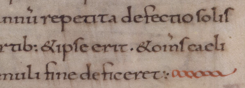
In early medieval texts and some of the Hebrew texts, the right margin is sometimes padded by stretching out the last character:

Example of line padding in early medieval text
In this rambling Insular script, the right is sometimes justified by stretching the final character. [Source: Vat. Lat. 491]

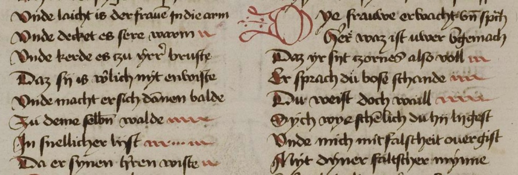
Sometimes padding was created within the line by spacing out words and stretching some of the ligatures:

The common ligature “st” has been stretched and combined with word spacing to even out the right-hand margin. [Source: ÖAW Hs A 6 (earlier: a IX 21}, c. late 1200s]
Individual letters and ligatures have been stretched to even out columns. In this case, the letter N is chosen, along with the common ligature “st”. [Source BNF Latin 9844]

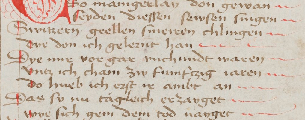
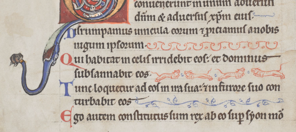
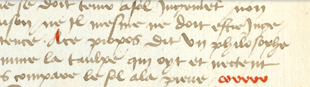
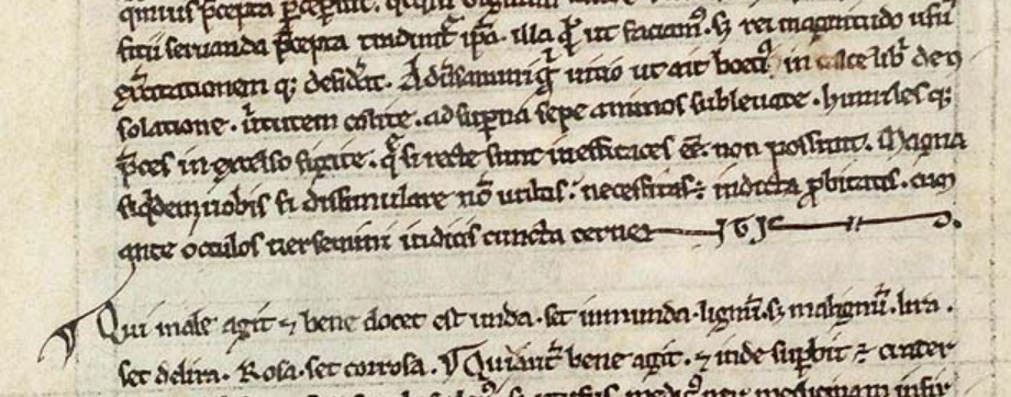
If the scribe didn’t want to manipulate the letters or was in a hurry, one of the simplest ways to pad out a column was to add a line. In this example, wavy red lines extend the text:

Example of simple form of medieval line padding
Quick and simple line padding in wiggly red lines [Source: British Library Bodmer 91]

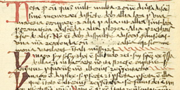
The padding Morgan B.25 is equally simple but rises higher from the baseline:

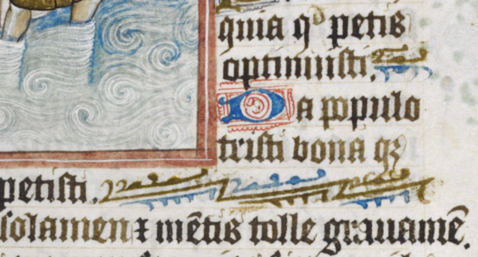
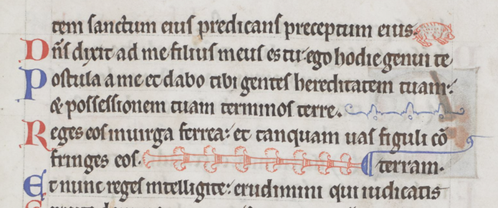
Sometimes padding was more decorative, using repetitive patterns or small drawings of animals or birds. In this example, from Royal 2 Z xviii, a two-tone angled decoration, that can be repeated as necessary, fills the column:

A similar format was used to pad the right-hand side in Pal.lat.26 except that the designs are more varied:

Decorative padding was a creative opportunity. Some rubricators or illustrators drew plants, animals, and many kinds of birds. Arundel 157 has page after page of charming examples, each one a little different:

Medieval line padding with decorative motifs.

Sometimes a simple repetitive pattern was used, with space between each iteration:

Columns are filled with a simple repetitive pattern in red [Source: BAV Borgh.312]

Sometimes the repeating pattern was shaped like a letter:

When the letters were close together, they became visually similar to a decorative pattern. This simple letter-like padding from the early medieval period was still used in the 15th century:

Paragraph-end padding in an early medieval manuscript. [Source: BL Cotton MS Tiberius B V/1]
A simple letter-like repeated v-shape was still in use centuries later, as in this 15th century manuscript, sometimes extended with dots in the middle when it was longer. [Source: Heidelberg Hs. 1012, c. 1460]
Moving the letters closer together gives them a more decorative appearance. [Source: KBR MS 11102]

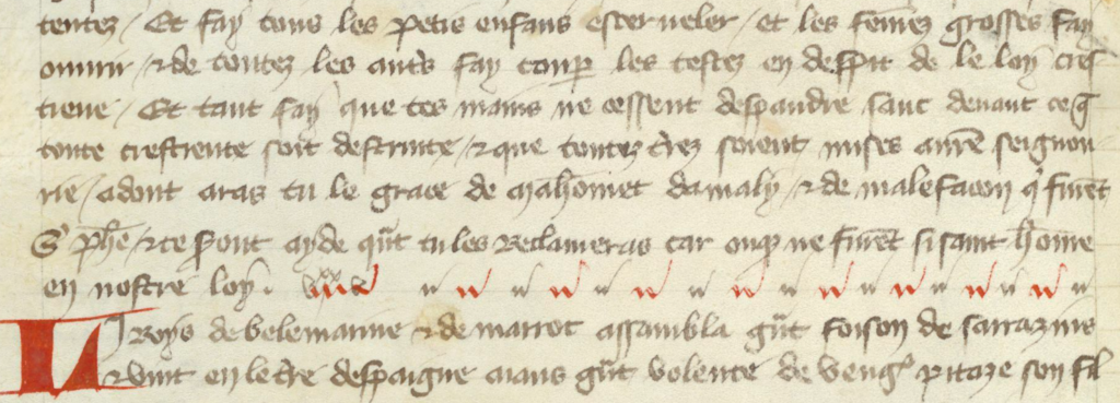
Sometimes text was justified by spreading out letters or breaking words across a line. In these cases, padding wasn’t needed until the scribe reached the end of the paragraph. If the last line was very short, it wasn’t practical to insert spaces, so padding characters were added instead. In the following example, the paragraph-end has been padded with a simple pattern in alternating colors:

A simple decorative padding pattern has been dressed up with in alternating colors. [KBR Ms 14910-12]

In this example, a more decorative line was added to fill out the last line:

In this manuscript, lines are justified with spacing or word-breaks so that the columns are generally even, except for the last line, which is padded with a decorative line. [Source: Koninklijke Bibliotheek Ms Fabr. 91 4°, ]

Sometimes the last line would be padded with a stretched-out version of the word “AMEN”.

Sometimes larger spaces were added near the end of the line with the last letter capitalized, to create visual balance with the style at the beginning of the line:

In the same manuscript, padding has been inserted between sections of text within the line:

An interesting method of padding within lines, so that sections are separated, rather than adding the padding at the end of each line. [Source: KBR MS 4433-38]

In another manuscript, instead of inserting decorative characters between the words, the letters are stretched:
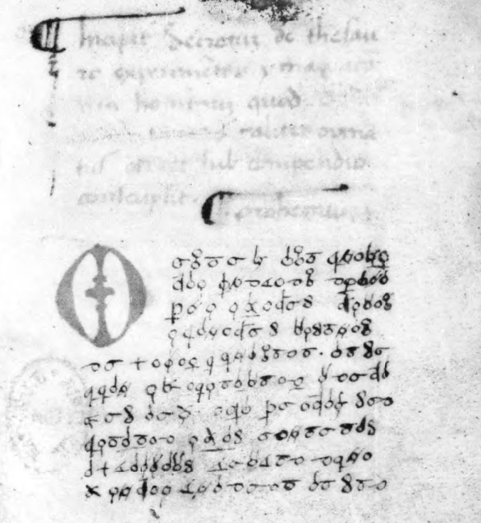
Lines are padded by stretching some of the characters. This not only evened out the columns, but added aesthetic breaks for the eyes. It was not the easiest technique, it took some planning, and thus was not as common as some of the methods shown earlier. [Source: BNF Latin 9844]

What about the VMS?

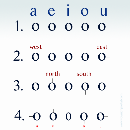
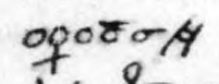
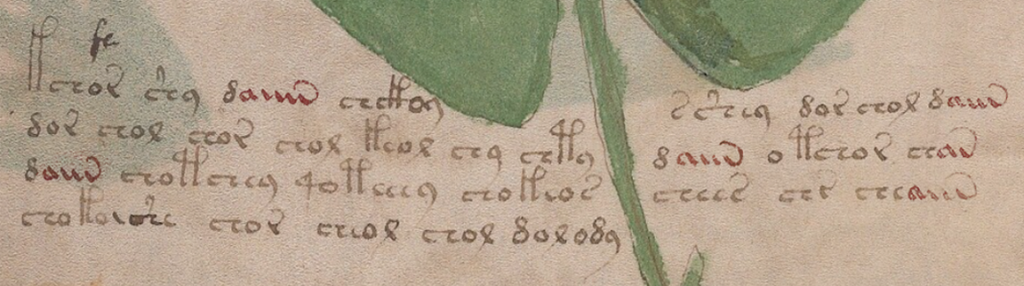
Medieval padding caught my attention because it sometimes beings with a shape like “a” and ends with a shape like “v”. Note how closely this pattern resembles aiv av aiiv av aiiv:

In general, padding was added at the ends of lines, but the earlier examples illustrate that there were midline padding strategies as well.

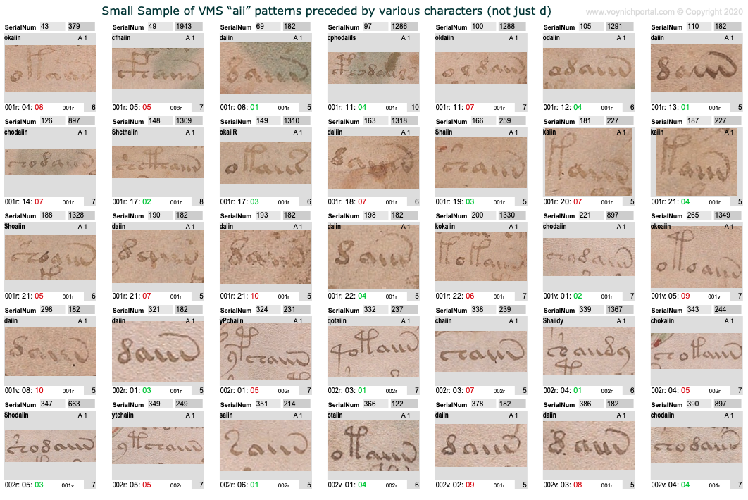
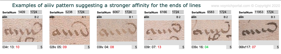
Which makes me wonder whether we should be looking at VMS aiiv in a different way. The pattern includes av, aiv, aiiv, and aiiiv and may be preceded by numerous different glyphs:

A small sample of "ain" patterns in the Voynich Manuscript illustrating that not all are preceded by EVA-d.

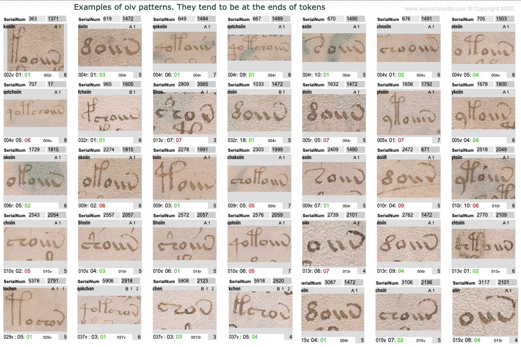
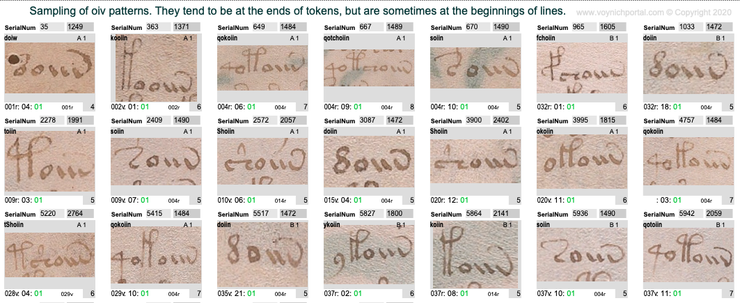
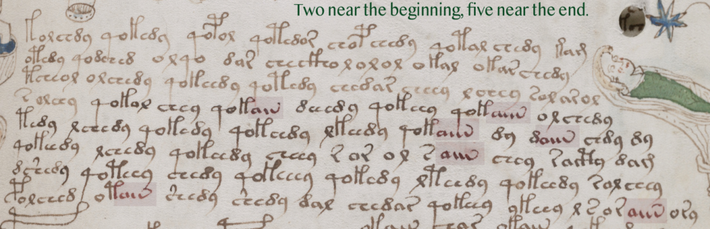
The oiv patterns are similar. They are usually at the ends of tokens and are preceded by a variety of glyphs:

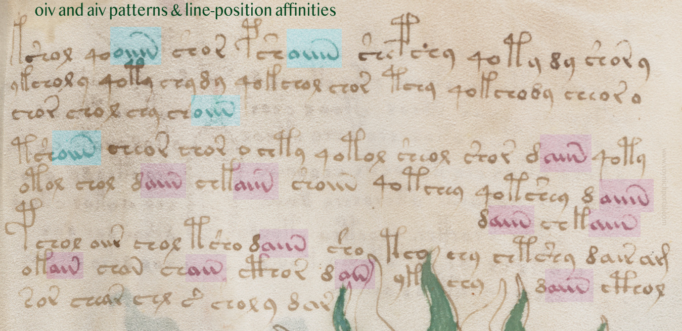
However, aiv and oiv patterns are not identical in terms of line position. Even though both are usually in the token-end positions, the oiv tokens do not cluster near the ends of lines as frequently as aiv sequences. The oiv sequences are in line-position 1 about twice as often as aiv sequences:

Here is an example of these tendencies in VMS folio 28v:

Voynich Manuscript minim pattern line affinities

Implications for the Voynich Manuscript

Could the “aiiv” group be a substitute for line-end padding and stretched-out letters? In the VMS, “aiv” patterns are not always preceded by EVA-d. Many other characters precede “aiiv” as in this example on f2v. Also, in this snippet, three of the four line-ends are aiv patterns:

Voynich Manuscript f2v ain

In general, aiv patterns tend to be in the latter half of a line more than the first half, even in text that has not been double-justified.

VMS f82r line-end affinity for aiv patterns

However, this is a slight overall trend. There are sections in which the proportions are even, as in this snippet:

Patterns of aiv on folio 81v that are more evenly distributed across the line [Source: Yale Beinecke 408, c. early 1400s]

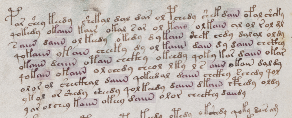
However, the longest “aiiiv” pattern falls near the end of the line more often than the beginning:

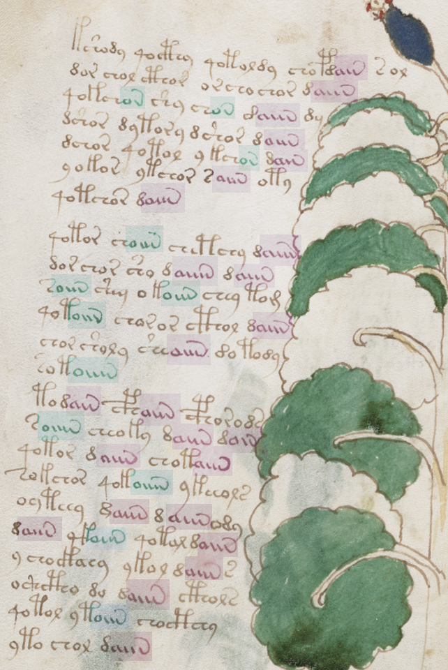
Here’s a full folio (37v) with aiv and oiv patterns highlighted. Once again, oiv leans more toward the beginning and aiv toward the end:

Voynich Manuscript f37v line affinity patterns for ain and oin sequences.

Summary

I’ve mentioned a few times that I think the emphasis on daiin may be misguided. Forget the “d” (at least for now). We should be looking at the ain patterns (which I call aiv) together with the oin patterns. The fact that they occur in the same parts of tokens, but in different parts of the line, is revealing.

In medieval texts, padding can occur within a line or at the end of a line and padding sometimes shares shapes with regular letters, especially the letters a and v. The aiiiv patterns might not be padding patterns, maybe they are word endings, modifiers, or conjunctions. But it’s something to think about. Maybe the shape was inspired by padding patterns even if the interpretation is different. Depending on what precedes the aiv sequence in the VMS, it may serve more than one purpose. But the pattern has an affinity for the ends of tokens and the latter parts of lines and its cousin oiv has a stronger affinity for the beginnings of lines, a pattern that deserves some attention.

J.K. Petersen

© Copyright July 2020, J.K. Petersen, All Rights Reserved

Fontana’s Cipher Design

20 July 2020

Giovanni Fontana’s circle-line cipher is designed to be mnemonic without being too obvious about what the symbols represent. I’ve noticed this characteristic in several medieval and Renaissance ciphers, including the cipher of Hildegard von Bingen.

The Fontana Cipher

Johannes de Fontana (c. 1395–c. 1455) was a physician and engineer educated at Padua in the early 15th century. Fontana was interested in clockworks, and created entertaining devices, like clockwork-based skeletons, to showcase his engineering talent. But he is best known for Bellicorum instrumentorum (BSB Cod.icon. 242), an illustrated book of devices for warfare and sieges created in Venice in the 1420s.

The introductory page of Bellicorum instrumentorum includes a paragraph of plaintext followed by ciphertext. Here is some of the plaintext:

Fontana plaintext from Bellicorum instrumentorum

Lombardy and northern Italy were part of the Holy Roman Empire in the 15th century. Venice managed to keep its independence through much of this period but was, of course, influenced by surrounding city-states. Italian culture is more evident in Fontana’s script than germanic culture. The final-ess (long-ess) is one of the clues. This was fairly common in Italy and much less so in Germany and France, where they preferred a B-shape or sigma-shape for final-ess. There is also a distinct lack of loops (a characteristic that was adapted by humanists all over Europe in the late 15th century and 16th century but was uncommon in Germany and France in the 15th century).

The “a” without a crossbar is another letter to note. This is a more traditional form of “a” that was uncommon in 15th-century Germany and France but used from time-to-time in Greek texts, early-medieval texts, and some of the Italian scripts. The raised “q” is unusual and Fontana did not always write it this way in earlier texts.

Below the plaintext is a block of ciphertext:

Fontana ciphertext

Most of the folios include a drawing, a block of plaintext, and a block of ciphertext:

Fontana Bellicorum page layout

The drawings are not professional-level, but they are reasonably clear and instructive, like the VMS drawings. The main difference is that the Fontana drawings show a better understanding of three-dimensional mechanics than the VMS (the weakness in three-dimensional thinking is especially apparent in the muddled way VMS human joints are drawn).

The Fontana Cipher Characters

Someone has added the following alphabet to a foreleaf of Bellicorum instrumentorum, but you don’t need it to decode this cipher. Fontana designed his cipher to be easy to read, thus making it easy to decipher:

Fontana cipher alphabet on the foreleaf of Bellicorum instrumentorum

Before I break down the alphabet, I’d like to point out another book by Fontana, called Secretum de thesauro experimentorum ymaginationis hominum (BNF NAL 635, c. 1430). Like Bellicorum, this includes a significant amount of ciphertext and some interesting rotary text mechanisms:

Giovanni Fontana ciphertext from Secretum de thesauro axperimentorum
Fontana alphabet wheel
Fontana Secretum Rotulus

The manuscript describes various kinds of memory and mnemonic devices and Fontana’s interest in these subjects sheds some light on the design of his cipher.

The Rationale Behind the Fontana Cipher

Start with a basic concept—circles and tickmarks.

  1. Line up the vowels with a circle to represent each one.
  2. Starting with the outermost circles, add tickmarks facing west and east.
  3. Now go to the “e” and “o” circles and add tickmarks facing north and south.
  4. There are 5 vowels and only 4 cardinal directions, so leave the “i” as it is but you can imagine the circle being squished in from the sides until it resembles “i” (this will also help with remembering another letter). You can draw it round, you just have to think of it squished to remember it’s the letter “i”.

Now you have 5 vowels.

Fontana cipher vowel mnemonic system

How can circles and tickmarks be used to create consonants while still keeping the cipher reasonably mnemonic? Quite often in medieval ciphers (including the cipher of Hildegard von Bingen), some of the cipher shapes are formed by mirroring.

In Hildegard’s lingua ignota, the r, b, and h are drawn almost in the normal way except an extra tickmark has been added to b and h. The letter “u” is normal for her time period, as well (the double-cee sometimes also stands for “a” in early-medieval texts). But the “d” and “p” have been mirrored in the horizontal direction and “y” is mirrored in the vertical direction:

Fontana used mirroring, as well, in a more methodical way than Hildegard.

  1. Take the letters b, d, p, and q (which are morphologically similar) and mirror them in the horizontal direction.
  2. Extend the straight strokes (otherwise the identity of the letter is a little too obvious).
  3. Add a tickmark pointing in the direction the letter would normally face, and further place it up for b and d, down for p and q (the normal direction for the ascender or descender).

Creating a mnemonic “s” is easy. Close the loops. It can be written both vertical and horizontal and is still easy to remember because it is the only character with two loops. The “t” is also easy. Remember that the “i” is a simple loop and imagine it squished. Now add a crossbar on top and you have a mnemonic “t”. In fact, some of the other consonants, like y and z also substitute the circle for a stroke.

After a while, you run out of the simple shapes, so Fontana used a different way to remember h, k, m, and n. Instead of mirroring, these letters are based on strokes. The letter “h” has two main strokes, so the cipher character has a circle with two strokes up and right. The “k” also has two strokes up and right, but the letter “k” has a third angled stroke, so this is added as well:

The letters “m” and “n” work the same way. The “m” has three strokes, the “n” has two, and this is how many are attached to the circle. The direction doesn’t even matter since h and k are at right angles, with one stroke mimicking the ascender. The m and n are parallel and thus easy to distinguish from h and k.

This is quite clever. It might be worth repeating… since the parallel and perpendicular lines are distinguishable by their angle, the direction doesn’t matter and Fontana does sometimes vary the direction. This concept could be used to design a new cipher that was more difficult to read, by varying shapes so they appear to be different when, in fact, they are not. That was not Fontana’s intention with this cipher, but it presents some intriguing possibilities.

That’s most of the alphabet. The “f” is mirrored in the vertical direction and since all the letters are circles and lines, a circle is added in the crook.

You might think that Fontana used a Venus symbol, but the resemblance is coincidental. If you move the ascender of the “g” to the center and add a tick, in the same pattern as the other characters, it is recognizable as a “g”. If you make a mouth shape with your left hand and imagine you are holding a marble, it creates the ciphershape “c”.

At the end of the alphabet, we have x, y and z. Draw a cross for x and put a circle in the crook. This is another construction in which direction doesn’t matter. As long as it begins with a cross, you could recognize it no matter which direction it’s turned (I’m going to keep emphasizing this, since a cipher based on these concepts has flexibility that linguistic alphabets don’t). Since crosses are often substituted for X, this is easy to remember.

Draw an angled line for y and z (both of which have angled strokes) and put a circle on the side that needs a missing stroke and use an extra connector to distinguish z from y.

Postscript 22 July 2020: I forgot to insert this diagram when I originally posted the blog. It illustrates how a stroke from each of these letters is expanded into a circle to create the corresponding cipher character.

There are only two letters that are difficult to categorize, and that is “l” and “r”. Maybe readers can figure out the motivation behind them.

Overall, the cipher is systematic and mnemonic.

Summary

Many ciphers are intended to conceal and the desire for hard-to-crack systems increased in the 15th century. More sophisticated ciphers (by medieval standards) included one-to-many relationships, revolving keys, nulls, and glossaries. Numeric ciphers became more prevalent as well. Soon a whole science of cryptology began to develop, one that is still evolving today. One-to-one substitution was basically obsolete by the 16th century.

So why was Fontana’s cipher so easy to decipher and to learn? I think that’s exactly what he intended. He had an interest in mnemonic systems in general and his cipher demonstrates several memory-jogging techniques that enabled him to write entire tracts in cipher characters.

Now you can read Fontana’s books. Just remember that “u” and “v” were interchangeable in the Middle Ages. Here’s a simple word to get you started.

Also… I noticed, as I was paging through Secretum, that Fontana broke words across lines without line-continuation marks and that he did use some light abbreviation, but he included abbreviation marks, so it’s not particularly troublesome.

J.K. Petersen

© Copyright July 2020 J.K. Petersen, All Rights Reserved