Notice: Function _load_textdomain_just_in_time was called incorrectly. Translation loading for the advanced-gutenberg-blocks domain was triggered too early. This is usually an indicator for some code in the plugin or theme running too early. Translations should be loaded at the init action or later. Please see Debugging in WordPress for more information. (This message was added in version 6.7.0.) in /home4/jensonje/public_html/voynichportal/wp-includes/functions.php on line 6131
Notice: Function _load_textdomain_just_in_time was called incorrectly. Translation loading for the wp-external-links domain was triggered too early. This is usually an indicator for some code in the plugin or theme running too early. Translations should be loaded at the init action or later. Please see Debugging in WordPress for more information. (This message was added in version 6.7.0.) in /home4/jensonje/public_html/voynichportal/wp-includes/functions.php on line 6131 The Voynich Text | Voynich Portal | Page voynichportal.com|category|voynichtext| Deprecated: Function WP_Dependencies->add_data() was called with an argument that is where to buy Pregabalin online deprecated since version 6.9.0! IE conditional comments are ignored by all supported browsers. in /home4/jensonje/public_html/voynichportal/wp-includes/functions.php on line 6131
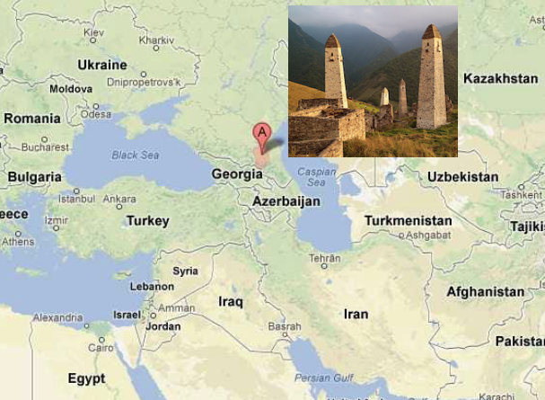
Speakers of Chechen sometimes have difficulty reading and writing their own language. Currently there are about 1.4 million Chechen speakers, mostly in the Caucasus, but also in scattered colonies in the eastern Mediterranean, western Russia, and Bavaria/Tirol. The Chechens live in the mountains, in a linguistically diverse region that includes some very old languages.
In July 2018, I posted a blog on Tischlbong, a Slavic/Bavarian blended language spoken in the village of Timau on the Bavaria/Italian border. This blog takes us further east, to the region between the Black and Caspian seas, where a surprisingly diverse group of languages, some of which are nearly extinct, are still spoken in cultures that are thousands of years old.
It was actually the Azerbijani language that attracted my attention first, for a number of reasons, but after I began to appreciate the diversity of languages in this region, I learned of some unusual aspects of Chechen and decided to look into this, as well.
Chechen and Nearby Languages
Chechen is spoken by a little more than a million people in a culturally ancient and linguistically diverse region between the Black and Caspian seas, bordering Georgia, Azerbaijan, and Russia. [Source: Google maps; Vyacheslav Argenberg, Wikipedia]
Ubykh, one of the languages in the Akbhaz-Circassian language group, became extinct in 1992. This remarkable language had 82 consonants and only two vowels (Coene, 2009).
In general, minority languages and even some of the majority languages in the northern Caucasus region did not have their own alphabets until the 19th and 20th centuries. Chechen has a longer written history than most of the minority languages. Some of the minority languages are spoken by only a few thousand people and may be gone in a generation or two.
The Avar or Azerbaijani languages are used bilingually for economic transactions by a number of people in this region. Russian is also spoken and mandated in some areas.
In some ways, the Caucasians and Basques have characteristics in common. Not in terms of their language specifics or background (although both languages are agglutinative), but in resistance to outside influences. This is largely due to cultural isolation—mountain strongholds are harder to conquer. Historically, these cultural groups retained a certain autonomy that is reflected in their languages.
More recently, however, technology, Soviet expansion, and wars have left their mark and have wiped out a sizable portion of native literature. When orthography changes, books in previous alphabets become obsolete and are destroyed. With them goes the link to ancestral history.
History and Orthography
Chechen and Ingush are related to Vainakh, a northeast Caucasian language.
Like several middle eastern and central Asian languages, Chechen exemplifies synchronic digraphia—a language written with several alphabets, usually Arabic, Cyrillic, or Latin. Historically, the Arabic alphabet was used for Chechen, but since 1862, a Cyrillic-based alphabet was the dominant script, with recurring and politically controversial attempts to convert to Latin. In 2002, the Russian language was mandated for education, which may threaten the future of numerous local languages.
Members of the Chechen diaspora who settled in Bavaria and the eastern Mediterranean sometimes use Latin characters because they are familiar, but their efforts are not standardized. The number of books published in Chechen is small and some of these were destroyed in recent wars.
Chechen literature has received very little study but is worthy of attention because of its unique poetic characteristics and the position of this region in an important crossroad between Christian and Muslim cultures.
Some Interesting Aspects of Chechen
Chechen is an agglutinative language with some interesting characteristics. Literacy levels were not historically high, so it is difficult to chart changes between current usage and older versions of the language.
Here are some general characteristics…
Numbers (in the singular) and names of the seasons usually end in a vowel. Dal is the word for God, Seli for the traditional thunderer, and Eter for the ancient underground god (the Chechens were traditionally polytheistic).
There are many words comprised of simple 2- or 3-letter syllables, and some that repeat a syllable, such as zaza (flower), or which repeat a consonant together with different vowel or vice versa, as in or qoqa (dove) or adam (person).
Letters like j tend to be at the beginnings of words.
One spelling can have different pronunciations and serve multiple purposes. To take an example cited by E. Komen, the single word деза (deza) can be interpreted as four very different concepts:
No, there is more variety in the positions of letters within Chechen words than in VMS tokens. But it demonstrates that natural languages can have orthographies in which different sounds are represented by the same shape, where vowel representation is limited, and within which the same linguistic unit can be repeated several times with different meanings for each iteration.
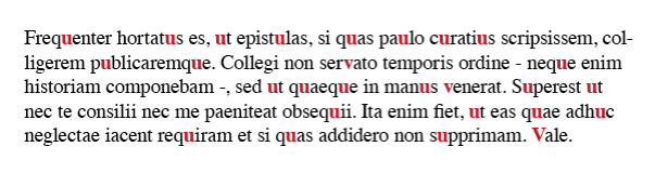
In page layout, text is frequently organized in columns. If the left side is even and the right side is ragged, it is “left-justified”. If it is even on both sides, it is “justified” or “double-justified”.
In contemporary page layout, lines can be padded with software algorithms that add extra space between each character to fill the columns. In the Middle Ages, padding was at the discretion of scribes, and there were numerous strategies.
Strategies for Padding
In early medieval texts and some of the Hebrew texts, the right margin is sometimes padded by stretching out the last character:
In this rambling Insular script, the right is sometimes justified by stretching the final character. [Source: Vat. Lat. 491]
Sometimes padding was created within the line by spacing out words and stretching some of the ligatures:
The common ligature “st” has been stretched and combined with word spacing to even out the right-hand margin. [Source: ÖAW Hs A 6 (earlier: a IX 21}, c. late 1200s]Individual letters and ligatures have been stretched to even out columns. In this case, the letter N is chosen, along with the common ligature “st”. [Source BNF Latin 9844]
If the scribe didn’t want to manipulate the letters or was in a hurry, one of the simplest ways to pad out a column was to add a line. In this example, wavy red lines extend the text:
Quick and simple line padding in wiggly red lines [Source: British Library Bodmer 91]
The padding Morgan B.25 is equally simple but rises higher from the baseline:
Sometimes padding was more decorative, using repetitive patterns or small drawings of animals or birds. In this example, from Royal 2 Z xviii, a two-tone angled decoration, that can be repeated as necessary, fills the column:
A similar format was used to pad the right-hand side in Pal.lat.26 except that the designs are more varied:
Decorative padding was a creative opportunity. Some rubricators or illustrators drew plants, animals, and many kinds of birds. Arundel 157 has page after page of charming examples, each one a little different:
Sometimes a simple repetitive pattern was used, with space between each iteration:
Columns are filled with a simple repetitive pattern in red [Source: BAV Borgh.312]
Sometimes the repeating pattern was shaped like a letter:
When the letters were close together, they became visually similar to a decorative pattern. This simple letter-like padding from the early medieval period was still used in the 15th century:
Paragraph-end padding in an early medieval manuscript. [Source: BL Cotton MS Tiberius B V/1]
A simple letter-like repeated v-shape was still in use centuries later, as in this 15th century manuscript, sometimes extended with dots in the middle when it was longer. [Source: Heidelberg Hs. 1012, c. 1460]
Moving the letters closer together gives them a more decorative appearance. [Source: KBR MS 11102]
Sometimes text was justified by spreading out letters or breaking words across a line. In these cases, padding wasn’t needed until the scribe reached the end of the paragraph. If the last line was very short, it wasn’t practical to insert spaces, so padding characters were added instead. In the following example, the paragraph-end has been padded with a simple pattern in alternating colors:
A simple decorative padding pattern has been dressed up with in alternating colors. [KBR Ms 14910-12]
In this example, a more decorative line was added to fill out the last line:
In this manuscript, lines are justified with spacing or word-breaks so that the columns are generally even, except for the last line, which is padded with a decorative line. [Source: Koninklijke Bibliotheek Ms Fabr. 91 4°, ]
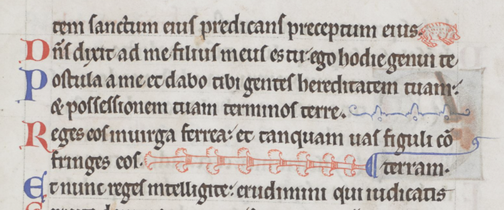
Sometimes the last line would be padded with a stretched-out version of the word “AMEN”.
Sometimes larger spaces were added near the end of the line with the last letter capitalized, to create visual balance with the style at the beginning of the line:
In the same manuscript, padding has been inserted between sections of text within the line:
An interesting method of padding within lines, so that sections are separated, rather than adding the padding at the end of each line. [Source: KBR MS 4433-38]
In another manuscript, instead of inserting decorative characters between the words, the letters are stretched:
Lines are padded by stretching some of the characters. This not only evened out the columns, but added aesthetic breaks for the eyes. It was not the easiest technique, it took some planning, and thus was not as common as some of the methods shown earlier. [Source: BNF Latin 9844]
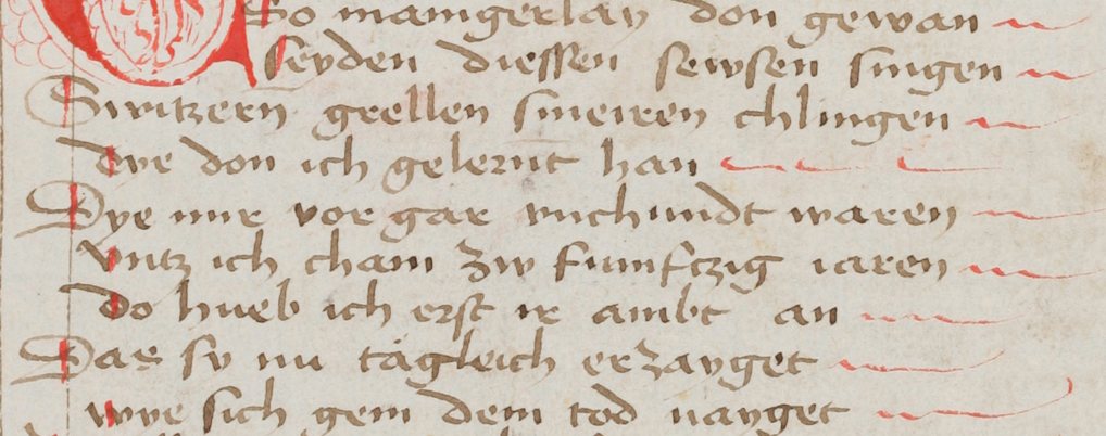
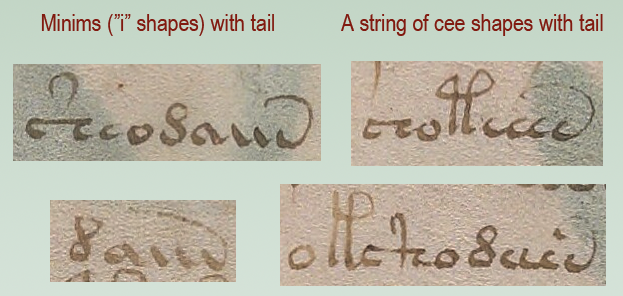
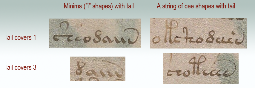
What about the VMS?
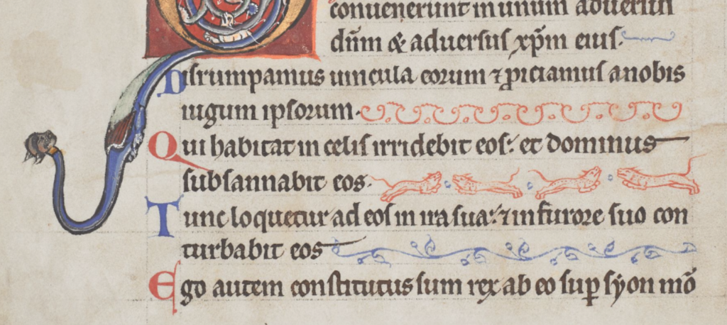
Medieval padding caught my attention because it sometimes beings with a shape like “a” and ends with a shape like “v”. Note how closely this pattern resembles aiv av aiiv av aiiv:
In general, padding was added at the ends of lines, but the earlier examples illustrate that there were midline padding strategies as well.
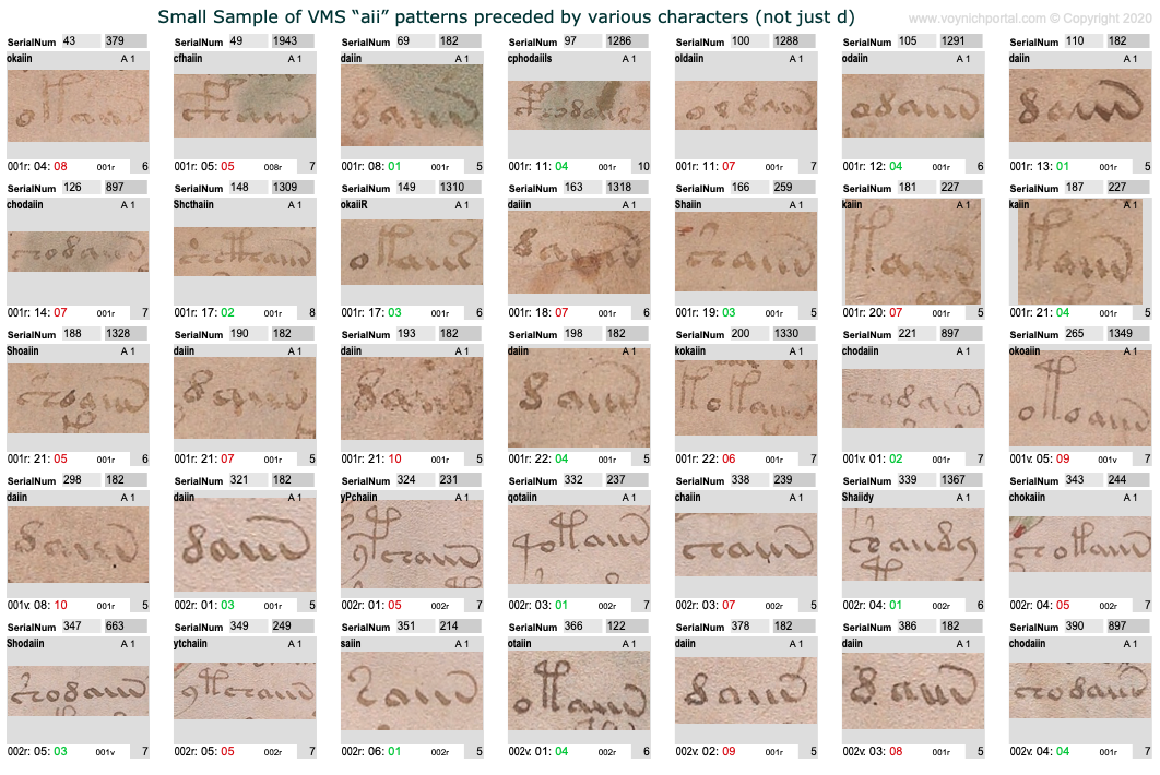
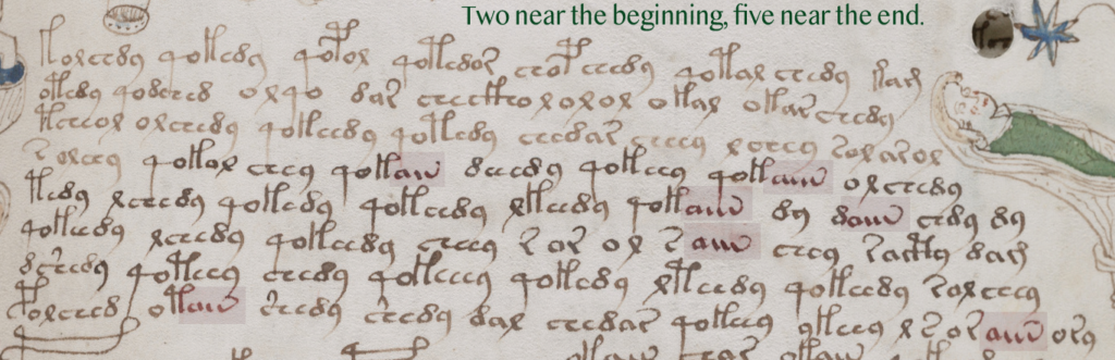
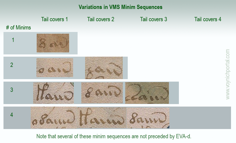
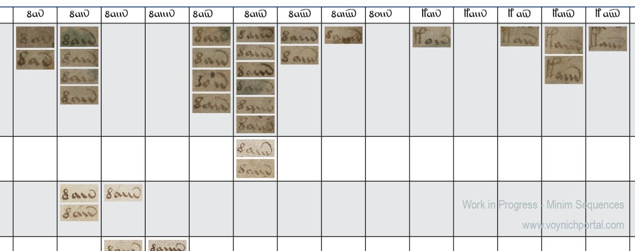
Which makes me wonder whether we should be looking at VMS aiiv in a different way. The pattern includes av, aiv, aiiv, and aiiiv and may be preceded by numerous different glyphs:
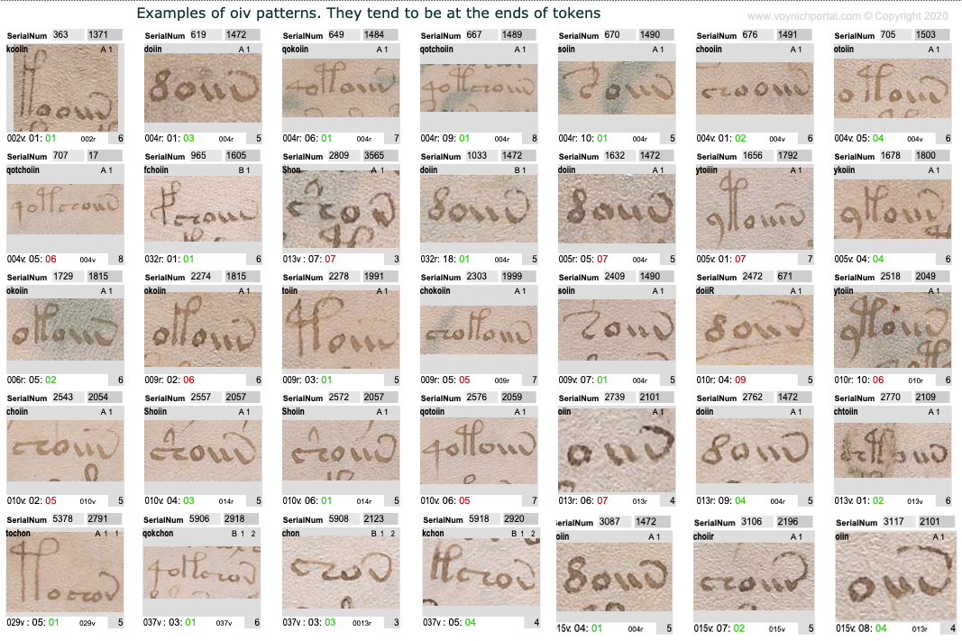
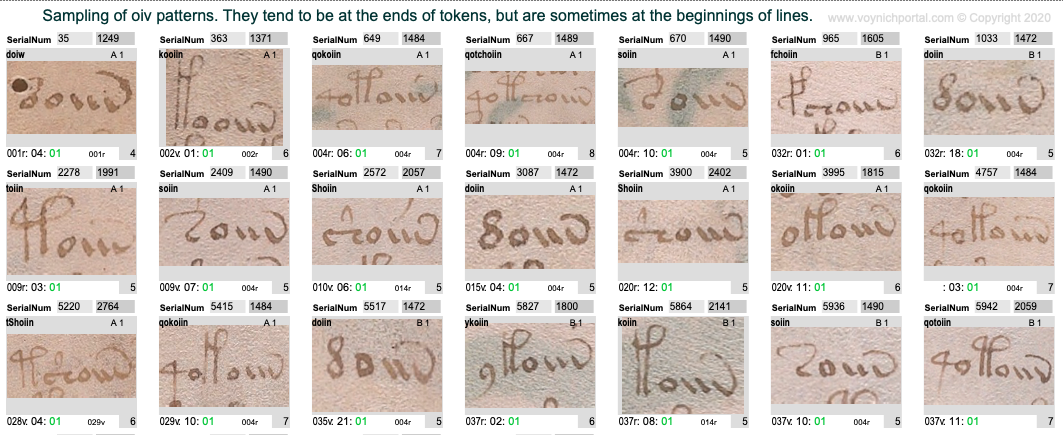
The oiv patterns are similar. They are usually at the ends of tokens and are preceded by a variety of glyphs:
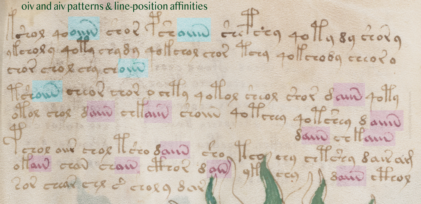
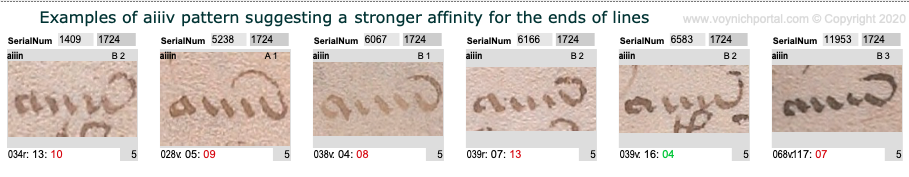
However, aiv and oiv patterns are not identical in terms of line position. Even though both are usually in the token-end positions, the oiv tokens do not cluster near the ends of lines as frequently as aiv sequences. The oiv sequences are in line-position 1 about twice as often as aiv sequences:
Here is an example of these tendencies in VMS folio 28v:
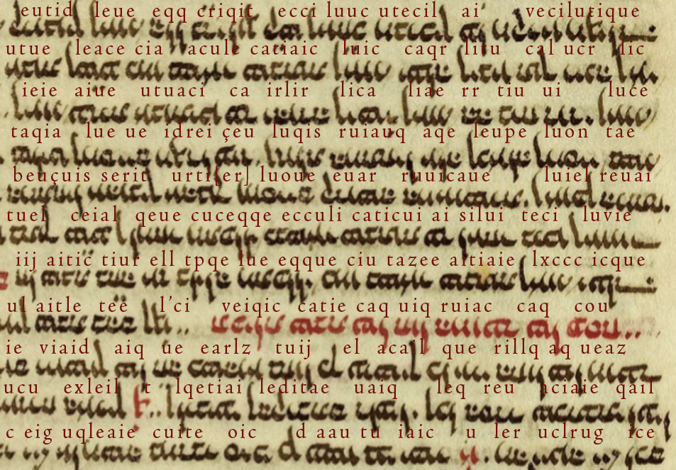
Implications for the Voynich Manuscript
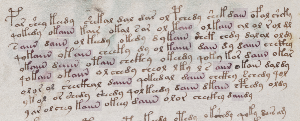
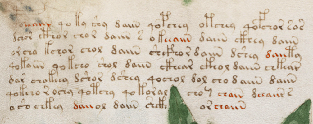
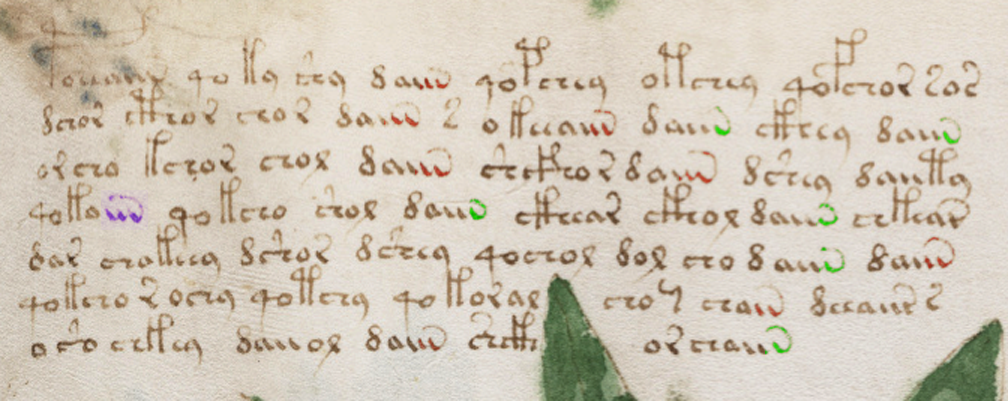
Could the “aiiv” group be a substitute for line-end padding and stretched-out letters? In the VMS, “aiv” patterns are not always preceded by EVA-d. Many other characters precede “aiiv” as in this example on f2v. Also, in this snippet, three of the four line-ends are aiv patterns:
In general, aiv patterns tend to be in the latter half of a line more than the first half, even in text that has not been double-justified.
However, this is a slight overall trend. There are sections in which the proportions are even, as in this snippet:
Patterns of aiv on folio 81v that are more evenly distributed across the line [Source: Yale Beinecke 408, c. early 1400s]
However, the longest “aiiiv” pattern falls near the end of the line more often than the beginning:
Here’s a full folio (37v) with aiv and oiv patterns highlighted. Once again, oiv leans more toward the beginning and aiv toward the end:
Summary
I’ve mentioned a few times that I think the emphasis on daiin may be misguided. Forget the “d” (at least for now). We should be looking at the ain patterns (which I call aiv) together with the oin patterns. The fact that they occur in the same parts of tokens, but in different parts of the line, is revealing.
In medieval texts, padding can occur within a line or at the end of a line and padding sometimes shares shapes with regular letters, especially the letters a and v. The aiiiv patterns might not be padding patterns, maybe they are word endings, modifiers, or conjunctions. But it’s something to think about. Maybe the shape was inspired by padding patterns even if the interpretation is different. Depending on what precedes the aiv sequence in the VMS, it may serve more than one purpose. But the pattern has an affinity for the ends of tokens and the latter parts of lines and its cousin oiv has a stronger affinity for the beginnings of lines, a pattern that deserves some attention.
Usually when I look at VMS text, I am trying to unravel the meaning (assuming there is one) or puzzle out some of the ambiguous shapes, but a while ago I noticed something about the pen strokes that reminded me of the text on folio 116v…
The Speed of the Quill
Medieval scribes wrote using a quill or stylus. Some wrote faster than others. A faster, lighter stroke dispenses less ink. There are other differences… some scribes pressed harder, and some pressed harder on the downstroke than the cross-stroke (for artistic effects). Some sharpened the quill to a finer point, which creates a different kind of line and overall look. Some sharpened the quill more frequently than others, which improves consistency. Usually goose quills were used, but other feathers were sometimes good for fine lines.
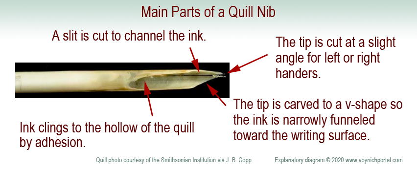
Adhesion holds the ink within the curve of the quill. When you press on the tip to spread the groove, gravity tugs the droplet and ink runs downward. You have to hold the pen at a certain angle, use exactly the right pressure, and pull the tip away from the topside for the ink to dispense evenly.
Here are the basic parts of a nib. It is a protein material that wears down. A scribe needs many quills to complete a long project.
A quill is not like a ballpoint pen. A ballpoint can draw loopty-loops because each part of the ball dispenses ink in the same way. It takes practice to pull a quill in the correct direction and, if you don’t do it right, the ink stutters or blobs. It takes a few years for calligraphers to really master the art.
Cutting a Quill
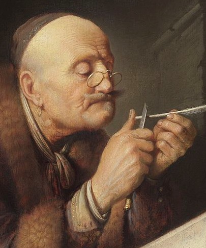
Shaping the tip of the quill. Often goose feathers were used. [Painting by Gerrit Dou c. 1633, courtesy of the Leiden collection.]
To create a quill, you harvest the feathers, scrape away the soft tissues, and age the feathers to “harden” them (in later years this was accelerated by heating). Artists and modern users have a romantic attachment to the feathery parts, but professional quill-makers and scribes usually removed them.
Use a sharp knife to shape the tip. The width of the tip is related to the width of the stroke. The tip is cut at a slight angle to accommodate the right or left hand. Even the curve of the feather is chosen for right- or left-handedness. A vertical slit is added to channel the ink in small doses from the inner curve of the quill.
If it is a feather quill, it needs to be re-dipped every few words and re-sharpened every few lines. (Don’t sharpen a quill as shown in this painting or you will cut your thumb—carve away, not toward your finger. What I do is press the quill-end alongside a small wooden block and shave toward the block—more control and less risk).
Because a quill needs to be pulled toward the side that holds the ink, a loop is usually drawn in two strokes—from top-to-bottom on the left, then top-to-bottom on the right. This prevents spattering or skipping.
Occasionally a scribe will draw a full loop if the nib is very fine and the loop is very small, but pushing against the direction of the pen is risky—the consequence may be a blob, pen-skip, or broken quill-tip. Similarly, straight strokes are drawn top to bottom to avoid going against the direction of the quill.
How Do Quill Mechanics Relate to the VMS?
If you pull a quill very quickly on the downstroke and start lifting in anticipation of moving to the next letter, the descender becomes very thin and light. Calligraphers are discouraged from doing this because it makes the script look uneven and a “g” might look like an “a”. Nevertheless, it happens, and appears to have happened in parts of the VMS.
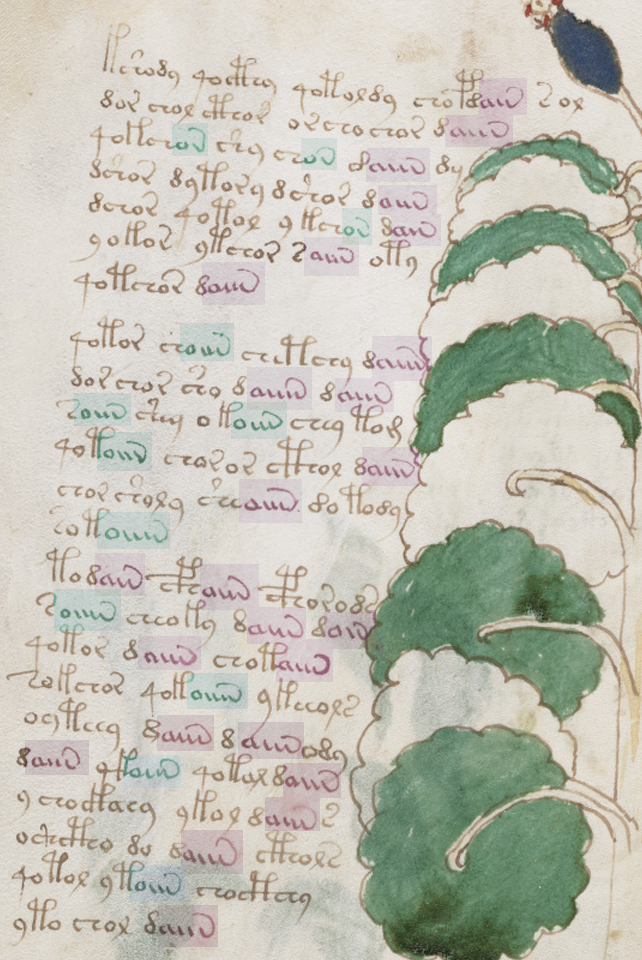
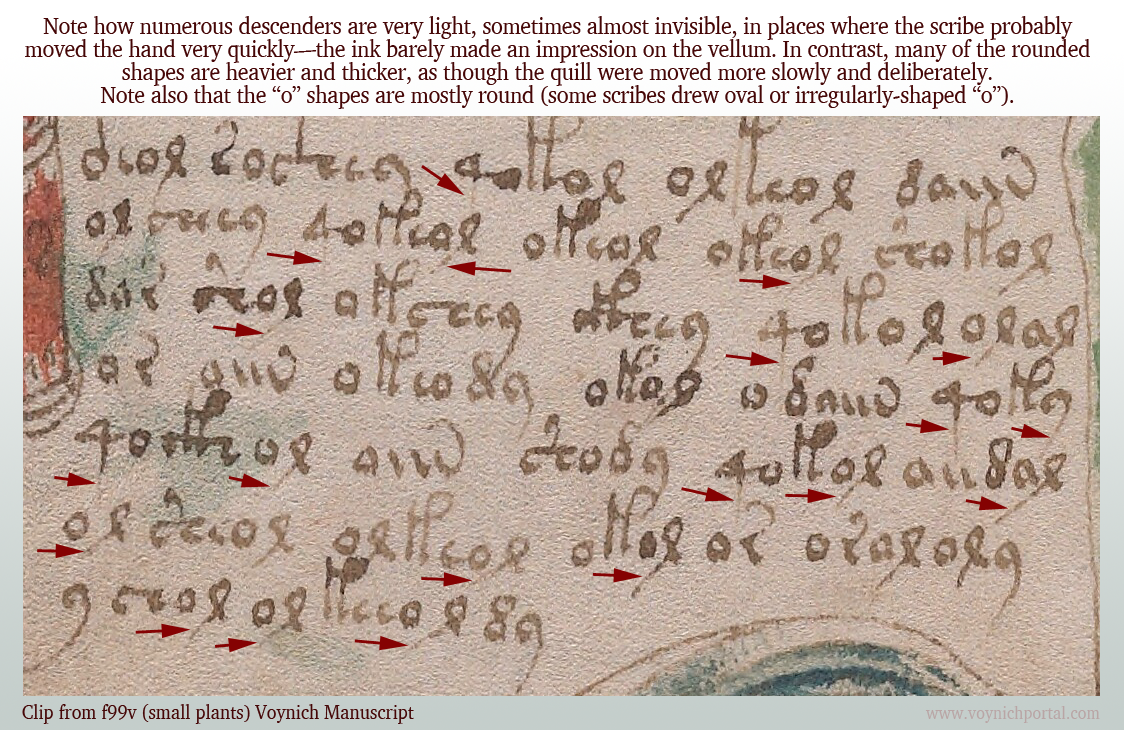
On folio 99v, I noticed many of the downstrokes were barely visible. The scribe probably moved fast and reduced the pressure compared to other parts of the glyphs.
Note how many of the descenders are unusually light:
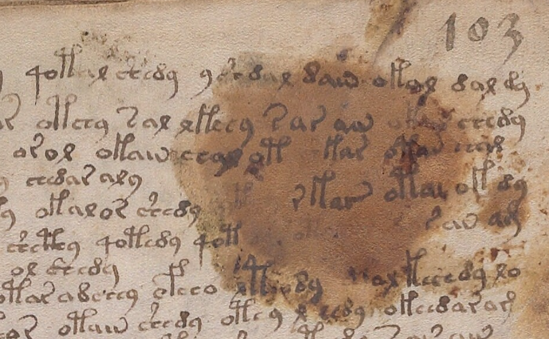
Compare it to this script on 103r where the descenders are darker and more clearly written:
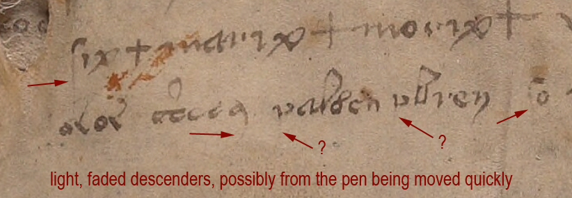
On 116v, at the end of the manuscript, there is some distinctive lightening of descenders, possibly from the pen being moved quickly or possibly from some text that has been expunged below the last visible line:
I am not sure if the two arrows marked with question marks are faded descenders, but the tops of the letters look more like medieval “p” than “v”.
Unfortunately the 116v text does not match the handwriting style of the scribe who wrote the light descenders on f99v. I wish it did—it would be evidence that the 116v scribe might have helped with the manuscript. But the 99v example has rounded c-shapes, not as squeezed as those on 116v, and the descender on EVA-y on 116v is distinctly rounded and arced, so it’s probably a different scribe.
Identifying the Ambiguous Letter
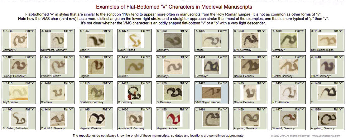
So what is the strange letter on 116v? A “v” or the top of a “p”?
I looked for examples of flat-bottom “v” in medieval manuscripts and found quite a few, but it was definitely not as common as other forms of “v” with pointed or round bottoms.
Below are samples specifically culled from scripts that are similar to the overall script on 116v. These samples don’t match the shape of the VMS char as well as similar examples of the top of the letter “p”, but the differences aren’t sufficient to determine the identity of the VMS char:
So let’s move on to sections where the VMS text has been corrected or changed…
Amendments to the VMS Text
This is one of the more obvious examples where something spilled and someone tried to re-create the damaged text on top of the stain. The text is a bit awkward, the stain may have impeded the quill, but it appears to be added by someone familiar with VMS glyphs:
Less Obvious Examples
Some corrections are more subtle. You have to hunt for them. There are many edits in the VMS. I tried recording them, but it was taking too much time and there isn’t space to enumerate them all here, but I’ll point out a couple of interesting examples.
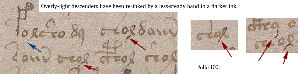
Apparently someone didn’t like the overly-light descenders on f100r (small-plants section) and tried to fix some of them. Note the light descender marked with a blue arrow. Some of the others have been overinked to add the missing stroke (marked in red).
Whoever over-inked wasn’t very expert. The lines are tentative and shaky. The thickness of the nib doesn’t match. The ink doesn’t match well either:
Medieval inks were not always brown. Some were closer to black when first applied and gradually faded to brown, so you can’t always go by color. Only testing can determine when the extra strokes were added. But the added ink isn’t just a different color, it’s a different kind of stroke, thin and spidery. It lacks the thick-thin characteristics of lines drawn with a quill. It resembles ink from a different kind of pen, maybe a metal stylus or something that can create thinner lines.
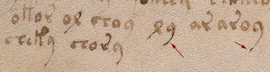
Darker ink also occurs at the bottom of f100v, on one of the small-plant folios, but the difference isn’t as great. One has to be careful in evaluating examples like the one below, because sometimes medieval ink was not mixed well and certain components in the ink faded while others remained dark.
I’m pretty sure the text on 100r in the previous example has been over-inked, but it’s harder to tell if the following example is over-inked or badly mixed ink where some components faded more than others:
Changes to Content
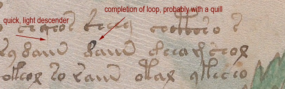
Darkening a too-light line is a superficial change that doesn’t alter the intention of a glyph, but there are places where lines have been added to change the shape of a letter. For example, on 100r in the middle, we see a shape that looks like a straight “d” changed into EVA-d with the addition of a loop.
In contrast to the overinked examples shown earlier, the added loop looks like a quill stroke. Even though it is darker ink, it has the thick-thin characteristics and more fluid style of the rest of the text:
So it’s possible that more than one person made changes to the text or that the scribe had difficulty with very fine lines and used a different, perhaps unfamiliar, kind of pen.
These revisions suggest that 1) someone cared about the legibility of the text and tried to fix the parts that were faded, and 2) someone comfortable with a quill cared about the consistency/accuracy of the VMS glyphs and corrected errors.
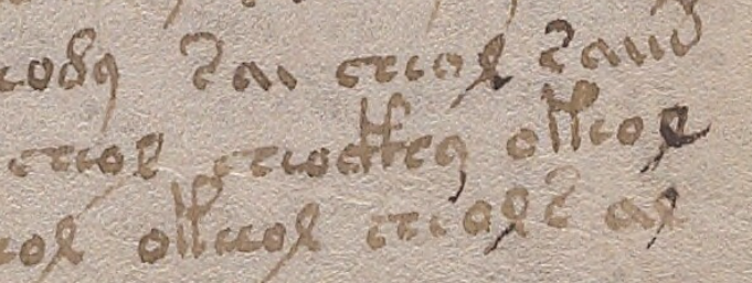
Here is another example with dark and light inks in which descenders have been fixed and one letter appears to have gained a longer lower-right stroke (100r lower-right):
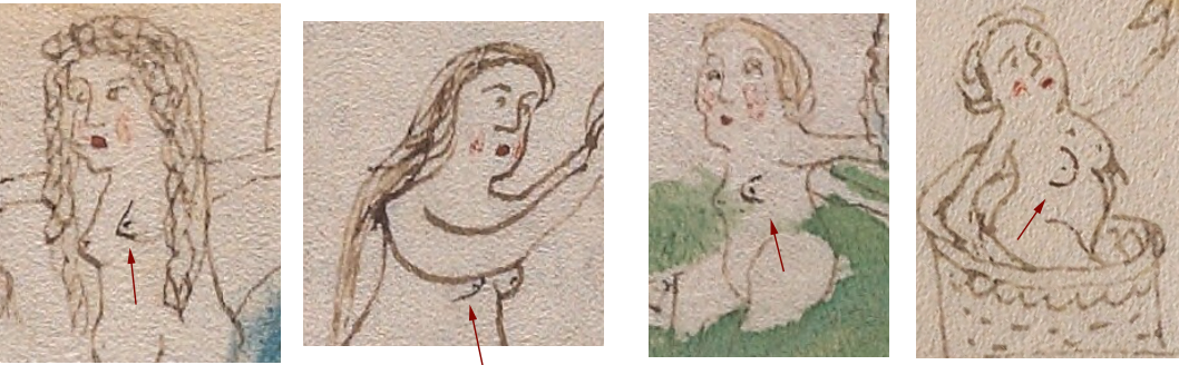
The text is not the only thing that has been amended. Some of the drawings have, as well.
There are numerous places where a breast has been added to a nymph in a slightly darker ink. Usually it is the one closest to the viewer:
Nymph 1 Nymph 2 Nymph 3 Nymph 4
So who added it? Was it a production-line process where one person drew the outline and someone else added the inner details? Or was it a master-apprentice situation where a young apprentice was asked to do something “safe” that wouldn’t ruin the drawings, like adding a second breast?
The added breasts are usually in the same style as the original breast. In this case, the first is pointed, the second is somewhat rounded, the third is shaped like a thumb, and the fourth is larger and distinctly rounded. So… either it’s the same person who added them, or someone else made an effort to copy the original style.
Sometimes other parts of the body look like they are drawn by a different person. For example, the arms of the second nymph are different from the others.
One of the characteristics of many of the nymph drawings is that there is no shoulder on the side facing the viewer—the arm grows out of the neck. This is particularly noticeable on nymphs in 3/4 view. It’s a distinctive characteristic that can be seen on nymphs 3 and 4 in the example above. In contrast, Nymph 2 has an angular shoulder and smoother, darker arcs to the curve of the arms. Note also that there is no elbow on #2. The arms of the second nymph look like they were drawn by a different person.
Here are more examples of nymphs with non-anatomical shoulders. The arm on the right is almost growing out of the ear:
Places Where Both Text and Images Were Amended
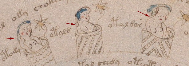
On folio 73r, someone has added both text and breasts in a darker ink, using a finer writing implement than the original text. The text is consistent with other text on the folio in both style and glyph-arrangement, so perhaps the lines were added close to the time of original creation.
Here is a sample from the top of the folio, but there are numerous other additions below it:
A second breast has been added in darker ink in much the same way in the zodiac-figure folios and the pool folios, which suggests some kind of continuity between sections, if the dark ink is contemporary with the rest of the manuscript.
One important thing to note… the glyphs in the darker ink are written in legal Voynichese. Did the person know the system for generating tokens? Or did they copy others that already existed? If they knew the system, these marks may have been added in the 15th century.
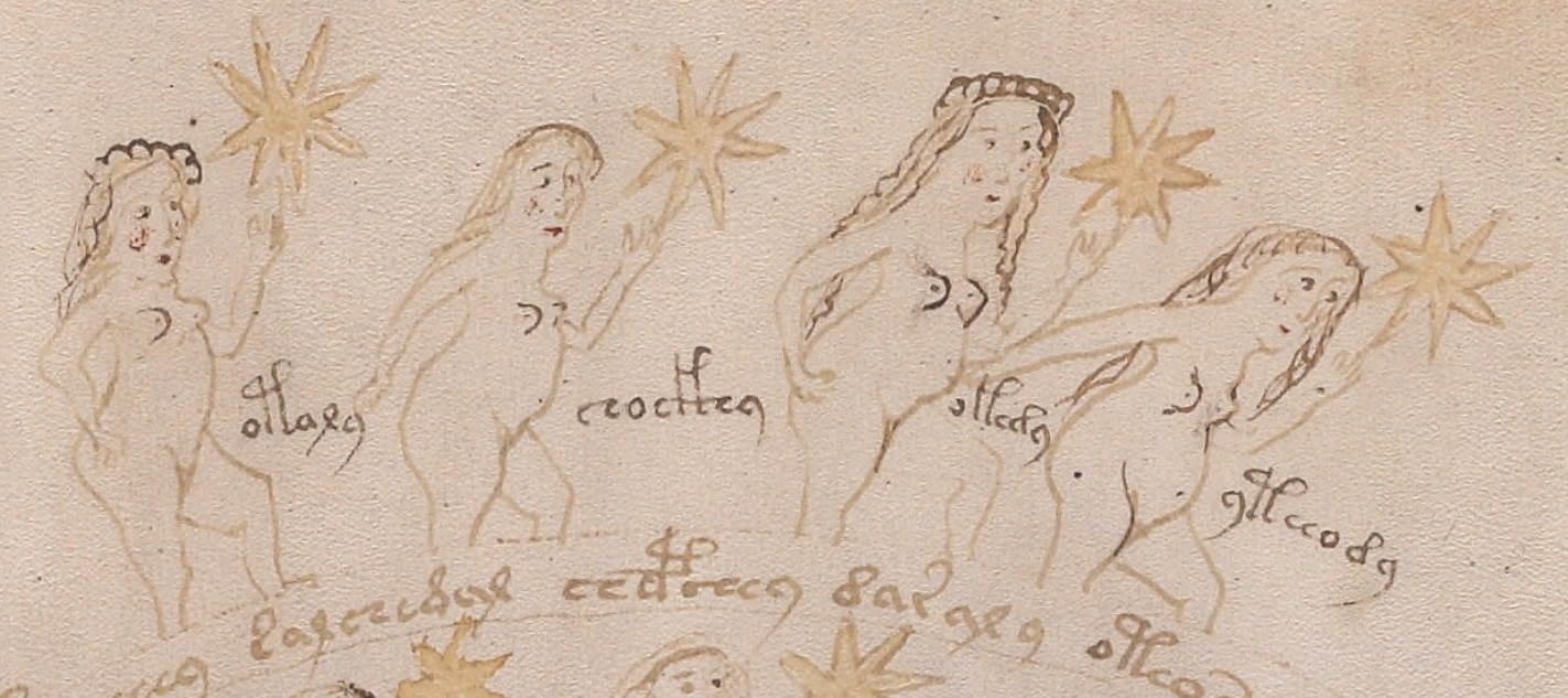
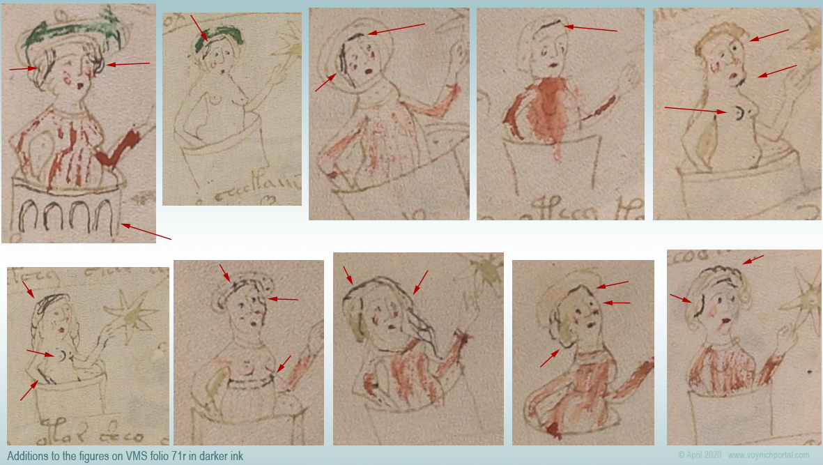
There are numerous amendments to the drawings on 71v, one of the zodiac-figure folios. Ten of the 15 figures have been touched up with darker ink (or ink that has faded less over time). Most of the changes are to the hair and breasts:
In this group of nymphs, there is an interesting anatomical difference between the nymph with two original breasts (#2) and the two nymphs with added breasts (#5 and #6)…
On the original drawing (#2), the contour of the breast is defined by a line underneath, and the general direction is facing the viewer straight on. The added breasts on #5 and #6 are drawn differently. The direction is more of a side or 3/4 view and the line that defines the contour is on the side rather than underneath. The “touch-up” person may have been different from the original illustrator.
Less-Explainable Amendments
The changes or additions in the above examples are understandable. Light strokes were darkened, missing information was added. But the following example is harder to explain.
On f86r, there is an instance of “daiin” in which the last minim doesn’t have the usual tail swinging up to the left. Instead, someone with a narrower quill and a less steady hand added a large angular shape that is inconsistent with the rest of the text on the folio. The last minim has been awkwardly changed into an ambiguous shape that is not typical of Voynichese:
The amended shape is not round enough to be EVA-y and lacks the loop that is usual for EVA-m. The “dain” block doesn’t usually end this way, so the amender either added the wrong kind of tail (facing the wrong direction), or didn’t know how to draw one of the other VMS glyphs correctly and turned the tail-less minim into something strange.
In a previous blog, I posted some other examples in which atypical text was added to the beginnings or ends of lines.
Summary
The VMS includes numerous adjustments to the text and drawings; most of them are fixes to the original in a similar style. In some cases, however, textual additions seem out of character with the rest of the folio and it’s unclear why it was changed.
Most of the amendments were probably done around the same time the VMS was created, but some of the textual changes may have been added later. The proportion of changes isn’t high, but there are enough to make you wonder what happened to the VMS during the gaps in its provenance.
Changes or additions are not especially frequent, however, considering the length of the manuscript. It seems likely that a draft version was used to design the script first. It would be remarkable if it eventually turned up somewhere in the forgotten corners of a library or private collection.
I found the series order stromectol online Ma Me My Mo Mu in a mid-15th-century German manuscript. This surprised me. If you know east Asian languages, you will recognize the syllabic nature of this series. Another sequence in the German codex is Ba Be Bi Bl Bo Be Bu.
So which language is it? It has elements of Japanese or Filippino but isn’t quite a perfect match for the order or the components. It’s unlikely that Japanese was known in the 1460s in Europe. Could east Asian languages have been recorded earlier than we realized? Or is it an African language (some of which are similar to Asian languages)?
Syllables and Numerals
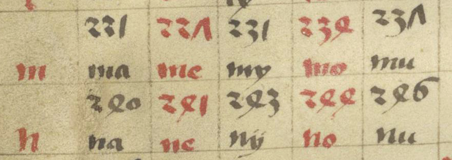
First I’ll introduce you to the manuscript. If you glance through the chart on Barth 24, f1v and you know Japanese, this sequence jumps out: ma me my mo mu (note that medieval languages often substitute “y” shape for “i”)…
Series of two-character syllables beginning with “m” and “n” [Source: Ms. Barth. 24, c. 1460s, Rhein region].
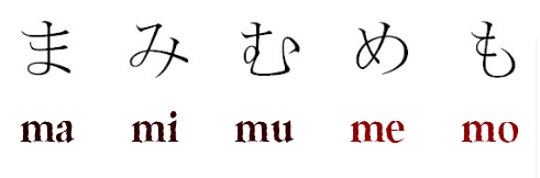
If you read the fragments in this order: black, black, black, red, red, you get ma, my, mu, me, mo which is the correct order for Japanese syllables. Here is the Japanese, with Hiragana equivalents:
But the syllables in the German manuscript are out of order. You have to read the black ones first, followed by the red ones, to get the correct sequence in Japanese. Is this because a medieval scribe or missionary got it wrong? Or because it’s not Japanese but perhaps a related language with a slightly different order?
It turns out it’s not a language at all, it’s a system based on language components and, even more surprising, it is remarkably consistent across unrelated languages. The same system is used in German, Spanish, English, and (believe it or not), Malaysian. Could this be relevant to the VMS, perhaps in more than one way?
It turns out that the German manuscript is a dictionary but not a Romanized-Japanese dictionary. The numbers paired with syllables in the above example refer to folios, and when I looked up an unfamiliar word in the “M” section on Google search, it took me to a word in Tagalog. Once again, I thought, did missionaries compile this? And yet the rest of it looked like Latin (and read as Latin).
The word I selected turned out to be one very big coincidences. It is Latin. The manuscript is Catholicon, and I coincidentally picked a word that is also valid in Latinized Tagalog.
So what are these syllables if they are not Japanese or Tagalog?
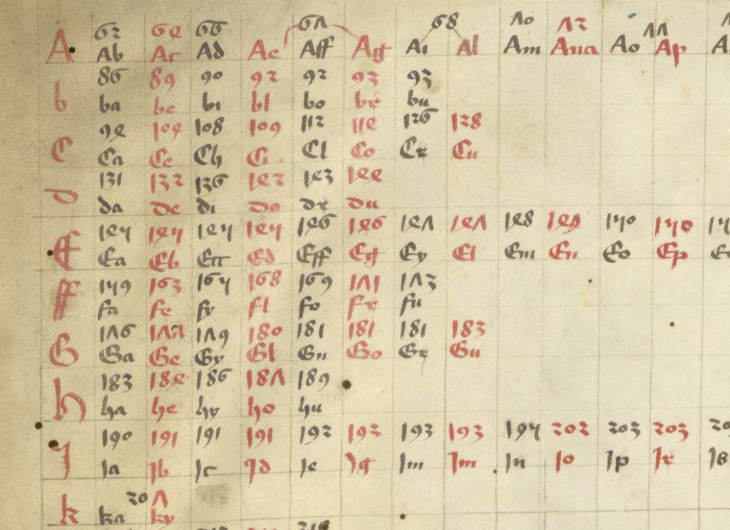
Here is a larger screensnap so you can get a sense of the overall system. The numbers above the syllables are folio numbers:
It took a bit of research to find answers, but I learned that this is a medieval indexing system, one that was designed for large datasets.
We’re used to indexes with numbers accompanying short words and phrases. The one above is a little different and reaches us from the minds of people who lived more than 500 years ago, and it’s still valid! In the post-medieval centuries, it was adapted by schools to teach writing, and by American companies to sell filing systems and insurance services. It is still in use today for a wide variety of purposes.
The system is based on the lookup characteristics of common syllables at the beginnings of words and it’s almost spooky the way it generalizes across unrelated languages. It appears that basic and common sounds at the beginnings of words are somewhat universal despite dramatic differences between western and eastern languages.
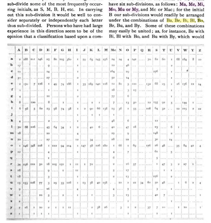
Here are some examples. The first one is an indexing system used in American accounting systems in the 19th century. Note the M and B sequences:
Indexing lookup chart for common syllables at the beginnings of words or names (such as cities or clients) from American Counting-room, Volumes 7–8, 1883. Note the sequences listed in the text above the chart.
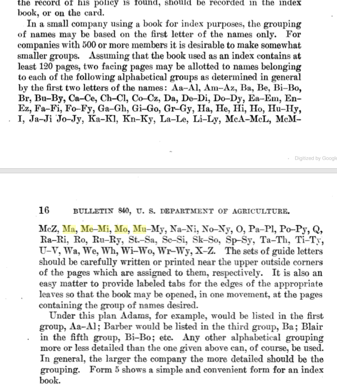
Here is another example of indexing for large sets of names (companies with 500 or more members). Note Ba Be Bi Bo Br Bu (not identical to the German example Ba Be Bi Bl Bo Be Bu, but close and also close to the Japanese Ma Me Mu Me Mo alphabet sequence:
Indexing system for insurance companies for large datasets, based on common syllables at the beginnings of words [A System of Records for Local Farmers’ Mutual Fire Insurance Companies, Valgren, USGPO, 1920].
The instructions for this system say to write the “guide letters” near the upper outside corners of the relevant pages (similar to folio numbers). It should probably be emphasized that even though medieval manuscripts were sometimes annotated with quire numbers prior to being sold, they were usually foliated by the purchaser, his heirs, or the bookbinder’s assistant when it was taken in for binding (sometimes decades or centuries after it was created).
Indexing didn’t always happen when a book was bound, sometimes the index was added weeks or decades later, but when it was professionally indexed, the indexers took their jobs very seriously. It could take months to critically analyze the manuscript, to annotate the margins and, finally, to create the index (as an example of this process, see BNF Latin 15754). In a sense, the index was like a Cliff Notes version of the manuscript.
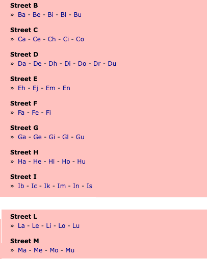
So how could this indexing system possibly relate to east Asia? Well take a look at this 21st-century sequence for indexing street names in Malaysia:
I have removed “J” because it was generally non-existent in medieval Europe (what looks like a “j” is usually an embellished “i”) and also k because there are many more “k” syllables in 21st century Malaysian names than most western medieval languages. It is not a complete match by any means, but considering that German and Malaysian languages are very different, there are a remarkable number of matches in content and sequence.
This unexpected linguistic continuity gave me food for thought. I wondered… can this characteristic of languages have any relevance to the VMS?
Are There Indexes in the VMS?
Maybe. Here are some things to consider…
Some manuscripts were almost entirely indexes, which means the word patterns don’t match full sentences and numbers are frequent.
Some manuscripts, even long ones, had no indexes at all.
Some had brief section indexes (note the folios in the VMS that resemble “key” pages).
Some depended on an index as a separate volume.
Some had long indexes, extending for several folios (not unlike the dense text at the end of the Voynich Manuscript). Sometimes each entry was notated by a symbol such as a cross or flower.
Summary
Numerous insights can be gleaned from this. First of all, it shows there are aspects of language that are similar among western and Asian languages. The sample posted above demonstrates this with startling clarity.
Maybe it explains why Voynich “solutions” have been offered in a dozen different languages with many solvers (and statistical analysts) feeling strongly that it matches their language of choice. Perhaps we are seeing fragments (as in an index or as in words that have been broken into syllables with extra spaces) that follow patterns common to a number of languages.
Or perhaps the VMS (or portions of it) comprises an index which, in the middle ages could sometimes look like a student notebook, with many note-style annotations interspersed with numbers.
The concept of multiple volumes existed in the Middle Ages. There are a number of medieval herbals designed with separate text and illustrations. Bibliographers and historians have suggested that certain specific books, in a variety of subjects, may once have had a companion volume.
But does this apply to the Voynich Manuscript?
It’s my opinion that many of the VMS “labels” are not words, at least not if space boundaries are retained. Maybe they are references rather than names. It seems intuitively obvious to look for label matches in the main text (and I, of course, have done this as well), but this isn’t the only way to cross-reference. Label text doesn’t have to match the exact pattern of glyphs in the main text to function as a reference. It just has to “point” in some way (e.g., referencing a folio number, section, paragraph or quadrant, or perhaps a separate volume), a process that would result in a high degree of repetition and self-similarity.
I have seen cross-referencing in medieval manuscripts. There is an herbal in an English repository that cross-references the same plant in another manuscript, with a short annotation near the root. It is also very common in Greek herbals for illustrations in the margins to include an indexed number (written as letters) that references a formal index or some part of the text.
Even so, it should probably be noted that the VMS has quite a lot of text, most of it carefully integrated with the illustrations, which seems to speak against a companion volume, but if the VMS glyphs represent a verbose code, as one possibility, then the information content could be much lower than it appears.
Medieval charms are like puzzles—ancient traditions, archaic names, corrupted words, blended languages, and numerous abbreviations. To decompose or interpret them, one has to learn about historic religious practices, both eastern and western, and to study hundreds of charms so that the general patterns become more evident.
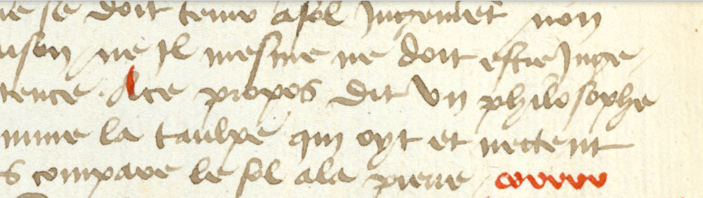
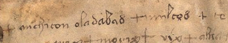
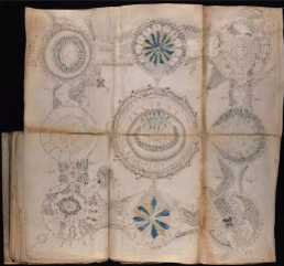
I’ve posted several blogs on charms, talismans, and amulets. It was the word oladabas on the second line and the repetition of six, morix, marix on the third line of VMS 116v that started me on this journey. These patterns reminded me of magic words (like Abracadabra) and patterns of sound-repetition that have long been associated with ancient magical rites.
The earlier blogs are here:
Repeated sound sequences and ancient words like Abracadabra (July 2013)
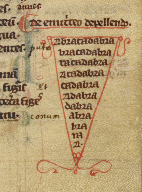
When I looked into this subject in more depth, I discovered that various versions of Aladabra, Abraca, Abracula, Abracadabra, ala drabra, et al, are closely related, and shortenings of the name in a repetitive line or diagram are not just to save space but to “reduce” the power of illness or malign spirits. Sometimes these are intended to be chanted aloud. Other times they are written on small squares or strips and worn on various parts of the body, or buried in the ground.
Abracadabra is possibly of Semitic origin and is mentioned in Serenus Sammonicus’s Liber Medicinalis as an incantation for fever as “chartae quod dicitur abracadabra”.
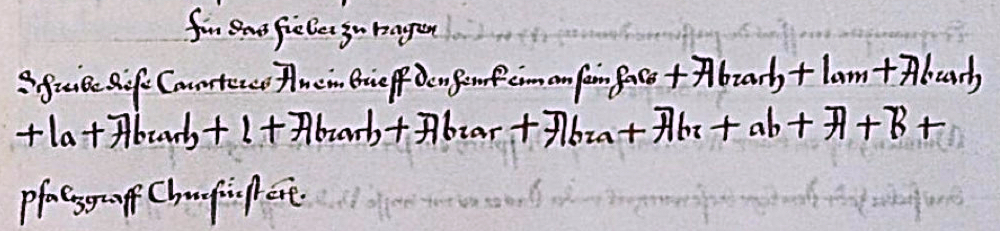
The charm words were not always written within shields or triangles, often they are within circles or pentagrams. Sometimes they are written in more prosaic style… let’s look again at an example I posted in 2016—a charm for fever:
The primary sequence begins with the word Abrachlam and is broken down in two sections Abrach + lam (you can think of this as alpha and omega, the beginning and end of the word). The beginning is reduced as follows:
Abrach, Abrach, Abrach, Abrach, Abrar, Abra, Abr, ab, A, B
And is interspersed with the shorter sequence from the end:
lam la l
Note how this differs from the shield charms (and from many of the more prosaic charms). This intertwining of the beginning and end is not common. Usually the ending is simply dropped to gradually reduce the word down to one or two characters, but the way the parts are interspersed in this example might be relevant to the VMS, as will be discussed farther down.
But first, a little more background. To fully appreciate charms, it helps to know a few abbreviations…
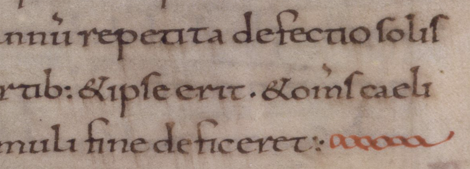
What is “aaa”?
Courtesy of St. John’s Orthodox Church
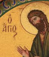
If you saw “aaa” in a manuscript or engraved on a talisman, you might scratch your head, but the history of charms reveals the meaning of this cryptic abbreviation.
When I came across the incantation “Agios Agios Agios” in a medieval manuscript, I recognized it because it is commonly written on Greek icons with images of saints, Jesus, and God (like the Arabs, the Greeks frequently exploited the calligraphic characteristics of letter shapes and intertwined them like monograms). On the right is a typical icon labeled O Agios. Agios means “otherly” and is often translated as reverend, holy, or sacred. It is written and abbreviated in numerous ways.
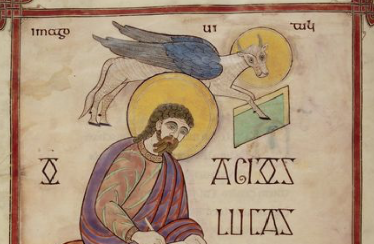
Agios was also Latinized in the Middle Ages. There are several examples in the Lindisfarne Gospels. I include one here:
O Agios Lucas, St. Luke [circa early 700s, century, British Library, MS Cotton Nero D IV]
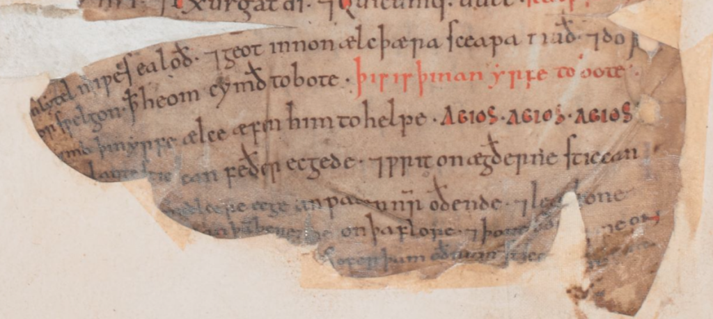
Another example of Agios, in the context of charms, is in an Old English manuscript from the 11th century. The reader is instructed to sing Agios Agios Agios to the cattle each evening (ælce æfen) as a form of protection and aid (him to helpe):
Agios charm to be sung each evening to protect cattle [British Library, Cotton Vitellius E XVIII, f15v]
Agios is sometimes abbreviated as Ai, and the abbreviation aaa is also a shortened version of Agios, Agios, Agios. But Agios, Agios, Agios (used in priestly invocations) is itself an abbreviation. It comes from an old hymn in Greek:
Ágios ó theòs, ‘ágios ìskhuròs, ‘Ágios àthánatos èléeson èmâs…
This hymn is known as the Trisagion (thrice Agion) and is sung in liturgies and processions. If a person is familiar with the hymn, then they would recognize Agios, Agios, Agios in the context of a charm without having to see the full text of the hymn. It seems likely that it is a direct reference to the hymn because the cattle charm instructs the user to sing the charm words.
Thus, extreme abbreviation to single letters or double letters was not uncommon.
Other Mystery Abbreviations
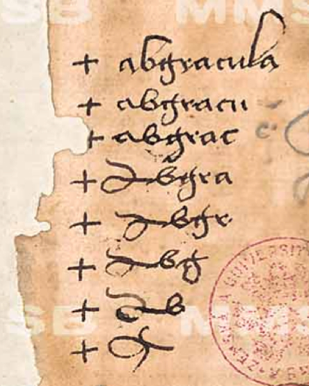
In previous blogs, I posted examples of Abracula/Abgracula (right), a word gradually reduced to a talismanic shape (sometimes as a shield diagram), and frequently combined with crosses. Since posting this in 2013, I have also seen the word shortened to “Abrac” and “Arac” in textual charms.
In addition to shortened words, medieval charms often include repetitious sounds, in addition to Hebrew and Latin,”power syllables”, names of angels, and other components.
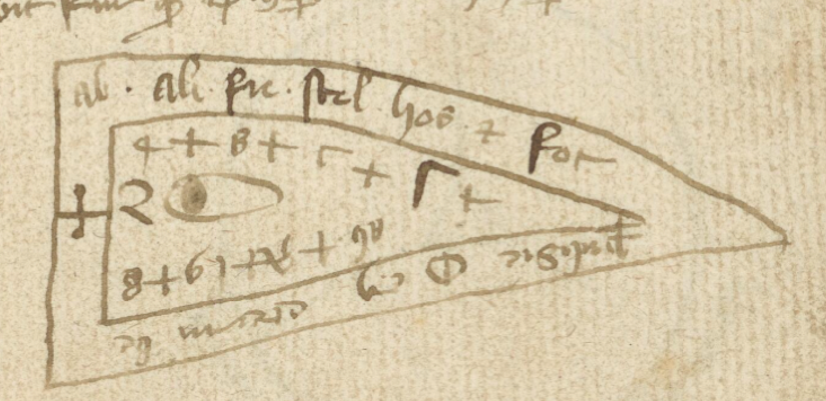
The following shield charm begins with “ab” in the upper left, followed by what appear to be mostly abbreviations in the outer band. The inner band also begins with “ab” if you flip it around, followed by numbers and a mixture of Greek and Latin letters. I was wondering why shield charms were common in Latin manuscripts and I’m not sure of the specific reason, but in Hebrew and Arabic exemplars, triangles are very common, so perhaps this is an adaptation of the triangle:
I noticed “ab” was frequently at the beginning of charm words and thought it might trace back to the biblical Abraham, but there’s another possibility… perhaps “ab-” is popular in charm words because it roughly represents the first two letters of the alphabet (Greek, Hebrew, Arabic, Latin).
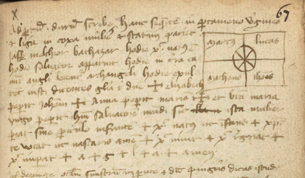
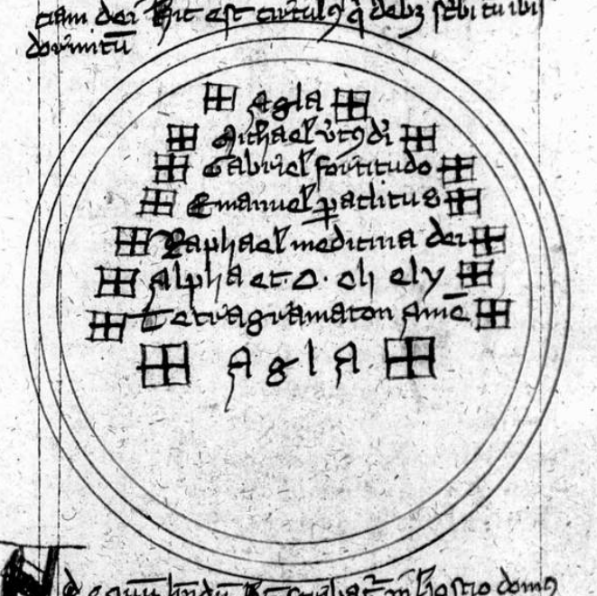
Below is another example from the same manuscript. In the top right are the names of the evangelists within quandrants, with a crossed circle in the center. On the third line are the names iasp[er] (a reference to Casper) melthior and bathazar (probably Balthazar), the three wise men, followed by invocations to archangels, followed by crosses and more names, including the following interesting passage:
+ elizabeth peperit Ioh[ann]em + Anna peperit Maria[m] + bra’ maria virgo peperit ihu’ (Jesus) Salvatore’ mu[n]di…
The names of women and their offspring are included in a number of childbearing charms and, if you scan down to the last line, you will see + a + g + l + a + amen, which is a clue that “agla” like “aaa” (Trisagion) is probably an acronym.
And so it is. It comes from the Hebrew אגלא for “Attah Gibbor Le’olam Adonai”. Adonai is one of the names of God, frequently included in charms with Eloyim and Sabaoth. This invocation acknowledges his might and power.
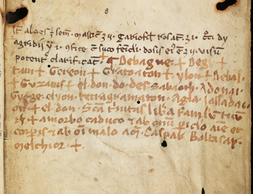
The following charm, added at the end of Arau MS Wett 4, also includes Adonai, Sabaoth, Grege, elyon, and tetragamaton (which also has Hebrew origins). At the end, are Baltasar and Melchior, as in the previous example and, as is common, several crosses (which in some cases indicates a genuflection):
Charm at the end of Ms Wett 4, folio 112r. This manuscript is from the second half of the 13th century, but these added notes might be from sometime in the 14th century, based on the handwriting. The second part may have been added at a different time, but it’s essentially the same style of handwriting (possibly the same writer), using a different writing implement and bottle of ink.
Near the end of the sixth line is the now-familiar agla.
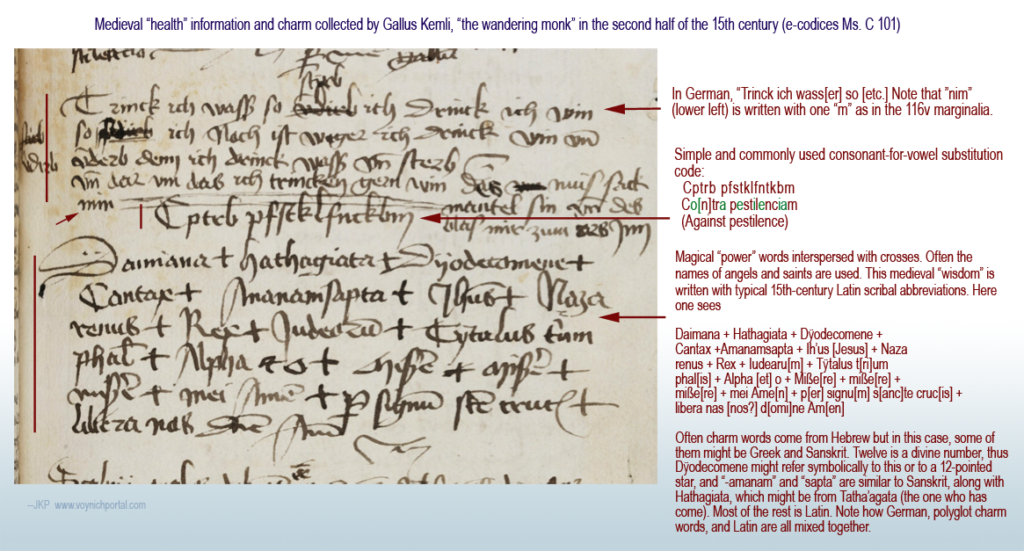
Here’s a pestilence charm with a similar format and a brief partial-substitution cipher that I posted in June 2018:
15th century charm for warding off the pestilence (black plague). [Source e-codices Ms c 101]
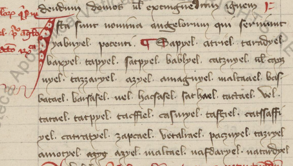
Names of angels are also very common in charms and general books of magic. Here is an example with names of angels (and other sacred personages).:
Long lists of the names of angels are common in medieval books of magic. Notice how many have “el” or “ael” endings as is also true of archangels Michael and Gabriel. [Source: Vatican Lat. 1300]
Specific angels were said to be associated with each hour of the day or night, with the archangel Michael presiding over the first hour of the day (the time when many rites were instructed to begin).
Sound Repetitions
I mentioned Agios as a repeated invocation, but there are also many vaguely Hebrew or Latin-sounding phrases that don’t appear to mean anything or which are simply repeats of names. Often the cluster of syllables is identical or self-similar.
For example Hatim, Hatim, Hatim (also written hatyn, and probably representing a name), kadosh, kadosh, kadosh (the Hebrew word for sacred) and eye, eye, eye can be found in medieval conjurations for Thursday (as described in the Heptameron and by Lauron de Lawrence, 1915) . The odd-looking eye, eye, eye found in BSB Clm 809, is an abbreviation for eschereie, eschereie, eschereie.
What might be even more interesting to Voynich researchers is sequences that are self-similar…
In a childbirth charm in MS Sloane 3160, the text following christus regnat is erex + arex + rymex. Looking more closely, if the wordplay is based on “regnat” or “rex” then eREX aREX RymEX might be the basis for the pattern.
Sometimes the short Latin-like words refer to longer statements, just as aaa refers to agios in its longer form as agios + agios + agios or as a hymn. For example, the following statement:
In nomine patris max, in nomine filii max, in nomine spiritus sancti prax.
will sometimes be abbreviated in charms as max + max + prax.
Another sound sequence found in charms is habay + habar + hebar, with habar being the Hebrew word for incantation. Note how each word varies by only one letter.
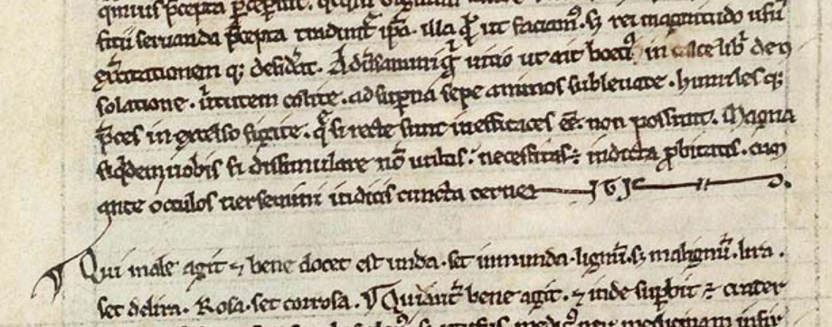
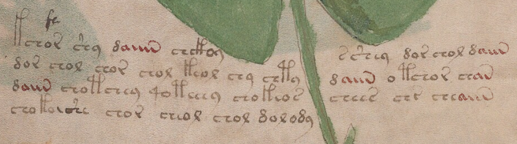
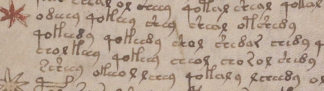
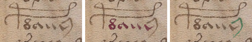
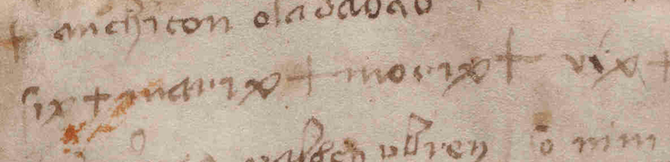
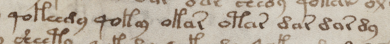
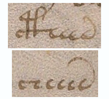
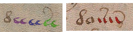
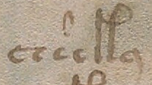
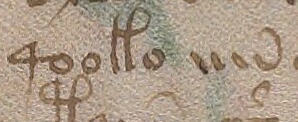
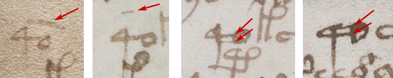
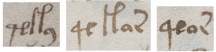
In VMS 116v, on line three, we see siX + mariX + moriX + viX + so IX is common to all four and this being the VMS, I can’t help wondering if “ix” was chosen because it also doubles as the number 9. There are some oddities of spacing… the ix in each case appears to be written in the same handwriting and the “a” is the same as others on the page, but the backleaning i character (resembling EVA-i) in “vix” is quite perplexing. Was it intentional? Or a slip into thinking in Voynichese? Or is it a later addition in another hand?
Spelling was quite variable in the Middle Ages, so I looked up “morax” as a substitute for “morix” and discovered that morax or more commonly marax is a demon, one of the fallen angels—a spirit that could be summoned by Solomon, appearing as a bull. Marax governs astronomy, herbs, and precious stones. He can be invoked at any time except twilight.
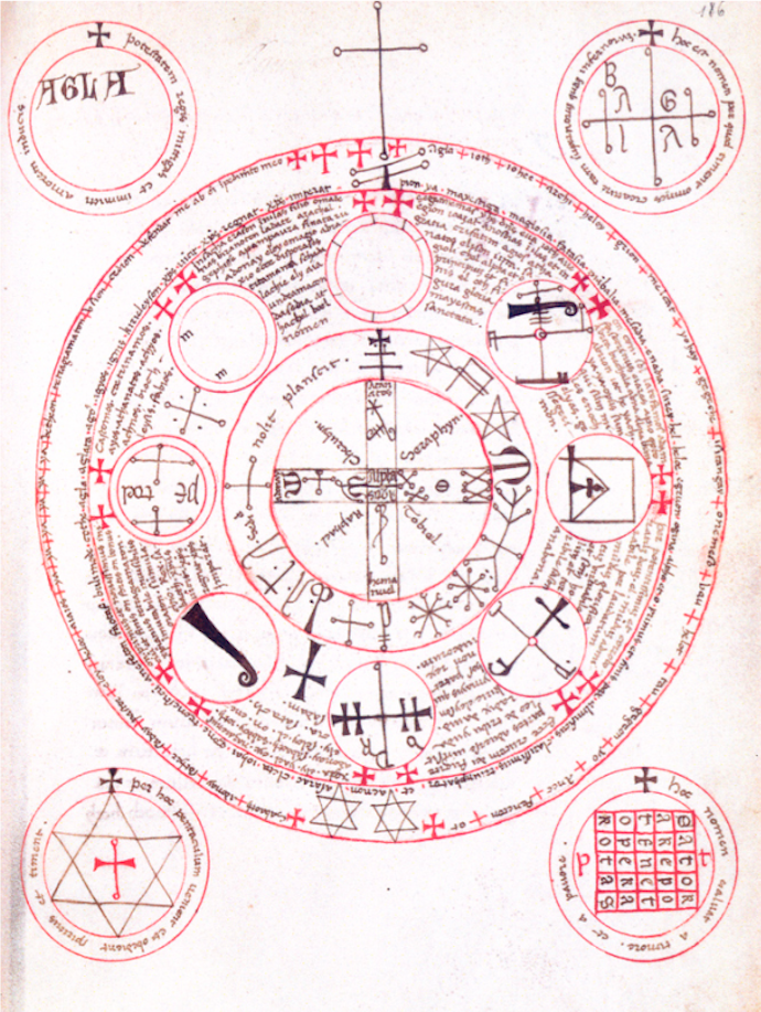
This information comes from De Laurence’s 1916 Lesser Key of Solomon, which is translated from manuscripts in the British Museum. BNF Italian 1524 is another version that includes this diagram with AGLA in the top left, and a magic square in the bottom right together with other talismanic symbols:
An earlier manuscript said to have inspired this is the Livre des Esperitz (Book of Spirits, Trinity O.8.29), a French grimoire with influences dating back at least to the 13th century (Boudet, Médiévales). The French version calls this demon “Machin”. Other variations include Mathim or Bathym. Ancient sources mention Tamiel or Temel for a demon with the same characteristics.
These fallen angels were said by some to be fallen stars. Others saw them as personifications of human failings.
Some of John Dee’s writings are referenced in an 18th-century hand-written version of the Book of Spirits that is now in the Penn State Library (Ars Artium, Ms Codex 1677). The book includes a reference to the papers of Alchemist Richard Napier and a statement on a flyleaf that “I” (the scribe) copied the book from an old manuscript written upon parchment (British Royal Commission).
The Royal Commission also mentions a book on Kabbalah “bought at Naples from the Jesuits” Colledge, &c.” and a book on alchemy that “the Government seized upon the Convent and sold their Library.” Another writer, possibly C. Rainsford, further mentions that Sepher Rasiel came into his hands from the Naples Jesuits (1874), which provides some interesting connections between the Jesuits and occult books.
But to get back to our demon…it appears that the name morax/marax, when associated with fallen angels, originated sometime in the late middle ages or Renaissance, and we cannot be sure that marix or morix in the VMS is a spelling variation, but the similarity is provocative.
Now let’s look at another way to generate charm words…
Magic Squares
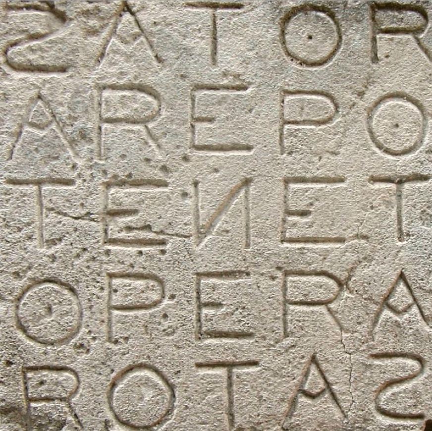
When I see self-similar patterns, I wonder if there is some formulaic way in which they are generated, other than simply having a couple of letters in common, as might be the case with palindromic magic squares. I saw one pattern that included the phrase ARAPS IASPER SCRIPT, which immediately reminded me of the famous SATOR/ROTAS square.
SATOR/ROTAS palindromic square [courtesy of M Disdero via Wikipedia, photo taken at Oppede, Luberon, France]
Many people are familiar with this square. It comes from ancient times and is frequently in books of magic, as with the Trinity example above.
Sometimes the square is omitted to show just the letters, as in the following incantation to influence friends in The Clavicle of Solomon, MS Sloane 3847. Note also the names of the three wise men, which were in MS Wett 4 pictured earlier, a variety of biblical names, and the four evangelists:
S. Sator, arepo, tenet, opera, rotas, Ioth, heth, he, vau, y. hac, Ia, Ia, Ia, papes, Ioazar, anarenetõ nomina sancta ad implete votum Amen. Baltazar, Iapher, Melchior, Abraham, Isaac, et Jacob, Sydrac, Misaac et Obednego, Marcus, Matheus, Lucas, Johannes, Ioron, Sizon, Tiris anfraton, adestote omnes in adiutorium ut a quacunque creatura voluere possim graciam impetrare.
Have you ever played with the letters in the SATOR/ROTAS square to create other words? For example, I noticed that PATER NOSTER (Our Father) can be constructed, and Pater Noster is also common in charms.
This made me wonder if charm sequences similar to ARAPS IASPER SCRIPT (ones whose origins are harder to identify) were loosely based on the SATOR idea. For example, something like this (I created this in a couple of minutes, so it’s not elegant, but it’s good enough to get the idea across).
Letters in this palindromic square can be picked out to generate the words ARAPS IASPER SCRIPT. To the medieval mind, perhaps they carry some of the “power” that comes from a palindromic square. Sound-similarity occurs almost by default when the character set is small.
Thus, I became suspicious that magic squares might have been used to generate a subset of charm words that are harder to fathom, and then I found this…
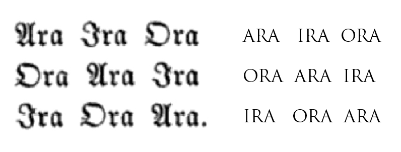
Abracula appears abbreviated as Abrac in Abrac Abeor Abere in Peter of Abano’s Heptameron. And it is apparently also the basis of “Ara”, an abbreviation used in a magic square with the following components:
Note the similarity of Ara and Ora to “aror” on folio 116v of the VMS. The preponderance of “a” and “o” (and the proximity of an “r” shape) is also a characteristic of the VMS main text.
If a string of something that looks like nonsense syllables were derived from other words in the same charm, then self-similarity across several lines would be significant. Even though the sequence SIX MARIX MORIX VIX isn’t sound-similar to the rest of 116v, it is similar to words in charms.
Practical Magic
The following example incorporates sacred names and abbreviations (typically Agla, Amara, Tanta, and others) within a circular frame surrounded by boxed crosses:
Sacred abbreviations and names surrounded by boxed crosses, all within a circle. The circle was not just decorative—often it was intended to be drawn on the ground, with the practitioner stepping within the circle and onlookers (if there are any) either waiting outside the circle or standing within, as well. The format varied with the tradition and the purpose of the charm. [15th century, BSB Clm 849]
If it is included, the name of God is often written first. Sometimes it is written several different ways. Other times the name of God is expressly omitted or only partially written, as certain cultures have prohibitions about writing the name of God.
AGLA is not specifically a name of God, but like max + max + prax represents a shortened phrase that includes the name Adonay, a reference to God that is very often in charms. Other common names in charms are Eloym and Sabaoth.
If you see C + M + B or G + M + B, there is a good chance it stands for Caspar Melchior Balthasar. M + G + E would be Michael, Emanual, Raphael and M + M + L + I is Mathew, Mark, Luke and Iohn (John). Names are sometimes written out in full or partly abbreviated. If there is limited space, the archangels are often chosen over other angel names. Sometimes many angel names are included.
Variations on words for friendship or love were also common in charms to win someone’s affections (or to get a girl to lift up her skirts).
As mentioned above, this shield-shaped charm symbol has numerous abbreviations and, as examples have shown, it was very common for charms and remedies to include Greek and Hebrew letters.
Unfortunately, when words or phrases are distilled down to one or two letters, it becomes harder to interpret them unless you can find a similar charm with the words written out. In this case, it’s possible the “ab” on the top-left is abracula or abracadabra as these words appear often in charms (especially shield charms):
This shield shape is populated with crosses and numerous abbreviations. It’s possible the “ab” stands for abracula, but sometimes an entire common phrase will be distilled down to a few letters for each word (note that there is “and” symbol before the last word on the top side) so it’s also possible this is a religious or magical invocation (a full phrase or sentence). [Wellcome MS Misc Alchem XII]
Magical diagrams in an Arabic manuscript, with symbols common to middle-eastern talismans and incantations [Baldah Al-Jinn]
Western charms have much in common with ancient Mediterranean, Arabic, and Indic charms, many of which have been transmitted through manuscripts created by Jewish and Greek scribes. Invocations to God from the Qur’an are sometimes included in divinatory diagrams.
Pentagrams, circles, shields, triangles, stars of David, and other geometric shapes are commonly found in both eastern and western manuscripts. Also common to eastern manuscripts is a double rectangle, with the second rectangle offset, with eight loops at the point, a symbol for Earth. Western manuscripts also include these shapes, but tend to favor circles, shields, stars, and rectangles. Sometimes the strange shapes that accompany divinatory frames are corruptions of Arabic letters and western-Arabic numerals.
Figures composed of spidery lines ending in circles are common in books of Kabbalah, and often the names of angels are expressed this way, as well. Some of the western alchemy and astrology symbols have these characteristics, as well. Shapes that resemble EVA-t are natural variations of these kinds of patterns.
Sword and Soil
In medieval books of magic, drawing a circle in the dirt with a sword or stick is a frequent instruction, and incantations may be chanted from the edge or inner portion of the circle, depending on the specific kind of charm. The user is frequently directed to face east. If animals are used in the ceremony, they are usually sacrificed (and sometimes buried in a specific spot) or let free with the understanding that bad spirits will depart with the animal. The unfortunate Hoopoe, a beautiful bird that is fast declining, was a favorite sacrificial victim.
Often a young virgin boy was used to read the signs in water, oil, or other somewhat reflective surfaces. It was assumed that someone with enough youth and innocence would tell the truth. Often the boy was asked to reveal who had perpetrated a crime and people were gullible enough to accept the boy’s interpretation and to punish the “guilty”.
This may seem irrational and superstitious, but even respected 16th-century scholars like John Dee believed it was possible to “channel” information from other realms via a scrying mirror and a medium (in this case, Edward Kelley, who was neither young nor virginal).
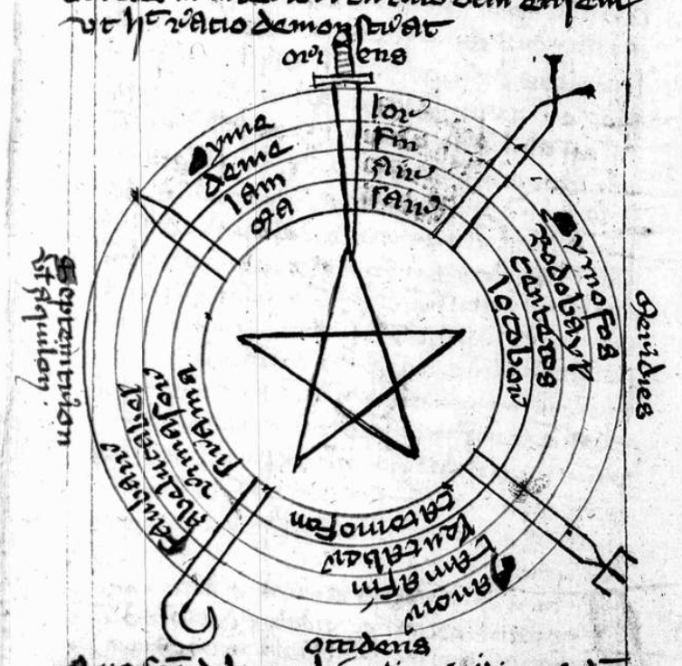
This example from a 15th-century manuscript (Clm 849) is circular, with a central star, five divisions, and a sword at the apex representing east (east was commonly shown as “up” in medieval maps and many magical diagrams). This is the general form of diagrams that were inscribed on the ground, sometimes with a real sword.
It was rare for books with diagrams like this to survive as they were actively sought out and destroyed by authorities. Sometimes just owning one of these books could get you imprisoned:
Instead of a figure, sometimes the words or letters for alpha and omega are written in the inner circle. In BL Sloane 3648, the central circle includes pentagrams with ADONAI written in each outer triangle and alpha and omega split across them on either side:
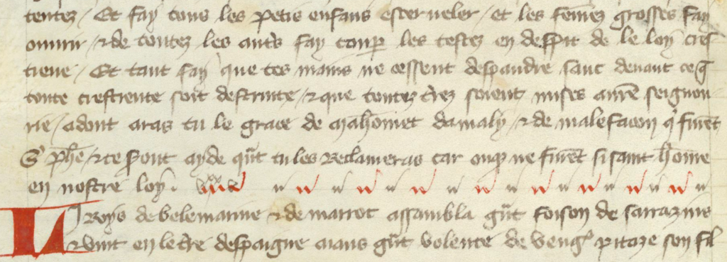
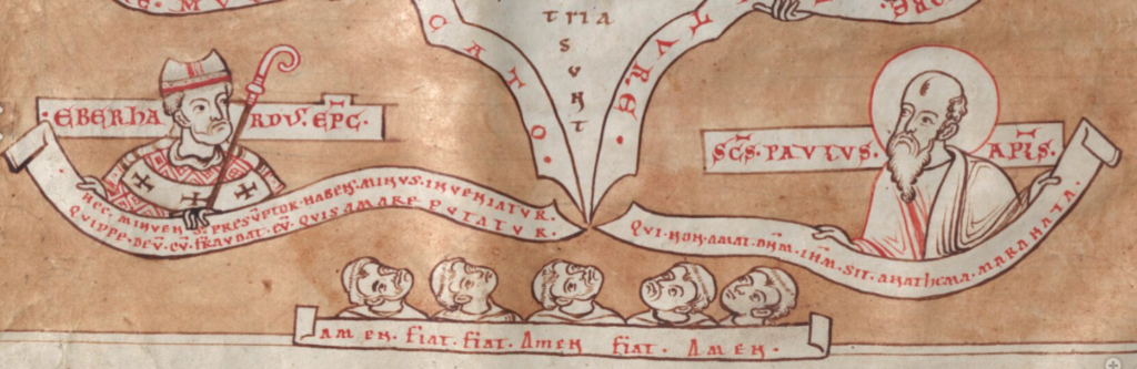
As mentioned earlier, charm words are often in groups of three with sound similarity. Sometimes the words are identical, as in Amen, Amen, Amen, or Fiat, Fiat, Fiat.
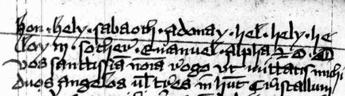
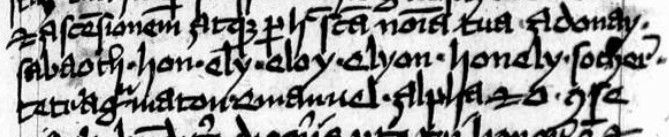
Sometimes they vary only slightly. Frequently the second and third words are only one or two letters different from the one that came before, as in Adra Adrata Adratta, or Adra Adrata Adracta, or one I see quite frequently, Hel, Hely Heloy (sometimes written Hely, Heloy, Heloe, Heloen or Helion, Heloi, Hel), or the variant shown here as Ely Eloy Elyon:
Holy names such as Sabaoth, Adonay, and Emanuel, and repetitious chants such as Hel, Hely, Heloy or Ely, Eloy, Elyon, are commonly found in books of divination, and in charms and remedies written in margins and flyleaves of manuscripts. [Source: BSB Clm 849, c. earlier in the 15th century]
I want to emphasize this because self-similar patterns are quite frequent in the main text of the Voynich Manuscript and I don’t think auto-copying is the only possible explanation. Before I post examples, I want to cover one more thing in folio 116v…
Names in Charms
In classical charms, a reference or invocation to Pagan heroes or gods was common. After Christianity became prevalent, the format remained essentially the same, but Hebrew and Christian names for God, angels, and the virgin Mary were often substituted, or shared space with older names whose origins were no longer known.
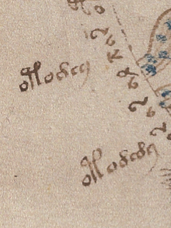
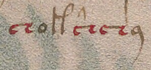
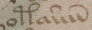
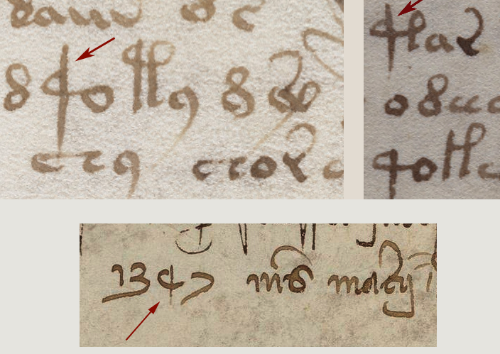
The second line of 116v has a word that might be “cere” which might be a Pagan reference to Ceres the goddess of crops and fertility, but there’s not enough information to know.
The next line includes the word maria with crosses on either side (which I mentioned in 2013 might be the sign for genuflection), and there is one that looks like it was inserted as an afterthought between the a and the r. This is quite possibly an invocation to the virgin Mary:
The word before “maria” is harder to discern. It looks like ahia, but the “i” is oddly written and the last stroke of the h is oddly abrupt and slightly truncated. It’s almost like an h badly melded with a k. It’s not quite a “b” (there is no bottom cross-stroke).
But let’s investigate the plausibility of ahia. This could be a reference to the prophet Ahia in the Biblical Book of Kings, who is best known for his prophesy that Jeroboam would be king. If the text on 116v is a medical charm, then Ahijah/Ahia/Ahiya would be an appropriate name, as Ahia the Shilonite was called upon in the Bible to be an intermediary between mortals and God in much the same way as Mary is asked to intercede on behalf of mortals in distress.
How Does This Relate to the VMS?
Patterns of repetition, in which subsequent tokens are only slightly different from preceding ones, are very prevalent in the VMS, but most of them are sequences of two (these can be found throughout the manuscript).
There are also dual and triple repeats with no apparent changes:
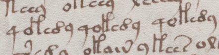
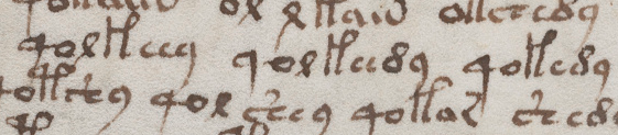
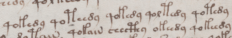
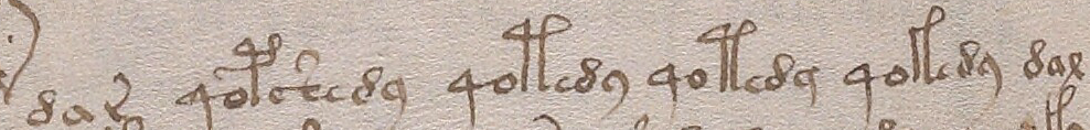
Are there sequences of three where the variation is limited to one character each time? A further example from folio 79r comes close, except that the third repetition has two changes, thus qolkeey qolkeedy qokedy:
This example, from the following folio might appear to be a sequence of five (with only one change in each), except that the differences in EVA-t and EVA-k create two changes rather than one:
Here’s a similar sequence with dar and dax at beginning and end and four very similar tokens in between:
There’s no rule in charms that limits changes to only one letter, but when studying an unknown text like the VMS, if you give yourself too many degrees of freedom, you may be biasing your results. It’s usually better to examine simple changes first and, depending on what they reveal, go from there.
What we frequently find in the VMS is sequences where two glyphs change from one to the next. What is especially interesting about these sequences is that the characters that create two changes rather than one are often EVA-t and EVA-k.
The word oladaba8 on 116v is similar to some of the variants on abracadabra. Here is a full phrase found in Grimoires:
ala drabra ladr[a] dabra rabra afra braraagla et alpha omega
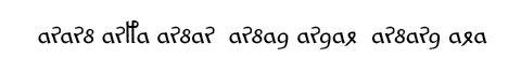
Now if we take the first part (before the readable part that says “agla et alpha omega”) and reverse it (something that was frequently done with magical words), we get
ararb arfa arbar arbad ardal arbard ala
If we substitute VMS characters with similar shapes, we get something close to Voynichese:
It’s not legal Voynichese (it’s too repetitive, there are other ways it could be substituted, and it breaks a couple of rules), but it shows some provocative similarities between Voynichese and charm sequences that are difficult to find between Voynichese and natural languages.
A French book of medicine from the early 19th century mentions both abracadabra and its reverse arbadacarba. In turn, if you break up arbadacarba into ar sa da 8ar sa (or something along those lines), the similarities to VMS components are more evident.
Remember the reduction charms I mentioned at the beginning? Where a charm word is broken down into smaller and smaller bits? Here is another interesting sequence in the VMS:
No, it’s not exactly the same in terms of which letters are dropped, but the way it diminishes is more similar to charm reductions than it is to the way sentences are usually constructed. Reduction-style charm sequences don’t follow hard-and-fast rules, just general guidelines (note that these patterns are more prevalent in some sections of the VMS than others).
Summary
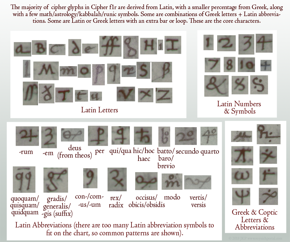
There are not enough VMS glyphs with talismanic shapes to prove a connection to books of kabbalah or western magic. There’s only one (EVA-t) that is not easily found in the Greco-Roman scribal repertoire. My research tells me that most VMS glyph-shapes are the same shapes as Latin letters, numbers, and abbreviations (with a few that resemble Greek).
Also… to suggest that the VMS is full of enciphered charm words would be to ignore line-complexity, and the great variety of sequences that comprise the text. It’s possible that VMS patterns are generated in another way and similarity to charms is coincidental.
But there are portions that resemble charms in terms of pattern, repetition, and successive lengths of tokens, so perhaps some parts of the manuscript were inspired by incantations or charms. The only way to find out is to study them to see where and how often they occur.
A week ago I posted commentary on Gerard Cheshire’s “proto-Italic ” and “proto-Romance” solution for the VMS. At the time, his most recent paper was pay-to-view, so I had to restrict my comments to the previous open-access paper. Now the most recent version is open-access. Unfortunately, not much has changed from the previous version. You can see his April 2019 proto-Romance theory here.
What exactly do the terms “proto-Romance” and “proto-Italic” mean?
Proto-Romance
If you search for “proto-Romance”, you will find many references to
“vulgar Latin” (also called colloquial Latin)—variations of Latin spoken
by the common people (most of whom were illiterate) during the
classical period of the Roman Empire.
The “classical period” of the Greeks and Romans spanned approximately
14 centuries up to about 6th century C.E. when the Roman Empire was no
longer dominant. As Rome lost its grip, vernacular languages and local
versions of Latin had the opportunity to evolve into modern languages
such as Italian/Sardinian, Spanish, Portuguese, French (with Gaulish
influence), and Romanian.
Extinct Languages and Undocumented Scripts
The prefix “proto-” comes from Greek πρωτο-. This refers to the first, or to something that comes before. So proto-Romance means before the Romance languages had fully emerged (from vulgar Latin), and proto-Italian script means an alphabet that was used before the script that became standard for writing medieval Italian. Medieval Italian script is essentially the same alphabet we use now except that the letterforms are more calligraphic than modern computer users are accustomed to seeing.
This brings us back to Cheshire, who is claiming that Voynichese is an extinct proto-Romance language in an undocumented proto-Italian script… something that existed about 1,000 years before the creation of the VMS.
How is that possible when the radiocarbon-dating and many of the iconographical and palaeological features of the VMS point to the early 15th century?
Cheshire’s Interpretation of Medieval Characters
Cheshire’s descriptions of individual glyphs, and his interpretations of the annotations on folio 116v, suggest that he is not familiar with medieval scripts.
It also seems that he hasn’t studied the frequency or distribution of the Voynich glyphs in the larger body of the main text, because he associates common letters and letter combinations with glyphs that are rare, or that have unusual positional characteristics. This point is so important, it bears repeating… Cheshire assigned substitution values for common letters to rare VMS glyphs, or glyphs that have positional characteristics that are not consistent with Romance languages.
Is it possible he never tested his system to see if it would generalize to larger chunks of text? Did he prematurely assume he had solved it?
Let’s look at some examples…
Cheshire’s Analysis and Transliteration of Voynich Glyphs
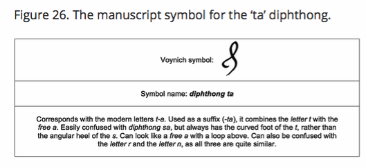
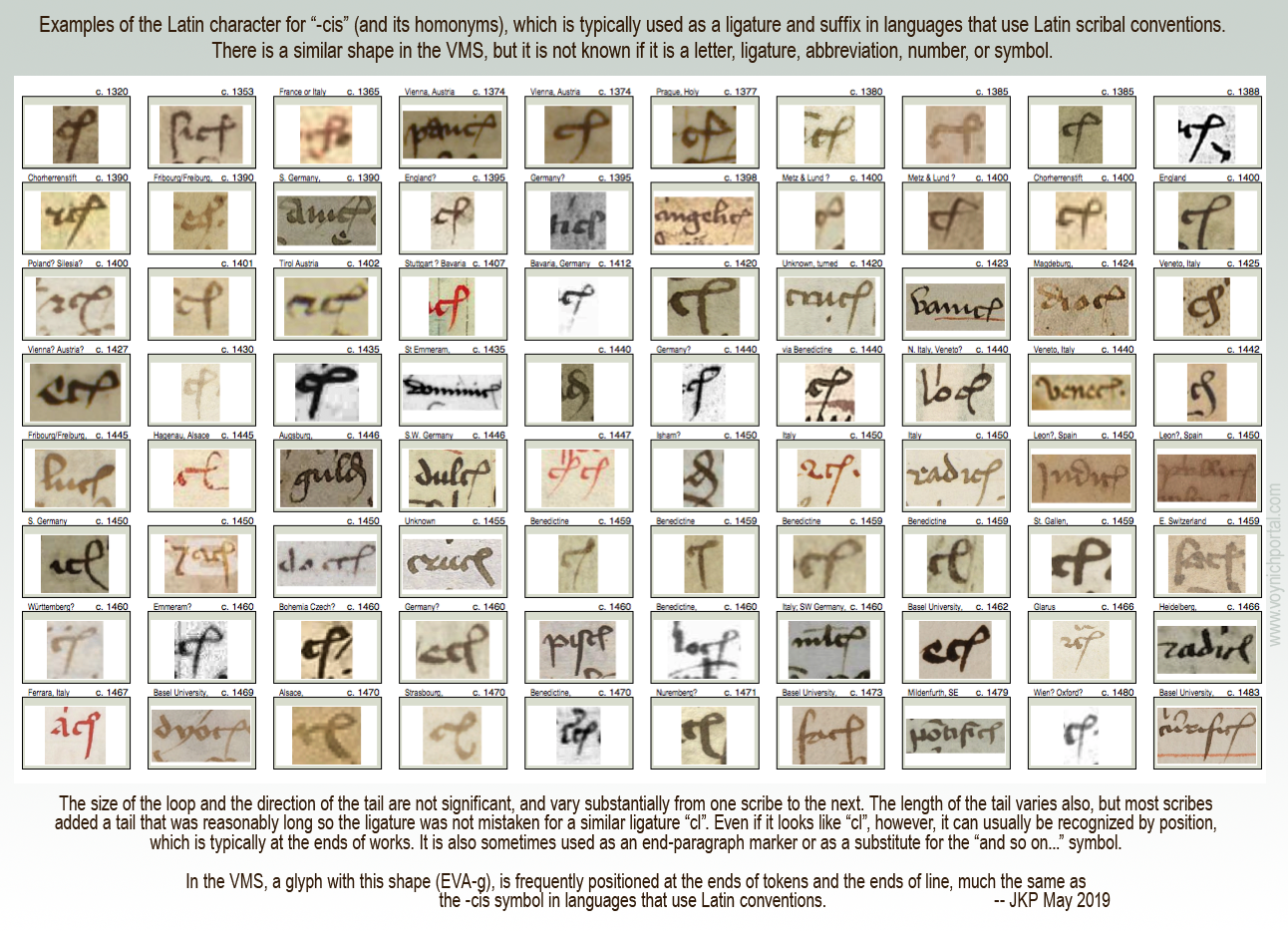
In his first example, Cheshire takes a glyph-shape that is known to palaeographers as the Latin “-cis” abbreviation (the letter c plus a loop that usually represents “is” and its homonyms). This shape is both a ligature and an abbreviation in languages that use Latin scribal conventions. It has not yet been determined what it means in the VMS, but its positional characteristics are similar to texts that use the Latin alphabet.
VMS researchers know this shape as EVA-g.
Cheshire transliterates it as a “ta” diphthong. It’s not a diphthong. A diphthong is a combination of two vowel sounds and “t” is clearly not a vowel. The terminology is wrong.
He then gives an explanation of the shape that doesn’t mesh with medieval interpretations of letter shapes. This is figure 26 from his paper (Source: tandfonline):
To say that this can be confused with the letter r and the letter n makes no sense to anyone accustomed to reading medieval manuscripts. It looks nothing like r or n. If Cheshire means it can be confused with his transliterated r or n, he should clarify and provide examples.
To get a sense of how this character was used in the medieval period, I have created a chart with examples of the “-cis” ligature/abbreviation that was common to languages that used Latin scribal conventions. I have sorted them by date.
This is not to imply that the Latin meaning and the VMS meaning are the same. The VMS designer may only have borrowed the shape, but it is important to note that the position of this glyph in the VMS is very similar to how it is positioned in Latin languages:
More important than the mistakes in reading medieval characters and linguistic terminology is that Cheshire did not address the basic statistics of VMS text and the fact that this glyph occurs primarily at the ends of words and sometimes the ends of lines. Thus, transliterating EVA-g as “ta” is highly questionable.
Perhaps Cheshire can justify this mismatch between letter frequency and position by saying that separate glyphs also exist for “t” and “a”, but when you put the various transliterations together, one finds that the character distribution of Romance-language glyphs and Cheshire transliterations are significantly out-of-synch.
For example, as in his previous paper, he chose one of the rarest glyphs in the VMS repertoire (EVA-x) to represent the letter “v”. In classical Latin and Romance languages, the letters “u” and “v” are essentially synonymous and very frequent. In this brief excerpt in modern characters, from Pliny the Younger, note how often u/v occurs:
If Voynichese were a proto-Romance language (some form of classical vulgar Latin), and EVA-x were transliterated to U/V and also F/PH, as per Cheshire’s system, one would expect to see this character more than 40,000 times in 200+ pages. Instead, this character occurs less than 50 times. That alone should create doubt in people’s minds about Cheshire’s “solution”.
So what has Cheshire done? He has assigned a different letter to represent “u”, but we know that in classical Latin, Etruscan, and Old Italic, “v” and “u” did not represent different letters even if both shapes were used (which they usually weren’t).
Even in the Middle Ages, when there were different shapes for “u” and “v”, most scribes used them interchangeably. In other words, “verba” might be written with the “v” shape in one phrase and with a “u” shape (uerba) in the next, just as “s” was written with several different shapes (without indicating any difference in sound).
This is the 23-character Latin alphabet in use around the time vulgar Latin was evolving into Romance languages:
Perhaps Cheshire didn’t know that they were interchangeable shapes rather than two different letters when he created his transcription system. But if he did know, if he actually believes that “u” and “v” were distinct letters in proto-Romance languages, he will have to provide evidence, because historians, palaeographers, and linguists are going to be skeptical.
Beginning-Paragraph Glyphs
Voynich scholars have noticed there are disproportionate numbers of
EVA-p/r and EVA-t/k characters at the beginnings of paragraphs. There is
a possibility that some are pilcrows, or serve some other special function when found in this position.
Cheshire doesn’t appear to have noticed this unusual distribution (at least he doesn’t comment on this important dynamic in his paper) and translates the leading glyph in the same ways as the others. In his system, a very large number of paragraphs inexplicably begin with the letter “P”.
Some of his translations cannot be verified. For example, he used a drawing on f75r to demonstrate a single transliterated word “palina” on f79v. There’s no apparent relationship between them (other than what he contends), so how does an independent party determine if the translation is correct?
Tenuous Assertions
On f70r, he uses a circular argument to explain the transliteration of “opat” (which he says is “abbot”). He says the use of “opat” indicates “that proto-Romance reached as far as eastern Europe” because “opát survives to mean abbot in Polish, Czech and Slovak”.
We don’t need a dubious transliteration to tell us that proto-Romance languages reached eastern Europe. The existence of Romania demonstrates this rather well—it borders the Ukraine, and used to encompass parts of Bohemia. Bohemia included Hungary, Czech, and parts of eastern Germany, so transmission of vulgar Latin to Polish through Czech was a natural process.
Palaeographical Interpretations
There are problems with the way Cheshire describes the text on folio 116v. He refers to the script as “conventional Italics”. It is, in fact, a fairly conventional Gothic script, not “conventional Italics”.
Then he makes a strange statement that the second line on 116v is hybrid writing, that it is Voynichese symbols mixed with “prototype Italic symbols, as if the calligrapher had been experimenting with a crossover writing system”. It’s hard to respond to that because his statement is based on misreading the letters. Here is the text he referenced in his paper:
Cheshire interprets this as “mériton o’pasaban + mapeós”
He misread a normal Gothic h as the letter “r” and a normal Gothic “l” as the letter “P”. In Gothic scripts, the figure-8 character is variously used to represent “s”, “d”, and the number 8, so it’s very familiar to medieval eyes, but he doesn’t seem to know that and interpreted it as a Voynich character that he transliterated to “n”.
If his reading of the letters is wrong, then his transliteration is going to be wrong, as well.
Zodiac Gemini Figures
Cheshire mentions the Gemini zodiac figures (the male/female pair), and states: “Both figures are wearing typical aristocratic attire from the mid 15th century Mediterranean.”
It takes research to determine the location and time period for specific clothing styles—it’s not something people just automatically know. Since Cheshire didn’t credit a source for this reference, I will. It’s possible he got the information from K. Gheuen’s blog.. Even if he didn’t, Gheuen’s blog is worth reading.
Flora and Fauna
I’m not going to deal with Cheshire’s fish identification. It’s just as dubious as the Janick and Tucker alligator gar. There are fish that are more similar to the VMS Pisces than Cheshire’s sea bass, and pointing out the fact that sea bass has “scales” is like pointing out that a bird has wings.
I was hopeful that Cheshire’s latest paper would be an improvement over his previous efforts, but I was disappointed.
Summary
It’s possible there is a Romance language buried somewhere in the cryptic VMS text (it was, after all, discovered in Italy, and the binding is probably Italian), but that is not what Cheshire is suggesting. He’s saying it’s an extinct proto-Romance language, without providing a credible explanation of how this information could have been transmitted a thousand years into the future.
There is a relentless publicity campaign going on right now to catapult Cheshire into the limelight. I’m not going to repeat the claims in the news release (they’re pretty outrageous), but even Superman would blush at the accolades being heaped on this unverified theory.
When I checked Cheshire’s doctoral research, I discovered it was in belief systems. Somehow that seems fitting.
Postscript 16 May 2019: The University of Bristol has retracted the Cheshire news release. You can see the retraction here for as long as they decide to make it available.
You may remember an announcement by Gerard Cheshire that he had found a proto-Italic solution for the VMS. There was no corroboration for his theory by any of the scholars who are well-acquainted with the text and, to date, I haven’t seen Cheshire provide an objective verifiable solution.
He has now completed his Ph.D. and is making a bold and possibly proposterous claim that he solved the Voynich Manuscript shortly after discovering it and that his so-called solution “was developed over a 2-week period in May 2017” [Tandfonline.com 2019 Apr 29].
Who would claim to solve the VMS and then post a series of papers (Jan. to Apr. 2018) based on a few isolated sections that do not provide a convincing solution? Proposing that it is an extinct language is no more valid than any other VMS theory.
Since I am not willing to pay $43 (or even $4) to download the current version of his paper, I will restrict my remarks to the last of the previous papers, dated April 2018, which I only just read for the first time today (the link to Cheshire’s paper redirects from The Bronx High School of Science student newspaper’s site to sites.google.com).
Cheshire’s “Linguistic Dating” Theory
In the introductory section Cheshire states, “…in this regard, manuscript MS408 is ‘manna from heaven’ to the linguistic community, as it offers the components necessary to compile a lexicon of proto-Romance words, thanks to the accompanying visual information.”
He then claims that his “proto-Italic alphabet is shown to be correct, so we know that the spelling of the words is also correct, even if unknown”, and then goes on to say that pages without illustrations “will, of course, be more of a challenge…”
Besides the dubious claim that the “proto-Italic alphabet is shown to be correct…”, I’d like to point out that most VMS folios include illustrations. If you can decipher 200 pages with help from illustrations, then the ones without shouldn’t be too difficult, considering that Voynichese is reasonably consistent from beginning to end.
Cheshire then claims labels are easier to interpret (personally I haven’t seen anyone translate the labels in any verifiable way, but let’s continue):
“The longer sentences are filled with conversational connectives, pronoun variants, singular-plural terms, gender specifics and so on, that make it necessary to identify the unambiguous marker words and then make sense of the equivocal words by a process of sequential logic.”
This stopped me in my tracks. One of the characteristics of the Voynichese that truly stands out is the similarity and repetitiveness of beginnings and endings. How can one identify singulars, plurals and gender specifics in text where the beginnings and ends appear to be stripped of their diversity? I guessed that Cheshire must be either shuffling spaces or breaking up tokens (or both).
The 9-Rotum Foldout as Example
To demonstrate his claim that the VMS uses a proto-Romance language and proto-Italic alphabet, Cheshire presents a partial analysis of the 9-rotum foldout folio, which he refers to as the Tabula regio novem.
He claims the correlations, “…are beyond reasonable doubt in scientific terms. Most of the annotations are translated and transliterated with entire accuracy…”
Another bold claim that doesn’t live up, in my opinion. But let’s look at his analysis…
Cheshire identifies Rotum7 as a volcanic eruption. I think this is possible, based on visual similarity alone, and others have suggested this possibility. However, it could just as easily be an image of mountain springs (the source of water) or a river delta as it spreads out in an alluvial fan or… something else.
So how does Cheshire support his claim?
Rotum7 Translation
Cheshire transliterates the text around the circumference as follows [I’ve added a Voynichese transcript to make it easier for readers to compare them and to see how Cheshire has broken up VMS tokens to create “words”]:
om é naus o’monas o’menas omas o’naus orlaus omr vasaæe or as a ele/elle a inaus o ele e na æina olina omina olinar n os aus omo na moos é ep as or e ele a opénas os as ar vas opas a réina ol ar sa os aquar aisu na
Note that EVA-ot is alternately translated as part of a word or as a separate letter with apostrophe to separate it from the following chunk. The breaking of words in various ways is, of course, subjective interpretation, and would have to be verified by testing the more common divisions on larger chunks of text.
Cheshire translates the above passage as follows:
people and ship in unity take charge mothers/babies of ship to protect life-force pots [he says this is pregnant bellies] yet in he/she at inauspicious/unfavourable he/she is in a/one omen to look it is man not mouse epousee and embrace an opening thus you go but carefully to the queen to facilitate not getting wet with seawater
So before we look into the details of the translation, this supposed narrative seems to me to relate more to river basins and seaports than it does to volcanoes. Cheshire’s contention that this text helps pinpoint the location and time period of the VMS’s creation via a volcanic eruption can definitely be challenged.
But let’s look at the interpretation. Here are some observations:
Cheshire has chosen a rare character to represent f/ph, and u/v. Less than 50 instances of one of the most common letters in Latin and Italian in c. 38,000 words of text is hard to believe. In classical Latin versions of Ovid’s Metamorphoses, the u/v character would occur about 15,000 times in 38,000 words (that’s not even including the f).
There’s no word “inaus” in Latin, Italian, French, or Spanish (in fact, it’s more Germanic than Romance), so Cheshire has expanded it to mean inauspicious via Latin inauspicatus. Presumably he feels it’s acceptable to subjectively choose which tokens might be truncated.
Obviously Cheshire is using variations of “om” to mean homo/people, thus om (people) omas (mothers/babies), omo (man), but he chose to interpret “omenas” as o’menas (take charge) rather than as om enas (people swim). People swimming is arguably more consistent with the surrounding subject matter. This illustrates that his interpretation has a strong element of choice. I’m not even sure why o’menas would mean “take charge”.
Some of the translation seems rather nonsensical and hard to relate to volcanoes, such as “to look it is man not mouse and marry and embrace an opening thus you go carefully to the queen to avoid not getting wet with seawater”. Consider that “aisu” is neither Italian nor Latin and the grammar is seriously questionable.
I’m not sure why Cheshire seguéd to Persian for “moos” (mouse). Moos is an acceptable alternate spelling for “mus” in western languages. Perhaps it was to justify his choice of Persian to explain another word “omr” which has no equivalents in Romance languages. Going to non-Romance languages when a word doesn’t fit his theoretical framework introduces yet another level of subjective interpretation.
The choice of phrase-breaks is clearly also subjective. Cheshire separated “opénas” from “os” even though they go together better than combining “os” with the following phrase. The word “opénas” itself is questionable—it’s not likely to be expressed this way and it could be interpreted quite differently as a penalty, punishment, or even as sympathy.
Overall, there is only a vague coherence to it, one that does not evoke thoughts of volcanoes, and one that makes little grammatical sense.
In his summation of the text, Cheshire does not explain why text unrelated to volcanoes would confirm that the Rotum7 IS a volcano and avoids any explanation of why marriage and the queen would be included.
Confirmation Bias?
In the next section Cheshire identifies the symbol bottom-left as a compass (I personally think it looks more like a sextant, which was used for surveying as well as navigation, but I’m not sure what it represents). His transliteration is “op a æequ ena tas o’naus os o n as aus[pex]”, which he translates to “necessary to equal water balance of ship as it is propitious”.
A compass doesn’t really have anything to do with a ship’s water balance (and doesn’t relate to volcanoes either) and I would like to know why he says “op” means “necessary” when the root “neces-” is common to all major Romance languages. In Romance languages “op” is more likely to equate to “work/produce” than to “necessary”, and once again the grammar is abnormal.
From these two pieces of “translation”, Cheshire takes a logical leap that only two volcanoes might be plausible for Rotum7: Stromboli and Vulcano and states:
“…Vulcano is known to have erupted very violently in the year 1444, which corresponds with the carbon-dating of the manuscript velum: 1404-1438.”
He further translates the Rotum7 inner annotations as “of rock, both directions, not so hot, veers here, it twists, reducing, it slows, middling/forming, of rock it is”.
This could describe mountain springs (the source of water) just as easily as a volcanic eruption. I’m not denying that Rotum7 might be volcanic flow, it’s on my list of possibilities, only that Cheshire’s argument is not as definitive or scientific as he claims. Also, I would like an explanation of how he turned “oqunas asa” into “both directions”.
Origins of Glyph Shapes
Cheshire has this to say about VMS glyph shapes:
“…the symbol is an inverted v with a bar above. It seems to derive from the Greek letter Pi in lowercase (π),…”
I disagree. Pi was rarely written like EVA-x in medieval manuscripts. However, alpha and lambda are sometimes written this way, including Greek, Coptic, and old Russian scripts (I have collected many samples). I think it’s unlikely that EVA-x is based on the shape of Pi.
Rotum7 Side Labels
I can’t go through every translation point-by-point, but if you are reading along, on page 7 of his paper, you’ll notice Cheshire inserted the word “lava” many times when it wasn’t part of the translation. I don’t know if he was trying to convince us or himself.
Note that in two places, he translated “omon” (EVA-otod) as lava. Now take a look at this:
Cheshire translates EVA-otodey as omon ena and EVA-otody as omon ea. In his system, this translates to “lava largest” and “lava smaller”. If this system were applied consistently throughout the manuscript then we are looking at root-suffix constructions, with EVA-ey as largest and EVA-edy as smaller. This has significant implications for interpretation of the rest of the text but Cheshire didn’t address this.
If you’ve been paying attention to the translations, you might have noticed certain inconsistencies. Cheshire presents omo as people/humans and omon as lava, and now omona as “big man” (it’s not hard to follow the logic) but does not explain why these words would occur in other places in the manuscript where the context does not seem relevant. He also inserts increasing levels of subjective interpretation to explain the “story” behind the rosettes folio and asserts that Rotum8 depicts emergency refuge from the eruption and Rotum 9 is emergency relief in the form of free bread on tables.
Summary
As for the letters “o” that occur so frequently at the beginnings of words, Cheshire variously interprets them as conjunctions and articles. I’m not going to argue with this because I think it’s possible the over-abundant leading-“o” glyphs could have a special function as markers or grammatical entitites, but even with this flexibility, Cheshire’s grammar falls apart upon inspection. Even notes and labels usually exhibit certain patterns of consistency, that are not readily apparent in the translation.
I’m also not going to argue with the choice of location for these volcanoes (if they are volcanoes), because I’ve considered the Naples area many times, have blogged about it, and it’s still on my list of favored locations.
But I have trouble accepting the translation in its current form because
there are a lot of nonsensical word combinations,
there’s almost no grammar,
the letter distribution is quite different from Romance languages (it would take a whole blog to discuss this aspect of the text, but take 4 as an example, which almost exclusively is at the beginnings of tokens—Cheshire relates it to “d”, and “9” which is usually at the end and sometimes at the beginning, but almost never in the middle, which he designates as “a”),
the words still match the drawings if the drawings are interpreted differently (which means the relationship isn’t proven yet),
some of the transliterated “words” don’t show any relationship to Romance word-structures (and the author neglected to explain how specific non-Romance words were derived), and
the same words (e.g., “na”) are sometimes interpreted differently.
If Rotum7 turns out to be flows of water, rather than flows of lava, Cheshire’s arguments about time period and location are seriously weakened. Even if it turns out to be lava, the problems with the translation have to be addressed, because it seems more relevant to water than it does to lava.
Consider also that Cheshire’s word “naus” (EVA-daiin) is translated as nautical vessels, but the author doesn’t explain why this exceedingly common Voynich chunk, that is usually at the ends of tokens, would occur in almost every line, and sometimes more than once per line, throughout the manuscript.
Cheshire hasn’t given a satisfactory explanation of why a mid-15th-century scribe would use an undocumented proto-Italian script from c. 700 C.E. or earlier.
And let’s be honest, the translations are semantically peculiar. The human mind is designed to construct meaning from small clues, to fill in the gaps, so it’s easy to read meaning into almost any collection of semi-related words, but it’s very difficult to confirm anything that doesn’t quite hold together in normal ways.
There are two pattern groups in the VMS that could be related, maybe. They have traits in common that might help us understand Voynichese.
I’ve blogged about double-cee shapes (EVA-ee), but felt it would be too long if I included relationships between cee patterns and the more familiar aiin patterns, so I’ll continue the discussion here…
The Double-Cee Question
As I’ve posted before, there are many places in the VMS where cee shapes (EVA-e) look like they might be joined. There are even places where double-cee and single-cee are adjacent:
I strongly suspect that double-cee (the one that is tightly coupled) is intended as one meaning-block.
In Visigothic manuscripts, the letter “t” was often written as a double-cee shape.
In early and mid-medieval manuscripts, a double-cee stood for “a”
In early and mid-medieval manuscripts, a superscripted double-cee stood for what we would call “u” (it was often next to a “q” character).
Thus, many scribes perceived tightly coupled cees as a unit.
Of course, nothing is easy with the VMS. Here is an example of overlapping cee-shapes next to ones that are separate. Do we interpret them as different or the same?
Note also how the bench joins with the row of connected cees, which brings us to the next point…
Is The VMS Deliberately Deceptive?
It’s very difficult to tell if the VMS is designed to deceive. Patterns like the following are hard to interpret.
Are the tails on these glyphs added to hide the length of a sequence? Or are they genuinely different glyphs?
In the same vein, are EVA-ch and EVA-sh cee-shapes in disguise? Could the cap on EVA-sh be yet another cee?
Here’s an example where two cee-shapes are topped with a macron-like cap (a shape that is usually associated with the benched char):
For that matter, is the 9-shape a hidden cee?
I don’t know for sure, but based on the behavior of the glyphs (in terms of position and proximity), I get the feeling (so far) that EVA-ch and EVA-sh might be related to cee-shapes, even if they mean something different (they frequently occur together), while EVA-y dances to a different drummer.
Positionality
Cee shapes frequently cluster in the middles of tokens, just as minim patterns are frequently at the ends, but are they somehow related? They are the only two groups of glyphs that repeat many times in a row.
These examples from f4v and f7v are provocative because they suggest that cee shapes and minims might be related. Rather than being word-medial, the cees on the right are word-final and have long tails from the bottom rather than the top:
Now, let’s examine the -aiin patterns…
Aiin not Daiin, and maybe not even Aiin
I think it was a big mistake for early researchers to cinch the idea of “daiin” in people’s minds. The aiin sequences are frequently (yes, frequently) preceded by glyphs other than EVA-d.
Stephen Bax wrote a paper in 2012 (revised Nov. 2013), in which he summarized one of the most common ideas for interpreting the glyph sequence called “daiin” (e.g., that it might mean “and”). Here is a quote and a link to the PDF file:
It is argued from this analysis that the element transcribed as ‘daiin’, the most frequently occurring item in the manuscript as a whole, is in fact a discourse marker separating out sense units, functioning like a comma or the word ‘and’, and analogous to the use of crosses in folio 116v.
First, let’s start with the crosses on folio 116v. There is a strong precedence in medieval manuscripts for including the plus sign in charms and medical remedies in places where the reader or speaker (or healer) genuflects. The plus sign is sometimes also used like “and”, just as we use it now (nothing new about that). However, I doubt that the plus- or cross-symbol on 116v is related to “daiin”.
Now back to the paper…
On page 3, Bax noted instances of word-final daiin, but he examined them out of context. He recorded instances of aiin that are preceded by EVA-d and basically ignored the other glyphs that precede -aiin in the same sample (as well as daii- that occurs at the beginning). I have marked the patterns that were not mentioned in red:
Studying the “daiin” pattern this way is like examining -tally patterns in English while ignoring related patterns like -ly, -lly, -ally, -aly, and -dly. He also failed to account for the fact that aiin is not a homogenous glyph pattern. It includes an/ain/aiin/aiiin and even sometimes iiin.
He further makes no mention of the tail patterns. If the length of the tail is meaningful then, like so many before him, Bax might have overestimated the frequency of daiin.
Tail Coverage
Most transcripts treat the many versions of daiin as if they are the same. They count only the number of minims (and they don’t always get that right). But there is another dynamic that gets little attention, and that is the length of the tails.
Tail coverage varies. Thus, a glyph with three minims might have three different versions of tail coverage and perhaps three different meanings:
Here is the text sample color-coded for different tail patterns, with green for one and red for two:
About half the instances of “daiin” look like dauv and the others look like daiw, if you pay attention to the length of the tail. They are not necessarily the same. If you include aiin sequences not preceded by EVA-d, it varies even more. Normally I wouldn’t consider tail length to be important. In Latin, the length of tails (a form of apostrophe or ligature) is pretty arbitrary. Some scribes lengthened the tail if more letters were left out, but this was not the norm. In the VMS, when you create a transcript and examine every token, tail-length feels deliberate.
Nick Pelling pointed out to me in a blog comment that there are dots at the ends of tails. I’m not sure I had noticed that (he’s right, there are). I had noticed the varying tail lengths. After Pelling called my attention to the dots it occurred to me that maybe the dots were to help the scribe accurately craft the length of the tail.
Tail lengths might turn out to be trivial rather than meaningful, but it’s still important to document their patterns as part of the research process. If they are significant, then vanilla-flavored “daiin” is not nearly as frequent as claimed.
Forget about the “d”…
Minim sequences don’t require EVA-d and don’t always need EVA-a. Here’s a minim sequence that stands alone (four minims with one covered, or perhaps three minims and another glyph entirely):
I think future research would be more fruitful if transcripts and descriptions of the text were more aligned with reality. Calling them minim sequences carries fewer assumptions than “daiin”.
Interpreting Minims
I’m not sure minim sequences are intended as separate characters. Just as some of the cee shapes look like they belong together as a block, the iii sequences do so as well. There are numerous instances where they resemble uiv rather than iiv.
In this example from folio 8r, a curved macron has been placed over two minims in aiiin (I prefer to call the shapes aiiiv rather than aiiin, but I’ll respect the existing EVA system for now). It is almost as though the scribe were explicitly associating two minims:
Maybe the cap is a macron in the Latin sense (apostrophe for missing glyphs), or maybe it’s a way to say, this is a “u” shape, don’t confuse it with “ii”. Note that there is a slight gap between the first “u” shape and the second (or between the “u” shape and the “iv” shape):
In this example from f8v, the first two minims resemble a “u” shape and are distinctly separated from the final glyph (which resembles “v” or “i-tail”, and yet there is a 3-coverage tail):
As for the length of the tail, in Latin it usually doesn’t matter, but there were a few scribes who pointed the tail at the particular spot where letters were missing (the tail is an apostrophe attached to the end so the scribe doesn’t have to lift the quill). What it means in the VMS is still a mystery.
Maybe progress in understanding the VMS is slow because many transcripts don’t include these details.
I have an enormous chart that documents these patterns, but it’s not yet finished and ready to interpret. This is only the merest snippet—part of the top-left corner:
Minims and Cee Shapes
This is getting long, so I’ll end with one last question (possibly an important one). Is there some connection between minims and cee shapes?
Minims are more frequently at the ends of tokens (but not always). Cee shapes more often in the middle. Both tend to cluster. Both have tails of varying lengths.
It’s fairly obvious that they both repeat, but I don’t know if anyone has offered a practical explanation (other than the possibility of Roman numerals). Here are examples that illustrate the similarities:
And here is an example that is particularly enigmatic. Is it EVA-ochaien or EVA-ocheiien or ochaiin or something else? Did the scribe slip and draw one of the minims as a cee-shape, or is this a uniquely structured token?
Here’s a chunk of cryptic text that looks like Latin at first glance, early Latin, in a 13th-century script. To read it, you need to remember a few things about old-style script…
In the early medieval period, they wrote letters differently…
“a” was written like two cees joined—”cc”,
“t” was small and round like a “c”,
“e” was sometimes written without a crossbar, and sometimes with a longer embellished crossbar,
the stem of the “i” sometimes had a slight curve, similar to the rounded “t”,
a common style of “r” had a long foot on the bottom (it almost looks like a square cee), and
roman numerals with several ones in a row or words with two “i” chars at the end, usually added a descending tail to the last one so it looks like a “j”.
I won’t keep you in suspense any longer. Here’s the cryptic text with a rough transliteration:
The transliteration doesn’t have to be perfect to demonstrate that there’s something a bit weird about this text.
What language is it? It looks vaguely like early medieval Latin, but the common words aren’t there, and it’s somewhat more repetitive than one would expect.
Is it another language expressed with Latin characters?
I’ll let you think about it before I provide further information.
I have written numerous times about Voynich “4o”, on my blog, on the forum, in comments on other blogs, but I have a feeling it needs to be done again because there may be misunderstandings about how the “4” glyph relates to others in Voynichese and to ciphers in general.
I’ve often seen Voynich researchers say that “o” usually follows “4” and, from a visual point of view that may be true but, in terms of understanding the VMS “4” character, it would be wiser to say that “o-tokens” are frequently prefaced by “4”. The idea that the “4” and the “o” are inextricably linked is not completely true and the idea that they are a unit, in essence one character, is not supported by evidence.
Does 4o Relate to Diplomatic Ciphers?
The diplomatic cryptography systems documented by Tranchedino are based on many-to-one and one-to-many substitution schemes, which means there are sometimes hundreds of characters per cipher system. The cipher on folio 1r of Diplomatsche Geheimschriften packs almost 340 glyphs into a single cipher system.
Think about that… 340 shape-combinations for a single cipher. This is in stark contrast to the VMS, which renders most of the text with 22 glyphs.
Diplomatic ciphers also coded names and common words into symbols and cipher pairs. For example, the cipher glyph for “Papa” is the Latin abbreviation symbol v + “-is”.
This creates a huge demand for shapes, but many were based on a core set. Here are the most familiar characters used to create the cipher system on f1r of Tranchedino’s collection:
It’s clear that Cipher 1r relies heavily on Latin letters, numbers, and abbreviations. Arabic and Hebrew letters (other than kabbalistic loops and lines) are conspicuously absent.
The straight and wiggly lines above some of the letters (not shown) are Latin macrons (the medieval version of the apostrophe). In fact, there are dozens of Latin abbreviations, too many to include on the chart. There is also a smaller percentage of Greek letters and abbreviations, and math/astrology/kabbalah/runic symbols. Sometimes Greek letters are combined with Latin endings (e.g., Greek letter theta + Latin “is” abbreviation), which is not uncommon in Latin texts.
The cryptographers created many new shapes by adding an extra line to a common shape. Or they would remove a stem or add a loop, as in these examples:
There are very few shapes that are pure inventions. Most are common shapes, combinations of common shapes, or common shapes altered in regular ways, as in the above examples.
So what inspired “4o” in diplomatic ciphers?
In Latin, it is a common convention to add a small “o” to represent words that end in “o” like “modo”, “quomodo”, “quo”, “libro”, “ergo”, “tertio”, or “quarto”. Latin abbreviations are also applied to homonyms, so go can also represent “gradu”. Thus, we have mo or mo (modo), go or go (ergo/gradu), quo or qo (quo), and 4o or 4o (quarto), etc., several of which are included in Cipher 1r.
One of the more common of these abbreviations, often seen in herbal manuscripts, is “gradu” (grade/degree). It is typically written like the character highlighted below-right.
This is highly abbreviated Latin, so I have transliterated it to make the ordinal number (tertio) and the “o” abbreviation (gradu) easier to see. Both are abbreviated in the same way. Note that the “g” has the “o” attached:
The abbreviation “o” can be placed in almost any position and still mean the same thing. It can be directly above the letter, superscripted to the right of the letter, or attached directly to the letter.
Diplomatic Cipher 1r includes abbreviations for “modo”, “secundo”, and “quarto” (4o). The 4o is not an invented shape. It is used to represent ordinal numbers in several languages.
Related Abbreviations
Here is an example of a related abbreviation (4or ) so you can see that this is a generalizable pattern. Even if you’ve never seen it before, you can figure out what it means because it is constructed in the same manner as mo, go, and 4o:
I chose this example for a second reason… it is written by two different scribes, one using the older form of “4”, the second using the newer. Note the “soft-4” (the older form) and the “sharp-4” (the one that became popular by the mid-15th century). In the VMS we see the “4” character written both these ways, and there is also an in-between shape that resembles “q” more than “4”:
This variability could have a number of explanations… different scribes, subtly different glyphs (possibly with different meanings), or scribes from the early 15th century who were transitioning to the newer form (I’ve seen foliation where the scribe changed the older rounded 4 to the newer one and then continued the rest of the numbers with the newer form, as though someone had told him to update the style).
Here is an example of how “quarto” was abbreviated in the 14th century, with the rounder form of “4” that was popular at the time:
The following examples, dating from the 14th and 15th centuries, illustrate how the shape of the four gradually changed from the rounded form to the sharper, more modern form. Note how the sharper form starts to show up in the late 14th century and is more frequent by the mid-15th century:
Is 4o one character or two?
In the VMS, “4” and “o” are strongly associated, just as “th” or “ly” are strongly associated in English, but I don’t see anything that points to them being one character. If you write t + h to create a “th” ligature, they are still two different letters. The same applies to 4 + o in languages that use Latin conventions—they are written together but still represent separate characters.
As I have illustrated in previous blogs, the VMS “4” glyph is not always followed by “o”. Sometimes it is followed 1) by other glyphs, 2) by a macron (which, if it were Latin, would indicate missing letters), or 3) by a shape that resembles a small Gothic “l” or the right leg of EVA-k or t:
Another picture I’ve posted before is the long-stemmed glyph that is similar to the “4”. Is it the same glyph or something different?
I’ve updated the sample by adding a date from a 14th-century manuscript that doesn’t completely answer the question but shows how diverse numerals could be in the Middle Ages. It’s not even clear if the marked letter is a 4 or a 9. It’s an oddball numeral that I’ve only seen once, yet it struck me as similar to the oddball character in the VMS, with a shorter stem but a similar swooped curve. At least we know from the context that it’s a number:
Is 4 a prefix that doesn’t require “o”?
There are many “o” words in the VMS and the “o” character sometimes stands alone. It’s possible “4” has an affinity for “o” words rather than “4o” being a character. Perhaps it’s a marker or modifier. Maybe it’s a number.
The 4 char has some interesting properties. It appears only once on f1v, yet is numerous on f3r. Voynichese is highly repetitive, but it’s not like homogenized milk, there are peaks and valleys, and 4 is not always at the beginning of tokens.
To really understand it, it has to be determined if sharp-4, round-4, and long-stemmed “4” represent the same thing, and it should be remembered that the “o” that follows “4” might relate more strongly to what follows than what precedes it.
Deprecated: ucfirst(): Passing null to parameter #1 ($string) of type string is deprecated in /home4/jensonje/public_html/voynichportal/VMSForum/.default on line 256