It’s a challenge to find paleographic matches to the VMS. I’ve been hunting for almost eleven years, sampled more than 50,000 characters from scripts that were similar to the marginalia or to the main text, and developed tools to more objectively compare scripts based on slant, heaviness, spacing (between letters and lines), and the individual shapes of each letter.
Evaluating the VMS main text is particularly difficult because some of the glyphs may not be letters, they may be symbols, numbers, or abbreviations, so I will describe the marginalia first, and then explain my strategy for locating scripts similar to Voynichese in a separate blog.
As a sideline, I also looked for matches to the column text on folio 1r, but it is not my primary interest, so I have presented it more simply as a chart, which you can see here.
Selecting the Marginalia
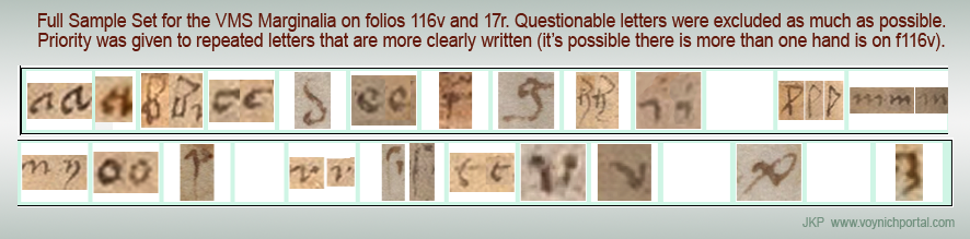
For sampling individual letters in the marginalia, I used these sections:
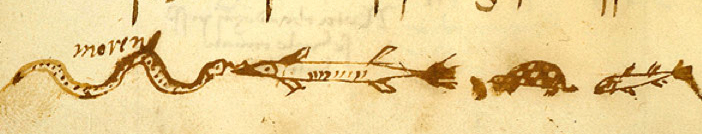
- The more consistent letter-forms on folio 116v (some shapes look like they might be in another hand, although it’s hard to tell, so I gave precedence to those that matched several times on the page rather than those that were questionable), and
- The strip of text at the top of folio 17r (which I believe is the same handwriting as most of the text on folio 116v):
![[pic of VMS 116v and 17r marginalia]](https://voynichportal.com/wp-content/uploads/2018/06/MarginaliaHand.png)
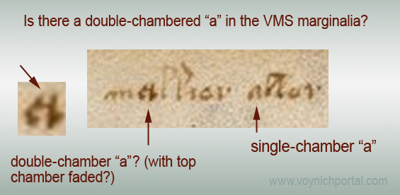
Note that I have doubts that the first letter of “valden” is a “v”. For one thing, no one wrote v like this in the Middle Ages (in more than 1,000 samples of text in a similar style, only one v comes close to the shape in “valsen”—this is an unusually low hit rate), but more importantly, if you look closely at the scans, you might notice traces of tails and letters under the last line (to see it you have to ignore the bleed-through from the other side).
Also, the part of the first letter that is visible is a close match to the top of other “p” shapes on this page, which makes me even more suspicious about this letter being “v”. Judge for yourself, here are some examples of common “v” shapes from the Middle Ages (keep in mind that “v” and “u” were used interchangeably in the Middle Ages):
![[pic of medieval letter u/v]](https://voynichportal.com/wp-content/uploads/2018/07/SamplesUV.png)
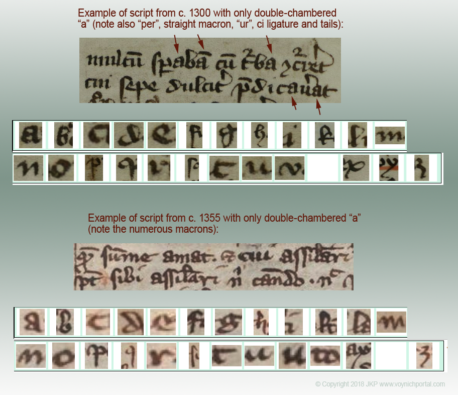
The “v” in “vix” is not common either, usually “v” was written with a curve, but this form is not rare, it is simply uncommon, so I have provisionally used this for “v”, but gave it lower priority than other letters that are written several times (and more clearly).
![[pic of V similar to VMS marginalia]](https://voynichportal.com/wp-content/uploads/2018/07/V-Pcompare.png)
First Impressions
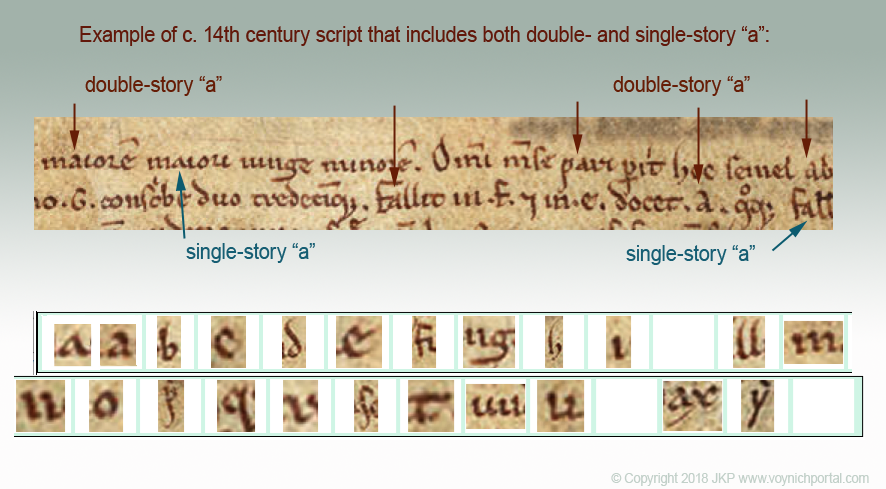
When I first saw the marginalia, it looked to me like hybrid text, Gothic with hints of both cursive and book hands (I’ll post details later). There are also hints of Italic/humanist hand (e.g., note the small, rounded, spaced-out m).
But… scribes and scholars moved around, so it’s hard to generalize, and there were blended scripts similar to the VMS marginalia in several multicultural areas, including 1) Lombardy, 2) the area encircling the Veneto, 3) some parts of Bavaria/Tyrol, and parts of 4) Alsace/Schwabia.
There’s no sign that the marginalia was influenced by Anglicana, but not all English scribes wrote Anglicana, some adopted the styles of St. Gall. It doesn’t seem as elegant as many of the Parisian scripts, but not all were elegant, and scholars brought many different writing styles to Paris, so… I tried to put my initial impressions out of mind as I searched for similar texts, because I didn’t want to narrow my search based on preconceptions. Thus, I searched digitized manuscripts from as many regions as possible.
Matching the Marginalia
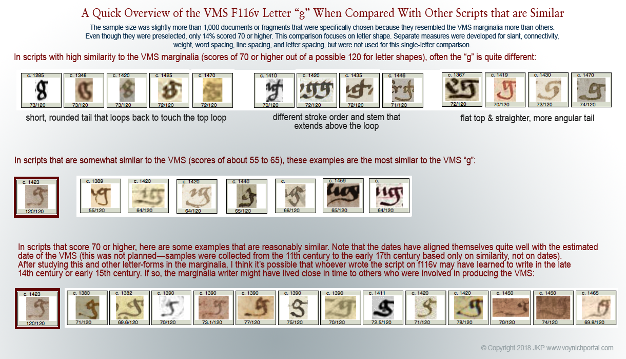
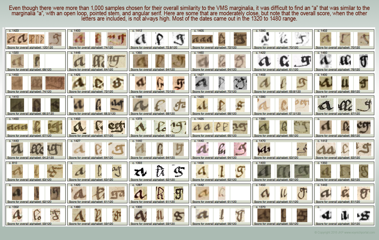
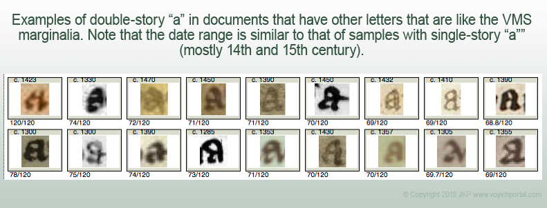
My only requirement for collecting a sample was overall similarity to the basic forms in the marginalia. These scripts tend to score 50 or higher. A really good score is 73 or higher.
Language didn’t matter and, for the most part, dates were ignored (I was hoping dates would fall naturally into place). In general, scripts scored as follows:
![[samples of Gothic text similar to the VMS marginalia]](https://voynichportal.com/wp-content/uploads/2018/06/SampleLevels.png)
I sampled the following characters:
- letters of the alphabet,
- common abbreviations, and
- words like leben/leber/lebe, maria, and vix, when I could find them, or similar words if I couldn’t.
A full sample was typically about 40 characters but not all source texts are long, some are marginalia or short dedications and thus were sampled for as many characters as were available. If the text was heavily abbreviated, I sampled most of the common abbreviations.
Scribes often used more than one shape for certain letters, depending on their position in the word, so I included terminal forms and forms with tails, but “character ratings” were only given to letters that specifically matched marginalia. The rest were evaluated separately.
Here are some general observations from approximately 1,000 reasonably close samples…
- Gothic cursive, book, and hybrid hands were common throughout Europe from the late 14th century until the early 16th century, so common that paleographers often have difficulty identifying place of origin.
- I was hoping for scores of 95 or better (out of a possible 120 for individual character shapes), but found it extremely difficult to find hands with totals higher than 75. I only have a few. There were a number of interesting finds in the 60 to 75-point range, however. Even if they didn’t match overall, there is some useful information that can be gleaned from individual characters that scored high.
- I was hoping high scores might help me geolocate the marginalia-writer’s origins, but many of the manuscripts that scored high are of uncertain origin.
- Certain letter-forms are very common, while others are specific to the scribe. For example, thousands of scribes wrote p, r, s, and o like the marginalia, while other letters are unusual or more commonly found in 14th-century scripts or in book hands. I will describe these characteristics in separate blogs.
The marginalia is not abbreviated in obvious or traditional ways, but one gets the feeling that some of the words might be missing letters because the words don’t quite make sense. There are, however, languages that have implied vowels, like some of the Bohemian languages, so perhaps this mindset was familiar to the writer and influenced the way words were written.
Scoring Individual Letters
Each letter is scored differently based on how widely the letter varied in medieval scripts. The letter “o”, for example, is not going to vary as significantly as an ornate letter like “g” or “h-with-a-tail”.
A perfect match scores 6. Out of tens of thousands of individual-letter clips, only one 6 has been given so far. Very close matches generally score 5 because even close matches don’t quite look like the same handwriting. The overall shape might be the same, but there are usually subtle differences in pressure, stroke order, or the way the parts connect.
![[pic of similar and dissimilar letterforms]](https://voynichportal.com/wp-content/uploads/2018/07/CompareIndividualLetters.png)
How objective and consistent are these scores?
The first (and more important) answer is that I have a list of criteria for rating each letter—these could be taught to another person as long as that person has experience in reading old scripts.
The second answer is anecdotal…
One day I noticed two sets of samples lined up next to each other with identical scores. I thought I had discovered two different manuscripts written by the same scribe. As it turned out, I had inadvertently sampled the same manuscript (different folios) almost four years apart. The results were exactly the same.
Why does it matter?
The marginalia may have been added long after the VMS was created, so why would I devote so many years to studying it?
It’s possible it was added later, but research into the letterforms has convinced me that the marginalia may have been written close to the time of the VMS, perhaps even at the same time. If so, then the marginalia writer was potentially a designer, advisor, or even illustrator.
Even if the marginalia was added later, anything that can be learned about the Voynich Manuscript brings us a little closer to understanding it, and if the source of the script style can be located (or connected with other documents in the same handwriting), it might help unravel the missing provenance.
J.K. Petersen
© Copyright 2018 J.K. Petersen, All Rights Reserved
![[Pic of Timau village, Italy]](https://voynichportal.com/wp-content/uploads/2018/07/TimauItaly.png)
![[Map detail Friulian language]](https://voynichportal.com/wp-content/uploads/2018/07/FriulianMap.png)


![[Pic VMS abc]](https://voynichportal.com/wp-content/uploads/2018/07/VMSabc.png)
![[Pics of medieval family emblems.]](https://voynichportal.com/wp-content/uploads/2018/07/FamilyEmblems.png)
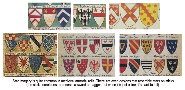
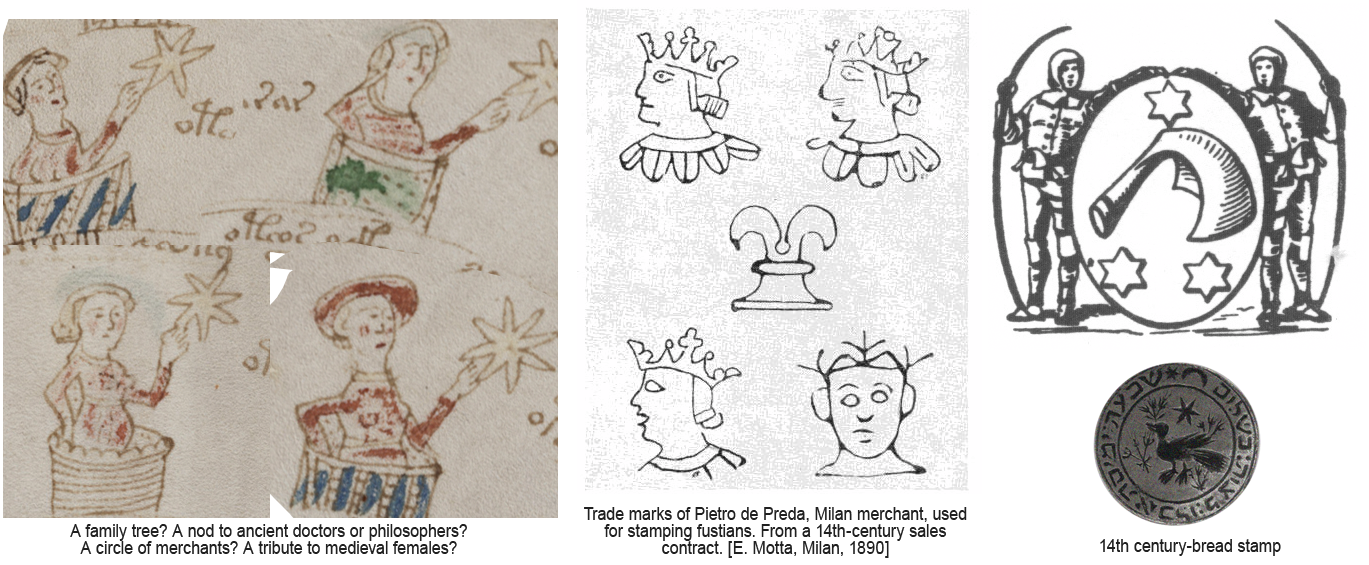
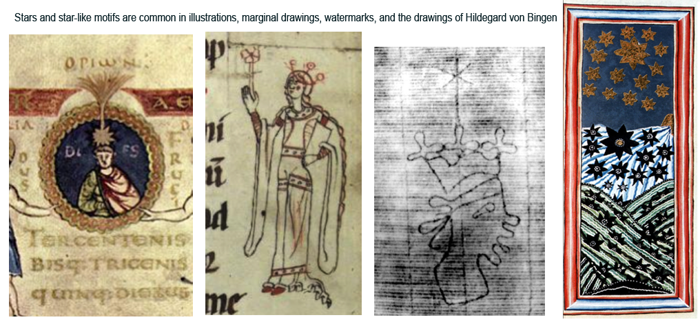
![[Pic of Waldeck family emblems]](https://voynichportal.com/wp-content/uploads/2018/07/WaldeckEmblems.png) Alchemical manuscripts contain a great deal of star imagery, as do books of kabbalah and magic.
Alchemical manuscripts contain a great deal of star imagery, as do books of kabbalah and magic.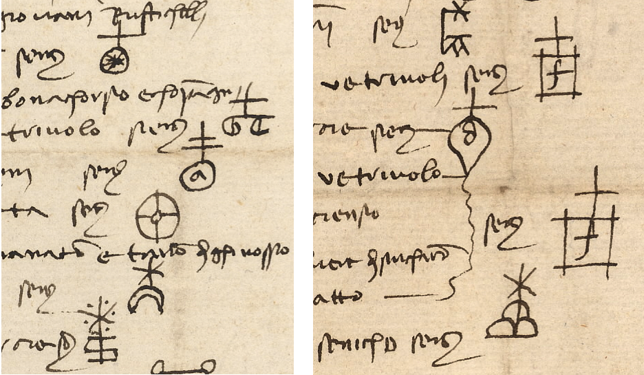
![[Pic of medieval and renaissance merchant marks.]](https://voynichportal.com/wp-content/uploads/2018/07/MerchantMarks.png)