Notice: Function _load_textdomain_just_in_time was called incorrectly. Translation loading for the advanced-gutenberg-blocks domain was triggered too early. This is usually an indicator for some code in the plugin or theme running too early. Translations should be loaded at the init action or later. Please see Debugging in WordPress for more information. (This message was added in version 6.7.0.) in /home4/jensonje/public_html/voynichportal/wp-includes/functions.php on line 6131
Notice: Function _load_textdomain_just_in_time was called incorrectly. Translation loading for the wp-external-links domain was triggered too early. This is usually an indicator for some code in the plugin or theme running too early. Translations should be loaded at the init action or later. Please see Debugging in WordPress for more information. (This message was added in version 6.7.0.) in /home4/jensonje/public_html/voynichportal/wp-includes/functions.php on line 6131 Palaeography | Voynich Portal | Page voynichportal.com|category|palaeography| Deprecated: Function WP_Dependencies->add_data() was called with an argument that is Lala deprecated since version 6.9.0! IE conditional comments are ignored by all supported browsers. in /home4/jensonje/public_html/voynichportal/wp-includes/functions.php on line 6131
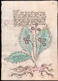
More than five years, ago Fabrizio Salani purchased a drawing at a second-hand market in Italy that resembles a copy of a VMS plant, folio 14v. Rene Zandbergen provided a link to the drawing on the voynich.ninja forum. Unfortunately, the link is no longer active, but Salani later posted an interesting video about his discovery on youtube that is still available.
Deja Vu
When I saw the drawing, I immediately noticed something familiar, something I had noticed while cruising through plant drawings, but I couldn’t remember where I had seen it. From that moment on, I was intrigued by the possibility of finding the illustrator and, after an extensive survey of medieval, Renaissance, and modern plant books, I located examples that have the same idiosyncrasies as the drawing purchased by Salani.
The Long Road Forward
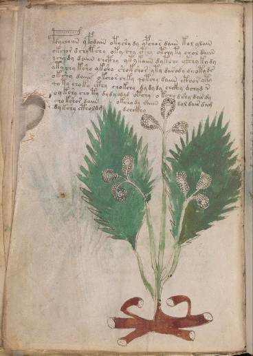
The only reason it was possible to find the Salani illustrator is because he substituted his own style of root for the VMS root. The VMS drawing (right) has a crab-like root, painted a dark brick-red). The Salani root is more naturalistic. He also added an extra leaf which has some distinctive properties.
At the time we were alerted to the Salani drawing, I posted a few examples of roots on the voynich.ninja forum (02/12/16). I knew they were not the same illustrator, but I had a feeling they they might be approximately the same time period. I did not restrict my search to this period of history, however, but several years of research brought me back to it, time and time again, and it turned out to be the right ballpark.
The Salani drawing is not a slavish copy of the VMS plant, but it’s faithful enough that it cannot be a coincidence. Assuming the Salani illustrator copied the VMS (or copied a copy of the VMS) and not the other way around (which seems unlikely), he apparently did not think a 100% faithful copy was needed for whatever purpose he made the copy.
Voynichese Characters
The VMS glyphs are not copied with complete accuracy either. They are mostly right, and even the way they cross the leaf has been honored, but there are some small discrepancies.
Guessing at the purpose of the copy is difficult, but my research on printing history revealed that Renaissance entrepreneurs scrambled to gather up manuscripts that they could turn into printed books. Perhaps there was a period in the life of the VMS when someone thought it might be worthy of print reproduction. If so, this may have occurred during the “dark” portion of the VMS provenance.
Another possibility is that the copy represents one of the events documented in letters about the VMS between the Jesuits who had it in their possession before Wilfrid Voynich acquired it. There is mention of a copy (the current owner apparently didn’t want to give up the whole manuscript). I will discuss this in future posts because this is only valid if the active life of the illustrator synchs up with the dates of the letters.
Summary
I will share more about this intriguing discovery in future blogs, but for now, here is a small portion of a chart I created as I was searching for the illustrator and, more importantly searching for corroborating evidence to pinpoint the dates during which he was active and who he associated with at the time.
J.K. Petersen chart documenting connections to the illustrator who apparently created the Fabrizio Salani drawing
I will post close-ups at a future date (this is a teaser since it’s not possible to explain the whole chart without close-ups that show the connections).
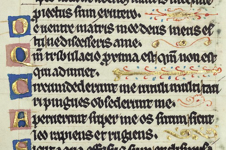
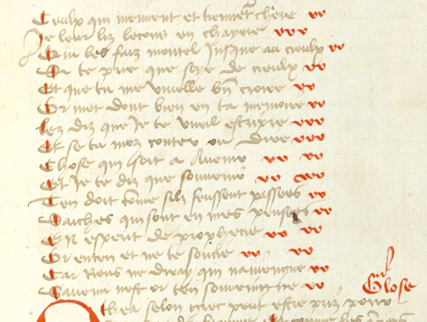
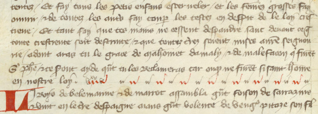
In page layout, text is frequently organized in columns. If the left side is even and the right side is ragged, it is “left-justified”. If it is even on both sides, it is “justified” or “double-justified”.
In contemporary page layout, lines can be padded with software algorithms that add extra space between each character to fill the columns. In the Middle Ages, padding was at the discretion of scribes, and there were numerous strategies.
Strategies for Padding
In early medieval texts and some of the Hebrew texts, the right margin is sometimes padded by stretching out the last character:
In this rambling Insular script, the right is sometimes justified by stretching the final character. [Source: Vat. Lat. 491]
Sometimes padding was created within the line by spacing out words and stretching some of the ligatures:
The common ligature “st” has been stretched and combined with word spacing to even out the right-hand margin. [Source: ÖAW Hs A 6 (earlier: a IX 21}, c. late 1200s]Individual letters and ligatures have been stretched to even out columns. In this case, the letter N is chosen, along with the common ligature “st”. [Source BNF Latin 9844]
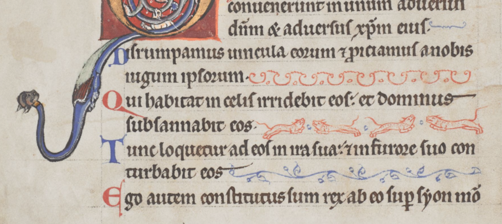
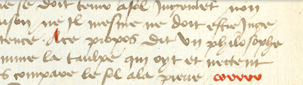
If the scribe didn’t want to manipulate the letters or was in a hurry, one of the simplest ways to pad out a column was to add a line. In this example, wavy red lines extend the text:
Quick and simple line padding in wiggly red lines [Source: British Library Bodmer 91]
The padding Morgan B.25 is equally simple but rises higher from the baseline:
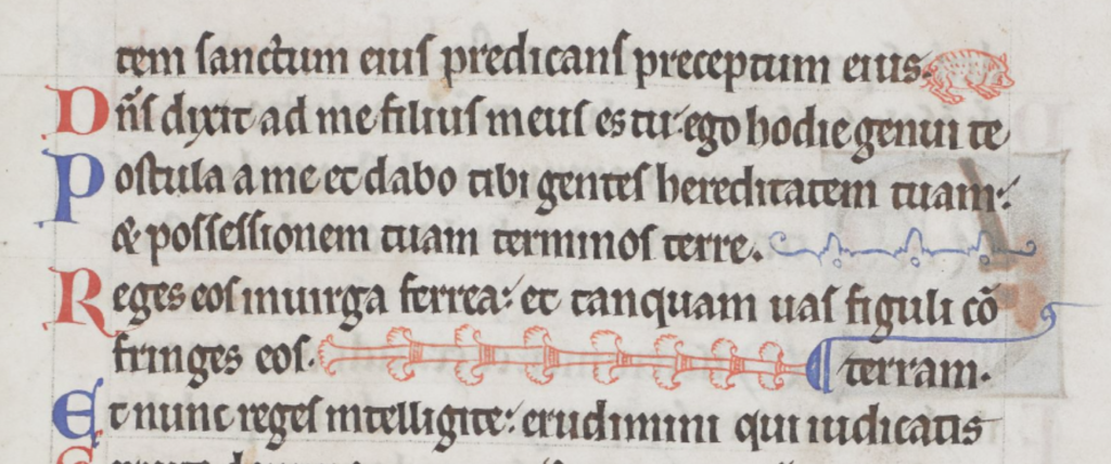
Sometimes padding was more decorative, using repetitive patterns or small drawings of animals or birds. In this example, from Royal 2 Z xviii, a two-tone angled decoration, that can be repeated as necessary, fills the column:
A similar format was used to pad the right-hand side in Pal.lat.26 except that the designs are more varied:
Decorative padding was a creative opportunity. Some rubricators or illustrators drew plants, animals, and many kinds of birds. Arundel 157 has page after page of charming examples, each one a little different:
Sometimes a simple repetitive pattern was used, with space between each iteration:
Columns are filled with a simple repetitive pattern in red [Source: BAV Borgh.312]
Sometimes the repeating pattern was shaped like a letter:
When the letters were close together, they became visually similar to a decorative pattern. This simple letter-like padding from the early medieval period was still used in the 15th century:
Paragraph-end padding in an early medieval manuscript. [Source: BL Cotton MS Tiberius B V/1]
A simple letter-like repeated v-shape was still in use centuries later, as in this 15th century manuscript, sometimes extended with dots in the middle when it was longer. [Source: Heidelberg Hs. 1012, c. 1460]
Moving the letters closer together gives them a more decorative appearance. [Source: KBR MS 11102]
Sometimes text was justified by spreading out letters or breaking words across a line. In these cases, padding wasn’t needed until the scribe reached the end of the paragraph. If the last line was very short, it wasn’t practical to insert spaces, so padding characters were added instead. In the following example, the paragraph-end has been padded with a simple pattern in alternating colors:
A simple decorative padding pattern has been dressed up with in alternating colors. [KBR Ms 14910-12]
In this example, a more decorative line was added to fill out the last line:
In this manuscript, lines are justified with spacing or word-breaks so that the columns are generally even, except for the last line, which is padded with a decorative line. [Source: Koninklijke Bibliotheek Ms Fabr. 91 4°, ]
Sometimes the last line would be padded with a stretched-out version of the word “AMEN”.
Sometimes larger spaces were added near the end of the line with the last letter capitalized, to create visual balance with the style at the beginning of the line:
In the same manuscript, padding has been inserted between sections of text within the line:
An interesting method of padding within lines, so that sections are separated, rather than adding the padding at the end of each line. [Source: KBR MS 4433-38]
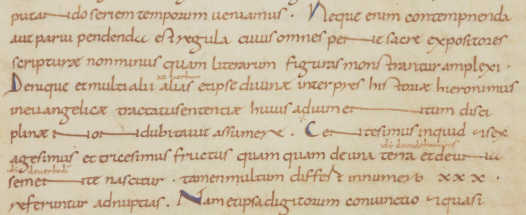
In another manuscript, instead of inserting decorative characters between the words, the letters are stretched:
Lines are padded by stretching some of the characters. This not only evened out the columns, but added aesthetic breaks for the eyes. It was not the easiest technique, it took some planning, and thus was not as common as some of the methods shown earlier. [Source: BNF Latin 9844]
What about the VMS?
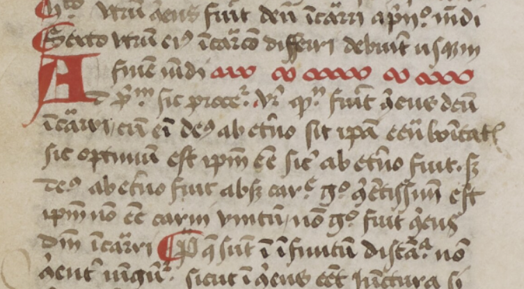
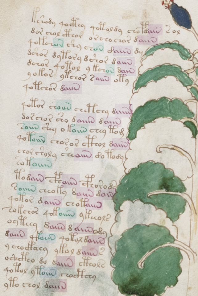
Medieval padding caught my attention because it sometimes beings with a shape like “a” and ends with a shape like “v”. Note how closely this pattern resembles aiv av aiiv av aiiv:
In general, padding was added at the ends of lines, but the earlier examples illustrate that there were midline padding strategies as well.
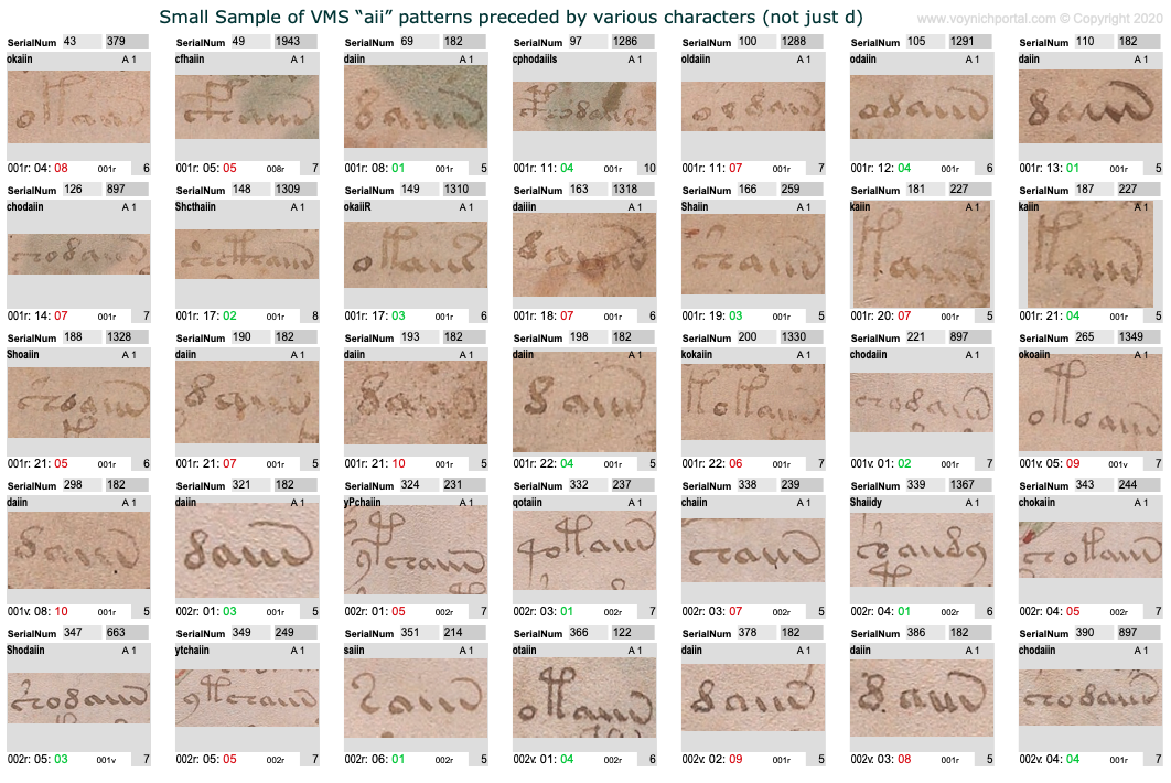
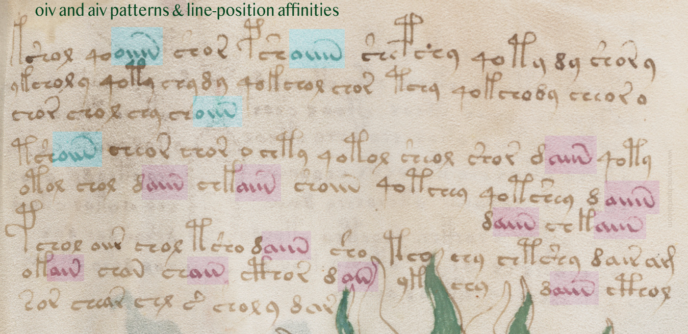
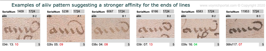
Which makes me wonder whether we should be looking at VMS aiiv in a different way. The pattern includes av, aiv, aiiv, and aiiiv and may be preceded by numerous different glyphs:
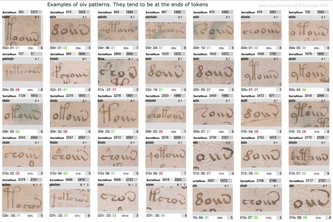
The oiv patterns are similar. They are usually at the ends of tokens and are preceded by a variety of glyphs:
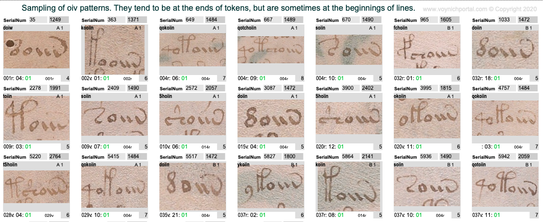
However, aiv and oiv patterns are not identical in terms of line position. Even though both are usually in the token-end positions, the oiv tokens do not cluster near the ends of lines as frequently as aiv sequences. The oiv sequences are in line-position 1 about twice as often as aiv sequences:
Here is an example of these tendencies in VMS folio 28v:
Implications for the Voynich Manuscript
Could the “aiiv” group be a substitute for line-end padding and stretched-out letters? In the VMS, “aiv” patterns are not always preceded by EVA-d. Many other characters precede “aiiv” as in this example on f2v. Also, in this snippet, three of the four line-ends are aiv patterns:
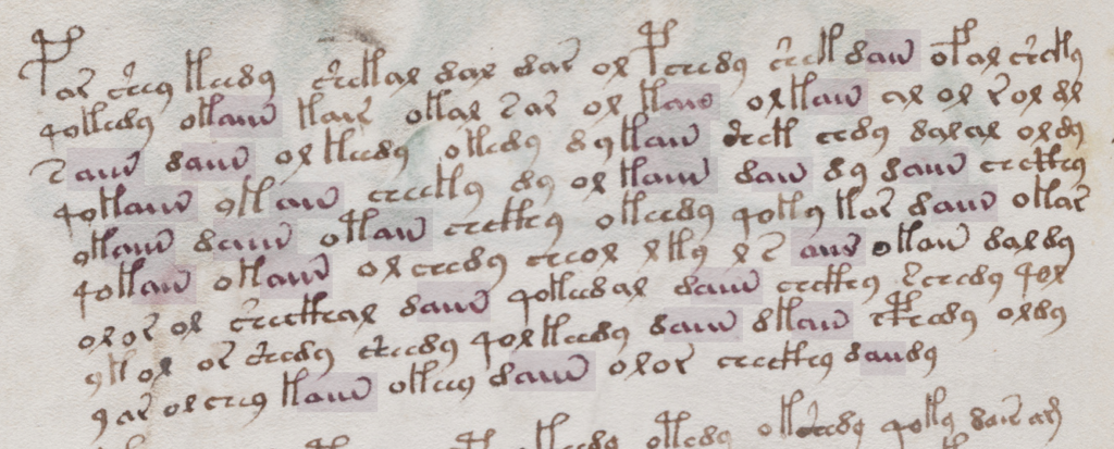
In general, aiv patterns tend to be in the latter half of a line more than the first half, even in text that has not been double-justified.
However, this is a slight overall trend. There are sections in which the proportions are even, as in this snippet:
Patterns of aiv on folio 81v that are more evenly distributed across the line [Source: Yale Beinecke 408, c. early 1400s]
However, the longest “aiiiv” pattern falls near the end of the line more often than the beginning:
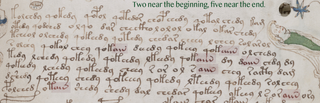
Here’s a full folio (37v) with aiv and oiv patterns highlighted. Once again, oiv leans more toward the beginning and aiv toward the end:
Summary
I’ve mentioned a few times that I think the emphasis on daiin may be misguided. Forget the “d” (at least for now). We should be looking at the ain patterns (which I call aiv) together with the oin patterns. The fact that they occur in the same parts of tokens, but in different parts of the line, is revealing.
In medieval texts, padding can occur within a line or at the end of a line and padding sometimes shares shapes with regular letters, especially the letters a and v. The aiiiv patterns might not be padding patterns, maybe they are word endings, modifiers, or conjunctions. But it’s something to think about. Maybe the shape was inspired by padding patterns even if the interpretation is different. Depending on what precedes the aiv sequence in the VMS, it may serve more than one purpose. But the pattern has an affinity for the ends of tokens and the latter parts of lines and its cousin oiv has a stronger affinity for the beginnings of lines, a pattern that deserves some attention.
Giovanni Fontana’s circle-line cipher is designed to be mnemonic without being too obvious about what the symbols represent. I’ve noticed this characteristic in several medieval and Renaissance ciphers, including the cipher of Hildegard von Bingen.
The Fontana Cipher
Johannes de Fontana (c. 1395–c. 1455) was a physician and engineer educated at Padua in the early 15th century. Fontana was interested in clockworks, and created entertaining devices, like clockwork-based skeletons, to showcase his engineering talent. But he is best known for Bellicorum instrumentorum (BSB Cod.icon. 242), an illustrated book of devices for warfare and sieges created in Venice in the 1420s.
The introductory page of Bellicorum instrumentorum includes a paragraph of plaintext followed by ciphertext. Here is some of the plaintext:
Lombardy and northern Italy were part of the Holy Roman Empire in the 15th century. Venice managed to keep its independence through much of this period but was, of course, influenced by surrounding city-states. Italian culture is more evident in Fontana’s script than germanic culture. The final-ess (long-ess) is one of the clues. This was fairly common in Italy and much less so in Germany and France, where they preferred a B-shape or sigma-shape for final-ess. There is also a distinct lack of loops (a characteristic that was adapted by humanists all over Europe in the late 15th century and 16th century but was uncommon in Germany and France in the 15th century).
The “a” without a crossbar is another letter to note. This is a more traditional form of “a” that was uncommon in 15th-century Germany and France but used from time-to-time in Greek texts, early-medieval texts, and some of the Italian scripts. The raised “q” is unusual and Fontana did not always write it this way in earlier texts.
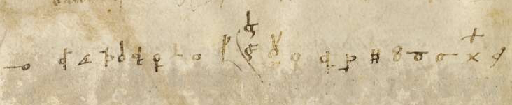
Below the plaintext is a block of ciphertext:
Most of the folios include a drawing, a block of plaintext, and a block of ciphertext:
The drawings are not professional-level, but they are reasonably clear and instructive, like the VMS drawings. The main difference is that the Fontana drawings show a better understanding of three-dimensional mechanics than the VMS (the weakness in three-dimensional thinking is especially apparent in the muddled way VMS human joints are drawn).
The Fontana Cipher Characters
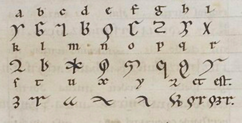
Someone has added the following alphabet to a foreleaf of Bellicorum instrumentorum, but you don’t need it to decode this cipher. Fontana designed his cipher to be easy to read, thus making it easy to decipher:
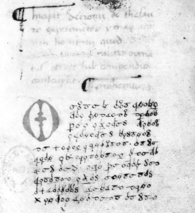
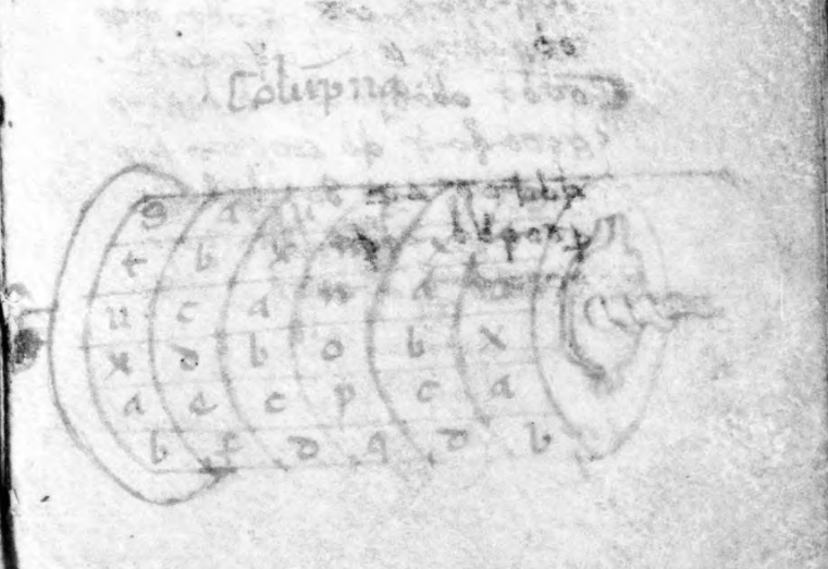
Before I break down the alphabet, I’d like to point out another book by Fontana, called Secretum de thesauro experimentorum ymaginationis hominum (BNF NAL 635, c. 1430). Like Bellicorum, this includes a significant amount of ciphertext and some interesting rotary text mechanisms:
The manuscript describes various kinds of memory and mnemonic devices and Fontana’s interest in these subjects sheds some light on the design of his cipher.
The Rationale Behind the Fontana Cipher
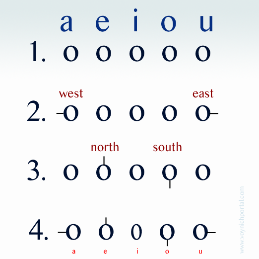
Start with a basic concept—circles and tickmarks.
Line up the vowels with a circle to represent each one.
Starting with the outermost circles, add tickmarks facing west and east.
Now go to the “e” and “o” circles and add tickmarks facing north and south.
There are 5 vowels and only 4 cardinal directions, so leave the “i” as it is but you can imagine the circle being squished in from the sides until it resembles “i” (this will also help with remembering another letter). You can draw it round, you just have to think of it squished to remember it’s the letter “i”.
Now you have 5 vowels.
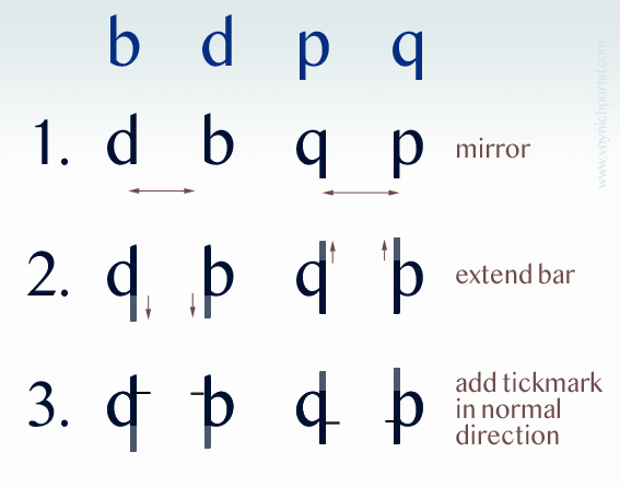
How can circles and tickmarks be used to create consonants while still keeping the cipher reasonably mnemonic? Quite often in medieval ciphers (including the cipher of Hildegard von Bingen), some of the cipher shapes are formed by mirroring.
In Hildegard’s lingua ignota, the r, b, and h are drawn almost in the normal way except an extra tickmark has been added to b and h. The letter “u” is normal for her time period, as well (the double-cee sometimes also stands for “a” in early-medieval texts). But the “d” and “p” have been mirrored in the horizontal direction and “y” is mirrored in the vertical direction:
Fontana used mirroring, as well, in a more methodical way than Hildegard.
Take the letters b, d, p, and q (which are morphologically similar) and mirror them in the horizontal direction.
Extend the straight strokes (otherwise the identity of the letter is a little too obvious).
Add a tickmark pointing in the direction the letter would normally face, and further place it up for b and d, down for p and q (the normal direction for the ascender or descender).
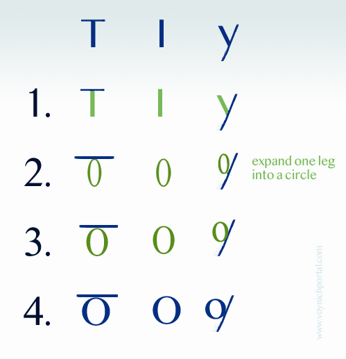
Creating a mnemonic “s” is easy. Close the loops. It can be written both vertical and horizontal and is still easy to remember because it is the only character with two loops. The “t” is also easy. Remember that the “i” is a simple loop and imagine it squished. Now add a crossbar on top and you have a mnemonic “t”. In fact, some of the other consonants, like y and z also substitute the circle for a stroke.
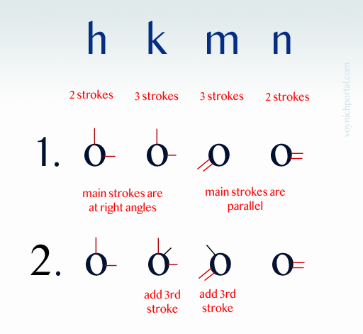
After a while, you run out of the simple shapes, so Fontana used a different way to remember h, k, m, and n. Instead of mirroring, these letters are based on strokes. The letter “h” has two main strokes, so the cipher character has a circle with two strokes up and right. The “k” also has two strokes up and right, but the letter “k” has a third angled stroke, so this is added as well:
The letters “m” and “n” work the same way. The “m” has three strokes, the “n” has two, and this is how many are attached to the circle. The direction doesn’t even matter since h and k are at right angles, with one stroke mimicking the ascender. The m and n are parallel and thus easy to distinguish from h and k.
This is quite clever. It might be worth repeating… since the parallel and perpendicular lines are distinguishable by their angle, the direction doesn’t matter and Fontana does sometimes vary the direction. This concept could be used to design a new cipher that was more difficult to read, by varying shapes so they appear to be different when, in fact, they are not. That was not Fontana’s intention with this cipher, but it presents some intriguing possibilities.
That’s most of the alphabet. The “f” is mirrored in the vertical direction and since all the letters are circles and lines, a circle is added in the crook.
You might think that Fontana used a Venus symbol, but the resemblance is coincidental. If you move the ascender of the “g” to the center and add a tick, in the same pattern as the other characters, it is recognizable as a “g”. If you make a mouth shape with your left hand and imagine you are holding a marble, it creates the ciphershape “c”.
At the end of the alphabet, we have x, y and z. Draw a cross for x and put a circle in the crook. This is another construction in which direction doesn’t matter. As long as it begins with a cross, you could recognize it no matter which direction it’s turned (I’m going to keep emphasizing this, since a cipher based on these concepts has flexibility that linguistic alphabets don’t). Since crosses are often substituted for X, this is easy to remember.
Draw an angled line for y and z (both of which have angled strokes) and put a circle on the side that needs a missing stroke and use an extra connector to distinguish z from y.
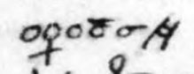
Postscript 22 July 2020: I forgot to insert this diagram when I originally posted the blog. It illustrates how a stroke from each of these letters is expanded into a circle to create the corresponding cipher character.
There are only two letters that are difficult to categorize, and that is “l” and “r”. Maybe readers can figure out the motivation behind them.
Overall, the cipher is systematic and mnemonic.
Summary
Many ciphers are intended to conceal and the desire for hard-to-crack systems increased in the 15th century. More sophisticated ciphers (by medieval standards) included one-to-many relationships, revolving keys, nulls, and glossaries. Numeric ciphers became more prevalent as well. Soon a whole science of cryptology began to develop, one that is still evolving today. One-to-one substitution was basically obsolete by the 16th century.
So why was Fontana’s cipher so easy to decipher and to learn? I think that’s exactly what he intended. He had an interest in mnemonic systems in general and his cipher demonstrates several memory-jogging techniques that enabled him to write entire tracts in cipher characters.
Now you can read Fontana’s books. Just remember that “u” and “v” were interchangeable in the Middle Ages. Here’s a simple word to get you started.
Also… I noticed, as I was paging through Secretum, that Fontana broke words across lines without line-continuation marks and that he did use some light abbreviation, but he included abbreviation marks, so it’s not particularly troublesome.
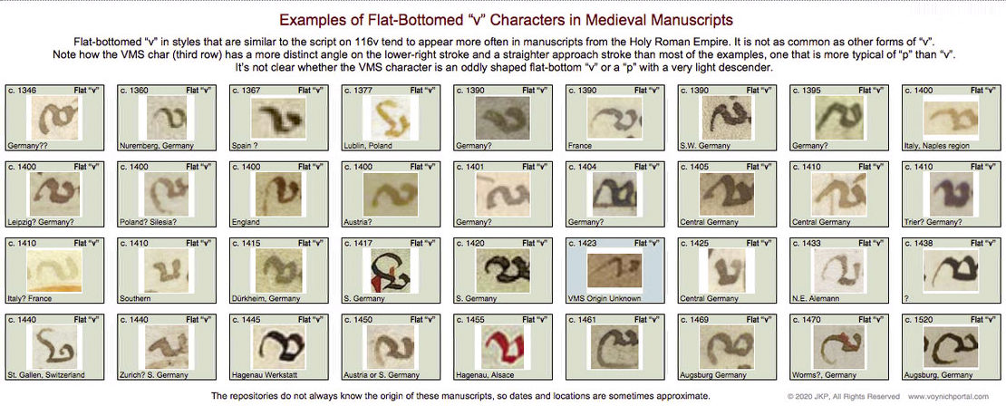
Usually when I look at VMS text, I am trying to unravel the meaning (assuming there is one) or puzzle out some of the ambiguous shapes, but a while ago I noticed something about the pen strokes that reminded me of the text on folio 116v…
The Speed of the Quill
Medieval scribes wrote using a quill or stylus. Some wrote faster than others. A faster, lighter stroke dispenses less ink. There are other differences… some scribes pressed harder, and some pressed harder on the downstroke than the cross-stroke (for artistic effects). Some sharpened the quill to a finer point, which creates a different kind of line and overall look. Some sharpened the quill more frequently than others, which improves consistency. Usually goose quills were used, but other feathers were sometimes good for fine lines.
Adhesion holds the ink within the curve of the quill. When you press on the tip to spread the groove, gravity tugs the droplet and ink runs downward. You have to hold the pen at a certain angle, use exactly the right pressure, and pull the tip away from the topside for the ink to dispense evenly.
Here are the basic parts of a nib. It is a protein material that wears down. A scribe needs many quills to complete a long project.
A quill is not like a ballpoint pen. A ballpoint can draw loopty-loops because each part of the ball dispenses ink in the same way. It takes practice to pull a quill in the correct direction and, if you don’t do it right, the ink stutters or blobs. It takes a few years for calligraphers to really master the art.
Cutting a Quill
Shaping the tip of the quill. Often goose feathers were used. [Painting by Gerrit Dou c. 1633, courtesy of the Leiden collection.]
To create a quill, you harvest the feathers, scrape away the soft tissues, and age the feathers to “harden” them (in later years this was accelerated by heating). Artists and modern users have a romantic attachment to the feathery parts, but professional quill-makers and scribes usually removed them.
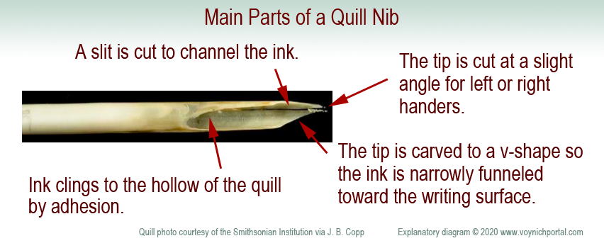
Use a sharp knife to shape the tip. The width of the tip is related to the width of the stroke. The tip is cut at a slight angle to accommodate the right or left hand. Even the curve of the feather is chosen for right- or left-handedness. A vertical slit is added to channel the ink in small doses from the inner curve of the quill.
If it is a feather quill, it needs to be re-dipped every few words and re-sharpened every few lines. (Don’t sharpen a quill as shown in this painting or you will cut your thumb—carve away, not toward your finger. What I do is press the quill-end alongside a small wooden block and shave toward the block—more control and less risk).
Because a quill needs to be pulled toward the side that holds the ink, a loop is usually drawn in two strokes—from top-to-bottom on the left, then top-to-bottom on the right. This prevents spattering or skipping.
Occasionally a scribe will draw a full loop if the nib is very fine and the loop is very small, but pushing against the direction of the pen is risky—the consequence may be a blob, pen-skip, or broken quill-tip. Similarly, straight strokes are drawn top to bottom to avoid going against the direction of the quill.
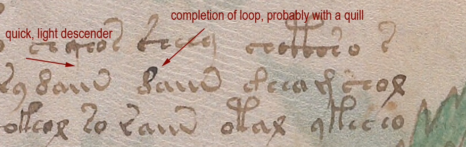
How Do Quill Mechanics Relate to the VMS?
If you pull a quill very quickly on the downstroke and start lifting in anticipation of moving to the next letter, the descender becomes very thin and light. Calligraphers are discouraged from doing this because it makes the script look uneven and a “g” might look like an “a”. Nevertheless, it happens, and appears to have happened in parts of the VMS.
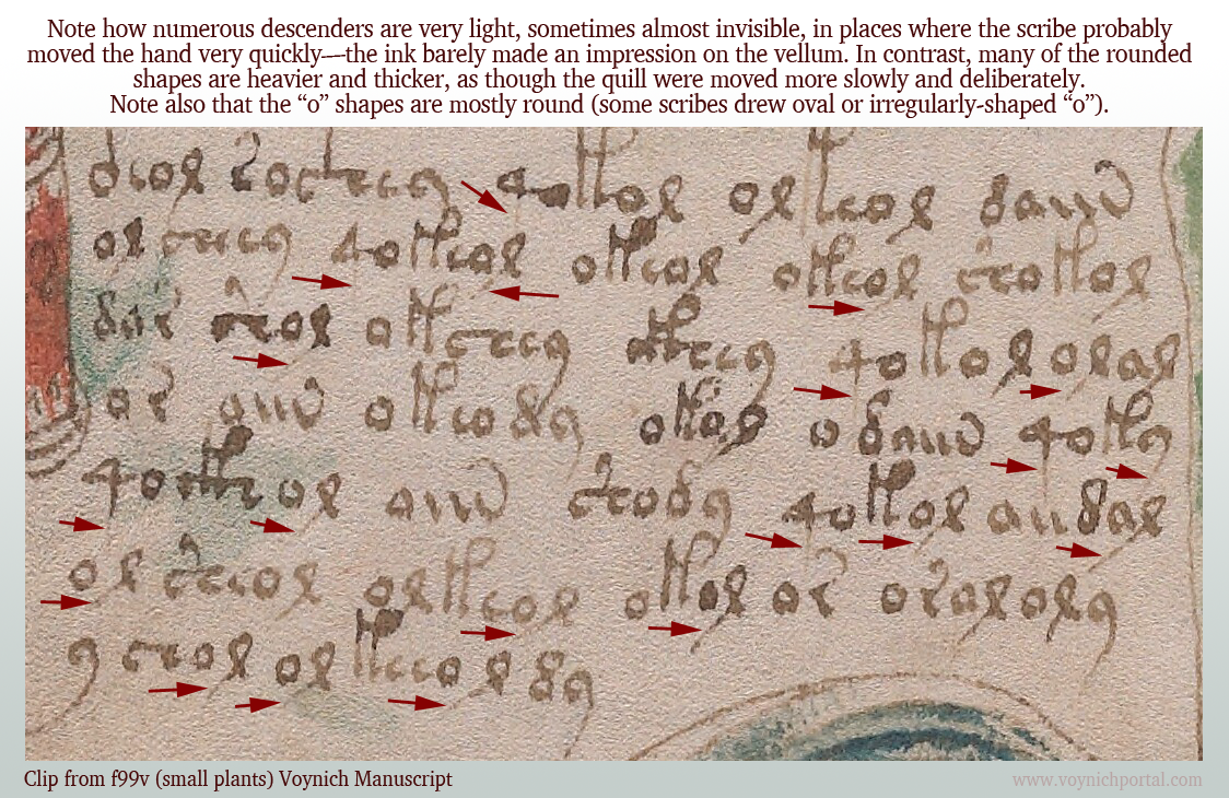
On folio 99v, I noticed many of the downstrokes were barely visible. The scribe probably moved fast and reduced the pressure compared to other parts of the glyphs.
Note how many of the descenders are unusually light:
Compare it to this script on 103r where the descenders are darker and more clearly written:
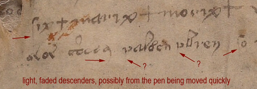
On 116v, at the end of the manuscript, there is some distinctive lightening of descenders, possibly from the pen being moved quickly or possibly from some text that has been expunged below the last visible line:
I am not sure if the two arrows marked with question marks are faded descenders, but the tops of the letters look more like medieval “p” than “v”.
Unfortunately the 116v text does not match the handwriting style of the scribe who wrote the light descenders on f99v. I wish it did—it would be evidence that the 116v scribe might have helped with the manuscript. But the 99v example has rounded c-shapes, not as squeezed as those on 116v, and the descender on EVA-y on 116v is distinctly rounded and arced, so it’s probably a different scribe.
Identifying the Ambiguous Letter
So what is the strange letter on 116v? A “v” or the top of a “p”?
I looked for examples of flat-bottom “v” in medieval manuscripts and found quite a few, but it was definitely not as common as other forms of “v” with pointed or round bottoms.
Below are samples specifically culled from scripts that are similar to the overall script on 116v. These samples don’t match the shape of the VMS char as well as similar examples of the top of the letter “p”, but the differences aren’t sufficient to determine the identity of the VMS char:
So let’s move on to sections where the VMS text has been corrected or changed…
Amendments to the VMS Text
This is one of the more obvious examples where something spilled and someone tried to re-create the damaged text on top of the stain. The text is a bit awkward, the stain may have impeded the quill, but it appears to be added by someone familiar with VMS glyphs:
Less Obvious Examples
Some corrections are more subtle. You have to hunt for them. There are many edits in the VMS. I tried recording them, but it was taking too much time and there isn’t space to enumerate them all here, but I’ll point out a couple of interesting examples.
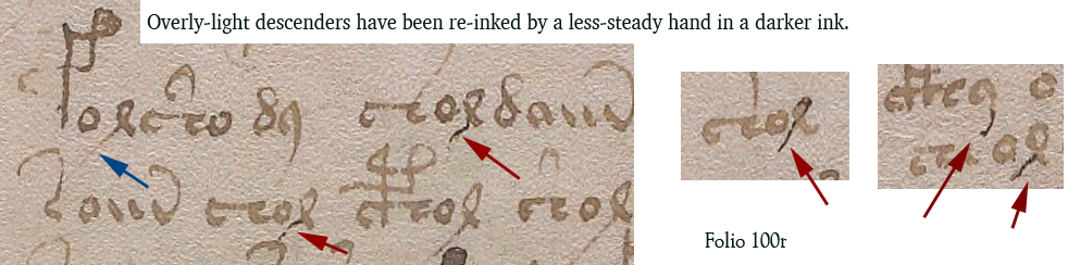
Apparently someone didn’t like the overly-light descenders on f100r (small-plants section) and tried to fix some of them. Note the light descender marked with a blue arrow. Some of the others have been overinked to add the missing stroke (marked in red).
Whoever over-inked wasn’t very expert. The lines are tentative and shaky. The thickness of the nib doesn’t match. The ink doesn’t match well either:
Medieval inks were not always brown. Some were closer to black when first applied and gradually faded to brown, so you can’t always go by color. Only testing can determine when the extra strokes were added. But the added ink isn’t just a different color, it’s a different kind of stroke, thin and spidery. It lacks the thick-thin characteristics of lines drawn with a quill. It resembles ink from a different kind of pen, maybe a metal stylus or something that can create thinner lines.
Darker ink also occurs at the bottom of f100v, on one of the small-plant folios, but the difference isn’t as great. One has to be careful in evaluating examples like the one below, because sometimes medieval ink was not mixed well and certain components in the ink faded while others remained dark.
I’m pretty sure the text on 100r in the previous example has been over-inked, but it’s harder to tell if the following example is over-inked or badly mixed ink where some components faded more than others:
Changes to Content
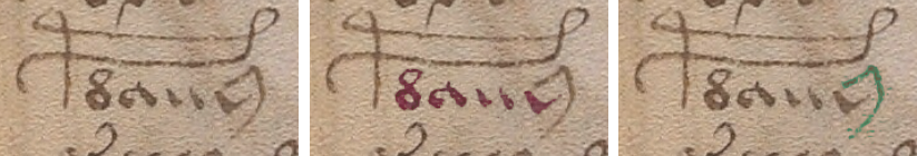
Darkening a too-light line is a superficial change that doesn’t alter the intention of a glyph, but there are places where lines have been added to change the shape of a letter. For example, on 100r in the middle, we see a shape that looks like a straight “d” changed into EVA-d with the addition of a loop.
In contrast to the overinked examples shown earlier, the added loop looks like a quill stroke. Even though it is darker ink, it has the thick-thin characteristics and more fluid style of the rest of the text:
So it’s possible that more than one person made changes to the text or that the scribe had difficulty with very fine lines and used a different, perhaps unfamiliar, kind of pen.
These revisions suggest that 1) someone cared about the legibility of the text and tried to fix the parts that were faded, and 2) someone comfortable with a quill cared about the consistency/accuracy of the VMS glyphs and corrected errors.
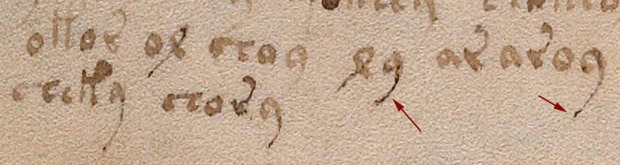
Here is another example with dark and light inks in which descenders have been fixed and one letter appears to have gained a longer lower-right stroke (100r lower-right):
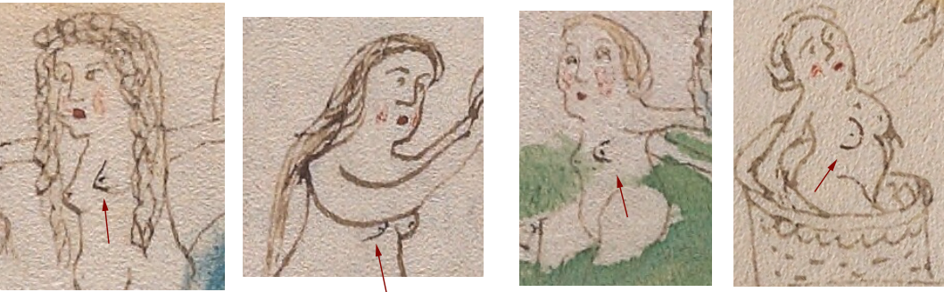
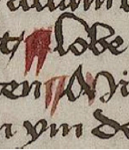
The text is not the only thing that has been amended. Some of the drawings have, as well.
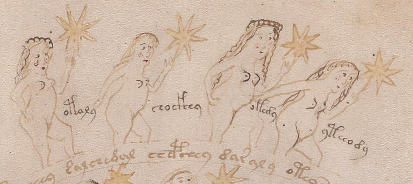
There are numerous places where a breast has been added to a nymph in a slightly darker ink. Usually it is the one closest to the viewer:
Nymph 1 Nymph 2 Nymph 3 Nymph 4
So who added it? Was it a production-line process where one person drew the outline and someone else added the inner details? Or was it a master-apprentice situation where a young apprentice was asked to do something “safe” that wouldn’t ruin the drawings, like adding a second breast?
The added breasts are usually in the same style as the original breast. In this case, the first is pointed, the second is somewhat rounded, the third is shaped like a thumb, and the fourth is larger and distinctly rounded. So… either it’s the same person who added them, or someone else made an effort to copy the original style.
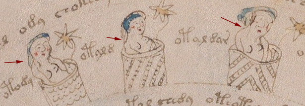
Sometimes other parts of the body look like they are drawn by a different person. For example, the arms of the second nymph are different from the others.
One of the characteristics of many of the nymph drawings is that there is no shoulder on the side facing the viewer—the arm grows out of the neck. This is particularly noticeable on nymphs in 3/4 view. It’s a distinctive characteristic that can be seen on nymphs 3 and 4 in the example above. In contrast, Nymph 2 has an angular shoulder and smoother, darker arcs to the curve of the arms. Note also that there is no elbow on #2. The arms of the second nymph look like they were drawn by a different person.
Here are more examples of nymphs with non-anatomical shoulders. The arm on the right is almost growing out of the ear:
Places Where Both Text and Images Were Amended
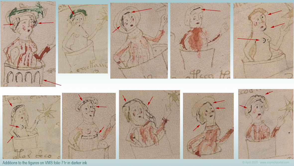
On folio 73r, someone has added both text and breasts in a darker ink, using a finer writing implement than the original text. The text is consistent with other text on the folio in both style and glyph-arrangement, so perhaps the lines were added close to the time of original creation.
Here is a sample from the top of the folio, but there are numerous other additions below it:
A second breast has been added in darker ink in much the same way in the zodiac-figure folios and the pool folios, which suggests some kind of continuity between sections, if the dark ink is contemporary with the rest of the manuscript.
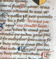
One important thing to note… the glyphs in the darker ink are written in legal Voynichese. Did the person know the system for generating tokens? Or did they copy others that already existed? If they knew the system, these marks may have been added in the 15th century.
There are numerous amendments to the drawings on 71v, one of the zodiac-figure folios. Ten of the 15 figures have been touched up with darker ink (or ink that has faded less over time). Most of the changes are to the hair and breasts:
In this group of nymphs, there is an interesting anatomical difference between the nymph with two original breasts (#2) and the two nymphs with added breasts (#5 and #6)…
On the original drawing (#2), the contour of the breast is defined by a line underneath, and the general direction is facing the viewer straight on. The added breasts on #5 and #6 are drawn differently. The direction is more of a side or 3/4 view and the line that defines the contour is on the side rather than underneath. The “touch-up” person may have been different from the original illustrator.
Less-Explainable Amendments
The changes or additions in the above examples are understandable. Light strokes were darkened, missing information was added. But the following example is harder to explain.
On f86r, there is an instance of “daiin” in which the last minim doesn’t have the usual tail swinging up to the left. Instead, someone with a narrower quill and a less steady hand added a large angular shape that is inconsistent with the rest of the text on the folio. The last minim has been awkwardly changed into an ambiguous shape that is not typical of Voynichese:
The amended shape is not round enough to be EVA-y and lacks the loop that is usual for EVA-m. The “dain” block doesn’t usually end this way, so the amender either added the wrong kind of tail (facing the wrong direction), or didn’t know how to draw one of the other VMS glyphs correctly and turned the tail-less minim into something strange.
In a previous blog, I posted some other examples in which atypical text was added to the beginnings or ends of lines.
Summary
The VMS includes numerous adjustments to the text and drawings; most of them are fixes to the original in a similar style. In some cases, however, textual additions seem out of character with the rest of the folio and it’s unclear why it was changed.
Most of the amendments were probably done around the same time the VMS was created, but some of the textual changes may have been added later. The proportion of changes isn’t high, but there are enough to make you wonder what happened to the VMS during the gaps in its provenance.
Changes or additions are not especially frequent, however, considering the length of the manuscript. It seems likely that a draft version was used to design the script first. It would be remarkable if it eventually turned up somewhere in the forgotten corners of a library or private collection.
“buy cheap isotretinoin Medieval book’s secret code remains unbroken …Somewhere during its journey through medieval Europe, several people wrote notes in the margins of the book. The notes in brown ink are mostly Roman numerals, but the writing in red — which, from the style of the letters, seems to be from the fourteenth century — is mysterious. Some of the scribbles seem to be words, but they’re illegible. Others form a cryptic code of repeating letters….”
Here’s a screensnap that illustrates the notes in red ink. They are on almost every folio in the first half of the book, but become less frequent after page 100:
A folio from a mid-13th-century manuscript with two columns of text in black ink, with notes in red ink in the margins [Source: Harold and Mary Jean Hanson Rare Book Collection ]
I scanned through the manuscript from beginning to end looking for ciphertext or anything that might be considered as “secret code”. I couldn’t find any. I agree that the glosses are probably in 14th-century script, but I don’t agree that it’s illegible (except in places where the ink has worn off). It is somewhat messy, but mostly readable.
The red text is not ciphertext and I don’t think what resembles a cipher list at the end is necessarily related to the red text in the margins.
The Text in Red Ink
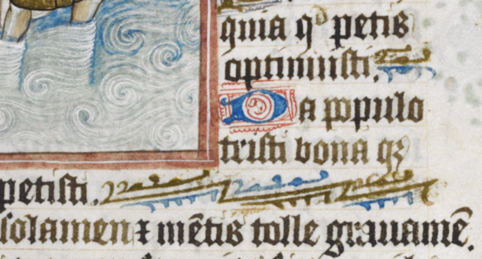
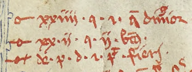
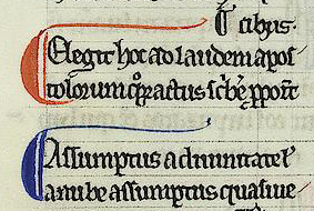
So what are the marks in red? They’re citations, cross-references. They follow a fairly regular format. Here’s an example, and below the screensnap I’ll give a breakdown of the parts:
The first symbol in each line is a paragraph-reference marker. These symbols are found in a variety of languages that use the Latin character-set.
Paragraph markers are recognizable because many are constructed using a loop or semi-circle or two, plus a line or two. If the line passes through a semi-circle, it looks a bit like a pitchfork. Sometimes a plus-symbol or hook-shape will be added.
This combination of shapes makes them sufficiently different from Latin letters that they can be added to the manuscript in the same color ink as the main text, and still be spotted without too much trouble. They mark passages-of-interest pointing to specific notes in the margins.
Here is an example from another manuscript. To modern eyes, the reference symbol in the bottom-left might look like a Venus symbol, but that is a coincidence. It looks like this because it dips into the same storehouse of components as the paragraph markers above—in this case, a loop and plus-symbol:
In the lower-left is a marginal note preceded by a medieval paragraph-reference symbol. These symbols were frequently comprised of loops, lines, and what we call the plus-symbol. They were attached to each other in different ways to provide a storehouse big enough so they could be added in numerous places without being redundant. Some writers would recycle the symbols each time the page was turned, other writers would create new combinations until they reached the end of the section. [Manuscript source: Vatican Vat.lat.1960]
Here is a simpler version from an earlier folio in the same manuscript:
Sometimes the reference symbols are more complex. This often happens if there are many notes and uniqueness is desired. Some writers recycled the same markers on the next folio, others added new ones until they reached the end of a section.
The example below is composed of a semi-circle, line, and hook-shape. You can see the symbol next to the marginal note and in the passage it references in the main text to the right:
Example of a paragraph-reference symbol in a medieval manuscript that connects a passage of text to a marginal note. [Source: MS Cotton Domitian A ix]
The Tranchedino collection of diplomatic ciphers includes many of these paragraph markers as cipher symbols. Since they are numerous, they are a convenient source for glyph-shapes. Often they have been combined with regular Latin letters.
But the U of F manuscript is not ciphertext. It’s Latin. So let’s look at the rest of the line of cryptic text.
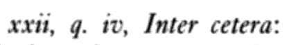
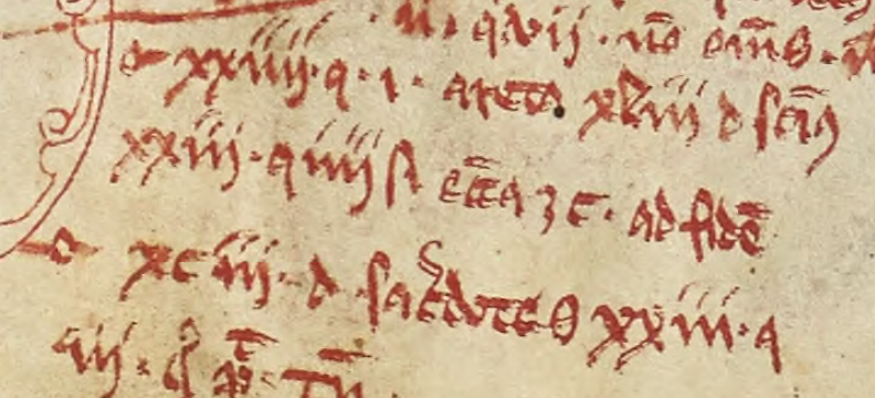
After the paragraph-reference symbol, the two top lines are followed by a number in Roman numerals. In this example, we see the numbers 24 and 22 (or possibly 20 • 2 since there is a dot in between).
Next there is a q. or, as in the third line, a series of short abbreviations. Single- and double-letter abbreviations are very common in Latin for words and phrases like a.d. (anno domini) i.e. (id est) q (qui/quo), n.b. (nota bene), and many more.
After the q. abbreviation in the first two examples is another Roman numeral.
All three are followed at the end by a word or two, abbreviated.
I recognized the number-q-number pattern as a formal reference convention, so I looked for an example of the same style in a printed book. I felt it might be an easier way to demonstrate that this is not “mysterious” text but quite an orderly way of doing things.
I found this canon reference arranged according to the same pattern as the notes in red ink. It is comprised of a Roman numeral, q. abbreviation, Roman numeral and short summary text:
Format of a canon reference citation using traditional Roman numerals. [Dives and Pauper, Vol. 2, Parker and Barnum, 1976]
The q. can mean many things in Latin (q-words are very common), but in this context, it refers to quaestio (question).
So the printed phrase reflects the format of the first two lines of the text in red ink.
The third line is different from lines 1 and 2. Instead of a Roman numeral followed by q., it has de pd, which is usually the Latin abbreviation for de poenitentia, distinctio, followed by the number 1 and a note.
The Terse Abbreviations at the Ends of Lines
In the U of F manuscript, the summary text at the end of each line is abbreviated. While scanning through it, I saw abbreviations for Paulus, penitence, loses (verb, loses his life), from good (ex bono), don’t (noli), decree (fiat), leader (ducator), and holy (et sancta), and Ecclesiastes (bible reference). There were also references to “three” (trinity?), six days (creation?).
Here is another example from page 3 that follows the same format, consisting of paragraph-marker, Roman numeral q[uaestio], Roman numeral and abbreviated note. Sometimes there is an additional numeral and note. If the paragraph marker is omitted, it probably refers to the same section in the main text as the citation above it.
At the end of the line that starts with the number 24 is the abbreviation for “sanctus” preceded by the letter “d”. In many cases, “d” stands for deus, but in this case, it is dominus to represent the Latin phrase dominus sanctus (Holy/Sacred Lord):
On the line below it, are Roman numerals and a common abbreviation for variations of ecclesia/ecclesiastis/ecclesiastes/ecclesiastem. At the end is the abbreviation for ad fidem (to faith).
This is a copy of the New Testament, so the notes are completely consistent with the subject matter of the main text.
The abbreviations are terse, you have to know Latin to recognize them, but I can’t see any “mystery” or intention to hide. It is a standard citation system, and medieval scribes were familiar with terse abbreviations.
Now, let’s look at the cipher-like chart on the second-to-last page…
Is There a Cipher Alphabet?
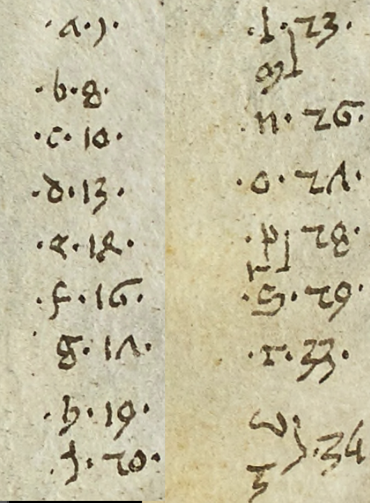
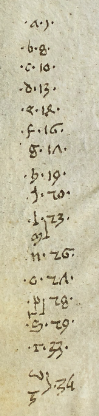
There is an alphabet paired with a set of numbers near the end of the manuscript. It looks like this (I have broken it into two parts so it will fit better on the screen, but you can see the original scan here on page 162):
It’s very tempting to think that 1) this is a substitution cipher and 2) the numbers might be related to the many numbers in red ink in the main manuscript, but I am doubtful.
First, this is a very limited set of numbers (only 16) and the red glosses don’t have limits on what numbers can be used, as long as they are relevant to the citation.
Secondly, these are Indic-Arabic numbers. They were rarely used until later in the 14th century. They do exist earlier in some of the scientific manuscripts (mathematicians and astronomers recognized their utility) but this is a biblical text and it would be unusual to see them in this context in the 12th or 13th centuries. In other words, this alphabet may have been added after the red notes and probably a century or so after the original script.
Even if the red notes and the cipher-like alphabet were added at the same time (which is possible, since the writing style is the same), they don’t appear to serve the same purpose.
So, let’s say for a moment that the alphabet was added because there was space, not because it was connected to the red citations.
Assuming the alphabet stands on its own, can we determine if it is a cipher key?
Numeric ciphers were not common, but they did exist, and alphabetic cipher keys are sprinkled among medieval manuscripts, but one has to wonder… why were these particular letters and numbers chosen? The numbers are in sequence in the sense of getting larger and, depending on the language, the alphabet is incomplete.
What Comprises an Alphabet?
Languages have different sounds, which results in different alphabets, so a “full” alphabet depended on the language.
In Latin manuscripts, the alphabet usually consisted of
a, b, c, d, e, f, g, h, i, l, m, n, o, p, q, r, s, t, u/v, x, z
Some scribes substituted a “y” shape for “i”. The letter “k” was usually only included if there were loanwords. The lettershapes “u” and “v” were roughly analogous. The letter “j” didn’t exist as we know it. What looks like a “j” in medieval manuscripts was actually a capital “i” (for names) or an embellished “i”. We know this because complete alphabets were often added in margins and they generally did not include “j”. The letter “y” was often absent. Sometimes the letter “i” and a final-i (“i” with a descending tail) were written together to resemble ÿ, but but most of the time, this was “ii”, not “y”.
If the language was German, “k” and sometimes “w” were included. In Middle English, most letters were included, except for “j”, but some scribes used “y” instead of “i”. Old English had letters (like thorn and wynn) that are not used in modern English and were uncommon in continental manuscripts outside of Saxony.
The Organization of Numbers in the Alphabet Chart
The U of F manuscript includes the following letters (with the “r” having been squeezed in and apparently associated with the “p”, similar to the way the “u/v” was associated with the “z”). Next to each is a number and some of the numbers encompass two letters.
If this were a cipher key, it would not be unusual for one cipher glyph to represent two letters, but it’s not certain that it’s a cipher key:
a, b, c, d, e, f, g, h, i, l, m, n, o, p, r, s, t, u/v (tilted back), z
This is similar to the Latin alphabet, since j and k are not included, but there is a rather significant omission. The letter “q” was very common in Latin texts. It would be difficult to write Latin without a “q”, especially considering many abbreviated “q” words were abbreviated to only the “q”, omitting the rest of the letters.
So, if it’s an alphabet what language is it?
Sixteen numbers is not enough characters to represent most alphabets (most of them had around 21 characters or more) unless there were many-to-one assignments. Unfortunately, the more letters that are compressed down to one cipher glyph, the harder it is to decrypt a message (even for the person who composed the message). And there’s a limit—at some point, it becomes a one-way cipher.
Why so few characters? Even the old Italic alphabet needed 17 characters.
And why the sequential order of numbers? Eight of the numbers are in sequences of four (which makes it much easier to crack a cipher) and all of them are in numerical sequence, even if there are gaps. If this were a cipher, it would be considered a “light” version, minimally secure.
A comment on the alphabet from the University of Florida article:
Is it the key to a secret code? No one knows. You can try to decipher it… (U of F News, 2018)
I love puzzles and I enjoy collecting medieval ciphers. I wanted this to be a cipher key, but I strongly suspect that it’s not.
What else could it be? It’s not likely to be a tally sheet, as the order of the letters follows the order of the numbers, and it doesn’t appear to be numbers related to playing cards (which were popular at the time), or other sorts of games.
Another Explanation
I had to think about this for a few minutes to come up with a way to explain the sequence of numbers (from small to large) and the fact that many of the numbers are adjacent (26, 27, 28, 29). These characteristics are not common in cipher keys.
I think this might be a short index, or table of contents, with the numbers referencing something alphabetical.
If so, then it could be interpreted this way… the “a” entries begin on page 1, the p and r entries begin on page 28, and the u/v and z entries on page 34.
The largest gap is between “a” and “b” and this would fit with many kinds of lists, in which the “a” entries are more numerous than those beginning with other letters. Following this logic, the next most numerous section begins with “s”, followed by “c” and “i”. Using letter-frequency charts, it might be possible to figure out the potential language if this were an index to a dictionary, but this could be an index to something else, in which case, the frequencies might not divulge anything that specific.
The alphabet chart doesn’t appear to relate to the six pages in brown ink that precede them. Maybe it references something external to this manuscript (or something that is no longer bound inside it).
I thought the lack of a “q” might indicate a medieval German alphabet, but the “k” is also missing and “k” was common in German.
Summary
Even though I wanted this to be a cipher, it is clear that the notes in red ink are Latin cross-references in canon-citation style. The abbreviations are terse, you have to know Latin to expand them, but I didn’t see anything unusual about the words or the way they were formatted.
The alphabet at the end was more intriguing, but after some consideration, it is probably not a cipher either. The numbers are organized in a way that is uncommon for ciphers but logically consistent with something organized with gradually increasing numbers.
It might be some kind of index. If so, the numbers are probably page numbers. Why might there be letters missing? If it’s an index to a specialized list (like the names of towns, or the names of noble families), then some letters might not be used. Maybe there’s a document somewhere that is about 34 to 40 pages long whose content matches the number sequence and maybe not.
I’m still keeping my eyes open for medieval ciphers. This was less of a mystery than I expected, but there will be others.
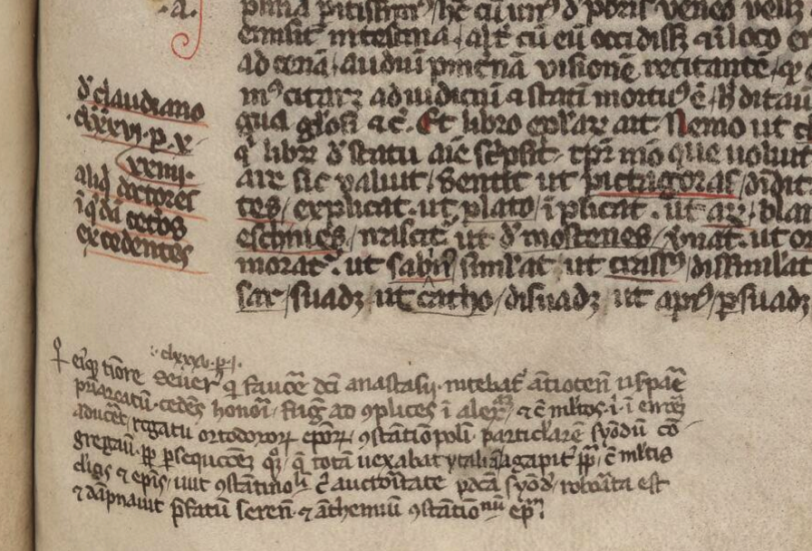
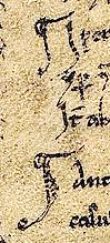
There’s a substantial gap in our knowledge of the VMS, from the time it was created (c. early 1400s) until the time it came into the hands of the Jesuits (c. mid-1600s), possibly through the court of Rudolph II. More than two centuries are shrouded in mystery.
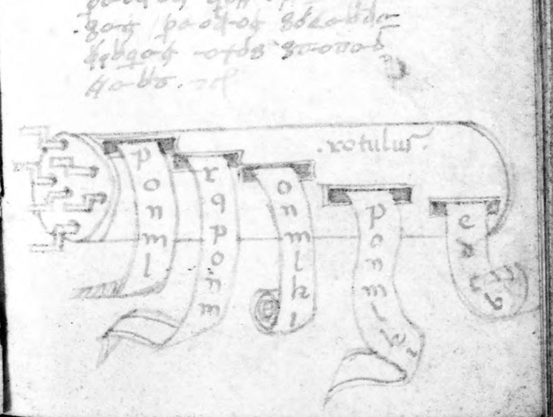
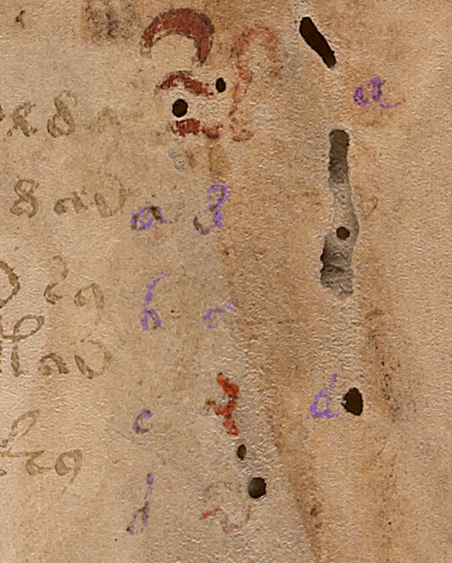
Part of my palaeographic research has included the faint text on the right-hand side of folio 1r because I was hoping it might reveal something about this hidden history, to fill in some of the missing provenance.
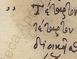
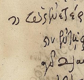
The column text on the right side of folio 1r has been partly obliterated and is very faint.
There appear to be four columns. The first two columns look like the same handwriting, with the alphabet shifted. The alphabet in the first column is complete, except that it’s impossible to make out the style of the r or the t. With very careful scrutiny, the other letters can be discerned.
The third column is slightly different. The loops are slightly rounder and it doesn’t appear to include as many letters as the first two columns. The fourth column is very faint and has fewer letters still. There also appears to be erased writing under the column letters (earlier attempts? or something else?). The spacing and style of the “red weirdos” doesn’t seem to have anything in common with the column text, so it’s probably written by another hand, perhaps earlier?
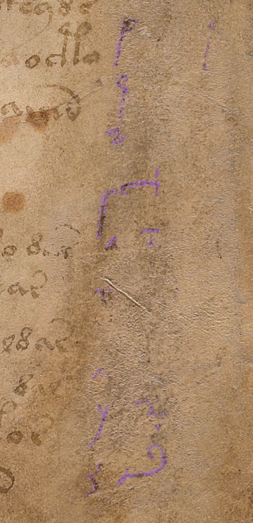
After extensive study of the letterforms, and intensive searches for similar handwriting, some of which I posted in previous blogs, I had enough information to try to reconstruct the handwriting of the person who wrote the column text. This research stretched over many years and included letterforms, spacing, final-ess styles, abbreviation styles, and time periods in which the text might have been added.
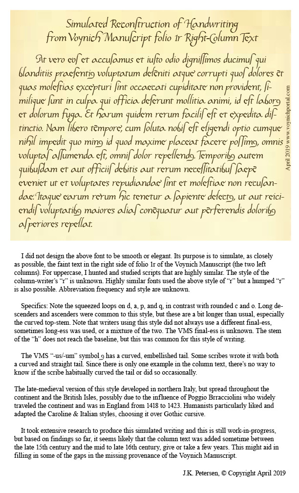
To make it easier to visualize how the scribe might have written whole sentences, I have created a font based on the style in the left-most column. It took a great deal of time and patience to try to achieve accurate reproduction of this script style. A couple of letters simply cannot be seen, but over time I became more familiar with this style of writing and how specific letters were usually written.
Scribal Specifics
Fortunately, there is a certain consistency to the way the shapes are written (not all writers do this).
The ascenders and especially the descenders are long, and some of the ascenders have an unusually long and rounded curve on the top (e.g., f, h, and s). This long curve is not common and appears to be specific to this scribe.
Letters with stems have a squeezed oval loop (b, d, p, and q); those without are more round (c and o).
An important clue to help identify the time period is the short left stem on the letter “h”—it doesn’t quite reach the baseline. The letter “h” was written this way during a fairly specific time period.
Another important clue is the style of the “g”. This was not an unusual style, but it was less common than the double-chambered “g” or one that is more angular.
Years ago, when I began this line of research, I was hoping to confirm John Dee as the foliator and/or writer of the column text. Unfortunately, after heroic efforts, I have some doubt that John Dee was the author of the column text or the folio numbers. His handwriting is close to both, but I have samples that are arguably closer. Examples of the column text can be seen in previously published charts and I have gathered more text and number samples since my early research was published that indicate a number of people had handwriting very similar to one another and to the VMS.
The Column Alphabet
Here is the basic alphabet (note that the column “e” is a variant that is less common and usually only shows up once in a while. I’ve seen it a few times but no scribe uses it habitually, so I have included the “base e” here and the variant column-“e” in the block of text below).
The shapes for u and v were used interchangeably by most scribes and the one in the VMS is hard to discern, but it looks like it might have a pointed bottom as we now associate with “v”.
I am not sure how long the descender is on the “x”, the x is barely discernible, but scribes who wrote in this style usually lengthened the stroke on the lower-left as follows. However, this specific scribe may NOT have added the small hook on the bottom left. It may have had a very severe tail, like the one on the y:
Constructing a Block of Text
To make it easier to imagine the handwriting of the column-text writer, I have created a block of text in Latin (I wasn’t worried about whether it was correct Latin or even medieval Latin, I just copied and pasted something more interesting than Ipsum Lorem).
Caveats
Be aware that reconstructing a block of text from an alphabet involves some educated guesses:
There are no upper-case letters, so the ones I included are based on writing samples that are very close to the column text, samples that took me years to locate.
The extent to which the writer used abbreviations is not known, so most of the following is not abbreviated except for the extremely common -us/-um abbreviation symbol that is included at the bottom of the alphabet on 1r.
The scale of the letter “o” is difficult to discern. I have made it a normal size in this sample BUT some scribes during this time period wrote the “o” smaller than other letters.
During the century or so that this style of writing was popular, some writers used long-ess as final-ess as well. Others used a snake-style final-ess, and some used both somewhat indiscriminantly. It’s impossible to know whether the column-text writer used a different shape for final-ess, so I have included both for purposes of illustration.
Whether the writer left out the serifs in the column alphabet because they were unnecessary, or because this is part of the writer’s style cannot be known from such a small sample, but the impression I get is that the scribe probably used serifs sparingly or not at all.
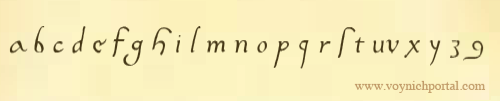
Here is the result of adapting the column text to a font that can be typed on a computer:
Keep in mind that real handwriting is typically more varied in slant, spacing, and letterforms than a computer font. I have varied the letters slightly, but I didn’t want to stray too far from the original letters or make too many guesses, so it will be up to the reader to imagine what this would look like as handwritten text. Hopefully the reconstruction will help in that regard.
Pinpointing the Date
Preliminary date ranges were suggested in the charts I posted in previous blogs, but I didn’t feel I had enough samples to narrow it down. I’ve collected about 100 more samples since then (ones that are specifically similar to the column text) and I still don’t feel I have enough but I’m more confident now than I was a couple of years ago. Here’s a rough timeline that might help illuminate some of the dark corners of the Voynich Manuscript’s early provenance:
Samples that are especially close to this script tend to be from the early 1500s, but this style was in use for about a century, so it might be premature to narrow it down any more than indicated by this date range. I will continue to seek out additional information and will post updates. I also have a great deal of information on other VMS text that I will post as I have time.
You’ve probably seen it in word-processed text, that funny backwards-P sometimes visible at the beginnings of paragraphs. It’s an ancient symbol that originated in the days when words were often broken across lines without a hyphen and sometimes run together without spaces so that it could be difficult to tell where one thought ended and another began.
The concept of the pilcrow is related to the Greek word paragraphos, the origin of our word “paragraph” from para (beside, next to, apart from) and grapho (write) but no one has given a really satisfying etymology for the word pilcrow. It has been suggested that pargrafte or pylcrafte somehow mutated into pilcrow but that seemed a bit of an aural stretch, so I looked up pilcrow in dictionaries from 1700 and earlier.
Looking at many definitions gave me the feeling pilcrow may have existed alongside the Greek-Latin paragraphus because old dictionaries listed it next to paragraphus as though they were synonyms, rather than as one leading to the other. In A Dictionarie of the French and English Tongues (1611), it is spelled Pill-crow which suggests it might have evolved from two words combined.
This 13th century paragraph marker in a Greek document consists of two curved slashes.
I tried looking up pill-crow, pylcrow and pull-crow and then remembered that many older languages would not have added “w” to the end. It then occurred to me that the Spanish pvlcro/pulcro, which means neat or tidy, might be related. I haven’t seen anyone propose pvlcro as a possible forerunner for pilcrow, but sound-wise it’s more tenable than pargrafte or even pylcrafte and the idea of tidying up or summing up a neat group of text might fit the sense of it, as well. So, it’s possible that there is a forerunner to pilcrow (perhaps pulcro or two words combined, or something else) that is not directly descended from paragraphos.
Whatever the origin of the name, the symbol was used to mark a new section, just as it is now.
The Pliable Pilcrow
The symbol has a very interesting visual history. Sometimes it was little more than a horizontal slash, or a vertical one, as in this Latin text on the right, from around 1100, or as in the example shown above with double slashes.
Sometimes a loop was added to the slash, making it look more like a contemporary pilcrow. That’s not to say every pilcrow was roughly P-shaped. Many didn’t resemble this shape at all.
If we look at medieval documents, there is a symbol called the “capitulum” (the diminutive of the word kaput for “head”). The capitulum or little-kaput is a C-shape that was used more liberally than our current concept of chapter or paragraph. It could mark a page, a paragraph, or even a sentence, and would sometimes occur mid-text, as well as at the beginning of the line.
In documents with only one color ink, sometimes the capitulum was drawn larger, to distinguish it from the letter C. To further distinguish it from the rest of the text, sometimes that extra vertical slash on the right, used to embellish the character, was extended below the line and superficially resembled the backwards-P.
When colored pigments were available, it was commonly drawn in red and sometimes blue. Alternating the blue and red made it easier to find certain passages and eventually scribes figured out that the colors could have meaning.
In one old ecclesiastical manuscript, there is a legend in the margin that designates blue and red capitula as 1) noteworthy, or 2) as biblical miracles. When used in this way, a capitulum can function as a combination paragraph marker and manicule.
The simple double-slash capitulum was still in use in the 15th century and is shown in its more basic form to the right. Sometimes a stem was added across the top, which makes it look more like an F than a double -slash or a C.
Variations on a Theme
Many of the section markers in the document to the right are drawn with the simple double-slash with an upper stem, but the two at the bottom look more like the letter C except that the bottom stem has a gap. The thicker back to the slash-shape that makes it resemble a C suggests greater emphasis.
Sometimes the shape is in between a backwards-P and a C as in the text to the left. These examples illustrate that scribes weren’t specifically trying to make these symbols look like Pees and Cees and were more concerned with their function than their exact form. When they are larger than the other letters and colored, there’s no problem recognizing their intended purpose.
Why did old manuscripts use these shapes instead of extra blank lines or indents?
Because parchment was expensive. It’s very labor intensive to kill a goat or calf, strip its hide, scrape off the hairs, and then prepare the parchment or vellum so it’s thin enough and smooth enough to use as a writing surface. Cramming the words together and using capitula for the breaks allowed more words to fit on the page.
End Markers
Sometimes a paragraph marker is put at the end, instead of the beginning of a paragraph, similar to the way Fin (end, finished) is used at the end of a story. Most of the time, in old documents, a pilcrow or capitulum symbol is used, but a simple P can also suffice (right).
Languages will sometimes borrow shapes from each other but assign them different values. The “-ris” abbreviation often used in old Latin texts shows up as an end-paragraph marker in German texts.
What does the pilcrow have to do with the Voynich Manuscript? It was too long for one blog, so I continue the topic here.
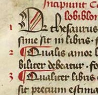
Postscript 13 May 2020: I have continued to study the enigmatic glyphs that head up each paragraph in the VMS and I am more convinced than ever that they have a pilcrow-like function rather than a letter-like function. In other words, in the VMS, the first glyph in each paragraph is not part of a word, it is a marker-glyph.
I have posted more than one blog on pilcrows and have already published some statistics for how the beginning-glyphs behave, plus I have run more tests since then. These include statistics on the makeup of the beginning-paragraph tokens with and without the first glyph.
This marker-like function is not limited to the VMS. It also occurs in medieval manuscripts, as in the example below.
In the Wellcome Apocalypse (MS49), the two letter-shapes to the left of each paragraph-group more-or-less alternate throughout the manuscript in essentially the same way as the begin-paragraph gallows glyphs in the Voynich Manuscript. They guide the eye to major sections.
But at the same time, there are also capital letters for the beginnings of words and major sections, a pattern that is also characteristic of the VMS. In other words, in MS49, the same letter-shape can serve a marker function and a letter function, something that may also be true for the VMS:
With thanks to Arca Librarian, who alerted us that the Wellcome Apocalypse (MS49) is now available for viewing online.
Deprecated: ucfirst(): Passing null to parameter #1 ($string) of type string is deprecated in /home4/jensonje/public_html/voynichportal/VMSForum/.default on line 256