Jeypore Evidence for the First Page Position
There are signs that the Voynich Manuscript may have been unbound when discovered (note that there have apparently been numerous “discoveries” of the manuscript in the sense of it being passed down through several hands) and possibly even rebound, and we have no definite map (other than pages written back-to-back) for their original order.
At some point, as often happens in libraries and other book repositories, someone added page numbers, but it doesn’t seem likely that the numbers were originally penned by the VM author—both the ink color and the handwriting style are different. Also, there are clues that suggest the manuscript may never have been finished (or may be incompletely assembled). If it was never completed, perhaps the author died or it was taken out of the author’s hands for other reasons, in which case there may not have been time to add page numbers if page numbers were originally intended (medieval manuscripts were not often numbered).
So, we do not know, with absolute certainty, that the first page in the manuscript is the first page written, but the red embellishments on the left look like a tentative attempt at slightly illuminated paragraph starters and the slightly tentative nature of the first page script, which becomes more practiced and smooth on subsequent pages, suggests it might indeed, be the first page, in which case another oddity in the script becomes an important clue.
Also, later in the manuscript, there are few, if any erasures, whereas there are erasures on the first page, along with some anomalies.
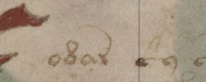
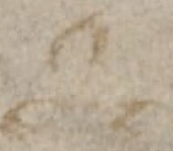
Note that the “t” or “c” shape with the cap (the glyph in the pic above left that later becomes the bench character, also known as EVA-ch) is followed by a “g” or 9 shape. This is not typical Voynichese. A little farther along the same line (right) there is an erasure, possibly to remove an error (although the many other alterations to the first page, especially along the top and right side, open the possibility that a drop of “erasing” fluid (acidic liquid) was inadvertantly dropped while erasing the alphabet column on the right, perhaps by someone other than the author).
Let’s pretend, for the sake of exploration, that the first page in the VM was 1) intended as the first page by the VM author and 2) was penned before most or all of the subsequent pages, then the disconnection of some of the letters that are later written as joined might provide some insights as to whether this glyph is a ligature or a single letter.
The Connected Glyphs
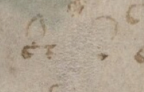
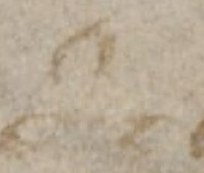
On page one, on the first line, note the disconnected shapes. The first one shown in the detail below is clearly disconnected, the second one appears to be, but it’s harder to know for sure. It’s even possible that the glyph on the left that resembles a “t” was followed by the superscripted curve, and then the second glyph that looks like an “r” or rotunda, rather than the letters being written first and the curve added over them later as appears to be the case in the rest of the manuscript. Was the VM author taking the first steps toward developing the distinctive script and a comfortable way to write it?
Later in the manuscript, and even on this page, the glyphs tend to be connected, which is not an uncommon scribal habit when a shape has to be written over and over, but the fact that they are disconnected in a number of places on what appears to be the first page suggests that this shape may be two glyphs combined, rather than one character, which would significantly affect the translation, as well as any computational analyses.
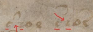
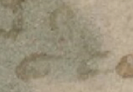
The same shape at the end of the first line (below left) might be disconnected also, but it’s harder to tell. It’s debatable as to whether the space in between is a disconnection or a pen stutter but it looks like it might be a pen stutter followed by a disconnect.
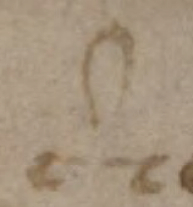
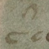
The shapes on the right are widely spaced as well, but the parchment is rough and it’s hard to tell if these have gaps between the shapes or the quill ink running out. The following example, however, is not ambiguous—there is clearly a gap between the first glyph and the second, underneath the cap.
In the earlier examples, the second shape (after the cap) was hard to discern. It could be a rotunda, a “t” shape, a “c” shape, or an “e” shape without the crossbar (not all scribes at the time made a strong distinction between “c” and “e” shapes).
Another thing to note about this shape or ligature, which sometimes has a curved glyph above it and sometimes doesn’t, is that the curved glyph is similar to the cap used in Latin sigla conventions. (Postscript, 2016: See the post about Latin abbreviations for more on this.)
J.K. Petersen
© Copyright 2013 J.K. Petersen, All Rights Reserved

