Author Archives: J.K. Petersen

Some Notes on Relativity

20 October 2017

Relativity may sound like the title for an Einstein blog but it also applies well to medieval musical notation systems, specifically those that differ from the modern western tradition. In the middle ages, there were many forms of relative notation and a particularly interesting one was posted yesterday by René Zandbergen on the Voynich.ninja site.
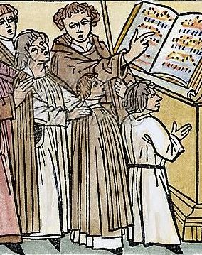
I’ve had a passion for music all my life and if I could quintuple the length of the day, I would spend one of those extra “lifetimes” as a composer.

I’m familiar with some of the notation systems in medieval manuscripts, but there are far too many to learn them all, and some of the earlier ones haven’t yet been unraveled, even by the experts. Many of them are comprehensible, however, and old tomes contain a wealth of staffed and unstaffed music (in the sense of not having horizontal lines).

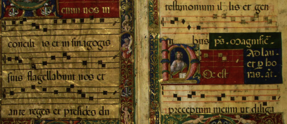
Here is an example of medieval chant music that uses a staff. Note there are only four staff lines and stems are barely visible on the rectangular notes. There are no phrasing arcs as we know them, and no bars to connect the stems but it’s still quite recognizable as western staff-notation:

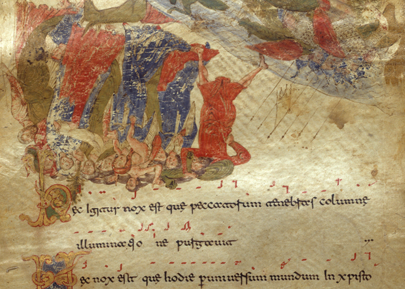
For comparison, this is an unstaffed line of musical symbols in a medieval Italian manuscript (MS 30337). Note how the symbols are laid in a horizontal line with a minimum of vertical positions and do not resemble round-headed notes as we know them:

My interest in music spilled over into my research on the Voynich manuscript almost from the beginning. When you are trying to figure out if something is ciphered, it’s important to search beyond linguistics. Certainly linguistic codes can be hidden in sneaky places, like astronomical charts and musical scores, but there are also non-linguistic ciphers. Take something like the Dorabella code mentioned on Nick Pelling’s cipher blog… the originator was a composer, so if I had time to investigate it, probably the first thing I would look for is a song or some commonality with music.

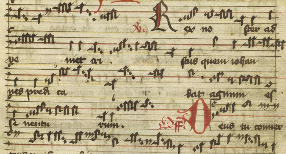
I am also intrigued by some of the notation systems that resemble letters and punctuation, such as this one from MS Lat Qu 44, and was curious as to whether musical notation might have inspired some of the VMS glyph-shapes:

I didn’t discover any convincing glyph origins in medieval music, but I did learn quite a bit about notation systems.

Jotting a Note
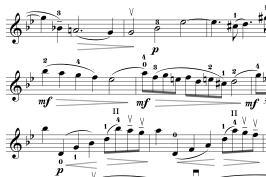
Detail of musical notation with five staff lines, vertical bars, the key signature, and arcs for phrases. This system is well-known to musicians throughout the world, but in the middle ages, music had not yet been standardized, and numerous staffed, staffless, and relative systems existed.

In modern western systems, the staff is an anchor for denoting a specific pitch, with the key signature providing a guideline to generalized sharps and flats.

The notes themselves follow conventions for duration (quarter note, half note, etc.), additional symbols specify the number of beats per bar, and curving arcs and <> symbols indicate phrasing and volume.

You could cut apart the music with scissors and still have a pretty good idea of how each part sounds.

Not every system works this way, however.

Some notation systems are based on the pitch distance from one note to the next, rather than an absolute system anchored within a staff. Ear-trainers teach intervals such as perfect fourth, perfect fifth, major thirds, minor thirds, etc. These are the distances between two notes. If you learn them, you can read certain forms of staffless music by following the interval from one note to the next based on the shape of the symbol rather than its vertical location on a set of lines. Other symbols function as modifiers to indicate duration or tempo.

Systems like this were developed when instrument-making was primitive, and choral music was widely practiced as a form of worship or as entertainment. Relative systems were especially suitable for chants. If you’ve seen the Brother Cadfael series, you’ve heard the kind of music that was originally expressed in this kind of notation system.

You might notice in the example from MS 30337, that the symbols are rather squarish. Many of the earlier systems have this general look-and-feel. Systems with curves and lines (a phrase familiar to Voynich researchers) tended to come later, and sometimes included more symbols than their predecessors. Even so, many of them were comprised of about 15 symbols—less than typical alphabets.

Some systems included a symbol for the key of the starting note and others did not—you could choose whatever was most comfortable for the voices. In modern western notation, the entire set of notes is transposed to a different position on the staff lines to alter the key. In a relative system, only the starting symbol is changed and the rest of the notes follow from that.

From Music to Mystery Glyphs

One of the reasons relative-notation systems intrigued me is a certain “follow-along” feeling to the way VMS word-tokens are organized, with many of them being similar to those that go before them, often differing by only one or two glyphs. Torsten Timm has done some interesting work in trying to algorithmically model these characteristics of the VMS text.

There also seem to be rules about where certain glyphs can be placed in a VMS-word, a characteristic I’ve discussed in numerous blogs, and one that is integral to many relative musical notation systems.
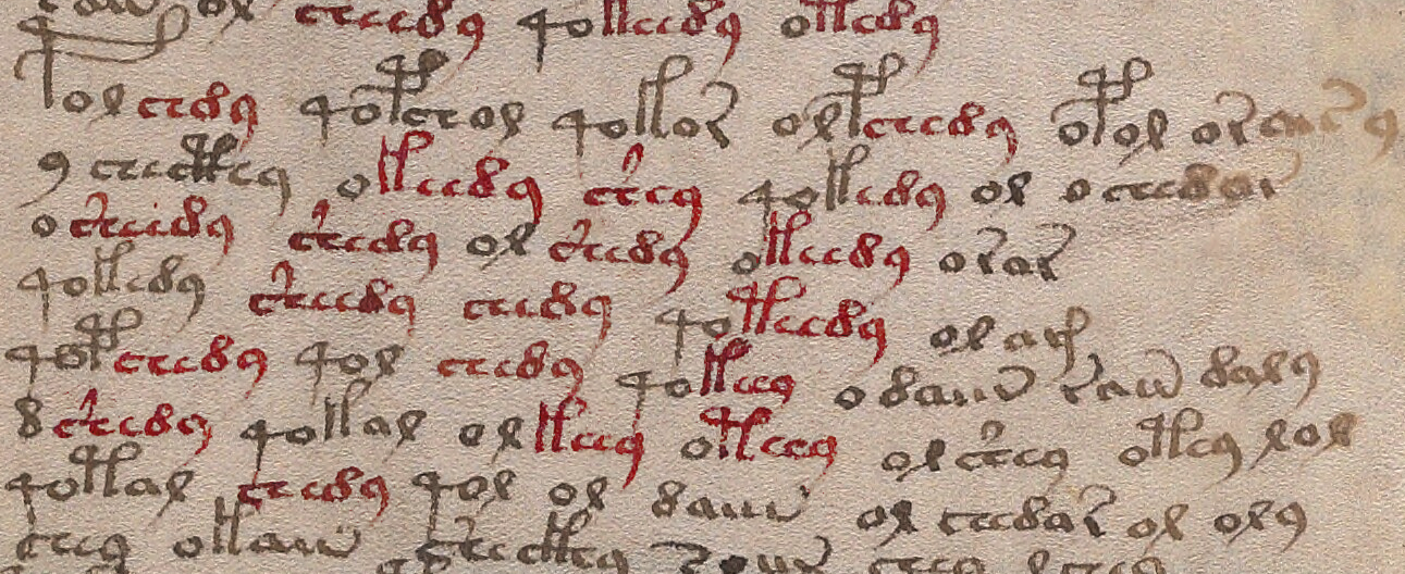
Repetition and self-similarity are very common in VMS text, with certain patterns occurring in specific positions in a word-token. This kind of positional priority is also found in Roman numerals and relative music-notation systems. [Image credit: Beinecke 408, Beinecke Rare Book Library, Yale.]

As I see it, there is a long list of commonalities between the VMS text and relative musical notation. For example, doubled letters are uncommon in the VMS (with the exception of the “c” shapes, which are sometimes repeated up to four times in succession). Doubled notes in certain musical systems are indicated with a doubling symbol rather than actually repeating the tone-symbol. Imagine writing words like penny, brittle, bell, and missal as pen2y, brit2le, bel2, and mis2al.

Most western languages are not tonal (in the sense of a different pitch indicating a different word), but many African and Asian languages are, and writing the sounds requires extra symbols to indicate the tones. This is also done in musical systems. In staffed systems, different pitches are arranged in different locations on horizontal lines. In relative systems, the shift in tone can be indicated with an interval symbol, but can also be notated as ascending or descending (in other words, there’s more than one way to notate related concepts).

Not every musical symbol has a sound value, just as linguistic systems include symbols without sound values, like the apostrophe. While some relative-notation symbols inherently indicate the length of a tone by their shape or length, others may be modifiers (like the one just mentioned that doubles a note). Modern staffed systems also have their share of modifiers, such as symbols to indicate the quality of a sound (e.g., pizzicato or staccato).

Byzantine Musical Notation

I don’t know Byzantine notation well enough to sing it aloud. There is a long set of rules for how the symbols may be combined and it takes practice to read it, just as sight-reading modern notation takes practice, but I am familiar with some of the basic terminology, a few of the symbols (known as neumes), and the concepts of relative notation that I learned from other musical systems, which apply in the same way to Byzantine systems.

For example, there is a small bowl-like symbol that is written together with tonal symbols to prolong the beat, just as there is a symbol for doubling the beat (playing it twice rather than prolonging it). Once again, this idea could be applied to linguistic notations. In English we typically double the following consonant if we want to shorten a vowel. Thus, the long-a in pater becomes a short-a in the word patter, but imagine if a common symbol were used rather than a letter, one that could be used throughout instead of a dozen different doubled letters—a certain economy of shapes is characteristic of relative notation and of the VMS.

The following example of Byzantine notation is from a manuscript in the British Library. Note how the symbols are curves and lines written in a linear fashion rather than flowing up and down on a musical staff.

I mentioned curves and lines because the VMS character set is unusual in having a strong emphasis on curves and lines, with many of the glyphs appearing to be composites of a few basic shapes.

Since relative systems were strongly tied to choral chants, and humans typically sing one note at a time (with Tibetan throat-singing being an exception) it wasn’t necessary to indicate simultaneous notes on a staff in the same way as one might for an instrument with several strings that are strummed at once.
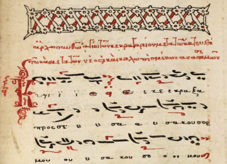
This sample of Byzantine music illustrates how notes are expressed relative to one another with a concise set of basic symbols, rather than being laid out as ovals on a musical staff. Note that some of the symbols are drawn in red, like the ell-shape that resembles Greek gamma. This is called a gorgon and there are rules for whether it is placed above or below the associated symbol, just as the VMS has rules for whether a glyph appears at the beginning, middle, or end of a token, and additional rules for its associate-glyphs.

Now imagine if you were to transliterate this musical notation into an alphabet system. One might take a symbol like the gorgon and place it before or after its associated symbol, rather than above or below. This calls to mind the highly frequent “o” symbol in the VMS, which is often at the beginnings of V-words, and frequently precedes EVA-t or -k. Note also that this notation system is very rule-based and would exhibit many positional characteristics if rendered as text.

Byzantine music was documented in this 18th-century Serbian manuscript held in Greece (Schoyen MS 1897) and I include it because a variety of whorled diagrams were not uncommon in books of music.
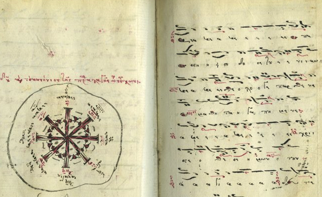
There was a particular interest in relating “music of the spheres” to cosmological concepts in the Middle Ages and Renaissance, so some of the whorled and wheel-with-spokes images reflect these ideas, and the shapes became iconic designs found in many music manuscripts to describe these and other concepts. Wheels were also used to illustrate a variety of tonal systems.

In fact, it doesn’t surprise me that composer Edward Elgar chose symbol positions for his Dorabella cipher that appear to rotate through eight angles, the same number of tones as in a basic western scale (do, re, mi, fa, sol, la, ti, do).

Summary

There was a large body of relative notation in the early middle ages, but musical instruments improved (along with our ability to play them) and the staff system (which could more readily accommodate simultaneous multiple notes), gradually superseded it. The algorithmic quality of relative notation was almost forgotten.

I know that people have assigned notes to the VMS glyphs and played them as music (I’ve done this myself), but relative notation isn’t about assigning a tone or chord per glyph, it’s a prioritized system describing tone, duration, direction of the pitch, and nuance, and the modifiers are applied in a certain order (and sometimes change based on what is being combined). When you scan it visually, it is concise, repetitive, and positional, as is Voynichese. It’s the closest analogy I’ve seen to the structure of the VMS text, and I wasn’t even planning to mention it until I had more time to explore it, but extra time doesn’t seem to be coming my way.

————— = + = —————

The frequent repetition in Voynichese is somewhat reminiscent of songs or verse, but there’s something more to it—even songs and verse have more positional variety than VMS glyphs.

Relative notation systems range from simple to very sophisticated, but many of the more sophisticated ones can be expressed in about 10 to 20 symbols, depending on how they are placed. In other words, the musical “alphabet” can be written with a smaller character set than many human alphabets.

What if the VMS were the notes themselves, rather than lyrics, lists, or narrative text, or were a constructed language built on the same concepts as relative musical notation, where one-to-one correspondence doesn’t apply, where modifiers determine how a glyph should be read?

Perhaps one of the glyphs is like the petaste, a symbol that represents a one-step tonal ascent. Imagine a symbol that says, “Don’t read the previous glyph as t, read it as the letter that follows it in the alphabet.” Or imagine if gallows-k meant something different depending on whether it’s followed by EVA-y, or ch or ol or od (Janus Pairs).

Many of the ideas common to relative musical notation have direct analogs in the cipher world and since chants were popular in monasteries, as was the development of ciphers, monks monks may have transferred some of these ideas from one to the other as the old notation systems faded away.


J.K. Petersen

© Copyright 2017 J.K. Petersen, All Rights Reserved

Oceans of Starry Notions

17 October 2017

Research is the systematic search for knowledge. Editorializing is presenting one’s opinions and interpretations, sometimes with examples specifically chosen to prove one’s point. When it comes to the Voynich Manuscript, it’s probably best to emphasize the former, since very little is actually known about the VMS.

Spirals and whorls were discussed recently on the voynich.ninja forum and, on October 15, 2017, D.N. O’Donovan posted a brief blog comprising a montage of seven images with the Latinesque title: Floribus campis Coeli. There is no commentary and I have only read a few of O’Donovan’s blogs, so I don’t know the background on these images, but one of the captions reads,

“As noted in the first of my posts mentioning this whorl motif in Beinecke MS 408, one finds early examples in Ephesus, Antioch and Rhodes but it reached the South-western Mediterranean no later than the 7thC AD.”

I haven’t made a systematic study of spirals or whorls, I’ve mostly concentrated on the Voynich Manuscript text and plants, but I have gathered a few images along the way.

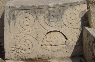
Spiral reliefs in wave and garland patterns decorate the Temple of Tarxien on the island of Malta [image courtesy of Wikipedia].

It’s my understanding that spiral and whorled imagery date back at least to the Maltans, before 2,500 BCE, which is considerably earlier than the 7th century CE mentioned in O’Donovan’s caption, and I would consider Malta, which had close ties to the Iberian Peninsula, to be sufficiently connected to the SW Mediterranean to be relevant to this discussion.

Megalithic courtyards, as the Maltan Temple of Tarxien, are well-decorated in wave- and plant-like spirals, and the Romans who occupied Malta from the 3rd century BCE, continued the tradition in their mosaics.

Next to a picture of the “Mosaic Ephesus”, which is a spiral with a sawtooth design, O’Donovan adds,

“In illustrating this mosaic, I was showing the antiquity of spiral armed forms – here it represents ‘all the world under the sun’. In other cases it might represent the sun itself. In one image from the Vms, it represents the rhumbs as I’ve explained.”

Spiral garland patterns carved into spoglia. [Image courtesy of Rag Rose’s blog.]

The mosaic mentioned by O’Donovan is on the Curetes walkway in Ephesus, Turkey, and is accompanied by many other mosaics and carvings with circular and feather-like overlapping designs, as well as natural images of dolphins, ducks, doves, dogs, deer, lions, and floral garlands.

Ionic columns in the area also include spiral motifs, as do decorative edges. Since many of the spiral carvings are integrated with floral garlands, it appears that most of the spiral and whorled designs in this complex were inspired by flora and fauna rather than celestial objects.

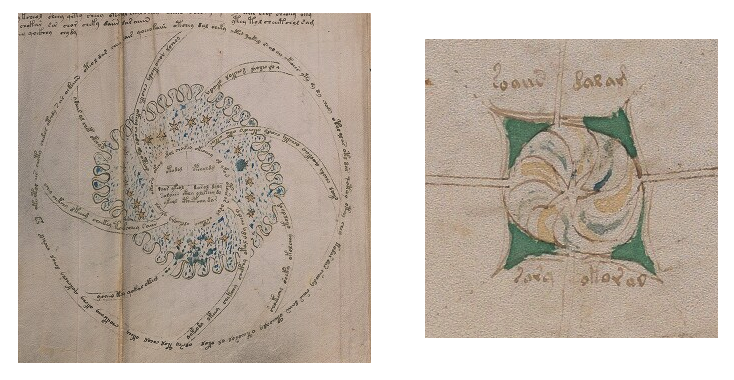
For reference, here are spiral images from the Voynich Manuscript:

The figure on the left fills most of the page and spirals in a clockwise direction, with text filling the spokes. There is an Armenian astrological diagram that is similar in construction (circles, spokes, and text associated with the spokes) but it does not include the T-O map or the cloudband-like scallops or star-shapes in the central portion. [Edit: 10/26/17 I forgot to mention when I posted this that the Armenian sun-cross was a prevalent symbol, usually consisting of a spiral sun, or a sun-symbol surrounding a cross. You can see examples on Google search.]
The spiral on the right is much smaller, comprising only the center of the page, and radiates in four directions toward other imagery. If you look closely, you’ll see that it originally had nine lines to mark the edges of the spiral arms, which doesn’t bear any relation to the four radiating lines or the six-pointed star, and doesn’t work well if you are trying to paint each section in alternate colors, so the painter fudged the colors on the bottom, with a thin stroke of yellow to separate two blue sections that ended up next to each other.

The Way-Back History on Whorls

Ancient spirals and whorls are found throughout the world, especially in the Americas, Buddhist Asia, Malta, Greece, Turkey, Africa, Ireland, and Scandinavia.

One of the easier ways to make attractive patterns from a piece of wire is to wrap it in a spiral—no exemplars needed—but there are also spirals in the ancient and medieval world that appear to be talismans, or to embody a more specific religious significance. Some patterns are purely decorative, or based on nature (e.g., a curled snake) rather than on religious symbology. One has to study the culture to interpret them correctly.

Studies of ancient imagery are often based on guesswork about the superstitious and spiritual beliefs of cultures for which we have limited information, but some spirals have been found in megalithic sites that are oriented toward the solstices or equinoxes and thus are thought to represent the sun.

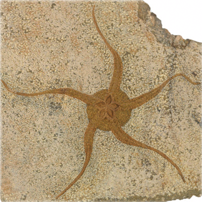
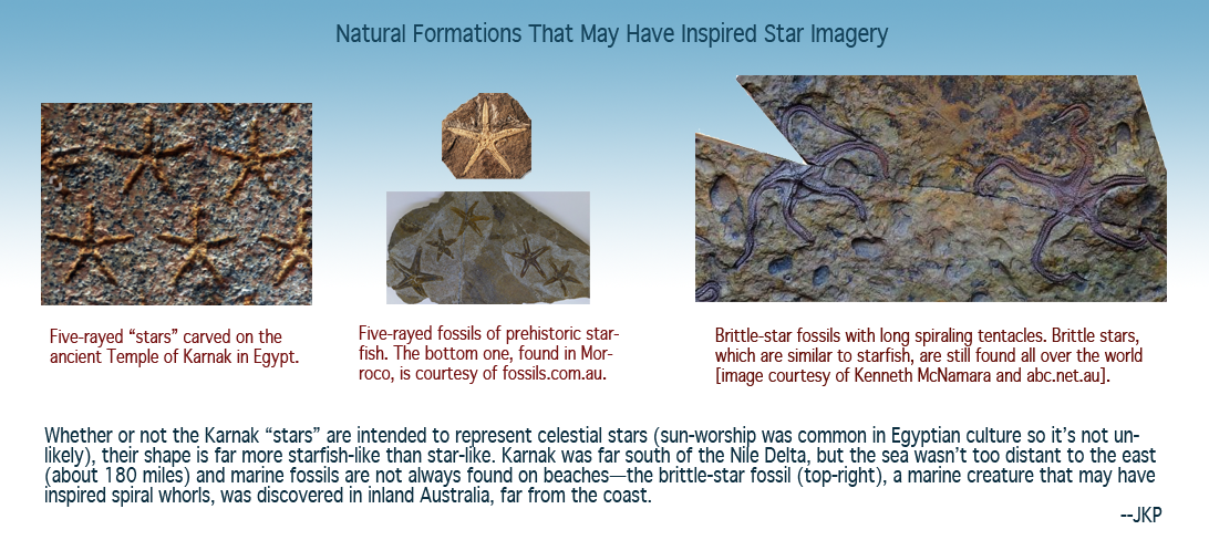
Brittle star fossil found in Mt. El Kissan, southern Morocco {Image courtesy of Fire & Ice].

The picture on the right might look like a petroglyph drawn by a sun-worshipping culture, but it’s actually a brittle-star fossil (Ordovicia) from Morocco.

In the Mediterranean, the patterns of nature were dear to the hearts of ancient people. Even today, the postage stamps of Malta show a rich appreciation of nature’s beauty.

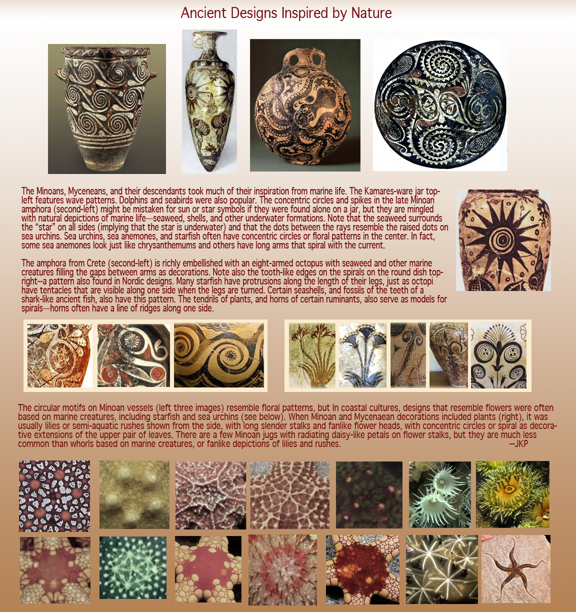
If you look at star shapes and spiral motifs on ancient vases and bowls, you will see many designs inspired by starfish, sun stars (an animal that resembles the starfish), sea urchins, and anemones. Even the little lines and colors in the centers of starfish and sea urchins can be found in Greek decorative arts and Roman mosaics (more on this below).

The Mycenaeans took most of their inspiration from marine life, rather than from the world above them. That’s not to say they were indifferent to the sky… as sea-people, stars were very important to them for navigation, but iconographic analysis has to acknowledge their strong bond to the sea.

Double Entendre

Double meanings are possible in imagery that has multiple interpretations. The stars at the Temple of Karnak in Luxor, for example, are numerous and golden against a blue background, so one immediately thinks of stars, but if you look closely at the way they are drawn, and consider the fact that water is also frequently painted blue, then you have to acknowledge that they may be inspired by starfish, or perhaps be a simultaneous reference to “the stars above and the stars below” [click the pic to see it larger].

Cultural Exchange

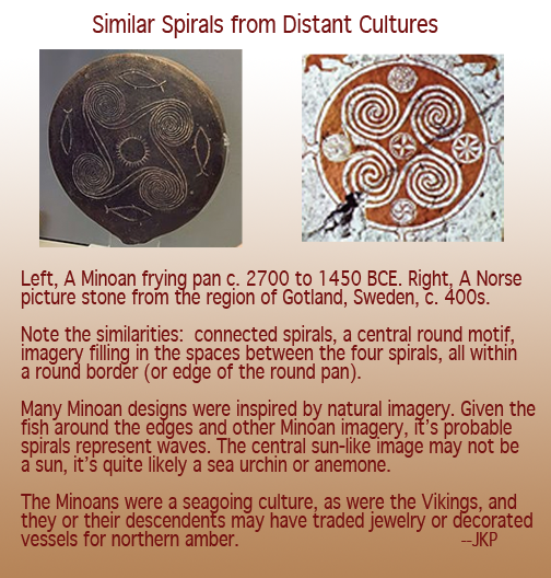
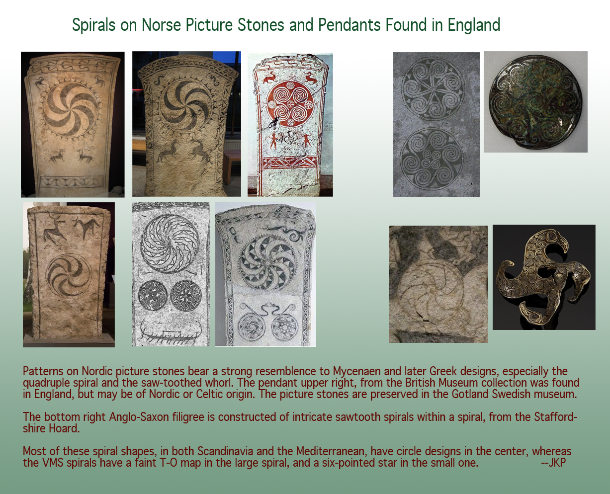
Surprisingly similar quad-spirals have been found on ancient ornaments in both Greece and Sweden (right).

While Scandinavia and the Mediterranean seem far from one another, there was trade between the Norse and early inhabitants of the Iberian peninsula.

The Basques may have served as a communications conduit between the north and the Mediterranean. They were expert mariners and whalers, equal to the Vikings in their seafaring prowess, and crossed paths with the Vikings at stopping points along the coasts of Norway and Iceland often enough that they learned some Icelandic.

The spiral is also a megalithic motif in pre-Celtic Ireland, and the Vikings apparently coerced or kidnapped Hibernian women on their way to Iceland, a fact that is reflected in the DNA of the Icelandic people. Thus, the women of Ireland may have contributed decorative arts to Viking culture.

Spirals are also found in the Canary Islands, whose “discovery” and plunder occurred prior to the creation of the Voynich Manuscript.

Thus, the similarity between northern and southern spirals may not be coincidental.

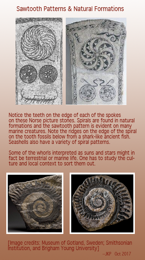
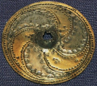
The beautiful spiral on the right bears a strong resemblance to some of the medieval manuscript illustrations containing sun spirals. It is dated to c. 300 CE from Birkenes in southeastern Norway. Some think the design may have originated in Asia, but there are similar spirals (with protrusions on the edges of the main arms) from Sanda, in Gotland, Sweden (c. 400 to 600 CE) and the Gotland picture stones, in turn, resemble Mediterranean designs.

Thus, one sees a chain of communication between the Norse, the Hibernians, and the Mediterraneans, possibly via the Iberian Peninsula, and a pattern of spirals in megalithic and classical art that may be rooted in communication rather than coincidence.

Spirals in Manuscripts

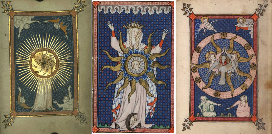
Rayed faces and suns are common to manuscripts from many cultures (they are frequently found in Arabic and Latin manuscripts, as well as the VMS). Spirals are more difficult to find, however, and many of them are more religious than astronomical, but there are some  provocative spirals and whorls in the Rothschild Canticles (MS 404, c. 1300) held at the Beinecke Library, that are interesting to examine:

The image on the left, featuring a central spiral with long rays is surrounded by four figures, each with arms outstretched, emerging from cloud bands. The VMS includes a number of images with four figures, some of them with their lower bodies deep in textured patterns. The image on the right also features four figures in the corners, two apparently celestial, the other two terrestrial, and there are round spirals between the rays of the inner whorl.
The central image has a whorl with long starfish-like arms around a central circle with cloudband-shapes radiating in two directions (and rimming the top and bottom edges of the frame). At the base is a face peering out from a crescent moon.
A further image (not pictured) includes four figure in the corners, and three faces in the central wheel with faces ringed by turban rolls not unlike the rolls that frame the faces on the VMS star pages.

There are many other manuscripts with spiral and whorled imagery, these just happened to be at hand, so I include them as visually appealing examples.

Summary

As I mentioned, I have not made a systematic study of these shapes, in fact I’ve barely looked at the parts of the VMS that include them, so I offer the information above as a “quick grab” from my files for those with a specific interest in VMS whorls.


J.K. Petersen

© Copyright 2017 J.K. Petersen, All Rights Reserved
A Helping Hand

What Can Hands Tell Us?

When I was creating a VMS transcript, I noticed immediately the change in handwriting partway through the big-plants section on folio 26r. It was not just scribal haste or fatigue—the spacing, rhythm, and slant were different, as were some of the letter forms. It was clearly the same style of writing (perhaps a blood relation of the original scribe?), but not the same hand.

Interpretation of VMS glyphs is something I’ve wanted to write up for a long time but I wasn’t sure how to express it in a way that was sufficiently clear, until I realized the hand on folio 95v1 might help me illustrate the concepts.

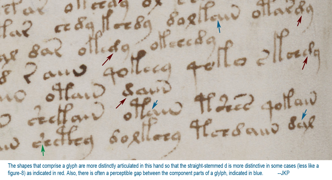
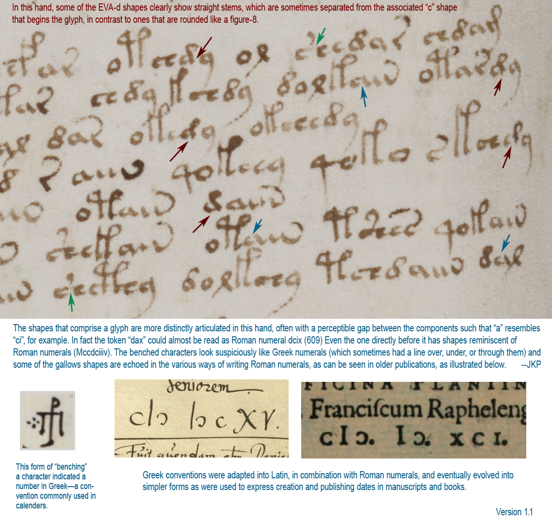
In the following illustration, there are several instances of EVA-d with a straight stem (marked in red), and certain glyphs with greater separations between their component shapes (marked in blue):

I have often wondered whether a rounded “d” and a straight “d” are different glyphs, and created two different characters in my transcript to record them. But I still treat them the same most of the time, as they seem to fall into similar patterns. But perhaps they are different. For example, when they are at the ends of words (which happens frequently when the d is paired with EVA-y), maybe the two shapes are meant to be read as two different endings. If this were Latin, for example, one might mean -us and the other -um, or one might mean -us or -um and the other might mean -bus. Or maybe there’s a completely different interpretation (that I’ll discuss later).

Another thing I noticed on this folio is the greater tendency of the scribe to separate the component shapes of a glyph. There’s a good example on the far right (marked with a red arrow) in which the first curve is clearly separated from the “is” shape (“is” is a Latin symbol that looks like a short cursive ell). The “is” shape occurs in EVA-m and gallows characters and sometimes the letters with “is” are written almost like short gallows, suggesting they might be related.

What Do Tails Tell?

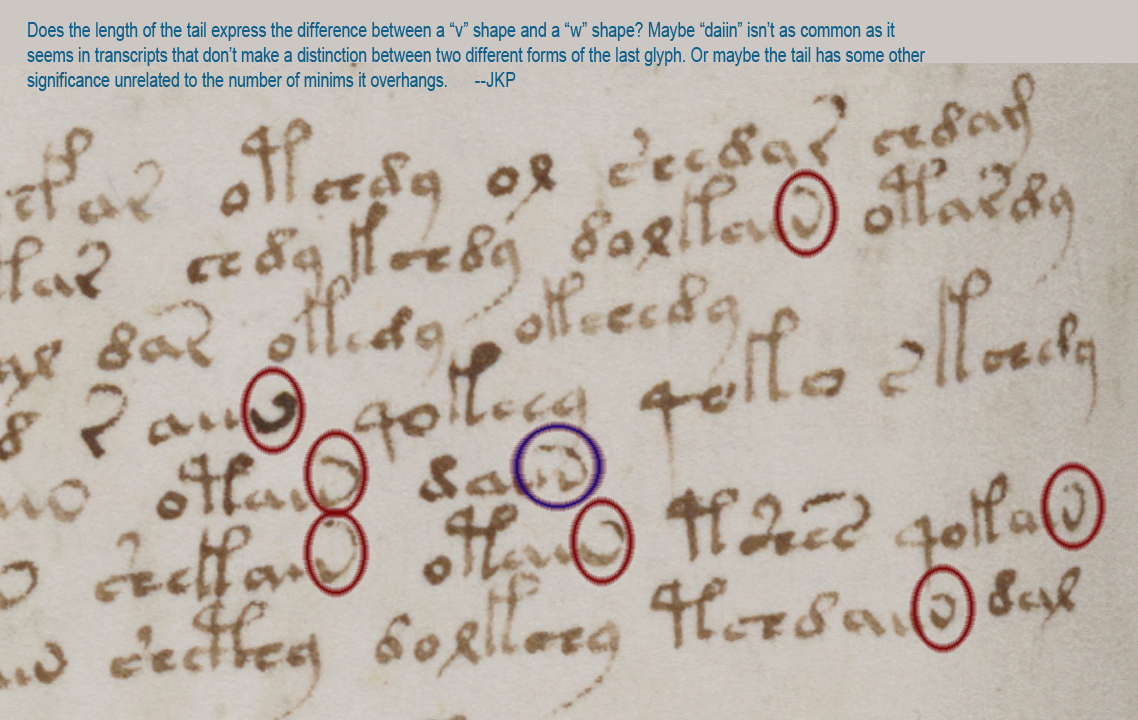
There’s another distinctive aspect of Voynichese that inspired me to create my own transcript and my own fonts. Notice how strongly the character normally referenced as “n” (in daiin) resembles a v or a w? This is how I transcribed them. But then how can you tell the difference between v or w if there are one, two, or more minims preceding them? This is something I pondered for a long time and I think the answer (at least for this scribe) might be the length of the tail. Notice how the tail loops back farther on the one that resembles “w”. I don’t know whether v and w are meant to represent two different characters, but I think the distinction between “n” and “v” in the transcript is important, as I’ll explain farther along.

Enumerating the Gallows

Some years ago, when I was looking up the history of pilcrows and gathering samples (which took a couple of years), I also collected examples of Greek and Latin abbreviations and number systems because many of them resemble gallows characters.

Early on I was insisting that almost all the VMS characters are based on Latin (with a few on Greek) and there was a lot of resistance to the idea (I got some “interesting” email). Quite a number of people disagreed with me, some rather disparagingly, and said I should be looking at Armenian or Georgian, or other script systems dissimilar to Latin because, as they said, “It doesn’t look anything like Latin.”

I have looked at those other alphabets (and many Asian scripts, as well) and still maintain that the majority are based on Latin character-shapes and abbreviation conventions, as I’ve noted in my blogs. But maybe things are changing. I’ve noticed a recent upswing in VMS “solutions” claiming that the text is Latin that needs to be expanded. Well, maybe, but I want to emphasize the fact that Latin characters and scribal abbreviations were used in many languages, not just Latin, so Latin glyph-shapes don’t automatically mean Latin language.

——=++=——

But to get back to similarities with Latin abbreviations, a horizontal line or slightly slanted line was commonly used in early Latin documents to signal missing letters (similar to an apostrophe). Here are some examples of abbreviations and ligatures (which are not the same thing and should not be confused with one another):

And now we get to the good part…

If you look at the first illustration again, where separations between individual parts of a glyph are more distinct, you might notice the Vword on the bottom-right, usually transcribed as “dal” looks suspiciously like the Roman numeral dcix (I was tired when I wrote this, this is 609, not 59). In my transcript, I have transcribed EVA-l as “x” for the simple reason that it looks more like a medieval “x” than “l” to me, but also because I noticed the similarity between Voynichese and Roman numerals early on and wondered whether there might be a connection.

Greek and Latin Numerals and Their Relationship to Voynichese

Old forms of Greek, Hebrew, and Roman script did not have a separate set of glyphs to express numbers. Instead, they were written with letters. Over the centuries various conventions were used to mark them so they were not mistaken for letters.

In Greek, a line was drawn above or through the character to signify a number. In Latin documents that used Greek conventions, some numbers were expressed using Greek forms, some were in Roman numerals (sometimes with a line over them), and some were Arabic.

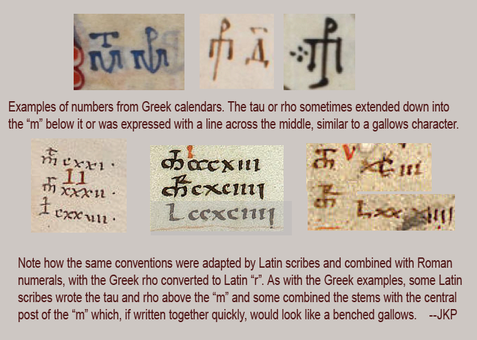
Here are examples of numbers from Greek and Latin manuscripts that may have inspired the benched gallows characters in Voynichese. Note also that if you’re not a paleographer and you came across the Greek examples (top row), without the Latin examples I’ve added below them for comparison, you might be mystified as to their meaning:

Look at this excerpt from 95v1 one more time, paying particular attention to the characters in the bottom right. Note how the separated “a” glyph makes the token look like dcix (609) in Roman numerals.

In fact, the text directly preceding “dax” looks very much like Mccdciiiv, which isn’t quite conventional, as two would usually be indicated with “ii” rather than “iiiv” and you wouldn’t normally place a dee between the three cees, but what if the tail is the common Latin abbreviation for a line over the letters, which was sometimes written as an attached tail to facilitate quick writing? Then you get Mccdciiii—still not quite conventional, there’s still the problem with the ccdc, but notice that the cc is benched.

Hmmm, could the bench on the cc (EVA-ch)… possibly mean it belongs on either side of the preceding “M”? Maybe what we are looking at is cMɔ dciiii (with a tail over the iiii to indicate a number), as it is in the illustration above. This can also be written with a pipe symbol as follows: c|ɔ dciiii as it was often written in the 15th century and onward.

The d-“aiin” token comes in many flavors. It’s not always preceded by “d”, it can be preceded by almost anything, and the number of minims after the “a” shape ranges from 0 to 4. If the stem of the “a” is also a minim (if a is ligature c + i), then it ranges from 0 to 5 or 0 to 4 plus “v” (Roman numeral 5) depending on whether one interprets that last glyph as a “v” or as an “i”-with-a-tail to indicate a number.

Inspiration for Shape and Structure

Is Voynichese numbers? If it’s numbers, do they represent letters or sounds? Or is Voynichese a coding system that includes a subsystem for numbers?

If you take your mind out of linguistic mode for a few moments, and pretend the text is Roman numerals (even if it isn’t), do you notice that you see it differently? Have you made assumptions you didn’t realize you were making?

——=++=——

As I’ve posted in many blogs, the glyphs are based on Latin letters and abbreviations, but they look to me like they’re based on specific Latin characters that have a high correlation to Roman numerals.

Roman numerals consist of M d c l x v i (sometimes scribes lined up several “i” characters instead of combining them with v), sometimes c-shapes were placed on either side of the M, sometimes a line was drawn over or through the letters. All of these are hauntingly similar to aspects of Voynichese.

Notice how the characters that are benched resemble tau and rho, the two characters placed above “m” (which was sometimes written as a bench in both Greek and Latin). In Greek, a rho looks like a “p”.

Even the EVA-r glyph might not be an “r”—it might be an “i” with a tail (as it was written in Latin).

Except for EVA-o, -y, which are suspiciously frequent compared to natural language frequencies, and EVA-q, which is very positionally consistent, almost all the common VMS glyphs bear a strong resemblance to M d c x v i and benched forms of  tau, rho and M + c. Note also that EVA-o and y are variations on circles. Maybe EVA-o, y, and q are some kind of markers.

Or maybe “o” stands for zero (as in 1408) or is another form of “c” (depending on position).

The Voynich characters are positionally constrained. So are Roman numerals. If you put a “d” in front of a “c” it means something different from “c” in front of “d” (600 versus 400). Maybe Voynichese does this too.

Summary

The VMS might not be Roman numerals, it might not be numbers, but there is a strong similarity between Voynichese glyphs and Roman numerals.

There is also a strong similarity in how Voynichese prioritizes glyph order. Whatever system is behind the VMS, I think Roman numerals, at least on the conceptual level, had something to do with the way Voynichese was designed.

Perhaps other people have mentioned Roman numerals in connection with the Voynich Manuscript, I don’t know (it seems like a reasonable supposition and I’m still comparatively new to the Voynich scene), but I haven’t seen anyone demonstrate a connection between benched numbers (Greco-Roman glyph conventions) and the bench characters in the VMS. Nor have I seen anyone provide a cohesive explanation of how VMS glyphs may have been historically and pictorially inspired by a system like Roman numerals, so hopefully this will add something new to the VMS corpus.

———————-=++=———————-

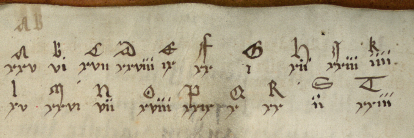
Before I close, I have a little bonus… It’s a secret where I found this (at least for now), but here’s a little medieval “pen test” that you might enjoy.

Note that only three characters are needed to represent the whole alphabet, except that one might need a few nulls to separate the individual “letters” and to obscure the fact that they are Roman numerals so it won’t be too easy to break. Imagine what it would look like if you did that?


J.K. Petersen

© 2017 Copyright J. K. Petersen, All Rights Reserved


Janus Pairs

16 September 2017

The Theme of Duality

You may have noticed pairing in the VMS… double crayfish, two sheets each of “Aries” and “Taurus”, 2 x 2 sets of 17 on the page that looks like a code wheel, but have you looked for pairing in the text?

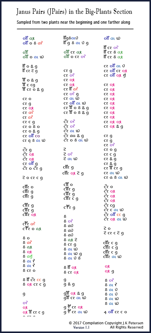
In a previous post I introduced a group of glyphs I call The Gang of Four (if you haven’t read it, I strongly suggest it or this followup blog won’t make much sense). The Gang of Four is a subgroup of glyph-pairs that occur with great frequency within Vwords, and can also stand alone. Together with other glyphs with similar properties, I refer to them as Janus Pairs (or JPairs for short).

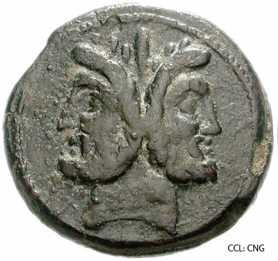
Janus was the god of duality. He presided over beginnings and endings, doorways and passages. I like the analogy of Janus Pairs opening a window into the structure of the text.

Unlike English and many other languages, VMS glyphs cannot be shuffled in a multitude of ways to create a large pool of Vwords. Certain glyphs are found only in certain positions. This is true even if you evaluate them in pairs, which means the VMS is more positionally rigid than syllabic Asian languages, as well.

But pairs there are, and they form a disproportionately high percentage of letter combinations in Voynichese, with some interesting differences in where they are used.

The Prevalence of Janus Pairs

I cannot fully describe the dynamics of Janus Pairs in one blog or two, any more than one could describe the dynamics of English in one blog or two, but I can introduce them so you can visualize the patterns and make sense of follow-up articles.

Before posting examples, please be aware that I’ve spent years trying to discern which are pairs and which are monoglyphs (or ligatures). This is not easy (if it were, it would have been done a long time ago), but some can be confirmed by following them through the entire manuscript and noting where they fall in relation to other glyphs. It took me a while to figure out how to present them so the patterns could be readily seen.

The Gang of Four is an example of prevalent pairs that can be either free-standing or joined to other words, but it’s important to look at all the JPairs. Unfortunately, it’s not practical to post all of them, so I have selected examples from two sections.

Examples

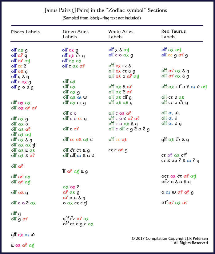
The first group is from the “zodiac” section. There isn’t room for all the zodiac symbols, so I selected four as examples and chose only the text from the labels (not from the text inside the double rings). If this subject interests you, you can look at transcripts yourself to work out the others.

The second group is from the big-plants section. I’ve chosen two plants near the beginning, and one farther along.

Obviously, to understand the text, you have to analyze and compare all sections and all the Vords on each page, and I have spent years doing this and still have some unanswered questions, but the following charts should be enough to get the concepts across. Note that I have chopped three of the less common Pisces labels from the bottom of the chart, mostly to save space, but also to put the emphasis on the ones that are most prevalent and most illustrative of patterns. This doesn’t mean the three deleted Vords are unimportant.

I have color-coded pairs to make them stand out because I’ve seen so many decryption attempts that don’t take them into account. These charts are not designed to reveal the meaning behind the text, that is best done by organizing them in several different ways and placing them side-by-side on a very long table. Their purpose is to illustrate

  • fundamental positional patterns,
  • pair composition,
  • pair frequency,
  • order of glyphs within pairs,
  • and differences between the text in two different sections of the manuscript.

So here is the first set of Janus Pairs, from the zodiac section:

I’ve collected samples of text in a number of languages to compare to these patterns (which is another long subject, possibly too long for a blog).

Here is the second chart, with examples from the big-plants section (note that a few Vords are chopped from the bottom of the first column due to space constraints).

You can immediately see that they differ in form and content from the zodiac-symbol vords but that there are structural similarities in where glyphs appear in specific vords (note that I am not certain aj is a Janus Pair, it can sometimes be oj and may be two separate glyphs).

Summary

Even though these are only small excerpts, there is much information to be gleaned from them.

Note the overall differences between zodiac Vords and plant Vords. There is a high prevalence of ot and ok combinations in the zodiacs. In the plant section, one sees many Vords starting with EVA-ch, -sh, or d and few of those that are common in zodiacs. If EVA-ch is a ligature then it may also qualify as a pair.

These patterns are prevalent enough that it’s possible to make a few predictions about where vords are likely to appear in the manuscript. You can’t do it from these charts alone (although some of the patterns are more obvious than others), but it’s possible when all the tokens in the manuscript are evaluated together.

Note also that there are priorities in terms of glyph placement. An “o” glyph paired with EVA-l, -t or -r, for example, behaves differently from one that isn’t combined into a pair group. This might be one of the reasons the o-glyph is so frequent, and also suggests that some glyphs may be intended as monoglyphs or ligatures—their status may be determined by their position and relationships to other glyphs, which might explain the strict positional rules.

VMS text is highly structured, not at all random, and there is substructure within individual sections. As to how it relates to natural languages, I’ll discuss that in a future blog, after you’ve had time to digest this one.


J.K. Petersen

© Copyright 2017 J.K. Petersen, All Rights Reserved
 

The Baths of Puteolanis

13 September 2017

A Blast in the Past

In my previous blog, I mentioned that in 2008 I had studied Naples as a possible inspiration for the Voynich rosettes, but didn’t realize until years later that it was connected to the Baths of Puteolanis (or that this ancient spa had been suggested as a parallel to the balneological section of the Voynich manuscript).

I mostly explored the geography and topology of Naples through aerial photographs, looking for the features I felt sure were depicted in the VMS—volcanoes, steep cliffs, islands close to the mainland, jetties, canals, but because water was a prevalent theme in the VMS, I was also looking for spas that included waterfalls and grottoes and there were spas in other regions that appeared to have these features in greater abundance than Naples… or so I thought…

I have been to Naples. I stopped there briefly on my way to Greece, so I knew it was thermally active and that there were many bathing holes, but I did not know there were also caves and grottoes connected to the ancient baths, and thus missed a significant connection to the VMS.

How could I overlook such a prominent and famous feature of an ancient city? It turns out that the popular spa was destroyed by major volcanic activities in 1538. These eruptions forever changed the grottoes and thermal conduits, burying many of them under a newly formed 1,500-foot cinder-cone aptly named Monte Nuovo, and rearranging the coastline (one that may have included a fresh-water canal) so that much of it is now under water.

The Naples Baths

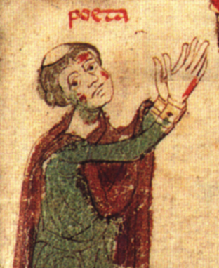
Court poet Petrus of Ebolo (c. 1196–1220 shown left) was the most significant author to document the baths prior to their destruction. He describes about three dozen baths situated between Naples and Baia (each of which had a name), and the diseases/body parts cured by each. According to Fikret Yegül, who extensively studied the history and architecture of the baths in the 1990s, only seven of the thirty-five baths appear in all of the ten illuminated copies that were known at the time the article was published, in 1996.

Based on extensive study and documentation of the ruins of Baia, Yegül paints a poignant picture of the bath complexes during their heyday that really caught my attention because he described aspects of the baths that no longer exist:

“The hot mineral water was brought by conduits directly into some of the chambers and filled the pools for private or public ablutions. Other units, particularly the small, domed ones, must have been intended for sweat bathing in hot, natural steam conducted into them through underground galleries and conduits… Some of the underground galleries and cavelike spaces might have been utilized even in their natural state for curative bathing and sweating…. The subterranean zone under the hillside complex is virtually riddled with caves, chambers and galleries.”

Pagan Influences

“The Apsidal Hall at Punta dell’Epitaffio appears to have been a particularly sumptuous example of the late Republican and early Imperial nymphaeum type in which aspects of a natural cave were imitated inside a vaulted architectural setting.”

The VMS has always struck me as very pagan in its presentation—almost devoid of Christian references and full of water and nymphs and an unselfconscious way of expressing nudity that was characteristic of pagan art of the Mediterranean. Yegül goes on to convey the pagan nature of the Naples-area baths:

“Originally, the apse had eight small niches instead of the three large ones seen now; these niches apparently contained fountains. Maiuri believed the complex served as a “nymphaeum” and was a part of the great rotunda… known as the “Temple of Venus”….

A nymphaeum thus conceived is not simply a fountain or source sacred to the water deities, the nymphs, but is also an architecturally integrated whole, shaped functionally and thematically around water….”

He then makes an interesting reference to Hadrian’s Villa in Tivoli (the town where the Villa d’Este water gardens are located that I described here due to architectural similarities that strongly reminded me of the VMS rosettes folio):

“… the “Fountain Court” of Nero’s Domus Transitoria, the triclinium of the Flavian Palace on the Palatine, and the various dining pavilions in Hadrian’s Villa in Tivoli (particularly the so-called Garden Stadium and the grotto pavilion at the end of the Canopus) are all creations of a kindred spirit.”

When I studied the Villa d’Este, years ago, I searched extensively for possible forerunners to the water-garden design, thinking I might find something from an earlier century that influenced the VMS, but only located bits and pieces of information, as many of the early estates were overbuilt by new gardens or other complexes. I knew that Cardinal d’Este was inspired to some extent by Hadrian’s ruins nearby, but I did not know about the connection between Hadrian’s ruins and the bathing culture in Naples or that Naples had elaborate waterworks such as those I imagined might be illustrated on the rosettes folio.

“Elaborate pipe work hints at a sophisticated play of water with jets and fountains along the length of the peripheral canal, and inside the apse and the side niches.”

Yegül goes on to describe another feature that I observed in the VMS but thought was absent from the Naples bathing spas. Apparently cascades (waterfalls) were also part of the Baia complex:

“The pool [in the Thermae of Sosandra] is connected to a grotto and an extensive network of subterranean galleries that penetrate deep into the hill to reach the source…; this source appears to have served both the Sosandra complex and Baths A, higher up the hill. Several reservoirs are located behind and above the exedra. The water must have flowed in streams and cascades into the pool and continued down to the lower terrace….

Large vaulted chambers (like subaquatic grottoes) run along the high banks of the pool enclosure connecting the pool to grottoes and tunnels carved deep into solid tufa….

A row of interconnected, vaulted cisterns behind the Ambulatio was supplied by an aqueduct of Augustan date. These and other cisterns higher up on the hill must have brought fresh water to the various bathing establishments…”

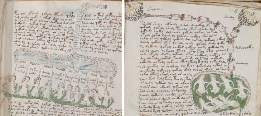
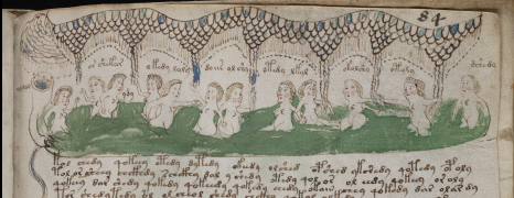
Voynich Manuscript bathing nymphs archways

These were all the physical features I had been seeking and thought were absent from Naples (I had pictured the usual somewhat-flat open-air thermal spas that are common in this region). I knew Naples had aqueducts, but so did many places… what I didn’t know is that the spas included caves, grottoes, grotto-like galleries, vaulted chambers, and domes. As we learn from the Petrus of Eboli manuscripts, there were also tents in which to rest after taking hot thermal cures. I had prematurely put Naples aside to look elsewhere.

A Fractured Narrative?

So how might these revelations relate to the pool pages in the VMS?

It’s very easy to say the VMS has sections on “healthful bathing”. That’s exactly what it looks like, at least to me… and long before I knew about the manuscript, others had dubbed it the “balneological section”. But how much of it is actually about bathing? I think the core of this section might be quite small, consisting of only two sheets which, back-and-front, comprise only eight pages—about 5% of the manuscript.

Which folios are they and how should they be arranged? The way the VMS is currently bound, these sheets are separated by other folios.

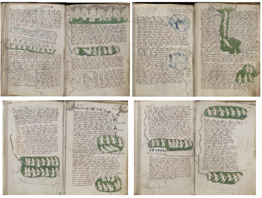
I’m not the only one who thinks the Voynich Manuscript may have been bound out of order. Many have noticed the inconsistencies. If one were to rearrange quire 13, it’s possible to separate out the bathing images from ones that might be related but may not be the exact same subject. Here is one possible way to organize the “core” of the bathing section.

You have to imagine the following pages as two wide sheets with a margin in the middle for the fold, with front and back sides shown left and right. Note how the upper sheet has both blue and green water and the second sheet has a very consistent set of green pools with roughly similar shapes.

binding order of Voynich Manuscript pool folios

I’m not certain where the narrative starts, but I suspect it is either the second or fourth frame on the top row.

There’s also more than one way to interpret individual parts of the images. For example, in the top-left frame, is that a conduit for bringing in the water or a steam vent for warming the chamber? Or is it a conduit for venting excess steam out of the chamber?

Whether these two sheets were intended to be folded one within the other is not certain either. What if they were meant to follow one another (which would be a very unconventional way to bind them, but since very little about the VMS is conventional, one should probably consider the possibility). Whether it matters depends on how self-contained each page is intended to be. If the text on each page describes a specific bathing complex, without wrapping to the next sheet, the order might not be crucial. Wrapping to the verso side of the same sheet would not be a problem, the narrative would follow regardless of whether the manuscript were bound or unbound.

The sections that separate the above folios in the current binding also have blue and green pools, but I noticed early on that the layout is quite different. The subject matter changes and the drawings inhabit the margins in a somewhat sequential manner.

While the above illustrations strike me as pragmatic, describing physical/geological features and maybe specific bathing pools, the ones currently sandwiched between them have a much more anatomical and metaphorical feel to them and may have been intended to follow or precede the pool section.

Biological References

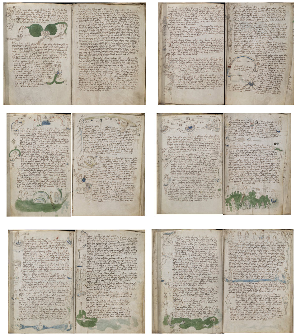
I’ve consolidated and shuffled the following block of pages to illustrate one possible way the sheets could be arranged separately from the pool section, with frame 2 on the top row (with the dense text that looks like it might be an index) being the first folio. It may be intended to introduce the new section (or to summarize the previous).

If there is any connection between the VMS and healthful bathing (and if the pools are meant to document a spa similar to those that existed in Naples) then the odd biological structures in the margins might represent the parts of the body that were supposedly cured by each kind of bath. This would be consistent with the way Eboli described the baths. It might be relevant to the VMS that Eboli included a list of ailments specific to females.

Koen Gheuens has presented some interesting parallels between these drawings and astrology/astronomy as it was understood in the 15th century. I find Gheuens’s ideas both interesting and plausible, given that each part of the body was believed to be ruled by a certain constellation, as evidenced by the many “zodiac man” drawings in medieval medical texts.

The Balneum Trituli had frescoes with figures pointing to the body parts that were supposedly cured by specific baths.

Imagine if the VMS author combined 1) bathing, 2) body parts cured by bathing, and 3) astrological medicine, all into one… it might come out something like the following folios. There are even sections with rainbows, which relate to both water and prisms (to this day prisms are still believed to have curative properties) and which also might represent “connections” in a metaphorical way.

Voynich Manuscript rainbow and pool folios

Summary

If the VMS documents healthful bathing practices and cures for specific body parts, it doesn’t have to represent Pozzuoli—any grotto-like health spa with a combination of natural and manmade pools and cascades might be illustrated in the same way.

In fact Yegül points out that Charles II founded a hospital for hydrotherapy in 1298, in the village of Triepergula and I found many spa areas in eastern Europe with characteristics similar to the thermally active baths of Naples.

Voynich Manuscript nymph poking eye, calipersBut given that the Naples bathing complexes experienced a surge of popularity after Ebolo’s manuscript was replicated, it’s not unreasonable to think they may have inspired the pool pages in the VMS. It’s also worth noting that the Baia complex was embellished with Hellenistic-themed statuary, including the Homeric blinding of Cyclops. Could the VMS eye-poking nymph be indicating a body part cured by a thermal bath, the blinding of a mythical character, a constellation related to a specific body part, or maybe all three?

I’m not sure whether the VMS illustrations are based on any specific reference like the verses of Eboli. I’ve felt for a long time that the author drew on a variety of sources, combined with personal experience in some subjects such as plants, and synthesized various forms of knowledge into the unique presentation we see today. But whether the text is copied from specific sources, I don’t know—it might be—it’s hard to say when we can’t read a word of it, even now after centuries of trying.

References

You can see an e-facsimile of a mid-14th-century copy of Eboli’s Baths of Pozzuoli on the e-codices site as Cod. Bodmer 135. There are other examples, but only about half are illustrated and some of them post-date the VMS.

I am indebted to the following article by Fikret Yegül for describing topological/geological features of the Naples region before the 1538 earthquake:

Yegül, Fikret K, “The Thermo-Mineral Complex at Baiae and De Balneis Puteolanis”, The Art Bulletin, Vol. 78, No. 1 (March 1996) pp. 137–161.

J.K. Petersen

© Copyright 2017 J.K. Petersen, All Rights Reserved

Postscript: I thought I would add a single VMS page with possible parallels to some of the various copies of De Balneis.

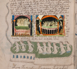
Images from a variety of De Balneis manuscripts that have actions and themes in common with the VMS nymphs-in-pools page.

There are other folios (e.g., arched pools and rainbow imagery) that might also be relevant, such as the artificial pool with architectural-style arches:

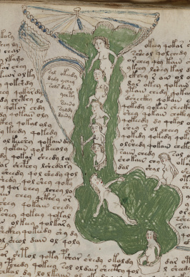
but folio 75r seems particularly relevant in terms of thematic similarities, from the tents at the top, to the people descending through a cavern to a pool below, a container of heated water, and even a figure that may be jumping or stepping into the pool at the bottom.

Did Gibbs Solve the Voynich Manuscript?

10 September 2017

A New Contender?

Every week a new “solution” is offered for the Voynich Manuscript, but none of these theories so far has stood the test of time. Some get more publicity than others, with a recent one, by Nicholas Gibbs, being widely re-quoted in news sources within hours of being published in The Times Literary Supplement.

Gibbs’s article is largely autobiographical, offering a laundry-list of “inspiration” provided by many of the most common references cited by Voynich researchers.

One has to wonder how Gibbs could be aware of all these medieval references for so many years, as he claims, without knowing (or saying) anything about related research by members of the Voynich community who have extensively communicated about all the historic precedents mentioned in Gibbs’s article.

Take the idea, for example, that the balneological section in the VMS represents healthful bathing practices. This has been frequently discussed since 2000, and possibly earlier, by Brian Smith, René Zandbergen, Dennis Stallings and many others. Here is an excerpt from those communications courtesy of http://ixoloxi.com:

Date: Thu, 10 Aug 2000 22:20:07 +0200
From: René Zandbergen (Rene Zandbergen)

To: Dennis Stallings

…In my opinion the most exciting possible identification, but  highly contestable and not really a clear precedent: I think that when the VMs artist drew f77v (Fig.2 in the Aesculapius article) he had in front of him (either physically or mentally) the text of one of the pages of the ‘Balneis Puteolanis’ which describes the baths of Pozzuoli near Naples and which was written some time in the 15th Century. This MS was brought to our attention by Brian Smith. The text describes, one by one, the pictures on the VMs page.

http://www.balnea.net/museum/terme/gallerie/pietro/pietro5.html

BALNEUM PETRAE, […]

Si chiama così perchè frange i calcoli;
[…]
apre la vescica, libera i reni dalla renella, lava gli intestini.
Vidi molti calcolosi che, bevutane l’acqua calda, ebbero l’urina
pietrosa.

(Called like this since it breaks chalk /kidney stones I think/. opens the bladder, relieves the kidneys of , washes the intestines. You will see many ‘with stones’ who, after drinking the water, have urine with grains)

You really _must_ look at the VMs page and read the text to get the full impact. Or maybe I’m just imagining things – I’d like to hear your honest opinion.
The original text (presumably Latin) would constitute a great ‘known plaintext’ sample.

I don’t know whether the author of AlchemyWebsite was part of these communications or independently researched VMS bathing themes, but the author made a well-reasoned proposal, on or before Nov. 21, 2008, that the rosettes page was a map of the baths of Pozzuoli.

In early 2008, I was independently exploring the possibility that the rosettes might be a map of Naples. Why Naples? Because Vesuvius is an eye-shaped volcano and the rosette in the upper left has always looked to me like a volcano (with flames in the inner layer). My secondary ideas for the eye-shaped rosette were

  • the Mount of Olives in Jerusalem,
  • one of the seven hills of Rome,
  • possibly one of the large Roman coliseums that were built in a number of cities (including Naples),
  • roundels related to the design of a water garden such as forerunners to the Villa d’Este,
  • a specific port town that I’m keeping in my back pocket at the moment,
  • Genoa or Venice,
  • the volcanic channel between Sicily and Italy, or
  • a metaphorical illustration of something fictional like a hell mouth.

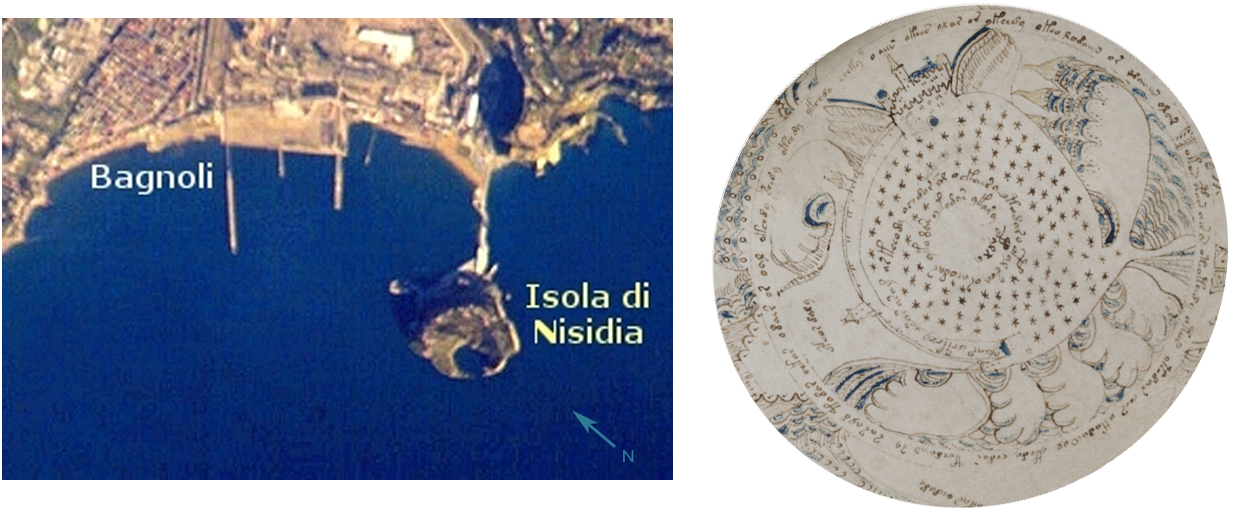
But Naples was still one of my top choices and I think the top-right rosette may be this unusual island atoll (see pic) perched off the coast of Naples, and tenuously joined to the mainland by a constructed jetty near one of the popular bathing areas.

Note the crater-like missing center on the island of Nisidia (aerial view courtesy of NASA). Could this be the VMS spiral? In medieval times, the water level was lower (many artifacts and signs of civilization have been found in the waters off the coast where land used to extend farther out than it does now) and there may have been plants in the crater-like basin that inspired the bushy star-like shapes in the VMS rosette. A close-up on Google Earth also reveals traces of ruins and possibly of a circular wall around the perimeter at the top of the hill. Notice also the rough water (big waves) on the VMS drawing and how Nisidia is exposed to the waters farther out in the bay. When water levels were lower and the coastline closer to the island, there may have been more jetties.

Healthful Bathing

While exploring Naples online, I knew there were thermal vents in the area (I have been to Naples), and many bathing areas (both water and mud) reputed to have healthful benefits, but I had never heard of the Baths of Pozzuoli. I did explore spas all over the world for almost two years (there are thousands of them) due to the numerous grotto-like bathing images in the VMS, but I didn’t make the explicit connection between Pozzuoli and Naples until years later when I began to meet some of the other Voynich researchers online and they mentioned manuscripts that document this popular spa. I think the reason I overlooked it is because it is currently in ruins and I didn’t know the area included caves and grottoes until I saw them depicted in medieval manuscripts (I thought those with caves and grottoes were more likely to match the themes in the VMS and most of those were in eastern or central Europe or outside of Europe altogether).

But to get back to Gibbs’s article…

Healthful bathing is clearly an old and thoroughly discussed aspect of Voynich research. If you’re reporting your own research on a casual venue, it’s not always necessary to credit prior research if you weren’t aware of it and it didn’t influence your thinking. But… if you are writing an article for publication in a major news outlet or academic journal, or specifically seeking credit for “being there first”, then checking and reporting prior research is part of the job, especially if you are making claims that you have solved the VMS,

The Claimed Solution

I read Gibbs’s article on Sept. 6, 2017, when Nick Pelling brought it to our attention. I didn’t see anything new other than a tiny mostly unreadable diagram of a proposed solution and a bold statement that there are no plant names or recipes in the VMS. Gibbs claims that the information that would help understand the manuscript has been trimmed away (an explanation that has raised more than a few eyebrows) and that the indexes are missing. This is an odd claim considering it is prefaced by the following statement:

“The abbreviations correspond to the standard pattern of words used in the Herbarium Apuleius Platonicus ” [Underlining is mine.]

If everything in the VMS is plagiarized from earlier sources, as Gibbs claims (entirely possible since that is how things were done in those days), and the abbreviations are based on standard Apuleius Platonicus herbarium word patterns, then a supposed missing index is not an insurmountable stumbling block to decryption.

I’ve seen the indexes in herbal manuscripts. They rarely add anything that can’t already be discerned by the combination of pictures and text on the pages, they simply make it easier to find the pages quickly or fill in missing data when only plant names and no further information are on the folio with the diagram. The paragraphs on the VMS plant pages are more extensive than the labels or brief notes on many medieval herbals.

Also, a point that Gibbs didn’t note is that many of these indexes were added later, sometimes half a century later, by other hands. The original users of the manuscripts apparently managed without them.

Foliation

I agree with Gibbs (and many others) that the folios may be out of order, but I doubt this would stymie decryption attempts either. The various sections are thematically consistent and each sheet of vellum has been folded to create four sides, so we DO know a large number of recto-verso relationships because they are physically inseparable.

Summary

I was eager to see Gibbs’s solution. But there are only two short  lines of tiny text subjectively expanded into questionable Latin that is almost unreadable in the online version. It’s a teaser and perhaps only tentative, at best. I think most people would agree that at least a paragraph or two from different portions of the manuscript should be illustrated, along with the method of decipherment, in order to establish that one has a “solution” or even the right direction for a solution to the VMS.

Gibbs hasn’t even established that the underlying text is Latin. Until he demonstrates how his decryption was accomplished, it’s merely an unsupported assertion. It’s not an irrational one—the glyphs are mostly Latin, the abbreviation symbols mostly Latin (there might be some Latin)—but many Latin scholars have tried to make sense of it without success, and Latin characters were used in dozens of languages, so we cannot assume it’s Latin until a cogent method is proposed.


J.K. Petersen

© Copyright 2017 J.K. Petersen, All Rights Reserved

Does Size Matter?

9 September 2017

Dimensional Comparison

René Zandbergen posted an interesting diagram a year ago on the Voynichninja forum that illustrates the Voynich Manuscript dimensions as they compare to other documents. The VMS is listed as 225mm x 160mm (note that there are also larger foldouts), and is quite small compared to some of the other volumes. It’s a size that suggests portability.

I haven’t been keeping track of the dimensions of manuscripts to any great extent, I only record about 5% of those I come across, but I do sometimes note them down and, over time, have accumulated dimensions on about 50 manuscripts that are in the same general ballpark as the VMS.

Sleuthing Out Similar Sizes

Out of the reasonably close matches, there are 19 20 with the same dimensions as the VMS, variously produced on parchment, vellum, and paper. Materials and dimensions are not always listed, but a glance at the date can give a rough idea of what the writing medium might be (and if the scans are good enough you can usually tell from the digital images).

Very few of the documents fall within the same time-frame as the VMS. Those that do, tend to be reference manuscripts that are carried and consulted, such as breviaries/books of hours.

For those who are interested, here is a sample of the documents so far that are similar to the dimensions of the VMS, with information on repositories and shelf marks, and the approximate place of origin and date. The ones that come closest to the VMS are marked with asterisks:

Since this was not a systematic search for manuscripts with certain dimensions, merely a survey of some of the information I have in my files, one should not try to generalize too much from the results. Many of the manuscripts are from France, England, Germany, and Italy, but that might simply mean that Spanish or Arabic manuscripts did not include dimensions (or were not similar in size) or that the information was in a language, like Indian or Thai, that I couldn’t read. Nevertheless, it may be of interest and may yield interesting results as more data is added over time.

J.K. Petersen

© Copyright 2017, J.K. Petersen, All Rights Reserved

The Gang of Four

9 September 2017

I’ve wanted to blog about VMS biglyphs for years, and have alluded to it in several blogs, but simply couldn’t figure out a lucid way to illustrate the patterns. Recently, I came up with an idea that might make it easier to explain.

Some Brief Background

I’ve already written about how the EVA-y glyph appears frequently at the ends of Vwords and sometimes at the beginning, a pattern very prevalent in medieval Latin. In Latin, this glyph is based on the number 9 (to distinguish it from the letter g) and usually represents -um or -us at the ends of words and con- or com- at the beginnings of words (see example right). Thus, a single glyph can be expanded in at least four ways, and its meaning known by context.

The apostrophe, shown here as a curved “cap”, similar to the cap in EVA-sh in the VMS, can also be written as a short line, a long line, or a squiggly line and can represent one, two, or many missing letters.

If Voynichese were meaningful (and somehow encrypted), and if some of the VMS glyphs are meant to be abbreviations, it would affect both frequency and entropy calculations and would not be readable using one-to-one substitution codes. Attempts to expand the abbreviations using software algorithms would be challenging, as well, if one considers that the medieval apostrophe could stand for almost anything, was not used consistently, and wasn’t always placed above the area where letters are missing.

Also, it’s important to keep in mind that Latin abbreviations were used in all major western languages, not just Latin, and their meaning adapted to common patterns for each specific language.

There have been a number of Voynich “solutions” lately that claim the text is abbreviated Latin (an idea that has been around for a long time). It’s important to keep in mind that Latin symbols do not automatically mean Latin language, just as Cyrillic characters don’t automatically mean Russian. Many languages are written in Cyrillic, including Mongolian, Bulgarian, and Ukrainian.

The Fearsome Foursome

In the process of trying to discern whether Voynichese is intended to be expanded and whether certain glyphs behave in specific ways that might reveal whether they are letters, abbreviations, or modifers/markers, I’ve been studying a group of glyphs that stand out as different.

Note that this article is not about abbreviations, it is about a set of glyphs I call The Gang of Four. The above note about abbreviations is a necessary preamble to explain why a fifth glyph-pattern that superficially looks like the other four doesn’t necessarily belong in the same group.

Also… all the following charts and numbers are based on my own VMS transcript, so there may be small statistical differences compared to other transcripts, but the overall concepts still apply.

First, before I go into detail, try this little experiment, it makes it easier to see the patterns.

• Take the two paragraphs on folio 1v.

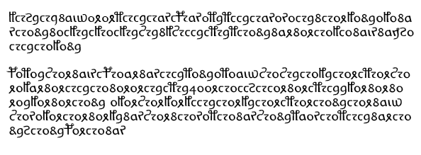
• Do some search-and-replace and remove all the commas, spaces, line breaks (but not the paragraph breaks) so you have two long continuous lines of text. You should end up with something that looks like this (this is my “easy-read” VMS font but you can do this with a transcript character set or with the EVA Voynich font):

• Save a copy of the processed text so you can use it again, it sometimes takes a couple of go-rounds to get used to seeing the pairs.

• Now remove the following characters (I have specific reasons for choosing these characters): EVA-ch, EVA-sh, EVA-d, EVA-s, EVA-q, and whatever follows the “ai” in aiin or daiin (depending on the transcript, this may be one, two, or three characters), and EVA-q.

Now your text should look like this:

Take the beginnings of paragraphs with a grain of salt. There may or may not be pilcrows that behave differently from other glyphs depending on their position.

Starting after the first glyph in the first paragraph, walk through the text and add spaces so you are breaking it into pairs with the exception of “air” which is to be treated as a triglyph. Consider a benched-gallows to be a pair. You will notice the paragraph breaks fairly naturally into pairs except that there is an extra “o” once in a while.

Do the same thing for the second paragraph starting after EVA-Po (can you see why?). Again, treat “air” as a triglyph.

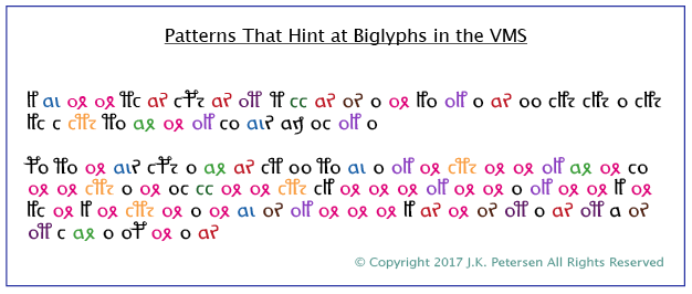
If you pay attention to the glyph pair patterns, you get something like this. Once again, it breaks down fairly naturally into pairs except that there are a few extra “o” glyphs (as in the first paragraph) and occasionally the gallows k or t stands alone.

These are the same pair patterns I pointed out in a previous blog but I realized later that I should have colorized them to make them easier to see:


I’m not sure of the significance of the extra “o” glyphs that sometimes occur between pairs, but I suspect that the o-glyph, when not paired might be a null or modifier (I am not certain of this, but there is a very high proportion of o-glyphs, and other glyphs like r or l or a do not show this propensity to appear in between common pairs).

Positional Flexibility and Doubled Letters

If you’ve studied the VMS glyphs individually, you’ve no doubt noticed that their positions are very constrained and that doubled letters are uncommon. And yet, even after removing seven glyphs, if one evaluates the processed text in terms of biglyphs (and perhaps a small number of triglyphs like “air”), then there are enough pairs to make a full alphabet. The peculiar lack of doubled letters in the VMS, and the positional rigidity changes when the text is evaluated this way.

I’m not suggesting this is a solution to the VMS or that the glyphs that were removed have no meaning. I’m using this as an exercise to focus eyes on certain important patterns that exist within the text that seem to be frequently overlooked and which change the dynamics of text breakdown and their statistical properties to a considerable extent.

So why did I choose seven specific glyphs to remove? Mostly to remove visual clutter to emphasize the glyph pairs, but also because I believe the ones that were removed may be ligatures (two shapes combined) and thus function as pairs on their own. That EVA-ch may be a ligature is suggested by its behavior and also by the gap that occurs between the left and right sides on folio 1r. Benched gallows characters are more obvious candidates for ligature-biglyphs and do appear to behave as such, so I left them in for this example.

Of the seven excised glyphs, EVA-y might be a special case. It doesn’t behave like the others. I strongly suspect it was added to make VMS superficially look like Latin and, of all the characters in the manuscript, if there ARE nulls, this one should definitely be considered.

Statistical Studies

If the VMS is constructed from biglyphs rather than monoglyphs, then many of the existing computational attacks would be irrelevant. I’ve been studying the biglyph-patterns almost since I first saw the VMS, but finding ways to describe their existence, their behavior, and especially their significance has been a challenge… which brings us back to the Gang of Four.

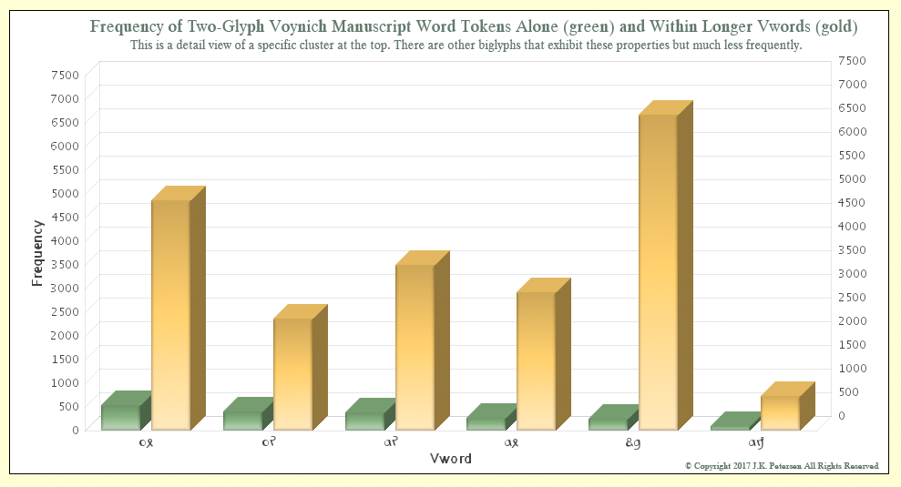
There are four biglyphs that form a statistical cluster and a couple that look superficially similar but behave a little differently. These biglyphs stand alone or act as part of other VMS tokens. Note, this is not a full chart of all two-glyph Vwords, there are several more, but these are ones that occur most frequently with spaces on either side and which can also be attached to other Vwords. Note also that if some of the deleted glyphs in the example above are confirmed to be ligatures, to represent two glyphs with one shape, then at some point, they must be evaluated in conjunction with these.

As can be seen from the chart, ox, or, ar, and ax cluster at the top in terms of how often they appear independently (with spaces on either side). They can be at the beginning, middle, or ends of Vords, indicating positional flexibility that is absent from monoglyphs when they are evaluated individually. I would have liked to include EVA-ot and -ai on the chart because they follow soon after those illustrated above, but for visual clarity, decided to exclude them for now.

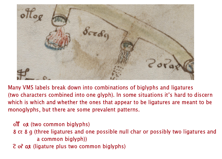
The Voynichese snippet mixed in with the other text on folio 116v is from this group, as are many of the VMS labels.

The odd combination of EVA-dy, in the fifth position on the chart, is almost always at the ends of Vords, and with suspicious frequency, more than one would expect with natural languages. I am reserving judgment on this pair, but feel that it may be a null calculated to make the VMS text resemble Latin or a generic syllable intended to be interpreted in a variety of ways (and yet still calculated to look like Latin).

The second odd combination of EVA-am sometimes appears in several positions in Vords but is most often at the end and very frequently at the end of the line and thus behaves quite differently from the first four pairs and somewhat differently from EVA-dy. It is less often attached to other Vords than the previous five.

These patterns can be seen in many of the VMS labels.

Significance

It is tempting to think that The Gang of Four might be vowels, as vowels are the most commonly used letters in many languages. Vowels can sometimes stand alone (depending on the language) and could conceivably have been crafted for the VMS from four combinations of two glyph-shapes to make them easier to remember or recognize when writing or deciphering the text.

Testing this idea is harder that one might expect (which is one of the reasons I haven’t posted about it sooner). One has to decide whether all the characters are biglyphs or just some of them, and whether the others are ligatures or monoglyphs.

It’s also important to have some sense of whether the spaces are real or contrived and one has to figure out if the text has been abbreviated. If it has, could this group of four glyphs be the anchor around which the rest of the text is crafted?

Vowels aren’t really necessary for text to be comprehensible. Mst ppl cn fgr t txt wtht vwls and many languages were originally written without vowels. What else might cause four biglyphs to share certain commonalities in shape and behavior?

Can we find out more by looking at where they appear in the manuscript?

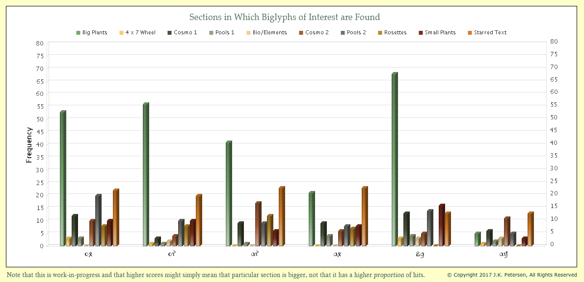
It may seem as though individual glyphs are more prevalent in certain sections, but keep in mind that the big-plants section is extensive and the amount of text on unillustrated starred-text pages is considerable, so it is natural that they would show up more often on these folios. However, it’s interesting to see the consistency with which the first four show up throughout the manuscript and how they differ in overall balance from the last two.

It may be noteworthy that ax occurs less frequently on the big-plant pages than the previous three and that EVA-dy, despite its relative frequency, is very infrequent on the rosettes foldout compared to the first four other five. I’m not even sure that EVA-dy is a biglyph. It might be a ligature plus a null.

I have much more information on the structure of the text but that’s probably enough for one blog. Once you begin to notice these pairs, they  jump off the page and you really can’t help wondering if Voynichese is synthetically constructed.

J.K. Petersen

© Copyright 2017 J.K. Petersen, All Rights Reserved
Fractured German & Fishing Expeditions

VMS Marginalia—Who Wrote it and Where?

The last page of the VMS has always struck me as similar to a pidgin pigeon language. As I’ve noted in previous blogs, it’s mostly but not quite readable in German and I often wondered, in the early days of studying the manuscript, whether it might be medieval Yiddish. Even though there are many dialects of Yiddish, as are described in some detail by Alexander Beider, I didn’t want to commit too strongly to this idea because many medieval scholars studied at universities in several countries and picked up bits and pieces of local languages along the way—there could be several explanations for the mostly-but-not-entirely-German nature of the script.

When I was looking into medieval languages that might have some relevance to the VMS, one of the blended languages I found particularly interesting was the pigeon-Icelandic spoken by the Basques. Icelandic is not an easy language to learn and Basque doesn’t resemble it in any way, and a visit to the little island requires a treacherous sea ride over particularly rough waters, so I wondered why the Basques would be motivated to learn a distant and seemingly impractical language like Icelandic, but it turns out that Basque whalers hunted the north Atlantic with some frequency and may have stopped on Iceland for rest, repairs, and supplies, eventually learning bits and pieces of a language very different from Basque (which is itself very different from most European languages).

The whaling trade was one of the reasons sailors ventured into the perilous arctic, where they stopped in Iceland and, later, the remote town of Spitzbergen on an island far north of Norway. This is believed to be the first map of Spitzbergen, in the Arctic hinterland, published in 1599, and whales are prominently featured in its waters. [Image courtesy of Wikipedia.]

Basque oral history claims that the Basques discovered the New World before Columbus, something I think is entirely plausible—if you can make it from the Iberian Peninsula to Iceland, you can surely reach Greenland, and from Greenland to North America is a short hop compared to the original trip to Iceland.

A Basque cemetery dating to about the mid-1500s was unearthed in Labrador, Canada, and Basque shipwrecks have been found off the coast of Red Bay.

It’s possible some of the whale hunters reached the New World before 1492 following the same routes as the Vikings, and it occurred to me that they might have brought back plants that otherwise were not known in the Old World, but it doesn’t seem likely that whalers would be concerned about physically documenting plants. Whaling is a practical trade, not an exploratory venture (unless you’re exploring for new places to fish), and botanists weren’t usually passengers on whaling ships headed for the New World until after Columbus’s voyage. So I put the Basque-Icelandic-New World plants idea to the side for the time being and looked for other interesting language combinations that might shed light on the VMS.

Linguistic Alphabet Soup

Inspired by the Basques’ willingness to learn Icelandic, I sought out other blended languages and found so many of them, it will take years to sort it all out. As examples, the language of the Veneto includes many Spanish words and some Latin/French constructions, as well as influences from Dalmatian, Greek, and Albanian. The area north of the Veneto has a great diversity of languages, and the region of Provençe and northern Spain is rich in blended dialects. Lombardic in its original form was southern Scandinavian and other germanic dialects mixed with northern Italian.

Any region that was a crossroads for trade, or a hotly contested area in which the borders were constantly shifting, was usually rich in variations that might seem like polyglot to the modern reader.

How does this relate to the Voynich manuscript? Perhaps the marginalia seems strange because it is from a linguistic melting pot, but there are so many I can’t fit all of them into one blog, so I’ll start with Silesian, as it would follow naturally from my previous blog about VMS Sagittarius, and includes German dialects that might result in text that looks mostly like German but is confusing to read.

Silesian History

Silesia is on the shifting border between Poland/Prussia and Czech/Bohemia. Breslau/Wroclaw was at its center in the 14th and 15th centuries, when Wroclaw was part of Bohemia.

This area is mentioned in previous blogs as the origin of the oldest-known example of crossbow-Sagittarius. It is also the birthplace of a German-Silesian dialect that was almost eradicated after World War II, when the language was banned by the Communists. Both during and after the war, millions of Jewish and German inhabitants from this area were murdered and expelled by Nazis and Communists, forever wiping out a huge percentage of Silesian language, culture, and history.

The Silesian Language

Even though the Polish border is farther south now than it was in the Middle Ages, Silesian is still a dominant language in the section of Poland between north Poland and eastern Czech, so this region still retains a certain amount of linguistic and cultural autonomy. To the north and east are greater and lesser Polish and to the west, along the Baltic, are a number of mixed dialects. South of Silesia are a variety of Slavic languages and to the southwest, the primary language is Czech [map detail courtesy of Wikipedia]. Before WWII and especially during the Holy Roman Empire, there was a strong German presence. Before the Holocaust, this area also had a significant Jewish population.

Silesian-German

Silesian-German, a dialect of Silesian, has Franconian, Thuringian, and Saxon roots and today, due to the purges, only a small region west of the Oder-Neisse still retains the language, which is undoubtedly different from what it was in the middle ages due to the modernizing influence of German radio and television. Historically, though, many Slavs spoke German and the Germans, with their blended Silesian-German, understood Slavic-Silesian.

The Lach Dialect

In the same area, one finds the Lach dialect, a west-Slavic blend of Czech and Polish that was spoken from Silesia to Moravia. In the middle ages, some forms of Czech and Polish were mutually intelligible and today Lach is considered by some to be a dialect of Czech, and the forerunner (or at least a strong influencer) of modern Polish.

Lach may soon die out, just as Lombardian is dying out. The Lach youth are learning Czech and the Lombardic youth are switching to Italian—both languages may be gone in two or three generations but these and many others were alive and closer to their original forms when the Voynich manuscript was created.

We can only guess at how Lach and Silesian-German sounded in the 15th century, when Polish and Czech cultures intermingled with Saxon German (which itself included Nordic influences), but we do have some idea of how they were written from a number of manuscripts that have survived.

So Silesia is a region where many dialects existed in a small geographical area and where language shifted and blended, due to frequent changes in political rulership and immigration.

Pinning Down the Dialect

Might Lach or Silesian-German explain some of the peculiarities in the somewhat germanic text on 116v?

It depends how one interprets the words. If “pox” is meant to be “boch” (billy goat) then we already have some clues. The substitution of p for b was quite common in areas like southern Germany/Lombardy, Augsberg (which was written “Augsperg”), Dinkelsbühl, and certain towns along the Swiss-German border.

Substituting “x” for “ch” was less common than substituting “p” for “b” but it did happen in some areas, especially those in which Greek was taught along with Latin. The familiar abbreviation xpo/xps/xpi/xpt for Christ (see right) is derived from Greek, with the x and p at the beginning descended from “chi” and “rho”. Thus, one occasionally sees chi (x) used for “ch” in Latin or other texts. Putting those pieces together “pox” becomes “boch” (goat) as suggested by Johannes Albes (and perhaps others).

It is not only the way the words are spelled, but also the way the letters are written that provide clues. The use of a figure-8 for D or S was not common uncommon (I’m leaning toward this being S since the previous D has an open loop and a word like “portas” is more likely than “portad”) but I sometimes wonder if it’s a ligature, or a symbol for another sound, such as ç or z as it is pronounced in Castilian Spanish.

Usually the figure-8 shape was written slightly asymmetrical to distinguish it from the number 8, but in a few areas (e.g., eastern France), the difference between “d” and “8” was less distinct and discerned by context. On folio 116v there aren’t enough instances of the figure-8 character to know for certain whether it’s D, S, or something else, but the fact that it exists in the marginalia (and possibly also in Voynichese) might be a regional indicator.

Geolocation

So, for quite a number of years, I have collected information on regional dialects, along with samples of text with scribal hands that resemble those of the main text and the last-page marginalia. When evaluated together, I was hoping they would help geolocate the VMS scribes.

This is a slow process and a certain amount of luck is involved. Many manuscripts have been lost in wars and fires and many sit unseen in private collections and libraries, so the odds of finding a match to the VMS handwriting is not very good. Nevertheless, I decided to try.

To date, I have about 600 hands that bear some resemblance to the handwriting of whoever penned all or most of the text on 116v. I had to study about 6,000 manuscripts to locate these samples, so only about 10% of the hands surveyed so far were similar enough to include in the sampling.

To evaluate the hands, I developed a mathematical system that describes each letter individually and the alphabet as a whole, and which also assigns scores for pen width, slant, letter spacing, and word spacing.

Unfortunately, neither the main text nor the marginalia provide a full alphabet but I am strongly convinced that the hand on f116v is the same as that on f17r, which helps fill out most of the alphabet for the marginalia, except for “k”, “q”, “y”, “z”, and “w” (“w” was not used in Latin but was in German). In Latin, there was usually no distinction between “u” and “v” but one was sometimes made in German, and the marginal writer does appear to write “u” and “v” differently, so I treated them as separate letters. The letter “j” was not typically used in the early 15th century. Normally the j sound was expressed with “iu” or “io” and sometimes written with an embellished “i” that resembles a modern “j”, but the “j” wasn’t usually treated as a separate letter when the VMS was created).

Thus, 20 letters are available for comparison (plus the figure-8 character, which might stand for terminal-S, D, or something else, and was not included due to its status being unknown).

When given numeric scores for similarity ranging from 1 to 6, with a perfect match for all the letters being 120 (not counting the spacing and slant variables), it becomes possible to search and sort the samples, and more objectively compare various hands to the VMS.

A Brief Overview of the Results So Far

Out of approximately 600 reasonably similar hands, only 18 scored 80 or higher on a scale of 1 to 120. This form of writing is loosely called Gothic cursive, although there are some traces of book-hand mixed in and it is sometimes referred to as Gothic quasi-cursive.

These are the ones that are most similar:

[Postscript 9/7/17: I noticed a copy-paste error in Row 7 Column 1 (the letter A), so I have corrected it and re-uploaded the chart.]

As can be seen from the top ten examples, which scored from 81 to 87, the scribes who wrote in hands most similar to the VMS marginalia did not typically write an unlooped “d”, a flat-bottomed “b”, or a “u” with serifs—the VMS hand differs in these respects not only from the hands that most closely match, but also from hands that scored in the 70 to 79 range, so these characteristics can be used as markers to help recognize an individual person’s writing. Unlooped “d” is not uncommon, it is simply less common in hands that most closely match the overall alphabet for the marginalia.

What especially surprised me about these 10 samples, which I hoped would help geolocate the marginal writer, is that historians and bibliographers don’t know where they came from. Seven out of ten have undocumented origins. In contrast, the origins of those that score in the 77 to 80 range are mostly known.

Is there a bigger mystery surrounding manuscripts with hands similar to the marginalia writer’s? Could there be a group of manuscripts from a particular area that were obtained or transmitted in some unusual way? We know that the VMS is listed in the Vatican catalog, but never made it to the Vatican library because the Jesuits, under a promise of secrecy from Wilfrid Voynich, sold it to the book dealer from America rather than conveying it to the Vatican. Might there be other manuscripts with shadowy histories?

Patterns in Subject Matter

When looking for handwriting samples, I scoured every kind of document I could find, including incunabula, legal documents, and manuscripts. I didn’t want my assessment of the handwriting to be influenced by the subject matter or source of the documents. Once I had enough samples, I began to study their subject matter. The top samples (which include documents with both known and unknown origins) fall into the following categories:

  • Alchemical (1 example, origin uncertain, possibly Austria, Bohemia, or Germany c. last half 15th century)
  • Saintly Miracles (1 example from a manuscript written in several different hands, the sampled hand may have been added c. 1400?, possibly from Germany)
  • Collections of sermons or theological treatises (3 examples, possibly from Germany, but this is not certain; 1 example of unknown origin; 1 example from Lund region; 1 late 15th-century example from the Alsatian region)
  • Mortuary Roll (2 examples in a document that includes different hands from different regions, 1458 to 1459, possibly from Flanders/Normandy area)
  • Armorial Roll (1 15th-century example in a Tirolian collection that includes different hands from different regions)
  • Homer’s Epic (1 example from Naples region, possibly late 1300s)
  • A handbook of fortune-telling, charms, medicine, virtues of plants (1 example from England, possibly mid-1400s)
  • Selected stories of Petrarch (1 example from S. Germany, c. mid-1400s)
  • Frontismatter in another hand on a c. 1380s Czech book of hymns and prayers (1)
  • Endmatter on a back leaf in another hand on a manuscript from c. 1300 Bologna, but which is housed in Germany and may have been added to in Germany in the late 14th century
  • Legal document: 1360 Charles IV grant (1 example from Nuremberg, Germany)
  • Astrological text with zodiacs (1 example, possibly from the Alsatian region)
  • Tristan and Isold themes (1 example, c. 1330, Veneto)

Clearly, those who used this style of writing come from several different areas and a number of different occupations and copied or wrote on different subjects. The examples range from the early 1300s to the late 1400s, a time period that is consistent with the use of Gothic cursive in general and which could indicate marginal writing that is either contemporaneous with the VMS, or later, or even earlier (although this seems less likely as there are two Voynichese tokens inline with the rest of the text on f116v).

The examples are both ecclesiastical and secular and only include a couple that delve into the occult. None of them are specific to herbs or bathing, although one does mention plants and includes charms (Trinity College MS O.1.57) and uses the Greek sigma symbol as a terminal-s. For the most part, however, they are practical collections of knowledge. None include cipher script. The only significant pattern that emerges is that the majority, where origin is known, are from germanic regions, which is perhaps not surprising, since the marginalia itself is somewhat germanic.

I have much more data and commentary than I’ve posted in this brief summary, and will report further on the marginalia (and on the main text) as I have time.


J.K. Petersen

© Copyright 2017 J.K. Petersen, All Rights Reserved
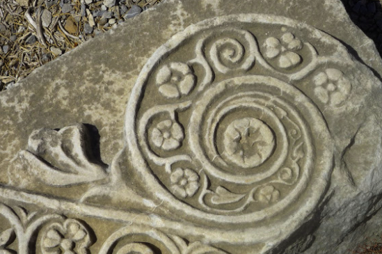
The Archer in Cod. 1842

Discussions about the Earliest Crossbow Sagittarius

There is currently an interesting (and lively) discussion about Voynich Manuscript history on K. Gheuen’s VoynichTemple site. I tried to post a long comment, but I’m not sure if it got through (maybe it was too long—several error messages popped up), so I’ve decided to expand it and post it with images as a blog instead.

This blog was inspired by the following comment:

“Nick: On Stephen’s site, Marco and Darren discuss a number of examples and the earliest crossbow-sagi-roundel is from Poland… https://stephenbax.net/?p=1656

This is an easy mistake to make, even by good researchers like those mentioned. Political borders are constantly changing and sometimes it’s difficult to keep track of where they were at any particular point in history, but Österreichische Nationalbibliothek Cod. 1842, the earliest manuscript so far that depicts Sagittarius with legs and a crossbow, is not from Poland. It originates in Bohemia, in the Holy Roman Empire.

Some Background

The zodiac-symbol roundels are perhaps the most recognizable series of images in the VMS next to the plants, and I have always been interested in the history of astrology, so in 2014 and 2015, I was independently researching every Sagittarius with legs that I could find because I was used to seeing centaurs with longbows, not people with crossbows (I had also researched the other symbols but have posted them as separate articles).

In 2015, I superimposed my findings on a map of the Holy Roman Empire because that is where the majority of images originated. I searched far outside these borders (including Russia, Persia, India, north Africa, and the far-east because I am interested in zodiac imagery from around the world, but was not able to find anything similar to the VMS zodiacs outside of western Europe and the Levant.

The crossbow-Sagittarius map can be seen here.

The crossbow-Sagittarius mentioned by researchers on Bax’s site is listed by the Österreichichische Akademie der Wissenshaften as Cod. 1842, originating from Prague and Breslau (now known as Wroclaw). From 1335, Breslau was in the Kingdom of Bohemia. Even in 1386, the Kingdom of Bohemia stretched just beyond Olesnica, and Breslau was still well within its borders (the Bohemian Kingdom is sometimes also called Królestwo Czech—the Czech Kingdom).

For the half century that is most relevant to the creation of the Voynich Manuscript, Breslau/Wroclaw (300 km NE of Prague) was within the borders of the Bohemian/Czech Kingdom ruled by a German-born Bohemian King who also served as Holy Roman Emperor. [Underlying map detail courtesy of Wikipedia.]
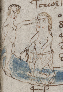
The Bohemia/Czech Kingdom was part of the Holy Roman Empire in the late 14th and early 15th century, reigned at the time by Wenceslaus IV, who was both King of Bohemia and Holy Roman Emperor. Wenceslaus was German, born in Nuremberg. Prague is about midpoint between Nuremberg and Breslau.

During the search for crossbow-Sagittarius, and while gathering several hundred historic zodiac cycles, I found

  • about eight Sagittarius with legs and a longbow (all within the Holy Roman Empire, with the exception of the Beit Alpha mosaic), and
  • a dozen Sagittarius with legs and a crossbow, all within the Holy Roman Empire, and all except one (Cod. 1842 from Bohemia) were from Germany or very near the border between what we now call Switzerland and Germany.

Although I tried to locate crossbow-Sagittarius from a wider geographic distribution, I was not able to find any from Scandinavia, the Baltic, the British Isles, Italy, Russia, Georgia, Persia, Greece, Africa, Spain (I did have difficulty accessing some of the Spanish image browsers, so I don’t know whether I missed any Spanish zodiacs due to technical problems), or Asia. This is an ongoing project. If I see additional examples, I will update the map.

Political borders change. Other than the usual local skirmishes, there wasn’t much distinction between Bohemia and Germany during the long reign of Wenceslaus, HRE and King of Bohemia, so it’s difficult to argue that any of the crossbow-Sagittarius images found so far come from outside Germanic culture.

Crossbow-Sagittarius Details

In my opinion, the crossbow itself is not drawn well enough to determine its origin. The only truly distinctive part is the long trigger (and maybe the recurved ends of the lath) and it’s hard to know whether the length of the trigger is literal, or a convenient way to draw it so it connects to the hand. It might be literal (the illustrator took time to draw the laces on the boots, a faint goatee, and the lacy edge on the sleeves of the Gemini female), but it’s a very tiny drawing, and the illustrator has difficulty with detailed structures like hands and rotating connections between body joints, so… even though all the basic parts are there, one has to wonder whether the finer details are accurate.

When I tried to find tunics and hats that matched as closely as possible to the archer’s garb, I also searched worldwide. After almost three years of keeping my eyes open, I had very few examples.

Nothing outside of Europe bore a close resemblance, but I found six manuscripts with similar tunics in the Holy Roman Empire, two in France, and two in England (one of which was a series of tapestries rather than a manuscript). Thus, more than half of this small sample originated within germanic cultures. Most illustrations of medieval tunics differ from the VMS archer. Some are gathered, rather than pleated, many have high or wide collars rather than a simple collar. Many are wide at the wrist, or have split sleeves, whereas the VMS tunic is narrow at the wrist and wider at the elbows. If the VMS tunic is intended to represent a specific garment (which is difficult to determine), it’s not a common style.

Summary

I haven’t stopped looking for examples of zodiac symbols (I’ve added about 200 zodiac cycles to my database since the Sagittarius map was posted), but additional crossbow-Sagittarius symbols are exceedingly difficult to find. Maybe some will show up as more manuscripts are digitized. And as I keep repeating in blog after blog, if there is an exemplar for the VMS archer, it’s not necessarily a zodiac, it could be inspired by a hunting scene, a tournament, or a book on archery, or perhaps a zodiac with a longbow that was given a crossbow instead.

What I have observed, so far, is that manuscripts with crossbow-Sagittarius are primarily from the Holy Roman Empire between c. 1395 and c. 1496, and tunics that are similar originate in the HRE, France, and England, and range from c. 1400 to c. 1433.

By the way, I don’t have any germanic or central European theories. I have almost no theories about the VMS—I am still at the information-gathering stage—but I think it’s clear from what has been observed so far, that influences from within the Holy Roman Empire appear in the Voynich Manuscript.
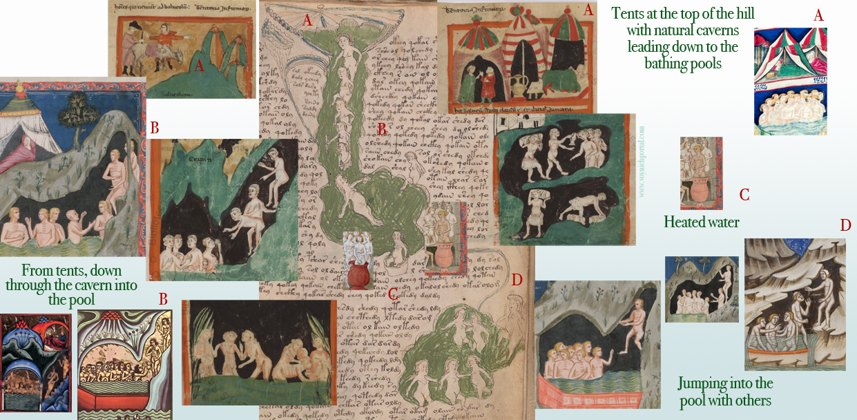
 

J.K. Petersen

© Copyright 2017 J.K. Petersen, All Rights Reserved