One of the difficulties in creating a transcript and analyzing textual patterns in the Voynich Manuscript is the ambiguity in some of the characters. When this occurs in common words, it makes it more difficult to assess glyph relationships and frequencies.
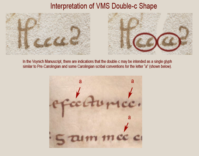
A simple example might illustrate this problem. I mentioned in my previous blog that I believe the paired c-shapes are meant to be read as one character (in most instances). There is also a single c (EVA-e) which may occur next to a double-c, to create three in a row. When there are three in a row, how does one decide whether it’s three cees, a double-c following to a single-c, or a single-c following a double-c?

In this example, I’m leaning toward the VMS glyphs (top) being two double-c shapes because of the slightly larger gap between the two pairs and the way the cc behaves in other parts of the manuscript, but I’m not 100% sure because the two latter cees are more tightly written than the first two. Is this normal pen-variation or are the first two cees single cees followed by a double-c?
Sometimes all we have to go on is slight differences in the spaces between characters and that’s not a good way to do it—there will always be some uncertainty, which is one of the reasons I feel it’s important to study the rule set and possible pairing paradigm for the VMS. Then the context can help us determine which glyphs are intended as ligatures and which might function as pairs.
The Devil in the Details
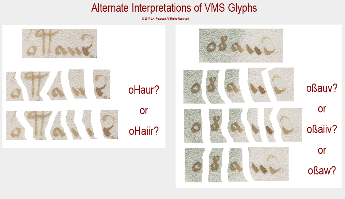
Unfortunately, ambiguity exists in one of the most common VMS word-tokens, one that is popularly called “dain”. I don’t use the EVA font-set, I developed my own based on shape designations, but you should be able to see the correspondence in the following illustration fairly readily.
In this example, there is ambiguity in the straight shape that alternately resembles a double-i or possibly a “u” as it was often written slightly separated, with straight legs, in the middle ages. I use a “v” and sometimes a “w” to describe the ending shape with a tail but I make no assumptions about what these shapes mean or whether the swept-up tail indicates an abbreviation, as it would in classical Latin, or whether it is an embellished glyph designed to look like Latin, just as the “9” shape (EVA-y) morphologically and positionally follows Latin conventions:
To complicate matters further, there are places in the manuscript where there is an additional stroke between the a-shape and the swept-up tail, one that Takahashi (and perhaps other transcribers) sometimes missed.
Summary
A fresh transcript is needed, and not just a “corrected” transcript that makes better assessments of the spaces (I’ve noticed errors in which glyphs with clear spaces around them have been attached to nearby words), but one in which all the glyphs are included, even ones that “look funny” because there are so many in a row, along with consideration for alternate interpretations for ligatures (combined glyphs) and paired glyphs.
I created a transcript that corrects some of these problems, but it’s not a stand-alone file. I’ve integrated it with a set of self-made VMS fonts and applications so that the whole thing is an interdependent set of tools that can’t really be split apart as they currently stand.
I can make some suggestions, however. When I created my fonts, I put the VMS characters in the upper register and the regular characters in the lower register as they are usually typed on the keyboard, so that it’s seamless to combine VMS and regular characters in the same document (handy if you’re writing an article about the VMS). This also allows comments to be added to the transcript that don’t interfere with searches of the VMS glyphs. Unicode standards have plenty of space for this, and it’s not difficult to come up with mnemonic references to the shapes to make it easier to type. I also set up glyphs that are similar such that they can be searched together or separately. Adding a symbol to the glyph is usually a better overall solution than putting each variation of a basic form in a different font-slot, a point that I’ll discuss more fully in my next blog.
J.K. Petersen
© Copyright 2017 J.K. Petersen, All Rights Reserved

