
What Can Hands Tell Us?
When I was creating a VMS transcript, I noticed immediately the change in handwriting partway through the big-plants section on folio 26r. It was not just scribal haste or fatigue—the spacing, rhythm, and slant were different, as were some of the letter forms. It was clearly the same style of writing (perhaps a blood relation of the original scribe?), but not the same hand.
Interpretation of VMS glyphs is something I’ve wanted to write up for a long time but I wasn’t sure how to express it in a way that was sufficiently clear, until I realized the hand on folio 95v1 might help me illustrate the concepts.
In the following illustration, there are several instances of EVA-d with a straight stem (marked in red), and certain glyphs with greater separations between their component shapes (marked in blue):
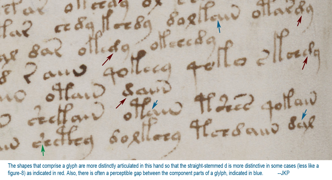 I have often wondered whether a rounded “d” and a straight “d” are different glyphs, and created two different characters in my transcript to record them. But I still treat them the same most of the time, as they seem to fall into similar patterns. But perhaps they are different. For example, when they are at the ends of words (which happens frequently when the d is paired with EVA-y), maybe the two shapes are meant to be read as two different endings. If this were Latin, for example, one might mean -us and the other -um, or one might mean -us or -um and the other might mean -bus. Or maybe there’s a completely different interpretation (that I’ll discuss later).
Another thing I noticed on this folio is the greater tendency of the scribe to separate the component shapes of a glyph. There’s a good example on the far right (marked with a red arrow) in which the first curve is clearly separated from the “is” shape (“is” is a Latin symbol that looks like a short cursive ell). The “is” shape occurs in EVA-m and gallows characters and sometimes the letters with “is” are written almost like short gallows, suggesting they might be related.
What Do Tails Tell?
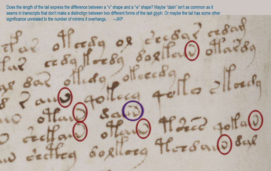
There’s another distinctive aspect of Voynichese that inspired me to create my own transcript and my own fonts. Notice how strongly the character normally referenced as “n” (in daiin) resembles a v or a w? This is how I transcribed them. But then how can you tell the difference between v or w if there are one, two, or more minims preceding them? This is something I pondered for a long time and I think the answer (at least for this scribe) might be the length of the tail. Notice how the tail loops back farther on the one that resembles “w”. I don’t know whether v and w are meant to represent two different characters, but I think the distinction between “n” and “v” in the transcript is important, as I’ll explain farther along.
Enumerating the Gallows
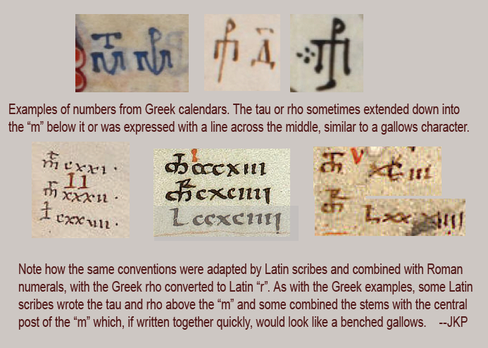
Some years ago, when I was looking up the history of pilcrows and gathering samples (which took a couple of years), I also collected examples of Greek and Latin abbreviations and number systems because many of them resemble gallows characters.
Early on I was insisting that almost all the VMS characters are based on Latin (with a few on Greek) and there was a lot of resistance to the idea (I got some “interesting” email). Quite a number of people disagreed with me, some rather disparagingly, and said I should be looking at Armenian or Georgian, or other script systems dissimilar to Latin because, as they said, “It doesn’t look anything like Latin.”
I have looked at those other alphabets (and many Asian scripts, as well) and still maintain that the majority are based on Latin character-shapes and abbreviation conventions, as I’ve noted in my blogs. But maybe things are changing. I’ve noticed a recent upswing in VMS “solutions” claiming that the text is Latin that needs to be expanded. Well, maybe, but I want to emphasize the fact that Latin characters and scribal abbreviations were used in many languages, not just Latin, so Latin glyph-shapes don’t automatically mean Latin language.
——=++=——
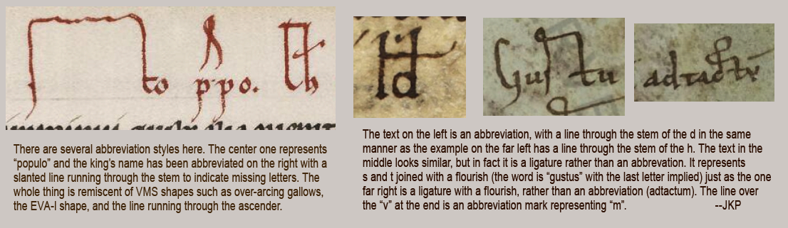
But to get back to similarities with Latin abbreviations, a horizontal line or slightly slanted line was commonly used in early Latin documents to signal missing letters (similar to an apostrophe). Here are some examples of abbreviations and ligatures (which are not the same thing and should not be confused with one another):
 And now we get to the good part…
If you look at the first illustration again, where separations between individual parts of a glyph are more distinct, you might notice the Vword on the bottom-right, usually transcribed as “dal” looks suspiciously like the Roman numeral dcix (I was tired when I wrote this, this is 609, not 59). In my transcript, I have transcribed EVA-l as “x” for the simple reason that it looks more like a medieval “x” than “l” to me, but also because I noticed the similarity between Voynichese and Roman numerals early on and wondered whether there might be a connection.
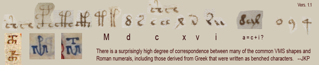
Greek and Latin Numerals and Their Relationship to Voynichese
Old forms of Greek, Hebrew, and Roman script did not have a separate set of glyphs to express numbers. Instead, they were written with letters. Over the centuries various conventions were used to mark them so they were not mistaken for letters.
In Greek, a line was drawn above or through the character to signify a number. In Latin documents that used Greek conventions, some numbers were expressed using Greek forms, some were in Roman numerals (sometimes with a line over them), and some were Arabic.
Here are examples of numbers from Greek and Latin manuscripts that may have inspired the benched gallows characters in Voynichese. Note also that if you’re not a paleographer and you came across the Greek examples (top row), without the Latin examples I’ve added below them for comparison, you might be mystified as to their meaning:
Look at this excerpt from 95v1 one more time, paying particular attention to the characters in the bottom right. Note how the separated “a” glyph makes the token look like dcix (609) in Roman numerals.
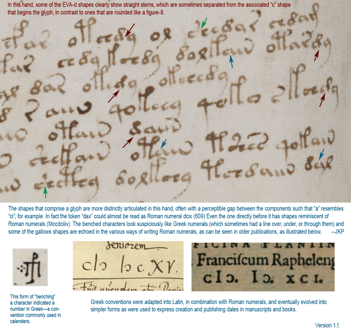
In fact, the text directly preceding “dax” looks very much like cytotec without rx Mccdciiiv, which isn’t quite conventional, as two would usually be indicated with “ii” rather than “iiiv” and you wouldn’t normally place a dee between the three cees, but what if the tail is the common Latin abbreviation for a line over the letters, which was sometimes written as an attached tail to facilitate quick writing? Then you get kindheartedly Mccdciiii—still not quite conventional, there’s still the problem with the ccdc, but notice that the cc is benched.
Hmmm, could the bench on the cc (EVA-ch)… possibly mean it belongs on either side of the preceding “M”? Maybe what we are looking at is cMɔ dciiii (with a tail over the iiii to indicate a number), as it is in the illustration above. This can also be written with a pipe symbol as follows: c|ɔ dciiii as it was often written in the 15th century and onward.
The d-“aiin” token comes in many flavors. It’s not always preceded by “d”, it can be preceded by almost anything, and the number of minims after the “a” shape ranges from 0 to 4. If the stem of the “a” is also a minim (if a is ligature c + i), then it ranges from 0 to 5 or 0 to 4 plus “v” (Roman numeral 5) depending on whether one interprets that last glyph as a “v” or as an “i”-with-a-tail to indicate a number.
Inspiration for Shape and Structure
Is Voynichese numbers? If it’s numbers, do they represent letters or sounds? Or is Voynichese a coding system that includes a subsystem for numbers?
If you take your mind out of linguistic mode for a few moments, and pretend the text is Roman numerals (even if it isn’t), do you notice that you see it differently? Have you made assumptions you didn’t realize you were making?
——=++=——
As I’ve posted in many blogs, the glyphs are based on Latin letters and abbreviations, but they look to me like they’re based on specific Latin characters that have a high correlation to Roman numerals.
Roman numerals consist of M d c l x v i (sometimes scribes lined up several “i” characters instead of combining them with v), sometimes c-shapes were placed on either side of the M, sometimes a line was drawn over or through the letters. All of these are hauntingly similar to aspects of Voynichese.
Notice how the characters that are benched resemble tau and rho, the two characters placed above “m” (which was sometimes written as a bench in both Greek and Latin). In Greek, a rho looks like a “p”.
Even the EVA-r glyph might not be an “r”—it might be an “i” with a tail (as it was written in Latin).
Except for EVA-o, -y, which are suspiciously frequent compared to natural language frequencies, and EVA-q, which is very positionally consistent, almost all the common VMS glyphs bear a strong resemblance to M d c x v i and benched forms of tau, rho and M + c. Note also that EVA-o and y are variations on circles. Maybe EVA-o, y, and q are some kind of markers.
Or maybe “o” stands for zero (as in 1408) or is another form of “c” (depending on position).
The Voynich characters are positionally constrained. So are Roman numerals. If you put a “d” in front of a “c” it means something different from “c” in front of “d” (600 versus 400). Maybe Voynichese does this too.
Summary
The VMS might not be Roman numerals, it might not be numbers, but there is a strong similarity between Voynichese glyphs and Roman numerals.
There is also a strong similarity in how Voynichese prioritizes glyph order. Whatever system is behind the VMS, I think Roman numerals, at least on the conceptual level, had something to do with the way Voynichese was designed.
Perhaps other people have mentioned Roman numerals in connection with the Voynich Manuscript, I don’t know (it seems like a reasonable supposition and I’m still comparatively new to the Voynich scene), but I haven’t seen anyone demonstrate a connection between benched numbers (Greco-Roman glyph conventions) and the bench characters in the VMS. Nor have I seen anyone provide a cohesive explanation of how VMS glyphs may have been historically and pictorially inspired by a system like Roman numerals, so hopefully this will add something new to the VMS corpus.
———————-=++=———————-
Before I close, I have a little bonus… It’s a secret where I found this (at least for now), but here’s a little medieval “pen test” that you might enjoy.
 Note that only three characters are needed to represent the whole alphabet, except that one might need a few nulls to separate the individual “letters” and to obscure the fact that they are Roman numerals so it won’t be too easy to break. Imagine what it would look like if you did that?
J.K. Petersen
© 2017 Copyright J. K. Petersen, All Rights Reserved
Mmmm, smells like progress 🙂
It’s interesting that you isolate the x-shape from eva l. This would imply that glyphs were masked by giving them a loopy bit on top, just like happened with [d], and apparently the gallows as well.
Have you tried to convert line of Voynichese to Roman numerals?
It did occur to me (later) that the loopy part might be a mask. It’s also possible EVA-l actually is the Roman numeral L, but L doesn’t appear as often as X in the manuscripts I’ve checked so far, so I’m still undecided about this.
Yes, I’ve been converting Voynichese into Roman numerals in several different ways (I intended to post samples, but this blog was already getting long). One has to work out spaces and where numbers begin and end, and whether they follow directional rules for Roman numerals, and also whether it might be text interspliced with numbers.
Roman numerals do appear to have influenced VMS shapes, but have they shaped the structure and content of the manuscript? One of the oddest things about Voynichese is its positional priority—one has to reach for analogies to describe it—it’s like chess pieces that can only move in a specific way. Roman numerals (in which direction determines the influence of a preceding or following glyph), might provide some insights.
One has to figure out if Voynichese is a linguistic subway with scheduled stops and directional constraints, or a numeric cipher that has to be unraveled before any linguistic assessments can be made.
I’m with you on the structure part. While there’s a infinite amount of Roman numbers, they are still positionally restrained. I guess this is more obvious in some customs than in others. Like when they write VIIII instead of IX.
Still, I’d almost put money on the idea that the small-plant labels are linguistic, in *some* way.
But since people were used to the idea of using the same glyphs for words and numerals, the possibility of a hybrid system (some words, some numerals) is large enough.
I am so happy that you also see [M],[c], [d] and [x] in the Voynich Glyphs. These where also my first thoughts when I saw them. And the capital P’s look in my eyes somehow like capital F’s.
There are also two different [a] shapes in the vms. one looks like c + i as you mentionend, the other one more like a heart bottom up. And you can also find different stroke orders in the Eva-d =number-8-shape.
Not only the spaces between the parts of one glyph but also the stroke order seems to be different between the (at least two) different scribes.
Perhaps it is a good idea to make a list with all glyphs in all variants and the stroke orders in which they are written to see if two glyphs are meant to be the same or in fact different by concept.
I think you are basically right in your observation that there are Roman numerals, it is something I saw myself soon after I started analysing the ms (and I think others as well), but I think it is even more interesting that there are Arabic/indian numerals as well. I don‘t think the Voynich glyphs are derived from Roman numerals, they are R.n.. which does not mean I am sure what they mean. But I must say I doubt some of your interpretations, the subtraction method, e.g. iv instead of iiii was very uncommon before the 16th c. And using a capital M for 1000 and minuscules for the others seems doubtful to me, as well as the Mccdciiii, it just doesn‘t look right. Another question is the d, I think there is an additional possibility, it could be an et-abbr. as well, the &.
Helmut, I’m not insisting that the letters are to be read as Roman numerals. I’m trying to take this one step at a time.
The VMS glylphs have a lot of curves and lines resembling c, d, x, and i, but this did not convince me that there was a link to Roman numerals—it was something I noticed long ago but assumed might be a coincidence. But the benched versions of EVA-p and EVA-t, are constructed like M+rho and M+tau (something no one in the Voynich community has previously mentioned or illustrated). Taken together with the other shapes, they provide paleographic precedents for a larger number of VMS glyphs.
And then the question becomes… if the VMS shapes were inspired by Roman numerals, did other aspects of Roman numerals (such as interpretation or order-priority) influence the structural design of the VMS text?
I don’t know the answer to this yet. I’ve been exploring it as I have time, and have run a number of tests to see whether the patterns might be 1) actual numbers, 2) numbers intermixed with text, or 2) a cipher to represent text.
If the VMS is ciphered natural language (and I don’t know that it is), the numerals don’t have to be in the right order, they just have to be consistently applied to whatever letter corresponds to that shape. If they are actual numbers, they don’t have to be read left-to-right either, they might be read right-to-left. Or maybe Roman numeral order-priority concepts were used to create a synthetic language.
Because there are so many possibilities, it will take some effort to sort it all out.
JKP,
The whole daiin as number thing appeared in Nick Spelling’s blog some years ago – about 2010 I think, I would need to check, it may even have been in “Curse”.
His hypothesis was that the original words had dots above the EVA i’s to generate the numbers and that these were subsequently covered up by tails of various lengths when the scribe appeared to change his mind – perhaps too obvious?
There were several photographs of clear examples, despite this phenomenon being on the edge of resolution in most cases. Yet now there are better resolution scans widely available!
I am a newcomer and have only just registered on Voynich.ninija. Currently I’m doing my initial and typically obsessive literature survey. Still I am surprised nobody else has pointed this out.
I think you are on to something important here. At the least as Nick said, this is an opening into the mind of the scribe, but who knows – perhaps now we can even begin to read Voynich numbers!