Monthly Archives: January 2016

Curiosity Shop or Little Shop of Horrors?          30 Jan. 2016

A Treasure Trove on a Single Page

LesserChrsI wasn’t sure what to title this blog because it’s not clear what is going on at the bottom of Folio 66r. Is this a murder mystery? Is that a dead body?
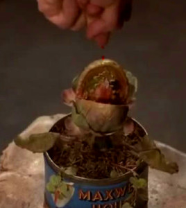
Audrey the ailing plant begs for blood in Little Shop of Horrors, courtesy of Warner Brothers, 1986.

Audrey the ailing plant begs for blood in Little Shop of Horrors, courtesy of Warner Brothers, 1986.

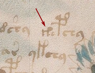
In fact, Folio 66r is unusual in many ways. Not only is there a mystery pic at the bottom, with some altered text beside it, but the upper left is full of character glyphs that differ from the majority of the text in both shape and position.

Since there are enough head-scratchers on this page to fill several blogs (perhaps several papers), I’ll start with the image and marginal text at the bottom. It might be a mistake to describe it out of context with the text at the top but, since we haven’t deciphered the big block of text, maybe it’s okay to start with the picture.

What is Going On Here?

F66rFigureThumb

It’s possible the Voynich Manuscript is a medical text, with a particular emphasis on women’s health. It is full of plants (plants were medicine in the Middle Ages), nude ladies bathing, women’s cycles, and stylized drawings of internal body parts.

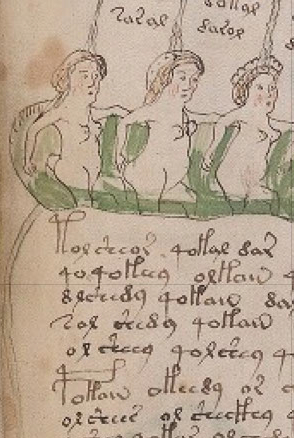
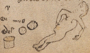
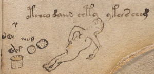
On Folio 66r, there is a figure in the lower left, presumably female, with a distorted stomach and an oddly curved back. The back might be some excess poundage or maybe some swelling. It may also be an example of weak drawing skills.

The bottom of the stomach is sticking out in an oddly irregular way, compared to the round bellies in other parts of the manuscript. Nearby are three objects: a spotty irregular mass that resembles a sponge but could be almost anything, a rounder spotted object (a lid? a rock? a rounded tuber?), and what might be a container of some kind (it has lines on it like a woven basket, but it’s very hard to tell—it could be a bucket, a cup, or a chamber pot).

Dead or Alive?
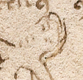
F66rFace.jpg

Is this prostrate figure a corpse? Or a figure looking toward us, with eyes open? Is it the face of distress or someone lying on a board waiting to be examined? Is she pinching her stomach? With so few details, it’s difficult to tell.

The face of the woman is faded, as though the quill were running out of ink, but it looks like the eyes might be open, and her right arm seems to be pinching and pulling the stomach, so maybe it isn’t a dead body after all—it might be someone in distress. Assuming for the moment that the prostate figure is alive (and female), what could be causing a problem?

  • Stomach ache?
  • Dysentery? (King Henry V is said to have died of dysentery in 1422)
  • Injury?
  • Appendicitis?
  • Menstrual cramps?
  • Childbirth pains?
  • Post-partem distress?

I hate to suggest abortion, because it’s always a touchy subject, but we have to consider this possibility. In medieval times, many girls, from peasants to royalty, were sold off as wives in their mid-teens and sometimes endured fourteen or more pregnancies when they scarcely had food to feed two or three mouths and, if their husbands were soldiers, the breadwinner was frequently away from home burning and pillaging, leaving the women to cope with the household and children alone.
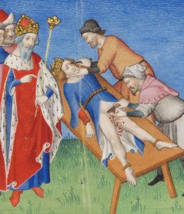
15thcTortureThey were turbulent times. People were hung, dragged behind horses, burned at the stake, castrated, and drawn and quartered in the public square, where even the smallest child could sit and watch. Explicit examples of these procedures were recorded by 15th century artists such as Giovanni Boccaccio (right).

Given this attitude toward life and death, abortion was a very common occurrence and abortifacient plants are mentioned in many herbal manuscripts, sometimes euphemistically as, “a plant that encourages courses” (“courses” meaning menstrual bleeding).

Maybe the other objects can shed some light on what’s happening to the recumbent figure.
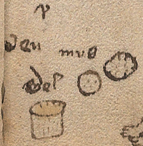
F66rBucketPerhaps the explanation is simple—the naked damsel might have a tummy ache. The irregular mass could be an unfortunate consequence of diarrhea, or it might be the afterbirth following pregnancy and childbirth. Maybe it’s a tumor or cyst (surgery has been around since Egyptian times and even Caesarian sections were performed in centuries past).

Note that images of children are conspicuously absent in the VMS. If you consider it’s full of cavorting naked women and women in various stages of pregnancy, it’s surprising there are no offspring. It does show a few girls on the cusp of puberty in the zodiac wheels, but they are included to show the beginning of the maturation process and very young children are not shown.

Men are not completely absent from the VMS. There are illustrations of men both clothed and naked, and details of body parts engaged in ejaculatory activity, as in the left margin of Folio 77v. If the drawing on 66r is a reference to childbirth, it would not be out of place.

What’s the Yellow Stuff in the Bucket?
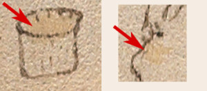
BucketBellyIf you look closely, you’ll note that the inside of the bucket (assuming it’s some kind of container) is a pale golden color. Maybe it was painted this way to make it look three dimensional and there’s nothing in the bucket, but there’s a splotch on the woman’s stomach that seems to match, so perhaps there’s a connection between the two.

It’s difficult to tell from a digital scan if the spot on the stomach is a natural discoloration in the page (it matches the ragged yellow edge of the parchment on the right) or is intended to refer to the contents of the bucket, but let’s assume it was painted there.
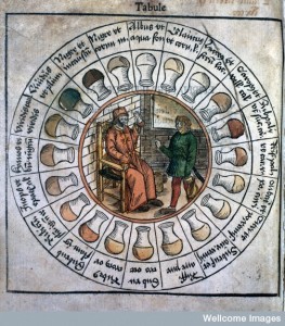
Urine chart illustrating different possible colors, Wellcome Library, London. Epiphaniae medicorum, Pinder, Ulrich, 1506

Urine chart illustrating different possible colors, Wellcome Library, London. Epiphaniae medicorum, Pinder, Ulrich, 1506

Could the substance be a salve to relieve distress, or a reference to something going on inside the belly? Is the yellowish color urine?

Diagnosis with urine specimens was a hot topic in medieval circles. Many herbal compendiums include wheels showing beakers filled with liquid in a range of colors. When urine was reddish, dark brown, or even purple, it was assumed some disease or internal malfunction might be present, but the substance in the VMS bucket is the color of healthy urine so it seems unlikely it relates to someone lying down, pulling on her belly.
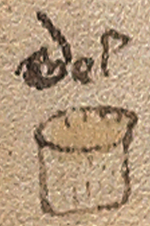
F66rMelMaybe it’s not urine; maybe it’s something used to treat disease or injury. Medieval pharmaceutical recipes often recommended mixing oil, wine, or honey with herbs for making ointments for external use, or potions for internal use. Assuming white wine rather than red, all of these might be a pale yellowish color. So how do we know? There might be a clue. If you look at the text above the container (which has been altered, but which may have originally read “mel”), then you have the word for honey that was commonly used in herbal manuscripts.

Which brings us to the text. Can the text help us understand the puzzling image?

Did the Right Hand Know What the Left Hand Was Doing?
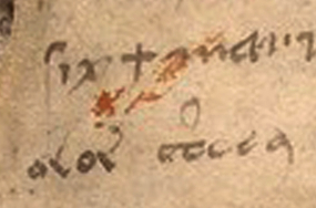
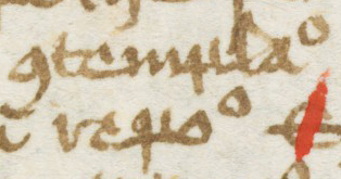
VoyGothic116There are a few places in the Voynich Manuscript where we see marginal text in a Gothic cursive hand, separate from the main text. Normally Voynichese and marginal text are not combined, but there are some instances where it happens, as on Folios 116v (right) and 17r. This only deepens the VMS mystery. Do different hands represent different people? Or did the VMS scribe write the marginal notes as well?

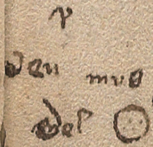
On 66r, the two forms of script are not intermingled, but there are definitely two different scripts—Voynichese above the drawing, and Gothic cursive (or something close to it) above the bucket. We don’t know which was added first, but the drawing was possibly there before the Voynichese was added, as the tail of the glyph next to the head looks like it has been shortened so the tail doesn’t clobber the head.
F66rTextPic

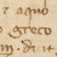
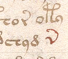
VenMusMelLooking at the text on the left, I can’t interpret the lonely letter at the top because it’s halfway between an “r” and a “v” as they were written at the time, or perhaps it’s the Greek ypsilon.

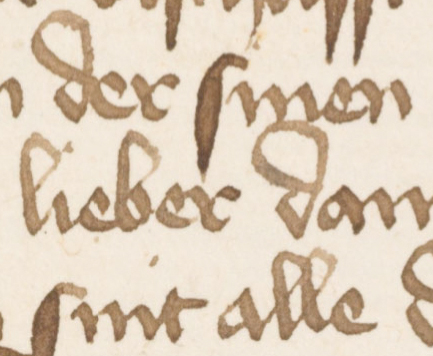
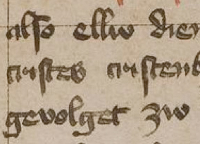
The text by the bucket is similar to the Germanic hand on Folios 17r and 116v.
TaxSanHoneyAs with the other marginal texts in the VMS, this one is difficult to read, but ignoring the over-writing, it looks like “ven muß mel” in Germanic or a mixture of Germanic and Latin.

It’s tempting to interpret this as “when one should use honey” or “in this situation one must use honey”. This assumes the first letter in the bottom word was an “m” before it was obscured.
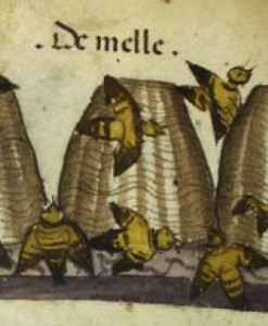
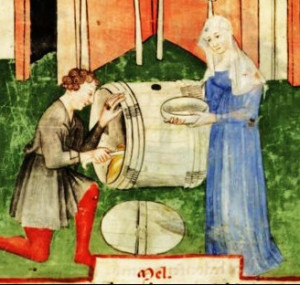
HoneyBeesSL4016In modern German, honey is “honig” but in the 15th century, throughout Lombardy, France, Italy, and Greece, variations on “mel” included meile, melle, meli, etc., and were used to notate honey in herbal documents, plus most scribes knew Latin, in which honey is “mel”. Honey is frequently mentioned in herbal compendiums in combination with Artemisia, Viola, garlic, and horehound. Examples of honey recipes can be seen in Ms. Egerton 747 and many others.

What about that first word of “ven muß mel”? Could it be something besides an old Germanic reference to “when”? Is it possible it relates to the old Anglo-Saxon word for swelling which is “wen” or “wenn”? Then the phrase might mean, “honey should be used for a swelling” (note that in German, a “w” is pronounced as a “v” in English).


Honey as Traditional Medicine

Honey was used as traditional medicine at least as early as Egyptian times. In the Ebers Papyrus of c.1550 BCE, which was found between the legs of a mummy, are passages about women’s health, with honey mentioned as a base for salves for treating wounds and other disorders.
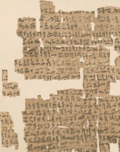
KahunPapyrDetailAn even earlier document, called the Kahun Gynecological Papyrus, dating from c.1800 BCE, is specifically devoted to women’s health.

Here are some examples of medical recipes from the Ebers and Kahun papyri related to complaints of the belly, or conception and childbirth:

  • A paste of honey and yellow ochre was suggested for intestinal or urological complaints.
  • “For the evacuation of the belly: Cow’s milk 1; grains 1; honey 1; mash, sift, cook; take in four portions.”
  • “To prevent conception, smear a paste of dates, acacia, and honey to wool and apply as a pessary.”
  • Another recipe for contraception was a paste of crocodile dung, honey, and sour milk (hopefully the document also includes a treatment for crocodile and leech bites).
  • “hin of honey, sprinkle over her womb, this to be done on natron bed”

Herbal traditions in ancient Rome included honey as a barrier method to contraception. Mixed with sodium carbonate to create a paste, it was used to cover the cervix.

Medieval Use of Honey

In the Wellcome library there’s an interesting 11th century folio that was preserved in a book from the 9th century, in which medical recipes have been added in more than one hand, apparently by monks. Here is a translation of a section that mentions honey as a treatment for “wenns” (which can mean either tumors or swellings):

WellcomeLeachTo make yourself an ointment for tumours [wenns], one shall take pure honey, such as is used to lighten porridge, boil it to almost the thickness of porridge; take radish, elder, wild thyme, cinquefoil, pound them as well as you can; and when it is almost done mix in a good measure of garlic and put to it as much pepper as you think.
A salve against tumours, water cucumber, a handful of spearmint, dittany, woodwax, mulberry; boil in malt-ale; squeeze through a linen cloth, boil in honey-droppings; take then clean spring barley, grind (it) in a handmill; then take madder, dry it in (an oven); grind a handful of red-cabbage seed in a peppermill; boil all together, not too hard. Use it three times a week, as is most convenient.
This salve is good for tumours and for the bleeding of piles. But it should be stirred up, lest it should be spoiled.

Summary

HoneyMatMedica

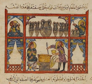
Preparing honey in an Arabic version of De Materia Medica from c.621 AD

The use of honey for belly complaints or gynecological purposes has been passed down for thousands of years and was not new to medieval physicians and midwives. Oils and wines were also used for tonics and salves, but it’s harder to reconcile those with the word “mel” appearing above the bucket.

We don’t know if the label in another hand accurately represents the drawing (or possibly a translation of the text above the drawing). Maybe the person who wrote the marginal notes was guessing, just as we are, but if it’s the same writer who added notations to f77r and f116v, it’s possible he had some knowledge of what was in the VMS.

Until we can decode the rest of the text, the purpose and contents of the bucket will remain a mystery and the status of the woman uncertain, but it’s reasonable to think it might be honey, and that’s a more pleasant note to end on than some of the other possibilities.

J.K. Petersen


© Copyright 2016 J.K. Petersen, All Rights Reserved

A Prickly Pear-adigm          28 Jan 2016

Eureka I Think I’ve Found It

GasparisSchottiWheelEvery few months, someone claims to have decoded the baffling text of the Voynich Manuscript. Many eager code-breakers seem to think it’s enough to crack the door a couple of inches and let others do the actual work of decrypting it according to their revelatory method. To date, no one has published even two paragraphs of text that can be generalized to the document as a whole and some have offered only a few words that have yielded not even a single decrypted sentence.

Even methods that show promise are applied to the inscrutable text in inconsistent ways or result in text that doesn’t have the flow of natural language and can be interpreted according to whim rather than to an objective standard. Until someone describes a method that can be adapted by others and generalized to at least a few pages, the VMS text remains unsolved.

When the Tail Wags the Dog

I’ve never made any assumptions about where the VMS was created or by whom. I look for trails and follow them wherever they happen to lead and, if they run cold, I look for another and follow that. Thus, it surprised me that Edith and Erica Sherwood made this statement several years ago on their Voynich site with regard to plant identifications:

“Acting on the premise that the Voynich Manuscript is a 15th century Italian manuscript, we limited our selection to plants native to Europe or at least the old world and excluded all plants from the Americas.”

HorseBlinders

Photo courtesy of Alex Proimos

It’s entirely possible that the VMS originated in Italy, and maybe it makes sense to start in the most likely locale, but why begin with a limited set of data when you are in the information-gathering stage? It’s possible the Sherwoods had a good reason for limiting their search for plants, maybe they knew something about the VMS that others didn’t, but my feeling is that if you’re starting out, it’s sometimes better to cast a wide net and let the data lead you rather than putting artificial constraints on the search.

There are times when it makes sense to impose limitations, if the scope of a problem is intractable due to time or resources, but identifying plants isn’t an intractable problem. Botanists do it every day, often with plants for which the origin is unknown. If you choose to keyhole your research, do it in a reasonable way or someone will come along and upset the apple cart like this…

A New World Origin

One of the more interesting ideas on the origin of the VMS was offered by Arthur O. Tucker, botanist, and Rexford H. Talbert, an information technologist with an interest in chemistry and botany. Tucker and Talbert’s 2013 paper was published in the American Botanical Council’s journal, the HerbalGram. A New World origin was proposed, with the suggestion that an extinct form of the Nahuatl language underlay the text.

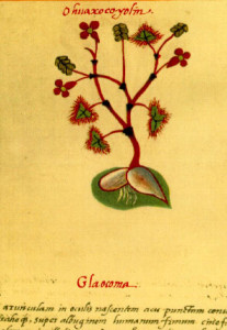
BadianusHerbal3

16th c Codex Badianus, a New World Herbal compendium

This is a cool idea, if you consider someone trying to write a 16th century Aztec language with Latin characters might make up new characters to represent sounds not found in Spanish or Latin. That the VMS could have been created somewhere other than Europe is a reasonable hypothesis. The VMS was found in a Jesuit library and missionaries (Jesuit, Franciscan, Benedictine and others) were often the first to set up schools and housing in new colonies in both the far east and the west, and a number of them were interested in recording natural history. It’s also reasonable to consider that the text and drawings in the VMS might have been added to the parchment years after the parchment was prepared. There may even be small caches of centuries-old parchment that remain unused.

Pinning Down that Pesky Date

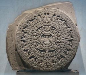
AztecSunStone

Aztec Sun Stone Calender, discovered in 1790, Mexican National Museum of Anthropology.

Radiocarbon dating is a very good scientific tool and has been greatly improved since it was first introduced. Scientists rarely use carbon dating by itself to determine the age of a document, they look at many factors (often hundreds of clues are considered together before estimating a date) but even by itself, carbon dating can sometimes yield useful information.

When the VMS style of drawing and writing, the cultural references in the pictures, the ink, parchment preparation, carbon dating, and other factors are taken into consideration, they point to the early 15th century. The Voynich Manuscript probably wasn’t created earlier than that (you can’t write on vellum/parchment that is still on the hoof), but there is a possibility that it was created later than the estimated dates, if the parchment (and ink) sat for a while before being used. Ink doesn’t last as long as parchment, it will dry out if exposed to air, but even ink can be stored for a couple of decades (maybe longer) in glass containers with good stoppers.

VinlandMapCarbon dating narrowed down the origin of the materials used to create the VMS to between 1404 and 1438. Interestingly, radiocarbon dating on the famous Vinland map (a Nordic map of the New World) dates it to the early 15th century as well.

Like the Voynich Manuscript, the Vinland map has been called a hoax, especially as it appears to have been created about four centuries after the original Viking voyages to the New World, but it’s also possible it is a copy of an older map that was passed down after the original voyages and may yet have some historical importance. Whether the VMS is historically important beyond being a curiosity depends in part on how much, if any, of the text can be deciphered.

It’s not practical to apply radiocarbon dating to every page of the manuscript, but the results from the samples were quite consistent. Whether the VMS was a short- or long-term project is difficult to assess. There are some puzzling anomalies in the text and illustrations that suggest it may have been created by more than one person. Perhaps it was begun in one decade and finished in another. But is it possible that it was created a century later than the ink and parchment, the clothing styles, and the style of drawing suggest? Except for some exploratory pillaging and slaughter of indigenous people in the late 1490s, the New World wasn’t colonized by Europeans until the 16th century. Could the VMS have been created later than the journeys of Columbus?

Herbal Tradition and New World Plants

Codex Badianus New World Herbal

The Codex Badianus text was written in Nahuatl expressed with Latin characters

The first New World herbal manuscript that has survived to the present day is the Codex Badanius, written in Nahuatl, in 1552, by Martinus de la Cruz, a physician at the College of Santa Cruz in Tlaltelolco. The Voynich text even looks a bit like Nahuatl, which has some linguistic rules that create a higher level of repetition than is characteristic of English.

English has many loan words from other languages, including old Norse and French. In fact, in the 15th century, a number of words in Middle English were spoken as they were in old Norse. Nahuatl gives the impression of being more homogenous than English (as Korean was before Chinese commercial terms and English computer terms began interfering with the internal consistency of the language). As cultures mingle, the basic “logic” of a language gets lost in the jumble of new words.

So what is the connection between the Voynich Manuscript and Spanish colonies at the southwest corner of the Gulf of Mexico?

In their paper, Tucker and Talbert state that they were

“… initially drawn to plant No. 8 of the 16 plants on folio 100r; this is obviously a cactus pad or fruit, i.e.g, Opuntia spp., quite possibly Opuntia ficus-indica (L.) Mill. (Cactaceae) or a related species. Thus, is quite easily transliterated as nashti, a variant of nochtli, the Nahuatl (Aztec) name for the fruit of the prickly pear cactus or the cactus itself.”

A Thorny Conundrum

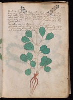
100r-8ThumbBased on their assertion that plant f100r–8 (right) was obviously a cactus, I consulted folio 100r and immediately questioned how so little information could result in such a definite ID. Given the limited artistic skills of the VMS illustrator, it could be many things and this plant didn’t look spiny to me, it looks knobby.

I was also curious as to how the VMS text next to the plant “easily transliterated” as nashtl. If this says nashtl, why can’t we translate the other plant names on the page using the same system of substitution? How do the researchers know this is a label for the plant rather than an instruction for processing it or perhaps a word to indicate which part of the plant is used? Maybe the text has nothing to do with the plant.

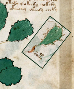
Voy26rThumbI also recalled there being a plant with a similar leaf structure on another page and sought out Plant 26r for comparison with f100r–8. It has somewhat pear-shaped leaves with regularly spaced, rounded protrusions. The margins are drawn darker than the plant on f100r and the area between the big bumps isn’t as ragged, but the essential shape of the leaf is similar.

Voy26r100rThere are other instances in the VMS where a smaller version of a larger plant can be found in the sections near the end of the manuscript, so it’s possible that the same plant might appear in two places. I’ve added the plant from f100r to 26r so you can see the similar shapes of the leaves. They’re not identical, but they’re close enough to propose that they might be the same plant and if they are, this is definitely not a cactus plant. It has a slender stem, long petioles, and flowers on long spikes. This plant would wither and die in a desert environment.

Even if Plant 26r and f100–8 are different plants, I think Plant 26r demonstrates that a pear-shaped leaf with protrusions can be something other than a cactus plant.

Summary

CodexOsunaCactus

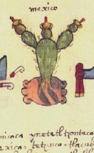
Cactus plant symbolically representing Mexico in the Codex Osuna, with Nahuatl in Latin script underneath.The Aztecs had a pictorial written language prior to colonization by Spanish-speaking Europeans, so the sounds were transliterated into the Latin alphabet and taught to young Aztec boys.

I’m not going to go through the Tucker and Talbert arguments point-by-point because it would be too long for a single blog post, but I’ll leave you to read their article, if you haven’t already (it’s an interesting read), and to think about whether the VMS plants are accurate and specific enough to say whether they correspond to New World or Old World plants.

Also, make note of Tucker’s statement about how botany students tend to draw by emphasizing the parts they particularly notice. This is something I’ve observed in a more general sense, as well, and it may explain some of the more bizarre physical traits of some of the VMS plants.

There were similar plants growing in both Eurasia and the New World in the 15th century, including violas, ivy, plantain, saxifrages, St. John’s wort, sundews, water lilies, terrestrial lilies, alliums (onions), loosestrife, chicory, wild lettuce, dodder, juniper, calendula, and solanum (nightshade). Whether the VMS represents New or Old World plants (or both) is still up for debate. I’m leaning toward Old World based on studying the plants for a couple of years, but if the plant that looks like Ricinus (an Old World plant) turned out to be a New World chestnut tree, for example, that would have a substantial impact on our understanding of the VMS.

J.K. Petersen


© Copyright 2016 J.K. Petersen, All Rights Reserved
Sirens, Sailors and the Lovely Melusina         25 Jan 2016

The Lure of Mythical Creatures

We are fascinated by mysteries—the glimpse through a keyhole, a whisper behind the door, a rabbit pulled out of a hat, the Loch Ness monster, unicorns, fairies and the Voynich Manuscript.

LadyUnicornDetail

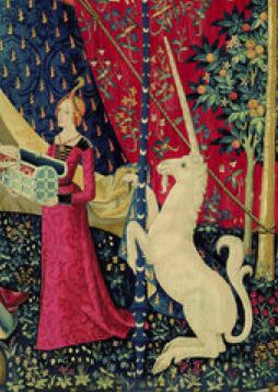
Lady and the Unicorn tapestry. Courtesy of the Cluny Museum.

We also have a propensity for mutating our favorite myths into something more glamorous than their original models. Hence the cloven-hooved goat—the original unicorn—becomes a silvery horned horse and the horse, already a fleet animal, becomes even fleeter when it takes to the skies on Pegasus wings.

The Water Sprite Who Desired a Mortal Existence

The legend of the melusine, a fairy with scaly legs, was passed down through oral history with certain monstrous characteristics not unlike those of the serpent in the Garden of Eden or the sirens of the seas, but also with qualities of beauty and sincerity and, in later retellings, of maternal devotion. Her union with a mortal resulted in children with defects, yet she and her husband loved them all.

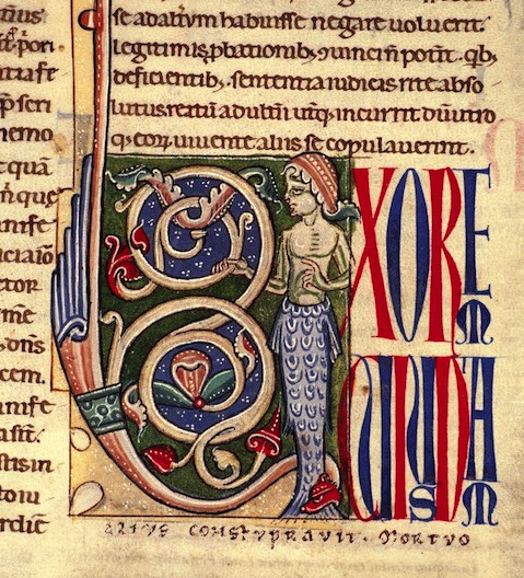
MelusinaInitialThe legendary half water-sprite, half mortal, was sometimes shown as serpent, sometimes as fish, but was usually distinguished from mermaids and sirens by being a fresh-water fairy or sprite, rather than a temptress of salt waters. Not always, however. It depends who is telling the story. In coastal locations, the melusine sometimes comes from the sea or, in others, Mélusina is a fresh-water sprite but her mother was a salt-water siren.

In the story, Raymond is wandering disconsolate through the forest because he accidentally shot an arrow through his host while aiming at a boar and can’t go back because he will be charged with murder. Unexpectedly he hears a sweet singing voice and is enticed by a lovely sprite by a fountain and she, in turn, falls for Raymond, a mortal of noble blood. Unfortunately, his fate is insecure and his material prospects not too bright, so Mélusina helps him avoid the gallows and attain his desires, and gives herself to him on the stern promise that he never watch her on Saturdays, the day that she bathes. Raymond readily agrees.

Mélusine and Raymondin in Marital Bliss

MelusinaArches2

Bibliothèque Nationale de Luxembourg

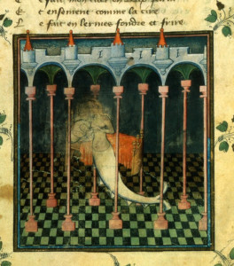
At first, Mélusine’s husband honored his promise and they had a happy union. She furthered their fortunes by clearing land and building castles. But first Raymondin needed to acquire the land, so he asked for as much land as would fit on a hide. Laughing, a nobleman granted his wish—how much land can fit on a hide? But the clever Mélusine instructed Raymond to cut the hide into long fine traces that would stretch for miles and surround a good bit of property. Then she blessed him with numerous children.

Being a mixture of mortal and fairy blood, the children were robust but born with unsightly disfigurements. Nevertheless, their parents loved them dearly and the family grew large.

DuBerryMarchMelusine

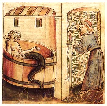
Mélusine in her bath. Book of Hours of Duc de Berry, 1392/1393.

Then a zealous (or perhaps jealous) brother put a bug in Raymond’s ear to erode his faith in his wife and convinced him to find out what she was doing behind his back. So Raymond spied on her during her bath and discovered she had the legs of a serpent.

Mélusina cried out in anguish at his betrayal and he swooned when he realized she had done no wrong and that his actions had doomed her to spend eternity in an uneasy spirit world.

In some versions, she disappears into netherlife with the children, in others, she stays but the children spiral downward into unspeakable acts and Raymond blames her because she is an unnatural creature. Either way, the trust is broken and the relationship irrevocably destroyed.

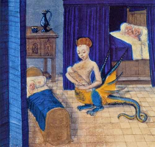
1401, ilustración tomada de la Historia de Melusina, del trovador Codrette, París, Biblioteca Nacional de Francia

Mélusina with her numerous children from Historia de Melusina, by Couldrette, París, 1401, Courtesy of Biblioteca Nationale de Francaise..

Written Versions. The legend of the melusine, passed down through oral history, was popularized in Roman de Mélusina, written for Jean, duc de Berry and Guillaume l’Archèvesque by Jean d’Arras in 1392/93. In 1401, it was retold in verse by Couldrette, with Mélusine depicted not only with a serpentine lower body, but also bird legs and wings.

The story spread through textual and illustrated manuscripts across Lombardy through the 14th and 15th centuries. A “mermaid” illustrated on land, keeping company with her children or being spied upon in a bath isn’t a mermaid at all, it’s a melusine, a water sprite. Mélusine is sometimes shown combing her hair in the bath when she is discovered by her husband, but she is not typically shown with a mirror.

Mermaid, Melusine or other Mythical Creature?

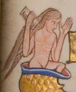
HuntPsalterMelucineIn the Hunterian Psalter, an ecclesiastical manuscript of the early 12th century, “Psalm 89” has been illuminated with an initial of a long-haired man or woman with a comb, climbing out from a scaly tail. There’s not enough context to know if it’s a reference to the legend of Mélusine—a story of faith, trust, and betrayal—or to something else. There are a couple of mentions of the sea and other water in the verse, but they are not central to the words of Ethan, the Ezrahite, who rebukes God for making and breaking a promise and cries out, “Lord, where is your former great love, which in your faithfulness you swore to David?

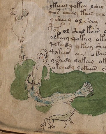
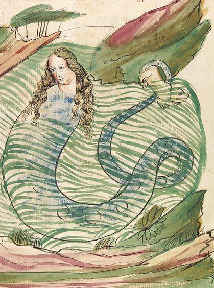
Voy79vMelusineThere is also a mermaid-like creature in the Voynich Manuscript, at the bottom of Folio 79v—half-woman, half-fish, immersed in a pool of green water. Except, like the embellished initial, it’s not one creature but two—a woman with regular legs and what looks like a spotted fish with two eyes and an unusual mouth. You almost expect to see a zipper. The mouth looks more like a costume than a natural fish, especially if you consider the rest of the fish looks more natural than many drawings of mermaid tails. I wondered sometimes if this were a variation of the Noah’s arc tale, but somehow it doesn’t feel that way to me.

Without the text, it’s difficult to explain this creature or the tube-like drawings up along the left side, or the other critters on the right side of the pool but I believe there are some important clues on this page and that the fish-woman may relate to the tale of the melusine, either directly or indirectly.

Similar Story and Illustrative Traditions

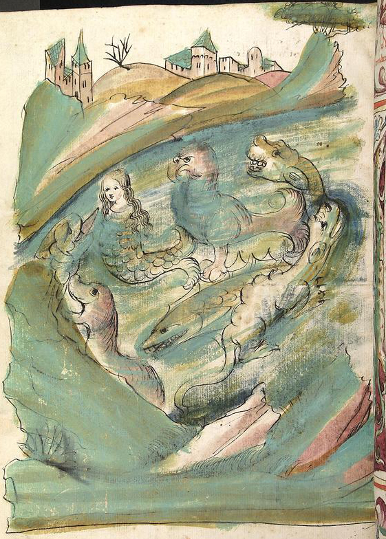
BuchNaturMermaid

Das Buch der Natur, Lauber Workshop, Hagenau, Alsace, c.1440s

A few years ago, I began tracing the script styles on the last page of the VMS and discovered some illustrations, accompanied by Gothic Cursive text, that were hauntingly similar to the “mermaid” page in the VMS.

Even though the mer-creatures aren’t the same as the VMS woman-in-fish creature, the way the animals were drawn and the pigments used, have many commonalities. I’m fairly certain it’s not the same artist—the water is always drawn differently, as is the fish-like creature in the VMS version, and the parchment of the commercial document appears smoother than the VMS—but otherwise, except for the obvious difference in drawing skills, they are so similar, it’s tempting to wonder if the two illustrators might be related in some way or if the VMS illustrator were somehow connected to the workshop by friendship or by blood.

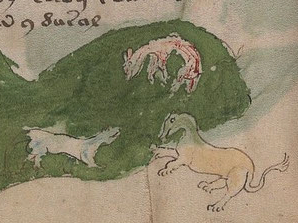
VoyFoxLionFirst notice the pigments—simple greens, blues, bluffs, and browns, quite subdued compared to Spanish and French illuminations of the time that included vibrant blues, greens, and golds.

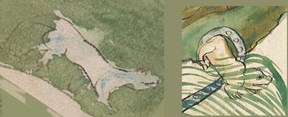
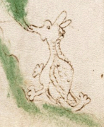
In addition to the limited palette, note the indistinct way the animals are drawn—you can’t quite tell what they are. This is also true of the critters on Folio 79v. They are not quite a dog, a lion, or a fox and the creature below the fish tail doesn’t quite resemble a lizard or salamander, either, not with that kinky tail.

NaturMelucineNow, if you inspect the illustration of the “melusine” from Das Buch der Natur (note the serpent’s tail rather than a fish tail) and look closely at that little creature caught up in the tail on the top right you might note its resemblance to one of the VMS critters. Also note these details:

  • the little animal has a happy face,
  • the tail belongs to the melusine, not the little animal, and
  • the VMS critter (which I have rotated to make it easier to see the similarities), has the tail originally drawn, but then painted over.

This painted-over tail is likely a coincidence (rather than a sign that the VMS illustrator may have copied and corrected the little critter) as Das Buch der Natur probably post-dates the VMS by as much as 20 or 30 years, but is it possible that both the VMS and Das Buch der Natur were taken from a common source? The workshop that created Buch der Natur is thought to descend from a similar workshop that operated in the early 15th century (one with a more formal and traditional illumination and script style but in the same region).

SmilingCritterAlso, note an even more important detail that I mentioned in my 2013 post on the zodiac symbols—the VMS illustrator had difficulty drawing hind legs.

Look again at Taurus and Aries. The illustrator doesn’t quite get that the “elbows” of the hind joints point backward rather than straight down or forward, an anatomical detail that is usually drawn correctly in medieval manuscripts and which is semi-flubbed in the VMS.

In Das Buch der Natur, we find this same quirk! In both drawings, the hind quarters are indistinct and ambiguously drawn—the illustrators apparently can’t envision the inner structure of the bones and joints even though the other parts aren’t drawn too badly. In fact the illustrator on the right drew a pretty good face.

Summing Up

So what does all this mean?

Pigment and writing traditions can sometimes help identify a place of origin as can the way parchment is obtained and prepared. The palette and writing style on the last page closely match those of Das Buch der Natur. The VMS main text doesn’t match anything that can be specifically identified and we don’t know if the person who did the drawings and the person who added the text are the same.

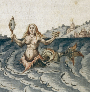
MermaidMirrorIt’s not certain whether the woman in the fish (if it is a fish) is separate from the fish or allegorically related to the fish, but the drawing could be derived from one of the popular legends at the time, especially considering there are other critters on the same page that evoke the same “feel” as the critters in Das Buch der Natur.

Maybe the woman on Folio 79v is a melusine donning her fishtail during her Saturday bath, or maybe there’s no connection to mythical creatures at all. I think we can say, however, that it’s probably not a mermaid, since the fish and woman appear to be separate creatures, and there’s no sign of a mirror as seen in most pictures of mermaids.

J.K. Petersen


© Copyright 2016 J.K. Petersen, All Rights Reserved
Marginal Notes and Miniscule Text         26 Jan 2016

There’s Something About Mariolli Folio F17r

VMf17rIf you look at Folio F17r, it’s laid out like many of the other plant pages. There’s a colored plant, a block of text that flows around the plant, and a marginal note at the top. If it weren’t for the marginal note, the page would probably not attract much attention.

By itself, the marginal note isn’t especially unusual. Notes are found elsewhere, in the same apparent handwriting, but… there’s something about the text that is different and some incongruities in the marginal note worth exploring, as well.

Normally I would describe the text first, and then talk about the marginal note, but I’m doing it it the other way around because there’s more than one mystery on this page and one may help illuminate the other.

Mallior Allor?

When I’m investigating marginal notes, I try not to look at other people’s interpretations until I’m fairly sure of what it looks like to me and what I think it might mean. Then I begin to wonder if others have come to the same conclusion and I start scouting around. In this case, my idea differed from most (perhaps all) of the others, at least in part.

This is what the note looks like after I adjusted it in Photoshop to try to make it clearer:

F17rDetailI confess I didn’t look at other analyses for very long, but this is what I discovered about other researchers’ interpretations…

  • Some consider the note unreadable.
  • Some say it’s in cipher text.
  • Some have suggested it is connected to Mattioli or Matthiolaus.
  • René Zandbergen, in 1999, suggested mallior adlor lucz(m) her vnllomnis olio**
  • Some say it’s Latin

I quickly stopped looking at other theories. I can’t see anything that evokes Mattioli or Matthiolaus in this text. I don’t think it’s cypher text, at least not the first part. Zandbergen’s suggestion makes more sense than any of the others, but I have some ideas that differ somewhat.

The Handwriting Style

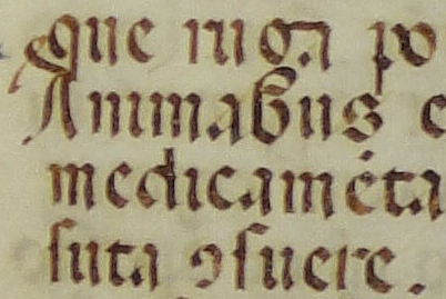
First, some background. The margin note is in the same style of script used on the last page and some of the other marginal notes. This style of script emerged in the late 1300s and was just about gone by the late 1500s due to the invention of printing presses. Just as Carolingian had its day, this form of Germanic text, which was particularly prevalent in southeast Germany in the early 1400s, declined and died. During its height, it was mainly used for Latin and German religious texts and chronicles, although a slight variant was also used in certain monasteries in England and another variant in northeastern France.

15thGermWritSample2I mentioned in a previous article that part of the reason this form of script became popular was because there was a businessman in southern Germany running a manuscript studio (see example right) who earned extra cash by teaching handwriting to children (and probably anyone else who was willing to pay). This style of script was also shared in ecclesiastical settings in the St. Gall area.

NaplesScriptI tried to trace the earliest example of this style of writing and I’m not sure I have the earliest, but there is a possibility it originated in Naples or that someone from Germany visited Naples and brought it back in the 14th century, or may have learned the script in Germany, then traveled to Naples before writing the manuscript. Naples was a Lombardic kingdom until the 8th century but it’s probably Charles III or Ladislavs I who was King of Naples at the time this document was created.

15thGermWritSampleThe example to the right originated in the early 15th century, about a decade before the one from the German workshop. It’s a heavier hand (a wider quill) than the spindly writing of the VMS margin-writer, but it’s the same style of writing and differs quite noticeably from most mid- and southern Italian writing of the time.

So, it appears that the margin notes are Germanic. Combine this with the sprinkling of Germanic words and it’s hard not to posit a Germanic influence on the handwriting style.

Most Lombardic scribes at the time wrote in both Latin and German and the marginal-notes writer is no exception. The last page includes both Latinesque and some almost-discernible Germanic words. The smaller marginal notes on other pages are a mixture of German and Latin with Latin scribal abbreviations and I’m somewhat sure that the marginal notes on this page are the same.

Don’t Keep us in Suspense… What Does it Say?

I’m fairly sure the note at the top is polyglot, just as I’m somewhat sure the text on the last page is polyglot. That’s not to say it was polyglot at the time. German was infused with Frankish words, Norman languages included a mixture of German, French, and old Norse, old Flemish existed somewhere between Latin, French, and Dutch, and most educated people knew Latin. Germanic script typically used a subset of Latin scribal abbreviations.

To start, I don’t think that first loopy letter is an “o” as has been suggested by many people. I think it’s an “e” mainly because many scribes wrote the letter “e” this way with hardly any tick mark to distinguish it from a “c”. Note how it slants more than an “o” and it doesn’t close all the way. The last letter of the first word is “r” as is the last letter of the next word. The “r” shapes are standard Germanic script of the time.

Here is my current guess at what it says. The “a” is messy, the second “e” or “o” is up for debate, but the other letters are discernible:

mallier aller lucorem hov vi[ ]lameno ??   o?   no/uo ?? olono?? (I cannot make out the end of it where it fades.)

Notice I expanded the Latin lucorum. The line above the cz means letters are left out—this was a common way to abbreviate a word. It can also be abbreviated with a -rum symbol that looks a bit like an embellished “4”. See my previous article about Latin abbreviations.

MallierAllerSo… what is mallier?

It would mean nothing to most people, even to many Europeans, but to a Norman, it could be understood as “to paint” in a mixture of Scandinavian with French pronunciation (even if it’s not French grammatical structure). Most languages use some form of the word “paint” (to mean coloring in something) but in German, it can be malen and in Norse, it’s “male” (it’s well to remember that Normandy derives from “Nor maend” (Men of the North, Norse men). Mallier could be a “verbized” form of “to paint”.

The next word aller or allor would be understood by most northern German or Scandinavians of the time as “all [of the]”. In Latin lucorem hov would refer to these things as green. I’m not absolutely sure it’s “hov” as the last letter is badly obscured but it might be.

Is it reasonable to believe that the marginal text could be instructions? I think it’s possible, given that there are annotations elsewhere in the same style of writing that could be interpreted that way and are added in a manner consistent with other herbal manuscripts. Consider that the “g” in the leaf of Plant 1v, the “por” (purple?) on the petals of the viola, and the “rot” on the stem of  Plant 4r might be painting instructions, as well.

I am guessing that the statement could be an instruction as in, “paint all these green” except that the word after hov is probably part of the statement as in, “paint all these ___[leaves? plants? a shade of green?]___ green “. Unfortunately, I cannot make out the next word but it has a peculiarity that needs to be mentioned in the context of the whole page.

Is That a Slip of the Pen or Something Else?

The first two letters of the fading word look like vi but the next doesn’t appear to match any known Latin/Germanic character. Maybe it was a slip of the pen and was meant to be something like rt, but it keeps teasing me into thinking it’s a mini-gallows character. What follows after these shapes is difficult to discern, maybe -lamino or something like that but I haven’t succeeded in making it out.

MiniGallows1But getting back to that possible gallows character. I rejected the idea several times, because gallows characters are tall. It’s hard to hang someone from the height of a footstool so it makes no sense to interpret it as a gallows character, does it?

Remember I mentioned at the beginning of this article that there’s something odd about this page? Well guess what.. when I tired of staring at the faded letters, my eye drifted down the page and landed on, I couldn’t believe it, a tiny gallows character. Right there on the same page, on line seven! How improbable is that?

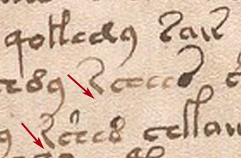
F17vMiniGallowsArrowIt’s very small, able to shelter under the arm of a full-sized gallows character and yet, despite its diminutive size, even has a tiny tick mark on the bottom foot that is characteristic of this symbol.

It’s hard to describe how surprised I was. As implausible as it seemed, at first, maybe there is a gallows character buried in the marginal note, just as there are VMS characters mixed in with Latin and German on the last page.

Summary

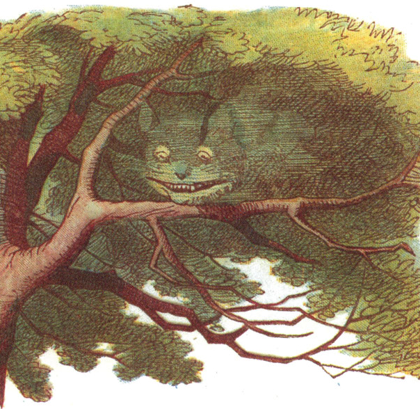
CheshCatInvisThere’s more to say about this page, but I’ll do that in another article. For now, I’m throwing out an alternate suggestion for the marginal text that differs from what I’ve seen so far in the hopes of furthering the discussion about what it might mean.

I wish I could see the Cheshire-cat text through a microscope—like everything else Voynichese, it’s a terrible tease.

J.K. Petersen

© Copyright 2016 J.K. Petersen, All Rights Reserved


Little Details that Loom Large         29 Jan 2016

Has Someone Messed with the Voynich Manuscript?

BathLadiesTextThis question has often been asked, along with assertions that the entire document is a hoax. It took scientific analysis to establish that the text was probably added in the early 15th century rather than centuries later by Wilfrid Voynich, the book dealer who acquired the document from a Jesuit cache.

Even if all the text were written in the early 1400s, that still doesn’t guarantee it was all done by one hand. It has been suggested a number of times that several people contributed to the VMS.

There are at least three styles of handwriting: 1) the main text (one hand or possibly more), 2) the marginalia and last page, and 3) the labels under the zodiac symbols.

Analysis suggests there may be two underlying “languages” or patterns to the text, as well. But what about the handwriting itself?

That’s a long subject and probably should be released as a paper rather than a blog article, but there’s an interesting example on one of the plant pages that certainly looks like someone has altered the original text by adding extra characters.

The Voynich “Style”

Before illustrating the unusual text, it’s necessary to look at how letters are normally formed in the VMS. I’ll use a specific character as an example, taken from the same page as the anomalous characters.

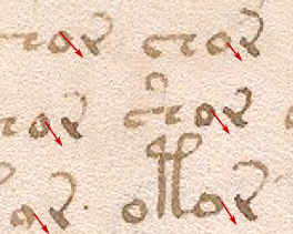
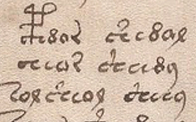
Folio10rLeanRThere is a glyph that somewhat resembles a leaning “r” with a backwards-looping tail that occurs frequently in the VMS. The tail varies but the stem is drawn in a reasonably consistent way. It leans back at approximately the same angle and is somewhat blunt on the ends, with minimal or no uptick at the bottom of the stroke to join it to the next letter as is found on the glyph that resembles an “a”. You can tell from the thick and thin strokes that the VM author holds the quill to a slightly left-leaning angle.

Now, take a look at the last two lines of text on Folio 10r. Unusual characters have been added that do not match the shape of normal VM glyphs.

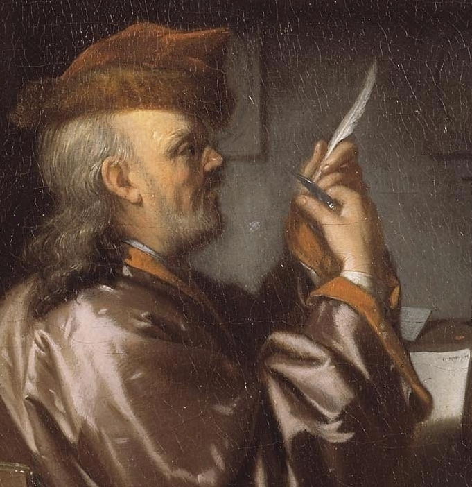
Jan van Bijlert | Detail – Saint Luke the Evangelist | Oil on Canvas | 93.6 x 77.4 cm. | Christie's Amsterdam 13 April 2010

Jan van Bijlert Saint Luke the Evangelist Detail, Christie’s Amsterdam 13 April 2010

Note: Some of these details may not be apparent to the viewer if you have never learned calligraphy (or spent a number of hours carefully studying the shapes of the VMS characters). Subtleties such as the angle of the pen are hard to discern unless you have training and you might want to consult the original high-resolution scans so you can look at these details more closely than they are illustrated here.


The Added Characters

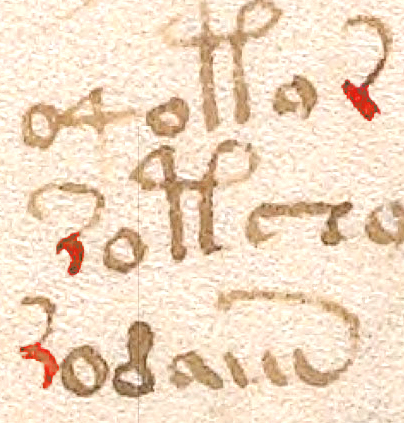
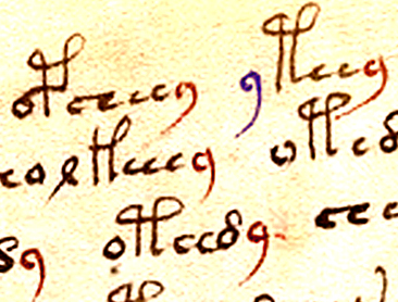
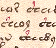
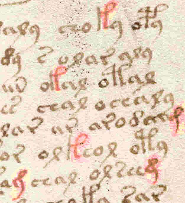
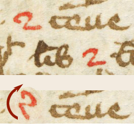
F10rXtraCharsOn the last four lines of Folio 10r are several anomalous characters. I’ve highlighted the main text r-with-tail in blue and the anomalous characters in red (I hesitated about including the “o” on the second-last line as it’s probably a regular VM character).

These characters differ from the surrounding text in a number of ways. It’s also possible that the figure-8 glyph on the bottom line has been added (or overwritten) by another hand but it’s hard to tell and it is contextually consistent with the main text, so I’m assuming it’s part of the regular text.

Note that in the unusual characters, the pen is held at a slightly different angle. On the high-res scans, you can particularly see this in the bottom “o” character which leans a tiny bit more to the left and correctly applies the thick and thin characteristics of a calligraphic “o” that is not usually seen in regular VM “o” shapes. Notice also that the average size of the added “o” glyphs (particularly the bottom one) is slightly larger than the average size of the “o” in the main text.

It’s not just the shape and size of the 1st and 3rd  “o” that are different, note that the added characters are tightly spaced (four of them touch adjacent characters), which is unusual for VMS script. Also note that the positions of the first and second “o” are inconsistent with the usual VM text formula for glyph placement. The “4” character is rarely preceded by other characters, it’s usually preceded by a space, and it’s very unusual for it to be preceded by an “o”. It is typically followed by an “o”.

Folio10rLeanRStemThe leaning “r” glyph differs even more from the main text than the “o”—it’s barely recognizable as a VMS character. It doesn’t have the typically straight stem, it’s not as blunt at the beginning or end of the stroke, and the stem curves backwards in a very nonVMS way.

It doesn’t connect the tail in the same way, either. The VMS “r” is created in two strokes like the c/e with a tail—first the stem, then the tail, with the tail attached slightly below the top of the stem. The anomalous “r” appears to be drawn in a continuous stroke, from bottom to top left and adding the tail without lifting the pen, so that the tail attaches to the top of the stem rather than partway down. Even if it were drawn in two strokes, the attachment is at the very top and there is almost a hook on the top-left that doesn’t occur in the regular VMS “r”.

Why Add Extra Characters?

It’s odd that only a few characters would be added in a very specific place on this page.

Was it to obscure the underlying meaning or to correct it? Was it to clean up the margin?

It doesn’t appear to be a correction to the sound or meaning of the text, because the first “o” appears to be incorrectly placed by someone who hasn’t noticed the glyph-combination patterns that dominate the rest of the manuscript. Either the scribe knew something we didn’t know or understood it even less than contemporary researchers.

It also doesn’t seem likely that text was added to clean up the left margin because the margin on this page was fairly wavy anyway, adding a few characters at the bottom (especially if the second “o” was part of the original text) doesn’t significantly alter the overall impression of the page.

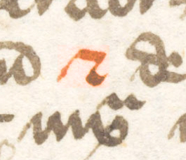
F14vCurvedVYou’re probably wondering if this alien hand appears elsewhere in the document. I think it does, although the example on the left from Folio 14v is only one character, so it’s hard to assess. It’s definitely not a standard VMS character.

Look at the left curve of the glyph marked in red. It’s the same curve as the fractured “r” on the previous folio and the VMS rarely has tails swooping from the bottom of a letter (they occur, but not often).

Summary

Folio10rThumb2Why would someone add letters that don’t contribute to formatting or the formulaic consistency of the text, with ink and a quill that are similar enough to the surrounding text that the anomaly doesn’t jump out at you right away?

Were they practicing? Did they pick an inconspicuous spot on an inner page to see if they could match the text, with the possible intention of adding more elsewhere in the document? If so, I would call it a failed experiment unless the scribe later figured out how to mimic the VMS characters more closely.

Was someone just playing around? Could it have been a younger person who wanted to be part of the big project and didn’t understand that there was a pattern to the text? Could it be the same person who painted some of the drawings in a more sloppy manner than others?

I don’t have an explanation for the extra characters but I think it’s important to note that the ink very closely matches the rest of the text, even if the letter shapes do not. It makes you wonder if it was done with the same quill and ink pot, even if by a different person.


J.K. Petersen


© Copyright 2016 J.K. Petersen, All Rights Reserved
 

When Herbal Traditions Gang Awry          16 Jan 2016

The Mutation of Information

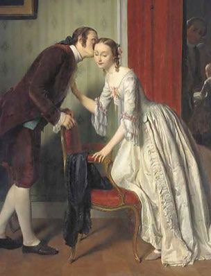
Our Grade 3 teacher wrote something on a piece of paper one day and handed it to the first student at the front of the class and told the student not to show the note to anyone, but to whisper the message to the next student. That student was then directed to whisper it to the next and so on, from mouth to ear, around the room.

WhisperJonghe

Detail of The Whisperer by Gustave Leonhard

We waited in anxious anticipation to find out the secret message. At the end of the chain, the final student repeated the words out loud and we laughed because it didn’t make much sense. When the original note was read out loud, quite a few of us were surprised at how the message had changed.

That was my introduction to how information can mutate, when passed from one person to the next, and I soon realized that drawings and text could undergo signification transformations as well. Like a photocopy of a photocopy of a photocopy, the original intent gets blurred and sometimes, as future copyists try to guess what is missing and reinsert it, it takes on a new life in a different form.

Herbal Traditions

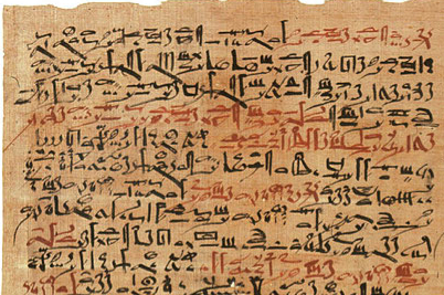
Medical papyrus from c. 1600 BCE held in the New York Academy of Medicine

Medical papyrus from c. 1600 BCE held in the New York Academy of Medicine

Medical writings date back more than 4500 years, to a time when only the elite had the knowledge and materials to record them. Due to high levels of illiteracy, much of what medieval westerners knew about herbs had been passed down unchanged from the Sumerians, Egyptians, Greeks, and Arabs. The words of Pliny, Hippocrates, Dioscorides, and Galen were still considered expert knowledge, with little critical analysis, centuries after they had passed away.

The earliest herbal descriptions do not include drawings, other than the occasional sheaf of grain, or an unidentifiable three-leaved plant meant to be symbolic rather than literal. Even when the plant was carefully described in words, those words were often very brief, and later students who studied the written descriptions sometimes misidentified the plants due to their limited understanding of botany or because they lived in regions where plants that looked similar could be entirely different species.

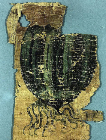
OldestHerbWe’re not sure when the tradition of creating illustrated herbals began but the Egyptian fragment on the right is from a c. 400 BCE herbal papyrus called the Johnson Papyrus. In the 1st century BCE, a physician known as Crateuas/Kratevus may have been a pioneer and it’s thought that his work influenced later illustrated copies of Dioscorides’ work. His name is mentioned in several Latin and French editions on the general history of plants from the 16th and 17th centuries but only a few fragments of his work survive.

The Development of Herbal Traditions

When efforts to illustrate plants became more common, those who drew them were often doctors and apothecaries rather than artists, limited in their drawing skills. To make matters worse, sometimes only the parts with medicinal properties were illustrated, leaving out features that might not be relevant to medicine, but which would have helped identify the plants. On top of this, copyists sometimes misinterpreted the older drawings and changed their features unintentionally.

Saffron

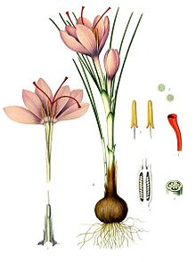
KohlerCSativusIf we take the example of saffron, which is revered for its golden-orange threads that are used as a dyestuff to color foods such as rice, we can see how herbal tradition can misinform.

The plant that the ancients identified as saffron is a form of crocus, a relative of the iris. The crocus plant, a bulbous harbinger of spring, is found worldwide and comprises almost 100 species. Saffron comes from a specific crocus (Crocus sativus), which may have been deliberately bred thousands of years ago, for its desirable threads.

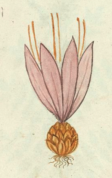
CSativasNoLeavesThe saffron crocus propagates through divisions of the bulb, and here is where herbal tradition goes awry. At some point, an attempt to document this propagation resulted in a drawing of a bulb that resembles a lily or garlic bulb more than a crocus. It doesn’t accurately illustrate the way crocus bulbs divide, and thus could lead to misidentification of the plant. The leaves are sometimes also represented incorrectly. Various crocus species can be recognized by the shape, width, and length of their leaves in combination with other features. In fact, some species have no leaves at all. If the plant is drawn inaccurately, the wrong species may be harvested. C. sativus has slender leaves yet some of the herbal manuscripts show it with no leaves.

If you consider that the autumn crocus, a toxic plant that looks very similar to spring crocus, is a different species that grows in many of the same areas, you can see why details are important. Except for the protruding threads, the botanical drawing on upper-left resembles certain varieties of autumn crocus (Colchicum speciosum) more than it does Crocus sativus. Worse yet, Colchicum is sometimes called “autumn saffron” or “meadow saffron”, even though it is not the plant that supplies saffron.

Peculiarities and Provenance

From a historian’s point of view, a mistake by the original scribe or illustrator isn’t always a bad thing. Imperfections and peculiarities in plant drawings can sometimes help us chart the provenance of a manuscript. If the drawings are accurate, it’s difficult to know whether they are based on live plants or on previous drawings. When they are inaccurate, especially if several plants in a compendium are inaccurate in the same specific ways, sometimes the quirks can reveal the illustrator’s sources.

Other aspects of the plant, such as the way it is rendered, or the addition of snakes or faces, or its relationship to other elements of the page, can also provide clues as to where the illustrator got his ideas. For example, in the Voynich Manuscript, roots shaped as animals and roots with human faces suggest a familiarity with other herbal manuscripts of the time.

Oddities That May Not Be So Odd

Sometimes eccentricities in herbal drawings are based on superstition, and sometimes they have other explanations. It’s not uncommon for herbal drawings to express similarities to animals. In fact, in the middle ages some people believed that if a plant was shaped like a body part, it was God’s signal that the plant should be used to cure that part of the anatomy. Or, if it resembled an animal, it was meant to attract or deflect that animal or to cure a specific kind of animal bite.

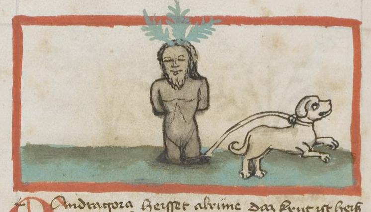
MandrakeThumbThe legend of the mandrake plant, which has a root that resembles the human form, is that it screams when it is uprooted and will harm those who hear the scream. The solution is to tie a dog to the plant, get out of hearing range, and then have the dog pull out the plant by its roots.

DragonThumbIt’s tempting to interpret VMS Plant 25v as a mandrake, with its whorl of basal leaves, but the root isn’t thick enough and the critter nibbling on the leaf looks more like a dragon than a dog. Also, the mandrake doesn’t have parallel veins, and the VM illustrator has clearly illustrated this leaf structure, so it’s not likely that this is intended to be Mandragora—it may be something else related to dragons (or possibly to sheep, since this may be a badly drawn turtle-shell lamb).

Another VMS plant has leaves that look like bird heads. The shape may be symbolic, intentional exaggeration, or perhaps there’s a simpler explanation. There are some plants that curve dramatically in one direction or the other as they dry. Sometimes leaves that hang down may turn upward or the tips of the leaves may rotate in one direction until they resemble the heads of birds. There is an African plant with symmetric leaves that look like birds’ heads when they dry.

Some of the peculiarities in the VMS may be due to tradition or superstition, they certainly appear fantastical in many ways… others may be artistic expressions of natural processes that aren’t so peculiar as they seem at first glance.

J.K. Petersen


© Copyright 2016 J.K. Petersen, All Rights Reserved

Voynich Location – What Can Libra Tell Us?

14 Jan 2016

The Constellation Libra

The constellation Libra hit the news at almost the same time I discovered the Voynich Manuscript. A comet was visible, in February 2009, at the topmost point of the stars we associate and identify as Libra. It delighted stargazers by being as bright as stars in the Big Dipper, visible to the unaided eye.

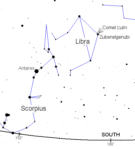
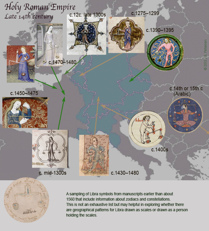
ConstellatLibraMy previous post discussed the unusual depiction of Scorpio in the VMS, and since Libra is adjacent to Scorpius, from our earthly point of view, this is probably a good time to post some of my findings about the VM illustrator’s drawing of Libra.

If you turn your head to the right when looking at this chart of Libra and Scorpio from NASA Science, you can see that Libra looks like a set of scales. Scales in the middle ages were different from what we have now. Modern scales are based on springs and pressure sensors. Medieval scales were based on comparisons of similarly weighted items.

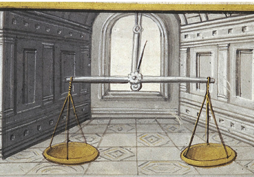
LibraMorgan632f9vIf you fasten cups to both ends of a pole and place a known weight in one of the cups, you can find out if another object, like a piece of silver, weighs more or less than the known object by how much the pole slopes off the horizontal.

To aid in determining whether the pole is horizontal, people in antiquity added a spike in the center of the pole that would poke out in one direction or the other to indicate whether the objects in the cups (or the cups themselves, if they were empty) were off-balance.

Scales and the Concept of Justice

The idea of a balancing scale has long been associated with concepts of fairness and equality and sometimes ventures into the allegorical, as in this Egyptian depiction, from the Book of the Dead (a collective term rather than a literal form of book), of a scribe’s heart being measured against the feather of truth. The goddess Maat, Egypt’s spiritual representative of truth and justice, is identifiable at the apex of the scale, wearing the feather of truth.

ScribeHeadScaleSometimes additional stars are considered when envisioning Libra. In fact, in antiquity, the “feet” of Libra were sometimes seen as part of the claws of Scorpio. The inclusion of additional stars explains why some illustrators show Libra held aloft by a Virgo-like figure.

This interesting variation, scales by themselves, or scales held by human figures, is what brings us back to the drawing of Libra in the Voynich Manuscript. Can the VM illustrator’s choice tell us anything about the temporal or geographical origin of the manuscript?

By Itself or Held Aloft

Images of Libra as a zodiac symbol can be loosely classified into two kinds: those that include only the scales (or sometimes a hand holding the scales), and those that have most or all of a human form holding the scales.

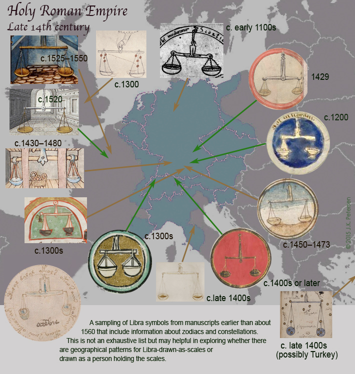
I assembled two charts to compare their geographical distribution. I confined the search to images of Libra that accompanied other zodiac symbols in the same document and which were created prior to about 1560. I found more images of Libra as scales than could fit on a chart and selected ones that were generally representative. It was more difficult to find examples of Libra held by human forms and they fit fairly well on one page.

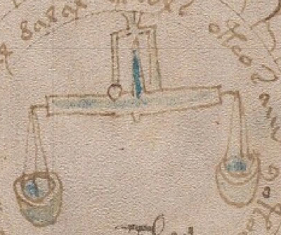
MapRomanEmpireLibra1Some of the scales are drawn level and straight on, so you can’t see the balance spike that shows when the scale is off balance. Others show the spike even though the pole is more-or-less horizontal. It’s noteworthy that the Voynich illustrator went to some pains to make the spike visible, even broadening the distance within the housing and painting it blue so it can be clearly seen.

Now let’s take a look at Libra in human form…

MapRomanEmpireLibra2Examples of Libra as a person holding scales are harder to find. This may be due to interpretation of the stars and how many constitute Libra or there may be a simpler explanation—humans are harder to draw. It might also be a combination of the two.

There aren’t enough samples to drawn any conclusions and most of the Libra-as-human examples appear to be from the same general geographical areas so we’re not looking at divergent data sets. The paucity of examples from southern France and Spain probably has to more to do with lack of access to digitally scanned files than it does to the number of examples that are extant.

With research, you never know where it will lead or which little details might become important later so sometimes you just have to gather it, present it, and offer it as information, without trying to extract too much meaning.

Thoughts about Scale and the Voynich Scales

As far as the Voynich manuscript goes, I’ll leave you with one little thought…

Did you notice that the cups of the Voynich scale are small and deep (almost round), rather than wide and a bit flatter like most of the others?

LibraCupsThe shape of the cups might be small so it’s easier to draw them within the circle, or perhaps they are small for the same reason they are small in the Arabic document shown in the lower right of the above chart.

Or, there may be a practical reason for drawing them this way. Scales for weighing food, or perhaps coins, need to be somewhat broad so it’s easier to move the items on and off the scale. Scales for herbs and powders need to be deeper and narrower so they are not blown away by a draft, or by a breath of wind, if the scale is used outside in a marketplace.

We can’t really know if the small deep cups are intentional, subconscious (if that is what the illustrator was used to seeing), or simply a space or time consideration, but given that the spike and the connection to the main pole are carefully included, perhaps the shape of the cups was intended as well.

J.K. Petersen


© Copyright 2016 J.K. Petersen, All Rights Reserved
Voynich Location – The Fantasy Scorpio

12 Jan 2016

Discerning a Big Picture from Small Clues

The zodiac pictures in the Voynich don’t appear to have much to do with zodiacs, they are mostly surrounded by ladies in loges, but the images themselves are recognizable as traditional zodiac symbols.

The depiction of Sagittarius in the Voynich manuscript as having legs and a crossbow is unusual and is, for the most part confined to a certain time and place, with the time being contemporaneous with the creation of the VMS. Since details like this may offer clues to the identity of the author or provenance of the document, it seemed worthwhile to examine some of the other symbols as well.

The Scorpio Zodiac Symbol

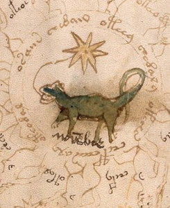
ScorpioF73rDetailFolio 73r features a lizard-like yellowish-green creature with a long tail and a line in its mouth leading to a drawing of an 8-pointed star. It is surrounded by successive circles of texts and naked women.

It’s assumed this is Scorpio because it would fit the overall theme of zodiac symbols on adjacent pages. Whoever labeled the creature in a hand that differs from the main body text of the VMS, apparently thought so too, and labeled it novembre.

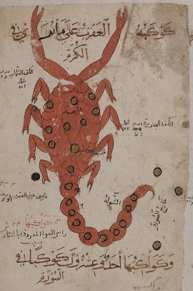
Scorpio15thMany medieval European ideas about astrology and astronomy came from concepts expressed in Arabic documents.

Scorpio is based on the constellation Scorpius, a clump of stars with a long curving chain of a tail that resembles a scorpion, a venomous creature in the same family as spiders. You might not guess it was cousin to spiders, because it resembles a crustacean more than a spider (picture a crayfish with an upcurved, pointed tail). Depending on the species, the scorpion has six or eight legs plus specialized pointed claws called pedipalps, and a distinctive claw-like stinger at the end of the tail.

Today, scorpions have spread to almost every part of the world. In the middle ages, however, they may have been infrequent (or absent) in northern latitudes because illustrators who did a good job of drawing the other zodiac symbols sometimes created fanciful versions of Scorpio, or perhaps retained a different concept of the animal that the Scorpius constellation resembled because they were unfamiliar with the creature after which it was named.

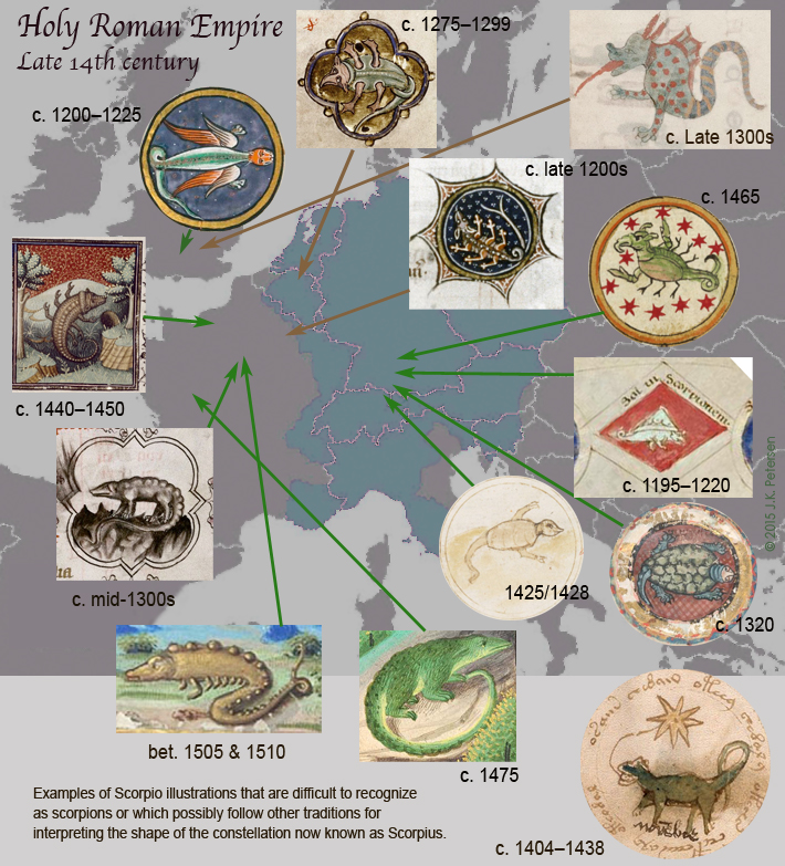
ScorpioNaturalThat’s not to say that all northern Scorpios were difficult to recognize as a scorpion, many were quite accurate, as can be seen by the examples above that range from about 1425 to the later 1400s, but there are a few that deserve attention because, like the Voynich Scorpio, they could easily be mistaken for lizards, mammals, or dragons.

Unusual Depictions of Scorpio

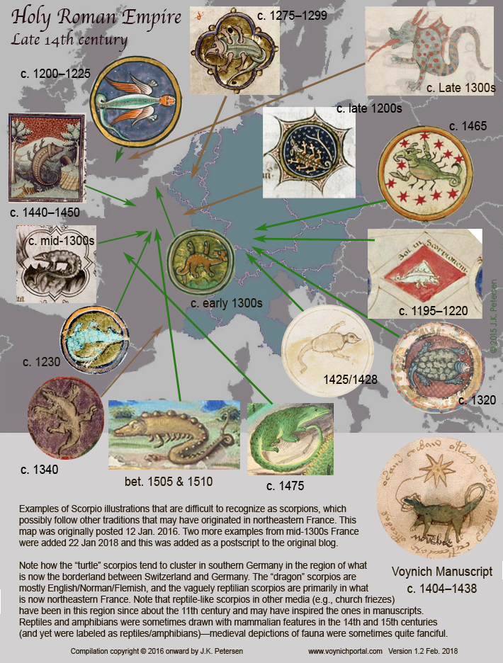
The following chart illustrates some unusual depictions of Scorpio that would be difficult to recognize unless they were labeled as such or included with the other traditional zodiac symbols for context.

MapScorpioLate14cNaturalistic Scorpios are far more common than examples like these. Note that the origins of unusual Scorpio symbols trends more to the north and west than Sagittarius with a crossbow and legs. There is noticeable clustering of Sagittarius in the southern German and northern Swiss area. In contrast, the unusual Scorpios range from Germany and Switzerland to France and England. The two examples from England look more like mythical creatures (perhaps dragons) than any natural animal.

I haven’t yet found any reptilian or mammalian Scorpios from eastern Europe or the Mediterranean. They may exist, but if they do, they are not common. There are some that are debatable because they are not of expert quality. I tried to steer away from illustrations where you really can’t tell whether Scorpio’s quirks were a deliberate choice or attributable to weak drawing skills, and concentrated on those that were drawn well enough or deliberately enough to classify them as one or the other.

The date range of odd Scorpio symbols is not as tight as Sagittarius. Sagittarius with legs and a crossbow tends to occur very close to the time the VMS was created (estimated to be in the early 1400s). Unusual Scorpios, however, range from about 1200 to the early 1500s and since they are rare, are more broadly separated in time. In fact, only one Scorpio in this sampling is contemporaneous to the VMS.

Drawing Conventions

There are three examples that cluster around the German-Swiss border that resemble turtles and which don’t resemble the VM Scorpio at all. Give the scarcity of turtle-Scorpios and their geographic proximity, you might expect them to originate around the same time, but they were actually created about 100 years apart.

The two examples that most closely resemble the side-on posture, orientation, and lizard-like qualities of the VMS were created about 70 years earlier and about 80 years later than the estimated time of the VMS. There’s little likelihood that the brownish Scorpio with stegosaurus-like bumps influenced the VM since it was probably created later and has numerous legs, but it’s possible the one from the mid-1300s did if it was stored in a library or other location where people had access to the manuscript.

ScorpioGreenThe green one from c. 1475 was probably created after the VMS, but note that both the VMS Scorpio and the green Scorpio from France have spots on their backs. There are a number of lizards, native to Portugal, Spain and southern France that are green with spots. Perhaps there was an oral tradition for the names of the constellations that influenced the choice of a lizardy creature that actually lived in north or central Europe.

Other Astrological Traditions

When you consider that most Scorpio symbols in the 15th century looked fairly realistic, even those from the north, you have to wonder why the Voynich illustrator chose this form. In some cultures, the stars that form Scorpius are perceived as a palm tree or as a bird, by why a lizard or mammal?

I considered that depictions of Scorpio in the north might be influenced by Nidhogg, a Norse serpent constellation that shares some stars with Scorpio but the resemblance is slight. The serpent is very long and doesn’t have legs. So, it appears that the Voynich manuscript, as it does in so many respects, serves up another mystery, one deserving of further study.


J.K. Petersen


© Copyright 2016 J.K. Petersen, All Rights Reserved

Postscript 23 Jan. 2018: I have added two more images to the map from manuscripts that originated in the mid-14th century—one from Thérouanne and the other with shelfmark H 437 (which was brought to my attention in a post by Marco Ponzi).

I am not certain where H 437 originated, but the Picard-dialect translation of the Bestiary has been variously attributed to Richard or Pierre de Beauvais sometime in the early 13th century. H 734, the c. 1341 version, is housed in the Montpellier library but possibly originated farther north.

There isn’t room on the map to include the reptilian scorpios from other media dating back to the 11th century, but I have referenced sculptures, stained glass, and mosiac images in previous blogs about the constellation (I was not able to include images of all the sculptures due to copyright restrictions).

Postscript 2 Feb. 2018: I’ve been trying not to clutter this image too much, but I managed to squeeze one more example on the map (from c. 1230), and I have added a version number. I have many “dragon” scorpios from England, but since they are somewhat different from most of the reptile/amphibian drawings from France, I have opted to include only a few for reference.

As mentioned in the original blog on Scorpius, the green arrows are for reasonably established origins, with brown for those that are not completely certain.

You can click the thumbnail to see a larger version.

Voynich Script – The Leaning Letter and Why I Never Use the Eva Font

9 Jan 2016

Delving into the Details

I am constantly asking myself what can I learn about a person who lived almost 600 years ago when all that remains are enigmatic pictures and about 200 pages of inscrutable text—text that has resisted the efforts of thousands (perhaps tens of thousands) of eager amateur and professional code-breakers.

It probably took a long time to create the VMS—hundreds of drawings, a couple of hundred pages of text. Writing and drawing with a quill takes considerable effort—something a generation of keyboarders might not fully appreciate.

SharpenQuillDijkThere were no ballpoint pens in the 15th century. Ink was hand-mixed from iron particles, vinegar, and oak galls, and getting the right consistency was important. To create the pen, someone had to pluck the feathers of a goose (preferably one that’s been given last rites—live geese will bite your knees off).

Even if you braved muddy streets crawling with rats and bought the ink and quills premade from a local craftsman, you had to trim your quill with a knife every few pages as the end of the nib wore away. If the angle or width of the nib changed, the text would be inconsistent. If you didn’t scrape enough ink off the nib right after dipping, the ink would drip or blob on the page. If you waited too long to redip, the ink would run out, the text would be too light and a few letters would have to be overdrawn without smearing.

Unlike a fountain pen, which provides a smooth flow of ink, the medieval scribe had to control the flow of ink using rhythmic movements of hand and wrist—a process similar to coaxing good sound out of a musical instrument.

Given the labor involved, writing nonsense-text would take almost as long as writing meaningful text.

What Penmanship Says about the Penman

15th c Lombardy calligraphy

15th c Lombardy calligraphy

Looking at the physical balance of the VM letters and lines, one would have to call it handwriting rather than calligraphy. The VM scribe was not an expert penman. As I mentioned in a previous post, the angle of the pen is not optimal for enhancing the aesthetic qualities of the pen strokes and the VM letter forms are not consistent enough to qualify for professional penmanship in an age when jaw-droppingly beautiful illuminated manuscripts were crafted by expert scribes.

Similarly, the “second script” on the last page of the VM (which may be in a different hand) lacks the artful shapes and consistency of high-quality penmanship.

VMTextSampleEven if it’s not up to calligraphic standards, the handwriting in the VM is careful, measured, and clear. In this respect, and in the fairly broad spacing, the VM script is more like 13th century Carolingian than Gothic cursive. That’s not to say it resembles Carolingian style (other than the broad spacing), but it is more readable than many medieval documents of the 15th century that were penned by amateur scribes—a detail that may say something about the personality of the author.

Discerning the Devil in the Details

This article doesn’t focus in depth on the writing style of the VM—I’ll do that in a separate post (there’s plenty to say about the spacing, size of the letters and how they are written). Instead I’d like to get to something more crucial—a clue that reveals that the VM author had a working knowledge of Latin scribal conventions that suggests classical training.

The Structure of the Text

MatrixIconThere have been a number of computational attacks on the Voynich—attempts to discern its structure through computer analysis. Some of these are quite interesting (and probably worthwhile), others are  based on faulty premises, but at least they yielded some funky graphs.

I’m in favor of computational attacks—they further our understanding of computer analysis, even if nothing else. I’m also in favor of computational attacks on the VM, even though many are based on the assumption that there’s a one-to-one correlation between VM glyphs and actual letters/sounds which, in my opinion, is a very shaky assumption.

One important detail about the VM text that I mentioned in my July 2013 zodiac post, and which I’d like to elaborate further, is the use of Latin abbreviations. The entire text incorporates writing conventions that were common in the 15th century, including the abbreviations in the zodiac labels written by another hand next to each animal.

Latin Conventions

Latin scribal abbreviations are shapes that stand in for letters. Some are used within words, some at the beginnings and ends of words. I’m not going to give a full tutorial on Latin sigla, since many of the conventions are outside the scope of the VM, but I’ll mention ones that are directly relevant.

SiglaConThe “9” abbreviation. The shape that resembles the number nine is used at the beginnings and ends of words. At the beginning, it typically stands for con– or com-. At the end, it is usually –cum or –cun but can also mean –us or –os or occasionally -is (particularly if it is superscripted). The 9 as a suffix is common to many manuscripts. The 9 is used as a prefix as well, but less often.

In the Voynich manuscript, the 9 is contextually similar to Latin and Germanic texts—it shows up frequently at the ends of “words” and occasionally at the beginning. If one hunts through the VM, one can find exceptions where it appears midtext, but that can happen in Latin, as well, and usually stands for -er or r.

CTailc/e with a tail. A shape that looks like a c or e with a tail has meaning similar to the suffix 9 (con, cum) except that the shape usually stands alone rather than being attached at the beginning or end. In the VM, it’s sometimes difficult to tell from the spacing whether a character is intended to be read by itself or is associated with nearby glyphs. In the VM example to the right, the spacing is similar to the 14th century Latin document above it, but the distinction between this character and others is not always so clear.

It perplexes me when I see “decodings” from Voynich researchers who rigidly assume a one-to-one relationship between character glyphs and their underlying meaning (assuming there is an underlying meaning). Even if you put aside the possibility of 1) ligatures, 2) medieval abbreviations, and 3) null characters, you still should not assume one VM glyph equals one letter. It could be one, two, three, or more. If it were a one-to-one substitution code (also known as a Caesar code), the mystery would surely have been solved centuries ago.

Other Numbers

Latin4oThe number 9 is not the only number used in Latin manuscripts. The numbers 2 and 4 have significance as well (as does the number 3, but it’s not found in the VM and won’t be discussed in this post).

The 4 on the left is paired with a superscripted o in a 14th century Latin manuscript. Voynich fans might recognize the similarity to the Voynich 4o. The context is a little different, however. In Latin documents, 4o usually stands alone, while in the VM, it’s typically at the beginnings of glyph groups—it doesn’t follow Latin positioning conventions as closely as the number 9.

In Latin, the 2 is contextually similar to suffix 9—usually at the end of the word, often superscripted, and typically means -ur. A character that resembles a 7 is also commonly used to denote et or e (and is the basis of the abbreviation etc. which started life as a ligature between the 7 shape and a c). Less often it stands for –us or –que. The 7 shape does not appear to be represented in the VMS.

The Curling Tails

UmTailThe tails of some of the VM characters swoop up and over the letter, and do so in a consistent way. In the 15th century this wasn’t a mere embellishment, the tail carried meaning. In Latin and Germanic text, the curved tail usually represented m or sometimes n. If it’s midtext, it appears as a line above the letters. At the end, it’s easier to swoop back the tail rather than lifting the pen.

UmTailLatinGermIn Latin documents, the swooped-up tails often follow the letter u to create –um. In Germanic texts, they often follow ai to form ain (an old form of ein). Many of the German scribes also wrote in Latin and retained some of these conventions when writing in their native tongue, as illustrated in the two examples on the right.

The Caps

In September 2014, Stephen Bax asked me the meaning of the curved caps that appear over some of the VM glyphs. I’m sure many people are wondering the same thing.

VMCapsI didn’t answer right away, because the question can’t be answered in a few sentences. It depends on context. In fact, a blog post can only scratch the surface of VM conventions.

In Latin, the cap has a variety of shapes. Sometimes a different shape has a different meaning and sometimes different shapes have the same meaning (but vary stylistically based on individual hands).

ClosedCapLatinIn most cases a closed cap (an “o” shape) represents something different from an open cap. This is also true of German script, in which the open cap usually symbolizes –er- (or sometimes an old-style umlaut) and the closed cap the sound “oo” (and is  placed over a u the same way as an umlaut in modern text). I’m not going to go into details on the cap in this post, because it needs a full post of its own and I want to concentrate on another shape that may be more important.

The “J” Character

IsRisCisVMOne of the less common characters in the VM alphabet is the J-like character found at the ends of words. In Latin, this is easily recognized as the suffix –cis, –ris, or –tis and sometimes is used as –is when attached to a different beginning stroke. Note how the connection between the beginning stroke is sometimes blunt and sometimes rounded (the Eva font acknowledges this difference but neglects the third variation). That’s how it’s done in Latin, as well. I’ve seen some pretty odd proposals for what the VM J-shape represents but the shape (if not its meaning) is standard medieval Latin script.

All three suffixes can be found throughout the VMS and it’s possible that the one-loop gallows character may be an example, as well. Picture it as a ligature comprising a letter and the abbreviation –is. I’m not proposing this as a theory, just encouraging people to remain open to possibilities. In Latin, the shape of an abbreviation may change depending on its position in a word.

Putting aside the gallows character for now, the VM J character is almost always at the end of glyph-groups, but there are exceptions (you can find some on Folio 58r). Occasionally, two can be found combined, but even this is not particularly exceptional, since it’s possible that valid syllable combinations analogous to –ristis exist in whatever language underlies the VMS.

The Funny “r” Character

LeaningR1This brings us to one of the shapes that might be overlooked due to its resemblance to contemporary alphabets. Since there are several VM glyphs that look familiar to western European characters, like the a and the o, it might be easy to perceive this as an embellished r. In fact the Eva font maps it as a lower-case “r”. I’ve also seen people refer to it as a question mark, but that loop is definitely a tail, not the primary stroke of the letter.

There’s a Latin abbreviation similar to this that represents -ter. It’s a combination of a “t” (which often looks like a “c” in old manuscripts) with a curled tail, representing er. It looks like the VM “r”, but the stem is usually upright. Which brings us to an important detail I haven’t seen mentioned anywhere else…

Have you ever asked yourself why this funny character that somewhat resembles an “r” leans backward when all the other “stem” characters (with the possible exception of a character that resembles an “i”) are straight up and down? Maybe not. Just as you may not have considered a possible relationship between the suffix-J character and the loop on the gallows character.

Context is everything when interpreting a 600-year-old document.

I’ll explain why I think the lean in the “r” is important and why it helps confirm the idea that the VM scribe was familiar with classical Latin conventions. I’m proposing that it may be based on another Latin abbreviation that is usually found by itself, between words, although sometimes in other positions.

Latin2CharRotThe letter that resembles a 2 in Latin manuscripts usually stands by itself, between words, but it can also be found in the end position (usually as a superscript).

Now use your imagination and picture this character rotated 60 degrees clockwise. Then you get a character that not only resembles the “r” with a tail but which appears in the VM by itself, between words, and sometimes at the ends of words. Even when it appears to be part of another word, the space between it and that word is sometimes greater than the distance between individual letters, which makes you wonder if it’s intended to stand alone or form part of the nearby group. In other words, the context of the VM “r” is similar to the way the “2” is used in Latin even if the shape, in this example, is not in the same orientation.

rTail14thYou don’t always have to rotate the character to recognize it. Here’s the same abbreviation in a different Latin document (14th c) in more angular handwriting. If you imagine the tail more smoothly curved, it resembles the VM glyph’s orientation without rotating it. One can also find examples where the tail (the backward swoosh) is more curved.

In the subscripted suffix position, the “2” or “r” (which sometimes looks like a leaning S) may represent –ur or –er. When it’s written as a suffix in-line with previous characters, it usually represents –re or –ri or sometimes –er, but this form would normally have an upright stem. In Latin, it’s less common to see it midword, but when it is, it can mean almost anything (and sometimes represents as many as five letters).

Darn Those Details

Italy12thcAbbrLearning medieval abbreviations is not as easy as looking at a chart. Some symbols are fairly consistent (mainly the suffixes) but many can only be interpreted in relation to the letters around them, which means you have to know the underlying language to understand whether the symbol stands for one character or many and to determine which ones they are.

The example above-right (from a 12th century Italian manuscript) is a relatively small snippet and yet is packed with Latin abbreviations, including pro-, der-, -us, -os, n, m, -er, -uo, -s-, con-, prae- and others.

Just when you think you’re getting the hang of it, another snafu comes along and you discover a symbol you thought you understood has other functions, as well. Like the J character that stands for -cis, -ris, or -tis… it sometimes doesn’t stand for characters in the preceding word at all. Sometimes it’s a paragraph-end marker.

Sang610c1455Knowing the language is especially important for interpreting 15th-century manuscripts like the one on the right from the mid-1400s because writing was taught to a larger segment of the population and was no longer the exclusive domain of those chosen for their literacy and handwriting skills. Later documents are often not as tidy as 12th and 13th century hands, and superscripted symbols were not always written directly over the position where the letters are missing.

Implications for the Voynich Manuscript

I’m confident that the VM scribe knew Latin conventions beyond simply copying the shapes. Many of them are contextually applied in the same way one would see them in medieval Latin and German manuscripts. Whether there’s any Latin in the VMS is a completely different subject. I have my own ideas about whether the VM author used Latin conventions to represent single letters, groups of letters, or… as a smoke-screen to hide the underlying contents of the manuscript by crafting the text to look like Latin.

J.K. Petersen

© Copyright 2016 J.K. Petersen, All Rights Reserved
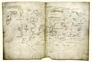
Voynich Folio 116v – A Charming Discovery

The Strange Formulas in the Voynich Manuscript Partially Revealed

I recently experienced the thrill of discovery—information to confirm a hunch, and new information that might pull back the Voynich curtain just a crack.

I discussed the last page of the Voynich in previous blog entries from 2013, where I speculated that it might be a charm. All I had to go on at the time was a hunch, based on its formulaic nature.

VMFinalPage

I have since discovered examples of charms that reveal something about the content and format of a charm that strengthens the identification of the VM last page.

German Charms and Healing Prayers

MoravskaCodeBreakdownMy introduction to charms happened by accident prior to posting the example on the left in 2013. I discovered this charm on the fly leaf of Der Neusohler Cato. I didn’t know it was a charm at the time, it just felt that way to me… and it really caught my attention due to its similarities to  oladabad and other cryptic text written on the last page of the Voynich manuscript (it might help to refer to that page before reading this one).

AbraculaCharmc1p391After discovering the Cato fragment, I searched the Web extensively for other variations of the word abracula or abgracula and found none. Two months later I tried again without success. And then I basically forgot about it.

A couple of years later, in 2015, I discovered the shield-shaped charm shown to the right and noticed immediately that the Cato charm uses the same “abgracula” or “abracula” or “abraculauß” (variations are common) as the shield charm.

The shield charm was revealing because there was information included around the edges of the shield, in a mixture of old Germanic and Latin, that were not included in the Cato fragment and… the blend of languages is similar to the Voynich manuscript. This shield charm, and a couple of others that I’ll illustrate below, gave me an exciting clue as to the nature of the text at the top and bottom of Folio 116v.

Abgracula/Abraculauß/Aburacula/Abraculuß

From looking at examples, I discovered that abracula, possibly derived from Abraxas, is a very specific charm word for the reduction of fever, one that was used in Germany in the 15th and 16th centuries (I don’t yet know if it was passed down through oral or written history prior to the 1400s but will continue to watch for examples).

I also discovered there’s a formula for presenting the charms.

To clarify this, I’m including two manuscript clips from the same document from the Heidelberg region dating to the second quarter of the 16th century.

AbraculaF16v

Note the same basic charm word (or “chant”) Abraculuß and the way it is broken down with cross symbols between each of the letter groups. Thus, it gradually becomes Abracan (quite similar to Abracadabra), Abracu, and finally Abra followed by several crosses and additional text in German. This may be a short form of the full charm.

A few pages earlier was a more extensive description of the same concept:

AbraculaF12r

There is German text on the first line to introduce the purpose of the charm, then the charm word Aburacula successively broken down (with crosses in between, possibly to indicate signing the cross) and then some more explanatory information in German about how to apply the charm.

Note that both these reductionist charms are for fever (loosely spelled “fieber” and “fiber”).

The lengthier example instructs the user to write down the words and then, it’s difficult to make out all of it, but if “hencken” is old German or Yiddish for hängen, then it says to hang it around one’s neck for nine? days, along with some further instructions.

Why is this significant?

Look at the format.. first there is a description of what the charm is for, then the charm itself, then instructions for anything else that needs to be done with the charm (such as writing it down and wearing it for certain number of days).

Now look at the final page of the Voynich manuscript. At the top is something that looks like pox leben or pox leber. Pox isn’t really German (pocken is more usual), but this is old German which sometimes has influences from other languages and perhaps “pox” refers to small pox or chicken pox and leben or leber could mean “life” or “liver” as I mentioned in my previous post from 2013. If so, then it may indicate, in some way, what this charm is for treatment of the pox or the liver, for example.

So, if this is a charm in the traditional German style, the text at the top describes the malady for which the charm is useful, then the charm follows and then there are further instructions on how to apply it.

Charm Varieties

Does this mean the VM text is a charm? It’s possible, not all charms were reductionist charms, some used words or abbreviations, names of saints or bits of prayer. Here’s an example of a non-reductionist charm that is closer to the Latin-like format of the VM text:

Fever16rNote the words at the end of the second line + Nox pax mox + (nox is night and pax is peace). They are reminiscent of the VM six + inarix + morix + vix +.(six and vix have meaning in Latin, the other two I don’t know).

Here’s one for fever that is entirely charm words within the crosses (basically nonsense syllables):

Abrach11rAglamandis was also used as a charm word (or chant) in the same document.

Discovering these charms helped me understand the Cato fragment better. There is some torn-away text underneath the Abgracula charm that says that the charm is for fever and should be worn for thirteen days. I didn’t know this text related to the Abgracula text until I knew more about charms.

Even with all these tantalizing clues, I don’t know for certain if the text on the VM last page is a charm, but more and more it appears that it might be. It’s also possible that something else is encoded in the general form of a charm, a subtext hidden within the larger context.

What I can say is that the format and content of the text follows that of medical charms from the same approximate time period and region as Sagittarius with legs (in the zodiac section)—thus adding some circumstantial evidence that might help unravel the as-yet-unknown early provenance of the Voynich manuscript.


J.K. Petersen


© Copyright Jan 2016 J.K. Petersen, All Rights Reserved
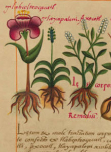

Postscript June 2018: This example may also be of interest. The wandering monk, Gallus Kemli collected a number of astrology and health-related items and this one includes a mixture of languages, and power words with crosses between them. The text is written with typical Latin abbreviations (I have expanded them to make them easier to read).
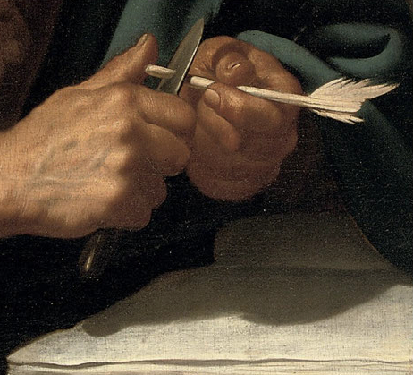
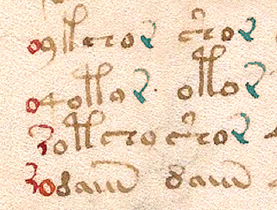
One thing that stands out for Voynich researchers is the use of a common cipher to write the purpose of the charm (against pestilence) in which consonants are substituted for vowels. This form of simple substitution code is very easy to read as is shown in the image below:

My original posts of more simple charms (a word repeated and reduced), are at this link (2013) and at this link (2015).