Notice: Function _load_textdomain_just_in_time was called incorrectly. Translation loading for the advanced-gutenberg-blocks domain was triggered too early. This is usually an indicator for some code in the plugin or theme running too early. Translations should be loaded at the init action or later. Please see Debugging in WordPress for more information. (This message was added in version 6.7.0.) in /home4/jensonje/public_html/voynichportal/wp-includes/functions.php on line 6131
Notice: Function _load_textdomain_just_in_time was called incorrectly. Translation loading for the wp-external-links domain was triggered too early. This is usually an indicator for some code in the plugin or theme running too early. Translations should be loaded at the init action or later. Please see Debugging in WordPress for more information. (This message was added in version 6.7.0.) in /home4/jensonje/public_html/voynichportal/wp-includes/functions.php on line 6131 Voynich manuscript | Voynich Portal | Page voynichportal.com|tag|voynich-manuscript| Deprecated: Function WP_Dependencies->add_data() was called with an argument that is buy ivermectin 3 mg deprecated since version 6.9.0! IE conditional comments are ignored by all supported browsers. in /home4/jensonje/public_html/voynichportal/wp-includes/functions.php on line 6131
This is the first time I’ve logged into my Voynich Portal account in 3.5 years. I couldn’t even remember my password. I’ve been fighting for democracy. All my research, hobbies, family relationships, all the things that matter to me, have been sidelined by the need to be actively engaged.
Time Lost
It was a crushing blow to set aside my research. After 13 years of basic legwork, I was making discoveries, exciting ones, and now all the emerging threads are moldering on an old hard drive that I pulled from a computer that I sold, with my paper notes gathering dust in the attic and under the bed. I feel like a small ship that lost everything in a bad storm, including the captain’s log and now, amidst an even bigger storm, I’m trying to find it all and drag it back into the boat.
Except I can’t. Not yet. There’s more work to be done on the home-front and it’s more urgent than ever.
A Token Note
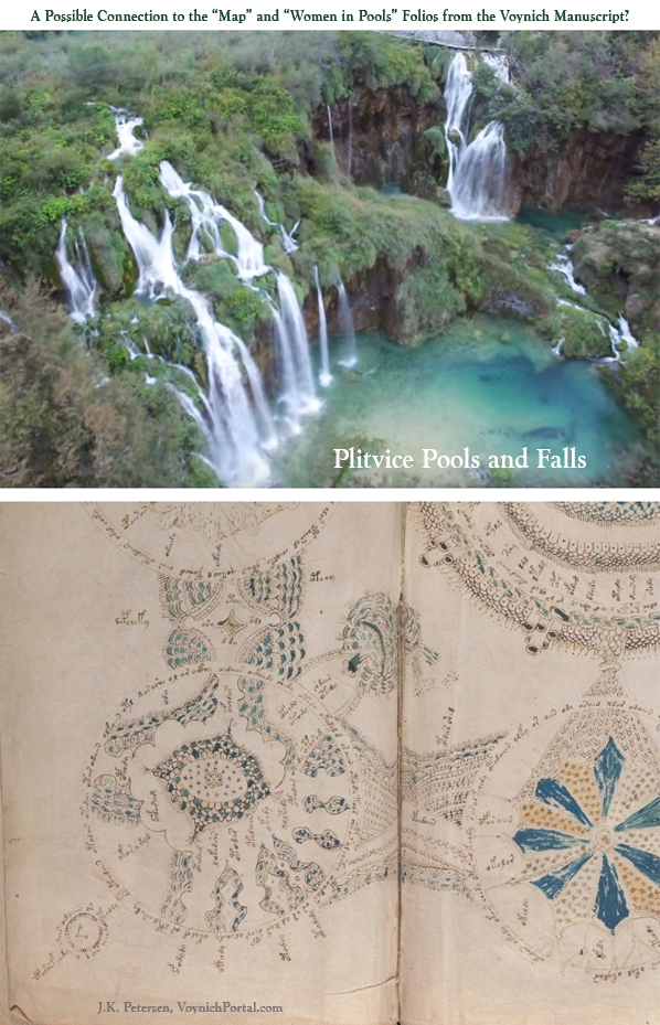
I can’t pop in and out without at least posting something about the VMS. So maybe the most appropriate snippet is this… at the time I was forced to drop my Voynich research, in 2021, I was booking a trip to Europe. This is one of the more speculative parts of my research but I was itching to travel somewhere mysterious and beautiful, and I set my sights on Plitvice, the waters of the mysterious legend of the Black Queen.
I tentatively booked accommodation, selected a train pass, and was making a final decision between two air routes. I was long overdue for a vacation and wanted to see if there was a connection between the fabulous pools and falls in Plitvice and drawings in the Voynich Manuscript. I wanted to “walk the walk” and try to match up the connections on the “map” pages and “pool” pages with something real. I was forced to cancel all of it. I’m still longing to go there for both personal and academic reasons.
This is all I can post right now. I will try against all odds to drop in and get some of the more important VMS-related matters resolved (like my findings about the drawing that was located in Italy by F. Salani) but for now, duty calls.
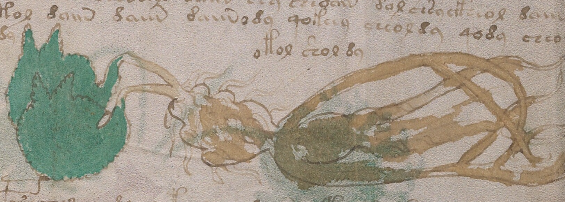
More than five years, ago Fabrizio Salani purchased a drawing at a second-hand market in Italy that resembles a copy of a VMS plant, folio 14v. Rene Zandbergen provided a link to the drawing on the voynich.ninja forum. Unfortunately, the link is no longer active, but Salani later posted an interesting video about his discovery on youtube that is still available.
Deja Vu
When I saw the drawing, I immediately noticed something familiar, something I had noticed while cruising through plant drawings, but I couldn’t remember where I had seen it. From that moment on, I was intrigued by the possibility of finding the illustrator and, after an extensive survey of medieval, Renaissance, and modern plant books, I located examples that have the same idiosyncrasies as the drawing purchased by Salani.
The Long Road Forward
The only reason it was possible to find the Salani illustrator is because he substituted his own style of root for the VMS root. The VMS drawing (right) has a crab-like root, painted a dark brick-red). The Salani root is more naturalistic. He also added an extra leaf which has some distinctive properties.
At the time we were alerted to the Salani drawing, I posted a few examples of roots on the voynich.ninja forum (02/12/16). I knew they were not the same illustrator, but I had a feeling they they might be approximately the same time period. I did not restrict my search to this period of history, however, but several years of research brought me back to it, time and time again, and it turned out to be the right ballpark.
The Salani drawing is not a slavish copy of the VMS plant, but it’s faithful enough that it cannot be a coincidence. Assuming the Salani illustrator copied the VMS (or copied a copy of the VMS) and not the other way around (which seems unlikely), he apparently did not think a 100% faithful copy was needed for whatever purpose he made the copy.
Voynichese Characters
The VMS glyphs are not copied with complete accuracy either. They are mostly right, and even the way they cross the leaf has been honored, but there are some small discrepancies.
Guessing at the purpose of the copy is difficult, but my research on printing history revealed that Renaissance entrepreneurs scrambled to gather up manuscripts that they could turn into printed books. Perhaps there was a period in the life of the VMS when someone thought it might be worthy of print reproduction. If so, this may have occurred during the “dark” portion of the VMS provenance.
Another possibility is that the copy represents one of the events documented in letters about the VMS between the Jesuits who had it in their possession before Wilfrid Voynich acquired it. There is mention of a copy (the current owner apparently didn’t want to give up the whole manuscript). I will discuss this in future posts because this is only valid if the active life of the illustrator synchs up with the dates of the letters.
Summary
I will share more about this intriguing discovery in future blogs, but for now, here is a small portion of a chart I created as I was searching for the illustrator and, more importantly searching for corroborating evidence to pinpoint the dates during which he was active and who he associated with at the time.
J.K. Petersen chart documenting connections to the illustrator who apparently created the Fabrizio Salani drawing
I will post close-ups at a future date (this is a teaser since it’s not possible to explain the whole chart without close-ups that show the connections).
I have to make this quick. My time for blogging is very limited (and I have many mostly-finished blogs I need to get posted). But I thought this quirk in some medieval zodiacs might be interesting to Voynich researchers.
Mislabeled or Misunderstood
In a cruise through eBay a couple of years ago I noticed that many small sculptures, pieces of jewelry, and designs on ceramics that were based on animals were mislabeled. Foxes labeled as mice, hedgehogs labeled as boars, deer labeled as foxes. These were not occasional errors, they were common. Apparently, some people don’t recognize animals, especially if they are small.
I’ve already posted a blog on how unrealistic medieval animal drawings can be, but sometimes this is because the animal was unknown. For example, unicorns sometimes resembled a cross between a goat and a rhino. Tigers were sometimes drawn as stripy horses. Elephants were sometimes cowlike animals with long noses.
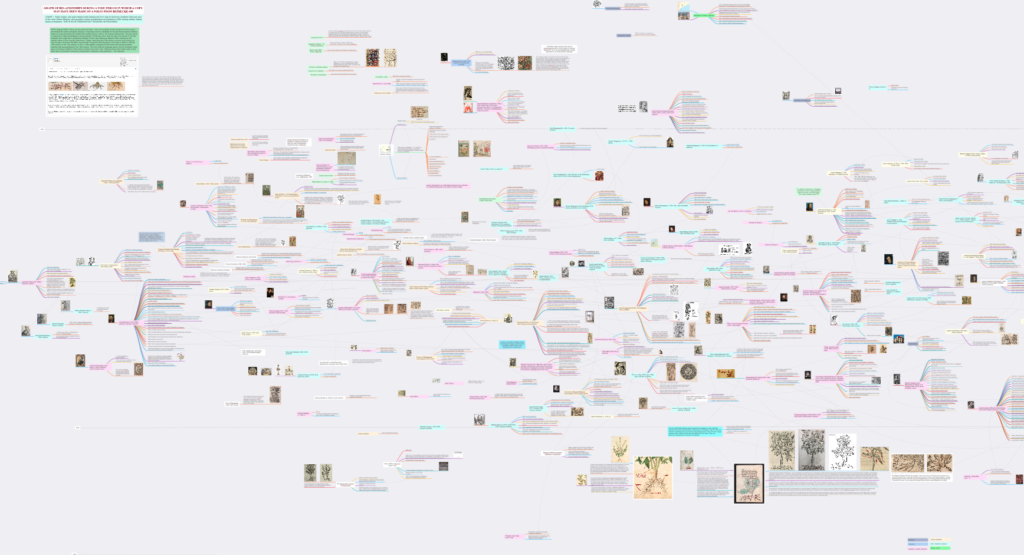
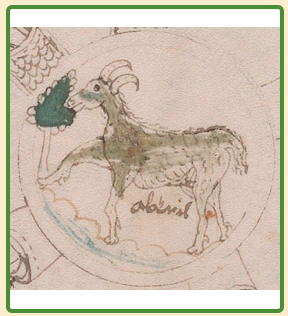
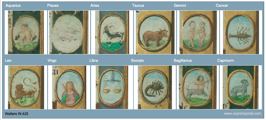
I have also seen marginal drawings of goats labeled as sheep (and sometimes vice-versa). The VMS pic where one would expect a sheep, in the slot usually assigned to Aries, does have fairly curvy horns but otherwise is quite goat-like:
Does this happen in other medieval zodiacs? Yes, sometimes. Here are some examples.
Goat-Like Aries or Misplaced Figures
In the first example, extracted from a wheel illustration, the constellation Aries is somewhat goatlike, especially considering that medieval sheep were often drawn with long tails. However, it can still be distinguished from the goat by having slightly more curved horns:
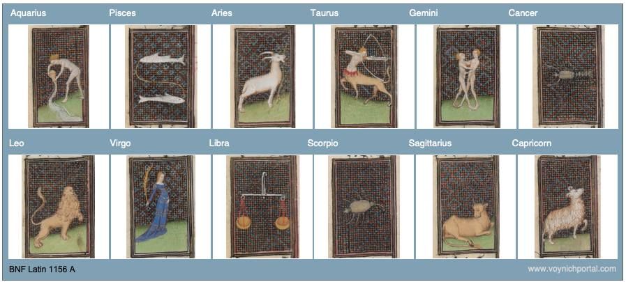
The following drawings are a bit degraded, so it’s hard to see clearly, but the goat and ram have been transposed. The drawing in Aries has long horns and a short, upturned tail (goat-like), and the one in Capricorn has shorter, curved horns and a longer down-turned tail:
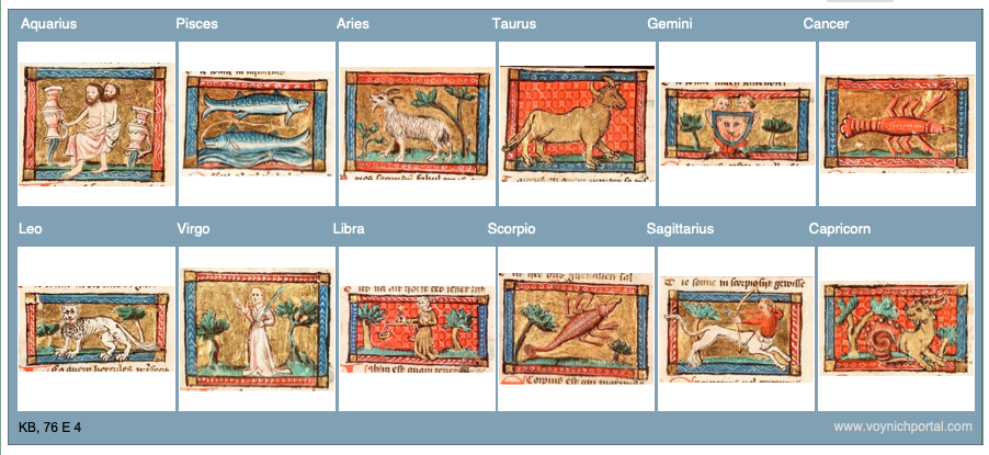
In this example, the figures are out of order. The illustrator mistakenly drew Capricorn (goat) and Sagittarius (centaur) in the months for Aries (ram) and Taurus (bull).
In the next example, Aries has a goatlike beard and the traditional goat-fish has been used for Capricorn:
In this example, Aries has sheep-like wool combined with a goat-like tail and beard:
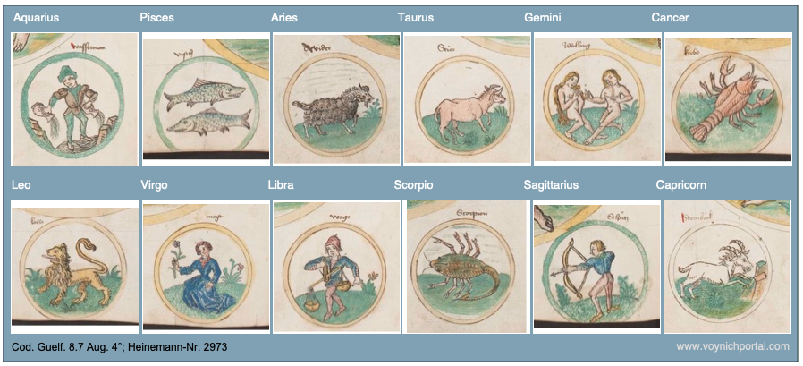
Sometimes the drawings are so similar, it’s difficult to tell the sheep from the goat. In this case the bodies are almost the same (Aries is slightly thicker, but not much). The main difference is the curl of the horns:
Summary
In general, in medieval zodiacs, Aries is depicted with curly horns and a puffy or long tail (usually pointing down), Capricorn usually has a shorter tail, sometimes upturned, with straighter horns and often a beard.
It doesn’t happen often, but Aries is sometimes drawn like a goat, and Capricorn is occasionally transposed with Aries. The VMS goat-like sheep in the Aries slot is somewhat unusual, but it’s not unprecedented, so it’s difficult to know if the deviation is lack of experience, a mistake, or a deliberate choice.
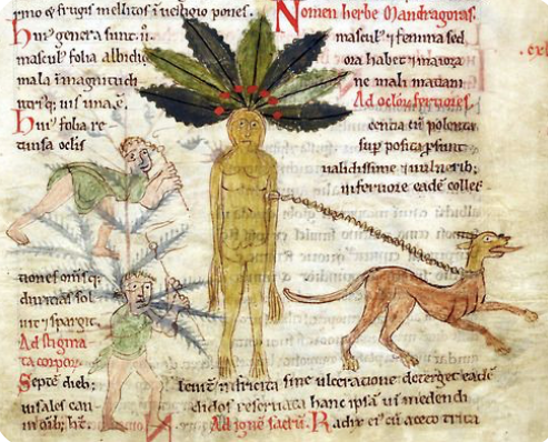
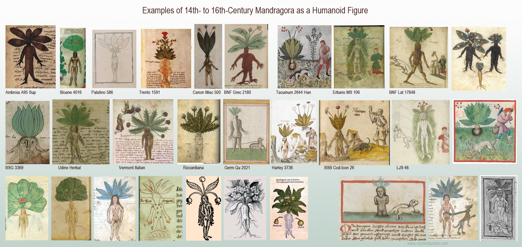
Mandrake is one of the best-known plants in medieval herbals. The root is roughly humanoid, and medieval entrepreneurs sometimes carved it to make it more overtly human. Folklore said it was dangerous to dig up the root. The plant would shriek and hearing it could kill you, so harvesters were counseled to use a dog on a leash to dig it up.
The Mandrake in Medieval Herbals
Many medieval herbals included the mandrake, from countries like Italy, France, England, Germany, Greece, the Middle East, and others.
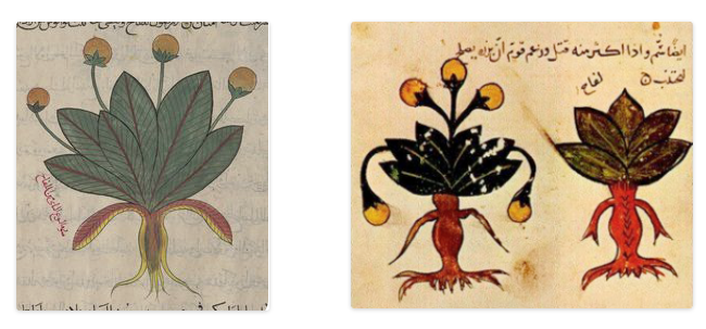
Sometimes only one plant is shown, sometimes two versions: “masculine” and “feminine”, as in these Arabic manuscripts:
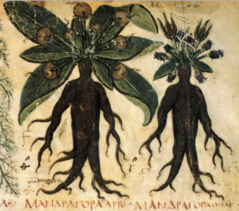
The male/female dichotomy goes back to the Dioscorides. In this early copy, the faces are not explicitly drawn, but the roots are distinctly humanoid. A dog is not included in the image, but is mentioned in the text:
Male and female Mandrake in the 7th-century Naples Dioscorides [MS Suppl. gr. 28]
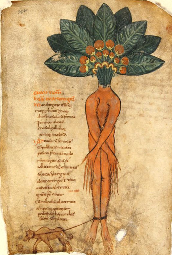
The humanoid root appears in early copies of Pseudo-Apuleis with a dog, but still does not have a humanoid face:
Mandrake with a humanoid body, but no facial features. [Pseudo-Apuleius, Kassel Mandragora, c. 9c]
The anthropomorphic Mandrake was especially popular in the 12th to 15th centuries. This one, from 12th-century England, includes the dog pulling out the plant while two figures approach with hooks or spears:
A dog pulls the mandrake from the ground and two humans approach it from the left: [Source: BL Harley Ms 5294]
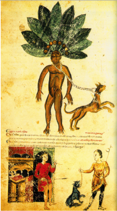
This 13th century example is the same basic theme, with the dog, and figures with spears, but the narrative is broken up into a series of panels:
The mandrake was supposed to be excavated with the help of a dog so the human was not harmed by the mandrake’s shrieks. [Codex Vindobinensis 93, 13 century, Wash. University]
On the facing folio, the dog has done its job and two figures poke the root with hooked spears, but it is different from most depictions of mandrake in that a second figure is under the feet of the standing mandrake. The shadow under the character on the left is very doglike.
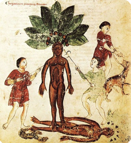
This version is the same general idea, but the spears are replaced by more familiar tools, and the male and female versions are shown as conjoined twins:
Male and female forms of mandrake cojoined, with the dog pictured above. [Biblioteca Bologna, Gr. 3632]
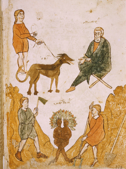
The dog is not always included. Here are a number of examples that emphasize the humanoid form both sans and with the dog:
Most mandrake drawings include berries. Some have smooth leaf margins, others are serrate. In real life, the margins are ruffled and irregularly serrate.
In the 16th century, the humanoid form was gradually superseded by naturalistic representations.
Is Mandrake in the VMS?
The Voynich Manuscript has a large number of plants in the “big plant drawings” section, and yet there’s nothing that overtly resembles Mandrake. Some have suggested that f33r might be mandrake, but I think there are better identifications for 33r.
A better possibility is f25v, but the root is not humanoid, the leaves are not ruffled or serrate, and they have been carefully drawn with parallel veins, more similar to Plantago or Dracaena. The little dragon is not typical for mandrake plants and I have a few things to say about the critter in another blog.
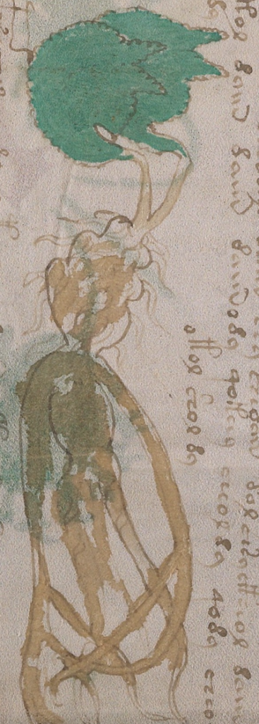
The VMS is incomplete, so if Mandrake was included, maybe it was separated from other folios. Or… perhaps it is in the section with the small plant drawings…
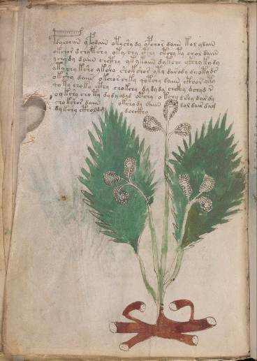
Artfully Subtle
I’ve been intending for years to write about the small-plants section, but it’s a large number of plants, my notes have turned into a dauntingly huge pile, and it’s hard to find time to write it up properly. But I’m beginning to think I should mention this particular plant because I’ve believed for a long time that it is mandrake, and that it is partly mnemonic:
Is this a sideways, mnemonic version of Mandragora? [Yale Rare Books and Manuscripts Library, Beinecke 408, f89r]
If you turn your head sideways, you can see the human figure, or rather a fairly naturalistic root with humanoid overtones. The head has little rootlets that look like hair, the shoulders have long root-like arms. There’s a rounded body and rootlike legs. To the left, coming out of the head, are two leaves with serrated margins. I believe the leaves are shaped to represent the heads of dogs, with ears facing right and the muzzle vaguely suggested.
Why two dog heads? Maybe the intention was to imply male and female plants without being too obvious about it.
Mandrake is toxic. Maybe the prone posture represents something that can make you ill.
If this is Mandrake, it gives us insight into the drawing style and thought processes of the VMS designer. The important elements are there, but nothing is completely traditional or overt. The figure is sideways, thus making it less noticeably humanoid. The dogs are not drawn separately, but included as a mnemonic in the leaves. It’s subtle, whimsical, clever, and irresistibly cheeky.
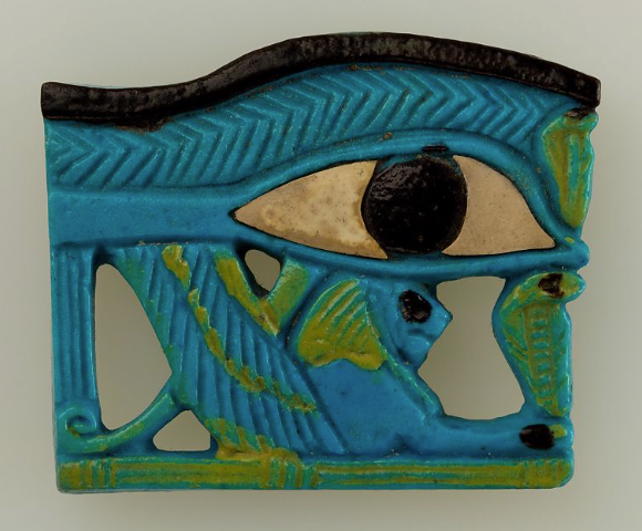
Ancient Egyptians mastered the integration of anatomical knowledge and mythological stories into artistic symbols and figures. Artistically, the Eye is comprised of six different parts. Mythologically, each part is considered to be an individual symbol. Anatomically, each part corresponds with the center of a particular human sensorium.
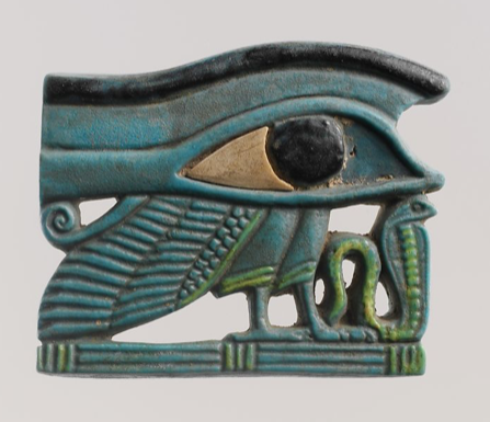
Many have seen the Eye of Horus (or the Eye of Ra) as a decorative motif in jewelry. Historically, the Udjat (eye of Ra) was a talisman of protection, regeneration, and health, and was often included as a funerary item:
This Egyptian amulet, from around 800 B.C.E., combines a winged Udjat eye, a lion, and two uraei (sacred serpents), thus embodying Egyptian myths. [Source: The Met, public domain]
The lion and serpent (cobra) represent authority and the more powerful or darker aspects associated with the eye goddess, who was variously personified as the mother, daughter, or consort of the sun god.
Horus was a sky deity, depicted as a raptor. His right eye was associated with the sun and Ra, the left eye with the moon and the god Thoth. In this Udjat, from around the same time period as the one above, the wing and feet of the raptor replace the lion, and are combined with a single serpent, which may represent Seth:
Egyptian amulet with horus as a raptor, together with a serpent [Source: The Met]
The Eye symbology may predate the Egyptians, but this is murky history that I know very little about, so I will restrict my comments to Egyptian interpretation of this symbol. Some of this information was passed on to people in the Middle Ages through Greek intermediaries and merchants, but I don’t know how much was known by the 15th century.
The Myth Behind the Eye
The god of storms and disorder is known as Seth (sth). Seth vied with his relative Horus for the rule of Egypt. Seth stole or injured Horus’s eye, which was then restored by Thoth. Thus, the restored eye came to represent healing and regeneration.
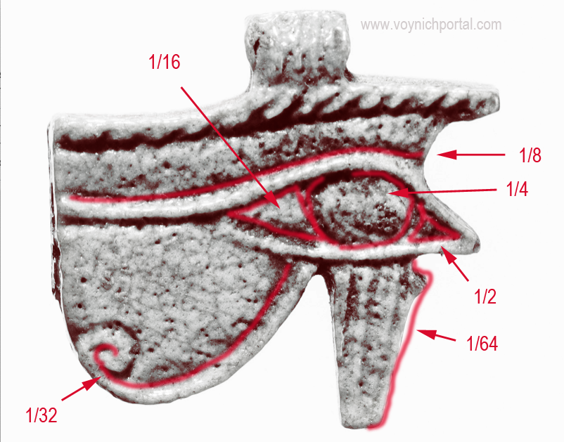
Variations of the eye motif were especially popular in the millenium leading up to the Current Era and, in a specific form, came to embody other concepts as well. In addition to representing the senses, the Udjat has a mathematical meaning for each of its primary contours:
The sum total of these fractions adds up to 63/64ths. There have been many theories as to what might represent the presumed missing fraction and even the measurements themselves are disputed. [Image source: The Met]
The fractions represent powers of two.
This propensity for integrating multiple interpretations into symbols with mythical significance caught my attention because it reminded me of the Voynich Manuscript. It’s possible the VMS illustrations were drawn to embody more than one concept. If so, there is a historical precedent for this, one that that has come down to us primarily through Egyptian writings and artifacts.
And there’s more…
The right eye of Horus came to represent the sun, the left eye the moon. Which means that the blotting out of a right eye could represent a solar eclipse. Ancient myths might actually be a codification of this kind of event, with “gods” as personifications of the heavens.
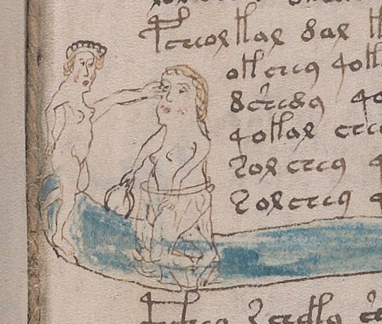
Can this be more directly related to the VMS?
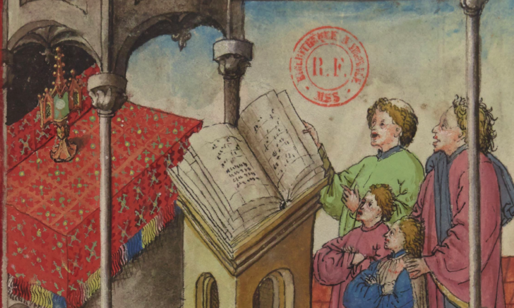
Nymph pointing to an eye or poking or removing it, a possible personification of a solar eclipse. [Source: Beinecke 408, Yale Rare Books and Manuscripts Library]
On Folio 80r we have an enigmatic illustration of a nymph pointing to the right eye of another nymph, or possibly stabbing or plucking it out. This is a departure from many of the more smiley and benign-looking VMS encounters. Could this unexpectedly violent interaction be a symbol for a solar eclipse?
If this seems implausible, look at the object in the nymph’s hand. The Eye of Horus is simultaneously a talisman, an embodiment of ancient stories, a celestial reference, and a representation of measures (the six pieces into which the eye broke in a battle with Seth).
If the blotting of the eye represents a solar eclipse, then perhaps the item in the hand of the nymph is a measuring caliper, a reference to the multiple uses for the Eye of Horus.
Is the eye-poking scene related to the one below It?
Like the ebb and flow of the Nile river, the battles between Seth and Horus stretched over decades, with Horus sometimes teaming up with Ra. Seth is sexually indiscriminant, makes a deal with Horus to sodomize him, and leaves behind his supposedly poisonous semen (Herman te Velde, 1967). Horus, at one point, steals Seth’s testicles (although I don’t know if this happened before or after their sexual encounter).
Could this drawing below the eye-poking scene be a sly reference to Seth’s severed testicles? Yes, I know, there are three bumps, but this is the VMS, nothing seems explicitly real.
Summary
Koen Gheuens posted a plausible interpretation for the figures at the top of this folio and the idea of the nymphs representing Seth and Horus and a possible reference to a solar eclipse does not fit well with the story of Philomela. So either the context shifts, or there is a connection that is more abstract (e.g., medieval astrology/astronomy), or it means something else.
If the Philomela story is correct, then the connection via astrology doesn’t seem very strong. Procne and Philomela were turned into birds, not stars.
Could it be a context-shift? Are there precedents for this possibility?
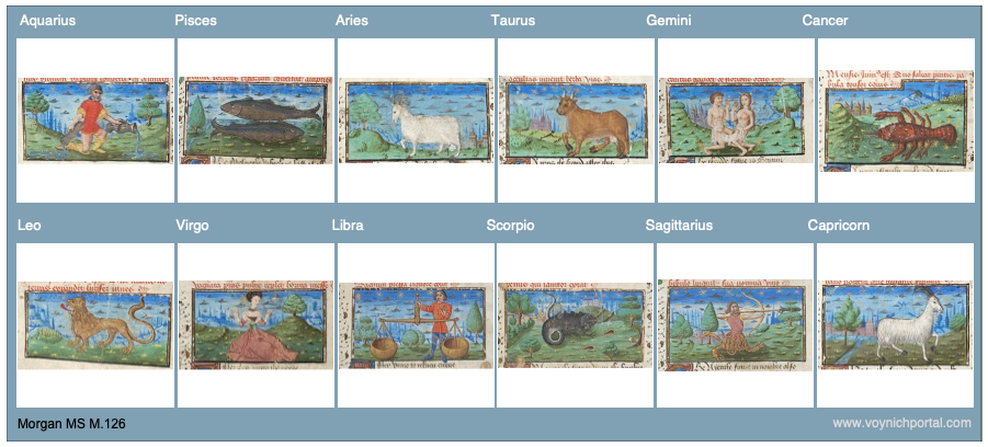
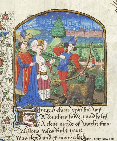
Morgan MS M.126 (England, c. 1470) is a series of tales that includes the story of Philomela on folio 125v. On the left, Tereus cuts out her tongue. On the right, Procne takes vengeance by feeding Tereus his child (note also the fancy containers). Above the action, the women are turned into birds:
Philomela, Procne, and Tereus. [Courtesy of Morgan Library MS M.126, England, c. 1470]
On the next folio is a different story. We go from Philomela, which is more of a morality tale, to a story of gods associated with stars. Here we see Arcas about to shoot Callisto, who Juno had transformed into a bear. When he saw what was about to happen to the bear, Juno changed Arcas into a bear, as well, and placed both of them in the sky to become Ursa Major and Minor, the Great and Little bears:
Creation of Ursa Major and Minor. [Courtesy of Morgan Library MS M.126, England, c. 1470]
Two folios later is the biblical story of Lazarus, and at the beginning of the manuscript is the story of Troy. In other words, Morgan M.126 is an eclectic collection from a number of mythical, moral, and historical sources. It is possible for stories of different genres, or with a different focus, to directly follow one another.
So perhaps there is more than one tale represented on VMS folio 80r and maybe the eye-poking scene represents a different myth from the one at the top. If it does represent a solar eclipse, then maybe it is related to cosmological or astrological imagery on other folios.
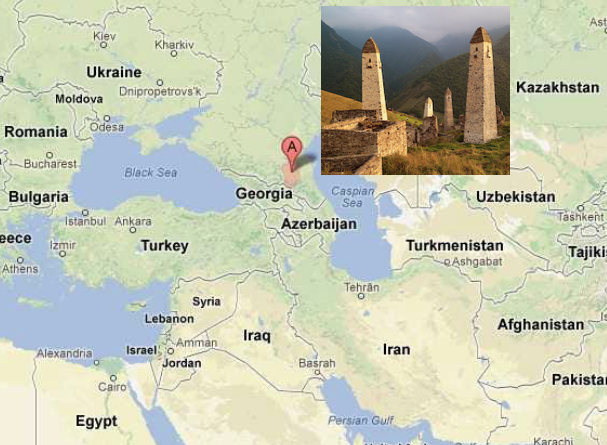
Speakers of Chechen sometimes have difficulty reading and writing their own language. Currently there are about 1.4 million Chechen speakers, mostly in the Caucasus, but also in scattered colonies in the eastern Mediterranean, western Russia, and Bavaria/Tirol. The Chechens live in the mountains, in a linguistically diverse region that includes some very old languages.
In July 2018, I posted a blog on Tischlbong, a Slavic/Bavarian blended language spoken in the village of Timau on the Bavaria/Italian border. This blog takes us further east, to the region between the Black and Caspian seas, where a surprisingly diverse group of languages, some of which are nearly extinct, are still spoken in cultures that are thousands of years old.
It was actually the Azerbijani language that attracted my attention first, for a number of reasons, but after I began to appreciate the diversity of languages in this region, I learned of some unusual aspects of Chechen and decided to look into this, as well.
Chechen and Nearby Languages
Chechen is spoken by a little more than a million people in a culturally ancient and linguistically diverse region between the Black and Caspian seas, bordering Georgia, Azerbaijan, and Russia. [Source: Google maps; Vyacheslav Argenberg, Wikipedia]
Ubykh, one of the languages in the Akbhaz-Circassian language group, became extinct in 1992. This remarkable language had 82 consonants and only two vowels (Coene, 2009).
In general, minority languages and even some of the majority languages in the northern Caucasus region did not have their own alphabets until the 19th and 20th centuries. Chechen has a longer written history than most of the minority languages. Some of the minority languages are spoken by only a few thousand people and may be gone in a generation or two.
The Avar or Azerbaijani languages are used bilingually for economic transactions by a number of people in this region. Russian is also spoken and mandated in some areas.
In some ways, the Caucasians and Basques have characteristics in common. Not in terms of their language specifics or background (although both languages are agglutinative), but in resistance to outside influences. This is largely due to cultural isolation—mountain strongholds are harder to conquer. Historically, these cultural groups retained a certain autonomy that is reflected in their languages.
More recently, however, technology, Soviet expansion, and wars have left their mark and have wiped out a sizable portion of native literature. When orthography changes, books in previous alphabets become obsolete and are destroyed. With them goes the link to ancestral history.
History and Orthography
Chechen and Ingush are related to Vainakh, a northeast Caucasian language.
Like several middle eastern and central Asian languages, Chechen exemplifies synchronic digraphia—a language written with several alphabets, usually Arabic, Cyrillic, or Latin. Historically, the Arabic alphabet was used for Chechen, but since 1862, a Cyrillic-based alphabet was the dominant script, with recurring and politically controversial attempts to convert to Latin. In 2002, the Russian language was mandated for education, which may threaten the future of numerous local languages.
Members of the Chechen diaspora who settled in Bavaria and the eastern Mediterranean sometimes use Latin characters because they are familiar, but their efforts are not standardized. The number of books published in Chechen is small and some of these were destroyed in recent wars.
Chechen literature has received very little study but is worthy of attention because of its unique poetic characteristics and the position of this region in an important crossroad between Christian and Muslim cultures.
Some Interesting Aspects of Chechen
Chechen is an agglutinative language with some interesting characteristics. Literacy levels were not historically high, so it is difficult to chart changes between current usage and older versions of the language.
Here are some general characteristics…
Numbers (in the singular) and names of the seasons usually end in a vowel. Dal is the word for God, Seli for the traditional thunderer, and Eter for the ancient underground god (the Chechens were traditionally polytheistic).
There are many words comprised of simple 2- or 3-letter syllables, and some that repeat a syllable, such as zaza (flower), or which repeat a consonant together with different vowel or vice versa, as in or qoqa (dove) or adam (person).
Letters like j tend to be at the beginnings of words.
One spelling can have different pronunciations and serve multiple purposes. To take an example cited by E. Komen, the single word деза (deza) can be interpreted as four very different concepts:
No, there is more variety in the positions of letters within Chechen words than in VMS tokens. But it demonstrates that natural languages can have orthographies in which different sounds are represented by the same shape, where vowel representation is limited, and within which the same linguistic unit can be repeated several times with different meanings for each iteration.
In page layout, text is frequently organized in columns. If the left side is even and the right side is ragged, it is “left-justified”. If it is even on both sides, it is “justified” or “double-justified”.
In contemporary page layout, lines can be padded with software algorithms that add extra space between each character to fill the columns. In the Middle Ages, padding was at the discretion of scribes, and there were numerous strategies.
Strategies for Padding
In early medieval texts and some of the Hebrew texts, the right margin is sometimes padded by stretching out the last character:
In this rambling Insular script, the right is sometimes justified by stretching the final character. [Source: Vat. Lat. 491]
Sometimes padding was created within the line by spacing out words and stretching some of the ligatures:
The common ligature “st” has been stretched and combined with word spacing to even out the right-hand margin. [Source: ÖAW Hs A 6 (earlier: a IX 21}, c. late 1200s]Individual letters and ligatures have been stretched to even out columns. In this case, the letter N is chosen, along with the common ligature “st”. [Source BNF Latin 9844]
If the scribe didn’t want to manipulate the letters or was in a hurry, one of the simplest ways to pad out a column was to add a line. In this example, wavy red lines extend the text:
Quick and simple line padding in wiggly red lines [Source: British Library Bodmer 91]
The padding Morgan B.25 is equally simple but rises higher from the baseline:
Sometimes padding was more decorative, using repetitive patterns or small drawings of animals or birds. In this example, from Royal 2 Z xviii, a two-tone angled decoration, that can be repeated as necessary, fills the column:
A similar format was used to pad the right-hand side in Pal.lat.26 except that the designs are more varied:
Decorative padding was a creative opportunity. Some rubricators or illustrators drew plants, animals, and many kinds of birds. Arundel 157 has page after page of charming examples, each one a little different:
Sometimes a simple repetitive pattern was used, with space between each iteration:
Columns are filled with a simple repetitive pattern in red [Source: BAV Borgh.312]
Sometimes the repeating pattern was shaped like a letter:
When the letters were close together, they became visually similar to a decorative pattern. This simple letter-like padding from the early medieval period was still used in the 15th century:
Paragraph-end padding in an early medieval manuscript. [Source: BL Cotton MS Tiberius B V/1]
A simple letter-like repeated v-shape was still in use centuries later, as in this 15th century manuscript, sometimes extended with dots in the middle when it was longer. [Source: Heidelberg Hs. 1012, c. 1460]
Moving the letters closer together gives them a more decorative appearance. [Source: KBR MS 11102]
Sometimes text was justified by spreading out letters or breaking words across a line. In these cases, padding wasn’t needed until the scribe reached the end of the paragraph. If the last line was very short, it wasn’t practical to insert spaces, so padding characters were added instead. In the following example, the paragraph-end has been padded with a simple pattern in alternating colors:
A simple decorative padding pattern has been dressed up with in alternating colors. [KBR Ms 14910-12]
In this example, a more decorative line was added to fill out the last line:
In this manuscript, lines are justified with spacing or word-breaks so that the columns are generally even, except for the last line, which is padded with a decorative line. [Source: Koninklijke Bibliotheek Ms Fabr. 91 4°, ]
Sometimes the last line would be padded with a stretched-out version of the word “AMEN”.
Sometimes larger spaces were added near the end of the line with the last letter capitalized, to create visual balance with the style at the beginning of the line:
In the same manuscript, padding has been inserted between sections of text within the line:
An interesting method of padding within lines, so that sections are separated, rather than adding the padding at the end of each line. [Source: KBR MS 4433-38]
In another manuscript, instead of inserting decorative characters between the words, the letters are stretched:
Lines are padded by stretching some of the characters. This not only evened out the columns, but added aesthetic breaks for the eyes. It was not the easiest technique, it took some planning, and thus was not as common as some of the methods shown earlier. [Source: BNF Latin 9844]
What about the VMS?
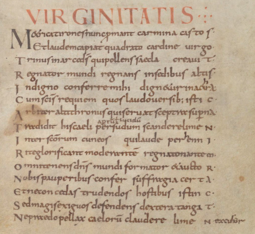
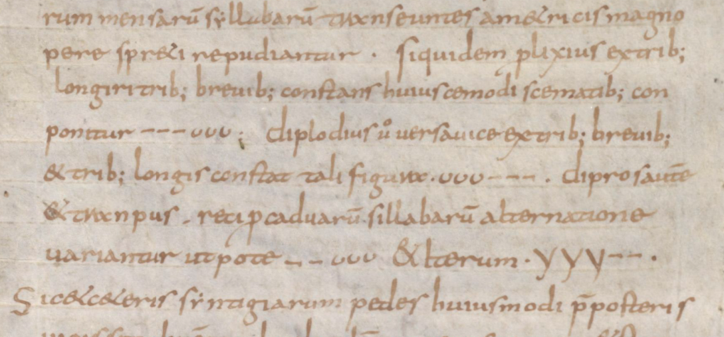
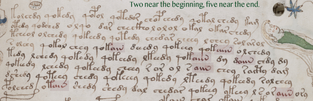
Medieval padding caught my attention because it sometimes beings with a shape like “a” and ends with a shape like “v”. Note how closely this pattern resembles aiv av aiiv av aiiv:
In general, padding was added at the ends of lines, but the earlier examples illustrate that there were midline padding strategies as well.
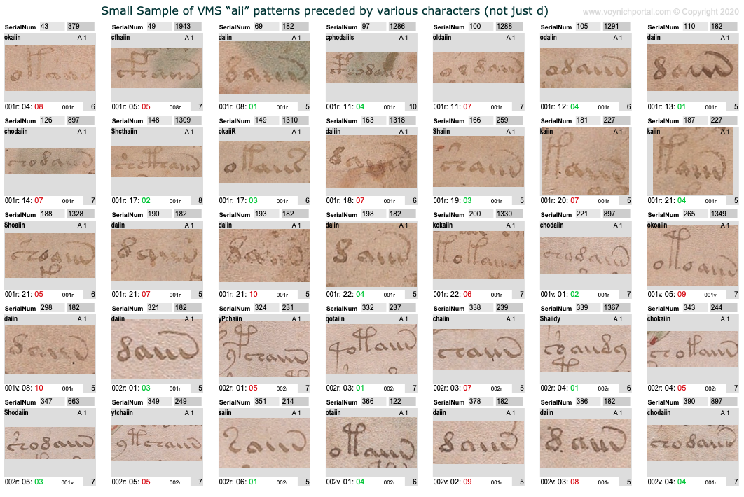
Which makes me wonder whether we should be looking at VMS aiiv in a different way. The pattern includes av, aiv, aiiv, and aiiiv and may be preceded by numerous different glyphs:
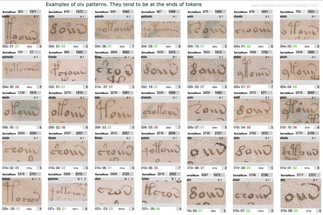
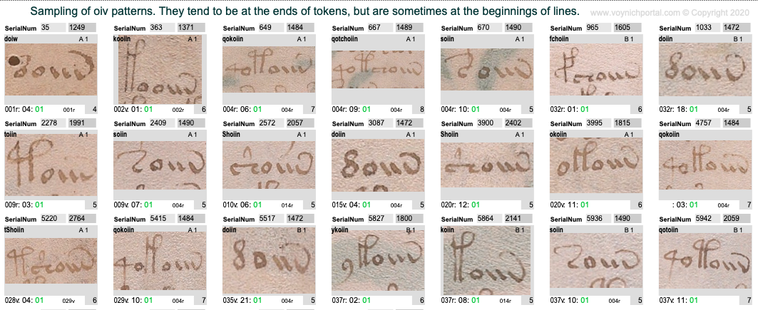
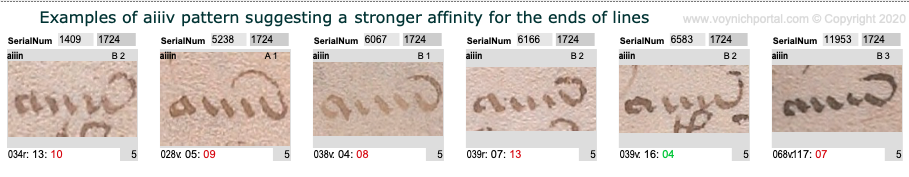
The oiv patterns are similar. They are usually at the ends of tokens and are preceded by a variety of glyphs:
However, aiv and oiv patterns are not identical in terms of line position. Even though both are usually in the token-end positions, the oiv tokens do not cluster near the ends of lines as frequently as aiv sequences. The oiv sequences are in line-position 1 about twice as often as aiv sequences:
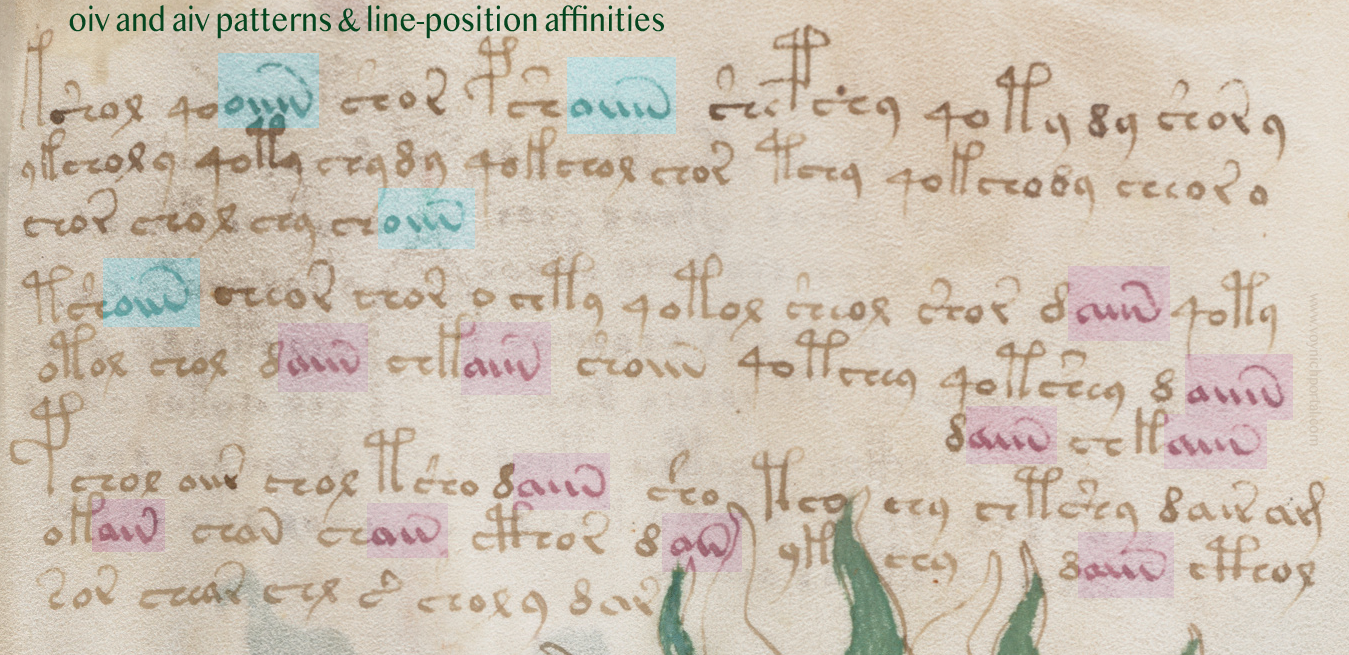
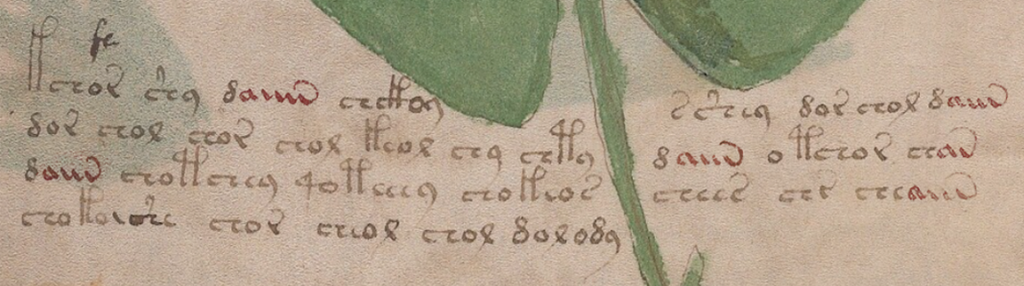
Here is an example of these tendencies in VMS folio 28v:
Implications for the Voynich Manuscript
Could the “aiiv” group be a substitute for line-end padding and stretched-out letters? In the VMS, “aiv” patterns are not always preceded by EVA-d. Many other characters precede “aiiv” as in this example on f2v. Also, in this snippet, three of the four line-ends are aiv patterns:
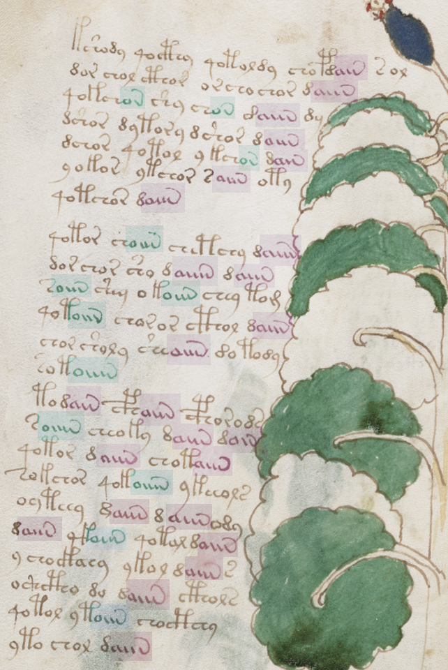
In general, aiv patterns tend to be in the latter half of a line more than the first half, even in text that has not been double-justified.
However, this is a slight overall trend. There are sections in which the proportions are even, as in this snippet:
Patterns of aiv on folio 81v that are more evenly distributed across the line [Source: Yale Beinecke 408, c. early 1400s]
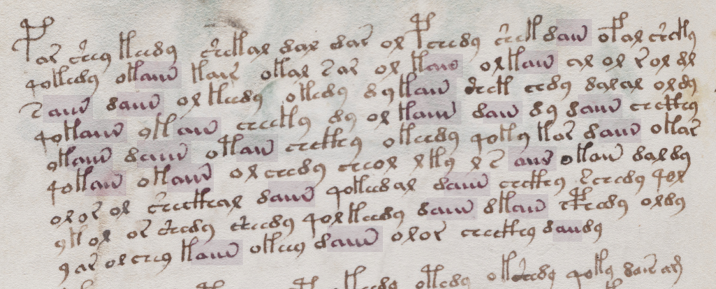
However, the longest “aiiiv” pattern falls near the end of the line more often than the beginning:
Here’s a full folio (37v) with aiv and oiv patterns highlighted. Once again, oiv leans more toward the beginning and aiv toward the end:
Summary
I’ve mentioned a few times that I think the emphasis on daiin may be misguided. Forget the “d” (at least for now). We should be looking at the ain patterns (which I call aiv) together with the oin patterns. The fact that they occur in the same parts of tokens, but in different parts of the line, is revealing.
In medieval texts, padding can occur within a line or at the end of a line and padding sometimes shares shapes with regular letters, especially the letters a and v. The aiiiv patterns might not be padding patterns, maybe they are word endings, modifiers, or conjunctions. But it’s something to think about. Maybe the shape was inspired by padding patterns even if the interpretation is different. Depending on what precedes the aiv sequence in the VMS, it may serve more than one purpose. But the pattern has an affinity for the ends of tokens and the latter parts of lines and its cousin oiv has a stronger affinity for the beginnings of lines, a pattern that deserves some attention.
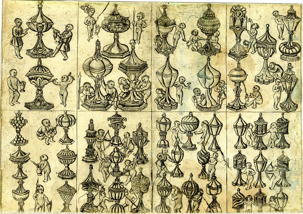
Numerous containers have been posted on blogs and on the Voynich.ninja forum to try to find a match for the simple and lavish containers in the VMS small-plants section. Some have suggested the VMS containers are microscopes, or telescopes. To me they look like pigment tubes, reading tubes, needle tubes, and spice containers. I’ve collected thousands of images of containers but it’s difficult to find ones that are highly ornate that are similar to the VMS drawings that were created before 1460.
I’ve previously blogged about some of the history and designs of containers. This time I’d like to post some images that are found on playing cards and manuscript illustrations from the 14th to 16th centuries.
Playing cards were very popular in the 15th century despite some social stigmas attached to cards and gambling. Some intriguing imagery in tarot cards has already been noted by VMS researchers.
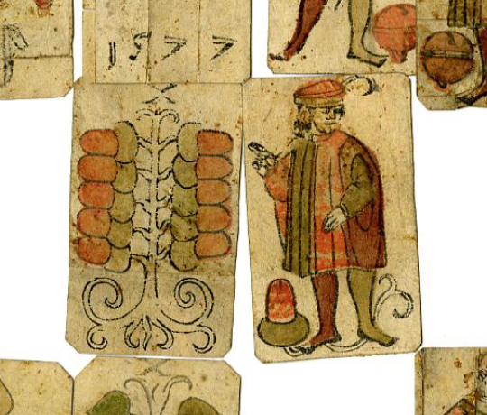
In addition to tarot designs, playing cards included religious imagery, fashions, zodiac themes, trees in the style of virtues and vices (see right), notable figures, and… fancy containers.
Below is an example of an uncut sheet of playing cards from the Lower Rhine, created about 1470. These lidded chalices were drawn in a variety of styles and some have interesting fluted or hexagonal bases. Some of the patterns spiral around the container, a pattern that would be difficult to fabricate in the 15th century, others have ornate textural overlaps:
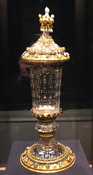
The Burgundian Court chalice [Gryffindor, 2007, Wikimedia Commons]
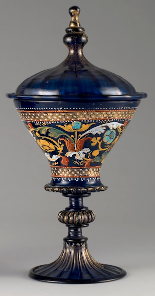
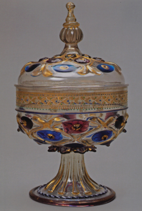
The chalices in the above drawings appear to be mostly metal, but containers made with gemstones and glass did exist in the 15th century. Jasper was a popular material, but there were also some transparent chalices made from rock crystal or glass, like this elegant chalice from the Burgundian court (right), dating from about the 1450s or 1460s.
Most of the lidded chalices on playing cards probably didn’t exist in real life. They would have been too expensive for most people to afford, even the nobility. There are some luxury goblets from Spain, Italy, and Austria that have survived from the latter 1300s that are similar to the Burgundy Court chalice, but they are not numerous, and some of the more ornate designs exist only as manuscript illustrations.
There are a few examples of chalices and urns carved from ivory or which use an ostrich egg for the central container, but most of them are later than the 15th century. For those on leaner budgets, copper was sometimes substituted for gold and silver, but even these were out of financial reach for the average person.
Some of the most ornate metal chalices of the 1450s were created in Hungary, but most of them did not include glass. Ornate enameling was sometimes inserted in the spaces between raised designs.
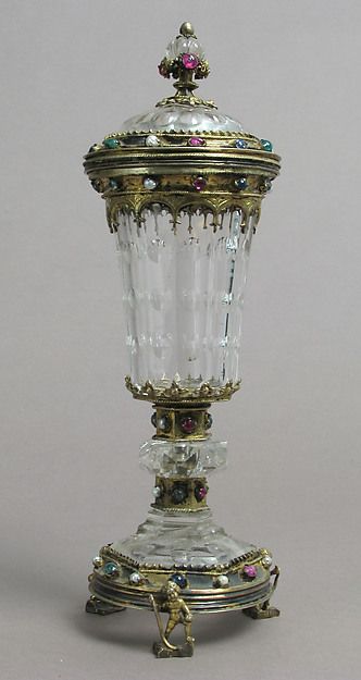
German chalice, 15th century, courtesy of The Metropolitan Museum of Art
On the left is a 15th-century German chalice similar to the Burgundian Court chalice (note the shape and position of the glass elements). Many of these luxury containers were studded with gemstones.
It’s possible that some of the fancier designs depicted on playing cards in the mid-15th century ended up in the collections of kings later in the 15th century or 16th century, when technology improved enough to fabricate more efficiently.
I sometimes wonder if some of the VMS containers were concept designs rather than actual containers. Some of them could have existed in the early 15th century but others would have been difficult or impossible to make, depending on how much glass was involved. There is at least one VMS container that looks like it might be transparent.
The Flemish painting below includes an ornate chalice very much like the Burgundian Court chalice. It’s a little smaller, and doesn’t have glass in the foot, but it’s the same general idea:
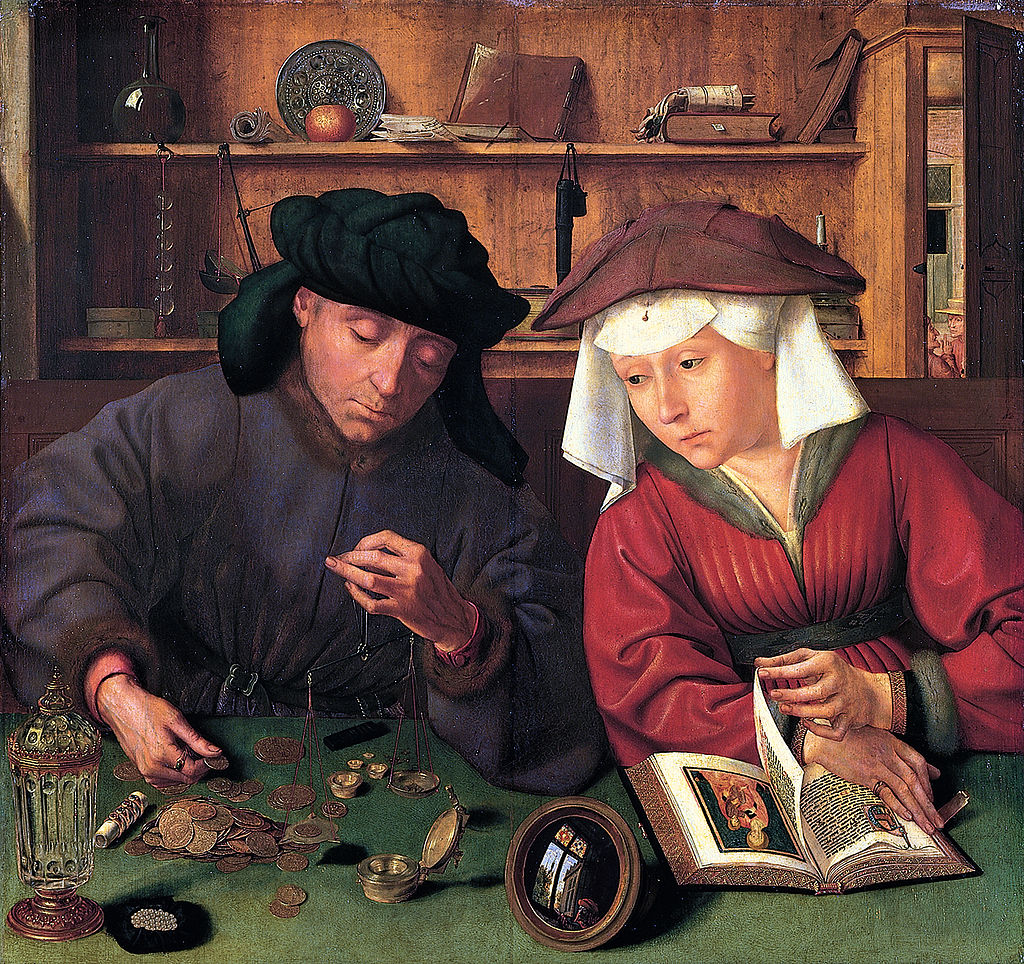
The moneylender and his wife by Quentin Massijs, c. 1500 [The Louvre, courtesy of Wikimedia Commons]
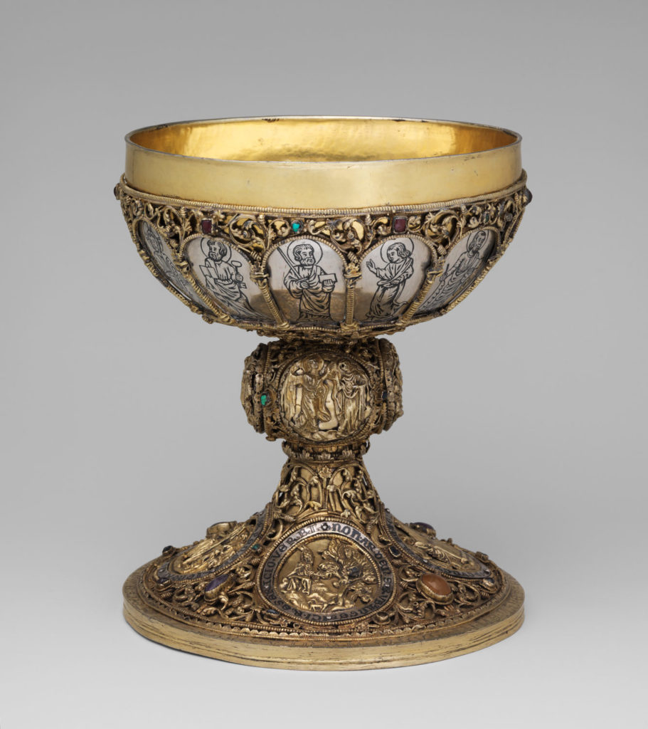
The chalice below is unusually ornate for its time. It is dated to the first half of the 13th century, created for a monastery near Freiburg im Breisgau, possibly for the celebration of Eucharist. Some of the Portuguese cibora from this time period are also highly ornate, but in a different style (more enamel and less filigree):
Highly ornate 13th-century chalice with religious imagery, possibly created for Eucharist [Source: The Met Museum]
Container Illuminations
It is easier to draw a chalice than to build one so we don’t always know whether the containers in manuscript illuminations were real or existed only in the imagination of the illustrator.
This Viennese painting of the presentation of Jesus to the Three Wise Men (below) probably depicts containers that were a little more ornate than most of the containers one would find in real life in the 1460s:
Fancy chalices are often included in illustrations of the Eucharist or Three Wise Men.
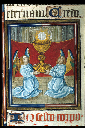
On the right are two angels holding a chalice that has been enlarged to indicate its importance. The exaggerated size makes it possible for us to see the detailing on the foot (BL Royal 2B XIII).
Luxury lidded chalices were often drawn with a wide middle and narrow, fancy finials. In the example below are two fancy chalices and a more utilitarian container on the right, similar to an arbarello:
Three chalices in two different designs in the Holkham Bible, southeast England, c. 1330s [BL Additional 47682]
Here are three chalices from a Dutch Book of Hours. One is open to show the contents:
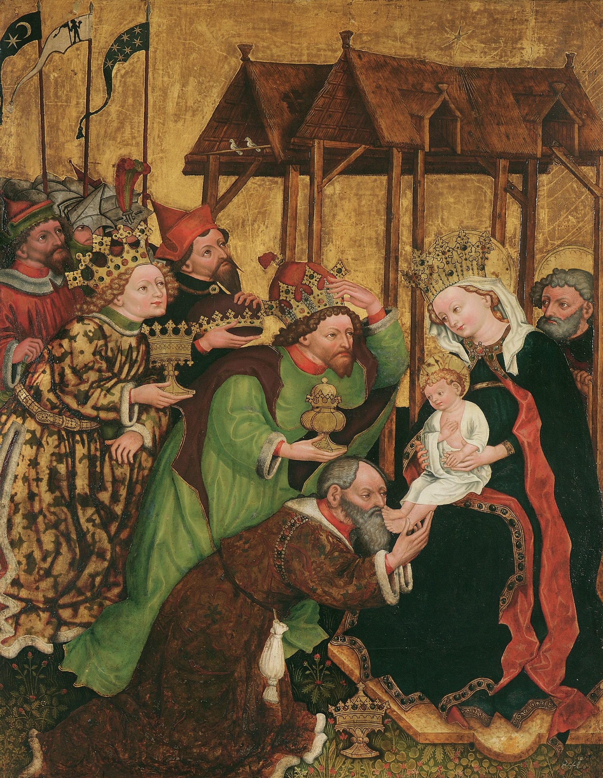
Three Wise Men presenting gifts in fancy containers to the baby Jesus [Source: BL Add 50005, ca. 1410s]
A very fancy spice tower or monstrance is included as an offering in a scene with VMS-style clothing (note the baggy sleeves):
A large spice tower or monstrance is captioned as a “very great offering” in this illustration from Augsburg, Germany, c. 1400 to c. 1425 [Vatican Pal.lat.1806]
This French manuscript includes some highly ornate containers being offered by the Three Wise Men. They are drawn as metal containers, but the one on the right is designed like a Christian monstrance. A monstrance would sometimes have glass in the windows:
The Three Wise Men presenting gifts in highly ornate containers. Two are chalice-shaped, the third is similar to a Jewish spice house, a style that was often used in Christian tradition as a monstrance. [Ms Arsenal 1175]
Here is an example of a reliquary shaped like a spice house in a Rhenish copy of Tacuinum sanitatis. The central portion is glass so the relic can be seen:
Singing hymns by the reliquary. [Source: Tacuinum Sanitatis, c. 1440s to c. 1470s, BNF Latin 9333]
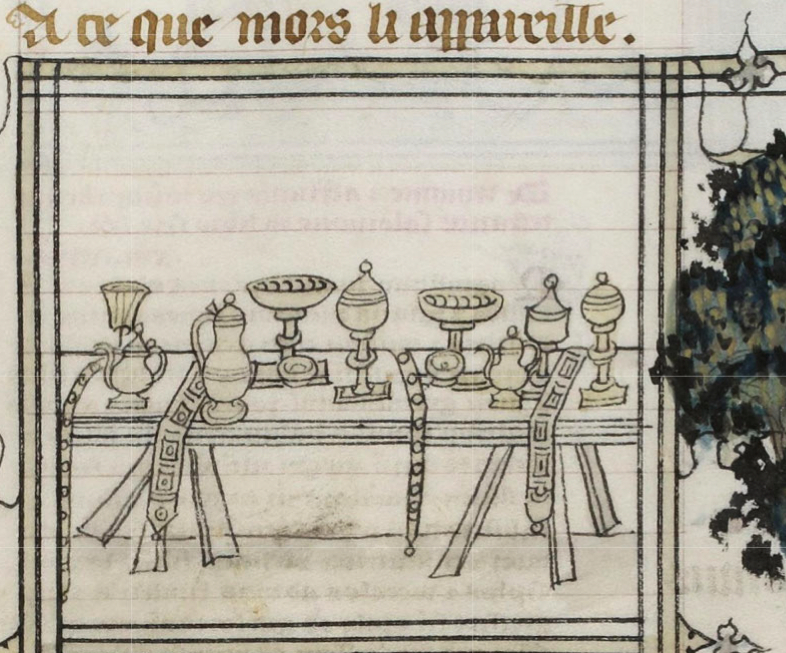
An elegant set of tableware in a French manuscript:
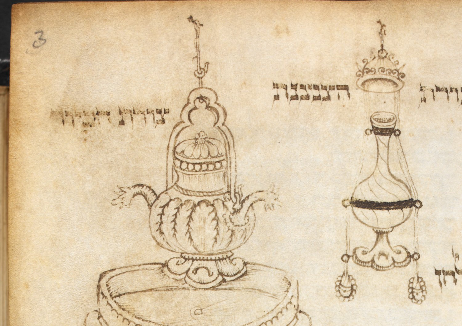
Hebrew codexes often have very beautiful ornate container designs. These illustrations are in a manuscript that includes both Sephardic and Ashkenazic scripts:
Ornate designs in a c. 1429 to c. 1460 Hebrew manuscript from France and Italy [BL Additional 14759]
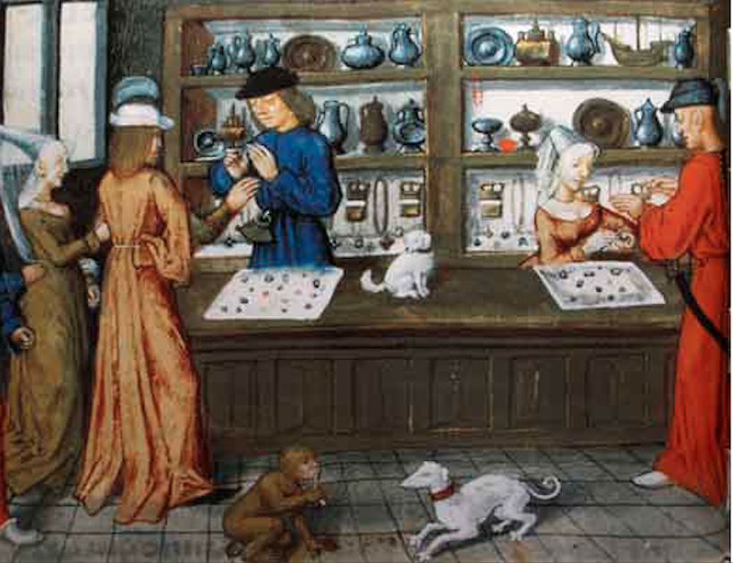
This illustrates a shop in Norwich, England, with a variety of pitchers, plates, and lidded chalices:
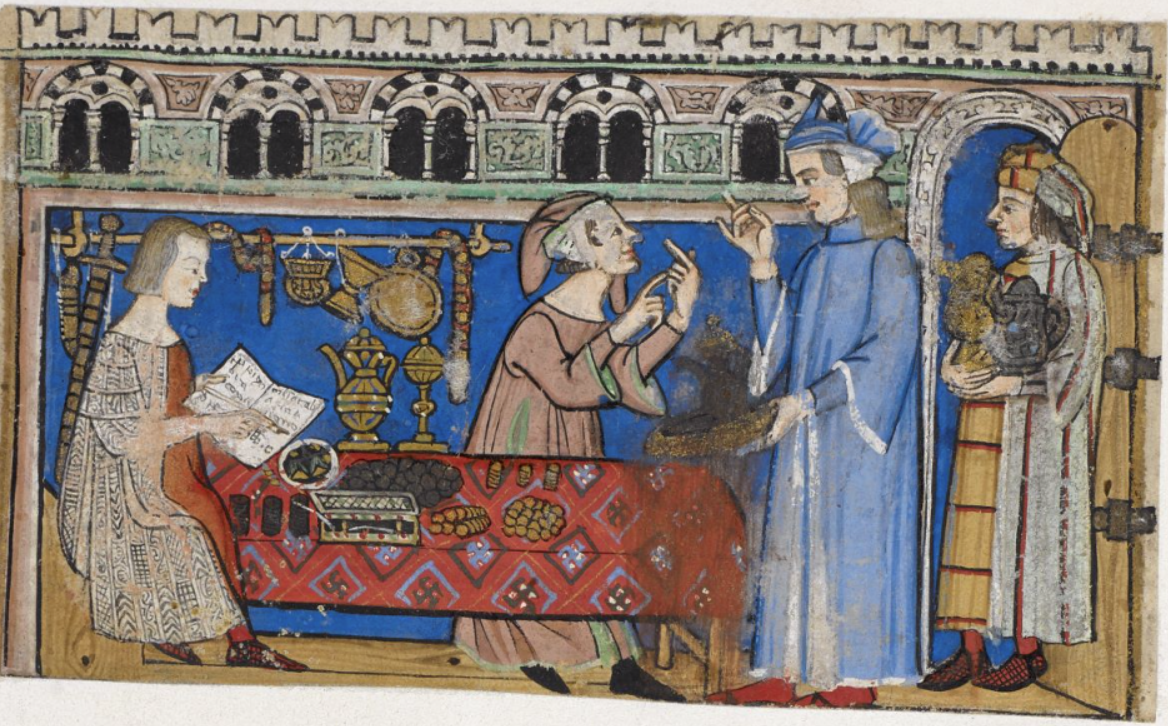
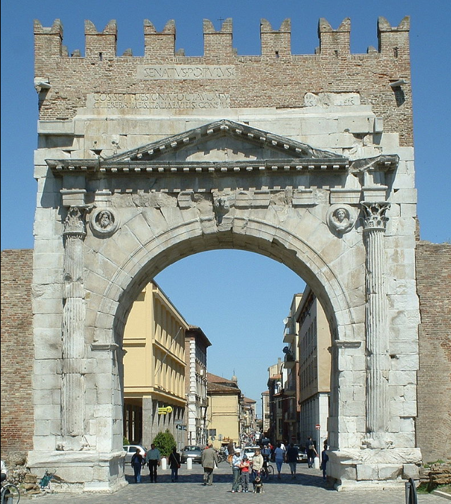
The following illustration from Genoa, Italy, includes fancy containers in a banking quarter, presumably items that have been pawned. Note the Ghibelline merlons across the top of the building. On the table are coins, with the owner, accountant, or clerk marking a register on the left. The hand gestures probably indicate a barter transaction for deciding the value of the items in the man’s hand.
In the background are a large lidded chalice and an ornate metal pitcher, probably studded with gemstones. The illustration is not strictly literal. It depicts the vice of avarice:
Transaction in a pawnshop illustrating the vice of avarice, c. 1330s Genoa [BL Add MS 27695]
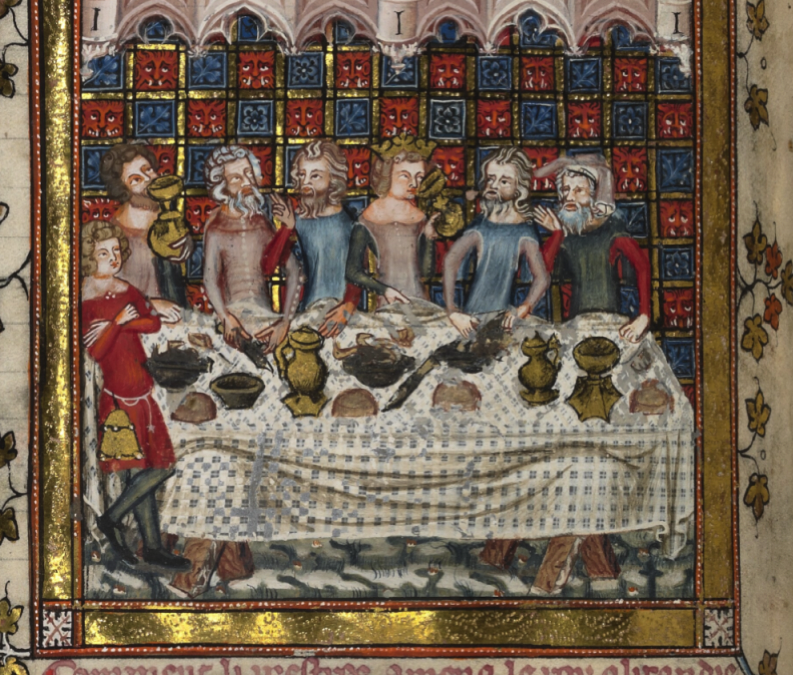
Chalices are not always associated with religious imagery, pawnshops or metal shops. Sometimes they are included in travelogues and novels. This is from the Romance of Alexander, from c. 1400, with participants in a feast being served food and drink from fancy containers:
This elaborate lidded container is from a medieval book of medicine:
Fancy lidded chalice in a 12th-century manuscript of medieval medicine [Source: BSB CLM 13002]
Are There Glass Containers?
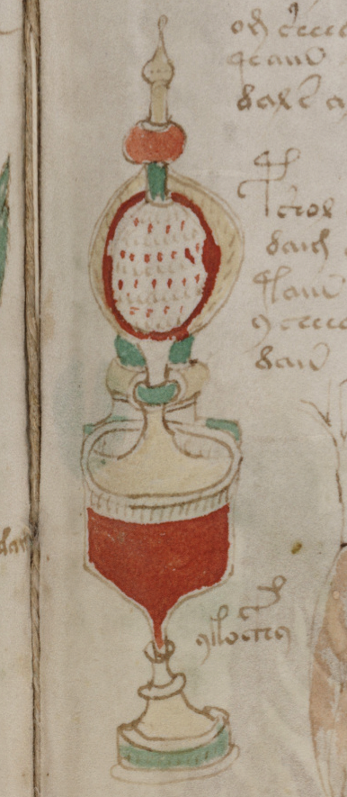
The VMS containers don’t appear to be studded with gems, and they probably don’t have filigree. They range from simple tubes that could be wood, metal, or leather, to cibora-like containers that are possibly metal. The fancy container on f89r might be partially or wholly made of glass. Regardless of whether the containers are real or conceptual, they aren’t necessarily all made of the same materials.
As mentioned in the previous blog, by the year 1500 containers similar to the VMS “fancy” container were being crafted in various parts of Bohemia, with northern Bohemian craftsmen having close ties to those in Italy.
The lidded examples below are from the Veneto. They are not quite the same shape as the VMS container, but they do have some traits in common, especially the finial and rounded foot:
Lidded cup, Venice, c. 1500 [Courtesy of Kunsthistorisches Museum, Vienna]
The Simpler Containers
In the Middle Ages, simple tubes were often crafted of leather or wood. Sometimes they were carved from bone. More ornate ones were usually made of copper, tin, silver, gold, or exotic materials like ostrich egg or ivory. Decorative curved glass was not common before the 1470s.
One container that differs substantially from the previous drawings is this leather scroll case. It’s like a larger version of a quill-pen case. Some were plain, others beautifully tooled like this one:
Scroll tube for carrying rolled messages [Courtesy of the State Hermitage Museum, Italy, 15th century]
Roman scroll cases were sometimes made of bronze. Some of the middle eastern scroll cases were finely detailed metal. Not all scroll cases were a full tube. Some were simple caps, to protect the ends of the scroll.
Needle cases were similar to scroll cases, but smaller.
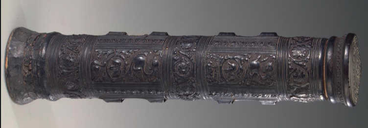
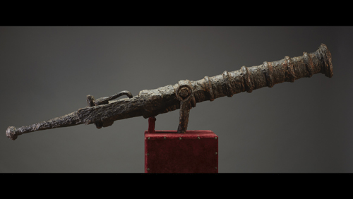
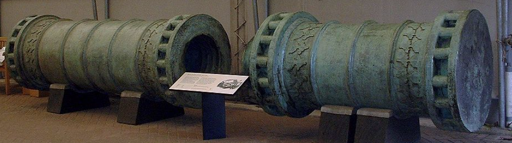
Swivel guns were bigger (15th c German, courtesy of Lennart Viebahn):
Seige guns were much bigger. These Turkish guns were built sometime around the late 1450s:
The siege guns actually look more like some of the “pipe” segments in the VMS pool drawings, but the naval swivel guns are vaguely like the VMS containers.
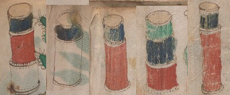
A selection of plainer containers in the small-plants section of the Voynich Manuscript. [Source: Beinecke 408, ca. 1404 to ca. 1438, Yale Rare Books & Manuscripts Library]
It’s difficult to tell if the VMS containers are tiered or telescoping. Tiered containers were not uncommon. And lensless sighting tubes were sometimes telescoping.
Sometimes a wooden layer was wrapped within leather or other materials and the ridge aligned with a cap. Containers were used for many purposes, so there were numerous variations in design.
There is a suggestion of a depression in the tops of some of the simpler containers.
Some of the simpler VMS containers look like they might be pigment tubes, scroll tubes, needle tubes, spice containers, or possibly even reading tubes. Some researchers have suggested weapons barrels for ones with reasonably straight shafts.
Summary
Maybe the VMS containers are documentary drawings, maybe they are designs or projections for something that would be difficult to craft until a decade or two later.
What I learned from looking at manuscript drawings is that many of the containers were reasonably accurate, but some were embellished beyond what was technologically feasible. I’m not sure which one applies to the VMS (especially since the VMS containers vary from simple to complex). The designs might be chosen to express a classification system for the plants, but given the practical nature of many of the tubes, perhaps they really existed.
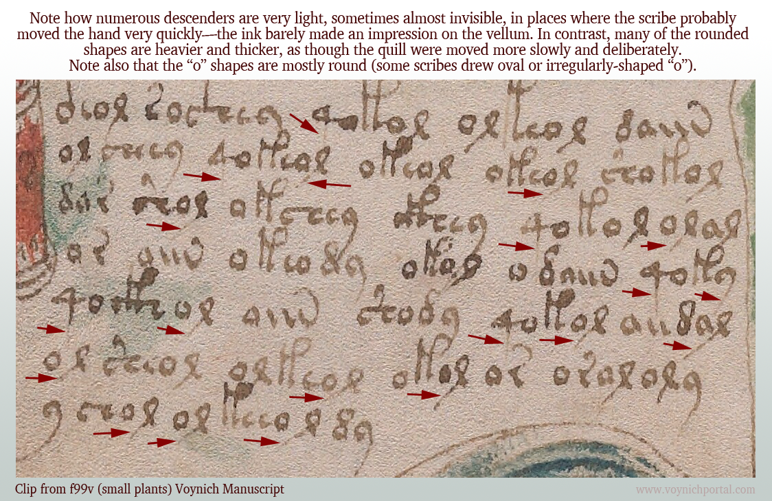
Usually when I look at VMS text, I am trying to unravel the meaning (assuming there is one) or puzzle out some of the ambiguous shapes, but a while ago I noticed something about the pen strokes that reminded me of the text on folio 116v…
The Speed of the Quill
Medieval scribes wrote using a quill or stylus. Some wrote faster than others. A faster, lighter stroke dispenses less ink. There are other differences… some scribes pressed harder, and some pressed harder on the downstroke than the cross-stroke (for artistic effects). Some sharpened the quill to a finer point, which creates a different kind of line and overall look. Some sharpened the quill more frequently than others, which improves consistency. Usually goose quills were used, but other feathers were sometimes good for fine lines.
Adhesion holds the ink within the curve of the quill. When you press on the tip to spread the groove, gravity tugs the droplet and ink runs downward. You have to hold the pen at a certain angle, use exactly the right pressure, and pull the tip away from the topside for the ink to dispense evenly.
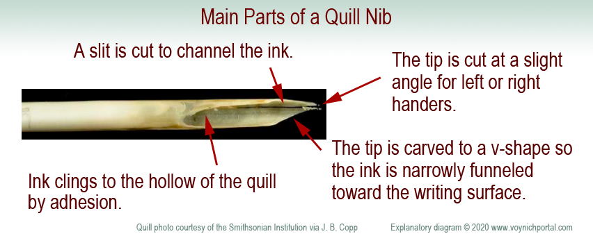
Here are the basic parts of a nib. It is a protein material that wears down. A scribe needs many quills to complete a long project.
A quill is not like a ballpoint pen. A ballpoint can draw loopty-loops because each part of the ball dispenses ink in the same way. It takes practice to pull a quill in the correct direction and, if you don’t do it right, the ink stutters or blobs. It takes a few years for calligraphers to really master the art.
Cutting a Quill
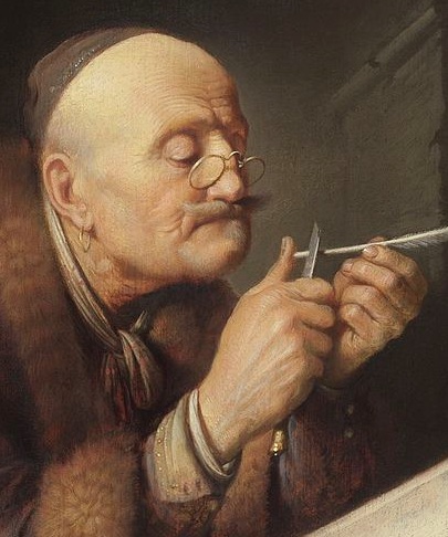
Shaping the tip of the quill. Often goose feathers were used. [Painting by Gerrit Dou c. 1633, courtesy of the Leiden collection.]
To create a quill, you harvest the feathers, scrape away the soft tissues, and age the feathers to “harden” them (in later years this was accelerated by heating). Artists and modern users have a romantic attachment to the feathery parts, but professional quill-makers and scribes usually removed them.
Use a sharp knife to shape the tip. The width of the tip is related to the width of the stroke. The tip is cut at a slight angle to accommodate the right or left hand. Even the curve of the feather is chosen for right- or left-handedness. A vertical slit is added to channel the ink in small doses from the inner curve of the quill.
If it is a feather quill, it needs to be re-dipped every few words and re-sharpened every few lines. (Don’t sharpen a quill as shown in this painting or you will cut your thumb—carve away, not toward your finger. What I do is press the quill-end alongside a small wooden block and shave toward the block—more control and less risk).
Because a quill needs to be pulled toward the side that holds the ink, a loop is usually drawn in two strokes—from top-to-bottom on the left, then top-to-bottom on the right. This prevents spattering or skipping.
Occasionally a scribe will draw a full loop if the nib is very fine and the loop is very small, but pushing against the direction of the pen is risky—the consequence may be a blob, pen-skip, or broken quill-tip. Similarly, straight strokes are drawn top to bottom to avoid going against the direction of the quill.
How Do Quill Mechanics Relate to the VMS?
If you pull a quill very quickly on the downstroke and start lifting in anticipation of moving to the next letter, the descender becomes very thin and light. Calligraphers are discouraged from doing this because it makes the script look uneven and a “g” might look like an “a”. Nevertheless, it happens, and appears to have happened in parts of the VMS.
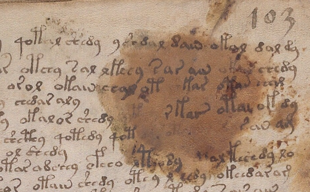
On folio 99v, I noticed many of the downstrokes were barely visible. The scribe probably moved fast and reduced the pressure compared to other parts of the glyphs.
Note how many of the descenders are unusually light:
Compare it to this script on 103r where the descenders are darker and more clearly written:
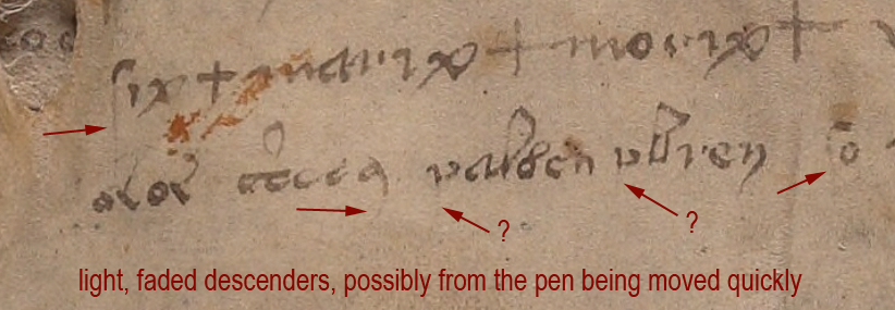
On 116v, at the end of the manuscript, there is some distinctive lightening of descenders, possibly from the pen being moved quickly or possibly from some text that has been expunged below the last visible line:
I am not sure if the two arrows marked with question marks are faded descenders, but the tops of the letters look more like medieval “p” than “v”.
Unfortunately the 116v text does not match the handwriting style of the scribe who wrote the light descenders on f99v. I wish it did—it would be evidence that the 116v scribe might have helped with the manuscript. But the 99v example has rounded c-shapes, not as squeezed as those on 116v, and the descender on EVA-y on 116v is distinctly rounded and arced, so it’s probably a different scribe.
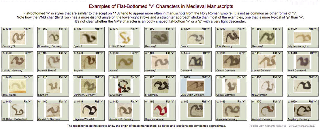
Identifying the Ambiguous Letter
So what is the strange letter on 116v? A “v” or the top of a “p”?
I looked for examples of flat-bottom “v” in medieval manuscripts and found quite a few, but it was definitely not as common as other forms of “v” with pointed or round bottoms.
Below are samples specifically culled from scripts that are similar to the overall script on 116v. These samples don’t match the shape of the VMS char as well as similar examples of the top of the letter “p”, but the differences aren’t sufficient to determine the identity of the VMS char:
So let’s move on to sections where the VMS text has been corrected or changed…
Amendments to the VMS Text
This is one of the more obvious examples where something spilled and someone tried to re-create the damaged text on top of the stain. The text is a bit awkward, the stain may have impeded the quill, but it appears to be added by someone familiar with VMS glyphs:
Less Obvious Examples
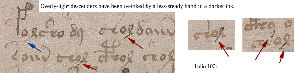
Some corrections are more subtle. You have to hunt for them. There are many edits in the VMS. I tried recording them, but it was taking too much time and there isn’t space to enumerate them all here, but I’ll point out a couple of interesting examples.
Apparently someone didn’t like the overly-light descenders on f100r (small-plants section) and tried to fix some of them. Note the light descender marked with a blue arrow. Some of the others have been overinked to add the missing stroke (marked in red).
Whoever over-inked wasn’t very expert. The lines are tentative and shaky. The thickness of the nib doesn’t match. The ink doesn’t match well either:
Medieval inks were not always brown. Some were closer to black when first applied and gradually faded to brown, so you can’t always go by color. Only testing can determine when the extra strokes were added. But the added ink isn’t just a different color, it’s a different kind of stroke, thin and spidery. It lacks the thick-thin characteristics of lines drawn with a quill. It resembles ink from a different kind of pen, maybe a metal stylus or something that can create thinner lines.
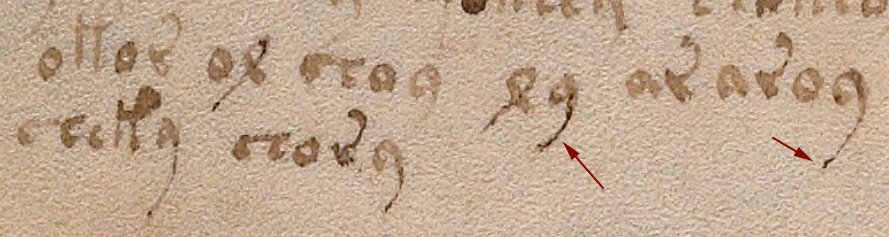
Darker ink also occurs at the bottom of f100v, on one of the small-plant folios, but the difference isn’t as great. One has to be careful in evaluating examples like the one below, because sometimes medieval ink was not mixed well and certain components in the ink faded while others remained dark.
I’m pretty sure the text on 100r in the previous example has been over-inked, but it’s harder to tell if the following example is over-inked or badly mixed ink where some components faded more than others:
Changes to Content
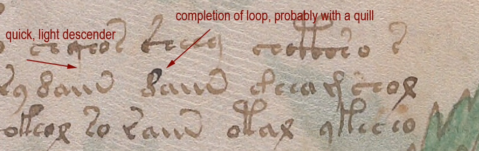
Darkening a too-light line is a superficial change that doesn’t alter the intention of a glyph, but there are places where lines have been added to change the shape of a letter. For example, on 100r in the middle, we see a shape that looks like a straight “d” changed into EVA-d with the addition of a loop.
In contrast to the overinked examples shown earlier, the added loop looks like a quill stroke. Even though it is darker ink, it has the thick-thin characteristics and more fluid style of the rest of the text:
So it’s possible that more than one person made changes to the text or that the scribe had difficulty with very fine lines and used a different, perhaps unfamiliar, kind of pen.
These revisions suggest that 1) someone cared about the legibility of the text and tried to fix the parts that were faded, and 2) someone comfortable with a quill cared about the consistency/accuracy of the VMS glyphs and corrected errors.
Here is another example with dark and light inks in which descenders have been fixed and one letter appears to have gained a longer lower-right stroke (100r lower-right):
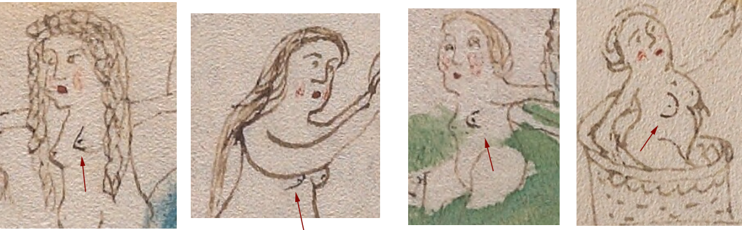
The text is not the only thing that has been amended. Some of the drawings have, as well.
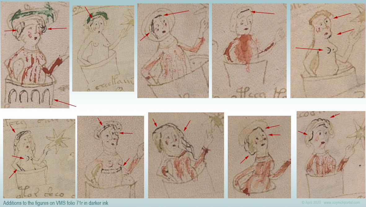
There are numerous places where a breast has been added to a nymph in a slightly darker ink. Usually it is the one closest to the viewer:
Nymph 1 Nymph 2 Nymph 3 Nymph 4
So who added it? Was it a production-line process where one person drew the outline and someone else added the inner details? Or was it a master-apprentice situation where a young apprentice was asked to do something “safe” that wouldn’t ruin the drawings, like adding a second breast?
The added breasts are usually in the same style as the original breast. In this case, the first is pointed, the second is somewhat rounded, the third is shaped like a thumb, and the fourth is larger and distinctly rounded. So… either it’s the same person who added them, or someone else made an effort to copy the original style.
Sometimes other parts of the body look like they are drawn by a different person. For example, the arms of the second nymph are different from the others.
One of the characteristics of many of the nymph drawings is that there is no shoulder on the side facing the viewer—the arm grows out of the neck. This is particularly noticeable on nymphs in 3/4 view. It’s a distinctive characteristic that can be seen on nymphs 3 and 4 in the example above. In contrast, Nymph 2 has an angular shoulder and smoother, darker arcs to the curve of the arms. Note also that there is no elbow on #2. The arms of the second nymph look like they were drawn by a different person.
Here are more examples of nymphs with non-anatomical shoulders. The arm on the right is almost growing out of the ear:
Places Where Both Text and Images Were Amended
On folio 73r, someone has added both text and breasts in a darker ink, using a finer writing implement than the original text. The text is consistent with other text on the folio in both style and glyph-arrangement, so perhaps the lines were added close to the time of original creation.
Here is a sample from the top of the folio, but there are numerous other additions below it:
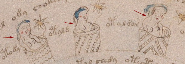
A second breast has been added in darker ink in much the same way in the zodiac-figure folios and the pool folios, which suggests some kind of continuity between sections, if the dark ink is contemporary with the rest of the manuscript.
One important thing to note… the glyphs in the darker ink are written in legal Voynichese. Did the person know the system for generating tokens? Or did they copy others that already existed? If they knew the system, these marks may have been added in the 15th century.
There are numerous amendments to the drawings on 71v, one of the zodiac-figure folios. Ten of the 15 figures have been touched up with darker ink (or ink that has faded less over time). Most of the changes are to the hair and breasts:
In this group of nymphs, there is an interesting anatomical difference between the nymph with two original breasts (#2) and the two nymphs with added breasts (#5 and #6)…
On the original drawing (#2), the contour of the breast is defined by a line underneath, and the general direction is facing the viewer straight on. The added breasts on #5 and #6 are drawn differently. The direction is more of a side or 3/4 view and the line that defines the contour is on the side rather than underneath. The “touch-up” person may have been different from the original illustrator.
Less-Explainable Amendments
The changes or additions in the above examples are understandable. Light strokes were darkened, missing information was added. But the following example is harder to explain.
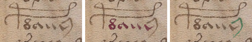
On f86r, there is an instance of “daiin” in which the last minim doesn’t have the usual tail swinging up to the left. Instead, someone with a narrower quill and a less steady hand added a large angular shape that is inconsistent with the rest of the text on the folio. The last minim has been awkwardly changed into an ambiguous shape that is not typical of Voynichese:
The amended shape is not round enough to be EVA-y and lacks the loop that is usual for EVA-m. The “dain” block doesn’t usually end this way, so the amender either added the wrong kind of tail (facing the wrong direction), or didn’t know how to draw one of the other VMS glyphs correctly and turned the tail-less minim into something strange.
In a previous blog, I posted some other examples in which atypical text was added to the beginnings or ends of lines.
Summary
The VMS includes numerous adjustments to the text and drawings; most of them are fixes to the original in a similar style. In some cases, however, textual additions seem out of character with the rest of the folio and it’s unclear why it was changed.
Most of the amendments were probably done around the same time the VMS was created, but some of the textual changes may have been added later. The proportion of changes isn’t high, but there are enough to make you wonder what happened to the VMS during the gaps in its provenance.
Changes or additions are not especially frequent, however, considering the length of the manuscript. It seems likely that a draft version was used to design the script first. It would be remarkable if it eventually turned up somewhere in the forgotten corners of a library or private collection.
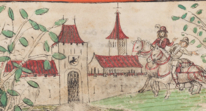
In medieval times, people walked. Many cities were completely walled and you entered by the portal gate. Some cities had only one entrance. Some had three or four. If there was only one, it was important to know where it was or you could approach from the wrong side and spend hours or days backtracking along treachorous mountainous paths or deep forest.
To make it easier to recognize the gate from a distance, certain “signal” styles were adapted by builders and architects, many of which were specific to their region. It was common to build a tower, or a pair of towers, over the main portal. The extra height let the watchmen see who was coming, and visitors knew where to approach.
Medieval portal entrances were designed with distinctive features and usually stood higher than the walls so watchmen could scan incoming traffic from a suitable height, and travelers could find the right entrance to walled cities. [Source: Eidgenössische Chronik, Cod. ZF 18, c. 1520s]
Portal-Tower Architecture
Most towers were built with brick and mud or stone according to local engineering and cultural traditions. Some had flat platforms, others had roofs.
The Canaanite Gate in Tel Dan is several thousand years old and currently under restoration (the doorway has not been fully excavated). It features a heavy wall and a single portal in the central recessed portion of a thick wall. The portal is within a broad arch that predates Roman arches by about 1,500 years. There may have been a higher central tower above the doorway at the time of original construction:
The mud-brick Canaanite Gate in Tel Dan was built almost 4,000 years ago and features a thick wall, a higher portion above the portal (perhaps the remains of a tower), and an arched door-support. [Source: Hanay, Wikimedia]
This basic format, a strong wall, a central portal, and a raised platform or tower over the doorway was common to many countries.
There are a number of ancient gates in Bosra, in southwest Syria. They typically have arched doorways, but high towers above the gate are not usual.
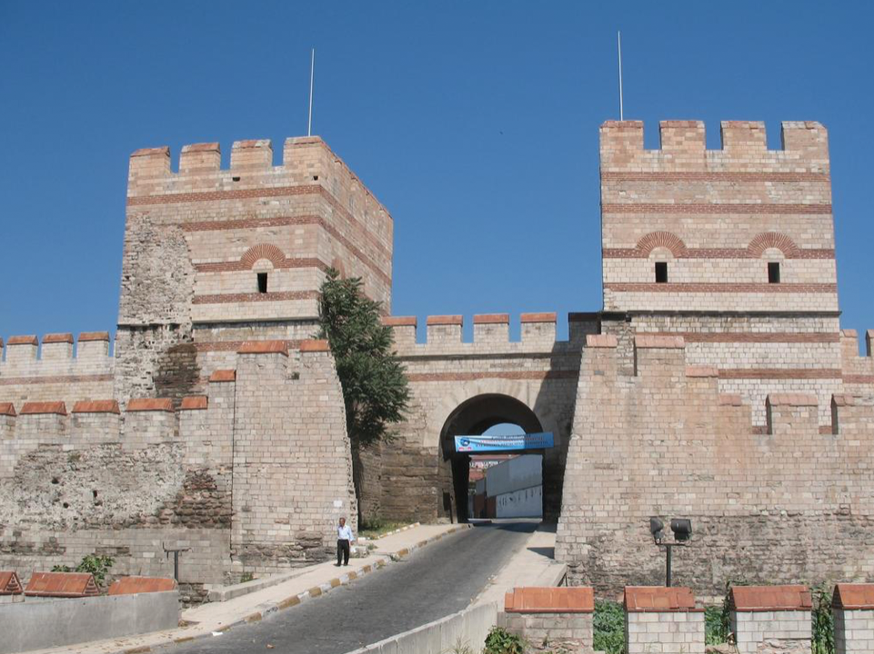
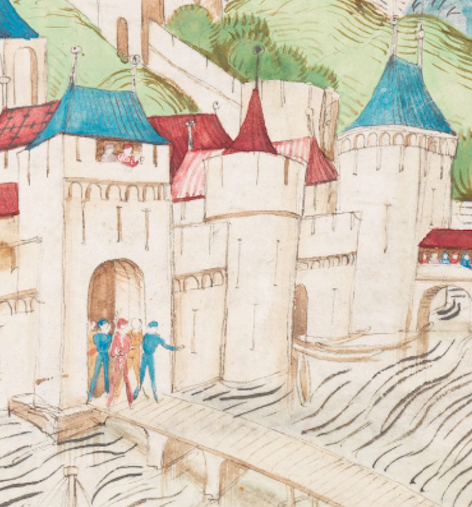
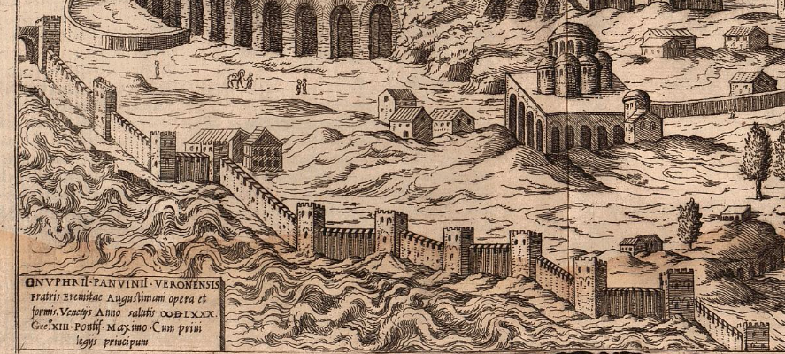
The Gates of Istanbul are massive, with mostly-square towers, and very old. Some have been bricked up or restored over the years. This is the Belgrade Gate which still includes parts of the original wall:
Portions of the wall ran along the water and a chain was stretched over the canal to prevent undesired entry by boats.
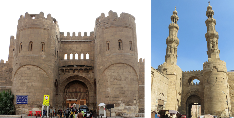
Here are two examples of medieval tower portals from Cairo, Egypt. The well-fortified north-facing portal (left) has a platform and crenellations. The south portal (right) has elaborately carved minaret towers and stone roofs with sculptural finials:
The north-facing portal and south portal to the city of Cairo were built in two different styles in the 11th and 12th centuries. [Sources: Sailko and JMCC1, Wikipedia]
The bastion style on the left was a common style. It was designed for visibility and also for protection. It enabled guards to drop arrows, rocks, and burning oil onto anyone trying to storm the gate. This form of tower is often depicted in manuscript illuminations.
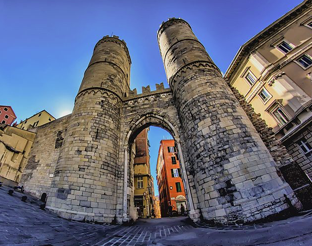
The Porta Soprana of Genoa, built in the 11th 12th century, is similar to the north-facing portal in Cairo, although not quite as massive. Between the two round towers, and on the top, are Ghibelline merlons, but it’s difficult to determine exactly when they were added. It is possible, in this case, that they are original, since this is one of the pockets where there were Ghibelline supporters, but since the portals were intended, in part, to assert the independence of Genoa, it’s questionable whether they would include a symbol specifically supporting the Holy Roman Empire:
The Porta Soprana portal in Genoa, built in the 12th century. [Source: Maurizio Beatrici, Wikimedia, 2016]
The little town of Münchenstein, on the northern Swiss border, had quite a simple portal with a square tower and crenellations:
The Augustus Arch, portal to Rimini, is very ancient and classical in design with an unusually large opening that probably never had a gate. The Ghibelline merlons were added in the 11th 10th century when the Ghibelline family took control of the city:
The Augustus Arch was originally built in the 1st century BCE and dedicated to Caeser Augustus by the Roman Senate. In the 11th 10th century, the Ghibelline merlons were added by the Ghibelline family. [Photo: Tobabi1, Wikipedia]
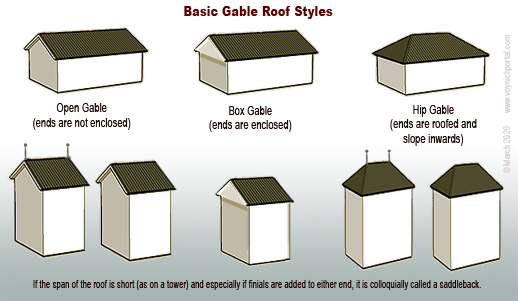
Gable Roofs
Sometimes towers had roofs similar to those on houses. A common style was the gable roof, seen in areas where ceramic or wooden roofs were added:
One of the roof styles used for medieval portal towers is the gable roof. In certain regions, the two ends of the roof-span sometimes included globe finials or flag finials.
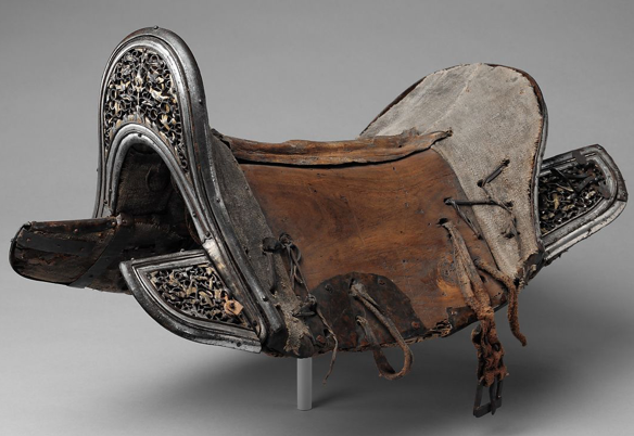
Antique saddle with raised pommel and cantle [Source: The Met]
The span of a gable can vary. If it is a short-spanned gable with finials or raised peaks at either end, it is sometimes called a “saddleback” because of the resemblance to saddles with raised pommels and cantles (right).
Saddlebacks were common in Bohemia/Bavaria, Alsace, and parts of eastern France in the Middle Ages.
Historic Portals
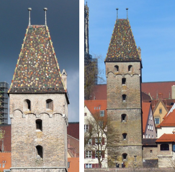
The Butcher’s Tower (below) is a hip-style gable with inward-sloping sides and roofing materials on all four sides.
This picturesque watchtower was built in the 14th century, and stands above an entrance gate in a long wall.
Hip-gable style of “saddleback” roof with globe finials. The Butcher’s Tower, 1349, Ulm, Germany.
A similar style of portal can be seen in the Berner Chronik (Burgerbibliothek Mss.h.h.I.1), created between 1478 and 1483. It has a hip-gable saddleback roof with finials:
The main difference between this and the Butcher’s Tower is that the Berner Chronik portal has a crenellated level where the stone ends and the roof begins. In some cases, towers started out unroofed and roofs were added later. In other cases, there is a crenellated balcony at the apex of the stone that was part of the design.
In this illustration, there are two entrance portals built along the water for accessibility by boat and for extra security. Both portal towers have saddleback roofs with globe finials, but the tower on the left has a viewing window and the one on the right has a covered walkway leading to the opening:
Two portal towers leading to the city, entered by crossing bridges, one plain, the other covered. Both have hip-gable roofs with finials. The arch-shaped extensions are similar to those on the Butcher’s Tower. [Source: Amtliche Berner chronik, Mss.h.h.I.1, c. 1480]
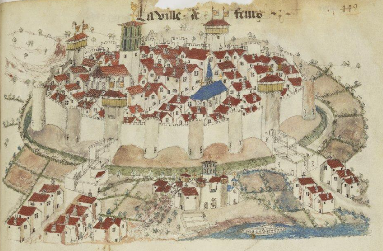
Postscript 29 March 2020: I forgot to add the following drawing when I posted this blog, but it’s worth including because it’s part of an extensive collection of town maps from the mid-15th century. The drawings of Guillaume Revel are generally more accurate than castle drawings in storytelling manuscripts because part of his purpose was to document ducal holdings.
Revel drew the town of Feurs around 1450. There are four saddleback portals, each with flag finials and, unlike most castle drawings, he included details of the archways and balcony just below the rooftops, a style that was fairly common in this area but not always elsewhere. Between the portals are semicircular wall towers with simple battlements:
The walled town of Feurs in the 15th century is drawn here with four saddleback portal gates with flag finials. This detailed drawing was created as part of an armorial record by Guillaume Revel [source: BNF Français 22297]
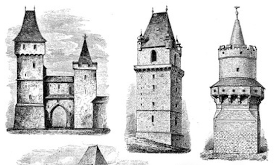
The following examples of German towers include 1) double towers, one with a hip-gable saddleback on the left and a cone-shaped tower on the right, 2) a single tower with a saddleback roof and globe finials, and 3) a finial-topped cone tower surrounded by a balcony with battlements:
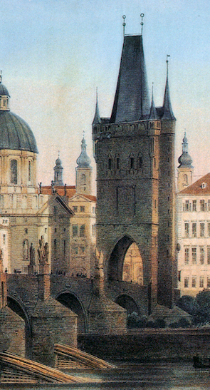
The Prague “Powder Tower” is situated on one of the main city portals on the Charles Bridge. During the reign of Emperor Rudolph II, it housed some of the alchemists
It has a hip gable with globe finials and turrets in the corners, similar to the tower in the center diagram above, but the Powder Tower was not built until 1475 and I couldn’t find any clear pictures of the original tower it replaced.
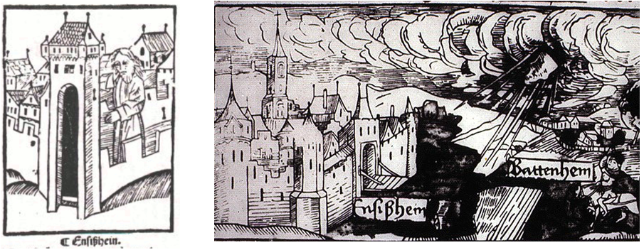
Towers similar to the Powder Tower served as portals to the cities of Batteheim and Ensißhein.
Sometimes local architecture was used to illustrate events in far-off places. For example, Vatican Pal. Lat. 871, includes a biblical story of Ezechiel that obviously didn’t take place in central Europe, and yet the illustrator drew local architecture, including a pair of flag finials facing outward:
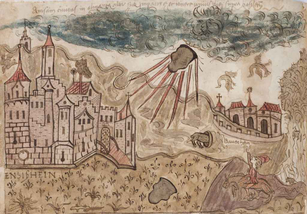
On a side note… outside Ensißhein a meteorite boomed out of the sky and landed in a field November 1492. A number of woodcuts and drawings commemorating the event show a saddleback portal gate (a 15th-century drawing of Belgrade includes similar-looking portals):
Ensißhein (now Ensisheim) was immortalized in story and images in 1492 when it was struck by a meteorite. Citizens quickly started hacking off pieces, but an official intervened and preserved it for future generations.
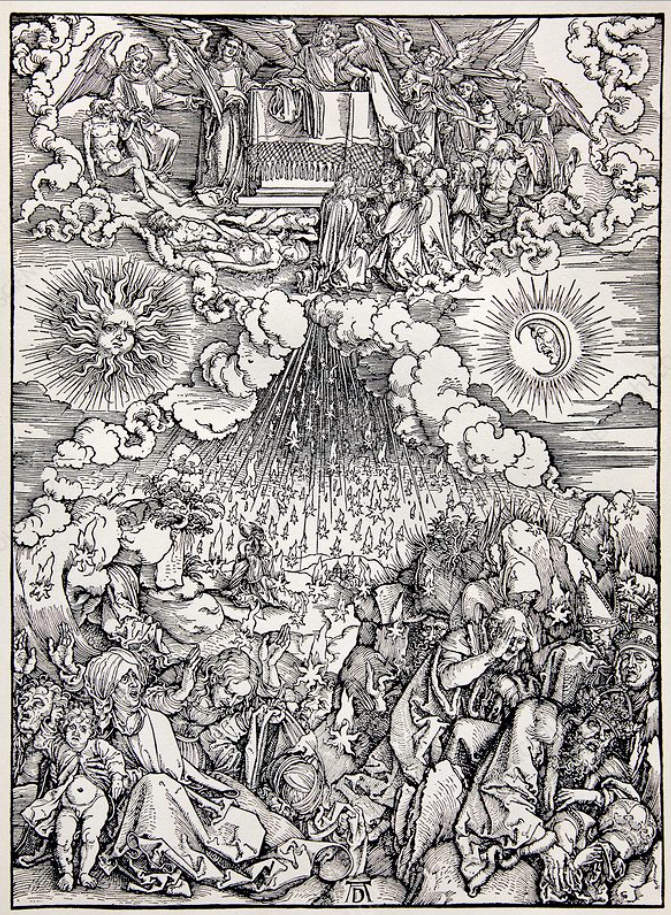
Albrecht Dürer created elaborate allegorical engravings of the meteorite event replete with sun, moon, stars, cloudbands, angels, and people cowering in fear. Here are two examples:
Ensisheim is in eastern France, near the Swiss and German borders and I was intrigued by a more humble drawing of the meteorite event. People are pointing, birds are knocked out of their flight by the boom from the “thunderstone”, and animals scurry for their dens:
Meteorite blasting out of the sky with a loud boom, causing chaos November 1492 in the environs of the city of Ensißhein. [Courtesy of the Vatican Observatory Foundation, BAV Chigi G.11.36]
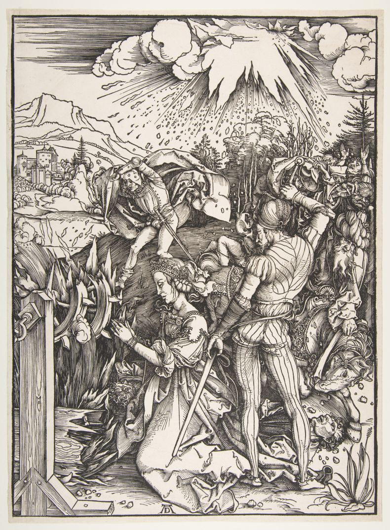
This illustration reminded me of the full-page drawing in the VMS that has multiple textures and emanations seemingly shaking the foundations of the earth. There is a person hiding or peeking out from behind a tor, a bird flapping by a cloudlike formation in the upper-right and another with wings raised as if to fly sits on the tor below.
I’ve already blogged about possible interpretations of this folio, and the Ensißhein meteorite event is probably too late to have influenced the VMS, but the fact that the folio has a narrative feel, like the Ensesheim drawings, makes me wonder if it chronicles a natural or mythical cataclysm:
Beinecke 408, the Voynich Manuscript, folio 86v, courtesy of the Beinecke Rare Book & Manuscripts Library at Yale.
Another meteorite hit the earth near Basel, Switzerland, in the 16th century but I wasn’t able to find any illustrations of similar events before the Ensisheim meteorite. There are some earlier drawings of “comets”, however, and since the word “comet” was used rather imprecisely at the time, maybe some of these sitings were meteorites.
U. dall’Olmo, in the Journal for the History of Astronomy, 1978, Vol. 9 searched medieval records for celestial events and describes a spectacular meteor shower in southern Italy in 1387 that was said to light up the sky. Three decades later, a meteor appeared after sunset and split into three while traveling west to east. If the VMS drawing has anything to do with meteor events, maybe it chronicles something earlier than the thunderstone of Ensesheim.
More on Portal Gates
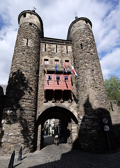
Helpoort portal, photo by Ben Bender, Wikimedia Commons
Getting back to portal gate designs… the Helpoort gate in the Netherlands is a 13th-century entrance portal with an arched entrance, two round towers, and an asymmetric cone-shaped roof. I don’t know how old the finials are (they tend to wear and be replaced) but globe and flag finials were common in the middle ages.
In the 17th century, Reims was drawn with two saddleback portal gates flanked by a pair of round towers with cone roofs. A series of round towers, some roofed, some not, are spaced at intervals along the city wall.
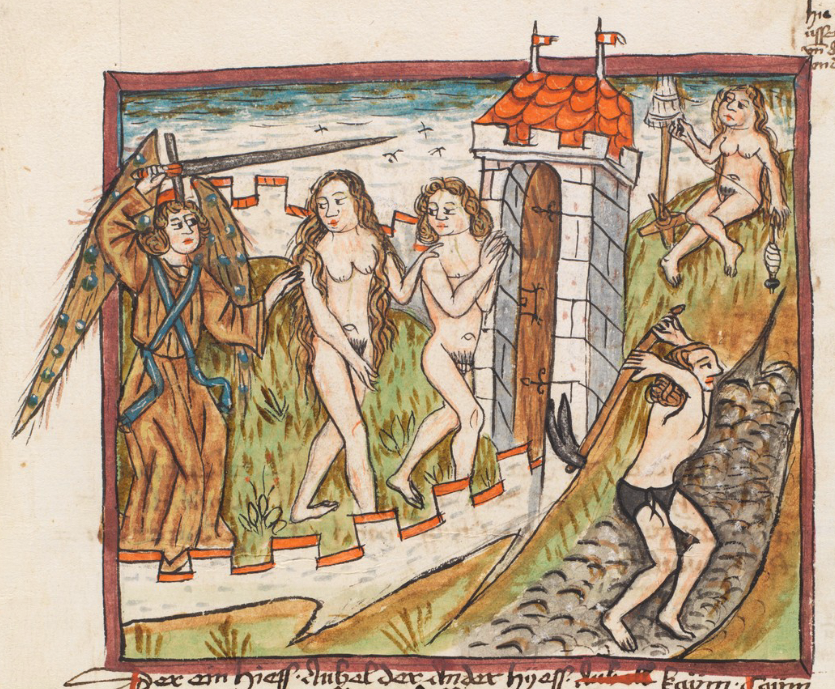
When Adam and Eve are driven from Paradise in this manuscript from Switzerland, we see them exiting through the portal gate roofed with a hip gable and two flag finials:
Adam and Eve driven from the walled garden of Paradise through a traditional portal gate with a hip gable roof with a pair of flag finials. [Source: Bern, Burgerbibliothek Cod. A 45, c. 1480]
Roofs in the VMS “Rosettes” Folio
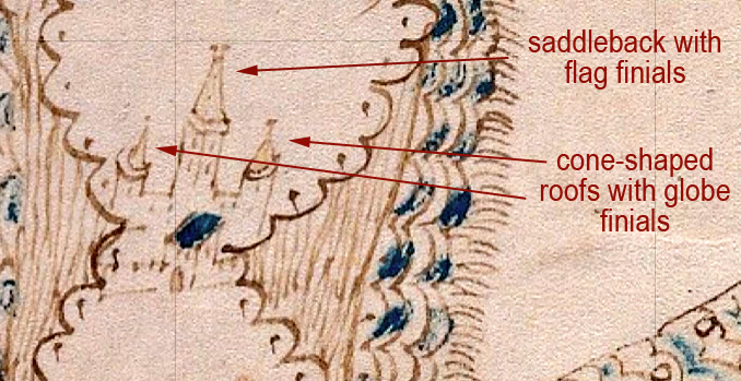
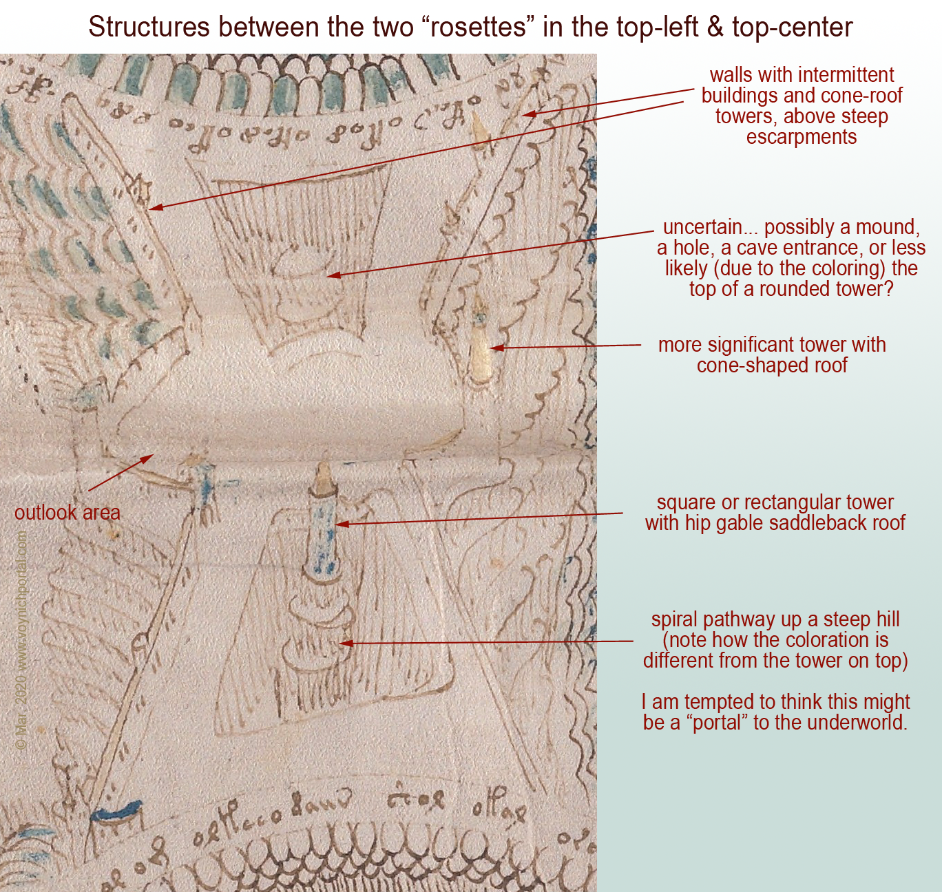
There are a number of corner towers and portal towers on the VMS “map” folio. The drawings are very tiny but still recognizable. The roofs are consistent with the styles of the towers and with each other.
On the lower side of the top-right rosette, there is a simple square tower facing the rosette, but the tall tower is probably also a portal tower that faces the pathway on the other side (imagine standing on the rosette and looking toward the “path” as though you are seeing it from the back). The central tower roof is a gable with flag finials facing outwards, a typical saddleback, flanked by cone roofs with globe finials (I think the finial on the right is probably a smudged globe finial, but it may possibly be a flag finial):
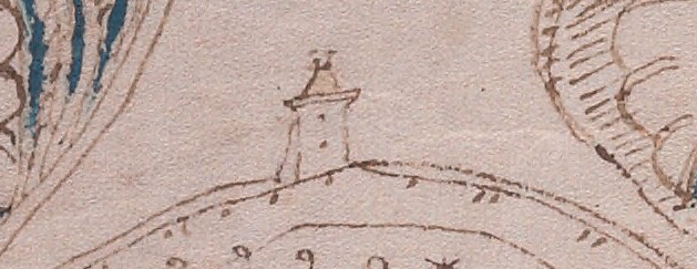
On a circular wall within the rosette, possibly at the top of a steep area, there is another saddleback tower apparently attached to the wall, but it doesn’t appear to have a portal opening. It may be a watchtower rather than an entry point.
This one has a hip gable and a pair of finials that are so small, it’s difficult to tell if they are flag or globe finials. If it’s a watchtower rather than an entrance tower, they are probably globe finials.
I think it’s very unlikely that the drawing below represents a lighthouse. Lighthouses were generally round and even if they were square near the bottom, as in some of the most ancient, the top was usually round so the signal fires could be seen from multiple angles. All through history, the majority of lighthouses were round or rounded (octagonal) at the top. Even the tower of Hercules transitions from square to octagonal to rounded as one reaches the top.
I have never seen a historic lighthouse with a saddleback roof and, in general, lighthouses were not attached to walls at the tops of hills. More often they were on prominences jutting out into the water closer at sea level, or they were on small islands or rock formations in or near the harbor. This looks like a typical wall-tower:
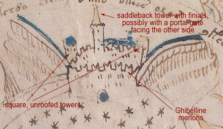
On the same wall, on either side of this tower, there are additional towers that appear to have cone roofs and finials. Moving to the left side of the rosette, facing another “pathway”, there is a wall castle or city with Ghibelline merlons, two unroofed towers, and a tall, narrow hip gable with finials:
Note also that the Ghibelline merlons are not on every side. The merlons on the left are the more common square merlons.
Pointed merlons are found in many areas of southern Spain, and if they are placed in pairs, they superficially resemble Ghibelline merlons, but they are not the same. The merlons on the VMS are straight on the outside and angled on the inside and join without reaching the base. The merlons in Spain are angled on two sides to create a different shape. There are some swallowtail merlons in Spain, but I haven’t found any that existed before the latter part of the 15th century.
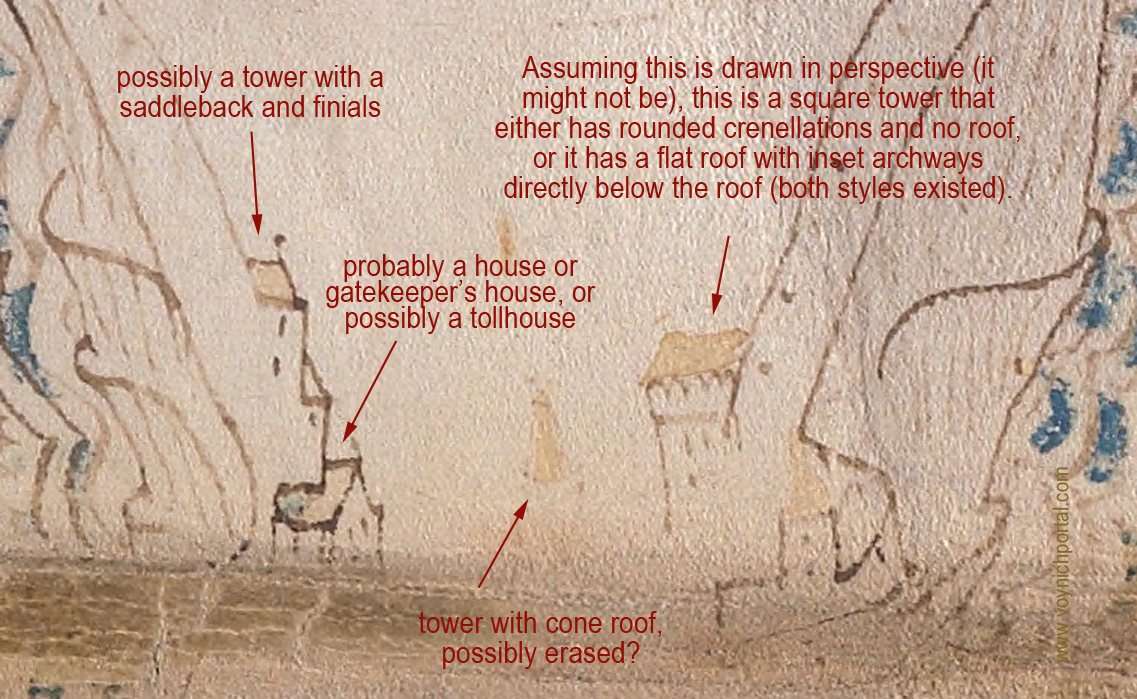
Beyond this compound, to the left, there appears to be a walled pathway with buildings and towers at intervals. On the outsides of the walls are what appear to be steep escarpments, very similar in shape to certain geological formations and also similar to the escarpments created by mining operations. The buildings on the left look like houses and possibly a tower with finials. On the right is a platform tower with crenellations, possibly roofed. In the center is a faint tower with a cone roof that looks like it might have been partially erased:
Mining was quite extensive in the Middle Ages. Silver, gold, and other metals, along with desirable stones such as gemstones, granite, and marble, were so heavily mined that entire mountains were sometimes reduced to foothills. During the process, narrow terraces were often formed. This makes it difficult to know whether the lines that look like escarpments in the VMS are natural or manmade.
The next section in the top-left is quite detailed and it’s difficult to interpret the structures that appear to be inset into apparent hollows in the pathway:
The blue tower appears to be sitting on a steep tor with a spiral pathway to the top, and is colored to distinguish it from the structures under and around it. For this reason, I am reluctant to call the bumpy thing in the upper hole a building, as it is the same colors and textures as the “dirt” around the lower tower. My best guess at the moment is that the upper “hole” might be a cave entrance or a cutaway in a cliff as was sometimes created in the middle ages, with arched lookout points along the way.
Walls with Buildings
Walls with attached buildings were quite common in the Middle Ages. The way the path widens out where it appears to be steep is fairly common, as well, providing intermittent stopping places and viewpoints.
Tollhouses were installed at regular intervals on major rivers and paths, so the presence of a house attached to the wall might indicate a checkpoint or tollhouse.
At the bottom of the folio, we see a long wall of Ghibelline merlons, but no towers:
This drawing of a wall in Constantinople, published 1580, has numerous attached towers, but they are shown with flat, unroofed, crenellated tops:
Old paintings of Florence, Italy, have towers similar to those in the illustration of Constantinople, with the exception of one portal tower that includes a low-profile hip-gable roof.
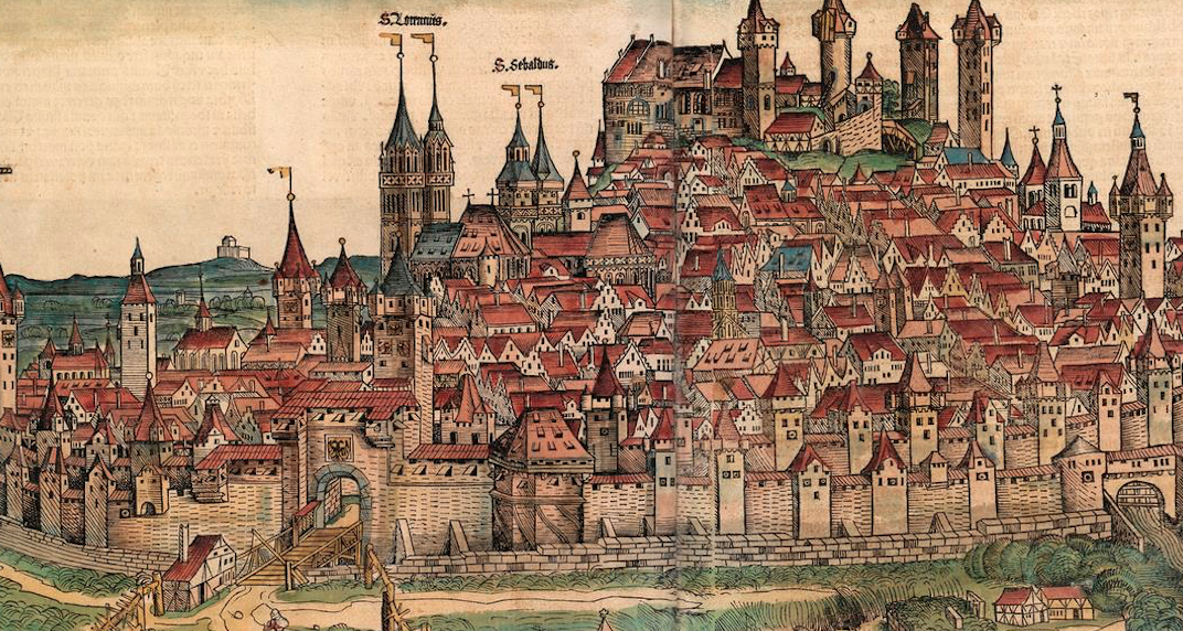
This image of Nuremberg published in 1493 includes numerous cone- and gable-style roofs, several with globe and flag finials:
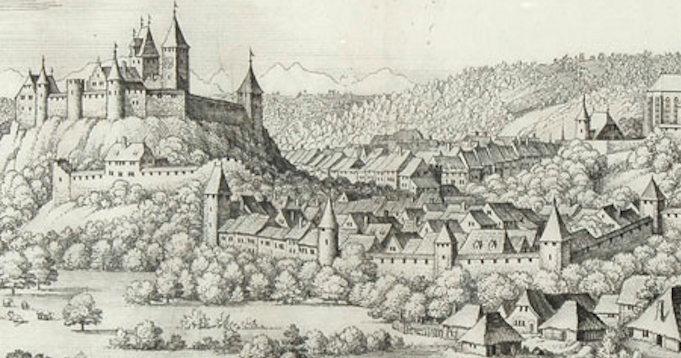
Burgdorf was drawn very similar to Nuremburg, with a variety of gable- and cone-style roofs. Note the tall tower with the saddleback roof is plainly visible even though trees obscure the gate. The buildings on the hill have flag finials (perhaps more than actually existed at the time but which were not uncommon in Switzerland and can also be found in Thun, south of Bern):
The way the portal-style towers and gates are positioned in the VMS, at significant junctions between landmarks and pathways, makes sense in the context of the Middle Ages, a time when there were many walled cities.
Real or Mythical?
But are they real or mythical? Should they be interpreted as actual places?
The “tower in the hole” has always made me wonder if the illustrator were suggesting a link to the underworld. Oceanus was said to swirl around the earth in nine rings (there are nine circular “rosettes”), which hints at the possibility of myth. When Psyche planned to throw herself off a tower after Aphrodite gave her an impossible task, it was the tower that told Psyche how to get to the underworld and back without losing her life. Is the tower-in-a-hole a conduit between this world and the one below?
Summary
As can be seen by some of the examples in this and other blogs, illustrations of far-off places or mythical events were sometimes drawn with local architecture. The illustrators guessed, or simply drew what they knew. This means that the saddleback portals and Ghibelline merlons might not be literal, they could be symbolic, or simply familiar and thus easy to use.
Regardless of why they were chosen, the consistency among them suggests awareness of architectural styles that were common in the region stretching from Bohemia in the east and the Alsace and eastern France in the west, and from Bavaria in the north and Lombardy and the republic of Genoa in the south. If the “rosettes” folio is a map, it might represent this region and it might not, but even if it doesn’t, the illustrator chose elements that betray a specific familiarity with the southern portion of the Holy Roman Empire.
You might notice that the picture to the right has a saddelback portal flanked by two round towers with cone-shaped roofs, similar to the first VMS castle illustrated above. It could easily be a coincidence, but for the record, the image is from a chronicle of the crusades penned in the 1460s (Bibliothèque de Genève Ms. fr. 85).
Deprecated: ucfirst(): Passing null to parameter #1 ($string) of type string is deprecated in /home4/jensonje/public_html/voynichportal/VMSForum/.default on line 256