
I’ve mentioned that the person who wrote the VMS marginalia may have learned to write in the late 14th century or early 15th century. If so, he or she could have lived at the same time as those who illustrated and wrote the VMS, and might even have been involved in the creation of the manuscript in some way.
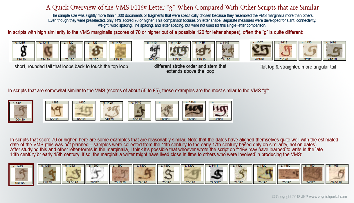
I’ve already posted some of the statistical properties of the marginalia “g” on the voynich.ninja forum. Here is a reprise of the comparison chart:
Samples of the letters “g” and “a” suggest the marginalia writer was familiar with older handwriting (e.g., 14th century), or with more formal book hands, and it appears that the writer may have learned to write in the late 14th or early 15th century. This suspicion is not based on just one set of statistics, however.
The Sample Set
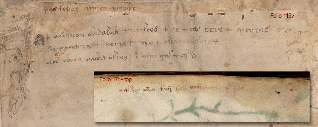
![[Pic VMS abc]](https://voynichportal.com/wp-content/uploads/2018/07/VMSabc.png) To sample the marginalia, I used the text on 116v and 17r because I’m fairly confident it is the same handwriting. I did not use “ven mus mel” because there are too few words to be certain if it’s the same. Many scribes had similar handwriting. In fact, they were encouraged to copy each other so several scribes could work on the same manuscript without awkward transitions.
To sample the marginalia, I used the text on 116v and 17r because I’m fairly confident it is the same handwriting. I did not use “ven mus mel” because there are too few words to be certain if it’s the same. Many scribes had similar handwriting. In fact, they were encouraged to copy each other so several scribes could work on the same manuscript without awkward transitions.
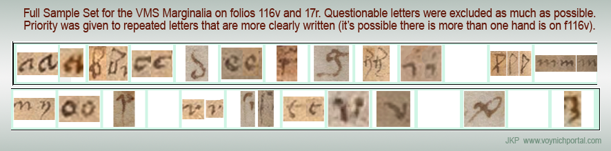
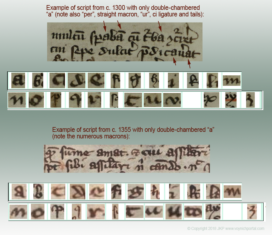
Below is the sample set I use for full comparisons. Note that the “z” is actually an abbreviation symbol, but most scribes wrote it like the letter “z” and sometimes also the number “3”, so I provisionally stored it in the “z” slot.
It’s not clear whether the last letter of “gaf” on the last line is “f” or “s” but since most scribes wrote them the same (except for the crossbar), it probably doesn’t make a big difference. When assigning values to similarity, I gave higher priority to letters that are repeated and clearly written. I consider the “u” and “v” shapes to be lower priority since “u” is not clear and the “v” appears to be in a different style.
Note that “n” has both a descending “tail” and a non-tail form. This is very common. Many scribes wrote n, m, and h both with and without a tail:
 Now here’s an interesting puzzle…
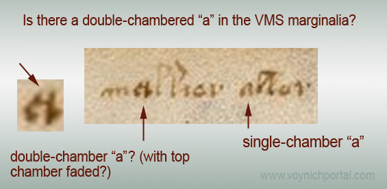
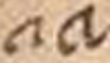
Is the first “a” on f17r a double-chamber “a”, the style that was popular in the 14th century, but less so in the 15th century?
It’s hard to tell, but it looks like it might be, if the top is slightly fuzzed. It was very common for the two-chamber “a” to be taller than other characters nearby:
It’s impractical to post exhaustive statistics or lists of manuscripts that have different styles of the letter “a” in a blog, but to give the flavor of it, here are examples from the 14th century with only the double-chambered “a” (from scripts with some similarity to the marginalia):
In paleography, there are many hybrid scripts (scripts that blend different styles). Paleographers frequently argue about names and classifications (some have devoted whole books to this), but diversity isn’t a bad thing—it can help identify an individual’s writing.
The Significance of the Double-Story “a”
As the single-story “a” became more popular in the 15th century, some scribes mixed both singles and doubles, sometimes even in the same sentence. Here you can see both kinds of “a” in marginalia that was added c. 14th century to an early medieval calendar:
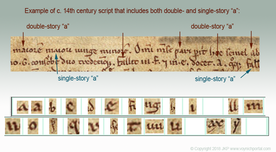
Sometimes the mixing was random, other times, the double-story “a” was used as an uppercase “a” or at the beginnings of words.
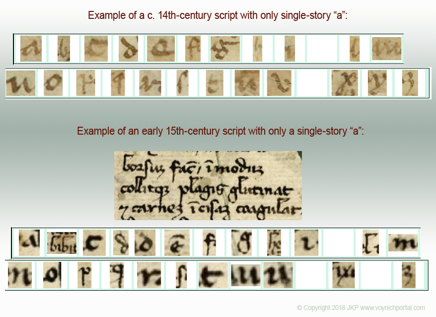
The double-story “a” was retained for a longer time in more formal book hands, but casual hands gradually abandoned it for the single-story “a”. By the late 14th century and early 15th century, many manuscripts included only the single-story “a”:
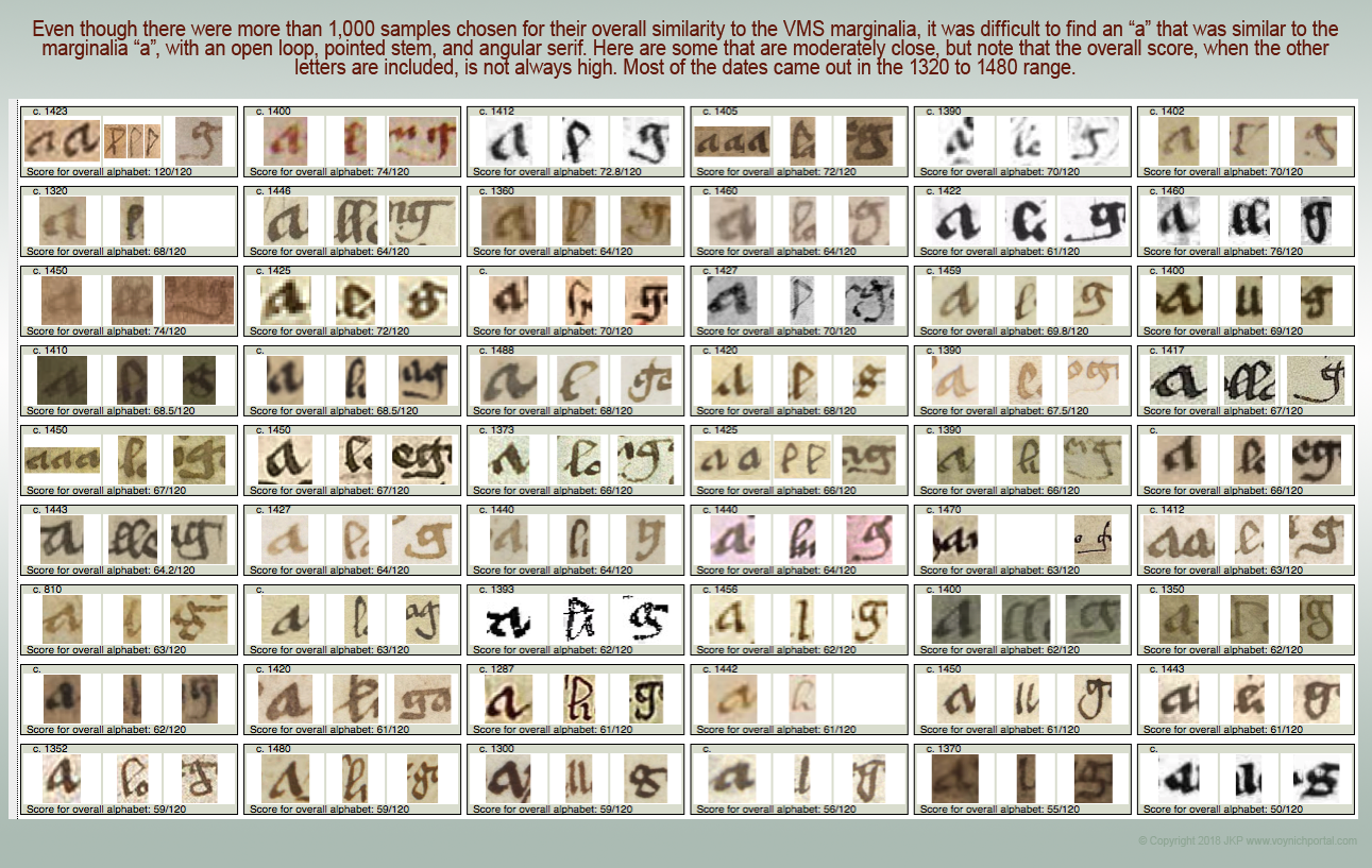
Some Statistical Properties of the Marginalia “a”
As mentioned previously, I set up a mathematical system to compare letters more objectively. A perfect match on higher-priority letters would be 120 (with slant, weight, connectivity, spacing, etc., assessed separately). After 10 years, 5 months, and 5 days of searching for a close match, I still find it quite difficult to locate scripts higher than 75, so a bit of luck will probably be necessary to do better.
It surprised me that a medieval “a” could be so varied. Out of a sample of more than 1,000 manuscripts specifically chosen for their similarity to the VMS marginalia, only 20% scored 4 or higher (out of 6) for letter-forms.
 Note that the stem is fairly vertical, and the loop doesn’t quite close on the bottom. There is a small point at the top of the stem and the serif turns up at a fairly sharp angle.
Finding all these characteristics together is a challenge, but here are some of the better matches. Note that the overall score (listed under the letter) isn’t always high. In other words, even if the “a” was fairly close to the VMS script, sometimes other letters were not:
If the letter on 17r is a double-story “a”, then it has some physical and statistical commonalities with the single-story “a”. The stem is fairly upright and the bottom loop is not quite closed. Note that the bottom loop is larger than the top one (some scribes did it the other way around).
Here are some examples from handwriting that is fairly similar to the VMS (note that only one “a” is significantly similar to the VMS “a” in shape, proportions, and slant, and it lacks the sharp serif):
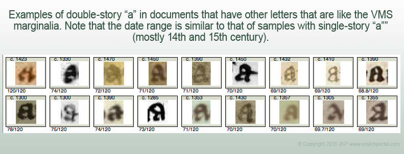
When the double-story “a” is substituted, the statistics for overall similarity come out very much like the previous search, as did the date range of most of the samples. In other words, scribes with handwriting similar to the VMS writer used either or both forms of “a” around the same time period as they wrote letter-forms similar to the VMS.
Summary
The greater popularity of the double-story “a” in the 14th century might suggest a date earlier rather than later in the 15th century, although there are a few areas where the double-story “a” was still common until the end of the 15th century. Some parts of eastern Europe, and many of the smaller more remote towns, lagged behind large urban areas in terms of the evolution of script. It does seem very likely, however, based on the paleographic evidence, that the marginalia was added after 1330 and before 1490. It’s not as precise as radio-carbon dating, but it does help when research from various disciplines tends to confirm rather than deny the existing data.
I have much more information on this topic, but will cover it in separate blogs, and I will leave it up to the reader to decide whether the letter on folio 17r is a double-story “a”.
J.K. Petersen
© Copyright 2018 J.K. Petersen, All Rights Reserved
I’d have never thought of explaining it as a two story a, but now you say it I can see how it’s possible. I can’t tell whether there is really a faint line on top or just a trick of the surface.
There’s a relatively large gap in the bottom. I wonder if this glyph could be some ligature?
I really can’t tell if it’s a faint line either. Parchment is bumpy stuff and the writing is small, so it’s possible the surface might impede the ink, plus some of the text on the right has been erased, so maybe this was indirectly affected.
There is a fairly big gap at the bottom, but those on f116v also have a fairly distinctive gap on the single-story “a”. Also, the one that might be a double-story “a” and a couple of the single-story “a” on 116v have a sharp serif on the bottom-right. The writing isn’t very consistent, however, so it’s hard to know what was intended.
Even though I’m leaning toward it being a double-story “a”, it’s on my list of things I’m not sure about.
I think there’s another of these double story a’s on the last page and again on the dead washerwoman page. I actually thought that double story was being used to distinguish it from Voynich a. And a question: could the double story a have been much more popular after the 15th century with standardization from the printing press?
Great work!
The double-story “a” was the common form before the 15th century, so it is frequently an indicator of older handwriting rather than newer. Toward the end of the 14th century, some scribes were using both styles (this also occurred in some places in the early medieval period). By the 15th century, the double-story “a” was disappearing, although it was still used sporadically. By the 16th century, very few scribes were still using it.
It did survive in typesetting, however, as you mentioned, and still does, but most writers preferred the single-story “a” for handwriting texts.