
1 March 2020
In April 2019, I posted a blog about double-cee shapes in the VMS text. This convention of combining two cees to create a different letter has a very long history but is not the custom in modern scripts. In medieval scripts, the tightly-coupled double-cee has a different meaning from two cee shapes slightly separated. Most of the time, the tightly-coupled cee represents a vowel. To identify which vowel, you have to look at position, as well. But first let’s look at the origins of some of these shapes…
Ancient Origins
To understand double-c and the Nota symbol, you need some familiarity with Greek and how it influenced Latin scribal conventions.
The Greek alphabet is found in handwritten Latin manuscripts up to about the 16th century, and was sometimes used in annotations in early medieval texts.
Here are a couple of examples from Latin manuscripts:
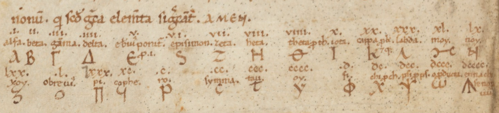
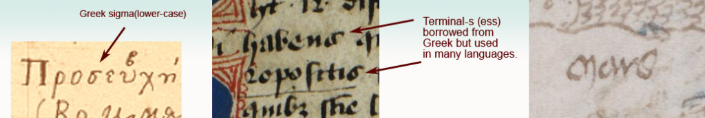
Some of the Greek shapes and scribal conventions were adapted by Latin scribes. For example, certain ligatures and letter-shapes such as the N in Nota were common. The lowercase form of sigma (sometimes called symma or summa) and variants similar to sigma evolved into a broadly used form of final-ess that has some relevance to the VMS.
Final-Ess
Medieval scribes used initial, medial, and final forms for certain letters. Some used the same initial and medial forms, but reserved other shapes for the final form. These distinctions still exist in Middle Eastern scripts, but have disappeared from most western alphabets:
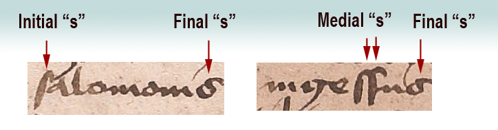
Here long-ess is used for initial and medial forms, whereas the shape loosely resembling Greek sigma is reserved for ess in the final position.
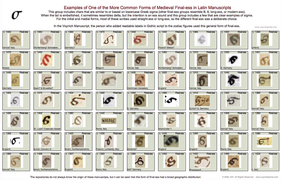
Not all scribes used the same shape for final-ess. There are several basic groups (long-ess/straight-ess, B-shape, 8-shape, sigma, and modern-ess). I will post examples of each in a future blog because the 8-shape relates to f116v.
The following set represents one of the common groups of final-ess relevant to Voynich studies because the month labels added to the VMS “zodiac figures” use this general form:
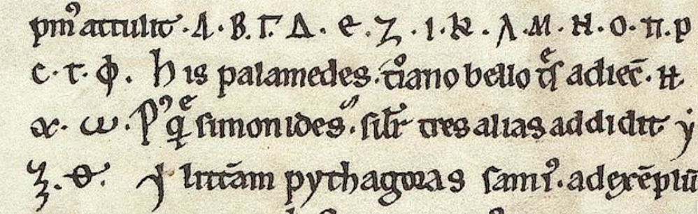
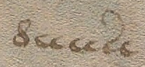
Here are examples of the sigma shape from a Greek manuscript, a Latin manuscript, and the “Mars” (March) label under the fish in the VMS:
Latin Vowels (and the occasional consonant) Written with Double-Cee
Another letter with Greek shape-mates (although not always the same meaning) is the double-cee. This is a loose term describing a group of symbols in Latin manuscripts. Why is it a loose term? Because some scribes wrote a tightly coupled “oc” rather than “cc”, but most of the time you’ll see “cc”.
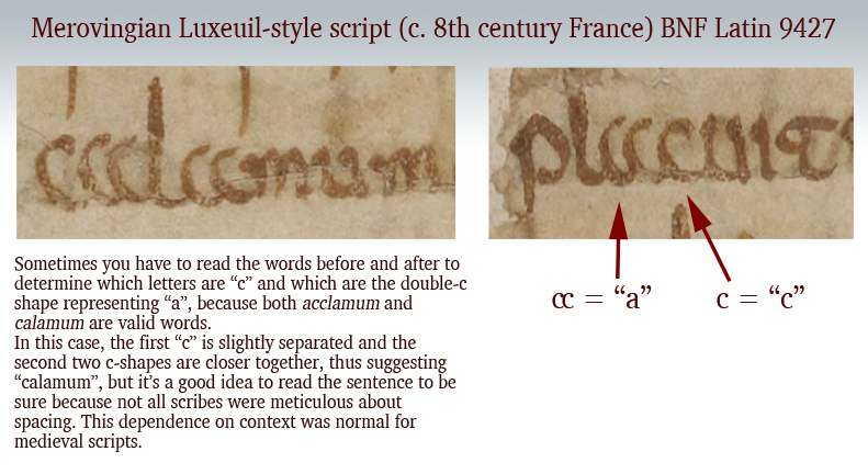
In the early medieval period, there was very little distinction between a “t” and a “c” and they can be hard to tell apart. But, it depends on which script you are reading. Sometimes the “t” is distinguished from “c” by being doubled, so it looks like “cc”. The letter “a” was sometimes written this way as well, which can be even more confusing to those who haven’t learned medieval languages because you can only figure it out by reading the whole sentence.
Here are some examples that explain how to distinguish double-t, double-c and two cees in a row, but note that some are ambiguous unless you can see the words before and after:
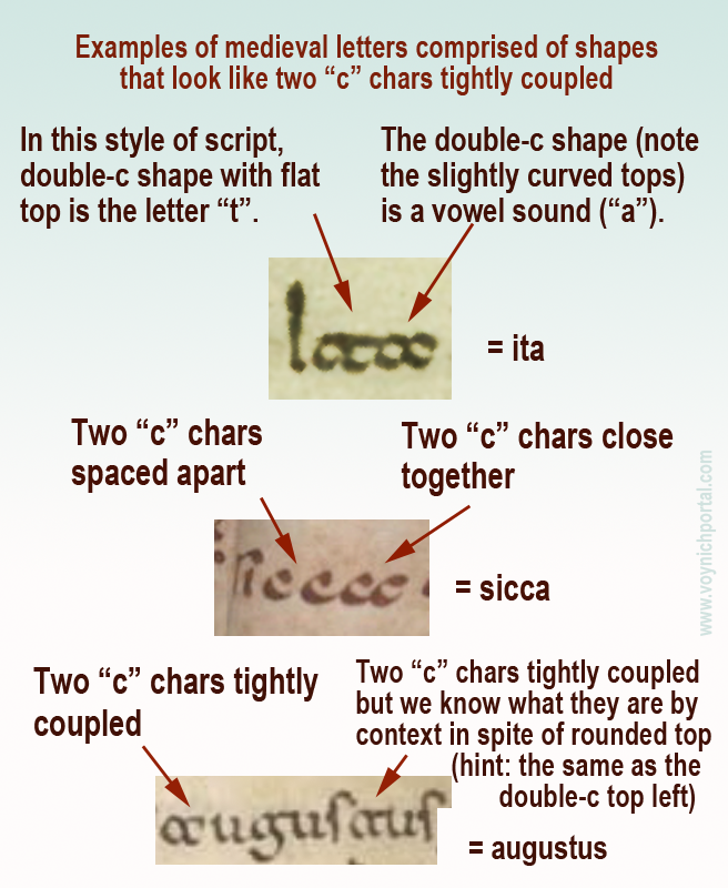
Note especially the second example (sicca) which includes both c + c and a tightly-coupled double-cee representing the letter “a”.
These loosely and tightly coupled cee shapes are also present in the Voynich Manuscript, but transcripts generally ignore the distinction (see my previous blog) and it is not yet known if it is a meaningful distinction. Now let’s look at another letter with similar characteristics…
Double-cee as “oo” “wa” or “u”
The medieval concept of “u” was not the same as we know it. In English, we make a distinction between “u” and “v” sounds and shapes. In medieval Latin, the “u” and “v” shapes were interchangeable in most languages using Latin characters and the sound was closer to a breathy w’ than an English “u” (and was not like our “v”). It was sometimes written as a superscripted double-cee shape next to the letter “q”.
Remember that Latin characters were used to write many languages, so it’s unwise to generalize too much, and difficult to describe a sound in any given language from 600 years ago. It’s better to think of the double-cee shape as a vowel (except when it was “t”) rather than as a specific letter.
Double-cee can represent “a” but it can also represent “u” (in the same manuscript), as well as indicating an ordinal, which means it is sometimes closer to a symbol than a specific letter. Once you understand the context, you can work out which letter it represents. In medieval script, context was king and many symbols had dual or triple meanings.
Greek Nu or “Noy”
Another Latin letter that is similar to Greek is the letter N.
We know it with an angular crossbar, as in the example to the right, but it was sometimes written with a straight crossbar (see below). In modern English, this form looks more like H than N. Sometimes the crossbar was at the top of the ascenders (somewhat like VMS EVA-k). Other times the crossbar was in the middle (similar to English H).
The crossbar could be single, or double, like a gate. Here are examples using a popular medieval symbol for pointing out interesting passages, the NOTA symbol. It was frequently stacked or intertwined like a monogram. Usually all four letters are present, although occasionally it is abbreviated NT:
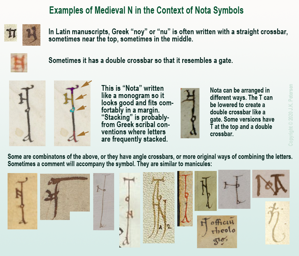
Clearly there was some creative freedom to arrange the letters and yet the meaning is quite clear. The N will sometimes be combined with a B to create Nota Bene (note well).
Nota with Double-C
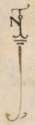
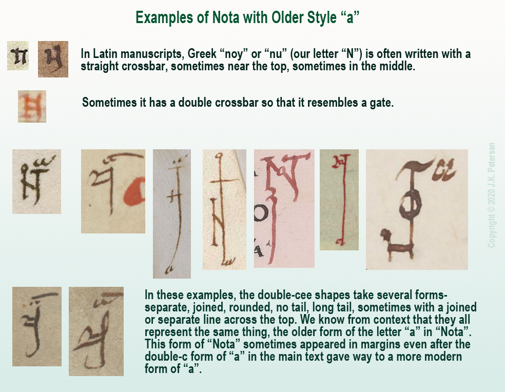
There is another form of Nota that uses more traditional forms.
Remember the “a” written as double-c mentioned above? Sometimes NOTA was written with the earlier form of “a” rather than the late-medieval “a”, as in these examples:
A Less Obvious Example
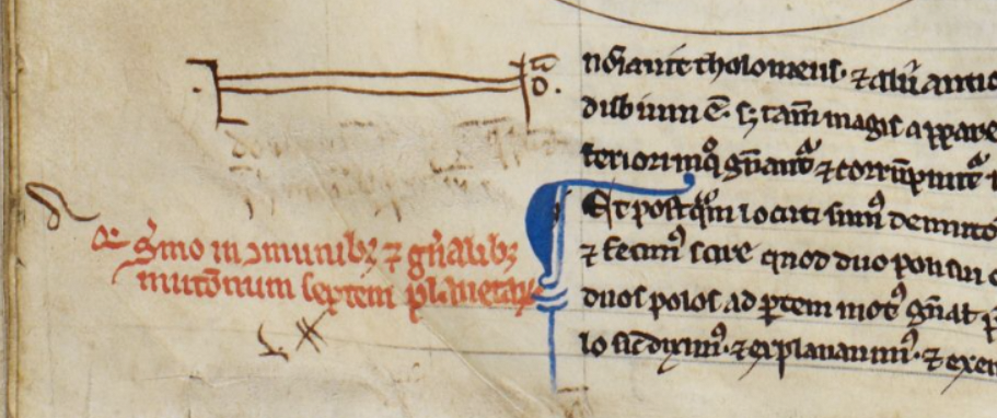
That should be enough background to help the reader interpret the more stylized symbol found in a 13th/14th-century scientific compilation.
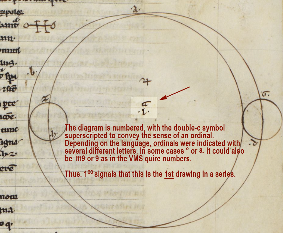
BL Harley MS 1 includes treatises on astronomy/astrology and mathematics, and the first section is attributed to Abu Ishaq al-Bitruji al-Ishbili. In it there is a series of geometric drawings, and below the third second drawing we find a symbol in the left margin…
It is essentially the same as the old-style double-c “a” Nota symbols in the above examples, except the gate-style N has been stretched more than usual to encompass the comment directly below (which has since been erased). On the right side of the “gate” there is a tick for the T, an “o” and, above it, the double-cee symbol representing “a”.
More Uses for Double-Cee
In Harley MS 1, the symbol that resembles double-c is used in other ways, as well. It can be found in each of the geometric diagrams.
Here the double-cee symbol superscripted next to the number 1 introduces this as a series of drawings. You can think of it as an ordinal symbol and this diagram as the http://iowacomicbookclub.com/wp-content/31cx4.php 1st:
As would be expected, the diagrams that follow are numbered in sequence as follows:
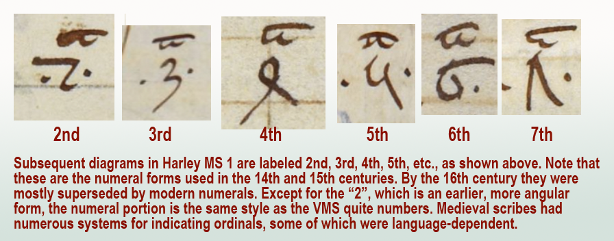
In a series of ordinals, sometimes the same symbol is used for all of them. Other times, the ordinals are individualized for each number, as in English (1st, 2nd, 3rd, etc.).
Here is an example showing the individualized ordinals of the VMS quire numbers compared to a set that uses only “m”:
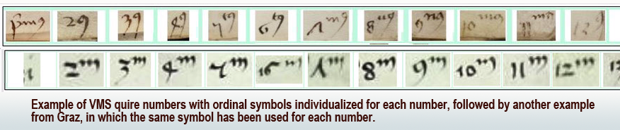
Other common ordinal symbols are ° and superscripted-a.
This aspect of the VMS is, in a sense, a gift. If this ordinal system can be identified in other manuscripts, it might provide some clues to the early life of the VMS. Unfortunately, quire numbers are very difficult to find. I’ve been searching since 2008 and only have a handful of examples. They are usually trimmed off or bound inside the signatures where they can’t be seen. When I have time, I’ll post the ones I have so far.
Summary
The double-cee shape was disappearing by the 14th century and by the 15th century, the Nota symbol was often replaced by a manicule. By the 16th century, final-ess was beginning to disappear, as well, which means Greek influences were gradually replaced by early modern forms.
Even so, it helps to know these earlier conventions because there are aspects of the VMS that hint at some of these characteristics. Plus there are glyphs in the main text that may have been influenced by early-medieval conventions.
Also… there is a possibility that the separate cee shapes and tightly-coupled cee shapes in the VMS are not the same, which might partly explain why there are sometimes four in a row. If cee-gap-cee and double-cee are different, it might add some variety to the oddly monotonic script.
J.K. Petersen
© Copyright March 2020, J.K. Petersen, All Rights Reserved
JKP,
I rather think the cc in the Harley Ms. is a u, primum, secundum, tertium and so on, like the quire numbers in Beinecke 408
Yes, thanks for your comment.
I agree that cc as ordinal-“u” is a possibility, since cc was used for multiple purposes based on context.
The clip I posted in the ‘Double-cee as “oo”…’ section is small (sorry I didn’t have a bigger one), but it includes an example of qcci to create “qui” (along with other “u” words).
The “c”-s in Harley MS 1 are not c’s, and I think that this is what Helmut was trying to say.
These symbols are the letter “u” with a macron above, meaning -um.
Also, in the Beneventan script, the symbols representing “a” and “t” look as if they are composed of “c” characters. This script was used in a limited geographical region, for a limited period of time. I won’t claim to know the details, but this certainly predates the time that the Voynich MS was written by centuries, and is not likely to be relevant.
Rene, I did not say they were cees. Not once. I said it was a SYMBOL shaped like double-cee that stands variously for “a”, “u”, and sometimes ordinals.
Double-c or “cc” is the name for this symbol in palaeography books. The term is used by Sir Edward Thompson, Eric Ramírez-Weaver, Bernhard Bischoff, and many other palaeographers.
I’ll find an example… back in a moment…
Okay, here is one from the U.K. archives that I hadn’t seen until now, but it is the same symbol I posted in my examples and they refer to it as “cc” (double-c). In the example, they illustrate how the double-c symbol stands for “ua” (the missing letters between q and m to create q[ua]m):
https://www.nationalarchives.gov.uk/latinpalaeography/abbreviations-lesson3.htm
I appreciate your comment, but what I posted is correct and I understood Helmut. In this instance, he is suggesting the double-c symbol can be interpreted as “u”. Since “u” is one of the common interpretations of the “cc” symbol and also fits endings on ordinals, I think Helmut’s suggestion is completely reasonable.
.
What might be confusing is the palaeography jargon. They call it “cc” (double-c) regardless of whether it is written like cc, oc, or uu and it doesn’t matter whether there is a bar across the top or not. As you can see by the NOTA examples above, some have bars and some don’t, but they all stand for “a”.
Rene: “Also, in the Beneventan script, the symbols representing “a” and “t” look as if they are composed of “c” characters. This script was used in a limited geographical region, for a limited period of time. I won’t claim to know the details, but this certainly predates the time that the Voynich MS was written by centuries, and is not likely to be relevant.”
I felt it was important to include history about “a” and “t” so readers could see where the concept of double-c originated and also because scribes often worked from older manuscripts when they were making contemporary copies, and thus were aware of some of the older letter forms. The shape wasn’t limited to southern Italy or the 9th/10th centuries:
• Some of the broader, more airy forms of double-c (sometimes called “open a”) are found in Merovingian scripts.
• Some of the Anglo-Caroline scripts include the double-c form of “a” (Stokes, 2014).
• Arundel 234 (late 12th century) includes Beneventan script.
• Benevantan script was still used in Dalmatia in the 13th century (Rozana Vojvoda, 2011).
Plus, the double-c shape wasn’t just used for the letter “t” or “a” in the main text of manuscripts. As shown in my examples, it was also used in symbols, such as the NOTA symbol, which was popular in a wider geographical region and for a longer period of time than the original Beneventan or Merovingian scripts.
• There are numerous double-c NOTA symbols in BNF Latin 12132, which was copied in Reims, France, and this form continued to be used in various parts of Europe until about the 14th century.
Harley MS 1, which is included in my illustrations, uses double-c as well. It was copied in England in the 13th and 14th centuries and the scribe used double-c in two different ways, apparently grasping its symbolic nature. Many scribes were aware of the double-c symbol. So were later-medieval university professors and students who were studying early-medieval manuscripts and adding NOTA symbols to the margins.
.
Postscript 11 March 2020: Rene, I found another example of the double-c symbol used as an ordinal that illustrates it was still in use in the late 15th century. Here is a small banner in BL Add 10302 for “2nd chapter” (the other chapter headings are done the same way):
I just discovered this comment on D.N. O’Donovan’s blog site:
“D.N. O’Donovan
March 8, 2020 at 10:07 pm
JKPetersen’s latest post includes pictures of more ‘nota’ signs. Worth a look, but as usual lacking any details that allow readers to verify his sources and precedents and define what is, and isn’t original. Still – worth a look.”
If O’Donovan wanted sources to all the NOTA symbols, all she had to do was ask rather than running me down for not burdening the blog with details that I honestly didn’t think would interest Voynich researchers.
I posted this blog because she asked about the double-c and “gate” symbols in Harley MS 1 on Nick Pelling’s ciphermysteries site. I tried to answer on Pelling’s site, but it became clear that illustrations would be better for those without a palaeography background. I don’t get paid for this, it was done out of kindness and courtesy. No one else offered help when she asked, and she said her colleagues were unable to help either. It took me almost 3 hours to comb my files for the clearest examples, to organize them with labels and explanations, and to write it up, so this is a surprisingly backhanded (ungrateful) response.
As for originality, I did not take the NOTA or ordinal examples from palaeography sites or books, I found them myself, over a period of years, in online e-manuscripts. They are the result of my own research.