9 Jan 2016
Delving into the Details
I am constantly asking myself what can I learn about a person who lived almost 600 years ago when all that remains are enigmatic pictures and about 200 pages of inscrutable text—text that has resisted the efforts of thousands (perhaps tens of thousands) of eager amateur and professional code-breakers.
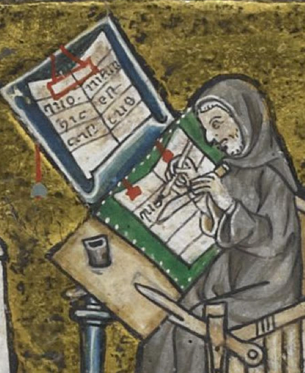
It probably took a long time to create the VMS—hundreds of drawings, a couple of hundred pages of text. Writing and drawing with a quill takes considerable effort—something a generation of keyboarders might not fully appreciate.
 There were no ballpoint pens in the 15th century. Ink was hand-mixed from iron particles, vinegar, and oak galls, and getting the right consistency was important. To create the pen, someone had to pluck the feathers of a goose (preferably one that’s been given last rites—live geese will bite your knees off).
Even if you braved muddy streets crawling with rats and bought the ink and quills premade from a local craftsman, you had to trim your quill with a knife every few pages as the end of the nib wore away. If the angle or width of the nib changed, the text would be inconsistent. If you didn’t scrape enough ink off the nib right after dipping, the ink would drip or blob on the page. If you waited too long to redip, the ink would run out, the text would be too light and a few letters would have to be overdrawn without smearing.
Unlike a fountain pen, which provides a smooth flow of ink, the medieval scribe had to control the flow of ink using rhythmic movements of hand and wrist—a process similar to coaxing good sound out of a musical instrument.
Given the labor involved, writing nonsense-text would take almost as long as writing meaningful text.
What Penmanship Says about the Penman
15th c Lombardy calligraphy
Looking at the physical balance of the VM letters and lines, one would have to call it handwriting rather than calligraphy. The VM scribe was not an expert penman. As I mentioned in a previous post, the angle of the pen is not optimal for enhancing the aesthetic qualities of the pen strokes and the VM letter forms are not consistent enough to qualify for professional penmanship in an age when jaw-droppingly beautiful illuminated manuscripts were crafted by expert scribes.
Similarly, the “second script” on the last page of the VM (which may be in a different hand) lacks the artful shapes and consistency of high-quality penmanship.
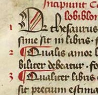
 Even if it’s not up to calligraphic standards, the handwriting in the VM is careful, measured, and clear. In this respect, and in the fairly broad spacing, the VM script is more like 13th century Carolingian than Gothic cursive. That’s not to say it resembles Carolingian style (other than the broad spacing), but it is more readable than many medieval documents of the 15th century that were penned by amateur scribes—a detail that may say something about the personality of the author.
Discerning the Devil in the Details
This article doesn’t focus in depth on the writing style of the VM—I’ll do that in a separate post (there’s plenty to say about the spacing, size of the letters and how they are written). Instead I’d like to get to something more crucial—a clue that reveals that the VM author had a working knowledge of Latin scribal conventions that suggests classical training.
The Structure of the Text
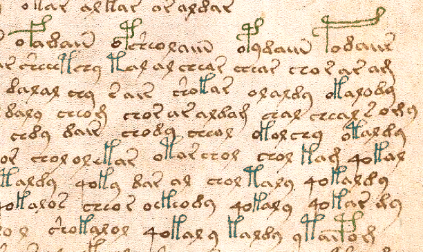
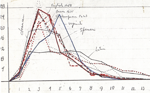
 There have been a number of computational attacks on the Voynich—attempts to discern its structure through computer analysis. Some of these are quite interesting (and probably worthwhile), others are based on faulty premises, but at least they yielded some funky graphs.
I’m in favor of computational attacks—they further our understanding of computer analysis, even if nothing else. I’m also in favor of computational attacks on the VM, even though many are based on the assumption that there’s a one-to-one correlation between VM glyphs and actual letters/sounds which, in my opinion, is a very shaky assumption.
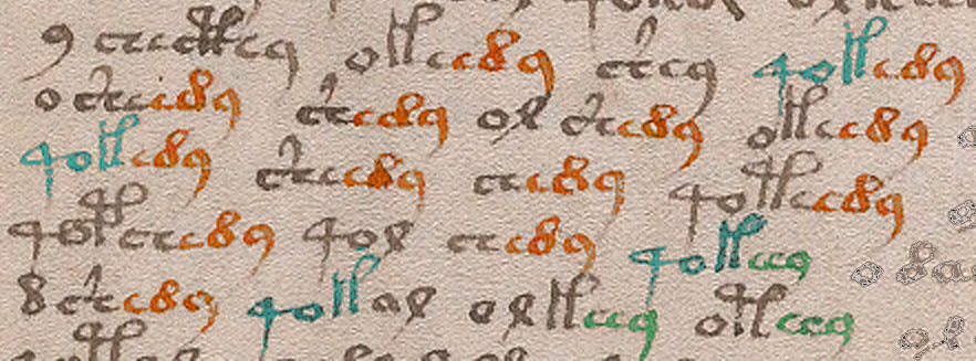
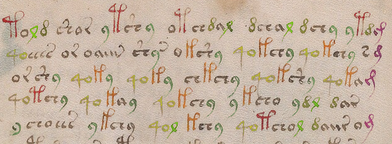
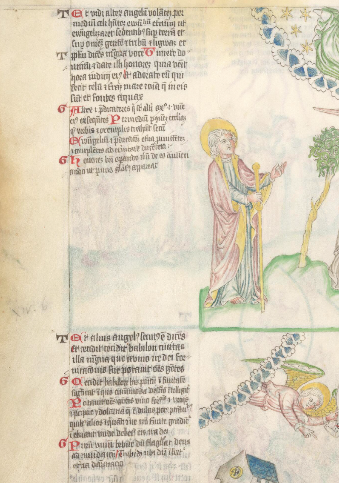
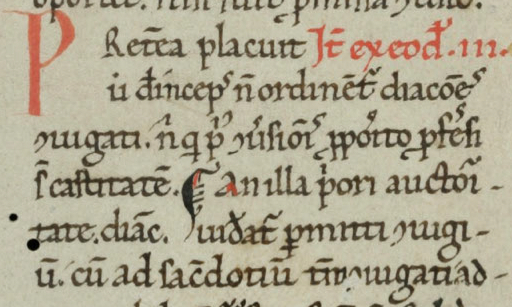
One important detail about the VM text that I mentioned in my July 2013 zodiac post, and which I’d like to elaborate further, is the use of Latin abbreviations. The entire text incorporates writing conventions that were common in the 15th century, including the abbreviations in the zodiac labels written by another hand next to each animal.
Latin Conventions
Latin scribal abbreviations are shapes that stand in for letters. Some are used within words, some at the beginnings and ends of words. I’m not going to give a full tutorial on Latin sigla, since many of the conventions are outside the scope of the VM, but I’ll mention ones that are directly relevant.
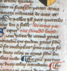
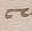
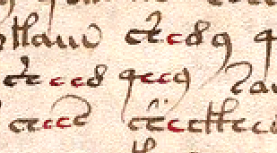
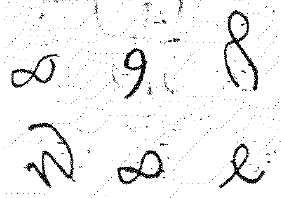
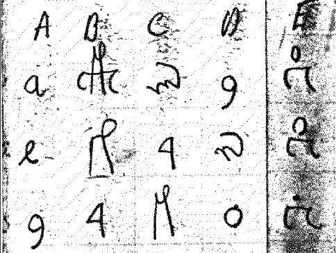
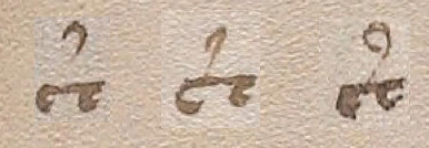
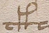
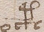
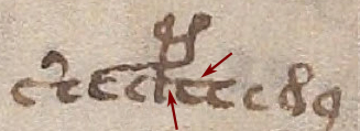
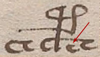
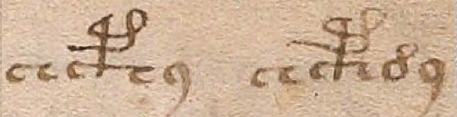
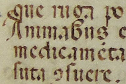
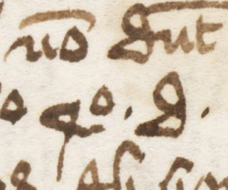
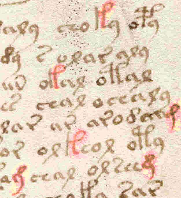
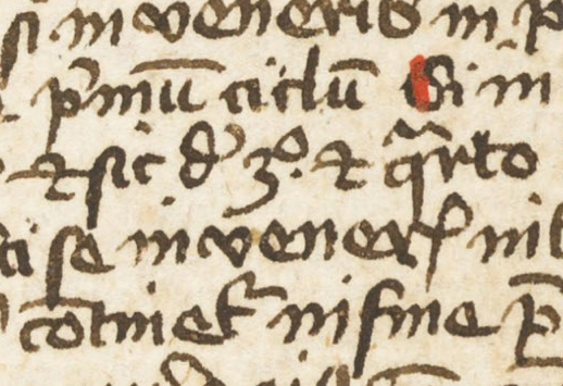
 The “9” abbreviation. The shape that resembles the number nine is used at the beginnings and ends of words. At the beginning, it typically stands for con– or com-. At the end, it is usually –cum or –cun but can also mean –us or –os or occasionally -is (particularly if it is superscripted). The 9 as a suffix is common to many manuscripts. The 9 is used as a prefix as well, but less often.
In the Voynich manuscript, the 9 is contextually similar to Latin and Germanic texts—it shows up frequently at the ends of “words” and occasionally at the beginning. If one hunts through the VM, one can find exceptions where it appears midtext, but that can happen in Latin, as well, and usually stands for -er or r.
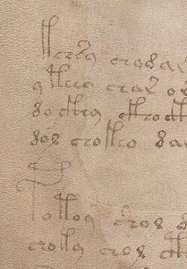
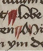
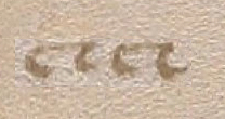
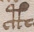
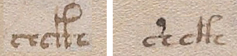
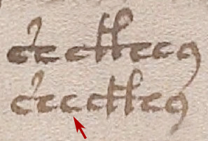
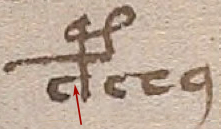
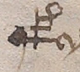
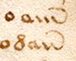
 c/e with a tail. A shape that looks like a c or e with a tail has meaning similar to the suffix 9 (con, cum) except that the shape usually stands alone rather than being attached at the beginning or end. In the VM, it’s sometimes difficult to tell from the spacing whether a character is intended to be read by itself or is associated with nearby glyphs. In the VM example to the right, the spacing is similar to the 14th century Latin document above it, but the distinction between this character and others is not always so clear.
It perplexes me when I see “decodings” from Voynich researchers who rigidly assume a one-to-one relationship between character glyphs and their underlying meaning (assuming there is an underlying meaning). Even if you put aside the possibility of 1) ligatures, 2) medieval abbreviations, and 3) null characters, you still should not assume one VM glyph equals one letter. It could be one, two, three, or more. If it were a one-to-one substitution code (also known as a Caesar code), the mystery would surely have been solved centuries ago.
Other Numbers
 The number 9 is not the only number used in Latin manuscripts. The numbers 2 and 4 have significance as well (as does the number 3, but it’s not found in the VM and won’t be discussed in this post).
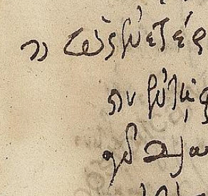
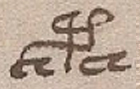
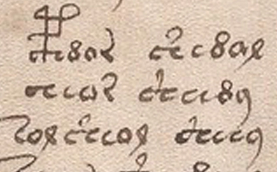
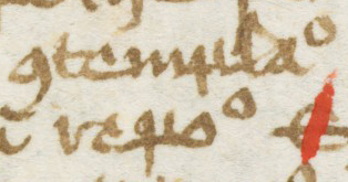
The 4 on the left is paired with a superscripted o in a 14th century Latin manuscript. Voynich fans might recognize the similarity to the Voynich 4o. The context is a little different, however. In Latin documents, 4o usually stands alone, while in the VM, it’s typically at the beginnings of glyph groups—it doesn’t follow Latin positioning conventions as closely as the number 9.
In Latin, the 2 is contextually similar to suffix 9—usually at the end of the word, often superscripted, and typically means -ur. A character that resembles a 7 is also commonly used to denote et or e (and is the basis of the abbreviation etc. which started life as a ligature between the 7 shape and a c). Less often it stands for –us or –que. The 7 shape does not appear to be represented in the VMS.
The Curling Tails
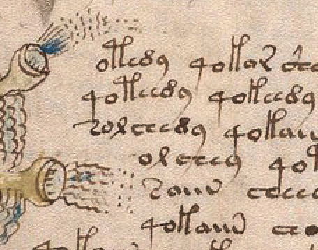
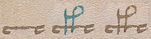
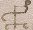
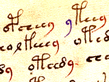
 The tails of some of the VM characters swoop up and over the letter, and do so in a consistent way. In the 15th century this wasn’t a mere embellishment, the tail carried meaning. In Latin and Germanic text, the curved tail usually represented m or sometimes n. If it’s midtext, it appears as a line above the letters. At the end, it’s easier to swoop back the tail rather than lifting the pen.
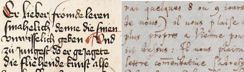
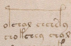
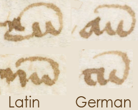 In Latin documents, the swooped-up tails often follow the letter u to create –um. In Germanic texts, they often follow ai to form ain (an old form of ein). Many of the German scribes also wrote in Latin and retained some of these conventions when writing in their native tongue, as illustrated in the two examples on the right.
The Caps
In September 2014, Stephen Bax asked me the meaning of the curved caps that appear over some of the VM glyphs. I’m sure many people are wondering the same thing.
 I didn’t answer right away, because the question can’t be answered in a few sentences. It depends on context. In fact, a blog post can only scratch the surface of VM conventions.
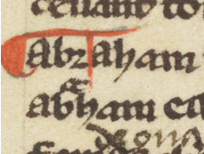
In Latin, the cap has a variety of shapes. Sometimes a different shape has a different meaning and sometimes different shapes have the same meaning (but vary stylistically based on individual hands).
 In most cases a closed cap (an “o” shape) represents something different from an open cap. This is also true of German script, in which the open cap usually symbolizes –er- (or sometimes an old-style umlaut) and the closed cap the sound “oo” (and is placed over a u the same way as an umlaut in modern text). I’m not going to go into details on the cap in this post, because it needs a full post of its own and I want to concentrate on another shape that may be more important.
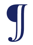
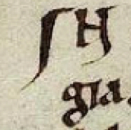
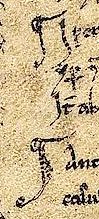
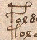
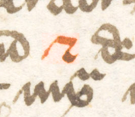
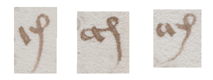
The “J” Character
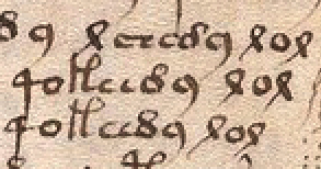
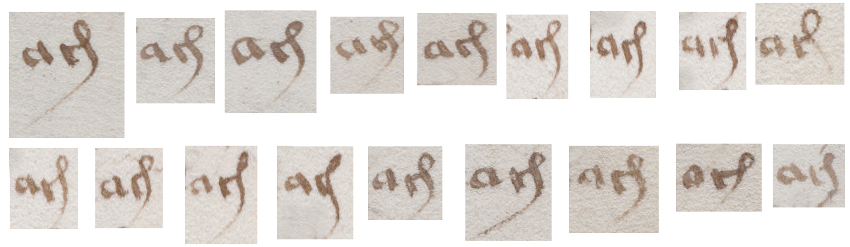
 One of the less common characters in the VM alphabet is the J-like character found at the ends of words. In Latin, this is easily recognized as the suffix –cis, –ris, or –tis and sometimes is used as –is when attached to a different beginning stroke. Note how the connection between the beginning stroke is sometimes blunt and sometimes rounded (the Eva font acknowledges this difference but neglects the third variation). That’s how it’s done in Latin, as well. I’ve seen some pretty odd proposals for what the VM J-shape represents but the shape (if not its meaning) is standard medieval Latin script.
All three suffixes can be found throughout the VMS and it’s possible that the one-loop gallows character may be an example, as well. Picture it as a ligature comprising a letter and the abbreviation –is. I’m not proposing this as a theory, just encouraging people to remain open to possibilities. In Latin, the shape of an abbreviation may change depending on its position in a word.
Putting aside the gallows character for now, the VM J character is almost always at the end of glyph-groups, but there are exceptions (you can find some on Folio 58r). Occasionally, two can be found combined, but even this is not particularly exceptional, since it’s possible that valid syllable combinations analogous to –ristis exist in whatever language underlies the VMS.
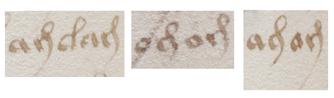
The Funny “r” Character
 This brings us to one of the shapes that might be overlooked due to its resemblance to contemporary alphabets. Since there are several VM glyphs that look familiar to western European characters, like the a and the o, it might be easy to perceive this as an embellished r. In fact the Eva font maps it as a lower-case “r”. I’ve also seen people refer to it as a question mark, but that loop is definitely a tail, not the primary stroke of the letter.
There’s a Latin abbreviation similar to this that represents -ter. It’s a combination of a “t” (which often looks like a “c” in old manuscripts) with a curled tail, representing er. It looks like the VM “r”, but the stem is usually upright. Which brings us to an important detail I haven’t seen mentioned anywhere else…
Have you ever asked yourself why this funny character that somewhat resembles an “r” leans backward when all the other “stem” characters (with the possible exception of a character that resembles an “i”) are straight up and down? Maybe not. Just as you may not have considered a possible relationship between the suffix-J character and the loop on the gallows character.
Context is everything when interpreting a 600-year-old document.
I’ll explain why I think the lean in the “r” is important and why it helps confirm the idea that the VM scribe was familiar with classical Latin conventions. I’m proposing that it may be based on another Latin abbreviation that is usually found by itself, between words, although sometimes in other positions.
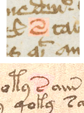
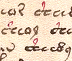
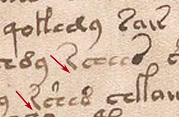
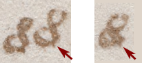
 The letter that resembles a 2 in Latin manuscripts usually stands by itself, between words, but it can also be found in the end position (usually as a superscript).
Now use your imagination and picture this character rotated 60 degrees clockwise. Then you get a character that not only resembles the “r” with a tail but which appears in the VM by itself, between words, and sometimes at the ends of words. Even when it appears to be part of another word, the space between it and that word is sometimes greater than the distance between individual letters, which makes you wonder if it’s intended to stand alone or form part of the nearby group. In other words, the context of the VM “r” is similar to the way the “2” is used in Latin even if the shape, in this example, is not in the same orientation.
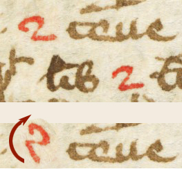
 You don’t always have to rotate the character to recognize it. Here’s the same abbreviation in a different Latin document (14th c) in more angular handwriting. If you imagine the tail more smoothly curved, it resembles the VM glyph’s orientation without rotating it. One can also find examples where the tail (the backward swoosh) is more curved.
In the subscripted suffix position, the “2” or “r” (which sometimes looks like a leaning S) may represent –ur or –er. When it’s written as a suffix in-line with previous characters, it usually represents –re or –ri or sometimes –er, but this form would normally have an upright stem. In Latin, it’s less common to see it midword, but when it is, it can mean almost anything (and sometimes represents as many as five letters).
Darn Those Details
 Learning medieval abbreviations is not as easy as looking at a chart. Some symbols are fairly consistent (mainly the suffixes) but many can only be interpreted in relation to the letters around them, which means you have to know the underlying language to understand whether the symbol stands for one character or many and to determine which ones they are.
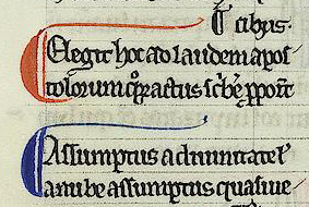
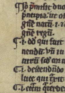
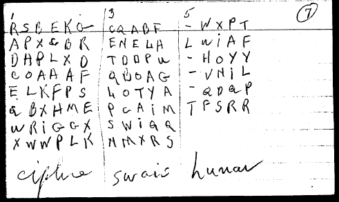
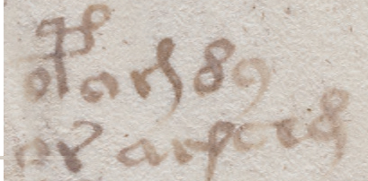
The example above-right (from a 12th century Italian manuscript) is a relatively small snippet and yet is packed with Latin abbreviations, including pro-, der-, -us, -os, n, m, -er, -uo, -s-, con-, prae- and others.
Just when you think you’re getting the hang of it, another snafu comes along and you discover a symbol you thought you understood has other functions, as well. Like the J character that stands for -cis, -ris, or -tis… it sometimes doesn’t stand for characters in the preceding word at all. Sometimes it’s a paragraph-end marker.
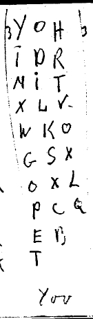
 Knowing the language is especially important for interpreting 15th-century manuscripts like the one on the right from the mid-1400s because writing was taught to a larger segment of the population and was no longer the exclusive domain of those chosen for their literacy and handwriting skills. Later documents are often not as tidy as 12th and 13th century hands, and superscripted symbols were not always written directly over the position where the letters are missing.
Implications for the Voynich Manuscript
I’m confident that the VM scribe knew Latin conventions beyond simply copying the shapes. Many of them are contextually applied in the same way one would see them in medieval Latin and German manuscripts. Whether there’s any Latin in the VMS is a completely different subject. I have my own ideas about whether the VM author used Latin conventions to represent single letters, groups of letters, or… as a smoke-screen to hide the underlying contents of the manuscript by crafting the text to look like Latin.
J.K. Petersen
© Copyright 2016 J.K. Petersen, All Rights Reserved

 here’s a glyph in the Voynich Manuscript
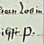
  To the medieval eye, the “j” shape was not a letter, it was a Latin abbreviation written as a ligature (two shapes combined together for comfortable writing—something I’ve mentioned in previous blogs about the Voynich glyphs). Here’s an example of -ris, from a 14th-century manuscript, decomposed into its parts.
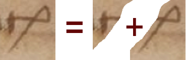
 But EVA-j is not limited to following the a-glyph. It doesn’t happen often, but it can follow other shapes:
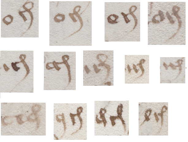
 One other detail worth noting is that some of the EVA-d characters have a straight rather than looping stem. Is it possible this shape is a short-stemmed -cis or “j” rather than a “d”? In some places the distinction between them is more dramatic than in this example but are they different enough to be considered different glyphs?