Sense or Non-Sense?

In Nick Pelling’s Cipher Mysteries blog, he commented on the challenges of parsing VMS text and creating transcripts, and specifically noted:

“… a big problem with entropy studies (and indeed with statistical studies in general) is that they tend to over-report the exceptions to the rule: for something like qo, it is easy to look at the instances of qa and conclude that these are ‘obviously’ strongly-meaningful alternatives to the linguistically-conventional qo. But from the strongly-structured point of view, they look well-nigh indistinguishable from copying errors. How can we test these two ideas?”

This is indeed one of the challenges in transcribing and understanding Voynichese. Our perception of the structure of the text will be skewed unless one can sort out, to a reasonable extent 1) the exceptions/rare forms, 2) handwriting variations, and 3) copying errors, from what may be meaningful text, so that relevant variations are acknowledged and artifacts filtered out.

The Characteristics of EVA-qo

The subject of EVA-qo was touched on in my previous blog, in which I posted a variant 4o image that shows a possible “component” relationship between “qo” and glyphs with ascenders. Prior to that I expressed uncertainty about identifying when EVA-qo functions on its own and when it functions as a pair (I suspect that pairs and singles may function according to priorities), but more examples are necessary to cover the topic in depth.

Glancing through the VMS, one will notice that “4o” is a frequent combination. In the following clip, which I chose arbitrarily, one sees several examples of 4o within the space of a few lines. One stands alone (which happens more often than one might think), the others are at the beginnings of V-words. Notice how some have sharp points and others are rounded. Most of them connect to the following glyph:
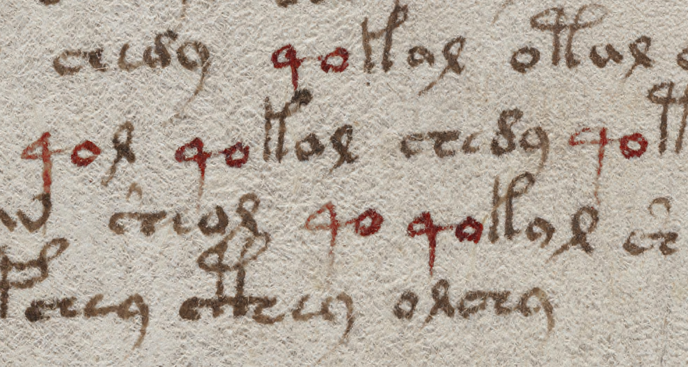
How does one determine if the 4 and o are intended as a paired glyph, or whether it is simply a common combination such as “qu” in English? Do the sharp and rounded corners have any significance? or the connected/disconnected characters? Note how 4o is frequently followed by an ascender glyph, except for EVA-qol. EVA-ol is one of the combinations that may function as a pair, in which case one has to ask whether 4 can function as a “single” when followed by a pair, according to some rule of precedence, as was noted in the discussion of pair patterns.


At first glance, it might appear that 4 is always followed by “o” and always falls at the beginning of a word. In fact, 4o can occur at the ends of words and occasionally in the middle.

Many characters can follow the 4, including a common Latin abbreviation symbol (which is sometimes straight, sometimes curved). Here are some examples:

It’s also fairly common for 4 to be preceded by o or 4o, and 4o4 and o4o sometimes stand alone:
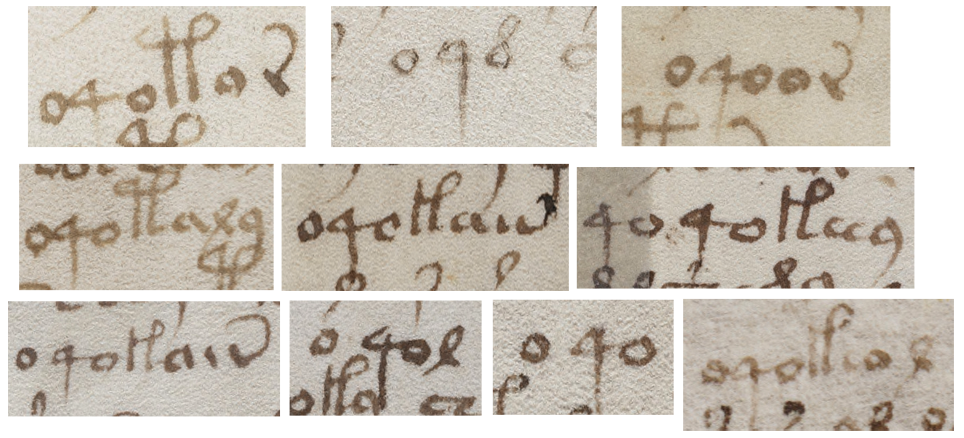
The o4o words appear mainly in the plant, pool, and starred-text pages, with one in cosmology and one on map rosette #1. There are none in the zodiac or small-plant pages.

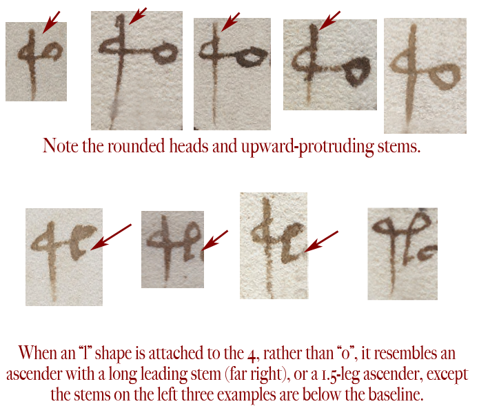
Some variations differ much more than those with straight or rounded connections, as in this example that I’m reposting from the previous blog. It has an extended stem and, below it, a variant that is followed by an “l” shape rather than “o” such that the glyph bears a strong resemblance to a 1.5-legged ascender:

To show this in context, note how a shift in position determines whether this combination looks more like 4o or a 1.5-legged ascender glyph. This isn’t drawn like a malformed 4o or oddball gallows glyph, this looks deliberate, but notice how it falls immediately before ascender glyphs or one that is a common pair, a position typical for 4o:

When EVA-q is followed by a form that looks like a cursive ell, it resembles a 1.5-leg double-looped ascender, except that it is positioned as EVA-q would be, as descending below the baseline.

The 4 glyph doesn’t only resemble the left leg and loop of an ascender, sometimes it is difficult to distinguish a rounded form of 4 from a straight-leg form of EVA-y, both of which look like a Latin “q”.


And Now to the Numbers

The 4 glyph makes its first appearance on folio 1v (the second page, as the VMS is currently bound), paired with “o”, with a line above it. If this were Latin, the line would indicate missing letters in much the same way as we use an apostrophe.

On folio 2r, “4o” becomes more numerous and precedes a variety of glyphs, with ascenders being the most common.

On folio 5r, something interesting happens. There is a unique word on the 6th line (EVA-qokeeey), but if you remove the 4o, it appears as a unique word, without the 4, on another large-plant page (folio 49r) and, without the 4o, on plant page 50v. Similarly, unique word qoToldaiin (folio 4v), without the 4o, appears as a unique word on folio 67r1.

It’s been suggested that unique words are names, but if they were names, wouldn’t someone have decoded them by now? And would so many names, differing only in the first one or two characters, appear on seemingly unrelated pages? If they are names, such as names of plants, wouldn’t they show up elsewhere in the manuscript, rather than being unique? It’s typical of medieval manuscripts to be extremely repetitive, especially if they include recipes, charms, or classification systems—the same names appear with great frequency, especially if they are common ingredients.

I haven’t seen any successful attempts to resolve unique tokens into natural language in any consistent or generalizable way, so maybe they aren’t words. Perhaps they serve a nonlinguistic function. Assuming the spaces can be believed, and they are indeed unique, is it possible that a certain class of word-tokens represents a medieval rendition of pointers, patterns that relate one data location to another?

Variations

The “4o” words are not all unique, some are quite common. For example, qokaiin occurs more than 300 times, mostly on the plant, pool, and starred text pages—it does not appear on the zodiac or rosette pages, which argues against random generation of the text. The 4o words tend to appear only once on the zodiac pages, except for Gemini and Sagittarius, where they occur several times. A unique word on the Pisces page (qoTeeal) appears as a unique word without the q on 69v, a cosmology page.

Summary

If the VMS includes a network of relationships, then it’s essential to determine if the glyph variations are meaningful and whether the spaces are real or contrived. As an example, is the unique word qoToldaiin, on plant 4v, related to the component words qoTol,daiin  that appear next to each other on folios 19v, 21v? The first one has a sharp-4 and an ambiguous space. The latter two, have sharp-4 and very clear spaces.

I have much more information on individual glyphs, but this is more than enough for one blog. I’d like to close with a suggestion that “confidence levels” for certain variations be documented in some way (for example, a pointed or rounded q might not be significant, but q with a high ascender is sufficiently different that it might), and a strong suggestion for structuring VMS transcripts to include Quire X, Side X, Folio X in the explanatory sections for each folio. That way, when looking at glyph variations and V-word relationships, it’s easier to see if similarities and differences are tied to physical proximity.

J.K. Petersen

© Copyright 2017 J.K. Petersen, All Rights Reserved

On the Gallows

VMS characters with ascenders have some interesting properties beyond their frequent appearance at the beginnings of paragraphs. Unfortunately, the seemingly simple task of selecting the most representative shapes and slotting them into a grid took far longer than I expected and this blog languished in “draft” status for several years. I did manage to post a preliminary assessment of whether some of the glyphs might be pilcrows, but did not go into depth about the glyphs themselves because I wanted to discuss that in a separate blog as follows…

Interpreting the Text

My perception of VMS glyphs differs substantially from one of the more popular transcripts created by Takeshi Takahashi. So much so, that I ended up creating my own rather than using any of the ones that were extant. I wanted to correct a number of errors, add the labels, and allow for the possibility that certain variations might be meaningful rather than the result of scribal variations. What follows is not just a collection of glyphs with differing shapes—it’s the result of a long process of trying to statistically differentiate variations that are meaningful from those that are not.

The “Gallows” Characters

As mentioned in previous blogs, most of the VMS glyphs can be traced to Latin characters and abbreviations, with a few that are derived from Greek, but there are some tall glyphs that are sufficiently different to modern eyes that they have been dubbed “gallows characters”. Not everyone is happy about the “gallows” moniker, so I’ll mostly refer to them as VMS glyphs with ascenders. Here is a sample of some common shapes. Note that some have one loop and some have two:

The VMS ascenders are not entirely alien. If they are ligatures (more than one character joined to create a cohesive shape), then the two-legged variety (right) resembles the Latin abbreviation for “-tis” or “Item”. The “P” shape could come from anywhere. A “P” shape is common to many alphabets, including Greek, Latin, Armenian, Cyrillic, and others, but I suspect that a rational design process may account more fully for the VMS “P” than any particular alphabet, an idea that I’ll describe below.

The Takahashi transcription recognizes four basic kinds of ascenders, the single-leg glyph (left), the double-leg glyph (right) and the double-looped version of each. Added to this are “benched” versions of each of the shapes—those that have a crossbar near the base that connects glyphs on either side. These are designated in the transcript with an uppercase “Z” that follows the character for the basic form, which is not a bad way to do it, since it allows for searching both the benched and unbenched varieties, and uses a shape that is easy to remember as the rotated Z somewhat resembles a crossbar.

Others have noticed that the crossbar does not always connect on both sides and have tried to account for this in various revisions of the EVA fonts.

Discerning Intent

I would like to propose that this appealingly simple classification scheme utilized in the Takahashi transcript may be wrong. When you really study them, there’s more to the ascenders than meets the eye and pen variations may, in fact, be meaningful.

Those who are familiar with Hebrew and some of the Malaysian scripts, already understand that subtle differences between characters might change their meaning. The swoop of a tail, the presence of a dot or tick mark that is high, medium or low, or the length of a crossbar, represent different letters or syllables. I think some of these variations may also exist in the VMS characters, but one cannot judge solely on shape, one has to look at the distribution and position of the glyphs, and the way they are written by different scribes.

Before discussing this in depth, I’d like to point out some morphological similarities between the two more distinctive ascenders. Note how the two-legged ascender resembles a one-legged ascender whose drawing was interrupted before the second leg was finished:

If you are skeptical that this may be the basis for the “P” shape, consider examples 5 and 6 below, in which the “interrupted” leg is clearly visible, a glyph that is neither a single- or double-leg, but one that is in between:

In the images that are second and third from the right, note how the second leg does not always reach the baseline or swoop back in a tail. The leg second-right is attached to a c-shape, a combination that occurs less ambiguously in other parts of the manuscript. This suggests the shapes might be ligatures, rather than individual characters and that the 1.5-legged glyph may be a component in its own right.


There’s more to this 1.5-leg idea that might surprise you…

Take a look at these 4o glyphs (EVA-qo) that have a long stem that rises up above the leading c-shape (not all 4o glyphs have a rounded head, some are very sharp, but these are all round). Then look at the shapes below them that are constructed the same way but are followed by an “l” shape rather than “o”.

Did you notice how this “4o” variant on the second line below resembles a 1.5-leg gallows? The main difference is that the shape on the left is a descender rather than an ascender. If it were shifted upwards, it would be interpreted as a 1.5-leg gallows without an additional letter or crossbar, but it superficially resembles 4o because it appears at the beginning of V-words and is mostly below the baseline. The long-stemmed “4” may be distinct from other glyphs identified as EVA-q:

I don’t believe the various theories that there are microscopic encodings in the VMS, based on incredibly tiny variations in shapes—I’ve seen no convincing evidence that this is so. I do however, believe that some of the more overt differences that might be meaningful have been overlooked and might make the text look more repetitive than it actually is.

The Case of the Curly Tail

Something I’ve wondered since I first examined the VMS is whether the curled tails on ascenders and other characters are meaningful. In Latin, a curled tail on the letters “i” or “r” are significant. They indicate abbreviations such as “er/ir/re/re” and sometimes “us/um”. On a “P”, they differentiate between “pro” and “per”.

Some scribes even control the shape of the tail to differentiate between “er” and “ir”. You’ll notice in the self-similarity example above that the far-right glyph has a distinctly curled tail. The one in the picture below is clearly straight. There are some that are slightly ambiguous but most of them can be differentiated as one or the other.

Does the difference matter in the VMS? I suspect it does. Curly tails appear more often on ascenders that are in key positions, such as the beginnings of paragraphs or places where one might expect a capitulum, but it’s difficult to know from position alone whether this is their function. Most of the midline ascenders do not have curled tails. This is not the way “per” and “pro” behave in Latin. They are liberally sprinkled throughout the text, with “per” being a bit more common than “pro”, but not excessively so, so it appears that the VMS glyphs are similar to Latin in shape but not necessarily in function.

Notes About the Chart

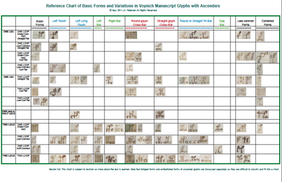
What follows is a PDF file with one possible configuration for studying and classifying VMS characters with ascenders, based on variations that may distinguish one from another.

  • As far as I can tell, the length of the tail is not significant, except possibly when it touches the baseline on a standalone glyph, or the bottom of the stem on a combination-glyph.
  • The shape of the tail (straight or curved) looks like it might be significant.
  • There appears to be some consistency in the way the connections are made on one-legged ascenders. The top-left connection might be significant. The bottom right corner, where the tail is attached, is sometimes sharp and sometimes rounded, but this connection doesn’t appear to be significant, as far as I can tell.
  • The characters that connect to the crossbars on “benched” characters are quite variable and the variation appears deliberate. The straight benches do not appear to be corrupted c-shapes. They might represent EVA-i, or EVA-r without the tail.
  • The combination glyphs appear to be a gallows character combined with lowercase glyphs or two gallows glyphs combined, perhaps as a way to put two together without setting them next to each other. It’s my feeling that combination characters differ from embellished ascenders, but I am not certain yet.

This is a preliminary chart, subject to revision. You can click on the link under the thumbnail to download the PDF file:

VMSAscenderChart092

(New chart uploaded June 3, 2017, with one error corrected. June 4, 2017, Gap bar moved next to Touch bars.)

                                                                                                                                   J.K. Petersen

© Copyright 2017 J.K. Petersen, All Rights Reserved

Two of This or One of That?

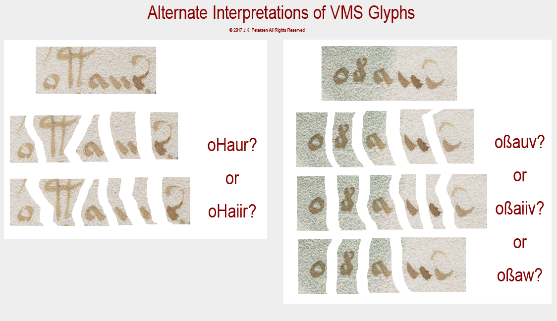
One of the difficulties in creating a transcript and analyzing textual patterns in the Voynich Manuscript is the ambiguity in some of the characters. When this occurs in common words, it makes it more difficult to assess glyph relationships and frequencies.

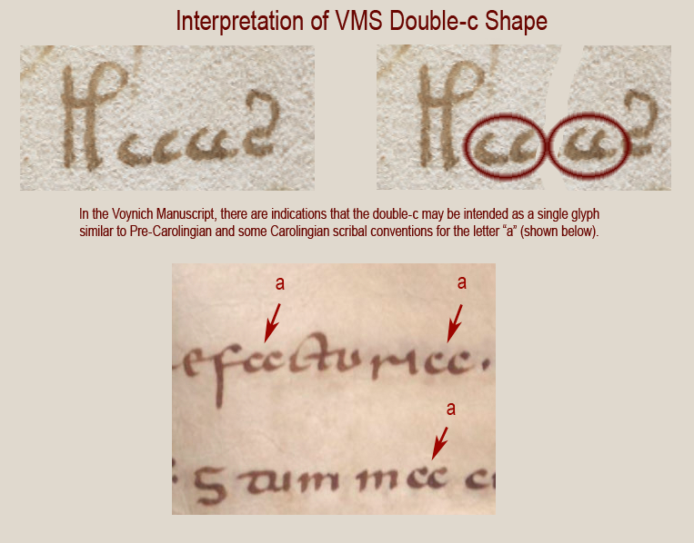
A simple example might illustrate this problem. I mentioned in my previous blog that I believe the paired c-shapes are meant to be read as one character (in most instances). There is also a single c (EVA-e) which may occur next to a double-c, to create three in a row. When there are three in a row, how does one decide whether it’s three cees, a double-c following to a single-c, or a single-c following a double-c?

In this example, I’m leaning toward the VMS glyphs (top) being two double-c shapes because of the slightly larger gap between the two pairs and the way the cc behaves in other parts of the manuscript, but I’m not 100% sure because the two latter cees are more tightly written than the first two. Is this normal pen-variation or are the first two cees single cees followed by a double-c?

Sometimes all we have to go on is slight differences in the spaces between characters and that’s not a good way to do it—there will always be some uncertainty, which is one of the reasons I feel it’s important to study the rule set and possible pairing paradigm for the VMS. Then the context can help us determine which glyphs are intended as ligatures and which might function as pairs.

The Devil in the Details

Unfortunately, ambiguity exists in one of the most common VMS word-tokens, one that is popularly called “dain”. I don’t use the EVA font-set, I developed my own based on shape designations, but you should be able to see the correspondence in the following illustration fairly readily.

In this example, there is ambiguity in the straight shape that alternately resembles a double-i or possibly a “u” as it was often written slightly separated, with straight legs, in the middle ages. I use a “v” and sometimes a “w” to describe the ending shape with a tail but I make no assumptions about what these shapes mean or whether the swept-up tail indicates an abbreviation, as it would in classical Latin, or whether it is an embellished glyph designed to look like Latin, just as the “9” shape (EVA-y) morphologically and positionally follows Latin conventions:

To complicate matters further, there are places in the manuscript where there is an additional stroke between the a-shape and the swept-up tail, one that Takahashi (and perhaps other transcribers) sometimes missed.

Summary

A fresh transcript is needed, and not just a “corrected” transcript that makes better assessments of the spaces (I’ve noticed errors in which glyphs with clear spaces around them have been attached to nearby words), but one in which all the glyphs are included, even ones that “look funny” because there are so many in a row, along with consideration for alternate interpretations for ligatures (combined glyphs) and paired glyphs.

I created a transcript that corrects some of these problems, but it’s not a stand-alone file. I’ve integrated it with a set of self-made VMS fonts and applications so that the whole thing is an interdependent set of tools that can’t really be split apart as they currently stand.

I can make some suggestions, however. When I created my fonts, I put the VMS characters in the upper register and the regular characters in the lower register as they are usually typed on the keyboard, so that it’s seamless to combine VMS and regular characters in the same document (handy if you’re writing an article about the VMS). This also allows comments to be added to the transcript that don’t interfere with searches of the VMS glyphs. Unicode standards have plenty of space for this, and it’s not difficult to come up with mnemonic references to the shapes to make it easier to type. I also set up glyphs that are similar such that they can be searched together or separately. Adding a symbol to the glyph is usually a better overall solution than putting each variation of a basic form in a different font-slot, a point that I’ll discuss more fully in my next blog.


                                                                                                                                   J.K. Petersen

© Copyright 2017 J.K. Petersen, All Rights Reserved
Construction of the Voynich Manuscript Text

28 May 2017

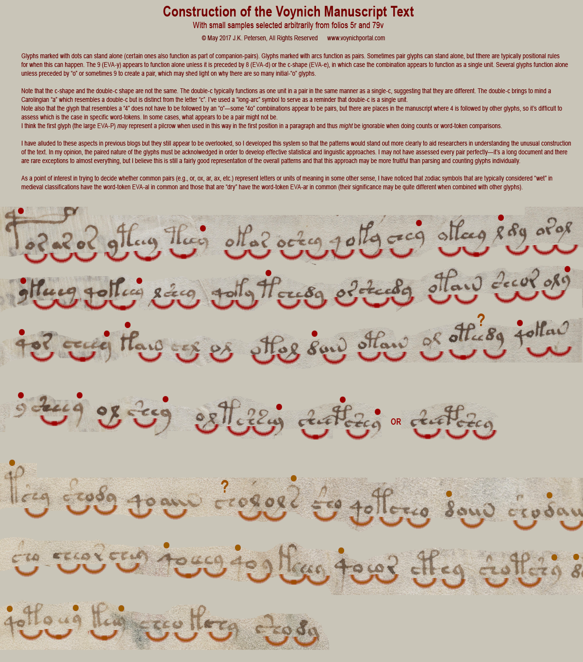
In previous blogs, I gave quick examples of the rule-dependent way in which Voynich Manuscript glyphs are combined (it’s far beyond the scope of a blog to define the entire rule-set, so I used a single page of text as an example and have been working on a long paper that describes the overall manuscript more fully). I also pointed out some of the more common atomic units, as I think of them.

Since that time I’ve been trying to think of a way to make these patterns and relationships easier to understand.

Hopefully this visualization method can illustrate why computational and linguistic attacks that assess individual glyphs may not yield fruitful results. The VMS has very particular ways of combining glyphs that affect not only which ones appear next to one another with greater frequency, and in what order, but also controls word-length in unique ways.

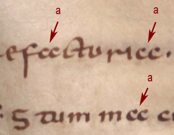
  • Note, as mentioned in the diagram below, a VMS double-c-shape (adjacent EVA-e glyphs) appears to function as a single unit in much the same way as a double-c shape in Carolingian script (right) represents the single letter “a”.
  • Certain glyphs, like EVA-d and EVA-s appear to function as single glyphs unless paired in very specific ways (with certain glyphs in certain positions, such as EVA-dy at the ends of words).
  • Note the prevalence of combinations like EVA- or, ar, oI, 4o, ly, che, sho, and ey. These pair-syllables, in various combinations with glyphs that function as singles, characterize the entire manuscript, including text in labels and wheels.
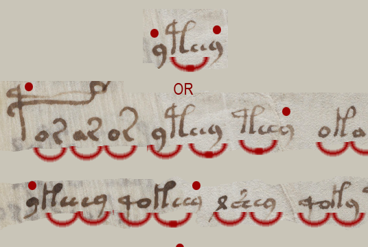
  • Note also the difficulty of assessing whether 4o is intended as separate glyphs or as a pair (in some tokens, it could be assigned either way and there are a few other combinations with this characteristic). I have included examples of both possible interpretations of 4o-tokens in the following illustration with the caveat that I am less sure of the 4o- breakdowns than most of the others.

Despite the difficulty of distinguishing singles from pairs with complete accuracy, I think these short examples come close and may help illustrate how the VMS text differs from common natural language patterns and patterns evident in medieval ciphered texts, and especially why one-to-one substitution systems have so far been unsuccessful.

Consequences

Also, give some thought as to how paired glyphs affect entropy and word length…

Paired glyphs greatly increase the number of letters or sounds a system could potentially represent. For example, if you had only o, a, r, and x, and placed them in a grid as pairs, your four glyphs could yield 16 pair-glyphs plus the four original glyphs to represent 20 letters or sounds. There aren’t as many combinations as this in the VMS, because glyph order is deliberately restricted and it’s not practical to put mirror pairs next to each other as they are hard to distinguish without extra spaces, but even so, the concept applies—entropy increases

As to word length… the VMS word-tokens are already short compared to natural languages, but if some of the glyphs are paired, word-length decreases further. If one is looking for letter or sound correspondence in text that has a large number of paired glyphs, then it’s more likely that they represent syllables, fragments, or abbreviations, rather than full words.

So, enough discussion… here are two examples that I grabbed arbitrarily. They’re short, but hopefully long enough to get the ideas across.

You can click on the image to see it full-sized  (you may have to click again when the new tab opens to read the small print):


Postscript (after getting some much-needed sleep): I hope it is apparent from my previous comments that these are examples, not a definitive breakdown. In the illustration, I have broken down the “4o” words and some of the “9” words (EVA-y) in both ways to show both possibilities—with the 4 and 9 as singles and as pairs, because there is evidence elsewhere in the manuscript that both are possible interpretations. Some pairs (the common ones) are much more consistent and discernible than 4 and 9 word-tokens and I have a long list of stats for some of the more consistent pairs.

The distinction is important because pairs and singles may have different classes of meaning. For example, in Latin, the 9 character (which frequently functions as a single in the VMS, except when paired with EVA-d and possibly EVA-e) expands into prefixes like con- and com- and suffixes like -us and -um, which brings up the question of whether pairs might represent letters and singles might represent abbreviations, as were commonly used in medieval scripts, or (another possibility) whether they were intended to be differentiated in some other way, such as singles representing nulls, modifiers, or markers and pairs representing something else (letters, sounds, or concepts). Note that the singles are often at the beginnings of paragraphs and word-tokens, and also sometimes form one-glyph word-tokens. It is further possible that the high preponderance of “o” glyphs (particularly those in the first position) might be evidence of a pairing process intended to make tokens come out in a certain way (with a particular pattern or length).

All this assumes, of course, that the VMS text is meaningful, something that has not been proven. The pattern of pairs and singles could just as easily have been devised to make it easier to write meaningless text that looks like syllables and abbreviations. I still have a certain cautious optimism that there is meaning behind the text and will post another blog soon that explores some of the details of gallows characters that haven’t yet been discussed.

                                                                                                                                   J.K. Petersen

© Copyright 2017 J.K. Petersen, All Rights Reserved
The Lion and the Phoenix

In a previous blog, I illustrated some of the Asian stylistic conventions that influenced Persian art in the middle ages, with dragon and phoenix imagery as examples. A while later, it occurred to me that someone reading the blog might get the misimpression that the phoenix itself had been inherited from east Asian art, but that is not that case. Persian culture was already rich with “phoenix/firebird” legends prior to the infusion of Asian illustrative traditions.

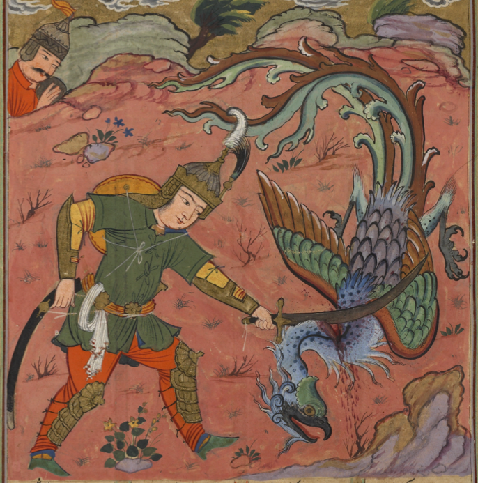
The Simurgh is a mythical bird that greatly resembles the east Asian phoenix except that it was originally drawn with a lion’s face and forepaws. In most respects, however, it would be mistaken for a phoenix by anyone not familiar with Arabic script or ancient Persian culture and, indeed, the two became almost indistinguishable after Asian drawing styles and myths were absorbed into Persian art, as is illustrated by this 17th century example:

In Isfandiyâr’s fifth trial in the Book of Kings (1616), he battles the simurgh with a well-aimed swipe to the neck. In the same manuscript, the simurgh is present at the birth of Rustam,legendary hero-to-be, who teams up with the simurgh to defeat Isfandiyâr. [Image courtesy of NYPL Spencer Coll. Pers. MS 3.]

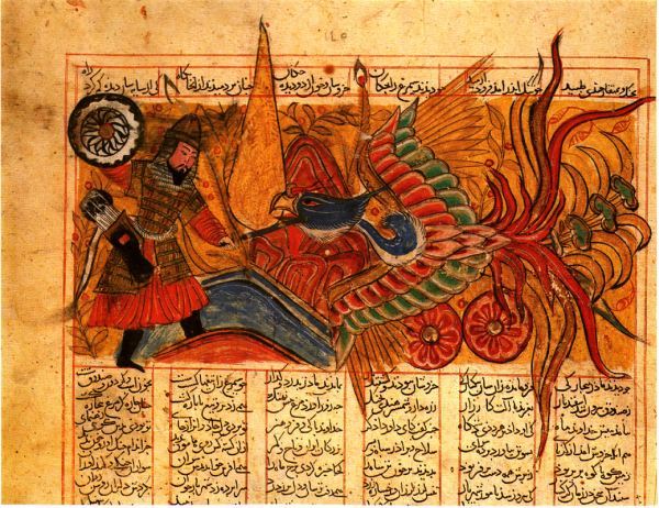
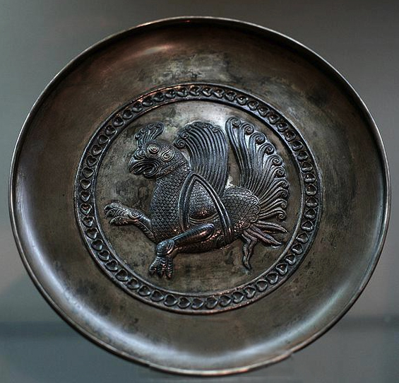
We can trace the evolutionary development of the Persian simurgh in reverse. In this 1330 manuscript from Shiraz, we see the simurgh with phoenix body and a shorter raptor neck and head, engaged in a fierce battle with Isfandiyâr. It is similar in form to an illustrated version of The Wonders of Creation that was written in the 13th century. This Sassanid silver plate has a bird-like version of the symurgh motif that was popular from around the 7th to 10th centuries:

This birdlike simurgh retains very little of the lion shape other than the forepaws, and includes a more extravagant tail similar to later expressions of phoenix imagery. [Photo credit: Reza Abbasi Museum, Tehran.]

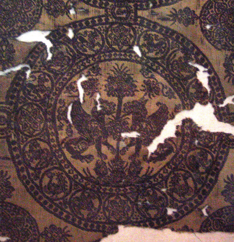
In even earlier depictions, the lion head and paws of the Simurgh are more evident, as in this silk fabric based on a griffon-style simurgh, a motif that was popular from the 6th to 9th centuries and possibly earlier. The only really bird-like aspect is the wings, although sometimes a mammalian face would include a beak:

Silk fabric featuring two simurghs facing one another with a tree (possibly the tree of life) between them. [Image credit:Tehran National Museum photo by Fabien Dany – www.fabiendany.com]

Sometimes a dog was substituted for the lion, but either way, the simurgh of this time period was rather gryphon-like.

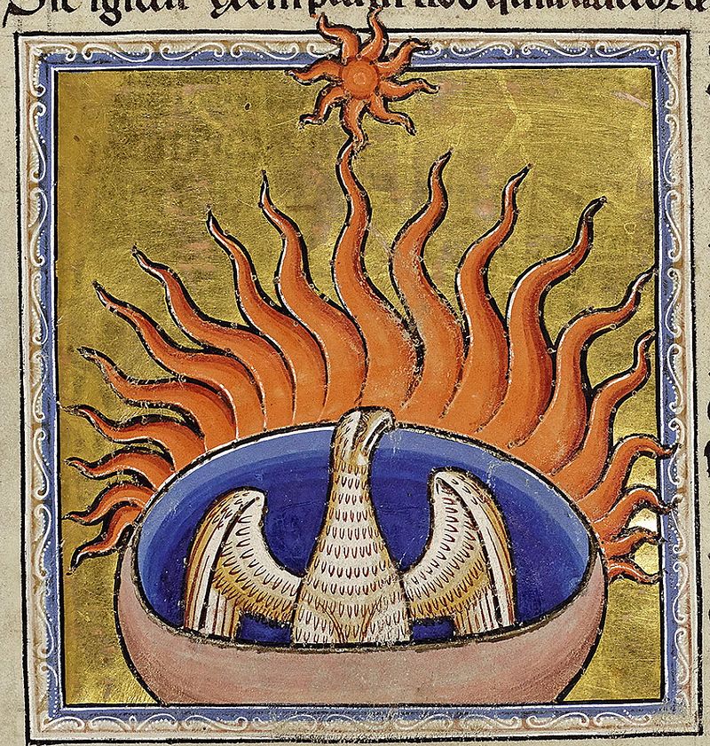
This 13th-century image from the Aberdeen Bestiary, resembles the earlier raptor-like versions of the simurgh more than the eastern phoenix or later Persian simurghs:

In the Aberdeen Bestiary, from about 1200, a raptor-like phoenix sits in a container that it has created with aromatic substances such as frankincense and myrrh. It looks toward the sun and fans the flames that will soon consume it. This hawk or eagle form of phoenix is more similar to the earlier Persian simurghs than later ones that show far-Asian influence. [Image credit: Aberdeen Univ Lib. MS 24.]

In ancient depictions, from several centuries BCE until the Roman period, in both text and image, the Simurgh, or Senmurw, is a raptor associated with health and prosperity and has linguistic associations with a bird that collected and dispersed seeds far and wide to facilitate a good harvest. The imagery was merged with a lion or dog and then gradually morphed into an eastern-style phoenix. This detail of ancient harvest myths may be of interest to Voynich researchers.

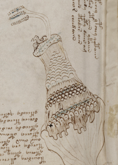
It’s difficult to know how long the tree-of-life and harvest associations with the simurgh were retained, as the simurgh was constantly evolving, but there is a perplexing image in the Voynich Manuscript in which a creature that looks like a bird sits in a nest (or some kind of container) on a precipitous tor. Next to the bird is a tree-like structure that might be a tree, bush, or perhaps stalks of grain. It’s difficult to tell because many medieval drawings of trees are rather twig or grain-like.

Assuming this is a bird in a nest, it’s almost impossible to guess what kind of bird it is—it’s not very clearly drawn and many birds nest on the ground or in high places. There is another bird, or possibly another rendition of the same bird, in the upper right corner, which may or may not relate directly to the one below.

Summary

I’m sure there are already many explanations for the identity and meaning of the VMS bird—there are thousands of bird stories, many of them featuring raptors that nest in high places—but I wonder if anyone has suggested that this might be the ancient phoenix, in the style of some of the more ancient Persian harvest birds, or the firebird in the Aberdeen Bestiary presiding in its aromatic container. Could the grain-like “tree” that hovers over the VMS bird represent both crop fertility and the tree of life? These days, we’re accustomed to very extravagant drawings of phoenixes, but the earliest depictions of the symurgh and its medieval European variations were much simpler than they are now.

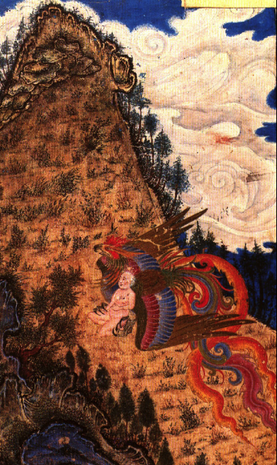
A phoenix drawn with Asian influence snatches baby Zal, the legendary warrior king and father of Rostam, in a detail from a c. 1370 manuscript from the Topkapi Palace Museum.

It was not uncommon for the simurgh to be drawn next to steep hills. The example on the right shows the phoenix rescuing baby Zal by a tall tree-flecked tor. The “Conference/Councourse of Birds” (a legend about birds seeking the phoenix to be their king) also frequently shows the birds against the backdrop of a steep mountain.

I’m not inclined to identify the VMS bird as a phoenix—the surrounding images don’t seem to confirm that idea. The bird in the top-right corner looks like it’s flying past a cloud deluge rather than into the sun to be consumed by flames, and phoenix myths don’t shed any light on the mysterious half-hidden figures on the left. But I wanted to mention the possibility in case there might be other myths or associations with the phoenix that could explain aspects of this folio. Three of the corners look like there is something flowing out of them, so the bottom-right is unique in having a plant-like structure rather than streams of mist or water (or spiritual energy). I’ve been assuming each corner is somehow associated with the others, but how direct that association might be is hard to say.

So, it’s just a thought (out of many), something to mull over until more is known about the bird.

                                                                                                                                   J.K. Petersen © Copyright 2017 J.K. Petersen, All Rights Reserved

The Cardinal’s Nymphs

I had hoped to write a whole series on this one specific topic (the Villa d’Este). I have thousands of images and copious notes, but I simply cannot find the time to sort and credit all the images and grammatize my notes. The material has been languishing in my files for nine years, so at the risk of never posting it at all, I have decided to upload it in skeletal form…

Of Water and Worts

In 2008, as I was familiarizing myself with the VMS plant drawings, and looking at the pool pages, I spent several months looking up all the botanical gardens that were in existence prior to 1520 and, while doing so, also investigated the culinary/medical gardens that were present in most large estates, including castles, universities, monasteries, and medical schools. Some of the ones I found were later than my cutoff date of 1520 but I hoped they might provide clues to earlier structures that inspired them.

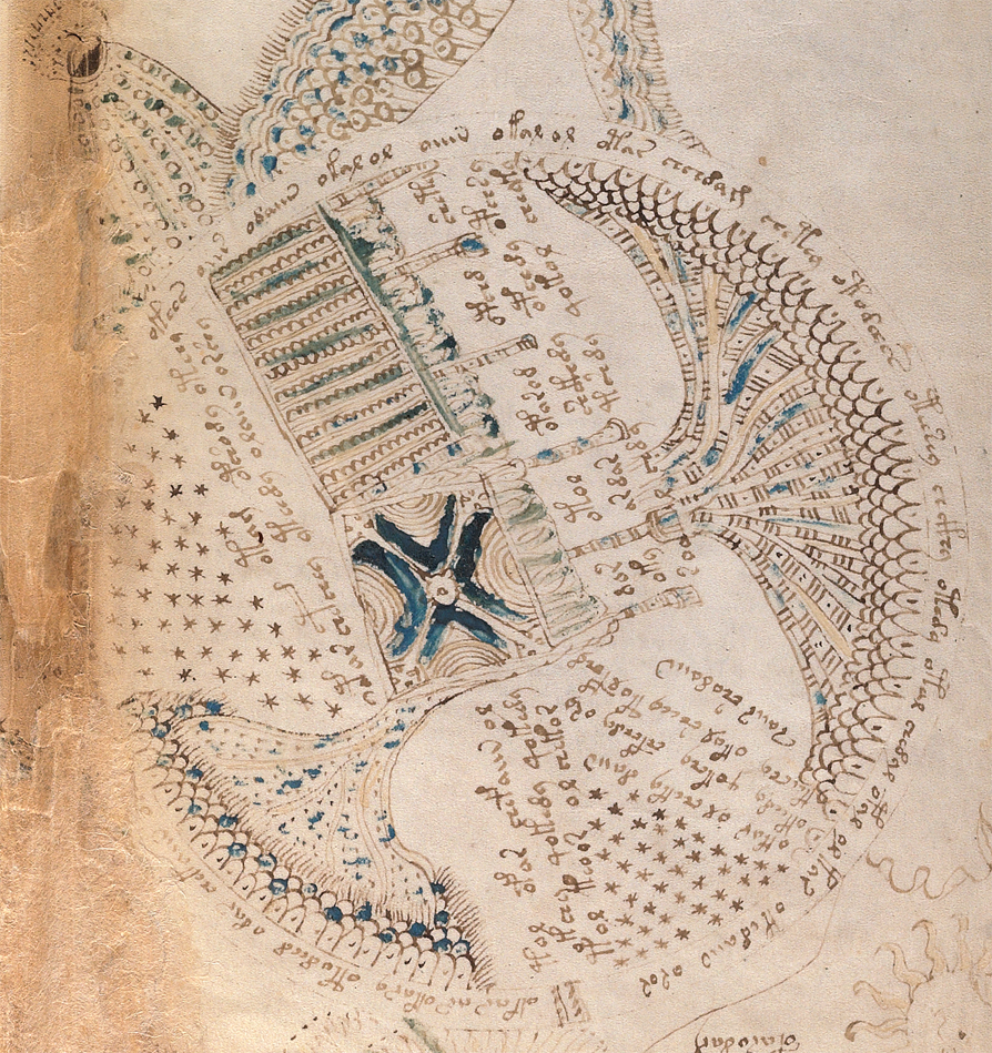
What motivated me to look into botanical and courtly gardens was the VMS emphasis on plants and water, and several “map” rosettes that looked like they might be related to gardens, as well (particularly the “aerial” view on rosette 9, which resembles a garden design with water flows).

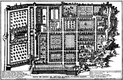
The Farnese Gardens were created on the Capotilline hill in Rome, in the mid 16th century. This shows an aerial view of the garden layout with each section arranged with different geometric shapes. Culinary, medical, and decorative gardens were an integral part of court and institutional life, and gardens with waterworks were particularly popular in the 16th and 17th centuries.

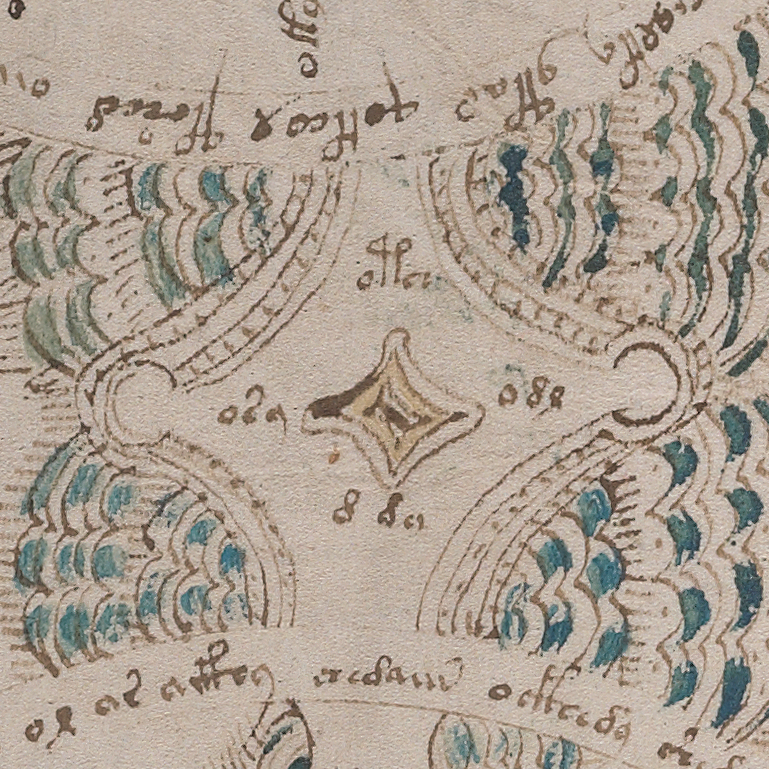
Other parts of the VMS “map” could be interpreted as fountains and pipes. The little decorative element between rosette 6 and 7 (right) might be a fountain and there are obvious parallels to water and streams in rosettes 3 and 7. Other parts look like water spraying and it’s possible that rosette 2 represents a water source with gargoyle spouts around a central column, as were found in many pubic squares.

In my search for medieval gardens that might have a strong connection to water, especially piped water, I explored the Vatican gardens, the Garzoni Gardens, the Versailles gardens, the Dresden fountains, the Salerno, Padua (which were framed by a circular wall), and Verona gardens, St. Petersburg gardens, English gardens (especially ones near Roman baths), the Villa d’Este, in Tivoli, Italy, and many others. I also looked into spa areas in Bohemia, Germany, Switzerland, Italy, and some of the Grecian islands. Information on similar themes in Spain was sparse. They may exist, but in 2008 there was almost no information on the Web about them.

Viva Villa d’Este

The d’Este estate particularly interested me because it had piped water and many Pagan artworks and architectural structures strongly connected to water, nymphs, and plants—reminiscent of VMS plant-and-water imagery in general and to the rosettes page, in particular. One could describe the d’Este estate as “unapologetically” Pagan for reasons I’ll discuss below.

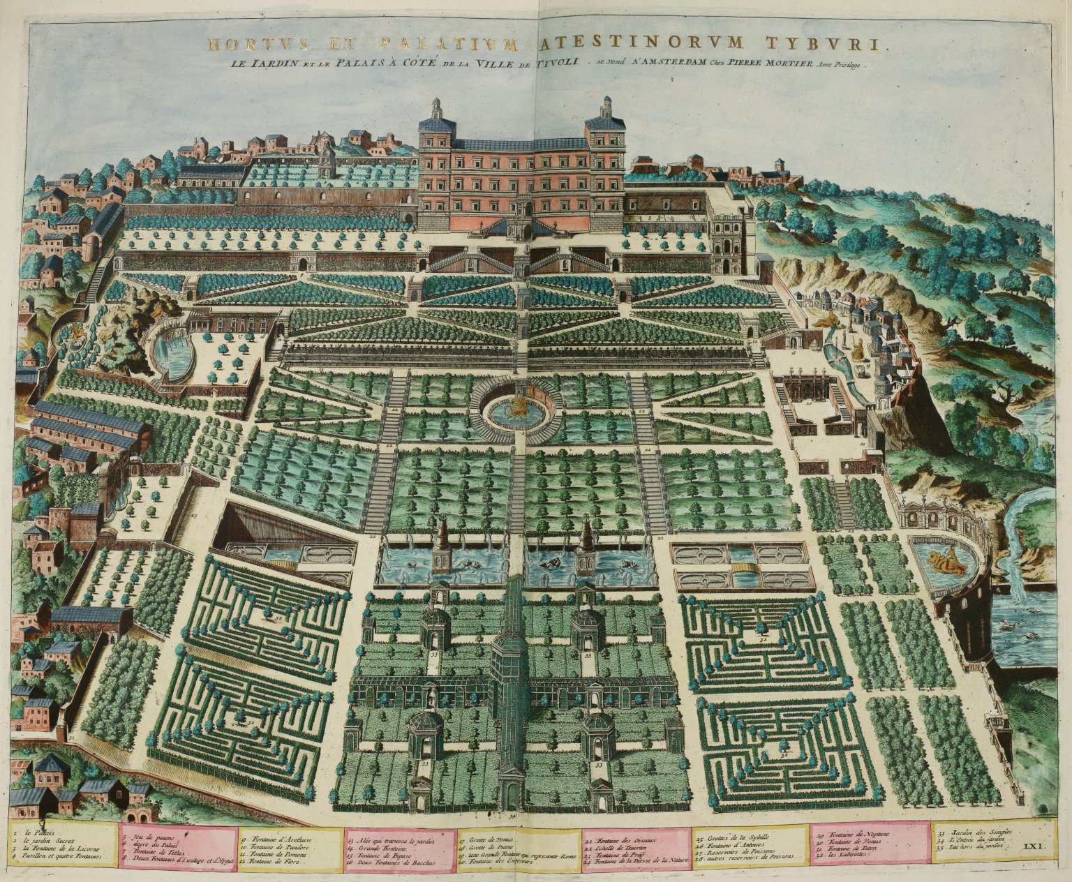
A diagram of the extensive gardens, fountains, and waterworks of the Villa d’Este. Water was also a prominent geographical feature on the lands surrounding the main estate, with many waterfalls and pools, some of which are a bright green.

A Brief Background

The d’Este family was wealthy, influential, and strongly interested in the arts. The Villa d’Este, in a scenic mountainous area near Rome, was commissioned by Ippolito II d’Este (1509–1572) and even though he was connected to the Roman Catholic church and became a cardinal, he was apparently more interested in Roman history and beliefs than in contemporary Christian customs. As such, the artworks on the estate include Greco-Roman gods, the Ephesian Diana, and round arched Pagan temple pools with nymphs sheltered under archways. Throughout the estate are fountains, cascades, gargoyles, and pools.

Thus, there are many parallels between the d’Este estate and the VMS and rather than blog about each one, as I originally hoped, I’m simply going to list them

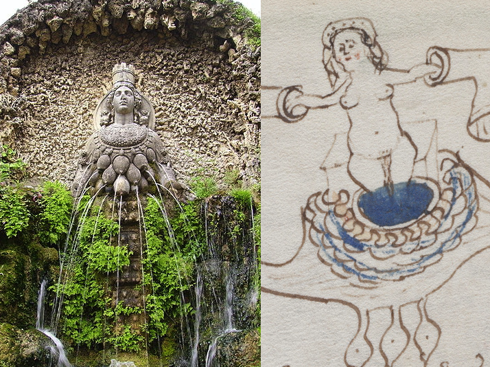
The dangling teats/testicles under the nymph on folio 77v is reminiscent of the acorns/testicles/breasts depicted on many ancient sculptures of Diana. It’s difficult to know what the breast-like shapes signify in the VMS. At first I thought it might refer to the she-wolf that suckled Romulus and Remus. Then I thought the figure might represent the Sabine who stopped the fight between the Romans and the native hill people. K. Gheuens has pointed out that it might represent a constellation, in which case Cassiopaea would be a good candidate. On the left, the Ephesian Diana is framed by an arched grotto, as are several of the VMS nymphs, as water streams around her and from the breast-like forms on her chest. Note also that the crown-veil shape framing the head of one of the VMS nymphs could be based on crown-veil shape imagery related to an ancient goddess. [Image courtesy of Yair Haklai, Wikimedia Commons.]

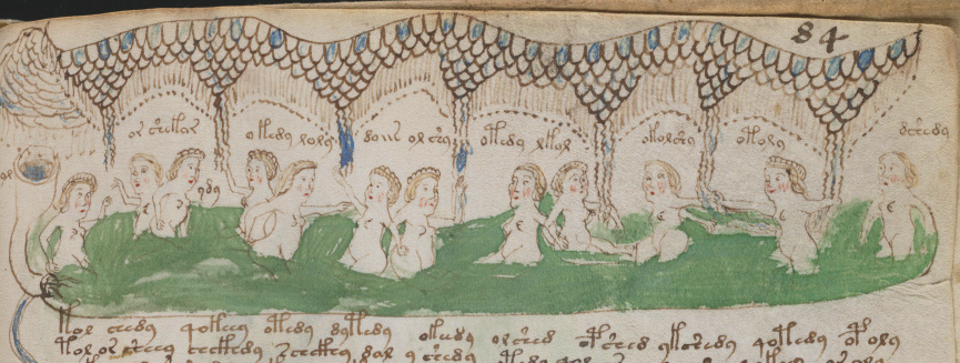
A number of the canopies and arches over the nymphs in the VMS look like the grotto structures surrounding goddesses and Greco-Roman gods on the d’Este grounds. Water was an intrinsic aspect of Pagan religion, and nymphs were believed to live in water or were created in (or from) water. There are also ancient caves nearby, carved into the cliffsides, and an ancient goddess temple by the road on a hilltop—the whole area is steeped in ancient traditions.

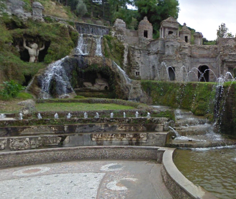
Legendary Greco-Roman figures are framed by archways and numerous fountain works. Trees and water were sacred and intrinsic to Pagan religion, as water was believed to be the birth and dwelling place of goddess nymphs. [Image courtesy of Google Maps Street-view].

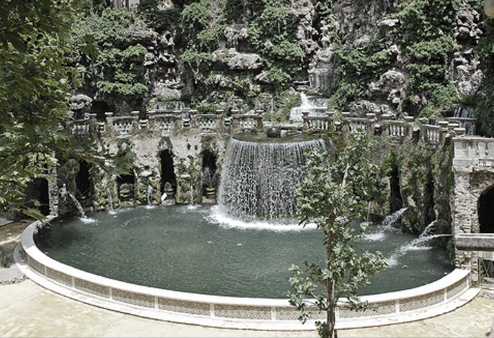
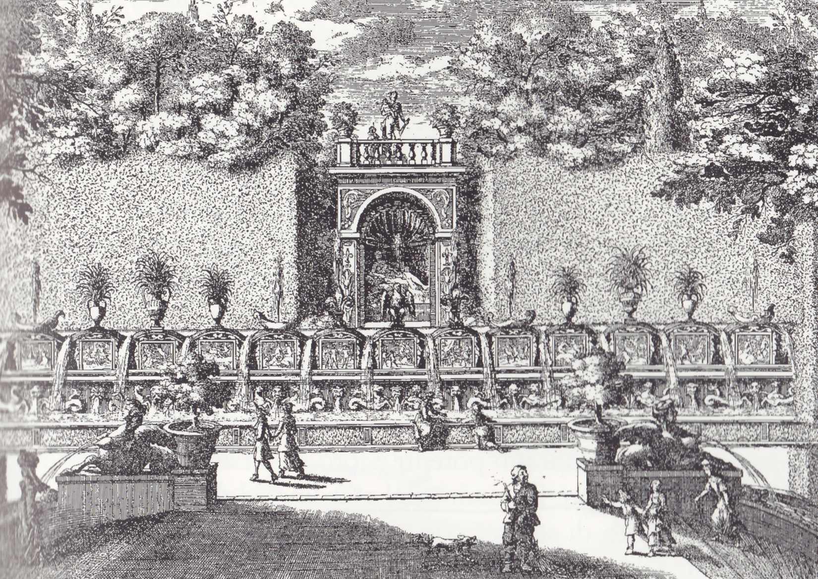
One of the more breathtaking corners of the estate is an oval pond, in the Pagan style, which includes a semi-circle of archways with sculptures under the arches, and a richly textured grotto-like waterwall behind the stone balcony.

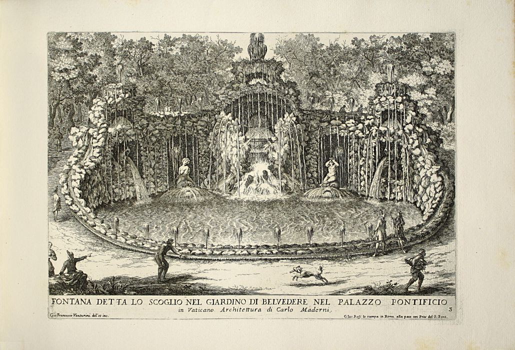
The Della Ovata pond and archways are evocative of Pagan goddess-temple styles. The VMS central rosette, which features a circular structure with stars and decorative “columns” could be an iconic representation of ancient goddess temple architecture. The Falda grotto-style fountain pool (below), built on a similar concept, shows what the rockwork around the Della Ovata may have looked like before the more recent low-wall was added.

Waterfalls and Green Pools

In the middle ages, the Villa d’Este was surrounded by natural wonders: mountains, cliffs, crooked roads, and many rivulets and waterfalls. The VMS is full of “waterfall”, pool, and bathing imagery that bears similarities to this topography. The VMS rosettes page includes many escarpments, and there is a shape between rosettes 4 and 6 that could be interpreted as a fountain. There is also a crooked mountain road connecting rosettes 1 and 4 leading from what might be an eye-shaped mountain or volcano. A similar road leads to the Villa d’Este. Notice the pipes coming out of the VMS volcano-like “mountain” (water was piped down to feed the estate’s cistern and extensive waterworks).

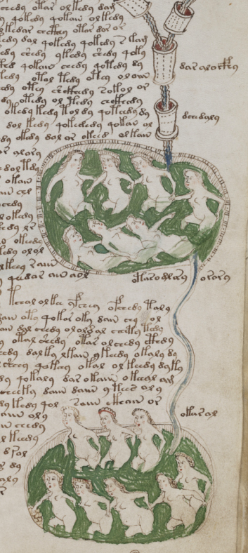
The Cascadia is a scenic landmark in Tivoli, by the Villa d’Este. Notice the green pools and the rivulet connecting the pools, very similar to how green pools are arranged in folios 78r and 81r. The Cascadia lower river has terraced pools, some of which have been shaped with nearby rocks to make them more comfortable for bathing.

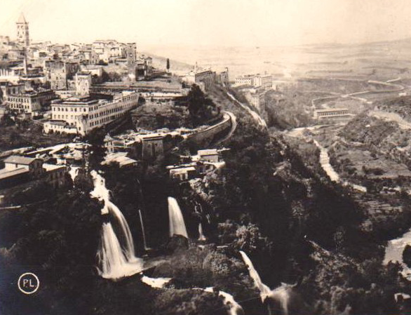
This image, from the 1930s, shows the topography of the d’Este estate in Tivoli, Italy, with its many waterfalls and green-water bathing pools. In the 16th century, the gardens were much more extensive.

The pool imagery on folio 78r might represent natural waterholes that have been rocked in for bathing, so it’s difficult to know whether the VMS “pipes” that appear to be feeding the pools represent natural water, or aquaducts and pools constructed to create bathing holes.

Natural water holes existed in the landscape in countless regions, including the Alps, Bohemia, Pozzuoli, and the town of Tivoli, Italy, and there may also have been bathing holes in the Villa d’Este grounds, which were larger in the 16th century than they are now, which makes it very difficult to know if these pool pages are generalized, allegorical, or meant to represent a specific location.

The Villa d’Este had a large culinary/medical garden, similar to those at monasteries. It’s possible that rosette 9 is an aerial view of gardens common to castles, monasteries, and universities.

The VMS map is full of pipe shapes. They come out of the mountain, they surround the central rosette, and they spray between rosettes 2, 4, 6, and 8. No one has been able to convincingly explain the meaning of the pipes or their relation to the rest of the imagery, and they may be allegorical, but if they are intended to be real pipes, here is one thought…

The Villa d’Este was built with some incredible piping systems and waterworks, centuries ahead of their time. They form a lattice underneath the grounds and are not just there to provide water to people and plants, but also to feed elaborate fountains and whimsical waterworks, throughout the estate, some of which were triggered by people walking nearby, so they would be showered unexpectedly as a form of entertainment. The estate was a marvel of hydraulic engineering and is now a UNESCO World Heritage Site.

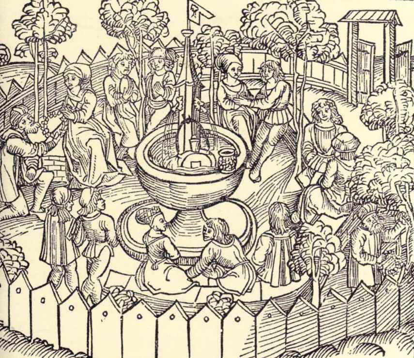
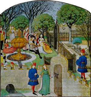
A popular theme in medieval imagery is the courtly garden party, which is often shown as a ringed area with a central fountain. You might notice in the second picture below that the fountain embellishment resembles not only the containers in the VMS small-plants section, but also the VMS “architectural columns with feet” that look like large containers in the central rosette.

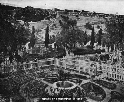
I didn’t want to constrain my research to Europe, I always search as far afield as possible, but information on medieval spa sites and gardens east of Constantinople or south of the Mediterranean is scarce and was especially scarce nine years ago, but I did find some information on gardens in the Levant, including the area around Jerusalem. The idea of Jerusalem intrigued me because I thought the “mountain” in rosette 1, with its almond-shaped “eye” (similar to an olive pit) might be the Mount of Olives.

The Garden of Gethsemane (image from 1893) is in an arid region, where it’s harder to grow things, but still bears some similarities to more northerly gardens, with a circular design and a fountain-like centerpiece, but I wasn’t able to reconcile many features of the VMS map with this part of the world.

Summary

I hate to stop in the middle of a topic, I have much more information but so little time, so I’ll end by saying I wasn’t able to convince myself that the rosette map was the Villa d’Este or any of the similar gardens that preceded it (many of which no longer exist except in verbal descriptions). The reason I’m not sure is because I couldn’t reconcile what looks like compass points (the two suns and the T-O map) with the layout of the d’Este estate. It’s close… the “mountain”, the water, the escarpments, and some of the other features could be related to real physical features, but it takes a bit of wrangling, and there is some imagery that doesn’t quite seem to fit this location.

Villa d’Este was one of many ideas, and I’m keeping it on the table, but it post-dates the VMS by more than a century, and information on its predecessors is scanty. Also, I subsequently found a location that MIGHT explain the rosettes page better than Villa d’Este, a location that better fits the compass points. It doesn’t have extensive waterworks, but it did have piped water and nearby natural waters, and some of the other features on the rosettes. Unfortunately, I can’t spare time to describe it today. It will have to wait for another blog.

                                                                                                                                   J.K. Petersen

© Copyright 2017 J.K. Petersen, All Rights Reserved

The Gumshoe Herb Hunter

It’s a delight to look through old herbal manuscripts, especially those with text that describes the plants and their uses. Even if the language and style of script are unfamiliar (and heavily abbreviated), that’s part of the fun—you get to be a detective.

Trinity College MS O.2.48, for example, is full of intriguing details. Created a century or so before the Voynich manuscript, it includes more than 300 herbal images. Some plants are recognizable and others take effort to decipher, even when names are provided in several languages. Fortunately, the Web is full of resources to help us unravel the identifications.

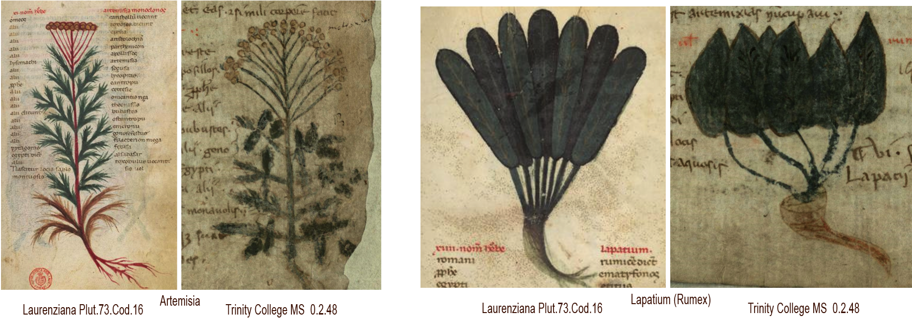
MS O.2.48 parallels Plut.73.Cod.16 (Biblioteca Medicea Laurenziana) in many ways, which means the two can be enjoyed side-by-side while sorting out some of the more puzzling imagery.

They are not exact copies, the two manuscripts differ in drawing style and page layout—Plut.73 is more heavily and evenly painted, and the plants are more stylized and symmetric, as can be seen in these examples:

The Plutei and Trinity College manuscripts differ in drawing style, layout and content, but include many parallels that can help sort some of the less obvious plant IDs.

Highlights

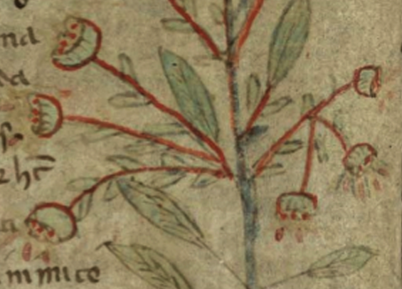
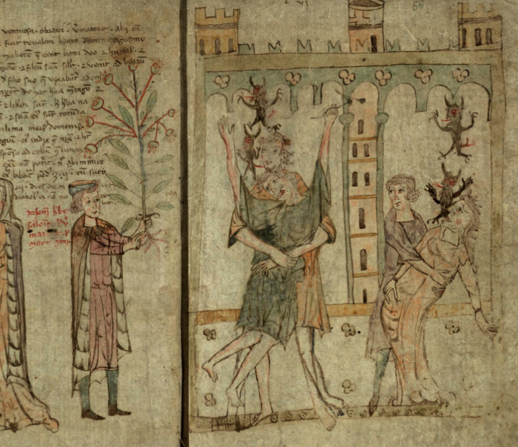
MS O.2.48 was created sometime in the 1300s at an uncertain location. In addition to images of herbs, there are scenes about how herbs were used. For example, on folios 54v and 55r, herbe salomonis is held aloft by an important figure to help him exorcise the demons to the right:

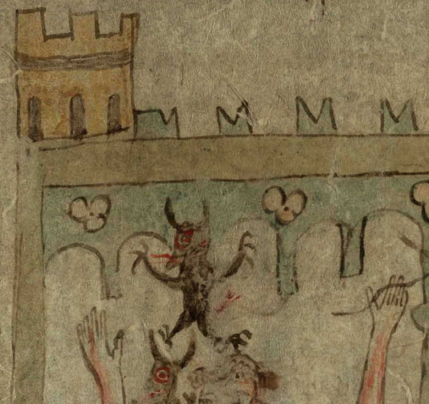
At the top of the scene is something of particular interest to Voynich researchers, V-shaped crenellations called swallowtail merlons, similar to those on the rosettes foldout in Beinecke 408. This architectural style was associated, in earlier centuries, with the Ghibellines, supporters of the Holy Roman Empire, who were at political odds with those who supported the pope in Rome. Swallowtail merlons have become decorative elements since that time, but in the 14th and 15th centuries, they were still emblems of a long-standing power feud between the loyalists and the papists.

So what exactly do those merlons signify in a section devoted to herbs? Do they reveal the political leanings of those who created the manuscript? Or were the creators contemptuous of attempts to establish power centers outside of Rome? Or are they saying that supporters of the emperor are heretics in need of herbal “therapy”?

The text to the left of the plant gives us a clue. It identifies the man holding the plant as “beat[us] augustin[us] and describes a brief legend of the saint and the martagon plant (also labeled salominis, ventriosa/ventuosa, and vermatore). Thus, St. Augustine, who was born in Algeria and served as bishop of the region before traveling to northern Italy, was chosen to administer the rights. St. Augustine is an important symbol of the Catholic church and thus would be considered by papists as an appropriate emissary for wielding herbal power.

The provenance of MS O.2.48 is uncertain, but it’s thought it may have been created in Germany. The Ghibelline merlons suggest that if it is Germany, it’s probably southern Germany or Lombardy (which is now part of northern Italy). Lombardy was much larger in the middle ages, with an interesting blend of cultures (Scandinavian, German, Italian, and Bohemian) and was known to have a number of illumination studios. Sloane 4016 (mid-15th century) is one of the best-known herbal manuscripts created in this region.

On the Trail of the Martagon

Thus, the drawing reveals something about those who created the manuscript, but the label next to the plant is hard to reconcile with the plant itself. Most of the Trinity MS plant illustrations are reasonably naturalistic, but this plant doesn’t resemble the martagon lily (aka Turk’s cap lily) in any way—the roots, leaves, and flowers are all wrong.

A closer look at the flowers shows red droplets. Is this a reference to sap or perhaps to blood? There are a number of plants with red sap, but most of them don’t look like this. The alternate names aren’t helpful either. ventuosa/ventriosa, and vermatore/virmatore aren’t easy to reconcile, many old plant names have been lost, but Salonis/Salomonis might be helpful. There are a number of plants that go by this name, which is an ancient reference to King Solomon.

The most well-known plant associated with the name is Sigillum salomonis, or Solomon’s seal, due to the round seal-like scars on the plant’s knobby roots. Unfortunately, its distinctive bell-like white flowers dangling from one side of the stem don’t look like the plant in Trinity O.2.48.

Verbena was once called “tears of Isis” and was later adapted into the Christian religion as the herb that was placed on Christ’s wounds. This might explain the red droplets, but Verbena is already represented in the Trinity MS by a drawing that more closely resembles the actual plant. The herbs in the Nine Herbs Charm didn’t provide any close matches either. Mugwort fits the context, but the flowers are spikes and the leaves are deeply serrated.

Bishop’s wort (Stachys officinalis) is an ingredient in remedies to exorcise demons. It has elliptical leaves but doesn’t closely match the flowers, and doesn’t explain the red droplets, but it’s closer to the drawing than plants called “martagon” or “Salomonis”, and fits the context.

Summary

I considered that the plant might be St. John’s wort (Hypericum), which has elliptical leaves, red sap that appears when the leaves are pounded, and fuzzy yellow flowers that change to a berry-like fruit. It is said to provide protection against demons, but it doesn’t appear to have a strong connection to exorcisms, and the plant in Trinity O.2.48 is quite large, larger than one might expect Hypericum to be drawn.

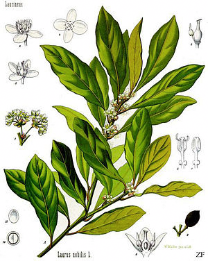
Laurus nobilis courtesy of Wikipedia.

The best candidate I’ve found so far, and I’m not certain it’s the right one, is Laurus nobilis, known as sweet bay. Laurel is a large shrubby plant with elliptical leaves and clusters of yellow flowers that point in various directions and change to small black fruits. It was a healing herb with the power to exorcise demons. In the 19th century, Parkinson writes: “It serveth to adorne the house of God, as well as of man; to procure warmth, comfort, and strength…” Northcote notes in 1903 that the Romans called it “the Plant of the Good Angell” and that it was used, in Rome, to “trim up their Churches and Monasteries on Solemn Festivals…” So Laurus nobilis has a strong connection to the Christian church consistent with the legend of St. Augustine.

So perhaps sweet bay is the puzzling plant and perhaps not. As far as Voynich research goes, a number of detractors have used the difficulty of identifying the VMS plants as a rationale for calling the VMS a hoax, but Trinity O.2.48 demonstrates that a plant can be clearly drawn and labeled, and even include allegorical imagery to explain it further, and still be a challenge to unravel.

                                                                                                                                   J.K. Petersen


Postscript: After I wrote this blog, I became aware of M. Ponzi’s translation of the story of St. Augustine in the Trinity MS text. You might enjoy reading the story so I have added a link here.

© Copyright 2017 J.K. Petersen, All Rights Reserved

Cultural Pollination

In the days before overpopulation and “private property” made it difficult to travel without getting permission or a passport, humans were nomadic. They followed the seasons and, when they had “used up” the resources in a particular spot, they moved to another one, eventually colonizing the whole planet, including places where the snow never melts. As resources dwindled, they changed from colonizers to conquerors, often displacing or assimilating earlier cultures.

From Watering Holes to Warfare

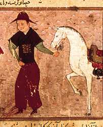
The Mongols have long been known for their great equestrian skills, and for their ability to travel long distances through harsh climates. In the 13th century they were ambitious invaders, making repeated efforts to conquer China, parts of Russia, and even eastern Europe—their campaigns ranged over thousands of miles. In so doing, they came in contact with diverse cultures, sometimes absorbing their ideas, other times influencing or extinguishing them.

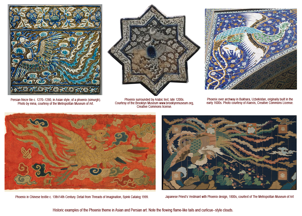
Some theorists say the Asian style of dragon that is especially prevalent in China, and to a lesser extent in Persia, was influenced by Mongolian art. I don’t have time to research this, it seems to me that 13th-century Mongolian art has a different look and different themes, and that a phoenix with flowing lines existed in early Japanese art and is found in Uzbekistan mosaic art, so perhaps it was indirect rather than direct influence that brought the extravagant flames and curlicue clouds to Persia in the middle ages. There were surely multiple lines of transmission, Mongol caravans with foreign goods, and new trade routes opened by Mongol incursions, but land-roving nomads were not the only visitors—seafaring traders were constantly moving goods between east and west and ship technology was constantly improving. Whatever the source, the ties with Asia are readily apparent in 13th-century Persian art.

Click to see a larger version.


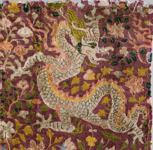
This fabulous textile art, created around the 11th or 12th century in east-central Asia, is thought to have been crafted by the Turkic Uyghur people, and might represent another route of transmission for east-to-west dragon imagery:

Note: Uyghur dragon textile was added a few hours after the blog was published. Note the tail snaking through the legs, a motif often seen in Mediterranean and western European drawings of lions. [Photo courtesy of the Metropolitan Museum of Art.]

With reference to the Persian Ilkhanid Period (1256–1353):

“In [book] illustration, new ideas and motifs were introduced into the repertoire of the Muslim artist, including an altered and more Chinese depiction of pictorial space, as well as motifs such as lotuses and peonies, cloud bands, and dragons and phoenixes.” –Suzan Yalman, The Metropolitan Museum of Art

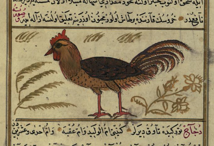
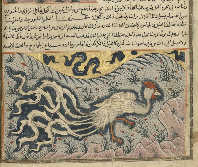
[Cockerel images added April 8, 2017] These examples from a group of Arabic manuscripts that were inspired by Al-Qazwini’s 13th-century bestiary, illustrate interesting differences in style:

Al-Qazwini’s bestiary, created around the mid-13th century, was reproduced in different versions. The top example of a cock from Walters MS 659 (1500s) is a traditional depiction, with no exaggeration in the landscape or details, the bottom one, from Bibliotèque Bordeau MS 1130, clearly shows eastern influence in the curlicue clouds, undulating landscape, and extravagant flame-like tail-feathers. The cock has almost been transformed into a phoenix.

Within the next few centuries, the eastern influence becomes even more apparent…

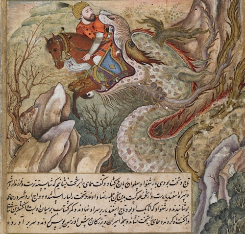
The British Library holds an illustrated Arabic romance of the adventures of the Persian King Darab, originally composed in the 12th century by Muhammad ibn Hasan Abu Tahir Tarsusi. The library’s copy dates to between c. 1580 to c. 1585, so it’s not as old as the phoenix tiles, but it shows a similar adaptation of eastern style in dragon art.

In this dramatic scene, Bahman and his horse are swallowed whole:

The nose looks like a camel, and it’s clearly a malevolent beast, but the tendrils on the lower jaw, the whiskers, eye-stripe, and mane are in the flamelike undulating style that is common to Chinese dragons.

[I had an example of an Asian-style dragon from western Europe that I found about three months ago but, unfortunately, despite a concerted hunt through my files, I can’t find it. If I do, I will upload it here.]

Summary

This is, in a sense, a follow-up to the post on the jongleurs, where the French illustrator used a different style to express itinerant performers (who may have been of eastern origin), but I also have a personal interest in Asian art and looked up some more specific examples that relate to cultural transmission to see when these particular styles were introduced to the Arabic world. Persia has had political ties with China at least since the 6th century (royalty intermarried), so there may be other examples, but unfortunately I can’t pursue all of them.

The images are interesting in their own right, so I decided to post them for Voynich researchers who may be curious about cultural influences between east and west.

J.K. Petersen

© Copyright 2017 J.K. Petersen, All Rights Reserved
Daisies and Dusters

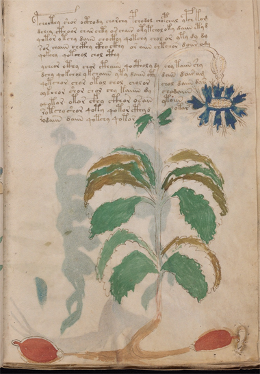
A quick glance at VMS Plant 10r reminded me of a daisy (family Asteraceae). It has serrated leaves and the characteristic flower whorl that is common for plants in the daisy family. The illustrator has also taken some pains to emphasize the serrated leaves, which gave me some ideas for the identity of the plant… I thought one possibility might be Senecio alpinus (Alpine ragwort) but… many daisies look the same, and the color of flower petals doesn’t help because the VMS is painted with a limited palette and some of the colors might be symbolic.

More importantly, daisies don’t have big red roots that look like yams or water balloons. For a while, I was at a loss to explain the roots.


Prior Plant IDs

I had a suspicion VMS 10r might be Dittrichia viscosa, a plant common to the Mediterranean that has medicinal uses as an astringent, and a strong fragrance (that not everyone finds agreeable). But, I don’t think the red objects are meant to be noses, so what else could they be?

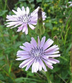
I hadn’t previously looked up other IDs for this plant. I wasn’t even sure what Sherwood had chosen, so I looked around while I was composing this blog and found Sherwood’s ID of Cichorium pumilum. I’m very familiar with chicory, it grows wild in this area, and 10r doesn’t look like chicory, so I searched again…

This time I found Ellie Velinska’s description of the plant as mountain cornflower (Centaurea montana). Except for the discrepancy in the leaves, I like this ID, because it more closely matches the characteristics of the plant and Velinska gives a plausible explanation for the roots as a mnemonic for an ocular medicinal use but, I think there might be another possibility…

Deeply serrated Dittrichia viscosa leaves, courtesy of Wikipedia and Rickjpelleg.

I didn’t want to spend a lot of time googling plant IDs, so I stopped looking so I could talk about Dittrichia viscosa, also known as false yellow fleabane. It is also called “aromatic inula” for its strong fragrance and resemblance to Helenium (Inula).

I’ve said many times that I believe the VMS illustrator cared about leaf margins and drew them quite accurately for some of the more naturalistic plants. This is unusual compared to traditional herbals where leaf margins are often sloppy or wildly inaccurate. Dittrichia viscosa has very distinctive leaves that are deeply serrated and the VMS seems to convey this.

D. viscosa flowers are typical for plants in the daisy family, a sunny ray of yellow petals and a rayed whorl after the seed-fluff has blown away. This plant is well-known around the Mediterranean, from Provençe, Spain, and Sicily to the Levant, and has long been the subject of folklore. For example, Wiki notes a Catalan saying, “Els raïms són madurs quan floreixen les olivardes.”, the grapes are ripe when the yellow [false] fleabane blooms. Unfortunately, the roots don’t look like grapes, at least not entirely.

Is there another way to explain the roots? I couldn’t think of a reason why Senecio alpinus would be drawn with red water-balloon roots. And if it’s Dittrichia viscosa and they’re not grapes (or eyeballs as Velinska suggested), what else could they be?

[Addendum: One idea I forgot to include when I posted this blog earlier today is that the big red “balloons” might be breasts—lactating glands. Lactuca plants are widespread Eurasian plants named for the milky white sap that oozes from the stems when you break them and Lactuca is part of the daisy family. However, as tempting as this idea is, I wanted to suggest one further possibility…]

Farther Afield

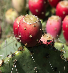
If the VMS were created after the conquest of the Americas, the roots might represent red potatoes, oca (Oxalis), or prickly pears (Opuntia), those mouse-ear-shaped lumps that form on the top of cactus plants. The Nahuatl called them Nopalli, and while their origin is not completely clear, they are thought to have originated in Mexico. Prickly pears are now grown worldwide, and D. viscosa is used like a duster to clean off the pear-like fruit after it is harvested.

Using false fleabane to clean prickly pears, courtesy of Carmelo Rifici.

But the New World theory is problematic. The VMS probably predates Columbus’s voyage to the Americas. Is it possible that the practice of cleaning prickly-pear fruit with daisy dusters comes from a long-standing Mediterranean tradition of cleaning similar-looking crops native to the Old World?

What about red-skinned shallots, which are smooth and fairly oval and have a little bump on the ends? Or radishes or beets? All of these come from the ground and need the dirt dusted off, and even radishes, which originated in Asia, have been grown in Europe since before Roman times. The toothy leaves of false fleabane are well suited for dusting. If the VMS roots are meant to express a characteristic of the plant, maybe the roots are breasts. On the other hand, if they show the use of the plant, maybe Velinska is right, maybe they are eyeballs, or maybe they are tubers that need a daisy-leaf dust-off before dropping them in the cart for market.

J.K. Petersen

© Copyright 2017 J.K. Petersen, All Rights Reserved
Leaves with Legs?

The leaves of Plant 51r resemble beetles, but could there be any reason to add a beetle to a section devoted to plants?

It was not unusual for medieval manuscripts to include drawings of reptiles and mammals. Snakes were often drawn alongside plants that had “serpentina” in the name, snakelike roots, or which were believed to cure snake bite. Animals with names similar to plants, like camel and Camelina, were often shown next to one another.
Critters are not uncommon in herbal manuscripts and bestiaries, but they are quite scarce in the plant sections of the VMS. The dragon-like creature that appears to be nibbling on Plant 25v is the exception rather than the norm.

Are There Bugs in the Leaves?

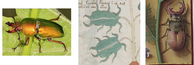
When I first saw Plant 51r, the leaves reminded me of stag beetles, industrious little bugs that use their mandibles like a stag uses its horns, to fight off rivals vying for sexual favors. There are three “legs” on each side, a pair of “mandibles” on the outer end, and a decorative line running down the middle.
The VMS leaves are reminiscent of beetles, with the correct number of legs and rounded “mandibles” like the clawlike choppers of the stag beetle. The illustration on the right is from an early 16th-century French manuscript that includes many plants and insects accurately drawn from life. Were the VMS leaves meant to represent bugs, or is it a plant with bug-like leaves?

I’m not aware of any plants that have points coming off the leaves that are quite as exaggerated as f51v, and the unpainted line running across the middle looks less like a plant vein than most of the other plants. I’m also not aware of any plant leaves with this basic shape that have distinctively different end-leaflets. As mentioned in the previous blog, the entire plant strikes me as more stylized than naturalistic, with a somewhat anthropomorphic pose.

Would there be any reason to include beetle leaves (or other insect leaves) in a section about plants? Pliny the Elder, who was the inspiration for many medieval herbal manuscripts, mentions that stag beetles were called “lucanus” after a region of Italy in which they were used as amulets, much as the rounder, less fearsome-looking scarab beetles were used in Egypt. In the middle ages, the horns of stag beetles were said to be medicinal.

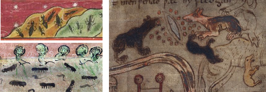
Maybe the VMS leaves aren’t beetles, maybe they are visual references to some other kind of bug. Ants were commonly included in medieval bestiaries and you would never guess they were ants if they weren’t labeled:

The ants on the top left are missing a pair of legs, but are otherwise fairly recognizable [British Library Harley MS 3244] and are somewhat similar to the VMS “beetle” leaves. The ants below them, from the 13th century, look more like centipedes or caterpillars. Those on the right are fearsome ants, drawn like dogs and bears, and it’s only because of the text that we know that they are ants [BL Cotton MS Vitellius A XV]. Another example (not shown) depicts ants as lunging hounds on leashes. Naturalism was apparently not as important as getting the concept across.


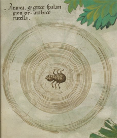
Sloane 4016, a manuscript familiar to Voynich researchers that has good drawings compared to many of its predecessors, includes an image of a spider on a web that suggests the illustrator had very little knowledge of spiders or their webs. The spider is missing a pair of legs and looks more like an ant than a spider. One might speculate that it’s a reference to a spider-like insect that was used to create red dyes, rather than an actual spider, except that it’s labeled Aranea which specifically refers to orb-weaving spiders.

Decorative Veins

The leaf dots on Plant 51r are out of character with most of the other plant drawings. Many of the VMS leaves are well drawn, accurately recording leaf margins and veins (note that this is my opinion, not everyone agrees), but this one resembles a zipper-like decorative element from a painting or piece of medieval stumpwork. It’s like the pattern on a rubricated initial or a caterpillar’s back.

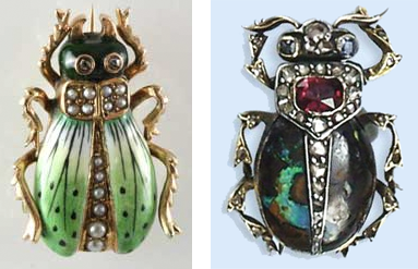
Beetles have inspired art for thousands of years and often include decorative elements down the middle of the back. Left, antique pin courtesy of Ten Two Three. Right, jewelry by Court Jeweler House of Bolin, est. 1791.

If the leaf were a reference to ants, it would be hard to explain the line. But beetles have wings under a protective cover and when the two sides are slightly spread, a textural difference emerges.

Jewelers often use this anatomical feature as inspiration for adding a row of precious stones down the center of the back. Given that scarabs and other forms of beetles have been used in jewelry for thousands of years, it would not be surprising to see a decorative element added to the back of something based on a beetle.

Possible Plant IDs

What if the resemblance to a stag beetle is unintentional? Can the VMS plant be identified without resorting to mnemonics or stylistic similarities to non-botanical elements? Are there plants with bug-like leaves with exaggerated leaflets?

There are many plants with irregular, lacinated, or ruffled leaf margins, but I’m not aware of any that look like the leaves of f51r if (this is an important “if”) you narrow them down to plants that have flowers with a bulbous section under the petals, as well.

Plants with Pinwheel Flowers and Beetle-Like Leaves

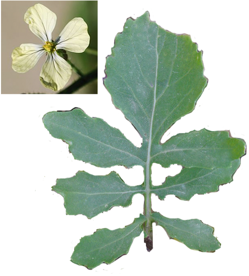
Perhaps the leaves of rocket (Eruca sativa), or one of its relatives, might qualify. Rocket leaves are similar to dandelion, but more deeply indented and with fewer leaflets. The vein down the middle is a little lighter than the rest of the leaf. It has 4-petaled flowers that look like pinwheels with a slightly bulbous attachment to the stem and a narrow tap root.

Rocket, also known as salad mustard or arugula, is widely used as food and was also a medicinal herb in the middle ages. It’s a Eurasian plant common to the Mediterranean that now grows worldwide. If sufficiently stylized, a rocket leaf might resemble 51r, especially if you consider that deer like to walk along and munch off the ends of the leaves, leaving them concave instead of convex.

Groundsel (Senecio) might qualify, but the leaves are longer, with more indentations, and the flowers don’t look like pinwheels. Silene or Saponaria have the right kind of flowers, but the leaves are lanceolate, not at all beetle-like. I glanced at Edith Sherwood’s ID just now, and she has listed sea rocket (Cakile maritima) as a possible ID, but the leaves are quite a bit longer and more narrow than the VMS plant and I think Dame’s rocket (Eruca) is a closer match than Cakile.

What about sound-based mnemonics? There is a plant called beetle daisy, but it doesn’t look like 51r and it’s from S. Africa. Another called beetleweed with rounded leaves grows in the eastern U.S. Trying to search for plants with the names of insects is almost impossible unless you’re willing to sift through millions of insect pictures to find one or two plant names in each language.

Summary

The leaves of Plant 51r may have nothing to do with beetles, but I thought it worth exploring because the morphological resemblance is pretty strong and the more stylized a plant, usually the more likely it is to be associative rather than naturalistic. It isn’t the most exaggerated VMS plant, there are some that are even wilder, but it is pretty animated and that adds to both its mystery and its charm.


J.K. Petersen

© Copyright 2017 J.K. Petersen, All Rights Reserved