Letter Patterns, EVA-m (the “j” Shape)

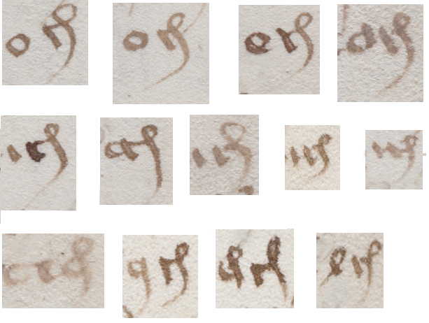
t-hunayninitialhere’s a glyph in the Voynich Manuscript EVA font-set that is mapped to the “j” key, because it resembles a j to contemporary eyes (note, it turns out this is mapped to “m” in EVA).

In the 15th century, however, the letter j barely existed. Many European languages used a soft “j” (similar to a “y” as in “you”) and it was written as an “i” preceding another vowel, as in IOANNES (Johannes) and IVLIVS (Julius).

The “j” wasn’t even part of the alphabet—it evolved gradually from an embellished capital “i” that was used for names.

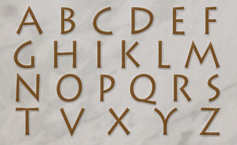
To the medieval eye, the “j” shape was not a letter, it was a Latin abbreviation written as a ligature (two shapes combined together for comfortable writing—something I’ve mentioned in previous blogs about the Voynich glyphs). Here’s an example of -ris, from a 14th-century manuscript, decomposed into its parts.

The letter "r"is on the left and is combined with the shape on the right, which is an abbreviation for "-is".

The letter “r”on the left is combined with the shape on the right, a common Latin abbreviation for “-is” to create the suffix “-ris”.

Depending on the shape of the first stroke, this can stand for “-ris”, “-tis”, or “-cis” and, in some contexts it was also used for the suffix “-rum”, instead of the more common 4-shaped “-rum”.

Origins of VMS Glyph Shapes

The Voynich Manuscript borrows many conventions from Latin, so it’s reasonable to assume that the inspiration for the EVA-j glyph-shape was probably the Latin -ris. It’s also interesting to note that in Latin, -ris occurs more frequently than -cis, and this is also true in the VMS. Whether this has anything to do with the meaning of the glyph or whether it is a case of misdirection (mimicry of Latin shapes without intending the same meaning) is not known but it’s noteworthy that -ris can occur at the end of a word almost anywhere in a Latin sentence, whereas it tends to occur at or near the ends of lines in the Voynich manuscript. The shape is the same; the positional patterns are different.

It’s also noteworthy that almost any letter can occur before -ris/-tis/-cis in Latin, whereas in the Voynich Manuscript it is usually preceded by the EVA-a glyph, as in the following examples:

ajexamplesBut EVA-j is not limited to following the a-glyph. It doesn’t happen often, but it can follow other shapes:

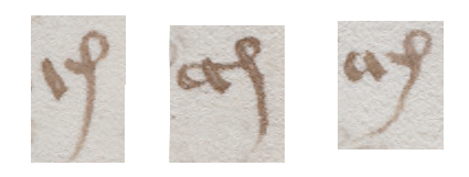
ojexamples

The aj combination is the most frequent, but many other glyphs can precede the EVA-j shape, some of which are unclear as to whether they are “o”, “a”, or something else.

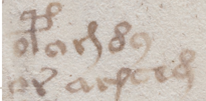
It’s difficult to tell which VMS glyphs are 1) combined shapes meant to be read as one glyph, or 2) combined shapes intended as multiple-glyph ligatures, but there’s some evidence that the Latin -is shape (the righthand side of the -ris) might be a separate glyph in the Voynich manuscript. There are instances where the -is loop is completely disconnected from the previous stroke and some where it is preceded by other glyphs besides the “r”, thus suggesting it may be able to stand alone:

ajunusual

In these examples, the -is glyph is separated from the previous glyph and is preceded by something other than the “r” shape, thus suggesting it may be a separate glyph and possibly used as a ligature.

In Latin, it’s uncommon for the -ris shape to appear anywhere other than the end of a word and even more unusual for two of them to occur in sequence unless they happen to be variations (e.g., -ris followed by -tis). Midword positions are infrequent in the VMS, as well, but they do occur:

risfollowed

In the VMS, “aj” is usually found at the ends of words, usually at the ends of lines, but it is sometimes written midword, as in these examples.

Many transcriptions of the VMS text do not recognize the distinction between the straight “aj” and the curved “aj” (which is part of the reason I created my own transcription), but it might be important to acknowledge the difference partly because they are separate suffixes in Latin, but also because they appear to be clearly distinguished from one another in adjacent examples in the same VMS word-tokens. For example, here we see the -ris shape both preceding and following the -cis shape:

ajdoubled

In the first example, there are two -ris shapes and one that may be either -cis with a short stem or a different character entirely. The second and third examples are less ambiguous, however. In both, the -cis glyph precedes the -ris glyph and it appears that the distinction is deliberate, as was the custom in medieval Latin.

Summary

If we assume that the looped part of the aj glyph is the right-hand side of a ligature, and could potentially be combined with other glyphs, then we have to look for other instances of its use.

As I illustratedIsRisCisVM back in January (and mentioned in even earlier blogs), the gallows character on the right may be composed of two parts, as well. Even if it is, what the glyph means is anyone’s guess. This shape has different interpretations in different languages—it can be “Il” in French, “lis” in Latin, “Item” in German, and sometimes even a very abbreviated “peri” in Greek. It’s also possible that it’s a capitulum, modifier, or marker, and the similarity to the looped shape in “aj” is coincidental.

Note that the gallows glyph also has certain positional peculiarities that differ from “aj”. It’s frequently preceded by “o” rather than “a”, it’s not usually found at the ends of words or the ends of lines, and might be a counterpart to the gallows glyph with two loops.

roundstraightdOne other detail worth noting is that some of the EVA-d characters have a straight rather than looping stem. Is it possible this shape is a short-stemmed -cis or “j” rather than a “d”? In some places the distinction between them is more dramatic than in this example but are they different enough to be considered different glyphs?

Questions like this can’t be answered by shape alone. Position and frequency have to be considered, as well, to see if they behave differently. I’ve done this kind of analysis on some of the other morphologically similar glyphs, but I haven’t had time to evaluate the short-stemmed -cis to see if it’s different from EVA-d.

J.K. Petersen

© Copyright 2016 J.K. Petersen, All Rights Reserved


Entering the Entropy Zone

I’ve been trying to find a way to introduce the concept of entropy without loading it full of mathematical formulas. The word “entropy” is often invoked when comparing the quantity, frequency, and position of the VMS glyphs, which is easier to describe in numbers than in words. After some consideration, I decided that at least some aspects of text analysis could be described with charts and examples rather than with numbers.

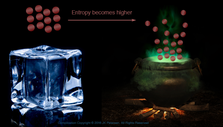
Imagine an ice cube—frozen water. The molecules are linked in a tighter, more ordered structure. When heat is applied, the structure changes, becomes looser, and exhibits higher entropy.

entropywater

This illustration is over-simplified but can still give an idea of how water molecules are more tightly ordered as ice and more loosely associated and disordered, as steam, thus illustrating states of lower and higher entropy. Similar relationships can be found in text. The association of the VMS glyphs to one another, and their relative quantity and frequency within this arrangement, can be studied and compared to ciphered texts and natural languages and expressed as numerical values.

If you’ve read my previous blogs, you’ve probably noticed I talk about the “structure” of the VMS text being different from natural languages. I gave a nutshell version of it in the blog about creating text that looks more like Voynich text where I described some of the ordering and relationships that are characteristic of the selected sample. I did not write out rules for the entire manuscript because that would take 20 blogs, but the concept can be applied to the text as a whole once it is understood that the glyphs tend to be ordered in a specific way.

So how does the idea of entropy apply to text? Maybe this too, is easier to explain with a diagram.entropychalkboard

  • On the left is an alphabet. By definition, an alphabet contains a specific character set, commonly consisting of consonants and vowels (although not every language has vowels), usually in a specific order decided by convention. In terms of text, an alphabet is relatively low entropy.
  • In the middle are words consisting of nouns, verbs, and a couple of adjectives. Even though it uses the same characters as the alphabet on the left, the characters have greater variance in where they are in relation to other letters and may be used more than once. The letters exhibit higher entropy than the alphabet.
  • On the right is alphabet soup. The letters don’t have to follow any particular order, direction, or spatial relationship to other letters. Alphabet soup has high entropy compared to words, it’s somewhat chaotic (but that’s okay, it tastes good).

Entropy and the VMS

capitali n the Voynich world, there is an oft-quoted statistic that the text exhibits low entropy compared to natural languages. It has been said that only one or two languages come close (with Hawaiian being one of them).

This comes as no surprise if one looks closely at the Voynich text. I created my own transcription of the entire manuscript several years ago, so I had no choice but to examine and evaluate every letter, every space, and one can’t help noticing how certain combinations repeat, and how certain letters re-occur in the same positions with surprising frequency. Line structure follows patterns also, with specific glyphs falling at the beginnings or ends of lines more often than one might expect.

How does the entropy of Voynich text compare to other 15th-century manuscripts? This is a broad and complex question, far beyond the scope of a blog whose purpose is to introduce the idea without all the math, but it probably wouldn’t hurt to show one example (note that entropy and repetition are related but not identical concepts—I’ll deal with repetition more specifically in a separate blog).

Comparing Two Snippets

Here’s an example from folio 81r I chose because the page layout reminds me of a song or poem and it’s not too hard to find 15th-century poetry for comparison. Poetry tends to be more repetitious and regimented than regular text, so I thought a medieval poem might resemble VMS text more than regular narrative text.

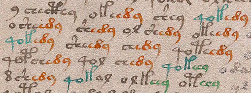
Excluding the fragments beginning with “o” on the right, and assuming the “9” and the “o” on the left are single characters, there are 23 word-tokens, and 20 repeated sequences of three characters (I was bleary-eyed from lack of sleep when I first wrote this, so I corrected this paragraph Nov. 10th).

repetitiongroups

Note that the repeating 3-glyph sequences are always in the same positions at the beginnings or ends of word-tokens. This is not a pattern we typically associate with natural languages except in specific forms of text such as prayers. poetry, or lists.

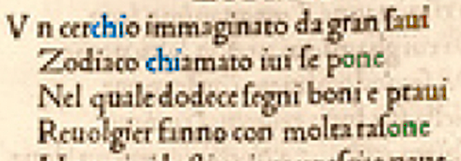
Compare this to a 22-word snippet from a 15th-century cosmology-themed rhyming poem in Italian that includes 6 repeated sequences:

repetitionpoem

In this example, there are also three 3-character sequences, but each one repeats only twice. Since this is a rhyming poem, two sequences are at the ends of words (and lines) but, unlike the VMS, the “chi” sequence appears in the middle of one word and at the beginning of another—it’s not positionally constrained.

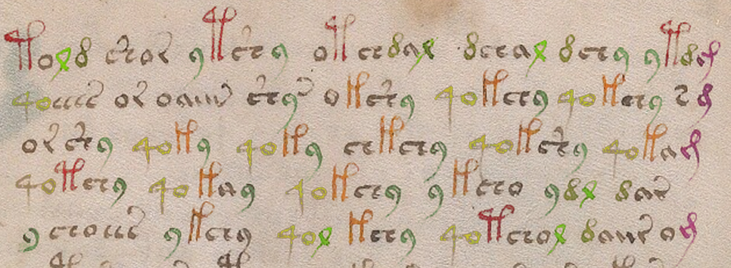
Here’s another example, from one of the large-plant pages:

largeplantsample

I colorized the sample to make it easier to see the patterns. Note that for the purposes of this example, I made the assumption that the “4o” sequence is intended to be together (this appears to be the case in most of the manuscript, but there are exceptions where the “4” appears without the “o”).


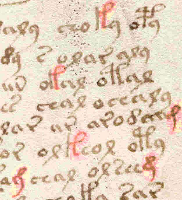
Even though the formatting and apparent subject matter of this plant page is quite different from the previous example, there are clearly many similarities, such as a high percentage of repeating sequences: the “4o” combination is almost always followed by a gallows character, the “c” and “r” shapes with tails are at the ends of words, the “9” is usually at the ends of words and frequently follows EVA-ch or EVA-sh, and the Latin “-ris, -cis” abbreviation (EVA-j) is always at the ends of lines (in other parts of the manuscript “j” appears elsewhere, but not as frequently as at the ends of lines). As I’ve mentioned on previous blogs, the structure is quite rigid.

Entropy is measured in a number of ways—it is not limited to repeating glyph sequences. Measures of word-length, character variability, and individual character combinations are all taken into consideration. Notice that the position of characters in relation to each other is more variable in the Italian example and the character set is larger. Most of the VMS text is expressed with about 17 to 20 of the more common glyph-shapes. The old Italic alphabet had only 17 characters, so it’s not an unworkable number but it’s fewer than most alphabets of the time and significantly less if you consider the various diacritical marks and abbreviation symbols that were in regular use. It’s also significantly less if any of the VMS glyphs are markers, nulls, or modifiers.

Summary

These snippets are only examples—they don’t mean anything by themselves. Genuine research requires hundreds or sometimes hundreds-of-thousands of samples and many different kinds of comparisons. For a draft tutorial on entropy as it applies to the Voynich manuscript, you can read Anton’s post on the Voynich forum. For mathematical studies of entropy, you can consult scientific journals and blogs, and books such as CryptoSchool by Joachim von zur Gathen. For a basic introduction, however, you can look through the VMS and see that the above patterns are common to the text as a whole—glyph-groups tend to repeat, and the same glyph-groups end up in the same positions much of the time, with variation in letter-position being very constrained, all of which tend to lower the entropy.

Does this argue against the VMS being natural language?

Maybe.

But that’s a subject for another blog.

J.K. Petersen

© Copyright 2016 J.K. Petersen, All Rights Reserved


Reconsidering the Columns

The Mystery of the Columns

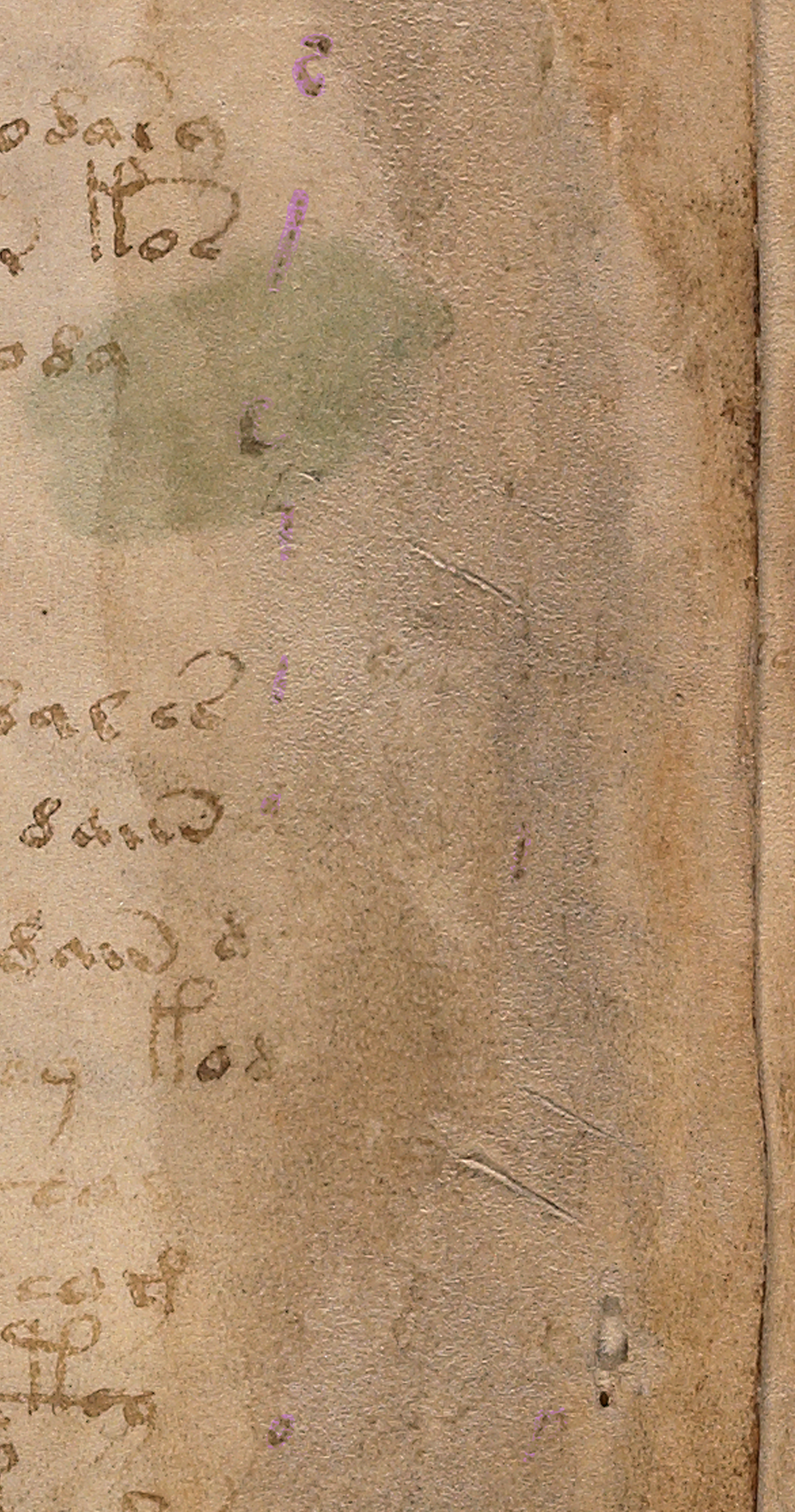
i-initialn May 2016, I posted a follow-up blog about the faint letters visible on the right-hand side of folio 1r and speculated that it might be a failed attempt at decoding the manuscript. That was a guess based on seeing the Latin alphabet in the first column paired with Voynich shapes in the second, and the fact that it was later erased. Two more columns are also faintly visible, but there’s not enough detail to discuss them in depth.

In my previous blogs, I was reluctant to guess the date of the columnar writing because only a few letters are clearly visible, but I went out on a limb and estimated that it might be late-16th- or possibly 17th-century script, based on the small round shapes, the long unlooped ascenders, the slant, and the overall look and feel. I wasn’t completely sure, however, because important clues about how the writer connected the letters and spaced the lines aren’t available.

As soon as I posted the May 2016 blog, I started this blog, to describe the writing further, but was pulled away by other interests and responsibilities. The column text is a sideline for me, but studying it might reveal a few details about the VMS’s provenance, so I come back to it from time-to-time.

Who Added the Columns to the Voynich Manuscript?

My paleographic collection includes thousands of writing samples, but most are focused on Carolingian or Gothic time-frames and the VMS columnar writing is different. It looks more recent than other parts of the VMS, and more like a casual or correspondence hand than a scribal book hand, and most of it has been erased. Nevertheless, there is enough to sample some of the letters.

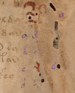
Voyf1rColumns1To recap: on folio 1r, the first column (to the right of the main text) is moderately clear. An alphabet has been written from top to bottom in a tidy script with small, relatively smooth curves and unlooped ascenders/descenders. I have colorized the letters to make them easier to see.

The second column starts with the VMS figure-8 glyph, followed by a small c-shape, and then some shapes that resemble the “red weirdo” at the top of the columns. I’ve colorized the “weirdos” red to distinguish them from the regular Latin alphabet in Column 1 and the VMS characters above them. Columns 3 and 4 are almost completely erased and crowded by wormholes, and column 4 appears incomplete (it’s even possible that columns 3 and 4 are one column worked in around the holes), so this blog focuses on the letters in column 1.

A Brief Background on Writing Styles

Voyf1rColumns3From a paleographical point of view, the style of writing in Column 1 is quite distinct from the angular looped ascenders and proportions of 15th-century Gothic scripts. Gothic book and cursive hands (and those that closely resemble them, like Anglicana) were predominant in the Holy Roman Empire in the 15th century and were in use all the way north to Scotland and Sweden and south to the area around Naples, partly through the influence of Benedictine and Franciscan monasteries, and partly due to commercial scriptoria that offered handwriting lessons.

Gothic cursive styles were less common in the central Italian states and western reaches of Portugal and Spain, but were used in Flanders, eastern France, and Bohemia.

Gothic handwriting is relevant to Beinecke 408 because the labels on the zodiacs, and the marginalia on the last page and a few of the other pages, are in Gothic cursive hands. The latter appears to be in an older transitional style, between a Gothic book hand and Gothic cursive (I have a detailed paper on this that I will upload in a future blog).

The folio page numbers also appear to be different from both the main text and the last-page marginalia, and it has been suggested that John Dee may have added the numbers. I have not read the prior research on Dee and the folio numbers because I wanted to determine for myself whether there is a match so I could independently corroborate or refute existing opinions and will post my observations on a separate blog. For this blog, I thought it might be interesting to ask the question…

Did John Dee Write the Marginal Columns?

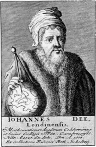
johndeeportraitJohn Dee was a pious family man with a thirst for learning. His broad interests included mathematics, medicine, astrology, and many other subjects. He avidly collected books, dreamed of establishing a national library, and was eager to communicate with angels in the hope of uncovering universal truths.

Dee is often described as an alchemist but he did not engage in alchemical experiments to any great degree, except in a secondary role if they were related to angelic communication. He was interested enough, however, to read about alchemy, to have some lab materials, and to leave marginal notes in this handwritten manuscript that may have been from his library:

johndeenotes

Dee’s margin note about “the grene lyon” (the green lion) is a reference to one of the ingredients of alchemical distillation processes. Interestingly, something I noticed as I looked at page after page of Dee’s writing, is that he appears to have picked up scribal ideas for ligatures and flourishes from some of the texts that he read or copied. I noticed the scribe on the left used a ligature for “th” and, in some places, a flourished “e” that are not found in Dee’s marginal notes for this page, but which show up in Dee’s later notes in adapted form.

johndeediarysnippet

In note form, Dee’s hand can be scrawly and difficult but is elegant and comprehensible when applied to finished charts and formal correspondence. Dee could draw reasonably well, valued good handwriting, and is said to have encouraged his sons to write well so as to make a good impression. (Image detail of Dee’s autobiographical notes courtesy of the Royal College of Physicians exhibit.)

In his search for knowledge, Dee ardently tried to communicate with angels and kept profuse notes of these sessions. He made efforts, sometimes on a daily basis, to contact these heavenly messengers. As a consequence, his notes, diary, and correspondence provide enough samples to get a good sense of his handwriting.

Evolution of Handwriting

By the 17th century, handwriting in academic circles had evolved from the upright, heavy, angular Gothic styles of the 15th century to a lighter, quicker, more slanted script. Compared to early 15th-century scripts, Dee’s 16th-century lower-case letters are small and rounded, the space moderately wide between letters, and the ascenders and descenders long and not always looped, more similar to the example on the right.

gothicitalicexample

On the left is a typical example of mid-15th century Gothic script from a commercial scriptorium that taught handwriting. By the 16th century, paper was more widely available, making it easier to engage in correspondence and quicker, lighter hands became prevalent in academic circles, as in the French example on the right. Dee’s hand also reflects this change in style and bears similarities to the hands of a number of scholars and nobles in France, distant parts of the Holy Roman Empire, and what is now northern Italy.

With regard to the VMS, Dee’s script is distinctively different from the Gothic cursive on folio 116v and a few other folios, so I think we can rule out Dee as the author of the last page and the zodiac wheels marginalia. It also doesn’t seem likely that he was one of the primary scribes for the VMS—the slant and spacing don’t match, the time-frame is wrong, and he handles the pen differently from the main text (more about that and the folio numbers in separate blogs).

Overall Impression

As I collected samples of Dee’s handwriting, it struck me that it was similar to Marcus Marci’s correspondence about the VMS, penned by a scribe on Marci’s behalf several decades later. I haven’t seen this similarity mentioned anywhere else in connection with Voynich studies, so I sampled one of Marci’s letters, as well, based on the image at http://www.voynich.nu. As far as I am aware, the identity of Marci’s scribe has never been determined.

Most of Dee’s available notes were written between 1550 and 1600, almost a century earlier than Marci’s letter, and yet you will see the similarities in style in the image below. The only significant differences are the following:

  • Dee sometimes wrote “e” with an ascending tail rather than a loop,
  • Dee’s “g” descender is shorter (although not always), and
  • the starting leg of the “h” is frequently truncated so it doesn’t reach the baseline—in combination with the flourished “e”, this is a distinctive marker in Dee’s handwriting but the pattern can be found in a few others, including that of Isabella d’Este who was raised in Ferrara, far from Dee’s London, England.
voy-f1rcolumnsmall

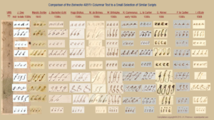
It was necessary to hunt through several hundred documents to find a few hands that closely resembled the style of writing on folio 1r and this is still a work in progress. It may require hundreds more to get a sense of when and where the columnar letters were written. As it is, Dee’s handwriting is somewhat close, and he sometimes wrote the “e” with a hook as in the columnar text, but the slant and pressure dynamics differ, so it’s not an exact match (click to see a larger version).

The hand of Isabella d’Esté (far right) is surprisingly similar to Dee’s (with the exception of the “g”), which demonstrates not only that geographically distant writers can end up with similar letter forms, but that it’s unwise to jump to conclusions when finding something that “almost” looks the same…. there might be others that match even more closely that may lie undiscovered.

Summary

When I first saw Dee’s handwriting, I noticed similarities between it and the VMS columnar text, but after sampling the handwriting of other writers, it appears that this style of script was widespread geographically even if it was not entirely common (I encountered many other styles in the search for this handful of samples).

My gut feeling, until more data is available, is that the columnar text was probably added sometime between the late 15th century and the mid-16th century. This is very tentative, as there is so little to go on, and certainly will be revised if additional examples that match more closely are found.

J.K. Petersen

© Copyright 2016 J.K. Petersen, All Rights Reserved

The Blue Cube

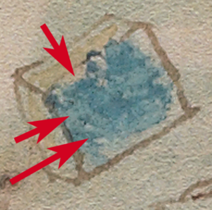
Voynich researchers have been discussing the “blue cube” on the small plants page in the Voynich forum and there are various ideas about why this anomalous object is in a section dedicated to plants and objects that look like containers.

It’s painted blue and pale yellow and is roughly book-shaped.

I wanted to know what was under the paint, so I tried to remove the paint without disturbing the faint brownish lines underneath. This is difficult because brown also includes a certain amount of blue which tends to disappear when the overpainted blue is lightened.

I didn’t expect to find anything under the blue paint. I assumed those faint traces of brownish color were just lines but was very surprised when shapes emerged that resemble writing.

Is There Writing Out of the Blue?

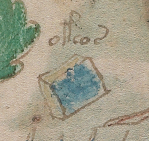
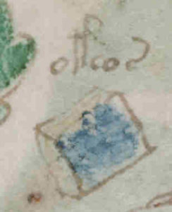
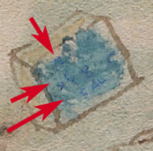
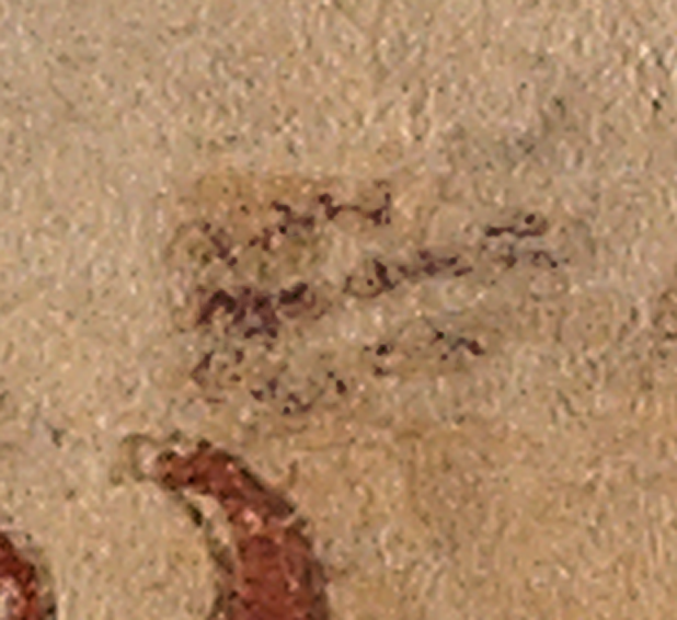
There may be two, perhaps even three lines of text and I don’t know if they’ll be sufficiently visible in a blog pic. The first one (the top line) I can’t be sure. There’s a shape that resembles an “M” or possibly “a M” but it might be irregularities in the parchment where the paint tends to pool.

bluecube bluecube2


The second line is less ambiguous. It looks like Voynich characters. I can almost discern an EVA-ell, then something faint that’s hard to see, perhaps another EVA-ell or EVA-r or maybe it’s a space. The following glyph looks like a figure-8, then there’s a space, then a messy shape that looks a bit like a c-shape with a blotchy descender that probably isn’t a descender at all. It looks to me like a darker paint-brush stroke.

What’s even more surprising is that there seems to be another line at the bottom in another hand. It’s not small and neat like Voynichese, and it doesn’t look like Voynich characters. It’s reminiscent of the large straight angular block letter scribbles that are drawn by children, somewhat like the scribbles on a few of the VMS pages. It looks like it might be “S A L” which is “salt” in some languages, and which might apply to a cube in a page of plants. Salt was a preservative, an ingredient in medicinal recipes, and was, of course, used in food.

If you’re wondering if I projected an expectation of the word “salt” on the shapes, I think that’s unlikely. I shook my head when I first saw it. I thought the cube might represent some resin or mineral more commonly associated with various herbal compendiums and would not expect salt to be drawn this way.

I’m not claiming the cube is salt or even that this interpretation of the shapes is correct. Why would someone represent it as a cube and paint it blue? Why would the sides be yellow with an added line that makes it look like two blocks laminated together? Salt crystals are whitish, irregular and very small. They’re grainy like sand. Rock salt looks more cubical than modern table salt but it doesn’t look like this.

Summary

bluecube4So… I’m not absolutely sure it says SAL—maybe it’s “S AL” or a parchment wiggle followed by “AL” or pressure marks from a knife as are found in a few places in the manuscript. You can click on the thumbnail right to see the larger version).

I’m not sure of any of the text—but there’s something under the paint that appears darker and more systematic than irregularities in the vellum that I have tentatively marked with dots in the bottom image.

bluecube3

In medieval manuscript preparation, it was common to write a color name on an object that was later to be painted. Finding text isn’t unusual in itself, but this text doesn’t show any obvious signs of indicating color.

The only glyph that is reasonably clear (on the unmarked image) is the EVA-ell, and we have to remember that all of this is very small—the marks might be artifacts created by the texture of the vellum.

Once again, you’ll have to decide for yourself if there’s writing under the paint and what it might mean.


J.K. Petersen

© Copyright 2016 J.K. Petersen, All Rights Reserved

A Maw in the Map?

The VMS Portal

I have an overfull schedule that makes it difficult for me to blog regularly, but the subject of apocalyptic cartography came up on the forum today and reminded me of some thoughts I had about the Voynich “map” section.

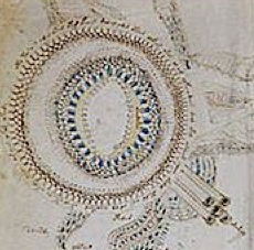
VMSRosette1ThumbI first set eyes on the rosettes page in the Voynich Manuscript in 2008* and immediately had several thoughts about it, including the impression that it might be a map (obviously this has occurred to many people but up to that point the only opinions on the VMS I had seen were Edith Sherwood’s plant identifications).

I started with the top-left rosette and expended a lot of energy following up ideas that came to mind from this one rosette alone. Unfortunately, most of this research was done very late at night, after a 12 to 14-hour workday,  which means the notes only make sense to me, and are not suitable for general consumption and I still don’t have time to whip them into human-readable form (hopefully I can do so one of these days). Now I’m shocked to see that 8 years have gone by and I still don’t have time to post them.

So… since ideas have a way of going stale if you hang on to them for too long, I decided to summarize my first impressions, in case they are of interest to fellow Voynicheros. I haven’t looked to see if any of these ideas were original when I first had them (or if any are still original now). I simply have given up hoping for more free time and, for what it’s worth… decided to share them. These were my thoughts on first seeing the VMS “map” and Rosette 1 (top left).

  • I thought it might be a volcano (the wiggly lines in the middle looked like flames to me and probably did to other people, as well).
  • I thought it might be the Mount of Olives in Jerusalem (I considered the possibility of the illustrator documenting a crusade, but try as I might, I couldn’t reconcile the individual parts to Jerusalem—they  don’t fit quite well enough to pass the sniff test, even if some of the tombs at the time looked a bit like the tower coming out of the hole).
  • That it might be a coliseum and the mounts might be the hills of Rome (coliseums were sometimes flooded for water sports and, if games continued into dark, may have had torches lining the arena and there’s a she-wolf teats-like picture in the bathing section).
  • That it might be a “portal” to another world and, since those look like flames around the inner edges, perhaps it was meant to be a portal to hell or something along those lines (which is why the apocalyptic cartography thread twigged my memory).

I’m going to have to win a lottery to make enough free time to whip my hundreds of pages of notes into shape, and since that’s not likely to happen in the near (or distant) future, I finally decided to post these ideas as food for thought.

J.K. Petersen

© Copyright 2016 J.K. Petersen, All Rights Reserved


Postscript, correction: I was going by memory when I wrote the above date of 2008. In looking back at my files, it turns out I first began studying the VMS map in spring 2007 (that’s when I created a directory and started collecting and studying medieval maps).

Tracing the Twins

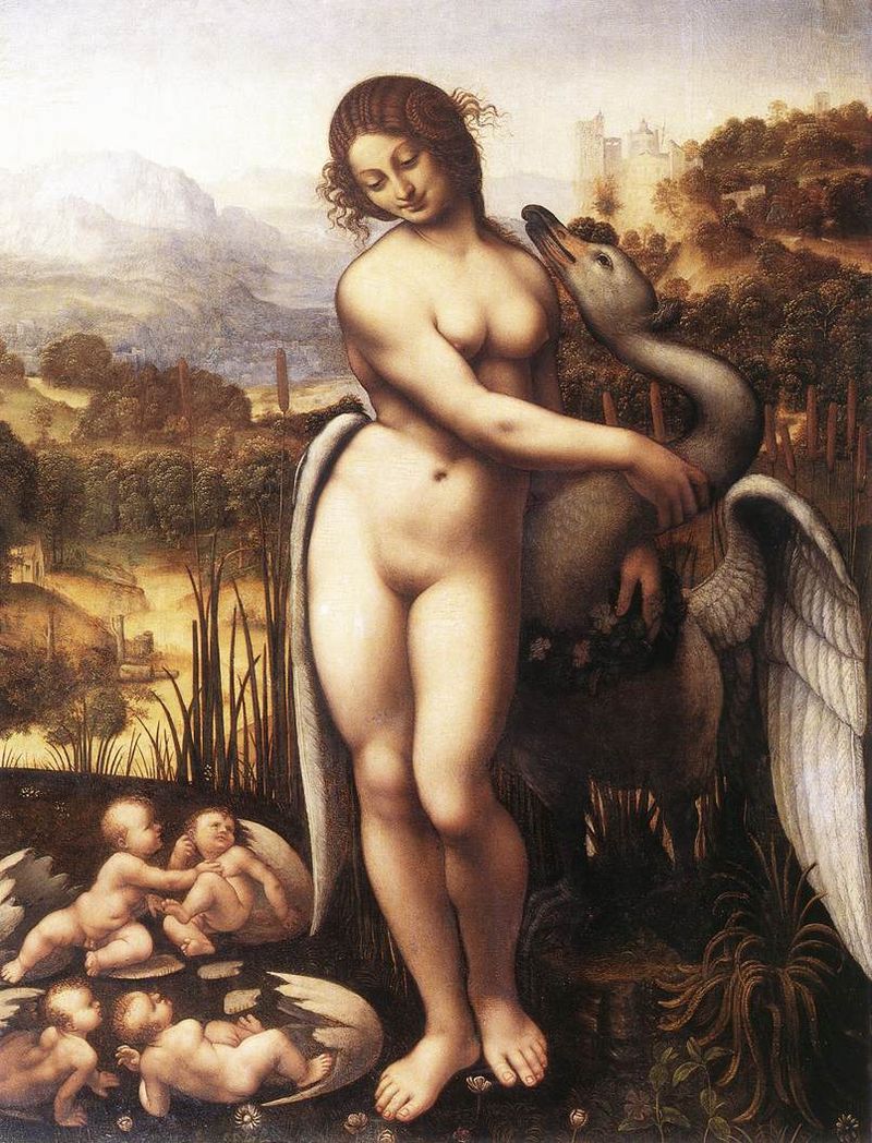
LedaSwanfromDaVinci

Cesare da Cesto copy of a painting by Leonardo da Vinci showing Leda, Zeus in the guise of a swan, and the two eggs that hatched from their union—one with the sisters, the other with the brothers, Castor and Pollux.

The constellation Gemini is traditionally represented by male twins who were born to the legendary Leda, daughter of King Thestius.

The god Zeus desired Leda, but she was married to the Spartan King, so he came to her in the form of a swan that was fleeing an attacking eagle, thus contriving to fall into her protective arms with the intent to seduce her. In the process he impregnated her and she bore two sets of twins.

In one version, the male twins Castor and Pollux were fraternal twins, one born of King Tyndareus, the other of Zeus. In another version, two eggs result from the illicit union—one hatches into Castor and Pollux, the other into their sisters.

The twins were close, as many twins are, so when Castor was killed, his brother Pollux was devastated and begged Zeus to reunite them. To soothe the twin’s grief and perhaps to atone for his adulterous sin, Zeus turned them into the constellation Gemini, so they could be together forever.

Based on this legend, Greco-Roman images of Gemini typically show male twins closely associated, side-by-side.

The VMS Interpretation of Gemini

In contrast, the Voynich Manuscript Gemini shows a man and a woman clasping hands crossways (a posture that was noted by a number of Voynich researchers) in the center of a figural wheel.
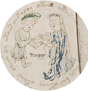
Voynich Manuscript Gemini tunic and laced bootsLet’s look more closely at the details…

The man wears a traditional belted pleated tunic, boots, and the larger floppier medieval version of a beret. The tunic and hat are painted green.

The woman is decked out in a flowing blue robe with wide sleeves with a scalloped edge (probably trimmed with ruffles or lace). An undergarment or shirt can be seen poking out past the outer sleeves. She has long hair and a blue band across her forehead. It’s interesting that the illustrator included this level of detail in the boots and sleeves considering this drawing is very small.

I wondered whether the VMS image were unusual or whether Gemini traditions changed during the middle ages, so I looked through hundreds of zodiac cycles to study the pattern of evolution.

Traditional Depictions
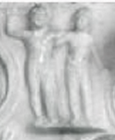
GeminiMithraicIn ancient and early medieval zodiacs, male twins are usually shown side-by-side with their arms around each other’s backs as in this Mithraic Gemini (right) from the 2nd century CE (now in the Modena Museum). From about the 9th century, the twins are sometimes shown standing side-by-side holding weapons, musical instruments, or symbolic items. Ancient Geminis were usually nude or wearing scanty togas. The ones in Jewish synagogues were usually clothed.
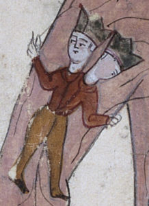
GeminiPersianIn Persia, we see a variety of cultural influences.

Some followed the Greco-Roman style of side-by-side twins and some depicted the twins with one body and two heads as in this 11th century “zodiac man” Gemini on the left. The Codex Vindobonensis (Austria? c. 13th C) has a similar image but the twins wear Phrygian caps rather than crowns. It would be easy to assume the two-headed Gemini was based on Janus, the ancient god who symbolized the beginning and the end and was often shown with two heads, but it doesn’t fit well with the legend of Castor and Pollux or the culture that created this variation, so it’s possible it’s based on something else…
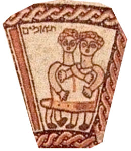
GeminiBeitAlphaThe two-headed Gemini is mostly seen in Hebrew manuscripts or those written by Jews in other languages, so it may have descended from the mosaics in the Jewish synagogues. In the Beit Alpha mosaic (6th C), for example, Gemini is two figures clothed in one garment. Even though each twin has two legs and two arms, it’s an image that could easily be interpreted as conjoined twins because we can’t see what’s going on under the shared clothing.

Gemini in the Middle Years
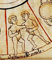
GeminiFranceIn other cultures, the Greco-Roman tradition of nude male twins (sometimes with and sometimes without genitalia) and, in some cases, a nude male Virgo, continued for a few more centuries. The 11th-century image on the left is a Frankish zodiac that retains Roman influence.

So when did the creators of manuscripts decide to go their own way and clothe the twins?
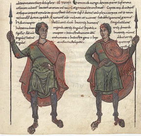
GeminiMonasteryOne of the earlier examples of the break with tradition is Vatican Reg. Lat. 123, created at the St. Maria Rivipulli monastery c. 1056. The influence is clearly Greco-Roman, but Virgo and Gemini are fully clothed (right), thus imposing Christian modesty on legendary Pagan characters. Note that they also separated the twins with a wider space. The addition of clothing was picked up by some of the English and Frankish illuminators at around the same time, as in Arundel 60 and Royal 13 A XI, but some continued to depict the characters nude.

Some illuminators compromised by drawing mostly naked twins in scanty breech cloths (e.g., Egerton 1139, c. 1130s CE) or, in later years, by hiding them behind a bush (the green kind).
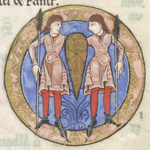
GeminiHunter

Hunterian Psalter, England c. 1170, British Library

In the Hunterian Psalter (left), the twins are fully clothed but display a further innovation… they share a common shield—an iconic representation of their commitment to stick together to defend one another as brothers. This detail is important because the shield becomes widely adopted later, first in England, then in other areas. Note also that the clothing is becoming more local than Roman.

One of the transitional zodiacs is the Stammheim Missal (Getty Ms 64, c. 1170s) which includes a mixture of Greco-Roman and biblical elements. Virgo is female, as in Jewish and Christian zodiacs, Sagittarius is a satyr with an animal head (Jewish), and Capricorn is a Roman-style sea-goat. I thought Gemini might be male-female, but on looking at a higher-resolution image, it appears that both are male.

Gemini Gender Reassigment
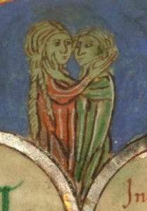
Claricia Psalter affectionate or romantic Gemini couple (male/female)One of the more significant changes in Gemini is the introduction of male-female twins, and one of the earliest unambiguous examples is the c. 1300s Claricia Psalter (right). Why alter a tradition that had remained virtually unbroken for more than 1,000 years? Maybe the female twin was introduced because this psalter was created by nuns—most scriptoria were staffed by males.

Hildegard von Bingen’s drawing of Gemini (c. 1200) might be male-female, but it’s hard to tell. There are definite differences between the twins, but the drawing is small and somewhat ambiguous. I suspect it’s male-male.

The Shared Shield
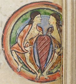
GeminiBloisComing back to the shield, the Henry of Blois psalter is an Anglo-Norman manuscript created in England in the late 12th or early 13th century that includes two seminude twins, probably both male, leaning toward each other over a shield-like central embellishment. Its identity as a shield is less definite than later manuscripts. If you separate out the blue background and orange cloaks, it’s unusually narrow, more like a decorative element than a shield, but it may have been perceived as a shield because shields became popular from this point on.
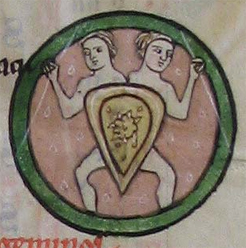
GeminiHoursVirginThe introduction of the shield allowed the nude tradition to continue without offending people of more modest sensibilities, as in the Hours of the Virgin (right), which interestingly shows conjoined twins (as does Trinity B-11-7 from c. 1400). Morgan Ms M.153 and Ms M.283 (France) follow the same illustrative tradition. Note that the twins are still typically male. You may also have noticed from the examples (and as mentioned in the previous blog on Libra) that medieval zodiacs are frequently enclosed within circles.

Diverging from Tradition
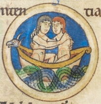
GeminiShaftesThe Shaftesbury Psalter (England, c. 1237) is similar to the previous three in many ways, but introduces a new motif for the twins. They’re not standing or holding weapons, they’re not hiding behind cloaks or shields. Instead they are clasping each other by the shoulders and floating together in a boat with a nordic-style figure-head. The sign for Capricorn is also unique from other zodiacs. It is bright blue, has been liberated from his fish-tail, and is marching and blowing a horn, a theme possibly inspired by marginal drawings in manuscripts that don’t include zodiacs.

The Male-Female Theme Goes Mainstream
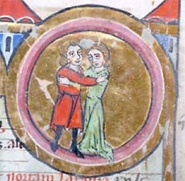
GeminiMorganBy the mid-to-late 13th century, male-female pairs show up independently of the Claricia Psalter. The Amiens Cathedral, near the north coast of France, has a stone-carved Gemini of a man and woman holding hands and gazing at each other with warm affection, exemplifying the break from Roman tradition. Closer to the source of the Claricia Psalter (and perhaps influenced by it) is Morgan Ms M.280 (right) with male and female clasping one another.
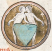
GeminiRoyal2BWhat is not known about these early examples of male-female Geminis is whether illustrators had lost the connection to the legend of Castor and Pollux or if this was a deliberate choice to create their own zodiac traditions at a time when the idea of “courtly love” (medieval chivalry) was gaining popularity.

In Royal 2 B II, a French Psalter, the figures aren’t just sharing a filial hug, they are kissing one another, in a manuscript created for a nun. After the mid-13th century, many manuscripts include a shield (usually with male twins) or male-female twins clasping one another or holding hands.

Hebrew Traditions
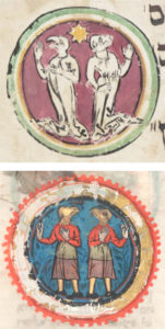
GeminiMMahzorThe Michael Mahzor (right), a Hebrew document from the mid-13th century, has a unique interpretation of the twins. They are drawn with animal heads and face away from one another, with no physical contact. Virgo is also drawn with an animal head, possibly due to the prohibition against graven images.

The Schocken Italian Mahzor,  Add 22413 mahzor (c. 1322, lower right), and Oxford Mahzor (1342) similarly have animal heads, but the figures face one another.

The Add. 26896 mahzor (c. 1310s) harks back to older versions with conjoined twins but with animal heads (rather than human heads wearing crowns, as in the Persian Gemini previously shown).

The Dresden Mazhor from 1290 contrasts with the previous examples by having male and female figures with human heads facing one another.

Innovations in the 13th Century
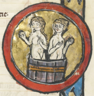
GeminiSwissThe twins-in-a-boat was an early 13th-century English creation. Half a century later, in Switzerland, there was another creative variation in which the twins (who may be male and female) are shown in a bathtub (or a wine-stomping barrel). The other zodiac signs in the Swiss manuscript follow traditional patterns for the region, so it’s not clear why the bathtub was added. The bathtub shows up again about a decade later in a manuscript from Liège that follows some of the conventions of central Europe.

England diverged from tradition again in the early 1300s by drawing the Gemini twins and Virgo as merpersons. Around the same time, a manuscript from Bologna included two sets of twins (possibly because Leda’s swan eggs produced twin boys and twin girls).

Persian Manuscripts

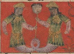
Persian astronomical/astrological manuscriptsGeminiFishPersia before the 11th century typically didn’t include a full zodiac but, by the mid-1300s (right), we see male twins with a conjoined fish tail facing one another, holding a head on a staff. Later manuscripts from the 15th century had male conjoined twins sitting crosslegged in eastern-style dress. Clearly the VMS Gemini is not based on this model.
The Exception Becomes the Norm
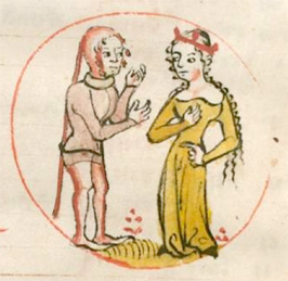
GeminiGermanBy the 14th century, male-female zodiacs were common in the Anglo-Frankish and Germanic regions (which included most of the Holy Roman Empire, including northern Italy down to Rome and Venice).

Not all illustrators made the switch, however. In Tractatus de sphaera (c. 1327), the traditional nude male twins and Virgo with wings are seen.

A Catalan breviary differs from most zodiacs by illustrating Gemini as a pair of male warriors going at each other in a very unbrotherly way.

Zeroing in on the VMS
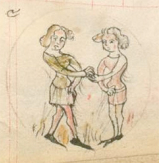
GeminiRegenBy the mid-1300s, Gemini twins start to more closely resemble the VMS Gemini.

There were still many Geminis with shields in France and England, and zodiacs from Genoa (c. 1365) and Padua (c. 1378) that include a traditional pair of nude males, but Germanic manuscripts (especially Swiss, German, and a few of the Czech zodiacs), and a few of the English and French manuscripts, illustrate the idea of “courtly/chivalric love” and are possible precedents. Getty Ms 34 (1395) takes it one step further and has the twins in an unusually tight hug.

Small Stylistic Changes in the 15th Century

Around 1418 there was a re-emergence of nude male twins in both France and Germany, but rather than drawing them like Roman warriors or gods, they look more like young men and boys. A manuscript from Germany takes a different approach and casts the twins as Adam and Eve holding branches against their groins.

The poses change as well. Rather than clasping one hand or hugging each other’s backs, the figures are commonly clasping arms at the elbow or stretching their arms so their hands are on each other’s ribs. To date, I have not found one in which the arms reach across each other as in the VMS.
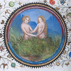
GeminiProvenceBy the 1440s, modesty again takes hold in parts of France, and the twins hide behind bushes. In one case conjoined twins hide their shared groin behind an oversized fig leaf (BNF Latin 924) and then the trend swings again toward depicting the twins as completely nude (and not hiding behind anything). In this way the French manuscripts generally differ from the VMS, which shows the twins modestly clothed with high necklines.

While central and northern Europe were developing their own styles, the illuminators in southern Italy retained many of the Roman traditions into the 15th century, including togas, two-legged Taurus, and Virgo with wings (e.g., Codex Bodmer 7 from Naples). A 15th-century zodiac by Cristoforo de Predis of Milan follows the central-European models except that the nude male twins stand back-to-back.

Summary
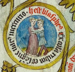
15th century affectionate couple similar to VMS Gemini and Claricia PsalterThe early 15th-century image on the right is not specifically from a zodiac cycle, but I’m posting it because it includes a clasping couple with text around the circle, reminiscent of the VMS, and helps to remind us that the VMS illustrator may have consulted non-zodiacal sources, as well.

It can be seen from the examples that the VMS Gemini bears little resemblance to the Persian, traditional Jewish, or southern Italian zodiacs, and only slightly resembles those from France and Spain. Like Sagittarius with a crossbow, the lizard/dragon Scorpio, and Libra without a figure, the ones that most nearly resemble the VMS in terms of subject matter, pose, and painting style, are the zodiac Geminis from Germanic Europe (the Holy Roman Empire).

J.K. Petersen

© Copyright 2016 J.K. Petersen, All Rights Reserved
Voynich Text Underpinnings

6 May 2017

A discussion about the Voynich Manuscript zodiac pages (with examples by Marco Ponzi) came up today on the Voynich.ninja forum and I wanted to post something I’ve been sitting on for a while that relates to the structure of the VMS text.

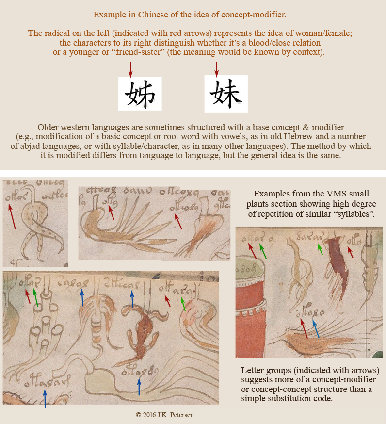
I’ve selected some of the imagery from one of the small-plant pages and included an example from Chinese. This does not mean the underlying language is Chinese but that the structure of the VMS text is similar to quite a number of languages that have a syllabic structure that is based on concept-modifier or concept-concept in various combinations of simple building blocks. I think this structure argues against a basic substitution code but might enlighten how the manuscript is encoded.

MVSConceptStructure

If you look at various sections of the manuscript, you will see the same patterns. The VMS is written mostly in Latin characters and numerals (with some original shapes included), but the conceptual foundation (that of basic building blocks combined in similar ways for similar items), exhibits some of the structural characteristics of syllabic languages (or of a constructed/synthetic language).

vonBingenScriptConstructed languages were not a novel idea in the middle ages. Magical languages have a long history, as do kabbalistic symbols as a means of communication. There are some interesting arguments that much of the Bible is allegorical and that there are numbers embedded in the text that provide secret information to those who are schooled in the hidden arts. Hildegard von Bingen created a cipher and partly constructed language in the 12th century.

In the 17th century, John Dee had a strong interest in ciphers, symbols, and magical languages and expended considerable energy on recording them, and Athanasius Kircher developed a universal script in the hopes that communication could reach a wider audience.

But coming back to the Voynich Manuscript…

The VMS has many properties that suggest a constructed language or perhaps one that is a hybrid of natural and constructed language. I’ve remarked before on its singularly regimented style and seeming rigidity and its similarity to syllabic languages (anyone who has practiced their ba, be, bo, bu, and ma, me, mo, mu while studying Asian languages knows what I’m talking about).

The likelihood that the labels are names or regular nouns (as opposed to combinations of noun-concepts) seems low, given that no one has managed to decode them in a way that relates to the labels as a whole or illuminates any of the rest of the text. Anagramming the characters to come up with a handful of labels that look like words isn’t sufficiently convincing either. It seems more likely that the labels represent attributes or information about the items’ composition or use than the names of the items.

Will this unlock the information on the pages without illustrations?

The structure of the “labels” is similar to that of the main text, which also appears to be made up of simple building blocks and includes a high degree of repetition, but there are some additional dynamics in the longer passages that go beyond the kind of glyph-combinations that are in the labels. The very fact that many lines end with the same characters, characters that rarely appear midline, suggests an added level of complexity. Nevertheless, a better understanding of the labels might help unlock the rest.

J.K. Petersen

© Copyright 2016 J.K. Petersen, All Rights Reserved

Weighing in on Libra

Stylistic Variations

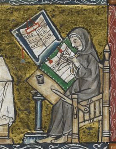
Medieval scribes were copyists. Before the invention of the printing press, it was difficult to mass-produce text other than by carving woodblocks or creating ceramic molds that could be impressed into wax or clay, both of which were inefficient, laborious processes for texts of more than a few pages. So they copied by hand, one letter at a time.

ScribeCopying

Medieval scribe copying a manuscript (Vatican Reg. Lat. 12).

Many of the copied manuscripts were sacred texts and it was considered sacrilege to alter the wording. Exact copies were encouraged and in some cases required by cultural law (as in the Hebrew Torah).

Since the idea was to reproduce the book as closely as possible, not to create an original composition, the basic template was often the same and regional patterns can be recognized, some of which can help us trace the origins of a manuscript.

That’s not to say there was no room for originality. Often the text was accompanied by embellished initials or illustrations, and variations were introduced by some of the more creative (or rebellious) individuals, variations that were then copied by subsequent generations.

Copying Zodiac Symbols

Aquarius9thCDrawings offered a little more leeway for artistic expression than the text. Over the centuries, zodiac symbols have been drawn or sculpted with small variations that point to certain regions or illustrative traditions. Ancient zodiacal figures, based on Pagan or Mithraic beliefs (which were broadly disseminated by Roman soldiers), often depicted figures as nude or dressed in scanty togas, while those from the late middle ages more often were clothed.

Animal symbols underwent small changes, as well. Capricorn started out as a seagoat with a distinctive fish-tail, and gradually took on a variety of forms, including goats in shells, goats with dragon tails, or a naturalistic goat with four legs. Cancer could be a crab, crayfish, or lobster. Scorpio was originally a scorpion but was later shown in some areas as a lizard or dragon. Sagittarius could be a centaur, satyr, or human figure.

Tracing the Traditions

Over a period of several years, I collected hundreds of examples of zodiac cycles. Almost 400 of them were western-style zodiacs (most of them full cycles with 12 signs). After comparing them for stylistic patterns and trends, I was surprised to notice a change in the depiction of Libra in the early 12th century that I haven’t seen others remark upon but which may tell us something about the VMS.

Libra in Hand

Libra9thC

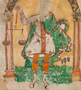
Roman-style Libra with male figure, c. 9th century St. Gall, Switzerland.

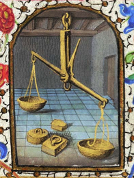
Prior to the 12th century, Libran scales were usually held in the hand of a human figure, except in a few instances where space was very constrained. There are a number of exceptions where the scales are shown alone, including

  • a Roman mosaic in Tunis
  • the 9th century Leiden Aratea zodiac, and
  • an 11th century mosaic in Otranto Cathedral (south of Brindisi, Italy).

But these are exceptions rather than the rule—scales-only Libras are less common than those where the scales are held by a human or human-like figure (usually a Roman god), as will be seen from examples that follow.

Exploring the Imagery

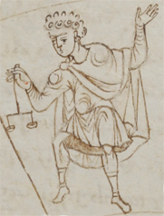
Male Libra holds scales aloft in this Carolingian zodiac from the Reichenau monastery, Germany. Image courtesy of the Vatican Library.

Male Libra holds scales aloft in this Carolingian zodiac from the Reichenau monastery, Germany. Image courtesy of the Vatican Library.

Prior to the 12th century, most treatises on astronomy and astrology were not illustrated, but there are some and they derived from Greco-Roman styles.

The painting on the right is from a Carolingian manuscript, illuminated at the largest scriptorium in S.W. Germany. The face has been damaged, but based on the clothing treatment of other figures in the cycle, the figure holding the scales appears to be male. This example illustrates that the figure-with-scales imagery was in use in central European manuscripts by the 9th or early 10th century, but that local styles of dress had not yet been incorporated into zodiac drawings.

About 200 years later, something changed and that change appears to center around southwest Germany.

What stands out after comparing hundreds of sets of pre-1500 zodiacs is a temporal and geographic cluster of Germanic zodiac signs that depict the scales alone (mostly in missals and psalters but also in medical and astrological texts). There is also a 13th-century zodiac from Georgia without a figure that could be an isolated example or which might be related in some as-yet undetermined way to the others that I have included in the diagram below.

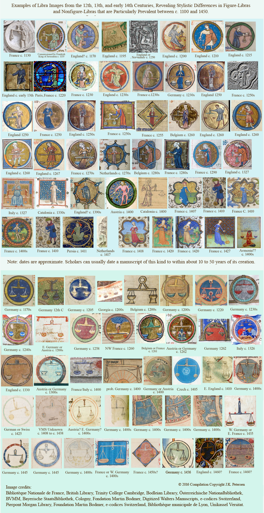
In the following chart, I have grouped the images according to whether Libra includes a figure (top) or only the scales (bottom). It is further organized according to approximate date of creation (exact dates are not known but are probably correct within about 10 to 70 years):

MedievalLibrabyJKPI thought I had found a 12th-century example of scales without a figure in the Soissons Cathedral stained-glass windows but then discovered that most of the glass had been replaced in the late 1800s.

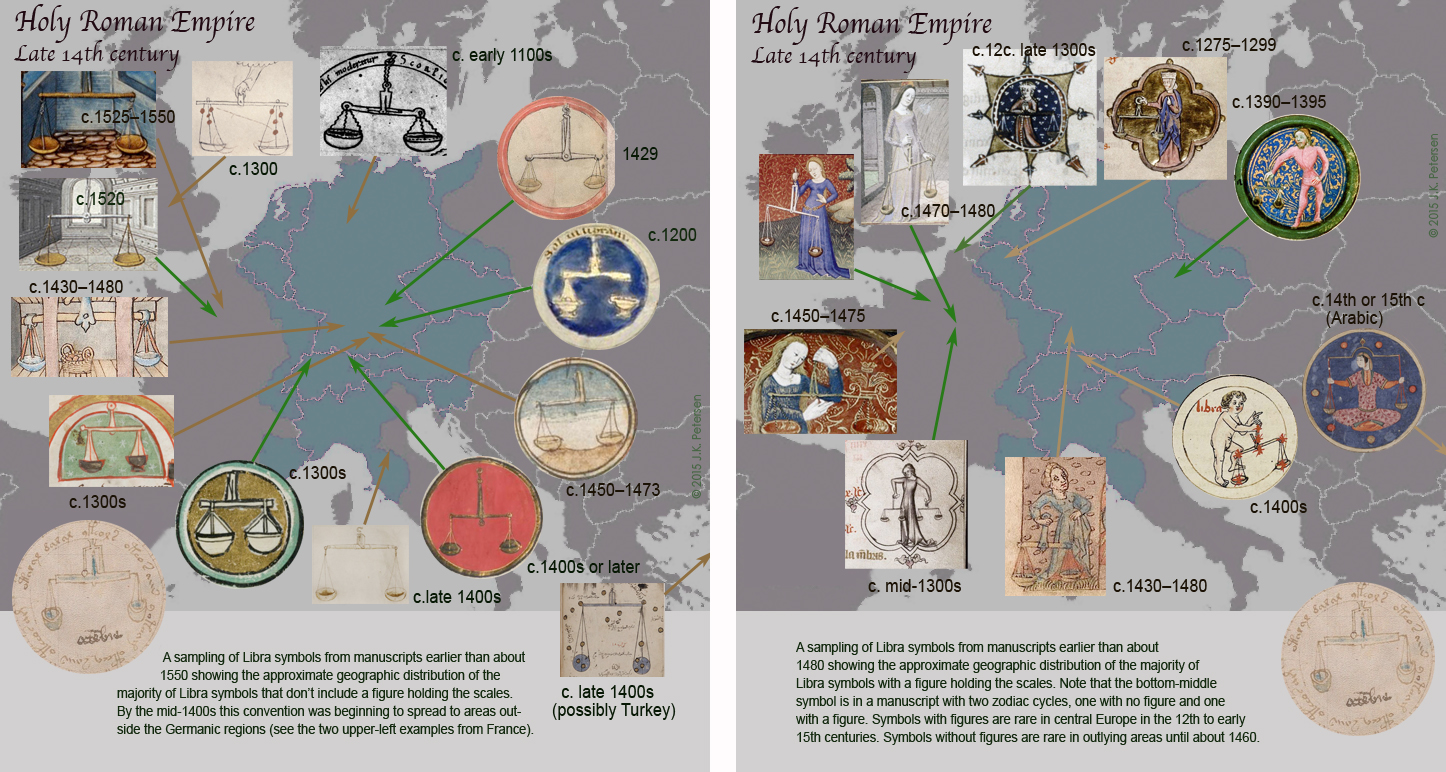
[Addendum: I forgot to post this map that accompanies the above chart, which shows a sampling of the approximate temporal/geographical distribution of these symbols. I include it now (May 7, 2016)]

LibraMap15thCAs with most research, the above chart, assembled over several years, is still a work-in-progress. Nevertheless, some interesting patterns are apparent between approx. 1130 and 1460:

  • Most zodiacs signs were enclosed by circles unless they were a spoke in a zodiac “wheel”. A few were on plain backgrounds. By the 15th century, some were becoming more elaborate, especially those from France.
  • Zodiacs in Frankish and English manuscripts typically feature a figure holding the scales (Trinity B-11-5 from Normandy is an exception to this general pattern) until around 1460.
  • The figures holding the scales are usually standing, except those from Persia and possibly Armenia, which are usually sitting cross-legged.
  • Libra images in traditional Roman garb are usually male. Others are usually female.
  • By the mid-13th century, most of the zodiacs are drawn with medieval dress rather than Roman togas.
  • Ancient Roman zodiacs were often created in tile or stone, but Carolingian-era and early-medieval zodiacs from English and Germanic regions (Germany, Switzerland, Austria and northern Italy) showed up frequently in manuscripts, whereas Frankish zodiacs tended to embellish physical structures such as churches (stone-carved portals and stained-glass windows were popular).
  • Before 1455, scales without figures were mostly Germanic.
  • Simple versions of scales without figures don’t show up with any regularity in England, Italy, or France until about 1260, and even then they were a distinct minority compared to those with figures.

The Missing Link

ScorpioLibra

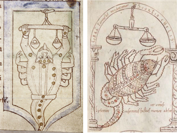
In Bodley Ms 614 and Digby 83 (both English manuscripts), a scorpion (rather than a human figure) holds the scales. In the German version (right) the scorpion is close to the scales but doesn’t hold them, which may have led copyists to assume the scales and scorpion were completely separate.

I searched extensively through zodiacs to discover a reason for the simplified Libra and finally had enough examples to guess what may have happened. Ancient depictions of Libra sometimes show the scales held by a scorpion rather than by Virgo.

The examples on the right serve as a tentative explanation. The one with a scorpion holding the scales is from England from c. 1150. The one on the right is from S.W. Germany from around the same time. They both derive from the Hyginus tradition (which traces back to Greek sources before the 2nd century CE), but the second one visually separates the scorpion from the scales. Since Scorpio is a constellation in its own right, copyists may have overlooked or dismissed the association between Scorpio and Libra and further separated the scales from the Scorpion in subsequent copies, thus creating a stand-alone Libra that was particularly prevalent in Germany.

The Spread of the Illustrative Tradition

FranceArchiLibraThe simplified scales in the Germanic manuscripts are not due to lack of space—the images of Sagittarius and Aquarius in the same zodiac cycles are quite detailed—so it appears to be a stylistic choice that contrasted with that of surrounding regions.

By the second half of the 15th century, it is apparent that figureless scales had spread to other countries, as in this example from France from c. 1457 (right). The French zodiac cycles (which were sometimes painted by Flemish artists) tended to be more ornate and more richly colored than earlier Germanic Libras and were often shown within architectural settings, an innovation that set them apart from the Germanic examples.

Simplified Libra and the Voynich Manuscript

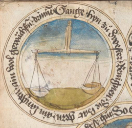
The Voynich Libra most closely resembles the Germanic zodiacs, regardless of whether this was coincidental or deliberate. It doesn’t look like conventional Libras from France (with the exception of  few isolated examples from NE France or Flanders) or from the eastern Mediterranean. It particularly resembles those from Switzerland, southern Germany, eastern Austria, and England (note that England had strong ties with St. Gall at the time).

This by itself doesn’t prove an association, but taken together with Cancer as a crayfish, Scorpio as a lizard or dragon, and Sagittarius with legs and a crossbow (which is a rare combination), there are multiple illustrative choices that point to the same region.

Summary

Librac1460

A German Libra from c. 1460s probably post-dates the VMS but I’ve included it here because it is a rare example of a zodiac with text written around the sign in a circle (BSB CGM 312).

There may not be an exact model from which the VMS was copied (if there is, it may not be publicly accessible or may have perished along the way). It’s entirely possible that the VMS illustrator was exposed to a variety of styles if a manuscript library or scriptorium were nearby, or if his profession involved travel.

If the illustrator researched multiple sources and then filled in the blanks with original ideas, the Voynich Manuscript’s association with other documents may never be clear, but the examples in the above chart show that this style of Libra was particularly prevalent in central Europe from about the early 12th century to the 15th century, which includes the period during which the VMS was created.

It hasn’t been determined where the VMS illustrator was born or lived, but it appears that he or she was influenced, at least in part, by documents from central Europe.

J.K. Petersen

© Copyright 2016 J.K. Petersen, All Rights Reserved


Colorizing the Columns

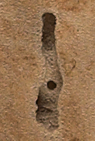
Wormhole1The Voynich manuscript has quite a few holes and “worm trails” from some kind of infestation that appears to have especially affected the outer pages (possibly because the pesky critters preferred the mmmm, mmmm good-tasting binding over the inner pages). I like to think of the one on folio 1r (right) as the portal to the medieval dimension.

In middle ages terminology, “worms” was a catchall word for things that make you sick, much as we use the word “germs” today, except that medieval “worms’ had superstitious associations because “germs”, as we see them through microscopes, weren’t yet discovered.

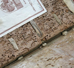
WormHoles

A worm-riddled manuscript cover in the Chicago University library. Detail of photo courtesy of CU and Melina Avery.

“Worms” also referred to the little wiggly things that infested medieval folks, such as lice, ringworm, round worms, pin worms, and some really nasty worms I’d prefer not to list. And then there are worms that like to gnaw through books, such as silverfish and various kinds of beetles.

Worm trails can make it particularly difficult to interpret parts of a manuscript that have been eaten away, especially if the text is small and faint. Worm trails are very intricate shapes and can sometimes look like letter forms, which makes small surface nibbles hard to distinguish from real letters.

Making Sense of the Columns

On folio 1r, on the right-hand side, there are three columns of letters and a few shapes that somewhat resemble the “red weirdos” on the same page. The first column appears to be the alphabet in Latin characters. The second column doesn’t follow an alphabetic pattern and may have been someone’s attempt at decoding the manuscript with a substitution code. The third column is faint and doesn’t appear to have as many characters as the others.

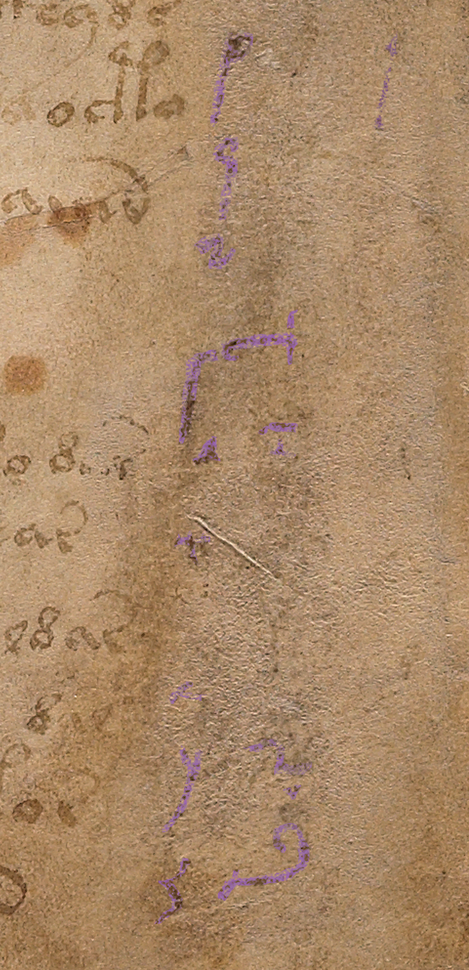
Voyf1rColumns1I had considerable difficulty trying to determine which marks were worm marks, which were variations in the parchment, which were chemical abrasions, and which were letters or other glyphs, but I did my best to colorize the forms so they can be more easily seen.

This is a very subjective process based only on scans, since I have never seen the original document, but I thought it might be helpful or at least of interest. I used a different color for the two shapes that look more like “red weirdos” than the other letters (the upper one, at least, the one that resembles a Y shape and is next to the “c”, looks like it was filled with a brush rather than a pen).

I asked myself what would motivate a person to scrape or chemically remove the columns on the right? The two most likely explanations seemed to be 1) to hide the original code or 2) to remove an unsuccessful attempt at decipherment.

Voyf1rColumns2Since the column script doesn’t match the handwriting for the marginal notes or the zodiac labels, and has a different look and feel than the original VMS text, I’ve been assuming for now that it was written by someone else and may be a failed attempt at decipherment. The problem with this idea is that some of the shapes in the second column are not regular shapes in the VMS and the Y shape that resembles a red weirdo may have been part of the original document, considering there’s an oddly placed red weirdo above it. Is it possible there were shapes in the margin before the columnar text was added?

The age of the column text is difficult to determine. The ink appears to be old, but the style is not Gothic cursive, as are the marginal notes. Gothic cursive was especially prevalent in the 15th century, which suggests that the marginal notes might be as old as the VMS, or almost as old, but the columnar text is different—it could range from about the 16th century to perhaps the 20th century, depending on the region. If I were forced to guess, I’d probably guess late 16th or 17th century.

Voyf1rColumns3You might notice something interesting toward the bottom of the second column—the shape at the bottom is rounder and more elaborate. It’s difficult to tell if it was written at a different time or by a different hand (or whether the column writer switched to a different style of writing, which seems less likely). To the left of it, in the first column, are a pretty standard y and z and possibly an x above the y, but it’s very faded and hard to tell. Above the curly letter in the second column is a shape I can’t make out.

A Little Dessert

I have one more image that strikes me as interesting. It was difficult to adjust the colors because it’s very small.

Voyf1rTinyTextIf you turn your head to the left next to the top right weirdo, there are three lines of what look like erased text. Nothing is clear except perhaps the shapes at the end of the second line, which look a bit like a modern era capital-F followed by an a (or maybe a g), but it’s scrawly, so I really can’t tell. It doesn’t look like Arabic, Hebrew, or any other language I recognize. The problem with identifying scrawls is that there are some shapes, like n or r, that look like letters in many languages (Anglo-Saxon, Latin, Greek, Hebrew, Italian, German, French, and many others) even if they mean something different in another language.

The VMS has gone through many hands, so who knows who may have added notes. Why the note would be so tiny is a bit of a puzzlement. Maybe you can make it out.

J.K. Petersen

© Copyright 2016 J.K. Petersen, All Rights Reserved

Character Glyph or Plummeting Rock?

This is a detail of part of the text on the last page of the Voynich manuscript. It appears to be a mixture of an unknown language or charm language, Middle German, and Latin, with a strange shape at the end of the last line:

F116vGasMichIs that an “o” following the word “mich”? I don’t think so, for the following reasons:

  • It’s not in line with the rest of the text.
  • It’s not shaped like any of the other “o” shapes—it’s irregular, like a rock, not like a letter and the stroke order is different.
  • It’s not only shaped differently from the “o” shapes, it’s bigger.
  • It’s drawn with four dots above it and a fifth to the left of the lowest. In contemporary iconography, it looks like it’s falling. I like to call it the plummeting rock and whether it’s falling or not, I consider it a drawing (like the drawings on the far left), not a part of the text.
  • It’s textually out of character with all the other words, which resemble Latin and old German, even if they’re hard to interpret, and an “o” would be linguistically out of step with what immediately precedes it.
  • Five dots is not an accent or diacritical mark in any language that I know. Two is usually the maximum; three is rare.
  • I don’t think the dots are pointing to anything. There are many snaky lines throughout the VMS pointing to things. Dots were sometimes used in Malaysian documents to point to important paragraphs, but dots are rare as pointers in most other documents—lines, arrows and manicules are more common. When scribes fixed mistakes, the corrections were rarely written underneath or so far away, usually they were written above or after the error.

So if it’s not an “o”, what is it?

As mentioned in a previous post, it looks more like the drawings on the left than a letter of the alphabet to me. I’ve been calling it a plummeting rock for lack of a better term, but that was simply a “working title”… I wasn’t expecting to find information to confirm or deny the identity of this little graphic because it’s small and appears unrelated to the other objects on the page.

Then I came across something of interest in alchemical documents. In medieval alchemy, the substances mercury, sulphur and salt were considered important and much has been written about Mercury, in particular, since it shares its name with the legendary Mercury of the gods.

Mercury was also widely used in medical remedies and was still used to treat syphilis in the 19th century (with questionable results). Mercurialis, a medicinal plant, also shares the name.

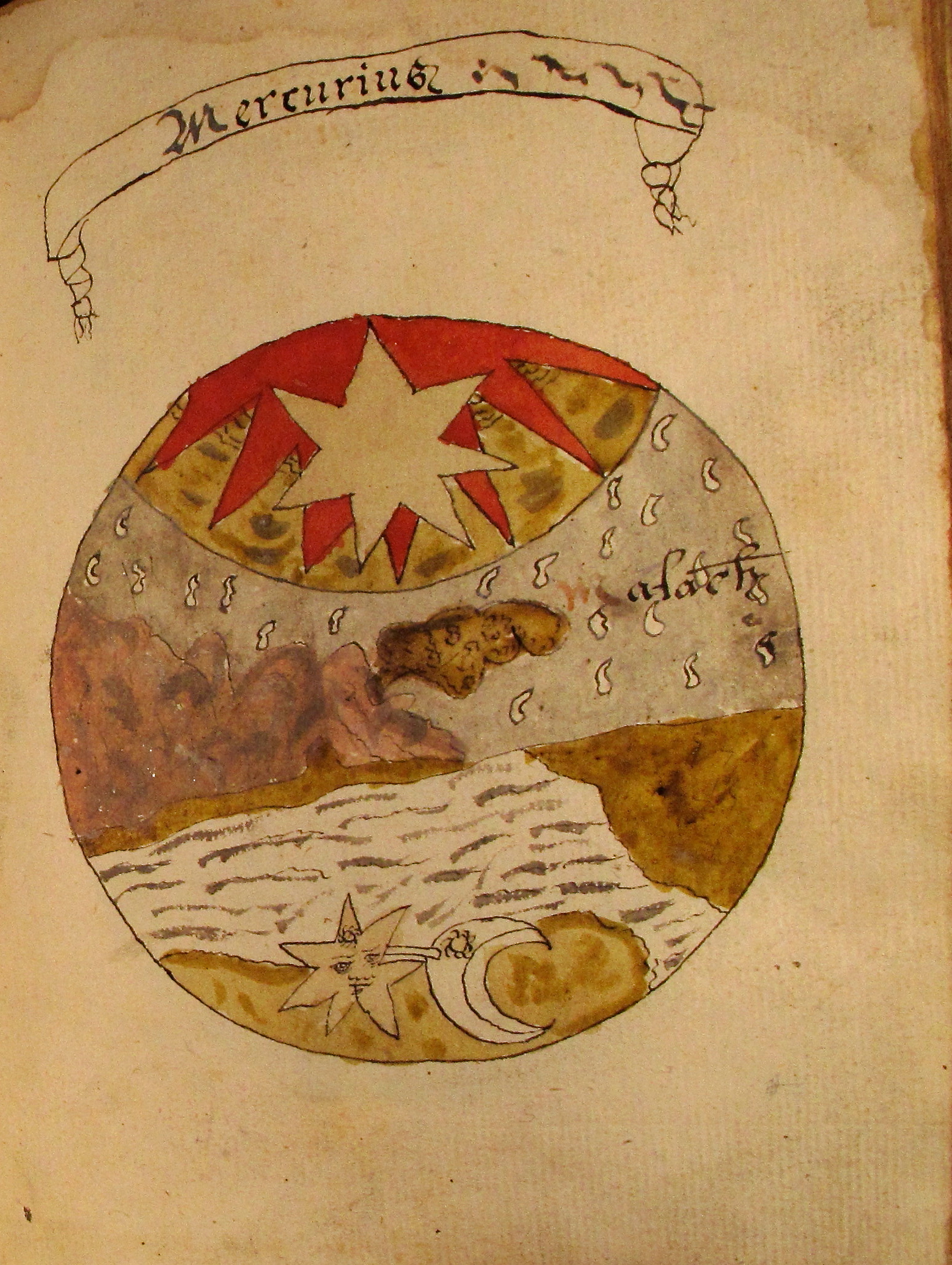
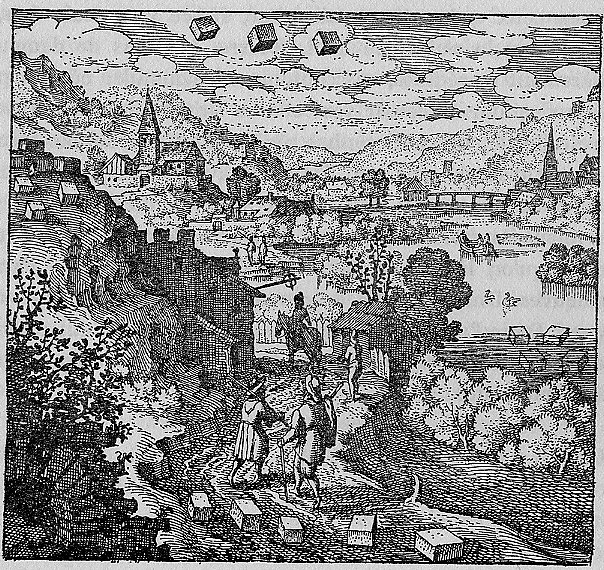
So what could Mercury have to do with this curiosity on folio 116v? I didn’t know this until recently, but Mercury is sometimes depicted as falling from the sky:

MercuryFallingSky StoneMercuryMaier1617


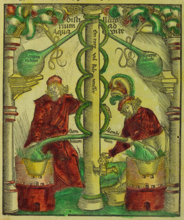
Distillation1512

Illustration from a book on the art of distillery by Hieronymous Brunschwig (1512).

Note that physical mercury and “celestial” mercury are not always considered the same thing and the word “mercury” was sometimes loosely given a variety of meanings.

Celestial mercury is sometimes called aqua vitae (which can also refer to aqueous ethanol) and is sometimes depicted with falling drops or falling chunks (as in the images above).

Aqua vitae, in turn, is associated with alchemical and apothecarial activities. Distillation was a common procedure for creating alcoholic beverages, but it was also used for alchemical concoctions and medicinal tinctures (in fact there may be visual references to distillation elsewhere in the VMS).

Summary

Is there a connection between falling mercury and the falling rock? I don’t know. There’s too little information to decide and there are no overt indications that the VMS is an alchemical document but it could possibly be a medical document.

I’m not even sure the text on this page will ever give up its secrets. If it’s a healing charm, as seems possible, then some of the words might be “magical” words (words not meant to be understood but which are intended to hold or transmit power by their shapes or sounds) and cannot be interpreted by anyone other than the person who created them.

If the VMS is ever translated (including the last page which may be in another hand), and contains a reference to Mercury, then perhaps a plummeting rock isn’t so far-fetched after all. In the meantime I think of it as a curiosity, something to keep us guessing.

J.K. Petersen

© Copyright 2016 J.K. Petersen, All Rights Reserved