14 Jan 2016
http://nonprofit-success.com/wp-plain.php The Constellation Libra
The constellation Libra hit the news at almost the same time I discovered the Voynich Manuscript. A comet was visible, in February 2009, at the topmost point of the stars we associate and identify as Libra. It delighted stargazers by being as bright as stars in the Big Dipper, visible to the unaided eye.
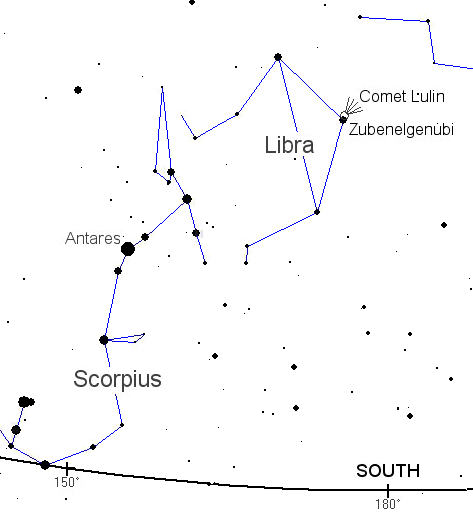 My previous post discussed the unusual depiction of Scorpio in the VMS, and since Libra is adjacent to Scorpius, from our earthly point of view, this is probably a good time to post some of my findings about the VM illustrator’s drawing of Libra.
If you turn your head to the right when looking at this chart of Libra and Scorpio from NASA Science, you can see that Libra looks like a set of scales. Scales in the middle ages were different from what we have now. Modern scales are based on springs and pressure sensors. Medieval scales were based on comparisons of similarly weighted items.
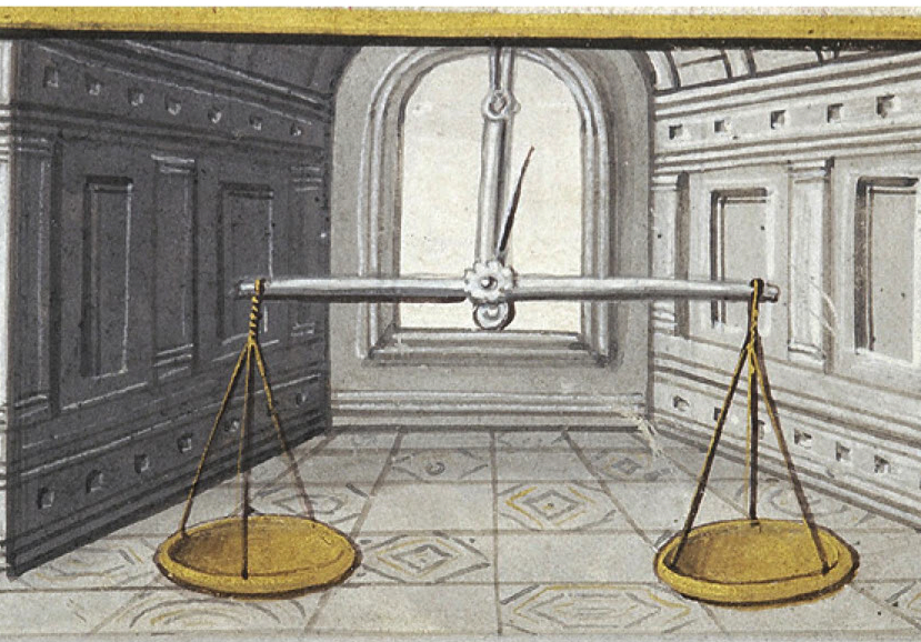 If you fasten cups to both ends of a pole and place a known weight in one of the cups, you can find out if another object, like a piece of silver, weighs more or less than the known object by how much the pole slopes off the horizontal.
To aid in determining whether the pole is horizontal, people in antiquity added a spike in the center of the pole that would poke out in one direction or the other to indicate whether the objects in the cups (or the cups themselves, if they were empty) were off-balance.
Scales and the Concept of Justice
The idea of a balancing scale has long been associated with concepts of fairness and equality and sometimes ventures into the allegorical, as in this Egyptian depiction, from the Book of the Dead (a collective term rather than a literal form of book), of a scribe’s heart being measured against the feather of truth. The goddess Maat, Egypt’s spiritual representative of truth and justice, is identifiable at the apex of the scale, wearing the feather of truth.
 Sometimes additional stars are considered when envisioning Libra. In fact, in antiquity, the “feet” of Libra were sometimes seen as part of the claws of Scorpio. The inclusion of additional stars explains why some illustrators show Libra held aloft by a Virgo-like figure.
This interesting variation, scales by themselves, or scales held by human figures, is what brings us back to the drawing of Libra in the Voynich Manuscript. Can the VM illustrator’s choice tell us anything about the temporal or geographical origin of the manuscript?
By Itself or Held Aloft
Images of Libra as a zodiac symbol can be loosely classified into two kinds: those that include only the scales (or sometimes a hand holding the scales), and those that have most or all of a human form holding the scales.
I assembled two charts to compare their geographical distribution. I confined the search to images of Libra that accompanied other zodiac symbols in the same document and which were created prior to about 1560. I found more images of Libra as scales than could fit on a chart and selected ones that were generally representative. It was more difficult to find examples of Libra held by human forms and they fit fairly well on one page.
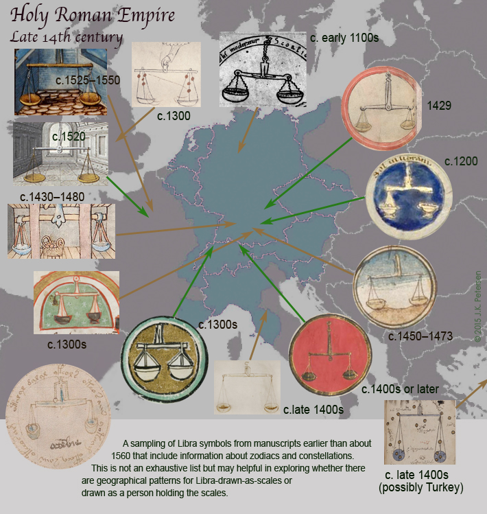 Some of the scales are drawn level and straight on, so you can’t see the balance spike that shows when the scale is off balance. Others show the spike even though the pole is more-or-less horizontal. It’s noteworthy that the Voynich illustrator went to some pains to make the spike visible, even broadening the distance within the housing and painting it blue so it can be clearly seen.
Now let’s take a look at Libra in human form…
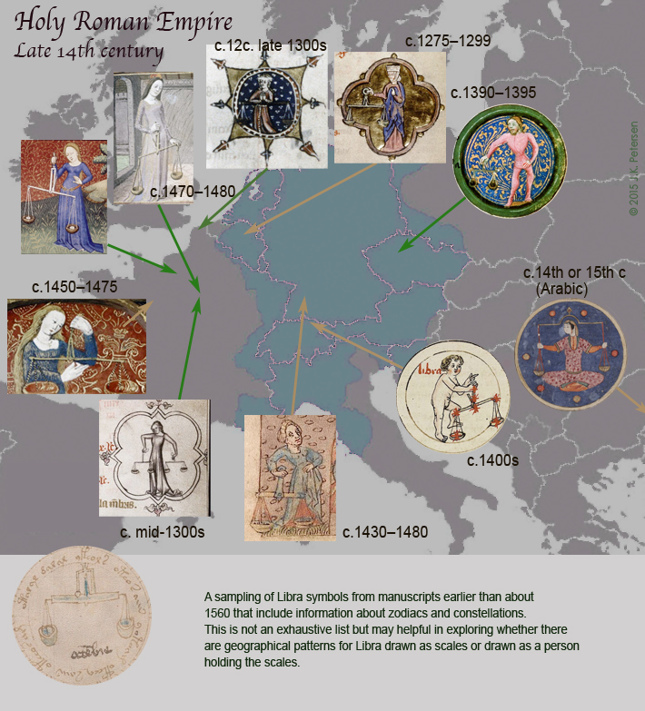 Examples of Libra as a person holding scales are harder to find. This may be due to interpretation of the stars and how many constitute Libra or there may be a simpler explanation—humans are harder to draw. It might also be a combination of the two.
There aren’t enough samples to drawn any conclusions and most of the Libra-as-human examples appear to be from the same general geographical areas so we’re not looking at divergent data sets. The paucity of examples from southern France and Spain probably has to more to do with lack of access to digitally scanned files than it does to the number of examples that are extant.
With research, you never know where it will lead or which little details might become important later so sometimes you just have to gather it, present it, and offer it as information, without trying to extract too much meaning.
Thoughts about Scale and the Voynich Scales
As far as the Voynich manuscript goes, I’ll leave you with one little thought…
Did you notice that the cups of the Voynich scale are small and deep (almost round), rather than wide and a bit flatter like most of the others?
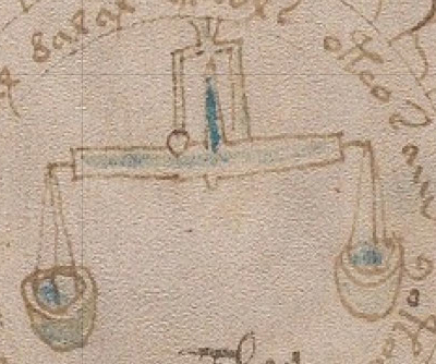 The shape of the cups might be small so it’s easier to draw them within the circle, or perhaps they are small for the same reason they are small in the Arabic document shown in the lower right of the above chart.
Or, there may be a practical reason for drawing them this way. Scales for weighing food, or perhaps coins, need to be somewhat broad so it’s easier to move the items on and off the scale. Scales for herbs and powders need to be deeper and narrower so they are not blown away by a draft, or by a breath of wind, if the scale is used outside in a marketplace.
We can’t really know if the small deep cups are intentional, subconscious (if that is what the illustrator was used to seeing), or simply a space or time consideration, but given that the spike and the connection to the main pole are carefully included, perhaps the shape of the cups was intended as well.
J.K. Petersen
© Copyright 2016 J.K. Petersen, All Rights Reserved

