
2 August 2019
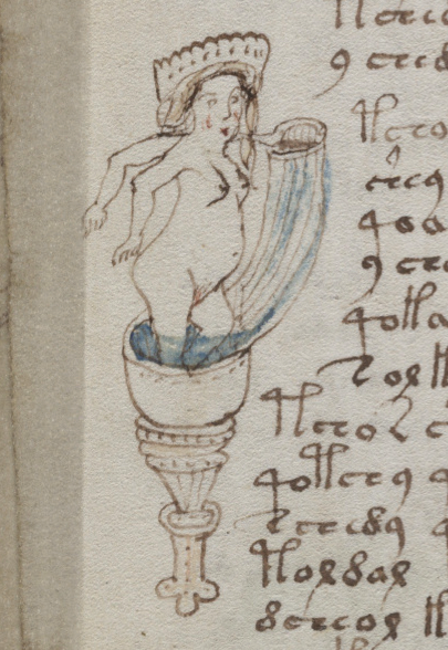
I have a tongue-in-cheek name for the “flying loges” in the Voynich Manuscript…. I call them “zoomers”. They remind me of strap-on rocket-powered vehicles in vintage science-fiction magazines.
They’re vaguely like baptismal fonts or the smaller “holy water” fonts, or the style of pulpit that is elevated and sometimes attached to a wall.
They’re also like loges in medieval family tree drawings, or images of Christ or St. John being baptized. Some look like the undersides of medieval censers or fancy corbels or archway supports. They’re used in many ways in medieval art.
Here are some examples:
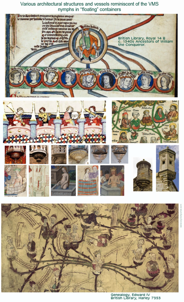
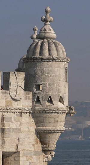
Balconies and bartizans (overhanging towers) were common on medieval architecture. Their lofty viewpoints and decorative elements make them particularly appealing to illustrators, so it’s not surprising that similar imagery turns up in illuminated manuscripts.
Even so, I’ve never seen any direct analogies to the VMS font-like or rocket-powered versions. As usual, the illustrator had a unique way of presenting nymphs that zoom or hover in the margins like imperious garita-drivers.
There is a lot of variety in the patterns on the containers, each one is different in basic shape. Connections between nymphs are frequent and these too tend to vary:
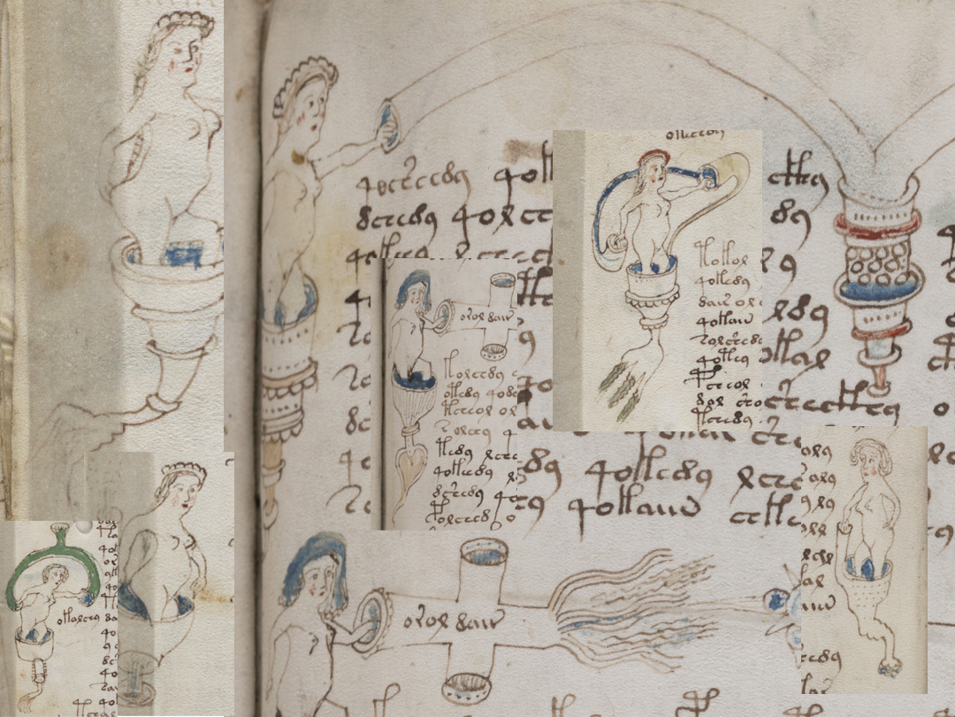
There’s a certain serious-faced exuberance in these drawings, as though the nymphs are absorbed in their tasks and taking them seriously. The illustrator seems to delight in individualizing the containers.
One source of imagery that seems somewhat similar is the fiery bartizans in some of the alchemical scrolls, like the Ripley scrolls:
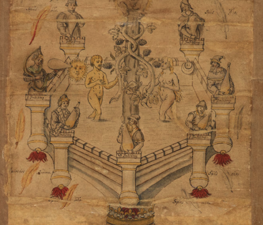
George Ripley (c. 1415–1490), best known for inspiring the “Ripley Scrolls” was an alchemist who was probably most active between about 1440 and 1470. Unfortunately, most of the scrolls that are named after him were created in the late 15th century and the 16th century, too late to have inspired the VMS, and we can only guess at the original inspiration. There are many common themes, however, with chemical processes and distillation expressed in metaphysical terms and emblems.
Alchemy was not just about turning cheaper materials into gold (although this was attempted by many alchemists), it also included the refinement of the distillation arts. The above drawings, with flames ejecting from the base of the balconies, is labeled “Spiritus” and “Imbibing” and likely refers to alcoholic distillation rather than chemical interactions between mercury and sulphur.
The VMS drawings are so unconventional in their execution, it’s difficult to know if distillation is intended by some of the drawings.
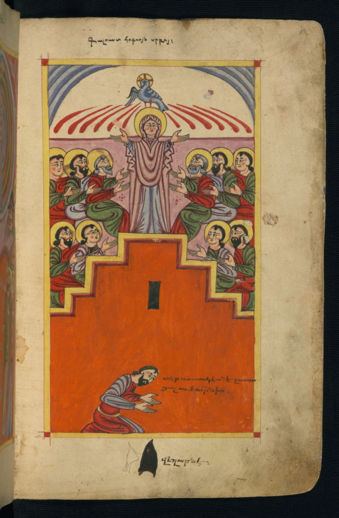
Here’s a similar drawing with a completely different meaning, imparting a Christian rather than an alchemical/metaphysical message. Drawings with doves and flame-like red lines are used to represent Pentecost:
![Emanations from an architectural support (under which is a dove) [BNF NAL 3226]](https://voynichportal.com/wp-content/uploads/2019/08/HoursBNFNAL3226.jpg)
In this Armenian manuscript, Pentecost is represented with parasol-like red lines emanating from the dove (this reminds me of some of the parasol shapes in the VMS):
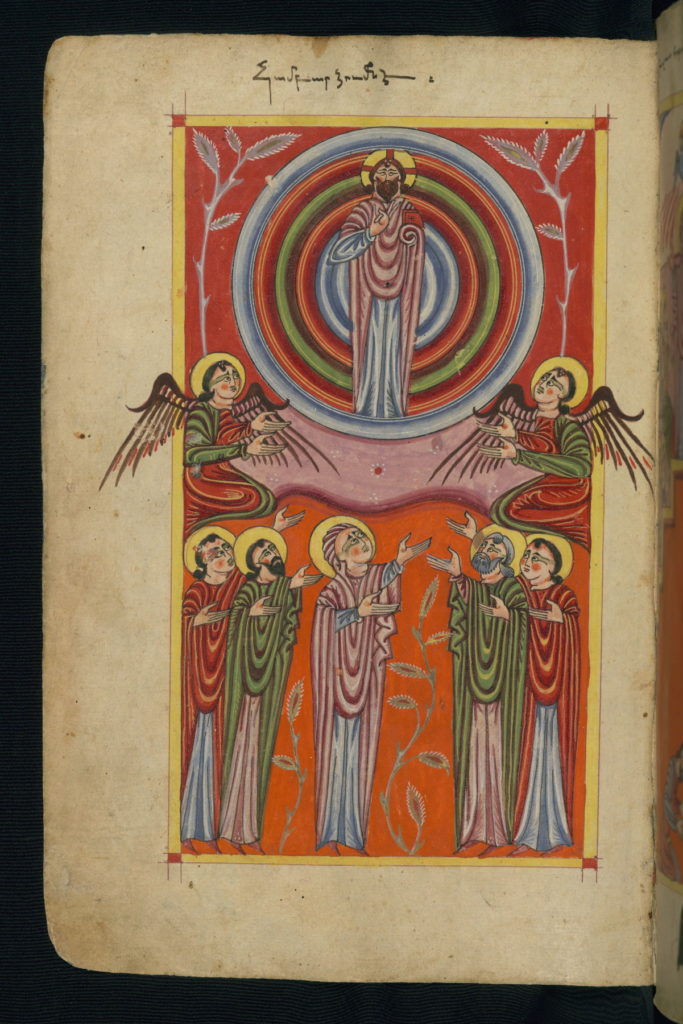
The same manuscript includes a mandorla-style circular rainbow rather than a double-arched rainbow as was more common in central and northern Europe:
A Touch of Color
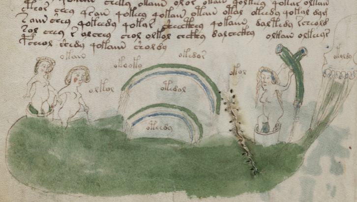
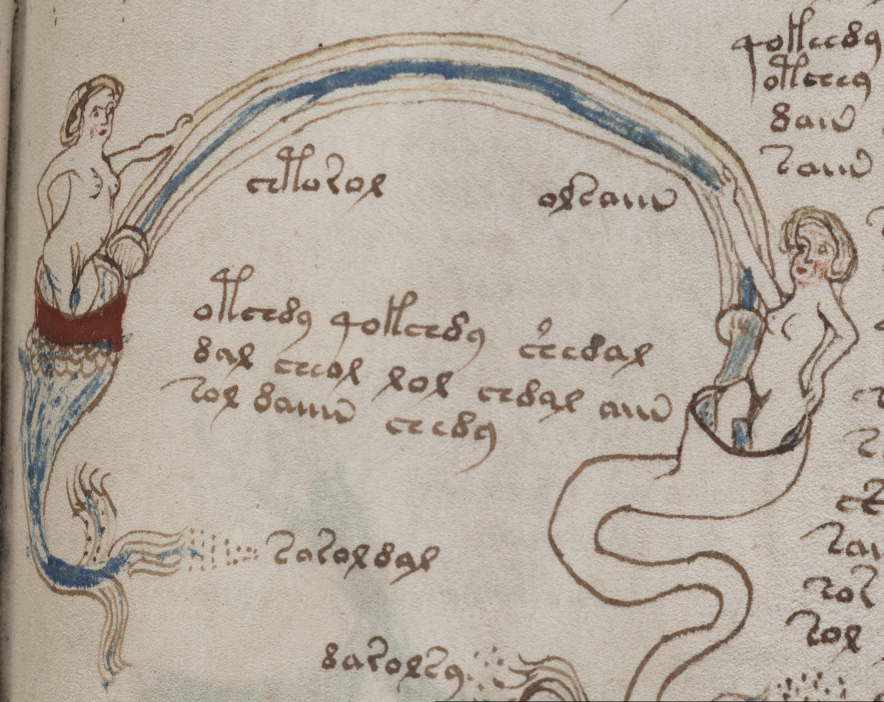
In addition to numerous zoomers, the VMS includes rainbows. For example, f82v has a double rainbow, a convention that usually refers to divinity and higher powers in medieval art. Something wavy seems to be attached to or pouring out of each of the ends.
On either side are nymphs in loges, with another closer to the rainbow with her legs in the pond. To the far right is a cloudlike shape that looks like it might be rising up out of the water or, alternately, raining something into the pool below. The nymph to the right is holding or fending off a pipelike object with something blue streaming into or out of the bottom.
The palette is quite restrained, mostly green, a bit of blue, and a touch of rouge on the nymphs:
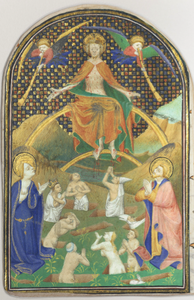
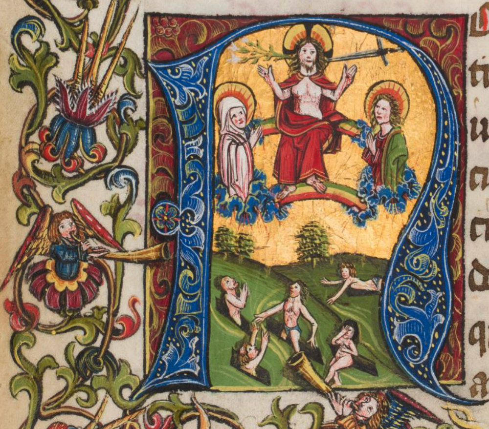
In medieval art, the double rainbow is frequent in Bible illustrations in manuscripts and church alcoves as a metaphor for a celestial throne. Below is a common theme of judgement. Note the double rainbow and two celestial beings in cloudlike “loges” on either side of the main figure (usually God or Jesus), with the lower halves of their bodies not visible:
This well-populated illustration also has double rainbows with celestial beings on either side, but their bodies have not been placed in cloudlike containers. Instead, their legs have been covered to the ankles with only their feet showing, so chopping off the lower half of the bodies was not characteristic of every illustration:

In this example, which I have posted previously, there is a double rainbow and the lower halves of the figures in the upper archway are obscured by the terrain, as though they were standing in water or clouds:
In this drawing, there is only one rainbow, but note the cloudbands on each end, and how the lower bodies of the figures in the upper portion are not shown, as in previous examples. There is a general trend, in these kinds of drawings, to identify celestial beings or “people of the stars” by obscuring their lower bodies:
I wanted to post this one for contrast. In France and Germany one sees a mixture of double rainbows and mandorlas (an almond- or sometimes race-track-shaped rainbow). In Italy, there are also sometimes double rainbows, but the mandorla appears to be more popular:
This one from Liége is more similar to the VMS arrangement, a double rainbow with two figures with their lower bodies obscured by cloudband shapes, and note also that the ends of the rainbows also have cloudband shapes.
Cloudbands are not visually the same as VMS loges, but the idea might be the same, and clouds create water droplets, so maybe the VMS wavy lines coming from the ends of the rainbows are rain. Note also the “flower loge” in the left margin. It was acceptable for the lower bodies to be placed in a variety of container styles:
This example from northwest Spain is earlier than the others (10th century) and does not explicitly include the rainbows, but the subject matter is similar, there are many curved shapes, and I was wondering if the hornlike structures in the upper corners might be parallels to the strange blobby thing on the right side of the VMS double-rainbow drawing:

Connecting the Dots
But is there a way to move beyond visual similarity and find relationships between themes in different parts of the manuscript?
Could there be a connection between these odd structures on the “bio” and pool pages and the VMS rosettes folio?
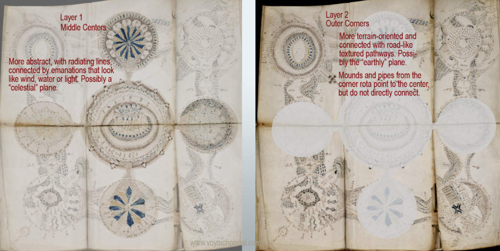
I’ve posted blogs suggesting that the VMS rosettes on the “map folio might be better understood if they are visualized as layers. One possibility is interpreting the corner rosettes as a map (and possibly also a representation of the elements), while the “upper” layer might be medieval cosmology.
Maybe the center rosette is the cosmic connection between the physical and spiritual worlds.
I can see other ways of dividing up the rosettes, as well, but let’s keep it simple and assume there might be something abstract or cosmological about parts of the rosettes folio, and that it might not all be “one thing”:
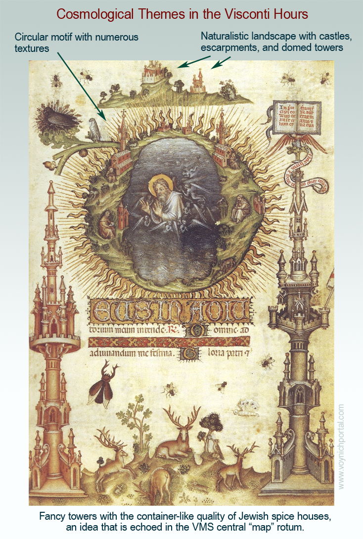
Now look at this folio from the Visconti Hours. Even though the style and viewpoint are different from the VMS “map” folio, there are thematic similarities.
Note the container-like architectural “fancy towers”. They don’t really look like the towers in VMS Rotum5, they look like Jewish spice boxes, but the idea is similar to the “towers” in the center of the VMS “map”, as are the ray-like textures. Note also the naturalistic landscape with tors and castles at the top, similar to the castles and escarpments in the VMS:
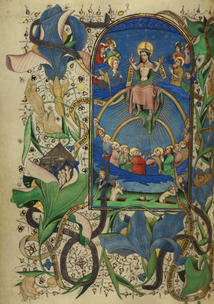
Now let’s jump back to the VMS nymphs in zoomers… here is an illustration of the “celestial court” in the Visconti Hours. Click on it to see it full-sized. This one is worth a second look.
Note the ladies around the edges, suspended in loges and on platforms, each with a different attribute, and how they are connected by “pipes”. It’s a much more elaborate drawing than the VMS nymphs-in-loges, but many of the conceptual elements are the same:

So even though the VMS drawings are quite individualized, there seem to be common themes.
But like the Ripley Scrolls, the Visconti Hours is a bit late to have informed the VMS, and is stylistically very different. And we have to keep in mind that towers, creation, and judgment are common to many manuscripts. Is there something with the same motifs in an earlier (and possibly cruder) version?
Seeking that Special Resonance
I’ve mentioned numerous times on the Voynich.ninja forum that manuscripts from some of the Carthusian monasteries have qualities more akin to the VMS. In particular, BL Add ms 37049 (The Desert of Religion) embodies a similar zeitgeist in terms of the drawing style and the way the drawings inhabit the margins with the text often wrapping in around them.
The text rambles across the pages. There are no prick marks to guide the scribe. The marginal drawings are charming and rather primitive. Some of the text is squeezed within curving bands. Large parts of it are in verse, which means there is greater repetition than in regular texts:
However, The Desert of Religion (and other miscellany) is written on paper, which rang caution bells for me. Like the Visconti Hours, it might be too late to have influenced the VMS.
The estimated origin is between 1460 and 1500 at a monastery in northern England, but it has some interesting variations on traditional themes that might be worth mentioning.
Traditional Themes in The Desert of Religion
Now, a slight digression. This section is not specifically about T-in-O maps (which I’ve discussed in previous blogs), but about how they are usually represented…
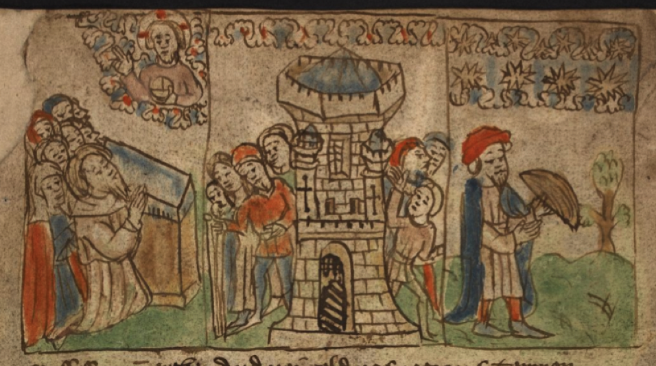
Folio 2v of Add ms 37049 (The Desert of Religion) is a simplified mappa mundi in T-in-O form, with a VMS-like double-infurled cloudband to represent air (ayer):

East is at the top, but Jerusalem is not in the center. Instead, there’s a cluster of buildings in the upper-right labeled Syria. The most prominent building in the “Europea” section is Roma, and “Affrica” is dotted with European-looking houses and a cathedral.
Below the drawing, it explains how the earth was bequeathed to the three sons of Noah after the great flood (the basis of the T-in-O configuration as discussed in a previous blog).
So what happened to Jerusalem? It’s usually front-and-center in most T-in-O maps. Why is it different in this manuscript? Was it dissed? Actually the opposite is true. The creators gave it a full page on the next folio, and this is what caught my attention…
I sometimes wonder if the VMS was created this way—with traditional themes divided up in less traditional ways. Perhaps ideas that are usually represented on a single page have been spread across more folios. If so, common motifs may be harder to recognize.
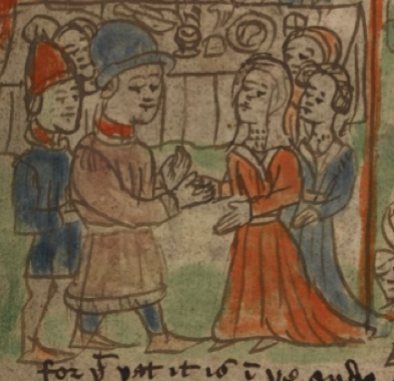
The following section is illustrated in comic-panel style, and again we see the style of scalloped cloudband that was popular by this time, along with rows of stars:
Note how the main figure of these festivities has been drawn with unusually short legs and a large head (not unlike the VMS zodiac males), and the couple has two right hands clasping in the traditional marriage pose (similar to VMS Gemini):
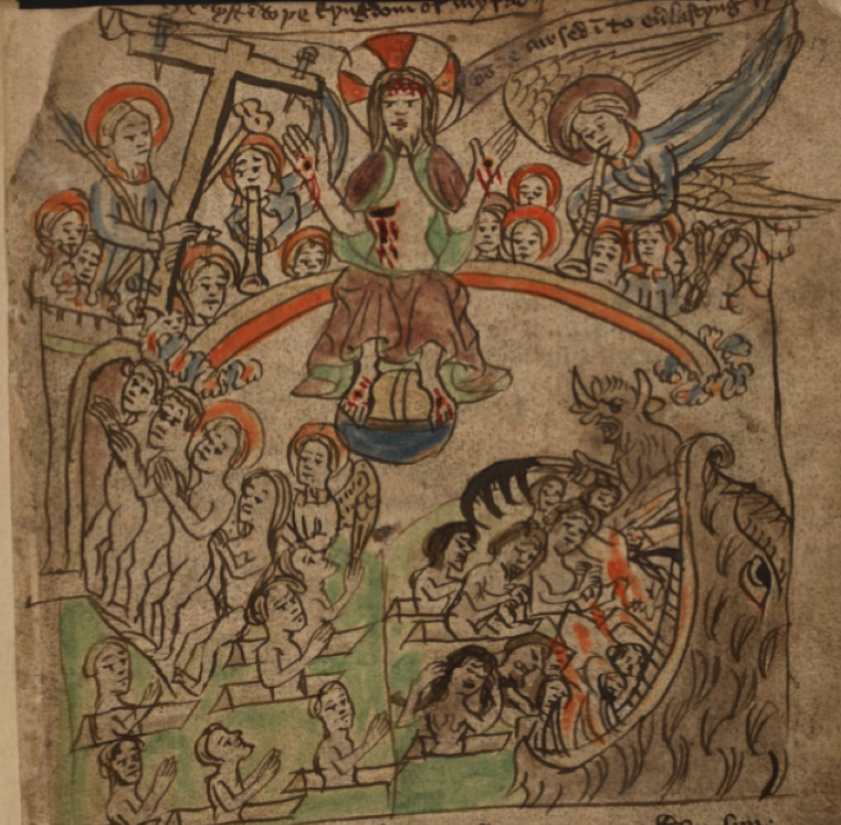
Then we move to the story of the crucifixion and the ascension, where there is a rainbow separating the earth from the heavens, with a small cloudband at each end. The celestial figures at the top have their lower bodies obscured. The text is fitted into “ribbon” label at the top:

The VMS has several rainbows, but rather than cloudbands, there is something that appears to be fluid flowing into or out of each end:
This is also true of the double rainbow on the later page. Are these meteorological substitutions for cloudbands?
In the following illustration we see God’s emissary (the dove with halo) near a ribbon label, describing the forgiveness of misdeeds:

Which shows up again later, as a plummeting bird and rays:

The VMS has something that is thematically similar on f86v, a bird near the top of the folio flying out of (or nearby) a cloudlike scaly shape. The lines and dots could be anything: air, spiritual essence, water (possibly a deluge?), so it’s hard to tell if there is any narrative relationship, but I include it to call attention to the bird and its position within the emanations:

The Desert of Religion also makes generous used of scalloped nebuly lines, stars, and rays.
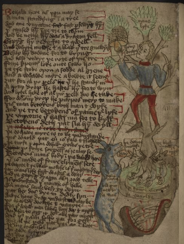
In this drawing, the illustrator borrowed the plant-platform motif common to genealogy diagrams. It’s not too much of a stretch to recast them as zoomers connected by flowing streams as occurs in the VMS:
This manuscript has another commonality with the VMS… numerous candelabra-like drawings of plants (see K. Gheuen’s blog for a more complete discussion of interesting menorah-like plant drawings). We don’t know what they represent in the VMS, but here they serve as guideposts to a spiritual life and each plant is drawn differently, with many of them almost looking like real plants:
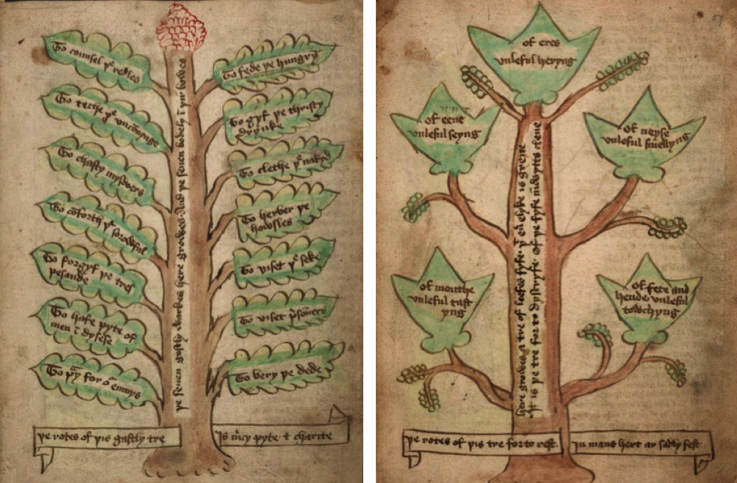
The leaves describe virtues, vices, and numerous other concepts related to the battle between good and evil within a soul striving to live a spiritual life.
In addition to rainbows and plants, there are numerous coffins and skeletons in shrouds. Judging by the smile on its face, this one likes being a corpse (or maybe likes the view):
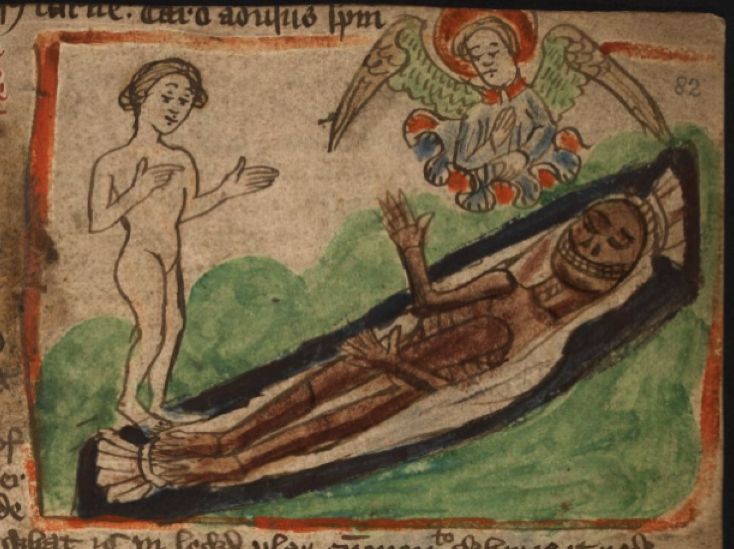
The commentary next to most of these smiling skeletons relates to the temporary nature of the corporeal body, and how it wastes away (the implication being that one should nourish and protect the longer-lasting spirit).
In medieval manuscripts, blank eyes usually represent a corpse or sometimes “extras” (people who are added around the central figures to flesh out the crowd). The arms of this nymph are bound as though in a shroud:

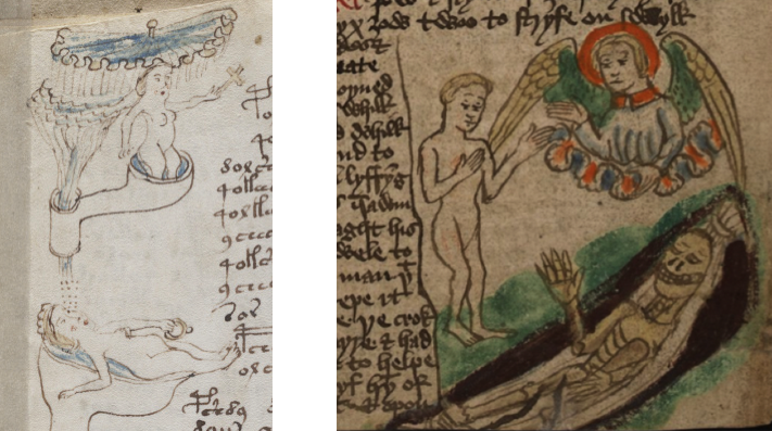
I’m fairly sure the nymph in the above drawing is a corpse, but I’m less sure about the following nymph (maybe she’s dreaming), but the idea of “levels” in both compositions is intriguing.
Here we have the corpse at the bottom, and above it elements that obscure the lower part of the figure, one with a cloudband-like “parasol” above the nymph’s head (tent-like parasols were used to denote authority in medieval texts). Maybe a VMS parasol is a stand-in for a halo or a way to symbolize authority. On the right, the “zoomer” is a cloudband:
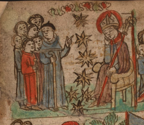
One small digression, before summing up… I’ve frequently said that the seven stars on VMS f68r don’t have to represent Pleiades, that there are other possibilities (it’s possible they are the Pleiades, but I don’t want to assume they are until there’s evidence). The Desert of Religion includes seven stars to represent the seven monks who started the Carthusian order in the 11th century:
_____________________________________________________________
Summary
The VMS doesn’t feel overtly Christian to me. It never has. My first impression 12 years ago was Pagan or clinical-gynecological, and when I saw the text on 116v, I wondered if the fractured German might be Yiddish. I’m not sure it is (any foreigner who knew a few words in German but was struggling with grammar could have written it), and the note on 116v might not be contemporary with the main text, so I’m keeping all possibilities open for now.
Even though it’s full of loges and connections between them, it doesn’t feel like family tree imagery either (except maybe the clothed figures on f71v in the zodiac-figures section).
So is it Christian imagery artfully disguised?
I’m still on the fence about whether VMS illustrations are direct references to Christian themes. The way objects are put together has echoes of Christian imagery, as can be seen from the numerous examples posted in this and previous blogs, but the creator could still have been Pagan, Jewish, Moslem, or Agnostic living in a dominantly Christian society.
Everyone in western society was exposed to Christian illustrative traditions, especially those who could read, and people from all religions are generally interested in themes like life, death, and the afterlife, especially those living at a time when plague was always around the next corner. Maybe someone Christian or non-Christian borrowed what was relevant to their conception of the VMS and ignored the rest.
J.K. Petersen
© Copyright 2019 All Rights Reserved