
7 April 2019
There’s a substantial gap in our knowledge of the VMS, from the time it was created (c. early 1400s) until the time it came into the hands of the Jesuits (c. mid-1600s), possibly through the court of Rudolph II. More than two centuries are shrouded in mystery.
Part of my palaeographic research has included the faint text on the right-hand side of folio 1r because I was hoping it might reveal something about this hidden history, to fill in some of the missing provenance.
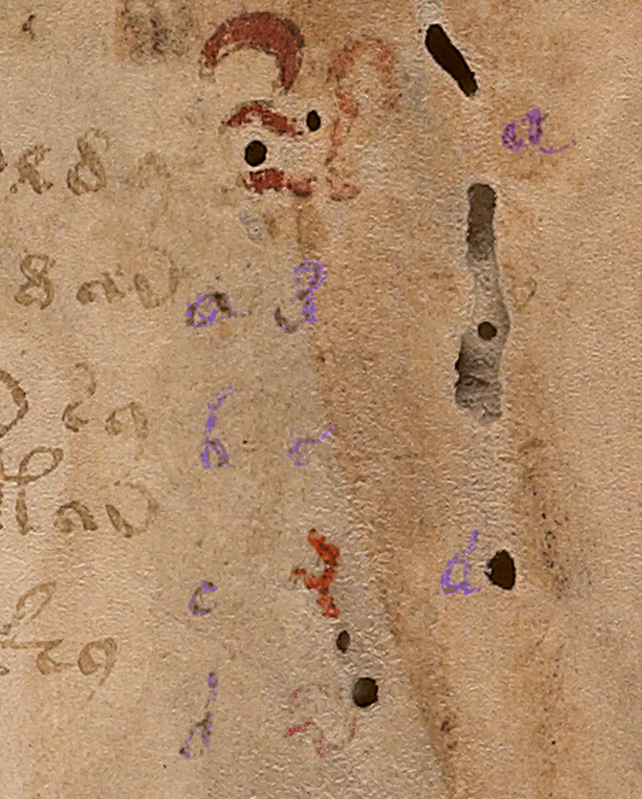
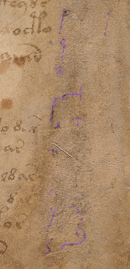
The column text on the right side of folio 1r has been partly obliterated and is very faint.
There appear to be four columns. The first two columns look like the same handwriting, with the alphabet shifted. The alphabet in the first column is complete, except that it’s impossible to make out the style of the r or the t. With very careful scrutiny, the other letters can be discerned.
The third column is slightly different. The loops are slightly rounder and it doesn’t appear to include as many letters as the first two columns. The fourth column is very faint and has fewer letters still. There also appears to be erased writing under the column letters (earlier attempts? or something else?). The spacing and style of the “red weirdos” doesn’t seem to have anything in common with the column text, so it’s probably written by another hand, perhaps earlier?
After extensive study of the letterforms, and intensive searches for similar handwriting, some of which I posted in previous blogs, I had enough information to try to reconstruct the handwriting of the person who wrote the column text. This research stretched over many years and included letterforms, spacing, final-ess styles, abbreviation styles, and time periods in which the text might have been added.
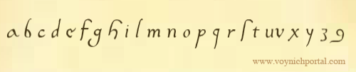
To make it easier to visualize how the scribe might have written whole sentences, I have created a font based on the style in the left-most column. It took a great deal of time and patience to try to achieve accurate reproduction of this script style. A couple of letters simply cannot be seen, but over time I became more familiar with this style of writing and how specific letters were usually written.
Scribal Specifics
Fortunately, there is a certain consistency to the way the shapes are written (not all writers do this).
- The ascenders and especially the descenders are long, and some of the ascenders have an unusually long and rounded curve on the top (e.g., f, h, and s). This long curve is not common and appears to be specific to this scribe.
- Letters with stems have a squeezed oval loop (b, d, p, and q); those without are more round (c and o).
- An important clue to help identify the time period is the short left stem on the letter “h”—it doesn’t quite reach the baseline. The letter “h” was written this way during a fairly specific time period.
- Another important clue is the style of the “g”. This was not an unusual style, but it was less common than the double-chambered “g” or one that is more angular.
Years ago, when I began this line of research, I was hoping to confirm John Dee as the foliator and/or writer of the column text. Unfortunately, after heroic efforts, I have some doubt that John Dee was the author of the column text or the folio numbers. His handwriting is close to both, but I have samples that are arguably closer. Examples of the column text can be seen in previously published charts and I have gathered more text and number samples since my early research was published that indicate a number of people had handwriting very similar to one another and to the VMS.
The Column Alphabet
Here is the basic alphabet (note that the column “e” is a variant that is less common and usually only shows up once in a while. I’ve seen it a few times but no scribe uses it habitually, so I have included the “base e” here and the variant column-“e” in the block of text below).
- The shapes for u and v were used interchangeably by most scribes and the one in the VMS is hard to discern, but it looks like it might have a pointed bottom as we now associate with “v”.
- I am not sure how long the descender is on the “x”, the x is barely discernible, but scribes who wrote in this style usually lengthened the stroke on the lower-left as follows. However, this specific scribe may NOT have added the small hook on the bottom left. It may have had a very severe tail, like the one on the y:
Constructing a Block of Text
To make it easier to imagine the handwriting of the column-text writer, I have created a block of text in Latin (I wasn’t worried about whether it was correct Latin or even medieval Latin, I just copied and pasted something more interesting than Ipsum Lorem).
Caveats
Be aware that reconstructing a block of text from an alphabet involves some educated guesses:
- There are no upper-case letters, so the ones I included are based on writing samples that are very close to the column text, samples that took me years to locate.
- The extent to which the writer used abbreviations is not known, so most of the following is not abbreviated except for the extremely common -us/-um abbreviation symbol that is included at the bottom of the alphabet on 1r.
- The scale of the letter “o” is difficult to discern. I have made it a normal size in this sample BUT some scribes during this time period wrote the “o” smaller than other letters.
- During the century or so that this style of writing was popular, some writers used long-ess as final-ess as well. Others used a snake-style final-ess, and some used both somewhat indiscriminantly. It’s impossible to know whether the column-text writer used a different shape for final-ess, so I have included both for purposes of illustration.
- Whether the writer left out the serifs in the column alphabet because they were unnecessary, or because this is part of the writer’s style cannot be known from such a small sample, but the impression I get is that the scribe probably used serifs sparingly or not at all.
Here is the result of adapting the column text to a font that can be typed on a computer:
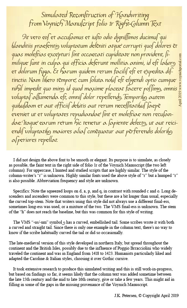
Keep in mind that real handwriting is typically more varied in slant, spacing, and letterforms than a computer font. I have varied the letters slightly, but I didn’t want to stray too far from the original letters or make too many guesses, so it will be up to the reader to imagine what this would look like as handwritten text. Hopefully the reconstruction will help in that regard.
Pinpointing the Date
Preliminary date ranges were suggested in the charts I posted in previous blogs, but I didn’t feel I had enough samples to narrow it down. I’ve collected about 100 more samples since then (ones that are specifically similar to the column text) and I still don’t feel I have enough but I’m more confident now than I was a couple of years ago. Here’s a rough timeline that might help illuminate some of the dark corners of the Voynich Manuscript’s early provenance:
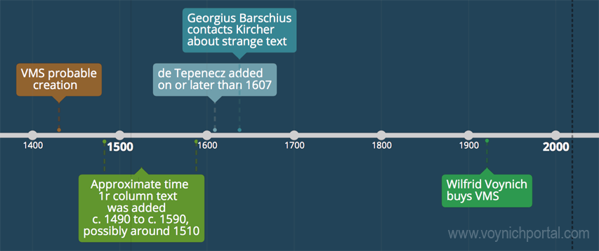
Samples that are especially close to this script tend to be from the early 1500s, but this style was in use for about a century, so it might be premature to narrow it down any more than indicated by this date range. I will continue to seek out additional information and will post updates. I also have a great deal of information on other VMS text that I will post as I have time.
J.K. Petersen
© Copyright 2019 J.K. Petersen, All Rights Reserved