Tag Archives: VMS zodiac-symbols

A Stitch in Time

I’ve posted several blogs on hats and tunics and the VMS Gemini tunic is now being discussed in depth on the voynich.ninja forum, so it’s clearly a topic of interest. I’ve been researching the clothing of the zodiac figures for a number of years, so I have many examples from a large variety of sources (including mosaics and stained-glass windows), but I thought I would focus on fashion in two specific manuscripts.

I see the VMS zodiac tunics and robes as belonging together in terms of style.

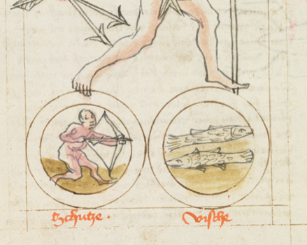
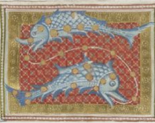
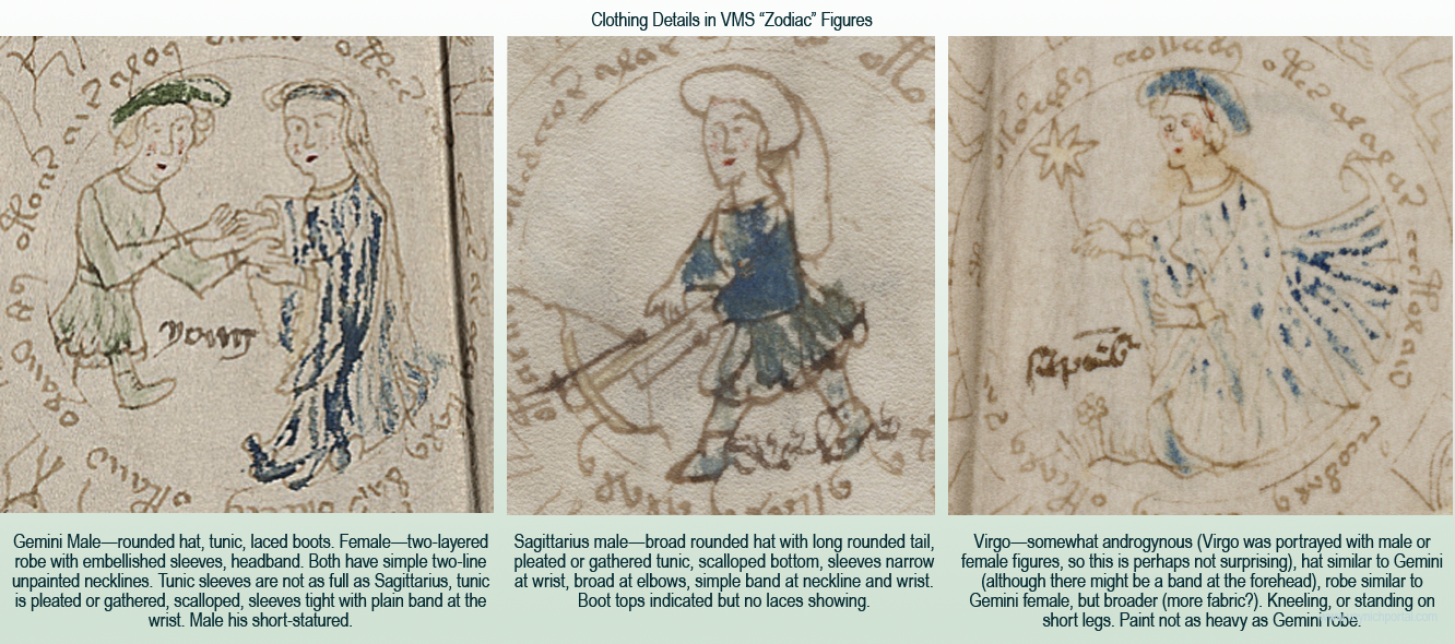
  • Both male-Gemini and Sagittarius wear basic tunics with simple double-line neckbands, both are wearing hats, Gemini a simple rounded hat, Sagittarius a hat with a very long rounded tail (similar to a foxtail hat, but with fabric rather than fur). Sagittarius has the hint of a goatee. Note that Gemini is conspicuously short-statured even though there’s room to make the leg longer.
  • Both females (assuming the slightly androgenous Virgo is female) are wearing long robes with embellished sleeves and the hint of an undergarment peaking out from under the outer sleeve:

The clothing in Vatican Pal.lat.871 has been mentioned before, because it has many commonalities with the VMS figures.

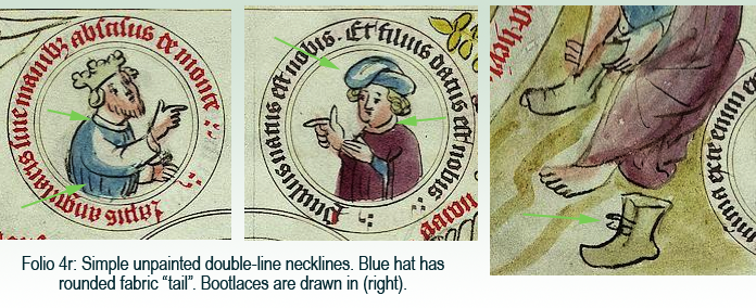
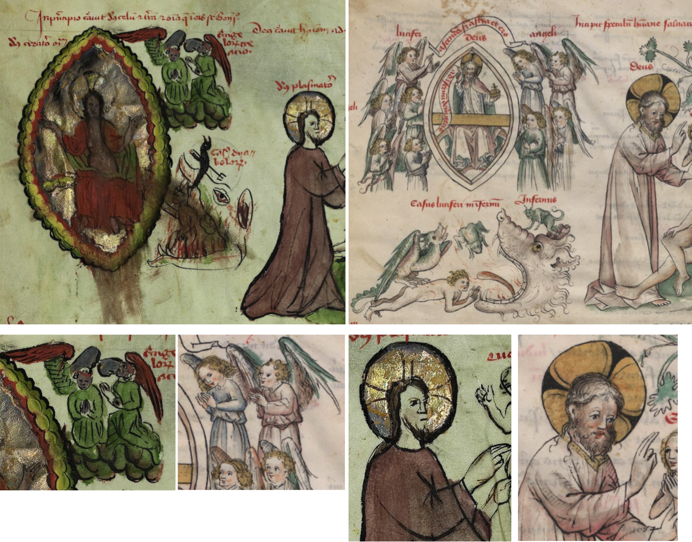
Here are examples from folio 4r. The subject matter is quite different from zodiacs, it’s a nativity scene, but the roundel-with-text presentation, drawing themes, and clothing have VMS parallels in necklines, gathers, and the hard-to-find bootlaces:

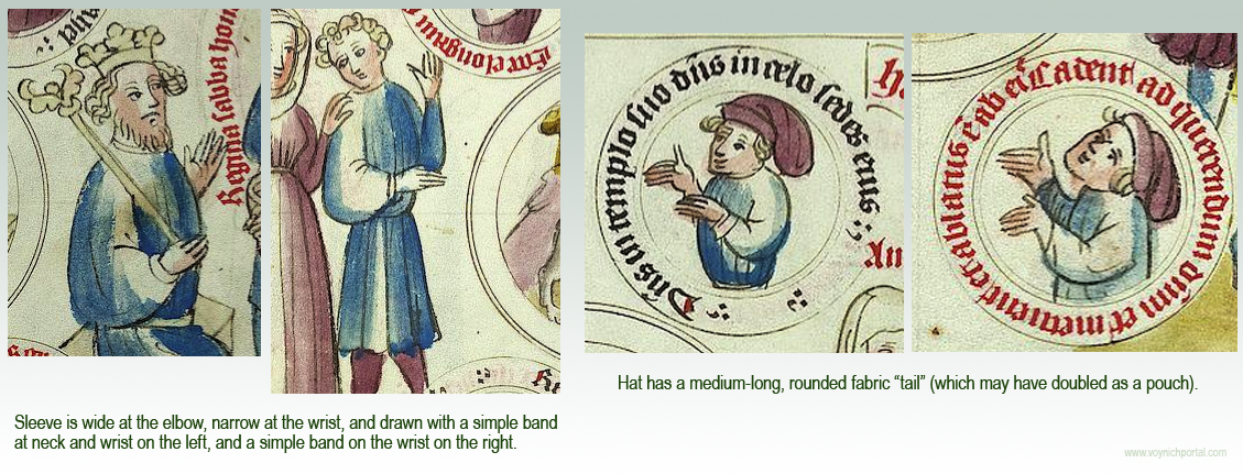
It’s possible that the round-tailed style of hat doubled as a carrying pouch since tunics generally did not have pockets. Small items were strapped to belts, carried on the back, or slipped into hat bands or pouches. The VMS hat does not look like an animal tail. Note that many of the neckbands are similar to the VMS (a plain double-line band), even though a variety of necklines are represented:

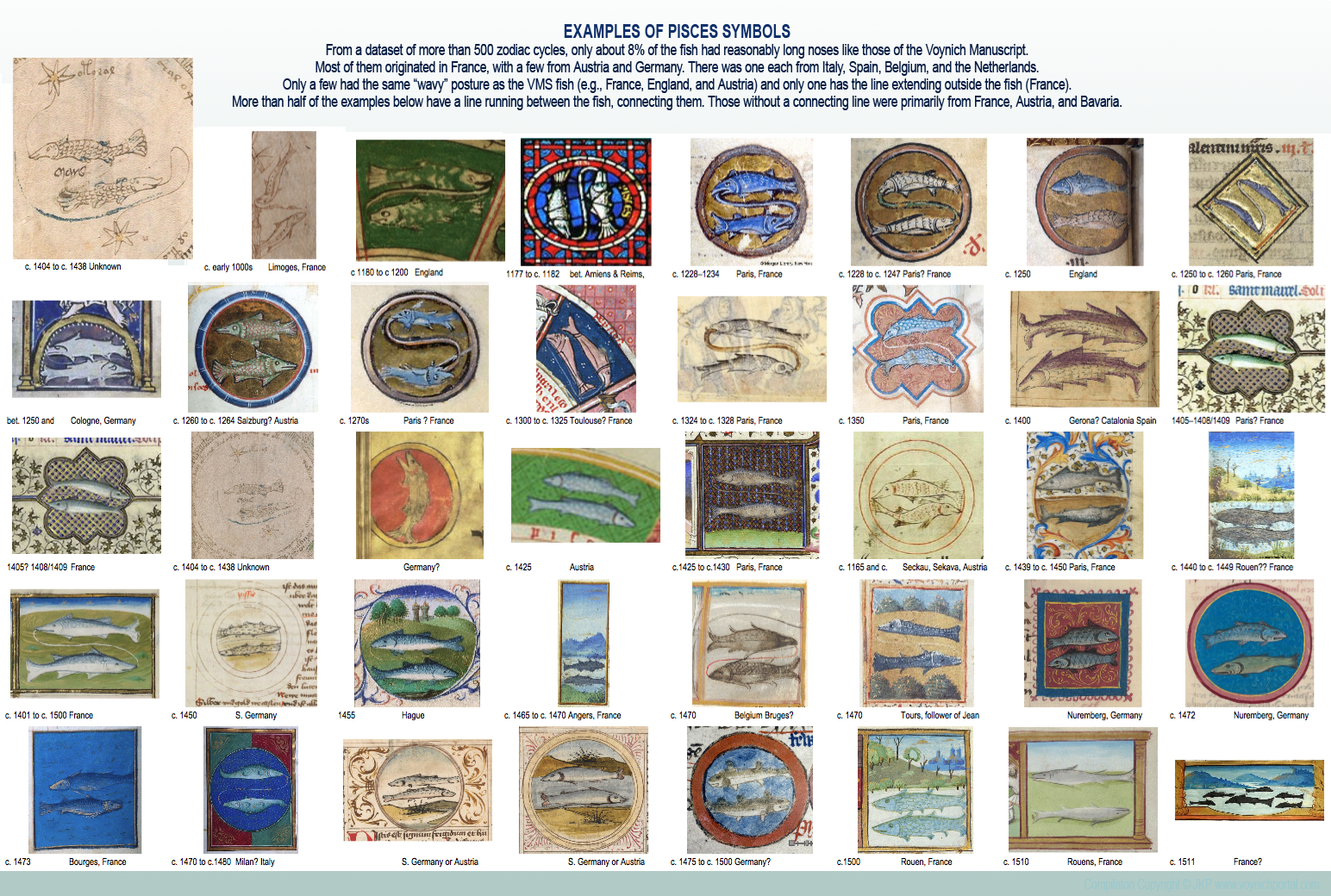
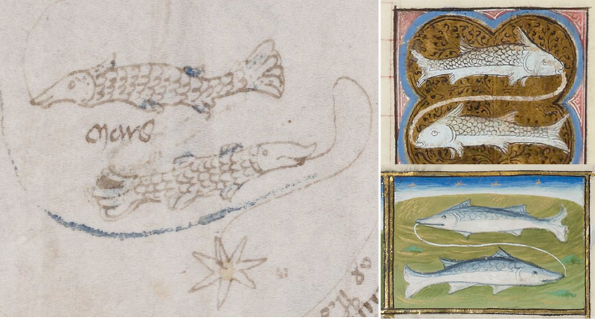
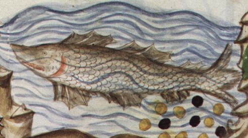
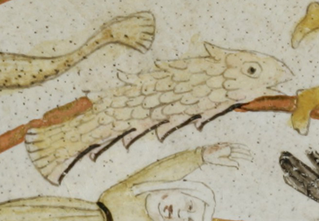
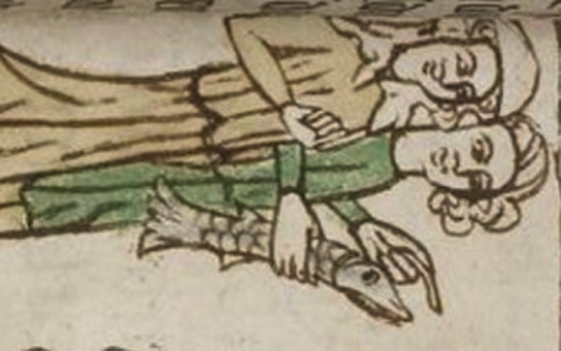
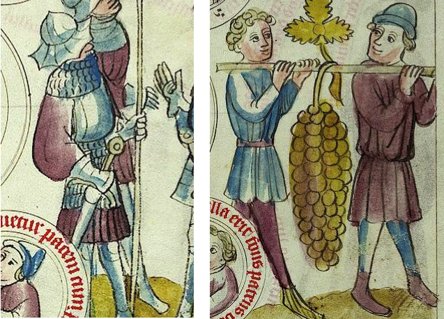
There are also tunics with bumpy or scalloped edges like those in the VMS:

One can also find sleeves that are narrow at the wrist and wide at the elbow (left), which is less common than sleeves that are mostly even or much wider at the wrist:

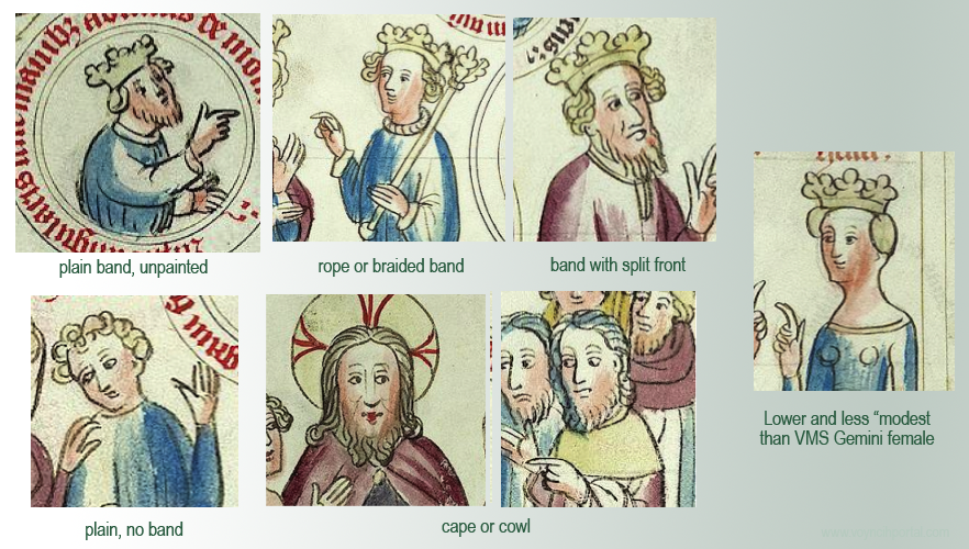
The illustrator was definitely making distinctions in dress. Not all collars were a simple band, there were also high collar, capes, and cowls. Tunics were sometimes single-layer, sometimes double.

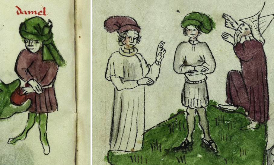
There are also many hat styles in addition to the “pouched” hat, including Phrygian hats, royal crowns, tonsured monks, berets, bowlers and, since this is a biblical text, pointed and flat hats to represent Jews and Philistines:

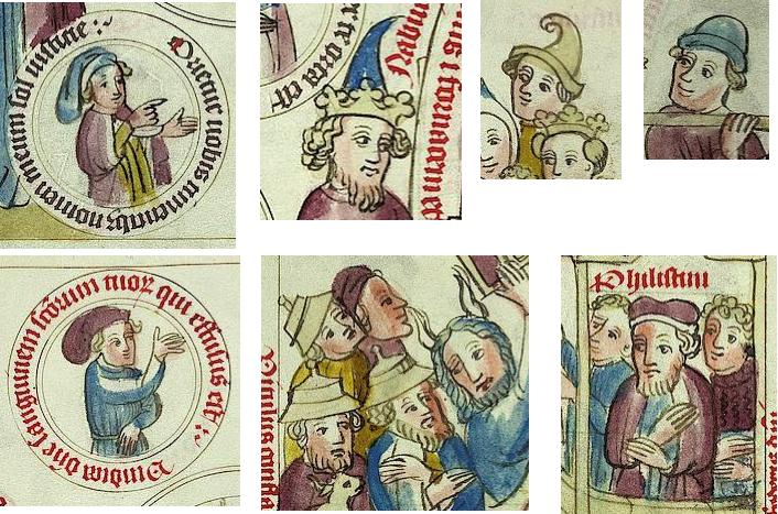
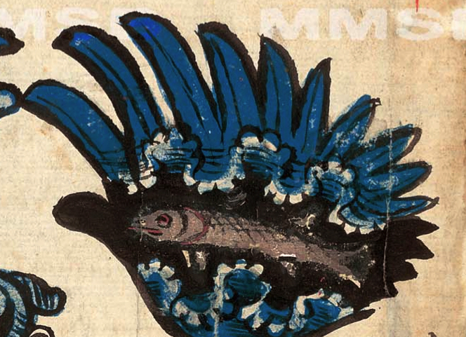
The drawings in Pal.lat.871 make it look like the “pouch” style of hat was common, but it is not easily found in medieval manuscripts. Usually, the tail was an animal tail or the ends were ragged, like a cock’s comb. Pouched hats with very long tails, like VMS Sagittarius, are especially hard to find, although I previously posted this one from Morgan M.453 (left) and one from a Swedish book of law that has a fairly long tail, with a conspicuous roll for the band:

Getting Back to Tunics

Many of the robes in Pal.lat.871 are long or have simple edges, but there are also tunics that are distinctly pleated (e.g., some of the warrior tunics, left) and some that are drawn with a bumpy, gathered, or scalloped edge, like the VMS:

So we can see numerous parallels to VMS clothing styles throughout the manuscript, not just in one or two places.

Finding the Origin of the Manuscript

I was curious about who drew the illustrations.

Pal.lat.871 is written in German, and I noticed it was a dialect. It is thought to be from central Germany, possibly north Hessen (near Frankfurt) or west Thuringia (about midway between Frankfurt and Prague). There is a woodcut version of the Pauper’s Bible created nearby in Bamberg, just north of Nuremberg (c. 1460s) with some of the same clothing styles.

I don’t know if it is specific to the illustrator, but there’s a political statement on folio 16r, a nimbed figure holding the battle banner of the Scandinavian tribes. This puzzling image is sandwiched between Sampson carrying tablets and Jonah in the mouth of the whale. It’s the only roundel on the folio without text.

In manuscript art, the white cross on a red field frequently represents the Lombards or Danes. The inverse of this flag, a red cross on a white field, often represented Helvetians, Templars, or participants in the Crusades. By the time this manuscript was created, Lombardian rule had long since diminished, and Lombardy itself had receded from Florence north to Pistoia, but it still dominated what is now northern Italy, and there were still pockets in Germany, Switzerland, and southern Italy.

But, I have also seen the white-on-red flag in drawings of 14th-century “Gaisler” (Geißler), Christian flagellants associated with the plague years.

Perhaps a sister manuscript can shed some additional light on origins.

A More Primitive Drawing Style

Vatican Pal.lat.1806 was created at approximately the same time as Pal.lat.871 and has very similar clothing themes. It is interesting because the illustrator’s skill level is a little less accomplished than Pal.lat.1806 and thus closer to that of the VMS. Here are some examples of tunics:

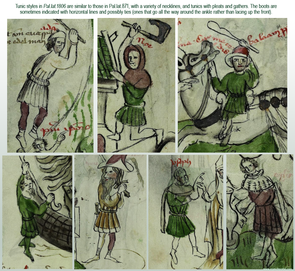
There are also sleeves that are narrow at the wrist and wide at the elbow, but they tend to be paired with fancier tunics. Here are some of the simpler ones

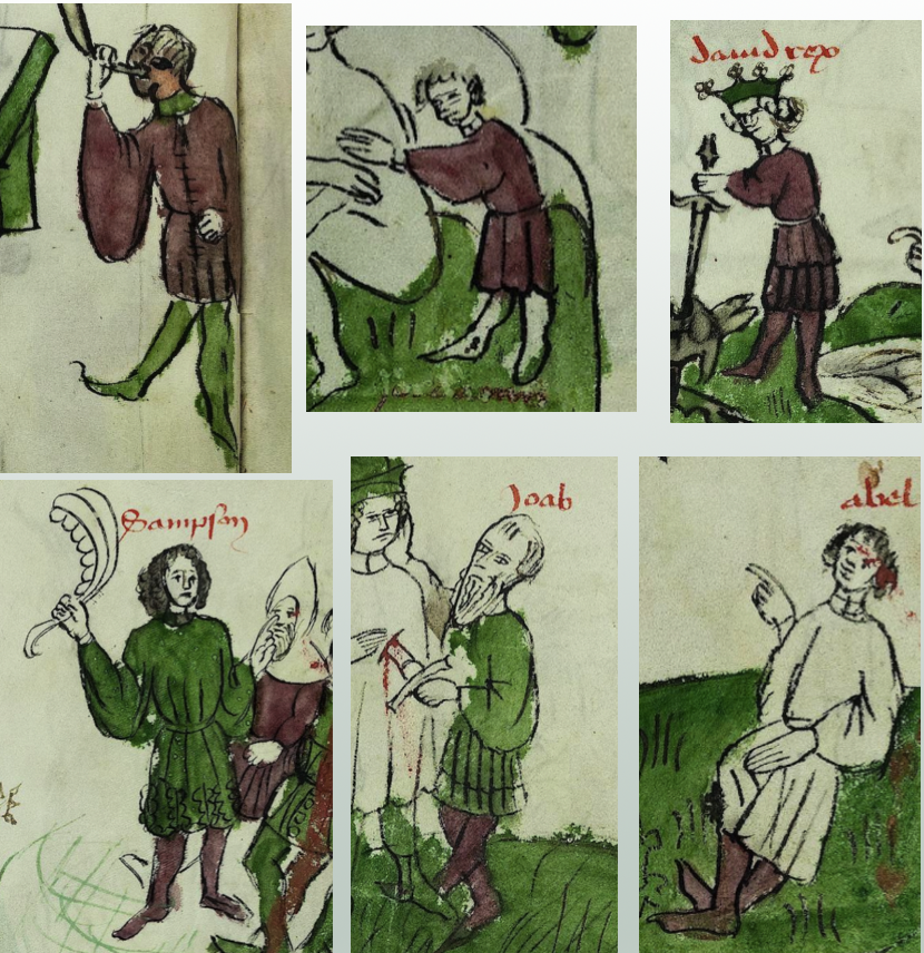
Also, if you keep looking, you can find the Sagittarius “pouched” hat. The hat (right) in Pal.lat.871 is not just a vague or generic drawing, it is drawn in a distinctively different way from the ragged-fabric chaperone on the left:

Pal.lat.871 and Pal.lat.1806 are thought to be from different towns, and are drawn by illustrators of different skill levels, yet the clothing themes are clearly related and, in turn, are similar to the VMS zodiac costumes.

Drawing Skill and Cultural Differences

What happens if the same subject matter is interpreted by someone from a different culture and significantly better artistic skills? Do the tunics change? That’s a subject for a separate blog, but I’ll include a few examples to introduce the topic. On the left, from Pal.lat.1806 and on the right, the same scene from BNF Latin 512:

Here some more specific tunic comparisons between Pal.Lat.871 and BNF Latin 512, both of which are from approximately the middle or third quarter of the 15th century:

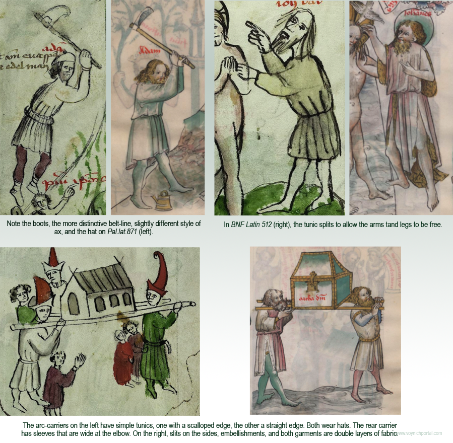
As might be expected, there are more details in the drawing by the better artist, but paging through the manuscripts side-by-side, there also appear to be small cultural differences that are probably related to the difference in German and French origins. In terms of clothing style and drawing skill, the VMS is obviously more similar to Pal.lat.1806 than BNF Latin 512.

Summary

I have much more on this subject, and don’t have enough space to post about the female dress in the same blog. For the moment, there are enough examples to illustrate that the two German manuscripts Pal.lat.871 and Pal.lat.1806 (in addition to those mentioned in previous blogs), bear notable similarities to the costumes of the VMS zodiac characters.

J.K. Petersen

© Copyright 2018 All Rights Reserved


A Line in the Stars

Recently Voynich Views posted a blog about the line (or lack of one) connecting the fish that represent the astrological symbol Pisces, paying specific attention to those that look like the VMS long-nosed fish. I have a dataset of more than 500 zodiac cycles, so I thought I would post them to help round out the picture.

Long-nosed fish are definitely in the minority. Only about 8% of the total samples in my files have long noses, and if you filter out those with a line between the fish, only 3% remain.

The majority of those with long noses originated in France, with a few from Austria and Germany. There were also single examples from Italy, Spain, Belgium, and the Netherlands. If you look back at the map of symbols similar to VMS Scorpio, you will see that several of those that resemble the VMS lizardy Scorpius are also from France.

The earliest examples, mainly from the 12th and 13th centuries are from France, England, Cologne, and Austria. Those enclosed in circles are from France, Austria, Germany, and the Hague.

Only two or three of the fish pairs have the same “wavy” shape as the VMS fish (a couple from Paris, possibly one from England, and one from Austria). Note that the 12th century zodiac from Seckau, Austria, may have had the drawings added in the 15th century, so I have sorted according to the later date [click to see larger]:

It’s interesting that so many of the VMS details are in the minority. Crossbow Sagittarius is relatively uncommon, as is lizardy Scorpius, and double-Cancer. The Gemini “courting couple” is also uncommon.

Pisces with a long nose is quite uncommon, especially those without a line between the fish. I sometimes wonder if the person who designed the VMS zodiac signs got the general idea from looking at zodiacs but inserted pictures copied from other sources. For example, in CLM 10072 and BNF Lat. 13025, we see a long-nosed fish in a pond, and a long-nosed fish with the scales emphasized in an embellished initial. The Book of Wonders and the Rochester Bestiary also have a variety of long-nosed fish. Plus, there are a couple of “zodiac man” images with long-nosed fish under the man’s feet that I didn’t include in the above compilation.

Another way that the VMS fish differ from many fish drawings is the way the scales cover the whole body. Many illustrators don’t put scales on the bellies:

The wavy form of the VMS bodies is also unusual. I found a “wavy” fish in an Arabic manuscript, but other than the undulating posture, it doesn’t strongly resemble the VMS fish. It has spots, three fins top and bottom, a pale belly, and a drawing style that is much more eastern:

There are also some long-nosed fish in the marketplace and in the water in Tacuinum Sanitatus:

This fish is scaly top to bottom, but the fins and nose are quite different from the VMS fish:

In the planetary influences section, Cod. Sang. 760 has a human Sagittarius and some scaly long-nosed fish, but the fish are roughly sketched and probably later than the VMS:

Morgan B.19 has a very cute drawing that looks like it was done by a child that includes a long-nosed fish with double dorsel fins:

In the Andalius De Sphaera (c. 1327), we see long-nosed dolphins. They’re not fish, they’re mammals but many old texts refer to them as fish and even today many people call them “fish”:

Family emblems, such as this one (which also features cloud-band imagery), sometimes include long-nosed fish:

The best match I’ve seen for the VMS fish outside of zodiac imagery was the one pointed out by MarcoP in the Sachsenspiegel. It has a long nose, a face quite similar to the VMS fish, and is scaly top to bottom. I’ve turned it sideways so it is easier to see:

Summary

Even though the VMS long-nosed fish are unique in a number of ways, there are several possible sources for the imagery, including zodiacs, bestiaries, and manuscripts unrelated to astrology.

The Parisian zodiac dating from c. 1350 (Morgan M.75) is the closest I’ve found so far as a Pisces symbol, in terms of style and features. Morgan M.75 also includes a four-legged Scorpius and crayfish Cancer, so perhaps there is some common source that connects them, but I’d like to gather more information and continue analyzing what I have before venturing any conclusions.

J.K. Petersen


[Postscript July 27, 2018] I found this picture after I posted the blog:

The drawing style is different from the VMS, but the features are notable. It has long-nosed double-dorsal fish that are scaly from top to bottom. Plus, something that is even harder to find in fish with these characteristics… the lower one has an undulating posture. The image detail is from a 14th-century hell-mouth fresco in the Timios Prodromos monastery in Serres, Greece.

Serres also has grottoes with fabulous stalactites. I’m always on the lookout for grottoes since some of the VMS bathing images have grotto-like structures.

J.K. Petersen


Postscript 30 August 2018: It has been suggested that the VMS Pisces symbol represents the New World alligator gar. Here is a picture of the gar. Note there is one fin top, two sets of fins bottom-front, and another fin back-bottom. Drawn from the side, it might look like one top and three bottom.

Alligator gar picIf the researchers who identified the VMS fish as alligator gar are going to ignore the mismatch in the number of fins, then any fish with a long nose could be said to be similar to the VMS fish, including the northern pike, which is indigenous to both Old and New Worlds:

Northern pike (Esox lucius)The same researchers claim the fish with the nymph in its mouth on folio 79v is also an alligator gar. I can’t take that seriously. Look at the mouth, it’s very broad and blunt, more like a wide-mouthed bass:

Voynich f79v fish

In contrast, the mouth of the alligator gar is long, narrow, and toothy (especially this species):Alligator gar long snout

Natural or Traditional?

Four years ago, I looked at hundreds of pictures of New World and Old World fish and there are several with long noses and two fins top and two bottom, but I have the feeling the VMS illustrator consulted other drawings rather than studying real fish because VMS Pisces resembles medieval illustrations more than it does naturalistic drawings of the time.

Here is a small subset of Pisces symbols with varying numbers of fins and long noses. They are all Old World illustrations:

Medieval fish drawings with different fins

I’ll leave it to the reader to decide whether the VMS fish look more like the New World alligator gar, or like fish in pre-conquest medieval illustrations. I’m partial to the fish in the Sachsenspiegel with its similar face and tail, and to the fish in the Greek fresco, which have the right number of fins, top-to-bottom scales, and narrow curvy bodies.

© Copyright 2018 J.K. Petersen, All Rights Reserved

The Catch to the Crossbow

7 November 2017

I’ve written several posts on the VMS bowman and didn’t think there was more to say about his bow, but after looking at hundreds of crossbows, I feel more strongly than ever that the origin of the Sagittarius bow might remain a mystery until the text is deciphered.

It’s difficult to find crossbows that originated before 1500. They’re made of natural materials that wear out or easily perish in fires. There are a few rare examples that are claimed to be from the late 15th century, but even those dates are speculative—a home-crafted bow from the 16th century can look very much like a typical 14th-century bow.

Crossbow artisans kept their trade secrets close to the vest, so most of what we know about crossbows was passed down by scribes and illustrators. Fortunately, a few descriptions are relatively detailed. Most of them, however, are not, including the drawing of a crossbow in the cheap Lyrica canada Voynich Manuscript.

To recap, here is a picture the VMS crossbow that was previously posted to point out its main features. The shape of the stock-end is speculative, since it’s hidden by his hand.

pic of details of Voynich Manuscript Sagittarius crossbow

In terms of locating the origin or time-period of the bow, there are four features of particular interest:

  • the rounded stirrup,
  • the long trigger,
  • the extra curve at the tips of the lath (also called a prod), and
  • the position of the nut or tumbler, also known as the catch (in a small, rough drawing it’s impossible to determine the style of catch).

Details of Interest

Lugs and Lath Tips

Most stocks in the Middle Ages were straight or narrowed. After the Renaissance, some evolved into gun-stocks like those on a rifle. Later bows were fitted with lugs for attaching a crank (these are usually positioned a couple of inches behind the nut), a feature that was less common in the 15th century, but quite prevalent by the 17th century.

pic explaining lugs on old crossbows

The VMS drawing is not detailed enough to show the style of cord, whether there were lugs, or how the stirrup was bound to the lath. It is interesting, however, that so much care and attention was given to the graceful curving tips at the end of the lath, a feature that was not common to crossbows (longbows didn’t always have long tips either). Medieval laths were usually wood, or composite materials such as wood and bone, with blunt tips, as in these examples:

pic of medieval crossbows with blunt tips

Sometimes when the cord is quite thick it gives the appearance of longer tips (as in the center image that follows), but the VMS drawing doesn’t look like an extended cord—it looks like the tips of the lath extend beyond the wound cord.

examples of wound crossbow cords

So what could account for the relatively sharp lath-tips in the VMS crossbow?

Could the illustrator have combined features of the longbow and crossbow? Or might the lath have been made of steel (as in the two images to the right above), a material that was gradually introduced in the 12th century, but did not become widespread until the late 15th or early 16th century? Steel prods were narrower than composite, sometimes with longer tips.

Or maybe the answer is more complicated… the lath in the following picture looks like it could be composite materials (it is moderately thick), but the tips are quite narrow and very hooked, as though they were reinforced and extended by metal caps. I’m not aware of any historic prods with caps, and the glue would have to be very strong to hold against the pull of a loaded cord, so I looked for another explanation. Perhaps the bow in the picture was wrapped in a material like snakeskin, with the tips left unwrapped… but that still doesn’t account for the extra curve in the tips—these kinds of curves are not easily incorporated into wood or composite bows, and the tips become fragile if sharply tapered—a broken tip could lead to death on the battlefield or the loss of a week’s food on a hunting trip.

If the tips were “caps” rather than a protruding unwrapped part, these drawings from 1459 http://ccritz.com/?3x=3x (Thott.290.2º) might illustrate a part of crossbow history that isn’t well documented. Either way, even if the curve is not literal, but simply an artistic embellishment, drawings like the VMS, with an extra curl in the tips, are definitely in the minority. I found very few compared to bows with blunt tips or only a slight curve. Here are some drawn with an extra curve:

pics of medieval crossbows with long curved tipsexamples of medieval crossbows with long triggers

Note how the laths in the Thott illustration above have darkened tips.

The following examples are the same crane-hunting scene from the Tacuinum Santitatus tradition, drawn by different illustrators almost a century apart. Except for drawing style, the later version is a fairly faithful reproduction of the storyline, but notice how the illustrator took time to change some of the details, like the sleeves of the tunic, and the color and shape of the crossbow tips:

crossbows in Tacuinum Sanitatus

The earliest example I could find of a relatively clear crossbow with slender long tips was in an ecclesiastical manuscript from the 11th century (BNF Latin 12302), probably from France. It doesn’t have a stirrup, however, and the trigger is almost vertical, in contrast to the mostly horizontal triggers of later crossbows:

crossbows in early medieval manuscript

I did locate a photo of a long-triggered steel bow from Portugal with slender tips curved a little more than average, from the late 1500s, but the stock extends a couple of inches beyond the lath, and there was no stirrup attached.

Coloration in Drawings of Medieval Crossbows

By the 15th century crossbow laths with dark tips are not uncommon. Here are examples of a battle bow from BNF Français 9342 and a hunting bow from Bodley 264, with darker tips. In these drawings, it looks like the bow might be wrapped (possibly with snakeskin) and the tips left unwrapped, as opposed to the tips being capped:

medieval crossbow laths in manuscript art

The VMS drawing doesn’t have dark tips but it does have a rounded stirrup, like the bow on the right.

Stirrups

The rounded stirrup, the style in the VMS drawing, appears to be more common than squared-off stirrups:

examples of different styles of crossbow stirrups

When comparing the VMS bow to historic crossbows, keep in mind that they were functional items, subject to wear-and-tear, and the stirrup bindings and cords were replaced as they wore out. Thus, the stirrup itself may also have been replaced, especially if the original was lost due to disintegrated bindings, which were usually leather or cord. The nut would sometimes also break and be replaced with a slightly different style.

By the late 16th and 17th centuries, many crossbows, especially those for the nobility, showed significant artistry, with ivory, bone, laminate, and incised decorations along the full length of the stock. In the 17th century, pompoms (rounded tassels) were added to some of the laths. This remarkable bow from Dresden, Germany, has elaborately carved bear-hunting scenes, a tooled lath tip, and pom-poms. It dates to about the late 17th century or early 18th century (it has similar characteristics to a 1663 bow in The Met collection).

The VMS drawing shows no signs of decoration (possibly because it is so small), but judging by other medieval drawings, embellishments were less common in the 15th century than later.

And now to the important part… a little detail that is scarcely a blot on the drawing of the VMS stock.

Nuts

The catch to this whole VMS crossbow identification effort, is, well… the catch, the nut, the little protruding knob that secures the power of the spanned cord, like a capacitor, until the bowman releases its energy.

The catch is approximately a third of the way down the stock from the stirrup, depending on the length and style of bow. The trigger “catches” on the underside of the nut so that pulling the trigger moves it just enough for the catch to rotate freely and ZING! the cord is freed and ejects the bolt. Here are some examples of the nut/catch. Notice it is clawlike, to grip the cord securely:

examples of crossbow nut mechanisms

Catches are pretty much alike… or so it seems if you look only at the shape and ignore the mechanics. There’s quite a bit of variation in the distance of the catch from the trigger, and how they connect inside the stock, but there are some things that are necessary for the trigger to work… And this is the important detail that throws all VMS identification efforts out the window… the VMS catch is like the legs on the lobster’s tail in the zodiac roundels, or like the joints in the back legs of the ruminants—it’s in the wrong place.

I looked at the catches of almost 200 historic crossbows, and all of them were located above or slightly ahead of where the trigger attaches to the stock (usually about 1/2″ to 2″, up to a maximum of about 3″). If you look at the VMS drawing again, you’ll see that the catch is about 2″ behind the trigger. This never happens, as far as I can determine. The portion of the trigger inside the stock rotates in a specific way when you squeeze it and the nut has to sit at the right junction to efficiently respond to this movement.

Summary

hunting scene with crossbow and VMS Sagittarius style of tunicI would love to say I found bows that closely resemble the VMS bow, and I did have some success, but if this important detail of the crossbow-catch is wrong, maybe others are too.

Maybe the tips are artistic, maybe the trigger is lengthened to make it look like it’s touching his hand, not because it’s long, maybe the attachment point of the trigger was moved up to show that it is long… It’s possible the position of the catch is the only thing that’s off, but there’s no way to be sure. We have to look to other factors, like the style of the bowman’s tunic (which is echoed quite well in the hunting scenes of Gaston Phoebus, right) and aspects of the manuscript that seem mostly but not-quite-right.

So, I’ve put crossbow identification on the table for now, but I’ll keep my eyes open for other imagery that might help us understand this roundel, and if I find some, I’ll post it.

J.K. Petersen

© 2017 J.K. Petersen, All Rights Reserved