Tag Archives: Voynich manuscript

Fleeced?

What is a sheep doing in a pond?

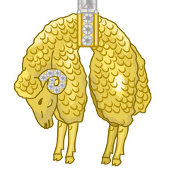
Voynich researcher René Zandbergen posted a picture of the emblem for the Knights of the Golden Fleece, an organization that was apparently founded in 1430 and, in the same thread, Koen Gheuens pointed out the similarity between the pangolin-like critter and the critter in the upper right corner of the pond that I mentioned in a previous blog.

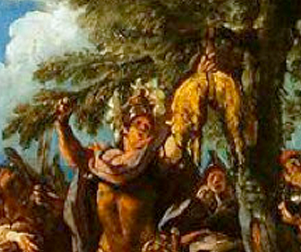
HangingSheepEmblemI had never seen the dead-looking sheep emblem before today (it’s apparently a fleece, not a dead sheep), but I have heard of the knights of the Golden Fleece and I am familiar with the mythical story of Jason and the Golden Fleece.

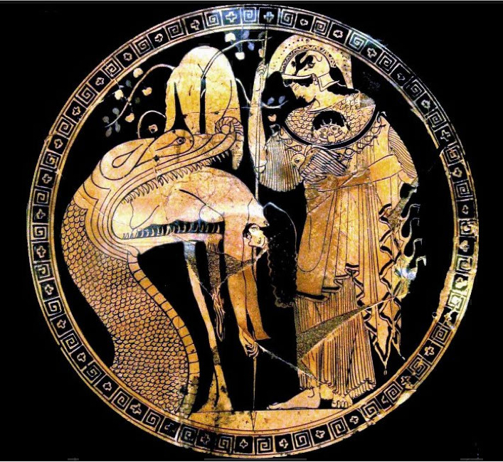
The reference on the forum to the golden fleece immediately brought to mind this famous depiction of Jason on a piece of beautifully crafted ancient pottery (Vatican Museum, ca. 5th century BCE):

JasonRegurgitatedThe serpent or dragon is guarding the Golden Fleece which is hung in the sacred tree, and Jason is emerging from its mouth with some help from Medea who worked a spell on the dragon.

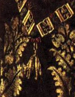
GoldenFleecePendantIn later depictions in the middle ages, a pendant with the hanging fleece can be seen around the necks of some of the early members to the order. The painting on the right, which I discovered after learning about the founding of the Order, includes the pendant worn by Baudouin de Lannoy, who was inducted in 1430.

But getting back to the more ancient depictions… does that image of Jason half-swallowed seem familiar to those of you who have looked at the pond images in the VMS?

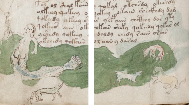
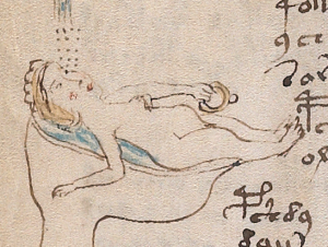
I’ll post the picture of the pond again, which I’ve mentioned both in the post about melusines and with reference to the images in the left margin of folio 79v. Below left, a figure is standing in a fish (or perhaps a serpent?) and, on the far right, a somewhat sheep-like critter (it has always looked somewhat sheeply to me) lies in a strange posture reminiscent of the symbol of the golden fleece:

VMSPondFleecePaintingA coincidence? Probably, especially considering it’s unwise to jump to conclusions about the meaning of the pond images without assessing the drawings along the left side (described in a previous blog). Plus, there’s no sign of the other personalities in the story of Jason and the Argonauts, or of a sacred tree… or  is there?

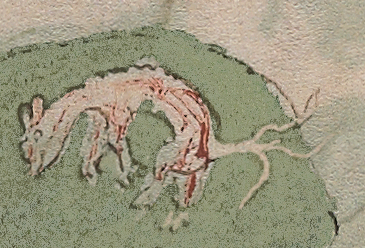
I recently digitally removed some of the paint from the pond and found a strange branch-like appendage apparently coming out of the sheepy creature’s behind. It’s positioned like a tail, but is it a tail? Is it actually attached to the critter or coming from behind it?

VMSSheepCould it represent part of a tree? It looks more like roots than branches, but I suppose it might be branches. As mentioned previously, flower- and tree-like tails were popular embellishments in medieval manuscripts so it may be an idea for a tail that was abandoned or painted over by someone else. And what is that faded line that stretches up from the critter’s back? A smudge? a mistake? an idea that was shelved and partly erased?

I don’t know if the sheep-like image is in fact a sheep, maybe the red color indicates a fox… and I’m not sure it’s related to the story of Jason and the Golden Fleece but, from a purely visual point of view, it’s an interesting parallel that might be worth keeping in mind.

J.K. Petersen

© Copyright 2016 J.K. Petersen, All Rights Reserved


In Greener Ponds

A Closer Look at the Pond Critters

Have you ever wondered what is going on underneath the green paint in the VMS “mermaid” pond? I was curious too, as a result of a post by Koen Gheuens, one of the other researchers.

The green paint on folio 79v is laid on fairly thick, so it’s hard to tell, but I took some time to digitally remove as much as I could without destroying the outlines of the animals and discovered more than I expected.

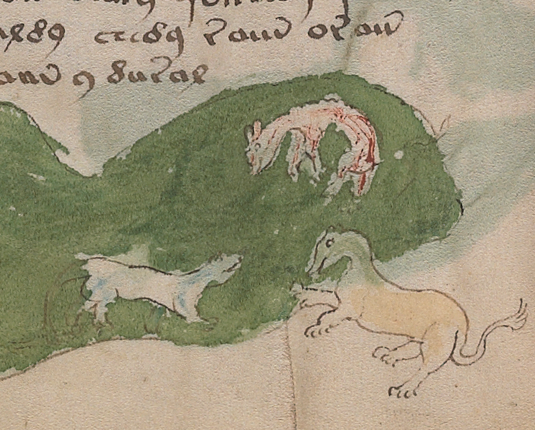
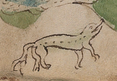
Here is the original picture of the bottom right side of the folio, with three of the pond critters that are hard to identify. The upper right one looks a bit like a dead lamb except that it is painted a brick-red color. The lower left looks a bit like a reptile or a badly drawn weasel-like mammal. Oddly the tail has been painted over (I’ve mentioned this on a previous blog). The bottom right resembles a lion rampant with the head of another animal:

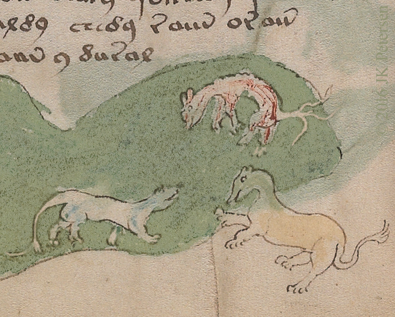
VMSPond1When I digitally removed some of the green paint and lightened some of the parts that were outlined and filled in, it ended up like this:

VMSPond2

Something I noticed when I removed the green is that the back and stomach of the lower-left critter have been overdrawn with a darker ink and the bumps on the back of the reddish creature look like they may have been added or emphasized later.

The biggest surprise was that tree-branch like shape coming out from or behind the reddish animal. It appears to be the animal’s tail but I’m not completely sure. The same thing happens lower left—there’s possibly and extra “branch” to the tail but it doesn’t appear as strongly connected as the tail-shape on the upper right.

SpotLizardAt first I thought the extra tail lines in the lizard-like creature to the left were a mistake, a slip of the pen, but after seeing the branched tails under the green paint on the right, I realize it was probably deliberate. The creature on the left may look like a lizard but it has a very unlizard-like fuzzy tail.

The dog-lion looks essentially the same, after removing the paint, except that you can see the ears better. I’m not sure if this reveals anything more about the identities of the pond creatures, but whoever covered over the “tails” with green may have done so intentionally as it alters their appearance quite a bit.

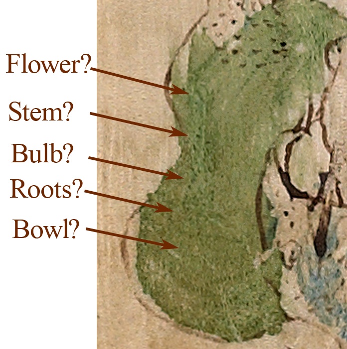
While adjusting the scans, I noticed something on the left-hand side of the pond that is hard to discern. Some of it is green, which makes it difficult to separate out from the pond-paint and some is brown (near the bottom) but it’s such a light brown, it’s difficult to make it show up better. The only part that seems somewhat clear is the shape at the bottom that looks like a bowl. The rest is subject to interpretation but could be a flower with an onion-like bulb and spidery roots. You’ll have to look closely at the high-res scans to see it.

PondBowl

The two rows of dots at the bottom, by the bowl-shape seem very ordered but they might be pores in the parchment and not part of a drawing. This reminds me a bit of the flower-like shapes in the yellowish-leaf on folio 1v, but they aren’t terribly clear either.

I’ll leave it up to the viewer to decide if there’s an overpainted image on the left side of the pond and whether it bears any relationship to the underlying penstrokes on other folios.

J.K. Petersen

© Copyright 2016 J.K. Petersen, All Rights Reserved


Sex & Procreation in the Voynich Manuscript

When Mores were Less

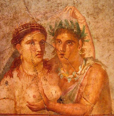
PompeiiFresco

A portion of a wall fresco from Pompeii after the eruption of Mt. Vesuvius, preserved in the archaeological museum of Naples, Italy.

In pre-Christian times, sex and procreation were viewed as natural and commonly depicted on vases, statues, and walls. Everyday objects such as oil lamps or tokens were embellished with images of coitus.

Many ancient Irish places of worship and sometimes even stone perimeters included a carved Sheila-na-gig symbol, a woman not just displaying her vagina, but opening it wide to celebrate fertility, childbirth, and the source of life. In some instances, the Sheila-na-gig warded off evil spirits and it’s been suggested that some served as reminders against excessive lust (you have to wonder if this was a later interpretation).

Gradually, Christianity was enforced by kings and embraced by the pious, and sexual repression was justified by stories of Adam and Eve donning clothes after their expulsion from the Garden of Eden. Prohibitions against nudity and sexuality increased and a proliferation of fig leaves appeared on artworks. Sculptures were emasculated with hammers and private parts were expunged from manuscripts with knives and acids. At one point religious teachings were so strict, husbands weren’t even permitted to see their wives nude and a marriage shroud with one small opening between the legs had to be draped over the woman before they had sex.

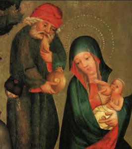
NursingMary

Joseph and Mary c. 1383. By the end of the 16th century, this popular motif openly showing the breast, known as Maria Lactans, was no longer common. Mary giving life to the baby Jesus through breastfeeding was branded obscene rather than as a nurturing part of life.

Usually it was the male sex organs that were removed from manuscripts and other artworks, but in some documents, women’s breasts were scraped away, as well, and it eventually become rare to depict Mary explicitly feeding her baby.

But these prohibitions weren’t as widespread in the early 15th century as they were in later centuries, and don’t entirely explain why some of the VMS sexually suggestive drawings appear to be coy and symbolic. There is plenty of nudity in the VMS, and some regions still retained their Pagan or other non-Christian beliefs into later centuries despite the Inquisition, so it’s possible the illustrator was from a non-Christian culture or an area where Christian prohibitions against nudity were less strictly enforced.

In fact, in the 15th and 16th centuries, encoding information could sometimes get you in more trouble than expressing taboo subjects openly. Medieval academics and alchemists inventing ciphers for recreational reasons, or to legitimately hide trade secrets, risked being accused of witchcraft.

Sexuality in the VMS

In the VMS, there is nudity on many pages, including the figures around the zodiac circles, but there are no explicit references to coitus. There is at least one image of an ejaculating phallus and some of the male figures are anatomically correct but, other than that, there is little to suggest procreation. Babies are completely absent. A number of drawings do, however, resemble internal organs with nymphs walking all over them. Is it possible to make any sense of these drawings?

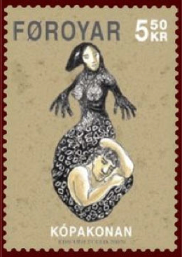
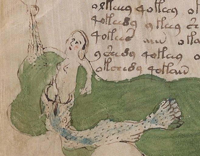
SelkieStampNymphinFishOne figure that has particularly captured the attention of researchers is the “mermaid” on folio 79v, in the bottom left corner. It could be a mermaid, a melusine (as described in a previous blog), or perhaps a selkie (right), a mythical sea creature who could shed her seal tail to walk on land.

The fact that the nymph appears to be separate from the fish-like creature in which she stands seems to argue against most of these interpretations, especially when it’s noted that it’s not only the tail of a fish—it has eyes.

In some ways the VMS image resembles depictions of the biblical Jonah emerging from the fish, but other references to this tale appear to be absent. Perhaps the picture can be explained by looking at other drawings in the left margin of this and the preceding page.

Bodily Functions and Fluids

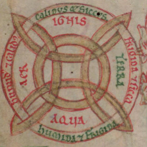
DigbyElementsIn medieval philosophy, a great deal of attention was given to organizing the universe according to general principles. Humans invest vast amounts of time trying to simplify a complex universe into simple building blocks in the hopes of understanding it. Sometimes it works; but more often it creates a shaky foundation that is eventually overthrown as knowledge advances.

In the Middle Ages, everything was considered to be comprised of four elements: earth, air, fire, and water (or of five elements, when aether was included). Similarly, in medieval medicine, it was believed everything could be described as hot or cold, wet or dry, and that anatomy could be understood in terms of blood, phlegm, yellow bile, and black bile. Notice that the latter are all liquids and that flowing liquids are prevalent in the VMS.

Interpreting Folio 79

It’s possible that folios 79r and 79v represent internal anatomy. Both pages are similarly organized—several fairly dense paragraphs of text combined with a chain of images running down the left side and across the bottom. On both folios, liquids appear to flow from top to bottom into pools. A distinction has been made by painting the upper liquids blue and the lower pools green.

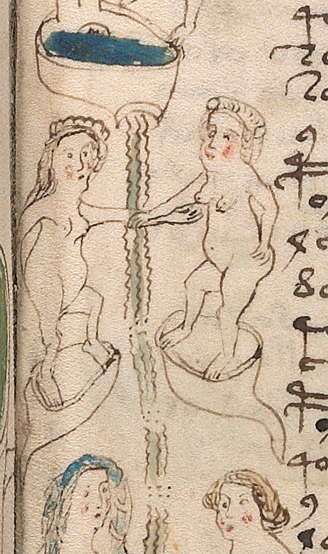
VMSDigestiveIn the first series, the nymphs on the right have shorter hair (or hair that’s tied back), the ones on the left longer hair. Length of hair distinguished a person’s age or marital status in parts of medieval society. In fact, in some cultures, a woman was required to cut her hair and wear hats or a veil when she was married. Note that the double pods near the bottom (see right) are not directly attached to the main “pipeline” of flowing liquids.

In the absence of textual confirmation, there are many possible interpretations of these illustrations but if you were to look at this as a diagram of a digestive system, for example, the top could be the esophagus, the next might be the stomach, the third could be ovaries (which are not connected directly to the digestive system) and the last could be the bladder and/or bowels. It’s difficult to interpret what’s going on in the green pool but it looks like a male figure leaning against a log that has two spikes through it (or behind it) and the squire’s arm is wrapped around one of them. One leg is bent forward as though he is walking or bracing his foot on something. Could the log be a phallic reference or something entirely different?

Voy79rLongVoy79vLongThe image on 79v is similar to 79r in that it runs down the left margin, shows flowing liquid in blue, and terminates in a green pool. There is some rare symbology on this page. The upper nymph holds a cross, the second one a ring. There are very few references to Christianity in the VMS, but if the cross were interpreted as Christian imagery, it might possibly stand for Confirmation, a religious ritual common to many cultures in which a pubertal child is initiated into adulthood.

Following this line of reasoning, the second nymph with the ring might mean marriage. A ring was a symbol of marriage in many cultures and notice that the nymph is lying down, as a married woman would lie with her husband.

The third nymph isn’t holding anything, she is dipping her hand into the apparently liquid-filled vessel, but she does have a very round stomach and could be heavily pregnant. The previous nymphs have fairly big stomachs too (as would be expected in the days before Photoshop and liposuction) but this one is even larger than the others. Is it possible that the nymph in the pool, stepping out of the fish’s mouth, is a symbolic representation of birth? If so, what would be the significance of all those other animals?

It might be possible to explain the animals in terms of common creation myths. The story of Genesis is at the beginning of the old testament and thus underlies both Jewish and Christian religions and medieval depictions of creation often show animals emerging out of the ground and out of the water. One of the animals emerging from the water in many European texts is a mermaid or mermaid-like creature. If the concept of creation is doubling as a metaphor for childbirth, it might explain the animals, the fish-and-woman, and the drawings along the side.

Summary

79vRingIt’s possible the fish represents the birth canal. In many Mediterranean mythologies, the word fish or dolphin also stood for womb or vagina. The ancient Ichthys fish symbol, later adapted by Christians to represent Jesus, originally represented fertility and was the name given to the offspring of Atargatis, a northern Syrian deity who, in turn, was a continuation of the concept of Asherah, the goddess of the sea who, even earlier, represented the concept of renewal and was, at that time associated with trees (as with the tree of life).

Without text, it’s difficult to confirm whether these folios represent bodily functions such as digestion and procreation, but I wanted to put forward the idea that the woman-in-fish could be something other than the more traditional imagery built around mermaids, selkies, and melusines. These might be biological symbols running down the left-hand side or perhaps biology and mythology combined.

J.K. Petersen

© Copyright 2016 J.K. Petersen, All Rights Reserved

More About Those Puzzling Pilcrows

Are There Pilcrows in the Voynich Manuscript?

PilcrowBlueIn the last article, I diverged from the Voynich theme to illustrate a brief history of the symbol we know as the pilcrow. I realized the article would be too long if I tried to tackle both the history of the pilcrow and its relevance to the VMS in one go, so this is a continuation of the previous blog.

What does a typographical symbol have to do with the Voynich Manuscript? Maybe nothing. The VMS has enough space on most pages to visually separate the paragraphs, and yet there’s something odd about the behavior of the tall glyphs, popularly called “gallows characters”, a clue that might be important in interpreting the text.

The Duplicitous Gallows

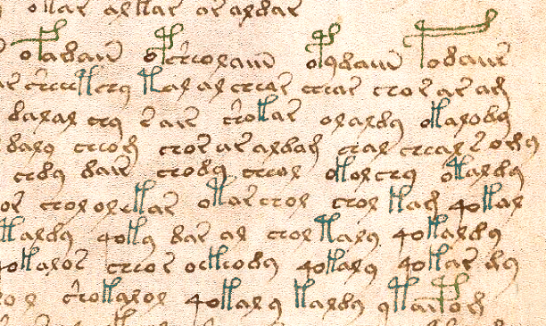
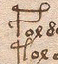
GallowsBeginThe first time I looked at the Voynich manuscript, I noticed a tall shape that looks like a Greek pi with a loop (or two loops) and one that looks like a P were often at the beginning of paragraphs. Sometimes they are embellished with extra loops that appear to be more decorative than meaningful (although that is not known for certain).

At the time, I knew very little about medieval scripts, nothing at all about capitula (although I was familiar with pilcrows from word-processing programs) and I further didn’t know that capitula could occur in the middle of a line, as well as at the beginning of paragraphs.

What I did know was that the VMS had been called a “cipher” manuscript and I noticed immediately that the gallows characters at the beginnings of sections would sometimes alternate (see Folio 3r as an example), so I entertained the notion that different gallows chars signaled a different encryption method, or perhaps a paragraph that required a different decryption key. It hadn’t occurred to me yet that the explanation might be simpler.

After paging through several of the VMS scans, it became apparent that gallows characters weren’t always at the beginning of paragraphs and didn’t all behave as pilcrows—some of them were midline and too close together to reasonably expect them to signify a new section.

This pattern prompted me to do some research on paragraph markers and I discovered capitula (section markers often used to separate units smaller than a paragraph) and noted that the C-shape in old manuscripts served two functions—it could represent a capital C or it could represent the capitulum symbol, depending on context.

Could some of the VMS glyphs have more than one purpose?

GallowsMidline

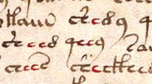
This example from folio 58r illustrates how gallows characters are frequently included within the main text, often close together, which provides an argument against them being section markers, but what if the gallows serve two purposes, as with medieval capitula, which can stand as section markers but also represent the letter C? Notice also how frequently EVA-k and EVA-t are followed by the glyphs that look like “ar” or “al” (more often than would be expected in natural languages and something I touched on briefly in another article). Is it possible that even the midline gallows is a marker rather than a letter?

Could the gallows characters be pilcrows or capitula in some situations and letter glyphs in others? If so, a computational attack would have to adjust for this possibility when estimating letter frequencies.

Maybe the glyphs aren’t doing double duty. Maybe they only represent section markers, proper names, or something else in the text that needs to stand out, but if that’s the case then there’s a problem… if the midline gallows are capitula or markers, it reduces the number of VMS glyphs that potentially correspond to an alphabet. The VMS character set is already rather restricted and reducing it further would make it even less like a natural language.

Counting the Pees and Ques Tees

In the EVA font, a character set that helps you write Voynich glyphs, the EVA-k and EVA-t stand for the pi-like gallows with one loop or two. Similarly, EVA-f and EVA-p represent the P-like gallows with one loop or two. There are also some glyphs that combine the gallows with the bench char and are numerous enough to be significant, but it’s a more complex subject, so I considered both benched and unbenched at the beginning of sections as gallows for the purpose of this tally.

I counted only the text groupings that could be identified as discrete sections, what we would call paragraphs. Most of them are fairly clear—either there is space between them or the last line is shorter and a new group begins. Here are the tallies for the first section from folio 1r to 57r, which consists entirely of plant drawings except for the first page.

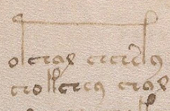
Out of 219 paragraphs, two were preceded by the red “weirdo” characters that resemble seagulls on the first folio. There were 206 groups preceded by gallows characters, most of them without bench chars, but a few had a full or partial bench character attached. A very small number were preceded by a gallows character with a leading “o”. Including the very small number with a leading “o”, 94% of paragraphs began with a gallows character.

The gallows were distributed as follows:

  • EVA-p    85  (double loop P-shape)
  • EVA-t     66  (double loop pi-shape)
  • EVA-k     40  (single-loop pi-shape)
  • EVA-f      15  (single-loop P-shape)

Gallows with two loops thus occur more frequently than those with single loops at the beginnings of paragraphs, with the most visually ornate of the four being the most numerous (whether by coincidence or design is not known).

Of the 11 glyphs that were not red seagull-shapes or preceded by gallows, all were secondary paragraphs (not the first one on the page) and were distributed as follows:

  • EVA-q      6  (all were followed by the “o”)
  • EVA-y       2
  • EVA-ch     2 (both were bench chars with caps)
  • EVA-s        1

Whether the lack of a gallows character at the beginning of some paragraphs was intentional or accidental is difficult to know without further interpretation or decryption of the text. Most of the exceptions were “4o” combinations that almost invariably fall at the beginnings of word-tokens throughout the manuscript.

A simple count cannot reveal whether a gallows at the beginning of a section is a paragraph marker, especially when there are four different symbols used for this purpose, all of which also show up in the main text. It does seem unusual, however, to have only four letters of an alphabet at the beginnings of paragraphs for such an extended number of pages. Even in medieval books of lists, calenders, and indexes, there is more variation than this when the length of the document exceeds 50 or 100 pages.

On folio 58r, the first full page of text after the plant section, the pattern of leading gallows characters continues, as does that of gallows characters occurring midline.

Perplexing Paragraphs

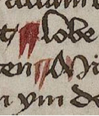
PilcrowDoubleSlashIn many respects both styles of gallows characters (the ones with two legs and the P), resemble pilcrows. Look again at the marker on the right from a manuscript written in medieval Lombardy—it’s two slashes with a horizontal bar. It’s a bit like EVA-k or -t and the regular pilcrow that resembles a P or backwards-P could be represented by EVA-P. Maybe the VMS gallows characters are a hierarchy of pilcrows, like the red and blue capitula where one is used for greater emphasis than the other. If one were a pilcrow and the other a capitulum, you would expect the “capitulum” to show up more often and perhaps even double for a letter, as it did in most medieval western languages.

GallowsStretchBut what about the strange behavior of gallows glyphs where they stretch over several characters? Is each leg standing in for the same character so it doesn’t have to be written twice? Is it an embellishment? Is it a different letter-glyph, one that’s only occasionally needed? Capitula never stretch over letters like that, do they?

CapitulCrossWordI didn’t think so until recently, and then I found the capitulum illustrated on the right. The manuscript had many traditional capitula and a few like this, where the stem came down several letters later. I don’t know if it’s because the scribe didn’t leave enough room for the stem and compensated by adding it farther on or if it was to give the capitulum greater emphasis. Perhaps it was an embellishment, but whatever its significance, apparently capitula can stretch over several letters.

Summary

Could the gallows characters be capitula, name or title markers, letter-glyphs or possibly both? At least some of the glyphs behave like capitula or pilcrows. Assuming that a natural language were behind the VMS, it seems unlikely that so many sections would start with the same two (or four) characters unless their function went beyond an alphabetic character. Maybe they aren’t letters at all. Maybe some or all of them are intended to provide emphasis, serve as modifiers, or as some kind of semantic break between words and perhaps that’s why they’re never placed two in a row.

J.K. Petersen

© Copyright 2016 J.K. Petersen, All Rights Reserved

Pointing out Pilcrows

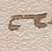
PilcrowBrownYou’ve probably seen it in word-processed text, that funny backwards-P sometimes visible at the beginnings of paragraphs. It’s an ancient symbol that originated in the days when words were often broken across lines without a hyphen and sometimes run together without spaces so that it could be difficult to tell where one thought ended and another began.

The concept of the pilcrow is related to the Greek word paragraphos, the origin of our word “paragraph” from para (beside, next to, apart from) and grapho (write) but no one has given a really satisfying etymology for the word pilcrow. It has been suggested that pargrafte or pylcrafte somehow mutated into pilcrow but that seemed a bit of an aural stretch, so I looked up pilcrow in dictionaries from 1700 and earlier.

VBarbPilcrow2Looking at many definitions gave me the feeling pilcrow may have existed alongside the Greek-Latin paragraphus because old dictionaries listed it next to paragraphus as though they were synonyms, rather than as one leading to the other. In A Dictionarie of the French and English Tongues (1611), it is spelled Pill-crow which suggests it might have evolved from two words combined.

This 13th century paragraph marker in a Greek document consists of two curved slashes.

This 13th century paragraph marker in a Greek document consists of two curved slashes.

I tried looking up pill-crow, pylcrow and pull-crow and then remembered that many older languages would not have added “w” to the end. It then occurred to me that the Spanish pvlcro/pulcro, which means neat or tidy, might be related. I haven’t seen anyone propose pvlcro as a possible forerunner for pilcrow, but sound-wise it’s more tenable than pargrafte or even pylcrafte and the idea of tidying up or summing up a neat group of text might fit the sense of it, as well. So, it’s possible that there is a forerunner to pilcrow (perhaps pulcro or two words combined, or something else) that is not directly descended from paragraphos.

Whatever the origin of the name, the symbol was used to mark a new section, just as it is now.

The Pliable Pilcrow

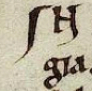
PilcrowSlashThe symbol has a very interesting visual history. Sometimes it was little more than a horizontal slash, or a vertical one, as in this Latin text on the right, from around 1100, or as in the example shown above with double slashes.

PilcrowLoopSometimes a loop was added to the slash, making it look more like a contemporary pilcrow. That’s not to say every pilcrow was roughly P-shaped. Many didn’t resemble this shape at all.

If we look at medieval documents, there is a symbol called the “capitulum” (the diminutive of the word kaput for “head”). The capitulum or little-kaput is a C-shape that was used more liberally than our current concept of chapter or paragraph. It could mark a page, a paragraph, or even a sentence, and would sometimes occur mid-text, as well as at the beginning of the line.

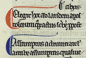
CapitBlueRedIn documents with only one color ink, sometimes the capitulum was drawn larger, to distinguish it from the letter C. To further distinguish it from the rest of the text, sometimes that extra vertical slash on the right, used to embellish the character, was extended below the line and superficially resembled the backwards-P.

When colored pigments were available, it was commonly drawn in red and sometimes blue. Alternating the blue and red made it easier to find certain passages and eventually scribes figured out that the colors could have meaning.

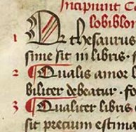
PilcrowDoubleSlashIn one old ecclesiastical manuscript, there is a legend in the margin that designates blue and red capitula as 1) noteworthy, or 2) as biblical miracles. When used in this way, a capitulum can function as a combination paragraph marker and manicule.

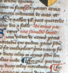
The simple double-slash capitulum was still in use in the 15th century and is shown in its more basic form to the right. Sometimes a stem was added across the top, which makes it look more like an F than a double -slash or a C.

Variations on a Theme

FPilcrowMany of the section markers in the document to the right are drawn with the simple double-slash with an upper stem, but the two at the bottom look more like the letter C except that the bottom stem has a gap. The thicker back to the slash-shape that makes it resemble a C suggests greater emphasis.

PilcrowPCSometimes the shape is in between a backwards-P and a C as in the text to the left. These examples illustrate that scribes weren’t specifically trying to make these symbols look like Pees and Cees and were more concerned with their function than their exact form. When they are larger than the other letters and colored, there’s no problem recognizing their intended purpose.

WaltersW15GospelsPilcrowWhy did old manuscripts use these shapes instead of extra blank lines or indents?

Because parchment was expensive. It’s very labor intensive to kill a goat or calf, strip its hide, scrape off the hairs, and then prepare the parchment or vellum so it’s thin enough and smooth enough to use as a writing surface. Cramming the words together and using capitula for the breaks allowed more words to fit on the page.

End Markers

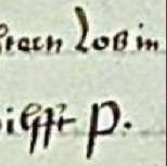
EndPSometimes a paragraph marker is put at the end, instead of the beginning of a paragraph, similar to the way Fin (end, finished) is used at the end of a story. Most of the time, in old documents, a pilcrow or capitulum symbol is used, but a simple P can also suffice (right).

Languages will sometimes borrow shapes from each other but assign them different values. The “-ris” abbreviation often used in old Latin texts shows up as an end-paragraph marker in German texts.

What does the pilcrow have to do with the Voynich Manuscript? It was too long for one blog, so I continue the topic here.

J.K. Petersen

© Copyright 2016 J.K. Petersen, All Rights Reserved


Postscript 13 May 2020: I have continued to study the enigmatic glyphs that head up each paragraph in the VMS and I am more convinced than ever that they have a pilcrow-like function rather than a letter-like function. In other words, in the VMS, the first glyph in each paragraph is not part of a word, it is a marker-glyph.

I have posted more than one blog on pilcrows and have already published some statistics for how the beginning-glyphs behave, plus I have run more tests since then. These include statistics on the makeup of the beginning-paragraph tokens with and without the first glyph.

This marker-like function is not limited to the VMS. It also occurs in medieval manuscripts, as in the example below.

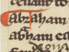
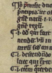
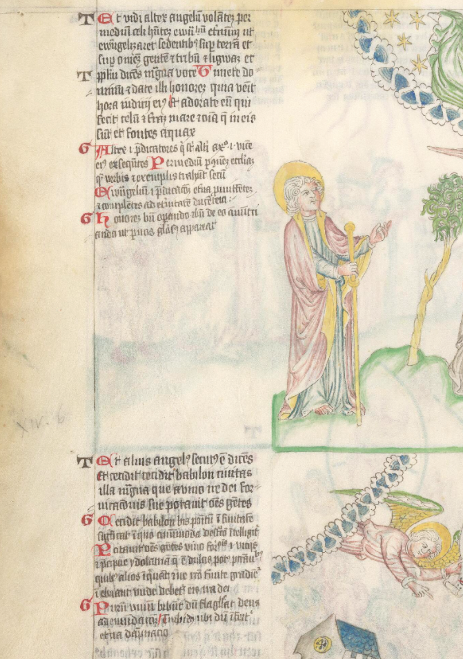
In the Wellcome Apocalypse (MS49), the two letter-shapes to the left of each paragraph-group more-or-less alternate throughout the manuscript in essentially the same way as the begin-paragraph gallows glyphs in the Voynich Manuscript. They guide the eye to major sections.

But at the same time, there are also capital letters for the beginnings of words and major sections, a pattern that is also characteristic of the VMS. In other words, in MS49, the same letter-shape can serve a marker function and a letter function, something that may also be true for the VMS:

With thanks to Arca Librarian, who alerted us that the Wellcome Apocalypse (MS49) is now available for viewing online.

The Inter-leaved Text

Is There Erased Text in Folio 1v?

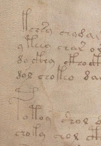
1vBudTextOn the obverse side of Folio 1r is a plant that occupies most of the page crossed by a couple of paragraphs of text. If you look very closely, you will find some text in the fruit, in one of the green leaves, and in three of the yellowish leaves.

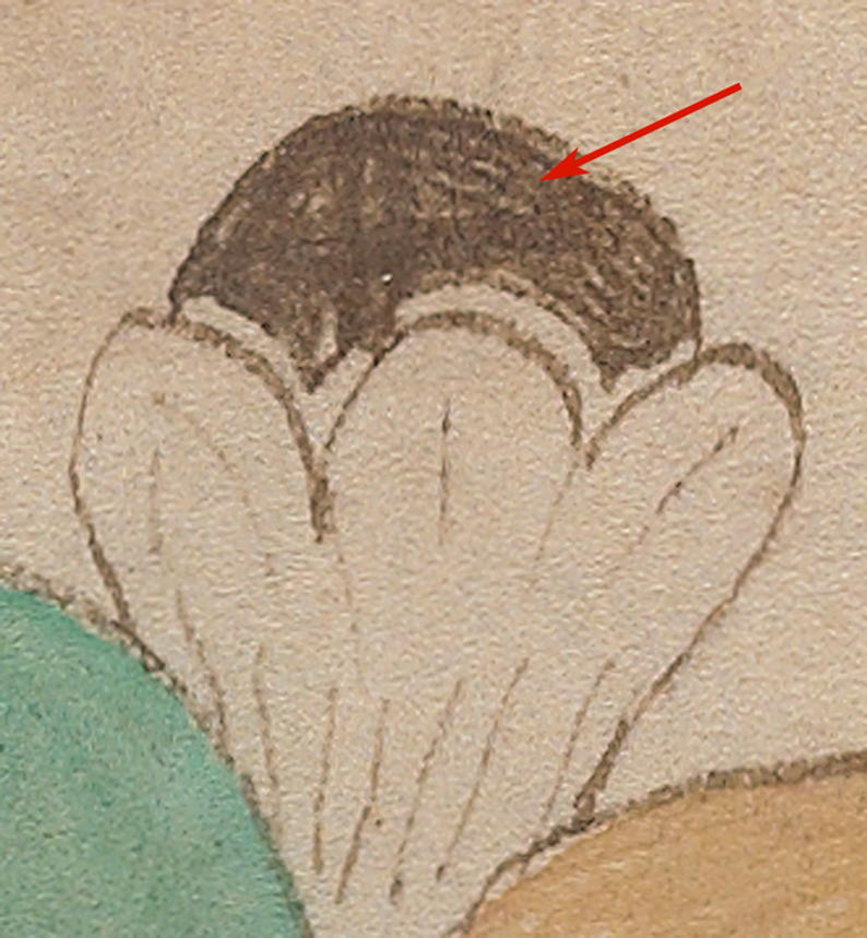
Because the bud or fruit capsule is painted brown, it’s very difficult to see what is buried there within a darker shade—it might be text or a scribble.

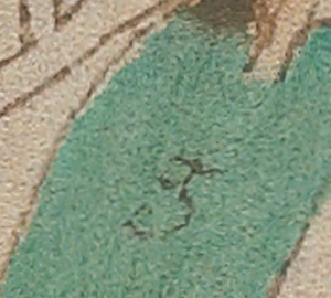
1vLeafText4The text in the green leaf is more clear and might be an instruction to paint the plant green. The word for green is variously grøn, grön, groen, grün, gwyrdd and grien in northern Germanic languages.

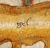
GelPaintThe “g” was not necessarily added by the same person who wrote the main text and it may not stand for green, but it was quite common for herbals to have initials or short words to indicate color, as in the example on the left, which is an instruction to paint the root “gel” (yellow/gold) from a Trento herbal in the Lombardic era.

The fact that the “g” and “gel” were not removed before painting is also not uncommon. If you look at many old manuscripts, you will find that embellished initials were sometimes blocked out with a break in the text and an initial to show which letter to paint. After the letter was added, you can still sometimes see the original letter-instruction underneath the paint.

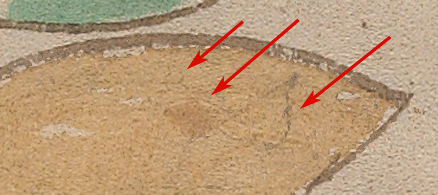
Getting back to the Voynich marginalia…the text in the yellowish leaves is difficult to discern and some of it looks as though it were removed before adding the plant drawing, or the marks may have resulted from pressure from something on top of Folio 1v, but it seems more likely that it was written directly on the parchment.

I’ve enlarged these elusive marks and given them slightly higher contrast so they are easier to see. The first one looks like a scribble, similar to the scribble mentioned in the previous blog. There’s a looped shape, a leaf-shaped scribble that is a slightly brownish shade, and a heart-shaped leaf that hasn’t been painted brown like the one to its left):

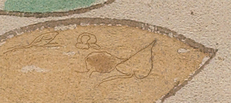
1vLeafText3I’ve attempted to interpret the darker parts of this very light impression and it might be way off-base, but here’s one idea for what these shapes might represent:

Voy1vLeafText3bAre those tiny leaf and flower shapes? It reminds me of the small versions of plants at the end of the manuscript but these shapes are too small (and the plants at the end are mostly leaves and roots, not flowers). I think I’ll leave this on the back burner for now since there’s too little information to know if the interpretation is even close to being correct.

The second example resembles three lines of text that were removed before the leaf was painted. Except for the mark in the bottom right, there’s not much left except pressure marks. They might be scribbles, but they are consistent enough that they may have been text.

1vLeafText2The third example, under the lower leaf, also resembles three lines of text (or possibly four if the fourth line is very short), but they don’t appear to be associated with the plant drawing or color instructions for a leaf, since the leaf margin crosses over the illegible shapes. The marks are faint, so it’s hard to tell if it’s a scribble or text, but it has a more orderly shape than most scribbles.

1vLeafText5

Summary

The “g” in the green leaf strongly resembles text and follows tradition if it is a painting instruction. What is interesting about the more enigmatic scribbles on Folio 86v and this last one on 1v is that they are mostly illegible and don’t have any discernible purpose related to the manuscript. Folio 86v has an unfinished T-O map in the same shade of ink as the main text on top of the scribble, and the leaf margin of Plant 1v appears to cross this one. Thus, the scribbles appear to pre-date the drawings.

Were some of these marks on parchment that was rejected by someone else and used by the VMS scribe? Was parchment graded the same way we grade clothes (with “seconds” being available at a lower price)? Or was the VMS created in an environment with a child, and did the child scribble on some of the blank parchment—marks that were later removed, perhaps imperfectly?

If the first scribble on the yellowish-beige leaf is a miniature picture of leaves, then perhaps a child witnessed the creation of the VMS plant pictures and tried to mimic them, and it’s a clue that the manuscript was created in a household rather than at a university or in a monastery. I’m leaning toward it being a secular rather than an ecclesiastical manuscript, but whether it were created in a university dorm or boarding school, in a household, or as a retirement project by a travel-weary doctor, is hard to know. Any clue adds to the existing data, even if we never entirely understand what it means.

J.K. Petersen

© Copyright 2016 J.K. Petersen, All Rights Reserved

Scribbling and Bibbling…

Did someone scribble on the VMS?

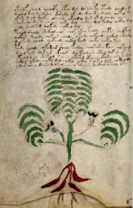
On Folio 66v, in the herbal section of the Voynich Manuscript, there’s a plant with scalloped leaves and some banana-like dark red roots. Researchers have expended enormous effort trying to identify the plants, with mixed results, but sometimes the Voynich serves up other puzzles in the margins or under the paint that beg to be solved.

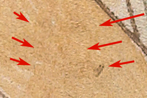
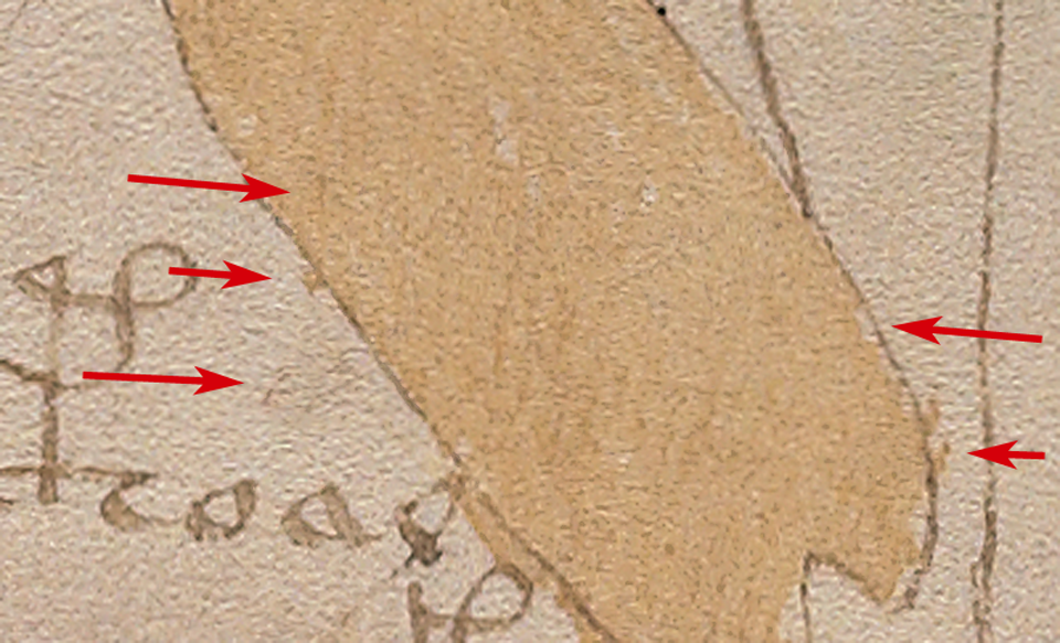
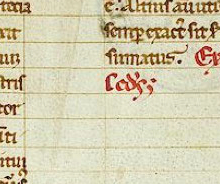
Plant66vThumbIf you look to the left of the roots, there’s a messy blob of irregular lines that resemble marks that occur if you cut something on top of something else and the blade goes slightly through the upper layer—not enough to damage the lower layer, but enough to leave a mark. A piece of dyed fabric or paper would have a similar effect, of leaving a dark “pressure mark” on the lower layer. Before the 13th century, pinholes and pressure lines were used to rule parchment and vellum before adding the ink, but the VMS appears to be free of ruled lines. The text was added freeform.

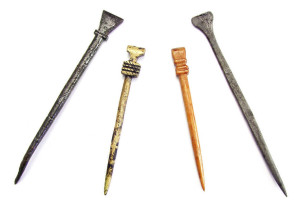
MedievalStylusA stylus was a common tool for ruling an unobtrusive mark to help organize the text in lines and columns and was made from a variety of materials such as bone, wood, or brass. A stylus was also useful for composing text on wax tablets before committing them to parchment. But a stylus doesn’t leave dark marks (unless it were dipped in something). Its function is to create a slight dent without leaving an obvious line and the VMS scribble appears to have a small amount of pigment in the crevices.

RuledLines

Guidelines were typically drawn to define columns and help align the flow of text, as in this 12th century manuscript.

The marks could result from use of a plummet—a leadpoint drawing instrument that evolved into our familiar graphite pencils. The scribble has that grayish color that is characteristic of lead-based impressions. Plummets were used to rule pages from about the early 13th century onwards but plummet marks are typically darker than the VMS scribble.

The VMS doesn’t have pinmarks at the ends of pages or pressure marks or lines like those that contain the flow of text, so it seems unlikely that a plummet was used for a marginal scribble when it isn’t evident in other parts of the VMS unless the scribbles were added in a different time period.

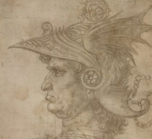
DaVinciWarrior

Leonardo da Vinci silverpoint drawing of a warrior in a helmet courtesy of the British Museum.

The VMS marks do have a certain kinship with silverpoint lines. Silverpoint is a pressure instrument that looks like an awl with a short point. The tip sheds just enough material to make a delicate line similar to a very light impression by what is called a “hard” pencil. Like the plummet, silverpoint was used to rule manuscripts in the middle ages and sometimes for drawing.

The fabulous image on the right is an example of silverpoint art. It was drawn by the young Leonardo da Vinci when he was an aspiring student.

So silverpoint might be one possibility, but the scribble looks a little too blunt in places to be silverpoint. Are there other possibilities?

Voy66vScribbleI wracked my brain trying to think of what other media might leave this kind of mark on parchment and it occurred to me that a basically empty quill pen might leave a barely legible impression if there were not enough ink for writing, but enough to make a light “tattoo” in the page.

Well, maybe it’s not worth worrying about about what was used to make the mark, at least for now. What may be more interesting is dissecting the scribble to see if it yields any useful information about the manuscript.

A Hidden Message?

Is there a hidden message in the incisions? Or a painting instruction, as possibly evidenced in other parts of the VMS?

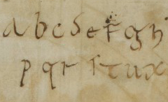
PenTestIt didn’t feel that way to me. When I saw the marks, they reminded me of a child’s scribble. Scribbles and pen tests are not uncommon on old manuscripts. Youngsters learning to write sometimes practiced their alphabets on flyleaves or blank pages, or worked out artistic renditions of their names or initials. Drawings are sometimes included as well. The example on the right, from another manuscript, looks like it might have been done by a child around seven or eight years of age. We have to remember that medieval quill pens are harder to handle than ballpoint pens.

The VMS scribble is less sophisticated than the alphabet “pen test”, which could mean a difference in age, or a difference in ability and coordination skills. Sometimes it’s hard to tell.

Are there other scribbles in the Voynich Manuscript? Yes, there are. Under the main text of Folio 86v3, is a scribble in the middle of the page that looks even more like writing than the example posted above and of interest is the lightly incised blank TO-Map that looks like it may cross over the lines of the scribble, suggesting that the scribble may be as old as the manuscript or older. I’ve increased the contrast so the scribbles are easier to see:

86v3Scribble

Were the scribbles on the parchment before the Voynich text and images were added? Was the TO-map added by the VMS author or by someone else? Or were the map and the scribbles added during the process of creating the manuscript which may have taken many months or years?

Interpreting the Scribble on F66v

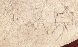
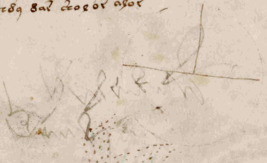
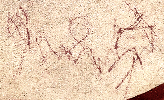
If you will indulge me for a moment, since I’m not suggesting I can interpret such a rough and barely visible scribble, but here’s what it looked to me the first time I saw it. I’ve upped the contrast so it’s easier to see.

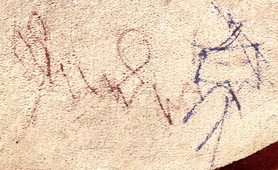
Voy66vScribble2Is that a name on the left, something like “John” or “Justin” or a word like “Juden” or “Yuden” and a human stick figure with a pointed hat on the right? It’s not very common for children to draw square heads but it does look like it might have eyes, two arms and two legs. The letter “J” was not part of the regular alphabet in some languages, but it was sometimes written as a capital “I” with a partial descender (as in “Iulian” or “Iuden” or “Iesus”) even in languages where “J” was not commonly used.

Here’s another version in which I’ve used two different colors to separate the part that looks like writing and the part that looks like a stick figure:

Voy66vScribble3Or is it a coincidence that it almost looks like text and almost looks like a drawing? Was it added at the time the VMS was created? Was there a child in the room with the manuscript? Or could it have been added a century or two later?

Summary

Unfortunately, scribbles are like clouds—they can resemble things we recognize completely by coincidence or by our brain’s tendency to pay attention to shapes that are familiar. The 86v scribbles do look like text, but they doesn’t appear to spell anything. The 66v scribbles are more enigmatic.

I would love to discover something in the manuscript that could help us understand it better, but we may never know whether this scribble is meaningful or whether it’s just random lines or a child’s attempt to create something that looks like real writing.

J.K. Petersen

© Copyright 2016 J.K. Petersen, All Rights Reserved

La La La Leeeeeo

The Tip of the Tongue

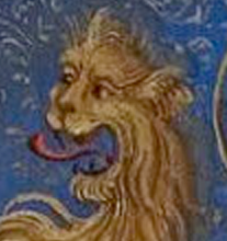
LeoTongueWhen I saw the VMS Leo symbol with its tongue sticking out, it reminded me of a South Pacific tongue dancer I saw when I was a teenager. He was dressed in colorful native attire, with tattoos and face paint, a spear in his hand, and looked amazingly fierce when he came over to where we were sitting on the ground and showed the whites of his eyes and displayed his tongue.

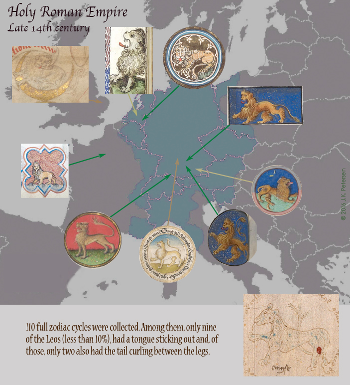
VMSLeoDetailThe VMS lion isn’t as fierce looking as the tongue dancer, but the image made me curious about how many other zodiac Leos had their tongues sticking out. After scouring the digital manuscript archives and collecting more than 100 medieval zodiac cycles, I only found nine with protruding tongues, and only two of those had their tails curled between their legs. Another thing I noticed with all the Leos except one or two from the Mediterranean region, is that they had full manes.

None of the tongue-Leos had a tree in the background, either, so it seems the VMS Leo is unique in a number of ways. You can see the zodiac Leos I found with tongues in the following map, superimposed on political boundaries for the late 14th century.

RomanEmpireLeo

The tongue Leos were mostly from central Europe with a few in France, the Netherlands, and eastern England.

It’s not even certain whether the VMS symbol is a lion. Sometimes spotted cats such as cheetahs are substituted for lions as zodiac symbols, but these are not common, either. The VMS Leo diverges from tradition and the tree in the background looks like it might be a palm tree rather than a deciduous tree, entirely appropriate if you consider lions are mostly concentrated in hot countries.

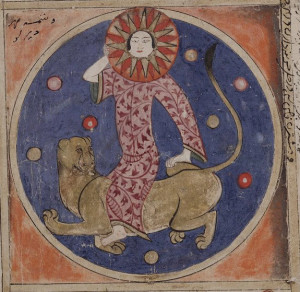
ArabicLeo

Leo zodiac symbol from the Kitab al-buhan courtesy of The Bodleian Library, University of Oxford.

It’s possible the VMS lion was inspired by zodiac illustrations of lions from the Mediterranean, which sometimes don’t have manes. There are also non-zodiac lions that have their tails curled through their legs, but whether the VMS illustrator based the drawing of Leo on having seen a lion in real life, or from studying a Mediterranean manuscript, is difficult to determine.

Since the VMS Leo resembles north-central European Leos in other ways, maybe the illustrator simply chose to draw a lion without a mane, just as he or she chose to draw a pair of crayfish (instead of a single one) as a cancer symbol, something I have yet to see in any other zodiac. Resemblance doesn’t always guarantee that a drawing was imitated.

The maned lions we think of as African lions used to inhabit southern Europe but were crowded out by hunting and loss of habitat between the time Stonehenge was built and about a century BCE except for a few that remained in the Caucasus until the 11th century. Cave lions, which looked more like the American mountain lion, were extinct long before the African lion disappeared from Europe.

TongueLeoWe know that the VMS illustrator was exposed to zodiac traditions in books or perhaps on the floors and walls of cathedrals or temples, but we don’t know if the way the symbols are drawn is based on other zodiacs or on illustrations and carvings of animals and mythical heroes not directly connected with a zodiac cycle.

Many western zodiacs, in the north and the south, included labors of the month, and sometimes those labors included animals like goats, sheep, and others, so they too might have inspired an inventive person to create zodiac symbols that were mostly like others but also different in some unique ways.

J.K. Petersen

© Copyright 2016 J.K. Petersen, All Rights Reserved

How to Write Voynichese

26 February 2016

ScribeDetailA Quick Course in Writing VMS-Style

Have you ever had the urge to write something in Voynichese that looks reasonably authentic, not just the letters, but the word-structure as well?

You can download the EVA font here (near the bottom of the page) so that you can reproduce the letter-shapes, but if you string them together any-which-way, it won’t come out looking like Voynichese. Keep in mind also that there may be two “dialects” in the Voynich manuscript, two styles of letter-combinations called Currier-A and Currier-B and I’m only going to cover one of them in this blog.

If you would like to read more about the two VMS dialects, you can look here. I haven’t had a chance to read it yet (there’s a lot of good information on the site and not enough hours in the day) but I’m sure it’s informative and I WILL get to it soon (I hope). What follows is based on my own observations.

Character Order

I randomly chose a section of text in the biological section (f77r), and created a simplified version of rules you can follow that will result in a pretty good representation of Voynich glyph-order. It might even give you some sense of how the text is constructed. Note that this applies to the big blocks of text, not the labels.

BenchChar BenchChar4Let’s start with one of the most common characters, the bench glyph. The bench char has some special properties that allow it to be split apart or to cross over other characters, but I’ll be describing a light version of Voynichese that works well for most of the text, so your brain doesn’t explode from trying to incorporate all the VMS idiosyncracies on the first go.

If you’re not familiar with the EVA font-set, you can consult a chart here on René Zandbergen’s site. Scroll about halfway down to see the Basic Eva Characters.

In this version of VMS-Write-Lite, based on a limited text selection, the capped bench char and the bench char both behave the same way, but the capped bench char is used slightly more often.

The Rules of Engagement

  • BenchCharThe bench chars can only appear at the beginnings of words unless preceded by the Gallows P or by EVA-l  (ell). There is one exception, but the ink is blobbed and I suspect it was intended to be “cc” rather than a bench char. The bench chars are almost always followed by EVA-e but are occasionally followed by “a” “o” EVA-d” or a bench char that straddles a gallows character.
  • EVAlolThe Eva-l (ell) must be preceded by an “o” or occasionally an “a” unless it’s the first letter in a word. It usually occurs with “o” or “a” about one to four times per line. I found only two exceptions to this on a full page of text. Near the bottom, there is one preceded by a bench char and one preceded by EVA-r.
  • EVAedyThe EVA-d char (that looks like a figure-8) is always followed by EVA-y and placed at the end of words or by itself UNLESS it spells out “dar” or “d ar” or “dain”. I saw only one exception to this where the text butted against a drawing and there was no room to add EVA-y. The combination EVA-dy is always preceded by EVA-e (it looks like a “c”) unless the EVA-dy stands alone. I found only one exception to this and I strongly suspect the missing EVA-e is a transcription error.
  • EVAarorThe EVA-r is not quite as common and only occurs at the end of words preceded by “a” “i” or “o” or, occasionally, by itself. It occurs on average about once every couple of lines. Sometimes it is doubled up, but each instance still needs a vowel-shape in front of it and they can be different ones as in the example on the right. There is a peculiar exception that shows up further down the page. If EVA-r occurs at the end of a line, sometimes EVA-y or EVA-ol is added and I suspect this may be to pad out the line length, but I can’t be sure without more study.
  • EVAsEVA-s can easily be mistaken for EVA-r so look carefully to make sure you don’t confuse them. After a while you get a feel for which one it is. The EVA-s occurs at the beginnings and ends of words and sometimes by itself (it’s by itself more often than most VMS characters). Whether it’s at the beginning of a word or by itself, it is almost always followed by EVA-a or occasionally EVA-o. In fact, if you aren’t completely sure if a shape is EVA-s or EVA-r, knowing this can help you figure it out.
  • EVAqoEVA-q (which looks like the number 4) is almost invariably at the beginning of words (there are a few rare exceptions), and is almost always followed by “o”. In fact, the “o” is usually connected to the 4 which is notable if you consider that most letters are unconnected or only loosely and inconsistently connected. The 4o is almost always followed by a gallows character and in the uncommon instances where it’s not, it’s usually followed by EVA-d or EVA-l. There are a couple of exceptions in the last paragraph, where it is followed by “cc” and EVA-y but I will say more about these later, because I discovered something about the last paragraph on the page in another section as well.
  • EVA-i is a rare character and almost always follows “a”. There are a few exceptions but you have to hunt for them.
  • GallowspandtGallows-P, Gallows-k and Gallows-t are almost never at the beginnings or ends of words unless it is the beginning of a paragraph or a line and then they are sometimes at the beginning. There are a few rare instances of Gallows-k at the beginnings of words mid-line (remember this is VMS-Write-Lite which documents only the more common patterns of one dialect as they appear in large blocks of text).
  • Gallows-k and -t are almost always followed by EVA-e (or EVA-e doubled) or by “ain” but are sometimes followed by EVA-al, -ar, or -y. Oddly, when they are followed by -y, it’s usually near the end of a line.
  • Gallows-P is usually followed by EVA-ol (at the beginnings of lines) or the bench char.
  • EVAeEVA-e is always midword and is often doubled (“cc”). I found only one exception in the last paragraph on f77r, and it’s a section that has been written over in darker pen (possibly by a different hand) where an “a” or bench char may have been misinterpreted as “cc”.
  • Gallows characters straddled by the bench char are usually midword, but are sometimes at the beginning. They’re not very common, occurring only four times on f77r. They are usually followed by EVA-e.

So that’s the basic structure in a nutshell for the most common characters.

Summary

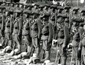
GurkhasLineupYou may have noticed that VMS glyph position is quite rigid. The order and position of glyphs rarely varies from a strict set of rules, rules that are not characteristic of natural languages, rules that apply not only to letter-glyphs and glyph combinations but to their position in lines, as well.

This is one of the reasons why one-to-one substitution codes are unlikely to get good results. It also brings up the question of whether glyph combinations represent one letter rather than two, but if the manuscript is interpreted this way, then the content would be very sparse and the word-lengths so short that spaces would have to be considered either contrived or arbitrary or, if they are abbreviations, a key to the abbreviations would have to be in the head of the writer or in another document.

SpewTextIn English, we have a few conventions that one can relate to the VMS… for example, the word “the” typically precedes a noun, and the letter “q” is almost always followed by a “u”, and there are some common letter combinations like “sh” and “th” that might correspond to double letters in a ciphered script, but English is a mongrel language with many loan words from French, Norse, and other languages, and thus has considerable variation in how letters can be combined and where they may be positioned in a word.

It’s probably more fruitful to look at ancient languages and some of the Asian languages to find text with a structure similar to the VMS. In terms of letter order and positioning, the syllabic languages (where a predetermined set of syllables is combined in specific ways) and abjads (languages that are typically written without vowels) have more in common with the VMS than English, German, French, Latin, Spanish or other European languages. It’s also possible that the VMS text has mathematical underpinnings rather than a direct relationship to a natural language.

TextRepetitionThis rigidity, and a character set that is constrained by positional rules, may also account for the extreme level of repetition that is found in the VMS. Significant repetition is not uncommon in medieval documents, it happens frequently in recipes, calenders, charms, and chants, but it’s also possible that the repetition in the VMS results partly from the textual structure.

If you like to code, you might enjoy generating some text algorithmically based on this rule-set combined with some study of the referenced folio. Even if you don’t like to code, studying the glyph-grammar of the VMS text might yield some insights on how it was constructed.

J.K. Petersen


© Copyright 2015 J.K. Petersen, All Rights Reserved

Dissecting the VMS Crossbow

The Bard with a Bow

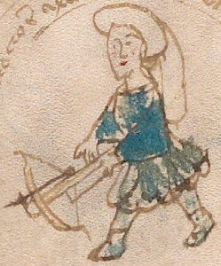
VMSArcherIn the Voynich Manuscript, Sagittarius the archer has two legs and carries a crossbow. Most depictions of Sagittarius show a four-legged centaur with a longbow, so I searched for those that were similar to the VMS archer and described them in a previous post. This time, I’m more interested in the details of his dress and his bow. On the right, I’ve removed some of the text that was crowding the picture so you can see his crossbow and costume more clearly.
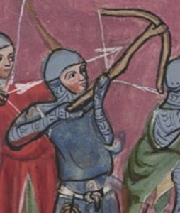
WarArcherIt’s unlikely the archer is dressed for warfare like the 14th century warriors pictured left. The long tail on his hat would be a distraction and a liability, but his dress is not uncommon for archers participating in crossbow tournaments or involved in recreational hunts.
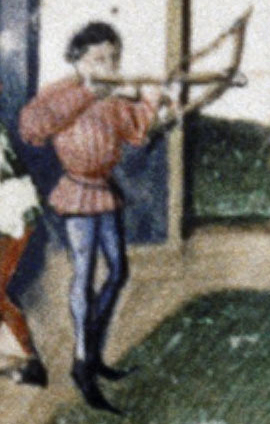
TourneyClothesA pleated tunic is typical for the middle ages, as is the style of the VMS archer’s hat. The broad sleeves are not as common as narrow sleeves, but are not unusual either. On the right is an archer at an English crossbow tournament wearing a similar outfit sans hat.

Hat tails made from fabric or sometimes from the tails of animals, like foxes, were common in many areas. The VMS archer also sports a goatee and booties and appears to be wearing leggings, as his legs are painted blue.

The Style of the Crossbow

Most zodiac drawings don’t have enough detail to determine the style of crossbow, but perhaps the VMS does.

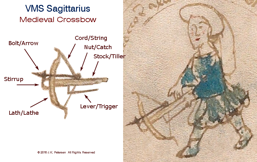
To help identify the archer’s bow, I removed it from his hands and labeled the visible parts. Fortunately, the trigger was visible, along with the shape of the stirrup. The style of the lathe is fairly clear and shows recurved tips. The catch, an important component that holds the cord until it’s ready to fire, is barely shown, but it clearly doesn’t have the crank called a cranequin that is found on some of the later crossbows. The stock looks pretty basic—this is not one of the high-octane automatic crossbows from China nor does it resemble earlier Greek and Roman crossbows that lacked a stirrup.
VoyCrossbowParts

HuntCrossbow

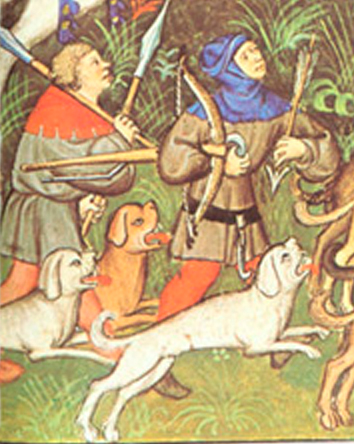
A hunting bow from a French manuscript from the mid- or late 1300s was drawn with a rounded stirrup, recurved lathe tips, and an angled lever. The bolt has a traditional arrowhead rather than a narrow spike.

Who Used this Style of Bow?

This simple style of crossbow isn’t difficult to find in medieval imagery—it can be seen in English, Czech, French, and Lombardic manuscripts from about the late 13th century to the mid-1400s. After that, some of the crossbows include accessories for drawing the cord and some have spikes on the stirrup, which I assume is to stabilize them in the soil when stepping on the stirrup.

I don’t have enough images to know if it’s a general pattern, but many of the images of battle bows had straight stirrups while some of the hunting bows, like the one on the right, had rounded stirrups. It’s not a hard-and-fast distinction, however.

An early Hussite bas relief also has a crossbow with a rounded stirrup, but the trigger is not shown and the lathe is not as broad as the one in the VMS, so it’s difficult to know if it’s the same kind.

Sometimes the bolts have narrow tips, sometimes the classic arrow shape. Crossbows in a c. 1380 manuscript from France are similar to the VMS, but the stirrup is quite thick and the trigger is not shown.
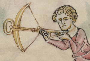
SaintsCrossbowThe image on the left is not a zodiac crossbow, it’s a marginal embellishment from an English psalter created around 1330, but it’s interesting because it shows the joint between the lathe and the stock more clearly than most (the illustrator has rotated the trigger, probably to make it easier to see). The stirrup is rounded, like the VMS, but the lathe has a narrower span and doesn’t have recurved tips.
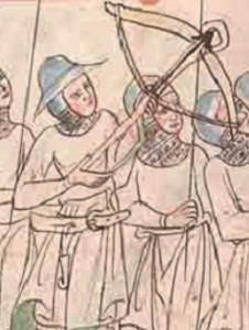
CzechCrossbowA number of the French manuscripts illustrate narrow bolts, probably developed because they could penetrate armor, while the one on the right, from the Czech region, shows arrow-shaped bolts. How accurately illustrators have represented the bolts (and the crossbows themselves) is hard to assess.

Quite a few crossbows from France, Switzerland, and the upper Rhine are depicted with a different style of stirrup that is  flatter at the end and more angular than the rounded stirrup in the VMS.
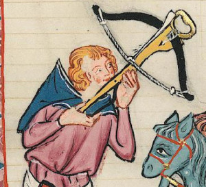
RecurvedFlatStirrupThis flatter stirrup is illustrated in a Germanic image of a hunting bow from the early 1300s (right). The lathe has probably been rotated in the image to show it more clearly, as the triggers were usually on the bottom rather than on the side of the stock. The image is thought to depict a nobleman from eastern Lombardy. Note the recurved tips.
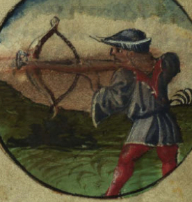
AustriaCrossbowThe symbol for Sagittarius on the left from c. 1469 was created in southern Germany or possibly eastern Austria and has recurved tips and a flattened stirrup similar to the previous non-zodiac image. Notice also the pleated tunic, wide sleeves, and typical leggings. The pointed hat is a different style from the VMS, but it’s one of the few examples of Sagittarius with a crossbow wearing a hat.

Summary
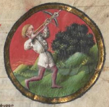
Crossbow1463It’s difficult to find examples of Sagittarius with both legs and a crossbow but those identified so far are from central Europe. It’s even more difficult to narrow it down to crossbows with a curved stirrup, because the stirrup is usually not clearly drawn in medieval Sagittarius symbols. In fact, the crossbow in the VMS shows more details than most examples of Sagittarius with legs, with the exception of one from approximately the mid-1400s shown on the right.

The VMS archer is also unusual in that he’s wearing a long-tail hat and a beard. The other zodiac symbols with crossbows and legs don’t include these features except for the one mentioned above. You have to look at images of crossbows that are not related to zodiacs to find them.

Did the VMS illustrator add the extra details based on seeing non-zodiac illustrations or based on personal observations? As with so many aspects of the VMS, there’s a level of uniqueness in the images that adds to the mystery.

J.K. Petersen

© Copyright 2015 J.K. Petersen, All Rights Reserved


Additional image added Oct. 27th, 2016:

Sometimes I come across a picture on the Web or in my files that relates to a previous blog that is worth including with the original material. I thought this image from BNF Lat. 9333, folio 68v, (created in the early 15th century) was particularly relevant. The book was inspired by an earlier copy of Tacuinum Sanitatus—a manuscript on living a healthful life.

The image is more detailed than the VMS crossbowman, including a loaded bolt, twirled cord, and lamination seam in the stock, but what caught my attention was the long trigger, and lath tips that are curved slightly more than those in many medieval crossbow drawings. I thought readers might enjoy seeing it.
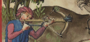
crossbowbnf9333b

Additional image added Nov. 11th, 2016:

Another interesting crossbow image in a siege commentary from BNF Latin 6067 (later 15th c) illustrating three archers. The first is loading a bolt, the second pulls the string while his foot supports the bow with the stirrup, and the third has a more automated form of crossbow with a crank to pull the string. The crank provides more leverage but also more weight and would be more appropriate for seige warfare than hunting. Quivers of bolts can be seen attached to belts. The two fully visible triggers are relatively long (the one on the right might be slightly stylized).
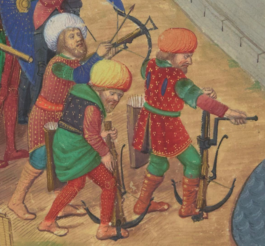
crossbowbnflat6067

Additional image added July 7, 2017:

This image post-dates the VMS, but I felt it worth including because it illustrates a long-triggered crossbow drawn with considerable detail for the time. (The source is a c. 1475 painting of the martyrdom of St. Sebastian from a region of Munich, Germany, now in the Wallraf-Richartz-Museum, Cologne):
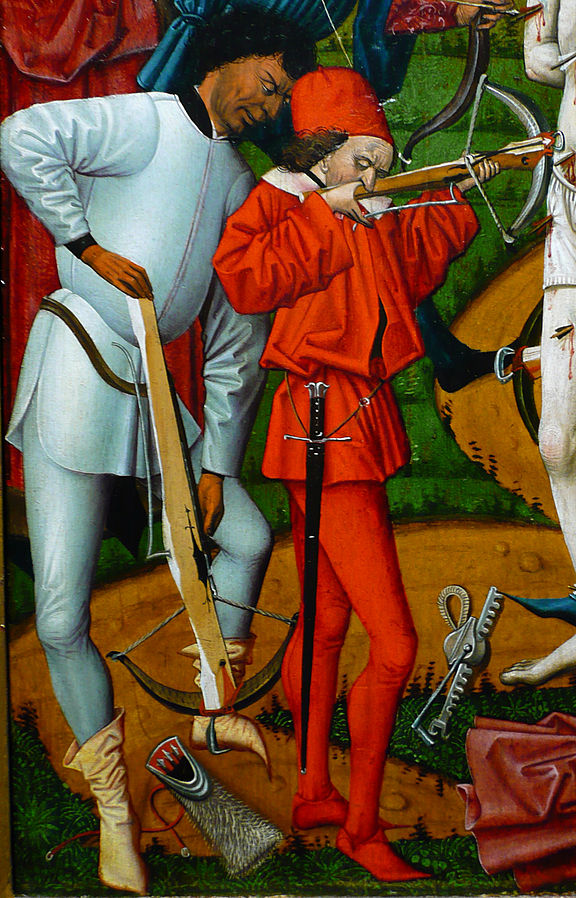
 

Additional image added August 7, 2017:

There is a clear drawing of a crossbow in Thott 290 2° (c. 1459). I was aware of it but didn’t include it in the original blog because it probably postdates the VMS. However, I’ve decided to add it because it has a long trigger and curved ends on the lath, similar to the VMS crossbow (note, however, that it has a straight stirrup), and because I noticed recently that it is similar to the crossbow and bolt in BNF Lat. 9333 noted above:
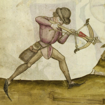
Additional image added October 16, 2108:

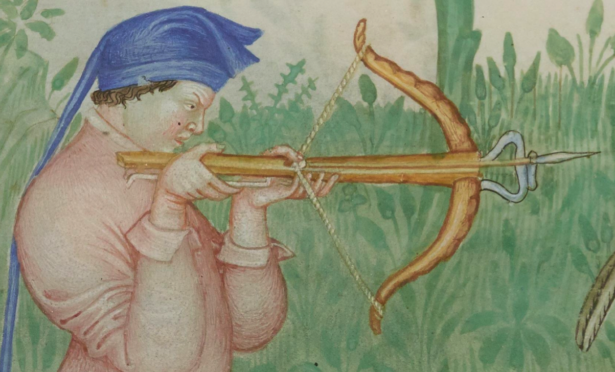
Close-up drawing from BNF NAL 1673 illustrating a narrow bolt, flat stirrup, the winding pattern of the cord, and a lath with a horn texture and extra curve at the tips. He’d better get his thumb off the nut before the trigger engages or he’ll shred then end of it:
Dec. 8, 2018 Additional Image (BSB CLM 74):
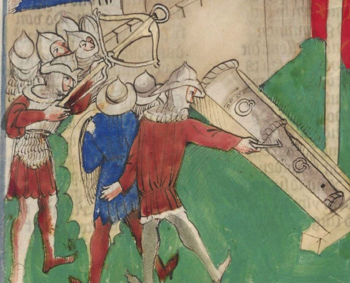
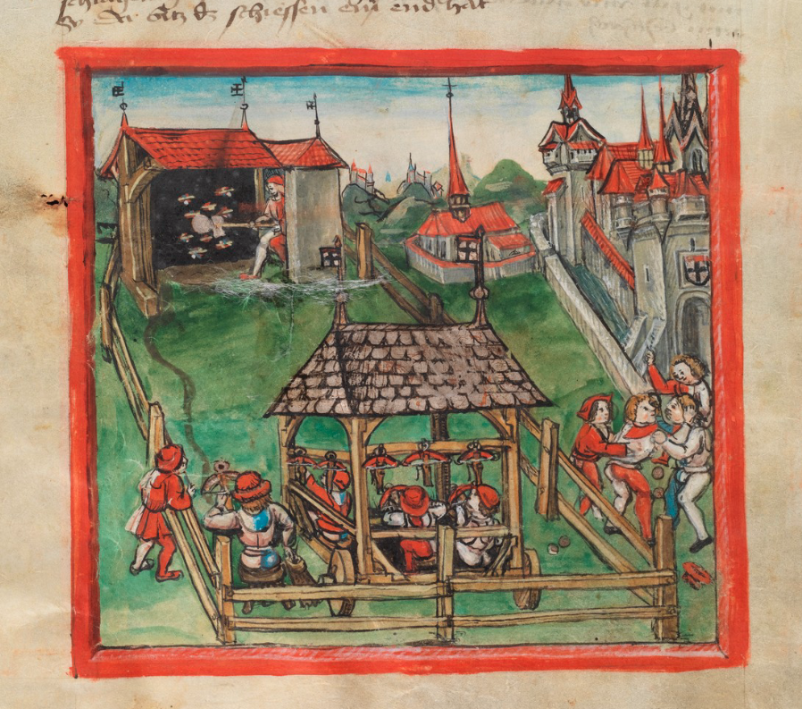
25 October 2019 Additional Image—a crossbow practice range on a movable pavilion (early 1500s, Switzerland):