
The VMS marginalia on folio 116v has a number of unclear letters and others that are reasonably clear. Fortunately, a few of them are repeated so we can see variations of the same letter, such as “h”, “i”, “m” and others. For the last decade I have been seeking matches to the marginalia in medieval manuscripts and incunabula, hoping to find the scribe (obviously not a professional scribe, but maybe there’s something out there). I don’t have a match yet, but I have some interesting paleographic data.
 It surprised me to discover that one of the letters that I considered clear and readable has been challenged. It has been suggested that the letter following “nim” in “so nim — mich” is “ez” rather than “g”.
I take exception to this. I also do not consider the “plummeting rock” shape after the word “mich” to be the letter “o”, as discussed in my previous blogs.
Here is the phrase in question:
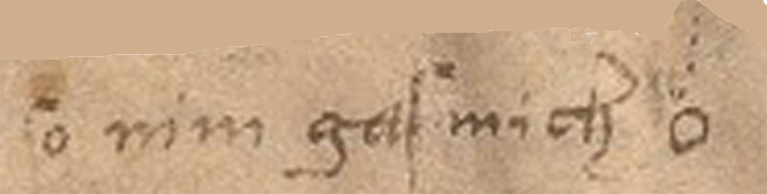
Note that the tall letter with a hook is a medieval “long s”. It’s only an “f” if there’s a crossbar. I read this as “so nim gas/gaf mich” followed by a small drawing.
I can’t tell if the third word is “gas” or “gaf” (both were used in the Middle Ages). There’s an abrasion on the parchment, so it’s hard to tell if it’s “s” or “f” but the letter in question is not the last one, it’s the first one. Another Voynich researcher stated on Nick Pelling’s CipherMysteries blog that the word that looks like “gas” or “gaf” is actually “ez as”. I don’t agree.
Here is a color-enhanced version of how I see it:
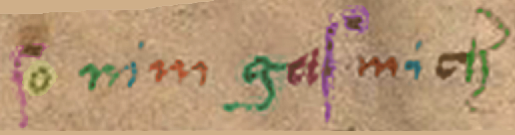
It’s a typical “g”, common for the time. The scribe does not write “e” like this and “z” is not typically written like the part on the right side of this letter in medieval scripts, not even as an “ez” ligature. I believe the first letter in the word is one letter and it is “g”. Especially note the serif (the tick on the right).
In medieval scripts that overall resemble the VMS marginalia, the letter “z” usually looks like the shapes in the chart below:

Are there other possibilities?
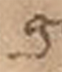
For the record, the “g” shape is not a medieval “9” abbreviation either. The medieval “9” abbreviation at the beginnings and ends of words was popular for centuries. The “9” abbreviation looks and is positioned pretty much as you see it in the VMS (so I included the VMS “9” glyph along with the other samples in the chart below with the date c.1425 for reference).
Here is how the “9” glyph looks in the VMS. Note that it is positioned the same way as in manuscripts that use Latin scribal conventions, mostly at the ends, but also commonly at the beginnings of words. I’ve written about this many times, but here is a visual refresher:
 Sometimes the “9” char was drawn simply, sometimes ornate, but it always signified the same thing in medieval manuscripts… an abbreviation (usually con-/com- or -us/-um).
Here are examples of how the con-/com- abbreviation looks at the beginnings of words (it was essentially the same shape at the ends of words). Note that a serif is expressly not included to help differentiate it from the letter “g”:
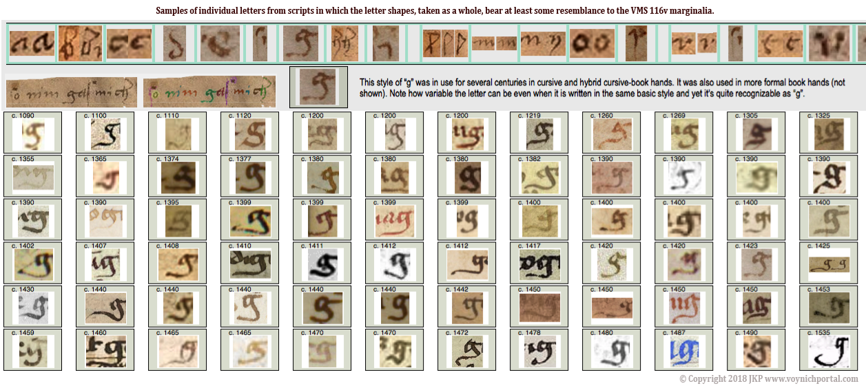
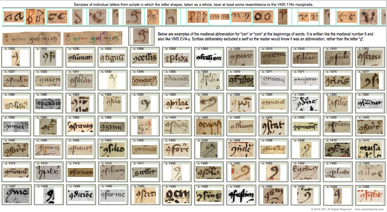 So, the marginalia “g” does not resemble a “z” or an “ez” ligature and it does not resemble a “9” abbreviation. It does, however, fit comfortably with common forms of medieval “g”, as in these examples:
Summary
There are many shapes in the marginalia that I can’t make out. Some letters have abrasions, some are indistinctly written, some are partly filled in or rubbed out. But I don’t think there’s much ambiguity about the “g”. There’s nothing unusual about the shape or its position in the word.
If someone has a different interpretation for this letter, they can post their paleographic evidence. Personally, I think it’s one of the less controversial letters on the page.
J.K. Petersen
© Copyright 2018 J.K. Petersen, All Rights Reserved
With the examples you provide, I don’t see how anyone can argue it’s not a “g”. Unless they have some preferred reading to prove 🙂
Gasmich = Dissolve