Folio 116v Revisited
In 2013, I posted a couple of times about Folio 116v, which is sometimes referred to as the last page of the Voynich Manuscript. I also suggested, as I worked through my journey of personal discovery, that it might be a healing charm. I knew nothing about healing charms before trying to puzzle out the VMS, but I was following a hunch that it might be associated with magic when I saw the strange word oladabas. I later discovered, in 2013 and again in 2015, that abracula was a charm word (a very old and and venerated one) used to cure fevers, and posted some examples of 15th century charms, which follow a format surprisingly similar to the VMS text.
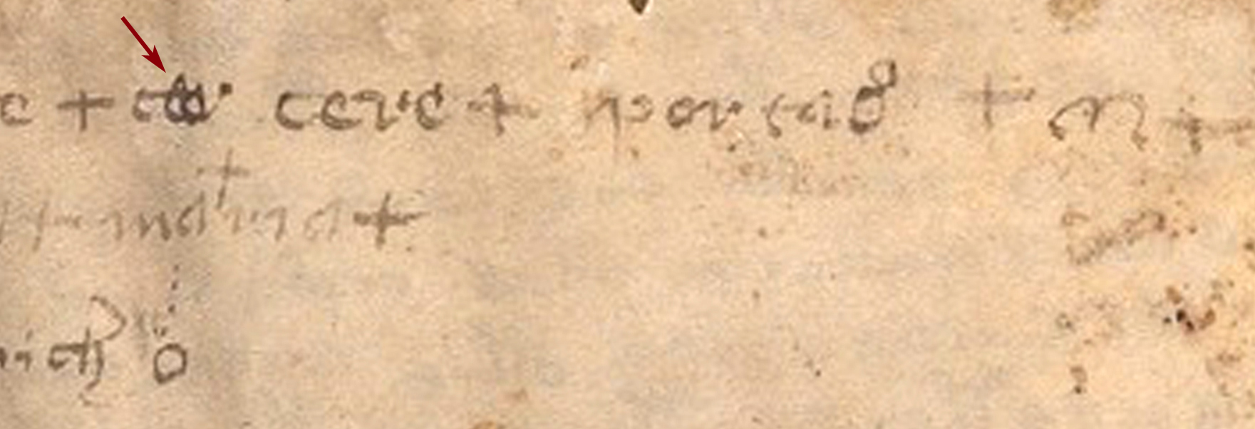
Considering how little is written (and drawn) on Folio 116v compared to most other pages, it’s surprising it has generated so many questions. One of the persistent challenges is the interpretation of the characters, some of which are faded and some of which are unconventional. I can read Gothic Cursive better now than I could in 2013, but that doesn’t help when a word is a blobby mess like the one in the middle of the first row of the main body of text (marked with an arrow):

Deconstructing the Blob
I didn’t pay any attention to what others proposed as the reading for this word because I was so focused on other aspects of the page that I never followed it up, but the subject was raised on the Voynich forum today and I thought it was time to post my impression of what the letters might represent.
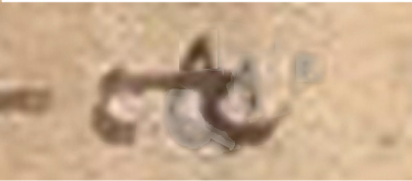
In 2013, I thought the word-group in question might be a messy rendition of toe because “o” and “e” are sometimes combined in old manuscripts as œ. After looking at it for a while longer, I realized the explanation might be something completely different.
 Let’s say, for example, that this was originally written as a bench character (EVA-ch). The bench char isn’t only a Voynichese char. As I’ve mentioned before, it’s also a common Latin ligature that can represent a wide variety of combinations of “t” “c” “e” and “r” characters, since they are similar to one another in Gothic cursive. In fact, in some manuscripts, it’s hard to distinguish “c” from “e” or “t” from “c” without context.
So, if it’s a bench character, maybe it’s a bench char with a cap or maybe the “cap” is part of the corrected shape or something not used anywhere else. I’m not sure. The cap is smaller and lower than usual, so it might be part of the corrected shape, but we don’t know if the script on the last page is written by the Voynich scribe or someone else who is somewhat able to mimic VMS text but doesn’t do it exactly the same. In the example above, I’ve lightened the shapes that appear to have been added after the initial shape was drawn. I left in the “cap” or “elbow”, but it’s probably best to picture it in your head both with and without the cap-shape since its connection with the other shapes is unclear.
All right. So let’s say for the moment that the scribe drew a bench character. What happened then? Why did he turn it into an unreadable mess? Perhaps the scribe was trying to correct an error. Maybe it’s Voynichese and he didn’t want to give things away. Maybe it’s a common Latin ligature and he decided it looked too much like Voynichese and could be misinterpreted later. Maybe it’s simply a mistake.
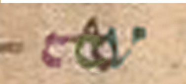
 Here’s what I think the scribe may have tried to do to correct it… I’ve added colors to the letters so they’re easier to see because I think the answer may lie right in front of us.
In this illustration, the “c” or “t” is purple, the added “e” or “c” is green, and the added “v” or “r” is bluish. Note how the bench char is still in the background, making it hard to clearly see the letters in front even when they’re highlighted with color? So… if it’s a mistake, adding the letters didn’t fix the problem.
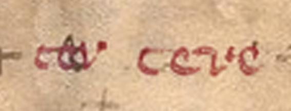
What was he trying to write? Was it tev/ter/tar or tcv or ccv or cev or cer—all of which might have been written with the first two letters as a ligature in Latin? I think maybe it’s “cer” or “cev” (ligature ce plus v) and he never finished correcting it because it wasn’t working, so instead of taking the time to scrape away a mistake—he wrote it again correctly as the next word, spaced out better and not blobby, to create “ceve” or “cere”.
Plausible?
I don’t know. It’s just an idea, I can think of other interpretations, as well, but I think it’s worth mentioning in case it sparks some fresh thoughts about how to read it.
J.K. Petersen
© Copyright 2016 J.K. Petersen, All Rights Reserved


Great post!
I really enjoyed reading this. Good idea to color the various sections of the characters differently, it helps to see past the jumble of lines.
Looks like yet another attempted emendation to me. 🙂
The big difference here is that it looks like an attempted emendation to other people too. 😉
Nick, I scratched my head for about 20 minutes over your comment and reread the darned thing four times.
I don’t know if this is what you’re referring to, but I have a problem with WordPress I haven’t resolved yet in that sometimes if the tab was left open (I usually have about 20 tabs open), it reverts to another version if the computer (or that specific tab) is idle for a few hours. Then I lose words, sometimes a sentence, occasionally a whole paragraph, the most recent edits disappear, it goes back anywhere from one to ten versions and I don’t notice right away. The software autosaves every 10 minutes and each version has a different oddity. I’m not quite sure how to revert to the correct one, without the losses, without creating more havoc and have to reconstruct my thoughts.
Another thing it does, that drives me crazy, is it randomly stores some of the edits as comments (like those at the bottom of the page) rather than as part of the article and the edits go into the Pending Comments section (which is really weird) instead of into the article. Once again, I don’t always notice right away and when I do, I’m afraid to delete the “Pending Comment” (which has nothing to do with comments and was created in the regular edit window) and have to manually copy and paste the fragment back into the post.
I’m not sure if anyone knows WordPress well enough to know how to prevent these problems (I’m still a relative WordPress greenhorn), but I’m open to suggestions.
JK: errrm…. no, I was referring to the curious shape on f116v that looks directly to me as though it is comprised of two or more layers, presumably an original (base) layer and one or more later emendatory (top) layers. You tried to false colour them:
https://voynichportal.com/wp-content/uploads/2016/04/Vm116Ceve3.jpg
Apart from that, a top tip for WordPress bloggers: never have more than one comments tab open at a time. 🙂
Ah, you are referring to the picture. Thank you for clarifying… I thought some of the text got lost or scrambled again (which happens when I leave a WordPress tab idle and fail to notice right away).
Here’s what I did… I opened the image in the graphics software, enlarged it as much as I could without major distortions, and made an educated guess as to which shapes belong together, and which had been drawn first (all of which are subjective and speculative). I then tried, as best I could, to single out each letter in succession without tampering with it too much (I try to make the software do the work when I can), then altered the color just enough to make it stand out from the others.
To respond to your comment more directly, if the example pic looks amended, it would be an artifact of the process, or imperfect application of software tools on my part, rather than any intention. Mucking about with something so tiny pixel-wise is not easy. I colorized the image three times, uploaded the image three times, and am still not satisfied because each attempt yielded different results.
Also, I’m not convinced that it was originally a bench char. The text is very small and I don’t know for sure which stroke belongs to which shape and clearly it’s a judgment call as to which shapes are on top and which are underneath. It’s possible the original shapes have nothing to do with bench chars (capped or otherwise). There could be the letter “a” under there, drawn larger than usual and leaning to the left a little more than usual, which is probably why a common reading for the word is “tar” (a very reasonable possibility), I simply wanted to throw out some alternate ideas in case there are interpretations that have been overlooked.
As it is, I appreciate that you take the time to read and comment.