In his most recent CipherMysteries blog, Nick Pelling zeroed in on a shape on the top line of f116v in the Voynich Manuscript. The letter in question (there are plenty of questions) has been interpreted in more ways than I realized. Pelling has suggested that it might be, “…a rare way of writing a Gothic ‘s’ shape”. I have to admit, “s” never occurred to me when I examined the letter. Not even once.
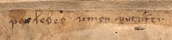
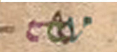
Here is a snippet that includes the mystery letter (focus on the first character). Underneath, I include a color-enhanced version to make it clear which shape(s) we are talking about and what I see when I look at it.
Pelling says he proposed in 2009 that it might be read as “simon sint (something)”. I found this puzzling. No matter how I look at it, or split up the pen strokes, I don’t see a medieval “s” at the beginning (I’ll post examples of Gothic “s” further on):
To clarify my thoughts on this…
First, I do not see the first letter in the first word and the first letter in the second word as necessarily being the same. To me, the second one might have a faint descender and a horizontal line just to the right of the descender (under the smudgy part). It’s more squished than the first one (in the horizontal direction). It might be the same letter and it might not. The serifs at the beginnings of words often look similar on different letters.
I couldn’t see any descenders in the multispectral scans, but whether a descender shows depends partly on resolution and partly on which spectra are chosen. The first letter doesn’t appear to have a descender, however. The one on “put?fer” might. The letter on the right word looks vaguely like a “p” but I’m not sure, so most of my comments will be about the first word and the mystery letter on the left.
Sorting out the Letters in the First Word
I usually refer to the first word as “umen” or “umon”, but ONLY for communication, not because I’m committed to any particular interpretation. I have a list of possibilities and I don’t assume it’s a word—it could be a string of characters (e.g., vmçn), or an abbreviation.
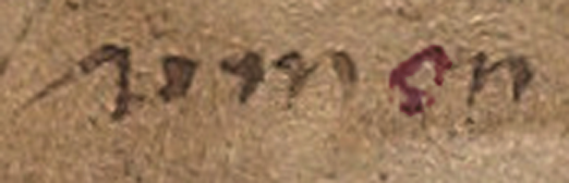 The “e/o” letter is indistinct. It could be “o”, “c”, “ç”, or “e” (or something else). When I enlarge it, looks like there might be a couple of pen skips, so it’s possible it is an incomplete “o” (right). Letters 2 and 4 look like “m” and “n”, but I’m not sure about “m” because the humps are different from all the other “m” letters on the folio. Could it be “in”?

Scribal Habits
Before going into detail about the mystery letter, I’d like to point out that whoever wrote this (assuming a specific individual authored most of it) habitually used leading serifs, some of them quite long. It’s possible the writer learned both bookhand (the more formal handwriting) and cursive hand (for rapid writing). There are many hybrid hands with elements of both (see previous blog about the letter “g” which has a bookhand tail and low end-serif).
Here are examples of letters with leading serifs. The serif on the letter “i” is longer than average for scripts of this style:

Now here comes the surprise…
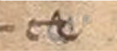
I couldn’t figure out why Pelling kept referring to the first letter as “^”. I assumed he was trying to be neutral about the letter’s identity by choosing a symbol instead of a letter, which is actually a good idea. It was several hours before it hit me that maybe he was interpreting only the serif as a letter. My reaction was, “Whoaaaaaaa!!”
It’s been a week of surprises palaeography-wise. I did not fully appreciate, until the last few days, how differently each researcher sees these characters.
Here are my feelings about it…
 The serif at the beginning of the shape on the right is not a letter. If it were, the only typical letter it might be in Gothic script would be an undotted “i” with a very long serif.
An extra-long serif is not unusual at the beginning of a word, but it still doesn’t look very much like “i”, in my opinion, it looks nothing like “s” either. Also, if the “^” shape were a letter, then what is the blob attached by a stroke on the bottom? The right stroke is not written like the other “i” shapes. NONE of the other “i” letters on the folio has a crooked stem or connects to the previous letter along the bottom. I think this is one letter, not two—one letter with a long serif.
So what letter is it?
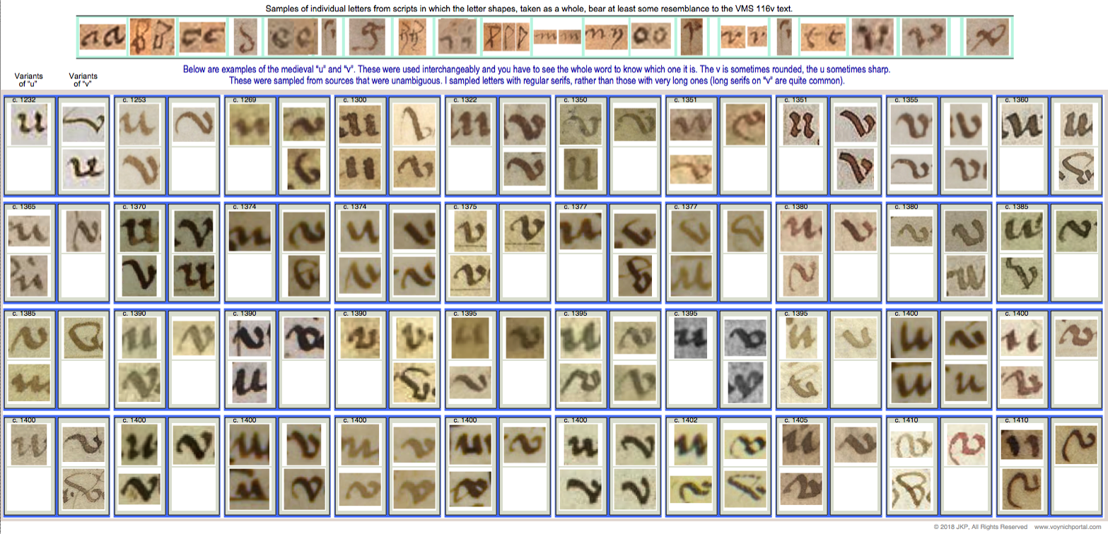
You may have noticed that the longest serif of all is on our mystery letter, but is it unusually long? That depends on the identity of the letter. A long leading serif is unusual on the letter “i” but completely normal on “u” and “v” shapes.
Before I post the v/u examples, I’d like to clarify the medieval letter “s” to explain why I don’t think the beginning of the word is “s” (not even a rare one)…
Examples of Medieval “s”
Based on direct observation and sampling thousands of medieval manuscripts, I have identified seven primary forms of “s” in scripts of the same basic style as 116v:
- straight “s”
- long “s” (essentially a straight “s” plus a descender)
- final-“s” sigma (inherited from Greek)
- final-“s” B shape (similar to modern ß but usually representing one “s”)
- final-“s” snake shape (like our modern “s”—not common in most countries, although Spanish manuscripts often have this form of “s”)
- figure-8 “s” (a true figure-8, not one that is deliberately skewed like a cursive “d” or accidentally similar to “8”—this was not common in cursive hands, but is sometimes found in book hands)
- esszett (commonly expressed on computers as ß, this character had slightly different meanings in different languages but was frequent in central European manuscripts)
The straight-s (which modern eyes can easily mistake for “f”) was more popular in the early medieval period. The stem does not go below the baseline. The long-s has the same hook shape as straight-s plus a descender.
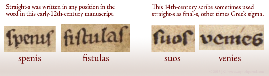
In the early medieval manuscripts, the straight-s was sometimes the only form of “s” used (which means it could be in any position in the word). In other manuscripts, a different “s” (final-s) was used at the ends of words. By the late medieval period, most scribes used a different “s” at the ends of words and some used multiple forms of “s”, as the example below-right:
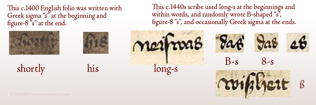
The straight-s was gradually replaced by long-s. Straight-s is not very common in scripts that are similar to the 116v text, most of them use long-s.
Sometimes scribes added loops or flourishes, but the general form was the same. This chart illustrates that the VMS long-s is quite ordinary:
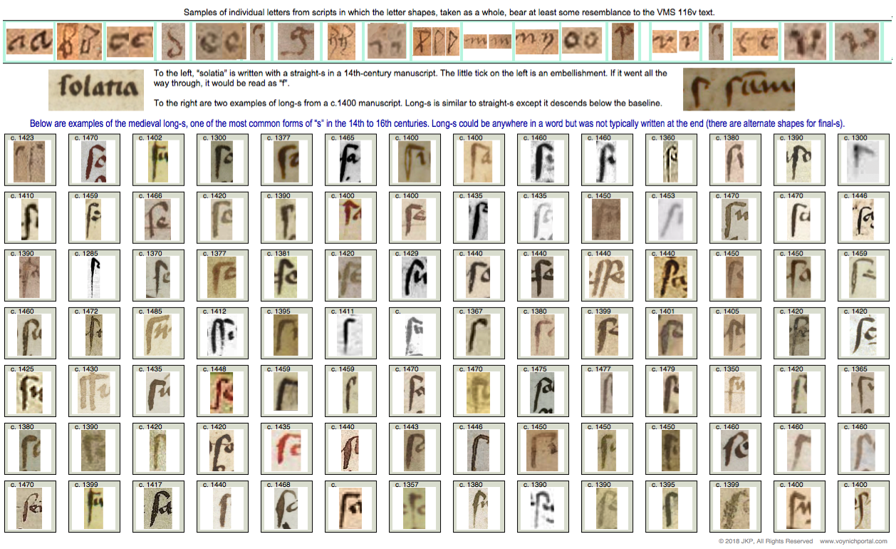
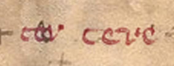
I’m not aware of any “s” shapes that resemble the first letter or even the first two penstrokes of “umen” but the above forms match well with the first letter of “six”, the last letter of “gas/gaf” and the last letters of “oladabas/oladabad”, “imiltos/multos/miltos” and portad/portas”, so the 116v script is reasonably conventional.
Summary
I don’t have a definitive ID for the mystery letter. It looks like the top of an open-p with a long leading serif, but I can’t see a descender (at least not on the first one) or any rubouts under the letter.
 It comes closer to a flat-bottomed “v” than the remaining letters of the alphabet but I haven’t found a close match (the flat-bottomed variant is not as common as those with pointed bottoms). The vee on the right is a little too flat—it has lost the “v” shape.
Here is a chart of v/u letters common throughout the medieval period. There are a some flat-bottomed versions circa 1355, 1395, 1400, 1402, and 1410, so it’s possible this style was more prevalent after the mid-14th century, but I haven’t had time to confirm if this is true:
 Coming back to the second letter… if this shape is “in” instead of “m”, it might be read as “vinen”, which has meanings in several languages (come, they come, the wine, the vines).
If the last word is “putrifer” then “vinen putrifer” (the grapes ferment/the wine ferments) would be hard to ignore as a possible interpretation. In certain germanic dialects, the “n” at the end of “vinen” is like adding the article “the”.
But what if it’s an “o”? Then it might be vinon or uinon which is harder to pin down than vinen. Vinon is a place in France, but a place name doesn’t seem like the best fit with the other words on the line.
Is anything gained by studying unknown letters?
Even if we can’t make out the letter, the serif on the mystery shape has a calligraphic “brush stroke” feel to it, as does the tail and dipped oval of the letter “g” on the last line. And yet, it’s not professional calligraphy. Maybe these clues hint at other skills…
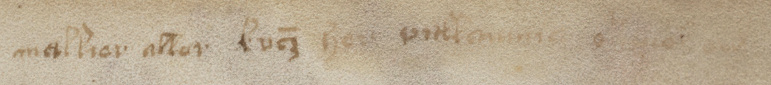
Was it someone who could draw or who used a brush for some other craft? Medieval artists and illuminators were sometimes illiterate or semi-literate. Perhaps the writer contributed the nose on Aries, painted some of the plants, or inked the secondary breasts on the nymphs. The style of writing is 15th century and might even be earlier in the century if the “a” in 17r “mallier” is a double-story “a”.
I’ve never assumed the writer had any involvement in the creation of the VMS—notes on back pages were often added decades later—but the possibility is there… and that makes it more interesting.
J.K. Petersen
© Copyright 2018 J.K. Petersen, All Rights Reserved