Author Archives: J.K. Petersen

Things that Make Your Head Spin

Do These Heads Tell Tales?

Some of the Voynich plants have a more naturalistic feel to them, including “viola” and the “water lily”, and some have stylistic differences and less obvious botanical structures that may be mnemonic, or representative of something more than (or something different from) a botanical illustration.

Plant 51v strikes me as more stylized than many of the other plants. The leaves look like beetles, the flowers have alternating colors that remind me of pinwheels (I call them spinnerheads), the roots look like a pair of medieval hose with legs crossed, including the long pointed toes that were all the rage.

Taken as a whole, the composition has a lively dancing feel to it, but I held off writing about it because I didn’t know how to convey this impression in words.

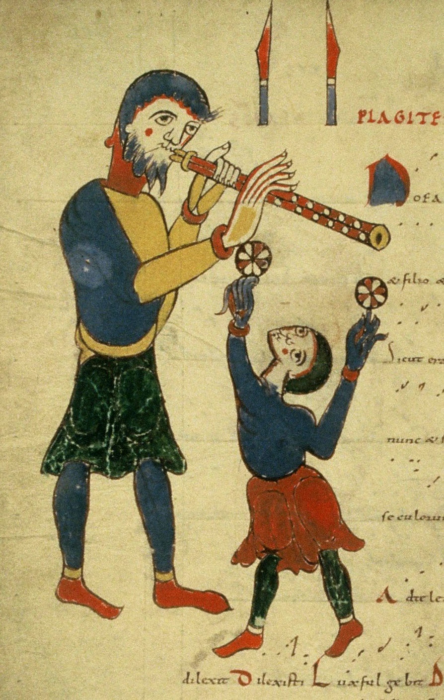
And then I stumbled upon an 11th-century image that conveys the same feeling I get from looking at the VMS plant drawing and it has the added bonus of… alternating flower-like “petals” in the same basic colors as the VMS.

Troubadours and Jongleurs

Medieval peasants and gentry loved entertainment and many of the nobility had live-in musicians, magicians, jugglers, and poets. There were also itinerant storytellers and colorful entertainers who traveled the country in wagons, a tradition that continues today in the modern circus.

This fabulous image is startling in its tropical brightness at a time when natural earth pigments could be quite pale and subdued. The colors fit well with the theme, commemorating those who brighten our day with music and sport. Other folios with musical notation are created in a similar style.

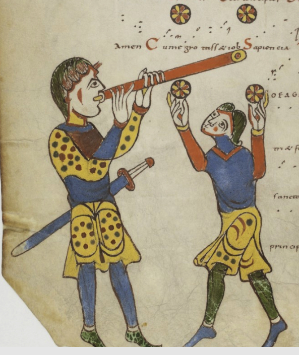
On the left, the musician wears a jaunty two-toned shirt with red collar and cuffs, and plays a double-reed flute (a forerunner to our oboe). Each cheek sports a clown-like spot of red. His fingers are unusually long and gracefully curved, reminiscent of Balinese dancers and elegantly long Buddha fingers. In fact, there’s a gourd named “Buddha’s hand” that looks just like this. The eyes resemble those in Persian paintings that feature almond shapes and long curving eyebrows.To his right is a person of small stature. Dwarves and midgets had limited opportunities for employment in the middle ages, so those with special talents often ended up as entertainers in royal courts. It is said that a gifted poet whose name may be featured on the Bayeau tapestry may have been a dwarf. Like the musician, the juggler has stage-makeup cheeks, very long, eastern-style fingers, and two objects that may be balls or some kind of round object that he is deftly spinning on his fingertips. There is a second folio that repeats this theme and shows the balls high in the air.

Musician and juggle in the Tropaire-Prosaire à l’usage d’Auch, c. 990 to c. 1010, Abbey Saint-Martial de Limoges

It’s tempting to think the manuscript was created by someone from the southern or eastern Mediterranean (or someone influenced by eastern art), but it’s illustrated by the painter of the lectionary of the library of the Abbey of Saint-Martial in Limoges, France, and much of the painter’s work shows Roman influence rather than eastern. The same painter is said to have worked on a large number of manuscripts.

Even the images with Roman themes have very long pointed fingers, mixed with fingers of normal proportions with rounded ends. The large portions of blue pigment in the jongleur images are absent in many of the other drawings, giving these pages a special look and feel.

Summary

I don’t have time to look into the Tropaire-Prosaire à l’usage d’Auch in more depth, but I thought Voynich researchers might enjoy the unique style of the image, and the juggling balls that resemble the VMS flowers. I don’t know if the pattern on the balls is meant to be decorative or to simulate the motion of spinning balls, but it’s one of the few examples of alternating orange and light “petals” that I’ve seen so far.

Getting back to the VMS plant, the shape of the plant very much reminds me of a dancer. Whether this is accidental or intentional, I can’t be sure, but if it is intended to be botanical, perhaps the unusual pose has some stylistic or mnemonic significance to the plant.


J.K. Petersen

© Copyright 2017 J.K. Petersen, All Rights Reserved

VMS F1r Column Text, updated chart

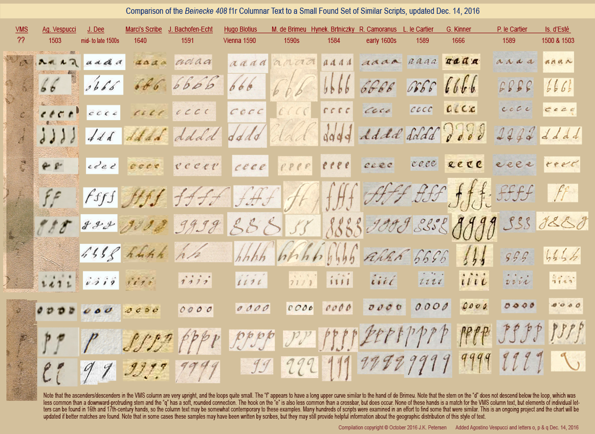
On October 24, 2016, I posted a blog about the partly erased vertical alphabet in the right column of folio 1r.  Over the next month, I added o, p, and q and one more sample of handwriting. The text is probably marginalia, it doesn’t appear to match any of the other text in the manuscript, but it may reveal a few things about the manuscript’s provenance if a match can be found.

I’m enclosing the revised chart illustrating similar hands as an addendum to the previous post, which you can read here. You can click on the revised image to see it full-sized:

J.K. Petersen

© Copyright 2016 & 2017 J.K. Petersen, All Rights Reserved

Mayhem, Macaroni-Style

It’s a challenge to read old manuscripts. Language has changed, writing styles were very different, a bewildering array of abbreviations occupies each sentence like a mine field, and there were no spelling checkers (or hard-and-fast rules about spelling) in the 15th century. To complicate matters, scribes often copied manuscripts in languages they didn’t fully understand.

The last page of the VMS reads like a cryptic alphabet soup, but are texts with blended languages that unusual?

Support for Billy Goat Liver?

My gut feeling, even before investigating it, was that blended languages were bound to occur in societies where a second language was an essential tool of commerce and scholarly correspondence. But a sixth sense and real data are two different things, so I kept my eyes open for an unambiguous example and found one, and inside was the most surprising Easter egg, something I never expected…

BSB CGM 8137 is a tract on fishing and has no obvious connection to the VMS, but the recipes use many of the same ingredients as folk medicine, so it reads very much like a medical manuscript. It mentions tormentilla, wine, beer and “pockleber” (goat liver)—that was the surprise! Finding goat liver is not particularly unusual, but finding goat liver in a manuscript that blends languages in such a quirky way made me sit up and take notice…

As far as I’m aware, no one has mentioned CGM 8137 “pockleber” in connection with the VMS, but it’s important because it demonstrates that this ingredient was used in ways other than cooking and might relate to the words written at the top of folio 116v. The spelling is different, but substituting “x” (Greek chi) for hard-h, ch, or ck was not unusual and “p” was often used where modern German uses “b”.

If poxleber and pockleber refer to the same thing, then this manuscript offers evidence to support the interpretation offered by Johannes Albus and anyone else who may have read the text as “goat liver”.

I was happy to find this example for two reasons:

•  it offers evidence that pockleber (both the word and the ingredient) was probably in use in the 15th century, and

•  the script is an excellent example of mixed language. CGM 8137 demonstrates that macaronic text was in practical use.

I’ve long wondered if some of the not-quite German words on f116v that are mixed with readable German might be fractured Latin (mixed in with accepted Latin) and that some of the text on the second line might even be Spanish. Here is an excerpt from fishing recipe #12 to give an idea of how intimately languages could be blended. Note also that the interpretation of “pockleber” as a compund word is unambiguous, as “leber” is mentioned again, by itself, on the fourth line:

Item rec[ipe] mayen et prachmonet pro piscib[us] et cancris ain pockleber et assa bene, pus?post? assacionem sparge desuper pulverem de gaffer. Postea? recipe das kalbs netzlen oder schaff netzlen das da frisch ist, und schlags umb die leber. Postea liga super asserem parvulum ad capiendum pisces et cancros…

The first word, “Item”, was widely used in both German and Latin, and “recipe” is middle French for “medical prescription”. Then there’s an odd combination of month names, the first Latinesque (mayen), the other German (prachmonet) (note that once again, a “p” has been substituted for “b”). Brachmonat is June in German, and calendars illustrating the month’s labors often illustrate June as a farmer tilling his fields. The next four words are Latin, followed by two German words (ain pockleber), and three more in Latin instructing the reader to dry or roast well.

The month names really caught my eye. You would think the writer would choose one language or the other for related concepts in the same sequence, but apparently there was no impulse to organize the languages this way.

The other recipes are interlaced in the same way.

It’s significant that German and Latin are mixed not just line-by-line (as in macaronic verse) or phrase-by-phrase, but sometimes word-by-word.

That’s the important part. If “pox leber” turns out to be German and even if “pfer” at the end turns out to be a German word like “pferd” that doesn’t mean the words in between have to be German. If CLM 8137 is any example, the word “um?n” and some of the German-looking words on the last line could be Latin (or something else).

The Possibilities…

CGM 8137 was created about a century after the VMS, so it’s not an exemplar, but “goat liver” was no doubt a common phrase—goats were an integral part of medieval society—which means that other examples might be found, as additional manuscripts are scanned and read.

This isn’t proof that “pox leber” says goat liver, there may be other interpretations, but it is greatly intriguing, especially considering polyglot manuscripts have been found to exist.


J.K. Petersen

© Copyright 2017 J.K. Petersen, All Rights Reserved

Why Clone the Crayfish?

Shellfish Anatomy 101

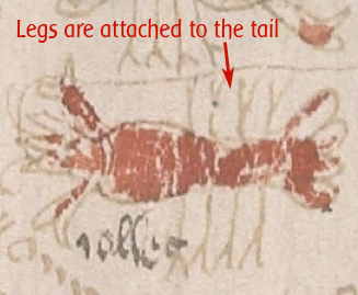
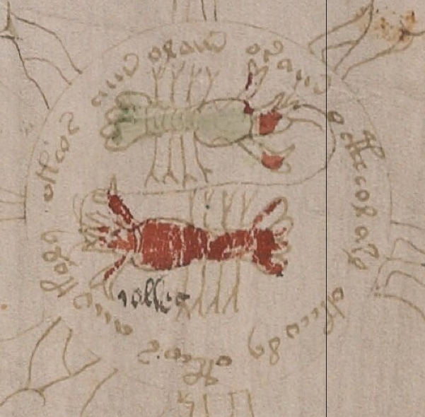
In a previous blog, I described the unusual placement of the legs on the “crayfish” in the “zodiac” section of the Voynich manuscript. Like traditional zodiacs, the crayfish or lobster occupies a position between images that we associate with Gemini and Leo. In the VMS, these positions include a courting couple and a large feline. In a traditional zodiac, in this order, the crayfish symbolizes Cancer but I’ll refer to it as a “crayfish”, which is a freshwater cousin of the lobster, because we can’t be certain this is a zodiac. Crayfish can be found in other zodiacs, but the VMS differs from them in some unusual, almost eccentric ways.

Dinner for Two?

You have to wonder why the illustrator drew two crayfish, especially when they are surrounded by naked nymphs. Could this be a romantic dinner for the courting couple? Both lobsters and crayfish have been eaten for thousands of years. Even if dinner wasn’t on the illustrator’s mind, the pairing of crayfish in a zodiac setting is unprecedented. It’s long been acknowledged that the naked nymphs are unusual, but the details of the crayfish deserve some points for originality, as well.

It is traditional for Pisces to be drawn with two fish, but why are there two crayfish? One crusty critter is the norm.

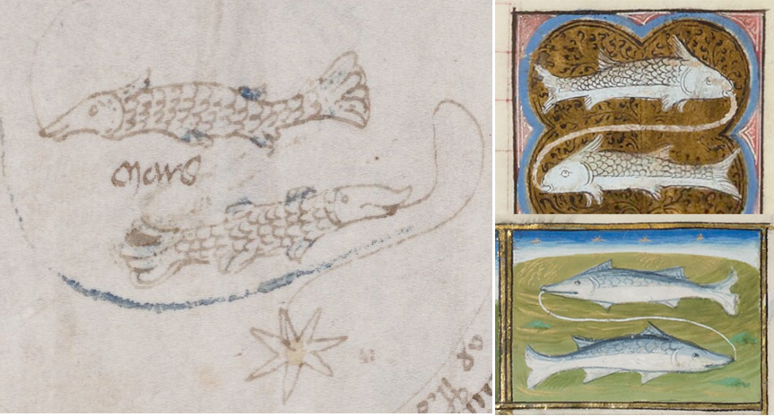
The “string” is unusual, as well. In the VMS, the crayfish are joined by a line. This little detail is usually reserved for Pisces. The VMS fish are joined by a traditional line, but the line itself is unusual. It curls outside the fish instead of in-between and, like many other parts of the manuscript, it ends in a star.

It’s not unusual for a line to connect the fish, many images of Pisces have a string or garland connecting them, due to a row of stars that occurs in this position. The extra fins are not unusual either as there are depictions of fish, in zodiacs and bestiaries, that have more fins, but the VMS is unusual in that the line curls outside of the fish rather than between them, as in the examples on the right from BNF Latin 924 and 1176.

So, the VMS crayfish are arranged in a way that is typical for Pisces, not Cancer. Normally only Pisces and Gemini are paired.

I’ve collected almost 500 zodiac cycles created prior to 1560 and have only found one that pairs several of the symbols, and it stops pairing them after Gemini, almost as though someone came along and tapped the illustrator on the shoulder and said, “Uh, no, you don’t have to pair all of them, just Pisces and Gemini.”

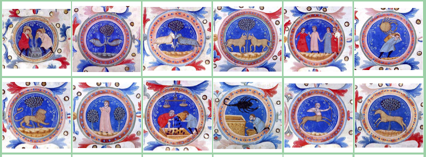
Morgan M.511 is an attractive calendar created in Bologna, c.1326. The zodiacs and months’ labors are drawn within circles, with trees in the background and, in an unusual departure from tradition, the first five symbols are paired.

There doesn’t appear to be a direct stylistic connection between the Bologna zodiac and the VMS. Morgan M.511 follows the Greco-Roman style—Cancer isn’t paired, and is depicted as a crab rather than a crayfish, the scorpion is naturalistic, and Sagittarius is a four-legged centaur with a longbow. The circular motif and the trees may be similar, but everything else is different. The VMS symbols include a bull-like animal eating from a basket, a “lizard” Scorpio, and a very uncommon two-legged Sagittarius with a crossbow.

So where do crayfish-style zodiacs originate?

An early example of Cancer the crab was created at the Monastery of Reichenau, in Germany, around 900 C.E. Obviously, the crab as a zodiac symbol was known in central Europe. But Vatican Reg.lat.123, created at the St. Maria Rivipulli monastery in 1056, diverges by using a crayfish rather than a crab. I mentioned this manuscript in previous blogs because it breaks from tradition in a few other ways.

Rivipulli (Ripoll) is not far from the Spanish coast, less than 60 miles, so one might expect a traditional crab, but it is at an elevation of 2300 feet at the confluence of two rivers, where the small monastery community may have been more familiar with freshwater crayfish than saltwater crabs. Before it was overharvested, crayfish was a popular food in Spain and the name for crayfish in Spanish is congrejo de rio “river crab”.

Not long after the Rivipulli manuscript was created, a zodiac cycle was carved into the Basilica of St. Madeleine in Vézelay, in Burgundy, France. The building has been sacked and neglected over the years, but the main tympanum is said to date from the 1100s. I don’t know if any of the stone zodiacs have been replaced, but Cancer is a crayfish or lobster with a curled tail.

Travel and Traditions

Is there a connection between S. Maria Rivipulli and the Burgundian basilica? Maybe. Both were Benedictine monasteries and there appears to have been regular communication among monasteries even in the days when travel was difficult. The Digital Walters collection includes another very early example of a crayfish zodiac from France, said to be from the 12th century. Like the Burgundian crayfish, it has a curled tail (Walters W.734). Similarly, Walters W.26 includes a four-legged crayfish from circa 12th century, from Augsburg, Germany.

One has to be cautious when tracing geographical transmission from scant examples, and similar traditions sometimes emerge independently in different areas, but looking at some of the other zodiac symbols in conjunction with this one, it seems possible that the crayfish “tradition” may have started in Catalonia and spread to France and, from there, to Germany.

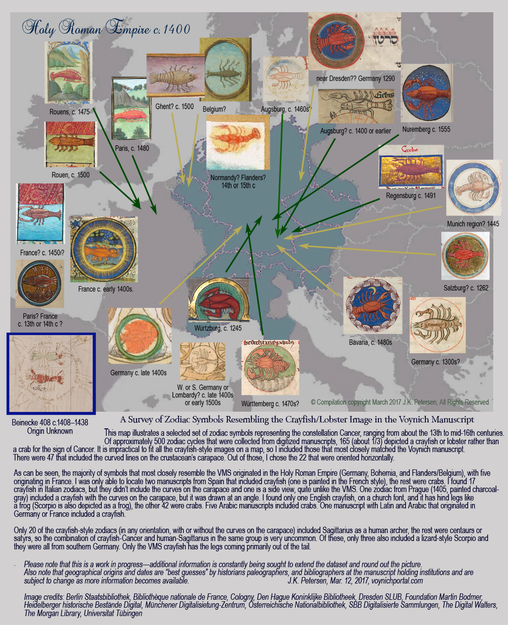
The following diagram illustrates crayfish/lobster zodiac symbols that were substituted for crabs and when they appeared. Note that the dates and geographical origins of these manuscripts is often unknown and have been estimated by the repositories holding them. This map is specific to the VMS and does not illustrate all the crayfish zodiacs (I found 165 of them). It includes the ones that most closely resemble the crayfish with the curves on the carapace in the Voynich Manuscript. You can click on the map to see it full-sized and to read additional statistics about examples not illustrated:

So Why Two Crayfish?

Is the paired crayfish somehow related to the paired ram and bull pages, or was the VMS illustrator intending something specific to Cancer? I’m not sure, but I have a couple of ideas…

Each constellation has a naturalistic image, representing the position of the stars, but there is also a shorthand version for textual references. As mentioned in the previous blog, the symbol for Aries is similar to the “red weirdo” on the first page of the VMS. It looks like a ram’s head with two horns.

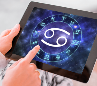
The traditional zodiac symbol for Cancer is a long-tailed 69, reminiscent of the claws of a crab (or perhaps two crabs in a whirling duet). Could the duplication of the two crayfish in the Voynich manuscript be a reference to the zodiac glyph? Would someone go to the trouble of drawing a second crayfish to mimic a symbol when the identity of the animal is already pretty clear?

That’s one idea but it lacks that special feeling you get when you cast your hook in the water and get a big tug on the line. So, I have another idea… if you look closely at the two crayfish, you’ll notice the green one has the two curved shapes on the carapace, but the red one does not. Was this an oversight, or do the two crustaceans represent different things? Maybe the upper one is a crayfish and the lower one is a lobster and the illustrator wanted to include both fresh- and saltwater species. It’s clear from the plant drawings that someone working on the manuscript had a strong interest in the natural world. But how do you explain the line running between them? Why would a Pisces tradition be applied to the crayfish as well? Is it a way of saying there’s a relationship between fish and crustaceans and between lobsters and crayfish? or is the anomaly somehow related to the text?

Summary

The paired crayfish are puzzling indeed, but it was worthwhile surveying zodiacs to discover that about 1/3 of those created between the 11th and 16th centuries specifically use crayfish instead of crabs and that they cluster in certain geographical regions.

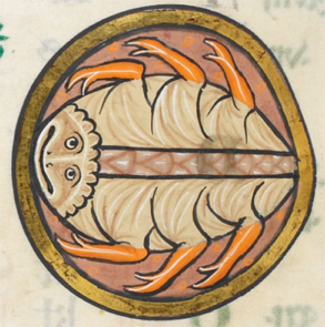
Cancer as a crab from British Library Royal 1.D.X psalter (c.1210).

Even if the pairing remains a mystery, it’s useful to know that zodiacs from England, Switzerland, Italy, and Arabic-speaking regions were almost entirely crabs. Manuscripts from France were a mixture of crabs and crayfish (as were Hebrew manuscripts), but the crayfish/lobster was the crustacean of choice in Germany, comprising 75% of the medieval Cancer symbols surveyed so far.

Looking back at the map for zodiacs with a crossbow, we find that Sagittarius symbols created in the early 15th century also cluster around southern Germany, with one earlier example from Prague. Unfortunately, two is not enough to prove a pattern…

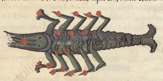
So what about lizard-Scorpio, another unconventional animal-symbol in the VMS menagerie? Is it also primarily from southern Germany? Nope. Nothing is ever easy when trying to understand the VMS. In southern Germany, when Scorpio diverged from tradition, it was usually in the form of a turtle. The dragon Scorpios are mainly from England and the lizard Scorpios from northern France.

How does one explain the geographical discrepancy? Was the VMS illustrator someone who traveled and dropped in on libraries along the way?

It was not unusual for scholars to do undergraduate work in Heidelberg or the southern parts of the Holy Roman Empire (what is now northern Italy) and then travel to Paris or Naples/Salerno for graduate studies, or the other way around.

The Voynich manuscript is very orderly but would be atypical if it were created by monks. It’s not impossible for it to be the work of monks—merchants and sailors sometimes took up the cloth in later years and brought their secular ways with them—but it feels more like a secular document.

I’ve long suspected that the creator was exposed to a variety of sources and didn’t rely on one exemplar or one kind of exemplar. Whoever masterminded it had the discipline to work out the separate parts and stick with a project that may have taken months or years, skills that could have been learned in a scholastic environment. It seems a bit esoteric for a merchant’s reference. Why would a merchant want wheels full of naked nymphs and pages and pages of naked nymphs bathing? Merchants are practical and time-conscious and even though trade secrets were heavily guarded, a medieval merchant probably wouldn’t have any more patience for an encoded reference than today’s businessmen.

I’m more inclined to think the VMS was for personal use of a college professor, an apothecary, or a physician to a royal court. Whether it was for a patron, or created by whoever intended to use it, I really can’t tell. Either way, a lot of work went into it and the eccentric details probably aren’t accidental.

J.K. Petersen

© Copyright 2017 J.K. Petersen, All Rights Reserved


The Origin of the Voynich Glyphs

The Search for the VMS Glyphs

Researchers have speculated for decades about the origins of those funny letters in the Voynich Manuscript.

When I first encountered the VMS, I recognized most of the shapes from medieval scribal traditions, but I couldn’t read the text, so I combed the world’s archives for examples of other alphabets that might have inspired the glyphs, hoping it might yield clues to an underlying language. Along the way, I discovered certain shapes are found in many scripts—loops, circles, snake-shapes, or sticks with a loop or two, seem to naturally occur in diverse regions. Shapes that look like p, s, g, and ell are particularly common.

In the end, after years of pouring over hundreds of languages and dozens of alphabets, I came back to where I started. The Latin alphabet and scribal abbreviation conventions can explain almost all the VMS characters. I already knew this, but sometimes you have to look around to appreciate what you already have.

I’ve mentioned the Latin origins many times, but I’ve noticed there is still a certain skepticism, and I’ve never posted examples of the entire alphabet due to the enormity of the task (I have thousands of examples and severe time constraints). So, I’ve decided to post it in installments rather than trying to fit it all into one very long paper that might never get finished.

Organizing the Glyphs

Most people are not familiar with Latin paleography, so I will try to include as many original samples as possible from medieval manuscripts.

Most of the VMS glyphs fall into four categories:

  • Latin letters,
  • Latin numbers,
  • Latin ligatures (two or more shapes combined for ease of writing), and
  • Latin abbreviations.

Some glyphs can be classified in more than one category. For example, in medieval script, the Greek sigma is sometimes used as a terminal-s in Latin scripts and is sometimes drawn with the last stroke looped so that it resembles a figure-8. This shape is hard to categorize unless one knows by context whether it is a letter or the number 8. Since the VMS lacks context (the text has not been decoded), I have assigned some glyphs to more than one category (e.g., letter and number, or letter and abbreviation). More on this later when I sum up the individual characters.

A number of Latin glyph-shapes are borrowed from Greek. Sometimes they mean the same thing and sometimes the shape has been adapted for other uses, as will be illustrated in today’s blog.

The Big Red Weirdo

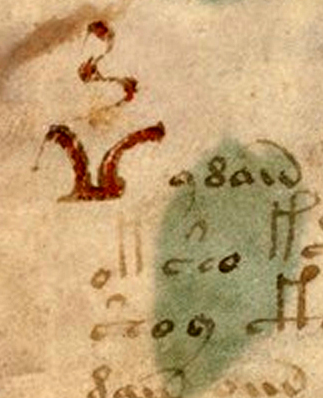
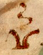
I thought I’d start with one of the iconic shapes in folio 1r, sometimes known as the “bird glyph” or the “seagull” or simply as a “big red weirdo”. This shape is used only once.

The big red weirdo somewhat resembles a bird with a vertical squiggle between the “wings”. I usually call it the seagull glyph.

We learn in primary school that letters have more than one version, and are taught to write both upper- and lowercase letters. In most ancient scripts, there was no distinction between upper- and lowercase, but sometimes the beginning of a paragraph or line would be adjusted for aesthetic reasons or to call attention to something of importance by enlarging the letter, using different colors, or by adding lines, curves, or other embellishments.

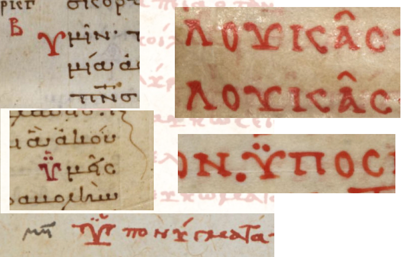
The seagull glyph without the squiggle can be found in old languages that use the Greek character set (a variation of it can be found in Arabic, but much less often). It is not always drawn with the line underneath, but the line is used in certain writing styles or sometimes to create emphasis, as in these examples. Note the double dots above some of the letters. A Latin squiggle doesn’t have the same meaning as Greek dots, but the dots show a precedence for the position of a squiggle in later Latin documents:

These examples are from leftmost columns of new paragraphs (left) and from header text written for emphasis (right). Just as capital letters sometimes have extra strokes to make them stand out from lower-case letters, the Greek letters, such as ypsilon, sometimes had an extra line on the base to give them emphasis. In Coptic Greek this shape (without the dots) represents the letter Ue and, depending on the handwriting style, sometimes the letter Djandjia.

In Latin, the seagull shape usually represents a V, but sometimes it retains one of the Greek meanings. Note that dots have a variety of meanings in Greek. In some cases they are associated with the character (pronunciation or abbreviation), in others, dots can mean that the copied text diverges from the original, a convention that is also used in Latin.

The Seagull Tradition

Latin was a required language for medieval scholars and many also studied Greek, so it’s not uncommon for Greek conventions to show up in Latin texts. Sometimes they mean the same thing in Greek and Latin, and sometimes a shape is preserved but used for different purposes. In some cases, two conventions are combined, as will be seen when I discuss the squiggle.

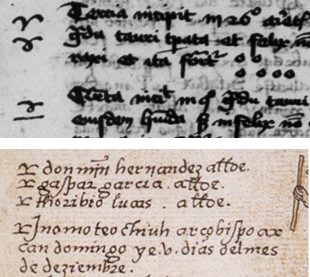
You might have noticed that the seagull shape, when written as it is above, resembles the symbol for Aries. The Aries symbol is ubiquitous in Latin texts on astrology and astronomy, but the Greek convention is sometimes also used to mark paragraphs in texts not related to astronomy. You might notice that the “seagull” shape also somewhat resembles an open book, when the line on the bottom is extended. This, in combination with the way it is used in some Greek texts, might have inspired its use as a pilcrow in certain Spanish documents.

In the above examples, the shape that resembles the Greek letter is used to mark passages in a 15th-century Latin manuscript on astrology, and a 16th century New World document by Spanish missionaries. The shape underwent some minor changes, but its use as emphasis or a topic marker was retained.

This manuscript combines Greek and Latin, and the character can be seen both with and without the squiggle. Note that symbols above letters in Greek do not have the same meanings in Latin. Greek pronunciation symbols, for example, were not carried into the Latin writing traditions but the use of symbols as abbreviations was prevalent in both traditions.

In Latin manuscripts, a seagull shape usually represented the letter V or the letter V plus additional letters. If a squiggle was added, it was almost always an abbreviation. The example on the left is from the late 13th or early 14th century. The one on the right, from the 15th or 16th century.

What About the Squiggle?

The VMS character is embellished with a flame-like squiggle that sits vertically between the “wings”. This too is a Latin convention, a very common one. It can be drawn as a straight line, a slightly curved line, or a full s-curve, and it can be horizontal or vertical.

In old Greek, marks above letters are a combination of pronunciation symbols and abbreviations. In Latin, pronunciation symbols are rarely used and the symbols usually represent a number of abbreviations. You can think of them as specialized apostrophes, depending on their shape and position.

In Latin, the squiggle was particularly prevalent in the 13th and 14th centuries and it was usually drawn in the vertical direction to distinguish it from the shape that represents “n” or “m” which is straighter and almost always horizontal, but it didn’t matter whether an s-curve was horizontal or vertical, the meaning was usually the same—it stood for er, re, or ir or these letters combined with additional letters. In the illustration above, the word on the right is “versus”, with the squiggle standing in for “-er-“.

Sometimes if a squiggle had an extra wiggle, it stood for a degree of something or a series, as the “th” that is added to ordinal numbers. In this case, it was usually horizontal, but not always.

I don’t know what the seagull glyph signifies in Voynichese, but whether one considers it to be textual or an embellishment, the shape is not unusual, especially when it appears like this, at the beginning of a block of text.

Summary

It seems abrupt to end a blog on just one character, but it will take at least a dozen blogs to describe the whole alphabet and a dozen more to describe the relationships between them and their positions in the text (and that’s without going into the actual structure or meaning of the text). As will be seen from other characters, including the more exotic ones, whoever designed the glyphs was familiar with classical scripts and used Latin as the primary source of inspiration (or Latin conventions derived from Greek). This is indicated not only by shape, but by the design of the alphabet as a whole, and by position.

I’ll post examples of the other characters, including a discussion of their behavior, in future blogs.

J.K. Petersen

© Copyright 2017 J.K. Petersen, All Rights Reserved

Voynich Glyph Structure

This started as a comment on Nick Pelling’s Cypher Mysteries blog, where he posted some ideas on EVA-s. Unfortunately, my comment became far too long to put on someone else’s blog, and it was in need of pictures to support the text, so I have changed the focus and posted on a related topic instead.

Much attention has been given to daiin (and its relatives). This is a surprisingly frequent combination of glyphs in the VMS that has generated substantial discussion and statistical analysis. Whole papers have been written on what it might represent.

I have a fairly long list of possible interpretations, some of which I’ve posted (and some that I admit I’ve kept to myself), but in this blog I’d like to discuss something more fundamental and focus attention on the shapes that underly it.

Why I Rejected Existing Transcripts

One of the reasons I created my own transcript of the VMS text is because I interpret the shapes differently from the way they have been historically recorded. As I’ve mentioned in previous blogs, I don’t use the EVA alphabet either (it would complicate the process of searching for patterns)—I developed my own.

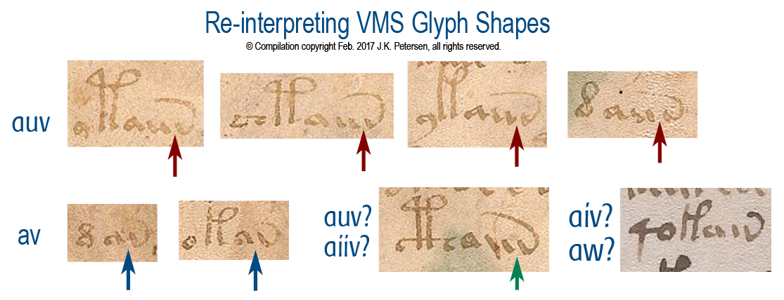
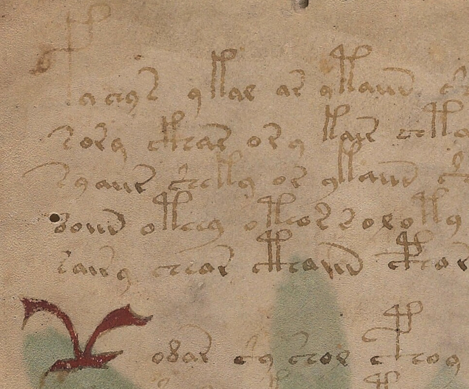
During this process, I chose -auv instead of -ain to represent the end of daiin. Here are some examples from folio 1r but note that even this has a caveat (there is one additional possibility that I will discuss below). Note the separation between the first two strokes and the “v” shape is more distinct than the first two strokes that resemble a “u”. You can click on the image to better see the gaps and connections:

Note how the gap between the “u” and the “v” shape is more distinct than that between the two stems of the “u”. Note also in the first two examples in the second row, that the “v” shape sometimes follows the “a” shape directly, and is separated in a way similar to “v” when it follows “u”, suggesting that the “u” is a glyph in its own right and is not necessarily an “n” shape as in historic transcriptions.

So, rather than transcribing daiin, I have been recording this pattern visually as dauv/dauw, etc. You might say, “So, what? It’s just a different shape for the same thing,” but it’s not quite as simple as that. Since the bottom right example suggests that even the “u” might sometimes be a single glyph and might at other times be two glyphs (a double-i shape), it opens up possibilities such as aiv/aiw/aiiw/aiuv/aiuw/aiiv, etc., which means there may be more variation in the daiin family than is apparent when using historic transcripts. The frequency counts are potentially all wrong.

You might still argue that the daiin shapes are positionally similar and thus less likely to vary as much as I’m suggesting (or that they might mean the same thing even if they do). That might be true if the spaces are literal, but if they are not, then the potential variations could be important to the interpretation of the text.

And Then There’s the Tail…

Yes, the tail—the upswooped shape on the end of the “v”…

These days, most swooping tails are embellishments added for aesthetic reasons. In early manuscripts, however, the upswooped tail was a convention to show that letters had been dropped from the end of a word.

We still occasionally use this form of abbreviation. For example, the words “with” or “without” are sometimes written with a line over the “w” or a slash between the “w” and “out” (w/out). This is a holdover from scribal conventions that are more than a thousand years old. Similarly, in the middle ages, in Latin, English, French, German, Italian, Czech, Spanish, and other languages, this back-sweeping tail stood for whatever ending was appropriate for that language and could represent one or several missing letters.

In the VMS, it is not known whether glyphs with tails, such as “v”, EVA-r, or EVA-s, represent individual units, multiple units, or whether the motivation for the tails is to make the text look like Latin.

Faster Your Seatbelt, EVA, It’s Going to Get Bumpier

Now hold that thought about tails, because this is where it gets gnarly (as is so typical of the Voynich manuscript)…

In Latin and other European languages, the “v” shape could be a “u” or “v” with a tail or, it could be an “i” with a tail. In other words, it might be “auv-something” or “aui-something” or, in the more ambiguous example on the lower right, it might even be “aiii-something”. If this were conventional text, the reader would know by context how to expand the swoop, or whether it were simply an embellishment.

Which brings us to a further wrinkle… if medieval conventions allow that the VMS “v” with a tail could alternately be an “i” with a tail, there is another aspect of the text that needs to be addressed, one I haven’t seen anyone mention yet…

If the glyph at the end of daiin is an “i” with a tail then EVA-r needs to be re-examined, as well. In terms of glyph design based on some internal system known to the scribes, it’s possible that the “v” is an “i” with a bottom-tail and EVA-r is an “i” with a top-tail. In fact, there are times when EVA-sh is written with a tail attached to the top of the crossbar (similar to EVA-s but without the right-hand part of the character) and sometimes to the bottom. This is more apparent in some hands than others.

Superficially, almost all the VMS glyph shapes can be traced to Latin and Greek (I’m still trying to finish my blog on this, but I’m nose-deep in examples that have to be sorted and inserted), but even if they are, it’s possible the relationships between the shapes are based on certain conventions unique to the VMS.

Some closing thoughts…

It’s true that EVA-d occurs very frequently before ai, but we have to keep in mind that more than a dozen other glyphs can directly precede ai, as well, including EVA-t and EVA-k (EVA-k more than twice as often as EVA-t).

It’s also important to consider one-to-many relationships—EVA-d is sometimes written like a c combined with Latin -is abbreviation, rather than a rounded figure-8. If it’s a ligature, it may stand for two units or something else.

I have more examples of glyphs that may not fit the assumptions made in historic transcripts, but I’ll save them for future blogs.

J.K. Petersen

© Copyright 2017 J.K. Petersen, All Rights Reserved

Scribal Relationships

Today’s blog isn’t directly related to the Voynich manuscript, but may be of interest to paleographers and medieval bibliographers in general.

Connecting the Scribes

While scanning through Vatican Ross.708, I noticed the script was similar to another manuscript I had previously seen. The writing is Gothic cursive which, in itself, is not unusual. This style of script was common in the 15th century throughout northern Europe, Bohemia, Lombardy, parts of northeastern Spain and, to some extent, the area around Naples and Salerno.

In fact, it never ceases to amaze me that a specific style of writing could be so widely distributed in the days before television and public schools began to standardize culture and teachings, especially when travel was so treacherous—turbulent seas and precipitous mountain passes were significant obstacles. If you were fortunate enough to have a horse or mule, there were places you had to dismount because the trail was too narrow for both horse and rider or, if the path wound along mountain cliffs, there was a real possibility the animal would slip and plummet, and it was better not to be astride when that happened.

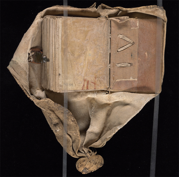
This book has been sewn into a swaddling girdle to protect the manuscript on journeys. The knot could be used to tie it to belt or saddle. [Image courtesy of the Yale Beinecke Library.]

Considering the distances, and the difficulties of finding food and shelter on journeys of hundreds or thousands of miles, it’s incredible that writing styles could be so similar… and yet they were. I don’t know if anyone has given an adequate explanation for this phenomenon, but it’s evident that scribes moved around and that manuscripts were carried for great distances. Book boxes, satchels, and girdles (like the one on the right) were designed to protect books while en route.

The Romans brought coins and a new culture to England in the early years and, by the eleventh century, partly due to the Crusades, manuscripts from major trading posts in the Mediterranean were showing up fairly regularly in England, a round trip of about seven thousand miles.

Handwriting as a Research Tool

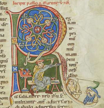
A rare self-portrait of Rufilis, the rubricator and his paints, from Bodmer Ms 127.

Handwriting is an important tool for identification. Along with other clues, it can help date a manuscript, and sometimes even pinpoint a specific origin or author. For the most part, the names of medieval scribes have been lost, although there was a greater tendency to name and date them in the middle east than in Europe. This is partly because many European manuscripts were created in monasteries and humility was considered a virtue (although some monks couldn’t resist the urge to encode their names within the text or their images within the illuminations). In other cases, even if the name was known, the person who penned it may have been lost to the annals of history due to an untimely death from war, disease, or famine. In times of war, sometimes entire villages were burned, including the records.

I mentioned in a previous blog on VMS folio 1r, that the handwriting of John Dee and Isabella d’Este show surprising similarities, considering one was educated near London and the other in Ferrara several decades earlier. You can see samples here. This is strong evidence that handwriting can be similar even if it originates in different areas at different times. It doesn’t happen often, however. After searching thousands of manuscripts, I have collected a very large number of samples, and rarely see temporally separated hands that are this similar. Because there are general patterns of change over time, handwriting can help us learn about a manuscript even if we are not completely sure of its origin.

Looking for Commonalities

To determine a common origin (or a common scribe who worked at different locations), one has to study the ink and pigments, the writing medium (parchment or paper), the angle of the writing, the angle of the pen, the slant, and the spacing between letters and lines. Even details, such as the way the pages are trimmed or bound, the worm holes, the stains, and the stitching, can provide clues.

If two different manuscripts show significant similarity, but end up in different repositories, the handwriting can help determine if they were written by the same scribe or the same scribal tradition. The origins of many manuscripts are not known and the community at large might be able to help with some of the unanswered questions now that e-facsimiles are becoming available.

The Doppelganger to Vatican Ross.708

The manuscript whose handwriting closely resembles Vatican Ross.708 (recently uploaded from microfilm to DigiVatLib in Italy), is Codex Sang. 726, which is on the Stiftsbibliothek site in St. Gallen, Switzerland. The distance between Rome and Switzerland on modern roads is almost 600 miles—a three-month journey in medieval times, much of it through steep mountain passes.

The handwriting is not a perfect match, but many of the letter forms, and even whole words, are almost indistinguishable, and the slant and line spacing are a good match as well (something that often differs dramatically even if the letter-forms are similar).

Here are some samples (click to see it full-sized). The brown ink is Codex Sang. 726 (“Scribe 1”), the black photostat is Ross.708.

Gothic cursive text samples from Codex sang. 726 and Ross.708

Samples for comparison between Codex Sang. 726 in Switzerland, and Vatican Ross.708 in Rome.

The main differences are

  • the “g” (Scribe 1 characteristically loops the tail up, Scribe 2 points it down to the left),
  • the “u” (Scribe 1 writes it with an undercurl, Scribe 2 with an overloop),
  • the “w” (Scribe 1 writes it like two v-shapes joined, while Scribe 2 tightens up the first “v”), and
  • a tendency on the part of Scribe 2 to sometimes not completely close the loop on the “e” or connect the stem on the “r”.

After collecting hundreds of samples of Gothic cursive, I’ve noticed it’s rare to find two scripts that are this similar unless they are by the same hand. Maybe they learned from the same tutor. Maybe they were blood relatives (sons often learned to write from their fathers).

Both manuscripts are in Middle German. Vatican Ross.708 (digitized from microfilm) is a popular story of travels attributed to John Mandeville and Codex Sang. 726 is about Schwabian history and law, so they are quite different in subject matter.

I can’t tell if Ross.708 was written on paper or parchment, but there are some vague horizontal striations in the muddy section about an inch in from the right on the bottom of page 2 that might suggest paper but it’s not clear enough to be sure. Note the Ex Libris mark on the same page for Bibliotheca Rossiana indicating that it probably originated from the de Rossi collection before it passed into the hands of the Society of Jesuits and the Vatican.

Sang. 726 is believed to be from S.W. Germany. It is listed as a late 14th or early 15th century document but I suspect it’s 15th century, probably closer to mid-15th century. It doesn’t use a single-loop “d” or double-story “a” as was more common in the 14th century, and it was written on paper rather than parchment, which also suggests 15th rather than 14th century (laminated paper was available around the eastern Mediterranean in earlier times, but laid and the later calendered papers, as were typically used in Central Europe, came later). Paper was available in France and Germany in the early-to-mid 14th century, but did not come into common use for manuscripts of this kind until about a century later.

Summary

So does any of this relate to the Voynich manuscript? Well, yes. As I’ve mentioned in previous blogs, most of the writing on the last page of the VMS is Gothic cursive script, which adds another piece of evidence to the estimated 15th-century origin of the manuscript and which relates to some of the research I’ve been doing on the text (to be posted later).

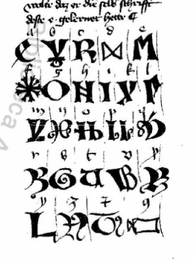
Also, Ross.708 (which was brought to our attention on the Voynich forum by René Zandbergen), includes a number of alphabets that might be of interest to Voynich researchers.

Whether these Mandevillian alphabets are actual or mythical is debatable, since Mandeville’s supposed travels have never been substantiated, and they scarcely resemble real eastern alphabets (note that each Mandeville story is accompanied by different illustrations), but they have some interesting shapes, some of which can be traced to other traditions, and might provide some food for thought.

J.K. Petersen

© Copyright 2017 J.K. Petersen, All Rights Reserved

The VMS Paint Pot

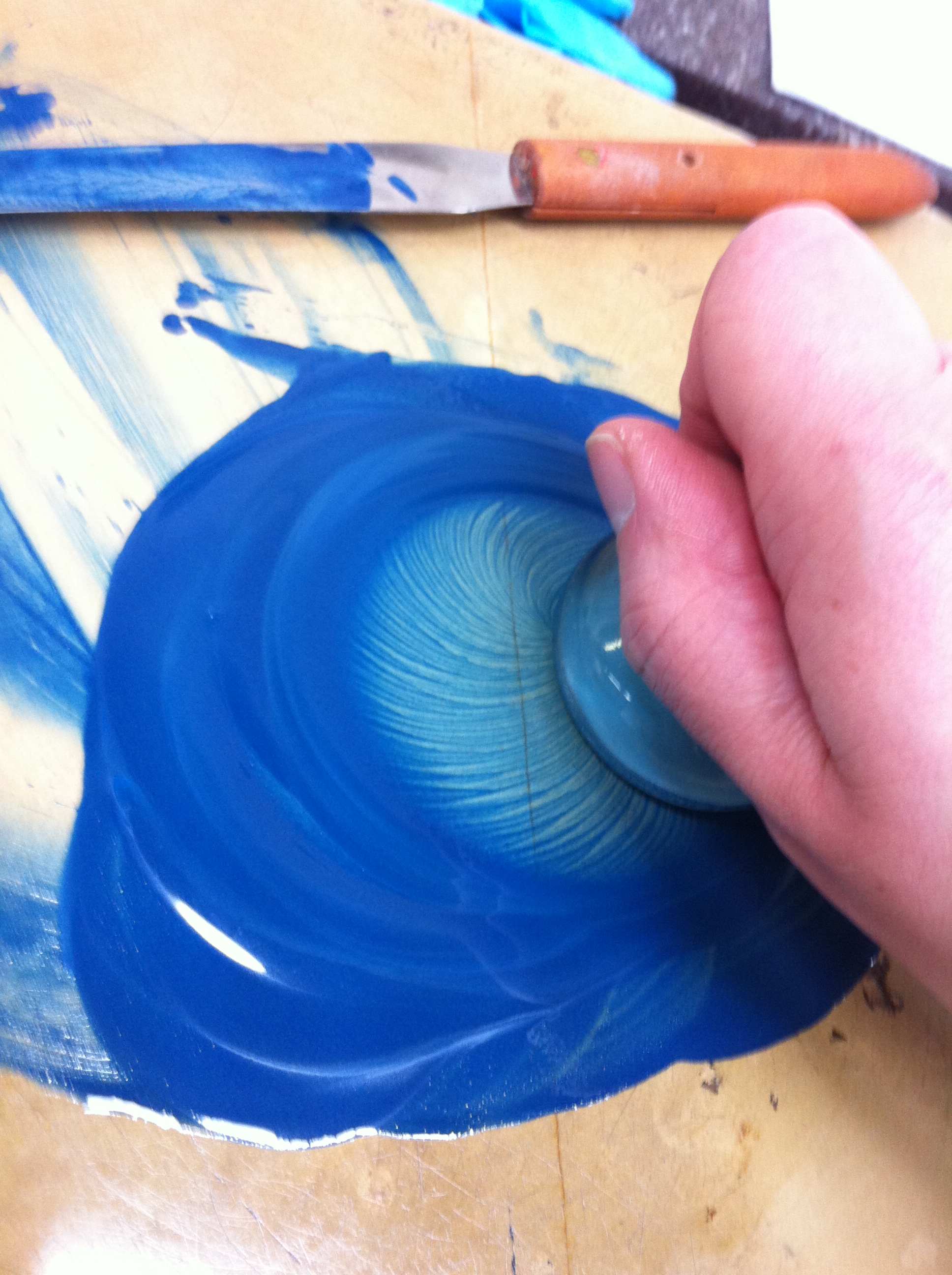
Artemis grinding azurite. You can see the picture full-sized and visit her interesting Jan. 14 blog on mixing pigments here (and note what she says about the time it takes to grind the minerals).

Much has been said about the possible origins and meanings of the VMS drawings but maybe the technical aspects of the paint should get some attention, as well.

In my previous blog, I posted some examples that suggest more than one person may have colored the VMS illustrations. I suspect there were at least two hands, based on differences in brushwork (smooth or scratchy), mixing of colors (reluctance to mix or propensity to mix), and attention to detail (extending the paint into narrow channels or avoiding tiny spaces).

I’ll have more to say about the painting styles in future articles, but I’d like to devote at least a couple of blogs to the composition of the pigments, starting with the color blue…

Back Story on the Testing

For a long time the Voynich manuscript went untested. In Wilfrid Voynich’s day, scientific examination was primitive compared to what we have now and may have been prohibitively expensive. In recent years, testing has improved, as has the availability of services. There may also have been some reluctance on the part of the library to subject the manuscript to tests, some of which can be invasive and some which might yield undesired results (such as evidence that the manuscript could be a fraud). Fortunately, the desire to know appears to have overcome any initial reluctance and the vellum and pigments have been sampled for radio-carbon dating and spectral analysis.

In April 2009, McCrone™ Associates, Inc., of Illinois, USA, provided a report on VMS pigments to the Curator of Modern European Books and Manuscripts at the Beinecke Rare Book and Manuscript Library. This report provides additional evidence and support for the early origin of the VMS. While it’s still possible to mix pigments from natural materials, it requires knowledge, skill, and access to sources to do so, and the use of some of these materials was essentially obsolete at the time Voynich acquired the VMS.

To test the blue, McCrone took samples from the tip of a stem on folio 26r and reported that the blue paint “was unambiguously identified as ground azurite with minor amounts of cuprite, a copper oxide.” Azurite and traces of cuprite were also found on folio 78r in the blue water coming from the pipe near the top right. In noninvasive tests by other labs on a variety of manuscripts, azurite appears dark in near-infrared spectral scans. In the McCrone report it describes how the samples were mounted on slides and examined with spectrographic tests.

Characteristics of Azurite
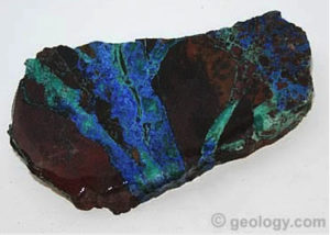
Azurite striations in rock fissures. Image courtesy of geology.com.

Azurite is a natural substance that occurs when water and copper ore interact under the right conditions to oxidize. It can range from a bright cyan to violet-blue to a deep slate-blue.

Azurite is a brittle substance—it scratches and breaks easily. It is beautiful, but only of limited use for jewelry-making. It is useful as a pigment, however, for creating paints and dyes.

In the VMS samples, the impurities (cuprite) were minor. The fineness of the powder depends partly on the patience of the grinder and whether it is sifted to remove larger particles. Despite its utility as a pigment, azurite has never been abundant, and the labor involved in finding and removing it from copper ore is considerable.

Use and Characteristics
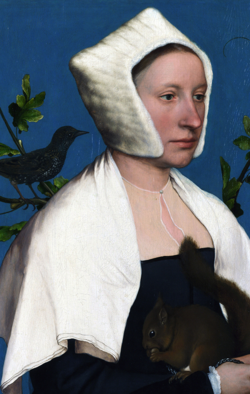
Detail of Hans Holbein’s “A Lady with a Squirrel and a Starling” (c. 1527), National Gallery of the U.K., was tested and found to include two layers of grainy azurite bound with linseed oil. Other very basic pigments were also detected, including copper resinate, lead white, lamp black, red earth, Cologne earth, and vermillion (a shade of red). The naturalism and variety of colors the master was able to achieve with a limited palette is remarkable. [Image courtesy of Wikipedia.]

Grinding and mixing with water, and optionally a binder (usually a gum binder), is all that is needed to turn azurite rock into paint. How easily it can be applied depends partly on impurities and how finely it is ground. Longer grinding makes it easier to mix and spread, but also creates a paler shade of blue that may be less desirable.

Mixing with chemicals other than simple gum binders can turn it darker, greener, or grayer, but this is an inexact process and mixing with other pigments to adjust the colors is often preferred to heating or adding oils or egg binders.

Azurite lightens over time, but darkens if heated, and may turn greenish if exposed to excessive heat or humidity. Despite its mutable nature, many medieval paintings and frescoes have retained their blue tones remarkably well (see Holbein painting) while others, such as “Madonna and Child Enthroned with Saints” by Raphael, have become darker or greener over time.

Azurite was popular among medieval and Renaissance painters. It was easier to obtain than lapis lazuli (an expensive semi-precious stone that was imported from northeast Afghanistan and possibly also from the mountains of Siberia, north of Mongolia).

Azurite was also widely used for embellishing manuscripts, as in the lavishly illustrated Pabenham-Clifford Hours MS 242 (England, early 1300s), which includes azurite throughout.
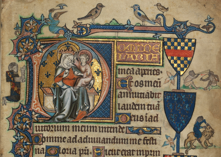
The Pebenham-Clifford Hours make liberal use of azurite for backgrounds, floral motifs, coats-of-arms, and embellished initials. Other pigments include carbon black, lead white, verdigris, and vermilion, and a red dye that may have been derived from cochineal. Skillful mixing of these pigments has created intermediary tones of gray, pink, and light blue. Note that despite the wide range of colors, purple is almost entirely absent.

Some medieval manuscripts were painted with both azurite and ultramarine, not only on the same page, but sometimes layered on top of one another, as in this example from the Fitzwilliam Museum.
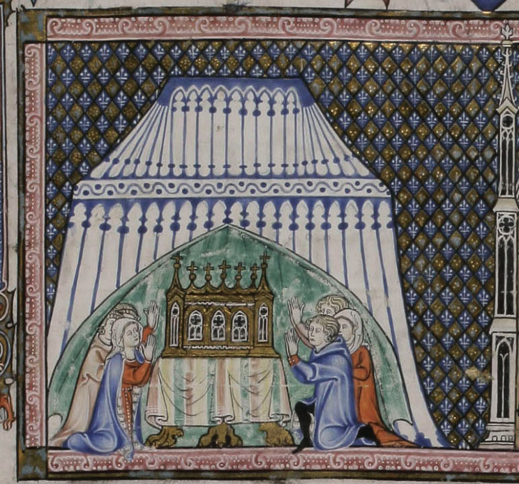
The Fitz Museum has examined the combined use of azurite and ultramarine in medieval manuscripts. In the Pontifical of Renaud de Bar MS 298 (commissioned by the Bishop of Metz from Lorraine in the early 1300s), the tent decorations are ultramarine, while many of the diamond-shaped background patterns include azurite. In other sections, as in some of the frames, the azurite has been laid down as a base color, with ultramarine embellishments on top.

Azurite was less expensive than ultramarine, and more stable and less complicated to prepare than some of the other natural blue pigments. Despite its relatively high cost, it became a mainstay for more than 300 years.

Which brings us to the big question… since azurite was used to create the blue paint for the Voynich manuscript, where was it from? Does it answer any questions about the manuscript’s origin? And why were the painters reluctant to mix it with red to create purple? This is too many questions to answer in one blog, so I’ll start with the availability of azurite…

Sources of Azurite

In ancient times, azurite was mined by the Egyptians on the Sinai Peninsula and used on the island of Crete to decorate ceramics. Pliny called it κυανός (“deep blue”). The modern name is derived from the Persian word lāžward (their word for lapis lazuli, and also the location where it was obtained), which was adapted into Latin and French to become azur, a more general term for blue and, eventually, azurite.

The Rio Tinto area in southern Spain has been mined for thousands of years, supplying a variety of minerals, including azurite, to the Mediterranean region. [Image courtesy of Wikipedia.]

In the middle ages, azurite was called bleu de montagne and Bergblau (mountain blue), as well as azure d’Alemagna and lapis Armenius (Armenian stone). The name “citramine” was used to distinguish azurite pigment from “ultramarine” (made from lapis lazuli). Culpeper mentions both Lapis Armenius and Lapis Lazuli as medicinal substances.

Azurite was extracted for centuries at the ancient Rio Tinto mines in southern Spain, possibly into the middle ages. The silver mines in Saxony may have been a minor source from about the 12th century, as were deposits in Sardinia. Azurite was used in the far east, as well as in pre-Columbian South America.

E.W. FitzHugh reports that in western China, azurite has been recorded in the literature at least since the 3rd or 4th century BCE and  has been used in Japan since the seventh century. The basic eastern palette based on natural pigments is very similar to that of western Europe.

Gold mines in Sardinia, Italy, may have yielded azurite in the middle ages. [Image courtesy of Google Maps.]

In Europe, azurite was especially popular from the 14th century onward. Northern Hungary (esp. Rudabánya), Spain, and France (especially Lyons), were significant sources of azurite. Chessy-les-Mines in mideastern France is known for its deep blue azurite called “chessylite” but it may not have been available until after the Renaissance. Northern Hungary was a significant source until Ottoman occupation made it unavailable to the west.

Granite impregnated with azurite has been found in India/Pakistan, but this may not have been known in the middle ages when prospecting was done with hand and axe rather than machines and dynamite. Azurite is mined in Namibia,  Zimbabwe, and the Gold Coast, but African sources other than Morocco tend to be more recent.

As a mine gets deeper, azurite becomes less available since it requires a process of oxidation. Many ancient sources were tapped out and the mines closed. Synthetic substitutes such as Prussian blue began to appear in the 1700s and substantially replaced azurite, although a small revival has occurred, with azurite again being used by restorationists and experimental artists.
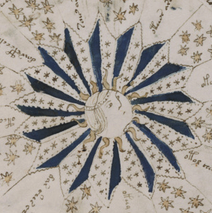
Azurite was not cheap or available in large quantities, but it was widespread. Those who had the resources to buy it, apparently could get it through the major trading centers, so it’s hard to know, exactly, where the VMS painters bought or made their pigments. We don’t even know for certain if azurite was used throughout the VMS, but it’s a piece of the puzzle and it may be significant that lapis lazuli, the more expensive shade of blue, was probably not used (further testing would be needed to confirm this), even though it was apparently available to those who really wanted it.

J.K. Petersen

© Copyright 2017 J.K. Petersen, All Rights Reserved
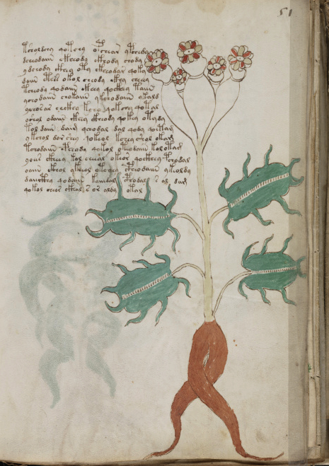
Pigments and Painters

How Many Scribes?

Some time ago, Currier proposed that more than one hand penned the Voynich Manuscript and labeled the pages as to which hand scribed it. I haven’t looked at these designations because I wanted to decide for myself whether more than one hand was present.

After creating my own transcript of the VMS text, and looking at every word in the document, I’m convinced there was more than one scribe and perhaps more than two. The hand at the beginning is a little rounder, the one that follows a little smaller, slightly less round, and shows signs of maybe being a quicker hand. I have more to say about this later, but it brings up questions about whether the VMS was 1) a cooperative project or 2) a situation where someone picked up the work where someone else left off. It is evident that the same systems of composing the glyphs were known by both scribes—there is a high level of consistency between the construction of the VMS word-tokens on the various pages—so perhaps the two main scribes were contemporaries.

How Many Painters?

It’s more difficult to assess whether those who added the text also created the drawings or added the paint, but it is possible to assess the styles to see if they were painted by different hands.

After looking through all of the VMS illustrations, I’m reasonably sure there was more than one person painting the drawings. The easiest way to explain my observations is with visual examples. This is not a comprehensive overview of the drawings (it deals only with the paint), and it doesn’t include examples that might have been painted by a third hand (if such a hand exists), but it’s enough to give a sense of why I believe there was more than one painter.
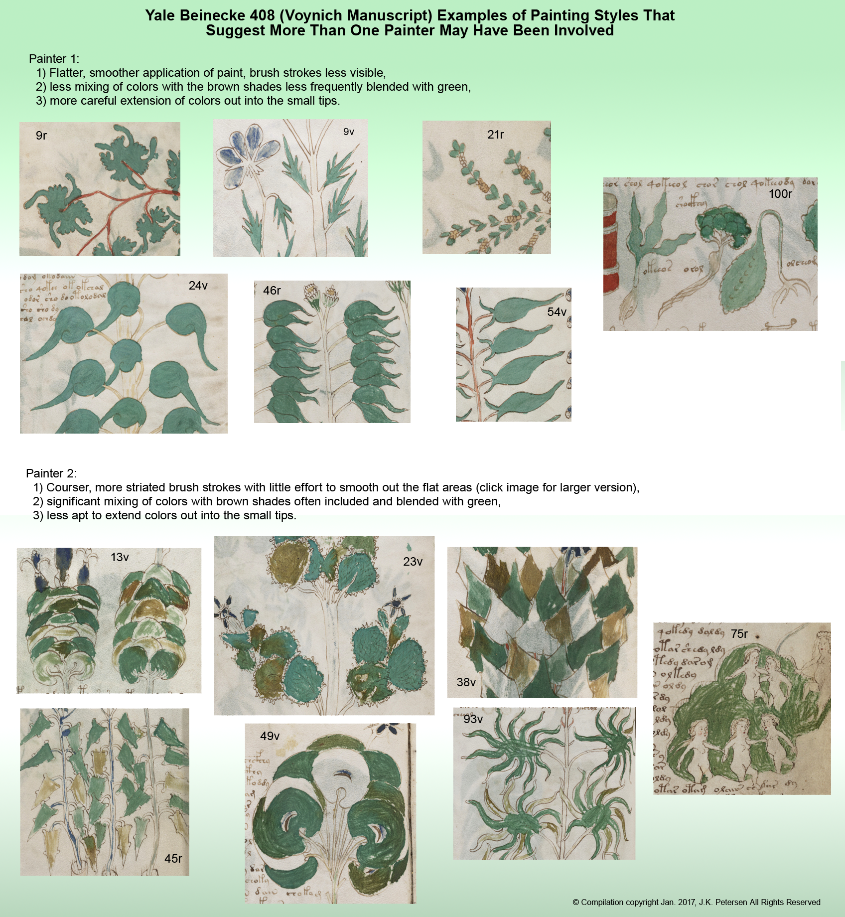
Some pages are hard to assess. They don’t have enough paint to reveal the style and those with blue pigment are problematic because the blue appears to have been more difficult to mix and apply, making it harder to distinguish any difference in styles, but those with a preponderance of greens and browns, which blended more readily, give some clues as to painting styles.
It’s a large image—you may have to click on it (and click again when it opens) to see the details, such as the brush strokes, and the tips of the leaves:

Summary

If the only difference between the two sets of samples were the care and attention with which the paint was applied, it would be hard to know if this were two painters, or one painter having good days and bad days, but the different way the brushstrokes are blended or not blended, the greater propensity for color mixing, and the different color “sensibility” (use of brown for accent and variety) increase the likelihood that more than one person painted the images.

J.K. Petersen

© Copyright 2016 J.K. Petersen, All Rights Reserved

Did Cicco Simonetta Bomb at Code-Breaking?

First a Few Words…

hose who know me know that I actively avoid looking at previous research about the VMS and have probably only read about 1/50th of what is out there. I hate spoilers and movie trailers—I enjoy the journey and the element of surprise.

If a new puzzle or game comes out, something like a Rubik’s cube, then lock me in a room and I’m happy. If you give me a book on how to solve it, or even the smallest of hints, I’m not happy—I want to solve it myself.

If I have an hour to spend reading someone’s analysis of the VMS or looking at the VMS itself, I usually choose the VMS. I like primary sources. If I have to learn a new language or other skills to understand it, that’s fine. It’s hard to find the time, but the effort is worth it.

Then along comes the Voynich forum and a personal dilemma… I want to support the forum. It’s a good thing because not everyone has blog-space and it provides them a more neutral environment to publish their findings than someone else’s blog. But it’s difficult to actively support a forum without reading it and if I’m reading it, I should be contributing, as well—to give something back. So… the peaceful days in my little cave are over and I’m now part of the “Voynich community”.

It’s not a bad thing, times change and we have to adapt, and I’ve met people I like and respect, but I’m in this weird twilight zone—I’ve only read a small portion of the prior research, which means I have no idea what people are talking about on some of their blogs!

Which brings us to the topic of today’s blog…

Enticed by a blogosphere note on the Voynich forum, I visited Nick Pelling’s Cipher Mysteries site today, where he posted a summary of Philip Neal’s translation of Cicco Simonetta’s treatise on decipherment.

I’ve barely heard of Philip Neal and I know nothing about Cicco Simonetta, so I was happy to see a summary, but I had a what-the-heck? reaction as soon as I started reading it. Who was this Cicco Simonetta dude and where did he get this information? I couldn’t believe my eyes and had to look up the full translation to confirm my impression… and then was even more surprised. It wasn’t some cockamamie 20th-century misunderstanding of 15th-century code-breaking, this was written in the 15th century!

The only way I can think of to explain my reaction is to go through the major points. It’s dated 1474, Pavia, as a treatise on extracting ciphered writings.

Note that Simonetta appears to be describing only Italian or Latin as possible languages for the ciphered text, even though there were many ciphered documents in German, Spanish, and French in the general region of northern Italy. At least I hope he’s only talking about Italian when he says “vulgar language”, because the generalizations only make sense in that light.

Simonetta’s Suggestions for 15th-century Code-Breaking

Evaluate the Word Endings

First Simonetta suggests looking at endings to determine if the code is in Latin or “the vulgar tongue” and counsels that five or less variations indicate vulgar tongue.

Right away we know Simonetta must be assuming that there are no null characters, that the spaces are real (not contrived or arbitrary), and that this is a one-to-one substitution code, otherwise it’s impossible, without significant analysis (and a little bit of luck) to determine which parts of the code are word endings.

Is it valid for Simonetta to make this assumption in the 15th century?

Sometimes.

Many codes were, in fact, one-to-one substitution codes, but it’s certainly not a given—it’s an extremely low level of encipherment. If there’s enough text, you can simply stare at it for a while and the word-structure starts to become clear (you begin to see where the vowels and consonants are) and then the general language group becomes easier to recognize and, if you can narrow it down to a language group, after a while words start popping out at you.

This is what happened when I recently read a long manuscript in a dead simple substitution code based on astrological symbols. After a few pages, it was clear that it was probably Latin, and then words like “frigida” and “elleborus niger” started popping out. It’s like playing a game where they show you three out of nine letters, but you get to see a whole paragraph, not just one word, and the brain puts the pieces together. After a couple of dozen pages, you can simply read it.

But not all codes are one-to-one substitution codes. In 15th-century Italy, one-to-many/many-to-one/with-null codes were common. In the 1400s, Tranchedino collected many such codes. Several symbols could stand for one letter, several letters could be expressed with one symbol, and several null characters were often included, all in a single cipher. In addition to the alphabetic rules, many names were ciphered from a glossary, rather than following the rules for the rest of the text. In other words, there’s no consistency in the way glyphs correspond to letters that can be used to analyze the text. And thus, there’s no way to evaluate word endings or any individual letter in the manner Simonetta suggests.

Look for One-Character Words

Simonetta goes on to say that if there are many words represented by one cipher, that the code is in the vulgar tongue (Italian) and is rarely Latin because in Latin “there be no words presented by one only letter or cipher saving four words…” Again, this presupposes that the spaces are real but is also deeply perplexing coming from someone with a “fine education” in classical languages, because it’s not true.

Simonetta’s generalization completely ignores the multitude of abbreviations that were regularly used in Latin. Sometimes whole sentences were written with one-character abbreviations. “Et” was frequently written with the character 7. D stood for domine or dominus, A for anno. I could go on for two paragraphs citing all the examples. There’s no basis for assuming ciphered text would be written out in full Latin when use of abbreviations was so ingrained.

And guess what… I almost snorted my drink when I noticed, in Simonetta’s own treatise, that he uses common one-character Latin abbreviations such as q for “qui” or “quo” and p for “per” or “pro”, thus contradicting himself in his own writings. In a cipher it’s easy to create a distinction between “per” or “pro” by the length or slant of part of the glyph (it’s difficult for decrypters to know which variations of the pen are part of the handwriting and which ones carry meaning, as Voynich researchers themselves have surely noticed).

Pay Attention to Letter Endings

After some details about “vulgar language” word patterns, Simonetta counsels the Latin decrypters to examine letters at the ends of words, pointing out that “the most part of Latin words conclude either in a vowel, or in s, or in m, or in t…”. Once again, this completely ignores the way Latin was commonly written. Word endings were often omitted entirely, sometimes with a line over the word or a swoop of the tail standing in for the missing letters. There are also many terminal ligatures. The letters “is” might be spelled out at the end of one word and then abbreviated with a simple stroke on another—the meaning is the same, only space (or habit) dictates which one is chosen. Simonetta’s writing uses this convention as well, so it’s odd that he would not consider this possibility.

Summary

I’d like to try to redeem Simonetta by saying that his advice might be useful for decoding simple substitution codes in Italian, but Italian, German, French, and Spanish scribes used many of the same abbreviation conventions as Latin, which means the same caveats apply.

Even simple substitution codes sometimes manipulate the position of the spaces. As I’ve mentioned near the bottom in a previous blog, Pal. Germ 597 (a manuscript that includes a number of paragraphs in code) has a page of plaintext broken into syllables. Even a simple adjustment to the spacing, one of the easiest ways to manipulate a substitution code, makes it difficult to determine word length or to find word endings as per Simonetta—other methods are more effective.

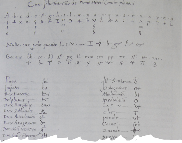
As food for thought, I’ll leave a typical example from Tranchedino’s collection and you can judge for yourself whether any of Simonetta’s advice is useful for decrypting 15th-century ciphers. You may also notice a few glyphs are similar to VMS glyphs but I think it’s probably because they are common symbols, not because they’re directly related:

J.K. Petersen

© Copyright 2016 J.K. Petersen, All Rights Reserved