5 November 2017
Most people don’t think of Indic and Latin scripts as similar, but the links between east and west are old and deep and medieval Latin script is not the same as modern Latin.
 When I first discovered VMS glyphs, I scoured foreign alphabets for the origins of some of the less familiar characters. I already knew the Latin alphabet, some of the runic scripts, the Cyrillic and Hebrew alphabets, the rudiments of Korean, a little bit of Russian and Japanese (and a tiny bit of Chinese), some Coptic Greek, a few Greek numeral systems, and a smattering of Malaysian alphabets, but no matter how hard I searched, none of them, except Latin (combined with a small percentage of Greek), seemed to match a high proportion of the VMS glyphs.
I also searched plant-related words in Baltic and Turkic languages. Unfortunately, I haven’t had time to study Finnish, Czech, or Silesian, but they’re on my list.
Just to be sure I hadn’t missed anything, I explored several other alphabets from languages I thought had potential, including Georgian, Armenian, Amharic/Ge’ez, Syrian, and Sanskrit/Gujarati/Nagari (the word Devanagari did not exist in the middle ages) and… once again was led back to Latin, but with a better understanding of how Latin, Greek, and Indic script were more similar in the Middle Ages than they are now.
Western Presence in Eastern Lands
In ancient times, the Greeks and Romans occupied Pakistan and made forays into northern India. Alexander the Great, the Kushana peoples, and the Persians all left their mark, and absorbed certain aspects of Indic culture. There were numerous Indic coins that included Greek letters and numbers long after Greek occupation had subsided.
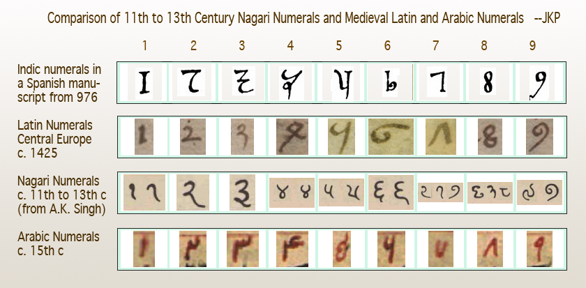
I couldn’t help noticing that “Arabic” numerals, as they were used by Latin scribes in the 14th and 15th centuries, resemble Indic numerals more than Arabic, and I subsequently saw the credit line in Latin, in the Codex Vigilanus (Spain, 976), attributing the number system to the Indians.

The earliest-known Indian numerals in a European manuscript are in the Codex Vigilanus (976 CE). It’s possible the manuscript reached the Spaniards through Arabic traders, thus leading to the “Arabic” moniker.
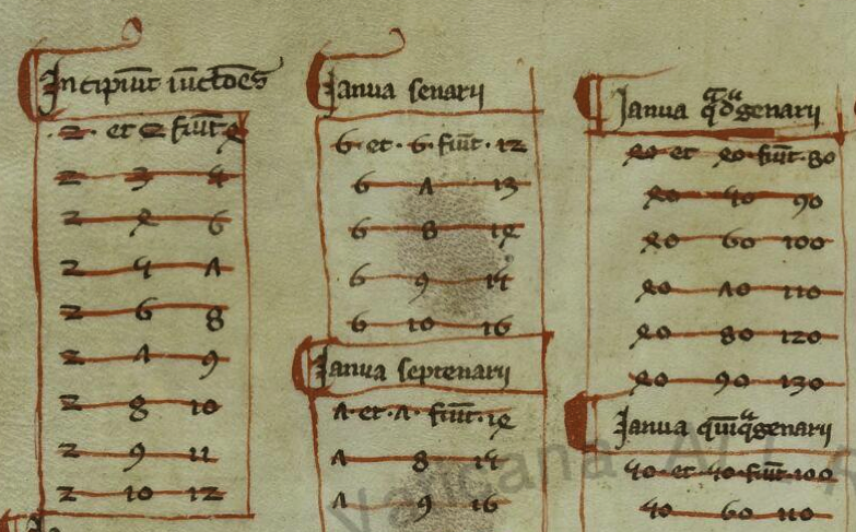
Leonardo of Pisa, now known as Fibonacci, appears to have independently discovered the Indic number system that was documented in Spain two centuries earlier. While traveling in Bugia, North Africa, with his father, he observed the notation system and calculations used by Muslim traders. When he returned to Pisa, he wrote Liber abbaci “Book of Calculation”, which included the Indic numerals. There are no copies of the original, completed in 1202, but a number of copies of Fibonacci’s enlarged 1228 edition survive.
The following is from a copy of Fibonacci’s book, believed to be from the late 13th century (BAV Pal. Lat. 1343). Like the Spanish manuscript, it introduced the numeral system that became popular until the 15th century, when slightly rotated glyphs for 4 and 7 and a more curled 5 evolved into our modern system:

Despite widespread acclaim for Fibonacci’s 13th-century manuscript on computation, change occurred slowly, and Roman numerals did not significantly give way until the 15th century when more flexible calculations were needed for scientific studies.
Latin Conventions in Medieval Scripts
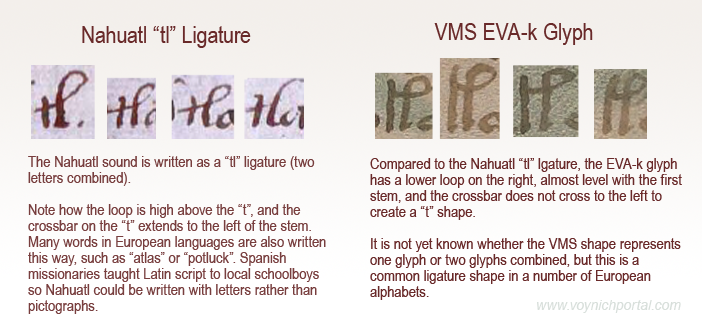
Researchers often miss similarities between VMS glyphs and Latin because medieval scribes used many ligatures and abbreviations that are not taught in modern Latin. These were as integral as the letters themselves, and it’s hard to find late-medieval manuscripts without them.
Before describing similarities between Latin and Indic scripts, it’s important to understand how Latin is more than just an alphabet. You’ll note in the examples that follow that several of these scribal conventions are apparent in Voynichese.
Example #1
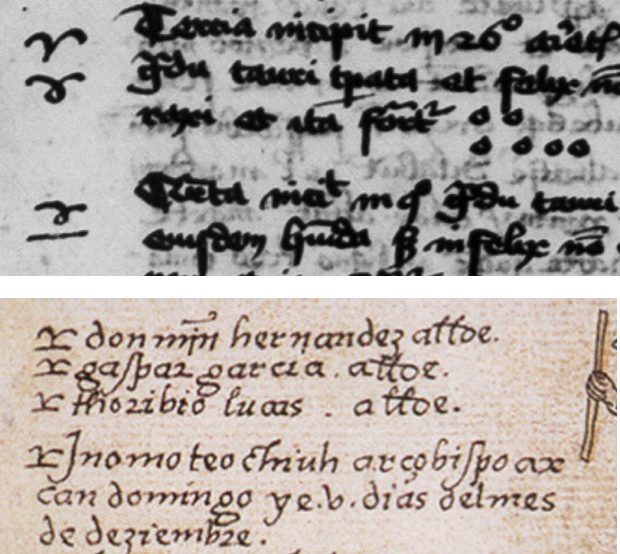
The first sample (BNF Lat 731) is lightly abbreviated. It uses some of the more common Latin conventions, including quibus, per, et, tails on the ends of words that loop back over the previous letters to indicate missing letters (it’s like an attached apostrophe), and caps over other letters to serve much the same purpose when the missing letters are closer to the middle of the word than the end.
Notice that loop-back tails and caps are common in the VMS, and that the abbreviation symbol that resembles a “2” or back-leaning “r” is, as well.

Example #2
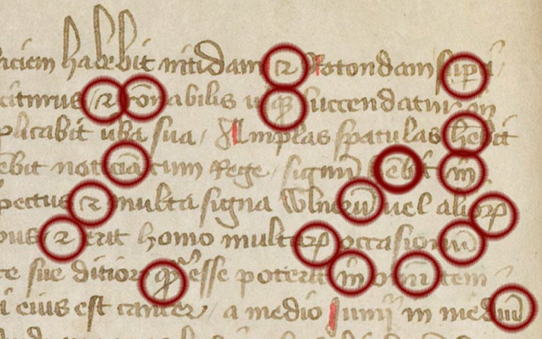
The second example (BSB CLM 29505) also uses very common conventions, but not identical to the previous example. Scribes were free to pick and choose what was convenient because they were interpreted by context.
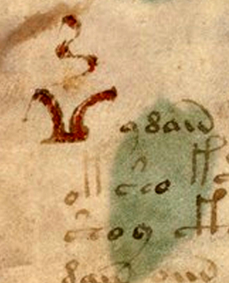
In this example, we see the common symbol for “Item” (at the beginnings of lines)—it resembles EVA-k; the macron or “cap” that indicates missing letters; the swooped-back tail at the ends of words (also missing letters); g° to stand for degree (grado/grade); a squiggly line over the “e”, which usually indicates a missing “r” or “er” “ir” or “re” (again, depending on context). Note that this is similar to the squiggle on the red weirdo on VMS 1r.
The loop on “item” is also used at the ends of words to represent “is” with the Latin suffixes -ris/-cis/-tis being drawn like EVA-m.
Notice also the tail on the “r” on the last line. This tail wasn’t always added to “r”, sometimes it was added to “i”, so one has to read for context to know which letter was intended. Take note that the shape of the tail sometimes indicates specifically which letters are missing (I’ll come back to that later), but not all scribes distinguished the missing letters by shape.
Thus, there are four scribal conventions in this small sample that are found as VMS glyphs:

Example #3
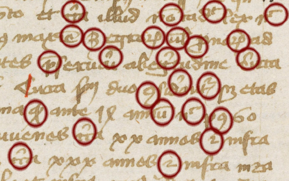
The third example (Ms San 827) makes slightly more frequent use of abbreviations, but they are still very common ones and easily readable.
In sample #3, note the lines and caps over the letters to indicate missing letters, the curled tail on the “p” to stand for “pro”, the symbol that resembles a “2” which sometimes means “et” (and) but often means -ur or tur.
On the fourth and fifth lines, you will see the “9” symbol at the beginning of one word and the end of another. At the beginning, in this example, it stands for “con-“. At the end it is usually “-us” or “-um”. This is one of the most common glyph-shapes in the VMS and, as in Latin, it is usually at the end, but sometimes at the beginning:
 Example #4
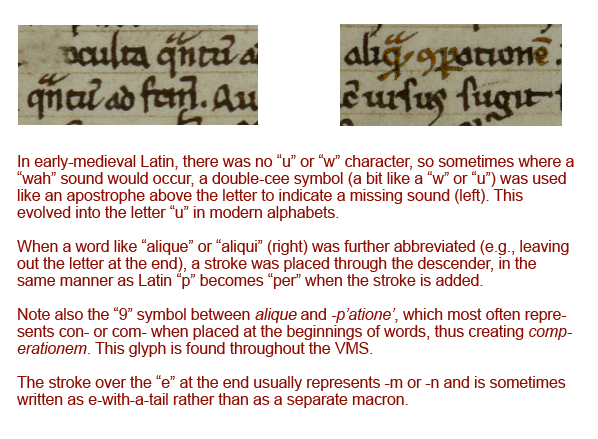
The above examples are all from the 15th century, but conventions were similar in the 11th to 14th centuries, leading up to the creation of the VMS. The following earlier text (OBV SG 21), uses all of the same concepts and most of the same conventions:

Thus, with four brief samples, and the numerals that evolved from Greek that were mentioned in a previous blog, we can account for the majority of glyphs in the VMS.
The problem is not in relating the VMS glyph-shapes to Latin letters, ligatures, and abbreviations—the similarities are numerous and obvious—the difficulty is in determining their meaning because VMS tokens do not, in general, behave like Latin or the majority of natural languages in terms of the variability of the words or the characters within the words. Here are some important differences:
- In Latin scripts used for a variety of languages, abbreviation symbols can be associated with many different letters. In the VMS we see caps only on EVA-sh and occasionally EVA-q.
- In Latin, the swept-back tail is found on almost any character where letters have been omitted near the end of a word. In the VMS, it is specific to EVA-e, EVA-r, and the last glyph in “daiin”.
- The “9” symbol is shaped and positioned the same in both Latin and Voynichese, but in Voynichese it’s much too frequent to mean the same thing as it means in Latin (or other common languages).
So the shapes are similar to Latin, but the extreme repetition and positional rigidity are not.
After the 15th century, abbreviations and ligatures fell out of use, as Latin scholarship was replaced by local languages, and the newly invented printing press and typewriter introduced mechanical limitations that made it difficult to mimic these scribal traditions.
Ties with the Eastern World
So what does all this have to do with the Indian scripts mentioned at the beginning?
Dozens of languages have been mentioned in connection with the VMS, but claiming it’s a specific language is easy. I saw one person claim five different languages in the same week, and another claimed three more in the course of three months. Proving that it’s a specific language is the real challenge, and so far no one has provided a convincing translation of even one paragraph.
I think I know why so many different languages have been proposed for the VMS. It’s partly because expanding or anagraming text expressly turns it into readable text or, if Voynichese is based on natural language, it may be partly because words related to disciplines like science are often loanwords and thus similar in many languages. But this bewildering array of suggested languages might not be entirely imaginary… certain languages did, in fact, have more in common with one another in the Middle Ages than they do now.
As an example, Indo-Iranian writing styles are more similar to medieval Latin than east-Asian character-based scripts like Chinese—both come from proto-Indo-European roots.
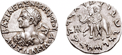
The Indo-Greeks and others who subsequently ruled Pakistan kept some of their native customs and adapted others from local culture. They blended pagan gods with Buddhist beliefs and minted bilingual Indo-Greek coins, as in the following example from c. 100 BCE:

[Image courtesy of the Classical Numismatic Group, Inc.]
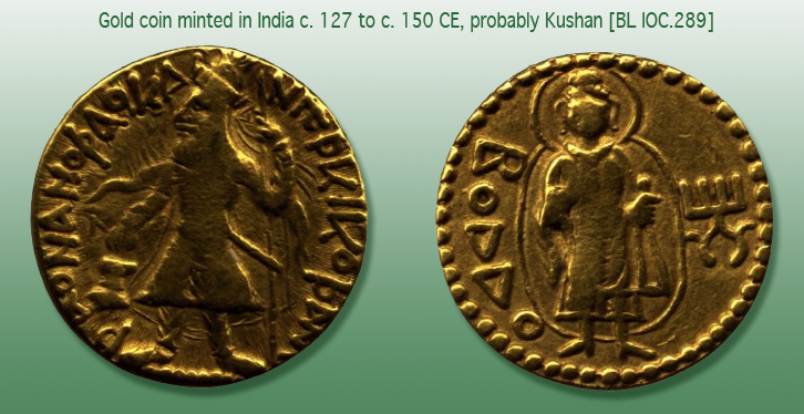
The Kushana, nomadic peoples from central Asia, at one time ruled a large region that included Afghanistan, parts of Pakistan, and northern India, and almost shared a border with the Romans during Trajan’s and Hadrian’s rules (a coin mould featuring Emperor Hadrian was found in excavations of c. 2 CE artifacts in Rairh, near New Delhi). The Kushana were Indo-Europeans who actively traded with both Rome and China.
This gold coin, probably of Kushan origin, is a testament to multicultural interaction. It was minted in India, inscribed with Greek letters with the ruler on one side and “Boddo” (Buddha) on the other, and was unearthed in Afghanistan. Sometimes Zeus was substituted for Buddha on this style of coin.

[Image courtesy of the British Museum.]
Commonalities with Indo-Iranian Scripts
Please note that I have used Gujarati as an example of glyph similarities, even though it is more recent than Nagari, because it does not have the line across the top (thus making it easier for westerners to read). It is very similar to other Indic scripts if you ignore the top-line and look specifically at the shapes underneath. The following observations apply to a group of related Indic scripts descended from Sanskrit, not specifically to Gujarati.
I’ll start with some of the simpler and more familiar shapes, followed by glyphs with ascenders (gallows characters), because the majority of VMS glyphs are Latin. Only a few that are rarely used (or which show up only once) are distinctly eastern and will be described later.
Glyphs with Tails
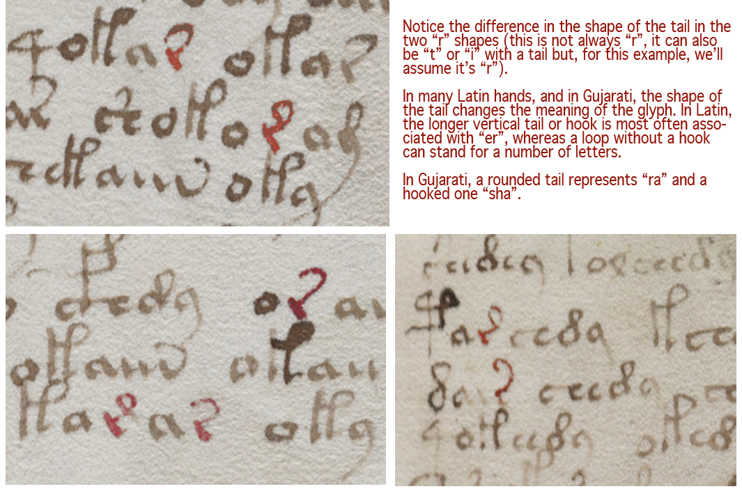
Voynichese has a number of glyphs with tails, a ubiquitous convention in medieval Latin. Adding a tail to a glyph wasn’t just an embellishment, it was a way to indicate missing letters. In the VMS, the r, c, and minim shapes at the end of the word “daiin” all have distinctive tails. Certain Indic glyphs also have tails, and the shape or length of the tail can change the sound or meaning of a letter.
Here are some interesting patterns in Latin and certain Indic scripts, that may have some relevance to the VMS:
- EVA-r. In Latin, when a tail is added to “r”, it can mean “rus, but it often means “re”, “er”, “ra”, “ar”, “ir”, or “ri”. In other words, a vowel is inherently indicated by a tail added to a consonant, as in some of the abugida languages. Similarly, in the later 13th- and 14th-century Nagari scripts, and in Gujarati, you will see an “r” shape with a curved tail to represent “r” or “ar” or “ra”. There are several places in the VMS where two forms of tails are apparent in the same block of text. In Voynichese, Latin, and Gujarati, the curved tail is more frequent than the extended-loop tail. If Voynichese is anything like Latin, Gujarati, or some of the Malaysian scripts, and not just a smokescreen to make the text look like Latin, then extending the tail and changing its shape changes the meaning of the glyph:

- EVA-s. In many older Latin scripts, the “t” was written like a “c”, rather than with a straight stem. It can be a struggle to tell them apart. Adding a tail to this c-like tee stood for “te” or “ta” or most combinations of “t” plus a vowel (it can also mean “ter” or “tus”). In Gujarati, the symbol for “ta” is a c with a tail (note that both “r” and “c” shapes with tails are found in the VMS) and some are ambiguous, with a slight hook on the foot, perhaps denoting a third character. In Greek, a c-shape was used as an abbreviation for “kai” (and). Once again, if you look at it from a Latin point of view, the c-shape can also be “e” (many early medieval e-shapes didn’t have a crossbar or hook), and adding the tail turns it into “eius” or “et” for “and” (in fact, if you extend the tail a little more, it becomes an ampersand). Thus, we have a glyph with many meanings. C-tail can be the abbreviation for te, ta, or ter, or for et, eius, or er. In the VMS, as in Latin, this tailed shape, which sometimes resembles c-tail, sometimes e-tail, and sometimes t-tail, is found both individually and within other words.

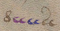
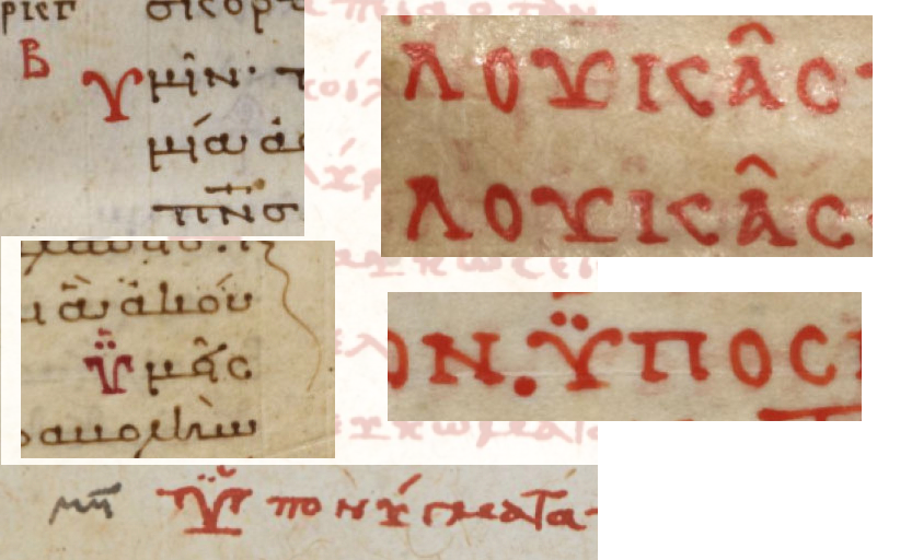
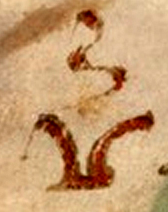
- EVA-d. If you look at variations of the thorn character, which is usually associated with northern European scripts, you’ll see some of them are written like a curvy “d” or a Greek sigma with a small bar through the ascender. It may be coincidental, but the Gujarati shape for “tha” is a curvy “d” shape. There’s no line through the stem, but many Latin scribes wrote it that way, and there is a strong association between “d” and “th” sounds in various Indo-European languages. If you round the top loop a little farther, as some scribes did with Latin “d”, thorn, and Greek sigma, it resembles a figure-8. This is why many researchers read the figure-8 on folio 116v as an “s” or “d”, but perhaps “th” should also be considered.
There are analogs to VMS shapes in both medieval Latin and some of the Indic scripts. The “a” and “o” shapes need no explanation—they are distinctly Latin, and “o” is common to many languages.
 The simple “c” shape doesn’t tell us much either, because it is found in most alphabets, but two c-shapes tightly joined were used in early-medieval Latin to express “a”, “t”, and sometimes “u”. The double-c is also found in the VMS (right)—a distinction that might be meaningful but is not recognized in most VMS transcripts. In fact, in the Takahashi transcript, which is probably the most widely used, the extra c-shapes are sometimes omitted.
But tails are meaningful in both Latin and Indic languages, and ligatures common to both. Sometimes the tail changes the letter, sometimes it extends a sound, and sometimes it specifies which vowel is used. Note that Nagari and Gujarati are syllabic languages which might not seem to have much in common with Latin, but medieval Latin script has its share of implied vowels.
A sidenote on abugida scripts… Gujarati is a syllabic language, but not entirely an abugida script (neither is Hebrew). Both Hebrew and Gujarati include a shape for alpha, so it is explicit rather than implied (it’s possible that in ancient languages alpha was more of a glottal stop than a vowel), but most of the time the most common vowel (alpha) is rolled in with the consonant, as it is in a number of Asian and African languages.
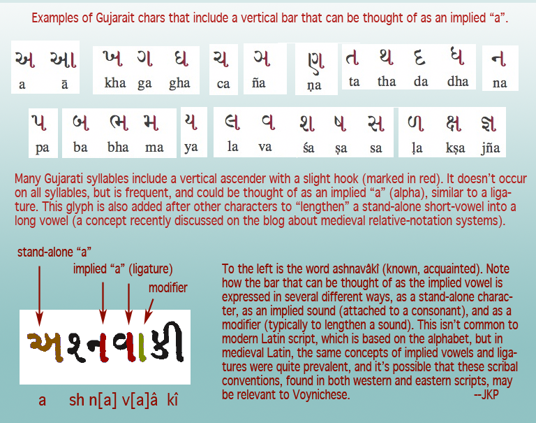
In Gujarati, several of the syllables are written as though they were ligatures, with a vertical stem on the right (as in sa, pa, na, and numerous other glyphs). This is technically part of the syllable but can also be thought of as the implied vowel. This vertical line has an additional function—it can be added to the preceding vowel or syllable to lengthen it into a long vowel, as in the following example:

Note how the vertical bar changes a short-a to long-a, a symbolic concept that was mentioned in the previous relative notation blog. A similar convention exists in Modi, another Indic script that is first recorded in the late 14th century.
Some of the commonalities between Latin and Indic scripts disappeared when Latin abbreviations were dropped and Latin was reduced to a simple alphabet.
Summary
I have much more information on this subject and was going to try to cover the Voynchese ascenders and some of the rare characters in the same blog because they also have their roots in scribal conventions, but this is becoming too long, so I will continue with the less common characters in a future installment.
… to be continued…
J.K. Petersen
© Copyright 2017 J.K. Petersen, All Rights Reserved
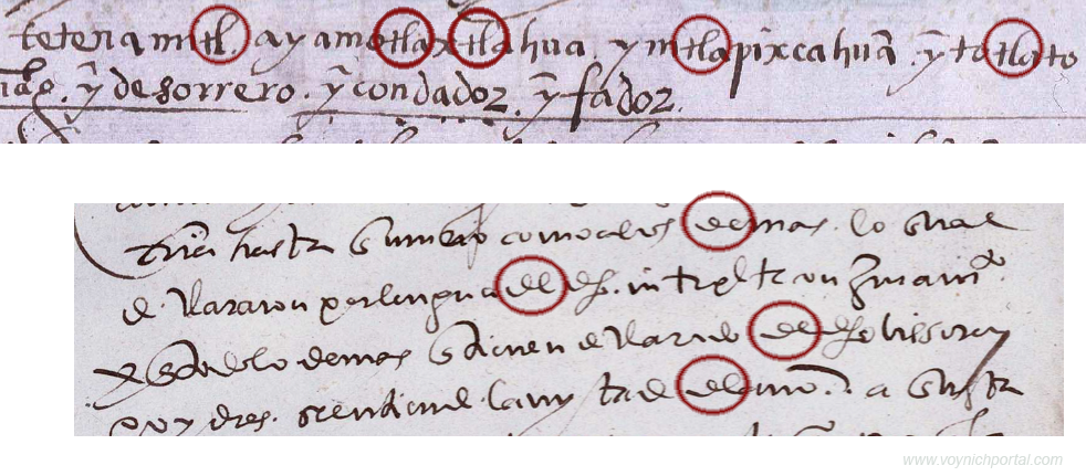
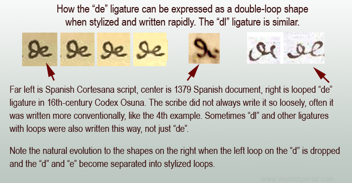 The examples on the right illustrate how loose a ligature could be and how combinations like “de” or “dl” or “Il” or “Ie” need to be seen in context to be distinguished from one another, especially if it is an open-loop “d” followed by a very round “e” or “l”.
