order disulfiram online canada Has Someone Messed with the Voynich Manuscript?
 This question has often been asked, along with assertions that the entire document is a hoax. It took scientific analysis to establish that the text was probably added in the early 15th century rather than centuries later by Wilfrid Voynich, the book dealer who acquired the document from a Jesuit cache.
Even if all the text were written in the early 1400s, that still doesn’t guarantee it was all done by one hand. It has been suggested a number of times that several people contributed to the VMS.
There are at least three styles of handwriting: 1) the main text (one hand or possibly more), 2) the marginalia and last page, and 3) the labels under the zodiac symbols.
Analysis suggests there may be two underlying “languages” or patterns to the text, as well. But what about the handwriting itself?
That’s a long subject and probably should be released as a paper rather than a blog article, but there’s an interesting example on one of the plant pages that certainly looks like someone has altered the original text by adding extra characters.
The Voynich “Style”
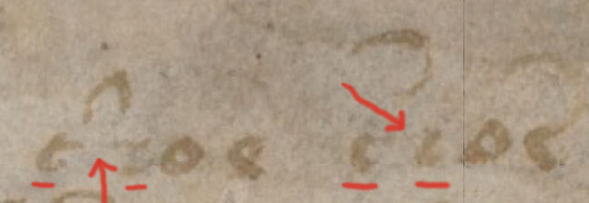
Before illustrating the unusual text, it’s necessary to look at how letters are normally formed in the VMS. I’ll use a specific character as an example, taken from the same page as the anomalous characters.
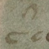
 There is a glyph that somewhat resembles a leaning “r” with a backwards-looping tail that occurs frequently in the VMS. The tail varies but the stem is drawn in a reasonably consistent way. It leans back at approximately the same angle and is somewhat blunt on the ends, with minimal or no uptick at the bottom of the stroke to join it to the next letter as is found on the glyph that resembles an “a”. You can tell from the thick and thin strokes that the VM author holds the quill to a slightly left-leaning angle.
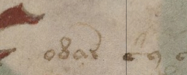
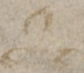
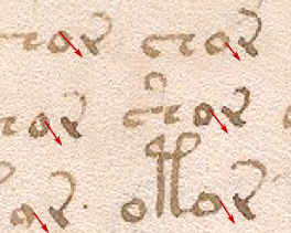
Now, take a look at the last two lines of text on Folio 10r. Unusual characters have been added that do not match the shape of normal VM glyphs.
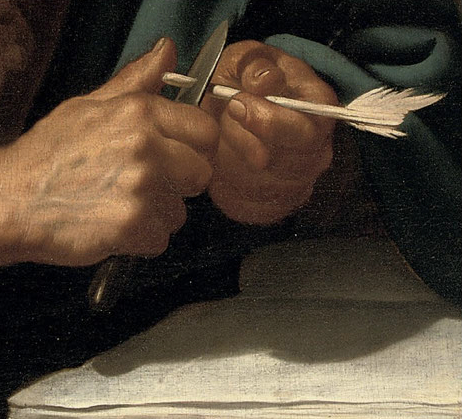
Jan van Bijlert Saint Luke the Evangelist Detail, Christie’s Amsterdam 13 April 2010
Note: Some of these details may not be apparent to the viewer if you have never learned calligraphy (or spent a number of hours carefully studying the shapes of the VMS characters). Subtleties such as the angle of the pen are hard to discern unless you have training and you might want to consult the original high-resolution scans so you can look at these details more closely than they are illustrated here.
The Added Characters
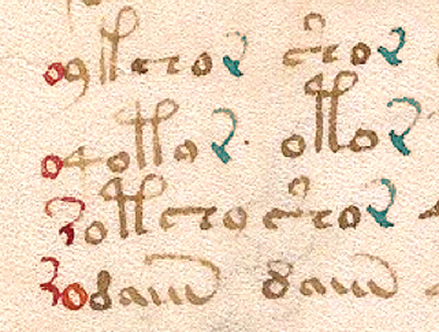 On the last four lines of Folio 10r are several anomalous characters. I’ve highlighted the main text r-with-tail in blue and the anomalous characters in red (I hesitated about including the “o” on the second-last line as it’s probably a regular VM character).
These characters differ from the surrounding text in a number of ways. It’s also possible that the figure-8 glyph on the bottom line has been added (or overwritten) by another hand but it’s hard to tell and it is contextually consistent with the main text, so I’m assuming it’s part of the regular text.
Note that in the unusual characters, the pen is held at a slightly different angle. On the high-res scans, you can particularly see this in the bottom “o” character which leans a tiny bit more to the left and correctly applies the thick and thin characteristics of a calligraphic “o” that is not usually seen in regular VM “o” shapes. Notice also that the average size of the added “o” glyphs (particularly the bottom one) is slightly larger than the average size of the “o” in the main text.
It’s not just the shape and size of the 1st and 3rd “o” that are different, note that the added characters are tightly spaced (four of them touch adjacent characters), which is unusual for VMS script. Also note that the positions of the first and second “o” are inconsistent with the usual VM text formula for glyph placement. The “4” character is rarely preceded by other characters, it’s usually preceded by a space, and it’s very unusual for it to be preceded by an “o”. It is typically followed by an “o”.
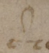
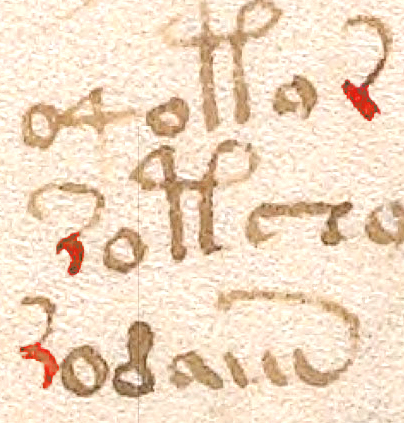 The leaning “r” glyph differs even more from the main text than the “o”—it’s barely recognizable as a VMS character. It doesn’t have the typically straight stem, it’s not as blunt at the beginning or end of the stroke, and the stem curves backwards in a very nonVMS way.
It doesn’t connect the tail in the same way, either. The VMS “r” is created in two strokes like the c/e with a tail—first the stem, then the tail, with the tail attached slightly below the top of the stem. The anomalous “r” appears to be drawn in a continuous stroke, from bottom to top left and adding the tail without lifting the pen, so that the tail attaches to the top of the stem rather than partway down. Even if it were drawn in two strokes, the attachment is at the very top and there is almost a hook on the top-left that doesn’t occur in the regular VMS “r”.
Why Add Extra Characters?
It’s odd that only a few characters would be added in a very specific place on this page.
Was it to obscure the underlying meaning or to correct it? Was it to clean up the margin?
It doesn’t appear to be a correction to the sound or meaning of the text, because the first “o” appears to be incorrectly placed by someone who hasn’t noticed the glyph-combination patterns that dominate the rest of the manuscript. Either the scribe knew something we didn’t know or understood it even less than contemporary researchers.
It also doesn’t seem likely that text was added to clean up the left margin because the margin on this page was fairly wavy anyway, adding a few characters at the bottom (especially if the second “o” was part of the original text) doesn’t significantly alter the overall impression of the page.
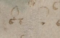
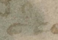
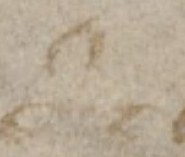
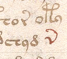 You’re probably wondering if this alien hand appears elsewhere in the document. I think it does, although the example on the left from Folio 14v is only one character, so it’s hard to assess. It’s definitely not a standard VMS character.
Look at the left curve of the glyph marked in red. It’s the same curve as the fractured “r” on the previous folio and the VMS rarely has tails swooping from the bottom of a letter (they occur, but not often).
Summary
 Why would someone add letters that don’t contribute to formatting or the formulaic consistency of the text, with ink and a quill that are similar enough to the surrounding text that the anomaly doesn’t jump out at you right away?
Were they practicing? Did they pick an inconspicuous spot on an inner page to see if they could match the text, with the possible intention of adding more elsewhere in the document? If so, I would call it a failed experiment unless the scribe later figured out how to mimic the VMS characters more closely.
Was someone just playing around? Could it have been a younger person who wanted to be part of the big project and didn’t understand that there was a pattern to the text? Could it be the same person who painted some of the drawings in a more sloppy manner than others?
I don’t have an explanation for the extra characters but I think it’s important to note that the ink very closely matches the rest of the text, even if the letter shapes do not. It makes you wonder if it was done with the same quill and ink pot, even if by a different person.
J.K. Petersen
© Copyright 2016 J.K. Petersen, All Rights Reserved