Category Archives: The Voynich Text

Investigations of the main text of the Voynich Manuscript.

The Origin of the Voynich Glyphs

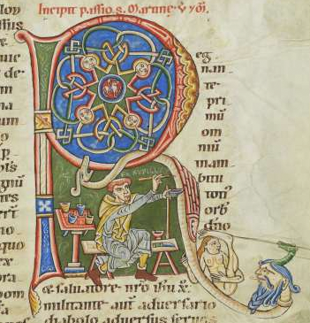
The Search for the VMS Glyphs

Researchers have speculated for decades about the origins of those funny letters in the Voynich Manuscript.

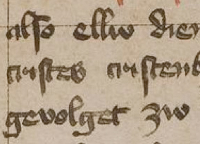
When I first encountered the VMS, I recognized most of the shapes from medieval scribal traditions, but I couldn’t read the text, so I combed the world’s archives for examples of other alphabets that might have inspired the glyphs, hoping it might yield clues to an underlying language. Along the way, I discovered certain shapes are found in many scripts—loops, circles, snake-shapes, or sticks with a loop or two, seem to naturally occur in diverse regions. Shapes that look like p, s, g, and ell are particularly common.

In the end, after years of pouring over hundreds of languages and dozens of alphabets, I came back to where I started. The Latin alphabet and scribal abbreviation conventions can explain almost all the VMS characters. I already knew this, but sometimes you have to look around to appreciate what you already have.

I’ve mentioned the Latin origins many times, but I’ve noticed there is still a certain skepticism, and I’ve never posted examples of the entire alphabet due to the enormity of the task (I have thousands of examples and severe time constraints). So, I’ve decided to post it in installments rather than trying to fit it all into one very long paper that might never get finished.

Organizing the Glyphs

Most people are not familiar with Latin paleography, so I will try to include as many original samples as possible from medieval manuscripts.

Most of the VMS glyphs fall into four categories:

  • Latin letters,
  • Latin numbers,
  • Latin ligatures (two or more shapes combined for ease of writing), and
  • Latin abbreviations.

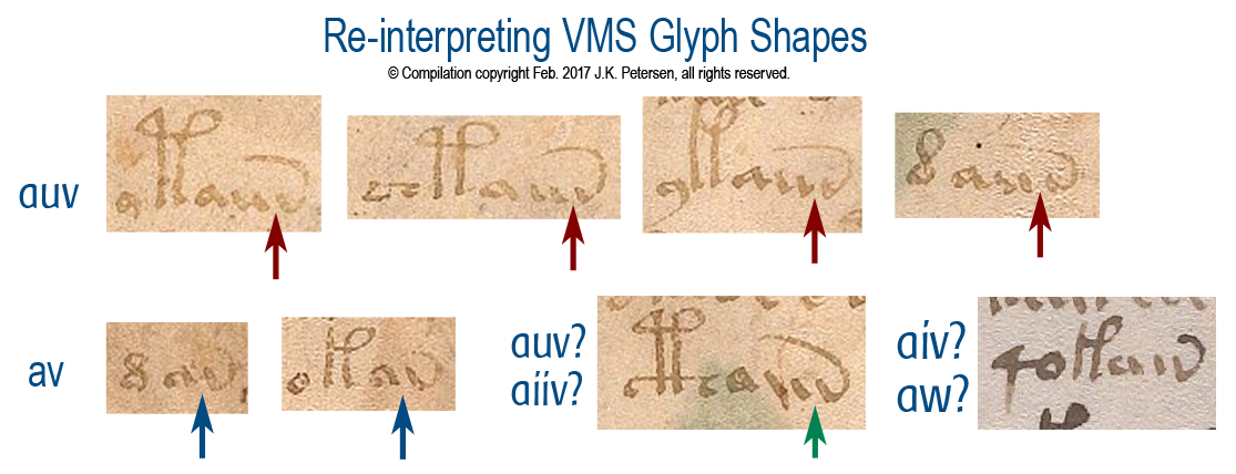
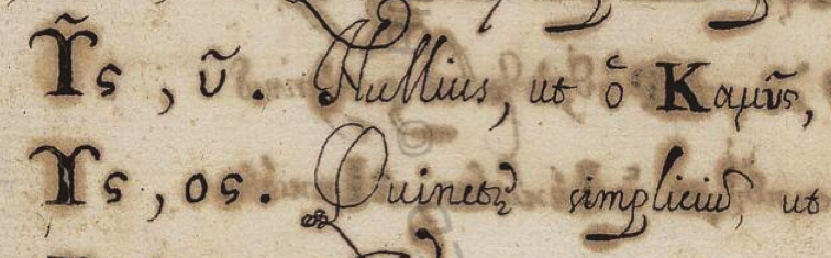
Some glyphs can be classified in more than one category. For example, in medieval script, the Greek sigma is sometimes used as a terminal-s in Latin scripts and is sometimes drawn with the last stroke looped so that it resembles a figure-8. This shape is hard to categorize unless one knows by context whether it is a letter or the number 8. Since the VMS lacks context (the text has not been decoded), I have assigned some glyphs to more than one category (e.g., letter and number, or letter and abbreviation). More on this later when I sum up the individual characters.

A number of Latin glyph-shapes are borrowed from Greek. Sometimes they mean the same thing and sometimes the shape has been adapted for other uses, as will be illustrated in today’s blog.
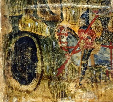
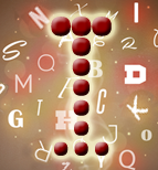
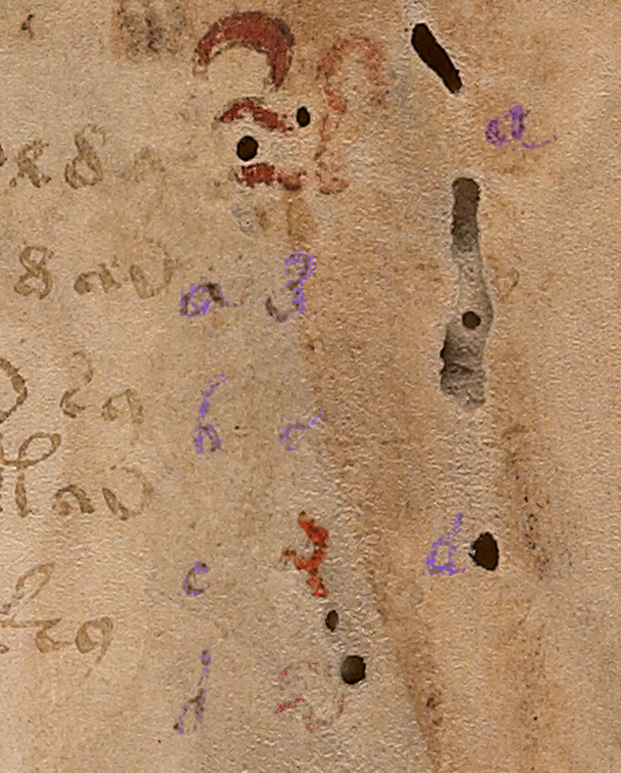
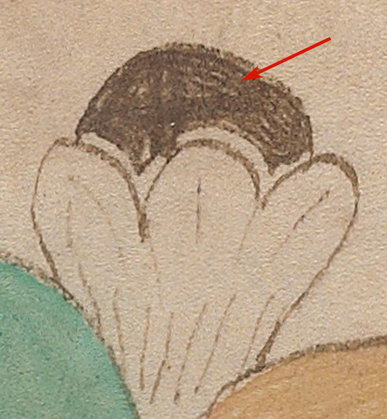
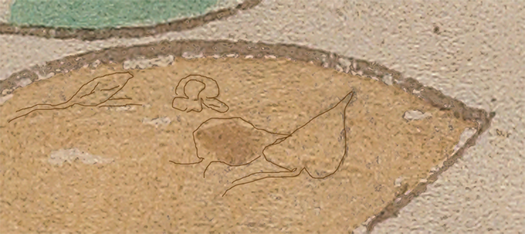
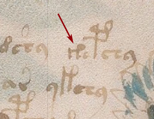
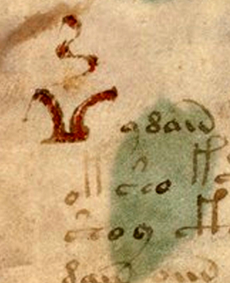
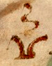
The Big Red Weirdo

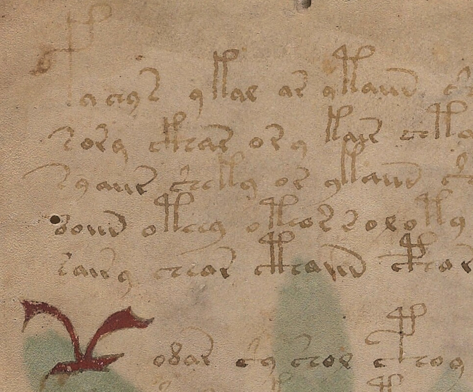
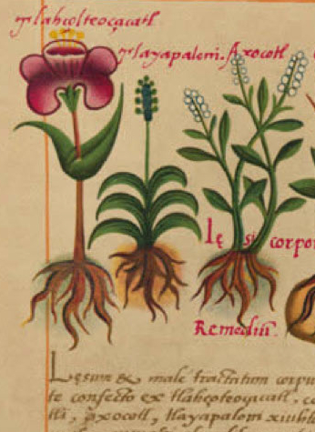
I thought I’d start with one of the iconic shapes in folio 1r, sometimes known as the “bird glyph” or the “seagull” or simply as a “big red weirdo”. This shape is used only once.

The big red weirdo somewhat resembles a bird with a vertical squiggle between the “wings”. I usually call it the seagull glyph.

We learn in primary school that letters have more than one version, and are taught to write both upper- and lowercase letters. In most ancient scripts, there was no distinction between upper- and lowercase, but sometimes the beginning of a paragraph or line would be adjusted for aesthetic reasons or to call attention to something of importance by enlarging the letter, using different colors, or by adding lines, curves, or other embellishments.

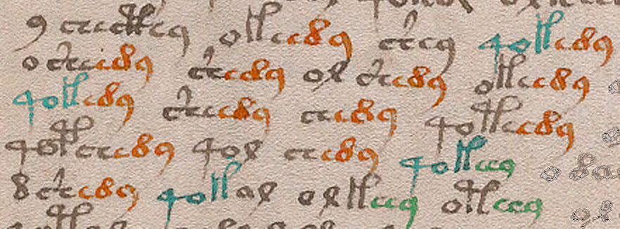
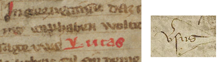
The seagull glyph without the squiggle can be found in old languages that use the Greek character set (a variation of it can be found in Arabic, but much less often). It is not always drawn with the line underneath, but the line is used in certain writing styles or sometimes to create emphasis, as in these examples. Note the double dots above some of the letters. A Latin squiggle doesn’t have the same meaning as Greek dots, but the dots show a precedence for the position of a squiggle in later Latin documents:

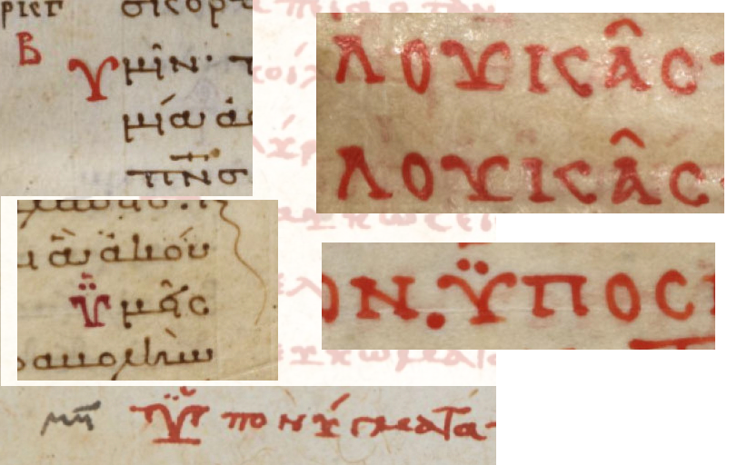
These examples are from leftmost columns of new paragraphs (left) and from header text written for emphasis (right). Just as capital letters sometimes have extra strokes to make them stand out from lower-case letters, the Greek letters, such as ypsilon, sometimes had an extra line on the base to give them emphasis. In Coptic Greek this shape (without the dots) represents the letter Ue and, depending on the handwriting style, sometimes the letter Djandjia.

In Latin, the seagull shape usually represents a V, but sometimes it retains one of the Greek meanings. Note that dots have a variety of meanings in Greek. In some cases they are associated with the character (pronunciation or abbreviation), in others, dots can mean that the copied text diverges from the original, a convention that is also used in Latin.

The Seagull Tradition

Latin was a required language for medieval scholars and many also studied Greek, so it’s not uncommon for Greek conventions to show up in Latin texts. Sometimes they mean the same thing in Greek and Latin, and sometimes a shape is preserved but used for different purposes. In some cases, two conventions are combined, as will be seen when I discuss the squiggle.

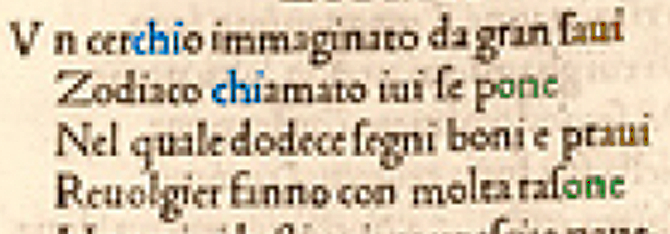
You might have noticed that the seagull shape, when written as it is above, resembles the symbol for Aries. The Aries symbol is ubiquitous in Latin texts on astrology and astronomy, but the Greek convention is sometimes also used to mark paragraphs in texts not related to astronomy. You might notice that the “seagull” shape also somewhat resembles an open book, when the line on the bottom is extended. This, in combination with the way it is used in some Greek texts, might have inspired its use as a pilcrow in certain Spanish documents.

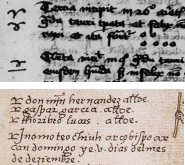
In the above examples, the shape that resembles the Greek letter is used to mark passages in a 15th-century Latin manuscript on astrology, and a 16th century New World document by Spanish missionaries. The shape underwent some minor changes, but its use as emphasis or a topic marker was retained.

This manuscript combines Greek and Latin, and the character can be seen both with and without the squiggle. Note that symbols above letters in Greek do not have the same meanings in Latin. Greek pronunciation symbols, for example, were not carried into the Latin writing traditions but the use of symbols as abbreviations was prevalent in both traditions.

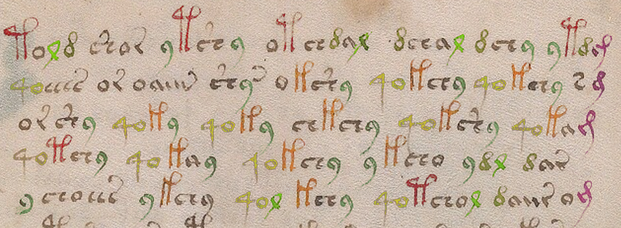
In Latin manuscripts, a seagull shape usually represented the letter V or the letter V plus additional letters. If a squiggle was added, it was almost always an abbreviation. The example on the left is from the late 13th or early 14th century. The one on the right, from the 15th or 16th century.

What About the Squiggle?

The VMS character is embellished with a flame-like squiggle that sits vertically between the “wings”. This too is a Latin convention, a very common one. It can be drawn as a straight line, a slightly curved line, or a full s-curve, and it can be horizontal or vertical.

In old Greek, marks above letters are a combination of pronunciation symbols and abbreviations. In Latin, pronunciation symbols are rarely used and the symbols usually represent a number of abbreviations. You can think of them as specialized apostrophes, depending on their shape and position.

In Latin, the squiggle was particularly prevalent in the 13th and 14th centuries and it was usually drawn in the vertical direction to distinguish it from the shape that represents “n” or “m” which is straighter and almost always horizontal, but it didn’t matter whether an s-curve was horizontal or vertical, the meaning was usually the same—it stood for er, re, or ir or these letters combined with additional letters. In the illustration above, the word on the right is “versus”, with the squiggle standing in for “-er-“.

Sometimes if a squiggle had an extra wiggle, it stood for a degree of something or a series, as the “th” that is added to ordinal numbers. In this case, it was usually horizontal, but not always.

I don’t know what the seagull glyph signifies in Voynichese, but whether one considers it to be textual or an embellishment, the shape is not unusual, especially when it appears like this, at the beginning of a block of text.

Summary

It seems abrupt to end a blog on just one character, but it will take at least a dozen blogs to describe the whole alphabet and a dozen more to describe the relationships between them and their positions in the text (and that’s without going into the actual structure or meaning of the text). As will be seen from other characters, including the more exotic ones, whoever designed the glyphs was familiar with classical scripts and used Latin as the primary source of inspiration (or Latin conventions derived from Greek). This is indicated not only by shape, but by the design of the alphabet as a whole, and by position.

I’ll post examples of the other characters, including a discussion of their behavior, in future blogs.

J.K. Petersen

© Copyright 2017 J.K. Petersen, All Rights Reserved

Voynich Glyph Structure

This started as a comment on Nick Pelling’s Cypher Mysteries blog, where he posted some ideas on EVA-s. Unfortunately, my comment became far too long to put on someone else’s blog, and it was in need of pictures to support the text, so I have changed the focus and posted on a related topic instead.

Much attention has been given to daiin (and its relatives). This is a surprisingly frequent combination of glyphs in the VMS that has generated substantial discussion and statistical analysis. Whole papers have been written on what it might represent.

I have a fairly long list of possible interpretations, some of which I’ve posted (and some that I admit I’ve kept to myself), but in this blog I’d like to discuss something more fundamental and focus attention on the shapes that underly it.

Why I Rejected Existing Transcripts

One of the reasons I created my own transcript of the VMS text is because I interpret the shapes differently from the way they have been historically recorded. As I’ve mentioned in previous blogs, I don’t use the EVA alphabet either (it would complicate the process of searching for patterns)—I developed my own.

During this process, I chose -auv instead of -ain to represent the end of daiin. Here are some examples from folio 1r but note that even this has a caveat (there is one additional possibility that I will discuss below). Note the separation between the first two strokes and the “v” shape is more distinct than the first two strokes that resemble a “u”. You can click on the image to better see the gaps and connections:

Note how the gap between the “u” and the “v” shape is more distinct than that between the two stems of the “u”. Note also in the first two examples in the second row, that the “v” shape sometimes follows the “a” shape directly, and is separated in a way similar to “v” when it follows “u”, suggesting that the “u” is a glyph in its own right and is not necessarily an “n” shape as in historic transcriptions.

So, rather than transcribing daiin, I have been recording this pattern visually as dauv/dauw, etc. You might say, “So, what? It’s just a different shape for the same thing,” but it’s not quite as simple as that. Since the bottom right example suggests that even the “u” might sometimes be a single glyph and might at other times be two glyphs (a double-i shape), it opens up possibilities such as aiv/aiw/aiiw/aiuv/aiuw/aiiv, etc., which means there may be more variation in the daiin family than is apparent when using historic transcripts. The frequency counts are potentially all wrong.

You might still argue that the daiin shapes are positionally similar and thus less likely to vary as much as I’m suggesting (or that they might mean the same thing even if they do). That might be true if the spaces are literal, but if they are not, then the potential variations could be important to the interpretation of the text.

And Then There’s the Tail…

Yes, the tail—the upswooped shape on the end of the “v”…

These days, most swooping tails are embellishments added for aesthetic reasons. In early manuscripts, however, the upswooped tail was a convention to show that letters had been dropped from the end of a word.

We still occasionally use this form of abbreviation. For example, the words “with” or “without” are sometimes written with a line over the “w” or a slash between the “w” and “out” (w/out). This is a holdover from scribal conventions that are more than a thousand years old. Similarly, in the middle ages, in Latin, English, French, German, Italian, Czech, Spanish, and other languages, this back-sweeping tail stood for whatever ending was appropriate for that language and could represent one or several missing letters.

In the VMS, it is not known whether glyphs with tails, such as “v”, EVA-r, or EVA-s, represent individual units, multiple units, or whether the motivation for the tails is to make the text look like Latin.

Faster Your Seatbelt, EVA, It’s Going to Get Bumpier

Now hold that thought about tails, because this is where it gets gnarly (as is so typical of the Voynich manuscript)…

In Latin and other European languages, the “v” shape could be a “u” or “v” with a tail or, it could be an “i” with a tail. In other words, it might be “auv-something” or “aui-something” or, in the more ambiguous example on the lower right, it might even be “aiii-something”. If this were conventional text, the reader would know by context how to expand the swoop, or whether it were simply an embellishment.

Which brings us to a further wrinkle… if medieval conventions allow that the VMS “v” with a tail could alternately be an “i” with a tail, there is another aspect of the text that needs to be addressed, one I haven’t seen anyone mention yet…

If the glyph at the end of daiin is an “i” with a tail then EVA-r needs to be re-examined, as well. In terms of glyph design based on some internal system known to the scribes, it’s possible that the “v” is an “i” with a bottom-tail and EVA-r is an “i” with a top-tail. In fact, there are times when EVA-sh is written with a tail attached to the top of the crossbar (similar to EVA-s but without the right-hand part of the character) and sometimes to the bottom. This is more apparent in some hands than others.

Superficially, almost all the VMS glyph shapes can be traced to Latin and Greek (I’m still trying to finish my blog on this, but I’m nose-deep in examples that have to be sorted and inserted), but even if they are, it’s possible the relationships between the shapes are based on certain conventions unique to the VMS.

Some closing thoughts…

It’s true that EVA-d occurs very frequently before ai, but we have to keep in mind that more than a dozen other glyphs can directly precede ai, as well, including EVA-t and EVA-k (EVA-k more than twice as often as EVA-t).

It’s also important to consider one-to-many relationships—EVA-d is sometimes written like a c combined with Latin -is abbreviation, rather than a rounded figure-8. If it’s a ligature, it may stand for two units or something else.

I have more examples of glyphs that may not fit the assumptions made in historic transcripts, but I’ll save them for future blogs.

J.K. Petersen

© Copyright 2017 J.K. Petersen, All Rights Reserved

Scribal Relationships

Today’s blog isn’t directly related to the Voynich manuscript, but may be of interest to paleographers and medieval bibliographers in general.

Connecting the Scribes

While scanning through Vatican Ross.708, I noticed the script was similar to another manuscript I had previously seen. The writing is Gothic cursive which, in itself, is not unusual. This style of script was common in the 15th century throughout northern Europe, Bohemia, Lombardy, parts of northeastern Spain and, to some extent, the area around Naples and Salerno.

In fact, it never ceases to amaze me that a specific style of writing could be so widely distributed in the days before television and public schools began to standardize culture and teachings, especially when travel was so treacherous—turbulent seas and precipitous mountain passes were significant obstacles. If you were fortunate enough to have a horse or mule, there were places you had to dismount because the trail was too narrow for both horse and rider or, if the path wound along mountain cliffs, there was a real possibility the animal would slip and plummet, and it was better not to be astride when that happened.

This book has been sewn into a swaddling girdle to protect the manuscript on journeys. The knot could be used to tie it to belt or saddle. [Image courtesy of the Yale Beinecke Library.]

Considering the distances, and the difficulties of finding food and shelter on journeys of hundreds or thousands of miles, it’s incredible that writing styles could be so similar… and yet they were. I don’t know if anyone has given an adequate explanation for this phenomenon, but it’s evident that scribes moved around and that manuscripts were carried for great distances. Book boxes, satchels, and girdles (like the one on the right) were designed to protect books while en route.

The Romans brought coins and a new culture to England in the early years and, by the eleventh century, partly due to the Crusades, manuscripts from major trading posts in the Mediterranean were showing up fairly regularly in England, a round trip of about seven thousand miles.

Handwriting as a Research Tool

A rare self-portrait of Rufilis, the rubricator and his paints, from Bodmer Ms 127.

Handwriting is an important tool for identification. Along with other clues, it can help date a manuscript, and sometimes even pinpoint a specific origin or author. For the most part, the names of medieval scribes have been lost, although there was a greater tendency to name and date them in the middle east than in Europe. This is partly because many European manuscripts were created in monasteries and humility was considered a virtue (although some monks couldn’t resist the urge to encode their names within the text or their images within the illuminations). In other cases, even if the name was known, the person who penned it may have been lost to the annals of history due to an untimely death from war, disease, or famine. In times of war, sometimes entire villages were burned, including the records.

I mentioned in a previous blog on VMS folio 1r, that the handwriting of John Dee and Isabella d’Este show surprising similarities, considering one was educated near London and the other in Ferrara several decades earlier. You can see samples here. This is strong evidence that handwriting can be similar even if it originates in different areas at different times. It doesn’t happen often, however. After searching thousands of manuscripts, I have collected a very large number of samples, and rarely see temporally separated hands that are this similar. Because there are general patterns of change over time, handwriting can help us learn about a manuscript even if we are not completely sure of its origin.

Looking for Commonalities

To determine a common origin (or a common scribe who worked at different locations), one has to study the ink and pigments, the writing medium (parchment or paper), the angle of the writing, the angle of the pen, the slant, and the spacing between letters and lines. Even details, such as the way the pages are trimmed or bound, the worm holes, the stains, and the stitching, can provide clues.

If two different manuscripts show significant similarity, but end up in different repositories, the handwriting can help determine if they were written by the same scribe or the same scribal tradition. The origins of many manuscripts are not known and the community at large might be able to help with some of the unanswered questions now that e-facsimiles are becoming available.

The Doppelganger to Vatican Ross.708

The manuscript whose handwriting closely resembles Vatican Ross.708 (recently uploaded from microfilm to DigiVatLib in Italy), is Codex Sang. 726, which is on the Stiftsbibliothek site in St. Gallen, Switzerland. The distance between Rome and Switzerland on modern roads is almost 600 miles—a three-month journey in medieval times, much of it through steep mountain passes.

The handwriting is not a perfect match, but many of the letter forms, and even whole words, are almost indistinguishable, and the slant and line spacing are a good match as well (something that often differs dramatically even if the letter-forms are similar).

Here are some samples (click to see it full-sized). The brown ink is Codex Sang. 726 (“Scribe 1”), the black photostat is Ross.708.

Gothic cursive text samples from Codex sang. 726 and Ross.708

Samples for comparison between Codex Sang. 726 in Switzerland, and Vatican Ross.708 in Rome.

The main differences are

  • the “g” (Scribe 1 characteristically loops the tail up, Scribe 2 points it down to the left),
  • the “u” (Scribe 1 writes it with an undercurl, Scribe 2 with an overloop),
  • the “w” (Scribe 1 writes it like two v-shapes joined, while Scribe 2 tightens up the first “v”), and
  • a tendency on the part of Scribe 2 to sometimes not completely close the loop on the “e” or connect the stem on the “r”.

After collecting hundreds of samples of Gothic cursive, I’ve noticed it’s rare to find two scripts that are this similar unless they are by the same hand. Maybe they learned from the same tutor. Maybe they were blood relatives (sons often learned to write from their fathers).

Both manuscripts are in Middle German. Vatican Ross.708 (digitized from microfilm) is a popular story of travels attributed to John Mandeville and Codex Sang. 726 is about Schwabian history and law, so they are quite different in subject matter.

I can’t tell if Ross.708 was written on paper or parchment, but there are some vague horizontal striations in the muddy section about an inch in from the right on the bottom of page 2 that might suggest paper but it’s not clear enough to be sure. Note the Ex Libris mark on the same page for Bibliotheca Rossiana indicating that it probably originated from the de Rossi collection before it passed into the hands of the Society of Jesuits and the Vatican.

Sang. 726 is believed to be from S.W. Germany. It is listed as a late 14th or early 15th century document but I suspect it’s 15th century, probably closer to mid-15th century. It doesn’t use a single-loop “d” or double-story “a” as was more common in the 14th century, and it was written on paper rather than parchment, which also suggests 15th rather than 14th century (laminated paper was available around the eastern Mediterranean in earlier times, but laid and the later calendered papers, as were typically used in Central Europe, came later). Paper was available in France and Germany in the early-to-mid 14th century, but did not come into common use for manuscripts of this kind until about a century later.

Summary

So does any of this relate to the Voynich manuscript? Well, yes. As I’ve mentioned in previous blogs, most of the writing on the last page of the VMS is Gothic cursive script, which adds another piece of evidence to the estimated 15th-century origin of the manuscript and which relates to some of the research I’ve been doing on the text (to be posted later).

Also, Ross.708 (which was brought to our attention on the Voynich forum by René Zandbergen), includes a number of alphabets that might be of interest to Voynich researchers.

Whether these Mandevillian alphabets are actual or mythical is debatable, since Mandeville’s supposed travels have never been substantiated, and they scarcely resemble real eastern alphabets (note that each Mandeville story is accompanied by different illustrations), but they have some interesting shapes, some of which can be traced to other traditions, and might provide some food for thought.

J.K. Petersen

© Copyright 2017 J.K. Petersen, All Rights Reserved

Did Cicco Simonetta Bomb at Code-Breaking?

First a Few Words…

hose who know me know that I actively avoid looking at previous research about the VMS and have probably only read about 1/50th of what is out there. I hate spoilers and movie trailers—I enjoy the journey and the element of surprise.

If a new puzzle or game comes out, something like a Rubik’s cube, then lock me in a room and I’m happy. If you give me a book on how to solve it, or even the smallest of hints, I’m not happy—I want to solve it myself.

If I have an hour to spend reading someone’s analysis of the VMS or looking at the VMS itself, I usually choose the VMS. I like primary sources. If I have to learn a new language or other skills to understand it, that’s fine. It’s hard to find the time, but the effort is worth it.

Then along comes the Voynich forum and a personal dilemma… I want to support the forum. It’s a good thing because not everyone has blog-space and it provides them a more neutral environment to publish their findings than someone else’s blog. But it’s difficult to actively support a forum without reading it and if I’m reading it, I should be contributing, as well—to give something back. So… the peaceful days in my little cave are over and I’m now part of the “Voynich community”.

It’s not a bad thing, times change and we have to adapt, and I’ve met people I like and respect, but I’m in this weird twilight zone—I’ve only read a small portion of the prior research, which means I have no idea what people are talking about on some of their blogs!

Nīlēshwar Which brings us to the topic of today’s blog…

Enticed by a blogosphere note on the Voynich forum, I visited Nick Pelling’s Cipher Mysteries site today, where he posted a summary of Philip Neal’s translation of Cicco Simonetta’s treatise on decipherment.

I’ve barely heard of Philip Neal and I know nothing about Cicco Simonetta, so I was happy to see a summary, but I had a what-the-heck? reaction as soon as I started reading it. Who was this Cicco Simonetta dude and where did he get this information? I couldn’t believe my eyes and had to look up the full translation to confirm my impression… and then was even more surprised. It wasn’t some cockamamie 20th-century misunderstanding of 15th-century code-breaking, this was written in the 15th century!

The only way I can think of to explain my reaction is to go through the major points. It’s dated 1474, Pavia, as a treatise on extracting ciphered writings.

Note that Simonetta appears to be describing only Italian or Latin as possible languages for the ciphered text, even though there were many ciphered documents in German, Spanish, and French in the general region of northern Italy. At least I hope he’s only talking about Italian when he says “vulgar language”, because the generalizations only make sense in that light.

Simonetta’s Suggestions for 15th-century Code-Breaking

Evaluate the Word Endings

First Simonetta suggests looking at endings to determine if the code is in Latin or “the vulgar tongue” and counsels that five or less variations indicate vulgar tongue.

Right away we know Simonetta must be assuming that there are no null characters, that the spaces are real (not contrived or arbitrary), and that this is a one-to-one substitution code, otherwise it’s impossible, without significant analysis (and a little bit of luck) to determine which parts of the code are word endings.

Is it valid for Simonetta to make this assumption in the 15th century?

Sometimes.

Many codes were, in fact, one-to-one substitution codes, but it’s certainly not a given—it’s an extremely low level of encipherment. If there’s enough text, you can simply stare at it for a while and the word-structure starts to become clear (you begin to see where the vowels and consonants are) and then the general language group becomes easier to recognize and, if you can narrow it down to a language group, after a while words start popping out at you.

This is what happened when I recently read a long manuscript in a dead simple substitution code based on astrological symbols. After a few pages, it was clear that it was probably Latin, and then words like “frigida” and “elleborus niger” started popping out. It’s like playing a game where they show you three out of nine letters, but you get to see a whole paragraph, not just one word, and the brain puts the pieces together. After a couple of dozen pages, you can simply read it.

But not all codes are one-to-one substitution codes. In 15th-century Italy, one-to-many/many-to-one/with-null codes were common. In the 1400s, Tranchedino collected many such codes. Several symbols could stand for one letter, several letters could be expressed with one symbol, and several null characters were often included, all in a single cipher. In addition to the alphabetic rules, many names were ciphered from a glossary, rather than following the rules for the rest of the text. In other words, there’s no consistency in the way glyphs correspond to letters that can be used to analyze the text. And thus, there’s no way to evaluate word endings or any individual letter in the manner Simonetta suggests.

Look for One-Character Words

Simonetta goes on to say that if there are many words represented by one cipher, that the code is in the vulgar tongue (Italian) and is rarely Latin because in Latin “there be no words presented by one only letter or cipher saving four words…” Again, this presupposes that the spaces are real but is also deeply perplexing coming from someone with a “fine education” in classical languages, because it’s not true.

Simonetta’s generalization completely ignores the multitude of abbreviations that were regularly used in Latin. Sometimes whole sentences were written with one-character abbreviations. “Et” was frequently written with the character 7. D stood for domine or dominus, A for anno. I could go on for two paragraphs citing all the examples. There’s no basis for assuming ciphered text would be written out in full Latin when use of abbreviations was so ingrained.

And guess what… I almost snorted my drink when I noticed, in Simonetta’s own treatise, that he uses common one-character Latin abbreviations such as q for “qui” or “quo” and p for “per” or “pro”, thus contradicting himself in his own writings. In a cipher it’s easy to create a distinction between “per” or “pro” by the length or slant of part of the glyph (it’s difficult for decrypters to know which variations of the pen are part of the handwriting and which ones carry meaning, as Voynich researchers themselves have surely noticed).

Pay Attention to Letter Endings

After some details about “vulgar language” word patterns, Simonetta counsels the Latin decrypters to examine letters at the ends of words, pointing out that “the most part of Latin words conclude either in a vowel, or in s, or in m, or in t…”. Once again, this completely ignores the way Latin was commonly written. Word endings were often omitted entirely, sometimes with a line over the word or a swoop of the tail standing in for the missing letters. There are also many terminal ligatures. The letters “is” might be spelled out at the end of one word and then abbreviated with a simple stroke on another—the meaning is the same, only space (or habit) dictates which one is chosen. Simonetta’s writing uses this convention as well, so it’s odd that he would not consider this possibility.

Summary

I’d like to try to redeem Simonetta by saying that his advice might be useful for decoding simple substitution codes in Italian, but Italian, German, French, and Spanish scribes used many of the same abbreviation conventions as Latin, which means the same caveats apply.

Even simple substitution codes sometimes manipulate the position of the spaces. As I’ve mentioned near the bottom in a previous blog, Pal. Germ 597 (a manuscript that includes a number of paragraphs in code) has a page of plaintext broken into syllables. Even a simple adjustment to the spacing, one of the easiest ways to manipulate a substitution code, makes it difficult to determine word length or to find word endings as per Simonetta—other methods are more effective.

As food for thought, I’ll leave a typical example from Tranchedino’s collection and you can judge for yourself whether any of Simonetta’s advice is useful for decrypting 15th-century ciphers. You may also notice a few glyphs are similar to VMS glyphs but I think it’s probably because they are common symbols, not because they’re directly related:

J.K. Petersen

© Copyright 2016 J.K. Petersen, All Rights Reserved

Entering the Entropy Zone

I’ve been trying to find a way to introduce the concept of entropy without loading it full of mathematical formulas. The word “entropy” is often invoked when comparing the quantity, frequency, and position of the VMS glyphs, which is easier to describe in numbers than in words. After some consideration, I decided that at least some aspects of text analysis could be described with charts and examples rather than with numbers.

Imagine an ice cube—frozen water. The molecules are linked in a tighter, more ordered structure. When heat is applied, the structure changes, becomes looser, and exhibits higher entropy.

entropywater

This illustration is over-simplified but can still give an idea of how water molecules are more tightly ordered as ice and more loosely associated and disordered, as steam, thus illustrating states of lower and higher entropy. Similar relationships can be found in text. The association of the VMS glyphs to one another, and their relative quantity and frequency within this arrangement, can be studied and compared to ciphered texts and natural languages and expressed as numerical values.

If you’ve read my previous blogs, you’ve probably noticed I talk about the “structure” of the VMS text being different from natural languages. I gave a nutshell version of it in the blog about creating text that looks more like Voynich text where I described some of the ordering and relationships that are characteristic of the selected sample. I did not write out rules for the entire manuscript because that would take 20 blogs, but the concept can be applied to the text as a whole once it is understood that the glyphs tend to be ordered in a specific way.

So how does the idea of entropy apply to text? Maybe this too, is easier to explain with a diagram.entropychalkboard

  • On the left is an alphabet. By definition, an alphabet contains a specific character set, commonly consisting of consonants and vowels (although not every language has vowels), usually in a specific order decided by convention. In terms of text, an alphabet is relatively low entropy.
  • In the middle are words consisting of nouns, verbs, and a couple of adjectives. Even though it uses the same characters as the alphabet on the left, the characters have greater variance in where they are in relation to other letters and may be used more than once. The letters exhibit higher entropy than the alphabet.
  • On the right is alphabet soup. The letters don’t have to follow any particular order, direction, or spatial relationship to other letters. Alphabet soup has high entropy compared to words, it’s somewhat chaotic (but that’s okay, it tastes good).

Entropy and the VMS

capitali n the Voynich world, there is an oft-quoted statistic that the text exhibits low entropy compared to natural languages. It has been said that only one or two languages come close (with Hawaiian being one of them).

This comes as no surprise if one looks closely at the Voynich text. I created my own transcription of the entire manuscript several years ago, so I had no choice but to examine and evaluate every letter, every space, and one can’t help noticing how certain combinations repeat, and how certain letters re-occur in the same positions with surprising frequency. Line structure follows patterns also, with specific glyphs falling at the beginnings or ends of lines more often than one might expect.

How does the entropy of Voynich text compare to other 15th-century manuscripts? This is a broad and complex question, far beyond the scope of a blog whose purpose is to introduce the idea without all the math, but it probably wouldn’t hurt to show one example (note that entropy and repetition are related but not identical concepts—I’ll deal with repetition more specifically in a separate blog).

Comparing Two Snippets

Here’s an example from folio 81r I chose because the page layout reminds me of a song or poem and it’s not too hard to find 15th-century poetry for comparison. Poetry tends to be more repetitious and regimented than regular text, so I thought a medieval poem might resemble VMS text more than regular narrative text.

Excluding the fragments beginning with “o” on the right, and assuming the “9” and the “o” on the left are single characters, there are 23 word-tokens, and 20 repeated sequences of three characters (I was bleary-eyed from lack of sleep when I first wrote this, so I corrected this paragraph Nov. 10th).

repetitiongroups

Note that the repeating 3-glyph sequences are always in the same positions at the beginnings or ends of word-tokens. This is not a pattern we typically associate with natural languages except in specific forms of text such as prayers. poetry, or lists.

Compare this to a 22-word snippet from a 15th-century cosmology-themed rhyming poem in Italian that includes 6 repeated sequences:

repetitionpoem

In this example, there are also three 3-character sequences, but each one repeats only twice. Since this is a rhyming poem, two sequences are at the ends of words (and lines) but, unlike the VMS, the “chi” sequence appears in the middle of one word and at the beginning of another—it’s not positionally constrained.

Here’s another example, from one of the large-plant pages:

largeplantsample

I colorized the sample to make it easier to see the patterns. Note that for the purposes of this example, I made the assumption that the “4o” sequence is intended to be together (this appears to be the case in most of the manuscript, but there are exceptions where the “4” appears without the “o”).


Even though the formatting and apparent subject matter of this plant page is quite different from the previous example, there are clearly many similarities, such as a high percentage of repeating sequences: the “4o” combination is almost always followed by a gallows character, the “c” and “r” shapes with tails are at the ends of words, the “9” is usually at the ends of words and frequently follows EVA-ch or EVA-sh, and the Latin “-ris, -cis” abbreviation (EVA-j) is always at the ends of lines (in other parts of the manuscript “j” appears elsewhere, but not as frequently as at the ends of lines). As I’ve mentioned on previous blogs, the structure is quite rigid.

Entropy is measured in a number of ways—it is not limited to repeating glyph sequences. Measures of word-length, character variability, and individual character combinations are all taken into consideration. Notice that the position of characters in relation to each other is more variable in the Italian example and the character set is larger. Most of the VMS text is expressed with about 17 to 20 of the more common glyph-shapes. The old Italic alphabet had only 17 characters, so it’s not an unworkable number but it’s fewer than most alphabets of the time and significantly less if you consider the various diacritical marks and abbreviation symbols that were in regular use. It’s also significantly less if any of the VMS glyphs are markers, nulls, or modifiers.

http://vintagegoodness.com/page/14/ Summary

These snippets are only examples—they don’t mean anything by themselves. Genuine research requires hundreds or sometimes hundreds-of-thousands of samples and many different kinds of comparisons. For a draft tutorial on entropy as it applies to the Voynich manuscript, you can read Anton’s post on the Voynich forum. For mathematical studies of entropy, you can consult scientific journals and blogs, and books such as CryptoSchool by Joachim von zur Gathen. For a basic introduction, however, you can look through the VMS and see that the above patterns are common to the text as a whole—glyph-groups tend to repeat, and the same glyph-groups end up in the same positions much of the time, with variation in letter-position being very constrained, all of which tend to lower the entropy.

Does this argue against the VMS being natural language?

Maybe.

But that’s a subject for another blog.

J.K. Petersen

© Copyright 2016 J.K. Petersen, All Rights Reserved


Voynich Text Underpinnings

6 May 2017

A discussion about the Voynich Manuscript zodiac pages (with examples by Marco Ponzi) came up today on the Voynich.ninja forum and I wanted to post something I’ve been sitting on for a while that relates to the structure of the VMS text.

I’ve selected some of the imagery from one of the small-plant pages and included an example from Chinese. This does not mean the underlying language is Chinese but that the structure of the VMS text is similar to quite a number of languages that have a syllabic structure that is based on concept-modifier or concept-concept in various combinations of simple building blocks. I think this structure argues against a basic substitution code but might enlighten how the manuscript is encoded.

MVSConceptStructure

If you look at various sections of the manuscript, you will see the same patterns. The VMS is written mostly in Latin characters and numerals (with some original shapes included), but the conceptual foundation (that of basic building blocks combined in similar ways for similar items), exhibits some of the structural characteristics of syllabic languages (or of a constructed/synthetic language).

vonBingenScriptConstructed languages were not a novel idea in the middle ages. Magical languages have a long history, as do kabbalistic symbols as a means of communication. There are some interesting arguments that much of the Bible is allegorical and that there are numbers embedded in the text that provide secret information to those who are schooled in the hidden arts. Hildegard von Bingen created a cipher and partly constructed language in the 12th century.

In the 17th century, John Dee had a strong interest in ciphers, symbols, and magical languages and expended considerable energy on recording them, and Athanasius Kircher developed a universal script in the hopes that communication could reach a wider audience.

But coming back to the Voynich Manuscript…

The VMS has many properties that suggest a constructed language or perhaps one that is a hybrid of natural and constructed language. I’ve remarked before on its singularly regimented style and seeming rigidity and its similarity to syllabic languages (anyone who has practiced their ba, be, bo, bu, and ma, me, mo, mu while studying Asian languages knows what I’m talking about).

The likelihood that the labels are names or regular nouns (as opposed to combinations of noun-concepts) seems low, given that no one has managed to decode them in a way that relates to the labels as a whole or illuminates any of the rest of the text. Anagramming the characters to come up with a handful of labels that look like words isn’t sufficiently convincing either. It seems more likely that the labels represent attributes or information about the items’ composition or use than the names of the items.

Will this unlock the information on the pages without illustrations?

The structure of the “labels” is similar to that of the main text, which also appears to be made up of simple building blocks and includes a high degree of repetition, but there are some additional dynamics in the longer passages that go beyond the kind of glyph-combinations that are in the labels. The very fact that many lines end with the same characters, characters that rarely appear midline, suggests an added level of complexity. Nevertheless, a better understanding of the labels might help unlock the rest.

J.K. Petersen

© Copyright 2016 J.K. Petersen, All Rights Reserved

Colorizing the Columns

Wormhole1The Voynich manuscript has quite a few holes and “worm trails” from some kind of infestation that appears to have especially affected the outer pages (possibly because the pesky critters preferred the mmmm, mmmm good-tasting binding over the inner pages). I like to think of the one on folio 1r (right) as the portal to the medieval dimension.

In middle ages terminology, “worms” was a catchall word for things that make you sick, much as we use the word “germs” today, except that medieval “worms’ had superstitious associations because “germs”, as we see them through microscopes, weren’t yet discovered.

WormHoles

A worm-riddled manuscript cover in the Chicago University library. Detail of photo courtesy of CU and Melina Avery.

“Worms” also referred to the little wiggly things that infested medieval folks, such as lice, ringworm, round worms, pin worms, and some really nasty worms I’d prefer not to list. And then there are worms that like to gnaw through books, such as silverfish and various kinds of beetles.

Worm trails can make it particularly difficult to interpret parts of a manuscript that have been eaten away, especially if the text is small and faint. Worm trails are very intricate shapes and can sometimes look like letter forms, which makes small surface nibbles hard to distinguish from real letters.

Making Sense of the Columns

On folio 1r, on the right-hand side, there are three columns of letters and a few shapes that somewhat resemble the “red weirdos” on the same page. The first column appears to be the alphabet in Latin characters. The second column doesn’t follow an alphabetic pattern and may have been someone’s attempt at decoding the manuscript with a substitution code. The third column is faint and doesn’t appear to have as many characters as the others.

Voyf1rColumns1I had considerable difficulty trying to determine which marks were worm marks, which were variations in the parchment, which were chemical abrasions, and which were letters or other glyphs, but I did my best to colorize the forms so they can be more easily seen.

This is a very subjective process based only on scans, since I have never seen the original document, but I thought it might be helpful or at least of interest. I used a different color for the two shapes that look more like “red weirdos” than the other letters (the upper one, at least, the one that resembles a Y shape and is next to the “c”, looks like it was filled with a brush rather than a pen).

I asked myself what would motivate a person to scrape or chemically remove the columns on the right? The two most likely explanations seemed to be 1) to hide the original code or 2) to remove an unsuccessful attempt at decipherment.

Voyf1rColumns2Since the column script doesn’t match the handwriting for the marginal notes or the zodiac labels, and has a different look and feel than the original VMS text, I’ve been assuming for now that it was written by someone else and may be a failed attempt at decipherment. The problem with this idea is that some of the shapes in the second column are not regular shapes in the VMS and the Y shape that resembles a red weirdo may have been part of the original document, considering there’s an oddly placed red weirdo above it. Is it possible there were shapes in the margin before the columnar text was added?

The age of the column text is difficult to determine. The ink appears to be old, but the style is not Gothic cursive, as are the marginal notes. Gothic cursive was especially prevalent in the 15th century, which suggests that the marginal notes might be as old as the VMS, or almost as old, but the columnar text is different—it could range from about the 16th century to perhaps the 20th century, depending on the region. If I were forced to guess, I’d probably guess late 16th or 17th century.

Voyf1rColumns3You might notice something interesting toward the bottom of the second column—the shape at the bottom is rounder and more elaborate. It’s difficult to tell if it was written at a different time or by a different hand (or whether the column writer switched to a different style of writing, which seems less likely). To the left of it, in the first column, are a pretty standard y and z and possibly an x above the y, but it’s very faded and hard to tell. Above the curly letter in the second column is a shape I can’t make out.

A Little Dessert

I have one more image that strikes me as interesting. It was difficult to adjust the colors because it’s very small.

Voyf1rTinyTextIf you turn your head to the left next to the top right weirdo, there are three lines of what look like erased text. Nothing is clear except perhaps the shapes at the end of the second line, which look a bit like a modern era capital-F followed by an a (or maybe a g), but it’s scrawly, so I really can’t tell. It doesn’t look like Arabic, Hebrew, or any other language I recognize. The problem with identifying scrawls is that there are some shapes, like n or r, that look like letters in many languages (Anglo-Saxon, Latin, Greek, Hebrew, Italian, German, French, and many others) even if they mean something different in another language.

The VMS has gone through many hands, so who knows who may have added notes. Why the note would be so tiny is a bit of a puzzlement. Maybe you can make it out.

J.K. Petersen

© Copyright 2016 J.K. Petersen, All Rights Reserved

The Inter-leaved Text

Is There Erased Text in Folio 1v?

1vBudTextOn the obverse side of Folio 1r is a plant that occupies most of the page crossed by a couple of paragraphs of text. If you look very closely, you will find some text in the fruit, in one of the green leaves, and in three of the yellowish leaves.

Because the bud or fruit capsule is painted brown, it’s very difficult to see what is buried there within a darker shade—it might be text or a scribble.

1vLeafText4The text in the green leaf is more clear and might be an instruction to paint the plant green. The word for green is variously grøn, grön, groen, grün, gwyrdd and grien in northern Germanic languages.

GelPaintThe “g” was not necessarily added by the same person who wrote the main text and it may not stand for green, but it was quite common for herbals to have initials or short words to indicate color, as in the example on the left, which is an instruction to paint the root “gel” (yellow/gold) from a Trento herbal in the Lombardic era.

The fact that the “g” and “gel” were not removed before painting is also not uncommon. If you look at many old manuscripts, you will find that embellished initials were sometimes blocked out with a break in the text and an initial to show which letter to paint. After the letter was added, you can still sometimes see the original letter-instruction underneath the paint.

Getting back to the Voynich marginalia…the text in the yellowish leaves is difficult to discern and some of it looks as though it were removed before adding the plant drawing, or the marks may have resulted from pressure from something on top of Folio 1v, but it seems more likely that it was written directly on the parchment.

I’ve enlarged these elusive marks and given them slightly higher contrast so they are easier to see. The first one looks like a scribble, similar to the scribble mentioned in the previous blog. There’s a looped shape, a leaf-shaped scribble that is a slightly brownish shade, and a heart-shaped leaf that hasn’t been painted brown like the one to its left):

1vLeafText3I’ve attempted to interpret the darker parts of this very light impression and it might be way off-base, but here’s one idea for what these shapes might represent:

Voy1vLeafText3bAre those tiny leaf and flower shapes? It reminds me of the small versions of plants at the end of the manuscript but these shapes are too small (and the plants at the end are mostly leaves and roots, not flowers). I think I’ll leave this on the back burner for now since there’s too little information to know if the interpretation is even close to being correct.

The second example resembles three lines of text that were removed before the leaf was painted. Except for the mark in the bottom right, there’s not much left except pressure marks. They might be scribbles, but they are consistent enough that they may have been text.

1vLeafText2The third example, under the lower leaf, also resembles three lines of text (or possibly four if the fourth line is very short), but they don’t appear to be associated with the plant drawing or color instructions for a leaf, since the leaf margin crosses over the illegible shapes. The marks are faint, so it’s hard to tell if it’s a scribble or text, but it has a more orderly shape than most scribbles.

1vLeafText5

Summary

The “g” in the green leaf strongly resembles text and follows tradition if it is a painting instruction. What is interesting about the more enigmatic scribbles on Folio 86v and this last one on 1v is that they are mostly illegible and don’t have any discernible purpose related to the manuscript. Folio 86v has an unfinished T-O map in the same shade of ink as the main text on top of the scribble, and the leaf margin of Plant 1v appears to cross this one. Thus, the scribbles appear to pre-date the drawings.

Were some of these marks on parchment that was rejected by someone else and used by the VMS scribe? Was parchment graded the same way we grade clothes (with “seconds” being available at a lower price)? Or was the VMS created in an environment with a child, and did the child scribble on some of the blank parchment—marks that were later removed, perhaps imperfectly?

If the first scribble on the yellowish-beige leaf is a miniature picture of leaves, then perhaps a child witnessed the creation of the VMS plant pictures and tried to mimic them, and it’s a clue that the manuscript was created in a household rather than at a university or in a monastery. I’m leaning toward it being a secular rather than an ecclesiastical manuscript, but whether it were created in a university dorm or boarding school, in a household, or as a retirement project by a travel-weary doctor, is hard to know. Any clue adds to the existing data, even if we never entirely understand what it means.

J.K. Petersen

© Copyright 2016 J.K. Petersen, All Rights Reserved

A Prickly Pear-adigm          28 Jan 2016

Eureka I Think I’ve Found It

GasparisSchottiWheelEvery few months, someone claims to have decoded the baffling text of the Voynich Manuscript. Many eager code-breakers seem to think it’s enough to crack the door a couple of inches and let others do the actual work of decrypting it according to their revelatory method. To date, no one has published even two paragraphs of text that can be generalized to the document as a whole and some have offered only a few words that have yielded not even a single decrypted sentence.

Even methods that show promise are applied to the inscrutable text in inconsistent ways or result in text that doesn’t have the flow of natural language and can be interpreted according to whim rather than to an objective standard. Until someone describes a method that can be adapted by others and generalized to at least a few pages, the VMS text remains unsolved.

When the Tail Wags the Dog

I’ve never made any assumptions about where the VMS was created or by whom. I look for trails and follow them wherever they happen to lead and, if they run cold, I look for another and follow that. Thus, it surprised me that Edith and Erica Sherwood made this statement several years ago on their Voynich site with regard to plant identifications:

“Acting on the premise that the Voynich Manuscript is a 15th century Italian manuscript, we limited our selection to plants native to Europe or at least the old world and excluded all plants from the Americas.”

HorseBlinders

Photo courtesy of Alex Proimos

It’s entirely possible that the VMS originated in Italy, and maybe it makes sense to start in the most likely locale, but why begin with a limited set of data when you are in the information-gathering stage? It’s possible the Sherwoods had a good reason for limiting their search for plants, maybe they knew something about the VMS that others didn’t, but my feeling is that if you’re starting out, it’s sometimes better to cast a wide net and let the data lead you rather than putting artificial constraints on the search.

There are times when it makes sense to impose limitations, if the scope of a problem is intractable due to time or resources, but identifying plants isn’t an intractable problem. Botanists do it every day, often with plants for which the origin is unknown. If you choose to keyhole your research, do it in a reasonable way or someone will come along and upset the apple cart like this…

A New World Origin

One of the more interesting ideas on the origin of the VMS was offered by Arthur O. Tucker, botanist, and Rexford H. Talbert, an information technologist with an interest in chemistry and botany. Tucker and Talbert’s 2013 paper was published in the American Botanical Council’s journal, the HerbalGram. A New World origin was proposed, with the suggestion that an extinct form of the Nahuatl language underlay the text.

BadianusHerbal3

16th c Codex Badianus, a New World Herbal compendium

This is a cool idea, if you consider someone trying to write a 16th century Aztec language with Latin characters might make up new characters to represent sounds not found in Spanish or Latin. That the VMS could have been created somewhere other than Europe is a reasonable hypothesis. The VMS was found in a Jesuit library and missionaries (Jesuit, Franciscan, Benedictine and others) were often the first to set up schools and housing in new colonies in both the far east and the west, and a number of them were interested in recording natural history. It’s also reasonable to consider that the text and drawings in the VMS might have been added to the parchment years after the parchment was prepared. There may even be small caches of centuries-old parchment that remain unused.

Pinning Down that Pesky Date

AztecSunStone

Aztec Sun Stone Calender, discovered in 1790, Mexican National Museum of Anthropology.

Radiocarbon dating is a very good scientific tool and has been greatly improved since it was first introduced. Scientists rarely use carbon dating by itself to determine the age of a document, they look at many factors (often hundreds of clues are considered together before estimating a date) but even by itself, carbon dating can sometimes yield useful information.

When the VMS style of drawing and writing, the cultural references in the pictures, the ink, parchment preparation, carbon dating, and other factors are taken into consideration, they point to the early 15th century. The Voynich Manuscript probably wasn’t created earlier than that (you can’t write on vellum/parchment that is still on the hoof), but there is a possibility that it was created later than the estimated dates, if the parchment (and ink) sat for a while before being used. Ink doesn’t last as long as parchment, it will dry out if exposed to air, but even ink can be stored for a couple of decades (maybe longer) in glass containers with good stoppers.

VinlandMapCarbon dating narrowed down the origin of the materials used to create the VMS to between 1404 and 1438. Interestingly, radiocarbon dating on the famous Vinland map (a Nordic map of the New World) dates it to the early 15th century as well.

Like the Voynich Manuscript, the Vinland map has been called a hoax, especially as it appears to have been created about four centuries after the original Viking voyages to the New World, but it’s also possible it is a copy of an older map that was passed down after the original voyages and may yet have some historical importance. Whether the VMS is historically important beyond being a curiosity depends in part on how much, if any, of the text can be deciphered.

It’s not practical to apply radiocarbon dating to every page of the manuscript, but the results from the samples were quite consistent. Whether the VMS was a short- or long-term project is difficult to assess. There are some puzzling anomalies in the text and illustrations that suggest it may have been created by more than one person. Perhaps it was begun in one decade and finished in another. But is it possible that it was created a century later than the ink and parchment, the clothing styles, and the style of drawing suggest? Except for some exploratory pillaging and slaughter of indigenous people in the late 1490s, the New World wasn’t colonized by Europeans until the 16th century. Could the VMS have been created later than the journeys of Columbus?

Herbal Tradition and New World Plants

Codex Badianus New World Herbal

The Codex Badianus text was written in Nahuatl expressed with Latin characters

The first New World herbal manuscript that has survived to the present day is the Codex Badanius, written in Nahuatl, in 1552, by Martinus de la Cruz, a physician at the College of Santa Cruz in Tlaltelolco. The Voynich text even looks a bit like Nahuatl, which has some linguistic rules that create a higher level of repetition than is characteristic of English.

English has many loan words from other languages, including old Norse and French. In fact, in the 15th century, a number of words in Middle English were spoken as they were in old Norse. Nahuatl gives the impression of being more homogenous than English (as Korean was before Chinese commercial terms and English computer terms began interfering with the internal consistency of the language). As cultures mingle, the basic “logic” of a language gets lost in the jumble of new words.

So what is the connection between the Voynich Manuscript and Spanish colonies at the southwest corner of the Gulf of Mexico?

In their paper, Tucker and Talbert state that they were

“… initially drawn to plant No. 8 of the 16 plants on folio 100r; this is obviously a cactus pad or fruit, i.e.g, Opuntia spp., quite possibly Opuntia ficus-indica (L.) Mill. (Cactaceae) or a related species. Thus, is quite easily transliterated as nashti, a variant of nochtli, the Nahuatl (Aztec) name for the fruit of the prickly pear cactus or the cactus itself.”

A Thorny Conundrum

100r-8ThumbBased on their assertion that plant f100r–8 (right) was obviously a cactus, I consulted folio 100r and immediately questioned how so little information could result in such a definite ID. Given the limited artistic skills of the VMS illustrator, it could be many things and this plant didn’t look spiny to me, it looks knobby.

I was also curious as to how the VMS text next to the plant “easily transliterated” as nashtl. If this says nashtl, why can’t we translate the other plant names on the page using the same system of substitution? How do the researchers know this is a label for the plant rather than an instruction for processing it or perhaps a word to indicate which part of the plant is used? Maybe the text has nothing to do with the plant.

Voy26rThumbI also recalled there being a plant with a similar leaf structure on another page and sought out Plant 26r for comparison with f100r–8. It has somewhat pear-shaped leaves with regularly spaced, rounded protrusions. The margins are drawn darker than the plant on f100r and the area between the big bumps isn’t as ragged, but the essential shape of the leaf is similar.

Voy26r100rThere are other instances in the VMS where a smaller version of a larger plant can be found in the sections near the end of the manuscript, so it’s possible that the same plant might appear in two places. I’ve added the plant from f100r to 26r so you can see the similar shapes of the leaves. They’re not identical, but they’re close enough to propose that they might be the same plant and if they are, this is definitely not a cactus plant. It has a slender stem, long petioles, and flowers on long spikes. This plant would wither and die in a desert environment.

Even if Plant 26r and f100–8 are different plants, I think Plant 26r demonstrates that a pear-shaped leaf with protrusions can be something other than a cactus plant.

Summary

CodexOsunaCactus

Cactus plant symbolically representing Mexico in the Codex Osuna, with Nahuatl in Latin script underneath.The Aztecs had a pictorial written language prior to colonization by Spanish-speaking Europeans, so the sounds were transliterated into the Latin alphabet and taught to young Aztec boys.

I’m not going to go through the Tucker and Talbert arguments point-by-point because it would be too long for a single blog post, but I’ll leave you to read their article, if you haven’t already (it’s an interesting read), and to think about whether the VMS plants are accurate and specific enough to say whether they correspond to New World or Old World plants.

Also, make note of Tucker’s statement about how botany students tend to draw by emphasizing the parts they particularly notice. This is something I’ve observed in a more general sense, as well, and it may explain some of the more bizarre physical traits of some of the VMS plants.

There were similar plants growing in both Eurasia and the New World in the 15th century, including violas, ivy, plantain, saxifrages, St. John’s wort, sundews, water lilies, terrestrial lilies, alliums (onions), loosestrife, chicory, wild lettuce, dodder, juniper, calendula, and solanum (nightshade). Whether the VMS represents New or Old World plants (or both) is still up for debate. I’m leaning toward Old World based on studying the plants for a couple of years, but if the plant that looks like Ricinus (an Old World plant) turned out to be a New World chestnut tree, for example, that would have a substantial impact on our understanding of the VMS.

J.K. Petersen


© Copyright 2016 J.K. Petersen, All Rights Reserved

Marginal Notes and Miniscule Text         26 Jan 2016

There’s Something About Mariolli Folio F17r

VMf17rIf you look at Folio F17r, it’s laid out like many of the other plant pages. There’s a colored plant, a block of text that flows around the plant, and a marginal note at the top. If it weren’t for the marginal note, the page would probably not attract much attention.

By itself, the marginal note isn’t especially unusual. Notes are found elsewhere, in the same apparent handwriting, but… there’s something about the text that is different and some incongruities in the marginal note worth exploring, as well.

Normally I would describe the text first, and then talk about the marginal note, but I’m doing it it the other way around because there’s more than one mystery on this page and one may help illuminate the other.

Mallior Allor?

When I’m investigating marginal notes, I try not to look at other people’s interpretations until I’m fairly sure of what it looks like to me and what I think it might mean. Then I begin to wonder if others have come to the same conclusion and I start scouting around. In this case, my idea differed from most (perhaps all) of the others, at least in part.

This is what the note looks like after I adjusted it in Photoshop to try to make it clearer:

F17rDetailI confess I didn’t look at other analyses for very long, but this is what I discovered about other researchers’ interpretations…

  • Some consider the note unreadable.
  • Some say it’s in cipher text.
  • Some have suggested it is connected to Mattioli or Matthiolaus.
  • René Zandbergen, in 1999, suggested mallior adlor lucz(m) her vnllomnis olio**
  • Some say it’s Latin

I quickly stopped looking at other theories. I can’t see anything that evokes Mattioli or Matthiolaus in this text. I don’t think it’s cypher text, at least not the first part. Zandbergen’s suggestion makes more sense than any of the others, but I have some ideas that differ somewhat.

The Handwriting Style

First, some background. The margin note is in the same style of script used on the last page and some of the other marginal notes. This style of script emerged in the late 1300s and was just about gone by the late 1500s due to the invention of printing presses. Just as Carolingian had its day, this form of Germanic text, which was particularly prevalent in southeast Germany in the early 1400s, declined and died. During its height, it was mainly used for Latin and German religious texts and chronicles, although a slight variant was also used in certain monasteries in England and another variant in northeastern France.

15thGermWritSample2I mentioned in a previous article that part of the reason this form of script became popular was because there was a businessman in southern Germany running a manuscript studio (see example right) who earned extra cash by teaching handwriting to children (and probably anyone else who was willing to pay). This style of script was also shared in ecclesiastical settings in the St. Gall area.

NaplesScriptI tried to trace the earliest example of this style of writing and I’m not sure I have the earliest, but there is a possibility it originated in Naples or that someone from Germany visited Naples and brought it back in the 14th century, or may have learned the script in Germany, then traveled to Naples before writing the manuscript. Naples was a Lombardic kingdom until the 8th century but it’s probably Charles III or Ladislavs I who was King of Naples at the time this document was created.

15thGermWritSampleThe example to the right originated in the early 15th century, about a decade before the one from the German workshop. It’s a heavier hand (a wider quill) than the spindly writing of the VMS margin-writer, but it’s the same style of writing and differs quite noticeably from most mid- and southern Italian writing of the time.

So, it appears that the margin notes are Germanic. Combine this with the sprinkling of Germanic words and it’s hard not to posit a Germanic influence on the handwriting style.

Most Lombardic scribes at the time wrote in both Latin and German and the marginal-notes writer is no exception. The last page includes both Latinesque and some almost-discernible Germanic words. The smaller marginal notes on other pages are a mixture of German and Latin with Latin scribal abbreviations and I’m somewhat sure that the marginal notes on this page are the same.

Don’t Keep us in Suspense… What Does it Say?

I’m fairly sure the note at the top is polyglot, just as I’m somewhat sure the text on the last page is polyglot. That’s not to say it was polyglot at the time. German was infused with Frankish words, Norman languages included a mixture of German, French, and old Norse, old Flemish existed somewhere between Latin, French, and Dutch, and most educated people knew Latin. Germanic script typically used a subset of Latin scribal abbreviations.

To start, I don’t think that first loopy letter is an “o” as has been suggested by many people. I think it’s an “e” mainly because many scribes wrote the letter “e” this way with hardly any tick mark to distinguish it from a “c”. Note how it slants more than an “o” and it doesn’t close all the way. The last letter of the first word is “r” as is the last letter of the next word. The “r” shapes are standard Germanic script of the time.

Here is my current guess at what it says. The “a” is messy, the second “e” or “o” is up for debate, but the other letters are discernible:

mallier aller lucorem hov vi[ ]lameno ??   o?   no/uo ?? olono?? (I cannot make out the end of it where it fades.)

Notice I expanded the Latin lucorum. The line above the cz means letters are left out—this was a common way to abbreviate a word. It can also be abbreviated with a -rum symbol that looks a bit like an embellished “4”. See my previous article about Latin abbreviations.

MallierAllerSo… what is mallier?

It would mean nothing to most people, even to many Europeans, but to a Norman, it could be understood as “to paint” in a mixture of Scandinavian with French pronunciation (even if it’s not French grammatical structure). Most languages use some form of the word “paint” (to mean coloring in something) but in German, it can be malen and in Norse, it’s “male” (it’s well to remember that Normandy derives from “Nor maend” (Men of the North, Norse men). Mallier could be a “verbized” form of “to paint”.

The next word aller or allor would be understood by most northern German or Scandinavians of the time as “all [of the]”. In Latin lucorem hov would refer to these things as green. I’m not absolutely sure it’s “hov” as the last letter is badly obscured but it might be.

Is it reasonable to believe that the marginal text could be instructions? I think it’s possible, given that there are annotations elsewhere in the same style of writing that could be interpreted that way and are added in a manner consistent with other herbal manuscripts. Consider that the “g” in the leaf of Plant 1v, the “por” (purple?) on the petals of the viola, and the “rot” on the stem of  Plant 4r might be painting instructions, as well.

I am guessing that the statement could be an instruction as in, “paint all these green” except that the word after hov is probably part of the statement as in, “paint all these ___[leaves? plants? a shade of green?]___ green “. Unfortunately, I cannot make out the next word but it has a peculiarity that needs to be mentioned in the context of the whole page.

Is That a Slip of the Pen or Something Else?

The first two letters of the fading word look like vi but the next doesn’t appear to match any known Latin/Germanic character. Maybe it was a slip of the pen and was meant to be something like rt, but it keeps teasing me into thinking it’s a mini-gallows character. What follows after these shapes is difficult to discern, maybe -lamino or something like that but I haven’t succeeded in making it out.

MiniGallows1But getting back to that possible gallows character. I rejected the idea several times, because gallows characters are tall. It’s hard to hang someone from the height of a footstool so it makes no sense to interpret it as a gallows character, does it?

Remember I mentioned at the beginning of this article that there’s something odd about this page? Well guess what.. when I tired of staring at the faded letters, my eye drifted down the page and landed on, I couldn’t believe it, a tiny gallows character. Right there on the same page, on line seven! How improbable is that?

F17vMiniGallowsArrowIt’s very small, able to shelter under the arm of a full-sized gallows character and yet, despite its diminutive size, even has a tiny tick mark on the bottom foot that is characteristic of this symbol.

It’s hard to describe how surprised I was. As implausible as it seemed, at first, maybe there is a gallows character buried in the marginal note, just as there are VMS characters mixed in with Latin and German on the last page.

Summary

CheshCatInvisThere’s more to say about this page, but I’ll do that in another article. For now, I’m throwing out an alternate suggestion for the marginal text that differs from what I’ve seen so far in the hopes of furthering the discussion about what it might mean.

I wish I could see the Cheshire-cat text through a microscope—like everything else Voynichese, it’s a terrible tease.

J.K. Petersen

© Copyright 2016 J.K. Petersen, All Rights Reserved